
DOT pictograms

The DOT pictograms are a set of fifty pictograms used to convey information useful to travelers without using words. Such images are often used in airports, train stations, hotels, and other public places for foreign tourists, as well as being easier to identify than strings of text. Among these pictograms are graphics representing toilets and telephones. As a result of their near-universal acceptance, some describe them as the "Helvetica" of pictograms, and the character portrayed within them as Helvetica Man.[1][2]
As works of the United States government, the images are in the public domain and thus can be used by anyone for any purpose, without licensing issues.
History
In the 1970s, the
In 1979, 16 symbols were added, bringing the total count to 50.[3]
Development of symbols
Initial groundwork
Symbols were collected from a variety of sources, including railways, Olympic events, airports and government agencies to form a catalog of each type of symbol to be created for close examination. A key goal was to avoid starting from scratch when possible, and instead build off previous development of robust symbol designs in existing systems.[2]
- 1964 Summer Olympics (Tokyo, Japan)
- 1968 Summer Olympics (Mexico City, Mexico)
- 1972 Winter Olympics (Sapporo, Japan)
- 1972 Summer Olympics (Munich, West Germany)
- Australian Department of Civil Aviation
- German Airports Association
- Air Transport Association
- British Airports Authority
- Dallas/Fort Worth International Airport
- International Air Transport Association
- International Civil Aviation Organization
- KFAI AB[a]
- Las Vegas Airport
- National Park Service
- Dutch Railways
- Picto'grafics[b]
- Port Authority of New York and New Jersey
- Sweden's National Parks
- Seattle-Tacoma Airport
- Tokyo International Airport
- Transport Canada
- International Union of Railways
- Expo 67 (Montreal, Canada)
- Expo '70 (Osaka, Japan)
Evaluation
The first overall step was to identify the symbols that were to be developed for the project, these were referred to as 'message areas'. The Department of Transportation's Office of Facilitation and AIGA committee devised the initial list of 34 messages. These messages were broken into four broad categories: 'Public Services', facility services and modes of transport (Telephones, toilets, first aid); 'Concessions', commercial activities (Car rental, coffee shop, shops); 'Processing Activities', passenger related processes (Ticket purchase, customs); 'Regulations', (No smoking, No entry).[2]
Symbols that conveyed the messages sought by the committee from the 24 sources were broken into 'concept groups', a simple grouping of symbols that used similar general designs to convey the message. For example, 'Telephone' symbols were divided into 4 concept groups: 'Telephone handset', 'Telephone dial', 'Front view of dial telephone' and 'Handset and dial'.[2]
Scoring
Symbols were assessed on three characteristics:
The semantic dimension refers to the relationship of a visual image to a meaning.
How well does this symbol represent the message? Do people fail to understand the message that the symbol denotes? Do people from various cultures misunderstand this symbol? Do people of various ages fail to understand this symbol? Is it difficult to learn this symbol? Has this symbol already been widely accepted? Does this symbol contain elements that are unrelated to the message?
The syntactic dimension refers to the relationship of one visual image to another.
How does this symbol look? How well do the parts of this symbol relate to each other? How well does this symbol relate to other symbols? Is the construction of this symbol consistent in its use of figure/ground, solid/outline, overlapping, transparency, orientation, format, scale, color and texture? Does this symbol use a hierarchy of recognition? Are the most Important elements recognized first? Does this symbol seriously contradict existing standards or conventions? Is this symbol, and its elements, capable of systematic application for a variety of interrelated concepts?
The pragmatic dimension refers to the relationship of a visual image to a user.
Can a person see the sign? Is this symbol seriously affected by poor lighting conditions, oblique viewing angles, and other visual 'noise'? Does this symbol' remain visible throughout the range of typical viewing distances? Is this symbol especially vulnerable to vandalism? Is this symbol difficult to reproduce?Can this symbol be enlarged and reduced successfully?
— Symbol Signs (1974)[2]
Scores for these three categories were awarded by each committee member on a scale of 1 (weak) to 5 (strong). In addition to the individual score of each symbol, 'concept groups' were given an overall score based on how well the concept met the three categories.[2]
Recommendations
Finally they made recommendations and observations based on their scores and discussions about the symbols they reviewed. For the 'Telephone' symbol, the handset icon was common but an odd shape that could be confusable for other items, like wrenches; while symbols with
The recommendations were summarized to suggest the final course of action to be taken with designing a symbol for the concept. For "Telephone", the decision was made to "Modify Group 1 concept; experiment with front view of modern telephone."[c][2]
Implementation
Symbol Signs provides some general guidelines as to implement the symbols in a facility. The guidelines present guidance to a design team, rather than a strict set of requirements for typeface, sizes, colors, illumination, etc, that must be adhered to. This decision is intended to strike a balance between creating a perfect system while allowing symbols to appropriately integrate into the environment they're being used in.[2]
...the guidelines that follow were developed to achieve the following goals:
To ensure legibility.
To aid in the process of learning to 'read' the symbols.
To provide adequate flexibility to allow appropriate response to specific design problems.
— Symbol Signs (1974)[2]
A typeface is not recommended, to allow flexibility for architectural and cultural needs of the facility. Emphasis is instead placed on examining the legibility and suitability for a particular typeface in the specific environment. In examples provided in Symbol Signs and when designing the symbols, Helvetica Medium, in an initial caps/start case[d] was used by designers. This was particularly true of the design of the directional arrow.[2] Letter size should be decided on a situational basis, using testing, however a general rule is that 1 inch (25 mm) in height for ever 50 feet (15 m) of viewing distance.
The 1974 edition of Symbol Signs was strict in its presentation of symbols: Symbols must appear in a 'symbol field'[e], consisting of a square with rounded corners. The 'figure' must be black on a white symbol field, and never the reverse, white symbols on a black field.[2]
Symbols were determined to be typically legible from approximately 30 feet (9.1 m) with a 3 inches (76 mm) symbol to 155 feet (47 m) with a 12 inches (300 mm) symbol. Attention should also be given to the mounting height of signs, as signs mounted so they fall outside of 10 degrees of the natural line of vision[f] will no longer be in a normal line of vision, and require the viewer to actively look up in order to see and read the sign.[2]
Symbols
Original Set (1974)
The original set of symbols developed consisted of 34 symbols, primarily intended for transportation facilities. First Aid, No Smoking, No Parking and No Entry used "Ostwald number 6 1/2 pa" for the color red.[g]
- Public Services
-
 Telephone
 -
 Mail
Mail -
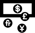 Currency Exchange
 -
 First Aid
 -
 Lost and Found
 -
 Baggage Lockers
 -
 Elevator
 -
 Toilets, Men
 -
 Toilets, Women
 -
 Toilets
 -
 Information
 -
 Hotel Information
 -
 Taxi
Taxi -
 Bus
Bus -
 Ground Transportation
 -
 Rail Transportation
 -
 Air Transportation
 -
 Heliport
 -
 Water Transportation


- Concessions
-
 Car Rental
 -
 Restaurant
 -
 Coffee Shop
 -
 Bar
Bar -
 Shops
Shops


- Processing Activities
-
 Ticket Purchase
 -
 Baggage Check-in / Baggage Claim
 -
 Customs
 -
 Immigration


- Regulations
-
 No Smoking
 -
 Smoking
 -
 No Parking
 -
 Parking
 -
 No Entry


1979 Additions
In 1979, the Department of Transportation requested 16 additional symbols, to fill in gaps observed in the original set. First Aid, No Smoking, No Parking, No Dogs, and No Entry used Pantone Red 032 C and Exit used Pantone Green 340 C.[3]
- Public Services
-
 Cashier
 -
 Coat Check
 -
 Escalator
 -
 Escalator, Up
 -
 Escalator, Down
 -
 Stairs
 -
 Nursery
 -
 Drinking Fountain
 -
 Waiting Room


- Concessions
-
 Barber Shop/Beauty Salon
 -
 Barber Shop
 -
 Beauty Salon


- Processing Activities
-
 Departing Flights
 -
 Arriving Flights


- Regulations
-
 No Dogs
 -
 Exit
Exit -
 Fire Extinguisher
 -
 Litter Disposal


2000s
An unofficial change has been forced to the original symbols following increased efforts by the
-
![First Aid[h]](//upload.wikimedia.org/wikipedia/commons/thumb/b/b4/Aiga_FirstAid_-_Green.svg/120px-Aiga_FirstAid_-_Green.svg.png) First Aid[h]
First Aid[h]
![First Aid[h]](/File:Aiga_FirstAid_-_Green.svg)
See also
 Transportation portal
- ISO 7001 – The International Organization for Standardization's equivalent standard
Notes
- ^ Sweden, Claes Tottie. Designed for Kooperative Fobundet, Sektor D.[2]
- ^ Paul Arthur & Associates. A collection of symbols for sign fabrication.[2]
- ^ Group 1 is "Telephone handset."
- ^ First letter of every word is capitalized, and all other letters are lowercase. (Ex: Baggage Claim, No Smoking)
- ^ An exception to this was No Smoking, No Parking and No Entry, these could be used without a symbol field.
- ^ This is where a person's eyes will naturally end up if they are standing up and looking straight ahead
- ^ The Ostwald color system is an older system that was phased out in the 1970s. Converting this information into a modern color system is difficult, for this reason Pantone Red 032 C, specified in the 1982 revised Symbol Signs is used instead.[5]
- ^ The AIGA has not officially specified an official change to the symbol or its color. This symbol uses Pantone 340 C, which was the green specified for the Exit symbol in the 1979 symbol additions.
References
![]() This article incorporates public domain material from Symbol Signs: The Development of Passenger/Pedestrian Oriented Symbols for Use in Transportation-Related Facilities. United States Department of Transportation.
This article incorporates public domain material from Symbol Signs: The Development of Passenger/Pedestrian Oriented Symbols for Use in Transportation-Related Facilities. United States Department of Transportation.
- ^ Ellen Lupton and J. Abbott Miller. Design Writing Research: Writing About Graphic Design. New York: Kiosk, 1996.
- ^ a b c d e f g h i j k l m n o p q r American Institute of Graphic Arts (November 1974). "Symbol Signs. The Development of Passenger/Pedestrian Oriented Symbols for Use in Transportation-Related Facilities". National Technical Reports Library. Retrieved 12 July 2020. A PDF copy of this report is for download.
- ^ ISBN 0-8038-6777-8.
- ISBN 0-9769513-0-4.
- ISBN 0-8038-6777-8.
Standardized red and Green paint chips for certain symbol signs are included..." "If an offset printing ink is being used...the closest colors in the Pantone Matching System are 032 (red) and 340 (green).
External links
- Symbol signs, AIGA
- Airport Archived 2018-08-16 at the Wayback Machine, an animated film made from AIGA pictograms
- Friconix board DOT 50 original set of pictograms