
Display typeface

A display typeface is a typeface that is intended for use in display type (display copy) at large sizes for titles, headings, pull quotes, and other eye-catching elements, rather than for extended passages of body text.[1]
Display typefaces will often have more eccentric and variable designs than the simple, relatively restrained typefaces generally used for body text.
Several genres of font are particularly associated with display setting, such as
Titling fonts are a subset of display typefaces which are typically used for headlines and titles. They are often only uppercase, and have stroke widths optimized for large sizes.[12][13]
Historical background
For the first centuries of printing, display type generally did not exist. Printing was used primarily to print
The arrival of the poster and greater use of signage spurred the arrival of new kinds of letterform, both as lettering and in print.
New technologies, notably riveted "sanspareil"
In the past, almost all decorative lettering other than that on paper was created as custom or hand-painted lettering. The use of fonts in place of lettering has increased due to new printing methods,
Styles of display typeface
Common genres of display typeface include:
- Lettering with a design intended to seem hand-drawn, such as
- "Shadowed", "engraved", "inline" or "handtooled" lettering, with a blank space in the centre intended to suggest three-dimensional letters in relief. An early genre of display type, inline sans-serifs were also very popular in lettering of the inter-war period.[34] "Shaded" or hatched designs have also been made which appear grey when viewed at a distance.[35]
- Unusual or abstract redesigns of the alphabet, such as those drawn by the Bauhaus school of design, Milton Glaser's Baby Teeth or Indépendant.[36]
- "Distressed" lettering, intended to seem damaged or distorted, such as Shatter or Electric Circus[37]
- Ultra-light or ultra-bold adaptations of conventional letterforms, such as Gill Kayo
- Mixed caselettering that mixes upper- and lower-case letters in unexpected ways for an unconventional effect
- Reverse-contrast typefaces that invert the contrast of conventional writing, with the horizontals made thicker than the verticals.[38][39]
- Lettering made to suggest an aesthetic, such as modernism, the natural world, or another genre of lettering. Examples of the latter include use of stencil or embossing tape fonts to suggest an industrial aesthetic.
A more prosaic genre of "display typefaces" is those intended for signage, such as Johnston, Highway Gothic, Transport and Clearview. These often have adaptations to increase legibility and make letters more distinct from each other. For example, Johnston and Transport have a curl on the lower-case 'L' to distinguish it from an upper-case 'i'.[42]
In German the term "Akzidenzschrift" is used for faces not intended for body text but for commercial or trade printing, without implying a specific size range, so including small-size sans-serifs in uses such as on forms or tickets. The famous sans-serif
Note that these genres may also be seen in custom lettering, with which this topic overlaps. Older examples of lettering are often custom-drawn, rather than fonts.[25][26][27]
Gallery
The following gallery shows the historical development of display type, from type similar to body text typefaces to the highly decorative types of the nineteenth century.
-
 1780 Norwegian notice using flourished blackletter type.
 -
 Challenge to a game of fives, 1786. Type is similar to Baskerville.
 -
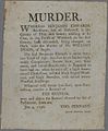 Murder poster 1796, using one inline initial.
 -
 1797 notice of an opera by Méhul, Paris 1797.
 -
 Theatre poster, 1808.
 -
 Welsh-language poster, 1818, using a bold italic inline "fat face" type.
 -
 An energetic bold and italic "fat face" type in an 1831 poster.
 -
 Fat face, slab-serif and sans-serif type, 1837.


See also
- Computer font, also known as a screen font
References
- ISBN 978-1-62153-582-9.
- ISBN 978-1-85669-348-6.
- ISBN 9780300120110.
- ^ Frere-Jones, Tobias. "Scrambled Eggs & Serifs". Frere-Jones Type. Retrieved 23 October 2015.
- ISBN 978-1-905217-45-8.
- ISBN 978-1-56898-765-1.
- ISBN 978-1-4299-9423-1.
- ^ Mosley, James. "English Vernacular". Typefoundry (blog). Retrieved 14 December 2016.
- ISBN 9780953520107.
- ^ Mosley, James. "Comments on Typophile thread - "Unborn: sans serif lower case in the 19th century"". Typophile (archived). Archived from the original on 28 June 2014. Retrieved 15 October 2016.
{{cite web}}: CS1 maint: bot: original URL status unknown (link) - ^ ISBN 9781567922400.
- ^ Strizver, Ilene (21 June 2017). "All About Titling Fonts".
- ^ Strizver, Ilene. "Titling Fonts". Retrieved 15 June 2021.
- ^ a b Mosley, James (1963). "English Vernacular". Motif. 11: 3–56.
- ISBN 9780900003103.
- ^ Berthold Wolpe (1964). "Caslon Architectural: On the origin and design of the large letters cut and cast by William Caslon II". Alphabet. Kynoch Press. pp. 57–64.
- Matrix. 24: 61–71.
- ^ Mosley, James (2003). "Sanspareil Matrices". Matrix: 104–114.
- ^ Kennard, Jennifer (3 January 2014). "The Story of Our Friend, the Fat Face". Fonts in Use. Retrieved 11 August 2015.
- ISBN 9781568984278. Retrieved 30 January 2016.
- ^ Mosley, James. "The Typefoundry of Vincent Figgins, 1792-1836". Motif (1): 29–36.
- ^ "Sentinel's Ancestors". Hoefler & Frere-Jones. Archived from the original on Sep 5, 2015. Retrieved 14 August 2015.
- ^ Mosley, James (6 January 2007). "The Nymph and the Grot: an Update". Typefoundry. Retrieved 12 December 2015.
- ^ Phinney, Thomas (August 30, 2010). "Decorative & Display Typestyles". Graphic Design and Publishing Centre. Archived from the original on 9 October 2015. Retrieved 10 August 2015.
- ^ a b Simonson, Mark (February 8, 2009). "Not a font". Mark Simonson Studio. Retrieved 14 December 2016.
- ^ a b Coles, Stephen (October 29, 2014). "Lettering is not type". Font Bureau. Type Network. Archived from the original on 2021-04-27. Retrieved 2016-12-22.
- ^ a b Johnston, Alastair (October 16, 2012). "The Misery of Edwin Drood: Bad Typography in the Movies". Booktryst. Retrieved 14 December 2016.
- ^ Shinn, Nick. "The Golden Age of Hand Lettering in American Advertising". Type Culture. Retrieved 1 April 2017.
- ^ Twardoch, Slimbach; Sousa, Slye (2007). Arno Pro (PDF). San Jose: Adobe Systems. Archived from the original (PDF) on 30 August 2014. Retrieved 14 August 2015.
- ^ Schwartz, Christian. "Neutraface". www.christianschwartz.com. Retrieved October 2, 2011.
- ^ Schwartz, Christian. "Neutraface No. 2". www.christianschwartz.com. Retrieved October 2, 2011.
- ^ Schwartz, Christian. "Neue Haas Grotesk". Retrieved 28 November 2014.
- ^ Shaw, Paul (7 April 2010). "Lettercentric: Type as Writing". Print. Retrieved 21 September 2015.
- ^ "Farewell Futura, Hello Neutraface No. 2".
- ^ "Graublock". Fonts in Use. Retrieved 24 January 2017.
- .
- ISBN 978-1-84091-649-2.
- ^ Bilak, Peter (25 September 2012). "Beauty and Ugliness in Type design". I love typography. Retrieved 10 August 2015.
- ISBN 9780879233334.
- ^ Chachra, Deb. "Faux Devangari". HiLoBrow. Retrieved 1 October 2014.
- ^ Shaw, Paul (17 June 2009). "Stereo Types". Print Magazine. Retrieved 1 October 2014.
- ^ Calvert, Margaret. "New Transport". A2-Type. Retrieved 1 March 2016.
- ^ a b c Reynolds, Dan (11 November 2019). "New details about the origins of Akzidenz-Grotesk". Klim Type Foundry. Retrieved 26 November 2019.
- ^ Marahrens, August, ed. (1870). Vollständiges theoretisch-praktisches Handbuch der Typographie nach ihrem heutigen Standpunkt, zweiter Band: Das Drucken in seinen verschiedenen Branchen. Verlag d. Leipziger Vereinsdruckerei. p. 431.
- ISBN 9783506741097.
Drucksache von geringem Umfang, Anzeige, Formular
- ^ Hardwig, Florian (2 August 2018). ""Herzlichen Glückwunsch" wedding cards (1919)". Fonts in Use. Retrieved 28 June 2021.
- ^ Lewis, Charlton Thomas; Short, Charles (1922). A Latin Dictionary. Oxford: Clarendon Press. p. 16.