
Scribal abbreviation
This article needs additional citations for verification. (March 2010) |

g[u]lor[um] a vigi[n]ti a[n]nis [e]t sup[ra] o[mn]es
qui ad bella p[ro]cedere[n]t: ((verse 25)) q[ua]dragi[n].
_-_Scribal_abbreviation_%22ihm_xrm_rdm%22_for_%22ihesum_christum_et_dominum%22.jpg)
Scribal abbreviations or sigla (singular: siglum) are abbreviations used by ancient and medieval scribes writing in various languages, including Latin, Greek, Old English and Old Norse.
In modern manuscript editing (substantive and mechanical) sigla are the symbols used to indicate the source manuscript (e.g. variations in text between different such manuscripts).
History
Abbreviated writing, using sigla, arose partly from the limitations of the workable nature of the materials (
During the
To learn the Tironian note system, scribes required formal schooling in some 4,000 symbols; this later increased to some 5,000 symbols and then to some 13,000 in the medieval period (4th to 15th centuries AD);[2] the meanings of some characters remain uncertain. Sigla were mostly used in lapidary inscriptions; in some places and historical periods (such as medieval Spain) scribal abbreviations were overused to the extent that some are indecipherable.
Forms
The abbreviations were not constant but changed from region to region. Scribal abbreviations increased in usage and reached their height in the Carolingian Renaissance (8th to 10th centuries). The most common abbreviations, called notae communes, were used across most of Europe, but others appeared in certain regions. In legal documents, legal abbreviations, called notae juris, appear but also capricious abbreviations, which scribes manufactured ad hoc to avoid repeating names and places in a given document.[3]
Scribal abbreviations can be found in epigraphy, sacred and legal manuscripts, written in Latin or in a vernacular tongue (but less frequently and with fewer abbreviations), either calligraphically or not.
In epigraphy, common abbreviations were comprehended in two observed classes:
- The abbreviation of a word to its initial letter;
- The abbreviation of a word to its first consecutive letters or to several letters, from throughout the word.
Both forms of abbreviation are called suspensions (as the scribe suspends the writing of the word). A separate form of abbreviation is by contraction and was mostly a Christian usage for sacred words, or
Another practice was repeating the abbreviation's final consonant a given number of times to indicate a group of as many persons: AVG denoted Augustus, thus, AVGG denoted Augusti duo; however, lapidaries took typographic liberties with that rule, and instead of using COSS to denote Consulibus duobus, they invented the CCSS form. Still, when occasion required referring to three or four persons, the complex doubling of the final consonant yielded to the simple plural siglum. To that effect, a vinculum (overbar) above a letter or a letter-set also was so used, becoming a universal medieval typographic usage. Likewise the tilde (~), an undulated, curved-end line, came into standard late-medieval usage. Besides the tilde and macron marks above and below letters, modifying cross-bars and extended strokes were employed as scribal abbreviation marks, mostly for prefixes and verb, noun and adjective suffixes.
The typographic abbreviations should not be confused with the phrasal abbreviations: i.e. (id est 'that is'); loc. cit. (loco citato 'in the passage already cited'); viz. (vide licet 'namely; that is to say; in other words' – formed with vi + the yogh-like glyph ꝫ, the siglum for the suffix -et and the conjunction et); and etc. (et cetera 'and so on').
Moreover, besides scribal abbreviations, ancient texts also contained variant typographic characters, including
(ꝛ). The u and v characters originated as scribal variants for their respective letters, likewise the i and j pair. Modern publishers printing Latin-language works replace variant typography and sigla with full-form Latin spellings; the convention of using u and i for vowels and v and j for consonants is a late typographic development.Scribal sigla in modern use
Latin script
Some ancient and medieval sigla are still used in English and other European languages; the Latin
Typographically, the ampersand, representing the word et, is a space-saving
The common abbreviation Xmas, for Christmas, is a remnant of an old scribal abbreviation that substituted the Greek letter chi (Χ) for Christ's name (deriving from the first letter in his name, Χριστος).
Church Slavonic
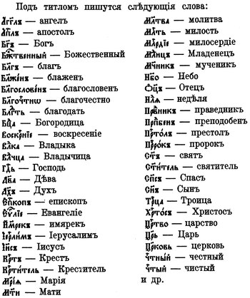
After the invention of printing, manuscript copying abbreviations continued to be employed in Church Slavonic and are still in use in printed books as well as on icons and inscriptions. Many common long roots and nouns describing sacred persons are abbreviated and written under the special diacritic symbol titlo, as shown in the figure at the right. That corresponds to the Nomina sacra ('Sacred names') tradition of using contractions for certain frequently occurring names in Greek ecclesiastical texts. However, sigla for personal nouns are restricted to "good" beings and the same words, when referring to "bad" beings, are spelled out; for example, while God in the sense of the one true God is abbreviated as Бг҃ъ, god referring to false gods is spelled out. Likewise, the word meaning 'angel' is generally abbreviated as агг҃лъ, but the word meaning 'angels' is spelled out for 'performed by evil angels' in Psalm 77.[6]
Abbreviation types
Adriano Cappelli's Lexicon Abbreviaturarum lists the various medieval brachigraphic signs found in
The original manuscripts were not written in a modern sans-serif or serif font but in Roman capitals, rustic, uncial, insular, Carolingian or blackletter styles. For more, refer to Western calligraphy or a beginner's guide.[8]
Additionally, the abbreviations employed varied across Europe. In Nordic texts, for instance, two runes were used in text written in the Latin alphabet, which are fé (ᚠ 'cattle, goods') and maðr (ᛘ 'man').
Cappelli divides abbreviations into six overlapping categories:
- by suspension (troncamento)
- by contraction (contrazione)
- with independent meaning (con significato proprio)
- with relative meaning (con significato relativo)
- by superscript letters (per lettere sovrapposte)
- by convention (segni convenzionali)
Suspension

Suspended terms are those of which only the first part is written, and the last part is substituted by a mark, which can be of two types:
- General
- indicating there has been an abbreviation but not how. The marks are placed above or across the ascender of the letters.

- The final three of the series are knot-like and are used in papal or regal documents.[9]
- Specific
- indicating that a truncation has occurred.

- The third case is a stylistic alternative (vertical instead of oblique) of the ligatured cursive sign abbreviating various common finals in Latin like -um, -us, or -io (Latin Extended-D, Unicode chart), found in several fonts, here Andron.


The largest class of suspensions consists of single letters standing in for words that begin with that letter.
A dot at the baseline after a capital letter may stand for a title if it is used such as in front of names or a person's name in medieval legal documents. However, not all sigla use the beginning of the word.

For plural words, the siglum is often doubled: F. = frater and FF. = fratres. Tripled sigla often stand for three: DDD = domini tres.
Letters lying on their sides, or mirrored (backwards), often indicate female titles, but a mirrored C (Ↄ) stands generally for con or contra (the latter sometimes with a macron above: Ↄ̄).
To avoid confusion with abbreviations and numerals, the latter are often written with an overline above. In some contexts, however, numbers with a line above indicate that number is to be multiplied by a thousand, and several other abbreviations also have a line above them, such as ΧΡ (Greek letters chi + rho) = Christus or IHS = Jesus.
Starting in the 8th or the 9th century, single-letter sigla grew less common and were replaced by longer, less ambiguous sigla with bars above them.
Contraction
Abbreviations by contraction have one or more middle letters omitted. They were often represented with a general mark of abbreviation (above), such as a line above. They can be divided into two subtypes:
- pure: keeps only the first (one or more) and last (one or more) letters but not intermediate letters. Special cases arise when a contraction keeps only the first and last letter of a word, resulting in a two-letter sigla
- mixed (impure): keeps one or more intermediate letters of the word that is abridged
Marks with independent meaning

Such marks inform the reader of the identity of the missing part of the word without affecting (independent of) the meaning. Some of them may be interpreted as alternative contextual glyphs of their respective letters.
- The straight or curved macron above a letter means that an n or m is missing. A remnant can be seen in Spanish where an n with a tilde (ñ) is used for [ɲ]. In Visigoth texts before the 9th century, however, a dot is placed above the macron to indicate m, and the same mark without a dot meant n. The line with a dot became the general mark after the 9th century in Visigoth texts.
- A mark that resembles the Arabic numeral nine (ꝯ), or a mirrored C (ↄ) in Gothic texts, is one of the oldest signs and can be found in the texts of Marcus Valerius Probusand Tironian notes with the same meaning as con.
- Another mark, similar to a bold comma or a superscript version of the previous mark (ꝰ), placed after the letter on the median line, represented us or os, generally at the end of the word, being the Saxon genitive.
- A wave-like or omicron-like mark stands for a missing r (rhotic consonant) or ra. Sometimes, a similar wave-like mark at the end of a word indicated a missing -a or syllable ending in -a. This is, however, a coincidence, as one of the marks stems from a small r-like mark and the other from an a-like one. In later texts, it became a diaeresis (two dots), or a broken line.
- A mark, resembling the Arabic numeral two (2) and placed on the median line after the letter (e.g. eᷣ), indicates tur or ur, which occurs generally at the end of the word. Alternatively it could stand for ter or er but not at the end of the word. (Nordic languages, such as Old English, have a lightning-bolt-like mark for words ending in er.)
- The r rotunda with a cut (ꝵ) generally stood for -rum (a common genitive plural ending in Latin), but it could also stand for a truncation after the letter r.
- A last mark, which could either be the Tironian note (⁊) or the ampersand (&), was used with equal frequency as the conjunction et ('and') or as et in any part of the word. The symbol ⁊ at the end of a word indicates the enclitic -que ('and'). A corruption occurs in some manuscripts between it and the us/os mark.
Marks with relative meaning

The meaning of the marks depends on the letter on which they appear.
- A macron not fully above the character but crossing the descender or ascender:
- b̵, b̄ – bre-, ber-, -ub
- c̄ – (with a link on the right) – cum, con, cen-
- ꝯ̄ – (above) – quondam
- d̵, d̄ – de-, der, -ud (a crossed d, not ð = eth)
- h̵, h̄ – haec, hoc, her
- ꝉ – vel, ul-, -el
- m̄ (above) – mem-, mun-
- n̄ (above) – non, nun-
- ꝋ (crossed horizontally, not Theta infelix)
- p̱ – per, par-, por-
- p̄ (above) – prae, pre- (alternatively, a mark similar to -us comma above but with a small spiral glyph could be used for this meaning, and it is also valid above the letter q)
- p̄p̄ (above), p̱p̱ (below) – propter, papa
- q̱ – qui and, in Italy, que, but in England quam, quia
- q̄ (above) – quae
- q̄q̄ (above) or q̱q̱ (below) – quoque
- q̱̃ (tilde above and line below) – quam
- t̵ – ter-, tem-, ten-
- ū, v̄ (above) – ven-, ver, -vit
- A dot, two dots, comma and dot (different from a semicolon), and the mark like an Arabic numeral three (ꝫ) were generally at the end of a word on the baseline. After b, they mean -us (semicolon-like and ꝫ also could mean -et). After q, they form the conjunction -que (meaning "and" but attached to the end of the last word) with semicolon-like and ꝫ the q could be omitted. Semicolon-like, in Lombard documents, above s meant -sis. The dot above median line on an h – hoc. Dot above u – ut or uti. The ꝫ could mean -est, or after a, e, u vowels meant -m not us or ei, if after an o it meant -nem. In certain papers the ꝫ mark can be confused with a cut r rotunda (handwritten 4-like).
- A dot to the left and right of a letter gave the following meanings: e – .e. est, i – .i. id est, n – .n. enim, q – .q. quasi, s – .s. scilicet, t – .t. tune, .ꝯ. – quondam, .⁊. etiam.
- A diagonal line, often hooked, mark crossing nearly all the letters gives a different meaning. Commonly a missing er, ar, re. Variants of which were placed above and were ¿-like, tilde (crossing ascender) and similar to the us mark. These, used in various combinations, allow for various uses giving additional meanings.
- 2-like mark, after a q – qꝛ quia. After 15th century alone ꝛ et (being similar to ⁊) and alone with line above ꝛ̄ etiam. After u and a at the end of a word (uꝛ, aꝛ) m, after s – sꝛ, ſꝛ et or ed.
Stacked or superscript letters
A superscript letter generally referred to the letter omitted, but, in some instances, as in the case of vowel letters, it could refer to a missing vowel combined with the letter r, before or after it. It is only in some English dialects that the letter r before another consonant largely silent and the preceding vowel is "
However, a, i, and o above g meant gͣ gna, gͥ gni and gͦ gno respectively. Although in English, the g is silent in
- a on r: rͣ – regula
- o on m: mͦ – modo
Vowels were the most common superscripts, but consonants could be placed above letters without ascenders; the most common were c, e.g. nͨ. A cut l above an n, nᷝ, meant nihil for instance.
For numerals, double-x superscripts are sometimes used to express scores, i. e. multiplication by twenty. For example, IIIIxx indicates 80, VIxxXI indicates 131.
Convention marks
These marks are nonalphabetic letters carrying a particular meaning. Several of them continue in modern usage, as in the case of monetary symbols. In Unicode, they are referred to as letter-like glyphs. Additionally, several authors are of the view that the Roman numerals themselves were, for example, nothing less than abbreviations of the words for those numbers. Other examples of symbols still in some use are alchemical and zodiac symbols, which were, in any case, employed only in alchemy and astrology texts, which made their appearance beyond that special context rare.
Some important examples are two stacked horizontal lines (looks like =) for esse ('to be'), and an obelus consisting of a horizontal line and two dots (looks like ÷) for est ('it is').
Other
In addition to the signs used to signify abbreviations, medieval manuscripts feature some glyphs that are now uncommon but were not sigla. Many more
Typographic replication

Various typefaces have been designed to allow scribal abbreviations and other archaic glyphs to be replicated in print. They include "record type", which was first developed in the 1770s to publish Domesday Book and was fairly widely used for the publication of medieval records in Britain until the end of the 19th century.
Unicode encoding
In the Unicode Standard v. 5.1 (4 April 2008), 152 medieval and classical glyphs were given specific locations outside of the Private Use Area. Specifically, they are located in the charts "Combining Diacritical Marks Supplement" (26 characters), "Latin Extended Additional" (10 characters), "Supplemental Punctuation" (15 characters), "Ancient Symbols" (12 characters) and especially "Latin Extended-D" (89 characters).[10] These consist in both precomposed characters and modifiers for other characters, called combining diacritical marks (such as writing in LaTeX or using overstrike in MS Word).
Characters are "the smallest components of written language that have semantic value" but glyphs are "the shapes that characters can have when they are rendered or displayed".[11]
| Symbols | Code points[13] |
|---|---|
| Ꜿ ꜿ | U+A73E LATIN CAPITAL LETTER REVERSED C WITH DOT U+A73F LATIN SMALL LETTER REVERSED C WITH DOT |
| Ꝯ ꝯ ꝰ | U+A76E LATIN CAPITAL LETTER CON U+A76F LATIN SMALL LETTER CON U+A770 MODIFIER LETTER US |
| ꝱ | U+A771 LATIN SMALL LETTER DUM |
| Ꝫ ꝫ | U+A76A LATIN CAPITAL LETTER ET U+A76B LATIN SMALL LETTER ET |
| Ꝭ ꝭ | U+A76C LATIN CAPITAL LETTER IS U+A76D LATIN SMALL LETTER IS |
| Ꝃ ꝃ | U+A742 LATIN CAPITAL LETTER K WITH DIAGONAL STROKE U+A743 LATIN SMALL LETTER K WITH DIAGONAL STROKE |
| Ꝁ ꝁ | U+A740 LATIN CAPITAL LETTER K WITH STROKE U+A741 LATIN SMALL LETTER K WITH STROKE |
| Ꝅ ꝅ | U+A744 LATIN CAPITAL LETTER K WITH STROKE AND DIAGONAL STROKE U+A745 LATIN SMALL LETTER K WITH STROKE AND DIAGONAL STROKE |
| Ꝉ ꝉ | U+A748 LATIN CAPITAL LETTER L WITH HIGH STROKE U+A749 LATIN SMALL LETTER L WITH HIGH STROKE |
| ꝲ | U+A772 LATIN SMALL LETTER LUM |
| ꝳ | U+A773 LATIN SMALL LETTER MUM |
| ꝴ | U+A774 LATIN SMALL LETTER NUM |
| Ꝋ ꝋ | U+A74A LATIN CAPITAL LETTER O WITH LONG STROKE OVERLAY U+A74B LATIN SMALL LETTER O WITH LONG STROKE OVERLAY |
| Ꝓ ꝓ | U+A752 LATIN CAPITAL LETTER P WITH FLOURISH U+A753 LATIN SMALL LETTER P WITH FLOURISH |
| Ꝕ ꝕ | U+A754 LATIN CAPITAL LETTER P WITH SQUIRREL TAIL U+A755 LATIN SMALL LETTER P WITH SQUIRREL TAIL |
| Ꝑ ꝑ | U+A750 LATIN CAPITAL LETTER P WITH STROKE THROUGH DESCENDER U+A751 LATIN SMALL LETTER P WITH STROKE THROUGH DESCENDER |
| Ꝙ ꝙ | U+A758 LATIN CAPITAL LETTER Q WITH DIAGONAL STROKE U+A759 LATIN SMALL LETTER Q WITH DIAGONAL STROKE |
| Ꝗ ꝗ | U+A756 LATIN CAPITAL LETTER Q WITH STROKE THROUGH DESCENDER U+A757 LATIN SMALL LETTER Q WITH STROKE THROUGH DESCENDER |
| ꝵ | U+A775 LATIN SMALL LETTER RUM |
| ꝶ | U+A776 LATIN LETTER SMALL CAPITAL RUM |
| Ꝝ ꝝ | U+A75C LATIN CAPITAL LETTER RUM ROTUNDA U+A75D LATIN SMALL LETTER RUM ROTUNDA |
| ẜ | U+1E9C LATIN SMALL LETTER LONG S WITH DIAGONAL STROKE |
| ẝ | U+1E9D LATIN SMALL LETTER LONG S WITH HIGH STROKE |
| ꝷ | U+A777 LATIN SMALL LETTER TUM |
| ꝸ | U+A778 LATIN SMALL LETTER UM |
| Ꝟ ꝟ | U+A75E LATIN CAPITAL LETTER V WITH DIAGONAL STROKE U+A75F LATIN SMALL LETTER V WITH DIAGONAL STROKE |
| Ꝥ ꝥ | U+A764 LATIN CAPITAL LETTER THORN WITH STROKE U+A765 LATIN SMALL LETTER THORN WITH STROKE |
| Ꝧ ꝧ | U+A766 LATIN CAPITAL LETTER THORN WITH STROKE THROUGH DESCENDER U+A767 LATIN SMALL LETTER THORN WITH STROKE THROUGH DESCENDER |
Examples of 8th- and 9th-century Latin abbreviations across Europe


See also
- Acronym – Word or name made from the initial components of the words of a sequence
- Claudian letters – Three new letters of the Latin alphabet introduced by Roman Emperor Claudius
- List of acronyms
- List of classical abbreviations
- List of medieval abbreviations
- Macron § Other uses – Diacritical mark
- Monogram – Motif made by overlapping two or more letters
- Palaeography – Study of handwriting and manuscripts
- Textspeak– Abbreviated slang used in text messaging
- Typographic ligature– Glyph combining two or more letterforms
- Palaeographic letters (category)
References
Citations
- ISBN 978-3-5150-7640-1
- OCLC 301255530
- ^ Lindsay, Wallace Martin, Notae Latinae: An Account of Abbreviation in Latin Mss. Of the Early Minuscule Period (C. 700–850), 1915, Cambridge: Cambridge University Press
- ^ Traube, Ludwig, Nomina sacra: Versuch einer Geschichte der Christlichen Kürzung, Munich,1907
- ^ "The @-symbol, part 2 of 2 – Shady Characters". Retrieved 20 January 2023.
- ^ Gamanovich, Alipi (1984) [1964]. Grammatika Tserkovno-Slavyanskago Yazyka. Jordanville, NY: Holy Trinity Monastery. p. 271.
- ^ Cappelli 2011, p. x.
- ^ Harris, David (2003). The Calligrapher's Bible: 100 Complete Alphabets and How to Draw Them.
- ^ Cappelli, Adriano (1982). The elements of abbreviation in medieval Latin paleography (PDF). Translated by Heimann, David; Kay, Richard. Kansas: University of Kansas Printing Service. p. 2. Archived from the original on 15 August 2023. Retrieved 15 August 2023.
- ^ "MUFI: Medieval Unicode Font Initiative". 15 September 2011.
- ^ "The Unicode Consortium". Unicode, Inc.
- ^ Everson, Michael; Baker, Peter; Emiliano, António; Grammel, Florian; Haugen, Odd Einar; Luft, Diana; Pedro, Susana; Schumacher, Gerd; Stötzner, Andreas (30 January 2006). "L2/06-027: Proposal to add Medievalist characters to the UCS" (PDF).
- ^ "Unicode character database". The Unicode Standard. Retrieved 9 July 2017.
Sources
- Cappelli, Adriano (2011) [1899]. Geymonat, Mario; Troncarelli, Fabio (eds.). Lexicon Abbreviaturarum: dizionario di abbreviature Latine ed Italiane usate nelle carte e codici specialmente del Medio-Evo (7th ed.). Milan: Ulrico Hoepli. ISBN 9788820345464.
Further reading
- Trice Martin, Charles (1910). The Record Interpreter: a collection of abbreviations, Latin words and names used in English historical manuscripts and records (2nd ed.). London: Stevens and Sons.
- Winiarczyk, Marek (1995). Sigla Latina in libris impressis occurrentia: cum siglorum graecorum appendice (in Latin) (2nd ed.). OCLC 168613439.
 This article incorporates text from a publication now in the public domain: Herbermann, Charles, ed. (1913). "Methods of Abbreviation". Catholic Encyclopedia. New York: Robert Appleton Company.
External links
- Bibliography on medieval abbreviations and other scribal conventions.
- Palaeography: Scribal Abbreviations
- XML Specifications for the use of sigla
- The abbreviations used in the 1913 edition of Webster's dictionary