
Wikipedia:Featured picture candidates/August-2005
| Featured picture tools |
|---|
|
Please cut and paste new entries to the bottom of this page, creating a new monthly archive (by closing date) when necessary.
Amaryllis stamens

Beautiful photo of Amaryllis stamens; illustrates the article stamen. Photographer: Aka.
- Nominate and support. - Sango123 18:13, July 13, 2005 (UTC)
Oppose.A lovely image. Sadly it doesn't (yet?) do a great job of illustrating the article, as it's stuck at the bottom of it without any context or explanation. Lupin 02:26, 14 July 2005 (UTC)- It does offer some explanation: 'Stamens of Amaryllis'. I think that since this image focuses primarily on the stamens instead of an entire flower, the article would benefit having this as the lead image instead of Image:Crateva religiosa.jpg. What do you think? Sango123 02:44, July 14, 2005 (UTC)
- I think the current lead image does a better job of visually explaining what stamens are. A macro shot like this is potentially ambiguous as it doesn't show how the stamens relate to the rest of the flower. Lupin 13:43, 14 July 2005 (UTC)
- Well I've moved the picture up, because although Lupin's point about showing the relation to the plant is a good one, I think the Amaryllis picture gives a much better idea of which bit of the plant the page is talking about. Also, the page is a redirect for anther, and the Amaryllis shows those clearly. Arguably the SEM picture is not as useful though. -- Solipsist 12:15, 16 July 2005 (UTC)]
- Well I've moved the picture up, because although Lupin's point about showing the relation to the plant is a good one, I think the Amaryllis picture gives a much better idea of which bit of the plant the page is talking about. Also, the page is a redirect for
- I think the current lead image does a better job of visually explaining what stamens are. A macro shot like this is potentially ambiguous as it doesn't show how the stamens relate to the rest of the flower. Lupin 13:43, 14 July 2005 (UTC)
- It does offer some explanation: 'Stamens of Amaryllis'. I think that since this image focuses primarily on the stamens instead of an entire flower, the article would benefit having this as the lead image instead of Image:Crateva religiosa.jpg. What do you think? Sango123 02:44, July 14, 2005 (UTC)
- Isn't this already a featured picture? It has a tag at the bottom of its image page saying it's a featured picture.Senatedems 23:58, 14 July 2005 (UTC)
- Support -- Solipsist 12:15, 16 July 2005 (UTC)
- Support -- Chris 73 Talk 16:40, July 16, 2005 (UTC)
- Oppose. Way too much white - the dark top makes it look a little top heavy. Also top left stamen is out of focus. Enochlau 11:07, 17 July 2005 (UTC)
- Oppose, but : If the focusing is better, I may support. But it's a very detailed picture. — Stevey7788 (talk) 20:59, 20 July 2005 (UTC)
- ( + ) Support great photo by a great wiki photographer --Fir0002 10:05, July 23, 2005 (UTC)
- Oppose. The pollen on the anthers looks quite old. it would be a better and useful picture if the David D. 18:08, 27 July 2005 (UTC)]
- Oppose --ScottyBoy900Q∞ 20:50, 27 July 2005 (UTC)
- Not promoted This link is Broken 02:36, 2 August 2005 (UTC)
Hippo Skull


A sharp and truely striking picture that does a great job of illustrating skull and hippopotamus
- Nominate and support. - Circeus 21:09, July 13, 2005 (UTC)
- (As the author of the picture) Support. →Raul654 21:21, July 13, 2005 (UTC)
- Neutral. Mildly distracting background and shadows. Might benefit from a tighter crop on the top and left to center the skull. —Cryptic (talk) 22:52, 13 July 2005 (UTC)]
Oppose the darkened version - edit lines are visible along the top edge of the box. —Cryptic (talk) 20:58, 30 July 2005 (UTC)]
- Not a vote, but I agree with Crptic about the background. I think that photoshopping this to make everything black except the wooden thing it's resting on would probably improve this image. Lupin 02:24, 14 July 2005 (UTC)
- Oppose. Background is a problem. Enochlau 03:22, 16 July 2005 (UTC)
- Support. Image is very good quality and when you view it full you can see every detail which in my opinion would make it a good candiate. • Thorpe • 11:53, 16 July 2005 (UTC)
- Support - Good quality, high-res pic. background is only a minor flaw -- Chris 73 Talk 16:39, July 16, 2005 (UTC)
- Support --ZeWrestlerTalk 21:30, 19 July 2005 (UTC)
- Slight support, but it does seem quite suitable for Halloween. :) — Stevey7788 (talk) 20:59, 20 July 2005 (UTC)
- Neutral. Hard to decide. Its an interesting subject and an excellent addition to the article. I particularly like the wear on the tusks (I seem to recall that tooth wear is one of principle causes of death for wild hippos, but I can't find a reference and as they are herbivores it would probably be problems with the back molars that is the issue.) My only problem is the unflattering flash lighting (which was probably necessary) and to a lesser extent the background. -- Solipsist 08:10, 26 July 2005 (UTC)
- Oppose. Not particularly striking. Background issues. --ScottyBoy900Q∞ 20:49, 27 July 2005 (UTC)
- Support version with darkened background. Sango123 20:32, July 30, 2005 (UTC)
- Support. Version with darkened background. I'd like the far end of the table to be more shadowed rather than just suddenly hit a black background with no gradient into it but the current one is striking. - Whitehorse1 02:13, 31 July 2005
- Comment: I think the darkened background is a good idea. I've just uploaded a version with a slightly neater job of masking the background, and also applied Whitehorse1's idea of de-emphasising the bottom left corner of the table. -- Solipsist 07:48, 31 July 2005 (UTC)
Promoted Image:Hippo skull dark.jpg +8 / -3 / 2 Neutral - most objections relate to the background, so promoting version with darkend background. -- Solipsist 20:19, 3 August 2005 (UTC)
Petronas Towers

An impressively lit night-time shot of the Petronas Towers by Commons user Angel Riesgo.
- Nominate and support - Solipsist 21:09, 14 July 2005 (UTC)
- Oh, that's nice. It's really hard to take a picture of a skyscraper and get a proper idea of its sheer bulk, and this really achieves that. -- Finlay McWalter | Talk 21:22, July 14, 2005 (UTC)
- Support either version (although the edited version loses the highlighting around the top edge, which I liked). -- Finlay McWalter | Talk 15:44, July 17, 2005 (UTC)
- To become one of the best pictures on Wikipedia. Phoenix2 22:39, July 14, 2005 (UTC)
- Support, grainy issue was cleared up in the edited version. -- Phoenix 00:08, 18 July 2005
- Looks like it's taken straight out of a sci-fi movie... unreal. Enochlau 05:18, 15 July 2005 (UTC)
- The hi-res picture is very grainy. Phils 10:12, 15 July 2005 (UTC)
 Support edited version --Fir0002 08:50, July 16, 2005 (UTC)
- Wow, this one caught my eye as I was scrolling down. Very nice. --coblin 10:56, July 16, 2005 (UTC)
- Support either version --coblin 05:20, July 27, 2005 (UTC)
- Support -- great image. - Longhair | Talk 03:56, 17 July 2005 (UTC)
- Support edited version. The sheer size and bulk of the building is amazing... TomStar81
- Support --ZeWrestler 15:30, 17 July 2005 (UTC)
- Support edited version. James F. (talk) 23:16, 17 July 2005 (UTC)
- Support - Very nice. Sango123 18:14, July 18, 2005 (UTC)
- Question - What are the American laws on pictures of buildings? In Icelandic law, which is all I know, a picture which has a building (or a sculpture) as its main content can be hampered by the architect's copyright. Is there something similar over there? In any case the picture is amazing. - Haukurth 01:36, 19 July 2005 (UTC)
- This came up at a conference I was at, and I believe it can be an issue, but only if money is made off of it. This would be a strong candidate for 'fair use', in my non-professional opinion. --DNicholls 02:30, 24 July 2005 (UTC)
- Support - Either version. Stunning Ferg2k 05:13, 19 July 2005 (UTC)
- Support either version. This will end up in the front page sooner or later. -- Titoxd 03:29, 20 July 2005 (UTC)
- Support Malaysia Boleh!!!
- Strong support, dazzling and one of the best images I've ever seen here. — Stevey7788 (talk) 20:57, 20 July 2005 (UTC)
- Support - Great photo! --Andylkl (talk) 17:13, July 22, 2005 (UTC)
- Support, the nicest photo of a skyscraper I've seen in a while. Ben Lunsford 18:33, July 22, 2005 (UTC)
- Support. Edited version. Very striking. Balster neb 17:30, 23 July 2005 (UTC)
- Support. Looks like one of those 'artist's conceptions'. Striking edges. Jogloran 09:00, July 24, 2005 (UTC)
- Strongly Support --ScottyBoy900Q∞ 20:47, 27 July 2005 (UTC)
Promoted Image:Torres Petronas Mayo 2004.jpg +20 / -0 preference for the edited version, but I have now overloaded that on the Commons original since they are otherwise similar -- Solipsist 20:42, 3 August 2005 (UTC)
O'Connor and Gonzales

Looking at the Alberto Gonzales article, I was stunned to find a picture of Justice Sandra Day O'Connor gesturing to Gonzales almost as if she passing her position to him. This is particularly stunning to me in light of the speculation about whether George W. Bush will nominate Gonzales to succeed the retiring O'Connor. This appears in the articles Sandra Day O'Connor and Alberto Gonzales. The picture is in the public domain, as it was taken by a White House staffer.
- Nominate and support. - Senatedems 23:49, 14 July 2005 (UTC)
- Uh, it's low resolution and very grainy. →Raul654 01:12, July 15, 2005 (UTC)
- Poor detail. --ZeWrestler 02:08, 15 July 2005 (UTC)
- Oppose -yuck, not interesting or striking or nice to look at in any way. sorry. --Deglr6328 02:15, 15 July 2005 (UTC)
- Rather small. Enochlau 05:18, 15 July 2005 (UTC)
- Nothing that special, a higher resolution version needs to be uploaded if possible. Also, people, please don't vote until pictures have passed the two day comments phase. Phoenix2 17:01, July 15, 2005 (UTC)
- Even with higher res (which is badly needed), I'm not convinced this picture fits the bill. Clearly the rationale for featuring would be that the picture is unusual in that it shows the exiting justice "welcoming" the new one -- at least, I can't see anything about the picture other than that content which would make it featurable. I think the nom is premature, in that we don't know yet if Gonzales is even a nominee, let alone whether or not he will be confirmed. Even if he is, I have to ask if this is all that unusual. SC Justices must surely be pictured with lawyers, judges, and other government officials in the course of their duties to the Court -- isn't it likely that we could produce a photo of O'Connor with other candidates as well? I just don't feel that this is a photo whose time has come, and I think a good explanation of the rationale for nominating it is important if it is to receive widespread support. Jwrosenzweig 17:24, 15 July 2005 (UTC)
- I uploaded this picture because I thought it would be interesting in the O'Connor and Gonzales articles, but even I don't think this should be a featured picture. I agree with the various commenters that it's too grainy and low resolution to become a featured picture. I also agree with Jwrosenzweig that the rationale given by Senatedems for this picture doesn't work since we do not know if Gonzales is the nominee. GoCardinal 02:30, 16 July 2005 (UTC)]
- Oppose --ZeWrestler 15:29, 17 July 2005 (UTC)
- Oppose for my reasons stated above. GoCardinal 22:49, 17 July 2005 (UTC)]
- Now that Roberts is the nominee, this picture is even less worthy of featured status. GoCardinal 05:53, 20 July 2005 (UTC)]
- Now that Roberts is the nominee, this picture is even less worthy of featured status.
- Oppose for reasons stated above. Sango123 18:12, July 18, 2005 (UTC)
- Oppose Isn't anything special. Not even striking to look at.--May the Force be with you! Shreshth91($ |-| r 3 $ |-| t |-|) 15:24, 23 July 2005 (UTC)
- Oppose. Not very significant and not striking. Also very low resolution. Balster neb 17:21, 23 July 2005 (UTC)
- Oppose. I never liked this picture!! --ScottyBoy900Q∞ 20:46, 27 July 2005 (UTC)
- Oppose -- Longhair | Talk 05:14, 29 July 2005 (UTC)
Not promoted +1 / -9 -- Solipsist 21:10, 3 August 2005 (UTC)
Forestfire4
Illustrates Wildfire. Striking and informative.
- Nominate and support. - —Cryptic (talk) 06:55, 20 July 2005 (UTC)]
- Support: it is most certainly striking. Semiconscious (talk · home) 07:07, 20 July 2005 (UTC)
- interesting light effect in the picture. --ZeWrestler Talk 12:05, 20 July 2005 (UTC)
- It is striking, but is it actually useful? The focus of the picture seems to be on the sun, or the leafy trees, not the "charred remains"... -- Rmrfstar 23:30, 20 July 2005 (UTC)]
- Stunning. Phoenix2 02:41, July 21, 2005 (UTC)
- Support - exceptional photo JoJan 08:41, 23 July 2005 (UTC)
- obvious support Circeus 09:40, July 23, 2005 (UTC)
- ( + ) Support Fantastic photo. --Fir0002 09:55, July 23, 2005 (UTC)
- Support. I admit that out of context it may be unclear as to what is depicted, but the fact that this is one incredible photograph can only be a bonus as used in the article. Jogloran 12:18, July 23, 2005 (UTC)
- Support, nice photo. --Shivu § Mesg 4 Mè § 16:57, July 23, 2005 (UTC)
- Support. Though it doesn't illustrate much by itself, it's still striking enough to draw readers to the article. Balster neb 17:27, 23 July 2005 (UTC)
- Support -- TomStar81 19:06, 23 July 2005 (UTC)
- Support, I like this picture very much, though I wish it was in higher resolution. Jay Ann 19:16, 23 July 2005 (UTC)
- Support -- Chris 73 Talk 22:46, July 23, 2005 (UTC)
- Support Absolutely stunning shot. Beautiful color and lighting. Alight 03:33, 24 July 2005 (UTC)
- Support. Enochlau 11:26, 25 July 2005 (UTC)
- Support - outstanding - Adrian Pingstone 08:28, 24 July 2005 (UTC)
- Support - Exceeds FP standards. Sango123 22:08, July 24, 2005 (UTC)
- Oppose - This photo has 'atmosphere' but shows little detail of the effects of a forest fire. Oska 11:28, July 27, 2005 (UTC)
- Oppose. Call me crazy I just am not a fan of this one. --ScottyBoy900Q∞ 20:31, 27 July 2005 (UTC)
- Oppose -- I don't think wildfire when I see this image. Perhaps after a wildfire, but not a wildfire itself. Nice image, but it doesn't illustrate the subject well enough. - Longhair | Talk 05:12, 29 July 2005 (UTC)
- Oppose The picture is great but my first thought was fog. It is not clear that these trees are burnt and does not depict a wildfire. I would expect to see a picture of the actual fire not the aftermath. Sorry, David D. 18:22, 30 July 2005 (UTC)]
- Support Very nice. cohesion | talk 05:31, July 31, 2005 (UTC)
- Neutral because I'm not allowed to vote Oppose. The Image looks like a fake. I see no fire nor burned trees --84.154.193.160 15:09, 31 July 2005 (UTC)
- Why can't you oppose? Enochlau 06:29, 2 August 2005 (UTC)
- Support - Great one. -- Darwinek 11:21, 2 August 2005 (UTC)
- COPYRIGHT VIOLATION ? This photograph, "Sun, smoke and trees," was taken by Mark Thiessen for the National Geographic, in Siberia, Russia, in 2001. It appeared in the August 2002 issue of National Geographic, in the article Russian Smokejumpers. It was the National Geographic Photo of the Day for March 30, 2004. It is copyright of the National Geographic Society, 2004. Why is is tagged as being part of the Forestry Service collection?—Encephalon | ζ 18:53:08, 2005-08-15 (UTC)
- I tend to agree. The image was probably just being published on the government web site, but the National Geographic copyright looks correct. I'll remove the FeaturedPicture tag. -- Solipsist 12:48, 16 August 2005 (UTC)
Promoted Image:Forestfire4.jpg 17/4/1 ----- 02:25, August 14, 2005 (UTC)
Wall-mounted light with shadows

I have always really liked this picture and wanted to add it to the
- Nominate and support. - Semiconscious (talk · home) 00:06, 19 July 2005 (UTC)
- Support Nice picture! However, one problem is that one of the stated criteria is that a featured picture should add significantly to the information in an article. This might not really fit that criteria. Thus, the nomination might be more appropriate for the Wikimedia commons featured picture. Purkinje 01:54, 19 July 2005 (UTC)
- That was my fear. I believe this photo would be a great picture for the shadows page, but there are several photos of shadows on there already. If people think this is worthy as a featured picture, but feel that in order to meet the criteria for article relevence it should go somewhere else, I am open to suggestions. Semiconscious (talk · home) 08:38, 19 July 2005 (UTC)
- I agree, this looks like one for the Commons. But my, how that lighting article could use some better illustrations. -- Solipsist 19:21, 19 July 2005 (UTC)
- Comment, this might sound dumb, but look at the black box in the centre and then scroll up and down the image (you'll need full res), the light beams appear to be moving. Is that what it illustrates? --Fir0002 09:59, July 23, 2005 (UTC)
- This might be some type of center-surround type optical illusion. If someone writes and article about higher visual processing, this picture could definitely be featured. Purkinje 00:50, 25 July 2005 (UTC)
- What about placing the picture in the article Optical illusion. With the revolation that the light seems to be moving when viewed at max res, this picture would add signifigantly to the article. Would that work? TomStar81 01:29, 29 July 2005 (UTC)
- Oppose. The pic has a nice geometry, but there is not really much to see or recognize -- Chris 73 Talk 22:48, July 23, 2005 (UTC)
- Oppose - doesn't seem to illustrate anything. It's not an illustrative shadow pic nor a clear lighting pic, although simply as a photo I like it a lot. But sadly not FPC material - Adrian Pingstone 08:37, 24 July 2005 (UTC)
- Oppose. Hard to tell what it is. Enochlau 11:31, 25 July 2005 (UTC)
- Oppose --ScottyBoy900Q∞ 20:34, 27 July 2005 (UTC)
- Oppose -- Longhair | Talk 05:11, 29 July 2005 (UTC)
- Oppose in the words of Enochlau: "Hard to tell what it is." Ahkayah cuarenta y siete 21:30, 31 July 2005 (UTC)
Not promoted 2/6/0 ----- 02:26, August 14, 2005 (UTC)
Coconut shy

A couple of weeks ago, the
- Self-nomination and support. - Solipsist 19:17, 19 July 2005 (UTC)
- I like the picture, though I'm not sure whether or not it illustrates coconut shy all that well, as the game is in the background and partially obscured. I think it's probably more illustrative of carny or sidestall/carnival game (neither of which has an article) --CVaneg 22:25, 19 July 2005 (UTC)
- That's a good point. Infact we do effectively have an article on funfair and this picture is already illustrating that section. Might as well make that a redirect. Carny looks like an Americanism - Mr Harris would actually be a fairground showman and again there is some discussion of showmen in the funfair article, although some of that could arguably be split off. -- Solipsist 06:27, 20 July 2005 (UTC)]
- That's a good point. Infact we do effectively have an article on
( − ) Oppose* Neutral very red,
 and I can't actually see any coconutswriting on the signs at the back is a bit dubious in character --Fir0002 09:56, July 23, 2005 (UTC)- Thats odd, I can see five - Adrian Pingstone 08:32, 24 July 2005 (UTC)
- Oh I can see it now! they're at the back! I always thought that you threw coconuts at a coconut shy, but obvioulsy you aim to hit the coconuts! --Fir0002 10:00, July 31, 2005 (UTC)
- Thats odd, I can see five - Adrian Pingstone 08:32, 24 July 2005 (UTC)
- Support for its placement in Cryptic (talk) 11:22, 23 July 2005 (UTC)]
- Support, good photo, adds to the articles -- Chris 73 Talk 22:46, July 23, 2005 (UTC)
- Support cheerful photo. Phoenix2 03:20, July 24, 2005 (UTC)
- Support - striking pic - Adrian Pingstone 08:32, 24 July 2005 (UTC)
- Support. Interesting slice of life of the person as well as the surroundings. I wouldn't say it's overly red - it's as overly red as a picture of the sea is overly blue. Enochlau 11:29, 25 July 2005 (UTC)
- Oppose --ScottyBoy900Q∞ 20:33, 27 July 2005 (UTC)
Neutral--Has anyone actually read the signs in th background? They seem a little ify for a featured picture. TomStar81 20:39, 27 July 2005 (UTC)- Support -- With the sign issue fixed I don't really have a good reason to oppose, and I do kinda like the picture. TomStar81 05:29, 3 August 2005 (UTC)
- Support Worthy of featured status for those suspenders alone ;)! Junes 21:59, 28 July 2005 (UTC)
- Support. I too see five coconuts. ;) 'Carny' is indeed a term not in use at all or not in wide use at best in the UK. The posters at back aren't too bad and if a subversive humour is commonly used at fairs then a pic should echo it within reason (which this is). Whitehorse1 02:04, 31 July 2005
- Support Ahkayah cuarenta y siete 21:28, 31 July 2005 (UTC)
Promoted Image:Image:Albert Harris - Coconut shy B.jpg 10/1/1 ----- 02:26, August 14, 2005 (UTC)
Red-whiskered_Bulbul

Contributed to the article of the
- Nominate. -- Shivu 13:36, July 15, 2005 (UTC)
- Nice photo. I'll make the changes you suggested on my talk page tonight when I have access to Photoshop, and possibly crop the sides a bit. --brian0918™
 14:50, 15 July 2005 (UTC)
- Nice picture, will vote support. It could indeed do with some cropping to better the balance. Phoenix2 16:59, July 15, 2005 (UTC)
- Support --ZeWrestler 18:02, 18 July 2005 (UTC)
- Support - Sango123 18:11, July 18, 2005 (UTC)
- Support - nice photo JoJan 20:09, 19 July 2005 (UTC)
- Support. Great resolution, centered and with detail. — Stevey7788 (talk) 20:56, 20 July 2005 (UTC)
- Support. Crisp, clear and good of detail. Enochlau 15:51, 21 July 2005 (UTC)
- Support Nice work --Fir0002 10:04, July 23, 2005 (UTC)
- Support. Shows the bird very well. Good photo. Balster neb 17:17, 23 July 2005 (UTC)
- Support -- good image. - Longhair | Talk 11:54, 25 July 2005 (UTC)
- Support --ScottyBoy900Q∞ 20:44, 27 July 2005 (UTC)
- Promoted Image:Red-whiskered_Bulbul-web.jpg This link is Broken 13:26, 6 August 2005 (UTC)
Wikipedia:Featured picture candidates/American Robin nest.jpg
B-2 Bomber


I think this image is striking; it appears in the
- Nominate and support. - TomStar81 10:14, 16 July 2005 (UTC)
- Oppose. Dark, and an uninformative angle. I prefer Cryptic (talk) 10:26, 16 July 2005 (UTC)]
- Oh it's not that bad. It's a little hard to see details though, perhaps higher res if available? Enochlau 13:48, 16 July 2005 (UTC)
- I don't understand the remark above, about "uninformative angle". The article on the B2 already has a conventional pic of the aircraft so I would regard this pic as a new angle on the B2 to make the article more enjoyable. So I'll support it - Adrian Pingstone 22:04, 16 July 2005 (UTC)
- I avoided the images suggested by Cryptic because its seems that everyone has a picture of the B-2 or F-117 flying... in the blue sky... at high noon... in plain sight. Its just so...depressing. This picture, on the other hand, shows what the B-2 was really built for: Stealth. Were it not for the eriely cool runway lights playing off the B-2's belly the craft would be practically invisible. That makes this shot worthy enough, in my opinion, to be a featured picture. TomStar81 05:49, 17 July 2005 (UTC)
- support Fore ground interest plus very unconventional shot looking up into the cockpit. It almost looks like a UFO. David D. 17:52, 19 July 2005 (UTC)]
- Oppose (sadly) -- much as I love pictures of this beautiful plane, parts of the plane seem to merge with the background. Its difficult to make out the exact outline. (I know, that's the purpose of the plane) =Nichalp «Talk»= 18:25, July 20, 2005 (UTC)
- Oppose. Very good shot of a plane and could serve as propaganda, but reluctantly, I'm not for it because of the dim yellow color. Please note that the image is also slanted and is not perfectly horizontal. — Stevey7788 (talk) 20:53, 20 July 2005 (UTC)
- Support. I love this photo. The slight slant can be corrected easily if it's really a big problem... might give it a go if i have time. In any case, the lighting effects gives it the perfect mood for a photo of a stealth plane. Enochlau 15:48, 21 July 2005 (UTC)
- See thumb#3, I have rotated the picture to make the plane horizontal using the hig res version. David D. 16:20, 21 July 2005 (UTC)]
- See thumb#3, I have rotated the picture to make the plane horizontal using the hig res version.
- ( + ) Support rotated version --Fir0002 10:01, July 23, 2005 (UTC)
- Support - this is my formal vote, ignore the Support (above) that I put on during discussion. A lovely pic, moody with interesting lighting - Adrian Pingstone 12:44, 23 July 2005 (UTC)
- Sorry, I was the one who bolded your other vote; I kept forgetting to count it so I made it bigger so I would remember. I guess I hit save instead of cancel. My mistake. Sorry ^_^ TomStar81 18:56, 23 July 2005 (UTC)
- No problem! - Adrian Pingstone 22:42, 23 July 2005 (UTC)
- Very Sadly Oppose. I don't like the guy in it, and it is a little too dark for me. --ScottyBoy900Q∞ 20:40, 27 July 2005 (UTC)
- 'Support Junes 22:02, 28 July 2005 (UTC)
- Oppose I agree that the B-2 during the day is overdone, but I just don't like this picture, the wierd colouring from the runway lights, the person, and I dont like the angle.say1988
- Not promoted +7/-5 This link is Broken 13:30, 6 August 2005 (UTC)
Bouillon, Belgium
I nominate this image that I took in the city of Bouillon, Belgium around mid December. It is along the Semois River as the sun was starting to rise; the fog was thick until two or three hours after this picture was taken. This photo illustrates the tranquility of a small village with the silent river, the empty streets, the timeless buildings and the majestic mountain range hardly visible.
- Nominate and support. - Taycher 06:49, 16 July 2005 (UTC)
- I don't think you've any chance with this one. I didn't enjoy looking at the massive lamppost and the "invisible mountains"! Better luck next time - Adrian Pingstone 08:02, 17 July 2005 (UTC)
- I apologise for the tone of my remarks above. I should have been constructive about the picture so apologies to the uploader - Adrian Pingstone 14:29, 17 July 2005 (UTC)
- I don't like looking at lamp posts either unfortunately. Enochlau 11:05, 17 July 2005 (UTC)
- It perhaps illustrates fog better than it illustrates Bouillon, although there are already quite a few good photos on the fog page. The relief map of Bouillon is an interesting perspective on a town. -- Solipsist 14:14, 17 July 2005 (UTC)
- Interesting image, but Solipsist made a good point. Phoenix2 23:06, July 17, 2005 (UTC)
- I don't know, I kinda like this picture. Its got a hot chocolate feel to it, reminds me of my time in Pennsylvania. And (to me) the lamp post isn't all that bad.TomStar81 05:00, 19 July 2005 (UTC)
- Oppose - Sorry, but i don't like it. The lamppost in the middle is the biggest flaw -- Chris 73 Talk 22:52, July 23, 2005 (UTC)
- Oppose - because of the lamppost - Adrian Pingstone 08:11, 24 July 2005 (UTC)
- Oppose --ScottyBoy900Q∞ 20:38, 27 July 2005 (UTC)
- Not promoted This link is Broken 13:32, 6 August 2005 (UTC)
Hurricane Emily 1915z July 14 2005.jpg

This is the most beautiful picture of a Hurricane I've ever seen. It appears in the
- Nominate and support. - The Peacemaker 06:13, 17 July 2005 (UTC)
- Computer drawn surely (just look at the 1920px version). If this is so then I would not support it since plenty of genuine photos of hurricanes are available - Adrian Pingstone 07:57, 17 July 2005 (UTC)
- If I remember correctly the land on most weather sat photos are computer compiled. PPGMD 02:07, 19 July 2005 (UTC)
- You've missed the point. I'm saying that the clouds themselves are computer drawn. Have another look at the peripheral clouds on the 1920px version. I'm not talking about the green land surface - Adrian Pingstone 10:12, 19 July 2005 (UTC)
- If I remember correctly the land on most weather sat photos are computer compiled. PPGMD 02:07, 19 July 2005 (UTC)
- ( + ) Support It was hard deciding on this one, because the clouds around the hurricane look crummy, but the actual hurrican (in particular the eye) looks great in the 3D. --Fir0002 10:04, July 23, 2005 (UTC)
- Oppose - a strange mixture of computer-generated height data on the pics edges and normal photography in the central areas - Adrian Pingstone 12:40, 23 July 2005 (UTC)
- It's computer-generated height data with photographs overlaid throughout the entire image. It's just that the heights are noticably discontinuous outside the hurricane (individual thunderstorms), and relatively flat inside (central dense overcast). -- Cyrius|✎ 18:17, 23 July 2005 (UTC)
- I understand your explanation but I still hate the look of the pics outer edges - Adrian Pingstone 22:08, 23 July 2005 (UTC)
- It's computer-generated height data with photographs overlaid throughout the entire image. It's just that the heights are noticably discontinuous outside the hurricane (individual thunderstorms), and relatively flat inside (central dense overcast). -- Cyrius|✎ 18:17, 23 July 2005 (UTC)
- Comment: If you're looking for a "real" picture, I believe this one of Dennis is real and is quite beautiful: talk) 21:53, July 23, 2005 (UTC)
- Oppose - Based on the computer generated height data on the pics edges and the fact there are other alternatives in wikipedia already. David D. 17:00, 24 July 2005 (UTC)]
- Oppose --ScottyBoy900Q∞ 20:36, 27 July 2005 (UTC)
- Support PPGMD 22:42, 27 July 2005 (UTC)
- Oppose for above reasons. Enochlau 06:30, 2 August 2005 (UTC)
- Not promoted This link is Broken 13:34, 6 August 2005 (UTC)
Example of perspective

The image exemplifies the concept of perspective, as objects become more distant, they begin to appear smaller. This image appears in article about
.- Nominate and support. - Pk2000 14:47, 17 July 2005 (UTC)
- Illustrates perspective well, but kind of boring for a featured picture. Phoenix2 06:46, July 18, 2005 (UTC)
- Oppose - The largest stalks are distracting since they're out of focus. Sango123 18:06, July 18, 2005 (UTC)
- Oppose Only illustrate perspective marginally well, plus the out-of-focus elements are distracting. Alight 15:37, 19 July 2005 (UTC)
- Support It is a good example of perspective, and would be a nice change of pace. Uber nemo 04:34, July 23, 2005 (UTC)
- ( − ) Oppose Although it's not that major, the noisy sky tips the balance against the image. --Fir0002 10:00, July 23, 2005 (UTC)
- Oppose - not a good illustration of perspective, there are many better possibilities (railway tracks, clouds, aircraft contrails, paintings, roads etc). I dislike the out of focus parts and the convergence of parallel lines is not shown clearly - Adrian Pingstone 08:41, 24 July 2005 (UTC)
- Oppose. I strongly dislike the out of focus parts as well. Enochlau 11:34, 25 July 2005 (UTC)
- Oppose --ScottyBoy900Q∞ 20:35, 27 July 2005 (UTC)
- Oppose -- Longhair | Talk 05:11, 29 July 2005 (UTC)
- Not promoted This link is Broken 13:35, 6 August 2005 (UTC)
July, 2005 media contest nominations
These images exemplify pure ideals of nature photography, still lives, sketches and diagrams, drawings and painting, and even animated gifs... please nominate them. WARNING: this is actually a reverse nomination and format anomaly. Please add nominations to the contest's Wikimedia Commons page and link to them from the contest page on meta. +sj + 19:12, 17 July 2005 (UTC)
Sheep Rock and Rainbow

Image from the homepage of the John Day Fossil Beds National Monument. The copyright is with the NPS, therefore this picture is in public domain. Great scenery and detail in the picture. The double rainbow mixed with the mountain background of the Oregon mountains makes this picture what it is. The fence in the foreground adds a nice touch of detail to the picture that complements the rainbow and mountains. The image quality is excellent and well deserving of Featured Picture status.
- Nominate and support. - ZeWrestler Talk 15:32, 21 July 2005 (UTC)
- The composition is nice, but the sky is a mess of artifacts. Can the original image be used? Denni☯ 01:04, 2005 July 22 (UTC)
- What is exactly wrong with the sky? This is the image that was on the parks homepage. Only one i can get my hands on. --ZeWrestler Talk 02:57, 22 July 2005 (UTC)
- Oppose- the pic is sloping as can be seen from all the fence posts - Adrian Pingstone 08:26, 24 July 2005 (UTC)
- Oppose. Looks smudged a bit in front of the fence. I also agree with Adrian's comment --ScottyBoy900Q∞ 20:28, 27 July 2005 (UTC)
- Oppose -- if that second rainbow was up in the sky it might look ok. The fence issue bugs me as well sorry. - Longhair | Talk 12:17, 31 July 2005 (UTC)
- Not promoted This link is Broken 13:52, 6 August 2005 (UTC)
Mackerel Sky

Burnt out highlights, and yet another image which is too small to be worthy of a FP status IMO
- ( + ) Support Too small --Fir0002 09:56, July 19, 2005 (UTC)
- For issues like size, we should try to get a larger version from the contributor before voting on delisting it. I can't see any attempt to tell the user in question user:Denni, so I'm going to oppose delisting until the contributor (who is still active) says they can't or won't provide a larger version. -- Finlay McWalter | Talk 19:32, July 19, 2005 (UTC)
- Oppose if a bigger image is found, it's a nice picture. This link is Broken 22:43, 30 July 2005 (UTC)
- Any success in getting a better copy? It's been a while since the delisting was nominated... Enochlau 11:29, 5 August 2005 (UTC)
- A bigger, better, and more beautiful version has been created and uploaded. Before, I was a little dubious of its place in the Featured Picture archive. Now it deserves it. Denni☯ 23:54, 2005 August 5 (UTC)
- Oppose delisting - Bevo 02:38, 7 August 2005 (UTC)
- After alternative image provided, Support delisting - 1 Oppose delisting - 4, Kept as a Featured Picture - Bevo 03:51, 8 August 2005 (UTC)
Van-gogh church


This is my favorite painting by Vincent van Gogh. For the eye, the painting has a high resolution, beautiful colors and superb detail. For the art lover, there is a great amount of symbolism in this painting. The Church at Auvers represents van Gogh’s feelings for the church after they refused to let him become a priest. One fact to point out about the painting is notice how there are no doors on the church. This shows his feelings of how there seems to be no way for him to get in.
- Nominate and support. - ZeWrestler Talk 16:14, 27 July 2005 (UTC)
- This image is cropped compared to the original painting. Consider for instance this photo of the painting: [1]. You can notice the colors are also different, but I don't know which photo is closest to the original. Actually, if we are to promote a painting by Van Gogh, I would prefer the photo of Bernard Helmstetter 20:53, 27 July 2005 (UTC)]
- Per your suggestion I looked up the picture some more and came up with this picture. I do agree, stary night is a great painting, but besides that fact, another reason, i nominated this is that I wanted to get some more attention to a lesser known van Gogh painting. I do agree about the original version of the painting. I did not realize it was cropped, and i hope this new version that i uploaded is better for the qualifications of becoming a Featured Picture.--ZeWrestler Talk 12:52, 29 July 2005 (UTC)
- Oppose. Picture of picture. Unless, possibly, there's something amazing about the reproduction, I don't like pictures of pictures being featured. I like discussions of which painting people prefer even less. Mark1 04:03, 29 July 2005 (UTC)
- There have been pictures of pictures promoted before. They maybe few and far between, but they exist, some recent examples include MuchaDancel898, GreencastleHarbour_2004_SeanMcClean, and Sir_Thomas_More. I believe this painting is on the same playing field as the 3 listed, and therefore is capable of becoming a featured picture. --ZeWrestler Talk 12:52, 29 July 2005 (UTC)
- Support Just about everyone has seen Starry Night before but not as many have seen this painting, and as a featured picture hopefully more people would. Personally, I find this painting and the story behind it Van Gogh's most interesting, and both the images represent it well. Chuckos 15:55, 4 August 2005 (UTC)
- Oppose paintings by notable artists on general principles. Featured pictures should first and foremost be the original work of Wikipedians, secondarily images which are noteworthy and have not had broad exposure (ie, most NASA stuff) may be featured. I would prefer that a featured image be one that the great majority of viewers have never seen before. Denni☯ 03:37, 2005 August 6 (UTC)
- You say great majority of viewers haven't seen before, that is part of the reason i picked this picture. Unlike Stary Night, this painting is one of his lesser known works of art. --ZeWrestler Talk 04:44, 7 August 2005 (UTC)
- Oppose. I was going to support until I read and agreed with the comment left by Denni]. --ScottyBoy900Q∞ 02:52, 8 August 2005 (UTC)
Not promoted Coffee 05:53, 10 August 2005 (UTC)
Fishing net in Kochi
I'm not a professional photographer. But, I feel that the setting sun right behind the net and a catamaran right below that all differing in their y and z co-ordinates but not in x looks good. I don't know if the darkness along the bottom right corner can be removed. This appears in
Nominate and support. - Sundar \talk \contribs 08:57, July 27, 2005 (UTC)I am withdrawing the nomination until I find a larger picture. -- Sundar \talk \contribs 05:20, July 29, 2005 (UTC)- It's very small. Do you have a larger version? Dunc|☺ 14:55, 27 July 2005 (UTC)
- Beautiful composition, but the small size makes it hard to determine any details. I like the darkness in the lower corners; I think it adds to setting sun. If you can upload a larger version of this, I would gladly support it. — EagleOne\Talk 17:08, July 28, 2005 (UTC)
- This is a lovely scene but its much too small and the horizon is clearly sloping. I could not support it without those two things being corrected - Adrian Pingstone 21:43, 28 July 2005 (UTC)
Not promoted Coffee 05:52, 10 August 2005 (UTC)
Film reel
This image I chosen to be a candidate is of high-quality and it is just of one thing. It must be a very good-quality image because if you go on the image page you'll see it is on few articles and on article's talk pages too. The reason for this is because it is on a template named
- Nominate and support. - • Thorpe • 11:30, 25 July 2005 (UTC)
- Oppose. Very narrow focus. —Cryptic (talk) 13:44, 25 July 2005 (UTC)]
- The film in the foreground seems blurred. Can anything be done about it? TomStar81 00:49, 26 July 2005 (UTC)
- I think it would be too advanced for me to do. • Thorpe • 11:01, 26 July 2005 (UTC)
- I think the limited depth of focus adds to this picture. David D. 17:55, 27 July 2005 (UTC)]
- I think the limited depth of focus adds to this picture.
- Oppose--ScottyBoy900Q∞ 20:19, 27 July 2005 (UTC)
- Support--TomStar81 20:30, 27 July 2005 (UTC)
- Oppose This pic just doesn't "grab me" and the focus is slightly off in too many places - Adrian Pingstone 21:46, 28 July 2005 (UTC)
- Oppose. Composition is a bit weird, and it doesn't really show the parts of a film reel all that well. Enochlau 12:21, 29 July 2005 (UTC)
- ( − ) Oppose Agree with Enochlau --Fir0002 09:24, August 3, 2005 (UTC)
- Weak Oppose even though this is a nice picture and a little bit out of focus would be good to convey depth, I have to oppose since just from the angle it doesn't look great, the focus is off in a lot of places and the angle leads a bit to be desired. ----- 05:55, August 5, 2005 (UTC)
Not promoted Coffee 05:51, 10 August 2005 (UTC)
Gray wolf

Wonderful image of a gray wolf. Illustrates the
- Nominate and support. - Sango123 00:31, July 25, 2005 (UTC)
- It's a nice picture but it would have been better had the rest of the wolf been in view. Enochlau 11:22, 25 July 2005 (UTC)
- Oppose. Enochlau 12:22, 29 July 2005 (UTC)
- Oppose only because I have seen nicer wolf pics out there. It does look great though...no quibbles about the photography --ScottyBoy900Q∞ 20:21, 27 July 2005 (UTC)
- Support-- I have seen nicer wolf pictures, but this one ain't that bad. TomStar81 20:50, 27 July 2005 (UTC)
- Sadly oppose. The out-of-focus rock in the left foreground is unfortunately too prominent. —Cryptic (talk) 23:23, 27 July 2005 (UTC)]
- Oppose - ruined by the rock on the left as Cryptic says - Adrian Pingstone 21:48, 28 July 2005 (UTC)
- Support - Not a bad picture. --ZeWrestler Talk 19:53, 30 July 2005 (UTC)
- Oppose -- I'm annoyed by the rock at left as well sorry. - Longhair | Talk 21:29, 31 July 2005 (UTC)
- ( + ) Support Sensational image, rock or no rock this would have been hard to get and it looks stunning. --Fir0002 09:25, August 3, 2005 (UTC)
Not promoted Coffee 05:50, 10 August 2005 (UTC)
Ansellia africana

List of Orchidaceae genera is packed with excellent illustrations of orchids, such as this striking Ansellia africana. Many of them come from Larsen Twins Orchids. In this case, the picture could be larger, but isotherwise very good. It also illustrates Ansellia. -- Solipsist 05:53, 24 July 2005 (UTC)
- Nominate and support. - Solipsist 05:53, 24 July 2005 (UTC
- I won't be supporting this one because the focus is very slightly off on the entire flower. That's a shame because otherwise it's a lovely pic - Adrian Pingstone 08:20, 24 July 2005 (UTC)
- A little grainy, perhaps a blur? Enochlau 11:23, 25 July 2005 (UTC)
- Oppose. Enochlau 12:25, 29 July 2005 (UTC)
- Oppose. Just looks a little grainy. Doesn't really stand out to me. --ScottyBoy900Q∞ 20:25, 27 July 2005 (UTC)
- Support I think its pretty,
although I will (reluctantly) concede a point that the picture looks a little blurred. Perhaps someone could touch it up?TomStar81 20:34, 27 July 2005 (UTC) - Support - I've re-uploaded a larger and slightly sharpened version. I'm glad that someone discovered the photographic treasures in the List of Orchidaceae genera. It took me a lot of work to compile this list of genera in the largest family of the plant kingdom. But it gave me great pleasure to upload all this magnificent images (thanks to the kindness of the Larsen twins orchid page, who graciously gave all their images in the public domain). JoJan 14:45, 30 July 2005 (UTC)
- ( − ) Oppose Agree with ScottyBoy900Q, the sharpening brings out white lines and doesn't really work. --Fir0002 09:27, August 3, 2005 (UTC)
Not promoted Coffee 05:50, 10 August 2005 (UTC)
Traditional hay stack


In this day and age of modern machinery we rarely see pictures such as this. Not only does it illustrate the subject Hay well but it illustrates a way of life that is becoming forgotten by many. This picture was contributed by User:Paulnasca.
- Nominate and support. - David D. 22:22, 28 July 2005 (UTC)]
- Who took this photo? Where in Romania was it taken? -- Beland 03:15, 29 July 2005 (UTC)
- support This picture was took by me and was taken in Lunca Bradului, a small village in Mures couty from Romania. I have many other pics of haystack :) Paul Nasca 17:17, 08 August, 2005 (UTC)
- Nice. I wonder if the top should be cropped slightly though? Whitehorse1 01:28, July 31, 2005 (UTC)
- I tried cropping it but I think I overdid it. How much did you have in mind? David D. 05:44, 31 July 2005 (UTC)]
- A second attempt. David D. 05:48, 31 July 2005 (UTC)]
- A second attempt.
- I tried cropping it but I think I overdid it. How much did you have in mind?
- Support all but the most cropped version. I like the atmosphere and contrast the background brings to the image. - Mgm|(talk) 01:26, August 4, 2005 (UTC)
- Oppose. Not terribly eye catching. Enochlau 10:05, 4 August 2005 (UTC)
- Support. While not "extremely" eye-catching, I find it nostalgic, and it happens to be a subject I've never seen in real life, besides having visited quite a number of farms in Quebec. Circeus 22:47, August 4, 2005 (UTC)
- 'Support -- colourful =Nichalp «Talk»= 18:46, August 6, 2005 (UTC)
- Oppose. Boring. --ScottyBoy900Q∞ 02:51, 8 August 2005 (UTC)
- Support This is an intriguing picture of hay, that would prompt me to read the article. To me this hay stack looks a bit like a hut, and unlike the rounds, blocks, and mounds of hay I have seen elsewhere. A technical question, can the caption provide more detail on the stack, does it represent the rippling method, the cock method, or some other method used by Romanian farmers. And I am curious if those poles sticking from the haystack are part of some internal basket that supports the hay. Hebb l 21:33, 10 August 2005 (UTC)
Promoted Image:Romanian hay.jpg 5/2 ----- 02:28, August 14, 2005 (UTC)
Fog reduces visibility

This picture gives a very good comparison for the visibilities on a normal day with clear sky and on a foggy day at the same place. Readers can see how the fog reduces the visibility. I took the two photographs and combined them into one picture by myself. This picture appears in the articles "fog" and "visibility", in which the picture plays important roles.
- Nominate and support. - Alanmak 09:23, 1 August 2005 (UTC)
Slight oppose. The locations of both images are not nearly, if not totally, identical. You would find out the differences if you overlap one image to another -- where's the tree (or bush?) in the fog at the bottom right-hand corner? -- Jerry Crimson Mann 17:24, 1 August 2005 (UTC)- I really took the two photographs at the same place. I think the difference was that the one taken on the sunny day was zoomed less closer. Other things, such as the road junction, and the little tree on the left hand side of each photograph and stuffs, are obviously the same. If somebody can still argue that the two photographs were not taken at the same place, he/she had better checked his/her eyes. :-P The purpose for the left photograph to zoom less closer is to show that the trees closer to the camera can be seen clearly, while the more distant ones are more fuzzy, due to the fog. - Alanmak 21:59, 1 August 2005 (UTC)
- Support. Now the cropping makes the image perfect. It shows a very clear concept of how fog affects visibilty, with the objects in the picture like the bridge, the building, the car, the trees. But I do hope there's a picutre of a higer resolution. -- Jerry Crimson Mann 06:27, 5 August 2005 (UTC)
- I had a talk with my optician, and he said my eyes were perky. >:-( Btw, where're the leaves on the top? Capped in the sunshine, huh? -- Jerry Crimson Mann 09:35, 2 August 2005 (UTC)
- I really took the two photographs at the same place. I think the difference was that the one taken on the sunny day was zoomed less closer. Other things, such as the road junction, and the little tree on the left hand side of each photograph and stuffs, are obviously the same. If somebody can still argue that the two photographs were not taken at the same place, he/she had better checked his/her eyes. :-P The purpose for the left photograph to zoom less closer is to show that the trees closer to the camera can be seen clearly, while the more distant ones are more fuzzy, due to the fog. - Alanmak 21:59, 1 August 2005 (UTC)
- ( − ) Oppose Good idea (i've been wanting to take something like this) but the difference in position/zoom is too much and spoils the effect IMO. --Fir0002 09:29, August 3, 2005 (UTC)
- I like the concept but I'm not sure this particular set of pictures is best for the purpose. For example, in the sunny picture there are flags, but not in the foggy picture. It would be useful to have a car and person in the foggy picture. Is the crane (is that a crane, top left?) in the sunny picture in the foggy picture or was that also missing?
- I think the best way to take these picture would be to do it looking down a street. A perfect place to do this would be in the sunset district of San Francisco. The advantage of a street is that there are features at regular intervals. In this way the effect of the fog is much more apparent. I did crop your pictures so they are the same scale. Another issue is that the image is now smaller since I had to reduce the size of the sunny picture to match similar region I cropped from the foggy picture. David D. (Talk) 16:40, 3 August 2005 (UTC)]
- Your cropping skills are really amazing! Looking forward to a higher quality version... -- Jerry Crimson Mann 04:31, 4 August 2005 (UTC)
- If you have the right software it is very easy. If Alanmak uploads the original photo's I'll be happy to crop them to help this picture get support. David D. (Talk) 16:34, 4 August 2005 (UTC)]
- If you have the right software it is very easy. If Alanmak uploads the original photo's I'll be happy to crop them to help this picture get support.
- Your cropping skills are really amazing! Looking forward to a higher quality version... -- Jerry Crimson Mann 04:31, 4 August 2005 (UTC)
- Some folks suggested that we can crop the two photographs for a little bit so as to make them more like each other. I have made a new version. This time I use PNG file format. Also, the two photographs are now made to have the exact same size. Please give some comments so that I can improve the picture before we vote to decide whether the picture can become a featured one. - Alanmak 23:03, 4 August 2005 (UTC)
- I think I like the slightly heavier crop. i wonder what other people think. I tried two versions, one that keeps the building and has two cars with their lights driving up the road (seems appropriate for the visability argument). The other I cropped similarly to how you had it before. I like the car version since your attention gets drawn down the road emphasising the poor visability. On my monitor the top version seems to have more intense colour. I actually cropped the same picture so I'm not sure why that difference is so large. David D. (Talk) 02:59, 5 August 2005 (UTC)]
- I think I like the slightly heavier crop. i wonder what other people think. I tried two versions, one that keeps the building and has two cars with their lights driving up the road (seems appropriate for the visability argument). The other I cropped similarly to how you had it before. I like the car version since your attention gets drawn down the road emphasising the poor visability. On my monitor the top version seems to have more intense colour. I actually cropped the same picture so I'm not sure why that difference is so large.
- Support. With the ccropping this becomes quite a nice picture. I would like the third one the most, but they are all good.say1988 19:49, August 6, 2005 (UTC)
- Oppose. I don't quite like the cars in the sunny picture. Because they are so prominent in the sunny picture, their absence in the foggy picture is rather noticeable, and take the eye away from noticing differences due to the fog. Enochlau 10:07, 7 August 2005 (UTC)
- Oppose. While a cool picture, I dont find it particularly striking. --ScottyBoy900Q∞ 02:48, 8 August 2005 (UTC)
- Support-- I like the one at the top the best. TomStar81 01:27, 10 August 2005 (UTC)
- Support It illustrates well how fog reduces visibility. Hebb l 10:09, 10 August 2005 (UTC)
- Support good quality. Shivu § Mesg 4 Mè § 04:24, August 11, 2005 (UTC)
Up to August 12th, 2005, we got six "supports" and 3 "opposes" for this picture, and the picture has been improved based on the suggestions that came with the "opposes". So, as the general consent is supporting this picture, it can now b promoted as a featured picture.
Thanks to David again for his improving the pictures. But since his cropped versions were modified from the original one that I made, the sizes were reduced, and they are a little bit blurred when enlarged. As seen from the comments above, the first picture seems to be more preferred. So, let us use the first picture at this moment. Later, I may ask our fellow Wikipedias whether they want some heavier cropping for the picture. If yes, then I would make a further cropped version with higher resolution.
-Alanmak 04:59, 12 August 2005 (UTC)
Promoted Image:Fog&Sunny.png
Beer
Great picture. Makes me want to have a pint of beer!
- Nominate and support. - Richard W.M. Jones 13:06, 30 July 2005 (UTC)
- The perfect reflection is a little disconcerting, otherwise great photo. -- Rmrfstar 15:05, 30 July 2005 (UTC)]
- The 'head' is too large (the froth part). Seems to be over one third 'head'? The glass isn't typical of one used in a bar but if a beer were served like that to a typical customer it'd be referred back to the bartender. Subject as well as the picture quality matter as it is a picture of a glass of beer. Whitehorse1 01:26, July 31, 2005 (UTC)
- I've had beer served to me in this way in UK of course this would not be tolerated! Richard W.M. Jones 09:19, 31 July 2005 (UTC)]
- I've had beer served to me in this way in
- Support, great photo. --Benna 02:37, 31 July 2005 (UTC)
- It's quite normal in continental Europe. But as usual the UK has differents standards ;-) Ericd 23:08, 31 July 2005 (UTC)
- Oppose - Reflection distracting, head too thick. Oska 03:01, August 1, 2005 (UTC)
- Support- the reflection adds a nice touch.
As for everyone else, this is comment only time. vote after its been moved into the voting section.--ZeWrestler Talk 02:42, 2 August 2005 (UTC) - Weak Support Good photo but too low res for today's standards --Fir0002 09:23, August 3, 2005 (UTC)
- Support the thick head actually makes it easier to see it. - Mgm|(talk) 01:24, August 4, 2005 (UTC)
- Support. Good job on the lighting. I wonder if the reflection is natural though, or whether it was added in Gimp/Photoshop. If it's natural, excellent job on the lighting. --MarkSweep 05:52, 5 August 2005 (UTC)
- Mmmmmbeer Couldn't resist, and it wasn't taken. Support. Denni☯ 03:31, 2005 August 6 (UTC)
- Support. Nice lighting, makes the beer glow! Enochlau 13:16, 6 August 2005 (UTC)
- Update: I'm slightly worried about the origin and real copyright status of this photo. I have asked commons:User:Aurevilly for clarification on his talk page, but he may be on holiday and I haven't heard back yet. What's the procedure for this? Richard W.M. Jones 15:00, 6 August 2005 (UTC)
- On further inspection, looks like this photo was uploaded by a different commons user, commons:User:Milesteg, who is perhaps the same as meta:User:Milesteg. Richard W.M. Jones 15:04, 6 August 2005 (UTC)
- Support looks nice. =Nichalp «Talk»= 18:44, August 6, 2005 (UTC)
- Support. I'm thirsty now. --ScottyBoy900Q∞ 02:50, 8 August 2005 (UTC)
- Oppose. Nothing special, annoying reflection. Not a great illustration of anything. — David Remahl 10:39, 8 August 2005 (UTC)
- Oppose. The reflection is disconcerting. -- Rmrfstar 14:18, 8 August 2005 (UTC)]
- Oppose. Boring. -Lommer | talk 02:24, 12 August 2005 (UTC)
- Oppose. Reflection is too distracting. - Bevo 11:42, 12 August 2005 (UTC)
- Support. Head is a little large for my liking, but the picture is destinctly better than the average - perhaps it could also illustrate Short measures. I assume the photograph is by User:MilesTeg. Does anyone know which wiki he hangs out on? -- Solipsist 20:40, 12 August 2005 (UTC)
- Oppose. Not special or interesting. The reflection is irritating.- Meamcat 11:42, 12 August 2005 (UTC)
Not promoted 10/9 -- No Consensus ----- 02:32, August 14, 2005 (UTC)
Columbia at Dawn

A striking photo that just looks cool; Appears in Space Shuttle Columbia, and was taken from a NASA website.
- Nominate and support. - Quadraxis 17:10, 30 July 2005 (UTC)
- This image is beautiful. cohesion | talk 05:28, July 31, 2005 (UTC)
- I see annoying horizontal lines in the larger version of this image. Is it just me? Otherwise, it's great. -- Longhair | Talk 12:18, 31 July 2005 (UTC)
- I don't see any horizontal lines -Quadraxis 01:57, 1 August 2005 (UTC)
- Support Ahkayah cuarenta y siete 21:24, 31 July 2005 (UTC)
- Oppose -I've replaced the image with a larger version and added more information to the page though I still can't support it. The building and light in the foreground are highly distracting and there are much better images of the phenomenon out there. The Cassini launch being one.--Deglr6328 02:09, 1 August 2005 (UTC)
- Support - Although there have been complaints about the building in the picture, I think that it adds more to the feel of being in the audiance watching the rocket launch into space. --ZeWrestler Talk 11:59, 2 August 2005 (UTC)
- Support Beautiful picture. TomStar81 05:23, 3 August 2005 (UTC)
- ( − ) Oppose Nice pic, but too noisy for my standards --Fir0002 09:22, August 3, 2005 (UTC)
- Oppose. Agree with Fir0002. Enochlau 10:49, 4 August 2005 (UTC)
- Oppose, the larger version is indeed too noisy. Phoenix2 18:41, August 4, 2005 (UTC)
- Support. It's like looking at God. There's noise in the large version, but the image is so big that I don't care. Coffee 13:06, 7 August 2005 (UTC)
- Oppose. agree with too noisy.say1988 02:37, August 8, 2005 (UTC)
- Support. --ScottyBoy900Q∞ 02:49, 8 August 2005 (UTC)
- Support Circeus 14:38, August 8, 2005 (UTC)
- Support Great looking photo. The image is huge, so the noise shouldn't really be a problem. Balster neb 11:51, 10 August 2005 (UTC)
- Support. Any picture will have noise if you blow it up enough. At regular size, it's striking. --Golbez 22:13, August 10, 2005 (UTC)
- Support. Echidnae 23:22, 10 August 2005 (UTC)
- Support. -Lommer | talk 02:23, 12 August 2005 (UTC)
- Support - Bevo 12:35, 12 August 2005 (UTC)
- Oppose - we already have one FP on Space Shuttle Columbia and several other similar NASA pictures. This one is very good, but its a crowded field. -- Solipsist 20:43, 12 August 2005 (UTC)
- Support. The buildings in the foreground give it a unique effect. --Titoxd 00:08, 13 August 2005 (UTC)
Not promoted 13/6 -- ----- 04:26, August 14, 2005 (UTC)
Winter

A beautiful picture I navigated across at commons. Currently illustrate WinterCirceus 19:28, August 3, 2005 (UTC)
- Support (had removed it for the initial 2-days no vote period) Circeus 13:10, August 9, 2005 (UTC)
- Kind of bland, resolution may be an issue, I still may support. Phoenix2 18:40, August 4, 2005 (UTC)
- A Beautiful picture, but I would prefer a high resolution shot, if it is available. TomStar81 04:54, 5 August 2005 (UTC)
- Oppose.I don't really see much in this picture and I don't think a snowy tree really demonstrates wintersay1988 19:46, August 6, 2005 (UTC)
- Support. Beautiful - in particular the shadows of the trees. Enochlau 00:29, 7 August 2005 (UTC)
- Support -Great detail in the picture. --ZeWrestler Talk 04:42, 7 August 2005 (UTC)
- Support. Really nice shot. White and desolate :) Echidnae 07:38, 7 August 2005 (UTC)
- Support --TomStar81 21:05, 7 August 2005 (UTC)
- Oppose. I agree with say1988. I do rather like the angle and lighting, but still oppose.--ScottyBoy900Q∞ 02:47, 8 August 2005 (UTC)
- Support Junes 19:59, 9 August 2005 (UTC)
- Support ----- 04:10, August 10, 2005 (UTC)
- Support. Balster neb 12:00, 10 August 2005 (UTC)
- Support - goes handy with Winter collabaration. Renata3 06:33, 11 August 2005 (UTC)
- Support - really nice picture. And, I am also creating a stub about the place Schauinsland.--Bhadani 17:01, 12 August 2005 (UTC)
- Strong support - I had my eye on this one a while ago, but it was only on the German Wiki. Since then the Winter article has been targeted by a collaboration and now makes good use of this picture.
- Support, beautiful. - Mgm|(talk) 08:50, August 13, 2005 (UTC)
- Support Oska 03:30, August 14, 2005 (UTC)
- Support Fantastic photo, I would love to see this in high res --Fir0002 03:33, August 14, 2005 (UTC)
- There is know a high-res Version. Richardfabi 16:36, 18 August 2005 (UTC)
Promoted Image:Windbuchencom.jpg 15/2 -- ----- 06:51, August 18, 2005 (UTC)
Ripening rowan berries


This new image illustrates Rowan. It was taken by a friend of mine who agrees to license it under GFDL. A non-cropped high-resolution version is available on commons:Rowan. I think the image is excellent. The subject is by no means perfect (look at the rotten berry for example), but it is a better illustration than an image of a "perfect" cluster would have been. — David Remahl 23:17, 6 August 2005 (UTC)
- Nom. and support. - David Remahl 23:17, 6 August 2005 (UTC)
- I find that patch of white light distracting. Enochlau 12:19, 7 August 2005 (UTC)
- Oppose I agree, the white light patch distracts from the berries,though other than that it's a great image. ----- 04:10, August 10, 2005 (UTC)
- Still oppose, even without the white spot the focus isn't great and the background distracts from the main subject of the image. ----- 22:16, August 18, 2005 (UTC)
- Note: I've uploaded the second version with the light patch Photoshopped away, and cropped to remove most of the blank green space that resulted. Sorry for doing this during voting time. Coffee 17:00, 10 August 2005 (UTC)
- Oppose It is an excellent representation of ripening Rowan berries, and should appear in the Rowan entry, but I don't think this bunch of berries is compelling enough for featured status. Perhaps if there were a bird snatching one of the berries in flight, it would be appealing enough for featured status. Hebb l 21:04, 10 August 2005 (UTC)
- Neutral. Its a good illustration, but I think I prefer the lead image on Rowan, although it is a little over saturated.
 Oppose Slightly blurry and the colors don't combine to make a pleasing image. Sorry --Fir0002 03:30, August 14, 2005 (UTC)
- Support. --ScottyBoy900Q∞ 03:33, 18 August 2005 (UTC)
Not promoted 2/1/4 -- ----- 06:08, August 19, 2005 (UTC)
Map of Manila

I know some people are hesitant about promoting maps as featured pictures, but we don't have a city detail map yet, and I think this one is certainly worthy. This map of Manila was brilliantly created by Seav. It's beautiful! I love the colors, fonts, and style selections. This should be the benchmark for city maps. A picture is worth a thousand words, and this one speaks tons. Coffee 12:59, 7 August 2005 (UTC)
- Nominate and support. - Coffee 12:59, 7 August 2005 (UTC)
- Have to say it doesn't fare well as a thumbnail. Circeus 13:43, August 7, 2005 (UTC)
- We vote on the full image don't we? Panoramas don't make good thumbnails either and yet we support them all the time. Enochlau 21:23, 8 August 2005 (UTC)
- I still expect a featured pic to be reasonably legible when reduced (I do not expect a panorama to be reduced at the same width as most other pictures), and I,m sorry to say I don,t find it legible much. Circeus 23:30, August 9, 2005 (UTC)
- Support. Full of detail and good colour scheme. Enochlau 05:31, 14 August 2005 (UTC)
- I still expect a featured pic to be reasonably legible when reduced (I do not expect a panorama to be reduced at the same width as most other pictures), and I,m sorry to say I don,t find it legible much. Circeus 23:30, August 9, 2005 (UTC)
- We vote on the full image don't we? Panoramas don't make good thumbnails either and yet we support them all the time. Enochlau 21:23, 8 August 2005 (UTC)
- I like the image, but all the red text is a bit distracting. I think it would be better with just a handful of very significant buildings and landmarks. --CVaneg 00:32, 9 August 2005 (UTC)
- Support! Simply gorgeous. Author should be promoted to Wikipedia's offical city map maker ;). Junes 20:02, 9 August 2005 (UTC)
- Neutral Good at full size, but I find it overly busy as a thumbnail. Circeus 23:30, August 9, 2005 (UTC)
- support Great job --JiFish(Talk/Contrib) 16:55, August 11, 2005 (UTC)
- Support Maganda! --Chris 08:31, 12 August 2005 (UTC)
- Support. Some images work better in the thumbnail, some work better at full size. Ideally we look at how well an image illustrates its article, and this one does a good job. I'm not sure why Image:Ph locator ncr manila.png is larger on the Manila page - I would increase the size of this map and reduce the size of the locator map. -- Solipsist 21:09, 12 August 2005 (UTC)
- Comment This pic would be good in large size but it's too confusing as a thumb. --May the Force be with you! Shreshth91($ |-| r 3 $ |-| t |-|) 07:07, 15 August 2005 (UTC)
- Oppose. Like usual I just don't like maps/charts as FP's. I don't find it striking in any particular way whatsoever. --ScottyBoy900Q∞ 03:32, 18 August 2005 (UTC)
- FPC is for pictures, diagrams and maps. Maps may not be as flashy but they can be just as informative. and I Support This link is Broken 13:02, 20 August 2005 (UTC)
- Support - It's a very skilfully drawn map, and it looks great at full size. (Donovan|Geocachernemesis|Interact) 02:46, 20 August 2005 (UTC)
Promoted Image: Ph map manila large.png 8/1/1 -- ----- 00:27, August 22, 2005 (UTC)
Cone-flower.png

My first attempt at picture features, so I'm not at all sure that I'm crossing the t's and dotting the i's, but the Echinacea article had only one photo (in its taxobox). That photo was of cone flowers growing wild in the Rocky Mountains, and therefore it is the best for that position, but I had a nice photo of the flowers grown as ornamentals in 2000, so I did a 300 dpi scan of the photo. It's part of Echinacea, and the photo was taken and uploaded by Geogre 03:04, 7 August 2005 (UTC).
- Nominate and support. - Geogre 03:04, 7 August 2005 (UTC)
- Looks like it been through a very lossy save. The dithering suggests that it was saved as an 8-bit PNG. — David Remahl 11:06, 7 August 2005 (UTC)]
- Yeh I agree - image quality is a problem. Enochlau 12:19, 7 August 2005 (UTC)
- I also have a problem with the quality. David D. (Talk) 13:08, 7 August 2005 (UTC)]
- Ok: I keep it in Photoshop on my desktop, so I'll to a low-lossy format. 24-bit .png coming up in a moment. Look again in an hour or so. Geogre 16:40, 7 August 2005 (UTC)
- Note: From this point on, the image is a much higher fidelity file save. I use dial-up, so uploading the 1.5 MB files always gets me down. However, other than going with .TIFF, this is about the least loss we're going to get on an open-source format. Geogre 16:55, 7 August 2005 (UTC)
- I'm not sure of the prefered formats in wikipedia? I would have thought the maximum information possible? TIFF is obviously over the top but a jpg compression can be pretty small. Does wikipedia prefer us to use color palettes, say 256 colours only etc? This is good for web sites but I do not see the advantage for wikipedia. David D. (Talk) 17:00, 7 August 2005 (UTC)]
- I do not think TIFF is over the top, however it is not recommended at this point. Commons says it may be in the near future. TIFF's can be saved to PNG's losslessly in most cases. For photographs that are included in articles, JPEGs are preferred. I recommend that both a PNG and a JPEG are uploaded, and that all colorspace information (ColorSync profiles e.g.) is maintained. Wikipedia must be careful to retain as much informaton as possible, so that images can be edited and used by future editors, when we are gone. A 3000x2000 picture may be overkill for today's displays, but may be considered small in a couple of years, or not fit for printing. — 22:35, 7 August 2005 (UTC)
- I'm not sure of the prefered formats in wikipedia? I would have thought the maximum information possible? TIFF is obviously over the top but a jpg compression can be pretty small. Does wikipedia prefer us to use color palettes, say 256 colours only etc? This is good for web sites but I do not see the advantage for wikipedia.
- Note: From this point on, the image is a much higher fidelity file save. I use dial-up, so uploading the 1.5 MB files always gets me down. However, other than going with .TIFF, this is about the least loss we're going to get on an open-source format. Geogre 16:55, 7 August 2005 (UTC)
- It is a beautiful picture; I'll put it on my desktop. However, the details of the flower itself are a bit blurry... Maybe sharpening a tad, if you haven't already done so. There are also some white specks and traces from the original photo. They can very easily be retouched in Photoshop. I'd be glad to help you if you want. Maybe I'd also crop a few pixels of the green/black from the top to make it more centered. — David Remahl 22:38, 7 August 2005 (UTC)
- Well, the composition is something I disagree with you on. The shot is balanced the way that, I at least, wished to balance it (although the scan is PD, so folks can do as they like). The difficulty with sharpening is that I can use an unsharp mask and selectively sharpen, but the blur that you're seeing is the effect of a telephoto. I.e. the focus is somewhat intended to be narrow. On the othe rhand, the specks...yeah, they drive me crazy. Since my first thought was to save this in a more lossy format to enable it to be displayed a about 800 x 1200 px, I didn't climb down to the really tight views. Then I did the high high-res save and didn't think of how much more detailed the display was going to be and therefore didn't do the manual cleaning. I'll certainly get in there and upload the thing again. Anyway, the composition and focus is a thing I'd rather leave alone and let the photo pass or fail as is, but the cleaning is something I'll get in there to do. I'll note when it's done; meanwhile, we can leave it as still in its first 2 days, I suppose. Geogre 12:31, 8 August 2005 (UTC)
- Cool, never mind about the composition then :). I like it fine as it is. The problem with the focus, I think, is that no part of the center of the flower is in focus. It seems the focus is on the petals closest to the lens. Or something. It might not be possible to do anything about that after-the-fact. — David Remahl 12:36, 8 August 2005 (UTC)
- Oppose for now. Scanner dust, grainy background, colors a bit too dull. I do like the composition and the wide format though. Ivan 03:57, August 11, 2005 (UTC)
- Oppose, per above, unless can be corrected. Phoenix2 16:32, August 11, 2005 (UTC)
- Well, the white spot (dust ?) at the top should be removed.... Ericd 00:05, 12 August 2005 (UTC)
- Oppose. Agree with other oppositions. --ScottyBoy900Q∞ 03:32, 18 August 2005 (UTC)
Not promoted 1/3 -- ----- 00:45, August 22, 2005 (UTC)
Hubble Space Telescope

Interestingly enough, there are very few featured articles using featured pictures. This one unsurprisingly illustrate
- Nominate and support. - Circeus 23:34, August 9, 2005 (UTC)
- Decent, but may not be striking enough for featured status. The notion that FA's should have FP's is promising, but the pictures still have to be of quality. Just my two cents. Phoenix2 03:27, August 10, 2005 (UTC)
- Support--ZeWrestler Talk 13:33, 12 August 2005 (UTC)
- Oppose. It's just not that interesting, and the colors are a bit dull. For all the spectacular images the Hubble has given us, the telescope itself looks like a beaten up tin can. Coffee 18:40, 12 August 2005 (UTC)
- ( − ) Oppose Agree with Coffee, and I also find the resolution disappointing - most of NASA's images are at high res --Fir0002 03:11, August 14, 2005 (UTC)
- Neutral. Enochlau 05:27, 14 August 2005 (UTC)
- Oppose. Doesn't strike you. Not good enough to be FP.--May the Force be with you! Shreshth91($ |-| r 3 $ |-| t |-|) 07:03, 15 August 2005 (UTC)
- Oppose. There are pictures of HST available from NASA that are more detailed. For instance: http://spaceflight.nasa.gov/gallery/images/shuttle/sts-109/hires/s109e5700.jpg - Bevo 13:08, 15 August 2005 (UTC)
- Oppose. While I love the Hybble and the images it's taken, this one is just not very flattering. --ScottyBoy900Q∞ 03:28, 18 August 2005 (UTC)
Not promoted 2/1/6 -- ----- 18:23, August 23, 2005 (UTC)
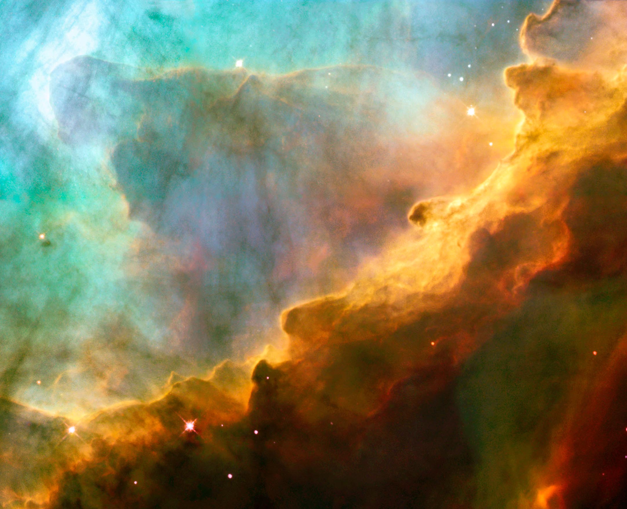
Warped Galaxy

This is a rare picture of a warped galaxy. It would provide an excellent illustration of the distortion caused by colliding galaxies, discussed in the entry Galaxy formation and evolution under the spiral galaxy heading. The image was taken by the Hubble telescope.
- Nominate and support. Hebb l 21:44, 9 August 2005 (UTC)
- Can one with higher resolution be found? --ZeWrestler Talk 00:04, 10 August 2005 (UTC)
- Yes, one with resolution of 1435 x 732 pixels is available. Hebb l 09:39, 10 August 2005 (UTC)
- Well, if you the higher res one up, i'll support it. --ZeWrestler Talk 11:53, 10 August 2005 (UTC)
- Done. Thanks for your support. And many thanks to NASA & Hubble! Hebb l 17:08, 10 August 2005 (UTC)
- Well, if you the higher res one up, i'll support it. --ZeWrestler Talk 11:53, 10 August 2005 (UTC)
- Yes, one with resolution of 1435 x 732 pixels is available. Hebb l 09:39, 10 August 2005 (UTC)
- Support -ZeWrestler Talk 13:32, 12 August 2005 (UTC)
- Oppose. Image is fuzzy at its full size, and it's not large enough for me to ignore. Coffee 18:47, 12 August 2005 (UTC)
- Support - That is a great picture, especially when you think about what it actually is. --Sterio 14:16, 13 August 2005 (UTC)
- ( − ) Oppose Less than spectacular, I think there are a lot nicer images of space (1, 2, 3, 4, 5, 6,
7, 8, 9, 10, take your pick) --Fir0002 03:37, August 14, 2005 (UTC)
- Oppose. I like the subject although I don't like the actual photo itself. Enochlau 05:29, 14 August 2005 (UTC)
- Support --ScottyBoy900Q∞ 03:29, 18 August 2005 (UTC)
- Support. Blurriness forgivable in the circumstances, highly striking for space fans. --Kizor 14:41, 22 August 2005 (UTC)
Not promoted 5/3 -- ----- 18:29, August 23, 2005 (UTC)
Red fox with prey


A beautiful red fox standing over its pray. Detail is excellent on this picture. The hair in his fur coat can easily be seen and the focus is great.
- Nominate and support. - ZeWrestler Talk 19:34, 9 August 2005 (UTC)
- Support, nice detail. Phoenix2 15:48, August 12, 2005 (UTC)
- Support. Great photo, the colors in it are fantastic. - Echidnae 15:53, 12 August 2005 (UTC)
- Support Sharpened version. Nice photo. --Fir0002 03:54, August 14, 2005 (UTC)
- Added another version with levels adjustment - not sure if it's going too far though --Fir0002 09:16, August 14, 2005 (UTC)
- Support third version. Coffee 10:12, 14 August 2005 (UTC)
- Support. Vivid detail. Great colours.--May the Force be with you! Shreshth91($ |-| r 3 $ |-| t |-|) 07:05, 15 August 2005 (UTC)
- Support second version. I feel that the colours in the third version seem a bit unnatural. -- Balster neb 11:00, 16 August 2005 (UTC)
- Oppose --ScottyBoy900Q∞ 03:30, 18 August 2005 (UTC)
Promoted Image:Vulpes_vulpes_with_prey.jpg 7/1, 6 for original, 1 for sharpened version, 1 oppose -- ----- 18:34, August 23, 2005 (UTC)
Prayer flag column

One of several rather good pictures that User:Moumine has contributed to the Zanskar article - it seems to capture a little of both the scenery and culture of the region. I'm surprised we don't already have an article on Buddhist prayer flags, but that would just be a bonus. -- Solipsist 13:00, 10 August 2005 (UTC)
- Nominate and support. - Solipsist 13:00, 10 August 2005 (UTC)
- Interesting indeed; mountains provide good background. Phoenix2 04:37, August 11, 2005 (UTC)
- Support, beautiful. - Echidnae 15:50, 12 August 2005 (UTC)
- Support. Coffee 18:35, 12 August 2005 (UTC)
- Support. A stunning picture that also shows the beautiful but rugged landscape, so much a part of the culture of the people living here. Who could not believe, in such a place, that the wind is not the breath of God? Pete 22:24, 12 August 2005 (UTC)
- Support, stunning images to shows something few of us get to see in real life. - Mgm|(talk) 08:48, August 13, 2005 (UTC)
- Neutral Quite a good photo, but I think the blue sky has been enhanced too much and because of this, the hills surrounding it have become blue. --Fir0002 03:13, August 14, 2005 (UTC)
- Support, absolutely stunning. ----- 04:30, August 14, 2005 (UTC)
- Support--ZeWrestler Talk 04:44, 14 August 2005 (UTC)
- Support. Great. Enochlau 05:25, 14 August 2005 (UTC)
- Support. Amazing picture --May the Force be with you! Shreshth91($ |-| r 3 $ |-| t |-|) 06:59, 15 August 2005 (UTC)
- Support very spiritual. Renata3 19:33, 15 August 2005 (UTC)
- Support That's a picture worth a thousand words. --Dysepsion 21:42, 15 August 2005 (UTC)
- Support. Superb picture. -- Balster neb 08:29, 16 August 2005 (UTC)
- Support. Very Cool. --ScottyBoy900Q∞ 03:25, 18 August 2005 (UTC)
- Support - A lovely illustration of prayer flags. (Donovan|Geocachernemesis|Interact) 02:52, 20 August 2005 (UTC)
- There is a wonderful sense of lonliness and desolation about this image. Support.Raven4x4x 04:12, August 20, 2005 (UTC)
- Support. The wind is the breath of God, indeed.—Encephalon | ζ 05:17:12, 2005-08-22 (UTC)
- Conditional support, so long as that's the real sky. -- user:zanimum
Promoted Image:Prayer flag above Tanze Gompa.jpg 18/1/0 -- ----- 08:51, August 25, 2005 (UTC)
Grand Prismatic Spring


The
- Nominate and support. - Deglr6328 20:11, 14 August 2005 (UTC)
- Support, fascinating. Phoenix2 01:25, August 17, 2005 (UTC)
- Support. thats is a great picture. --ZeWrestler Talk 03:11, 17 August 2005 (UTC)
- Support. Very striking, also a bunch of interesting phenomena -- Balster neb 06:27, 17 August 2005 (UTC)
- Support original Dsmdgold 23:15, August 17, 2005 (UTC)
- Oppose, Pretty but not FP worthy in my eyes. --ScottyBoy900Q∞ 03:20, 18 August 2005 (UTC)
- Support original The most striking piucture possible for Grand Prismatic Spring. I find edited version too contrasted. Circeus 04:27, August 18, 2005 (UTC)
- ( + ) Support Edited version --Fir0002 12:22, August 18, 2005 (UTC)
- Support original, per above. Phoenix2 21:44, August 19, 2005 (UTC)
- Support - amazing picture. FTIII 0:57, August 20, 2005 (UTC)
- Support original - A striking image. Sorry Fir0002, but your enhancements are way over the top. (Donovan|Geocachernemesis|Interact) 03:03, 20 August 2005 (UTC)
- Support either image - This is the kind of picture that makes me want to travel there and see it with my own eyes. Raven4x4x 04:15, August 20, 2005 (UTC)
- Support. Need I say more...--May the Force be with you! Shreshth91($ |-| r 3 $ |-| t |-|) 06:45, 20 August 2005 (UTC)
- Support original. Enochlau 06:21, 21 August 2005 (UTC)
- Support original. Nature amazes us enough in the first as it is, no need to exaggerate colours. -- user:zanimum
- Support original. Mark1 06:56, 24 August 2005 (UTC)
- Oppose: Looks unreal.
- That's exactly why I like it, and why we need a picture to explain it. It's certainly real. Raven4x4x 00:08, August 26, 2005 (UTC)
Promoted Image:Grand prismatic spring.jpg 15/2, 13 votes for orginal version, 1 vote for edited version, 1 vote for either version, 2 votes opposed -- ----- 02:44, August 28, 2005 (UTC)
- Support original Just a beautiful thing to look attalk) 02:09, 24 January 2010 (UTC)]
Yellow-winged Darter
.jpg)
This is a self-nomination of this Yellow-winged Darter image.
- Nominate and support. - Aka 15:50, 14 August 2005 (UTC)
- The wings are mostly out of focus. I prefer Cryptic (talk) 06:50, 15 August 2005 (UTC)]
- Nice, but indeed the wings are out of focus. Phoenix2 16:50, August 15, 2005 (UTC)
- I don't have a problem with the focus, although the stick is overexposed. I know it's a picture of an insect and not a stick, but a very white stick is annoying to look at. Enochlau 13:53, 16 August 2005 (UTC)
- Oppose. Enochlau 06:21, 21 August 2005 (UTC)
- Support - Impressive --ZeWrestler Talk 03:13, 17 August 2005 (UTC)
- Support brilliant photo, and considering the size and the fact that it's an insect I doubt there was anyway to focus the wings especially if they were moving at the time. ----- 05:00, August 17, 2005 (UTC)
- Support -Normally I'd say we already have too many bug photos but... such exceptionally sharp focus and colors, wow.--Deglr6328 06:13, 17 August 2005 (UTC)
- Support. Great photo, amazing colours, illustrates the insect very well. -- Balster neb 06:20, 17 August 2005 (UTC)
- Support --ScottyBoy900Q∞ 03:25, 18 August 2005 (UTC)
- Support Simply Fantastic. That 90mm macro lens sure is a killer! Keep up the good work --Fir0002 12:02, August 18, 2005 (UTC)
- Support - Wonderful! I also like the fact that it is one of a pair of viewpoints. (Donovan|Geocachernemesis|Interact) 02:58, 20 August 2005 (UTC)
- Well and Truely Support. The detail and clarity is amazing. Raven4x4x 04:10, August 20, 2005 (UTC)
- Support as per above.--May the Force be with you! Shreshth91($ |-| r 3 $ |-| t |-|) 16:28, 20 August 2005 (UTC)
- Support Dsmdgold 17:02, August 20, 2005 (UTC)
- Support, very nice! Echidnae 04:10, 21 August 2005 (UTC)
- Support. Extraordinary detail, clarity, color.—Encephalon | ζ 05:12:40, 2005-08-22 (UTC)
Promoted Image:Sympetrum flaveolum - side (aka).jpg 13/1 -- ----- 02:45, August 28, 2005 (UTC)
TouchWall

This was a chance shot. I wanted to capture the spirit of the place, the extraordinary feeling that you are being watched by the shades of those whose names are listed here, and I took a photograph of the geometry of the situation, the young man in the foreground just looking up at the Wall. I thought my hand might have shaken a little and blurred the photograph in the fading January twilight, so I took another, and as I did so he reached up to touch a name. And my heart. I have placed this in the Vietnam Veterans Memorial article.
- Nominate and support. - Pete 06:45, 10 August 2005 (UTC)
- Needs rotation; the Washington Monument is visibly leaning, and the horizon appears to slope (or is that a hill on the right?) —Cryptic (talk) 13:29, 10 August 2005 (UTC)]
- This being taken on a Canon A60, the original would've been 1600x1200. This is 768x858 so it's either been cropped heavily, scaled down or both. Either way the current version looks badly compressed at full size, and not very sharp. ed g2s • talk 18:26, 10 August 2005 (UTC)
- I've uploaded a new version, uncompressed, rotated a further 1.5 degrees, cropped to remove the large area of sky above the central figure and the now slanting borders.
- Support, beautiful picture. Phoenix2 15:43, August 12, 2005 (UTC)
- Support. Coffee 18:36, 12 August 2005 (UTC)
- Support. —Cryptic (talk) 21:21, 12 August 2005 (UTC)]
- Support --TomStar81 19:03, 13 August 2005 (UTC)
- Support Good photo, v.nice subject--Fir0002 03:09, August 14, 2005 (UTC)
- Support. Excellent composition and subject. Enochlau 05:26, 14 August 2005 (UTC)
- Oppose. Out of focus. ed g2s • talk 09:16, 16 August 2005 (UTC)
- Support --ZeWrestler Talk 13:02, 16 August 2005 (UTC)
- Oppose. Looks staged and just a bit unsettling to me. --ScottyBoy900Q∞ 03:28, 18 August 2005 (UTC)
- Doesn't look stages to me. I think he's looking up a particular name Circeus 18:55, August 18, 2005 (UTC)
- See this article for more information on the photograph. BookCrosser 23:27, 19 August 2005 (UTC)
- Doesn't look stages to me. I think he's looking up a particular name Circeus 18:55, August 18, 2005 (UTC)
- Support Circeus 18:55, August 18, 2005 (UTC)
- Support, but I wonder if he really is looking at a specfic persons name. This link is Broken 12:52, 20 August 2005 (UTC)
- Support Dsmdgold 18:11, August 21, 2005 (UTC)
- Oppose. I don't think that it's striking enough to be FP.--May the Force be with you! Shreshth91($ |-| r 3 $ |-| t |-|) 15:18, 22 August 2005 (UTC)
- Oppose this subject matter can be very striking, this one is very tame. Dunc|☺ 14:02, 23 August 2005 (UTC)
- Oppose - no interest, no contrast, focus is indifferent. Sorry to be negative - Adrian Pingstone
![[3]](https://en.wikipedia.org/wiki/Image:Vietnam_memorial_dc_c_20031013.4.jpg)
Not promoted 11/5 -- ----- 08:47, August 25, 2005 (UTC)
place all votes during extension below this line
- Neutral it would be a conflict of interest for me to vote one way or another at this point thus the neutral vote. Even though this is a very moving picture it is somewhat blurry and the focus of the photo is unclear as to whether it's the Vietnam wall, the person, or the Washington monument. ----- 20:26, August 26, 2005 (UTC)
Isn't this Support/Oppose count wrong? I make it 11 Supports and 5 Opposes - Adrian Pingstone 15:18, 25 August 2005 (UTC)
- I put this page back on FPC for a short time to see if a more clear concensus could be reached. This link is Broken 14:44, 26 August 2005 (UTC)
- By which you mean you put it back on FPC until you can justify promoting it. You don't have to like the fact that I didn't promote the image but I find this underhanded that you are relisting this because it didn't end the way you hoped. ----- 19:28, August 26, 2005 (UTC)
- To clarify why I closed it as such, I closed it as not promoted because there was no clear consensus to promote
- I did not mean "put it back until it was promoted" and I feared it would look as such. I recieved an email saying that this vote was particularly close and that perhaps I should review it, I also saw a comment elsewhere suggesting that the result was unclear. I also felt that it was close and some votes were based on incorrect information. In order to allay any fears over vote rigging I think the vote should stay open for no more than 36 hours after it was put back. If nothing changes then, don't promote it. It had quite strong support up until the very end. Sorry for making this look like some sort of insult or unfair tactic. This link is Broken 03:51, 27 August 2005 (UTC)
- To clarify why I closed it as such, I closed it as not promoted because there was no clear consensus to promote
- By which you mean you put it back on FPC until you can justify promoting it. You don't have to like the fact that I didn't promote the image but I find this underhanded that you are relisting this because it didn't end the way you hoped. ----- 19:28, August 26, 2005 (UTC)
- I put this page back on FPC for a short time to see if a more clear concensus could be reached. This link is Broken 14:44, 26 August 2005 (UTC)
(68.75% to promote) and I felt that there were some real concerns with the image as noted in the oppose votes, thus not promoting it. ----- 19:28, August 26, 2005 (UTC)
Not promoted , no new votes came in during the alotted extension, so it fails. This link is Broken 13:18, 28 August 2005 (UTC)
- pity... but ok. Gwyndon 21:48, 29 August 2005 (UTC)
Phalacrocorax-auritus-007.jpg


A very good picture by
- Nominate and support. Dsmdgold 04:10, August 15, 2005 (UTC)
- My support is for the original. Dsmdgold 10:32, August 21, 2005 (UTC)
- Support -- Technically excellent. — Xiong熊talk* 07:38, 2005 August 18 (UTC)
- Support--Looks good --ZeWrestler Talk 11:58, 18 August 2005 (UTC)
- Support Edited version --Fir0002 12:21, August 18, 2005 (UTC)
- Support, edited version is much brighter and more appealing. Phoenix2 02:14, August 19, 2005 (UTC)
- Support original - A great illustration for the topic. Again, Fir0002, the enhanced version is more striking, but it now looks unnatural, and the background has become too prominent. Perhaps somewhere between the two images would be better. (Donovan|Geocachernemesis|Interact) 03:08, 20 August 2005 (UTC)
- Support the original image. 144.137.244.4 07:47, 20 August 2005 (UTC)
- Support original.--May the Force be with you! Shreshth91($ |-| r 3 $ |-| t |-|) 16:38, 20 August 2005 (UTC)
- Support either version. Sango123 16:52, August 20, 2005 (UTC)
- Support original. Enochlau 06:20, 21 August 2005 (UTC)
- Support original.—Encephalon | ζ 05:03:48, 2005-08-22 (UTC)
- Support original. While I don't immediately think "unnatural", the colours our reminiscent of 1960s Kodachrome technique. -- user:zanimum
- Oppose. I dont eally know what to say, it just doesnt grab my eye at all. Maybe a front shot I would appreciate more. --ScottyBoy900Q∞ 14:29, 25 August 2005 (UTC)
Promoted Image:Phalacrocorax-auritus-007.jpg 12/1 -- 9 votes for orginal version, 2 votes for edited version, 1 vote for either version, 1 vote opposed -- ----- 06:09, August 29, 2005 (UTC)