This is a brilliant depiction of the rings of Saturn, with the planet backlit by the Sun, showing all parts and rings very clearly. It is also a very symmetrical composition.
Support as nominatorDane13 16:54, 27 July 2007 (UTC)[reply]
Very strong support--Mbz1 17:14, 27 July 2007 (UTC)Mbz1[reply]
Support and comment: NASA says This marvelous panoramic view was created by combining a total of 165 images taken by the Cassini wide-angle camera over nearly three hours on Sept. 15, 2006. The full mosaic consists of three rows of nine wide-angle camera footprints; only a portion of the full mosaic is shown here. Color in the view was created by digitally compositing ultraviolet, infrared and clear filter images and was then adjusted to resemble natural color." Caption should point out that the colors are adjusted. Spikebrennan 17:57, 27 July 2007 (UTC)[reply]
Strong support. Also note the small white dot inside the outer rings on the left side, and wave. --Golbez 19:04, 27 July 2007 (UTC)[reply]
Support - Wonderful image; I adjusted the caption; please improve as you see fit. --TotoBaggins 19:12, 27 July 2007 (UTC)[reply]
I like the caption, though the main subject article (bolded out for POTD's) should probably be more prominent. I'm not sure how; I may take a swing at it later. --Peter 20:31, 27 July 2007 (UTC)[reply]
Good find. Based on this, I think only one should be featured; given equal footing, I'd vote for this one, but the other has already been a FP and POTD. What about delisting that one and promoting this one in its place? --Peter 20:31, 27 July 2007 (UTC)[reply]
I think I prefer this one, it's brighter and easier to see. So far as I know. the colors for both were adjusted, so it's not like one is more encyclopaedic than the other. --Golbez 21:25, 27 July 2007 (UTC)[reply]
This image was originally nominated here, but did not win. That said, I prefer the original, unedited version. --Goodmanjaz 00:29, 28 July 2007 (UTC)[reply]
Close the nomination? The preference was for the unedited version during the last nomination. Jumpingcheese 11:36, 28 July 2007 (UTC)[reply]
I'd have to say that this current edited version looks really atrocious; it is brighter, but the quality is seriously degraded and there are artifacts present in the picture. I think that the image that I originally submitted should be the one that is featured.--Dane13
True, look at the upper hemisphere of Saturn - it's really washed out. I think based on that alone, and considering we already have the same picture featured, I have to switch to oppose.--Golbez 22:03, 28 July 2007 (UTC)[reply]
Thank you to whomever replaced the picture with the original. It looks much better now.--Dane13
Not promoted (already promoted). MER-C 08:56, 1 August 2007 (UTC)[reply]
Spanish conquest of Mexico. This image depicts the foundation of the city of Tenochtitlan. The image of the golden eagle, perched upon a cactus (depicted in the middle of the page) is the Coat of arms of Mexico and appears on the Flag of Mexico
Reluctant Oppose Love the subjec; however, there are unsightly compression artefacts. Has this been resized? If so, where is the larger version? Jellocube27 15:12, 26 July 2007 (UTC)[reply]
Comment. I can't decide what's actually going on with the origin of this document. For something this old and obviously delicate, I am unclear why it would have been scanned this poorly. This makes me believe that there is a careful, full-res scan available somewhere. If people agree, I'll oppose. Zakolantern 16:43, 26 July 2007 (UTC)[reply]
If this page is any indication, the Bodleian Library (which is where the Codex Mendoza is now kept) claims copyright on their scans of the document. There's another scan here, but it's from a (presumably copyrighted) book: Frances F. Berdan and Patricia Rieff Anawalt, ed., Facsimile of the Codex Mendoza. Berkeley: University of California Press, 1992. Spikebrennan 03:08, 27 July 2007 (UTC)[reply]
You can't copyright scans of public domain works, not in the US anyway (and we're operating under US law here)—please see Bridgeman Art Library v. Corel Corp. and feel free to upload the highest quality digital copy, no matter where you find it.--Pharos 05:24, 27 July 2007 (UTC)[reply]
What's the problem with the nominated scan? Spikebrennan 18:59, 27 July 2007 (UTC)[reply]
Oppose. (I had just commented before). The scan probably had nothing wrong with it. The problem is the resolution of this version of the image. It's *barely* within the minimum size limit for FPs, and that size feels too small for me for a scan of a large document. Because of the small size, the writing is difficult to read and some details appear lost. Also, it may be heavily processed post-scanning in a negative way leading to way to high contract, especially in the "paper" background. ("paper" because I don't know what material it is). As Pharos said, no version of this image which is faithful to the original can possibly be under copyright. I see the copyright symbol on the linked page; it's not relevant in the United States. However, the first link in Spikebrennan's paragraph above indicates that a very detailed scan has been created for this item, where one small section takes as many pixels as this entire image. That is what we ideally want to feature, not this. Zakolantern 22:04, 27 July 2007 (UTC)[reply]
Problem is, the website for the library that has this document only seems to have posted a limited number of scans on its website. I've tried to find better ones, no luck yet. Spikebrennan 23:30, 27 July 2007 (UTC)[reply]
New version. OK, I've managed to scan a higher-res version out of a book. This presumably needs a little editing, but I'm not skilled in that so I'll leave it to others.--Pharos 03:21, 28 July 2007 (UTC)[reply]
Question - is the texturing visible in the image, especially in the top-right, part of the original document or part of the paper in the book you scanned it from? Thanks. Zakolantern 05:58, 28 July 2007 (UTC)[reply]
Part of the original document. The book's pages are very plain, flat, white paper, in "mint" condition, as it were. The white areas you see around the document are not edited; they're what the surrounding parts of the page actually look like.--Pharos 06:21, 28 July 2007 (UTC)[reply]
Comment on the new scan: can you straighten and re-scan? Presumably a crop will take care of most of the rest of the problems. Spikebrennan 02:27, 29 July 2007 (UTC)[reply]
Not promoted MER-C 08:55, 1 August 2007 (UTC)[reply]
Comment I'm not too fussed what hppens to the text on the right. we can cut the remains of the previous obit., cut the whole thing, muck about with it - however you like. Adam Cuerdentalk 12:13, 25 July 2007 (UTC)[reply]
Comment I actually like the text, it adds to the overal aura. Yet is there anyway that you can find out who wrote it, namely who the journalist was and perhaps a bit about him. We wouldn't want some poor soul's work go unattributed now would we? :p Chris Buttigieg 14:53, 25 July 2007 (UTC)[reply]
W. S. Gilbert wrote for Fun at around this time, among other magazines. He republished some of it, but do you know the only way we can identify his work that wasn't republished? Because an editor's copy survives with notes in it as to who was paid for what. But we don't have one of those for the first few years, so we just have to guess. Some things are obviously his (A self-portrait in one ongoing series does help identification) but the rest... we can't know. For that matter, do you know how I know about the editor's copy? Because a friend told me to look up a Bulletin of the New York Public Library article from a couple decades ago.
In other words: I really doubt attribution's possible. I suppose you might have a chance if went to their offices in London, since they still exist, unlike Fun. But how helpful they'd be, I don't know. Adam Cuerdentalk 16:01, 25 July 2007 (UTC)[reply]
In that case it is alright; I wouldn't worry too much. Anyhow the focal feature is the portrait which is well illustrated in this case and I think the text acts as the perfect complement. I therefore support. Chris Buttigieg 18:50, 26 July 2007 (UTC)[reply]
Support Good quality. The article needs work, but there's no doubt this makes a fitting contribution to it. I agree with Chris Buttigieg, leave the (con)text as is. ~ Veledan • | T | 21:04, 25 July 2007 (UTC)[reply]
Support just came across this whilst browsing. Retention of the text is important IMHO to add enc. value. Pedro | Chat 13:14, 27 July 2007 (UTC)[reply]
Support Very sharp scan, also its PNG. :) vlad§ingertlk 16:54, 29 July 2007 (UTC)[reply]
Promoted Image:Robert William Thomson - Illustrated London News March 29 1873.pngMER-C 08:55, 1 August 2007 (UTC)[reply]
Hi-res image, one of the most ubiquitous images in Wikipedia (it's part of the userbox for Christianity.
Proposed caption
A 6th century mosaic of Jesus at Church San Apollinare Nuovo in Ravenna, Italy
Articles this image appears in
Sign of the Cross
, many others.
Creator
unknown 6th century artist, apparently uploaded by User:Aiden
* Support as nominatorSpikebrennan 03:03, 29 July 2007 (UTC) Nomination withdrawn, move along, nothing to see here. (I still think it's a great image, but this dead horse has already been beaten.) Spikebrennan 03:39, 30 July 2007 (UTC)[reply]
Why don't image talk pages have any indication of whether the image was previously nominated for FPC and failed? Spikebrennan 03:24, 29 July 2007 (UTC)[reply]
If you look at the file links section, and see that it is used in at least one page titled Wikipedia:Featured picture candidates/whatever, then it's already been nominated. MER-C 03:37, 29 July 2007 (UTC)[reply]
Oppose / Idea, Why don't they make a "This image was a previous FPC" tag? 8thstar 02:35, 30 July 2007 (UTC)[reply]
Probably so the author/photographer doesn't have to perpetually have their image tarred with a "not good enough" tag. —Pengo 15:29, 30 July 2007 (UTC)[reply]
We do already have a "former FP" tag, so I wouldn't think "former FPC" would be much worse... At the very least, maybe put something in the closing procedure about noting it on the talk page, though that step would be easier to miss than "replace the FPC template with a former FPC template." --Peter 19:57, 30 July 2007 (UTC)[reply]
Let's move the policy discussion to the talk page so we don't lose it when this nomination is removed. Spikebrennan 20:15, 30 July 2007 (UTC)[reply]
Not promoted MER-C 05:51, 4 August 2007 (UTC)[reply]
I like the woman's traditional Islamic/Turkish dress, and the fact that she is looking directly at the camera. I also think the photograph is lined up well.
Proposed caption
A woman wearing traditional Islamic dress in Selçuk, Turkey
Support as nominatorKitkatcrazy 20:10, 28 July 2007 (UTC)[reply]
Oppose. I really like the photo (it has soul--her expression is great), but it has technical issues at full size which I think would prevent it from FP status. I see grain and/or JPEG compression artifacts, especially at her ankles and beneath the bench, and much of the photo is unsharp (possibly out of focus, as the aperture and focal length are rather large, and the area around her knees appears sharper). I saw you took this with a Fuji Finepix S5600; the quality guidelines here, while silly for full-screen viewing and small prints, make it hard for a camera with such a small sensor to get FP status without full, bright sunlight or some serious editing. (Though I wonder how this would fare?) That said, encyclopedic value is a different matter than artistic value, and this definitely has the latter. Thanks for submitting! --Peter 22:01, 28 July 2007 (UTC)[reply]
Strong support In my opinion encyclopedic value should matter much more than artistic value does. Besides Featured picture criteria specify that "An image's encyclopedic value is given priority over its artistic value." --Mbz1 23:06, 28 July 2007 (UTC)Mbz1[reply]
Agreed, hence my opposition. As I said, it has great artistic value; it's the technical issues that detract. --Peter 00:09, 29 July 2007 (UTC)[reply]
Oppose per Peter. SingCal 23:36, 29 July 2007 (UTC)[reply]
Oppose Photo is just a picture of a Turkish woman, nothing special about it. Cheers,JetLover(talk) 02:32, 31 July 2007 (UTC)[reply]
Oppose. Face is just out of focus. 129.215.191.74 03:11, 31 July 2007 (UTC)[reply]
Oppose Close, but the lighting (?) gives the colours a weird pasty look. True we haven't that many portrait FP's, but that doesn't mean we shouldn't strive for excellence in portraits --Fir0002 07:53, 31 July 2007 (UTC)[reply]
Comment Perhaps a closeup of her face and religious headcover/hijab would be better. It would also be a very nice complement to the article Turkish people. Chris.B 10:42, 2 August 2007 (UTC)[reply]
Oppose per Fir0002. The subject matter of the portrait is potentially FP-worthy, but the colors seem a bit off and there are focus problems as noted above. Spikebrennan 14:47, 2 August 2007 (UTC)[reply]
Not promoted MER-C 05:51, 4 August 2007 (UTC)[reply]
Esenboğa International Airport in the Turkish capital, Ankara
.Edit: I originally had taken this photo and Enderender has uploaded it with my permission. However due to licensing reasons I had to re-upload. I also re-tuned the image (per opposing reviews) and supplied a bigger file.
Reason
Image in my mind seems to meet the featured picture criteria. Good technical standard, high resolution and seems to demonstate the subject very well. Above all, the picture just seems very impressive. Admittedly my eye is untrained for these things but the different range of colours on show really seem to make the subject stand out. --A.Garnet 18:09, 21 July 2007 (UTC)[reply]
Support as nominator — A.Garnet 18:09, 21 July 2007 (UTC)[reply]
Comment .67 MP is not that high res and is absolutely tiny for a panorama. J Are you green? 18:25, 21 July 2007 (UTC)[reply]
Comment Great picture, but very small. Can we get it any larger? Contact the photographer or suchlike? Adam Cuerdentalk 19:39, 21 July 2007 (UTC)[reply]
Oppose Looks too small. 8thstar 21:00, 21 July 2007 (UTC)[reply]
Conditional support on getting a somewhat larger version. May as well vote this way, it'll save tracking us down later. Adam Cuerdentalk 11:20, 22 July 2007 (UTC)[reply]
Oppose too small, over sharpened, columns off verticle, lots of fffff highlights and 000000 shadows. Debivort 19:07, 22 July 2007 (UTC)[reply]
Thanks for the comments so far, hopefully Enderender will get back to us if he has a better version of the picture. --A.Garnet 20:51, 22 July 2007 (UTC)[reply]
weak support Much better, but columns on the left are still a bit off vertical, and there are some minor jpeg artifacts. Debivort 16:00, 28 July 2007 (UTC)[reply]
Comment First I should thank Debivort because I really haven't noticed the column thing. I fixed it. But as for the noise, unfortunately there's not much I can do. I shot this photo(s -it's actually a 7-piece panorama) literally hand-held with a small canon elph (ixus). Hand-held meaning no special lighting, therefore high iso and short exposure time. Sorry for that, this is the best noise reduction can do. --Cheyrek 18:12, 28 July 2007 (UTC)[reply]
Oppose, unless a larger image could be obtained. For now the resolution is a bit too low. --snowolfD4( talk / @ ) 01:14, 23 July 2007 (UTC)[reply]
Comment Edited version is 2500px wide, less sharp and less bright. BTW, thank you for the nomination.--Cheyrek 22:47, 26 July 2007 (UTC)[reply]
The new version seems to have address the concerns raised, though the black border should disappear. I speedied the original as redundant. Relisting to get a few more opinions on the revised version. MER-C 11:09, 28 July 2007 (UTC)[reply]
Comment. Isn't Cheyrek the creator of this image, not Enderender, or are they the same person? --jjron 14:17, 29 July 2007 (UTC)[reply]
Comment Yes, I am both the creator and the uploader. Originally Enderender had uploaded it but after the nomination I uploaded a bigger and re-tuned file, old one is deleted by MER-C. I guess the creator line above stayed same, I didn't want to touch it since I'm not the nominator. --Cheyrek 15:11, 29 July 2007 (UTC)[reply]
Ah, I see. I've changed it up top. --jjron 00:48, 30 July 2007 (UTC)[reply]
Comment What's the guidelines for the resolution of a panorama, anyway? I don't know if I'm looking at the right image (one of the links is red right now), but it doesn't seem large enough. Also, some of the spotlights are blown out, I think. vlad§ingertlk 16:43, 29 July 2007 (UTC)[reply]
The red link has been deleted as per MER-C's note. The resolution guideline onlt specifies 1000 px in one dimension, but I personally would rarely stand for a panorama that's less than 1 or 2 MP - after all, the purpose of a panorama is to capture more information by photographing a larger-than-normal area, and what's the purpose of that if you are going to delete all that extra info? J Are you green? 20:16, 29 July 2007 (UTC)[reply]
Really, we have to follow the rules as they stand, which is 1000px in one dimension. Having said that, as a bit of a rule of thumb, I usually upload panos at around 1000px in the shorter dimension. --jjron 00:52, 30 July 2007 (UTC)[reply]
Oppose. Landscape panoramas are one thing, but using a strong wide-angle lens for an interior shot like this causes an amount of distortion that I find upsetting. Bending the strong straight lines originally present in the design does nothing for the aesthetics. Being thus unrepresentative, I find it loses in encyclopaedic value. 129.215.191.74 03:17, 31 July 2007 (UTC)[reply]
Well I'm sorry but who said "a strong wide-angle lens" is used? It's a standard 35-100mm equivalent camera. 7 photos were taken from a "person's POV" (which is about 50mm) and stitched by a panorama software (autostitch). BTW I'm not defending the photo or anything, I'm not even the nominator. I just wanted to make a correction. --Cheyrek 07:48, 31 July 2007 (UTC)[reply]
Support as nominatorBewareofdog 01:30, 28 July 2007 (UTC)[reply]
Support--Mbz1 02:17, 28 July 2007 (UTC)Mbz1[reply]
Support Very high res and clear scan. Encyclopedic. Jumpingcheese 11:39, 28 July 2007 (UTC)[reply]
oppose looks washed out (but this could be the way the painting actually is, I dunno). But my real concern are the obvious halftone artifacts in the hair and other places. I think the original from which this was scanned probably wasn't high enough quality. Debivort 16:05, 28 July 2007 (UTC)[reply]
Weak oppose. I agree with Debivort. The halftone artifacts are subtle enough to appear to be the texture of the canvas but I doubt it is the case here.. I suppose we'd have to see a higher resolution image elsewhere to compare. Diliff | (Talk)(Contribs) 13:33, 29 July 2007 (UTC)[reply]
Comment This image has a en-wikipedia image page but appears to be hosted on commons...only noticed because the No Script extension in Firefox flagged it as "cross site scripting". Seems odd. vlad§ingertlk 16:48, 29 July 2007 (UTC)[reply]
All Commons images can be viewed from the En Wiki. Look directly under the image and it tells you it is hosted on Commons. Or are you refering to something else and I'm confused? Diliff | (Talk)(Contribs) 17:49, 29 July 2007 (UTC)[reply]
I just noticed that the URL of the full sized image is http://upload.wikimedia.org/wikipedia/commons/a/ac/William-Adolphe_Bouguereau_%201825-1905%20_-_The_Bohemian_%201890%20.jpg#9558619781663987567, unlike the other images on this page such as the top one (http://upload.wikimedia.org/wikipedia/en/5/5a/George_IV_bust.jpg.). No Script doesn't like this for some reason and I get a 404 error and I can't see the full sized image. Shouldn't be a problem for people not using No Script. vlad§ingertlk 19:37, 29 July 2007 (UTC)[reply]
Support Regarding the image itself, it seems to be a faithful reproduction with only minor technical flaws. vlad§ingertlk 19:43, 29 July 2007 (UTC)[reply]
Oppose per Debivort. We can hope for better than a scan of a print reproduction, and the halftone artifacts are not subtle.--ragesoss 22:46, 29 July 2007 (UTC)[reply]
Oppose per Debivort. As a general policy comment, it seems to me that a lot of fine art scans that get nominated for FPC but fail end up failing because of "jpg artifacts" or "halftoning" or other scan quality issues. Is there a primer somewhere that can help potential FPC nominators spot these issues so that they can evaluate whether a fine art scan suffers from those problems? Spikebrennan 21:39, 1 August 2007 (UTC)[reply]
OriginalEdit 1 - Cropped, corrected spots, left people in
Reason
Striking image, illustrates well several of the important buildings in the castle, as well as its walls. Technically the colours are good, and the image is quite large.
Oppose. Before I say why, let me thank you for taking this picture; it's great for the encyclopedia, and great to have. I hope you found my comments useful; I obviously value your contribution enough to give a detailed response. However, I oppose for a variety of reasons, some technical, some artistic.
Technical: I don't like the fisheye perspective - it feels wrong. If you want a wide angle shot like this, try just a very wide-angle lens, going on top of a building farther back, or a different/better panorama. (Note: I don't know what techniques were used, just that they produced a fish-eye effect). The lines of the buildings are not that sharp; in full sun, there should be no issues with crispness and wide depth of field. Look at the roof edges to see this. Surprisingly for this high a resolution image, there also may be jpg artifacts - check out the right-hand edge of the roof of the right-hand full building. This may just be part of the overall lack of sharpness.
Artistic: I don't like the composition much. There is too much blank courtyard foreground, and not enough subject. There should either be a lot of people in the courtyard, doing something worth looking at, or none at all; the couple of groups on the sides of the shot detract from the value. The picture might be better if you cropped off some of the bottom, maybe at a line from the top of the grass. It also might be worth trying again on a day with a festival in the square (although the clouds are great). Your shooting location was probably not ideal; I can't say where you were standing, but it created an odd perspective on the scene to me. (EDITED to add line breaks)
Oppose I don't like the fact that there isn't a focus within the picture. More than 1/3 of it is used up by a courtyard with nothing on it and I think it would be better if you were say in the courtyard (opposite of what User:Zakolantern said) and took a very wide panorama with the façade of the buildings facing towards you. I also modified User:Zakolantern's line breaks to remove the unnecessary <br>. --antilivedT | C | G 01:47, 28 July 2007 (UTC)[reply]
Oppose. I checked it out before Zakolantern voted and something bothered me about it; I didn't vote because I didn't know how to explain it, but it's the same thing he said about how the fisheye perspective affects the overall feeling. I now also notice the lack of sharpness, and there seems to be some chromatic aberration as well near some of the edges. That said, something about the clouds strikes me as very cool--maybe it's the same blur and fringing, but it looks like it's been painted... nice artistic effect. And there are a couple spots in the dirt that look like blending issues stitching a panorama, though that could be just how the courtyard was tended, as well as what appears to be a rather prominent painted area near the center building. I'm curious how you got this shot--what gear, image editing techniques, etc. you used. --Peter 01:52, 28 July 2007 (UTC)[reply]
Comment - I am also really curious how this photograph was made. As you can see from my original comments, I couldn't decide what methods were used to take the picture, including if it was a regular shot, panorama, or fisheye lens. Zakolantern 05:56, 28 July 2007 (UTC)[reply]
Comment - Thanks for the comments. It's a basic panorama, four shots stitched together. The position I was at was right at the end of the wall you can see - there's actually another building between me and the leftmost building in the photo, I decided to leave that one out because it was cut off from the bottom and top. That position was really the only viable one - had I moved centre, then the midright building would only be seen from the side, had I moved far right, then the rightmost building would have obstructed a lot of the shot. The problem with the panorama was that people who were walking through the courtyard ended up showing twice, like ghosts almost, so I edited them out, so yeah in some cases that is a bit visible (the spots of dirt are real though). The clouds are completely natural, even where it changes from grey to white above right of the centre building, I was wondering about that even myself, but there's no stitch there. Lack of sharpness, can't explain. I was using a Sony T10, not the greatest but at 7MP and 'Fine' it generally comes up relatively sharp. About the fisheye thing - while my shooting method would be conducive to such, I can't really see much of it - most of the lines are quite straight. I'm thinking perhaps the layout of the courtyard itself may just be confusing it, none of the building are built in relation to each other.
Comment I don't think this is what you call "fisheye effect", maybe just that the eye is not used to the fact that you can see sides of the buildings that are supposed to be facing each other. Did you try shoot inside the courtyard, and make like a 360 degree panorama around you? --antilivedT | C | G 06:19, 29 July 2007 (UTC)[reply]
Yeah I tried, but unfortunately the size and proximity of all the surrounding buildings made it impossible; having to point the camera upwards and then stitching that to a level photo would just have created a real fisheye effect.
Oppose - really don't like the composition. It seems that there are three buildings, and all are caught side-on, meaning a lot of empty space, and not much detail on any of the buildings. I think for situations like this, we're better off having a few different photos, of each of the different buildings (eg,
Château de Blois), rather than somewhat artificially trying to get them all in one photo. That said, it's a good, useful photo - but not quite FP standard. Stevage 01:59, 30 July 2007 (UTC)[reply
]
Comment. I'm refraining from voting on the new version right now, and I have struck my prior vote. Schcambo, thank you very much for listening to my suggestions and using them to create the new version. I think it is dramatically better than it was before. That said, I'm undecided if it is good enough for a FP still. Zakolantern 17:31, 30 July 2007 (UTC)[reply]
Not promoted MER-C 05:51, 4 August 2007 (UTC)[reply]
Amazing image, which shows the flare , sunspot and Photosphere in great details. The image has a very high encyclopedic value. It illustrates the subject in a compelling way, making the viewer want to know more about flares and the sun in general.
Strong Support as nominatorMbz1 18:05, 5 August 2007 (UTC)[reply]
Comment I think the caption needs to do a better job of explaining what we're seeing. It's not exactly ovious from the image or current caption. Adam Cuerdentalk 22:14, 5 August 2007 (UTC)[reply]
I did. Do you believe it is OK now? Thank you.--Mbz1 23:32, 5 August 2007 (UTC)Mbz1[reply]
The main questions I have are "This looks like a false colour image, or, at least, one extremely dimmed. Which is right?" and "How big of a section of the sun are we looking at?" Adam Cuerdentalk 01:17, 6 August 2007 (UTC)[reply]
In answer to question 1: yes, it is a false color image. Question 2: it would be possible to add some kind of scale. I should check before giving exact numbers, but the image is something from around 100 to 200 arcseconds wide.Gringo.ch 21:08, 8 August 2007 (UTC)[reply]
It is pretty much as the sun looks, when is viewed with H-Alpha filters. I'm not sure how big the flare was because I do not know when the picture was taken and what sunspot we are talking about, but here's my image, which shows sunspot taken at sunset and a flare taken the same day with a solar scope. (Please note the sun's not round shape in the image is due to a mirage.) It could give you an idea how big the nominated flare could have been. I also like to tank you for your questions because in my opinion the most important part of nominating an image is to make the viewers want to know more.
comment The bright strip doesn't strike me as typical of solar flares, unlike the other image on that page. Also, there are better images of sunspots. Debivort 02:19, 6 August 2007 (UTC)[reply]
Please note there are different classes of solar flares. Big flares are rare especially now in solar minimum. I believe the nominated flare could have been B or C class flare. They are much more common and the nominated image shows a very typical solar flare as seen through h-alpha filter. I've seen and photographed many of them myself and it is exactly how they look, when are viewed through h-alpha filters. Please also note that it matters, if a flare is close to the Sun's limb. These flares look much more spectacular, but again they are much rarer than flares, which are located farer from the Sun's limb. --Mbz1 02:47, 6 August 2007 (UTC)Mbz1[reply]
Comment - the copyright status of the image needs to be resolved. It was taken by Hinode, but is licensed under PD-self. Mgiganteus1 05:57, 6 August 2007 (UTC)[reply]
db-noncom}}. MER-C 09:24, 6 August 2007 (UTC)[reply
]
The JAXA copyright notice holds for images found on the webpage, but I generated the image from satellite raw-data by myself, so I believe this is not covered by the copyright restriction stated in the above link.Gringo.ch 20:52, 8 August 2007 (UTC)[reply]
I've removed the speedy tag for now. I know this may sound silly but do we have any way of verifying your claim Gringo.ch? Pascal.Tesson 17:59, 10 August 2007 (UTC)[reply]
I wouldn't know how to give real evidence (after all digital stuff can be mainpulated ad infinitum), but the original reason for complaining by MER-C is that this image has been produced by JAXA, citing the restrictions from using material from the JAXA website. I claim this is not the case (addmittedly, the raw-data comes from Hinode, a JAXA mission, but it is the image itself we are discussing, not the data). Shouldn't user MER-C be the one to provide additional information as to where exactly on the web-page the picture was supposedly copied from? If nobody can provide a link on JAXAs website featuring this picture, the issue is moot. I think the accusation should be substantiated by some facts first.Gringo.ch 09:01, 11 August 2007 (UTC)[reply]
With the delisting of our previous rose FP I reconsidered uploading these and decided that I thought they hit the mark for qualty. They are interesting and well composed. I belive technicaly sound and pretty. I can't decide which of the two I like better.
Support as nominator and creatorFcb981 22:52, 31 July 2007 (UTC)[reply]
Oppose both I see no encyclopedic value in the images. Sorry.--Mbz1 01:06, 1 August 2007 (UTC)Mbz1[reply]
Yes, don't worry, you made it suficiantly clear on the delist nom that you dont like the idea of roses as FPs. -Fcb981 04:02, 1 August 2007 (UTC)[reply]
Weak suppport - I'm afraid I don't understand Mbz1's comment. The encyclopaedic value is clear, and I'd be inclined to make one of them the main image for Hybrid Tea. On the technical side, neither image is quite as stunningly sharp as we'd ideally like for an FP, but it's pretty close. There's also quite a lot of background noise. Preference for #1. Stevage 02:06, 1 August 2007 (UTC)[reply]
Sorry, I did not explain what I meant better. In my opinion roses are beautiful flowers, but roses are also very, very common flowers. In my opinion there are so many different kind of roses that it would be unproductive to feature every one of them. We've just finished delisting one very nice picture of Yellow Rose, which in my opinion was better than nominated images. In my opinion there is no use to delist one picture of a very common flower just to feature another.--Mbz1 03:16, 1 August 2007 (UTC)Mbz1[reply]
Ouch!, that other rose pic was overexposed, small, artifacty and not as nice a specimine. -Fcb981 04:22, 1 August 2007 (UTC)[reply]
I'm glad you said it. Thank you.--Mbz1 04:39, 1 August 2007 (UTC)Mbz1[reply]
Oppose due to technical issues. I like the second one better, and think they're both sufficiently encyclopedic. But they're underexposed (check the levels in Photoshop) and have too little depth of field, as evidenced by the center of the rose being in pretty sharp focus, but dropping quickly by the time you get to the edges. I saw you used f/4.8; I'd retake it with at least f/8 or smaller. You might also sacrifice some shutter speed for a lower ISO to decrease the noise. (Side note: Nice D40! I got the D50 last year and love it.) --Peter 03:24, 1 August 2007 (UTC)[reply]
in hindsight I should have stoped down to f/8, I had plenty of light, still the DOF is a bit better than the rose that was just delisted and they are downsampled a bit. The exposure is fine. The pileup of pixles on the left of the histogram is just the BG, if you were to select just the flower you would see a different story. If I, say stoped up a stop, not only would the flower show a bit of overexposure but the details of the BG would become more distracting. I personaly like the dark BG but tastes very. And yes, I love my D40 also. -Fcb981 04:18, 1 August 2007 (UTC)[reply]
Oppose Sorry but to me it is underexposed quite badly. Also there is pretty bad noise, especially in the dark bg. Oh btw I pulled it out of the lead spot in the rose article, without a full ID it's not a very enc image --Fir0002 07:15, 1 August 2007 (UTC)[reply]
Oppose - Actually I really like the image (second more than first) with the dark background, artistically. However, for me to pass it on enc value, I want to have exactly what strain of rose it is, since most roses for sale (I think) are Hybrid Teas. Yes, the bar is high for FP roses; they are easy to photograph and there are lots of free images of them. My bar: Photographically excellent (this is close if not there), showing a specific strain of rose to add enc value, and probably some other things I'll note on other pictures. Zakolantern 16:14, 1 August 2007 (UTC)[reply]
Oppose Per above. 8thstar 17:06, 1 August 2007 (UTC)[reply]
Oppose I like the second one better, but they're both underexposed and simply not very interesting to look at. Roguegeek (talk) 00:21, 6 August 2007 (UTC)[reply]
Not promoted MER-C 09:33, 6 August 2007 (UTC)[reply]
A rare historical picture. Relatively in high quality. Maybe some darkening in some places would help, but I think the picture is good enough to pass already.
Support as nominatorTomer T 22:35, 31 July 2007 (UTC)[reply]
Oppose - nothing significant or interesting to be seen.--Svetovid 23:43, 31 July 2007 (UTC)[reply]
Oppose. It may be rare (I don't know - they may have taken rolls of film like this), it may be high quality (I'd say medium at best). But I don't actually think it has much enc value, rendering any other points moot. It does not contain anything in it that indicates Gestapo, or that even indicates WWII to me. It could be a half-dozen mobsters rounded up in New York in 1935, as far as can be told from the image. Zakolantern 23:56, 31 July 2007 (UTC)[reply]
support --Mbz1 01:08, 1 August 2007 (UTC)Mbz1[reply]
Oppose We've really had an unusual amount of historical images become featured lately. That in itself isn't a bad thing, but it's raised my personal bar for what makes a historical image FP-quality. As mentioned above, it's noticeably absent of historical identifiers, and there's not much about the subjects that is really eye-catching. An important and encyclopedic image, perhaps, but doesn't really scream FPC for me. SingCal 03:16, 1 August 2007 (UTC)[reply]
Oppose for similar reasons as above. This does not visibly illustrate anything encyclopedically unique or explain anything to the viewer. Whereas, to set a bar, a concentration camp victim photograph illustrates something that may not be believed without strong evidence. In this case it's an interesting portrait of high quality but tells us very little about their circumstance, so I can only see it as an illustration of the specific activity. --Dhartung | Talk 06:56, 1 August 2007 (UTC)[reply]
Support contradicts the image of the stereotypical Gestapo agent in a black leather coat and a hat as shown in Hollywood films, but I guess prison life may do that to anyone Bleh999 10:56, 1 August 2007 (UTC)[reply]
Oppose - "What am i looking at?" 8thstar 17:08, 1 August 2007 (UTC)[reply]
Comment I would consider expanding the caption a little. -- Chris.B 10:28, 2 August 2007 (UTC)[reply]
Not promoted MER-C 09:33, 6 August 2007 (UTC)[reply]
An image of one of the most accurate spheres ever created by humans, as it refracts the image of Einstein in the background. This sphere was a fused quartz gyroscope for the Gravity Probe B experiment which differs in shape from a perfect sphere by no more than 40 atoms of thickness. It is thought that only neutron stars are smoother. It was announced on June 15, 2007 that Australian scientists are planning on making even more perfect spheres, accurate to 35 millionths of a millimeter, as part of an international hunt to find a new global standard kilogram.[1]
Support as nominatorHadseys 14:09, 31 July 2007 (UTC)[reply]
Support--Mbz1 14:48, 31 July 2007 (UTC)Mbz1[reply]
comment in principle I could support this, but it looks really washed out, or fake sepia toned. Is a levels adjust in order? Debivort
comment well, the focus is the sphere. That they photographed it in front of a washed-out picture isn't in itself a problem, so long as it reflects reality. Adam Cuerdentalk 16:39, 31 July 2007 (UTC)[reply]
Fair point. On balance I find it striking and it draws me to the article. support. Debivort 17:58, 31 July 2007 (UTC)[reply]
Oppose nice image, but the context is too confusing. When I looked at the image I didn't know what the subject was. I had to read the caption to understand what this image was trying to show me. I guess the point is that with a less perfect sphere the refracted image would be more distorted? The sphere is too small to really tell how distorted the refracted image is. Mak(talk) 17:19, 31 July 2007 (UTC)[reply]
Comment this has already
gone through FPC and failed (nom'd by me). -Ravedave 18:13, 31 July 2007 (UTC)[reply
]
Wasn't there some "this image failed FPC" template that could be added to images to prevent these kinds of re-noms? --TotoBaggins 19:17, 31 July 2007 (UTC)[reply]
Just because it failed then, it doesn necessarily mean it will again
Oppose per above. Background is confusing and distracting. Spikebrennan 19:26, 31 July 2007 (UTC)[reply]
Why is it? The sphere was created by physics, the picture is of the master of physics. For it to be a perfect sphere it would need to regract something, it seems only fitting that the person is somebody considered to be one of the most intelligent men of all time
Please sign comments. The subject matter of the photo is supposed to be the sphere, yet most of the image space is dominated by a partial portrait of Einstein. Spikebrennan 21:50, 31 July 2007 (UTC)[reply]
Oppose; kind of ugly. Unencyclopedic. --John 23:13, 31 July 2007 (UTC)[reply]
How do you draw the conclusion that its unencylopedic
Because I had to read the caption to see what it was a photo of. The sepia colouring is what I find ugly. Sorry. --John 03:38, 1 August 2007 (UTC)[reply]
Oppose. Eye-catching newspaper photograph, but not very encyclopedic. The extent to which it illustrates the "perfection" of the sphere is not clear, and the framing is odd. You have to look at it to figure out what it's illustrating. --Dhartung | Talk 06:59, 1 August 2007 (UTC)[reply]
Oppose. I held off on voting because I was unsure. Reasoning: There is nothing in the image to indicate the sphere is close to perfect. It could be any glass ball on a stick. Therefore, it doesn't have enc value to its article, merely mild cute enc value. Zakolantern 16:25, 1 August 2007 (UTC)[reply]
Oppose Per all above, 8thstar 17:13, 1 August 2007 (UTC)[reply]
Oppose. Interesting subject, but I don't feel this photo is the best way to illustrate it for WP's purposes. --Peter 03:57, 2 August 2007 (UTC)[reply]
Not promoted MER-C 09:32, 6 August 2007 (UTC)[reply]
When I first saw this picture, I was breathtaken. A stunning example of U.S. Air Power. The sun shining brightly on this Godly Warbird, the dark shadows on the wide, the mist over the ground, it's just stunning to me.
Proposed caption
An
A-10 Warthog flies above cropfields, moving to attack Iraqi ground forces during the 1991 Gulf War
support--Mbz1 01:06, 31 July 2007 (UTC)Mbz1[reply]
Oppose I agree, the image is very dramatic, and well-crafted. I really enjoy the image and think that its artistic value is top-notch, but I see the encyclopedic value is lacking. The image doesn't portray the whole aircraft, so it doesn't really do the job of helping readers understand the subject in the
A-10 Warthog article. And in the context of the article Gulf War, which already has so many shots of D.S. airfighters (many of which show more planes and a heavier emphasis on environment), I don't know that it adds a substantial amount. Per FPC 5, I unfortunately can't support this particular candidate. SingCal 02:40, 31 July 2007 (UTC)[reply
]
oppose Stunning, Godly subject is cut off, inky shadows obscure detail and are noisy. Debivort 02:57, 31 July 2007 (UTC)[reply]
oppose It would be a cool picture if so much of the plane wasn't cut off. I think that many of the images on the Warthog page are much better, for instance , , , and even more on Commons , . Cacophony 04:06, 31 July 2007 (UTC)[reply]
That third image there is just totally bad-ass. I mean, technically speaking, of course. Spikebrennan 17:20, 31 July 2007 (UTC)[reply]
Ruefully oppose - Per above. I can't believe they're retiring these things. Their absolute bad-ass-ness puts my pinko commie pacifism to the test. --TotoBaggins 13:42, 31 July 2007 (UTC)[reply]
Not promoted MER-C 09:32, 6 August 2007 (UTC)[reply]
This detail of the ceiling of the Sistine Chapel by Michelangelo portrays Adam and Eve taking the "forbidden fruit" from the Tree of Knowledge and their subsequent expulsion from Eden. This image shows the results of the restoration of the Sistine Chapel's ceiling paintings from 1979 to 1994.
Articles this image appears in
Sistine Chapel - restoration of frescoes. (Surprisingly few others: I would think that Genesis and Adam and Eve
Comment Seems a little awkwardly cropped at the top.... Adam Cuerdentalk 23:27, 30 July 2007 (UTC)[reply]
Oppose. Cropping at the top and the righthand side is way too tight. It looks awkward and important parts of the figures are cut off. --jjron 23:49, 30 July 2007 (UTC)[reply]
weak support I like it, but can't wholeheartedly support because of the cropping. The snake figure is particularly interesting. Debivort 03:02, 31 July 2007 (UTC)[reply]
Comment - You guys are going to have to take the tight cropping up with Michelangelo. You can see here and here that it really is framed that way. This nom just takes a tiny bit off the top. --TotoBaggins 14:15, 31 July 2007 (UTC)[reply]
This is a good point, but there is a 'however' to that. If you look carefully, especially at your first link showing the full ceiling, you'll be able to discern that the ceiling has a vault to it. There are always issues when flattening a curved surface like this onto a 2D picture, similar to the issues with creating maps of large areas of the world, where you are trying to show a curved Earth on a flat piece of paper. The next, and probably bigger issue, is to do with the architecture. A problem with the Sistine Chapel ceiling is distinguishing the real architecture from the illusionary architecture. In other words, some of the plasterwork/beams/whatever-they-are that separates the panels are real, some are just painted on to look like they're there. Therefore, depending on where you are, your view of the ceiling will be partially obscured by the real three-dimensional parts of the architecture. For example, if you look at this view you will see that Eve's left foot is cut off, although it is clearly visible in other views, including the current candidate. I suspect that if you went there and looked closely you would see that Michelangelo in fact painted a full Eve, as you would expect, and also did not 'crop' off any other parts of the picture. It is the interpretation that we've been given that leads to the cropping. Oh, incidentally, this has lead me to another issue here - the Vatican's Sistine Chapel official site says that this is called "Original Sin and Banishment from the Garden of Eden", or more simply "Banishment from the Garden of Eden"; why is this image identified under different names than this everywhere it appears in Wikipedia? --jjron 07:52, 1 August 2007 (UTC)[reply]
Not promoted MER-C 09:32, 6 August 2007 (UTC)[reply]
OriginalDust, scratches, text(?) removed by Thegreenj
Reason
An outstanding image from among Brady's large collection of Civil War photography. I particularly like the contrast between his gray jacket and the darker background. The image fits within all the required technical parameters.
Support as nominator (Support edit) Hemlock Martinis 07:38, 30 July 2007 (UTC)[reply]
Support. I like this image best among all of the photographs in the Robert E. Lee article. (preference for edit) Spikebrennan 22:42, 30 July 2007 (UTC)[reply]
Support. While the FPs of people are starting to be overwhelmed with Americans, we don't have one of Lee, and this is a fairly iconic photo of a genuinely significant historical figure. I wonder if it would be innappropriate to tidy the picture up a bit, such as removing the sizeable mark on the door jamb to the left (his left) of his head. --jjron 00:03, 31 July 2007 (UTC)[reply]
Support either, preference for Edit - looks to be a good job by thegreenj, I can't pick up any loss of image quality. --jjron 08:15, 2 August 2007 (UTC)[reply]
Mathew Brady was American, what can you do? Is there a comparable non-American portrait photographer whose works are in the public domain? If so, by all means tell us so that the person's works can be considered for FP status. Spikebrennan 10:42, 31 July 2007 (UTC)[reply]
As I said in my original vote Lee is a “genuinely significant historical figure”. In fact I would regard him as being in the top half-dozen figures in American history (at least its political history, even if he was on the wrong side), and in say the top twenty military leaders in world history. I have no issue with there being an FP of him, or in fact with most of the other historical portrait FPs, especially when they are a quality photo like this. I do have a bit of an issue with some nominations I have seen that seem to have little more to recommend them than that they are an old photo of someone of minor fame who is now dead, and perhaps that the photograph was taken by a now famous photographer (such as Brady). As I wrote my original comment I in fact thought along a similar line to you, i.e., whether any other countries had readily available public domain sources of these type of historical photos. Picture Australia is a great free source of general historical photos for Australia, including some portraits, but I am unsure on whether they could be freely and legally used on Wikipedia. I have a hard enough time keeping up with my own photos, and finding time to upload and place them in articles, without worrying about hunting down other people’s photos, no matter how worthy they may be. --jjron 08:18, 1 August 2007 (UTC)[reply]
weak oppose as the subject, there isn't very much pixelage dedicated to Lee, also seems a bit high contrasty, and I don't know what to make of the background which looks torched. Debivort
Weak Support If someone removed the dust I'd switch to full support. I'd do it myself but just haven't the time --Fir0002 07:49, 31 July 2007 (UTC)[reply]
Support I've seem this pic in textbooks, so it's probably one of the best pic portraying Lee. I would like a bit of noise cleanup though. Encyclopedic and historical pic. Jumpingcheese 15:57, 31 July 2007 (UTC)[reply]
Support I must say that for its age it is remarkably good; moreover, it serves as a very nice historic illustration. Chris Buttigieg 18:15, 31 July 2007 (UTC)[reply]
Support per above reasons, however, in the upper right side of the image there is half a bit of text. It would be nice to crop or photoshop it out if possible. WikipedianProlific(Talk) 12:42, 1 August 2007 (UTC)[reply]
Suport edit Dust and scratches removed. J Are you green? 01:42, 2 August 2007 (UTC)[reply]
Suport edit - high historical value and good quality.--Svetovid 18:58, 2 August 2007 (UTC)[reply]
Support edit per all above.--HereToHelp 19:46, 2 August 2007 (UTC)[reply]
Support edit. Encyclopedic high-quality image of highly notable historical figure. (We can deal with
balancing out us Americans by finding more photos of non-Americans.) Small question; even the edit has a very dark background, especially behind the chair, probably a combination of shadow and dark Victorian varnish. I tried to play with the image gamma a little but that always washes out Lee's face. Can anyone lighten that area so it doesn't look "burnt" per Debivort, without affecting the overall image? --Dhartung | Talk 15:47, 5 August 2007 (UTC)[reply
]
Promoted Image:Robert E. Lee, 1865 (edit).jpgMER-C 09:33, 6 August 2007 (UTC)[reply]
This is an amazingly iconic image of the world's first lunar mission and the crowning moment of the
Max Q
makes it a one-of-a-kind snapshot of a defining moment in American history, never to be seen again and impossible to duplicate.
Proposed caption
The American flag heralds the flight of
Edwin E. Aldrin, Jr., at 9:32 a.m. EDT July 16, 1969, from Kennedy Space Center's Launch Complex 39A. During the eight-day mission, Armstrong and Aldrin descended in a lunar module to the Moon's surface while Collins orbited overhead in the Command Module
. The two astronauts spent 22 hours on the Moon, including two and one-half hours outside the lunar module. They gathered samples of lunar material and deployed scientific instruments to transmit data about the lunar environment before rejoining Collins in the Command Module for the return trip to Earth.
Support with reservations. First, this is a pretty image, because of the flag, with patriotic appeal to Americans (and I feel out of politeness most non-Americans can recognize the positive associations as such). In that sense this is a good illustration of the historical pride of the moon launch. Second, and more applicable to encyclopedic purposes, this is a rare image showing a transonic vapor cloud, or
Prandtl-Glauert singularity, which can be visible under certain conditions.e.g. There are a few shuttle launch photos that show one, but I've never seen one just like this. As for reservations, I am slightly concerned about the attribution of the photo to Max Q. I'm not sure (or persuaded by the sources) that Max Q represents the moment of flight here, or that Max Q and transonic vapor clouds happen at the same time or that there's a direct relationship between Max Q and a cloud. I would like to see that key point attributed rather than (apparently) assumed. --Dhartung | Talk 07:14, 30 July 2007 (UTC)[reply
]
Comment The above comment is correct, the vapor cloud formation is related to passing through the speed of sound and is unrelated to Max Q. Meniscus 20:40, 31 July 2007 (UTC)[reply]
The image noise is somewhat of a concern. MER-C 09:49, 30 July 2007 (UTC)[reply]
NASA has a 2400x3000 version here. Much of the noise is present, suggesting they have no better digital version. But it's the one we probably should have regardless. --Dhartung | Talk 11:01, 30 July 2007 (UTC)[reply]
Further, this image page lists "Source" as "DIGITAL". This may have been state-of-the-art in 1969. What is the earliest digital photograph on Wikipedia? --Dhartung | Talk 11:03, 30 July 2007 (UTC)[reply]
Doing my own refutation here. Apparently in 1969 state of the art was the vidicon, but the typical specs are more like television (e.g. 833 scan lines). Additionally, the super-hi-res version of the photo clearly shows several artifacts such as vertical lines consistent with scanning, and one (near the cloud, to the left) consistent with a scratch on a negative or print. There probably was an analog photograph at one time, but who knows whether it still exists. --Dhartung | Talk 11:24, 30 July 2007 (UTC)[reply]
Strong support Great image! The American Flag makes composition even more interesting.--Mbz1 13:50, 30 July 2007 (UTC)Mbz1[reply]
oppose Quality is terrible, I give this a major yawn, and do we really need more US-American symbolism/patriotism featured? There's far better quality photos of the astronauts on the moon itself which are far more interesting. —Pengo 15:27, 30 July 2007 (UTC)[reply]
I'm sorry you don't find this as "interesting" as I do. But trust me when I tell you that these are not shots that are commonly available. There may be video stills of these moments in flight, but the majority of the shots that are found in books or even here are of a) the human activity during the mission, b) the actual liftoff moment, or c) ocean recovery. That there's an in-flight shot that shows a) the craft off vertical and b) at the exact moment it is creating a vapor cloud was news to me. --Dhartung | Talk 18:32, 30 July 2007 (UTC)[reply]
oppose Low resolution, noisy, and a cluttered composition. Overall not among Wikipedia's best. Cacophony 15:48, 30 July 2007 (UTC)[reply]
Comment. We should stop offering opinions on this image, and instead upload the full-size version on top of it and go from there. With slight noise reduction in Photoshop of the full-size image, it will fare much better here. Zakolantern 16:37, 30 July 2007 (UTC)[reply]
Comment Actually, I'm inclined to contact NASA and see if there is an "original" available. This is a sufficiently rare shot, as I've said above, that it would be fantastic to have a better-quality version, should one be capable of retrieval. --Dhartung | Talk 18:32, 30 July 2007 (UTC)[reply]
I uploaded the medium size 1200x1500 version, since the full 2400x3000 file is way too big at 7.7 MB. I'm sure the pic is a scan of the original pic...since digital cameras didn't come around until the 1970's. A little noise clean-up can go a long way for this nomination. Jumpingcheese 19:07, 30 July 2007 (UTC)[reply]
Jumping, digital imaging was certainly around in 1969. If I can both fully understand and explain vidicon technology, not guaranteed, I believe it is essentially an analog TV camera translated to digital format for recording on a tape cassette. Not a "true" digital camera but a form of digital imaging nonetheless. Regardless, as I've said, NASA's page says "Source: DIGITAL" and I agree with you that is incorrect. It would not, however, have been impossible. --Dhartung | Talk 06:22, 31 July 2007 (UTC)[reply]
oppose Without denying the importance of the USA in space exploration, i don't think a patriotic picture like this one should be in Wikipedia. I think that in an encyclopedy, a picture is interesting for its scientific value (Prandtl-Glauert singularity) or its historic value (First lunar mission), but not because it appeals to American patriotic feelings. I m not one of theses clueless people who think "USA = EVIL", but i really dislike this picture because of its much too strong patriotic point of view. The flag is on the foreground and seems more important than the rocket itself. I would really like a less patriotic picture. Ksempac 20:36, 30 July 2007 (UTC)[reply]
I would gladly support any photograph that showed a Saturn V with vapor cloud. --Dhartung | Talk 06:22, 31 July 2007 (UTC)[reply]
CommentI'm withholding a vote until the higher res pic comes up, but I don't see how this shot is any more encyclopedic than, say, this one, which I happen to prefer. I'd also like to see a resolution to Dhartung's reservations. Matt Deres 20:43, 30 July 2007 (UTC)[reply]
Comment I don't disagree that's a lovely shot of the blastoff, but there's more than one stage of flight, especially with a Saturn V, and they have their own characteristics. If we had to choose one image of the first moon launch, I'd probably choose that one as well. I see this one as illustrating a particular aspect of the rocket flight. --Dhartung | Talk 06:26, 31 July 2007 (UTC)[reply]
Oppose - The picture is quite beautiful as a picture, but it needs to be cleaned up. Try to eliminate some of the smoke. --Tλε Rαnδom Eδιτor (ταlκ) 21:26, 30 July 2007 (UTC)[reply]
Oppose. I'm as patriotic as any other American, but (1) the photo is a mess, and (2) the subject matter for encyclopedia purposes is the rocket launch, not the flag, so the image should focus on that. Spikebrennan 22:15, 30 July 2007 (UTC)[reply]
Oppose, even if the picture was really high quality I would oppose. Many other pictures better represent Apollo 11. Even for American space exploration I think there are better options. grenグレン 20:08, 31 July 2007 (UTC)[reply]
Comment I have submitted a request to "Ask NASA" for more information on the photograph's origin and whether the original is accessible. Getting an answer may take several days. If anyone has a direct contact at NASA they believe could be helpful, let me know. --Dhartung | Talk 07:16, 1 August 2007 (UTC)[reply]
Comment The rocket's inclination at that altitude does not seem correct to me. That suggests to me that the flag was "doctored into the picture" to boost it's propaganda value. I could be wrong though. Can anybody with knowledge about Saturn launch trajectory & speed confirm that the picture seems real? --Roman 16:52, 3 August 2007 (UTC)[reply]
Comment Looks fine to me. The Saturn V began to gimbal just 15 seconds after liftoff.[1]Watch the launch and you'll see that near Max Q the angle is comparable. (The photo was taken somewhat downrange, though.) --Dhartung | Talk 12:15, 4 August 2007 (UTC)[reply]
Not promoted MER-C 09:32, 6 August 2007 (UTC)[reply]
Amazing image, which shows the huge, erupting solar prominence. The image has a very high encyclopedic value. It illustrates the subject in a compelling way, making the viewer want to know more about solar prominences and the sun in general.
Proposed caption
Large, eruptive prominence in He II at 304Å, with an image of the Earth added for size comparison. This prominence from 24 July 1999 is particularly large and looping, extending over 35 Earths out from the Sun. Erupting prominences (when Earthward directed) can affect communications, navigation systems, even power grids, while also producing auroras visible in the night skies
Strong Support as nominatorMbz1 18:35, 5 August 2007 (UTC)[reply]
Oppose - Terrible quality, looks like a bad scan from a book. Alvesgaspar 19:21, 5 August 2007 (UTC)[reply]
The picture was taken from SOHO web site. I have neither scanner nor book with this image.--Mbz1 19:51, 5 August 2007 (UTC)Mbz1[reply]
The sun is not an easy thing to photograph, you're going to get gsraininess on any picture of it. Adam Cuerdentalk 22:15, 5 August 2007 (UTC)[reply]
Support - Mediocre-quality picture of an extremely hard to photograph subject = good picture Adam Cuerdentalk 22:15, 5 August 2007 (UTC)[reply]
oppose main part of the image is unnecessarily enlarged leading to the blurry pixelation. This image is effectively much smaller than the 1k px guideline, and doesn't meet FPC2a. Debivort 02:12, 6 August 2007 (UTC)[reply]
support interesting subject matter Bleh999 02:54, 6 August 2007 (UTC)[reply]
Oppose. I would support a higher-quality version of this image. But I strongly doubt this is one of the best quality copies of an image of this event. On image quality, I agree with either Alvesgaspar or Debivort. Mbz1 - I agree that you didn't scan it, or take it - but that fact doesn't make it higher quality. Zakolantern 05:35, 6 August 2007 (UTC)[reply]
This image is ineligible. SOHO images are copyrighted and are {{
db-noncom}} material! This is noted on the bottom of {{PD-USGov-NASA}}. Can someone get this image deleted, please? MER-C 09:15, 6 August 2007 (UTC)[reply
OriginalEdit 1 by Fir0002Edit 2 by Fir0002 - sharpening only
Reason
Nominated by User:Palthrow on Wikipedia:Picture peer review. It is a very beautiful image, fairly good technically (the pipes could be sharper, but a large area is in decent focous), and answers the burning question "What does a geothermal power plant actually LOOK LIKE, anyway?"
Proposed caption
The
Nesjavellir power plant, located near Þingvellir, Iceland is the largest geothermal power plant in Iceland
.
Articles this image appears in
Nesjavellir
Creator
Gretar Ivarsson
Support as nominatorEnuja 21:06, 1 August 2007 (UTC) support either original or edit 2; oppose edit 1. Enuja 02:57, 7 August 2007 (UTC)[reply]
By the way, picture peer review desperately needs more eyeballs and more opinions. Personally, I think it's a good thing to have, but it's just not fair to tell people to nominate there first when very few people will look at it, and it might not even get a single bit of feedback. Help make
WP:PPR stronger! Enuja 21:06, 1 August 2007 (UTC)[reply
]
Fine point. I'm going to start checking it more regularly. --Peter 03:52, 2 August 2007 (UTC)[reply]
support--Mbz1 21:19, 1 August 2007 (UTC)Mbz1[reply]
Comment - I think I would prefer this image if it was cropped so that the flat bunkerish building is on the far left and a corresponding amount from the bottom to maintain aspect ratio. I may do this myself tonight as an alternate. Zakolantern 21:48, 1 August 2007 (UTC)[reply]
Support - very good picture and encyclopedic. Chris H 01:39, 2 August 2007 (UTC)[reply]
Comment - What kind of processing was done on this? There's something about it I can't put my finger on--the first time I looked at it, I thought it was a painting--a sort of surreal quality, maybe some contrast tweaking? I'm leaning towards support but that aspect makes me a little uneasy. --Peter 03:52, 2 August 2007 (UTC)[reply]
I don't know about the processing, but Palthrow said, on the PPR nomination page, that they could acquire a higher resolution version. Enuja 04:20, 2 August 2007 (UTC)[reply]
The pic does have a very artificial feel to it. The smokestacks (or steamstatck or whatever they are called) pipes almost look like CGI. I'm sure it's not a CGI pic, but I do suspect some contrast tweaking. It's nothing major, but it'll be nice to know. Otherwise, a very stunning and encyclopedic pic. Will support upon further clarification. =) Jumpingcheese 05:40, 2 August 2007 (UTC)[reply]
It's something about the colour. Was the picture taken around the sunrise/sunset?--Svetovid 19:01, 2 August 2007 (UTC)[reply]
In answer to your questions, as far as I know, the photographer did not alter this photo at all with image processing tools. The strange illumination is due to Iceland's well-known midnight sun. The illumination in the evening when the sun is just above the horizon is somewhat surreal ;). In regard to obtaining a higher-resolution version, I can do it once I get back in touch with the photographer. -- Palthrow 17:44, 6 August 2007 (UTC)[reply]
support My eye saw nothing funky in it originally, and I still can't. Perhaps per Svetovid's suggestion, it is the low incidence arctic illumination which I've heard alters color balance in strange ways because it passes through a lot of atmosphere. Debivort 19:32, 2 August 2007 (UTC)[reply]
Support The lighting is probably it's strongest point (the composition is nice too though) - it transforms a pretty dull scene into a great shot. Original image however is a bit soft, especially at full res. Easily fixed however Preference for Edit 1 followed by Edit 2 followed by Original --Fir0002 07:54, 6 August 2007 (UTC)[reply]
Support Edit 2 - good work.--Svetovid 11:55, 6 August 2007 (UTC)[reply]
Support original, oppose edit 1 Nicely done - it does answer that burning question! Edit 1 is way oversaturated/overcontrasted, though. thegreen J Are you green? 16:15, 6 August 2007 (UTC)[reply]
Support Edit 2 - Cacophony 05:27, 7 August 2007 (UTC)[reply]
Promoted Image:NesjavellirPowerPlant edit2.jpgMER-C 09:52, 7 August 2007 (UTC)[reply]
cultivated by Eugene Boerner in 1967. Photo taken at the Morwell Rose GardenEdit 1 by Fir0002
"Strike while the iron is hot" said the blacksmith to his apprentice. Well Fcb has raised the challenge of replacing the delisted rose image. However I feel (full bias acknowledgement) that my image is superior. Shot just after dawn while on school camp, for an opportunistic shot while the others were still eating breakfast I think it came out quite nicely. The composition is enhanced by the unopened buds framing the center bloom. The glistening morning dew drops help too! :). Oh and before people oppose because it is a "common flower", please note there is nothing in the criteria which excludes roses from becoming FP's. Sure we don't want a flood of images, but we should have at least one.
Appears in
Hybrid Tea Rose
Support Self Nom --Fir0002 07:12, 1 August 2007 (UTC)[reply]
Support. In thumbnail it looks like there could be blown highlights, but at full resolution I can't see anything wrong. Maybe it's just the lighter color of the flower against the darker background that fooled me... Very encyclopedic as it shows the full flower as well as the buds. — BRIAN0918 • 2007-08-01 13:13Z
Strong Oppose both In my opinion half of the rose is out of focus (including the middle). In my opinion the rose does not look fresh, buds are distracting and one of them is out of focus, while the other streched to the rose herself. In my opinion the picture has no encyclopedic value. The other rose (which, in my opinion, has much better artistic quality and value) nomination is only one nomination down, which, in my opinion, show how common the flower is. In other words I see absolutely nothing special in that image.--Mbz1 14:00, 1 August 2007 (UTC)Mbz1[reply]
What sort of image would you consider to be of encyclopedic value for the articles
Maybe an image of a wild, rare hard-to-find rose would do it for me. The thing is that roses are so common, so easy to photograph even with a point and shot camera, so many pictures with free licence are available at the NET that in my opinion an image of an rose should be something really,really special to make it FP. Today or tomorow or in a few days somebody will post a better picture of a rose (maybe somebody already did). Should we oppose it because that one was promoted, should we delist that one to promote another one? What I'm trying to say there are endless images of roses are available everywhere. In my opinion FP in general should be made out of much more unique and rare images. I hope I answered your question. Please feel free to ask me, if you have some more. --Mbz1 16:38, 1 August 2007 (UTC)Mbz1[reply]
Nowhere does the featured picture criteria state that the image needs to be of something exotic. For instance, images like these #1, #2 . #3, #4, #5, are all featured pictures of everyday objects. It dosen't matter how diffucult the shot or uncommon the subject is, the main concerns is that it is technically sound and helps a reader understanding the article. I'm sorry your fogbow image didn't pass, but using your misguided understanding of featured picture criteria is not fair to the other featured picture candidates. Cacophony 18:12, 1 August 2007 (UTC)[reply]
I've read the statememt above. It speaks for itself. No reply is needed. --Mbz1 20:11, 1 August 2007 (UTC)Mbz1[reply]
Well no, Cacophony raises a valid point, there is nothing in the criteria excluding common subjects and you can't just make up your own rules for voting. Please note that we have no FP of a rose at the moment but we do have an FP of a lemon. Equally common subjects, and as long as they are of high quality, have good enc value and are aesthetically pleasing they are perfect candidates for FP. Rarity of the subject may bring allowances for poor technical quality, but that's about it. Please note too that we have many featured articles of commons subjects (such as cheese) and we can't have a double standard for photos --Fir0002 00:43, 2 August 2007 (UTC)[reply]
Ok, I'll try explain my opinion one more time. Number 5 of Wikipedia:Featured picture criteria states: Adds value to an article. There are quite of few pictures of roses in thearticle one is better than another. There are many other pictures of roses all around Wikipedia. In my opinion the nominated images do not add any more value to the article than other pictures in the same article do, or the one nominated below, which you removed in order to place yours instead. I also cannot agree with the stement: "aesthetically pleasing" is a reason to support the image. Number 3 of Wikipedia:Featured picture criteria states just the opposite: A featured picture is not always required to be aesthetically pleasing; it might be shocking, impressive, or just highly informative. Number 3 of Wikipedia:Featured picture criteria also states: Is among Wikipedia's best work. If I'm allowed to have my own opinion, I do not consider the images to be even close to Wikipedia best work. Number 3 of Wikipedia:Featured picture criteria also states: It illustrates the subject in a compelling way, making the viewer want to know more. As a matter of fact it kind of prooves my point about common subjects that everybody saw, smelled, tried and so on in real life. I'm not sure how the image of Red capsicum sitting on a piece of white paper, for example, could make me to want to know more about Red capsicum than I already know. To me it is just a pepper on paper and nothing more. By the way there are plenty of more no value(in my opinion) images displayed at the same page I took that Red capsicum from. Looking at your images of the rose does not make me to want to know more, even after I've used eyeglasses. Would it be very wrong, if I'd say that in my opinion not all articles of common subjects should be represented in FP? Please note that my opinion count is only a single vote. It seems to me that cacophony's point would have been much more stronger, if he just supported your image. I hope he will. If one of your images is to pass, it is fine with me - one more no value (in my opinion) picture from the same user, one less, who cares .Good luck and have a nice day. --Mbz1 01:27, 2 August 2007 (UTC)Mbz1[reply]
Oppose It is a bit overexposed, the DOF is too tight, the specimen is rather unappealing. (here I too may be biased) : \ -Fcb981 16:03, 1 August 2007 (UTC)[reply]
I've uploaded an edit where I've recovered the blown areas from the RAW file - if you look at the histogram it's perfect exposure now. Also shot at f/8 it has good DOF w/o compromising the background (a in focus background is very distracting) --Fir0002 00:36, 2 August 2007 (UTC)[reply]
Weak Oppose I have no problems with the exposure or the focus (DOF is a little tight, but better than the other rose), but I really dislike the lighting and the shadow on the upper part of the flower. The texture just isn't there. Shadows are fairly harsh, not too bad, but prominent, giving a sort of flash-picture feel. I know that I'm not the first to say this, but roses are very common, and it wouldn't take that much more to perfect this one and make it featured. J Are you green? 18:39, 1 August 2007 (UTC)[reply]
OK, personally I feel the lighting is one of it's strengths - as I mentioned above it was taken just after dawn and this gives it great lighting. Remember without shadows an image becomes flat and formless. You need good shadows to give depth and a bit of "3D" --Fir0002 00:36, 2 August 2007 (UTC)[reply]
Yes, shadows from the texture give depth. It's not these but the shadow from the bud on the right that I dislike. I have no problem with shadows, but those from objects not the subject don't really add anything. And given that the lighting is supposed to provide depth, I find the surface of the rose surprisingly flat. Admittedly, it's not too big a problem, hence the weak vote. J Are you green? 01:11, 2 August 2007 (UTC)[reply]
Support. Seems to me to fit all of the FPC criteria. Spikebrennan 19:33, 1 August 2007 (UTC)[reply]
Oppose - I think this is a perfectly suitable subject for an FP, but the DOF is too narrow, and it should be an easily-reproducible shot. --TotoBaggins 20:14, 1 August 2007 (UTC)[reply]
comment Number 3 of Wikipedia:Featured picture criteria states: It illustrates the subject in a compelling way, making the viewer want to know more. I'll be very grateful, if some of you could share with me how looking at the images makes you to want to know more about the subject. Thank you. --Mbz1 04:04, 2 August 2007 (UTC)Mbz1[reply]
Well, if I had never seen a rose before, this would certainly be a good introduction. J Are you green? 02:50, 2 August 2007 (UTC)[reply]
Thank you for the response. I agree with you and I believe that somebody, who's never seen a rose (if of course that hypothetical somebody exists) before probably has never seen the Internet either. So, in my opinion, that images will not help that somebody to became more familiar with the subject just because he/she has no Internet access.--Mbz1 03:03, 2 August 2007 (UTC)Mbz1[reply]
Oppose This is not the best possible picture of a rose. I agree with other opposes re technical and compositional issues. And, there's no "wow" here... --Janke | Talk 07:58, 2 August 2007 (UTC)[reply]
Weak support. It's nice, and very well photographed. I like it more than the one lower on the page. Actually, I think the lighting and dew droplets and DOF are all great - I simply think you choose a specimen of rose that isn't "A" quality, and so the overall effect doesn't grab me as much as it needs to for a full support. Zakolantern 23:57, 2 August 2007 (UTC)[reply]
Oppose Simply not the best example of a rose. Roguegeek (talk) 00:18, 6 August 2007 (UTC)[reply]
Not promoted MER-C 09:51, 7 August 2007 (UTC)[reply]
The Crown Prince Frederick William of Prussia
OriginalCropped
Reason
I don't think we have - or, for that matter, are likely to get - a better image of him. Photography of that time has a tendency to be rather degraded, so we're probably better off using very high-quality engravings made from it than the actual originals. Of course, there's also paintings, but looking at the one on commons, frankly, I think this engraving is higher quality. It's only possible downside is that medal at his throat, which does lack a bit of detail. Mind, I'm not sure I got the portait part of the scan quite straight - see what you think; it's pretty easy to rescan it.That was written before I rescanned it. - AdamVanished usertalk
Proposed caption
Crown Prince Frederick William of Prussia (1831-1888), later
Illustrated London News, during his time as commander of one of the three divisions of the German Army in the Franco-Prussian War. He was noted for his fondness for liberal democracy and pacifism, but died less than a year after he became king, before he could institute any real reforms. His death and replacement by his more militaristic son, without the reforms that might have impeded his son's urges, is often considered one of the factors that led to World War I
CommentUm... give it a little time. I think there's a minor bug on commons regarding the re-upload at a new size. Vanished usertalk 02:22, 1 August 2007 (UTC)[reply]
Should be fixed now. The crop is probably a little tight, but there's literally nothing I can do about that if I want it to display: It's that large. Vanished usertalk 12:08, 1 August 2007 (UTC)[reply]
support--Mbz1 16:18, 1 August 2007 (UTC)Mbz1[reply]
Conditional Strong Support - Yes, a very odd vote. I love the image. But I am unsure from Vanished user's description why the header was cut, that can be viewed in the previous versions of the image. Can you explain better? What do you mean about it being too large for display otherwise? I think I like the header there, although I am undecided. Zakolantern 16:22, 1 August 2007 (UTC)[reply]
There's a limit in Wikipedia's thumbnail software that means very large images can't be thumbnailed. This image is right on the borderline. I can just get the header to fit on and still thumbnail, but the crop is so harsh that it looks pretty awful when used as a thumbnail - the text blocks rub up against the frame, etc. Without the header, there can be reasonable amount of whitespace. Have a look at commons:C:VP#Funny_upload_bug (until they archive it) for the discussion. Vanished usertalk 16:43, 1 August 2007 (UTC)[reply]
Support There are no major flaws in the image itself from what I can see, and I suppose it fits the criteria satisfactorily. The fact that it's unattributed is somewhat off-putting; but then again, sometimes it can be harder to identify a Victorian engraving than a medieval script. And the text is the perfect complement. -- Chris.B 10:36, 2 August 2007 (UTC)[reply]
Support With all this talk about image size, would it be possible to crop out the text and include the header? I personally don't like the text. Perhaps it could be typed up and included on the image page.--HereToHelp 01:36, 3 August 2007 (UTC)[reply]
Comment It'd probably look ugly to include the header without the text: It's much wider than the picture itself. Could crop it down to just the picture, I guess, but I think the text adds value. Vanished usertalk 16:34, 3 August 2007 (UTC)[reply]
I think the picture alone, without the text or the header, might be best. With the text included, the image really illustrates "newspaper article about William". With the text cropped out, the image is more versatile. Spikebrennan 20:51, 3 August 2007 (UTC)[reply]
Going to be a little bit of a bother to decide between the two, though. I prefer the one with the text for FPC, for the simple reason that it's interesting text and I'd like people to see it. But I'm open to the other one being FPC if that's the judgement of others. Vanished usertalk 06:58, 4 August 2007 (UTC)[reply]
Promoted Image:Crown Prince Frederick William of Prussia - Illustrated London News August 20, 1870.PNGMER-C 09:51, 7 August 2007 (UTC)[reply]
Comment. It's a wonderful image with good flow, but it's ridiculously small! Is there a chance that it could be made bigger? Jared(t) 00:03, 31 July 2007 (UTC)[reply]
Bigger Isn't Always Better For these things, bigger isn't always better. This small image was a recent featured picture was a featured picture. — Preceding unsigned comment added by Cafe Nervosa (talk • contribs) 16:56, July 30, 2007
support--Mbz1 01:07, 31 July 2007 (UTC)Mbz1[reply]
support smooth, size is fine. Debivort 03:00, 31 July 2007 (UTC)[reply]
Comment: Article is a three-sentence stub. 129.215.191.74 03:07, 31 July 2007 (UTC)[reply]
Unfortunately true, but how is that relevant? Also, remember to log in if you decide to vote. Debivort 06:12, 31 July 2007 (UTC)[reply]
Oppose For something which is rendered, unlike photographed, it should be easy to create a higher res version of this image. Obviously animations don't need to hit the 1000pixel mark, but I'd like to see this at least 500px, preferably 600px in size. Very nice otherwise --Fir0002 07:47, 31 July 2007 (UTC)[reply]
Support andcomment. I like the animation as is, but it is supposed to point out a mechanism that translates circular motion into linear motion. It is not that obvious where the circular and linear motion takes place: perhaps on every alternate iteration of the movement, appropriate parts of the machine could trace out the circular and linear motion. Spikebrennan 10:52, 31 July 2007 (UTC) Oppose Change of vote because the more I think about this, the more I don't like the fact that the circular motion is not obviously shown. Per Vanished user's comments, perhaps the additional mechanical parts of the device can be added.Support alternative 2--this version addresses my concerns.Spikebrennan 21:53, 31 July 2007 (UTC)[reply]
Oppose - I don't understand what I'm looking at. If a caption is written that explains what this thing is doing beyond looking cool, I will happily support. --TotoBaggins 13:59, 31 July 2007 (UTC)[reply]
Comment As mentioned by Spike, I don't see the circular motion. The animation or caption has to clearer. The stubby page doesn't help much either. Jumpingcheese 15:54, 31 July 2007 (UTC)[reply]
After staring that the animation for a while, I'm guessing the hinges of the green squares are where the circular motion comes into play. If that's right, maybe outlining the movement so that it's clearer? Jumpingcheese 16:05, 31 July 2007 (UTC)[reply]
Oppose: Part of the Sarrus linkage is missing. We don't even see the rotating part. See [2]Vanished usertalk 16:38, 31 July 2007 (UTC)[reply]
I see what Vanished user is saying. Showing a trace of the circular motion would improve this a lot like at Chebyshev linkage. I now oppose since the trace is not included. Cafe Nervosa 18:00, 31 July 2007 (UTC)[reply]
Oppose Without the rotating part or some acknowledgement of the rotating part this makes no sense. The article it is attached to is not in a state ready to recieve a featured picture either, it needs significant expansion before it will be ready. WikipedianProlific(Talk) 12:40, 1 August 2007 (UTC)[reply]
Oppose per above. What in the world am I looking at?--HereToHelp 15:26, 1 August 2007 (UTC)[reply]
Comment - Hé... just found out about this, some constructive criticism :-). Will try to respond to some:
Like Fir0002 says, you can indeed easily re-render these kind of images as large as you like, I had to consider download time however. And though ImageMagick can scale animated gifs down, it sometimes produces weird results (like here).
Jumping-cheese is right; the hinges of the green squares represent the circular motion part. The connected rod with wheel, as can be seen on the link of Vanished user, are not part of the Sarrus linkage. They are just there for demonstration purposes and/or an example of how it "could" be done. The thing you’re looking at is the thing Pierre Frédéric Sarrus invented.
Unfortunately, it’s pretty clear that the working principle the image tries to get across by itself... is pretty much unclear.
Thanks for the comments & suggestions. --Van helsing 16:49, 1 August 2007 (UTC)[reply]
Thank you for creating the image in the first place. It's a good image-- I just think that by addressing the concerns, it can be elevated to FP status. Spikebrennan 19:35, 1 August 2007 (UTC)[reply]
Grey lines showing the linear and circular motion will make the image much more understandable. Very nice animation nevertheless. =) Jumpingcheese 05:47, 2 August 2007 (UTC)[reply]
Comment With proper edits, taking into account suggestions above, I would love to support this image. Zakolantern 23:59, 2 August 2007 (UTC)[reply]
AlternativeI’m trying, but regardless how often I refresh or purge, the server doesn’t give me a thumbed version back for the last 14 hours to show here (any suggestions on this issue?) (Apparently patience is the answer, or does the namespace have anything to do with it?) I’ve taken up the resolution and image purpose concerns. Tripled the resolution from 180×200px to 540×600px as suggested by Jared and Fir0002, I think that’s pretty much borderline for smooth movement without stutter (at least on my 3 year old pc with IE7). Also added grey lines indicating the linear and circular motion as Jumping cheese suggested. Any further suggestions appreciated of course. But again, can’t get that thumb. --Van helsing 11:58, 3 August 2007 (UTC)[reply]
I think this animation is definitely on its way. I believe that you only need one vertical line, not three (the arc indicating the circular motion is definitely helpful). Also, on my computer, the full-view version seems jerky-- is this just my computer, or is it a low framerate?Spikebrennan 14:12, 3 August 2007 (UTC)[reply]
I'm getting a very jerky animation too, but I'm guessing that has more to do with the computer than the animation. thegreen J Are you green? 18:26, 3 August 2007 (UTC)[reply]
Had different results on different pc’s as well today, first looked okay, but then slows down building up each next frame with each cycle. Think 90 frames of 70 milliseconds with this size are even too much for modern computers. I re-rendered one on 360×400px (in between the small and big), with only one straight movement line (360×400px image). Is this one jerky as well? --Van helsing 20:44, 3 August 2007 (UTC)[reply]
Full-res version works perfectly fine on my 3 year old computer... --antilivedT | C | G 05:28, 4 August 2007 (UTC)[reply]
comment The purpose of the sarrus linkage is to turn rotary motion into back-and-forth motion. Showing that part of it traces out a 1/4th circle isn't the same as rotary motion. I think you need the parts as per that photo. Vanished usertalk 15:38, 3 August 2007 (UTC)[reply]
I know what you mean and I‘m tempted to try it. When somebody talks about circular/rotary motion I’m thinking full rotation. But if you look at similar mechanisms like
Parallel motion and even Chebyshev linkage (which only works for half a rotation), full rotation wasn’t apparently what the guys had in mind those days. None of them can actually do a full rotation to straight line. It’s probably cheaper to use a simple crankshaft with reference guide ways in these cases. --Van helsing 20:44, 3 August 2007 (UTC)[reply
]
Not promoted MER-C 09:50, 7 August 2007 (UTC)[reply]
OriginalEdit 1 by CillanXC; adjusted tilt a bit, corrected blue discoloration on leaves
Reason
I figure that it's time for me to come down from the peanut gallery and put one of my own snapshots on the firing line. Yes, it's tilted, but that's largely due to the limited number of positions from which the building can be photographed from that direction due to the locations of trees and other buildings. [The Reynold's Club will soon be the victorious stomping-ground of the lovely MP and dashing DD].
Proposed caption
The Reynolds Club is the student union building for the
Oxford University. The building serves as a bell tower and as the home of WHPK
Comment I attempted to correct the tilt a little bit; also played with the coloring to try to get rid of the blue highlights on some of the leaves (Edit 1). CillaИ X♦C[dic] 21:50, 3 August 2007 (UTC)[reply]
oppose tilt, subject cut off, and chromatic abberation. Edit still doesn't deal with the fringing, as it leaves pale fringing, and it's color balance is green shifted. Debivort 05:45, 4 August 2007 (UTC)[reply]
Oppose per debivort BlackArk 14:35, 5 August 2007 (UTC)[reply]
Oppose (and revised version is worse, sorry). Even considering the limitations of a crowded urban campus, there are existing better portraits of the Reynolds Club building out there and this one is only of the bell tower. It's nice enough for illustrative purposes but it isn't nice enough for featured. --Dhartung | Talk 14:44, 5 August 2007 (UTC)[reply]
Not promoted MER-C 11:12, 9 August 2007 (UTC)[reply]
40 mm, 44 mm, and 54 mm celluloid Table Tennis balls
Reason
The photo displays these celluloid spheres in hi definition and beautiful colors, as well as demonstrating their scale by combining the table tennis bat and the net in the background.
Support as nominator J Crow 17:33, 3 August 2007 (UTC)[reply]
Comment Seems a little harshly cropped at the top, though otherwise pretty good. Adam Cuerdentalk 18:29, 3 August 2007 (UTC)[reply]
Comment The composition is a bit of a downside I'm afraid. I think it could do with a little more space at the top. Chris.B 18:43, 3 August 2007 (UTC)[reply]
Support For some reason I am drawn to this image more than any of the other nominations. The fluorescent colours really make it stand out, and I do not see any reason why it should not be a featured picture. Although I agree with Chris.B - perhaps you could find a version of this photograph with more space at the top to balance it out.Kitkatcrazy 19:34, 3 August 2007 (UTC)[reply]
Oppose but only on some technical issues: purple fringing, harsh lighting and odd cropping (too much table at the bottom of the image). This should be replicable, so I would urge you to re-shoot. Spikebrennan 20:44, 3 August 2007 (UTC)[reply]
Weak Oppose - the concept is stunning, as is the lightening. The light filtering through the balls is its best feature. There are enough little technical issues that I can't support it, considering ease of replication and medium to low enc value. First off, its horizontal lines are not parallel to the top and bottom of the frame. They are slightly off, and it is distracting. The image would be improving by straightening them or by taking it at a true angle to add some sense of depth. Next, I would consider positioning the "face" of each ball intentionally. The issues with wasted space at the bottom and lack at the top are true, but I think the space at the bottom just be balanced by a tiny bit more at the top and not cut; it helps to add depth. Zakolantern 21:14, 3 August 2007 (UTC)[reply]
Weak Oppose as per Zakolantern, though I'm in favour of the bottom (also) being cropped, as the bottom fifth of the picture is essentially a blur. Matt Deres 01:12, 4 August 2007 (UTC)[reply]
Oppose The shot is highly reproducible and the lighting could be much improved. Try it with a more diffuse light source. Cacophony 19:24, 4 August 2007 (UTC)[reply]
Weak Oppose. I find this image very striking, per Chris B., but the noise on the table, the tilt, and the arguably unbalanced composition outweigh it. I would love to see this reshot, though. (Note: I corrected the header/footer formatting in this subpage a bit.) --Peter 00:11, 9 August 2007 (UTC)[reply]
Not promoted MER-C 11:12, 9 August 2007 (UTC)[reply]
Support as nominatorRaul654 14:18, 3 August 2007 (UTC)[reply]
Support Enc, no glaring technical defects, although it's not mindblowingly good. The caption needs work, but that's the easy part.--HereToHelp 14:22, 3 August 2007 (UTC)[reply]
Oppose It's just not featured picture material. There's nothing really remarkable about the shot. On a more technical note, there are some noticeable artifacts. CillaИ X♦C[dic] 15:31, 3 August 2007 (UTC)[reply]
Oppose Sorry, not FP quality. It's poorly lit, lacking in detail and glare has burned out the top right. ~ Veledan • | T | 16:38, 3 August 2007 (UTC)[reply]
Aww, puppies. Oppose, per Veledan. Spikebrennan 19:05, 4 August 2007 (UTC)[reply]
Weak oppose. Poor lighting. It does illustrate the article very well, though. --Peter 00:03, 9 August 2007 (UTC)[reply]
Not promoted MER-C 11:12, 9 August 2007 (UTC)[reply]
Oppose Caption needs work, but more importantly, the resolution is way too low. Nothing wrong with it other than resolution, and if a bigger version can be found, I'll reconsider.--HereToHelp 14:20, 3 August 2007 (UTC)[reply]
Weak oppose. Bergman is a film god, but the image is too small. I would support a larger one. — BRIAN0918 • 2007-08-03 14:29Z
Oppose. Good composition, but low resolution, and really, I just don't find it as striking as some of the other FP's. --Peter 15:02, 3 August 2007 (UTC)[reply]
Oppose I do actually find it striking, but the resolution is far too small. Isn't there is a criterion which specifies it has to be over 1000 pixels? Chris.B 18:39, 3 August 2007 (UTC)[reply]
Sadly, I must Oppose on the issues of size, as it is far too small to be a FP - if you can find a bigger version I will support. BlackArk 14:38, 5 August 2007 (UTC)[reply]
Oppose, as the mere distraction this provides against the backdrop of the oppression of human existence is not enough to rouse me from my torpid funk, and it's too small. (I did, however, add it to film director, which is short of images showing directors directing.) --Dhartung | Talk 15:05, 5 August 2007 (UTC)[reply]
Not promoted MER-C 11:12, 9 August 2007 (UTC)[reply]
OriginalUser:J.reed Edit Version 2Edit 3 by CillanXC; downsized to reduce artifacts, adjusted color to correct "purpleness"Edit 4 by Fir0002, edit of Edit 3 - removed noise
Reason
It may not be the highest quality (Read: Noise), it is well composed, features an array of aircraft in formation, and really catches the defining feature of the Gulf War, the oil wells.
Support as nominatorJ.reed 19:46, 2 August 2007 (UTC)[reply]
Strong support original, edits #2 and #3--Mbz1 21:04, 2 August 2007 (UTC)Mbz1[reply]
*Strong support really like it, shows planes flying in formation and the background illustrates war zones well --Childzy(Talk|Contribs) 22:50, 2 August 2007 (UTC)[reply]
Support Per nom. Noise reduction/cleanup welcome.--HereToHelp 01:27, 3 August 2007 (UTC)[reply]
New version; still needs crop. J.reed 03:01, 3 August 2007 (UTC)[reply]
Support edit The new color balance is superior. I don't think it needs to be cropped, but I personally think a slight down-sampling might help the blurriness. I imported the new image into a simple image viewer and zoomed out a little (to maybe 75% of the original size) and it looked much better. (It was worth a try.)--HereToHelp 13:02, 3 August 2007 (UTC)[reply]
Support edit 3 Per my above comment.--HereToHelp 21:54, 3 August 2007 (UTC)[reply]
Support edit 4 It keeps getting better. Thanks, Fir.--HereToHelp 18:32, 5 August 2007 (UTC)[reply]
Support alt 3 or 4oppose cool, but the color balance looks like a faded image from a 70s text book. Purple planes? Debivort 04:37, 3 August 2007 (UTC)Debivort 18:22, 4 August 2007 (UTC)[reply]
Oppose much too blurry, very noticeable defects in upper left-hand corner. Agree with the comment about the coloring.Support edit 3 or 4CillaИ X♦C[dic] 20:31, 6 August 2007 (UTC)[reply]
I don't see the blur, but I can repair the jpeg artifacts in the corner and the color balance. I am on a hardware based calibrated monitor and I don't see the colors as being purple, though they are off a bit. (See version 2)J.reed 05:13, 3 August 2007 (UTC)[reply]
Oppose either, due to noise and blurriness. A real shame; if this had been clearer it would have been a fantastic photograph.Support edit 4Spikebrennan 14:06, 3 August 2007 (UTC)[reply]
Comment I uploaded a third edit. Hopefully it helps a little bit with the issues mentioned above, but the image is still pretty grainy. CillaИ X♦C[dic] 14:46, 3 August 2007 (UTC)[reply]
Oppose Even though I like and would support most hi-res pictures of aircraft in formation, this one just has too much noise.Support Edit 4RMelon 17:45, 3 August 2007 (UTC)[reply]
It is a picture of war not just aircrafts in formation. Why to care about noise in such high value picture?--Mbz1 05:10, 4 August 2007 (UTC)Mbz1[reply]
I agree, this is a picture during war time that is also from before the digital camera age (1991). I've removed the errors from the film source of this image. Noise is simply unavoidable in this situation. J.reed 06:27, 4 August 2007 (UTC)[reply]
Support edit 3 Very dramatic and encyclopedic pic. The edit addressed almost all of the concerns brought up, so I'm satisfied. Jumpingcheese 08:49, 4 August 2007 (UTC)[reply]
Support edit 4 I'm very impressed by how much the pic has been cleaned up. Wow. Jumpingcheese 08:48, 8 August 2007 (UTC)[reply]
Support either Edit 3 or Edit 4 (although I'm not sure if the aircraft didn't end up a little too dark). Given the conditions we really cannot expect the highest quality photography and this is certainly not just a pilot's scrapbook snapshot. The caption grammar seems a tiny bit strained, though. Maybe a "which" or another transition word would help. --Dhartung | Talk 11:55, 4 August 2007 (UTC)[reply]
Agreed-- it sounds like the Iraqi army "set" the airplanes or the squadron, whatever that means. I suggest: "USAF aircraft of the 335th Fighter Squadron (F-16, F-15C and F-15E) during Operation Desert Storm in 1991. The oil fires appearing in the background were set by the Iraqi army as it retreated from Kuwait."
Oppose It may look impressive and appear in that many articles, but I'm unsure of much encyclopedic value unless you want to show some burning oil wells, you can get a myriad of similar images of aircraft flying by Bleh999 19:08, 4 August 2007 (UTC)[reply]
Comment The encyclopedic nature comes from the oil wells, the planes in formation, and most importantly, the war-time nature of the photograph. I believe edit 4 removes a little too much noise from the smoke and loses detail, however I still support as nominator. J.reed 03:33, 5 August 2007 (UTC)[reply]
Strong support edit 4 - I think the image is very striking and very enc - and of course not reproducible unless the United States somehow decides to destroy all the Middle East oil tomorrow...wait...unlikely at best. The downsampled denoised version is the best, but I wouldn't mind any but the first. Zakolantern 05:46, 6 August 2007 (UTC)[reply]
Strong support edit 4 really like it, shows planes flying in formation and the background illustrates war zones well --Childzy(Talk|Images) 21:13, 6 August 2007 (UTC)[reply]
Strong support edit 4 per above Ksempac 08:04, 7 August 2007 (UTC)[reply]
It cruised through FPC on Commons, so I figured I would give it a shot here.
Proposed caption
The skyline of
west coast of the United States, and the twelfth tallest in the United States. Smith Tower (left), completed 1914, was at one time the fourth tallest building in the world. The highway in the foreground is Interstate 5
Comment. Without commenting on the image itself for now, the caption is a mess: is the subject matter of the caption intended to be Seattle, or the highway? I would suggest: "The skyline of
west coast of the United States, and the twelfth tallest in the United States. Smith Tower (left), completed 1914, was at one time the fourth tallest building in the world. The highway in the foreground is Interstate 5." Spikebrennan 16:58, 2 August 2007 (UTC)[reply
]
Suggestion taken. I didn't invest much time into writing a caption because there are others out there that do a much better job of it. Cacophony 17:24, 2 August 2007 (UTC)[reply]
question Without commenting on the image itself for now, if in your opinion the nominated images suppose to add value to the article Seattle why did you placed it to the gallery and not to the main body of the article? (Galleries sometimes are moved around and taken out of articles too.)--Mbz1 17:08, 2 August 2007 (UTC)Mbz1[reply]
Excellent point. I moved it from the gallery into the transportation section. I remember spending a lot of time with the article layout before but I couldn't work it in to the right location. After I looked at it again I'm not sure what I was thinking before, there was plenty of room in the transporation section and that is where I think it belongs. Cacophony 17:24, 2 August 2007 (UTC)[reply]
support--Mbz1 18:23, 2 August 2007 (UTC)Mbz1[reply]
Support despite being dark in places.--HereToHelp 19:43, 2 August 2007 (UTC)[reply]
Weak support. I personally like it (soft spot for cityscapes), but find its encyclopedic value lacking just a bit, as it doesn't illustrate what many of the buildings are, how they're distinct, etc.; a day shot would be better for that, similar to a recent FPC of a ship's silhouette in front of a sunset. --Peter 15:24, 3 August 2007 (UTC)[reply]
Support I'm usually a bit suspicious about the enc value of attractive night shots too, but I don't doubt this one makes a valuable contribution to Seattle. The article has a lot of pictures but none of the same quality. How long an exposure was used, out of interest? ~ Veledan • | T | 16:53, 3 August 2007 (UTC)[reply]
I added Spikebrennan's suggested caption to the image page too. No need to wait for a vote to improve it! Added to the page here rather than commons because of all the en:wikilinks ~ Veledan • | T | 17:05, 3 August 2007 (UTC)[reply]
It was a 15 second exposure @ f22 on a 50 mm lens. Thanks, Cacophony 17:57, 3 August 2007 (UTC)[reply]
Support per above. Good shot. Chris.B 21:06, 3 August 2007 (UTC)[reply]
Support I love the blur of the cars. Shaizakopf 11:45, 5 August 2007 (UTC)[reply]
Support I find that the image blurs at it's native resolution, yet the twilight and intentional blur of the cars makes this a definate support for me. CKBrown1000 05:04, 9 August 2007 (UTC)[reply]
Promoted Image:SeattleI5Skyline.jpgMER-C 11:13, 9 August 2007 (UTC)[reply]
Dione is a moon of Saturn discovered by Giovanni Cassini in 1684. It is named after the titan Dione of Greek mythology who (with Zeus) created Aphrodite. It is also designated Saturn IV.
Support as nominatorChris H 02:13, 2 August 2007 (UTC)[reply]
Very Strong Support--Mbz1 03:04, 2 August 2007 (UTC)Mbz1[reply]
Support. --Golbez 07:26, 2 August 2007 (UTC)[reply]
Oppose. Yes, this is higher res and more detailed than the existing FP of Dione, but what does that tell me other than Dione is just another pockmarked moon (the existing FP already did that)? I prefer the existing FP image which also shows a corner of Saturn in the background, and which incidentally the user has not only replaced as the main picture in the article, but removed from the Dione article completely. And I know there's no rule against having two FPs of the same subject, but I really feel it is overkill to have two of a very minor astronomical object such as this. --jjron 08:00, 2 August 2007 (UTC)[reply]
Neutral The current one has superior composition and shows an entire side of the object. This one is higher rez but lacks to context of Saturn (both an aesthetic and enc hit) and has part of the subject in darkness. Still a fine pic, and although this one is probably more straightforward, making it better suited for the infobox, the other one should be kept in the article.--HereToHelp 12:37, 2 August 2007 (UTC)[reply]
Oppose. I can't tell from this pic what I am looking at; it can be any of a very large number of moons. The existing FP has more enc value because you can at least tell it's a moon of Saturn. And I think the existing one is more artistic / cooler. The greater resolution of this one does not make up for that. Zakolantern 23:52, 2 August 2007 (UTC)[reply]
Strong Support This may look like any other pockmarked moon, but it is the detail of those features that allows us to identify it, so I think this is just as encyclopedic a shot as the current one. Of course, it would be great to somehow have the best of both worlds (this one's size and detail and the other's composition), but that pic doesn't seem to exist. (to Jjron) The darkness on the left side provides the contrast that allows us to see the craters and other features in greater detail; if this was a "full moon" shot, Dione would appear much more washed out (as indeed the existing FP of Dione is, though it's not quite full). Matt Deres 01:21, 4 August 2007 (UTC)[reply]
Sorry, were you addressing me or HereToHelp? I didn't say anything about the darkness. --jjron 09:15, 6 August 2007 (UTC)[reply]
Support - High enc value, nice quality. - Alvesgaspar 18:41, 4 August 2007 (UTC)[reply]
Oppose Per jjron. The old FP has immeasurably better composition. Not to make this a soapbox for a different image, but how come such a common thing as a moon photo is unquestionably supported by users (I name no names) when it basically shows a pockmarked rock of which there is no doubt infinite number in the universe! --Fir0002 10:04, 5 August 2007 (UTC)[reply]
Comment Common thing? I see only a handful of Dione at the JPL site, of which this is probably the best in terms of level of detail shown. Now, if you really believe that every "pockmarked rock" is the same, why do we have a whole article dedicated to a List of geological features on Dione? Are you planning on AfD'ing it as being non-encyclopedic? Have you read the article for Dione? Despite being apparently identical to other pockmarked rocks, Dione (and Callisto) are notably and importantly different than the Moon and Mercury. Matt Deres 14:28, 5 August 2007 (UTC)[reply]
I'd like to clarify that "by users (I name no names)" fir0002 ment me opposing yet another of his no value (in my opinion) rose image and supporting that one. Oh, well... --Mbz1 16:34, 5 August 2007 (UTC)Mbz1[reply]
Damn hippy these pockmarked rocks are common throughout the universe, and I'm sure we could write a worthy article on every last one of them, as well as take a nicely detailed photo if we could get to them. To link the two arguments here together, if I write a nice article explicating the details of every variety of rose and upload a lovely accompanying photo, then people will be happy to support all those photos to become FPs? I mean after all, they are different varieties, each with their own special features! How about two photos of each one? --jjron 09:26, 6 August 2007 (UTC)[reply]
Hehe, exactly my point. Without disparaging Dione in any way, no doubt it's great rock as rocks go, what seperates it from [3][4][5][6]? Perhaps I'm taking a too simplistic view but they all look the same to me. Even [7][8][9][10][11][12][13][14][15] et al bear the same "rock on a black background" resemblance. And then when you contemplate the number of these objects there must be in the universe, the novelty kinda wears off. But perhaps it's just because I'm not very geological, perhaps when other people look between these examples they see as much difference as when I compare a hoverfly to a bee. If so I apologize for saying it's common, but stand by my opinion that the other image is vastly superior and this one does not warrant a second FP IMO --Fir0002 12:20, 6 August 2007 (UTC)[reply]
To start with, my previous comment was perhaps just a teensy bit more sarcastic than I'd originally intended. Apologies to all. To answer Jjron's semi-hypothetical question, my answer would be, "Yes. If a subject is worthy of being an article, then I'd be happy to see an FP for it, even if we're talking about hundreds of moons or rose varieties, or whatever." The key thing, I think, is that it would be hard to write a reasonable article about more than a couple of dozen rose varieties (if that); beyond distinguishing characteristics, the developer, and perhaps some sales figures, there's not much there: it could be collected in a table. For the most part, natural satellites fall into the same kind of problem, it's just that Dione happens to one of the couple of dozen for which we can really write something meaningful. I'm not going to shed any tears if this pic doesn't get promoted, but I honestly believe that the subject is deserving of a picture which accurately captures its detail and that the photo that does that could be worthy of being an FP. Fact is, as breath-taking as the old FP is, it's not a terribly great picture of Dione itself. End rant! Matt Deres 16:50, 6 August 2007 (UTC)[reply]
I will agree with you that this is a more detailed photo of Dione, as I said even in my original vote, and as far a photo just of Dione goes I also agree it is better than the existing FP. But the existing FP gives the moon a context that this lacks - the old 'composition' issue. Also, as I was trying to get at originally, although this shows the detail a bit bigger and more clearly it really tells me nothing more; to draw a loose analogy, it's like looking at a page of writing from 10m away instead of 20m away - I can see a bit more detail perhaps, but I still can't read it and find out what's really going on. And it's a struggle, at least for me, to understand how this one moon can deserve to have two FPs, when (according to Mbz1) there should be absolutely no FPs of roses at all. --jjron 08:08, 7 August 2007 (UTC)[reply]
And how could anyone possible argue that there should be no FP roses????? Chris H 18:18, 7 August 2007 (UTC)[reply]
Strong oppose due to copyright status. (Does {{Template:PD-USGov-NASA}} apply?) And it doesn't even have the FPC template! Does anyone look at the image pages anymore? It's also been poorly downsampled, per the jagged right edge. --Peter 23:53, 8 August 2007 (UTC)[reply]
Oppose per Peter. The right edge looks very bad. Cacophony 03:16, 9 August 2007 (UTC)[reply]
Not promoted MER-C 11:13, 9 August 2007 (UTC)[reply]
'. Good quality scan as well as being vastly encyclopaedic and historic.
Proposed caption
The Prince Regent by
levée. Soon after, the Prince visited Lawrence at his studio in Russell Square
. Lawrence wrote to his brother that: To crown this honour, [he] engag'd to sit to me at one today and after a successful sitting of two hours, has just left me and comes again tomorrow and the next day.
Support editOppose prominent halftoning artifacts. Much better now. J Are you green? 16:32, 29 July 2007 (UTC)[reply]
I agree. Also, isn't the image rather unecessarily large (as in file size) for its resolution? Not an issue for FPC, but I was just wondering... vlad§ingertlk 16:36, 29 July 2007 (UTC)[reply]
I have a feeling that the speckled artefacts in the scan are from the canvas (or brush strokes) because I think they appear in the original. Chris Buttigieg 17:37, 29 July 2007 (UTC)[reply]
Those artifacts are definitely from halftoning. At the very least, canvas texture wouldn't be so regular or cause colour variations. I suppose the file size is a bit excessive, but if the uploader wants to give us extra information, I say take it (even if involves long downloads)! J Are you green? 18:53, 29 July 2007 (UTC)[reply]
Oppose halftoning artifacts. 8thstar 23:27, 29 July 2007 (UTC)[reply]
Encyclopedic and high quality image of a common cat, comparing favourably with the existing pictures of the subject
Proposed caption
Portrait of a street cat (
Felis silvestris catus
), showing a common relaxed posture, probably taken after one of their frequent naps. The three-coloured coat pattern (dark grey, light grey and brown) is typical of a tabby she-cat.
Support as nominatorAlvesgaspar 23:13, 4 August 2007 (UTC)[reply]
SupportShaizakopf 11:42, 5 August 2007 (UTC) 11:41, 5 August 2007 (UTC)[reply]
Weak Oppose Quite a good looking image, but I find the fact the subject is cut-off too much of a flaw to vote support - however, if you this picture could be retaken to show the full cat, I would gladly change my vote to Support, if not Strong Support. BlackArk 14:33, 5 August 2007 (UTC)[reply]
Oppose For such a common subject to qualify as a FP, I would say that it has to be pretty much the best possible picture of the subject. This picture, which does not depict the entire cat, is not the best possible picture for the purpose of illustrating the cat for encyclopedia purposes. Spikebrennan 17:45, 5 August 2007 (UTC)[reply]
Comment - The idea was to show the head of a cat the best poosible way, hence the title of the image. If there are FP portraits of a tiger, a racoon, a giraffe, a monkey and even of some people, why not of a cat? - Alvesgaspar 19:35, 5 August 2007 (UTC)[reply]
Oppose Overall i think it should show more of the cat, all we see is the head and though it is a great picture it is not FP standard because cats are known for their climbing, jumping, balancing skills etc. So for it to be a FP it should really be illustrated in this way. Fir0002's pic of the cat in the tree is a better image --Childzy(Talk|Images) 22:41, 5 August 2007 (UTC)[reply]
Support - Opposing this is like balancing intangible good qualities against tangible downsides and essentially giving precedence to the tangibles. In my opinion this image is reasonable; it is detailed, attractive, and it has caught the cat's expression exquisitely. Chris.B 10:40, 6 August 2007 (UTC)[reply]
Reluctant Oppose - The photo has a lot of good qualities, but unfortunately, having half the subject cut off reduces its encyclopedic usefulness. Might I suggest trying to get it featured over on Wikimedia Commons, where it'll be judged on its quality alone, and not how it'll fit into any particular encyclopedia article? GeeJo(t)⁄(c) • 16:42, 7 August 2007 (UTC)[reply]
It is the problem with common subjects in general. Everybody has few images and how to decide which one should be FP?--Mbz1 02:25, 9 August 2007 (UTC)Mbz1[reply]
Support I like it a lot its stylish, well presented and encyclopedic --Hadseys 10:42, 9 August 2007 (UTC)[reply]
Oppose For a subject as common as a cat, a better pic can surely be taken. Rather boring and the subject is cut off. Sorry. Jumpingcheese 06:25, 10 August 2007 (UTC)[reply]
Not promoted MER-C 02:59, 11 August 2007 (UTC)[reply]
Somehow, this nom never made it to the main FPC page. Listing it now, with alternatives. MER-C 06:07, 4 August 2007 (UTC)[reply]
Support. No question the miamitom one is the highest quality. The alternatives with and without the foreground are hazy and indistinct and even unfocused at the edges, and one has a distracting island in the foreground, whereas the other seems to eliminate the coastal nature of Miami altogether. --Dhartung | Talk 11:39, 4 August 2007 (UTC)[reply]
Oppose all The original is blurred and indistinct and the other two are hazy as well. The original is slightly better, but still not close. Matt Deres 14:44, 4 August 2007 (UTC)[reply]
Oppose all - No doubt this a beautiful landscape but the technical quality is terrible, sorry. Alvesgaspar 20:34, 4 August 2007 (UTC)[reply]
IP users do not have suffrage. Please sign in if you wish to vote. Cacophony 19:20, 4 August 2007 (UTC)[reply]
Oppose alternatives They're way too small and washed-out. The original might work, but that horribly distorted crane kind of ruins it. Maybe if it was clearer in the original, and we could get a less downsampled version? Adam Cuerdentalk 06:59, 7 August 2007 (UTC)[reply]
Oppose all - Poor quality. They are all blurry.die2u2 (talk) 01:31, 22 June 2009 (UTC)[reply]
Not promoted MER-C 02:59, 11 August 2007 (UTC)[reply]
This image is from a security camera that happened to be pointed at the I-35W Bridge at the time of its collapse. It adds significantly to the article by illustrating article content in a way that no still frame image of the disaters can. It also shows the horror of the collapse in a way that can not be conveyed by a still image photograph. For these reasons, I do believe that this image meets the minimum requirements for a Featured Picture, and so I have decided to nominate it.
Proposed caption
The I-35W Mississippi River Bridge collapsing on August 1, 2007. This was caught by a surveillance camera near the southwest corner of the bridge, overlooking the Lower Saint Anthony Falls Lock.
Weak support The rarety and significance of the image probably outweigh the technical shortcomings. CillaИ X♦C[dic] 22:44, 3 August 2007 (UTC)[reply]
Question I think this qualifies as an historic image, so I'm willing to overlook the obvious technical shortcomings, but I wonder if a better version might be made. Just counting as I watch, there seems to be about 23 frames to the animation. If the original frame rate supports it, a smoother animation could conceivably be made (you'd just have to grab more frames per second). For still pictures, bigger is often better; for GIF animation, more frames is often better. If this really is pretty much as smooth a conversion as possible, then I will likely support. Matt Deres 23:39, 3 August 2007 (UTC)[reply]
The original upload to en-wiki (since deleted as the current version was moved to commons) had a faster framerate and looked smoother, if I recall. A subsequent upload slowed it down so the few frames of the initial collapse could be seen better (or maybe to match actual real-life timing). This was a security camera though so it's likely these were the only frames taken by the original camera. Carl Lindberg 01:48, 4 August 2007 (UTC)[reply]
There are 26 frames in total. The original .gif was set at 100fps, probably as a program default. I adjusted the animation to fit a copy of the video found on youtube, at approximately 1.5 fps. The images themselves appear to be cropped from the original in order to single out the bridge, it appears that some postprocessing was also applied. If we can procure a copy of the original Army Corps of Engineers footage, a higher quality version of this animation could be created. The possible image improvements include a better crop, deinterlacing, adding a timestamp to the sequence (the framerate right now is an approximation) and possibly enhancing a higher-than-native resolution version of the images. ˉˉanetode╦╩ 02:03, 4 August 2007 (UTC)[reply]
Why should we use an unrealistic framerate? Using a faster framerate would misrepresent the original footage and the amount of time it took for the bridge to come down. ˉˉanetode╦╩ 11:50, 4 August 2007 (UTC)[reply]
The GIF appears to be in slow motion to me; particularly the first few frames where we actually see the bridge bending and falling, though that's probably just a false impression caused by the low frame rate. Matt Deres 12:59, 4 August 2007 (UTC)[reply]
The security cam had a very low framerate of about 1.5fps, see [16] (& note the obscured, but still decipherable timestamp at the bottom) ˉˉanetode╦╩ 13:18, 4 August 2007 (UTC)[reply]
Weak Support per Chrishomingtang. One 07:22, 4 August 2007 (UTC)[reply]
Oppose Very encyclopedic pic. However, I find the animated GIF file inappropriate after at least eight people have died in the tragedy. The wounds are still very fresh. It's almost like a mini version of the towers collapsing. An animated GIF can easily be created and it'll surely be encyclopedic, but is it in good taste? How about animated GIF of executions, police beatings, and other unsettling subjects? I'm concerned we are opening a potentially explosive can of worms if this nomination is promoted. Sorry. Jumpingcheese 08:45, 4 August 2007 (UTC)[reply]
not censored. I have personally watched this over 20 times, not because I am ghoulish, but because the engineering questions interest me and this suggests some of the potential causes. --Dhartung | Talk 11:46, 4 August 2007 (UTC)[reply
]
The content disclaimer doesn't really works if the pic is on the main page for everyone to see. Considering the amount of outcry from the dead dolphin pic, imagine the negative response from this pic. And the issue of taste still bothers me. Jumpingcheese 18:16, 7 August 2007 (UTC)[reply]
Support. It might not be the best technically or esthetically, but it sure is very compelling, supremely important and entirely encyclopedic. As for the bad taste issue, we've got pictures of a man falling from the WTC, autofellatio, and a variety of nasty-looking diseases on real people. And rightly so. They represent the truth. Shockingly, perhaps, but necessarily. Repressing images like this one is purely and simply
Comment This is widely understood to be an Army Corps of Engineers video, but from the beginning it was presented by CNN et al. as "anonymous" because the provider was uncertain if they had permission. I don't know if that has any bearing on featuring the video. It just concerns me that it might. --Dhartung | Talk 11:46, 4 August 2007 (UTC)[reply]
Washington Post story on it here. It was leaked originally, but was distributed to all media outlets a little while later. As it turns out, it is public domain and so no one has any rights over it, so no issues at all. Carl Lindberg 21:23, 4 August 2007 (UTC)[reply]
This vote is invalid due to a subsequent vote made by this user on 13:56, 9 August 2007 (UTC). Chicago god 20:13, 9 August 2007 (UTC)[reply]
Comment It would look better if the first and last frames were held for a few moments before continuing, I think. Not too long, but.... Adam Cuerdentalk 01:50, 5 August 2007 (UTC)[reply]
Strong Support This is the only image of the bridge while it was collapsing. -JWGreen 03:00, 5 August 2007 (UTC)[reply]
Oppose An event that happened less than a week ago is now considered "historical"? Please. This wasn't even the most newsworthy event of the week, despite the mainstream media's coverage of it. Since, in my opinion, this event is not currently "historical" (nor should it be deemed such anytime soon), this animated picture does not live up to most of the featured picture criteria. Chicago god 07:12, 5 August 2007 (UTC)[reply]
Weak support Though it seems awfully small... Adam Cuerdentalk 09:37, 5 August 2007 (UTC)[reply]
Support as historic imagery of an important event. Quality concerns are trumped. --Dhartung | Talk 14:47, 5 August 2007 (UTC)[reply]
Strong oppose. Horrible quality, and it ain't "historic" to me. The collapse of the
Tay bridge (1879, memorized memorialized in two poems, one English, one German) or the fall of the First Tacoma Narrows Bridge (1940, a classical example of mechanical resonance) are historic. This one is just tragic. Lupo 07:29, 6 August 2007 (UTC)[reply
Oppose - The historical (in)significance does not overcome the horrible quality.--Svetovid 11:52, 6 August 2007 (UTC)[reply]
Strong Oppose I won't even speak about the poor quality of the image. What i can't understand is why some people consider this historical ? The bridge collapse is a sad but insignificant accident : There are far worse accidents than this one every year in every country (fire, plane crash, hurricane, etc...). Moreover, this accident will probably not have any notable consequence (like a law, or a new way to design bridges, to prevent this kind of accident). This means nobody will remember this accident in 10 years (unlike 9/11 or Hurricane Katrina). Actually, if you really want to propose this picture as a FP, I think we should discuss it in 6 months (or even a year) and see if people still care about it. Ksempac 11:56, 6 August 2007 (UTC)[reply]
"This means nobody will remember this accident in 10 years..." Try selling that to the Twin Cities region, the people on the bridge when it collapsed, the rescue workers who aided the victims, and to the people who losted loved ones in the collapse. This most certainly will be remebered in 10 years; how it will be remebered is another story altogather. PS: You really ought rant a little about the poor picture quality; this comes off as a comment on the person instead of the image, and I would rather not have you vote disregarded. That is of couse, just a suggestion, but one which I make in good faith. TomStar81 (Talk) 19:19, 6 August 2007 (UTC)[reply]
I m sorry but 50 families (that's the number of cars on the bridge at that time) and a hundred rescue workers (who probably see lot of deaths and accidents) are "nothing". We're 6 billions on Earth, accidents and catastrophes happen nearly everyday, this one is only one of many others. May i recall you that a plane crashed on July 19th in Sao Paulo (
one of the countless plane accident every year) with 200 deaths ? Do you remember it now ? Maybe. Will you remember it in 10 years or even a year ? No. Same for this bridge accident. I repeat, unless this accident has an important consequence (such as a law), this will only ends up in a "list of notable bridge accidents" and that's all. Ksempac 07:24, 7 August 2007 (UTC)[reply
]
Yeah right. Nobody remembers the Tacoma Narrows bridge collapse either, obviously. It doesn't even has its own article! Circeus 01:15, 7 August 2007 (UTC)[reply]
Comment Speaking of which, why doesn't someone make an animated GIF out of the Tacoma Narrows Bridge movie (Tacoma_Narrows_Bridge#Film_of_collapse) and nominate that? That one actually is historically significant, having happened 67 years ago, and from my memory the film is of much better quality. Spebudmak 23:06, 7 August 2007 (UTC)[reply]
Strong Oppose - per Chicago god, Lupo and Ksempac. Certainly not FP quality or significance. This is just another news story that will die out before long, unlike 9/11 or other major events. Thruppence 12:06, 6 August 2007 (UTC)[reply]
Oppose per above. This is another news story that will quickly get forgotten, not speaking about quality. MarkBAt/c/@ 12:33, 6 August 2007 (UTC)[reply]
Support - while the event may not be of grand historic significance, it is a unique sort of disaster in the size of the bridge and the circumstances of its collapse; plus, this image is itself historical, as very few such events get caught on camera. Radagast 15:41, 6 August 2007 (UTC)[reply]
COMMENT - many people are saying that the actual event isn't all that significant - so what? The Feature Picture criteria do not demand that the object or even being illustrated be significant - only that the illustration depict it encyclopedically. Obviously the bridge collapse is going to get a WP article - therefore the subject and the image pass notability criteria!
The only question left is, is it technically / aesthetically good enough? Please remember that exceptions to the size rule are made in the case of animations. Debivort 19:53, 6 August 2007 (UTC)[reply]
If you were to arrange the ~27 frames of this image into a 3x9 array of images, it would make a single image 981x1800 pixels in size; this single image would carry all the same information. However, the bottom half of all the frames is uninteresting and does not change at all throughout the animation; so it could easily be cropped and you would be left with an image of size 981x900 -- under the image minimum of 1000 pixels on a side. I don't mean to be picky and I wouldn't oppose solely for this reason, but from an 'information content' point of view this animation does not have what a featured picture is expected to have. Spebudmak 03:57, 8 August 2007 (UTC)[reply]
Oppose– The quality of this image isn't good enough to warrant a featured picture. The event not withstanding in historical "significance," other pictures of the actual event are far more superior. Even though the size of a featured pictured doesn't apply to an animation, this animation just isn't good enough to be a featured picture. Notorious4life 23:03, 6 August 2007 (UTC)[reply]
Support I spent quite some time staring at this animation before it was nominated as a featured picture. The presence of a good, comprehensive article about the bridge collapse along with phenomenally informative images (primarily this video, but also the still photos) is what makes Wikipedia so useful to me. I think this is exactly the kind of nomination that is impressive and informative instead of aesthetically pleasing, that is small and of poor technical quality but still worthy of being featured. It is "historical" because it can't, ever, be taken again. Still images of the remains of the World Trade center after 9/11 are not the same, because they sat there, smoldered, and had lots of really excellent images taken of them, so only a very high quality image should be featured. If I were just browsing through the FPs, this would capture my attention, and that's a ringing endorsement. Enuja 00:23, 7 August 2007 (UTC)[reply]
Support Uniqueness far outweight any quality concern. Circeus 01:15, 7 August 2007 (UTC)[reply]
Oppose this lousy picture that documents an unimportant accident. Five friggin' people are confirmed dead, get a grip of yourself. Had this happened in Burma it'd got nothing but a notice on CNN and be forgotten after two days. Stop trying to push your "national tragedies" up the face of the entire world. Go away. --Servant Saber 10:09, 7 August 2007 (UTC)[reply]
Oppose Historical insignificance is no mitigation for the very mediocre quality. Lycaon 11:33, 7 August 2007 (UTC)[reply]
Support Illustrates the event in question far better than pages and pages of text ever could. Technical concerns are secondary to this in my mind. --Falcorian(talk) 17:37, 7 August 2007 (UTC)[reply]
Incredibly strong oppose I don't care if the gif was of the actual Big Bang or Moses parting the sea; this is an awful image as far as quality is concerned. I won't argue the significance of the image; I'm merely stating that it is in no way is up to FP standards. -- Kicking222 18:44, 7 August 2007 (UTC)[reply]
Strong support A picture paints a thousand words.Wikipete 21:52, 7 August 2007 (UTC)[reply]
Oppose based on the two comments I made above plus I think it makes sense to let some time go by before promoting something of questionable quality like this. Spebudmak 03:58, 8 August 2007 (UTC)[reply]
Support I don't normally vote here, but decided to this time. This seems to me to be virtually unique footage -- is there any other video of any bridge collapsing unexpectedly? Tacoma Narrows (which had zero fatalities) is the only other one I can think of, and that was rocking for some time before it eventually came down, and that video is played frequently even today. This video will give armchair engineers something to discuss and speculate on for some time while the investigation to the cause continues. While the historical significance is yet to be determined, one would think that there will be at least some lasting change due to it (be it a design flaw not to repeat, or better care when closing lanes on a bridge to not cause imbalances, better inspection techniques, a shift of money into fixing existing bridges, or other). While the quality is poor, I think it shows something never caught on film before (and here's hoping we never get another chance with another bridge). Carl Lindberg 05:58, 8 August 2007 (UTC)[reply]
Zero fatalities? What about poor Tubby? :) Spebudmak 18:28, 8 August 2007 (UTC)[reply]
Comment 21 Support and 14 oppose so far. TomStar81 (Talk) 07:31, 8 August 2007 (UTC)[reply]
Oppose The quality is too low, and only part of the bridge is seen. The Tacoma Narrows film is spectacular (someone nominate that!), this one is not. --Janke | Talk 08:24, 8 August 2007 (UTC)[reply]
Oppose - An interesting event in engineering terms but from a historical point of view, this is of very little importance. Since the quality is pretty appalling and the viewpoint also pretty poor, the only reason this might become featured is if its historical significance and irreplaceability makes it a spectacularly important piece of footage. I'm sorry, but although this is "fresh" at the moment having just made the news and having a fair bit of shock value, particularly in the US, it just isn't anywhere near featureworthy from a world perspective. Sad and worrying, yes - of such lasting historical importance to justify featuring a really crap video - no. --YFB¿ 09:44, 8 August 2007 (UTC)[reply]
Support This image is of a noteworthy event and definitely one of the only videos showing a real bridge collapse which makes it unique and shocking enough to be featured. Gold Nitrate 04:01, 9 August 2007 (UTC)[reply]
Support and comment. I think this is unique and important enough to forgive the serious image quality issues. My comment is that the bridge looks like it's going down in slow motion-- does there exist sufficient data to add a time counter, so that it's possible to tell how many seconds actually elapsed during the event covered by the video? Spikebrennan 13:56, 9 August 2007 (UTC)[reply]
Comment: Why are we discussing the importance of the picture when what we should think about is it uniqueness. A featured picture is regard as 'wikipedia's best work.' Judging the picture according the Featured picture criteria, I think it qualifies every one of them. First, although this picture is not in the highest quality, but "If it is considered impossible to find a technically superior image of a given subject, lower quality may sometimes be allowed." Second regarding the resolution, it says "Exceptions to this rule may be made for historical or otherwise unique images." Third, it is definitely wikipedia’s best work even if it is a shocking image. Fourth, it has a free license. Fifth, it definitely adds value the article. And it is accurate and neutral. Finally, if no change is made on the picture, then it qualifies the last criteria of “avoid inappropriate digital manipulation”.
"it is definitely wikipedia’s best work"...best work for what ? to illustrate this particular accident ? with a 5 death toll, this particular accident will probably be forgotten pretty soon. If you consider this best work for "bridge accident", then you should check pictures/footage from the Tacoma Bridge accident which are far better. Moreover, Tacoma Bridge has historical signifiance because engineers learned lessons from this accident and it is still used as an exemple of bad design. It doesn't look like this will be the case for the I-35 accident Ksempac 18:29, 9 August 2007 (UTC)[reply]
Ksempac, you have countered your own logic: no one died at Tacoma, yet the bridge disaster is still vividly remembered all these years later. Moreover, there has been a sudden dash across the united states to check bridges of the same type as the one in minasota that collapsed. Even with this low death toll, the collapse will have a ripple effect across the board. Simply because we can not see that ripple effect doesn't mean that it does not exist; you have applied your own logic to the situation and elected to ingore the obvious importance of the event. What you choose to do with your own logic is one thing, but to oppose an image becuase you deem the event unimportant is stupid. If you insist that this bridge collpase will not be remebered 10 years from now than find a bridge collapse that no one has heard of and cite it instead; until then, all you have succeded in doing is proving the supporting camp's points. -- Anita
Concur. You clearly miss the point of a featured picture. A featured picture doesn't have to illustrate something important.
Oppose Poor quality images do not qualify as examples of Wikipedia's best work simply because no better image of their subject is available! ~ Veledan • | T | 20:09, 9 August 2007 (UTC)[reply]
Comment Read the featured picture criteria. Wikipedia's best work doesn't have to be good quality if no better image is available.
With respect, Chris, it is actually you whose interpretation of the criteria is incorrect. It has been well established over countless nominations that "we don't have a better picture" is not a reason to feature a substandard one. It is perfectly valid to oppose as Veledan has done, if in their opinion the importance/uniqueness of the event does not outweigh the poor quality of the footage. We don't have to have a featured picture of every subject. --YFB¿ 02:20, 10 August 2007 (UTC)[reply]
Maybe in other cases, the "we don't have a better picture" is not a reason to feature a picture simply because they can retake a better picture on the subject. But in this case, we cannot replace this picture because the bridge is gone. Perhaps that is just me, but I honestly think that this picture is not ugly or of poor quality. Also I am not saying Veledan's opinion is not valid, or yours. I am just expressing my opinion.
Strong Support Informative animation depicting a rare subject Jellocube27 02:21, 10 August 2007 (UTC)[reply]
Strong oppose I think there are a lot of people getting caught up in the whole spur-of-the-moment-let's-nominate-it type thing, understandably seeing as it has just happened and it was a fatal accident.
Oppose. I get the feeling someone's thinking "If we make this featured, it's a memorial to the people that died". Well, I'm sorry to put a downer on that. I have every sympathy for the families of the people that died, but this isn't the way to say it. There's nothing excellent or featured about this gif at all. --Deskana(banana) 17:31, 10 August 2007 (UTC)[reply]
Strong Oppose While this is definitely relevant to the article on the bridge, it's nowhere near high enough quality or historical relevance to merit featured status. Yes, a bridge fell, and there was a big media circus over it, and it ended within what, four, five days? Yes, I'm sure it's still fresh in a lot of minds, and yes I'm sure the locals care about it, but there are far better candidates out there for featuring.Lucid 18:15, 10 August 2007 (UTC)[reply]
Oppose per Deskana. Cacophony 23:31, 10 August 2007 (UTC)[reply]
Comment I count 24 Support and 21 oppose so far. TomStar81 (Talk) 01:10, 11 August 2007 (UTC)[reply]
Although as we all know, this is not a straight numerical vote, so tallies are essentially meaningless to the outcome. --YFB¿ 01:19, 11 August 2007 (UTC)[reply]
Especially since some of the votes have been cast in spite of the media coverage this event received. On the other hand, there's a clear consensus to promote the Tacoma Narrows video... ˉˉanetode╦╩ 02:41, 11 August 2007 (UTC)[reply]
No consensus MER-C 02:59, 11 August 2007 (UTC)[reply]
I like the smiling expression of the woman, and the intimacy of the close-up. The photo has both artistic and encyclopaedic value, and I think it is relevant to show this image since many people have to realise that often Muslim women enjoy wearing the headscarf.
Proposed caption
A woman at a market in Kalkan, Turkey wears a headscarf as part of Islamic Hijab.
Support as nominatorKitkatcrazy 17:47, 3 August 2007 (UTC)[reply]
Comment I really like her charismatic expression and the overall aura, but unfortunately the technical quality is under par. It's somewhat blurry, noisy and the subject is cut off. Moreover, I know that the subject matter is the headcover, but I'm certain that most people would like to see more of her face. The colours lack vibrancy and when all's said and done, I'm not too sure if it adds much encyclopaedic value. Chris.B 18:18, 3 August 2007 (UTC)[reply]
Weak oppose Would support if subject wasn't cropped so severely. CillaИ X♦C[dic] 19:42, 3 August 2007 (UTC)[reply]
Oppose cropped too close and quite a bit of noise. Matt Deres 01:07, 4 August 2007 (UTC)[reply]
Support this is a good image from life. Normal a Muslim Turkish women. This is nice.--Absar 15:14, 4 August 2007 (UTC)[reply]
Support per above Bleh999 18:03, 4 August 2007 (UTC)[reply]
Oppose - Quality is far from adequate for FP status due to noise, unsharpness and bad framing. If we remove the headscarf (which is the 'exotic' element for western eyes) the photo becomes trivial. - Alvesgaspar 18:39, 4 August 2007 (UTC)[reply]
Weak support. The framing is fine from a composition standpoint, the feeling is great (like your last one), but due to technical issues (mainly the noise) and relatively low encyclopedic value as noted above (I wonder if seeing the full hijab would resolve this or spoil the composition?), I'm giving weak support. Again, personally/artistically, I really like this photo. --Peter 02:50, 5 August 2007 (UTC)[reply]
weak Oppose The tight crop, green chromatic aberrations and high noise are disappointing. -Fcb981 04:51, 5 August 2007 (UTC)[reply]
Oppose With over 1 billion Muslims, some of them in my hometown, it should be possible for us to get a much better image of a hijab. --Dhartung | Talk 14:50, 5 August 2007 (UTC)[reply]
As the nominator and creator of this image, I strongly advise you to take a photo of a woman wearing Hijab, and of a much better quality than mine. Kitkatcrazy 09:48, 6 August 2007 (UTC)[reply]
Oppose per Dhartung. The composition is just not excellent. Compare [17], [18], and [19], all free images (though not as high-quality). Calliopejen1 13:05, 7 August 2007 (UTC)[reply]
Not promoted MER-C 02:59, 11 August 2007 (UTC)[reply]
The crossed keys symbolize the keys of Simon Peter. The keys are gold and silver to represent the power of binding and loosing given to the Church. The triple crown (the tiara) represents the pope's three functions as "supreme pastor", "supreme teacher" and "supreme priest". The gold cross surmounting the triple crowns symbolizes the crucifixion of Jesus.File:Holysee-arms.png(Not nominated) For comparison: The coat of arms of the Holy See.
Reason
It has a good caption, it's pleasing to the eye, and it's of high quality.
Support, great use of SVG. --Golbez 23:17, 15 March 2007 (UTC)[reply]
SupportE8T10A8 Looks better than the one on the Vatican webpage. Now the caption only needs wikilinks and we're done. (PS Any chance we get a version on the red shield too?) ~ trialsanderrors 03:32, 16 March 2007 (UTC)[reply]
Suspending my support for the moment, there are a number of differences between the one on the Vatican website and this one, and I'd like to see non-Wiki sourcing that establishes the accuracy of this version. ~ trialsanderrors 22:34, 16 March 2007 (UTC)[reply]
Comment I see what you mean this one might not be accurate.Bewareofdog 00:25, 17 March 2007 (UTC)[reply]
I requested expert input from the Heraldry WikiProject. ~ trialsanderrors 03:08, 17 March 2007 (UTC)[reply]
Strong oppose until I can figure out what exactly this is representing. It's brilliantly done... but all of the source images are for different emblems. Nothing tells me that this SVG represents an emblem officially used by the Vatican. If it is it will have a strong strong support. I should note that I don't think it's supposed to represent any of its three sources or the image trialanderror linked to... but, is this a specific pope's emblem? We just need more info. grenグレン 18:38, 19 March 2007 (UTC)[reply]
It's this one, scroll down to "Coat of Arms of the Holy See and of the State of Vatican City". There are some differences, but I can't tell if they're relevant in Heraldry. Artists have a certain amount of license when creating their versions of coats of arms. ~ trialsanderrors 20:42, 19 March 2007 (UTC)[reply]
I don't think there is license in this regard... this is not just differences in proportions.... this is differences in colors, etc. and they really need to be explained. It looks nice and they did a great job on it but it needs to represent something in reality to be used in an encyclopedic article.... we can't just go around changing heraldry emblems. grenグレン 12:38, 20 March 2007 (UTC)[reply]
Support, if only to piss off people who hate SVG logos. One question, should the hanging tassel in the center be in front of the one going side to side? It is in the vatican's version. Night Gyr (talk/Oy) 05:37, 20 March 2007 (UTC)[reply]
The one without the red shield has one, the one on the red shield has two. ~ trialsanderrors 08:45, 20 March 2007 (UTC)[reply]
Partial support. The papal emblem looks fine and is well done. However, it does not belong on the page Coat of arms of the Holy See since it is not the coat (missing important elements required by heraldry conventions & Vatican law; see my note below). Maybe use it on the Pope page? Perhaps also use it to explain the differences between the two? Pmadrid 21:33, 6 April 2007 (UTC)[reply]
Support as it is now. Very well done. Pmadrid 03:30, 7 April 2007 (UTC)[reply]
So, is this accurate? Moving to "suspended nominations" section. --KFP (talk | contribs) 14:23, 28 March 2007 (UTC)[reply]
I would love to support, but I think it's not accurate and it can be done a bit better (maybe a matter of taste). --Arad 20:44, 30 March 2007 (UTC)[reply]
In heraldry a large amount of flexibility is allowed for the artist's imagination - it's accurate if it corresponds to the blazon, which is "two keys in saltire or and argent, interlaced in the rings or, beneath a tiara argent, crowned or." How the lappets are curled, or whether the ropes pass in front or behind, doesn't matter. How specifically is this considered inaccurate? Gimmetrow 15:55, 3 April 2007 (UTC)[reply]
The crown looks way different. It's like putting Pahlavi Crown on head of Elizabeth II. And I think the ropes can be done better. Otherwise a very good image. --Arad 21:05, 3 April 2007 (UTC)[reply]
It's still recognizable as a "tiara argent, crowned or." If it's the jewels, they can be found on the personal arms of quite a few popes, and Image:John_XXIII_coa.png, Image:Paul VI coa.png, Image:JohnPaulICOA.jpg and Image:John paul 2 coa.svg show a wide variation. If you find the image artistically deficient, that's fine, but this image seems within the range of artistic license allowed in heraldry. Gimmetrow 23:55, 3 April 2007 (UTC)[reply]
That's pretty much the answer I expected. I know there is limited freedom in rendering heraldic symbols, I just wasn't sure how much. Thanks! ~ trialsanderrors 05:55, 4 April 2007 (UTC)[reply]
This image was removed from the article Coat of arms of the Holy See with the following edit summary: "the emblem was not a coat of arms and was incorrectly blazoned" (diff). --KFP (talk | contribs) 11:15, 5 April 2007 (UTC)[reply]
I asked the editor to comment here. ~ trialsanderrors 20:25, 5 April 2007 (UTC)[reply]
The "coat of arms" displays the symbol on a red shield ("gules" in the blazon). Gimmetrow 12:41, 6 April 2007 (UTC)[reply]
OK, I reinstated it then, since the press office website shows both versions. ~ trialsanderrors 16:55, 6 April 2007 (UTC)[reply]
The papal emblem is indeed used on the Holy See's coat of arms, but with two important differences. (1) It is displayed on a red shield, as gimmetrow properly acknowledged. (2) It's interlaced cord is changed to gold (interlaced in the rings or in blazon) in order to comply with heraldry rules. If you note, the papal emblem (not the coat) is displayed on the Vatican flag with the red cord, so I really have no problem with the image as displayed here. I just don't think it goes on Coat of arms of the Holy See since the blazon in the fundamental law requires a red field and a gold cord, and this image omits both. It could be used somewhere else, though, as it's a fine rendition of the papal insignia despite it failing as the coat of arms of the Holy See and Vatican City. Pmadrid 21:30, 6 April 2007 (UTC)[reply]
Sounds more like the article should be expanded or merged than that the nomination withdrawn, especially since the website uses them in conjunction (similarly, the Coat of arms of Germany shows the Bundesadler both on golden shield and neutral background). I don't have access to the actual codex (which I just added as reference), so I don't know how reliable the Vatican website is in that regard. I'd say the best solution would be to also create a version on red shield, but sadly the creator hasn't respondend to a request to comment here. ~ trialsanderrors 23:39, 6 April 2007 (UTC)[reply]
Although the Vatican site shows both the emblem and the coat together, this isn't necessarily something to follow. The Vatican site does not distinguish the Vatican arms from the arms of the Holy See, although other authors do. Also the Vatican site shows the "coat of arms" with a red cord on a red shield, and the ropes untied. The coat of arms is sufficiently confusing that the emblem just adds to the confusion, unless it were contrasted and explained very well. Gimmetrow 23:11, 6 April 2007 (UTC)[reply]
Trialsanderrors, your solution (creating a version on a red shield) would work; however, the cord would need to be changed from red to gold. Otherwise, you'd not only have a coat of arms violating a fundamental heraldry rule (no color on color) but also not conforming to the blazon prescribed by law (interlaced in the rings or). While heraldry gives artists considerable license in rendering the arms, it does not give them licence to ignore prescribed charges or tinctures.
Besides, this is a fine rendition of the papal insignia as it appears on the Vatican flag, and I don't think it should be defeated merely because it is not a proper rendition of the Holy See's coat of arms, which is not on the Vatican flag. I think a solution for the time being might be to place the picture on Papal regalia and insignia, remove the emblem from Coat of arms of the Holy See, and start working on an svg version of properly rendered arms. This would also allow the nomination to continue. Pmadrid 01:17, 7 April 2007 (UTC)[reply]
I agree, I don't see a problem with this as the emblem. (Was it taken from a svg version of the flag to begin with?) Determining the accuracy of both Image:Coa Vatican.svg and Image:Holysee-arms.png is a separate issue. The Vatican site says in text that the rope can be red. Also the personal coats of arms of popes usually have the rope untied, so this may be significant on the corporate arms. Gimmetrow 02:08, 7 April 2007 (UTC)[reply]
Hi, I'm the author of the image (Trialsanderrors call me in my Italian thalk page). I've done it from this image and this one. If you need some corrections, please ask me and I manage to satisfy your requests. Cheers, F l a n k e r 09:34, 7 April 2007 (UTC)[reply]
I think we figured it out, but if you're able to create an svg of the coat of arms that would be much appreciated. Thanks for stopping by. ~ trialsanderrors 19:09, 8 April 2007 (UTC)[reply]
(De-indent) If the Vatican was concerned about little things like this, they'd publish an official version (probably raster) that we could faithfully vectorize. If they don't publish an official copy of the emblem, who's to say this isn't accurate?--HereToHelp 18:17, 8 April 2007 (UTC)[reply]
There is of course an official text: Acta Apostolicae Sedis, Supplement, 01.02.2001, Attachment B. I don't think the good people at the Vatican are quite as web-savvy as the average Wikipedian though. ~ trialsanderrors 19:09, 8 April 2007 (UTC)[reply]
Well, the onus is on us not to commit original research. My opinion in brief: I feel very wary about creating any emblem/logo that we don't have an example to copy from because, it may be in the guidelines, it may not be. Maybe someone should e-mail the Vatican PR and say "is this a proper version of your emblem" --grenグレン 09:00, 10 April 2007 (UTC)[reply]
There is not "a proper way" because is a very old emblem-coat of arms, so it is been represented on portals, documents, monuments, flags, and many more things, in many different shapings (like many others coats in Italy...). That's all. And it is not a big deal. --F l a n k e r 12:08, 10 April 2007 (UTC)[reply]
), who distinguishes between the Papal emblem (tiara, crossed keys, red cord, not on a shield but could be on a lot of stuff like the flag of the Vatican City) and the Coat of Arms of the Holy See (red shield, tiara, crossed keys, gold cord). See his book Heraldry in the Catholic Church: Its Origins, Customs, and Laws. So at least one heraldry scholar of repute denounces a red shield-red cord or a no shield-red cord version of the Holy See's coat of arms and supports the idea of a red-cord Papal emblem, and thus supports the proposition that this picture is an accurate depiction of the Papal tiara/crossed keys emblem.
Other secondary sources are extraordinarily ambiguous. The text of the blazon from the Holy See's own website supports a differentiation, since for the coat of arms it uses a blazon which specifically says interlaced in the rings or (put a gold cord between the rings) and has examples that are not the Holy See's coat of arms (such as the Vatican flag and John Paul II's personal arms) using a red cord version. Despite this differentiation, right above the blazon it displays a red cord red shield version. What is up with that??? Later on the same page says the cord can be red or blue. Both of these contradict the explicit text of the blazon provided on the page. So, either both the provided blazon and Archbishop Heim are wrong or the website is wrong. This is why simply using secondary sources in this case is unacceptable. There's too many ambiguities, and going to the Acta, the primary source on what is the coat of arms and what is the emblem, would be useful to resolve the discrepancy.
Let's not forget though, as Gimmetrow has accurately pointed out, that this page's debate should not be about whether this picture is an accurate depiction of the coat of arms of the holy see. It should instead be whether this depiction of the tiara and keys, a traditional emblem of the Papacy used in many contexts other than the principal charge on a corporate coat of arms (flags, behind Papal personal arms, etc), is proper. I think it is. Pmadrid 17:44, 10 April 2007 (UTC)[reply]
F l a n k e r, I'm not saying that there is a proper way and I (have come to) realize that there are many ways to represent the old, non-standardized emblems. I believe we could use any version that has previously been used in history and it would be fine. My worry is that--even if it may be a possible proper representation of the papacy--the first time this version has ever been used is on Wikipedia which makes me uncomfortable with its usage. I am not disputing anything of what you have said about it being proper heraldry, I am just worried that without this version having been used before it (while accurate) is still creating new work. That being said, if I am the only one still very wary about this do not let me keep this nomination held up. grenグレン 03:23, 11 April 2007 (UTC)[reply]
I can see the problem, but I can't see the solution. If someone can find a good image (good for all of you), I can try to make a new emblem. --F l a n k e r 15:40, 11 April 2007 (UTC)[reply]
Mhm, this image is already present in Commons, so I don't need to make another. You can use it instead of the one mine. --F l a n k e r 17:02, 20 April 2007 (UTC)[reply]
Support. I've always liked seals and coats of arms. This is crisp and clean and I love that you did it in SVG. --Valley2city₪‽ 06:53, 27 April 2007 (UTC)[reply]
Question. Looking at the official coat of arms, is the SVG not incorrect because the gold key points right instead of left, and vice versa for the silver key?
The gold key must points to the right in the Coat of Arms of the Holy See and of the State of Vatican City, the same for the flag. In the Coat of Arms of the popes I've noticed the different disposition but I can't explain why (www.vatican.va). --F l a n k e r 17:57, 28 April 2007 (UTC)[reply]
To answer my own question: "The coat of arms of the Holy See. That of the State of Vatican City is the same except that the positions of the gold and silver keys are interchanged." [20] -
Oppose the line thicknesses seem to vary, which looks a little off to me. —Pengo 09:03, 30 April 2007 (UTC)[reply]
Comment This one's still here? What are we waiting for? vlad§ingertlk 16:56, 29 July 2007 (UTC)[reply]
Support per nom. Very easy to see and not complicated. --HirohisatTalk 23:27, 30 July 2007 (UTC)[reply]
Comment The accuracy issue is what is preventing this nomination from passing. IS there a solid conclusions yet?!? Jumping cheese 00:39, 1 August 2007 (UTC)[reply]
Not promoted Several issues and no consensus. Please feel free to nominate this image again in future after considering the feedback. --—Pengo 05:16, 12 August 2007 (UTC)[reply]
I thought this picture really captured the nice scenery that you see while hiking on the Rainbow Falls Trails.
Proposed caption
This picture displays part of the creek that results from Rainbow Falls in Smokey Mountain Park.
Articles this image appears in
Creator
Rohit Murjani
Support as nominatorRMurjani 01:21, 7 August 2007 (UTC)[reply]
oppose Thanks for the nom, but the photo has several problems. First, it doesn't particularly illustrate the trail per se, and it is unclear if this stream is significant. Secondly, there is motion blur and graininess visible at the full resolution. Debivort 03:12, 7 August 2007 (UTC)[reply]
Oppose due to technical reasons per Debivort. Plus there's a speedy delete on the page, and it's not actually in the article you said it was (nor any article) it's not in any article. --Peter 03:47, 7 August 2007 (UTC)[reply]
Updated my comments above. Please familiarize yourself with the Featured picture criteria before submitting. Also feel free to use Picture peer review to get started; you could post this image there and ask for help in finding a suitable article, for example. --Peter 15:40, 10 August 2007 (UTC)[reply]
Weak Oppose Nice, but a bit out of focus. Adam Cuerdentalk 08:30, 7 August 2007 (UTC)[reply]
Oppose - low technical quality and there is nothing special about it (not WP's best work).--Svetovid 14:09, 7 August 2007 (UTC)[reply]
Oppose for want of it being included in any articles. Spikebrennan 21:50, 7 August 2007 (UTC)[reply]
Oppose Camera shake severely blurs the image. This is enough to prevent FPC status. --Janke | Talk 08:13, 8 August 2007 (UTC)[reply]
Oppose - Unremarkable snapshot. Cacophony 06:31, 10 August 2007 (UTC)[reply]
Not promoted MER-C 09:34, 13 August 2007 (UTC)[reply]
This is a high resolution photograph of Kirby's Dropwing, a not uncommon tropical dragonfly.
Proposed caption
Kirby's Dropwing (Trithemis kirbyi) is a dragonfly which can be found over much of Africa. It also occurs into the Middle East and parts of Asia. This male, photographed in Namibia, is displaying the pose that gave its genus the name Dropwings.
Articles this image appears in
At the moment this species has no lemma of its own, but it figures in Dragonfly and Libellulidae.
Support as nominatorLycaon 22:15, 6 August 2007 (UTC)[reply]
Support some insane detail in that shot! Matt Deres 22:52, 6 August 2007 (UTC)[reply]
Support High enc and quality. The only flaw I find is the blown highlights on the eyes--really "glaring," actually. Sorry.--HereToHelp 23:22, 6 August 2007 (UTC)[reply]
Conditional Support - it's great, but I think it needs to be cropped somewhat - I would take some of the bottom left corner out. But others may think the top-right corner should go instead. Zakolantern 23:39, 6 August 2007 (UTC)[reply]
Support You beat me to the nomination. I saw this one on Commons FPC and actually added it to the dragonfly article so that it could be nominated here. Excellent shot. Cacophony 00:01, 7 August 2007 (UTC)[reply]
Strong support I don't want it cropped. The detail, in the wing especially would be sufficient to key this to family at least. Libellulicious! Debivort 03:15, 7 August 2007 (UTC)[reply]
Support. Very nice. The far wing goes beyond the DOF, but the close wing more than makes up for it. (I wonder if I'm the only one who thought it was two dragonflies sharing a special moment mid-flight at first glance...) --Peter 03:55, 7 August 2007 (UTC)[reply]
Support Very detailed, like the red hoe the red colors make it stand out. --Hdt83Chat 03:57, 7 August 2007 (UTC)[reply]
Support Focus is spot on (the whole front wing is sharp!), great detail. The "wow" factor (in full size) gets my vote. --Janke | Talk 06:50, 7 August 2007 (UTC)[reply]
Image is tagged LVCE (Italian fascist propaganda news agency). This is a cleaned-up version of Image:Hitlermusso.jpg with editing thanks to User:Fcb981. (The original upload had very obvious patterning from the printing process.)
Comment encyclopedic and historic, but I wonder if it surpasses a shot like this, which has the same people featured, but in a much larger image. Matt Deres 23:08, 6 August 2007 (UTC)[reply]
Both are interesting, and I could see both as complimentary FP's. But I think this one probably works better at the scales it'll tend to be used on Wikipedia, because of its simplicity. Adam Cuerdentalk 08:30, 8 August 2007 (UTC)[reply]
Support, though I wonder if the white splotch (not sure what it is) in the top right-hand corner should be edited out? Regardless, I do think this image is better than the suggested alternative, which is pretty blurry. CillaИ X♦C[dic] 01:02, 7 August 2007 (UTC)[reply]
Support I think the white splotch is a missing piece of negative or print, but it's in an area where it'd be fairly easy to manipulate away. Adam Cuerdentalk 08:27, 8 August 2007 (UTC)[reply]
Support edit. Well done on the healing, CillanXC. I'd like to see a more detailed caption if possible—what battle in North Africa, part of this? Who else was involved (Patton?)? --Peter 23:04, 9 August 2007 (UTC)[reply]
Support edit, Per Above. 8thstar 00:25, 10 August 2007 (UTC)[reply]
Question do the words LVCE in the bottom right present a copyright issue?--Hadseys 13:17, 10 August 2007 (UTC)[reply]
OriginalMinus red filterHigher res imageEdit 1 by CillanXC; downsampled to reduce artifactsEdit 2 by Fir0002 - an edit from the "minus red filter" version
Reason
I think this is worthy of Featured Picture status and it is informative and meets all of the criteria
Proposed caption
This image shows two sets of train wheels connected to axles, sitting on the deck of the
I have to admit there is some slight artification; mainly because of the size guidline on the Commons. I think some of this though, as well as with the "blurry" is because of the nature of the image. It is taken underwater and refraction and plankton play their part. At 33metres down there is limited light, the light is mainly artificial and hits the plankton. If this disqualifies it then so be it. Thanks for your comments though. Woodym555 21:10, 6 August 2007 (UTC)[reply]
Of course I realize it is difficult to get a shot like this. However, I still feel it could be better. This FP: has a similar concept but is slightly better quality (IMHO). CillaИ X♦C[dic] 21:44, 6 August 2007 (UTC)[reply]
(edit conflict) I agree it is of better quality, but i don't quite have the equipment available to the USA Government nor that of the Russian Government!;) I will try to look at uploading the original image without any compression and see if commons don't disagree with its size. Woodym555 21:45, 6 August 2007 (UTC)[reply]
Strong support--Mbz1 22:22, 6 August 2007 (UTC)Mbz1[reply]
Oppose Can you upload a new version with much lower jpeg compression? Don't worry about Commons size guidelines. I think that would be the first essential step if this nomination is to have a chance. — Preceding unsigned comment added by Debivort (talk • contribs)
I have uploaded the large version. The remaining "artifaction" is in fact plankton; around the wreck visibility is quite poor, the strong currents don't help. I have also added the original version without the red filter in the hope that someone with a better filter/program can help improve it in case that is a problem. Any further comments would be welcome. Thanks Woodym555 12:50, 7 August 2007 (UTC)[reply]
Weak support Edit 2 by Fir0002Debivort 06:26, 12 August 2007 (UTC)[reply]
Comment It will still satisfy the size requirement if downsampled to half size. Might allay artefact concerns. GIMP has a cubic sampling algorithm for this (make sure you use the cubic one). 82.71.48.158 06:59, 10 August 2007 (UTC)[reply]
Weak Support Edit 2. Nice scene, but the quality is a little low hence the "weak" --Fir0002 02:05, 12 August 2007 (UTC)[reply]
Support Edit 2. I really liked the composition and colors of the original image, but the red "dots" always destroyed it for me. Fir0002's Edit (#2) doesn't have this problem anymore. – sgeurekat•c 07:12, 12 August 2007 (UTC)[reply]
I agree that my red filter wasn't the best. That was why i put it up here so others could hopefully improve it. My thanks go to Fir0002 for doing that!. Woodym555 10:25, 12 August 2007 (UTC)[reply]
Promoted Image:Thistlegorm train parts minus red edit.jpgMER-C 09:33, 13 August 2007 (UTC)[reply]
Very attractive and encyclopedic view of the Boston skyline, with the traffic pattern in the foreground serving as attention-getter. Or, alternatively, the picture without the bridge.
Weak support I see many small quality problems (blown lights in buildings, slight blurriness, especially around trees) but I don't find anything deal-breaking. I have a slight preference for the original because of composition.--HereToHelp 14:09, 6 August 2007 (UTC)[reply]
Conditional Support Original Well, the alternative is too blurry IMO, but I really like the original — as long as the slight tilt (at least, I think it’s tilted) is corrected. Yeah, there are some blown areas (like that streetlight), but overall, it works as an FP, I think. —BrOnXbOmBr21 • talk • contribs • 19:29, 6 August 2007 (UTC)[reply]
I de-tilted the picture based on the verticals of the buildings in the background. The light poles are at an angle compared to the buildings, which makes me believe they might not be perfectly vertical. ~ trialsanderrors 19:42, 6 August 2007 (UTC)[reply]
Conditional support alternative, oppose original. I oppose the original because the highway is distracting to the encyclopedic-ness and because of the distracting halo on the left side of the image from a cut-off source. My support on the alternative is conditioned upon it being a crop or an original photograph rather than the original with the highway photoshopped out.(this concern addressed per Trialsanderrors) Spikebrennan 20:14, 6 August 2007 (UTC). Additional comment on original: I don't like how the streetlights are in the same part of the picture as the skyline-- above or below would be not so bad, but in this image they seem to meld together.[reply]
Per Flickr data, the two pictures were taken 8 minutes apart, so they're separate original images. ~ trialsanderrors 21:23, 6 August 2007 (UTC)[reply]
Support first, oppose second - a bit of motion blur in both, but more so in the second. As opposed to Spike, I think the highway (Memorial Drive) adds to the encyclopedic value, by showing the breadth of the river, which might otherwise look like a lake. Debivort 20:25, 6 August 2007 (UTC)[reply]
Oppose first, mild oppose alternate all the lights are blown, particularly the streetlights in the original. Would make for a gorgeous postcard, but the lack of clarity in full size really brings these down. Nice shots, but not quite as good as some of our other skylines and cityscapes. Matt Deres 22:58, 6 August 2007 (UTC)[reply]
Oppose both they both have motion blur as others have stated, futhermore the street lights on the original are very distracting as they are very bright --Childzy(Talk|Images) 19:39, 7 August 2007 (UTC)[reply]
Support original, weak oppose alternative Very nice night shot. The highway goes a long way in giving a sense of scale, as mentioned by Debivort. I agree that the streetlights in the foreground are a bit distracting but nothing major. I would actually like the pic more if it was darkened a bit...in it's current state, it's too bright for a night shot. Very encyclopedic and impressive. Jumpingcheese 08:42, 8 August 2007 (UTC)[reply]
It was taken at 8:40pm in May, so it's not really a night shot, but just after sunset. ~ trialsanderrors 15:08, 8 August 2007 (UTC)[reply]
Oppose both - Although they are not the subject, the "twinkling" of the street lights in the first picture and the motion blur in the second picture is just too much for me. Beautiful night though! tiZom(2¢) 11:28, 8 August 2007 (UTC)[reply]
Oppose both - Per Above. 8thstar 00:27, 10 August 2007 (UTC)[reply]
The high resolution image adds big encyclopedic and educational value to the articles it appears in. The rare (next one is going to be on May 6, 2016) Mercury transit over the Sun was photographed together with three sunspots present at the time. The comparison of the sizes of Mercury and sunspots helps viewers to appreciate the enormity of the Sun itself.
Proposed caption
The Historical Transit of Mercury on November 8,2006. The planet Mercury appears, silhouetted against the disk of the Sun, as a small circular spot below and to the left of the solar disk.This image also show sunspot #923, which is just below the equator at the left side of the solar disk and sunspots #921 and #922 at the right side of the solar disk. The sunspot #923 is much bigger than Mercury is. Sunspots can be distinguished from transiting planets as dark spots, which are surrounded by plages, while a transiting planets (such as Mercury) as shown here are seen only as a dark spot.
Support alternative 1 as nominatorMbz1 00:56, 6 August 2007 (UTC)[reply]
weak oppose Maybe encyclopedic, but I don't find it aesthetically appealing, the font size seems misproportioned and is useless in the thumb, Also the "high resolution" isn't particularly useful, since it isn't all that sharp. Debivort 02:01, 6 August 2007 (UTC)[reply]
Thank you for your comments,Debivort. I respect your opinion even, if I disagree with it. Wikipedia:Featured picture criteria states: A featured picture is not always required to be aesthetically pleasing; it might be shocking, impressive, or just highly informative. Wikipedia:Featured picture criteria states: an image's encyclopedic value is given priority over its artistic value.. Besides it was very aesthetically pleasing for me, when the clouds cleared up just in time to see the amazing event. I cannot agree with the comment about sharpness. It is as sharp as it gets for such photograpgs as you could see from that APOD image of a different Mercury transit. The nominated image was published at another site sponsored by NASA my image. The editor of the site e-mailed to me that they got many of images with the transit of Mercury and my image(the one that nominated here) was the best. The font size is easy to change.--Mbz1 02:22, 6 August 2007 (UTC)Mbz1[reply]
Well, I don't find it shocking, impressive or particularly highly informative, so aesthetics are factored in to my analysis. Debivort 03:48, 6 August 2007 (UTC)[reply]
It is OK. Everybody could have a different opinion. You as the viewer probably do not have explain your opinion to me. On the other hand I as a nominator and creater of the image have to explain my opinion to you. In my opinion the nominated image is highly informative simply because it provides the visual ability to compare the sizes of the Sun, Mercury and the sunspots.If it is not highly informative, I'm not sure what is.--Mbz1 04:13, 6 August 2007 (UTC)Mbz1[reply]
Oppose I don't see that this photographic image is any more encyclopedic, or carries any more information, than an illustration would be. Since the image itself is not impressive to me, I don't believe the image should be featured. Thank you, Mbz, for taking this image and uploading it under a free license. It is a good contribution to the encyclopedia, but it is not a good candidate to be a featured picture. Enuja 02:46, 6 August 2007 (UTC)[reply]
Thank you for your comment, Enuja. I respect your opinion even while I disagree with it. I'm not sure what illustration you are talking about. Do we have any one here at Wikipedia? As I've already mentioned earlier Wikipedia:Featured picture criteria states: A featured picture is not always required to be aesthetically pleasing; it might be shocking, impressive, or just highly informative. I believe that everybody would agree that the image is highly informative. I also believe that Wikipedia FP is not a photo contest of aesthetically pleasing images, but rather an educational and informational tool, which should prompt the viewers to want to learn more about the subject(s), which I hope the nominated image does. In my opinion it is really facinating to look at the image and to be able to compare the sizes of the Sun, Mercury and the sunspots.If this image of a very rare event(next one is going to be on May 6, 2016) that adds value to three important articles is not encyclopedic, I'm not sure what image is.Please note, I do like "opposes" as much as I like "supports" as long as the viewer clicked on the links and tried to learn more about the subject.--Mbz1 03:03, 6 August 2007 (UTC)Mbz1[reply]
Oppose - The useful resolution is tiny in this image, and it is not so enc that I am willing to completely overlook the lack of image quality. One test: as I zoom the image in towards 100% from a fraction of that, I don't see any more information. Also, it doesn't actually make me want to know more because it is so bland. Cool idea though. Zakolantern 05:31, 6 August 2007 (UTC)[reply]
Oppose per above. Also, the pink color cast is disorienting, as we're used to seeing a yellow Sun. That said, it's an impressive photo to have personally created. --Peter 14:50, 6 August 2007 (UTC)[reply]
Btw the color of the sun is not yellow, but white. The color's of the sun at pictures deppends on what filters were used--Mbz1 14:52, 10 August 2007 (UTC)Mbz1[reply]
Comment I'd like to thank you all for the comments on the image. They all are very polite and very interesting to read. Of course the color and font size are easy to change, but I do not think it would change anything, so I will not.I also like to mention that it is extremely hard to make the right focus in astro photography with a telescope involved. As a matter of fact, if there were no sunspot #923, I probably would not have been able to make the right focus. I mentioned this fact not to soften your hearts to the image, but rather because it kind of interesting(in my opinion), that the size of Mercury was not big enough to focus, while the size of a sunspot was. The most important thing I realized while reading most of your comments is that the image not only fails to impress, but also fails to prompt the viewers to want to learn more about the subjects. If it is the case, I agree with you that the image should not be displayed in Wikipedia's FP page. The only thing that I could say in my defense is that I recorded the event very accurate and exactly how I've seen it in a real life. As I said at the beginning of this comment I really enjoy reading your opposes. Keep them coming please.--Mbz1 16:23, 6 August 2007 (UTC)Mbz1[reply]
Comment--why not remove the legends entirely and save them for the caption? That way, the image can also be used without difficulty on other language versions of Wikipedia. Spikebrennan 20:15, 6 August 2007 (UTC)[reply]
Well, I've changed the colors and took the text off the image not because I hope you will support it now (if the image cannot impress, it should not be FP no matter what color it is). Still I'd like to learn your opinion which of the two images will be better for the article. Thanks.--Mbz1 22:18, 6 August 2007 (UTC)Mbz1[reply]
Support alternative 1 conditioned upon a suitable caption. Spikebrennan 21:52, 7 August 2007 (UTC)[reply]
I did change caption. Do you believe it is better now? Thanks.--Mbz1 01:57, 8 August 2007 (UTC)Mbz1[reply]
May I propose an edit: "The Historical Transit of Mercury on November 8,2006. The planet Mercury appears, silhouetted against the disk of the Sun, as a small circular spot below and to the left of the solar disk. This image also shows sunspot #923, which is just below the equator at the left side of the solar disk, and sunspots [name them] at the right side of the solar disk. The sunspots are much bigger than Mercury is. [is this true of all of them?] You could also see two more sunspots at the right-hand side at the equator. Sunspots can be distinguished from transiting planets as sunspots are surrounded by plages, while a transiting planet (such as Mercury as show here) are seen only as a dark spot." The purpose of my proposed reorganization of the caption was to concentrate on describing Mercury at the beginning. Spikebrennan 11:07, 8 August 2007 (UTC)[reply]
I did and yes it is better. Thank you.
Weak Oppose Pretty impressive for a home rig (what exactly did you use btw?) but the quality just isn't there. Also I prefer the way Image:Merc transit.jpg shows the actual path that it took across the sun (yours doesn't give any indication) and the ingress/egress of the event. Another advantage of a time lapse with yours would be to see how the sun spot moves --Fir0002 06:14, 8 August 2007 (UTC)[reply]
I'm glad you've asked what I've used, which show that maybe you'll be interested to see it yourself one day (then we also could talk about image quality). Btw my only goal of nominating my pictures was to make people get interested in the subjects, (so I really like to thank you for your question). I've used Nextar 80 GTL with white light filter and with Canon XT (prime focus). In my opinion my image is better than the one you refer to simply because my image show important sunspots, while other one does not. Yet it does not matter for me what image is to pass. If I knew people would support that other image, I would have nominated it instead of mine. Would you support that other image? In any case it is great you've visited the article.Btw you cannot be serious about showing time lapse of sunspot movement. You're kidding, right? It took only about 4 hours for Mercury to transit the sun. It could take up to 28 days for a sunspot to move across the sun due to the sun's rotation (it is of course, if sunspot will not disappear before). Here's Soho time lapse of sunspots movement. Please watch the dates changing. -Mbz1 14:48, 8 August 2007 (UTC)Mbz1[reply]
Comment I've just added the animation.--Mbz1 18:10, 8 August 2007 (UTC)Mbz1[reply]
Comment on animation. I like it, but there's no way to tell, from the animation, that the transit took four hours, or how much time has elapsed between the images that comprise the animation. Can you add a time-counter? Also, the Mercury dot is nearly impossible to see in the thumbnail of the animation-- do you think that cropping the top half of the sun would help?Spikebrennan 13:52, 9 August 2007 (UTC)[reply]
I do not think I could do that animation this way that it would show the right position of Mercury for a certain time. The picture is much more accurate than animation. I did the animation more like a tool in order to help viewers better understand the picture, but not to nominate it for FP.My fault. I should not have called it Alternative#2. Sorry. --Mbz1 16:53, 9 August 2007 (UTC)Mbz1[reply]
Not promoted MER-C 09:32, 13 August 2007 (UTC)[reply]
Support--Mbz1 01:11, 6 August 2007 (UTC)Mbz1[reply]
Oppose Obvious post processing - I wonder what filters though could generate the speckling in the background. Debivort 02:04, 6 August 2007 (UTC)[reply]
Oppose I was very excited by the nominator's description and the thumbnail, but was very disappointed when I looked at the full version. There is a large blown out highlight on the frog's side, and all of the blow out highlights on the moss are distracting. The blurring on the tree looks strange and artificial; it looks like much more than just a shallow depth of field. Yes, the size requirement is only 1000 pixels on any one side, but for an image that hits that lower limit, the full size version must be very sharp. The technical quality of this image isn't up to FP status, but I would certainly support you replacing the current infobox image with this one, as this image looks superb at 200 pixels. Enuja 02:13, 6 August 2007 (UTC)[reply]
Oppose - Basically, I agree with Enuja. It looked great at thumbnail size and very disappointing after that. Zakolantern 05:32, 6 August 2007 (UTC)[reply]
Weak oppose Per above.--HereToHelp 14:03, 6 August 2007 (UTC)[reply]
Strong support This picture is amazing! MalwareSmarts 15:37, 6 August 2007 (UTC)[reply]
Oppose Great subject but poor technical quality per above. CillaИ X♦C[dic] 20:35, 6 August 2007 (UTC)[reply]
Encyclopedic and high quality image of an animal that there is minimal knowledge about on Wikipedia.
Proposed caption
The Black and Rufous Elephant Shrew, Rhynchocyon petersi, is one of 15 species of elephant shrew alive today in Africa. When first described by Western Scientists in the 19th century, they were classified with Shrews as Insectivora. Later, they were discovered to be more closely related to rabbits, primates, and ungulates.
support--Mbz1 01:12, 6 August 2007 (UTC)Mbz1[reply]
oppose grainy, washed out, subject, while cute, blends in too much with its background. Debivort 02:05, 6 August 2007 (UTC)[reply]
Oppose In addition to Debivort's reasoning, this is not a good angle on the elephant shrew. You can't see its tail at all, and I personally prefer animal-height images. Enuja 02:50, 6 August 2007 (UTC)[reply]
Comment It may be rare, but I think that must be the most hideous animal I have ever seen, lol. Chris.B 10:44, 6 August 2007 (UTC)[reply]
Oppose per Debivort. Cacophony 05:24, 7 August 2007 (UTC)[reply]
Support I don't see any problems on the shrew itself, and the ground looks fairly naturally-coloured to me. Maybe it could be cropped a bit tighter? Adam Cuerdentalk 14:56, 7 August 2007 (UTC)[reply]
Oppose It is clearly washed out and has flat lighthing. There are many things wrong. sorry, -Fcb981 03:08, 8 August 2007 (UTC)[reply]
No, I think that's a natural colour for dry, but hummus-rich soil. Adam Cuerdentalk 05:37, 8 August 2007 (UTC)[reply]
Oppose - the real problem is it just looks too snapshotty. The POV is human-height rather than down on the ground, the subject is looking at the camera in a "please don't hurt me" way, and it looks like flash has been used, with some natural light as well. Compare to some of the existing FP's. Stevage 06:31, 9 August 2007 (UTC)[reply]
Oppose per above (except the bit about it being hideous--it's cute!). There also seems to be a bit of flare/aberration, but that could've been from the flash. Fine for its article, but not FP caliber IMO. --Peter 23:18, 9 August 2007 (UTC)[reply]
Not promoted MER-C 09:31, 13 August 2007 (UTC)[reply]
Large, detailed and high-quality depiction of a beautiful species of insect. adding value to the articles it appears in.
Proposed caption
Red-veined darter (Sympetrum fonscolombei) is a common dragonfly in southern Europe and, from the 1990s onwards, has increasingly been found in northwest Europe, including Britain and Ireland. It belongs to the family Libellulidae, whose members are strong fliers and often perch on exposed reeds from where they dart out to snatch prey. Adult red-veined darters are red (males) or yellow (females), showing beautiful saturated colours. Juveniles are greenish with black stripes on the thorax and abdomen.
Support as nominatorAlvesgaspar 22:35, 10 August 2007 (UTC)[reply]
Support alternative: top macro.--Svetovid 00:13, 11 August 2007 (UTC)[reply]
oppose both - looks like too much unsharp masking. Debivort 01:28, 11 August 2007 (UTC)[reply]
Why do you say that? Do you see a particular artifact pattern in it? --Peter 01:36, 11 August 2007 (UTC)[reply]
Um, Unsharp masking takes edges and sharpens them, and non edges and blurs them. This has clearly been done, as the images have fine detail, and blurred areas and nothing in between. Debivort 05:04, 11 August 2007 (UTC)[reply]
Please check the new alternative. Alvesgaspar 10:24, 11 August 2007 (UTC)[reply]
Support alternative. Very encyclopedic; alternative gives a more complete view of the bug. It's got a bit of a "painted" look, different from ruthlessly realistic shots. Did you try this with a larger aperture? I wonder if that would improve the contrast and sharpness, if diffraction accounts for a drop of both at f/16 with that lens; if that's motion blur, I'm sure the stop of shutter speed you'd gain would've helped. Regardless, great shot, no serious complaints. --Peter 01:36, 11 August 2007 (UTC)[reply]
Oppose Per Debivort, but I suspect a too strong de-noise filter has been used removing detail in the compound eye and body. --Fir0002 08:51, 11 August 2007 (UTC)[reply]
Info - The suspiction about the detail in the eye is wrong. Here is the RAW file converted to jpeg, with no compression or any other processing. The only difference is the crop, which I couldn't make exactly the same. I have also added a more conservative alternative- Alvesgaspar 09:33, 11 August 2007 (UTC)[reply]
That is by far the best version. I'm sorry to say that post-processing completely ruins an otherwise good image. Mgiganteus1 11:19, 11 August 2007 (UTC)[reply]
Check your RAW processor, it's either smoothing things down or you might be getting motion blur (1/80 on a 100mm is a bit slow esp for macro). There should be more detail like hairs (particularly where the wings join the body) and factions in the compound eye visible. --Fir0002 11:40, 11 August 2007 (UTC)[reply]
This species has not much hair (and none at the base of the wings, I think). As for the raw processor, I'm using Capture NX from Nikon (no smooting was used in the raw version). The shots were quite difficult: a small aperture was necessary to have adequate DOF and there was some wind. With an old 100 mm Tokina macro (with no VR) I think that was close to the best possible. Someone once wrote that dragonflies should be shot early in the morning for the heat makes them more active. Alvesgaspar 11:58, 11 August 2007 (UTC)[reply]
Hmm, I still think something there's something weird with the quality (take a look at the crop I posted) - looking at this the dragonfly seems to have a normal amount of hair etc (it's not that high res but you can still see the detail) --Fir0002 12:31, 11 August 2007 (UTC)[reply]
Oppose per the discusson above; great shot but the "painted"/overly-smooth look ruins it for me (also makes it less encyclopedic). CillaИ X♦C[dic] 19:51, 11 August 2007 (UTC)[reply]
I withdraw my nomination. A new one with improved pictures will be added above. - Alvesgaspar 19:06, 12 August 2007 (UTC)[reply]
Not promoted MER-C 10:27, 16 August 2007 (UTC)[reply]
Support as nominatorArman Aziz 02:20, 10 August 2007 (UTC)[reply]
Oppose Nice shot but a bit blurry. CillaИ X♦C[dic] 02:49, 10 August 2007 (UTC)[reply]
oppose blurry, artifacts. Debivort 06:39, 10 August 2007 (UTC)[reply]
Oppose due to technical issues--blur, aberrations, seems underexposed, and I don't find it compelling. Sorry... --Peter 15:33, 10 August 2007 (UTC)[reply]
Oppose, for the technical issues Peter notes above. But I actually like the content, and if this was as crisp and focused as we've come to expect of FPs, I'd support it. Unschool 03:30, 16 August 2007 (UTC)[reply]
Not promoted MER-C 10:27, 16 August 2007 (UTC)[reply]
Support Self NomMbz1 18:40, 9 August 2007 (UTC)[reply]
Comment The background is a little distracting, since it's right behind the critters' heads. Very cute image, though. Spikebrennan 20:09, 9 August 2007 (UTC)[reply]
Question - is the color in this image right? According to the article, they should be tan, not reddish. Can you either confirm or adjust the color? Zakolantern 21:07, 9 August 2007 (UTC)[reply]
Comment I like it, very cute! Technically, it could use a levels adjustment (looks a little underexposed) and additional sharpening. I can take a shot at it if you'd like. The background's a bit noisy too, and there's a little red "hot spot" under the right "arm" of the prairie dog on the left, but the levels and sharpness are the main things for me. Alt#1 looks better. Looking at the articles, Alt#1 looks like a great fit for
Black-tailed Prairie Dog, though maybe that's a discussion for its talk page. Also, links to other Wikipedia pages can and should be direct wiki links, not URL's, such as: Prairie dog --Peter 22:50, 9 August 2007 (UTC)[reply
]
Oppose because of composition. The other prairie dog and the wood (?) in the background are very distracting. On the caption; it looks to me like the mouths of both prairie dogs are closed, which I believe would make it impossible for them to touch teeth. Might I suggest: "Prairie dogs at (insert zoo where you took this picture) greeting each other." Enuja 23:50, 9 August 2007 (UTC)[reply]
Support Alternative #1. Great picture, despite the presence of an onlooker playing with a laser pointer while this shot was taken. Unschool 03:26, 16 August 2007 (UTC)[reply]
hot spot on your sensor - should be easy enough to clone it out. --Fir0002 06:09, 16 August 2007 (UTC)[reply
]
Thanks for stopping by (as always in the very last moment, where there's no time to respond). I guess you dare to say whatever you wish. It only shows one more time who is the judge. Do you downsample all your images to prevent us from seeing they are not sharp?--Mbz1 22:51, 16 August 2007 (UTC)Mbz1[reply]
Not promoted MER-C 10:28, 16 August 2007 (UTC)[reply]
Casting tin soldiers
Original
Reason
A picture series that clearly illustrates the process of casting molten metal in a mold. The enc is high, which offsets any lack of artistry in the image - we are creating an encyclopedia, right? ;-) (Tech note: blown highlights are inevitable when shooting shiny metal.)
Proposed caption
flash (metal that has penetrated cracks and air channels in the mold) are seen in the third image, and have been removed from the castings
Support as nominatorJanke | Talk 07:52, 8 August 2007 (UTC)[reply]
Comment It's very informative, and the technical quality is very good, but the individual images don't seem all that artistic, but rather functional. It illustrates the articles it's in very well, of course, but I kind of like Featured Pictures to be a bit more interesting to look at in their own right, and I'm not sure this image does that. Adam Cuerdentalk 08:23, 8 August 2007 (UTC)[reply]
Support Set (of individual pictures). Neither is an individual fractal artistic still we feature them and in particular we featured a set of fractals. I suggest breaking them up and explicitly nominating them as a set. It is a nice piece of work, with great setup and lighting. The images in combination assist a great deal in understanding the process, and the uniform style of the series looks very professional. --Dschwen 08:57, 8 August 2007 (UTC)[reply]
Comment Neither image really indicates how big/small the tin soldiers are. Up until the last image, I imaged the size to be 10 cm (4 inches), but on the last image, they only seem to be half this size(?). – sgeurekat•c 12:09, 8 August 2007 (UTC)[reply]
Ah, forgot that. The soldiers are about 65 mm (2-1/2") high. Added to proposed caption now. They do look smaller in the last image, since it is a wider shot in order to show both halves of the mold with one of the handles. --Janke | Talk 16:03, 8 August 2007 (UTC)[reply]
Comment. If the casting process can coherently be described as consisting of these four steps, then why not combine the four images into a single larger image with the four numbered steps identified? Spikebrennan 17:22, 8 August 2007 (UTC)[reply]
It's not quite that simple. The fist pic really isn't a "step", it only shows the molds. The actual first step is assembling the mold, then in turn: melting the metal, pouring, let it solidify, opening the mold, removing the casting(s), let them cool, cutting the sprues, cleaning off flash. No need for a photo of each of these steps, is there?. Sure, these pics could be numbered, but is that really necessary? (BTW, this is a single large image - there really is no use for the separate images, they need to be together...) --Janke | Talk 17:29, 8 August 2007 (UTC)[reply]
Disagree, individual images allow for a more flexible layout. You can allways arrange them together using Wikimarkup but you cannot take your composite easily apart. --Dschwen 11:30, 9 August 2007 (UTC)[reply]
OK, fair enough. If there is a consensus to make this a FP, I can upload the separate images. --Janke | Talk 15:43, 9 August 2007 (UTC)[reply]
Support Highly informative, good caption, and interesting. ~ Veledan • | T | 19:24, 9 August 2007 (UTC)[reply]
Support - Very enc, enough to make up for only okay artistic value. It's sets like this that are the reason we have a Wikipedia set of featured pictures and a different set at Commons. Zakolantern 21:47, 9 August 2007 (UTC)[reply]
Support We need more of this sort of high quality, instructive, educational illustration in the encyclopedia, so it gets my support despite a few minor gripes: lighting should be all the same throughout; if you used the flatter lighting of shot 4 throughout you'd have fewer blown highlights; the final shot could be cropped much tighter to the figures, as the molds aren't so relevant. I agree that if promoted it should be a set of four separate shots, not least because it's tough to show a 4:1 vertical shot on the main page. Good work! mikaultalk 16:24, 10 August 2007 (UTC)[reply]
Support - good technical quality and exceptional encyclopaedic quality.--Svetovid 11:40, 11 August 2007 (UTC)[reply]
Support Enc outweighs minor technical flaws.--HereToHelp 15:51, 13 August 2007 (UTC)[reply]
Support, it's the type of image you aren't likely to find many alternatives, and it's nice to be able to provide four images all of the same mold - rather than having to show each step in a different lighting, of different subjects and different time periods. Solid photography, though slightly lacking in technical mastery as mentioned. Sherurcij(Speaker for the Dead) 08:17, 16 August 2007 (UTC)[reply]
Promoted Image:Castingtinsoldiers.jpgMER-C 10:28, 16 August 2007 (UTC)[reply]
Eh, it's good art, captures a time period very well, and is rather iconic. What more reason do I need?
Proposed caption
"Discussing the War in a Paris Café" from the
Illustrated London News of 17 September, 1870: A scene from the Franco-Prussian War. The Napoleonic empire had ended a few days before this when Napoleon III was captured in the Battle of Sedan
and deposed by the French government soon thereafter. However, the German peace treaty was rejected, and two days after this image was published, Paris came under siege.
Oppose. Delightful little image, but what does it really illustrate from an encyclopedic point of view? Spikebrennan 17:24, 9 August 2007 (UTC)Support (I missed the fact that it illustrates Café.[reply]
Slice of life. After all, aren't most modern historical scholars moving towards more inclusion of the populace at large in history? And, anyway, even if you don't like it for Franco-Prussian War, you must admit that it's encyclopædic for
Good point-- I had missed that. Spikebrennan 20:07, 9 August 2007 (UTC)[reply]
CommentSupport I like it--good illustration of a crowded, bustling cafe. It's right at home in both of its articles. But there looks like a stitching artifact (white horizontal line) through the head and hat of the guy directly below the chandelier. Any way to correct that? Also, its Image: page needs the FPC template. --Peter 22:58, 9 August 2007 (UTC)[reply]
The stitching was vertical; that's a printing error. It's almost surely fixable, I'm just never sure whether you should fix printing errors, or leave it. Vanished usertalk 05:48, 10 August 2007 (UTC)[reply]
Yeah, I wondered if it was vertical after seeing the other version. I can see arguments for fixing or not fixing it; I'll support it either way. I also added the FPC template--be sure to follow the instructions when nominating an image for FP status. --Peter 15:26, 10 August 2007 (UTC)[reply]
Arr, never sure whether to use the template if the image is hosted on Commons, as it often leaves an empty page if it fails... Vanished usertalk 14:06, 11 August 2007 (UTC)[reply]
Support its of good quality and is interesting --Childzy ¤ Talk 10:28, 15 August 2007 (UTC)[reply]
Support So this is how people argued about wars before there was any Usenet or Blogs? Or Wikipedia for that matter. Great image. Spebudmak 03:47, 16 August 2007 (UTC)[reply]
Promoted Image:ParisCafeDiscussion.pngMER-C 10:28, 16 August 2007 (UTC)[reply]
Kind of an iconic image of France, with real-life imitating Hugo's literature. A year later, we'd get the Paris Commune (and there's so much I want to upload about that!)
Proposed caption
"The [Franco-Prussian] War: Defence of Paris-Students Going to Man the Barricades" After the surrender of Napoleon III, the French Republic refused the German settlement terms, and the war was forced to continue. Paris was besieged, and people of all walks of life entered into its defence.
support--Mbz1 18:06, 5 August 2007 (UTC)Mbz1[reply]
Support - A historic view; and it's the epitome of Les Misérables. Chris.B 10:58, 6 August 2007 (UTC)[reply]
Oppose. This is a lovely detailed scan of this image, but I just don't get it. I'm presuming that 'the students' are the group we can see marching behind what appears to me to be the main characters - the couple of soldiers (?), the old man, the young woman. Perhaps this has some deeper message about the students going off to do the soldiers work because they were mucking around doing other things like flirting with young women, but I really can't be sure of that. It's also an issue that other than the image captions, I can see nowhere in the articles where it's mentioned that the scene depicted occurred (i.e., the students going to the defence), or why it occurred - maybe I haven't read the articles closely enough. Incidentally, aren't the students going to man the fortifications, not the barricades? And how can we be sure that 'Barnard' is 'Mr Barnard'? Sorry. --jjron 09:03, 10 August 2007 (UTC)[reply]
We can tell he's a Mr. because, frankly, the image is Victorian, and women weren't being apprenticed as engravers. Sexist times make sex-identification easy. Adam Cuerdentalk 07:34, 11 August 2007 (UTC)[reply]
Quite true - however, the not insignificant number women that did do 'men's' work at the time, like science, art, etc, often did so under male pseudonyms, or variations on this such as publishing as their husband. It could be that a female artist recorded her name simply as Barnard to avoid 'outing' herself as being a woman. Of course, as you say it most likely it is indeed a man, but it is an assumption and would therefore seem to defy Wikipedia:No original research; I think the 'Mr' should go and the name simply be recorded as Barnard. --jjron 16:08, 11 August 2007 (UTC)[reply]
Not promoted (quorum not reached). MER-C 10:28, 16 August 2007 (UTC)[reply]
Female red-veined darter
OriginalEdit 1 by Fir0002 - cropped and sharpenedAlternative
Reason
Large, detailed and high-quality depiction of a beautiful species of insect, adding value to the articles it appears in.
Proposed caption
Red-veined darter (Sympetrum fonscolombei) is a common dragonfly in southern Europe and, from the 1990s onwards, has increasingly been found in northwest Europe, including Britain and Ireland. It belongs to the family Libellulidae, whose members are strong fliers and often perch on exposed reeds from where they dart out to snatch prey. Adult red-veined darters are red (males) or yellow (females), showing beautiful saturated colours. Juveniles are greenish with black stripes on the thorax and abdomen.
Support as nominatorAlvesgaspar 19:15, 12 August 2007 (UTC)[reply]
Info - Please consider this nomination with improved pictures instead of the one below - Alvesgaspar 19:18, 12 August 2007 (UTC)[reply]
Support original High quality shots :) Jellocube27 21:12, 12 August 2007 (UTC)[reply]
Support Edit 1 - best composition and improved sharpness, Weak Oppose Original - good composition but poor sharpness, Oppose Alternative - poor angle/composition and sharpness --Fir0002 06:13, 13 August 2007 (UTC)[reply]
Support edit 1 per above. --HereToHelp 18:14, 13 August 2007 (UTC)[reply]
Support edit 1 - the image is excellent and that edit makes it slightly sharper.--Svetovid 19:32, 13 August 2007 (UTC)[reply]
Support edit 1 - per above. It's incredibly sharp. Chris.B 15:51, 15 August 2007 (UTC)[reply]
Support edit 1 per above. --jjron 09:39, 16 August 2007 (UTC)[reply]
Support edit 1 very good shot --Childzy ¤ Talk 20:19, 16 August 2007 (UTC)[reply]
Promoted Image:Darter August 2007-22 edit.jpgMER-C 04:23, 18 August 2007 (UTC)[reply]
Out of the several images of western Air Forces planes in correlation to the Tupolev Tu-95 on the page, this is the best out of the bunch (and sadly, put near the bottom). The composition and positioning of the planes shows the dynamic differences between Jet plane and Propeller plane very nicely. The background doesn't show too much obstructions and looks nice.
in Central Alberta to intercept "a number of the Russian Tu-95 Bear heavy bombers participating in an annual Russian air force exercise near the coast of Alaska and Canada." This launch was a result of the bombers penetrating the North America's Air Defense Identification Zone by the Russian 37th Air Army.
Articles this image appears in
North American Aerospace Defense Command, Tupolev Tu-95
Support No glaring technical problems, and very encyclopedic. CillaИ X♦C[dic] 23:33, 11 August 2007 (UTC)[reply]
Oppose, all I get from this is two planes next to each other. Nothing really jumps out at me about it, and I'm not seeing this dynamic difference you talk about. Night Gyr (talk/Oy) 23:51, 11 August 2007 (UTC)[reply]
Except there's nothing dynamic about this picture. If the F-15 was pulling maneuvers around the Tu-95 we'd have something, but this is very static. Night Gyr (talk/Oy) 03:10, 12 August 2007 (UTC)[reply]
Oppose Unremarkable and unencyclopedic. There are about 5 photos on the Tupolev Tu-95 page that are more informative. Cacophony 01:39, 12 August 2007 (UTC)[reply]
I think the strict profile view is far from the best way to illustrate this. It would be vastly improved if the camera was 45 degrees above and 45 degrees in the front of the planes. I would agree that it is an above average photo, but nowhere near the top .01% of all images on Wikipedia. Cacophony 02:41, 12 August 2007 (UTC)[reply]
Oppose per Night Gyr --Childzy ¤ Talk 20:20, 16 August 2007 (UTC)[reply]
Not promoted MER-C 04:22, 18 August 2007 (UTC)[reply]
The Fra Mauro Map is a map made between 1457 and 1459 by the Venetian monk Fra Mauro. It is a circular planisphere drawn on parchment and set in a wooden frame, about two meters in diameter.
Support as nominatorBewareofdog 21:54, 11 August 2007 (UTC)[reply]
Oppose - The Fra Mauro mappa mundi is one of the most precious historical maps in the world. It was ordered by king Afonso V of Portugal but considered of little value because it didn't agree with the geographical knowledge of the world the Portuguese already had at the time. Its actual value is given not only by the cartographic message itself, but also by its numerous legends. Unfortunately the picture is not large enough to make them readable. This is a good and detailed reprodution though - Alvesgaspar 22:14, 11 August 2007 (UTC)[reply]
Oppose. It's very high resolution but not high enough to actually read a lot of the map. This would be a shoe in if it were at least 10 to 15 times the resolution so you can read the writing. --frotht 04:33, 12 August 2007 (UTC)[reply]
Oppose per above; having the text not quite readable is a little maddening. Matt Deres 11:20, 12 August 2007 (UTC)[reply]
Comment No need to add any more opposes, I just want to say I would love to support this if a legible version could be provided, in case anyone spots one!! ~ Veledan • | T | 19:25, 12 August 2007 (UTC)[reply]
Oppose Does really need to be bigger for it to be useful --Childzy ¤ Talk 10:26, 15 August 2007 (UTC)[reply]
Not promoted MER-C 04:22, 18 August 2007 (UTC)[reply]
Drone Fly, Eristalis tenax, feeding on a marigold flower
Staying in Melbourne during the school holidays I saw what looked like a strange bee flying about the garden. Noticing it had a different flying style to a bee I went to examine it a bit closer (taking my camera of course!). Well I took some snaps and was a bit excited because it looked like some kind of rare bee mimicking fly - was a bit disappointed when I found out it was actually quite common! Anyway a clear sharp photo, with good enc value showing the role this fly plays as a pollenator.
Support Self Nom. --Fir0002 11:22, 11 August 2007 (UTC)[reply]
Support Great stuff; might also be useful on the
pollinators page. Matt Deres 12:45, 11 August 2007 (UTC)[reply
]
question Wikipedia:Featured picture criteria states: "Adds value to an article".What article the image is in?--Mbz1 16:08, 11 August 2007 (UTC)Mbz1[reply]
Support if it is used in an article. (It shouldn't be hard.)--HereToHelp 18:48, 11 August 2007 (UTC)[reply]
Support Amazing detail. It's in use in the Eristalis tenax article so I don't think that should be a problem. CillaИ X♦C[dic] 19:36, 11 August 2007 (UTC)[reply]
Support--Mbz1 19:50, 11 August 2007 (UTC)Mbz1[reply]
Crisp clear and high quality depiction of the flower in two of its stages of development. Also, a good illustration of the beauty of little things that live all around us, which we won’t notice unless we look carefully.
Proposed caption
The Yellow Chamomile (
Anthemis tinctoria
) is a species of the sunflower family, Asteracea. It is found in wastelands and roadsides, usually in dry places and low altitudes, and also cultivated for its flowers. The flower-heads are 3 to 9 mm, in general all yellow. It was once the source of a yellow dye, hence the species name tinctoria. The picture shows a full-grown flower and a bud.
Support as nominatorAlvesgaspar 00:41, 11 August 2007 (UTC)[reply]
Oppose Noisy/unsharp at full res. For a (relatively) common subject a better technical quality can be expected. Also I'm not convinced on the ID - it looks quite different from Image:Anthemistinctoria.jpg and Image:Anthemis tinctoria.JPG. As a last note is there any particular reason for the image name "mother and daughter"? It just sounds a bit tacky if taken in the literal sense... --Fir0002 08:47, 11 August 2007 (UTC)[reply]
Info - Improved version added. It is Anthemis tinctoria, please check the leaves too. It is a very variable species (see Blamery & Grey-Wilson - Wild Flowers of the Mediterranean, A & C Balck, London, 1988) Alvesgaspar 08:57, 11 August 2007 (UTC)[reply]
ConditionalSupport alternative. The noise reduction has helped. I'm not worried by the slight unsharpness and remaining noise in a photo this large of a very small flower—better to upload it at this size and let people downsample where required than to offer a smaller but sharper image. I support the alternative, but only if the image name can be changed to something relevant, otherwise please count this as an oppose in the reckoning. Nice shot. The article (such as it is) could probably stand to lose the other photos, except for the lithograph. ~ Veledan • | T | 19:23, 12 August 2007 (UTC)[reply]
Info - Done (to alternative version) - Alvesgaspar 20:29, 12 August 2007 (UTC)[reply]
Oppose per most of Fir's comments.. and i really dont like the angle or composition, personally i find it distracing --Childzy ¤ Talk 08:58, 16 August 2007 (UTC)[reply]
Not promoted MER-C 04:22, 18 August 2007 (UTC)[reply]
Large, detailed and high-quality depiction of a beautiful species of insect. adding value to the articles it appears in.
Proposed caption
Red-veined darter (Sympetrum fonscolombei) is a common dragonfly in southern Europe and, from the 1990s onwards, has increasingly been found in northwest Europe, including Britain and Ireland. It belongs to the family Libellulidae, whose members are strong fliers and often perch on exposed reeds from where they dart out to snatch prey. Adult red-veined darters are red (males) or yellow (females), showing beautiful saturated colours. Juveniles are greenish with black stripes on the thorax and abdomen.
Support as nominatorAlvesgaspar 22:28, 10 August 2007 (UTC)[reply]
Weak support alternative The detail is mostly there, even if sharpness is somewhat lacking. thegreen J Are you green? 18:51, 12 August 2007 (UTC)[reply]
Info - Please consider new alternatives 2 and 3 with improved pictures. - Alvesgaspar 19:07, 12 August 2007 (UTC)[reply]
Weak Support Alternative 3 - by far the best composition of all the darter shots you've submitted so far. However it's a little unfortunate that the eye is OOF (focus seems to be on the body behind it) hence the "weak". Oppose Original, Alternative, Alternative 2 - due to composition and quality (sharpness) issues --Fir0002 06:18, 13 August 2007 (UTC)[reply]
Not promoted MER-C 04:22, 18 August 2007 (UTC)[reply]
OriginalEdit 2 by Fir0002 - reduced oversharpening artefacts
Reason
It's sharp, has an interesting composition, no artifacts, is in focus. And how can you say no to them eyes? --Hadseys 12:18, 10 August 2007 (UTC)[reply]
Proposed caption
Kittens are young domesticated cats that are not fully-grown. A litter of kittens usually consists of two to five kittens. They are born after a gestation that lasts between 64-67 days, with an average length of 66 days. For the first several weeks, kittens are unable to urinate or defecate without being stimulated by their mother. They are also unable to regulate their body temperature for the first three weeks, so kittens born in temperatures less than 27 °C (80 °F) can die from exposure if they are not kept warm by their mother. The mother's milk is very important for the kittens' nutrition and proper growth; so if possible, the kitten should not be taken from their mother for at least 5 to 6 weeks after birth. This milk transfers antibodies to the kittens, which helps protect them against infectious disease. Newborn kittens are also unable to produce concentrated urine, so have a very high requirement for fluids
Support as nominatorHadseys 12:18, 10 August 2007 (UTC)[reply]
Support Good clear image, good angle and subject. Very well done. Chris H 12:57, 10 August 2007 (UTC)[reply]
Support per above. Excellent image. CillaИ X♦C[dic] 15:55, 10 August 2007 (UTC)[reply]
Oppose It's so sad to oppose such a cute kitten, but I don't like the fact that the (out of focus) tip of the kitten's tail is right under an (out of focus) bit of brown background greenery, making the kitten's tail look a bit forked, even in the full version. Enuja 18:36, 10 August 2007 (UTC)[reply]
Maybe its a devil cat :-P
Support A very illustrative, high-quality photo. Jellocube27 22:10, 10 August 2007 (UTC)[reply]
DOn't forget cute :-P
Oppose both - Really cute but anyone noticed the technical flaws: overexposure, burned areas, oversharpening, noise? - Alvesgaspar 23:48, 10 August 2007 (UTC)[reply]
Comment: Can this be edited so it doesn't have so many technical flaws mentioned by Alvesgaspar? If not, oppose.--Svetovid 00:02, 11 August 2007 (UTC)[reply]
Support and comment ran this through my autofix button on Windows phot galler and the alternative came out. Dunno if it helps--Brendan44 02:28, 11 August 2007 (UTC)[reply]
Comment - Sorry, but it didn't work. You would have to re-start with the original unprocessed picture. Alvesgaspar 09:01, 11 August 2007 (UTC)[reply]
Oppose Per Alvesgaspar - the quality just isn't there. I've uploaded an edit which reduces the over sharpening, but the blown highlights aren't recoverable from this file. --Fir0002 10:36, 11 August 2007 (UTC)[reply]
Seems converting it to srgb from a Nikon colourspace has made it darker - I can fix this if people don't like it... --Fir0002 10:39, 11 August 2007 (UTC)[reply]
Support second picture. Smokizzy (talk) 16:58, 12 August 2007 (UTC)[reply]
Oppose Sorry, very cute kitten but per above the technical quality just isn't there for such a common and easily photographed subject. ~ Veledan • | T | 19:38, 12 August 2007 (UTC)[reply]
Oppose For such a common subject, the technical aspects should be perfect. The distracting grass in the background and the various minor technical problems can easily be eliminated by placing the cat in a controlled environment (like a mini studio)...like all those bug pics. Sorry. Jumpingcheese 16:48, 13 August 2007 (UTC)[reply]
Oppose Poor composition.. Tail gets lost in background. For a picture of a common domestic animal, the photo needs to be really something. —Pengo 00:24, 14 August 2007 (UTC)[reply]
Support edit 2 i really like this image --Childzy ¤ Talk 20:22, 16 August 2007 (UTC)[reply]
Not promoted MER-C 04:22, 18 August 2007 (UTC)[reply]
Support as nominator — SM 23:33, 23 May 2007 (UTC)[reply]
The nominator forgot to transclude this to the main FPC page. Listing it now. MER-C 12:44, 16 August 2007 (UTC)[reply]
Oppose the color is trying to hide other technical difficulties, which are apparent nevertheless.--Svetovid 16:05, 16 August 2007 (UTC)[reply]
Oppose must admit i wanted to support but i agree with the above --Childzy ¤ Talk 20:07, 16 August 2007 (UTC)[reply]
This image is not currently used in any articles, and therefore fails criteria #5, "adds value to an article." Enuja 20:10, 16 August 2007 (UTC)[reply]
But no vote? --Peter 23:58, 17 August 2007 (UTC)[reply]
Oppose - Fake sepia? No thanks. Stevage 04:26, 17 August 2007 (UTC)[reply]
Oppose due to color. Do you have the original version still? Cacophony 08:09, 17 August 2007 (UTC)[reply]
Oppose due to color but if you put the original color back in I might change my mind. --St.danielTalk 13:29, 17 August 2007 (UTC)[reply]
Oppose This image does not appear in any article, nor does it appear that it ever did Bleh999 13:46, 17 August 2007 (UTC)[reply]
Oppose. No article; blur and color give it artistic value IMO but not encyclopedic. --Peter 23:58, 17 August 2007 (UTC)[reply]
Oppose, sepia filtering is a way to remove encyclopedic value. I was reminded, not in a good way, of this deviantart image. --Dhartung | Talk 18:24, 19 August 2007 (UTC)[reply]
Oppose You must admit it's a nice photo, yet it's not suitable for an encyclopedia I'm afriad. It's needs to be in an article too. -- Chris.B 16:54, 20 August 2007 (UTC)[reply]
Not promoted MER-C 09:25, 22 August 2007 (UTC)[reply]
Oppose lovely compostion and it is eye catching but i cant help but feel more of the beach could be shown --Childzy ¤ Talk 20:10, 16 August 2007 (UTC)[reply]
Oppose Low encyclopedic value. Pictures of pretty beaches are a dime a dozen. Cacophony 08:04, 17 August 2007 (UTC)[reply]
weak support very high quality picture but the concern about only a little bit of the beach being shown is valid. --St.danielTalk 13:36, 17 August 2007 (UTC)[reply]
Oppose - Correct composition and good technical quality. But that is not enough for FP. Lacks enc relevancy and the horizon is tilted ccw. Alvesgaspar 19:57, 17 August 2007 (UTC)[reply]
Beautiful, crisp picture showing the reflection of the nighttime cityscape of Detroit, Michigan, USA onto the Detroit River, with the river surface taking on a glassy, reflective appearance in the night.
Proposed caption
Skyline of downtown Detroit Michigan, United States at night as seen across the Detroit River from Windsor, Ontario, Canada
Support as nominator→Lwalt ♦ talk 12:33, 16 August 2007 (UTC)[reply]
Weak oppose I honestly don't know what to say about it, its definitely not "crisp" but I want to support it because the lights have a beautiful effect on the water but overall its technical quality is lacking some --Childzy ¤ Talk 20:13, 16 August 2007 (UTC)[reply]
Oppose. Noisy and not sharp. The starbursts from street lights should be crisp and well-defined; using a smaller aperture will help this. As for the noise, going down to ISO 80 may not help much, so you might either remove it in an editor (which could hurt the sharpness); short of that, you'd have to get an SLR with a larger sensor. Good exposure level, though. This is another one of those photos that looks great as a thumbnail, but has issues at full size. --Peter 03:29, 17 August 2007 (UTC)[reply]
Oppose per Peter. Far from being "crisp". Cacophony 08:07, 17 August 2007 (UTC)[reply]
Oppose prominent noise Bleh999 11:54, 18 August 2007 (UTC)[reply]
While I discovered that either I suck or the FinePix S9500 has a disappointing amount of noise (or both!), this image seemed to stand out in composition - providing what I (immodestly) feel is an excellent balance of an "in-action, unposed" shot of a firefighter, without being a "busy snapshot with distracting backgrounds" - wisps of smoke. They add atmosphere, without distraction.
Proposed caption
A Canadian firefighter pauses to assess the situation, in
Support i really like it, maybe others will oppose because its not showing his full body or theres no fire (i may be being a bit cynical) but from my point of view it is excellent, well taken, great composition and the noise isnt that bad --Childzy ¤ Talk 08:54, 16 August 2007 (UTC)[reply]
Support A bit artsy, but of respectable technical quality. I don't find the noise to be too bad, but the blown highlight on the helmet is somewhat distracting.--HereToHelp 12:53, 16 August 2007 (UTC)[reply]
Mild oppose Nothing terrible about the picture, but I'm not sure it represents the best possible. One the tech side, there are slightly blown highlights in the helmet and back reflector. On the encyclopedic side, it doesn't illustrate the firefighter uniform or gear particularly well (I agree it doesn't have to be a posed full-front shot, but something a bit more revealing would be better). On the aesthetic side, I think it's pretty good; the smoke is so thick and indistinct that you can't really see what he's in front of. It doesn't complicate the picture, but on the other hand it kind of leaves it a bit drab and unexciting. Matt Deres 14:12, 16 August 2007 (UTC)[reply]
Oppose not very encyclopaedic and bad composition. It doesn't show the whole body (fireman's gear), nor what they do.--Svetovid 16:11, 16 August 2007 (UTC)[reply]
see i wasnt be cynical.. Childzy ¤ Talk 20:08, 16 August 2007 (UTC)[reply]
Now I read your comment ;). Seriously, this picture basically shows me that a fireman is human and wears a helmet and nothing more. It's not even technically perfect.--Svetovid 12:40, 17 August 2007 (UTC)[reply]
Neutral - I like the photo, but it's a bit lacking in 'enc' - there's very little context here. I'm not one of those that demands every claw of every animal to be visible, but a bit more of the subject, or a bit more background (eg, a burning house rather than just the implied presence of smoke) would make this more compelling. As is, it's just sort of a guy with a hat one. If we could see as much as in Image:TFS Training Exercise.JPG, it would be great. Stevage 04:24, 17 August 2007 (UTC)[reply]
Heh, I actually much prefer Image:TFS Training Exercise.JPG, but I felt it offered less - plus I know some people don't like deliberate "blow-outs", though you have to admit they're better than accidental ones ;) Sherurcij(Speaker for the Dead) 09:17, 17 August 2007 (UTC)[reply]
Oppose Multi colored noise and artifacts possibly caused by high ISO speed or post processing Bleh999 13:36, 17 August 2007 (UTC)[reply]
Oppose. I don't much care about the "failure" to include the whole body. I just don't see any context at all. Unschool 07:30, 19 August 2007 (UTC)[reply]
Oppose, per Unschool and Stevage I don't see what this is illustrating. Whole body or action would be more encyclopedic if less arty. --Dhartung | Talk 18:33, 19 August 2007 (UTC)[reply]
Weak Oppose The composition is not too bad, but there are a few quality issues (noise). And I also like the added drama in Image:Firefighting exercise.jpg --Fir0002 07:03, 20 August 2007 (UTC)[reply]
Not promoted MER-C 09:25, 23 August 2007 (UTC)[reply]
Dried Seahorse
OriginalAlternate 1Edit 1. Sharpened version of 'Original' by jjron
Reason
Because I think it is very informative and has good technical quality.
Support as nominatorDigon3 14:36, 14 August 2007 (UTC)[reply]
Weak support. Not exactly an interesting image, but I can't argue that it's not basically the most encyclopedic shot of a seahorse possible (unless it was still alive in its natural environment, but that's a bit much to expect from a macro shot). My only real qualm is that portions of the 'cutout' around the seahorse are sloppy- depending on the area, either not enough is cut out or there are aliasing problems. --frotht 17:41, 14 August 2007 (UTC)[reply]
weak support i agree that this is a nice photo, but I'd prefer a living one in its habitat. Reywas92Talk 19:26, 14 August 2007 (UTC)[reply]
OpposeNeutral While seahorses do have bony rings on the outside of their bodies, I believe they do also have internal bones and that this image includes more than just bones (such as the dried eye). I'm not sure exactly what this specimen is, but I wouldn't call it a skeleton. In order for something to contribute to the encyclopedia enough to be a featured picture, I think we need to know more about what this actually is. (I tried to check just off my bookshelf, but my fish books were sadly unilluminating). Also, since I think it's just dehydrated, I miss the distinctive dorsal fin on the back of the fish. As an image, the flaky dried surface with linear highlights is not aesthetically appealing to me, and I don't consider that texture encyclopedic instead of aesthetic because this isn't a living seahorse. Enuja 01:01, 16 August 2007 (UTC) I added a note to the fish project talk page, so hopefully we'll get some illumination on the issue. Enuja 01:09, 16 August 2007 (UTC) I've changed to neutral, because there is more information about this image, making it more encyclopedic. However, the image is very much out of context on the mummy page, as it currently says that natural mummification is rare, and the traditional chinese medicine page says that dried seahorses are common. Enuja 18:11, 16 August 2007 (UTC)[reply]
I think it's technically called a "mummy". It's the same thing as those dried-out starfish. Adam Cuerdentalk 02:50, 16 August 2007 (UTC)[reply]
Comment, yes, as Adam says, this is a natural mummy. The outside of a seahorse is covered with bony scutes similar to those on a boxfish or catfish. The bones are inside and invisible in this shot. I've collected similar things from the Thames estuary, in this case a close relative, the greater pipefish. The salty air extracts the moisture before the cadaver can decompose, so you get what is effectively a natural process of mummification. The arrangement of the bony scutes is interesting, because unlike the situation in, say, armoured catfish, where the scutes are plate-like, these are rings that go around the body. This makes the armour more flexible (compare full-plate armour with something like the Roman lorica segmentata). This is why seahorses can coil their tails around seaweed and other objects. Most other armoured fish are far less flexible. Neale Monks 15:42, 16 August 2007 (UTC)[reply]
Support though with some commentary added: dried seahorses like these are extensively used in traditional 'medicine' in China and elsewhere, and the demand for them drives a major collecting industry. This in turn has endangered populations of seahorses, prompting projects (like Project Seahorse) to study the animals in the wild to find ways to "farm" them. So if the image was going to be used as a Feature, I'd like to see the image used to put dried seahorses into their medical/conservation context, which is significant. Cheers, Neale Neale Monks 08:26, 16 August 2007 (UTC)[reply]
Comment - Edit. I have uploaded Edit 1, a sharpened version of the 'Original' picture, which was to me lacking sharpness. --jjron 09:18, 16 August 2007 (UTC)[reply]
Neutral. I must say I share some of Enuja's concerns re skeleton/mummification question, and possibly it should have an exact species identification as well. Neale's comments are pertinent also; this image could be put to further use and up its encyclopaedic value. Switch to full 'Support Edit 1' if these issues are straightened out. --jjron 09:34, 16 August 2007 (UTC)[reply]
Comment It now links to the appropriate places in Mummy and Traditional Chinese medicine and I have changed the description to read mummified. Digon3 16:16, 16 August 2007 (UTC)[reply]
OK, I've done a little bit of work on the articles as well to make the image fit more neatly. It would still be nice to get a full species ID, but it's not vital for the way this image is being used, so, as promised, Support Edit 1. --jjron 17:32, 17 August 2007 (UTC)[reply]
Support edit 1 I was sitting on the fence, but the sharpening makes it just good enough.--HereToHelp 14:40, 16 August 2007 (UTC)[reply]
Weak support. As it now supports the animal product section of
Chinese medicine, it now perhaps illustrates its subject better. However, I don't know how well this represents the product that comes from the (over) harvesting of natural populations which are presumably dried in a different manner? And as a natural mummy, the black background seems to decontextualize it too much. So it seems too natural for "Chinese medicine", but too artificial for "mummy".. not to mention too dead for "Seahorse". Still, a good picture of what it is. —Pengo 23:36, 16 August 2007 (UTC)[reply
]
Support edit 1 i was neutral but this image has been improved enough to get my vote --₵hildzÿ Δ Tãlk 15:01, 20 August 2007 (UTC)[reply]
Support edit 1 to be honest i'd have supported the original to. Good encylopedic quality and can link into several articles. Black background is a nice touch, usually these go on white which makes it harder to pick out the detail in my opinion. Will go nicely on the front page. WikipedianProlific(Talk) 11:22, 21 August 2007 (UTC)[reply]
High quality picture illustrating well the various parts of the head of a living dragonfly. The captions add encyclopaedic value to the image.
Proposed caption
Head of a living female dragonfly of the species Sympetrum fonscolombei, where the compound eyes are the most striking element. Captions with the names of the various parts of the head are shown in he image file.
Support as nominatorAlvesgaspar 00:05, 14 August 2007 (UTC)[reply]
Oppose We already have a featured picture of a dragonfly's compound eyes which IMO thanks to better sharpness shows the compound eyes much better. --Fir0002 05:55, 14 August 2007 (UTC)[reply]
Info - But this is a depiction of the whole head, not of the compound eyes only. Alvesgaspar 09:46, 14 August 2007 (UTC)[reply]
Comment - Why is the eye so blurry, especially on the lower half? Is it simply a trick of light that the lines can't be seen, or what? I'm not saying it's a problem with the photograph, it's just curious. --Golbez 09:25, 14 August 2007 (UTC)[reply]
I have no idea but this has happened with all my dragonfly pictures of this species. I supoose it has something to do with the fine strutcture of the lower part of the eye, which is not resolved by the sensor. Alvesgaspar 09:46, 14 August 2007 (UTC)[reply]
Weak Oppose original. The image appears to have poor quality post-processing - is it noise reduction? The image appears very clean but there seems to be a sort of jagged posterization most noticable on the legs but visible across the image. Diliff | (Talk)(Contribs) 11:13, 14 August 2007 (UTC)[reply]
It is not the result of post-processing, the "painted-like" parts already appear in the raw file. Alvesgaspar 11:43, 14 August 2007 (UTC)[reply]
Strange. I agree with Dschwen that it might be in camera noise reduction (don't use it - it isn't necessary. There are better post-processing noise reduction tools available!) then. Still a good image for use in the article, but it has quality issues. Have you noticed the same effect in other images? Diliff | (Talk)(Contribs) 14:50, 14 August 2007 (UTC)[reply]
I don't know what it is, but it looks similar to the effects of a median filter to me. thegreen J Are you green? 01:52, 16 August 2007 (UTC)[reply]
Oppose - not a bad macro but we have the same subject already featured at better quality.--Svetovid 12:50, 14 August 2007 (UTC)[reply]
Oppose for the DOF/resolution/smoothing effect. Maybe it is in-camera noise reduction? --Dschwen 14:42, 14 August 2007 (UTC)[reply]
Oppose per above. Still a cool shot, though. --Peter 14:58, 14 August 2007 (UTC)[reply]
Oppose; the picture that Fir0002 refers to is better, methinks. Only thing this one has going for it might be its superior colorfulness. Unschool 01:03, 16 August 2007 (UTC)[reply]
Comment - Before the nomination is closed with no glory there is something I have to say: the comparison with Fir0002's picture is not fair. First because this is a depiction of the whole head, taken from a different angle, and not just of the eyes; and secondly because the pic was taken "in the wild", with wind and direct sunlight, to a very alive and nervous animal. Under this conditions the tripode is useless because we have to approach very closely to a moving subject in order to get the maximum magnification. - Alvesgaspar 14:46, 17 August 2007 (UTC)[reply]
Not promoted MER-C 09:25, 22 August 2007 (UTC)[reply]
Denver's Millennium Bridge is a cable-stayed bridge, the first to use post-tensioned structural construction. It allows the bridge deck to be as thin as possible, with minimum elevation gain, as it crosses over the city's railroad and lightrail system. The cluttered setting of the rail yard makes it difficult to capture the drama and beauty of the bridge. Looking down 16th Street in Denver, the bridge's mast stands out like a ship pulling up to the city. This photo focuses on the central mast and cables, a key element of the bridge design, and the strong composition conveys the ship-like ambiance.
Proposed caption
Mast of Denver’s Millennium Bridge rises to 200 feet (61m), connecting to the footbridge's deck and foundation anchors with post-tensioned steel cables.
Support as nominatorCher Skoubo 09:50, 13 August 2007 (UTC)[reply]
Oppose - Sorry, but I just don't see how this illustrates anything. Every object in the image is cut off. --Sean 12:59, 13 August 2007 (UTC)[reply]
Oppose Agree with Sean. Subject is way too cut off...taking the pic from 16th Street as you mentioned might be a better idea. Sorry. Jumpingcheese 16:41, 13 August 2007 (UTC)[reply]
InfoCher Skoubo Are these alternatives better? First alternative caption, "Denver's Millennium Bridge connects Riverfront Park in the Central Platte Valley neighborhood with downtown's 16th Street pedestrian mall." This view shows what it looks like from street level. It is a very flat bridge. Please advise. If not appropriate I will withdraw nomination. I appologize for being new.
Reluctant oppose all - The angle is a problem; they're good attempts, but we just can't see enough of it. Maybe if you could get a shot down from a building roof or window? Adam Cuerdentalk 04:04, 15 August 2007 (UTC)[reply]
Oppose. I love cable-stayed bridges; I think they're beautiful. I just don't think this picture is anything special, at all. So sorry. Unschool 01:07, 16 August 2007 (UTC)[reply]
Oppose per Unschool and others. Nor do I like either of the alternatives. Please do try again, Cher, taking encyclopedic context into consideration. --Dhartung | Talk 18:35, 19 August 2007 (UTC)[reply]
Not promoted MER-C 09:25, 22 August 2007 (UTC)[reply]
Shout me · Stalk me) 09:20, 16 August 2007 (UTC)[reply
]
Comment Poor image description. No metadata (time, date, camera settings), no location info. --Dschwen 09:47, 16 August 2007 (UTC)[reply]
Oppose - the composition isn't really there for me. And the viewpoint beside the road screams "snapshot" to me. Though it is nice to see fir0002 a wide angle lens on fir0002's camera :) Stevage 04:21, 17 August 2007 (UTC)[reply]
Oppose - Uninteresting landscape, no enc relevancy - Alvesgaspar 20:00, 17 August 2007 (UTC)[reply]
Neutral, leaning oppose - I actually liked this picture—a lot. I want to vote for it. But what does does it have to add to an article? What article? Unschool 07:28, 19 August 2007 (UTC)[reply]
Oppose, nice shot but does not clearly illustrate drought conditions, thus unenc. --Dhartung | Talk 18:32, 19 August 2007 (UTC)[reply]
Oppose agree with above --Childzy ¤ Talk 14:51, 20 August 2007 (UTC)[reply]
Oppose Minimal encylopedic value given the file size. It wont really add significantly to any article its placed on or improve understanding and the number of articles it can link into is limited really. WikipedianProlific(Talk) 11:20, 21 August 2007 (UTC)[reply]
Not promoted MER-C 09:25, 22 August 2007 (UTC)[reply]
Support - Very well done. Cacophony 05:50, 13 August 2007 (UTC)[reply]
Support great composition and technically good too --Childzy(Talk|Images) 13:44, 13 August 2007 (UTC)[reply]
Support I'm surprised we don't have a pyramid FP already.--HereToHelp 15:33, 13 August 2007 (UTC)[reply]
We have this one, but that's of course from a very different vantage point. ~ trialsanderrors 16:23, 13 August 2007 (UTC)[reply]
Support looks good. Matt Deres 16:09, 13 August 2007 (UTC)[reply]
Support Wow, this kind of sharpness at this size without the need to stitch. wow. -Fcb981(talk:contribs) 17:36, 13 August 2007 (UTC)[reply]
Question The image has a weird speckled or "pointilized" look (see crop above). Pardon my ignorance but can somebody explain what this is? CillaИ X♦C[dic] 23:07, 13 August 2007 (UTC)[reply]
Part gravel, part undulations. The picture was possibly sharpened, but only moderately so, or otherwise one would see a halo on the horizon. A similar issue came up during this discusssion on Commons, where the photographer provided the raw file to show that image was not sharpened. In any case, I contacted the photographer and asked him to comment here. ~ trialsanderrors 04:12, 14 August 2007 (UTC)[reply]
Having been there a few years back, it's likely gravel - there are dark small stones on top of the sand over a lot of the area there. Debivort 17:53, 14 August 2007 (UTC)[reply]
It shows every sign of being quite heavily but selectively unsharp masked. The sky is super-smooth while the edges of the pyramids, foreground figures (there are even some jaggies there) and anything with any detail display that distinctive high-contrast edge. This is why the otherwise fairly subtle shade of the pebbles and rocks makes them darker and more noticeable. I still think it's a good photo; perfect lighting means lots of visible information, just enough people to give some scale, etc. A downsampled version would look much better full size on screen, just as this version would look in print. mikaultalk 20:13, 15 August 2007 (UTC)[reply]
Oppose I also notice the localized blurs spotted all over the picture (It fits the description in the question above), and it takes away from the picture. — Preceding unsigned comment added by 75.75.90.35 (talk • contribs) ← You need to sign in to opine. ~ trialsanderrors 04:12, 14 August 2007 (UTC) ← not technically true, guidelines say "however that anonymous votes are generally disregarded" Debivort 17:53, 14 August 2007 (UTC) [reply]
Oppose. Needs to be heavily downsampled, and light levels need to be played with. Lighting on the pyramids is so harsh it's practically 2-color (obviously this is a problem in the desert but maybe the picture could be taken in the evening?) and there are speckles on almost half the image. Look at the horses- some kind of digital operation has been done on this image and it's negatively affected quality. Horses and people don't naturally look like oil paintings. --frotht 17:45, 14 August 2007 (UTC)[reply]
An evening shot might get you a nicer colour palette, but I think you'd lose out on clarity and contrast. The sharp light is almost clinical, but it allows us to see pretty much each individual block. Matt Deres 20:46, 14 August 2007 (UTC)[reply]
Support - Brilliant shot, good composition and very encyclopaedic. Chris.B 15:59, 15 August 2007 (UTC)[reply]
Oppose - Unpleasant black pixels, apparently artefacts (compression, not ancient!), dot the
heat haze; I don't think it is the result of a sharpen or any other digital editing process); sides that face the sun appear almost burnt out. Also, as Froth says, image appears two-tone in places (just see the rubble at the base of the pyramids). Having the skyscrapers of Cairo in the bottom right hand corner is also a tad distracting, but this probably can't be avoided. Laïka 19:44, 15 August 2007 (UTC)[reply
]
Support per my comments above. Valuable image with forgivable flaws.mikaultalk 20:13, 15 August 2007 (UTC)[reply]
Support Speckle here or there... with 12.7 million sharp pixels, I don't care. I disagree about downsampling - with this as detailed as is, downsampling would delete precious information. If a user wants to downsample to remove the speckles, that's his business, but downampling really can do no good. Lighting is a little harsh, but illustrates the pyramids well. The picture is illustrative and well done. thegreen J Are you green? 20:23, 15 August 2007 (UTC)[reply]
Support. Sounds to me as if several of the complaints are not with the picture, but with the subject; but the subject is portrayed faithfully and is worthy of FP status, methinks.Unschool 01:26, 16 August 2007 (UTC)[reply]
Support. Encyclopedic, sharp, great quality. —dima/talk/ 19:47, 16 August 2007 (UTC)[reply]
Support. This is not the best Giza photograph I have seen, but they are among the most photographed structures in the world. This is a very good photograph that shows the multiple-pyramid arrangement reasonably well. I'm not myself bothered by the Cairo skyline to the right, as this shows the context of the site today. (In fact, many professional photos come from the other direction, as much for getting the Great Pyramid in better view as for obscuring the modern intrusions.) I can't comment on the technical minutia except to say they didn't particularly bother this non-photographer. --Dhartung | Talk 06:08, 20 August 2007 (UTC)[reply]
Support Simply gorgeous, and there's nothing on the technical side that's so blatantly wrong that the image could not be featured. I'd say this fits into "WP's best work". -- Kicking222 02:47, 21 August 2007 (UTC)[reply]
Promoted Image:All Gizah Pyramids.jpgMER-C 09:26, 22 August 2007 (UTC)[reply]
This image gives a good image how a normal kitchen sink looks like, and what it's used for too. It also displays artifacts generated by use during time.
Support as nominator→AzaToth 13:09, 18 August 2007 (UTC)[reply]
Oppose to be honest the composition could be better, my sink normally has bubbles and fair liquid in, not leaves and petals, also showing a whole sink would be more useful to the viewer --Childzy ¤ Talk 13:13, 18 August 2007 (UTC)[reply]
Oppose Really uninteresting. 8thstar 13:48, 18 August 2007 (UTC)[reply]
Oppose Not very encyclopedic. A 3D diagram might be better, I'm not sure. — BRIAN0918 • 2007-08-18 14:41Z
Oppose FPCriteria 1, 3, 5, 6. Fail. Chicago god 18:26, 18 August 2007 (UTC)[reply]
Oppose - is this a joke?--Svetovid 19:34, 18 August 2007 (UTC)[reply]
Oppose - don't see a need for dirt and deterioration in articles other than those dealing with dirt and deterioration. Kitchen sinks not typically used for gardening. Unencyclopaedic and uninspiring. 82.71.48.158 20:17, 18 August 2007 (UTC)[reply]
Neutral - I actually kind of like it but I won't support because it doesn't show the edges of the sink so it doesn't give a sense of scale. Other than that I think it matches most of the criteria. Spebudmak 01:34, 19 August 2007 (UTC)[reply]
Oppose. Refer to an old discussion on an image here. This just isn't the kind of illustration we need. Unschool 07:09, 19 August 2007 (UTC)[reply]
Putting that link as a comparison to this nomination is like comparing apples and oranges I'm afraid Bleh999 09:03, 19 August 2007 (UTC)[reply]
My point was merely that, regardless of the ostensible "accuracy" of the picture, the inclusion of minor (yet unmistakable and unnecessary) filthiness of the chosen subject distracted from the clinical utility of the photo. Unschool 15:38, 19 August 2007 (UTC)[reply]
Oppose, not helpful in showing sink use or structure, not technically great either, and just looks a little strange. --Dhartung | Talk 18:13, 19 August 2007 (UTC)[reply]
Oppose per above; also major technical problems, and I don't think flower pieces are what you'd typically find in a kitchen sink. --Peter 18:51, 19 August 2007 (UTC)[reply]
Oppose per above. That's not what I have I my kichen sink. -- Chris.B 16:50, 20 August 2007 (UTC)[reply]
Oppose I giggled a bit at this one. Regardless of whether you are using your kitchen sink for gardening or, like me, for storing dirty dishes, this really does not illustrate a kitchen sink very well at all. --Midnightdreary 18:17, 22 August 2007 (UTC)[reply]
Not promoted MER-C 05:30, 25 August 2007 (UTC)[reply]
This image is one of the better examples of the effects of a successful kamikaze attack on the English Wikipedia and Commons, and enhances the articles that it currently appears in. The graininess that can be seen on the sides of the image if examined is due to the effects of the smoke on the shot.
Support Even the thumbnail has such an (uncomfortable) WOW-ness to it that I read the aircraft carrier article. – sgeurekat•c 20:07, 18 August 2007 (UTC)[reply]
Support, the graininess is acceptable in a one-of-a-kind historical shot like this. I do see that some scratches etc. have been cleaned up. --Dhartung | Talk 18:15, 19 August 2007 (UTC)[reply]
Support. Govigov 23:42, 19 August 2007 (UTC)[reply]
Support--Mbz1 13:50, 20 August 2007 (UTC)Mbz1[reply]
Support - good action shot. -- Chris.B 16:52, 20 August 2007 (UTC)[reply]
Support The image is impressive. One of this shoot you only take once in a life. I love the mariner sitting on the edge staring passively at the smoke. Great souvenir of the history--Neburzaragoza 19:26, 23 August 2007 (UTC)[reply]
This animated image illistrates that landfall of Hurricane Katrina in a way that can not be replicated by images alone, and as such this image signifigantly adds to the articles it is in. As an added bonus, this animation contains the original time stamp(s) of the individual radar images that make up its parts, allowing viewers to gain some sense of the time the hurricane began to effect the gulf coast region and the time it took the hurricane to actually make landfall in Louisiana.
Proposed caption
Hurricane Katrina makes her second landfall near New Orleans, Louisiana, as seen by the National Weather Service radar in New Orleans. Katrina maintained hurricane strength well into Mississippi, but weakened thereafter, finally losing hurricane strength more than 150 miles (240 km) inland near Meridian, Mississippi, and ultimately merging with a frontal boundary in the eastern Great Lakes region.
Comment I don't really like how the colors in the legend change in different frames. Like just looking at (14) 70 frame 9 is like a blue/red pattern, while frame 8 is a light purple solid color. Maybe just take one of the legends and copy it to all the frames? The one in the first frame has all the colors as solid colors, no patterns. Or just crop the information off. Wuzzeb 02:19, 18 August 2007 (UTC)[reply]
Also, looking at Mode/VCP most frames are A/121 and only a few A/11... reading NEXRAD it seems like the frames were taken with different sweep times? Although I don't really know what the difference is and if it really matters... maybe we should try to replace the A/11 frames with A/121? Wuzzeb 02:26, 18 August 2007 (UTC)[reply]
Oppose Cool image, but oppose per Wuzzeb. Also there's no scale bar. —Pengo 08:08, 18 August 2007 (UTC)[reply]
Oppose it runs too fast and cuts off too soon --Childzy ¤ Talk 12:27, 18 August 2007 (UTC)[reply]
Support--Mbz1 15:32, 18 August 2007 (UTC)Mbz1[reply]
Oppose I expected FPs to be something special, something that I likely have never seen before, at least, not in such detail. Not only have we all seen gazillions of such images of hurricanes on TV, we all saw more of Katrina than any other in recent history. This just doesn't add to the project, I think. Unschool 07:18, 19 August 2007 (UTC)[reply]
Oppose. Unschool's point has merit, these are such a TV staple we've all seen before. The color/speed inconsistency is also a distracting problem. --Dhartung | Talk 18:18, 19 August 2007 (UTC)[reply]
Not promoted MER-C 05:30, 25 August 2007 (UTC)[reply]
I believe this meets all criteria as it is a good quality photograph with lots of colour and a background and foreground that do not distract the viewer. It is a lovely composition and very appealing to the eye. The wind turbine is in perfect focus. Overall there is nothing wrong with this image and it has great encyclopedic value as it shows turbine design plainly and simply, there isn't a mass of turbines to try and look at, just one which makes it easy for the viewer. I see no reason why this should fail --Childzy ¤ Talk 10:53, 17 August 2007 (UTC)[reply]
Proposed caption
An example of a modern wind turbine, this 3 bladed turbine is the classic design for wind turbines as they are easy to assemble, small and produce good power outage
Support as nominatorChildzy ¤ Talk 10:53, 17 August 2007 (UTC)[reply]
Oppose. Since it's supposed to illustrate the turbine, I'd like to see a more detailed close-up shot, or a shot of a wind farm.--Svetovid 12:37, 17 August 2007 (UTC)[reply]
Comment what do you gain by showing a closer image? By nature wind turbines are simple looking so that they do not detract too much from the environment. On your second point i would like to add that it is not an image detailing the article Wind farm but Wind turbine so how by showing many of them does it better show the workings of a Wind turbine --Childzy ¤ Talk 12:48, 17 August 2007 (UTC)[reply]
Support I don't think a closer image need is needed --St.danielTalk 13:31, 17 August 2007 (UTC)[reply]
Scale! (not for voting)
Oppose - It's a lovely picture (except for the foreground grass stalk), but for enc. value I'd want the base to not be cut off, and also to have something else in the shot to demonstrate the magnificent scale of this machine. --Sean 14:03, 17 August 2007 (UTC)[reply]
Oppose Nice, clear pic of the turbine, which for me need not be any more "full length" than it already is, but there's nothing else there to make it either compelling, enc or feature-worthy. I love the sky but the shot angle and very central composition adds no drama or interest; the final nail is the scale issue TotoBaggins refers to. You have to assume Martian scientists might view this and go away thinking wind turbines are only three times as tall as a sheaf of barley. mikaultalk 15:42, 17 August 2007 (UTC)[reply]
Oppose. Simply too uninteresting for FP. It's vaguely enc since, hey it does show the wind turbine, but come on it's just a plastic tube with fins on top. Utterly unremarkable --frotht 17:14, 17 August 2007 (UTC)[reply]
Comment I really like the one marked "Scale. not for voting" that one have lots of drama. Why isn't that one nominated?Moravice 19:03, 17 August 2007 (UTC)[reply]
Oppose - Uninteresting composition. Also the lack of detail kils enc value. Alvesgaspar 19:52, 17 August 2007 (UTC)[reply]
Oppose per TotoBaggins. I also prefer the comparison pic; if it weren't for the JPEG artifacts around the fins and some minor clarity issues, I'd pony that one up for FPC... Matt Deres 21:25, 17 August 2007 (UTC)[reply]
Weak oppose - the turbine itself looks really good. However, I don't like the foreground much - it's a bit harsh and jarring - and there's really not much context to give a scale. A building or something like in the other photo would really help. Stevage 00:26, 18 August 2007 (UTC)[reply]
Oppose. One reason: lack of scale. The additional picture to show scale does shock the uninitiated (moi) with the size of the turbine, but it (the scale-demonstrating picture) is not attractive in any way to FP standards. The nominee is beautiful, but for all I would know, this thing could be just 5m in height. We need a beautiful picture that somehow shows scale. Unschool 07:22, 19 August 2007 (UTC)[reply]
Not promoted MER-C 05:30, 25 August 2007 (UTC)[reply]
It's one of the better engravings of the war, and, better still, is of a subject that was previously unillustrated on any Wikipedia. It does have a minor printing error in the lower left, but I don't think it's really much of a problem. That said, it could probably be fixed fairly easily depending on the consensus about such manipulation.
Proposed caption
"The [
Illustrated London News The Siege of Strasbourg was a rather one-sided battle, with the German assault only limited by the amount of ammunition they had, and fortresses falling regularly. Napoleon III's capture in the Battle of Sedan on 1 September, 1870 (and the fall of the Second French Empire
) meant that no relief was coming, and, though the city held on a while after the news reached them, the relentless forward movement of the Prussian lines eventually forced surrender on the 27th of September.
Support great scan, lovely quality and interesting --Childzy ¤ Talk 20:16, 16 August 2007 (UTC)[reply]
Comment. Starting to suffer from 1870s Illustrated London News/Franco-Prussian War engravings fatigue -
3, 4 plus this one from August alone. --jjron 16:38, 17 August 2007 (UTC)[reply
]
Heh. Right. I'll switch to a different year. Just I have a friend with a strong interest in it, so I gathered a whole lot and sent them to him last Christmas, and am now working through 'em.
Question. I may be becoming hard of seeing, but where does it say anything about "Mr Simpson" being the creator? All I can see is AH. --jjron 16:52, 17 August 2007 (UTC)[reply]
It's not on the image - he's named as the artist elsewhere in that issue of the newspaper. My best guess is that A.H. is the engraver who turned Mr. Simpson's art into an engraving, since I have seen an engraving with both a signature and initials - Uthis one. But I really don't know - attribution of Victorian newspapers really is a crapshoot. Adam Cuerdentalk 17:57, 17 August 2007 (UTC)[reply]
Support on the assumption that is a printing error and not a munged scan (which is what it looks like). Maybe it would be worth the cleanup. Encyclopedic quality is clear, though. --Dhartung | Talk 18:31, 19 August 2007 (UTC)[reply]
It's like that in the original. I could probably get Graphics lab to fix it. Adam Cuerdentalk 18:38, 19 August 2007 (UTC)[reply]
Support per above. Who would have figured that the Franco-Prussian War would be this well-represented with FPs? Spikebrennan 03:24, 25 August 2007 (UTC)[reply]
Promoted Image:StrasbourgSiege.pngMER-C 05:31, 25 August 2007 (UTC)[reply]
An interesting picture, which in my opinion adds some value to the articles.
Proposed caption
A mosquito and a fly in Baltic amber necklace are between 40 and 60 million years old. Please note the mosquito survived the hole, which was drilled to make the necklace.
Articles this image appears in
Jurasic Park
Creator
Mbz1
Support all as nominatorMbz1 21:13, 19 August 2007 (UTC)[reply]
Mbz1 has stated here: "...i will vote to oppose no value pictures and i will vote to support value pictures no matter what quality they are." This is contrary to voting procedure. -Fcb981(talk:contribs) 14:45, 24 August 2007 (UTC) [reply]
comment Just for the information: I have not seen insects, when I bought the neclace in Ukraine. I found them 5 years later, when I became intested in fossils.
Oppose. Not a very high quality image - edges are quite blurred and soft. I've also removed the image from the Jurassic Park article as it has no direct relevence to the book. Diliff | (Talk)(Contribs) 21:34, 19 August 2007 (UTC)[reply]
Sure it does: Here's the quote from Jurassic Park article.
"Upon arrival the park is revealed to contain cloned dinosaurs, which have been recreated from damaged dinosaur DNA (found in mosquitos that sucked Saurian blood and were then trapped and preserved in amber) that have been spliced with reptilian, avian, or amphibian DNA to fill in the sequence gaps. Hammond proudly showcases InGen's secret advances in genetic engineering and parades them through the island's vast array of automated systems."
. I'm sure somebody will be interested to see how that amber could have looked.So I put the image right back.--Mbz1 22:01, 19 August 2007 (UTC)Mbz1[reply]
Just because the article mentions a mosquito in amber in relation to the plot, that doesn't mean you should put an artibrary image of a mosquito in amber in the article. At the very least, the caption should explain the relevence of that particular image, and said relevence is very tenuous indeed. Diliff | (Talk)(Contribs) 13:59, 20 August 2007 (UTC)[reply]
So, you believe it could stay in the article, if I change the caption? Thanks.I was also surprised by the reason you provided for removing the image from the article, which stated (exact quote): "A random image of somebody's amber collection is NOT relevent to the article on Jurassic Park". The question is, if the image were from a museum amber collection, would it have been relevant then?--Mbz1 14:25, 20 August 2007 (UTC)Mbz1[reply]
Actually I still don't think it would be appropriate for the article, even if it were from a museum collection. The article is about Jurassic Park and really should only contain images directly related to the movie, not images of a similar concept. Would you expect to see a picture of a random monkey in the article on King Kong??? A link to the article on amber is more than enough. Diliff | (Talk)(Contribs) 14:33, 20 August 2007 (UTC)[reply]
No,I do not think a picture of a random monkey would be good in the article on
Jurasic Park article.--Mbz1 14:54, 20 August 2007 (UTC)Mbz1[reply
]
Yes, it is an educational image but not appropriate for the Jurassic Park article. The only images that should be on that article are images directly related to the book. Anyway, this discussion is for the article talk page if you want to pursue it.. Diliff | (Talk)(Contribs) 21:51, 20 August 2007 (UTC)[reply]
Wikipedia:Featured picture criteria states:"Its main subject is in focus". I'm afraid Wikipedia:Featured picture criteria does not say anything at all about "edges", which btw could be removed in photo shop. Maybe it will be good to remember that the picture is macro and not a landscape--Mbz1 22:18, 19 August 2007 (UTC)Mbz1[reply]
Oppose Does not contribute much to the articles. In amber for example, the image above this one in the Amber#Amber_inclusions subsection is a much clearer example of an insect in amber. Although this image does contribute to the Fossil#Resin_fossils subsection, the one I mentioned above would contribute more information. Enuja 21:49, 19 August 2007 (UTC) oppose all Alternate 1 has artifacts (see edge of amber at upper right corner) and a few too many blown-out highlights. Enuja 19:20, 21 August 2007 (UTC)[reply]
Thanks for the comment. I wonder, if I understood you right, that you would have supported the other image, if it was nominated? I do agree with you that the other image has a much bigger and easier to see insect, yet in my opinion the nominated image is more interesting. Only think about this - two insects in the same necklace --Mbz1 22:23, 19 August 2007 (UTC)Mbz1[reply]
The technical quality of the "alternate" in the articles at the time I posted isn't up to FP quality, so, no, I wouldn't have voted for it. I'm sorry, I meant to include that in my original statement. Enuja 00:41, 20 August 2007 (UTC)[reply]
Oppose Agree with Diliff - the corners of the image suffer from very poor sharpness - almost as if it's had a radial blur on it. Aside from that the lighting could have been improved to achieve a proper white background. --Fir0002 08:00, 20 August 2007 (UTC)[reply]
comment The edges are gone in Alternate 2. The lighting is improoved. Diliff snd fir0002 please come up with a new reasons to oppose Alternate 2. Thanks. I'd like also to ask fir0002 about one of his fp images(I could provide few more samples, if you like). Here's the image . Don't you think, if just to be fair, that back leg and one of the front leg of Calliphora augur are blured beyond repair? And it is not the edges, it is your main subject.--Mbz1 13:47, 20 August 2007 (UTC)Mbz1[reply]
In Fir0002's image's defense, there is a big difference between macro limited DOF (absolutely unavoidable at times, no matter how expensive the lens) and severe edge softness (very avoidable with a decent lens and stopping down a bit). Anyway, the edge softness was not the only issue I had with it - it is also reasonably uninspired compositionally. I suppose the question is about whether the image could easily be improved (and therefore how close to ideal the image is). I'd say it could... Diliff | (Talk)(Contribs) 14:27, 20 August 2007 (UTC)[reply]
Oh, I see. You did not want to hurt my feeling in your first oppose, when you talked only about the edges, and now , when the edges are gone, you came up with a new reason "reasonably uninspired compositionally". I do not think we could use the word "deffence", when we're talking about FP quality, because in the end it is result what matters, but it's OK, no worries, you guys. We have so many FP of sharp or not so sharp bugs, that two more, two less(even, if these two more are absolutely different because they are in amber) really does not matter:)Yet I guess I'm interested to learn how to improove the composition. Thanks.--Mbz1 15:00, 20 August 2007 (UTC)Mbz1[reply]
No, I just didn't expect to have to justify every single reason why I thought it wasn't high quality to you - one was enough to begin with. I think you also misunderstand my use of the word defence, or perhaps you are delibrately being obtuse. ;-) If you really are interested in improving the composition, I would suggest you have a look at high quality product images in magazines/brochures as they tend to be shot in good studio quality light and pay attention to presentation. Its hard to explain specifically what you should have done differently, but perhaps you could have presented the amber better rather than what looks like a crumpled up pile. Diliff | (Talk)(Contribs) 21:51, 20 August 2007 (UTC)[reply]
Well, it is how my amber neclace look and it is beautiful! This was my last comment for the nomination. Thanks, everybody for your time and comments.--Mbz1 22:41, 20 August 2007 (UTC)Mbz1[reply]
Support Alternate 1 A nice interesting image that has both good quality and good color--
Support Alternate 1 which seems clearly the best of the 3 to me. its closer up, less cluttered with objects and there are no shadows cast which is a problem with the original and 2nd diagram. WikipedianProlific(Talk) 11:17, 21 August 2007 (UTC)[reply]
Oppose The white BG shots have strong shadows and blurry edges and the Alt 1 is too backlit for my liking. -Fcb981(talk:contribs) 18:53, 23 August 2007 (UTC)[reply]
Not promoted ----Stefantalk 00:50, 26 August 2007 (UTC)[reply]
It's very grainy at full size. 81.153.125.209 17:08, 18 August 2007 (UTC)[reply]
Oppose - Grainy with fringing at full resolution. --Sean 18:48, 18 August 2007 (UTC)[reply]
Oppose - low technical quality.--Svetovid 19:33, 18 August 2007 (UTC)[reply]
Oppose - as above Matt Deres 00:25, 19 August 2007 (UTC)[reply]
Support - I think that, as a panoramic shot, the level of detail is quite acceptable, and I really liked the shot.— Preceding unsigned comment added by Unschool (talk • contribs)
Oppose nice compostion but not enough quality --Childzy ¤ Talk 09:57, 19 August 2007 (UTC)[reply]
Comment - Seeing as how the main problem is graininess when viewing the image at 100%, I've reduced the width to 4000 px (or roughly 55%), so while still giving more than enough detail, the problem isn't really noticeable.
Question. You wouldn't have one more face on to the building would you? I kind of like this, but I find that dominating road up the lefthand side really offputting. If this was taken from the centre of the lawn I'd probably support. --jjron 08:05, 20 August 2007 (UTC)[reply]
I do actually, this one is taken from behind a fountain in front of the house, see alternate 1.
I guess that doesn't quite do it either, I can see why you went for the nominated version. That height over the lawn adds to the appeal of the picture, and I'm guessing you can't get that from front on. The other thing I tried was cropping the road out at the left, but I'm not sure that quite does it for me either. Shame, but as is, probably the best I can go for is a neutral non-vote. --jjron 09:50, 21 August 2007 (UTC)[reply]
Weak support I like the image and I think it illustrates what it says it does. As noted before, I am a bit distracted by the road on the left. I'd like to see the cropped version you mentioned. --Midnightdreary 18:15, 22 August 2007 (UTC)[reply]
Support Simple, effective and of nice quality --Childzy ¤ Talk 23:48, 27 August 2007 (UTC)[reply]
Question - what's the blurry spot on the lower leg of the "U"? Otherwise, this is a fantastic image; I was thinking about the motorcycle image, which has blown out highlights on the chrome, and I was wondering if it was possible to shoot chrome without blown out highlights. Apparently, it is possible! Enuja 00:01, 28 August 2007 (UTC)[reply]
Darn! I can't believe I missed that. I brightened the bg theough some masking and I believe that was a clumsy mistake. I'm working on it right now... thegreen J Are you green? 00:11, 28 August 2007 (UTC)[reply]
I cannot find the source images. I am withdrawing this nomination with the intention of renominating once I can retake this picture. thegreen J Are you green? 00:40, 28 August 2007 (UTC)[reply]
Large, detailed and high quality depiction of a beautiful species adding valure to the article on the European beewolf.
Proposed caption
European beewolf, or bee-killer, is a solitary digger wasp of the Crabronidae family, which nests in the ground. Though adult animals are vegetarian, feeding on pollen and nectar, impregnated females chase honey bees, paralyze them with the sting, and stock them in a underground chamber to feed the larvae.
Support as nominatorAlvesgaspar 18:10, 22 August 2007 (UTC)[reply]
SupportIt's not in the European beewolf article, but it should be. Forwards to a different page now. Looks great. --Puddyglum 18:19, 22 August 2007 (UTC)[reply]
Weak Oppose The composition is nice, but the image suffers from what looks like a slight motion blur, and the focus isn't quite spot on - difficult, for sure, with such a shallow DOF. --Janke | Talk 19:42, 22 August 2007 (UTC)[reply]
Please note that this a much larger size (>2200 px) and resolution (300 dpi) than required by the guidelines. If the image was to be downsampled to 1000 px, or even to "Fir's standard" (1600 px), those minimal flaws would probably become unnoticed. — Preceding unsigned comment added by Alvesgaspar (talk • contribs)
Weak Oppose per Janke. I really like it, though. If downsampled to "Fir's standard" as you note, 1.7 MP, even smaller than 1600px the flaws are still obvious, if somewhat more subtle. Unrelated to the vote, I dislike your using of Fir's pictures to justify yours. I personally dislike that Fir provides so heavily downsampled his images (not that I'm complaining; the pictures are all amazing and resolution is far beyond what any other web encyclopedia - not to mention a free one - provides), and following that example to encourage degrading all of our images so that they can look prettier at a certain size is not the way to go. FP standard is 1000px, true, but it really better be something special to scrape the limits. thegreen J Are you green? 21:43, 22 August 2007 (UTC)[reply]
Comment - There was no pejorative intention when referring to “Fir’s standard”. On the contrary, that was the recognition of his important contribution in macro shots during the last months. From October 2006 to now 26 FP of insects were promoted and 21 were shot by Fir0002 in the “1600 px” format. Should we then say “WP macro standard” instead of “Fir standard”? Anyway, why is an author not allowed to refer to Fir’s macros when the reviewers, and also himself, do it when evaluating other pictures (not always with fairness by the way)? - Alvesgaspar 08:36, 23 August 2007 (UTC)[reply]
Comment - from my perspective I don't really mind when people compare photos against mine (it's usually quite flattering to see). However the usage here is obviously not such a case and was mildly irritating. Just my two cents Fir0002 09:17, 23 August 2007 (UTC)[reply]
There's no reason for you to get irritated, (it is of course, if you do not think that I was right.)--Mbz1 17:04, 23 August 2007 (UTC)Mbz1[reply]
I have no problem with refering to other users' pictures to try to get an idea of what the standard is. However, the fact that you referred to it as "Fir's standard" bothers me; we have the
FP standard, but taking one user's uploads (however worthy of FP) to set the standard for all FP... FP is about amazing pictures, not amazing pictures at 1600px. Because Fir produces wonderful pictures at 1600px doesn't mean that everyone should downsample his pictures to 1600px. An FP should e great on its own right, rather than compared to others. I agree that Fir's pictures play a gigantic role in answering "What is a FP?" - I'm hope I'm not just succumbing to over-correctness that seems to be more and more the way. thegreen J Are you green? 21:21, 23 August 2007 (UTC)[reply
]
Now it's my turn to be slightly bothered (and also bored, by the way). Any idea why
I can't decide what the community consensus is; I just think calling a downsampled picture better than the original is just wrong in most cases. Deleting useful information because it isn't perfectly sharp. Of course, I don't mind if a downample doesn't actually delete anything, but otherwise, it's just giving people less. thegreen J Are you green? 19:42, 25 August 2007 (UTC)[reply]
Oppose Significant motion blur. Sorry, but I think we can demand higher standards even at that res. For interest, I've uploaded Image:Large brown mantid07 edit crop.jpg which shows a crop at 100% of the original size. Obviously the quality of the crop is not equal to that of the downsampled image, but it is still reasonable --Fir0002 09:17, 23 August 2007 (UTC)[reply]
As reasonable, I think, as the quality of the presente picture whose subject has a much finer detail. - Alvesgaspar 01:02, 25 August 2007 (UTC)[reply]
Oppose per Fir0002 --Childzy ¤ Talk 09:43, 23 August 2007 (UTC)[reply]
Withdrawn my nomination - That was my best macro shot, much better IMO than this one, this one or even this one. Sorry, I don't believe that this picture was evaluated with care. "Significant motion blur"? Where, in the antenae? This shot was made outside, with some wind and no flash. Under these conditions, it is expected the DOF to be less than perfect (it was 3.5mm in this case). Really I can't stop thinking that this place suffers sometimes from a sterile pedantism. Alvesgaspar 01:02, 25 August 2007 (UTC)[reply]
IMO the focus is spot on the head and that's were it has to be. DOF is very narrow it's common for macro shots. I don't see no motion blur. Ericd 01:30, 26 August 2007 (UTC)[reply]
Alvesgaspar, I think your dragonfly shows better sharpness than the wasp, even though the DOF is small. Check the smallest details on the wasp (white spots on wing edge), they're all stretched to short vertical line, which indicates motion blur. I wouldn't call it significant, but this picture isn't razor sharp. That's why my oppose was weak only. Otherwise, I like this picture, just so you know! --Janke | Talk 06:26, 26 August 2007 (UTC)[reply]
Well the real problem is not motion blurr DOF or any other bullshit. The real problem is Out of Focus Yellow thing in the background. Ericd 19:26, 26 August 2007 (UTC)[reply]
Not promoted MER-C 11:03, 28 August 2007 (UTC)[reply]
Support as nominatorDestitute 21:24, 21 August 2007 (UTC)[reply]
Oppose Far too small for FP, and a bit tilted I fear. It's a good illustration for its article, but it'd need a rather larger image for featured picture. I think the inside would also be interesting to see, since its contents make it at least equally notable, if not more so (since it's not particularly unusual for an American university campus building, though it must be said that it isn't by any means unattractive). Adam Cuerdentalk 21:52, 21 August 2007 (UTC)[reply]
Oppose Far too small & obvious tilt Bleh999 00:14, 22 August 2007 (UTC)[reply]
Oppose should be speedily closed --Childzy ¤ Talk 09:29, 22 August 2007 (UTC)[reply]
Oppose Even without the tilt and with better sizing, it's just not good composition; it's a straight-on shot of a boring-shaped building the flat side of an otherwise interestingly-shaped building. Maybe if it was taken from fifteen feet to the left? I also support speedily closing. --Midnightdreary 18:02, 22 August 2007 (UTC)[reply]
Oppose Talk about
Wikipedia:Snowball. Close please. vlad§ingertlk 21:37, 22 August 2007 (UTC)[reply
]
Not promoted MER-C 11:03, 28 August 2007 (UTC)[reply]
A large animated cut away diagram of a fuel injector. Its a fairly simple mechanical device in itself but without a visual aid it can be quite hard to understand a written description of how an injector actually works, especially if one has no mechanical inclination. We don't have many cut away diagrams on wikipedia, and even fewer orthographic illustrations. This diagram sets a good example to others and would go nicely on the front page. It also principally links into the fuel injection article which has undergone massive additions over the last year bringing it up to a reasonably good standard, which is assisted by this diagram. It is a nice size (especially for an animated diagram) and quality is high.
Proposed caption
An animated cut away diagram of a typical
magnetic
force. This uncovers the valve opening allowing fuel to flow into the atomiser and out the spray tip as it is under pressure. A valve spring attached to the plunger returns the plunger to its original position when the solenoid is switched off. The route of fuel is shown in orange; grey-blue indicates no fuel present.
support: i am well immpressed with the work of wikipidea to have animated fuel ignition system on web . one thing to add to it is that a voice meassage with it which will explaiin what is happening to everyone. it may be done in more than one language. i think it will help student to learn easily and to me also.
Comment. It has potential with some modifications:
DoneRemove the title
DoneCaption should explain what is happening in image, not compare things not shown in the image
Need to have a better feel for where there is/isn't fuel at a given time.
Not clear what each component does. More frames may be necessary to make this clear. — BRIAN0918 • 2007-08-21 15:16Z
Thanks for the ideas Brian0918, I've made changes and re-uploaded the original diagram based on your recommendations. Fuel is shown fairly clearly in orange, its passage through the injector is quite obvious now. The title has been removed, the caption changed to focus on the mechanism not surrounding detail. As for what each component does its fairly simple really, i mean obviously one needs to know what a solenoid (electro-magnet) is, as thats far to complicated to explain as part of this diagram. Infact a solenoid would probably take several diagrams to explain itself! Otherwise its very simple, its just a plunger which blocks a hole, the electromagnet pulls the plunger out the way and out the fuel squirts. Hence why an animated diagram is so useful as it shows just how simple these things are despite using some complicated and very carefully calculated technology.WikipedianProlific(Talk) 19:32, 21 August 2007 (UTC)[reply]
Comment Im trying not to sound too picky but i think if it ran just a little bit slower it would be better, other than that i'd support --Childzy ₪ Talk 19:36, 21 August 2007 (UTC)[reply]
No not too picky at all, these are the kind of comments that make a good diagram a really great feature picture so they're welcome. I've taken your advice and slowed it down to 2 seconds per frame. I agree it makes the text more readable and the diagram less challenging to follow. Thanks for the pointers (btw if your seeing the old version you may have it caches, press F5 in internet explorer to re-cache the image) WikipedianProlific(Talk) 19:40, 21 August 2007 (UTC)[reply]
Support that looks much much better, gives you a chance to take all the information in now. As for my voting reasons; clean, large, simple, informative and useful so support --Childzy ¤ Talk 21:28, 21 August 2007 (UTC)[reply]
Comment It looks wonderful, but the coloring is somewhat confusing. Why not use different colors for the plunger and fuel filter? I assume the fuel filter and plunger are not made of fuel, but what about the small tube between those two parts is. Is there a reason that you used the same color for all three items? Cacophony 02:43, 22 August 2007 (UTC)[reply]
I've updated this now to show exactly where fuel is at any one time and the colours for the fuel filter and plunger have been changed to illustrate they arent 'made of fuel'. WikipedianProlific(Talk) 15:16, 23 August 2007 (UTC)[reply]
CommentSupport It looks me as if the section of the solenoid on top turns on before the section of the solenoid on bottom turns on, and that's not a good impression. However, it might be unavoidable; are those different frames, or is it just an optical illusion from the darker lower section of the solenoid? Also, I agree with Cacophony that it looks like the fuel filter and plunger are made of fuel. Enuja 19:37, 22 August 2007 (UTC) My objections have been addressed, and it is now very informative, and also very aesthetically pleasing. Enuja 01:36, 24 August 2007 (UTC)[reply]
I will be making changes to clarify the situation with the plunger in the next 24 hours. The top and bottom of the solenoid come on in the same frame and off in the same frame. As your eye probably reads left to right, top to bottom and the computer screen also loads each frame left to right, top to bottom your probably registering it slightly later so I'm guessing optical illusion, a filmed screen capture reveals they definately appear at exactly the same time when taking 24 frames per second. Personally I can't see the delay. WikipedianProlific(Talk) 19:59, 22 August 2007 (UTC)[reply]
Thanks for analyzing my optical illusion so completely, and I look forward to the clarified plunger! Enuja 21:54, 22 August 2007 (UTC)[reply]
Support The color updates are even better than I was expecting. Great job! Cacophony 16:21, 23 August 2007 (UTC)[reply]
weak support I really like it - just two minor suggestions away from an enthusiastic support: the "spray" of fuel is off-axis with respect to the long axis of the injector. Do they spray assymetrically? If not, it would be nice to see that fixed. Also, in the blue frame, there is some speckliness which looks like compression artifacts around the blue parts of the solenoid. Debivort 21:16, 23 August 2007 (UTC)[reply]
I can certainly change the fuel spray but the speckliness isn't on my full sized uploaded version, it seems to be an artefact of wikipedias rendering at that size. Its not uncommon on animated diagrams, perhaps on the next upload it wont be there, i'll see what I can do. WikipedianProlific(Talk) 22:03, 23 August 2007 (UTC)[reply]
You're absolutely right - so please ignore the speckle part. Debivort 23:08, 23 August 2007 (UTC)[reply]
Okay fixed the fuel, its now in the true center as opposed to being roughly drawn by eye. WikipedianProlific(Talk) 14:19, 24 August 2007 (UTC)[reply]
Well, it still looks strange to me, but if you say it's geometrically correct, I'll take your word for it. Debivort 18:33, 24 August 2007 (UTC)[reply]
Promoted Image:Injector3.gifMER-C 11:03, 28 August 2007 (UTC)[reply]
Support as nominatorACBest 06:11, 21 August 2007 (UTC)[reply]
Oppose due to overexposure and poor composition. It would be much more illustrative if more of the train was visible. Cacophony 06:26, 21 August 2007 (UTC)[reply]
Oppose many many things could be better with this picture --Childzy ₪ Talk 07:02, 21 August 2007 (UTC)[reply]
Oppose Exposure problem with snapshot type image. Try again with better lighting and view angle. --Janke | Talk 14:52, 21 August 2007 (UTC)[reply]
Oppose, it's just a nice snapshot of a train cab, but that's about it. --Dhartung | Talk 05:00, 22 August 2007 (UTC)[reply]
Oppose Sky is completely blown out, probably due to a cloudy day + low level camera. vlad§ingertlk 21:40, 22 August 2007 (UTC)[reply]
Oppose Exposure problems, purple fringing top left, also looks like there is hand jitter Bleh999 13:51, 23 August 2007 (UTC)[reply]
Not promoted MER-C 11:02, 28 August 2007 (UTC)[reply]
Featured picture candidates/1882 Kingston Fire
Original
Reason
We don't have enough coverage of the historical Caribbean. And this is a very good overview image.
Proposed caption
In late 1882, the last of several major fires swept through the lower half of
Illustrated London News, we see some of the destruction caused. Top row:Left, the view from the Royal Mail
Steam-Ship Company's Wharf. Centre, Peter-lane, from Barry-street, looking south. Right, In Harbour Street. Second Row:Left, German Synagoue, Orange-street. Note the lack of roof. Right, Harbour-street from King-street. Third row:Left, Ruins from McDonald's Wharf, King-street. Centre, Portuguese Synagogue, from Princess-street. Right, Water-lane, from King-street. Note the advertisement for Christmas Cards and Toys. Bottom Row:Left, Princess-street, from Port Royal-street, looking north. Right, Peter-lane, from Town-street.
Note: Will try making a better caption in the morning - I didn't realise how ill I was. Vanished usertalk 03:40, 20 August 2007 (UTC)[reply]
Support, very good illustration of an historic event and a high-quality scan (and stitch, I couldn't find evidence of that). Encyclopedic content and relevance. --Dhartung | Talk 05:59, 20 August 2007 (UTC)[reply]
Oppose If this were a photo montage - I would be saying cluttered composition, each individual image is too small, not enough detail etc.. So, I'll oppose for those reasons. Should an exception to those arguments be made because it is an engraving? Debivort 15:56, 20 August 2007 (UTC)[reply]
That's up to you, but this is a very common type of newspaper engraving layout from that period, and this is one of the better uses of it I've seen. (It gets used a lot for hodge-podges of archaological sites visited by the Archaological Society at their meeting in town X, etc) Size is a little bit under an A3 sheet. Vanished usertalk 18:12, 20 August 2007 (UTC)[reply]
Yeah ... guess I'll stick with the oppose, especially since you are saying this type of engraving is common. Debivort 05:03, 22 August 2007 (UTC)[reply]
Well, this layout, anyway. This is slightly unusual in being one of the few good depictions of a fire in the Illustrated London News, largely because it avoids flames - There's this engraving of the Great Chicago Fire which shows how stunningly ineffective flames are in a black and white engraving. Still, I understand your oppose, and, though I like talking about these engravings, don't take this as an attempt to sway you. Vanished usertalk 05:49, 22 August 2007 (UTC)[reply]
Support very good scan, and the event of course is important --₵hildzÿ Δ Tãlk 19:52, 20 August 2007 (UTC)[reply]
Support Excellent scan, nice quality, only mediocre encylopedic value though given the large file size in my opinion but it is useful so it has my support. WikipedianProlific(Talk) 11:15, 21 August 2007 (UTC)[reply]
I've put a copy resized for convenient computer viewing on its page. It has to be a bit large if it's going to be printable, but it's fair to expect to be able to easily view it without printing it. Vanished usertalk 05:52, 22 August 2007 (UTC)[reply]
Promoted Image:1882 Kingston Fire.pngMER-C 03:13, 1 September 2007 (UTC)[reply]
Support as nominatorBrendan44 02:02, 20 August 2007 (UTC)[reply]
oppose too small, jpeg artifacts. Debivort 02:19, 20 August 2007 (UTC)[reply]
Oppose. There just isn't anything special about this picture, to my eyes. Sorry. Unschool 02:36, 20 August 2007 (UTC)[reply]
Oppose, A tiny picture with jpeg artifacts... Nice. 8thstar 06:00, 20 August 2007 (UTC)[reply]
Oppose. I like the idea, but it's too small, tilted, and they're fairly cheap plastic chess pieces rather than anything particularly appealing. --jjron 08:01, 20 August 2007 (UTC)[reply]
ReluctantOppose - it's a really good idea, but sadly the pic fails some of the criteria - it's too small, has lots of JPG artifacts and it doesn't really look that impressive. As mentioned above, if it could be re-taken at higher quality and with some nicer pieces on show, I'd support. E7T4A7 —Vanderdecken∴ ∫ξφ 13:27, 20 August 2007 (UTC)[reply]
Oppose with a better camera it would be brilliant --Childzy ¤ Talk 14:48, 20 August 2007 (UTC)[reply]
Comment how on earth would the illustration of Chess and Rules of chess be improved by "nicer" chess pieces? Debivort 16:07, 20 August 2007 (UTC)[reply]
It wouldn't but better pieces would help the picture "illustrate the subject in a compelling way" per criterion #3 ~ Veledan • | T | 19:52, 20 August 2007 (UTC)[reply]
Maybe something like this . (Please note the image is not nominated).--Mbz1 20:26, 20 August 2007 (UTC)Mbz1[reply]
I'm struggling to pick out what piece is what, but I'm not sure this is a checkmate. Assuming the piece on the far left is a queen, the next on the left is a rook or a bishop and the piece to the right of the king is a pawn; then there are at least two spots the king can move. Assuming the piece is a rook, then the king can move one square right (directly in front of the pawn) or diagonally down and right (one square away from the pawn. If the piece is a bishop, then the king can either move one square straight down, or down and left. But anyway with ergards to the composition I would actually prefer a game in progress with more piece (and less ornate ones at that!) --Fir0002 22:14, 20 August 2007 (UTC)[reply]
What is really strange that such prominent and very busy contributer as fir0002 loosing his time to change the description on the my checkmate image, (which is not nominated and not in an article), for the second time already. So I guess I need to explain what I meant with this composition: The picture shows only a small part of the board, which was made in purpose to force the viewers to think about what is there behind the scene, which makes it a checkmate.fir0002, if you have an extra time to spare on my images, you would do much better by opposing few of my images, which I nominated on Commons instead of changing description on that one.--Mbz1 04:09, 23 August 2007 (UTC)Mbz1[reply]
fir0002, Please relax. Such an old and sick man as you are really should not worry so much. The image is not nominated and is not even in any article. It is just a snapshot to show "better pieces". That's it. You could submit a deletion request for this image as well as for all other images that I uploaded to Wikipedia and I'm gladly support it. Just do not worry, please. OK?--Mbz1 22:34, 20 August 2007 (UTC)Mbz1[reply]
You're quite right, and the biased voting and perversion of COM:FPC and en:FPC are not doing my old age much good either. Please stop being so reactionary over the comments on your photos Mbz1, I was just saying that it's not a checkmate and hence you'd probably be better to change the image description page. However given the fact you still haven't bothered to fix the spelling on your images from San Francisco Zoo (San Ftancisco ZOO) perhaps I'd better make the changes for you? --Fir0002 06:33, 21 August 2007 (UTC)[reply]
I'm sorry but that's not what Wikipedia is for Mbz1. Photos are not there for people to "think about what is behind the scenes" - they are there to illustrate a point. This image does not illustrate a checkmate. If I didn't know what a checkmate was, could this image help me to learn? --Fir0002 08:02, 23 August 2007 (UTC)[reply]
On a bit of a side note, there are literaly trillions of trillions possablities about what might be behind the scenes. I'm just saying that that is a lot of pondering. ;) -Fcb981(talk:contribs) 18:20, 23 August 2007 (UTC)[reply]
Take it easy, guys. Even if you don't agree about that particular image, it's not really relevant to what this page is about, right? It's a beautiful day outside (at least, it is where I am). Get some fresh air for an hour or two, and see whether this still seems like it's worth arguing about. -Hit bull, win steak(Moo!) 18:16, 23 August 2007 (UTC)[reply]
You are absolutely right,Hit bull, win steak. Thank you.--Mbz1 00:58, 24 August 2007 (UTC)Mbz1[reply]
Oppose Should really be arranged on the board in a way that might be seen in a chess game, not just clustered together off the squares. I'd use the now-traditional chess piece shapes, but it would be nice if they were somewhat more luxury versions - marble, or stained wood, say. Adam Cuerdentalk 03:14, 21 August 2007 (UTC)[reply]
Oppose The pieces are far too cluttered together. Maybe spread out a bit and with a removed background. If using a chess board, I agree that it should be making use of a typical chess spread. I will say, though, that I like the use of the traditional pieces rather than "luxury models" as suggested above. No offense to that user. ;) --Midnightdreary 18:11, 22 August 2007 (UTC)[reply]
Oppose Considering that chess pieces are readily avaliable, any featured picture of them needs to be technically flawless. This isn't. Also, if we're going for nicer pieces, I'd like those clear glass/frosted sets with fairly traditional shapes rahter than the whale thing in the above picture. If the image is going to be used in an article, the pieces within should be easily recognizable just on the basis of the text of the article. vlad§ingertlk 21:53, 22 August 2007 (UTC)[reply]
Not promoted MER-C 11:02, 28 August 2007 (UTC)[reply]
Lighter backgroundDarker backgroundA Different One
Explanation
The observer is at the point where the black lines converge. The big translucent ball is an object moving faster than the speed of light. As the object approaches, it's outrunning its own light and it's invisible. After it passes, the light from where it was is just reaching you so it appears to be moving away from you. But light is still leaving the object where it actually is so it looks like the object is in 2 places at once, and in both places moving away from you at superluminal speed. And from the side that the object is actually going, the back of the object appears to flatten out. The fascinating thing about this phenomenon is that an observer at any point along the tachyon's path observes the same complex, bubbly transformation even though the object is spherical the whole time.
Reason
Not the best image quality and it's pretty darn big (over a megabyte) but I thought the concept was very cool :)
Support as nominatorfrotht 06:16, 10 August 2007 (UTC)[reply]
Support either Caption would do well to explain the colors - which I assume show red/blue shifting of each image. btw- welcome back froth. Debivort 06:38, 10 August 2007 (UTC)[reply]
Comment: Er, excuse me, but please explain the supposedly impossible "The big translucent ball is an object moving faster than the speed of light" - what has happened to the physics I once learned? --Janke | Talk 07:15, 10 August 2007 (UTC)[reply]
It's OK Janke - if you check the article, tachyons are hypothetical particles that travel faster than the speed of light. As normal particles we know of have an upper speed limit of c, tachyons would have a lower speed limit at c, i.e., they can never travel slower than the speed of light. Let me emphasise again that they are hypothetical. --jjron 09:17, 10 August 2007 (UTC)[reply]
That's what I thought - thus, the image is also hypothetical. I'll abstain from voting for that reason... I kinda like real pictures more! ;-) --Janke | Talk 13:52, 10 August 2007 (UTC)[reply]
The image is still encyclopedic. Even if it turns out that tachyons are an incorrect model and do not exist, this image still illustrates the theoretic model of tachyons and thus is still very encyclopedic, even if it is hypothetical. Wuzzeb 19:50, 10 August 2007 (UTC)[reply]
It's not really hypothetical anyway since particles are regularly observed travelling faster than the local speed of light, in earth's atmosphere for instance or in the water tanks that are used to detect neutrinos, such as the
Cerenkov radiation. Spebudmak 20:49, 18 August 2007 (UTC)[reply
]
Support either. Reading the caption and looking at the animation, I was able to get a good picture of what tachyons might look like! Good job :) Wuzzeb 19:50, 10 August 2007 (UTC)[reply]
Oppose Comment: I think this would be easier to follow if the "object" moved towards the observer from father back, and for a longer amount of time. Since that's when the animation starts, it would be easier to follow the animation if I had a longer time to figure out when it starts. Enuja 22:05, 10 August 2007 (UTC) As my question was never addressed, and I think that it would be fairly easy to come up with a much better version with all of the comments on this page, I change my lack of vote into an oppose. Enuja 00:33, 28 August 2007 (UTC)[reply]
Support all but third, prefer top: Though I agree with Enuja. Ideally, we could let the tachyon come on from off panel right, then wait until the bubbles had left the image to send it on again. Adam Cuerdentalk 07:32, 11 August 2007 (UTC)[reply]
Oppose. This is a fascinating animation. Kudos to the creator. However, a featured picture is something that will illuminate (pun intended, but without humour) the visitor to Wikipedia in a glance. Tachyons are first of all, as has been noted, merely hypothetical particles. Secondly, this animation is one possible way in which an observer would see tachyons, under commonly-held perceptions of tachyon behaviour. But they are theoretical, and no one really knows. All of this and more is critical to understanding what one is looking at, and the visitor viewing the Featured Picture will likely know none of it. Without a deeper understanding, this beautiful animation is only slightly more useful than a work of psychedelic art. Unschool 15:37, 12 August 2007 (UTC)[reply]
Support Great simple illustration of a concept that would be quite difficult to visualize from a verbal description. Unschool, I'd agree with your objection if this were a picture of a unicorn or if tachyons only appeared in science fiction, but to me the subject seems encyclopedic. Whether or not there may be different ways to depict a tachyon, I reckon this is illuminating. No caption given above but the one in the article is good.~ Veledan • | T | 22:54, 12 August 2007 (UTC)[reply]
Well, of course, the subject is encyclopedic; I didn't mean to imply otherwise. (For that matter, so too are
unicorns, aren't they?) Anyway, my opposition is not vehement, the imagery is fascinating, thus meeting criterion for inclusion. I just would prefer the animation not be displayed outside of the context of the article. Slightly curmudgeonly, :-) Unschool 01:51, 14 August 2007 (UTC)[reply
]
A good point, and one that stopped me clarifying my support for a few days. I trust that whoever writes the POTD caption (if this becomes one) will make it clear this is theoretical! ~ Veledan • T 20:52, 25 August 2007 (UTC)[reply]
Support alternative - For its enc value. Alvesgaspar 20:09, 17 August 2007 (UTC)[reply]
Question So this is just an effect due to retarded arrival times of photons? There is no
Lorentz Contraction going on here? Note that any object that is moving close to the speed of light will have its length changed as measured in the reference frame of a stationary observer, according to Einstein's Special Relativity. Spebudmak 20:31, 18 August 2007 (UTC)[reply
]
Oppose All are too small in my opinion even for an animation and are appearing very scrathy. The animation is not appearing smooth on my PC, perhaps that is just me though. WikipedianProlific(Talk) 11:24, 21 August 2007 (UTC)[reply]
Comment Are we agreed we can exclude the third one, for its lack of information about the tachyon's "real" movement? That'll leave us with just a choice of backgrounds. Adam Cuerdentalk 03:44, 25 August 2007 (UTC)[reply]
Yes, that's why this nom is down here. MER-C 05:38, 25 August 2007 (UTC)[reply]
Hmmm all but one supporter seems to be prepared to support either and 1 each show a preference for a light or dark background. I'm pretty indifferent too, but I'll plump for the black background if it'll help get this nom closed. This hasn't been clarified after a few days on ice, but it's clear that both versions have consensus to promote... I think that under these circs the closer should feel authorised to make the casting vote and go ahead! Just my 2c. ~ Veledan • T 20:52, 25 August 2007 (UTC)[reply]
Opppose The combination of article text and image need to be more symbiotic. This image is so confusing that it takes a full page-long caption to explain it, cluttering the article and making it less readable. There simply must be a better way to illustrate this point, even if it is to break the illustration up into several images, each of which are attached to their own paragraphs. As a stand-alone image, without the context of the article, it's just not useful (though certainly impressive). -Harmil 03:39, 28 August 2007 (UTC)[reply]
No consensus MER-C 11:02, 28 August 2007 (UTC)[reply]
Support, in fact an excellent example of photochrom that is better than what is in the article now. Lively even with posed persons in foreground, showing the wide variety of activity on a typical urban street of the day. --Dhartung | Talk 22:54, 24 August 2007 (UTC)[reply]
Throwing support to edit 1 preferentially. Caption does need revision to indicate our articles on photochrom and the DPC. --Dhartung | Talk 07:04, 27 August 2007 (UTC)[reply]
Support What a great scene! And we could certainly use more pictures depicting ordinary life from times past in my opinion—they tend to be underrepresented, compared with the wider availability of older photos of famous people ~ Veledan • T 00:58, 25 August 2007 (UTC)[reply]
Conditional support. The image page needs better descriptive information; it doesn't even mention it's a photochrom.--ragesoss 01:37, 25 August 2007 (UTC)[reply]
Support edit 1 (or original) - So I actually don't like the noise in the full version. I'm sympathetic to the "never downsample" argument, but looking at the full size I was totally distracted trying to make heads or tails of the image because of all the noise. Here is an alternative. Debivort 03:43, 25 August 2007 (UTC)[reply]
Support edit 1. What a great scene, what great details. My only question was about the color process used and whether it was even contemporaneous with the picture. Agree with Ragesoss that Photochrom needs to be in the caption wherever it is used. Unschool 08:34, 25 August 2007 (UTC)[reply]
Support edit1 per above. Delightful street scene indeed. -- Chris.B 10:32, 25 August 2007 (UTC)[reply]
Support Edit 1. Who said downsampling was a bad thing? Sure, as a current photo this may get torn apart, but fascinating insight into city life at the time and nice colour work. --jjron 16:25, 25 August 2007 (UTC)[reply]
Conditional support edit - expand caption.--Svetovid 20:04, 25 August 2007 (UTC)[reply]
Support Edit 1 but conditional as above, the caption is poor --Childzy ¤ Talk 09:22, 26 August 2007 (UTC)[reply]
Conditional support edit as above. Matt Deres 15:05, 26 August 2007 (UTC)[reply]
Support Edit 1 if the caption is changed. --NauticaShades 00:34, 27 August 2007 (UTC)[reply]
Question So when was the colorisation done? Was it contemporary with the photo or has it been done more recently? Spebudmak 17:18, 27 August 2007 (UTC)[reply]
Comment If I understand the references of the Library of Congress it seems it was published in color around 1900. As it is a colorized photograph the color was added after the shooting and before the publishing. It may have taken some time because hand painting picture was probably a slow work. This makes a bit difficult to know when the photo was shot. Photocrom was invented in 1890 but the publisher could have used a 20 years old photography. It seems to me that it is gelatin-silver process (the standard Black and White process today) and shot with a good lens so think it was shot circa 1900, but that only opinion. Ericd 21:31, 27 August 2007 (UTC)[reply]
Support the downsampled version. And well, I think that the downsampled version is still to large it was originally shot for a postcard a size that doesn't need more than 1 Mpixel to get a nice print. What we have is probably a scan ofa photo of postcard sized-print. It doesn't make justice to the picture to oversize it. Ericd 21:31, 27 August 2007 (UTC)[reply]
I came across this image while I was looking for information about WWII. I was very surprised that this image was not already featured, as it is an image of the atomic bombing of Nagasaki. Therefore, it is historical and very encyclopedic. It also provides a lot of value to the articles it illustrates, as it shows an important event in the history of our world. I also think it is somewhat unique, as I doubt we'll find another image from that same angle of the bomb. I think this explains why it meets the criteria.
Strong Support All--Mbz1 02:57, 24 August 2007 (UTC)Mbz1[reply]
Mbz1 has stated here: "...i will vote to oppose no value pictures and i will vote to support value pictures no matter what quality they are." This is contrary to voting procedure. -Fcb981(talk:contribs) 14:40, 24 August 2007 (UTC) [reply]
Not really; I mean, a low-quality image of an easy subject is low-value anyway. I presume he's referring to valuable historical images. Adam Cuerdentalk 04:02, 25 August 2007 (UTC)[reply]
Well, not only historical images, but also astronomical images, underwater images and any interesting, hard to get images that add lots of value to the articles they are in, but cannot make it out for FP because of quality problems. We have featured many very nice bugs pictures, but do we really have to have so many dragonflies for example? Yes, they are sharp, yes, they are different kind, yet they all are dragonflies and they all look alike. I guess I'd like to find out how many of these kind of images are too many?On the other hand a wild and unique underwater shot gets rejected because of quality problems. We have no shots like this in FP. If later one would become available, we always could delist low quality one. In my opinion Wikipedia viewers would appreciate some rare shots even, if the quality is low.--Mbz1 20:40, 26 August 2007 (UTC)Mbz1[reply]
Seriously agree with this. What is UP with all the bug FPs? Mcrawford620 22:15, 26 August 2007 (UTC) [reply]
Weak Support - It's rather grainy; I don't suppose there's any better versions floating around? I do think this should be FP, but, well, might as well use the best possible copy of it. Adam Cuerdentalk 05:27, 24 August 2007 (UTC)[reply]
Oppose the photo, support the idea of it. This particular photo just is too grainy. Staxringoldtalkcontribs 05:52, 24 August 2007 (UTC)[reply]
Well, what did you expect? It's an aerial picture of an atomic bomb in 1945, not a photo of the guy in the corner with a Minolta 110 Zoom SLR :-) Seriously, though, I'll try to look for a better version. --Boricuaeddie 10:38, 24 August 2007 (UTC)[reply]
Comment- I did a Google search and the only images I found were this one ([21][22]) and the same one from a different angle ([23]). I think this one's best. --Boricuaeddie 10:44, 24 August 2007 (UTC)[reply]
Support - for the reasons stated in my previous nomination of that historically significant, and stunning picture. Mikeo 19:00, 24 August 2007 (UTC)[reply]
Support original. "Higher resolution" image has exactly the same grain size (which is probably film grain), and its contrast is too high. Visually and technically much better than Image:Atomic_cloud_over_Hiroshima.jpg, which as far as film and situation available, should be just as good. Yes, the Hiroshima image is in lower resolution (so the original may be far better), but from looking at the two I strongly suspect that the Nagasaki image is simply a really well done image of a mushroom cloud taken from a plane in the bombing run. Enuja 21:01, 24 August 2007 (UTC)[reply]
Support, technical quality is of less importance for unique historical images taken under "field" conditions. This was one of only two atomic bombings in history (to date -- knock on wormwood) and it is doubtful that any photography exists of higher quality. --Dhartung | Talk 23:07, 24 August 2007 (UTC)[reply]
Support original The high res version looses a lot of details due to the sharper contrast. Very encyclopedic and historical pic. I've seen this pic several times in my history textbooks (as with several other promoted featured pics) and it's certainly iconic of the horrific close of WWII. Jumping cheese 23:15, 24 August 2007 (UTC)[reply]
Support original Historic value outdoes graininess. -- Chris.B 10:30, 25 August 2007 (UTC)[reply]
Support. The best available, and we can't very well say no. --frotht 18:36, 25 August 2007 (UTC)[reply]
Oppose on grounds of quality. I don't know where the recurring idea comes from, that the exception to criterion #1, "If it is considered impossible to find a technically superior image of a given subject, lower quality may sometimes be allowed" translates to "we should promote whatever happens to be the best representation of any particular subject, however narrowly defined". If we were to apply that argument in all cases, FP would be meaningless and populated by very poor quality images, and no-one will browse them. Perhaps we should have a separate category for Most Important Historic Images: but to dilute FP with it is harmful to the entire concept of FP in my opinion. Many subjects have no possible FP, because no image likely to absorb the viewer exists, and that is that. I admit that this image is compelling and shocking because of its horrifying context, but I believe there are better pictures depicting the devastation of Nagasaki (for historical significance) and better pictures of mushrooms clouds (for technical enc value). Sorry for the rant. ~ Veledan • T 23:22, 25 August 2007 (UTC)[reply]
Support - Very historic, quitly it good for a short exposer from the time period. Chris H 04:34, 26 August 2007 (UTC)[reply]
Support original Per above. 8thstar 05:54, 26 August 2007 (UTC)[reply]
Oppose on grounds of quality. There is too much grain for a photographer who used top camera and and film for that era. The fact that it was impossible to meter the light should not be taken in account. If it really was impossible to photograph the Nagasaki bomb with accurate exposure, then there is quite simply no possible FP of the Nagasaki bomb. Ericd 19:05, 26 August 2007 (UTC)[reply]
Comment - ""If it is considered impossible to find a technically superior image of a given subject, lower quality may sometimes be allowed" translates to "we should promote whatever happens to be the best representation of any particular subject, however narrowly defined". If we were to apply that argument in all cases, FP would be meaningless and populated by very poor quality images.". However it might be populated by a bunch of interesting images instead of high quality boring images. Ericd 19:10, 26 August 2007 (UTC)[reply]
Comment I support Ericd's position here. I just can't be bothered to open up the next FP of a pretty flower or a bee, however technically perfect they may be. This, however ... this is one of the defining moments of human history. All of it. For me, it has enormous power to travel across time and grab me.--Dhartung | Talk 07:08, 27 August 2007 (UTC)[reply]
Support Well, I stop joking. Ericd 09:07, 27 August 2007 (UTC)[reply]
Support Either. I personally prefer the higher contrast, but if detail is lost, then the original works fine. --NauticaShades 00:44, 27 August 2007 (UTC)[reply]
Comment I strongly support the low contrast version. From a technical POV the low contrast version is better it carries more information has more tone of greys. Aesthetically the high contrast version may seem more "pleasant" as high contrast suggest violence. But I don't think aesthetic considerations should prime here. Ericd 09:17, 27 August 2007 (UTC)[reply]
The problem is that most people have uncorrected displays so they can't see the shadow detail in darker b/w pictures, the 2nd version also has corrected tilt if you compare them side by side Bleh999 02:40, 28 August 2007 (UTC)[reply]
Support Original version, they second version has too many areas that are too bright (I suck at photographer talk) --Childzy ¤ Talk 21:19, 28 August 2007 (UTC)[reply]
Support Original. One of the most recognizable historical pictures. Regarding quality I am not sure if it possible to find better one at all. M.K. 23:03, 28 August 2007 (UTC)[reply]
Strong Support probably for the hi-res version. This is a universally recognized and used picture, seeing as it is a clear illustration of the destructive climax of WWII. -- Reaper X 06:45, 29 August 2007 (UTC)[reply]
Promoted Image:Nagasakibomb.jpgMER-C 09:41, 31 August 2007 (UTC)[reply]
It shows a highly detailed picture of a yakuza irezumi that uses good lighting to catch the eye and focus it only on the tattoo. It should pique the interest in the yakuza of one who looks at it without knowing what it is.
Proposed caption
This is an irezumi (literally:insert ink) tattoo of a member in the Japanese criminal organiztion known as the Yakuza. Irezumi are often used to symbolize a personal trait that the wearer has or wishes to achieve, such as wealth or bravery. (more from someone else please)
Articles this image appears in
Yakusa, Irezumi
Creator
Sean Wilson
Support as nominatorDanMonkey 23:23, 23 August 2007 (UTC)[reply]
Very cool picture, but I don't believe it fulfills the size requirements. Also, the bottom of the tattoo is cut off - how far down does it go? I guess the question is whether it is so impossible to get another picture of this sort of tattoo that this should be featured, and also whether it is so unique a type of tattoo that a sub-standard size image of it is acceptable. Mak(talk) 03:03, 24 August 2007 (UTC)[reply]
Also, I'm not entirely convinced the uploader's images are their own. Mak(talk) 03:20, 24 August 2007 (UTC)[reply]
Why did you write it ? Do you have the beginning of a proof or is it just
I hope people don't mind me nominating another picture, but. I really like this one and think that it depicts the subject in an attractive way. It is one of the better pan shots I have taken.
Support low noise, surprisingly sharp focus on rider, conveys the motion well. Debivort 21:12, 23 August 2007 (UTC)[reply]
oppose I could not find the image in Motorcycle article, but even id I could, I'm not sure how the article could benefit from the image.Besides I do not like background--Mbz1 22:45, 23 August 2007 (UTC)Mbz1[reply]
Mbz1 has stated here: "...i will vote to oppose no value pictures and i will vote to support value pictures no matter what quality they are." This is contrary to voting procedure. -Fcb981(talk:contribs) 14:42, 24 August 2007 (UTC) [reply]
How does any picture benefit any article? How does any picture benefit the encyclopedia? By giving a visual to a topic! This picture is of a motorcycle, on a road (its natural environment), going fast (shown by panning), with a rider (showing its use) this is much better than a picture of a bike propped up on a lawn. You have no problems sticking pictures with much more tenuous links to the article up for FP. As evidenced by your amber pic, which was in jurasic park. (Is that what a jurasic park looks like)??? I am tired of the petty shit you always pull, your bad faith nom of fir002's frog on commons, your note about cocaphony on your talk page. -Fcb981(talk:contribs) 01:49, 24 August 2007 (UTC)[reply]
Oh, it is what happened. Well,I do not agree that the image is vandalism, but in my opinion the image has no value.--Mbz1 23:33, 23 August 2007 (UTC)mbz1[reply]
Seriously mbz - you will get much more credibility if you at least try to explain seeming non sequitors, such as this image having no value. Debivort 05:36, 24 August 2007 (UTC)[reply]
Sure, Debivort.I did a very extensive explaining here. If you just replace the word "rose" with the word "Motor Cycle" you could read my explanation, or, if you'd like you could read here in #5. Btw under "no value" I meant no encyclopedic value(in other words I do not believe the image adds any value to the article). I also would like to mention (once again)that my vote count is only one and I strongly believe I'm entitled to have my own opinion. Thanks.--Mbz1 12:08, 24 August 2007 (UTC)Mbz1[reply]
Apparently, the edit summary was a mistake, but it is still not now used in any article. thegreen J Are you green? 00:03, 24 August 2007 (UTC)[reply]
I added it back, I think its much better than the one that replaced it. : ( -Fcb981(talk:contribs) 01:49, 24 August 2007 (UTC)[reply]
And... Motorrad again replaced it. Something needs to be worked out about the pics at motorcycle - they are way too many, and a lead image needs to be agreed upon. thegreen J Are you green? 20:13, 24 August 2007 (UTC)[reply]
Support - good technical quality for a moving object. Also, that's a nice motorcycle. Speaking of which, the article is way too full of images.--Svetovid 09:38, 24 August 2007 (UTC)[reply]
Oppose. Sorry, I rather agree with the basic reasons you've given in the nom, however probably my biggest concern is that I don't think we should be promoting an image to FP that ignores appropriate road-safety measures, i.e., jeans are not appropriately safe clothing for motorcycling (yes, you could argue quite correctly that they are commonly worn and you're demonstrating something commonly seen, but I'd still be concerned about the safety message, perhaps unless he was clearly defying all safety concerns, such as not wearing the helmet or jacket either - you could then use the photo to illustrate "Blatant stupidity" or something). The writing on the bike and helmet is a little blurred, possibly as a result of only being taken at 1/250s, but probably passable. And, to be honest, I find the fact that the bike is riding away from us a bit uncomfortable, it makes it look a bit snapshot-ish; I would much rather if he was coming towards us. A good picture, but too many issues for me. Sorry. --jjron 17:36, 25 August 2007 (UTC)[reply]
Hahaha, safety concerns, jeez! This isn't our job at all! What FP criterion does that violate? What about the safety concerns of nuking Nagasaki? Your other reasons are fine, but... Debivort 18:04, 25 August 2007 (UTC)[reply]
By featuring a picture it is not saying: "this is what we condone". I mean you are entitled to your opinion but nobody else I'v seen has voted because of "safety concerns". Look at the picture of the full body tattoo, there are obviously health issues relating to that degree of body manipulation. -Fcb981(talk:contribs) 23:00, 25 August 2007 (UTC)[reply]
Lol: please forgive me if I sound flippant jjron—but that one did make me laugh out loud! ~ Veledan • T 00:20, 26 August 2007 (UTC)[reply]
Well, I'm glad you guys take such a gung-ho attitude to safety - good luck to you. But I disagree Fcb, I think it is saying we condone it - I mean if it was a picture from the 50s when the attitudes were different, or a picture from a third world country with lax attitudes to safety, then OK, but this is pretty clearly a contemporary picture from a developed country. By putting it in an encyclopaedia (much less classifying it as featured, i.e., saying 'this is the best we can do'), it is saying that this is how motorcycles are (and should be) ridden. Now, on the same criteria I would oppose photos put up for FPC such as a welder who wasn't wearing appropriate eye protection, a surgeon not wearing appropriate medical garb, a driver without a seatbelt, or...well you get the message. As I originally said, the exception could be if a photograph was illustrating the opposite, i.e., a rebellious lack of safety. Personally - and I may be wrong - I think we can at least get a photo of motorcyclist wearing proper safety gear. Now Debivort, the very reason most people are supporting a so-so quality picture of the Nagasaki bombing is precisely that it is defying our usual concerns for human life and safety, i.e., why support this, when, if the same quality image was offered from one of the hundreds of nuclear bomb tests done around the world it would get roundly opposed? Pretty obvious I would have thought. It certainly is our job to ensure that contemporary images portray a subject to the best of current knowledge, and the best current knowledge says that you don't wear jeans while riding a motorcycle. Incidentally the same basic argument applies to the tattoo picture mentioned - it is shocking because of the person's flagrant disregard for what most people would consider sensible behaviour. Now, unless I'm mistaken, this motorcycle picture was never meant to illustrate anything like that. So, although I may be a sole voice in the wilderness promoting safety, and despite your combined scorn, I will stick to my opinion. --jjron 11:39, 26 August 2007 (UTC)[reply]
Fine, you can have your opinion, but let me just clarify. An encyclopedia is not a safety manual, we have no obligation to sensor dangerous behavior. In fact, I would argue that a neutral POV would have to be accepting of many peoples disregard for safety. Look at the article on
Drug abuse and reading it, it does not scorn the use of drugs... and it shouldn't. We can say: "safety experts have expressed that (enter activity here) is potentially dangerous.(citation here)" but to make the very distinction between dangerous and safe is to induce personal bias. This is not a staged picture, this is a real rider of a motorcycle on a day he didn't know he would be photographed. Go out and set up a picture of a Motorcycle rider with all the safety gear in the world and it would be more slanted than this 'because' you set up the situation. In your effort to make sure we are keeping people safe you are also ensuring that we are that much more biased, that much less acurate. This I think is a far greater danger then that posed by a motorcycle rider in jeans. My view on this is unlikely to change as well. -Fcb981(talk:contribs) 23:00, 26 August 2007 (UTC)[reply
]
I don't want to go on with a long boring argument about nothing, but as I said before "the best current knowledge says that you don't wear jeans while riding a motorcycle". See
motorcycle safety clothing. This is not personal bias as you suggest, this is what the safety experts tell us. As Matt says below (oddly while disagreeing with me) he could get out and take a photo of a motorcyclist in thongs, shorts and a singlet. Yes, it happens - but we don't need to be saying this is what you should be doing (hey didn't my original vote say something like this). And you wonder why people vote: Oppose. Composition. Give a genuine reason, get pilloried (shakes his head in disbelief). --jjron 06:29, 27 August 2007 (UTC)[reply
]
It's not that "the best current knowledge says that you don't wear jeans while riding a motorcycle", it's that "the best current knowledge says that you shouldn't wear jeans while riding a motorcycle". Obviously people do underprotect themselves, and illustrating this is encyclopedic. Moreover, "Composition" is a reasonable reason to oppose because it addresses
FP Criterion 1.3. Safety reasons are inappropriate reasons to oppose because they are not among the FP criteria. Simple as that. Our job as FP voters is to apply those criteria to nominations, and nothing more. Perhaps safety should be a consideration, and if so, I'd suggest you start a discussion to include it among the FP criteria. Debivort 22:12, 27 August 2007 (UTC)[reply
]
Oh dear. Can you actually follow an argument? WOT. --jjron 08:12, 29 August 2007 (UTC)[reply]
Conditional Support provided it gets put into an article; it is no longer in motorcycle. I don't think the safety issue is an issue at all, but for the record, the guy is at least wearing a helmet, proper boots, gloves, and full pants and jacket - a far cry from the flip-flops and shorts wearing riders I often see on the streets. Matt Deres 01:19, 27 August 2007 (UTC)[reply]
Incidentally Matt, not quite - these are not "proper boots" as you claim. As best I can tell from this distance the boots are work boots, not proper motorcycle boots. Lace up boots are not recommended due to potential danger of laces being caught up in the mechanisms. But hey, so what? --jjron 06:29, 27 August 2007 (UTC)[reply]
Support - I like the picture, technically great and it had value as an encyclopedic image — Preceding unsigned comment added by childzy (talk • contribs)
Neutral It's a great photo but the colorful background of leaves distracts from the subject, I'm afraid, particularly in the thumbnail view where the difference in focus is not obvious. Spebudmak 17:38, 27 August 2007 (UTC)[reply]
Support very high quality, though the downhill slant does bother me a little. As far as "safety concerns" go, I agree entirely with Matt Deres. CillaИ X♦C[dic] 18:02, 27 August 2007 (UTC)[reply]
Support very interesting picture; very sharp rider; it does help show what a motorcycle is; Mcrawford620 18:49, 27 August 2007 (UTC)[reply]
Support. As usual I cannot see any merit in Mbz1's arguments - In my opinion it does have value as a high quality image of a motorcyclist in motion with good panning skill on the part of the photographer, and there are very few, if any distracting elements in the background. Diliff | (Talk)(Contribs) 14:24, 28 August 2007 (UTC)[reply]
Promoted Image:Motor Cycle EB.jpgMER-C 09:42, 31 August 2007 (UTC)[reply]
Weak oppose Lovely picture, great stitch job, but I'm not convinced of its contribution to the article, especially given your existing FP at the head which depicts much of the same scene by daylight. It could certainly benefit from a more informative caption though (and the removal of the template deletion template!) ~ Veledan • T 23:45, 23 August 2007 (UTC)[reply]
Yeah, its pretty similar to my other one but that doesn't preclude it from FP, compare this and this. Thanks for being more coherent then Mbz1. -Fcb981(talk:contribs) 01:55, 24 August 2007 (UTC)[reply]
Agreed, let me be completely clear and say that I'd have supported this photograph if your current FP of the same subject didn't exist. Criterion #5 doesn't make clear whether multiple images of the same subject where neither has any enc advantage over the other can simultaneously be FPs, and in the 3 years I've hung around WP:FPC I've seen many discussions on the subject fail to reach consensus. I am of the opinion that any image that doesn't provide additional value to an article should be featured on Commons not Wikipedia, hence the vote. Of course, this image might have informative/interesting elements that the existing FP doesn't cover but without a decent caption that can't be determined by people who don't know Portland! ~ Veledan • T 01:01, 26 August 2007 (UTC)[reply]
Oppose The image adds no value to the article.--Mbz1 02:40, 24 August 2007 (UTC)Mbz1[reply]
Mbz1 has stated here: "...i will vote to oppose no value pictures and i will vote to support value pictures no matter what quality they are." This is contrary to voting procedure. -Fcb981(talk:contribs) 14:42, 24 August 2007 (UTC) [reply]
Comment How so?--Svetovid 09:40, 24 August 2007 (UTC)[reply]
Because Wikipedia:Featured picture criteria No 1 & 2 specify the technical quality required. Therefore it is contrary to support regardless of quality. --jjron 18:03, 24 August 2007 (UTC)[reply]
Well put but uh, I think svetovid's comment was a response to Mbz1's vote since I added the note after svetovid added his. -Fcb981(talk:contribs) 19:02, 24 August 2007 (UTC)[reply]
Ah yes, oops, I think you're right, I didn't look at the times, sorry (I guess that can happen when stuff gets out of chronological order and indenting goes awry; still, my miss). --jjron 15:34, 25 August 2007 (UTC)[reply]
Oppose Because Portland's skyline is already a FP. I believe the photograph does add value to the article, but the Wikipedia:Featured picture criteria #3: "It is a photograph, diagram, image or animation which is among the best examples of a given subject...," for which I would say the subject of Portland's skyline has it's best, as mentioned by Veledan above.--Puddyglum 20:59, 24 August 2007 (UTC)[reply]
Strong support - This is a gorgeous picture, which is certainly enough for adding significant value to the article. Sometimes I have the strong feeling that sterile pedantism is cultivated in this forum. - Alvesgaspar 00:11, 25 August 2007 (UTC)[reply]
I truly don't think the distinction between Commons FP and Wikipedia FP is pedantic. Commons FP is the proper showcase for beautiful, well-photographed images; Wikipedia FP is the showcase for beautiful, well-photographed images that happen to be most valuable from an enc point of view, in the context of their article. I do feel that there is value in the exclusivity of the WP:FPC criteria. It's possible I'm wrong of course, but honestly it's not a pedantic discrimination ~ Veledan • T 01:01, 26 August 2007 (UTC)[reply]
Support per nom and Alves. Very detailed. Although, personally, I think we could do with a guideline against multiple redundant FPs of the same subject. Debivort 03:34, 25 August 2007 (UTC)[reply]
Support. A high quality picture. The fact that there is a similar FP does not prevent it from becoming one itself. --NauticaShades 01:00, 27 August 2007 (UTC)[reply]
Support great panorama, nothing wrong with the article having 2. Anyway they arent even almost similar --Childzy ¤ Talk 11:50, 28 August 2007 (UTC)[reply]
Weak support I have seen many other pictures just like this one. It's similar and they're not ALL featured pictures, however interesting they are. →
I found this image while I was adding historical images from the National Archives to articles here, and I thought it was a really nice shot. It's big and clear, with pleasing composition, and it adds a lot of value to its article.
Proposed caption
Snake River Canyon, a large canyon formed by the Snake River in the Magic Valley region of southern Idaho.
Oppose - "It's big and clear" sorry but its not, it seems grainy and has large areas with poor focus. The technical quality lets the image down, the composition is quite nice --Childzy ¤ Talk 09:36, 23 August 2007 (UTC)[reply]
Oppose - low technical quality - grainy and unfocused.--Svetovid 11:38, 23 August 2007 (UTC)[reply]
Comment It's soft & grainy because it's straight out of the camera, where (for some reason) it was shot at ISO400. At 10MP it stands downsampling and enhancing a little. I've uploaded another version. I'm still not sure about it though.. it's basically a shot of a golf course.. mikaultalk 15:59, 23 August 2007 (UTC)[reply]
I guess ISO 400 helped with the camera shake but increased the noise, nice edit btw Bleh999 15:38, 24 August 2007 (UTC)[reply]
Oppose Original, Weak Support Edit 1. The edit is quite an improvement, but as mikaul said, it's just a shot of a golf course. Never mind then. --NauticaShades 01:06, 27 August 2007 (UTC)[reply]
Comment: It's not a picture of a golf course, that's what you see from the Perrine memorial site at the Perrine Bridge. Look beyond the lower right corner of the photo. Gh5046 22:59, 28 August 2007 (UTC)[reply]
Not promoted MER-C 09:45, 31 August 2007 (UTC)[reply]
comment: I guess I should have voted myself, but all is well. Thank you for the nomination Hit bull, win steak, and thank you everyone else for your consideration and feedback! Gh5046 03:21, 20 September 2007 (UTC)[reply]
I was browsing through some featured pictures, specifically
Wikipedia:Featured pictures/Sciences/Astronomy, when a link led me to Terrestrial planet
, where I found this image. I think the image very encyclopedic and that it adds a lot of value to the articles it illustrates.
Proposed caption
The
terrestrial planets, which are primarily composed of silicaterocks, compared by size. The term is derived from the Latin word for Earth, "Terra", so an alternate definition would be that these are planets are, in some notable fashion, "Earth-like". From left to right: Mercury, Venus, Earth, and Mars
Weak Oppose It's a nice image, but it's rather small. I'd like to see a bit more planetary detail if I zoomed in. Adam Cuerdentalk 03:05, 21 August 2007 (UTC)[reply]
Well, the main point is not to show the planets, but to compare their sizes. Maybe it can be uploaded again, but this time a little bigger. Do you wish for it to be a specific size? --Boricuaeddie 03:27, 21 August 2007 (UTC)[reply]
It'd be nice if the planets were, say, in the range of 1200-1600 px high, or even bigger, if possible. As it is, it's not giving terribly more information than simple circles would. Adam Cuerdentalk 04:23, 21 August 2007 (UTC)[reply]
Introduce edit 1 — Jack · talk · 23:38, Friday, 24 August 2007
Support A nice informative image that clearly shows the size comparision of the inner planets.--
Support--Mbz1 05:58, 21 August 2007 (UTC)Mbz1[reply]
Mbz1 has stated here: "...i will vote to oppose no value pictures and i will vote to support value pictures no matter what quality they are." This is contrary to voting procedure. -Fcb981(talk:contribs) 14:43, 24 August 2007 (UTC) [reply]
I don't believe it's proper to bring a personal issue with Mbz1 into all nominations he or she has recently voted on. Jumpingcheese 02:05, 28 August 2007 (UTC)[reply]
Support a tad bigger would be nice but that would only help aesthetically, the image its self is fine --Childzy ₪ Talk 07:05, 21 August 2007 (UTC)[reply]
Oppose. Several reasons, won't give them all, most have come up in its previous noms. Even though it is within guidelines, I rather agree with Adam on size, but wouldn't oppose just for that. Probably my main issue is that I find it a bit offputting, if not rather misleading, to show a radar image of Venus alongside regular visible light images of the other planets. I can sort of understand why it may have been done, but I don't like it. --jjron 09:39, 21 August 2007 (UTC)[reply]
Support Lovely piece with good encylopedic value (something thats often overlooked in my opinion in favour of pretty pictures of flowers which arent really that encylopedic). Size is good in my opinion, as if you want a picture of earth we have better quality ones elsewhere, this isn't about that, its about comparison and it does that very well. Provided its technically correct it has my full support.WikipedianProlific(Talk) 11:13, 21 August 2007 (UTC)[reply]
Oppose Useful, yes, but certainly not an example of the top fraction of a % of Wikipedia's best images. I'm sure this could be recreated fairly easily in far greater detail from free US gov images, and if it's only comparison—not detail—you want to show, then it could be made more useful by including all the planets, as well as some other massive objects. ~ Veledan • T 22:40, 21 August 2007 (UTC)[reply]
Support I think it's usefulness dictates the planets it includes and its level of detail. It illustrates exactly what it says it does. I agree it would be nice to have more detail, but that detail is somewhat irrelevant for its purpose. --Midnightdreary 18:07, 22 August 2007 (UTC)[reply]
Conditional support - I have previously nominated this image, and upon a suggestion I created edit 1. However, I did a bit of a shitty job (courtesy of paint); if anyone could do a better job, using my instructions, please feel free. It would surely be a featurable picture — Jack · talk · 23:35, Friday, 24 August 2007
Looks fine. Thanks. BTW, I suggest you use Inkscape; it's much better than Paint :-) --Boricuaeddie 23:50, 24 August 2007 (UTC)[reply]
"It would surely be a featurable picture" - well, not necessarily Jack; it addresses size concerns, but doesn't address the factual concerns raised in my vote above, and Adam's comment below. --jjron 15:42, 25 August 2007 (UTC)[reply]
Comment I'm a little worried about that smooth band on mercury - it's not reality, it's just somewhere for which we don't know what it looks like, but this isn't indicated. Also, I think it'd be better to use a cloudy Venus in this case, to match the other images. Adam Cuerdentalk 07:55, 25 August 2007 (UTC)[reply]
Oppose Original, Weak Oppose Edit 1. Edit One's size is better, but I still weak oppose per jjron and Adam. --NauticaShades 01:23, 27 August 2007 (UTC)[reply]
No consenus MER-C 09:45, 31 August 2007 (UTC)
Not promoted --Makeemlighter (talk) 00:35, 10 April 2012 (UTC)[reply]


 would fare?) That said, encyclopedic value is a different matter than artistic value, and this definitely has the latter. Thanks for submitting! --Peter 22:01, 28 July 2007 (UTC)
_-_The_Bohemian_(1890).jpg)


 Oppose I like the second one better, but they're both underexposed and simply not very interesting to look at. Roguegeek (talk) 00:21, 6 August 2007 (UTC)


 ,
,  ,
,  , and even more on Commons
  ,
,  . Cacophony 04:06, 31 July 2007 (UTC)

.jpg)


 sitting on a piece of white paper, for example, could make me to want to know more about Red capsicum than I already know. To me it is just a pepper on paper and nothing more. By the way there are plenty of more no value(in my opinion) images displayed at the same page I took that Red capsicum from. Looking at your images of the rose does not make me to want to know more, even after I've used eyeglasses. Would it be very wrong, if I'd say that in my opinion not all articles of common subjects should be represented in FP? Please note that my opinion count is only a single vote. It seems to me that cacophony's point would have been much more stronger, if he just supported your image. I hope he will. If one of your images is to pass, it is fine with me - one more no value (in my opinion) picture from the same user, one less, who cares .Good luck and have a nice day. --Mbz1 01:27, 2 August 2007 (UTC)Mbz1


 Support - great example of the proper use of SVG. —Vanderdecken∴ ∫ξφ 18:15, 17 March 2007 (UTC)
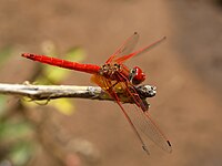


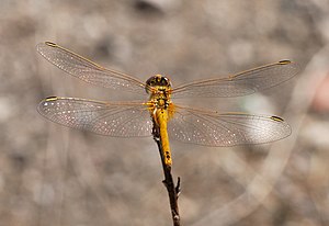


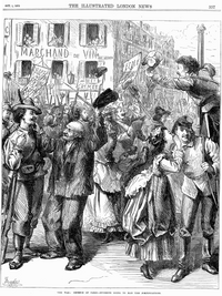


 . Don't you think, if just to be fair, that back leg and one of the front leg of Calliphora augur are blured beyond repair? And it is not the edges, it is your main subject.--Mbz1 13:47, 20 August 2007 (UTC)Mbz1


 DoneRemove the title


 . (Please note the image is not nominated).--Mbz1 20:26, 20 August 2007 (UTC)Mbz1


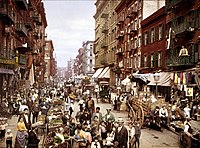
 gets rejected because of quality problems. We have no shots like this in FP. If later one would become available, we always could delist low quality one. In my opinion Wikipedia viewers would appreciate some rare shots even, if the quality is low.--Mbz1 20:40, 26 August 2007 (UTC)Mbz1


.jpg)


.jpg)
.jpg)


,_28_September_2006_(060928-F-0000X-104).jpg)


.jpg)
_edit.jpg)


_-_Dante_And_Virgil_In_Hell_(1850).jpg)
![[3]](https://commons.wikimedia.org/wiki/Image:N00037561.jpg)
![[4]](https://commons.wikimedia.org/wiki/Image:PIA07581.jpg)
![[5]](https://commons.wikimedia.org/wiki/Image:Rhea_hi-res_PIA07763.jpg)
![[6]](https://commons.wikimedia.org/wiki/Image:Tethys_PIA07738.jpg)
![[7]](https://commons.wikimedia.org/wiki/Image:Iapetus_706_1419_1.jpg)
![[8]](https://commons.wikimedia.org/wiki/Image:Ariel_%28moon%29.jpg)
![[9]](https://commons.wikimedia.org/wiki/Image:ComputerHotline_-_Lune--06-08-3_%28by%29.jpg)
![[10]](https://commons.wikimedia.org/wiki/Image:243_ida.jpg)
![[11]](https://commons.wikimedia.org/wiki/Image:Tempel_1_Deep_Impact_5min.jpg)
![[12]](https://commons.wikimedia.org/wiki/Image:Ganymede%2C_moon_of_Jupiter%2C_NASA.jpg)
![[13]](https://commons.wikimedia.org/wiki/Image:Phobos_moon_%28large%29.jpg)
![[15]](https://commons.wikimedia.org/wiki/Image:Enceladusstripes_cassini.jpg)
.jpg)
.jpg)
.svg)
![[22]](http://www.japaneselifestyle.com.au/travel/images/nagasaki_bomb.jpg)
![[23]](http://www.atomicarchive.com/Photos/Nagasaki/images/NG30.jpg)