
Wikipedia:Featured picture candidates/August-2014
| Featured picture tools |
|---|
|
Please cut and paste new entries to the bottom of this page, creating a new monthly archive (by closing date) when necessary.
Aerial Photo of the 80 foot motor yacht "Alchemist"
Voting period is over. Please don't add any new votes. Voting period ends on 1 Aug 2014 at 01:41:22 (UTC)

- Reason
- Wonderful high res photo of a 80 foot motor yacht at full speed taken from aircraft.
- Articles in which this image appears
- Luxury yacht - Gulfstar Yachts
- FP category for this image
- Wikipedia:Featured pictures/Vehicles/Water
- Creator
- WPPilot
- Support as nominator – talk→ WPPilot 01:41, 22 July 2014 (UTC)
- Support - Yes, excellent. Coat of Many Colours (talk) 01:47, 22 July 2014 (UTC)
- Oppose Lots of noise, especially chroma noise. Seems underexposed and lacking detail. The angle-of-view would be more involving if lower. Is this really our best picture of a yacht? -- Colin°Talk

- @Sca, it at 80 feet is actually considered a Super Yacht, and I do not think that anyone in the boating community would ever consider this just a Speed Boat. With regard to Aesthetic value, Commons has few Aerial photos of any boats this one is from the DEA, Created: 2004-12-01 or this one a coast guard shot from 2007, are the only aerial photos I have seen. talk→ WPPilot 15:56, 23 July 2014 (UTC)
- Comment I very much liked the original here, which I thought striking indeed. But I can't fault the technical objections raised. If it was a historical image, then per the guidelines that wouldn't matter. But that's not the case here and frankly Pilot has to up his (her) game. It's a bore, I agree. I have a whole load of images shot on my own gear I know are very fine from a compositional point of view, but I can't in all honesty advance them as "featured". Coat of Many Colours (talk) 22:00, 23 July 2014 (UTC)
- Wow that was a fun ride from" Yes, excellent" to "It's a bore" in a few short hours. OK, Coat of Many Colours thank you for your comments, I have, in the past already been able to retain a featured photo status for aerial shots of yachts: File:Cabo San Lucas Race Start 2013 photo D Ramey Logan.jpg and perhaps, if the airplane in your own gear bag is running ok would you mind showing me how it is I "up my game", as I would love to know, what your talking about in detail. Aerial photos here, on Wikipedia are not that common nor relatively easy to get as it is not easy to fly, and shoot :) talk→ WPPilot 02:34, 24 July 2014 (UTC)
- To clarify, it's the issue of technical excellence that is a bore, not the image, which as I say has wow for me. Wish you better luck with your other entries and I shall always be happy to support the ones that wow me. Coat of Many Colours (talk) 04:06, 24 July 2014 (UTC)
- Wow that was a fun ride from" Yes, excellent" to "It's a bore" in a few short hours. OK, Coat of Many Colours thank you for your comments, I have, in the past already been able to retain a featured photo status for aerial shots of yachts: File:Cabo San Lucas Race Start 2013 photo D Ramey Logan.jpg and perhaps, if the airplane in your own gear bag is running ok would you mind showing me how it is I "up my game", as I would love to know, what your talking about in detail. Aerial photos here, on Wikipedia are not that common nor relatively easy to get as it is not easy to fly, and shoot :) talk→ WPPilot 02:34, 24 July 2014 (UTC)
- Oppose Since there's not much to give it a sense of scale, it's only somewhat interesting after you read the description, not on first sight. Otherwise it's framed like any number of vanity aerial boat shots. I don't think I've learned or felt a single new thing from it. Slightly bigger than usual boat, as seen from above. I'm sure it would be fun to be in the plane or in the boat, but the picture doesn't capture that.__ E L A Q U E A T E 00:13, 31 July 2014 (UTC)
Not Promoted --Armbrust The Homunculus 05:25, 1 August 2014 (UTC)
Aerial photo of a 100 foot Blue Whale cresting off Southern California
Voting period is over. Please don't add any new votes. Voting period ends on 1 Aug 2014 at 04:20:41 (UTC)

- Reason
- It is a remarkable perspective few have ever seen, much less photographed
- Articles in which this image appears
- Blue whale
- FP category for this image
- Wikipedia:Featured pictures/Animals/Mammals
- Creator
- WPPilot
- Support as nominator – talk→ WPPilot 04:20, 22 July 2014 (UTC)
- Support - Fine image. Coat of Many Colours (talk) 16:40, 22 July 2014 (UTC)
- Oppose Way under minimum resolution, added less than a week ago, not the lead image, and you can barely see the whale. I have no clue why Coat of Many Colours considers this a fine image. Honestly, I would like to know. Mattximus (talk) 22:11, 22 July 2014 (UTC)
- Senior moment ... I got carried away by its EV, but researching a little I can't see it's quite as rare as Pilot says. I'll leave my vote as it is, vote and be damned I say, but yes *hand quite properly smacked* and I'll be more careful in future. Coat of Many Colours (talk) 03:25, 23 July 2014 (UTC)
- Oppose Per Mattximus. Might have been a 'great capture,' but alas as a photo it's substandard. Sca (talk) 14:51, 23 July 2014 (UTC)
- Oppose. Valuable, but I do not feel that the value outweighs the technical problems enough for this one to be featurable. Sorry. J Milburn (talk) 15:17, 24 July 2014 (UTC)
- Oppose. Image quality is simply too lacking. Ðiliff «» (Talk) 09:14, 26 July 2014 (UTC)
Not Promoted --Armbrust The Homunculus 05:30, 1 August 2014 (UTC)
Edvard Munch - The Scream (pastel)
Voting period is over. Please don't add any new votes. Voting period ends on 1 Aug 2014 at 17:13:14 (UTC)

- Reason
- Iconic. A 3,003 × 4,000 pixels 12MP file.
- Articles in which this image appears
- The Scream, List of paintings by Edvard Munch, List of most expensive paintings
- FP category for this image
- Wikipedia:Featured_pictures/Artwork/Paintings
- Creator
- Edvard Munch
- Support as nominator – Iconic great granddaddy of all drama royals. I just know it will receive generous support here. This is the version that sold for $119,922,500 a couple of years back. Two failed nominations for the Oslo version. Coat of Many Colours (talk) 17:13, 22 July 2014 (UTC)
- Hey, I know that look! Thats the "Da $#@% you mean the USA is 17 trillion dollars in debt!?" look. TomStar81 (Talk) 20:50, 22 July 2014 (UTC)
- Pretty soon we could be looking at serious money there ...
 Coat of Many Colours (talk) 21:18, 22 July 2014 (UTC)
- erm ... and is that what it takes to buy a vote here? Coat of Many Colours (talk) 21:19, 22 July 2014 (UTC)
- Pretty soon we could be looking at serious money there ...

- It's a different version from the Oslo versions nominated before 1 first, 2 second. Second time round you opposed on the ground it had been published so often it's become almost a cliché, but not many clichés sell for $119,922,500. On both occasions the stumbling block was the lack of resolution, and indeed that won't be fixed until the holding museums issue high resolution images. But this was sold at auction and the on-line catalogue made available a 3,003 × 4,000 pixels 12MP file. That's plenty of resolution enough. Coat of Many Colours (talk) 22:21, 22 July 2014 (UTC)
-
- In this case the price tag came in at about $25,000 a square centimetre - isn't that just amazing? Coat of Many Colours (talk) 02:55, 23 July 2014 (UTC)
- The British Guiana 1c magenta on the other hand works out at about $1 million a square centimetre. Eat your heart out, Ed. Coat of Many Colours (talk) 16:41, 23 July 2014 (UTC)
- Ya know, that stamp might have a chance at passing FPC too. — Crisco 1492 (talk) 10:01, 23 July 2014 (UTC)
- I would support, but I've got my eye on a little blonde bombshell I fancy next. Coat of Many Colours (talk) 16:07, 23 July 2014 (UTC)
- Comment - Wish this was better used in the article. Discussed in text, but relegated to a gallery. — Crisco 1492 (talk) 09:43, 23 July 2014 (UTC)
- As an alt., how about a rectangular background detail showing just the two men on the bridge (or pier) and the sailboat in the water? Sca (talk) 14:20, 23 July 2014 (UTC)
- Would be happy to support. I always thought this was a bridge too, but in fact the location appears to be a road above Copenhagen harbour according to this interesting blog I linked in to to the article this morning. Coat of Many Colours (talk) 16:07, 23 July 2014 (UTC)
- Oppose: First this does not appear to have a free license or a clear title, at least for Wikimedia Commons. Secondly, compared to the two earlier submissions; this image is quite grainy, especially along the roadway or bridge (whichever). I find that an unpleasant and worrisome feature for a pastel. It now appears speckled. The image is not restful in any regard, so smooth colours at least make it tolerable to look at. I actually prefer choice one, which has been earlier reviewed and not promoted. Fylbecatulous talk 00:11, 24 July 2014 (UTC)
- You mean PD and The Scream is certainly PD in the US. It's true it can't go onto Commons until the beginning of next year when Munch comes into PD in Europe, but I'm not aware that's one of the criteria. First nom raised Les Demoiselles d'Avignon, one of the lamer copyright dramas in recent years, but it's unassailable that The Scream was 'published' within the terms of the Berne convention (i.e. made available for copying) before 1923.For example it was made available as a limited edition of prints in 1895. As for the resolution, it's at the mark and pastels at the mark 'are' 'speckled', that's the nature of their mark. Have a look at this Degas pastel Commons:File:Edgar Degas - Young Woman in Blue - Google Art Project.jpg. Why should you be worried about that? I should think it extremely unlikely that a Sotheby's catalogue for a work expected to sell in the high tens of millions of dollars carried a substandard image. Pretty sure at any rate we are not going to get better any time soon. Nomination 1 was for an oil painting and it failed on resolution concerns. Coat of Many Colours (talk) 03:58, 24 July 2014 (UTC)
- I can vouch that this is acceptable for hosting locally on the English Wikipedia as well. Don't get what is meant by "speckles"/ — Crisco 1492 (talk) 08:51, 24 July 2014 (UTC)
- Like speckled eggs: Bing has many images. Here is one not so well defined: https://commons.wikimedia.org/wiki/File:Common_Tern_Nest_with_Three_Eggs_(2)_(3593033259).jpg. Good for eggs; not so good for images unless graininess is required. Fylbecatulous talk 13:39, 24 July 2014 (UTC)
- Welcome to the demanding (and discerning) world of the visual arts, Fylbe. I still can't follow your objection to the image here. There's no noise in that image. That 'speckling' is merely the mark pastel chalks make on paper especially prepared to 'take' the chalk. Really I think you should strike your oppose here unless you can make a more substantial case. Thank you. Coat of Many Colours (talk) 16:13, 24 July 2014 (UTC)
- @Fylbecatulous: I think it's disappointing that you haven't responded to a request to clarify your issues. I take it that means you don't have any further issues, and since the objections you raised have been adequately explained by myself and by an administrator at the forum, I think in the circumstances it would be courteous to strike your oppose. Coat of Many Colours (talk) 12:16, 26 July 2014 (UTC)
- Really, I do not intend to strike my oppose. I believe it would be courteous to now leave me alone. I am an editor worthy to cast a vote here and it has been thusly done. It's disappointing that this process is becoming an unpleasant experience. I speak for myself, of course. Others may speak on their own behalf. Fylbecatulous talk 14:33, 26 July 2014 (UTC)
- @talk) 16:06, 26 July 2014 (UTC)]
- Hi Corinne. Indeed I've noticed you around and I left you a message here saying how much I liked your User page. In this case we have a newbie wrong about everything and apparently unwilling to cooperate. It would likewise be kind,tolerant and generous of him simply to admit his mistakes, embarrassing and possibly unpleasant though that might be, and move on. That's how I see it. Coat of Many Colours (talk) 16:28, 26 July 2014 (UTC)
- @
_-_Portrait_of_Do%C3%B1a_Isabel_de_Requesens_-_Louvre_612_Joconde_000PE026978.jpg)

- @Fylbecatulous: I'm sorry to hear that your experience here has been unpleasant. If you could be more specific I should be happy to help in any way I can. You will forgive me, but you are a new contributor here are you not? It's difficult to judge from your contribution record because you are such a prolific contributor to Wikipedia, but that does seem to be so - that you made your first contribution here supporting Hafspajen's recent School of Raphael nomination, which I opposed on the grounds that it suffers a pronounced yellow colour cast on account of its processing (see thumbnails)? As an experienced Wikipedian you should know the etiquette about newbies joining forums. Really I must ask you to reconsider. When I make a mistake in this forum, I courteously acknowledge that I have so and make the appropriate remedial actions to set it right. With respect I courteously suggest that you ought to as well. Coat of Many Colours (talk) 16:17, 26 July 2014 (UTC)
- @Coat of Many Colours:. Surely, you are not serious. It appears my first participation was to: https://en.wikipedia.org/wiki/Wikipedia:Featured_picture_candidates/File:Hans_Baluschek_-_Arbeiterstadt_(1920).jpg, involving a different nominator. Now I feel that I am being subjected to most unfriendly interrogation. Whether or not you believe this is to be a forum, it is still pertaining to Wikipedia content. All the best. Fylbecatulous talk 16:38, 26 July 2014 (UTC)
- Yes excellent nomination which I warmly supported as well, but that's still only less than a fortnight ago. I think it would be generous, tolerant and kind of you to admit your mistake here and strike your oppose. I can't see what's unpleasant about that. Only a little prick to one'e sense of self-esteem surely? And then you can be confident of my good will. Coat of Many Colours (talk) 16:49, 26 July 2014 (UTC)
- C.o.m.c. - you will forgive me, but you are a new contributor here also, are you not? It was 23 June 2014 you made your first edit here. Just about a month ago. Drmies, please tell this editor not to intimidate other editors just because they vote for a nomination s/he is vigourosly opposing for reasons og her/ his own. Hafspajen (talk) 17:29, 26 July 2014 (UTC)
- Also, I have to remind you that in the fact Crisco 1492 also votes support on the nomination you obviously trying to destroy. Just because you, C.o.m.c. doesn't think that nomination is OK; that doesn't mean that you have to put down this much energy on it - opposing it EVEN here, posting those painting even here. A simple oppose would have been quite enough, and in that case the whole thing wouldn't blow up like this. I think you go too far now. Crisco 1492, since when are we telling to editors what to do and how to vote on this project? Hafspajen (talk) 17:31, 26 July 2014 (UTC)
- @Coat of Many Colours:. I have read the guidelines for this project page. I cannot find where it states that a nominator may hassle a commentor into striking what might be considered a misguided vote. However I do see: Please remember to be civil, not to bite the newbies and to comment on the image, not the person. Since you allege that I am a newcomer and to that I agree, Please apologise for your incivility, biting of a newcomer and commenting about me: ie In this case we have a newbie wrong about everything and apparently unwilling to cooperate. It would likewise be kind,tolerant and generous of him simply to admit his mistakes, embarrassing and possibly unpleasant though that might be, and move on. You surely misread me as to my motives. After my requested apology is given, I shall be confident of your good will. Fylbecatulous talk 17:32, 26 July 2014 (UTC)
- I'm asking you to concede what is clearly the case, that your objection had no merit i.e. to say there is no copyright issue and there is no problem with the image. In such a case it would be a courtesy to strike the oppose, especially when requested. I would not hesitate to do that. However it's quite plain you won't do me that courtesy. Coat of Many Colours (talk) 19:18, 26 July 2014 (UTC)
- @talk) 03:17, 27 July 2014 (UTC)]
- Thanks Corinne. You are brave. Maybe you are right - C.o.m.c. is affraid that more editors to come along, see the image, and vote... Now when this nomination so effectively is killed, spitted on and dragged in the mud - what an annoyance would be if two more headstrong editors would come by and vote in the very last 24 hours, hahaha what a dissapoitment that would be, that would be really funny... Well, Insha'Allah, - "os mynn Duw". Hafspajen (talk) 04:19, 27 July 2014 (UTC)
- @CorinneSD: Thank you for your remarks Corinne. I'm sure that's a sensible analysis. Coat of Many Colours (talk) 04:45, 27 July 2014 (UTC)]
- So here's where Fylbecatulous gets to speak for myself. Again, my motives have not been accurately described by others, but thank you, CorrineSD, for quite kind and affirmative comments on my behalf. Really appreciated. My reason for not reverting or striking my vote, (which was cast in the light of the best knowledge I have about the criteria, as dim as it may be), has nothing to do with defiance, embarrassment, pride, being upset, whatever. Here's the thing. There has become a perception by myself from lurking and from others who participate frequently; that the atmosphere is recently becoming difficult, unfriendly, snarky, and argumentative. A hostile environment where there used to be civility. This exchange for this submission is just one example.
I am simply standing my ground and therefore not reinforcing what I perceive to be bad behaviour towards another editor (in this case, me), (but that has been duly noted by others as well). If I give in to being bullied or coerced and pinged or talked about in a bad light, and strike my vote, made in good faith, due to feeling intimidated; I have just reinforced the negative behaviour that we wish would go away. So I do not question authority, so if one of those admins happens along that keep getting pinged to this thread; and requests me to amend or strike my comments or vote, I shall do so on that basis, Otherwise, the nominator and one who has been hassling me, is no more an authority than I, so I intend to ignore. Perhaps an admin would also remove the two unrelated images that were added to make fun of Hafspajen's entry elsewhere. Thanks. Fylbecatulous talk 15:23, 27 July 2014 (UTC)
-
- And we haven't even scratched the surface yet ... Coat of Many Colours (talk) 21:31, 28 July 2014 (UTC)
- So here's where Fylbecatulous gets to speak for myself. Again, my motives have not been accurately described by others, but thank you, CorrineSD, for quite kind and affirmative comments on my behalf. Really appreciated. My reason for not reverting or striking my vote, (which was cast in the light of the best knowledge I have about the criteria, as dim as it may be), has nothing to do with defiance, embarrassment, pride, being upset, whatever. Here's the thing. There has become a perception by myself from lurking and from others who participate frequently; that the atmosphere is recently becoming difficult, unfriendly, snarky, and argumentative. A hostile environment where there used to be civility. This exchange for this submission is just one example.
- @
Not Promoted --Armbrust The Homunculus 17:17, 1 August 2014 (UTC)
Bixby letter
Voting period is over. Please don't add any new votes. Voting period ends on 2 Aug 2014 at 09:59:49 (UTC)

- Reason
- High quality scan of a facsimile of a notable (now-lost) letter signed by Abraham Lincoln. Besides, we can't let Adam have the whole Civil War category to himself now, can we?
- Articles in which this image appears
- Bixby letter
- FP category for this image
- Wikipedia:Featured pictures/History/American Civil War
- Creator
- Signed Abraham Lincoln, but some think John Hay penned the letter
- Support as nominator – — Crisco 1492 (talk) 09:59, 23 July 2014 (UTC)
- Support I feel how weak and fruitless must be any word of mine which should attempt to beguile you from offer your support to a letter so overwhelming. But I cannot refrain from tendering you the consolation that may be found in the thanks of the community who may yet have a chance to learn of the this power literary piece. I pray that our Heavenly Father may leave you only the cherished memory of the nomination, and the solemn pride that must be yours to have successfully beaten Adam to the punch. TomStar81 (Talk) 10:29, 23 July 2014 (UTC)
- Comment Not overwhelmed by the EV of this I have to say. Would be happy to support a genuine autograph of Lincoln, and autographs in general. Coat of Many Colours (talk) 15:59, 23 July 2014 (UTC)
- Who said this had EV only as a sample of Lincoln's handwriting? That's a dime a dozen, almost. This has EV as a facsimile of the original Bixby letter. — Crisco 1492 (talk) 16:10, 23 July 2014 (UTC)
- Featured? My understanding is that it's a facsimile of a forgery, likely by John Hay, who provided one of the Gettysburg address it seems. I did look at the category. I just can't see taking its place there. Not opposing, just explaining why I'm not supporting. Coat of Many Colours (talk) 16:48, 23 July 2014 (UTC)
- CN on "forgery", please. Read Hay's article. Current scholarship is that either Lincoln wrote the letter himself, as generally held, or that Hay wrote the letter (i.e. wrote the original letter) in Lincoln's name as part of his duties as Lincoln's secretary. No matter who penned it, the Bixby letter is notable (i.e. has an article on it) and this is an almost exact reproduction of it. The only image that would have more EV in the Bixby letter article is a scan of the original, which no longer exists. — Crisco 1492 (talk) 00:38, 24 July 2014 (UTC)
- CN? Whether by Lincoln or Hay, the origin of the facsimile is unknown and plausibly it's a forgery. Coat of Many Colours (talk) 03:22, 24 July 2014 (UTC)
- Also, for the category: Wikipedia:Featured pictures/History/USA History is home to the scan of the embossed copy of the Declaration of Independence and the check used for the Alaska Purchase, suggesting documents go in the history category. Since we have one exclusively for the American Civil War, I used that category for this document (which is from the Civil War, after all). — Crisco 1492 (talk) 02:37, 24 July 2014 (UTC)
- Not convinced. It's a condolence letter. A high resolution scan of a original in Lincoln's handwriting (you say his autographs are two a penny) would have EV. A forged (by common consent) facsimile of a particular example doesn't IMHO. Coat of Many Colours (talk) 16:01, 24 July 2014 (UTC)
- CN on "forgery", please. Read Hay's article. Current scholarship is that either Lincoln wrote the letter himself, as generally held, or that Hay wrote the letter (i.e. wrote the original letter) in Lincoln's name as part of his duties as Lincoln's secretary. No matter who penned it, the Bixby letter is notable (i.e. has an article on it) and this is an almost exact reproduction of it. The only image that would have more EV in the Bixby letter article is a scan of the original, which no longer exists. — Crisco 1492 (talk) 00:38, 24 July 2014 (UTC)
- Featured? My understanding is that it's a facsimile of a forgery, likely by John Hay, who provided one of the Gettysburg address it seems. I did look at the category. I just can't see taking its place there. Not opposing, just explaining why I'm not supporting. Coat of Many Colours (talk) 16:48, 23 July 2014 (UTC)
- Who said this had EV only as a sample of Lincoln's handwriting? That's a dime a dozen, almost. This has EV as a facsimile of the original Bixby letter. — Crisco 1492 (talk) 16:10, 23 July 2014 (UTC)
- Support per TomStar81. Hafspajen (talk) 00:55, 24 July 2014 (UTC)
Oppose I see no reason why I can't have the category to myself.Support. Whether real or forgery, this specific lithographic reproduction is discussed in the article. Adam Cuerden (talk) 00:05, 25 July 2014 (UTC)
- So is Vermeer article. Coat of Many Colours (talk) 00:19, 25 July 2014 (UTC)]
- Remember the point of FPs is to add value to articles. This can be a specific section of an article, such as the long section on whether this print was a forgery or not. Adam Cuerden (talk) 03:18, 25 July 2014 (UTC)
- To highlight images that add value to articles. The van Meegeren forgeries are notable and an image of one of them no doubt worthy of a place in the Vermeer article. But if such an image was made a Featured Picture candidate I would certainly question its EV. Same here. Coat of Many Colours (talk) 07:57, 25 July 2014 (UTC)
- I... really don't see how your logic works there - it's notable, but when it gets here, it's not? Adam Cuerden (talk) 15:11, 25 July 2014 (UTC)
- First of all this is going to be my last remark here. It's just a comment saying that, personally for me, I can't see its EV. That's what we are after here, EV not notability. That's the criteria, notability after all being a given, or should be, if an item is to appear in the encyclopaedia at all. For me a reproduction of genuine letter of condolence written by Abraham Lincoln would have EV, but this facsimile of a forgery doesn't pique my interest at all. Coat of Many Colours (talk) 17:19, 25 July 2014 (UTC)
- So is
- Support -- Just 'cos I'm off on my hols and I don't want to feel weighed down by guilt as I sun myself on the beach. I would like to see more autographs Featured. Of course the major auction house have regular sales of these, accompanied by high resolution images in their catalogues. I'll make a point in future of uploading any that catch my eye, much as I did with the British Guiana 1c. Magenta. Looking round for a parting nomination yesterday, I was surprised to see that there are no Hubble Deep Field images, unless they're buried somewhere implausible in the categories. This recent one didn't make it through Wikipedia:Featured_picture_candidates/Hubble_Ultra_Deep_Field_2014 only last month. Odd that. I mean I grant that the whole world and their mums (pet dogs and cats, snakes, ducks whatever) don't necessarily rush to this forum, but there are enough nominating here to help images like these through. Coat of Many Colours (talk) 16:32, 28 July 2014 (UTC)
- Support - Authorship questions aside, an historic letter, in the only state (facsimile) known.-Godot13 (talk) 17:01, 28 July 2014 (UTC)
- Oppose- I'm confused, this is a (admittedly good) scan of a mere copy of the letter; that doesn't deserve to be featured. Bzweebl (talk • contribs) 17:14, 30 July 2014 (UTC)
- And why not? — Crisco 1492 (talk) 17:19, 30 July 2014 (UTC)
Promoted File:Bixby letter facsimile.jpg --Armbrust The Homunculus 10:03, 2 August 2014 (UTC)
Great Mosque of Central Java (Interior)
Voting period is over. Please don't add any new votes. Voting period ends on 4 Aug 2014 at 00:00:30 (UTC)

- Reason
- A bit noisy and distorted at the top, but very high resolution, which I think is ample to make up for the minor flaws. Illustrates the subject in a way that a mere description wouldn't, showing its grandeur and elegant simplicity. Also, why should Chris get to nominate all the images of things in Indonesia, eh?
- Articles in which this image appears
- Great Mosque of Central Java
- FP category for this image
- Wikipedia:Featured pictures/Places/Interiors
- Creator
- Chris Woodrich (a.k.a Crisco 1492)
- Support as nominator – Adam Cuerden (talk) 00:00, 25 July 2014 (UTC)
- Support -- Yes, beautiful. I love the floor and the cool colours. Coat of Many Colours (talk) 00:15, 25 July 2014 (UTC)
- Support -- Agree with nom - bit noisy and distorted, but high resolution mitigates much of that. Also (at least in my experience) permission to photograph mosque interiors is not always given...--Godot13 (talk) 00:25, 25 July 2014 (UTC)
- Wow Adam, I didn't realize you nominated this. I seem to recall some minor parallax in this image... (Godot, noise can be fixed; brb) — Crisco 1492 (talk) 00:42, 25 July 2014 (UTC)
- Now that you mention it, there is a bit on the floor at the bottom, just left of the middle, but it looks fixable. Adam Cuerden (talk) 00:52, 25 July 2014 (UTC)
- Oppose for now. I just noticed that there are considerable focus errors (see, for instance, the edge of the inner chandelier ring). I've denoised and uploaded, but it's just too noticeable. — Crisco 1492 (talk) 00:56, 25 July 2014 (UTC)
- I'll try and restitch; maybe this can be fixed. — Crisco 1492 (talk) 01:01, 25 July 2014 (UTC)
- No, didn't get any better... once I get the proper equipment, I'll reshoot and nominate. :-( — Crisco 1492 (talk) 07:26, 25 July 2014 (UTC)
- I'll try and restitch; maybe this can be fixed. — Crisco 1492 (talk) 01:01, 25 July 2014 (UTC)
- Oppose also. The quality is just a bit lacking, although I look forward to seeing the reshoot. Ðiliff «» (Talk) 18:44, 25 July 2014 (UTC)
Not Promoted --Armbrust The Homunculus 00:31, 4 August 2014 (UTC)
File:Magdalene College Dining Hall, Cambridge, UK - Diliff.jpg
Voting period is over. Please don't add any new votes. Voting period ends on 4 Aug 2014 at 00:53:21 (UTC)


- Reason
- It's an interesting view of the dining hall of Magdalene College, one of the constituent colleges of the University of Cambridge in England. The photo was taken from the very corner of the room, allowing me to get a wide angle view that was able to capture the entire table in the foreground (if you look closely, you can see that you're looking almost directly down on the nearest chair). Detail is good enough that you can practically read what was for lunch on the menu. :-)
- Articles in which this image appears
- Magdalene College, Cambridge
- FP category for this image
- Wikipedia:Featured pictures/Places/Interiors
- Creator
- User:Diliff
- Support as nominator – Ðiliff «» (Talk) 00:53, 25 July 2014 (UTC)
- Question What are the circles on the nearest painting and directly below it on the wall (between the candle tips)? They look like lens flare to me. I couldn't see them on a couple of other views of the same hall I found on the web, but those photos were quite small, so I'm not completely sure. --99of9 (talk) 03:17, 25 July 2014 (UTC)
- On the painting looks like lens flare to me. — Crisco 1492 (talk) 07:32, 25 July 2014 (UTC)
- You're right, its lens flare. I could probably clone the one on the wall out but the one on the painting would be very difficult. Ðiliff «» (Talk) 07:33, 25 July 2014 (UTC)
- (Personally I think the one on the painting looks rather nice. Almost deliberate). — Crisco 1492 (talk) 07:40, 25 July 2014 (UTC)
- Thanks for confirming. I'm afraid I must Oppose original, because this is a reasonably noticeable defect. --99of9 (talk) 00:35, 28 July 2014 (UTC)
- Support alt Thanks for helping out Adam Cuerden.--99of9 (talk) 03:01, 30 July 2014 (UTC)
- Hey, it's what I do on FP. Kind of weird not having to worry about film grain, though. ;) Adam Cuerden (talk) 03:14, 30 July 2014 (UTC)
- Thanks indeed. Sorry for the delayed response, I've been away (Cathedral Photography Trip II, of which photos will soon follow). Nice work, what tool(s) did you use on the painting? I've always found it difficult to remove lens flares from areas of detail as there a complex combination of contrast, colour and brightness alterations. It's one thing to adjust these, but another to do it seamlessly. Ðiliff «» (Talk) 19:47, 1 August 2014 (UTC)
- Offhand, hue-saturation, levels, clonestamp, healing brush, and I think maybe dodge/burn. Clonestamp and healing brush are very useful for removing small issues (such as rings around the edges) caused by the main adjustments. Adam Cuerden (talk) 00:43, 2 August 2014 (UTC)
- Thanks indeed. Sorry for the delayed response, I've been away (Cathedral Photography Trip II, of which photos will soon follow). Nice work, what tool(s) did you use on the painting? I've always found it difficult to remove lens flares from areas of detail as there a complex combination of contrast, colour and brightness alterations. It's one thing to adjust these, but another to do it seamlessly. Ðiliff «» (Talk) 19:47, 1 August 2014 (UTC)
- Hey, it's what I do on FP. Kind of weird not having to worry about film grain, though. ;) Adam Cuerden (talk) 03:14, 30 July 2014 (UTC)
- Support alt Thanks for helping out Adam Cuerden.--99of9 (talk) 03:01, 30 July 2014 (UTC)
- Support either, Alt preferred -- Coat of Many Colours (talk) 08:14, 25 July 2014 (UTC)
SupportSupport Alt great work as usual.talk) 13:38, 26 July 2014 (UTC)]- Support I am becoming a Diliff fan!--Mark Miller (talk) 21:15, 27 July 2014 (UTC)
- Alt uploaded, support alt Adam Cuerden (talk) 18:15, 29 July 2014 (UTC)
- Support alt Well done; looks fantastic. — Crisco 1492 (talk) 01:17, 30 July 2014 (UTC)
Promoted File:Magdalene College Dining Hall, Cambridge, UK - Diliff - sans lens flares.jpg --Armbrust The Homunculus 01:18, 4 August 2014 (UTC)
File:St John's College Chapel, Cambridge, UK - Diliff.jpg
Voting period is over. Please don't add any new votes. Voting period ends on 4 Aug 2014 at 01:07:57 (UTC)

- Reason
- The beauty of the interior speaks for itself, but I think the the ambiance and details are captured nicely.
- Articles in which this image appears
- St John's College, Cambridge and Choir of St John's College, Cambridge
- FP category for this image
- Wikipedia:Featured pictures/Places/Interiors
- Creator
- User:Diliff
- Support as nominator – Ðiliff «» (Talk) 01:07, 25 July 2014 (UTC)
- Support - Absolutely breathtaking. — Crisco 1492 (talk) 01:49, 25 July 2014 (UTC)
- Amazing picture. On the Commons page I've noted what I think are a couple of minor stitching errors. Big support if they can be removed. --99of9 (talk) 03:22, 25 July 2014 (UTC)
- Support....That isn't a stitch issue. After close inspection, it seems to be wires or cables that are supporting a barely visible...item suspended from those wires or cables. 99of9 please let me know if I am completely wrong here.--Mark Miller (talk) 06:30, 25 July 2014 (UTC)
- No, the ones he highlighted are definitely parallax. Barely noticeable, but fixable one would hope — Crisco 1492 (talk) 07:30, 25 July 2014 (UTC)
- Probably fixable. Yes, you're right, that's parallax. I wasn't able to shoot this with a panoramic head unfortunately, as I was shooting this through a wrought iron gate. I also couldn't quite shoot it from the middle of the chapel because the two gates close in the middle which forces you to shoot slightly from one side or the other. Barely noticeable indeed, I was aware that there could be slight parallax issues in this image and I looked long and hard before uploading it! I'll see what I can do about fixing it. Ðiliff «» (Talk) 08:46, 25 July 2014 (UTC)
- OK, should be largely fixed now. Ðiliff «» (Talk) 09:49, 25 July 2014 (UTC)
-
- If you have some time in the near future is it possible for you to point out the issue you saw involving the parallax. I stared at this image so long I am truly shocked I didn't see what the issue was...but I am truly glad it was worked out because the image is just beautiful!--Mark Miller (talk) 00:31, 27 July 2014 (UTC)
- If the stitching errors in my interior below were so small, I wouldn't have opposed. Do you see the line of orange tiles heading north-east (pretend this is a map?) Four tiles from the bottom there is a very small disconnect. It's more obvious with the black tile just north of the one I pointed to. — Crisco 1492 (talk) 02:38, 27 July 2014 (UTC)
- Mark, does this image with red circles highlighting the stitching problems help? As Crisco said, they're quite minor so I'm not surprised you didn't spot them. Neither did I until 99of9 pointed them out. Ðiliff «» (Talk) 09:27, 27 July 2014 (UTC)
- Yes that did help. My god....you guys have good eyes! I am getting too old for this. ;-)--Mark Miller (talk) 21:14, 27 July 2014 (UTC)
- Just a matter of knowing what to look for (the kind of glasses I have to wear [-14.25 in each eye] have to be special ordered from Japan; definitely not good eyes ) — Crisco 1492 (talk) 01:46, 28 July 2014 (UTC)
- Just a matter of knowing what to look for (the kind of glasses I have to wear [-14.25 in each eye] have to be special ordered from Japan; definitely not good eyes
- Support -- Coat of Many Colours (talk) 08:12, 25 July 2014 (UTC)
- Support - Godot13 (talk) 11:35, 25 July 2014 (UTC)
- Support --///EuroCarGT 04:43, 26 July 2014 (UTC)
Promoted File:St John's College Chapel, Cambridge, UK - Diliff.jpg --Armbrust The Homunculus 01:18, 4 August 2014 (UTC)
Édouard Manet, A Bar at the Folies-Bergère
Voting period is over. Please don't add any new votes. Voting period ends on 4 Aug 2014 at 16:39:34 (UTC)

- Reason
- Édouard Manet's last major work, dating from 1881-82. Griselda Pollock calls it an image of modernity, concerning itself with "unstable reflections and ambivalent identities in a world of commodities and public spectacles". The device of the mirror stretched behind the barmaid borrows from Mary Cassatt's 1879 Woman with a Pearl Necklace in a Loge, a portrait of her terminally ill sister Lydia, while the detail of the fashionably dressed lady holding opera glasses to her eyes is a direct quotation from her 1878 painting At the Opera. One of the commodities on display here was, of course, the barmaid herself. Naturally Cassatt could not frequent such places, but Manet exulted in them. He was to die of syphilis in 1883, some six month after the death of Cassatt's sister Lydia. Berthe Morisot, subject of a celebrated portrait by Manet, was with him at the end, writing to her sister "These last days were very painful; poor Édouard suffered atrociously. His agony was horrible. In a word, it was death in one of its most appalling forms ...".
- Articles in which this image appears
- A Bar at the Folies-Bergère, Courtauld Gallery
- FP category for this image
- Wikipedia:Featured pictures/Artwork/Paintings
- Creator
- Édouard Manet
- Support as nominator – Coat of Many Colours (talk) 16:39, 25 July 2014 (UTC)
- Comment — I've always liked this one. However, as with certain other familiar paintings, I wonder if it's lost some appeal due to frequent reproduction in mass media. Sca (talk) 13:45, 26 July 2014 (UTC)
- Yes well, 'iconic' is a word you see frequently in the descriptions. I don't see it loses its EV merely because it's familiar. Coat of Many Colours (talk) 14:13, 26 July 2014 (UTC)
Not Promoted --Armbrust The Homunculus 16:46, 4 August 2014 (UTC)
Nighthawks
Voting period is over. Please don't add any new votes. Voting period ends on 4 Aug 2014 at 18:45:57 (UTC)

- Reason
- High quality scan of a painting with high EV.
- Articles in which this image appears
- Nighthawks (most EV), Night in paintings (Western art), Visual art of the United States, +5 others
- FP category for this image
- Wikipedia:Featured pictures/Artwork/Paintings
- Creator
- Edward Hopper
- Support as nominator – Armbrust The Homunculus 18:45, 25 July 2014 (UTC)
- Support -- Coat of Many Colours (talk) 19:04, 25 July 2014 (UTC)
- Support - Very nice scan. — Crisco 1492 (talk) 08:05, 26 July 2014 (UTC)
- It's not a "scan" is it? It's a digital image and the file description just gives the source as "email". I don't think that's very satisfactory. It does look like the museum image (realistically it's certainly the museum image because it's virtually impossible to copy colour values with such fidelity), though not immediately apparent its rights managed high resolution version, which is still larger. Nevertheless it's most likely a reduced version of it. No copyright issues in the US, but indeed contractual issues which uploaders of these images ought to be aware of, especially as it would be routine to add a digital signature to the image identifying the purchaser. I mean I have dozens and dozens of such images from the British Museum, but I wouldn't dream of uploading them to Wikipedia, though I do occasionally their publicly available images. Not sure if Wikipedia has any liability in such cases. I think it probably must have if it's knowingly hosting these images. That would seem plausible to me. As of course would presumably the admins overseeing the forum here. I do think there should be a policy about sources here. They should be transparent. Coat of Many Colours (talk) 11:42, 26 July 2014 (UTC)
- Support on AGF basis that the email source is authentic. However, here, here, here and here the painting looks less greenish. Brandmeistertalk 12:16, 28 July 2014 (UTC)]
- Support A classic. Adam Cuerden (talk) 04:23, 30 July 2014 (UTC)
Promoted File:Nighthawks by Edward Hopper 1942.jpg ----Mdann52talk to me! 10:19, 5 August 2014 (UTC)
Einstein 1921 by F Schmutzer
Voting period is over. Please don't add any new votes. Voting period ends on 5 Aug 2014 at 21:15:59 (UTC)


- Reason
- One of the few early photographs of Einstein available. Rediscovered in 2001 by the estate of Ferdinand Schmutzer. The image is being renominated following the resolution of a copyright problem which got in the way of the last nomination. I have chosen a sepia print because Schmutzer's 1921 etching (which incidentally 'publishes' the image under US case law thus making it PD regardless of other copyright considerations) is a sepia aquatint.
- Articles in which this image appears
- Albert Einstein and History of Germany (highest EV)
- FP category for this image
- Wikipedia:Featured pictures/People/Science and engineering
- Creator
- Ferdinand Schmutzer
- Support either (Original or Alt1) as nominator – Coat of Many Colours (talk) 21:15, 26 July 2014 (UTC)
- Comment - Wikipedia:Featured picture candidates/E=mc squared ///EuroCarGT 03:50, 27 July 2014 (UTC)
- Yes, that's right. It's the nomination I mentioned above that got involved with a nomination for deletion on copyright concerns. That proved to be a somewhat complicated affair that took some time to resolve. Coat of Many Colours (talk) 04:51, 27 July 2014 (UTC)
- Okay, thanks for clarifying Coat! ///EuroCarGT 04:57, 27 July 2014 (UTC)
- Alt 1 uploaded, support Alt Adam Cuerden (talk) 06:08, 28 July 2014 (UTC)
- Support either as per my vote above. Thanks Adam. Coat of Many Colours (talk) 18:47, 28 July 2014 (UTC)
- Support restoration. Copyright looks to have been cleaned up, and the image is very good. — Crisco 1492 (talk) 03:30, 29 July 2014 (UTC)
- Support Alt 1. Nice restoration. Great image. nagualdesign 22:10, 3 August 2014 (UTC)
Not Promoted --Armbrust The Homunculus 21:18, 5 August 2014 (UTC)
- Not enough support for promotion. Armbrust The Homunculus 21:18, 5 August 2014 (UTC)
Johannes Vermeer - Christ in the House of Martha and Mary
Voting period is over. Please don't add any new votes. Voting period ends on 5 Aug 2014 at 21:54:37 (UTC)
_Vermeer_-_Christ_in_the_House_of_Martha_and_Mary_-_Google_Art_Project.jpg)
- Reason
- Vermeer's earliest work ( Saint Praxedis is possibly earlier but its autograph is disputed, although that didn't stop it selling for £6 million at a Christie's sale this month). Martha, with her eyes downcast, evokes several of Vermeer's later canvases such as The Milkmaid .
- Articles in which this image appears
- Christ in the House of Martha and Mary (Vermeer) and four others.
- FP category for this image
- Wikipedia:Featured pictures/Artwork/Paintings
- Creator
- Johannes Vermeer
- Support as nominator – Coat of Many Colours (talk) 21:54, 26 July 2014 (UTC)
- Support, good to have the relevant article on this. Brandmeistertalk 09:12, 31 July 2014 (UTC)
Not Promoted --Armbrust The Homunculus 21:56, 5 August 2014 (UTC)
File:Selwyn College Old Court, Cambridge, UK - Diliff.jpg
Voting period is over. Please don't add any new votes. Voting period ends on 5 Aug 2014 at 21:55:26 (UTC)

- Reason
- It's an aesthetic view of the college courtyard and has good detail, showing the brickwork, the arrangement of buildings etc.
- Articles in which this image appears
- Selwyn College, Cambridge
- FP category for this image
- Wikipedia:Featured pictures/Places/Architecture
- Creator
- User:Diliff
- Support as nominator – Ðiliff «» (Talk) 21:55, 26 July 2014 (UTC)
- Support -- Coat of Many Colours (talk) 22:54, 26 July 2014 (UTC)
- Support - An exterior? You haven't nominated one of these in ages. — Crisco 1492 (talk) 02:32, 27 July 2014 (UTC)
- Exteriors are easier to shoot (but with their own challenges like the time of day being vitally important, geographic/logistical constraints not allowing the right angle, too many people getting in the way, etc) so I haven't concentrated so much on them with the cathedrals. I've been largely trying to get quality images of subjects that other people have been unable to get, and most people struggle more with interior photography due to lack of the proper equipment and patience. But I took quite a few exterior images in Cambridge. :-) Ðiliff «» (Talk) 09:17, 27 July 2014 (UTC)
- I hear ya on the challenges... although I'm glad to see more exteriors, I'm definitely not tiring of your interiors! Keep 'em coming. — Crisco 1492 (talk) 11:44, 27 July 2014 (UTC)
- Exteriors are easier to shoot (but with their own challenges like the time of day being vitally important, geographic/logistical constraints not allowing the right angle, too many people getting in the way, etc) so I haven't concentrated so much on them with the cathedrals. I've been largely trying to get quality images of subjects that other people have been unable to get, and most people struggle more with interior photography due to lack of the proper equipment and patience. But I took quite a few exterior images in Cambridge. :-) Ðiliff «» (Talk) 09:17, 27 July 2014 (UTC)
- Support — A lovely ensemble of Victorian structures. Agree it's good to see an exterior. Nice light & shadow. Sca (talk) 14:06, 27 July 2014 (UTC)
- Support per Sca. Adam Cuerden (talk) 04:43, 30 July 2014 (UTC)
Promoted File:Selwyn College Old Court, Cambridge, UK - Diliff.jpg --Armbrust The Homunculus 21:57, 5 August 2014 (UTC)
- Placed image in Places/Panorama, Armbrust The Homunculus 21:57, 5 August 2014 (UTC)
Selwyn College Chapel, University of Cambridge
Voting period is over. Please don't add any new votes. Voting period ends on 6 Aug 2014 at 00:33:55 (UTC)
-
 The view looking towards the altar
 -
 The view looking towards the entrance and organ


- Reason
- This is a set nomination of two images, showing the view from both ends of the chapel. I think either image would be of sufficient quality individually but as a set, they add slightly more EV. It is the interior of the chapel of this nomination.
- Articles in which this image appears
- Selwyn College, Cambridge
- FP category for this image
- Wikipedia:Featured pictures/Places/Interiors
- Creator
- User:Diliff
- Support as nominator – Ðiliff «» (Talk) 00:33, 27 July 2014 (UTC)
- Support set. — Crisco 1492 (talk) 02:33, 27 July 2014 (UTC)
- Support I find the second image more brighter esp. the roof, the first one looks dark. ///EuroCarGT 03:48, 27 July 2014 (UTC)
- That's somewhat expected, given they're views from different directions. I think that's due to the way the light is entering the chapel. You can see that the direct sunlight is entering through the glass at the rear of the chapel in the second image. There seems to be some complex reflections and interactions though, that make different areas darker and lighter. All I can say is that they were processed the same way with the same exposures. Ðiliff «» (Talk) 09:02, 27 July 2014 (UTC)
- Support set -- Coat of Many Colours (talk) 04:55, 27 July 2014 (UTC)
- Support set, good choice. Brandmeistertalk 11:08, 29 July 2014 (UTC)
- Support set.--Mark Miller (talk) 18:43, 29 July 2014 (UTC)
- Support I scrutinized, and all I got is that the view of organ should have its left side's vertical fixed (and this time I'm pretty sure it's not the building ;) ). Very, very nice... - Blieusong (talk) 20:27, 30 July 2014 (UTC)
Promoted File:Selwyn College Chapel 1, Cambridge, UK - Diliff.jpg Armbrust The Homunculus 00:48, 6 August 2014 (UTC)
Promoted File:Selwyn College Chapel 2, Cambridge, UK - Diliff.jpg Armbrust The Homunculus 00:48, 6 August 2014 (UTC)
William Crooks
Voting period is over. Please don't add any new votes. Voting period ends on 6 Aug 2014 at 02:54:14 (UTC)

- Reason
- A rather good illustration of a historic locomotive, from the period when it was in use. Identified by an expert on the subject, We hope, and the identification definitely does seem to check out.
- Articles in which this image appears
- William Crooks (Could probably go into a few others, like Swinburne, Smith and Company)
- FP category for this image
- Wikipedia:Featured pictures/Vehicles/Land
- Creator
- National Photo Company, restoration by Adam Cuerden
- Support as nominator – Adam Cuerden (talk) 02:54, 27 July 2014 (UTC)
- Support Yes please! — Crisco 1492 (talk) 04:37, 27 July 2014 (UTC)
- Support -- Coat of Many Colours (talk) 04:53, 27 July 2014 (UTC)
- Support — Of historical interest (particularly if one grew up in Minnesota).
This early 20th C. photo of the 1861 locomotive seems slightly canted to the right — straighten? Sca (talk) 13:57, 27 July 2014 (UTC)
- Uploaded a separate, straightened version (though I still prefer the original image). — Crisco 1492 (talk)16:42, 27 July 2014 (UTC)
- Any other rotation requires cropping. Adam Cuerden (talk) 22:00, 27 July 2014 (UTC)
- Exactly why I don't like the straightened version. The gentleman in the far left is cut in half in that version. — Crisco 1492 (talk) 01:47, 28 July 2014 (UTC)
- Hence the crop/rotation I chose. Adam Cuerden (talk) 02:47, 28 July 2014 (UTC)
- Right. — Crisco 1492 (talk) 13:49, 28 July 2014 (UTC)
- I think there WAS a point to that when I wrote it. Don't know where it is now. Adam Cuerden (talk) 14:13, 28 July 2014 (UTC)
- Support My personal preference is to see photos of locomotives and trains when they were in service as I think it adds more to the understanding of why this locomotive or train is/was important. There are any number of color photos of the Crooks on exhibit at Union Depot and the Lake Superior Railroad Museum, but a photo like this has captured an instant in history. We hope (talk) 19:46, 29 July 2014 (UTC)
- Oppose due to the man blocking part of the front of the train and the strong light at the top of the photo. Bzweebl (talk • contribs) 17:11, 30 July 2014 (UTC)
Promoted File:William Crooks at station.jpg --Armbrust The Homunculus 03:53, 6 August 2014 (UTC)
John William Waterhouse - The Lady of Shalott
Voting period is over. Please don't add any new votes. Voting period ends on 6 Aug 2014 at 10:05:49 (UTC)

.jpg)
- Reason
- John William Waterhouse's The Lady of Shalott (1888) was one of Sir Henry Tate's founding gifts to the Tate Gallery and has always been one of Britain's favourite paintings.
- Articles in which this image appears
- The Lady of Shalott
- FP category for this image
- Wikipedia:Featured pictures/Artwork/Paintings
- Creator
- John William Waterhouse
- Support as nominator – Coat of Many Colours (talk) 10:05, 27 July 2014 (UTC)
- Oppose much darker than the original.--Mark Miller (talk) 21:09, 27 July 2014 (UTC)
- It's a Google Art Project work. At 100% it looks fine. Its the image at 100% we should be judging not its thumbnail. If you take the virtual tour in the Google Cultural Institution you can see the painting as hung is naturally a rather sombre one. The thumbnail is actually missing some 20% of the lighter tones in RGB colour space. If you try to adjust it with the naive techniques used in the Romano painting nominated here you get the same sort of hideous result you see there. I've uploaded an Autocontrast edit in LCH space which editors coming after me can use as a thumbnail if they like. Coat of Many Colours (talk) 05:56, 28 July 2014 (UTC)
- Without being too judgmental, I would rather you stopped accusing people of judging "the thumbnail". I am familiar with this painting. It is way darker than the original and is just not Feature quality to me.--Mark Miller (talk) 06:13, 28 July 2014 (UTC)
- I'm saying it looks just fine at 100%. The thumbnail is indeed too dark by some 20%. We know that's a problem with some Google Art Project images. I suggested a workround as far as the thumbnail is concerned. I love this painting too. It's one of the most popular at the Tate. I'm glad you're familiar with it. Coat of Many Colours (talk) 07:17, 28 July 2014 (UTC)
- Oppose- compared with Tate's own photo here, it's darker, has a different colour balance and is slightly cropped, and the stretcher line's not as visible at top. Xanthomelanoussprog (talk) 16:48, 28 July 2014 (UTC)
- Hello Xanthi. We've already corresponded elsewhere when you wondered whether I was making up my criticism of another image here and it's plain that you're expert in imaging, which makes me wonder why you are commenting here like this. The Tate Gallery image is a scaled down version of its license managed image available for fees typical ranging from £50 to £250 or more depending on how many copies it is proposed to publish. It's a 27.6 Mb file comapred with Google's 6.6 Mb and the first thing that can be said about it is that Wikipedia isn't going to to get to lay its hands on it unless an editor makes a legacy donation of it, unlikely I think. I think it's quite possible it was taken years ago, but the main point is that neither of the two images can be held to be inauthentic in the way I have critised other images appearing in this forum. It's within normal variation for art images.There is nothing in WP:FP?#8regarding digital manipulation, the issue in the image we discussed elsewhere. There's no reasonable prospect of a better image appearin soon, and if I may so the feature here isn't its eye-candy wowness, but its utility as a source for students anxious to examine more closely the artist's technique.
- I have no agenda in promoting this image (maybe there's be a message there, maybe not ). I gather at least one aficionado of this forum are pre-Rapaelite fans, so I present one ... itt van! I shall check its progress with interst when I return (off for a while). Coat of Many Colours (talk) 18:41, 28 July 2014 (UTC)
- To show Waterhouse's technique (for example his use of heavy textured paint on highlights over a flatter surface) a photo at an angle with raking light is useful. A clearer example is "Bird's Nest" Hunt where his distinctive contribution to watercolour technique isn't shown by flat-on photos. According to Margulis (who devotes a chapter to the subject) LCH or equivalent colour space is the most useful for removing casts or increasing the range of colour in an image- so it may be possible to bring the image closer to the Tate rendition. Xanthomelanoussprog (talk) 20:32, 28 July 2014 (UTC)
- Yes, well I wouldn't claim to match Dan Margulis's expertise, even read his books, and I don't own Adobe Photoshop or intend ever to. I think it's quite possible there are edits out there which are still superior, but I would say LCH space should be the starting point. The only thing I would say is that the Tate image may not be the reference of choice here. I mean I just don't know, I haven't looked at the painting in more than 20 years. I do recall it's pretty sombre. When I get back I might try to find a forum which discusses these Google images. They're not all wonderful by any means and I don't think articles should blindly link to them. Coat of Many Colours (talk) 21:23, 28 July 2014 (UTC)
- To show Waterhouse's technique (for example his use of heavy textured paint on highlights over a flatter surface) a photo at an angle with raking light is useful. A clearer example is "Bird's Nest" Hunt where his distinctive contribution to watercolour technique isn't shown by flat-on photos. According to Margulis (who devotes a chapter to the subject) LCH or equivalent colour space is the most useful for removing casts or increasing the range of colour in an image- so it may be possible to bring the image closer to the Tate rendition. Xanthomelanoussprog (talk) 20:32, 28 July 2014 (UTC)
- Hello Xanthi. We've already corresponded elsewhere when you wondered whether I was making up my criticism of another image here and it's plain that you're expert in imaging, which makes me wonder why you are commenting here like this. The Tate Gallery image is a scaled down version of its license managed image available for fees typical ranging from £50 to £250 or more depending on how many copies it is proposed to publish. It's a 27.6 Mb file comapred with Google's 6.6 Mb and the first thing that can be said about it is that Wikipedia isn't going to to get to lay its hands on it unless an editor makes a legacy donation of it, unlikely I think. I think it's quite possible it was taken years ago, but the main point is that neither of the two images can be held to be inauthentic in the way I have critised other images appearing in this forum. It's within normal variation for art images.There is nothing in
- Oppose - another crappy Google Art rendition. They really should hire someone to do some post-processing. While there may be nothing unauthentic about the rendition, technically a 100% black rectangle is also authentic (image under no light). It would be hugely disappointing to feature such a dark, drab version of the painting. Kaldari (talk) 00:32, 30 July 2014 (UTC)
- I can't find a source for this image and I don't know enough about their images. It might well be "in-house". It's certainly not the Tate image. Which is more faithful in tone I can't say. Coat of Many Colours (talk) 05:42, 30 July 2014 (UTC)
- Oppose for now. I'll see if I can get something up. There's a reason why the article on this painting doesn't use the Google scan. — Crisco 1492 (talk) 05:37, 30 July 2014 (UTC)
- The The Lady of Shalott (painting) image comes from the-athenaeum.org, a blog whose images are uploaded by its members without sourcing. In Wikipedia terms it can't really be regarded as a "reliable source". I shall probably be away when you upload your something, but if it's a derivative work and I see it I shall oppose it. Coat of Many Colours (talk) 05:57, 30 July 2014 (UTC)
- I'm not adding it here, because I'm not pleased with it. But my oppose on the darkness issue still stands. There are some very interesting color dynamics going on here, but they're lost in the darkness of the scan. — Crisco 1492 (talk) 14:56, 30 July 2014 (UTC)
- When I get back I'll get in touch with the Tate and with Google about this image. From what I can remember the Google image is more likely to be the more accurate tonally. The painting is really very sombre, as you might expect from its subject (she was after all sailing to her death). Of course it's gorgeously rich in those autumnal hues. Coat of Many Colours (talk) 16:13, 30 July 2014 (UTC)
- I agree, it's a sombre painting, but that doesn't preclude dynamic colours. The reds and golds of the tapestry vs the whites of her gown, in particular, are a little lacking in the Google scan. — Crisco 1492 (talk) 03:33, 31 July 2014 (UTC)
- The Google Art Project sheds more light on the Tate. The impression I get is that Google provides its own images of artworks when they do a Virtual Tour of a museum. I can quite readily believe these are often superior to the images a gallery provides. Equally they can't all be successful. It's interesting that when I search on the terms "Google Art Project image too dark" I only find these posts here i.e. to say it seems not to have been an issue debated elsewhere. Whatever the source used, it should be documented and verifiable. I have been editing some Mauritshuis files on Commons recently. It's quite common to see high resolution digital images uploaded that can only have come from their rights managed collection. They are typically sourced as "unknown" or given spurious origins such as geheugenvannederland.nl (Memories of the Netherlands), a Dutch national archive which does provide moderate high resolution Zoomify images of some artworks but certainly not these high resolution images. Now of course one can turn a blind eye to the origin of these images and assume good faith. But the trouble is that they have invariably been tinkered with by the uploaders, lightened or warmed, and even cropped, to their personal satisfaction, and that's when it becomes problematic. But I'm afraid I do think this isn't the place to carry on this debate. I really do wonder that the community can be satisfied with showcasing an image whose source simply can't be verified. Coat of Many Colours (talk) 07:54, 31 July 2014 (UTC)]
- @Coat of Many Colours: The images from Google Art Project are almost always too dark. I imagine they are trying to avoid specular highlights on the paint texture/cracks at all costs (which is only an issue for extremely high resolution images). Unfortunately, the cost is a dark, drab image that rarely does justice to the actual painting. It's like touring a museum with the lights off. Kaldari (talk) 05:53, 1 August 2014 (UTC)
- That might well be. I haven't really interested myself in Google Cultural Institute's virtual tours very much. The idea is very pleasant, but in practice I find it quite frustrating positioning myself to look at the paintings. In the case of Commons:File:Auguste Renoir - Dance at Le Moulin de la Galette - Google Art Project.jpg, where it was claimed in this forum that the image was too dark, in fact the image comes from the museum database and when I go into their virtual tour at the Musée d'Orsay I don't find their images too dark. I uploaded yesterday the smaller version of this painting Commons:File:Auguste Renoir - Dance at Le Moulin de la Galette (ex Whitney collection).jpg which hadn't previously been represented on Commons. I shall be away most of August incidentally, and not contributing here.Coat of Many Colours (talk) 09:47, 1 August 2014 (UTC)
- The
Not Promoted --Armbrust The Homunculus 10:19, 6 August 2014 (UTC)
File:Fountains Abbey, Yorkshire, UK - Diliff.jpg
Voting period is over. Please don't add any new votes. Voting period ends on 6 Aug 2014 at 15:21:04 (UTC)

- Reason
- It's an interesting and aesthetic view of the ruins of Fountains Abbey.
- Articles in which this image appears
- Fountains Abbey, Cistercian architecture, Cistercians, Abbeys Amble, Henry Murdac, History of Yorkshire, Grade I listed buildings in Harrogate (borough) and 6 more lists.
- FP category for this image
- Wikipedia:Featured pictures/Places/Architecture
- Creator
- User:Diliff
- Support as nominator – Ðiliff «» (Talk) 15:21, 27 July 2014 (UTC)
- Support -- Coat of Many Colours (talk) 18:19, 27 July 2014 (UTC)
- Oppose Image looks very flat. This one does not scream Feature to me. It actually looks very much like a typical tourist photo.--Mark Miller (talk) 21:08, 27 July 2014 (UTC)
- Excepting the bang-on exposure, straight verticals, and balanced composition, you'd be right. 70.72.190.205 (talk) 06:08, 29 July 2014 (UTC)
- Let me reword that a bit. As usual, Diliff's photography is superb, but the exposure does seem to leave the image flat and without dimension. The focus is sharp and one can see every detail and every separate brick, but its the lighting in this scene that seems to cause the eye to try to grasp hold of something for direction. The cloudy conditions seem to have detracted from the over all look and feel of this one.--Mark Miller (talk) 18:48, 29 July 2014 (UTC)
- Support I wouldn't go so far as to call this a tourist photo, but I agree that it seems a bit... drab. That being said, this is a fantastic image: tack sharp, well exposed, and pretty well composed (though I feel another 250px on either side would have balanced the image a bit better). Cutting a bit from the top and bottom may work as well. If we get a better image, we can delist it. For now, this is pretty much perfect for its purpose. — Crisco 1492 (talk) 09:31, 29 July 2014 (UTC)
- Oppose- The composition is a bit boring, the object looks strangely far away. Bzweebl (talk • contribs) 17:07, 30 July 2014 (UTC)
- Oppose per other opposers and on the nitpicking side, haloings going on around the trees + double leaves, probably as a result of exposures blending (?). - Blieusong (talk) 20:17, 30 July 2014 (UTC)
- I'm happy to withdraw this one given the feedback. I thought the lighting was dramatic rather than flat, but I can appreciate that perhaps the composition could be improved. I was trying to get as far back as possible to get the whole structure in (actually it's even much bigger than this but really only an aerial view would show it better). Blieusong, as for the double leaves, you're right. I thought I had cropped that out of the frame but I guess not. And indeed it is an exposure blend to avoid the sky being overexposed. Ðiliff «» (Talk) 16:48, 1 August 2014 (UTC)
Not Promoted --Armbrust The Homunculus 15:25, 6 August 2014 (UTC)
Wells Cathedral Interior Set
Voting period is over. Please don't add any new votes. Voting period ends on 6 Aug 2014 at 15:44:16 (UTC)
-
 The nave
 -
 The stairs leading to the Chapter House
 -
 The Chapter House
 -
 The St Andrews Cross arches of the central tower
 -
 The Lady Chapel
 -
 The organ


- Reason
- These images all contribute to a varied and comprehensive illustration of the interior of the cathedral. All are high quality individually, and although they may not all have the necessary 'wow factor' on their own, I think they do as a set.
- Articles in which this image appears
- Wells Cathedral
- FP category for this image
- Wikipedia:Featured pictures/Places/Interiors
- Creator
- User:Diliff
- Support as nominator – Ðiliff «» (Talk) 15:44, 27 July 2014 (UTC)
- Support All. -- Coat of Many Colours (talk) 18:18, 27 July 2014 (UTC)
- Support Don't sell yourself short Diliff. Individually, these all have an immense "wow" factor!--Mark Miller (talk) 21:06, 27 July 2014 (UTC)
- Support - Very beautiful. Love the organ. — Crisco 1492 (talk) 02:02, 28 July 2014 (UTC)
- Support - per Mark Miller...-Godot13 (talk) 12:34, 29 July 2014 (UTC)
- Support Good stuff. ///EuroCarGT 21:51, 30 July 2014 (UTC)
- Support- These photos range from good to excellent, and are deserving of featured status as a set. Bzweebl (talk • contribs) 02:20, 1 August 2014 (UTC)
Promoted File:Wells Cathedral Nave 1, Somerset, UK - Diliff.jpg --Armbrust The Homunculus 15:46, 6 August 2014 (UTC)
Promoted File:Wells Cathedral Stairs to Chapter House, Somerset, UK - Diliff.jpg --Armbrust The Homunculus 15:46, 6 August 2014 (UTC)
Promoted File:Wells Cathedral Chapter House, Somerset, UK - Diliff.jpg --Armbrust The Homunculus 15:46, 6 August 2014 (UTC)
Promoted File:Wells Cathedral Arches, Somerset, UK - Diliff.jpg --Armbrust The Homunculus 15:46, 6 August 2014 (UTC)
Promoted File:Wells Cathedral Lady Chapel, Somerset, UK - Diliff.jpg --Armbrust The Homunculus 15:46, 6 August 2014 (UTC)
Promoted File:Wells Cathedral Organ, Somerset, UK - Diliff.jpg --Armbrust The Homunculus 15:46, 6 August 2014 (UTC)
Sunita Williams
Voting period is over. Please don't add any new votes. Voting period ends on 6 Aug 2014 at 17:23:03 (UTC)
- Reason
- good quality, high EV
- Articles in which this image appears
- List of female astronauts, List of spacewalkersand more
- FP category for this image
- Wikipedia:Featured pictures/People/Science and engineering
- Creator
- NASA
- Support as nominator – talk) 17:23, 27 July 2014 (UTC)]
- Support -- Wonderful portrait! Coat of Many Colours (talk) 18:16, 27 July 2014 (UTC)
- Support - Glad to see NASA avoided a lot of the dust that usually plagues their uploads. — Crisco 1492 (talk) 03:59, 29 July 2014 (UTC)
- Support I love the enthusiasm in her expression. Not that it's hard to imagine why. Great picture of a great woman. Adam Cuerden (talk) 00:17, 30 July 2014 (UTC)
- Support. Nice portrait. Rreagan007 (talk) 05:59, 5 August 2014 (UTC)
Promoted File:Sunita Williams.jpg --Armbrust The Homunculus 17:31, 6 August 2014 (UTC)
Pair of Mandarin ducks
Voting period is over. Please don't add any new votes. Voting period ends on 7 Aug 2014 at 02:21:56 (UTC)

- Reason
- FP on commons, lead image in the bird article, can't think of a better way to illustrate sexual dimorphism
- Articles in which this image appears
- Mandarin duck, sexual dimorphism
- FP category for this image
- Wikipedia:Featured pictures/Animals/Birds
- Creator
- Francis C. Franklin
- Support as nominator – — Crisco 1492 (talk) 02:21, 28 July 2014 (UTC)
- Comment These don't really look like ducks to me, come on. Also when I actually zoom in close it turns out that the whole thing is made up of tiny little squares giving it a speckled effect which I find disturbing. Coat of Many Colours (talk) 07:01, 28 July 2014 (UTC)
- "They don't really look like ducks"? Sigh... — Crisco 1492 (talk) 09:10, 28 July 2014 (UTC)
- Support Oh well, OK. Maybe they quack like ducks, fair enough. Excellent image by the way, even if it is made up of those funny little squares. Coat of Many Colours (talk) 16:42, 28 July 2014 (UTC)
- Support: per nom. My feathers will never be ruffled. Fylbecatulous talk 17:17, 28 July 2014 (UTC)
- Support ///EuroCarGT 21:23, 28 July 2014 (UTC)
- Support — Striking example of sex (or must I say gender?) differentiation. The female may be modestly coiffured, but she looks like a flirt to me. Sca (talk) 13:49, 29 July 2014 (UTC)
- Support Outstanding photo with high EV. --Lewis Hulbert (talk) 15:22, 29 July 2014 (UTC)
- Support- beautiful. Bzweebl (talk • contribs) 17:05, 30 July 2014 (UTC)
- Support This is awesome. Fredlyfish4 (talk) 21:15, 1 August 2014 (UTC)
Promoted File:Pair of mandarin ducks.jpg --Armbrust The Homunculus 04:24, 7 August 2014 (UTC)
Henry Wallis- The Death of Chatterton
Voting period is over. Please don't add any new votes. Voting period ends on 7 Aug 2014 at 06:49:39 (UTC)

- Reason
- One of the most seminal paintings of all time by a great unacknowledged master. It shows the tragic results loosed upon us when true genius is suppressed by rude and disruptive elements. A lesson for us all.
- Articles in which this image appears
- The Death of Chatterton, Henry Wallis, Thomas Chatterton
- FP category for this image
- Wikipedia:Featured pictures/Artwork/Paintings
- Creator
- Henry Wallis
- Support as nominator – Coat of Many Colours (talk) 06:49, 28 July 2014 (UTC)
- Comment 1,506 px on one side is rather small for a painting. Brandmeistertalk 20:23, 6 August 2014 (UTC)
Not Promoted --Armbrust The Homunculus 07:21, 7 August 2014 (UTC)
Mahmoud Ahmadinejad
Voting period is over. Please don't add any new votes. Voting period ends on 16 Aug 2014 at 14:23:37 (UTC)
- Reason
- Good composition and very good encyclopedic value.
- Articles in which this image appears
- Mahmoud Ahmadinejad
- FP category for this image
- Wikipedia:Featured pictures/People/Political
- Creator
- Daniella Zalcman from New York City, USA. Website http://dan.iella.net/
- Support as nominator – حسین حاجی دولیسکانی ho3einhajy (talk) 14:23, 6 August 2014 (UTC)]
- Oppose and speedy close - Very noisy. Blurry. Composition is bog standard. Two of the three can be mitigated, but not to the point this will be featureable. — Crisco 1492 (talk) 14:59, 6 August 2014 (UTC)
- Oppose and speedy close very blurry and very noisy. The quality is simply bad. --Alchemist-hp (talk) 07:04, 7 August 2014 (UTC)
- Dissuasion حسین حاجی دولیسکانی ho3einhajy (talk) 09:07, 7 August 2014 (UTC)]
Not Promoted --Armbrust The Homunculus 09:18, 7 August 2014 (UTC)
- Withdrawn nomination. Armbrust The Homunculus 09:18, 7 August 2014 (UTC)
Stephanie Wilson
Voting period is over. Please don't add any new votes. Voting period ends on 8 Aug 2014 at 04:12:29 (UTC)

- Reason
- High quality image of a notable individual. I think it's a bit better composed then a lot of the official portraits from NASA
- Articles in which this image appears
- List of female astronauts
- FP category for this image
- Wikipedia:Featured pictures/People/Science and engineering
- Creator
- NASA; light restoration by Chris Woodrich
- Support as nominator – — Crisco 1492 (talk) 04:12, 29 July 2014 (UTC)
- Support -- Yes, it's striking. Coat of Many Colours (talk) 23:53, 29 July 2014 (UTC)
- Support Very nice. Adam Cuerden (talk) 13:10, 6 August 2014 (UTC)
Not Promoted --Armbrust The Homunculus 04:52, 8 August 2014 (UTC)
Red Skelton
Voting period is over. Please don't add any new votes. Voting period ends on 8 Aug 2014 at 21:30:56 (UTC)


- Reason
- High-res picture of a notable entertainer. Copyright seems to check out, though if there's any problems, please tell me.
- Articles in which this image appears
- Red Skelton
- FP category for this image
- Wikipedia:Featured_pictures/People/Entertainment
- Creator
- Unknown photographer, restoration by Adam Cuerden
- Support either as nominator – Adam Cuerden (talk) 21:30, 29 July 2014 (UTC)
- Support Great expression — a human Daffy Duck. Sca (talk) 22:13, 29 July 2014 (UTC)
- Comment - Fantastic image, glad to see the LOC had it. Question though: do you think this could use a bit more contrast? — Crisco 1492 (talk) 01:24, 30 July 2014 (UTC)
- I've actually boosted it a bit already. I don't want to go too far, because a little tweaking is one thing, but it currently looks reasonable for the era. Adam Cuerden (talk) 01:45, 30 July 2014 (UTC)
- Support V2 - Fair enough, then. — Crisco 1492 (talk) 01:49, 30 July 2014 (UTC) (edited 06:47, 8 August 2014 (UTC))
- I've actually boosted it a bit already. I don't want to go too far, because a little tweaking is one thing, but it currently looks reasonable for the era. Adam Cuerden (talk) 01:45, 30 July 2014 (UTC)
OpposeContrast issues. If this can be corrected with a different version I could support. Loved Red Skelton as a kid and still have fond memories of lying in front of the council TV in my PJs eating TV dinners. Yeah...it was good to be a kid back then.--Mark Miller (talk) 20:59, 30 July 2014 (UTC)- I'm not at all convinced this should have more contrast - pictures from this period were often relatively low contrast, as far as I'm aware. Now, I could be wrong, and, if you have evidence I am, I'm happy to change it, but I'm worried it's all too easy to make everything fit modern sensibilities, particualrly when the image looks extremely good when not being seen as a tiny thumbnail against a pure white background. Adam Cuerden (talk) 23:13, 30 July 2014 (UTC)
- Support either version - SagaciousPhil - Chat 18:01, 6 August 2014 (UTC)edited to support either 08:28, 8 August 2014 (UTC)]
Opposecurrent version per Mark. We do have an obligation to make things reasonably screen-viewable. I don't think it looks any less wonderful if you stretch the histogram out a bit. Samsara (FA • FP) 04:51, 8 August 2014 (UTC)- I suppose, if two people who know photography suggest something, you should at least try an alternative. I've uploaded one. I may be overreacting from one too many people seeing one of my restorations of sepia toned images, and immediately desaturating it and suggesting it as an alt, which makes you somewhat resistant. That may be an overreaction in this case, given photographic prints' contrast can be adjusted readily by changing development time from the negative. Armbrust, can we give this a day to get people's responses to the alt? Adam Cuerden (talk) 06:01, 8 August 2014 (UTC)
- Support v. 2. I wonder if it mightn't be possible to leave a note in the file description that the new version is optimised for screen viewing and the earlier one may better reflect the contrast in the original copy - something like that? Samsara (FA • FP) 06:22, 8 August 2014 (UTC)
- That might be best. Though it does look good to have white shirts fairly white, and eyes white, and so on. This is why I prefer working from my scans. If I have questions, I pick up the book, look at it in a good light, and adjust. Adam Cuerden (talk) 06:30, 8 August 2014 (UTC)
- Support v.2 - I can support this version.--Mark Miller (talk) 06:32, 8 August 2014 (UTC)
- Comment — I can go with either one, but honestly I prefer the original, which looks more natural to me. In the alt., there's a sort of burned-out area on subject's left cheek. Sca (talk) 13:04, 8 August 2014 (UTC)
Promoted File:Red Skelton 1960 rebalance.jpg --Armbrust The Homunculus 21:31, 8 August 2014 (UTC)
Hubble Ultra Deep Field 2014 2
Voting period is over. Please don't add any new votes. Voting period ends on 9 Aug 2014 at 01:23:14 (UTC)

- Reason
- High quality, absolutely astounding in regards to the amount of detail. Complements the FP File:Hubble ultra deep field high rez edit1.jpg very well.
- Articles in which this image appears
- Hubble Ultra-Deep Field +4
- FP category for this image
- Wikipedia:Featured pictures/Space/Looking out
- Creator
- NASA, ESA, H. Teplitz and M. Rafelski (IPAC/Caltech), A. Koekemoer (STScI), R. Windhorst (Arizona State University), and Z. Levay (STScI)
- Support as nominator – — Crisco 1492 (talk) 01:23, 30 July 2014 (UTC)
- Comment From what I can tell, File:Hubble ultra deep field high rez edit1.jpg covers a lot more area. Why doesn't this one? Adam Cuerden (talk) 04:03, 30 July 2014 (UTC)
- NASA's press release doesn't say. — Crisco 1492 (talk) 04:27, 30 July 2014 (UTC)
- I'm mainly just worried there might be a bigger, fuller one we could grab. Chances of this? Adam Cuerden (talk) 04:35, 30 July 2014 (UTC)
- Neither source here has one. — Crisco 1492 (talk) 04:37, 30 July 2014 (UTC)
- Support, I suppose. D&R can always be done later, right? Though I don't like it so much as the old one - I think one of the new signals has lower resolution and is removing a bit of the sharpness. Adam Cuerden (talk) 04:52, 30 July 2014 (UTC)
- Neither source here has one. — Crisco 1492 (talk) 04:37, 30 July 2014 (UTC)
- I'm mainly just worried there might be a bigger, fuller one we could grab. Chances of this? Adam Cuerden (talk) 04:35, 30 July 2014 (UTC)
- NASA's press release doesn't say. — Crisco 1492 (talk) 04:27, 30 July 2014 (UTC)
- Support -- File:Hubble ultra deep field high rez edit1.jpg was delisted, right? On the other hand apparently it was featured as pic of the day 24 September 2014. Deep. Coat of Many Colours (talk) 05:25, 30 July 2014 (UTC)
- No, it hasn't been delisted, nor has it run yet (it is scheduled to run in 2 months). This is a new release from NASA which complements the original, and would make for a more interesting blurb if we put them side by side. — Crisco 1492 (talk) 05:33, 30 July 2014 (UTC)
- Support Absolutely breathtaking. Capturing the full range of spectrum and the detail give this lasting value. Fylbecatulous talk 13:11, 30 July 2014 (UTC)
- Support Nice! ///EuroCarGT 05:26, 2 August 2014 (UTC)
- Support - Evokes awe and a sense of wonder. An all-time classic. Jusdafax 05:30, 2 August 2014 (UTC)
- Support. Very nice. Rreagan007 (talk) 05:58, 5 August 2014 (UTC)
Promoted File:NASA-HS201427a-HubbleUltraDeepField2014-20140603.jpg --Armbrust The Homunculus 01:24, 9 August 2014 (UTC)
Neural map of a giant scallop
Voting period is over. Please don't add any new votes. Voting period ends on 9 Aug 2014 at 18:09:12 (UTC)

- Reason
- SVG diagram is freely licensed, is of high technical quality, has been purged of rasters, and represents the highest quality image of its subject that has likely every been created.
- Articles in which this image appears
- Scallop, Placopecten magellanicus
- FP category for this image
- wp:Featured pictures/Sciences/Biology
- Creator
- KDS444
Artist's commentary: Image is based closely on a 1906 drawing by a biologist named Gilman Drew (source provided on image page on Commons). Drew's version was a complicated unshaded line drawing and very difficult to interpret. I have recreated Drew's image with minor corrections and have added color to facilitate interpretation. If the final test is, "Does this image look like it could have come from the pages of Science, I finally feel I can say, "Yes."
Also note: as the arrangement of nerves within scallops is highly regular, this image can stand as a definitive neural diagram of scallops generally.
Nominated through my Wikipedia account of an image uploaded through my Commons account. (KDS4444=KDS444)
- Support as nominator – KDS4444Talk 18:09, 30 July 2014 (UTC)
- Support -- Coat of Many Colours (talk) 20:16, 30 July 2014 (UTC)
- Support - Very useful. — Crisco 1492 (talk) 01:07, 31 July 2014 (UTC)
- Comment Very nice picture, but some nitpicking: I'm not sure exactly what you are pointing to for the ventrocentral lobe, lateral lobe, and dorsocentral lobe. Although my research is in mammalian brains, I can probably bet that there are two lateral lobes, but only one arrow is shown? Two are shown for cerebral ganglia. It's just a bit confusing when you really look at it. Otherwise it's really nice. Side note: any reason why this picture isn't used in Placopecten magellanicus? Mattximus (talk) 15:28, 1 August 2014 (UTC)
- Comment: I found the diagram particularly hard to visualise. Perhaps a comparative version with an outline of the animal could help? --Paul_012 (talk) 18:38, 5 August 2014 (UTC)
- Support: Given the nature of the diagram, I think it's fine to be at a somewhat advanced level. I do agree an outline wouldn't hurt, though. Adam Cuerden (talk) 04:53, 8 August 2014 (UTC)
- I have now added a "sub-diagram" of the scallop's shells to help orient the viewer. It was a bit of a rush job-- I am now down to the wire, but I hope it meets people's approval. KDS4444Talk 14:39, 9 August 2014 (UTC)
- Thanks a lot for making the effort, but I'm not quite convinced about the new composition. (The big black arrow seems rather distracting.) I'd be okay with having the subdiagram as a thumbnail in the description page, but I'm still having trouble wrapping my head around the diagram. In particular, I keep seeing the anterior and posterior sections of the circumpallial nerve in reversed positions, probably because the posterior section appears much thicker than the anterior. --Paul_012 (talk) 18:24, 9 August 2014 (UTC)
- Paul_012, where were you when I started working on this diagram? You are absolutely correct, the nerves did appear counterintuitively thick-- I have now reversed this problem, so the thicker part of the circumpallial is the anterior portion and the thinner is the posterior (I even applied this style to the little "flip" the nerve takes at its dorsal anterior "commissure" so it now "pokes back" slightly at the viewer). Also removed big black arrow (which was a bit distracting, I agree). Time for me to stop messin' with it. Thank you! KDS4444Talk 11:49, 10 August 2014 (UTC)
- Comment Before I close this, I want everyone to check the modifications made today by KDS4444. @Coat of Many Colours:@Crisco 1492:@Mattximus:@Adam Cuerden: Armbrust The Homunculus 18:38, 9 August 2014 (UTC)
- Fine with me. — Crisco 1492 (talk) 23:58, 9 August 2014 (UTC)
Promoted File:Scallop Neurological Diagram.svg --The herald 12:49, 10 August 2014 (UTC)
- 5 supports The herald 12:49, 10 August 2014 (UTC)
Voting period is over. Please don't add any new votes. Voting period ends on 18 Aug 2014 at 02:37:56 (UTC)
- Reason
- Great quality and EV
- Articles in which this image appears
- Navya Nair
- FP category for this image
- Wikipedia:Featured pictures/People/Entertainment
- Creator
- Rahul R Nair
- Support as nominator – talk) 02:37, 8 August 2014 (UTC)]
- Comment - This is clearly a studio shot, and posed... I'd rather we had more evidence that this file was free than the "self" claims of a one-upload account which is claimed to belong to a family member (also, the photographer would own the copyright, so I'm not sure they could freely release the image). — Crisco 1492 (talk) 02:42, 8 August 2014 (UTC)
- Oppose: she has not foots. White line is interfering. OsvátA Palackposta 09:09, 8 August 2014 (UTC)
- Her feet are covered by the dress. Agree about the line being disturbing. — Crisco 1492 (talk) 09:21, 8 August 2014 (UTC)
- "She has not foots" is one of my favourite ever comments! 217.44.214.95 (talk) 02:18, 11 August 2014 (UTC)
- Oppose - Badly edited. The real face of the actress is entirely different in different ways. I have searched in google, she does not have brown eyes and the face here looks totally different. Bellus Delphina talk 07:12, 10 August 2014 (UTC)
- I think she does have brown eyes... It seems pretty clear to me, both from her ethnicity and from the same google search that you refer to. But yes, it is heavily processed/touched up with heavy make up and isn't necessarily the most representative image of her looking natural. But it could be representative of some kind of 'public persona'. I don't know enough about her to say for sure. Ðiliff «» (Talk) 15:19, 10 August 2014 (UTC)
- I agree that she is obviously highly posed / decorated / dressed up / made-up, but I don't see why this should prevent it being featured if other criteria are satisfied. She is after all an actress, and if this picture is showing an image of her in her professional role, then that seems fine to me. What would concern me more is if some aspects have been heavily photoshopped. Her face, for example, does not look very natural to me even if heavily made-up. 217.44.214.95 (talk) 19:47, 10 August 2014 (UTC)
- I think she does have brown eyes... It seems pretty clear to me, both from her ethnicity and from the same google search that you refer to. But yes, it is heavily processed/touched up with heavy make up and isn't necessarily the most representative image of her looking natural. But it could be representative of some kind of 'public persona'. I don't know enough about her to say for sure. Ðiliff «» (Talk) 15:19, 10 August 2014 (UTC)
- Withdraw I withdraw my nomination per above comments. talk) 02:09, 11 August 2014 (UTC)]
Not Promoted -- — Crisco 1492 (talk) 22:30, 11 August 2014 (UTC)
- Withdrawn — Crisco 1492 (talk) 22:30, 11 August 2014 (UTC)
Bank of North America, 3 pence (1789)
Voting period is over. Please don't add any new votes. Voting period ends on 13 Aug 2014 at 20:09:49 (UTC)
- Reason
- High quality, high EV, historical
- Articles in which this image appears
- Bank of North America
- FP category for this image
- Currency
- Creator
- Bank of North America (for Province of Pennsylvania); printed by Benjamin Franklin Bache
Image by Godot13.
- Support as nominator – Godot13 (talk) 20:09, 3 August 2014 (UTC)
- Support - very good. — Crisco 1492 (talk) 23:55, 4 August 2014 (UTC)
- Support. Nice work. Rreagan007 (talk) 05:58, 5 August 2014 (UTC)
- Support Looks good, or, at least, as good as it can look. I don't quite get why it's not cut straight: is this like the złoty of a few weeks back? Still, it's authentic, and authentic wins out over someone taking scissors to it in the modern day. Adam Cuerden (talk) 07:16, 8 August 2014 (UTC)
- No, there is no counterfoil involved in these notes. The margins could be better but these early notes could have anywhere from nearly perfect to horrendous margins. The redeeming factors are the marbled paper acquired by Franklin: it was only used for partial runs of two issues of currency- the present and the Continental Currency $20. It also grades choice uncirculated. Sadly, there are some who would trim margins to have a more "even" appearance...-Godot13 (talk) 18:20, 8 August 2014 (UTC)
- While that might make sense for an engraving in a book or something, where the funny margins aren't really part of the artwork, why would you do that for currency?! Adam Cuerden (talk) 00:44, 9 August 2014 (UTC)
- No, there is no counterfoil involved in these notes. The margins could be better but these early notes could have anywhere from nearly perfect to horrendous margins. The redeeming factors are the marbled paper acquired by Franklin: it was only used for partial runs of two issues of currency- the present and the Continental Currency $20. It also grades choice uncirculated. Sadly, there are some who would trim margins to have a more "even" appearance...-Godot13 (talk) 18:20, 8 August 2014 (UTC)
Not Promoted --Armbrust The Homunculus 20:21, 13 August 2014 (UTC)
- Not enough support for promotion. Armbrust The Homunculus 20:21, 13 August 2014 (UTC)
Glassy carbon
Voting period is over. Please don't add any new votes. Voting period ends on 14 Aug 2014 at 20:19:11 (UTC)

- Reason
- a good image with a very good view of the glassy properties of the glassy carbon
- Articles in which this image appears
- Glassy_carbon, Carbon, Allotropes_of_carbon
- FP category for this image
- Wikipedia:Featured_pictures/Sciences/Materials_science
- Creator
- Alchemist-hp
- Support as nominator – Alchemist-hp (talk) 20:19, 4 August 2014 (UTC)
- Comment - Is it just me, or does this look like it's reflecting a book? (I've added a note). This is a very good shot, just curious about what looks like lines of text. — Crisco 1492 (talk) 00:29, 5 August 2014 (UTC)
- No, this are structures of a conchoidal fracture. It's typical for glas materials. And this image was made in a locked light box, another image: a shoot under UV-light and the result.. --Alchemist-hp (talk) 02:35, 5 August 2014 (UTC)
- Alright then. Interesting patterns, I must say. Support. — Crisco 1492 (talk) 03:43, 5 August 2014 (UTC)
- Support. That's a good looking rock. Rreagan007 (talk) 05:59, 5 August 2014 (UTC)
- Support great! --Brackenheim (talk) 21:09, 5 August 2014 (UTC)
- Support I don't think I've ever seen a bad image from you. Adam Cuerden (talk) 07:18, 8 August 2014 (UTC)
- Thanks :-) --Alchemist-hp (talk) 11:14, 9 August 2014 (UTC)
- Support per nom. Samsara (FA • FP) 04:24, 10 August 2014 (UTC)
Promoted File:Glassy carbon and a 1cm3 graphite cube HP68-79.jpg --Armbrust The Homunculus 20:20, 14 August 2014 (UTC)
Hereford Cathedral set
Voting period is over. Please don't add any new votes. Voting period ends on 14 Aug 2014 at 21:30:29 (UTC)
-
 The nave looking east
 -
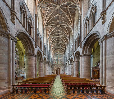 The nave looking west
 -
 The choir
 -
 The lady chapel


- Reason
- All four images are interesting and very detailed views of Hereford Cathedral's nave, choir and lady chapel respectively. I think the view of the choir is particularly beautiful.
- Articles in which this image appears
- Hereford Cathedral
- FP category for this image
- Wikipedia:Featured pictures/Places/Interiors
- Creator
- User:Diliff
- Support as nominator – Ðiliff «» (Talk) 21:30, 4 August 2014 (UTC)
- When I hear Herford, I think SAS... but that's from being a Tom Clancy fan Comment - The nave, looking east, seems to lean outwards on the lefthand side (my issue here). There's a bit of warping near the edges, but considering the apparent angle that's okay (and it's only really distracting when you look at the heads on the wall). Is the actual church not straight? — Crisco 1492 (talk) 00:49, 5 August 2014 (UTC)
- It's rare for these churches to be perfectly straight and the columns are of the Norman era; it's fundamentally a 12th century building, although various ruins and other disasters make it a bit of a mishmash of styles. I'm not sure what you mean by the nave looking east seeming to lean outwards though. Do you mean the columns or the walls behind the columns? The columns appear to bulge ever so slightly in the middle, but fundamentally appear straight to me (no significant lean). Did you measure the lean or was it just a visual perception of lean? Ðiliff «» (Talk) 07:59, 5 August 2014 (UTC)
- No, not measured. I think the appearance of a lean in the thumbnail is coming from the contrast between how three and a third panes of glass are visible in the left side whereas only three (and a tenth, if I'm feeling generous) are visible on the right; were you perhaps slightly off center? This may also be the lack of contrast between the white windows and grey columns/walls. That being said, if there is lean it's negligible at full size (measuring it, I see the bulge, but no real lean) and the technical quality on all of the images is up to your usual standard. — Crisco 1492 (talk) 08:34, 5 August 2014 (UTC)
- These inconsistencies in the symmetry are a continual bane of my work. Sometimes, yes, it's because I wasn't quite centred properly, sometimes it's because the building itself, or the seating in the nave, etc is not centred properly. It only takes a few centimetres off-centre to really mess with the symmetry, particularly because the wider the view, the more prominent it becomes. Sometimes the columns themselves are not precisely aligned or are staggered on each side, and it could be the case in this image (or it could be that the window is not aligned with its opposite). Another frustrating thing is that the nave and choir/presbytery/chancel are often not along exactly the same axis. I just got back from part II of my Cathedrals project (working on the photos currently) and there were some great examples of this. You would expect to be able to look down the aisle of the nave and straight through the middle to the end of the cathedral, but quite often they deviate slightly, either angled away or at the same angle as the nave but off centred. I actually mentioned it to one of the volunteer guides at a cathedral and she, with a twinkle in her eye, said that it is usually explained as representing the figure of Christ on the cross (as most cathedrals are cross-shaped when seen from above), slumped to one side! I suggested back to her that it could be a convenient excuse for poor surveying and she agreed. Anyway, I digress, but perfect symmetry is usually little more than an ideal. Ðiliff «» (Talk) 09:14, 5 August 2014 (UTC)
- Sounds like it! If I'm ever in Europe, I'll have to take a look at some of these old churches. They are all quite beautiful – even if they're a little off centre.
 — Crisco 1492 (talk) 12:20, 5 August 2014 (UTC)
- Sounds like it! If I'm ever in Europe, I'll have to take a look at some of these old churches. They are all quite beautiful – even if they're a little off centre.
- These inconsistencies in the symmetry are a continual bane of my work. Sometimes, yes, it's because I wasn't quite centred properly, sometimes it's because the building itself, or the seating in the nave, etc is not centred properly. It only takes a few centimetres off-centre to really mess with the symmetry, particularly because the wider the view, the more prominent it becomes. Sometimes the columns themselves are not precisely aligned or are staggered on each side, and it could be the case in this image (or it could be that the window is not aligned with its opposite). Another frustrating thing is that the nave and choir/presbytery/chancel are often not along exactly the same axis. I just got back from part II of my Cathedrals project (working on the photos currently) and there were some great examples of this. You would expect to be able to look down the aisle of the nave and straight through the middle to the end of the cathedral, but quite often they deviate slightly, either angled away or at the same angle as the nave but off centred. I actually mentioned it to one of the volunteer guides at a cathedral and she, with a twinkle in her eye, said that it is usually explained as representing the figure of Christ on the cross (as most cathedrals are cross-shaped when seen from above), slumped to one side! I suggested back to her that it could be a convenient excuse for poor surveying and she agreed. Anyway, I digress, but perfect symmetry is usually little more than an ideal. Ðiliff «» (Talk) 09:14, 5 August 2014 (UTC)
- No, not measured. I think the appearance of a lean in the thumbnail is coming from the contrast between how three and a third panes of glass are visible in the left side whereas only three (and a tenth, if I'm feeling generous) are visible on the right; were you perhaps slightly off center? This may also be the lack of contrast between the white windows and grey columns/walls. That being said, if there is lean it's negligible at full size (measuring it, I see the bulge, but no real lean) and the technical quality on all of the images is up to your usual standard. — Crisco 1492 (talk) 08:34, 5 August 2014 (UTC)
- It's rare for these churches to be perfectly straight and the columns are of the Norman era; it's fundamentally a 12th century building, although various ruins and other disasters make it a bit of a mishmash of styles. I'm not sure what you mean by the nave looking east seeming to lean outwards though. Do you mean the columns or the walls behind the columns? The columns appear to bulge ever so slightly in the middle, but fundamentally appear straight to me (no significant lean). Did you measure the lean or was it just a visual perception of lean? Ðiliff «» (Talk) 07:59, 5 August 2014 (UTC)
- Support set. Another great church interior. — Crisco 1492 (talk) 08:34, 5 August 2014 (UTC)
- Support set. A fantasy scenery. Brandmeistertalk 09:01, 6 August 2014 (UTC)
- I suppose the only thing that the third image is lacking is a throne made of swords... ;-) Ðiliff «» (Talk) 09:06, 6 August 2014 (UTC)
- Apparently:) Brandmeistertalk 09:16, 6 August 2014 (UTC)
- I suppose the only thing that the third image is lacking is a throne made of swords... ;-) Ðiliff «» (Talk) 09:06, 6 August 2014 (UTC)
- Oppose I didn't check them all in detail, but I think the processing needs to be toned down here, especially since EV wins over anything else here. It really has a strong "HDRish" signature, and I've checked that the cathedral doesn't necessarily look like that. The choir, which can be seen on the "nave looking east" and eponym pictures doesn't look consistent ; do I miss something? - Blieusong (talk) 18:00, 6 August 2014 (UTC)
- I think maybe you are missing something because I don't think it does look particularly HDRish. I mean, it is HDR, but doesn't look like typical overdone HDR renderings IMO. It's hard to compare directly to other images because these cathedrals look very different depending on the lighting conditions (direction and angle of sunlight, which lights are turned on etc). But here is an image of the nave, and I think it looks extremely similar. The only significant difference is that the choir lights are not turned on in my image. Regarding the inconsistent look of the choir between the nave shot and the choir image, I'm not sure. I don't think it's related to the processing though. I suspect that they have turned on the choir lighting between the nave shot and the choir shot, which has changed the white balance requirements. When there is a strong orange incandescent lighting, I usually reduce the white balance colour temperature so that it isn't so overwhelmingly orange. This has the effect of making the ambient light more blue. So basically, I think the difference is mainly due to the lighting changes and then the white balance changes to compensate for this. I haven't processed this image any differently to all the others. Yes, that doesn't mean that processing couldn't end up being too strong, but I look at these images and I don't think they misrepresent. I could go back and find the middle exposures and stitch it again using them and see if it ends up looking like the HDR version (but obviously with darker shadows and blown highlights) if that would help. Ðiliff «» (Talk) 20:54, 6 August 2014 (UTC)
- OK, here's the completely unprocessed, middle exposure stitch. As I said, the only adjustment that was made in Lightroom was the white balance adjustment of the RAW files prior to export. Everything else is 100% defaults, including linear tone curve (most people have medium contrast but I prefer to use linear for my tone mapping) for a slightly flatter contrast. I don't think it looks that different to the image on Wikipedia to be honest. It's slightly more vivid (which I think is mainly because the overexposed areas are recovered and therefore appear to have more saturation), there's a bit more contrast and there's more detail in the shadows as you would expect. If I could give myself any criticism over this image, it might be the slightly overly saturated blue reflection on the right side of the choir stalls which is the result of the mixed lighting and the white balance compromise, but other than that, it's got the same tonality IMO. Your thoughts? Ðiliff «» (Talk) 21:32, 6 August 2014 (UTC)
- I'm at work now, so this is a quick check, but two things : you're probably right that the inconsistency comes from the lights turned on between shots ; and the less processed shot looks much better IMO because of less saturation, but mainly because of less "clarity LR slider" effect (that HDRish thing I meant). I would offset WB towards warmer side as well to make up for the blue light on the sides, but maybe it just looked like that right then. You know better than me ;) I'll have a more careful look at it tonight if you still mind. - Blieusong (talk) 07:08, 7 August 2014 (UTC)
- I hadn't touched the clarity slider (but that isn't really the same thing as HDR, they both play with local contrast but not necessarily in the same way as Photomatix or similar). What you're describing is probably just a general boost in contrast (which as Colin pointed out in another nomination, also increases saturation as a by-product). I tried warming up the WB but it didn't work at all (which is probably why I didn't use it originally), it just washed out the colours and gave it an unpleasant yellow cast. What I've done instead is reduced the saturation of the blues and darkened the choir stalls. I think this has improved things. I've uploaded this over the top of the existing image. It hasn't fundamentally changed the tonality though, so you might still have an issue with that. But to be honest, I don't, and don't really want to change it too much, I think the single exposure stitch looks too flat. Ðiliff «» (Talk) 09:54, 7 August 2014 (UTC)
- Yes, I really meant it has a similar effect as the Clarity slider (which seems to increase contrast only on the mid tones). Understand you don't want to alter it. I still think it's behind the "too HDRish" line (as least as much as the nom on Commons you comment on), see [1] for comparison. - Blieusong (talk) 17:43, 8 August 2014 (UTC)
- My issue with the nom on Commons (here's the link for others who are trying to follow) isn't simply that it was 'too much HDR', it was the more about the method he was using to processing it. The tonality is completely different to mine. That Hereford Cathedral image that you linked to isn't nearly as bad as some of them and although I would say it's slightly too bright, I probably wouldn't oppose that one. But his HDR processing is very inconsistent. Some of them aren't too bad (although the stained glass is almost always a pale blue and with a sort of halo softness around it, probably due to coma from the lens I guess), but some of them are just really not nice. The trouble with HDR is that it's really hard to explain in words why something looks good or doesn't. If you can't see the difference in tonality between my images and his, well.. I can't explain it, but I see it. :-) Maybe you see something with my images that I don't see. Anyway, I don't want this discussion to be about his photography as it's a bit inappropriate to be criticising them in response to your critique of mine! Ðiliff «» (Talk) 23:40, 8 August 2014 (UTC)
- I don't think you're personally aiming at author, so it's fine (in my view anyways). Yes, it's a very difficult thing to explain, especially in a language which I'm not native with... ;) I do also HDR, so I have an idea of what the signature of overdone HDR is, but can't really explain either. For the sake of EV, maybe a good practice to introduce would be to show a processed picture side by side with an unprocessed one (taken with very neutral setting) for future noms. - Blieusong (talk) 10:48, 10 August 2014 (UTC)
- Your English is very close to native. I never have any problem understanding you, although occasionally I can see that you (along with most other non-English speakers) use words that would be considered correct but unusual to native English speakers. ;-) I don't think it's really a good idea to do a side by side comparison with unprocessed images though. As well as being extremely time-consuming to do for every image I create, there is a slight bad faith element to it, that anyone would have to continually justify their artistic and technical choices and prove that they aren't misrepresenting a scene. I'm happy to show my Lightroom settings or an unprocessed version of my image when I feel it's important for the discussion (such as here), but I'm not prepared to do that for every image to preempt assertions that my photos are not representative. In any case, unprocessed images are often not representative either, they're just a baseline to compare changes to. It is usually the case that processed images are actually more accurate in terms of representing what the eye sees (I should add some caveats though: When processed by someone who intends to represent a scene accurately, and who has an understanding of how to do so!). Ðiliff «» (Talk) 12:05, 10 August 2014 (UTC)
- Thank you. It's a bit easier when writing (Google translate is my friend ;)). Yes after a second thought, I think it's not necessary, and this can be done on per case basis when needed (as you did here). Also, "overdone HDR" being a rather subjective issue, it's resolved by this very voting process. I think it's slightly overdone here, other reviewers don't think so. I'm fine with that. btw I agree that an unprocessed picture may not be representative, and that non HDR can be overcooked as well. As you mentionned the unprocessed pic would only serve as a reference, which I think helps a lot to tell if one went too far or not. Enough digressing from me... - Blieusong (talk) 12:04, 11 August 2014 (UTC)
- I always welcome your comments and have a lot of respect for them, even if you are often more critical than most. I appreciate that. Yes, it seems that others don't agree that it's overdone, but with so few voters on the English FPC, it's difficult to know for sure. As it stands now, it will fail to be promoted, not because of your oppose vote but because of insufficient votes from everyone else! Ðiliff «» (Talk) 14:10, 11 August 2014 (UTC)
- I consider a duty to be critical and demanding, this is FPC after all ;) and it shouldn't end up like something à la Facebook where reviewers would only raise their thumb up. But I hope I don't have bad faith. Also, you are greatly responsible for the bar set so high! I don't know the promotion thresholds on en:FPC, but maybe they should be lowered down given the decline of contributors on Wikipedia in general. - Blieusong (talk) 21:17, 11 August 2014 (UTC)
- I always welcome your comments and have a lot of respect for them, even if you are often more critical than most. I appreciate that. Yes, it seems that others don't agree that it's overdone, but with so few voters on the English FPC, it's difficult to know for sure. As it stands now, it will fail to be promoted, not because of your oppose vote but because of insufficient votes from everyone else! Ðiliff «» (Talk) 14:10, 11 August 2014 (UTC)
- Thank you. It's a bit easier when writing (Google translate is my friend ;)). Yes after a second thought, I think it's not necessary, and this can be done on per case basis when needed (as you did here). Also, "overdone HDR" being a rather subjective issue, it's resolved by this very voting process. I think it's slightly overdone here, other reviewers don't think so. I'm fine with that. btw I agree that an unprocessed picture may not be representative, and that non HDR can be overcooked as well. As you mentionned the unprocessed pic would only serve as a reference, which I think helps a lot to tell if one went too far or not. Enough digressing from me... - Blieusong (talk) 12:04, 11 August 2014 (UTC)
- Your English is very close to native. I never have any problem understanding you, although occasionally I can see that you (along with most other non-English speakers) use words that would be considered correct but unusual to native English speakers. ;-) I don't think it's really a good idea to do a side by side comparison with unprocessed images though. As well as being extremely time-consuming to do for every image I create, there is a slight bad faith element to it, that anyone would have to continually justify their artistic and technical choices and prove that they aren't misrepresenting a scene. I'm happy to show my Lightroom settings or an unprocessed version of my image when I feel it's important for the discussion (such as here), but I'm not prepared to do that for every image to preempt assertions that my photos are not representative. In any case, unprocessed images are often not representative either, they're just a baseline to compare changes to. It is usually the case that processed images are actually more accurate in terms of representing what the eye sees (I should add some caveats though: When processed by someone who intends to represent a scene accurately, and who has an understanding of how to do so!). Ðiliff «» (Talk) 12:05, 10 August 2014 (UTC)
- I don't think you're personally aiming at author, so it's fine (in my view anyways). Yes, it's a very difficult thing to explain, especially in a language which I'm not native with... ;) I do also HDR, so I have an idea of what the signature of overdone HDR is, but can't really explain either. For the sake of EV, maybe a good practice to introduce would be to show a processed picture side by side with an unprocessed one (taken with very neutral setting) for future noms. - Blieusong (talk) 10:48, 10 August 2014 (UTC)
- My issue with the nom on Commons (here's the link for others who are trying to follow) isn't simply that it was 'too much HDR', it was the more about the method he was using to processing it. The tonality is completely different to mine. That Hereford Cathedral image that you linked to isn't nearly as bad as some of them and although I would say it's slightly too bright, I probably wouldn't oppose that one. But his HDR processing is very inconsistent. Some of them aren't too bad (although the stained glass is almost always a pale blue and with a sort of halo softness around it, probably due to coma from the lens I guess), but some of them are just really not nice. The trouble with HDR is that it's really hard to explain in words why something looks good or doesn't. If you can't see the difference in tonality between my images and his, well.. I can't explain it, but I see it. :-) Maybe you see something with my images that I don't see. Anyway, I don't want this discussion to be about his photography as it's a bit inappropriate to be criticising them in response to your critique of mine! Ðiliff «» (Talk) 23:40, 8 August 2014 (UTC)
- Yes, I really meant it has a similar effect as the Clarity slider (which seems to increase contrast only on the mid tones). Understand you don't want to alter it. I still think it's behind the "too HDRish" line (as least as much as the nom on Commons you comment on), see [1] for comparison. - Blieusong (talk) 17:43, 8 August 2014 (UTC)
- I hadn't touched the clarity slider (but that isn't really the same thing as HDR, they both play with local contrast but not necessarily in the same way as Photomatix or similar). What you're describing is probably just a general boost in contrast (which as Colin pointed out in another nomination, also increases saturation as a by-product). I tried warming up the WB but it didn't work at all (which is probably why I didn't use it originally), it just washed out the colours and gave it an unpleasant yellow cast. What I've done instead is reduced the saturation of the blues and darkened the choir stalls. I think this has improved things. I've uploaded this over the top of the existing image. It hasn't fundamentally changed the tonality though, so you might still have an issue with that. But to be honest, I don't, and don't really want to change it too much, I think the single exposure stitch looks too flat. Ðiliff «» (Talk) 09:54, 7 August 2014 (UTC)
- I'm at work now, so this is a quick check, but two things : you're probably right that the inconsistency comes from the lights turned on between shots ; and the less processed shot looks much better IMO because of less saturation, but mainly because of less "clarity LR slider" effect (that HDRish thing I meant). I would offset WB towards warmer side as well to make up for the blue light on the sides, but maybe it just looked like that right then. You know better than me ;) I'll have a more careful look at it tonight if you still mind. - Blieusong (talk) 07:08, 7 August 2014 (UTC)
- OK, here's the completely unprocessed, middle exposure stitch. As I said, the only adjustment that was made in Lightroom was the white balance adjustment of the RAW files prior to export. Everything else is 100% defaults, including linear tone curve (most people have medium contrast but I prefer to use linear for my tone mapping) for a slightly flatter contrast. I don't think it looks that different to the image on Wikipedia to be honest. It's slightly more vivid (which I think is mainly because the overexposed areas are recovered and therefore appear to have more saturation), there's a bit more contrast and there's more detail in the shadows as you would expect. If I could give myself any criticism over this image, it might be the slightly overly saturated blue reflection on the right side of the choir stalls which is the result of the mixed lighting and the white balance compromise, but other than that, it's got the same tonality IMO. Your thoughts? Ðiliff «» (Talk) 21:32, 6 August 2014 (UTC)
- I think maybe you are missing something because I don't think it does look particularly HDRish. I mean, it is HDR, but doesn't look like typical overdone HDR renderings IMO. It's hard to compare directly to other images because these cathedrals look very different depending on the lighting conditions (direction and angle of sunlight, which lights are turned on etc). But here is an image of the nave, and I think it looks extremely similar. The only significant difference is that the choir lights are not turned on in my image. Regarding the inconsistent look of the choir between the nave shot and the choir image, I'm not sure. I don't think it's related to the processing though. I suspect that they have turned on the choir lighting between the nave shot and the choir shot, which has changed the white balance requirements. When there is a strong orange incandescent lighting, I usually reduce the white balance colour temperature so that it isn't so overwhelmingly orange. This has the effect of making the ambient light more blue. So basically, I think the difference is mainly due to the lighting changes and then the white balance changes to compensate for this. I haven't processed this image any differently to all the others. Yes, that doesn't mean that processing couldn't end up being too strong, but I look at these images and I don't think they misrepresent. I could go back and find the middle exposures and stitch it again using them and see if it ends up looking like the HDR version (but obviously with darker shadows and blown highlights) if that would help. Ðiliff «» (Talk) 20:54, 6 August 2014 (UTC)
- Comment — I'm not conversant in these technical processing issues, but to my (inexpert) eye the colors do look rather bright. Sca (talk) 14:12, 12 August 2014 (UTC)
- Do they? The term you're looking for is saturated, I think. Brightness refers to the luminosity. I haven't adjusted the colours except in the choir image, where I actually reduced the saturation. I think that overall, the colours are largely quite muted to be honest. Most of the interior is grey stone. There is some yellowy light coming in from the stained glass windows in the nave photos. Really the only particularly saturated colours are in the choir image, where the orangy incandescent lights are pointing upwards at the ceiling. Ðiliff «» (Talk) 17:22, 12 August 2014 (UTC)
- Perhaps one has been used to more somber church interiors. Certainly a majestic structure of medieval origin. Sca (talk) 17:42, 12 August 2014 (UTC)
- After Blieusong's concern I also started to feel some HDR, but will not retract my support. The file info, however, should mention it in featurable pics, I think. Brandmeistertalk 19:13, 12 August 2014 (UTC)
- Not that I'm discounting what Blieusong has said (although I still disagree about the extent of the HDRness) but I wondered if that discussion would cloud other people's opinion on the matter. The processing used in these images is basically exactly the same as that used in all my recent interior images (which are virtually all HDR). I appreciate that it would be useful to know that it is HDR, but on the other hand, most people don't explain all the other little processing adjustments that they apply to an image... Why is HDR the exception? Hypothetically, if tomorrow, Nikon or Canon release a new camera with 25 stops of dynamic range (most modern DSLRs only have about 12 stops), then we will essentially have a camera that will output what constitutes HDR today. I'm only using that as an example to explain that there isn't anything really magical about HDR (although sometimes, the results do look about otherworldly). HDR can be subtle and it can be garish, depending on how it is used. I happen to think that my images are at the subtle end of the scale, so that's why I'm loathe to simply define my images as HDR when there is such a stigma attached to the word from poor attempts by people in the past. Ðiliff «» (Talk) 19:58, 12 August 2014 (UTC)
- Wrt the consistent processing, I personally found out that a very same recipe can yield both realistic and kitsch results depending on raw material. This may explain I'm opposing here while I found most of your other interiors very good. Or It's me, but there's nothing one can do then. - Blieusong (talk) 18:49, 14 August 2014 (UTC)
- Nobody else is willing cast a vote, either for or against? It's sad when a nomination fails through lack of response rather than any clear mandate. Ðiliff «» (Talk) 17:54, 14 August 2014 (UTC)
Not Promoted --Armbrust The Homunculus 21:32, 14 August 2014 (UTC)
Calton Hill
Voting period is over. Please don't add any new votes. Voting period ends on 15 Aug 2014 at 01:12:18 (UTC)
- Reason
- Very encyclopedic image of a very busy hilltop. Well composed, good technical quality.
- Articles in which this image appears
- Calton Hill, National Monument of Scotland, Nelson Monument, Edinburgh
- FP category for this image
- Wikipedia:Featured pictures/Places/Urban, I guess
- Creator
- Saffron Blaze
- Support as nominator – — Crisco 1492 (talk) 01:12, 5 August 2014 (UTC)
- Support One of the classic sights of Edinburgh. Maybe a smidgen on the dark side, though. - I live in Edinburgh, and it's a pretty familiar sight. Adam Cuerden (talk) 01:17, 5 August 2014 (UTC)
- Neutral. For what is fundamentally a landscape image, I find the lighting quite unappealing, and as Adam Cuerden said, it's a little dark. It also seems like the colour balance is a little confused too, as the sun seems quite low on the horizon but the tint is a little too cool. All that would be needed to improve on this image is to revisit when the lighting is more conducive, so I'm not sure I can support it when it's so easily reproducible in a more aesthetic way. Ðiliff «» (Talk) 08:11, 5 August 2014 (UTC)
- Support I like it. Nice light. --Alchemist-hp (talk) 07:05, 7 August 2014 (UTC)
- Oppose It's a worthy subject, but this is not a good capture of it. It is rather dark and also rather lacking in fine detail. In a daylight landscape image at a location that allows for tripod use, I find this difficult to explain away. As a minor quibble, the chosen angle has also made for a rather messy separation of foreground and background. I think this could be improved. Samsara (FA • FP) 20:14, 8 August 2014 (UTC)
- Given the landscape, a better angle is difficult; the only other good view is from North Bridge, and it only shows some of the structures. Adam Cuerden (talk) 23:57, 8 August 2014 (UTC)
- Vertical angle. Samsara (FA • FP) 04:54, 9 August 2014 (UTC)
- Yeah... that's not really changeable. Salisbury Crag is a cliff on the side facing Calton Hill. There might be some other place you could photograph from, but offhand, I can't think of anywhere tall enough to see the structures, but substantially different in height. Adam Cuerden (talk) 23:55, 10 August 2014 (UTC)
- Vertical angle. Samsara (FA • FP) 04:54, 9 August 2014 (UTC)
- Given the landscape, a better angle is difficult; the only other good view is from North Bridge, and it only shows some of the structures. Adam Cuerden (talk) 23:57, 8 August 2014 (UTC)
- Support - Seems just a bit on the dark side, but I like the perspective and composition (EV).--Godot13 (talk) 02:29, 9 August 2014 (UTC)
Not Promoted --Armbrust The Homunculus 03:54, 15 August 2014 (UTC)
Halftone diagram
Voting period is over. Please don't add any new votes. Voting period ends on 15 Aug 2014 at 04:10:39 (UTC)

- Reason
- A very useful diagram illustrating roughly how color halftoning works.
- Articles in which this image appears
- Halftone, CMYK color model (just added)
- FP category for this image
- Wikipedia:Featured pictures/Diagrams, drawings, and maps/Diagrams
- Creator
- Original by Pbroks13
- Support as nominator – — Crisco 1492 (talk) 04:10, 5 August 2014 (UTC)
- Support Very clearly demonstrates CMYK. --Janke | Talk 06:11, 5 August 2014 (UTC)
- Support. Excellent diagram. Clear, aesthetically pleasing and interesting too. Ðiliff «» (Talk) 08:03, 5 August 2014 (UTC)
- Support. Illustrates the topic particularly well. --Paul_012 (talk) 18:26, 5 August 2014 (UTC)
- Support Good EV. --Godot13 (talk) 22:17, 5 August 2014 (UTC)
- Comment: This is more modern half-toning; it might be worth noting that early halftoning could be aesthetically rather different. Partially down to screen angles, partially due to dot shapes. Adam Cuerden (talk) 04:33, 6 August 2014 (UTC)
- Will note in the blurb here and article. — Crisco 1492 (talk) 10:00, 6 August 2014 (UTC)
- Thanks! Adam Cuerden (talk) 10:33, 6 August 2014 (UTC)
- Comment. I don't understand the use of the "approximately equal to" sign. 86.167.125.78 (talk) 23:25, 9 August 2014 (UTC)
- Depending on laptop settings, it might be off by a very small margin, hence "approximately". It's possible to verify, though a bit difficult. On my laptop, I had to open the image at minimum size, downsize it in Firefox (CTRL + - ), then stand on the other side of the room. It looked the same to me. — Crisco 1492 (talk) 00:04, 10 August 2014 (UTC)
- Well, mapping an RGB display to CMYK colours is a whole different ball game. None of the separation illustrations are proper CMYK colours (arguably with the exception of K), and they only work as an approximation and because our eyes don't resolve the individual RGB elements. By that token all the panels should have the same "approximately equal" caveat. I think the diagram only works at all if we assume that everything is through the same RGB "filter" that shows us the best approximation on our RGB screens of the actual process. — Preceding unsigned comment added by 86.167.125.78 (talk) 00:16, 10 August 2014 (UTC)
- I think you're getting a bit too far. The "approx equals" sign just mean that it looks like that from far enough, but it's not really like that when looked at closely. No fussy RGB conversion or other here: this doesn't detract us from understanding the actual process. - Blieusong (talk) 21:47, 11 August 2014 (UTC)
- You seem to have misunderstood. I'm not "getting a bit too far"; in fact I was actually countering the suggestion by someone else that the use of the symbol was to do with monitor settings. I don't understand your comment "no fussy RGB conversion". Clearly there is an RGB conversion. 86.190.237.29 (talk) 00:34, 14 August 2014 (UTC)
- Strong support Clear, clean. I don't think it was necessary to have the operators overlapping the squares, but they don't really distract either. A little technical issue: the PNG renderings don't seem to come from the SVG, but from an enlarged bitmapped version of it. - Blieusong (talk) 11:50, 11 August 2014 (UTC)
Promoted File:Halftoningcolor.svg --Armbrust The Homunculus 04:15, 15 August 2014 (UTC)
Princess Aswathy Thirunal Gowri Lakshmi Bayi
Voting period is over. Please don't add any new votes. Voting period ends on 15 Aug 2014 at 05:14:31 (UTC)

- Reason
- A rare free picture of the popular writer. Good composition and very good encyclopedic value.
- Articles in which this image appears
- Aswathi Thirunal Gowri Lakshmi Bayi
- FP category for this image
- Wikipedia:Featured pictures/People/Artists and writers
- Creator
- Augustus Binu
- Support as nominator – Bellus Delphina talk 05:14, 5 August 2014 (UTC)
- Technically, it's quite good... but her expression seems quite forced and uncomfortable. — Crisco 1492 (talk) 05:19, 5 August 2014 (UTC)
- Crisco I think, this is the better one I can have because she came for a celebration and was on the stage, listening to a speech, I mean she was a bit far. I have another one too but I din feel to upload it because the wrinkled neck may spoil the technical sides of the photograph. Bellus Delphina talk 05:31, 5 August 2014 (UTC)
- 210 mm... I'll say that's quite far. Not too sure about the expression though. Let's see what others think. — Crisco 1492 (talk) 05:38, 5 August 2014 (UTC)
- Crisco I think, this is the better one I can have because she came for a celebration and was on the stage, listening to a speech, I mean she was a bit far. I have another one too but I din feel to upload it because the wrinkled neck may spoil the technical sides of the photograph. Bellus Delphina talk 05:31, 5 August 2014 (UTC)
- Oppose. The expression is unfortunate. I appreciate that there were constraints (as there usually are) on getting a good photo, but it's just not one of our best portraits unfortunately. Ðiliff «» (Talk) 15:08, 5 August 2014 (UTC)
Not Promoted --Armbrust The Homunculus 06:28, 15 August 2014 (UTC)
Tape recorder
Voting period is over. Please don't add any new votes. Voting period ends on 17 Aug 2014 at 03:15:08 (UTC)

- Reason
- Good quality, encyclopedic image
- Articles in which this image appears
- Compact Cassette
- FP category for this image
- Wikipedia:Featured pictures/Engineering and technology/Electronics
- Creator
- Evan-Amos (very small edit by Crisco 1492)
- Support as nominator – — Crisco 1492 (talk) 03:15, 7 August 2014 (UTC)
- Support Adam Cuerden (talk) 14:45, 11 August 2014 (UTC)
- Support : Bellus Delphina talk 13:48, 15 August 2014 (UTC)
- Support--Godot13 (talk) 21:36, 16 August 2014 (UTC)
Not Promoted --Armbrust The Homunculus 05:10, 17 August 2014 (UTC)
- Not enough support for promotion. Armbrust The Homunculus 05:10, 17 August 2014 (UTC)
Portrait of Mrs Richard Brinsley Sheridan
Voting period is over. Please don't add any new votes. Voting period ends on 17 Aug 2014 at 10:31:11 (UTC)


- Reason
- Quality image with good E.V. - the colours are very near the original colours of the artwork
- Articles in which this image appears
- Mrs. Richard Brinsley Sheridan (painting)
- FP category for this image
- Wikipedia:Featured pictures/Artwork/Paintings
- Creator
- Thomas Gainsborough
- Support either as nominator – SagaciousPhil - Chat 10:31, 7 August 2014 (UTC)]
Oppose Great painting, but there's issues with the reproduction - lots of artefacts, and, as it's a Yorck Project scan, it's highly likely the colours are off. I'd like to see this painting featured, but we'll need a better photo. Adam Cuerden (talk) 17:35, 7 August 2014 (UTC)Oppose original, support NGA copy. Just look at it: It's gorgeous, and the NGA wants them to be used. (And now you see why we don't tend to promote Yorck Project copies at FPC) Adam Cuerden (talk) 06:43, 8 August 2014 (UTC)
- Ace, brilliant - thank you, Adam! Do I need to change my above support to the NGA version? SagaciousPhil - Chat 08:41, 8 August 2014 (UTC)]
- Probably wouldn't hurt, but I think Armbrust can figure it out. =) Adam Cuerden (talk) 10:30, 8 August 2014 (UTC)
- Regarding Adam's recent enthusiasm for the NGA high resolution pics, they've been out for more than a year now and were highly publicised at the time [2]. I for one have been uploading their images to Commons, and I assume [redacted]'s recent Fragonard image came from the same source. There are 25,000 such images and it raises a point I've made before - these high resolution are now two a penny (the Prado, the Rijks and many others are similar examples of museums now offering high resolution images, even Getty offers them). Are we really going to Feature them all? Does it really depend just on the personal whims of editors? What we really are in some need of here is attention to the same kinds of details regarding fidelity and scholarship we see amongst the photographers regarding technical issues. At the moment that's not happening. Coat of Many Colours (talk) 06:35, 14 August 2014 (UTC)
- Probably wouldn't hurt, but I think Armbrust can figure it out. =) Adam Cuerden (talk) 10:30, 8 August 2014 (UTC)
- Ace, brilliant - thank you, Adam! Do I need to change my above support to the NGA version?
- Shame I can't find this on Google Art Project. — Crisco 1492 (talk) 00:14, 8 August 2014 (UTC)
- Support NGA version, please! — Crisco 1492 (talk) 07:00, 8 August 2014 (UTC)
- Support, for NGA copy. Fylbecatulous talk 08:16, 11 August 2014 (UTC)
- Support NGA copy, thanks for digging it out. Brandmeistertalk 14:06, 11 August 2014 (UTC)
- Support NGA copy. Nice picture. That's what the discussion should be about, not personal attacks on past editors now driven out of wikipedia by this bullying. Sminthopsis84 (talk) 00:58, 15 August 2014 (UTC)
- Oppose. The article is rather poor, the description of the painting consisting entirely of a lengthy quote from the NGA museum page and failing to address the most basic issue looking at this portrait -- why so sad, why so troubled? Minimal EV. Coat of Many Colours (talk) 23:49, 16 August 2014 (UTC)
- This is FP, not FA. The article doesn't need to be perfect for the picture to be featured. Adam Cuerden (talk) 01:55, 17 August 2014 (UTC)
- The reductio of that would be that it doesn't need an article at all, or at best merely a stub. The issue isn't that the article is not perfect, but that's there's actually nothing to set the Featured Picture in any kind of context to explain its EV. Thus someone clicking though our portfolio of Featured Pictures and wondering why this rather humdrum painting is Featured, is in fact none the wiser on going to its linked articles. Coat of Many Colours (talk) 07:13, 17 August 2014 (UTC)
- There is nothing in the WP:POTD/Unused, but this is not such a case: the article on this painting is enough for a main page blurb. — Crisco 1492 (talk) 08:27, 17 August 2014 (UTC)]
- There is nothing in the
- The reductio of that would be that it doesn't need an article at all, or at best merely a stub. The issue isn't that the article is not perfect, but that's there's actually nothing to set the Featured Picture in any kind of context to explain its EV. Thus someone clicking though our portfolio of Featured Pictures and wondering why this rather humdrum painting is Featured, is in fact none the wiser on going to its linked articles. Coat of Many Colours (talk) 07:13, 17 August 2014 (UTC)
- This is FP, not FA. The article doesn't need to be perfect for the picture to be featured. Adam Cuerden (talk) 01:55, 17 August 2014 (UTC)
Promoted File:Thomas Gainsborough - Mrs. Richard Brinsley Sheridan .jpg --Armbrust The Homunculus 10:39, 17 August 2014 (UTC)
The Washington Family
Voting period is over. Please don't add any new votes. Voting period ends on 17 Aug 2014 at 08:20:49 (UTC)

- Reason
- High quality image about a notable painting = high EV.
- Articles in which this image appears
- The Washington Family (most EV), George Washington, Martha Washington, +7 others
- FP category for this image
- Wikipedia:Featured pictures/Artwork/Paintings
- Creator
- Edward Savage
- Support as nominator – Armbrust The Homunculus 08:20, 7 August 2014 (UTC)
- Support - Very nice... the portrait, at least. The slavery ... obviously not. — Crisco 1492 (talk) 00:10, 8 August 2014 (UTC)
- Support: I don't actually like the art much (rather stiff), but it's a notable painting, and that's enough to give it a load of my-opinion-overruling EV. Adam Cuerden (talk) 07:19, 8 August 2014 (UTC)
- Support- High quality image, notable subject, notable artist = EV. --Godot13 (talk) 02:25, 9 August 2014 (UTC)
- Support - not especially an artistic style I like but it is a good quality image and, as highlighted by others, notable subjects etc etc. SagaciousPhil - Chat 14:27, 12 August 2014 (UTC)]
- Support - Coat of Many Colours (talk) 11:24, 14 August 2014 (UTC)
Promoted File:Edward Savage - The Washington Family - Google Art Project.jpg ----Mdann52talk to me! 15:20, 17 August 2014 (UTC)
Hoodoo
Voting period is over. Please don't add any new votes. Voting period ends on 17 Aug 2014 at 22:53:54 (UTC)
- Reason
- Interesting subject, decent angle (even though there's at least one hoodoo FP already).
- Articles in which this image appears
- Grand Staircase-Escalante National Monument
- FP category for this image
- Places/Landscapes
- Creator
- Ciar
- Support as nominator – Brandmeistertalk 22:53, 7 August 2014 (UTC)
- Comment. Lighting is not great; hard to get any impression of scale. 217.44.215.152 (talk) 03:17, 8 August 2014 (UTC)
- Comment Seems to be a fair bit of noise in the sky, any way to fix that (and get some kind of geo-location)? --Godot13 (talk) 02:21, 9 August 2014 (UTC)
- Oppose I agree with the less than optimal lighting and noise in the sky. I think the angle is decent but not great, plus the photo is less than 2 mb. Fredlyfish4 (talk) 01:10, 15 August 2014 (UTC)
Not Promoted --Armbrust The Homunculus 22:55, 17 August 2014 (UTC)
Soldiers Playing Cards and Dice (The Cheats)
Voting period is over. Please don't add any new votes. Voting period ends on 18 Aug 2014 at 10:55:14 (UTC)
.jpg)
- Reason
- I love the dynamicism of this painting, the wonderful expressions, the fluid positioning, and that the most armoured of the five is also the one that looks the most timid.
- Articles in which this image appears
- Valentin de Boulogne; might be useful in some gambling articles.
- FP category for this image
- Wikipedia:Featured pictures/Artwork/Paintings
- Creator
- Valentin de Boulogne
- Support as nominator – Adam Cuerden (talk) 10:55, 8 August 2014 (UTC)
- Support - Something different. I like it. — Crisco 1492 (talk) 12:24, 8 August 2014 (UTC)
- Support — For illustration of high-contrast tenebrist style — although I have to wonder how all this gambling could be going on without beer & tobacco smoke. Sca (talk) 14:54, 11 August 2014 (UTC)]
- Support – nice composition. SagaciousPhil - Chat 16:32, 12 August 2014 (UTC)]
- Support per Sca. --Hafspajen (talk) 07:01, 18 August 2014 (UTC)
Promoted File:Valentin de Boulogne - Soldiers Playing Cards and Dice (The Cheats).jpg --Armbrust The Homunculus 12:01, 18 August 2014 (UTC)
Yokugo no onna by Goyō Hashiguchi
Voting period is over. Please don't add any new votes. Voting period ends on 18 Aug 2014 at 11:17:02 (UTC)
_Yokugo_no_onna_(cropped_and_compressed)_01.jpg)
- Reason
- Beautiful image by a representative artist of the Shin-hanga movement of woodblock printing in Japan in the 20th century.
- Articles in which this image appears
- Goyō Hashiguchi, Shin-hanga
- FP category for this image
- Wikipedia:Featured pictures/Artwork/East Asian art
- Creator
- Goyō Hashiguchi
- Support as nominator – Curly Turkey ⚞¡gobble!⚟ 11:17, 8 August 2014 (UTC)
- Weak support - I've been looking at Hashiguchi's work, but I seem to have fallen in love with File:Hashiguchi Goyo - Woman in Blue Combing Her Hair - Walters 95880.jpg, which is used fairly well as well but does not have the necessary resolution. That being said, this is still a very good reproduction, and I wouldn't mind it passing... just feel the woman combing her hair would be more representative. — Crisco 1492 (talk) 12:23, 8 August 2014 (UTC)
- @Crisco 1492: There's this, which I'm also going to upload; it's a reprint though, while this Yokugo no onna was done while Hashiguchi was still alive. Do you want to change your !vote? Curly Turkey ⚞¡gobble!⚟ 20:28, 8 August 2014 (UTC)
- Ick, so noisy. — Crisco 1492 (talk) 00:14, 9 August 2014 (UTC)
- It's still better than what we have, though, right? Curly Turkey ⚞¡gobble!⚟ 03:16, 9 August 2014 (UTC)
- Shudder. — Crisco 1492 (talk) 05:45, 9 August 2014 (UTC)
- That can't be a no, can it? I wasn't going to nominate it, but I'm looking at the two files side-by-side and I see it as an enormous improvement. Are my eyes that bad? Curly Turkey ⚞¡gobble!⚟ 09:45, 9 August 2014 (UTC)
- An improvement for articles, yes, but I don't think a modern reproduction would work well in this forum. — Crisco 1492 (talk) 05:54, 10 August 2014 (UTC)
- That can't be a no, can it? I wasn't going to nominate it, but I'm looking at the two files side-by-side and I see it as an enormous improvement. Are my eyes that bad? Curly Turkey ⚞¡gobble!⚟ 09:45, 9 August 2014 (UTC)
- Shudder. — Crisco 1492 (talk) 05:45, 9 August 2014 (UTC)
- It's still better than what we have, though, right? Curly Turkey ⚞¡gobble!⚟ 03:16, 9 August 2014 (UTC)
- Ick, so noisy. — Crisco 1492 (talk) 00:14, 9 August 2014 (UTC)
- @Crisco 1492: There's this, which I'm also going to upload; it's a reprint though, while this Yokugo no onna was done while Hashiguchi was still alive. Do you want to change your !vote? Curly Turkey ⚞¡gobble!⚟ 20:28, 8 August 2014 (UTC)
- Support Like it and good resolution. Brandmeistertalk 16:30, 8 August 2014 (UTC)
Not Promoted --Armbrust The Homunculus 12:05, 18 August 2014 (UTC)
Strandherd-Armstrong Bridge
Voting period is over. Please don't add any new votes. Voting period ends on 18 Aug 2014 at 16:42:19 (UTC)
- Reason
- High quality, good EV, encyclopedic angle for the portraytal of the bridge
- Articles in which this image appears
- Strandherd-Armstrong Bridge
- FP category for this image
- Wikipedia:Featured pictures/Places/Architecture
- Creator
- Saffron Blaze
- Support as nominator – Tomer T (talk) 16:42, 8 August 2014 (UTC)
- Support. Excellent image. Perhaps not the best angle to show the geometry of the bridge in a conventional way, but engaging. Saffron Blaze, I noticed that at 100%, the tail-light ghosts seem to be a bit jagged. Is this the result of the removal of the anti-aliasing filter, or is it processing related? Ðiliff «» (Talk) 17:17, 8 August 2014 (UTC)]
- Support - Excellent. Draws the viewer right in. — Crisco 1492 (talk) 01:03, 9 August 2014 (UTC)
- I've been wanting to do that kind of photo at Tower Bridge for a while.. Maybe this is my inspiration. Not so easy though, you would basically have to stand in the middle of the (quite narrow) road with a tripod ;-) Something a bit like this. Ðiliff «» (Talk) 03:05, 9 August 2014 (UTC)
- There's Commons' "wow" right there, alright. Looks like it'll get your heart pumping too. — Crisco 1492 (talk) 05:44, 9 August 2014 (UTC)
- I've been wanting to do that kind of photo at Tower Bridge for a while.. Maybe this is my inspiration. Not so easy though, you would basically have to stand in the middle of the (quite narrow) road with a tripod ;-) Something a bit like this. Ðiliff «» (Talk) 03:05, 9 August 2014 (UTC)
- Support - First rate photo.--Godot13 (talk) 02:16, 9 August 2014 (UTC)
- Support very nice. --Alchemist-hp (talk) 11:23, 9 August 2014 (UTC)
- Support - Amazing Bellus Delphina talk 07:05, 10 August 2014 (UTC)
- Support Cool. Got to see the construction last year. ///EuroCarGT 18:39, 10 August 2014 (UTC)
- Support - Coat of Many Colours (talk) 11:20, 14 August 2014 (UTC)
Promoted File:Strandherd-Armstrong Bridge.jpeg --Armbrust The Homunculus 16:58, 18 August 2014 (UTC)
SMS Gazelle
Voting period is over. Please don't add any new votes. Voting period ends on 19 Aug 2014 at 10:57:40 (UTC)

- Reason
- Part of a series of lithographs of ships from the Imperial German Navy, admittedly my least-favourite, but given it's the lead image for two good articles and a featured artice, it has EV, at least
- Articles in which this image appears
- SMS Gazelle, Gazelle-class cruiser, List of light cruisers of Germany, etc.
- FP category for this image
- Wikipedia:Featured pictures/Vehicles/Water
- Creator
- Hugo Graf (1844-1914) [Scan by commons:User:Mr.Nostalgic, restoration by Adam Cuerden.]
- Support as nominator – Adam Cuerden (talk) 10:57, 9 August 2014 (UTC)
- Support - Even though I agree the image is not 110%, it undeniably has good EV and is a good representation of the subject. — Crisco 1492 (talk) 13:43, 9 August 2014 (UTC)
- Comment — In previous examples from this series, weren't the (tacky-looking) borders removed? Sca (talk) 14:44, 11 August 2014 (UTC)
- I kind of like the borders, but can remove them if preferred. It's a somewhat slow process. Adam Cuerden (talk) 14:57, 11 August 2014 (UTC)
- Support for its EV (even though I don't like the garish red hull paint), since there apparently are no others of the 10-ship Gazelle class in this series by Hugo Graf. Would prefer no border. Sca (talk) 17:59, 11 August 2014 (UTC)
- I'll start work debordering. Adam Cuerden (talk) 21:49, 11 August 2014 (UTC)
-
- debordering (archaic) - referring to lists made by young bloods at the start of the London coming out season. Coat of Many Colours (talk) 11:19, 14 August 2014 (UTC)
- Support -- Coat of Many Colours (talk) 11:19, 14 August 2014 (UTC)
- Support--Godot13 (talk) 21:35, 16 August 2014 (UTC)
Promoted File:S.M. kleiner kreuzer Gazelle - restoration.jpg --Armbrust The Homunculus 11:01, 19 August 2014 (UTC)
Orion Head to Toe 2
Voting period is over. Please don't add any new votes. Voting period ends on 20 Aug 2014 at 12:57:57 (UTC)

- Reason
- High quality non-NASA image. First nomination failed because of low resolution problems, which are now solved.
- Articles in which this image appears
- Orion Molecular Cloud Complex, Rogelio Bernal Andreo
- FP category for this image
- Wikipedia:Featured pictures/Space/Looking out
- Creator
- Rogelio Bernal Andreo
- Support as nominator – The herald 12:57, 10 August 2014 (UTC)
- Conditional support - if someone can get rid of those black lines above and below Bellatrix... --Janke | Talk 14:46, 10 August 2014 (UTC)
Not Promoted --Armbrust The Homunculus 13:15, 20 August 2014 (UTC)
The Tale of the Bamboo Cutter
Voting period is over. Please don't add any new votes. Voting period ends on 22 Aug 2014 at 04:28:21 (UTC)

- Reason
- High resolution, attractive image.
- Articles in which this image appears
- The Tale of the Bamboo Cutter, Japanese folktales
- FP category for this image
- Wikipedia:Featured pictures/Artwork/East Asian art and Wikipedia:Featured pictures/Artwork/Literary illustrations both work
- Creator
- Unknown
- Support as nominator – — Crisco 1492 (talk) 04:28, 12 August 2014 (UTC)
- Weak support The borders seem to be cropped slightly more compared to the Metmuseum source (particularly, the left border). Since the borders aren't perfectly straight, the small pieces of background left after an accurate crop, may be just turned black, as on some other featured paintings. Brandmeistertalk 08:54, 12 August 2014 (UTC)
- The one we have is the one that the MET made available at the time I uploaded. I wouldn't crop works of art, at least not as hack a job as that. I can crop a bit further if you want. — Crisco 1492 (talk) 09:29, 12 August 2014 (UTC)
- Maybe MET has updated the source since then. Compare, for example, the thin white tree on the left in the source, which is barely visible here. Brandmeistertalk 10:35, 12 August 2014 (UTC)
- I'm pretty sure it's been updated, because I don't remember there being seventy-five scans to download when I went through this. Sadly the Met's "full size" isn't working for me, and I'm afraid I don't see the tree you mention. — Crisco 1492 (talk) 14:45, 12 August 2014 (UTC)
- Maybe MET has updated the source since then. Compare, for example, the thin white tree on the left in the source, which is barely visible here. Brandmeistertalk 10:35, 12 August 2014 (UTC)
- The one we have is the one that the MET made available at the time I uploaded. I wouldn't crop works of art, at least not as hack a job as that. I can crop a bit further if you want. — Crisco 1492 (talk) 09:29, 12 August 2014 (UTC)
- Comment about description. Maybe I am being stupid somehow, but I see nothing resembling "the discovery of baby Princess Kaguya inside the stalk of a glowing bamboo plant". 86.179.112.79 (talk) 11:57, 12 August 2014 (UTC)
- Sorry, my mistake. Fixed. — Crisco 1492 (talk) 14:45, 12 August 2014 (UTC)
- So is the "baby" the thing in the basket? That posture looks very unlike that of a baby to me, but more like that of a young child. Also, she was the size of a thumb when she was found, so I wonder whether this really can be "shortly after"? 86.179.112.79 (talk) 17:26, 12 August 2014 (UTC)
- Sorry, my mistake. Fixed. — Crisco 1492 (talk) 14:45, 12 August 2014 (UTC)
Not Promoted --Armbrust The Homunculus 05:59, 22 August 2014 (UTC)
Wildebeest on migration in East Africa
Voting period is over. Please don't add any new votes. Voting period ends on 22 Aug 2014 at 14:06:53 (UTC)

- Reason
- A high resolution aerial image showing the extraordinary natural phenomenon of migration by Wildebeest in East Africa, used
- Articles in which this image appears
- Wildebeest, Maasai Mara
- FP category for this image
- Animals
- Creator
- T. R. Shankar Raman
- Support as nominator – Shankar Raman (talk) 14:06, 12 August 2014 (UTC)
- Support Interesting. Brandmeistertalk 08:24, 14 August 2014 (UTC)
Not Promoted --Armbrust The Homunculus 14:07, 22 August 2014 (UTC)
ColecoVision
Voting period is over. Please don't add any new votes. Voting period ends on 23 Aug 2014 at 14:20:39 (UTC)

- Reason
- Attractive product shot of an old (yet beloved) video game system.
- Articles in which this image appears
- ColecoVision +4
- FP category for this image
- Wikipedia:Featured pictures/Engineering and technology/Electronics
- Creator
- Evan Amos; very light edit by me.
- Support as nominator – — Crisco 1492 (talk) 14:20, 13 August 2014 (UTC)
- Support This picture brings back a ton of memories. Great picture. No reason it shouldn't be featured. Chambr (talk) 08:04, 14 August 2014 (UTC)
- Support. Looks more like an old fashioned 'portable phone' than a game system! Ðiliff «» (Talk) 09:44, 14 August 2014 (UTC)
- Before the age of ergonomics, sadly ;-). — Crisco 1492 (talk) 15:31, 14 August 2014 (UTC)
- Support - Bellus Delphina talk 13:47, 15 August 2014 (UTC)
- Note This is one of the pictures that never matched my other console photos, because I took it a long time ago at a place without lights and a short lens. I haven't updated it yet because I didn't have the system, and literally just bought one a few days ago so I could retake this picture. Given that, I don't know if I'd vote on it because it will be replaced in a week or two by a much higher quality picture. Evan-Amos (talk) 00:26, 17 August 2014 (UTC)
- We can D&R (delist and replace) if necessary. — Crisco 1492 (talk) 00:31, 17 August 2014 (UTC)
- Although I think this would likely be a FP anyway (if it gets another vote, that is), maybe it's best to suspend the nomination and wait for the replacement? I'm not that bothered if we do go ahead with a delist and replacement but it seems like more admin work than simply suspending. A week or two isn't long. Ðiliff «» (Talk) 11:49, 18 August 2014 (UTC)
- Good idea. I don't mind waiting. Evan? — Crisco 1492 (talk) 13:13, 18 August 2014 (UTC)
- Although I think this would likely be a FP anyway (if it gets another vote, that is), maybe it's best to suspend the nomination and wait for the replacement? I'm not that bothered if we do go ahead with a delist and replacement but it seems like more admin work than simply suspending. A week or two isn't long. Ðiliff «» (Talk) 11:49, 18 August 2014 (UTC)
- We can D&R (delist and replace) if necessary. — Crisco 1492 (talk) 00:31, 17 August 2014 (UTC)
Not Promoted --Armbrust The Homunculus 14:32, 23 August 2014 (UTC)
U.S. Gold Certificates (Series 1882, complete denomination set)
Voting period is over. Please don't add any new votes. Voting period ends on 24 Aug 2014 at 00:15:10 (UTC)
- Reason
- High quality, high EV (presented as a set). A complete denomination set of seven Series 1882 Gold certificates (only five are nominated for FP). There are two $5,000 and $10,000 notes known in other government institution collections. No high resolution image has ever been made available.
Note – The $100 and $1,000 images are already featured. They are part of this nomination only to be included in the set. - Original
- A seven-note complete denomination set of Series 1882 United States Gold Certificate
- Articles in which these images appear
- Gold certificate (all), Large denominations of United States currency(4)
- FP category for this image
- Currency
- Creator
- Bureau of Engraving and Printing
From the National Numismatic Collection, National Museum of American History.
Images by Godot13.
-

$20 James Garfield -

$50
Silas Wright -


-
$500
Abraham Lincoln -

$1,000
Alexander Hamilton


-

$5,000 (specimen)
James Monroe -

$10,000 (specimen)
Andrew Jackson


- Support as nominator – Godot13 (talk) 00:15, 14 August 2014 (UTC)
- Support - Coat of Many Colours (talk) 11:14, 14 August 2014 (UTC)
- Support - more excellent work. — Crisco 1492 (talk) 15:31, 14 August 2014 (UTC)
- Support No-brainer. Brandmeistertalk 10:42, 20 August 2014 (UTC)
- Support. Rreagan007 (talk) 19:57, 21 August 2014 (UTC)
Promoted File:US-$20-GC-1882-Fr-1177.jpg --Armbrust The Homunculus 04:36, 24 August 2014 (UTC)
Promoted File:US-$50-GC-1882-Fr-1195.jpg --Armbrust The Homunculus 04:36, 24 August 2014 (UTC)
Promoted File:US-$500-GC-1882-Fr-1216a.jpg --Armbrust The Homunculus 04:36, 24 August 2014 (UTC)
Promoted File:US-$5000-GC-1882-Fr-1221a.jpg --Armbrust The Homunculus 04:36, 24 August 2014 (UTC)
Promoted File:US-$10000-GC-1882-Fr-1223a.jpg --Armbrust The Homunculus 04:36, 24 August 2014 (UTC)
- Additionally File:US-$100-GC-1882-Fr.1207.jpg and File:US-$1000-GC-1882-Fr.1218g.jpg are also part of the set. Armbrust The Homunculus 04:36, 24 August 2014 (UTC)
Mary Cassatt - Little Girl in a Blue Armchair
Voting period is over. Please don't add any new votes. Voting period ends on 24 Aug 2014 at 11:10:23 (UTC)

- Reason
- Described by Japanism fashion of the time were heavily influenced by Edgar Degas, venerated by Cassatt, who worked on the picture. The dog is a Brussels terrier, a breed that Cassat kept as companion all her life. This first one was purchased for her by Degas, who obtained it from his friend (and dog lover) Ludovic-Napoléon Lepic. Degas' curious painting of him as a flâneur has often been described as influenced by photography in its treatment of negative space, also a feature of Cassatt's painting. The image is amongst the 25,000 or so high resolution images made available last year for educational purposes by the National Gallery of Art, Washington
- Articles in which this image appears
- Little Girl in a Blue Armchair
- FP category for this image
- Wikipedia:Featured pictures/Artwork/Paintings
- Creator
- Mary Cassatt
- Support as nominator – Coat of Many Colours (talk) 11:10, 14 August 2014 (UTC)
- Weak support. I can't say I rate it as a work of art, but what the hell do I know? Weak only because the reproduction could be a bit bigger given the size of the original. J Milburn (talk) 15:47, 17 August 2014 (UTC)
- Comment — There's something awkward about this composition, particularly the subject. Further, it doesn't appear at Mary Cassatt, which includes 27 other works, mostly pleasant, by Cassatt. Sca (talk) 15:28, 20 August 2014 (UTC)
Not Promoted --Armbrust The Homunculus 11:13, 24 August 2014 (UTC)
John Hay
Voting period is over. Please don't add any new votes. Voting period ends on 24 Aug 2014 at 15:42:32 (UTC)

- Reason
- A high-quality early-twentieth century portrait of a statesman, ambassador, and biographer. It's a little ways down the Hay article, but I think it adds a fair bit nonetheless. Adam Cuerden (talk) 15:42, 14 August 2014 (UTC)
- Articles in which this image appears
- John Hay et al.
- FP category for this image
- You could probably quibble as to which subcategory of "people", but I'd say Wikipedia:Featured_pictures/People/Political.
- Creator
- C. M. Gilbert, restored by Adam Cuerden
- Support as nominator – Adam Cuerden (talk) 15:42, 14 August 2014 (UTC)
- Moustache - Erm, Support. Nice restoration. — Crisco 1492 (talk) 23:33, 14 August 2014 (UTC)
- Support - Good deal of background and clothing dirt cleanup, nice job.-Godot13 (talk) 02:11, 21 August 2014 (UTC)
- Support. Rreagan007 (talk) 20:00, 21 August 2014 (UTC)
- Support Quite interesting pose. Brandmeistertalk 08:25, 22 August 2014 (UTC)
Promoted File:C.M. Gilbert. - John Hay, c. 1904.jpg --Armbrust The Homunculus 15:52, 24 August 2014 (UTC)
John Jellicoe
Voting period is over. Please don't add any new votes. Voting period ends on 25 Aug 2014 at 00:31:55 (UTC)
- Reason
- While a bit grainy, it's a fine picture of a notable person, from newspaper archives. And, yes, I should be working on other things, but they were taking ages so I switched to something simpler for a little bit. Plus, it's one of the core topics for WWI, and I want to support Wikipedia:WikiProject Military history/Operation Great War Centennial =)
- Articles in which this image appears
- John Jellicoe, 1st Earl Jellicoe, and as linked in description.
- FP category for this image
- While you could argue political for the New Zealand position, on the whole, I'd say Wikipedia:Featured_pictures/People/Military.
- Creator
- Bain News Service, restoration by Adam Cuerden
- Support as nominator – Adam Cuerden (talk) 00:31, 15 August 2014 (UTC)
- Support - Coat of Many Colours (talk) 04:52, 15 August 2014 (UTC)
- Support — Every inch an admiral of the Royal Navy. Iconic. (And just look at those sleeves!) Sca (talk) 14:20, 15 August 2014 (UTC)
- Support - Yes, grainy, but very useful. — Crisco 1492 (talk) 15:10, 15 August 2014 (UTC)
- Support ///EuroCarGT 04:08, 18 August 2014 (UTC)
- Support - per Crisco. --Godot13 (talk) 02:08, 21 August 2014 (UTC)
Promoted File:John Jellicoe, Admiral of the Fleet.jpg --Armbrust The Homunculus 00:37, 25 August 2014 (UTC)
Vincent van Gogh
Voting period is over. Please don't add any new votes. Voting period ends on 27 Aug 2014 at 03:01:52 (UTC)

- Reason
- I think it's very easy to over-emphasize the super-colourful van Gogh. This is a very good picture, it's subdued, it's relatively realistic, but it still has all the energy of van Gogh's style. It's very easy, with some artists to turn them into caricatures of themselves. So, to keep us a little more grounded, how about a very different self-portrait of van Gogh?
- Articles in which this image appears
- Self-portraits by Vincent van Gogh, Cultural depictions of Vincent van Gogh, Van Gogh Museum, Vincent (opera), Vincent van Gogh chronology
- FP category for this image
- Let's put the relatively realistic depiction under Wikipedia:Featured pictures/People/Artists and writers.
- Creator
- Vincent van Gogh
- Support as nominator – Adam Cuerden (talk) 03:01, 17 August 2014 (UTC)
- Oppose (regretfully). It's certainly calm and assured and valuable on that account for the reasons you put forward. The trouble is that you search in vain for a context for the portrait in Wikipedia. In most of those articles, the portrait has been selected for identification purposes and in the only article Self-portraits by Vincent van Gogh where you might seek EV, it's been passed over bar placing it as an early portrait. At least the Commons file should provide context, as I did at Commons:File:Vincent van Gogh - The Old Tower at Dusk - F40 JH507.jpg for the recent Christie's sale. Coat of Many Colours (talk) 07:51, 17 August 2014 (UTC)]
- Identification purposes is a valid use of an image of an artist. Adam Cuerden (talk) 08:14, 17 August 2014 (UTC)
- Well I'm sure it is. But that is at the whim of editors, who are generally allowed their personal choices. But this not Crazy Vinnie as we and all our mums know him. We do all know the real Vincent with the bandaged ear and staring eyes. You are quite laudable in the reasons you give for featuring the portrait and as I say I support them, but in vain will the reader find any of that in the article links - that in a few of his earliest Paris portraits he seemed uncharacteristically in command of himself. Except he wasn't. Not really. He had come down from Antwerp where he had suffered a breakdown. His teeth were falling out and he was worried about his personal appearance. Within six months his self-portraits betray that familiar haunted look we know so well. For this portrait to have real EV that should be written up in the articles somewhere (and there's also the question of its technical brilliance that should be mentioned and set in the context of his very far from promising start as an artist). At the moment it's not, and that's why I'm opposing. Coat of Many Colours (talk) 12:31, 17 August 2014 (UTC)
- Identification purposes is a valid use of an image of an artist. Adam Cuerden (talk) 08:14, 17 August 2014 (UTC)
- Oppose. I share COMC's concerns, but also echo that this is a regretful oppose, as I really like the work. Perhaps if it was the lead image used for identification purposes in the main Vincent van Gogh article I'd support, but, unsurprisingly, a more famous and recognisable self-portrait is used. J Milburn (talk) 15:40, 17 August 2014 (UTC)
- I'm somewhat inclined to make this the lead image on his article. The more famous work does a much poorer job at showing what Vincent looked like, as it's a lot more abstracted and loosely-composed, and it's probably not even the most famous (I'd say "Self-portrait with straw hat" is more commonly seen, and better composed). This portrait is far better for identification purposes. Adam Cuerden (talk) 07:50, 18 August 2014 (UTC)
- I agree to a certain extent, but the lead image also serves the purpose of showing the artist's style- questions may be raised about the extent to which this one does that (I'm neutral on the issue). I'm going to have to keep my oppose for now, but if the image is stable as a lead image for a few months, I would probably be prepared to support then. J Milburn (talk) 16:21, 18 August 2014 (UTC)
- But should an identification portrait really showcase the artist's style? It could be argued that an identification portrait should have as little 'style' as possible, really, if it in any way detracts from the accuracy of the portrait. Would we use Pablo Picasso's self portrait to identify him? ;-) Ðiliff «» (Talk) 23:57, 18 August 2014 (UTC)
- I certainly have some sympathy for that view- I'm just reporting what I understand to be standard practice with painters. Whether or not we like the practice (I have no strong opinion, and see the merits of both sides) it's going to effect stability, and so we have to be aware of it. J Milburn (talk) 00:10, 19 August 2014 (UTC)
- But should an identification portrait really showcase the artist's style? It could be argued that an identification portrait should have as little 'style' as possible, really, if it in any way detracts from the accuracy of the portrait. Would we use Pablo Picasso's self portrait to identify him? ;-) Ðiliff «» (Talk) 23:57, 18 August 2014 (UTC)
- I agree to a certain extent, but the lead image also serves the purpose of showing the artist's style- questions may be raised about the extent to which this one does that (I'm neutral on the issue). I'm going to have to keep my oppose for now, but if the image is stable as a lead image for a few months, I would probably be prepared to support then. J Milburn (talk) 16:21, 18 August 2014 (UTC)
- I'm somewhat inclined to make this the lead image on his article. The more famous work does a much poorer job at showing what Vincent looked like, as it's a lot more abstracted and loosely-composed, and it's probably not even the most famous (I'd say "Self-portrait with straw hat" is more commonly seen, and better composed). This portrait is far better for identification purposes. Adam Cuerden (talk) 07:50, 18 August 2014 (UTC)
- Support: For the encyclopedic value alone and the fact that this already exists in multiple English Wikipedia articles. I personally think this is the better image for the Van Gogh article, but that not being the issue decided here at the moment, I vote support for this image. Fylbecatulous talk 17:18, 18 August 2014 (UTC)
- It is generally regarded as van Gogh's first self-portrait. The fact that it's not mentioned in the letters is the best indication it and a number of others at the same time date from the Paris period (the brothers having no cause to correspond as they were living together). It's an extremely accomplished portrait, surprisingly so when compared with the life studies he had made at the academy in Antwerp just the year before, but it is frankly rather pedestrian otherwise. He was dressing himself in city clothes at the time to stress his middle-class background, perhaps hoping to restart a conventional career as an art dealer. Marc Edo Tralbaut (his principal biographer) valorises F208a https://commons.wikimedia.org/wiki/File:Van_Gogh_-_Selbstbildnis_mit_dunklem_Filzhut.jpeg much more from this time, and in fact chose it at the dusk jacket picture of his biography, saying of it that Vincent has laid himself bare. And of course he's quite right. F208a is an absolutely magnificent self-portrait, incomparably better than F180 nominated here. Why don't you just try substituting F180 at the van Gogh article? I strongly suspect the long-suffering expert editors there will give you pretty short thrift for your trouble. 81.129.69.67 (talk) 22:02, 18 August 2014 (UTC)
- Ugh. The Vincent Van Gogh article is full of the sort of people who'll change the lead image without warning, then hurl abuse at you if you don't like their undiscussed change, and insist you discuss your change, but not their shitty change. Seriously, I hate the current lead. I think it's easily the worst of Van Gogh's self-portraits, and the long-standing Self portrait with a straw hat lead image is far, far better. But only they have the right to undiscussed changes. Adam Cuerden (talk) 02:06, 19 August 2014 (UTC)
- Naughty ... I don't edit there myself, but it's an excellent article. I think IP above has it about right. I'll try and get a better image for F208a, maybe add at a bit at Self-portraits by Vincent van Gogh, but that's a big topic. As for your nomination. I can understand your motives, but it's really not characteristic of his work, even his saai Dutch period. (CoMC abroad) 138.199.77.225 (talk) 07:06, 19 August 2014 (UTC)]
- Naughty
- Ugh. The Vincent Van Gogh article is full of the sort of people who'll change the lead image without warning, then hurl abuse at you if you don't like their undiscussed change, and insist you discuss your change, but not their shitty change. Seriously, I hate the current lead. I think it's easily the worst of Van Gogh's self-portraits, and the long-standing Self portrait with a straw hat lead image is far, far better. But only they have the right to undiscussed changes. Adam Cuerden (talk) 02:06, 19 August 2014 (UTC)
- It is generally regarded as van Gogh's first self-portrait. The fact that it's not mentioned in the letters is the best indication it and a number of others at the same time date from the Paris period (the brothers having no cause to correspond as they were living together). It's an extremely accomplished portrait, surprisingly so when compared with the life studies he had made at the academy in Antwerp just the year before, but it is frankly rather pedestrian otherwise. He was dressing himself in city clothes at the time to stress his middle-class background, perhaps hoping to restart a conventional career as an art dealer. Marc Edo Tralbaut (his principal biographer) valorises F208a https://commons.wikimedia.org/wiki/File:Van_Gogh_-_Selbstbildnis_mit_dunklem_Filzhut.jpeg much more from this time, and in fact chose it at the dusk jacket picture of his biography, saying of it that Vincent has laid himself bare. And of course he's quite right. F208a is an absolutely magnificent self-portrait, incomparably better than F180 nominated here. Why don't you just try substituting F180 at the van Gogh article? I strongly suspect the long-suffering expert editors there will give you pretty short thrift for your trouble. 81.129.69.67 (talk) 22:02, 18 August 2014 (UTC)
'Withdraw I think I'm going off doing anything with van Gogh on Wikipedia. Adam Cuerden (talk) 02:07, 19 August 2014 (UTC)
- That's a shame, I was intending to support it (although obviously it would be better as lead if you could get that past the article cabal!). But I suppose getting two opposes makes it very difficult to recover from, as convention then dictates that you would need a further 6 support votes for it to clearly pass. And given the low participation levels at the moment, that's probably unlikely. *sigh* Ðiliff «» (Talk) 09:02, 19 August 2014 (UTC)
- As far as works of art, I think it quite possible that low levels of participation might well have something to do with getting nominations past any cabal that may or may not itself exist here, not to mention a certain bemusement as to what the project actually means for work of arts - I mean quite what the point can be. I do take umbrage at "recover from". So long as opposers give cogent reasons for their opposition, their input should be respected. It's a bit rich that photographers who will oppose on the basis of a single blemish cry fowl when the visual arts groupies stake a claim. We do know this painting F180 (imagine!) It's very derivative of work by John Peter Russell, whom van Gogh had met in Paris and had formed a friendship with. Perhaps you don't know it, but our Vinnie was a quite insufferable companion; anyone who did take him seriously for a while likely to be lauded and praised to the sky by him (same thing Gauguin, and you can notice the same sort of tendency in a certain class of Wikipedia editors it's worth adding I think). Really it's quite uncharacteristic of van Gogh. And there's no cabal at the van Gogh article. Just a group of enthusiasts defending their own against the world and their attack dogs. (CoMC) 138.199.75.144 (talk) 11:09, 19 August 2014 (UTC)]
- I think you're being a bit sensitive. I'm not sure why you'd take umbrage at the words 'recover from', because it was used in terms of a successfully supported nomination requiring a significant change in the voting pattern, both in momentum shift, and in total supports votes required. The word 'recovery' would seem appropriate for this kind of turnaround. That's the context I used it in, so I don't understand how it could be controversial. I don't claim to be an expert on the artwork itself, but I don't think I necessarily need to be to have an opinion on how the image is used as for identification, because I believe the artist's style (as I mentioned earlier) is secondary to how faithful it is to his likeness. It may be not be representative of his broader work, but I don't think it needs to be in this context. I'm not, however, suggesting that I should barge in and make the change in the article single-handedly either, I'm deferring that judgement to those article editors involved. Ðiliff «» (Talk) 12:14, 19 August 2014 (UTC)
- You did sign off with a *sigh*, which I take to be unwritten wikiquette code for
*dick*... There is policy or guidance somewhere to the effect that identification pics for artists should be self-portraits wherever possible. I should have thought that implies "representative" as well, but right it's open to debate. But F180 truelly is not representative. He had come to Paris, sick and undernourished from his deprivations the previous three years. He had grown a moustache to hide his unsightly broken teeth (he had had ten extracted in Antwerp) and was endeavouring to establish himself as a conventional artist (in truth his own artistic tastes were decidedly conventional, none of that impressionist nonsense for him thank you), going as far as to join an atelier (master-classes run by established artists). But he was ridiculed by his fellow-students, forced to seek company from foreigners like Russell. This self-portrait belongs to that period when he was trying to establish himself in a conventional way, a period lasting less than six months. I can't see it's a good choice for identification purposes, nor worth featuring for its EV. F208a a quite different proposition. But I can't find a good image of it. The Van Gogh museum is supposed to be the holder but I can't find a page for it, nor is there a Google image. That might well mean they're worried about its provenance (it was discovered in 1952 in the cellars of the Stedelijk, apparently stored there by Vincent's great-nephew Willem). I'll email the VG about it and if possible get an image and write it up in time. Best I can do genuinely constructive here. 138.199.64.26 (talk) 13:31, 19 August 2014 (UTC)
- I think you need to take a step back and stop reading into things so much. The *sigh* relates exclusively to the sentence that it follows; the lack of participation in FPC at the moment. It had nothing to do with any of the art politics (of which I'm not even involved!) that you seem to be so bristled by. In any case, I'd be interested to see this policy. But even if there is such a document, that doesn't mean that my opinion is overruled by the policy. We're all entitled to discuss and debate conventions as they apply to the subject in question because policy is not always right, and it doesn't always apply to all circumstances. I'm not convinced that a self-portrait is going to be more representative than a portrait by another artist, because we know very well that we as human beings are more biased towards our physical appearance, both negatively and positively, than we are to others generally, and may not necessarily portray ourselves as accurately as would be deemed necessary for an identification portrait on an encyclopaedia. I'm not saying there is no place on Wikipedia for self-portraits by any means, but I just don't think you could rightly argue that they should take precedence. If it is suggested somewhere, I would argue against it as an overarching policy. Ðiliff «» (Talk) 13:55, 19 August 2014 (UTC)
- Happy to take your word for it. I think I may have been guilty of misquoting the artist infobox template. You're quite right about discussing policy, but really this is not what's at issue here. There is currently a discussion about the lede image at the van Gogh article. I gather it was agreed to ring the changes from time to time. For myself I'd stick with the bandaged ear, the one from the Courtauld with a Japanese print in the background into the bargain Commons:File:VanGogh-self-portrait-with bandaged ear.jpg. The Courtauld is another museum currently making high resolution images available. I'll try and get a better, but pass on laying it on at van Gogh . 138.199.77.43 (talk) 14:20, 19 August 2014 (UTC)
- Articles which are unwelcoming to new editors are a real pain to try to do anything to improve, so I just don't think it's worth it. Particularly when the edit summaries include accusations of bad faith, just for suggesting a different change to the one made three days previously. [Anyway, if they want to ring the changes, why not just use a randomly selected lead image? It's trivial to code.] Adam Cuerden (talk) 16:05, 19 August 2014 (UTC)
- I suspect the van Gogh article has had more of its fair share of new editors over the years. It's an extraordinary phenomenon this van Gogh thing. I often muse on it. He's just got to be the world's favourite painter, but he was such a total complete loser in life and god only knows what kind of a Wikipedia editor he would have made if it had been around in his time, though to be fair he kept his personal issues out of his letters. I have to confess if I was editing at van Gogh I would reverted your substitution with a request to take it to the Talk page. But you shouldn't have been made to feel unwelcome if that was so. Anyway I must sign off here. I'll be back, but perhaps not quite so frequently. I'll probably ignore most art work nominations unless I really feel moved to intervene. I do generally like the "own work" nominations though, always happy to support there. 138.199.73.37 (talk) 18:27, 19 August 2014 (UTC)
- Botaurus has already supplied the Courtauld high res commons:File:Vincent van Gogh - Self-portrait with bandaged ear (1889, Courtauld Institute).jpg - didn't notice. 138.199.73.37 (talk) 20:58, 19 August 2014 (UTC)
- As an editor who has cast a vote here, I suppose I can have a stake in the matter. I have just commented on the article talk page: [[3]] to request a new discussion to gain current concessus for an image. There is decidedly a tone of article ownership there, which is one of my pet peeves. Fylbecatulous talk 13:53, 21 August 2014 (UTC)
- Happy to take your word for it. I think I may have been guilty of misquoting the artist infobox template. You're quite right about discussing policy, but really this is not what's at issue here. There is currently a discussion about the lede image at the van Gogh article. I gather it was agreed to ring the changes from time to time. For myself I'd stick with the bandaged ear, the one from the Courtauld with a Japanese print in the background into the bargain Commons:File:VanGogh-self-portrait-with bandaged ear.jpg. The Courtauld is another museum currently making high resolution images available. I'll try and get a better, but pass on laying it on at van Gogh
- You did sign off with a *sigh*, which I take to be unwritten wikiquette code for
- As far as works of art, I think it quite possible that low levels of participation might well have something to do with getting nominations past any cabal that may or may not itself exist here, not to mention a certain bemusement as to what the project actually means for work of arts - I mean quite what the point can be. I do take umbrage at "recover from". So long as opposers give cogent reasons for their opposition, their input should be respected. It's a bit rich that photographers who will oppose on the basis of a single blemish cry fowl when the visual arts groupies stake a claim. We do know this painting F180 (imagine!) It's very derivative of work by
Although I do have an interest in art, I'm far from being an expert, so I don't often vote at Featured Picture nominations. I've read the entire discussion here, and I thought I'd add a few thoughts about possible reasons for lack of participation:
- The use of abbreviations for terms that you all must understand, but may not be clear to newcomers, like "EV" and "VG"
- Frequently jumping from topic to topic, from the merits of this particular portrait, to the appropriateness of the portrait, to the painter's life story, to the editing history of the article, to a speculation on the intention behind another commentator's word, to the availability of high resolution images, to threats to stop participating,... It would be nice if the discussion were a bit more focused and organized.
- Including distracting emotional reactions and comments, and veiled and not-so-veiled criticisms of other editors:
- you can notice the same sort of tendency in a certain class of Wikipedia editors
- then hurl abuse at you if you don't like their undiscussed change, and insist you discuss your change, but not their shitty change
- I do take umbrage at "recover from".
- Using phrases such as "ring the changes" (I had never heard that expression before) and "cry fowl [sic]".
- Just saying... Instead of learning something so that I might be able to participate in the future, I was totally confused. talk) 18:36, 24 August 2014 (UTC)]
- Points taken... however, I thought EV was a term used fairly commonly throughout Wikipedia, meaning 'encyclopaedic value'. It's also explained in the Featured Pictures Criteria. I'm not saying that every participant should have memorised the criteria or should be aware of every relevant acronym, but neither can it be said that it's secret code for something. You could always chime in and ask what the certain acronyms mean. We don't generally bite the newbie for asking a genuine question. The meaning of VG seemed fairly obvious in the discussion (to me, at least) to be the Van Gogh Museum, which had been mentioned by its full name in the previous sentence. Otherwise, yes, of course it would be nice if the discussion was more focused, but when there is some confusion about something, it rightly should be clarified through discussion... I noticed that the German Featured Pictures project has two separate sections in each nomination. One for the votes, and the other for 'discussion'. This would at least separate the two, and may be a better way of arranging the nominations, but I'm not sure it would necessarily keep things concise as you wished for. You mentioned some of the things that put you off participating, but how would you change FPC so that it is more inviting/informative for new participants? Most of the criticisms you had were directed towards the discussion itself and the criticisms made by individuals, rather than the process itself. Given that changing an individual's behaviour/demeanor is not necessarily without the responsibility of FPC, and we will probably always have some participants that are frustrated, angry or just discordant in nature, what could improve the things you mentioned above? Ðiliff «» (Talk) 19:39, 24 August 2014 (UTC)
- Well, perhaps more of an effort to make it clear what is being discussed at any one point in a long discussion. Perhaps an arbitrary section break now and then. Perhaps adding a question in bold like: Which is more important for the lead of a biographical article, that a painting be representative of a painter's work or that the painting depict the artist accurately? Perhaps making an effort not to go off on tangents. I'm sorry, I had not seen EV before. I figured out "the VG" meant "the Van Gogh Museum", but "the Van Gogh" or "the VG museum" wouldn't take much more time to type. Other than that, I really don't know. I would like to point out that something made talk) 01:01, 25 August 2014 (UTC)]
- Well, perhaps more of an effort to make it clear what is being discussed at any one point in a long discussion. Perhaps an arbitrary section break now and then. Perhaps adding a question in bold like: Which is more important for the lead of a biographical article, that a painting be representative of a painter's work or that the painting depict the artist accurately? Perhaps making an effort not to go off on tangents. I'm sorry, I had not seen EV before. I figured out "the VG" meant "the Van Gogh Museum", but "the Van Gogh" or "the VG museum" wouldn't take much more time to type. Other than that, I really don't know. I would like to point out that something made
Not Promoted --Armbrust The Homunculus 05:58, 27 August 2014 (UTC)
Portrait of Amalie Zuckerlandl
Voting period is over. Please don't add any new votes. Voting period ends on 27 Aug 2014 at 14:43:27 (UTC)

- Reason
- An unfinished portrait by Bełżec extermination campwhere they were murdered.
- Articles in which this image appears
- Facing the Modern: The Portrait in Vienna 1900, Otto Zuckerkandl
- FP category for this image
- Wikipedia:Featured pictures/Artwork/Paintings
- Creator
- Gustav Klimt
- Support as nominator – Coat of Many Colours (talk) 14:43, 17 August 2014 (UTC)
- Comment: I would like to support this, but I am unconvinced by the EV- in the article on the exhibition (which, naturally enough, is very heavily illustrated) the image is only used in a gallery, while I'm unconvinced of the EV of the image when it's used to illustrate the work's subject in an article about the subject's husband. J Milburn (talk) 15:36, 17 August 2014 (UTC)
- Yes, that's true. I did put in something about Fauvism in the exhibition article, but it got buried, and I think that's right about its EV. I'm contemplating providing some starts for Klimt's better known paintings, but it would mean forking out a couple of hundred pounds for his catalogue raissoné. Maybe at the New Year, but I also want to write up Piet Mondrian who comes into PD next year. (CoMC abroad) 138.199.77.225 (talk) 07:15, 19 August 2014 (UTC)
Not Promoted --Armbrust The Homunculus 15:20, 27 August 2014 (UTC)
K. Babu
Voting period is over. Please don't add any new votes. Voting period ends on 28 Aug 2014 at 19:09:01 (UTC)

- Reason
- Good quality, composition and High EV.
- Articles in which this image appears
- K. Babu
- FP category for this image
- Wikipedia:Featured pictures/People/Political
- Creator
- Augustus Binu
- Support as nominator – Bellus Delphina talk 19:09, 18 August 2014 (UTC)
- Comment — Rationale? Sca (talk) 21:39, 18 August 2014 (UTC)
- Oppose. I'm not a fan of the lighting and the expression on the man's face. It seems like an opportunistic portrait rather than one of our best. Ðiliff «» (Talk) 07:51, 19 August 2014 (UTC)
Not Promoted --Armbrust The Homunculus 19:14, 28 August 2014 (UTC)
U.S. Colonial note printed by Benjamin Franklin
Voting period is over. Please don't add any new votes. Voting period ends on 29 Aug 2014 at 05:18:08 (UTC)
-Pennsylvania-18_Jun_1764.jpg)
- Reason
- High quality, high EV. Uncirculated example of an early American colonial bank note printed by Benjamin Franklin.
- Articles in which this image appears
- Early American currency, Benjamin Franklin
- FP category for this image
- Currency
- Creator
- Province of Pennsylvania, printed by Benjamin Franklin and David Hall
Image by Godot13
- Support as nominator – Godot13 (talk) 05:18, 19 August 2014 (UTC)
- Comment The lower right corner of the left scan and the lower left corner of the right scan are bent. Maybe it would be better to straighthen them. Brandmeistertalk 09:33, 19 August 2014 (UTC)
- Brandmeister-The margins on these early notes were never perfect (although this comes fairly close). I'm not sure how to straighten them without cropping the note itself...-Godot13 (talk) 15:45, 19 August 2014 (UTC)
- Perhaps to delicately bend the margins manually to the opposite direction, but I suppose that would be rude given the note's age and historical value :) Brandmeistertalk 19:24, 19 August 2014 (UTC)
- Support - This is fine, for a 250 year old banknote. — Crisco 1492 (talk) 02:59, 20 August 2014 (UTC)
- Support — Interesting because it mentions Declaration of Independence, issued 12 years later and also signed by Benjamin Franklin. Sca (talk) 15:21, 20 August 2014 (UTC)]
- Support – SagaciousPhil - Chat 09:17, 26 August 2014 (UTC)]
- Support nice work. Rreagan007 (talk) 19:17, 26 August 2014 (UTC)
Promoted File:US-Colonial (PA-115)-Pennsylvania-18 Jun 1764.jpg --Armbrust The Homunculus 05:18, 29 August 2014 (UTC)
New Court of Corpus Christi College
Voting period is over. Please don't add any new votes. Voting period ends on 28 Aug 2014 at 21:04:15 (UTC)

- Reason
- High quality, high EV image. Already featured on Commons.
- Articles in which this image appears
- Corpus Christi College, Cambridge
- FP category for this image
- Wikipedia:Featured pictures/Places/Panorama
- Creator
- Diliff
- Support as nominator – Armbrust The Homunculus 21:04, 18 August 2014 (UTC)
- Support. Oh go on then... Might as well. Judging by the more recent nominations, it'll need all the support votes it can get! Ðiliff «» (Talk) 12:17, 19 August 2014 (UTC)
- Support - Lovely. — Crisco 1492 (talk) 14:07, 19 August 2014 (UTC)
- Support helping with quotas ;) -Blieusong (talk) 18:06, 19 August 2014 (UTC)
- Comment. To my eye, this picture does not look exactly straight, especially the gatehouse. It benefits from a very slight rotation anticlockwise. 86.128.3.186 (talk) 03:08, 20 August 2014 (UTC)
- Support. So I take it this isn't in the only Corpus Christi I'm familiar with :) High quality, attractive photo. I opened the image in Photoshop and it appears to be quite straight -- it's the composition that is slightly off-balance. Not enough for me to oppose though -- I don't think we could expect anything better from the subject. Jujutacular (talk) 03:10, 21 August 2014 (UTC)
- Yeah, I think any apparent tilt is probably due to the lack of symmetry, not in the building itself (which seems pretty symmetrical to me) but the lighting, and the ivy only growing on one side. Is this what you mean by the composition being off balance? It's pretty much perfectly centred and apart from visiting when the lighting was overhead and casting no shadows, I'm not sure what I can do about it. Ðiliff «» (Talk) 10:34, 21 August 2014 (UTC)
- I'm not sure whether it's an optical illusion or what, but almost the very first thing I notice every time I look at the photo is that doesn't seem straight. When I rotate the image slightly anticlockwise, the apparent tilt is corrected and the picture looks straight. Does it not appear tilted to anyone else? If not, then it must just be me. 217.44.214.6 (talk) 19:25, 21 August 2014 (UTC)
- Yes, the shadow and ivy is what I meant by the composition being off-balance. I do believe it is pretty much perfectly straight and centered. Jujutacular (talk) 13:47, 22 August 2014 (UTC)'
- Support nice wide shot, did find it tilted at first but upon further examination the photo is fine. ///EuroCarGT 03:15, 23 August 2014 (UTC)
- Comment: I don't really know anything about architecture photography, but have played with Hugin a bit, and I'm wondering if the image would be helped by a projection that conserves the parallel horizontals a bit more. (Perhaps some setting of the General Panini Projection?) --Paul_012 (talk) 09:58, 26 August 2014 (UTC)
Promoted File:Corpus Christi College New Court, Cambridge, UK - Diliff.jpg ----Mdann52talk to me! 05:38, 29 August 2014 (UTC)
Vreten metro station, Stockholm
Voting period is over. Please don't add any new votes. Voting period ends on 29 Aug 2014 at 12:20:10 (UTC)

- Reason
- High quality and resolution images showing the plattform.
- Articles in which this image appears
- Vreten metro station
- FP category for this image
- Wikipedia:Featured pictures/Places/Architecture
- Creator
- Arild Vågen
- Support as nominator – ArildV (talk) 12:20, 19 August 2014 (UTC)
- Comment: Great photo and subject. I worry a little about the noise, but the real problem is that the article is a very short stub with a very large gallery- it's drowning in photos. This makes it hard to judge the value of any individual picture. J Milburn (talk) 21:23, 20 August 2014 (UTC)
- Hey J Milburn,
- This photo is used as an single images in many Wikipedias and VI at Commons. I think it gives more information (platform, train) than the other images. The station also has only one entry/exit to the plattform, and this picture is taken at the entrance/exit. The other photos are taken from the opposite side of the plattform, which gives a cleaner image but lower EV.
- I dont think small amounts of noise is a problem for a very high resolution indoor shot of a subway station with strong contrast. It does not work with HDR here.--ArildV (talk) 09:48, 21 August 2014 (UTC)
- Support I like it, and I don't think the noise would be noticeable; were it not for the very high resolution. -- ]
Not Promoted --Armbrust The Homunculus 12:30, 29 August 2014 (UTC)
Anousheh Ansari
Voting period is over. Please don't add any new votes. Voting period ends on 30 Aug 2014 at 16:35:13 (UTC)
- Reason
- High quality, EV, FP on Persian Wikipedia
- Articles in which this image appears
- Anousheh Ansari
- FP category for this image
- People
- Creator
- NASA
- Support as nominator – talk) 16:35, 20 August 2014 (UTC)]
- Support EV and high quality. Alborzagros (talk) 07:37, 23 August 2014 (UTC)
- Support - Blieusong (talk) 10:12, 23 August 2014 (UTC)
- Support It's a nice portrait. Rreagan007 (talk) 19:18, 26 August 2014 (UTC)
- Oppose - It's useful, yes, and she is a heck of a person. But the image itself is garish. The red gradient background overwhelms the subject at thumbnail, and even at full size it contrasts too sharply. NASA has yet to learn to save its files at a less lossy compression, and it shows here: noticeable JPG artefacting even at 100% where the garish red background is, giving her a sort of halo. — Crisco 1492 (talk) 04:49, 30 August 2014 (UTC)
Not Promoted --Armbrust The Homunculus 18:02, 30 August 2014 (UTC)
ΔFosB
Voting period is over. Please don't add any new votes. Voting period ends on 31 Aug 2014 at 20:44:56 (UTC)
Nominated diagram (as it appears in articles)
| |
|---|---|
References
|

_(3593033259).jpg)
.jpg)
_Vermeer_-_Christ_in_the_House_of_Martha_and_Mary_-_Google_Art_Project.jpg)
.jpg)
.jpg)

- Reason
- It's an interactive image that illustrates the fairly technical process/mechanisms through which addiction to stimulants occurs. It's been linked on the talkpages of three relevant wikiprojects (WP:PHARM) for feedback prior to this nomination.
- Articles in which this image appears
- FP category for this image
- Wikipedia:Featured pictures/Diagrams, drawings, and maps/Diagrams
- Creator
- Seppi333
- Support as nominator – Seppi333 (Insert 2¢ | Maintained) 20:44, 21 August 2014 (UTC)
- Hmm. I'm inclined to Support, but this is one of the most unusual noms I've seen in a while. I'm mainly worried about the technical problems, e.g. how do we put it into a gallery; how do we put it on PotD, etc. Crisco 1492, Armbrust, can we have some commentary on this aspect?
Either way, though, I think we should promote it, but we might want to make its own section at FP, for such interactive images. Adam Cuerden (talk) 11:02, 22 August 2014 (UTC)- The image will be added to the gallery as every other image, the links in the template are not part of the image. There is no need for a separate section. Armbrust The Homunculus 13:01, 22 August 2014 (UTC)
- Small technical comment. (Win 7 / IE11) In the actual SVG image at http://upload.wikimedia.org/wikipedia/commons/4/47/%CE%94FosB.svg, the black arrow heads, which apparently should be solid black, appear white with a black border, with the coloured line visibly protruding into the arrow head. In the rendering on this page, and in media viewer, they appear solid black. I'm not sure whether this is a bug in IE rendering or a bug in the SVG. 217.44.214.6 (talk) 14:05, 22 August 2014 (UTC)
- It's a bug in SVG, though I didn't bother correcting it since the image renders correctly once converted to PNG. It appears that way regardless of the browser used. Seppi333 (Insert 2¢ | Maintained) 06:02, 26 August 2014 (UTC)
- Oppose No idea about the accuracy of what is depicted, but definitely needs polishing. It really looks like the kind of diagram one would find in secondary/high school report on a first sight. Even though it's correct, I think it takes more than just accuracy to get FP tag. - Blieusong (talk) 10:09, 23 August 2014 (UTC)
- This image would be featured for its encyclopedic value, not primarily its artistic value. You are on extremely loose footing calling this "high-school" quality, even if you only mean the artistic choices. -- ]
- I do realize that EV gets the priority over here. But it's still featured picture candidate and so we can't do anything artistically wise, which was the point of my comment. I don't ask for Picasso grade diagrams, but at the very least, this candidate should use sans serif fonts, and be less cluttered. - Blieusong (talk) 16:28, 23 August 2014 (UTC)
- I agree with you that this diagram is nothing special in terms of execution. It is easy to find lots of small niggles. I could not comment on other aspects. I do not wish to denigrate the picture overall, as it may be excellent in terms of information content. 86.130.67.100 (talk) 19:59, 23 August 2014 (UTC)
- The diagram uses sans, though I'll point out that font style isn't a criteria for FP. My apologies if it's too complicated for you though; the diagram is geared towards individuals with more than a secondary/high school education. Seppi333 (Insert 2¢ | Maintained) 04:32, 26 August 2014 (UTC)
- OH! What font are you using? It isn't showing up properly on my computer... Are you using Inkscape or illustrator to edit this? Illustrator has an option to convert all text to outline - which will get rid of all the issues. If you don't use it everyone will need the correct font installed (including the MediaWiki software, which has a very limited number of fonts). -- ]
- P.S.It will make the image harder to edit, but the trick here is to save an image for editing with the text as normal as well, and upload it for reference. -- ]
- I used Inkscape to write it; I can change the text to Inkscape's "Microsoft sans serif" font if you think it'll look better. Seppi333 (Insert 2¢ | Maintained) 05:56, 26 August 2014 (UTC)
- Add: Inkscape's sans serif isn't in wikimedia software. Seppi333 (Insert 2¢ | Maintained) 05:57, 26 August 2014 (UTC)
- comment What are those green rectangles? They should be labelled. I'm assuming they are Adenylate cyclase, in which case they should be bound to the membrane right? Mattximus (talk) 14:02, 24 August 2014 (UTC)]
- The issue is that they are labeled in the template, but not in the svg itself. Check the template link.-- ]
- They're G proteins. I omitted AC to reduce the number of nodes in the cascade. Seppi333 (Insert 2¢ | Maintained) 04:51, 26 August 2014 (UTC)
- comment What are those green rectangles? They should be labelled. I'm assuming they are
- Comment: Not sure if it's relevant for this FPC, but the template's using red text to represent transcription factors is confusing. I initially thought they were red links. --Paul_012 (talk) 08:16, 25 August 2014 (UTC)
- I don't mind changing it; what color do you suggest as a substitute? Seppi333 (Insert 2¢ | Maintained) 04:32, 26 August 2014 (UTC)
Not Promoted --Armbrust The Homunculus 20:45, 31 August 2014 (UTC)
TAAR1–Dopamine neuron pharmacodynamics diagram
Voting period is over. Please don't add any new votes. Voting period ends on 31 Aug 2014 at 20:44:59 (UTC)
References
- ^ PMID 21073468.
- ^ PMID 21272013.
VMAT2 is the CNS vesicular transporter for not only the biogenic amines DA, NE, EPI, 5-HT, and HIS, but likely also for the trace amines TYR, PEA, and thyronamine (THYR) ... [Trace aminergic] neurons in mammalian CNS would be identifiable as neurons expressing VMAT2 for storage, and the biosynthetic enzyme aromatic amino acid decarboxylase (AADC).
- ISBN 3540389164.
- Reason
- It's a helpful visual aid for explaining a technical concept – the trace amine-associated receptor 1.
- Articles in which this image appears
- Amphetamine, Adderall, Dextroamphetamine, Phenethylamine, TAAR1, Dopamine, Lisdexamfetamine, and Autoreceptor (+3 more on the German wiki
 )
) - FP category for this image
- Wikipedia:Featured pictures/Diagrams, drawings, and maps/Diagrams
- Creator
- Seppi333
- Support as nominator – Seppi333 (Insert 2¢ | Maintained) 20:44, 21 August 2014 (UTC)
- @Mattximus: Hi Mattximus; I'm pinging you since I'm finally renominating this diagram.
Note: similar to my other nominated diagram for ΔFosB, this image is transcluded into articles via template:amphetamine pharmacodynamics, although it only contains a single wikitext annotation. Seppi333 (Insert 2¢ | Maintained) 20:44, 21 August 2014 (UTC) - Weak oppose Good diagram, but needs "prettying up": The outer edge of it isn't very smooth or symmetrical (and I don't see any reason not to make it fairly symmetrical), for example; "DAT internalization" is unclear as to what it refers to due to positioning, and the colours are a bit too... bold; the mustard yellow, for example. A little shading would make it look better - the solid colouurs give it a slightly MSPaint-y feel. It's a quite good diagram, it's just not quite at FP yet. Adam Cuerden (talk) 17:34, 22 August 2014 (UTC)
- I'll see if I can tone down the boldness of the colors over the next few days. I may withdrawal this nomination since I'm not that good at manipulating the finer details in SVG diagrams though. Seppi333 (Insert 2¢ | Maintained) 04:57, 26 August 2014 (UTC)
- comment is TAAR1 membrane bound? I know it can form a heterodymer with D2R which is definitely membrane bound... Mattximus (talk) 14:07, 24 August 2014 (UTC)
- It's seldom, if at all, expressed along the membrane. ]
Not Promoted --Armbrust The Homunculus 20:45, 31 August 2014 (UTC)