
Wikipedia:Featured picture candidates/July-2011
| Featured picture tools |
|---|
|
Please cut and paste new entries to the bottom of this page, creating a new monthly archive (by closing date) when necessary.
Xerochrysum subundulatum
Voting period is over. Please don't add any new votes. Voting period ends on 2 Jul 2011 at 03:48:24 (UTC)

- Reason
- Good technical photographic quality. Overall aesthetically pleasing, nice lighting. EV: geocoded in natural habitat, shows two stages of bract development, commons only has two images of this species.
- Articles in which this image appears
- Xerochrysum subundulatum Xerochrysum
- FP category for this image
- Wikipedia:Featured pictures/Plants/Flowers
- Creator
- 99of9
- Support as nominator --99of9 (talk) 03:48, 23 June 2011 (UTC)
- Comment. It's a nice "icon" type picture of the flower, but I really prefer the "whole plant" shot that is in the file description for encyclopedic benefit. If I had not seen that would not have known how high the flower grows and how much of a roughish wildflower it is.TCO (talk) 17:51, 23 June 2011 (UTC)
- Comment That could be said for any of the pictures in Wikipedia:Featured pictures/Plants/Flowers - less than 5 of those show enough of the plant to know the full context. But especially when a shrub is named for its flower (i.e. this is often called Orange Everlasting), I think it's legitimate to feature a picture of the flower alone. (P.S. Of course I agree that both views are necessary in the encyclopedia article to give a full perspective and maximum EV.) --99of9 (talk) 00:00, 24 June 2011 (UTC)
- I hear you. Obviously each is noteworthy, just feel we are a bit imbalanced to flowers. I just went and scanned the flowers, fruits, and others directories of plants. we are very, very heavy on images of flowers and light on images of overall plants. I think it is more than 1:1 flowers versus overall plants. And that number of plants includes a lot of nonflowering plants. (We also have a huge number of FPs of pieces of fruit! ;)) TCO (talk) 21:10, 24 June 2011 (UTC)
- I don't think thinking about targetting ratios or putting limits on categories is a good way to go. If that became mainstream, we would have to stop all animal nominations as they are clearly (by species count) overrepresented in proportion to plants. We should just be aiming to get excellent illustrations of as many encyclopedic phenomena as possible, and evaluate each on its own merits. 99of9 (talk) 14:25, 25 June 2011 (UTC)
- I strongly agree with 99, but I'm afraid I don't think this particular picture is up to scratch. It's not stunning technically, and, whilst the composition is rather nice, I don't think it's something that can stand up to close scrutiny. Obviously, a very valuable flower FP would be one that could be looked at closely to idenify certain features of the plant. Compare with the three most recently promoted flower shots- File:Richea Scoparia-2.jpg, File:Notocactus minimus.jpg, File:Cypripedium acaule - Sasata edit1.jpg- all very different, but all, I feel, a level above this one. I'm sorry my criticism isn't very precise. J Milburn (talk) 23:13, 25 June 2011 (UTC)
- I actually think FPC unintentionally selects against whole plant shots. It is hard not to get all sorts of distracting elements, and a clean composition for one species or another. The end result is that it often looks like a snapshot, which tends not to pass. JJ Harrison (talk) 23:54, 26 June 2011 (UTC)
- I strongly agree with 99, but I'm afraid I don't think this particular picture is up to scratch. It's not stunning technically, and, whilst the composition is rather nice, I don't think it's something that can stand up to close scrutiny. Obviously, a very valuable flower FP would be one that could be looked at closely to idenify certain features of the plant. Compare with the three most recently promoted flower shots- File:Richea Scoparia-2.jpg, File:Notocactus minimus.jpg, File:Cypripedium acaule - Sasata edit1.jpg- all very different, but all, I feel, a level above this one. I'm sorry my criticism isn't very precise. J Milburn (talk) 23:13, 25 June 2011 (UTC)
- I don't think thinking about targetting ratios or putting limits on categories is a good way to go. If that became mainstream, we would have to stop all animal nominations as they are clearly (by species count) overrepresented in proportion to plants. We should just be aiming to get excellent illustrations of as many encyclopedic phenomena as possible, and evaluate each on its own merits. 99of9 (talk) 14:25, 25 June 2011 (UTC)
- I hear you. Obviously each is noteworthy, just feel we are a bit imbalanced to flowers. I just went and scanned the flowers, fruits, and others directories of plants. we are very, very heavy on images of flowers and light on images of overall plants. I think it is more than 1:1 flowers versus overall plants. And that number of plants includes a lot of nonflowering plants. (We also have a huge number of FPs of pieces of fruit! ;)) TCO (talk) 21:10, 24 June 2011 (UTC)
- Comment That could be said for any of the pictures in Wikipedia:Featured pictures/Plants/Flowers - less than 5 of those show enough of the plant to know the full context. But especially when a shrub is named for its flower (i.e. this is often called Orange Everlasting), I think it's legitimate to feature a picture of the flower alone. (P.S. Of course I agree that both views are necessary in the encyclopedia article to give a full perspective and maximum EV.) --99of9 (talk) 00:00, 24 June 2011 (UTC)
Not Promoted --Makeemlighter (talk) 04:28, 2 July 2011 (UTC)
Black cat
Voting period is over. Please don't add any new votes. Voting period ends on 5 Jul 2011 at 05:10:11 (UTC)

- Reason
- Has a great full view of the cat and captures great details
- Articles in which this image appears
- collage in Cat
- FP category for this image
- Wikipedia:Featured pictures/Animals/Mammals
- Creator
- Sage Ross
- Support as nominator --LittleJerry (talk) 05:10, 26 June 2011 (UTC)
- Oppose Unfortunately it is not sharp, and the composition is not pleasing (perhaps all four legs should be shown). Jó Kritika (talk) 18:51, 26 June 2011 (UTC)
- Oppose Cute, but agree with Jo that the composition is poor, although I'm not sure all 4 legs need to be shown (others don't, and our FP car photos don't show all 4 wheels), just that the grass is too long so you can't see his feet at all. Matthewedwards : Chat 22:42, 26 June 2011 (UTC)
- Oppose. An ultra highly illustrated topic and highly illustrated article; I'd want to see something really remarkable to warrant a FP star. J Milburn (talk) 23:20, 26 June 2011 (UTC)
- Comment Isn't there a commercial that talks about filling up the internet with cats? Yet somehow we only have one FP of a housecat. Seriously though, maybe the criteria should mention something about preferring pictures that aren't similar to a million other pictures already on the internet. In other words, while a cat may be cute, we'd rather have a really good picture of a Pangolin.--RDBury (talk) 11:58, 27 June 2011 (UTC)
- Oppose. Love cats and cute pic. But seeing that it is part of a collage and is such a well covered subject...points to low EV. — Preceding unsigned comment added by TCO (talk • contribs)
Not Promoted --Makeemlighter (talk) 01:34, 5 July 2011 (UTC)
Comma
Voting period is over. Please don't add any new votes. Voting period ends on 7 Jul 2011 at 23:10:55 (UTC)

- Reason
- High quality and great EV
- Articles in which this image appears
- Polygonia c-album
- FP category for this image
- Wikipedia:Featured pictures/Animals/Insects
- Creator
- Quartl
- Support as nominator --Jujutacular talk 23:10, 28 June 2011 (UTC)
- Support. Very straight-forward, well-done descriptive image. Article reads well and usage is decent. Couple minor EV notes. Wish we could display it a little bigger in article (the way it is here). I know for painted turtle, User Suncreator did some razzle dazzle to make the infobox wider. Also, down in the gallery, there is an image showing the actual underwing comma. Really ought to be dug out and put up in article text somehow. (I do support our image as the most descriptive and prominent one, just that one is second best and is burried tiny in a mass of images...and is the reason for the name.)TCO (talk) 02:41, 29 June 2011 (UTC)
- Weak support. IMO, another case of 'bigger isn't always better'. At full res the head and parts of the body, particularly the hairs down the mid-line on the left wing, are uncomfortably OOF. Reduced to a still decent resolution (well above FPC cutoffs) and it's not so glaring. Otherwise pretty decent. Oh, and I've never seen a species with dash in the species name (c-album) - interesting, but I wouldn't mind seeing the article explain that. --jjron (talk) 11:19, 3 July 2011 (UTC)
- Support I strongly recommend against downsampling to make it seem "better". --99of9 (talk) 01:28, 5 July 2011 (UTC)
Not Promoted --Makeemlighter (talk) 02:19, 8 July 2011 (UTC)
- Support < 5 Makeemlighter (talk) 02:19, 8 July 2011 (UTC)
Aerogel insulation properties
Voting period is over. Please don't add any new votes. Voting period ends on 9 Jul 2011 at 00:06:03 (UTC)

- Reason
- Adds significantly to an article about either aerogel or insulation, meets technical requirements, sharp and in focus, and a fascinating image in and of itself.
- Articles in which this image appears
- Aerogel (would probably work nicely on Thermal insulation)
- FP category for this image
- Sciences, Materials science
- Creator
- NASA/JPL
- Support as nominator --– Kerαunoςcopia◁galaxies 00:06, 30 June 2011 (UTC)
- Oppose, switch.
Weak support. Love the topic and the image is cool in a way. Have seen even more striking versions done with a person putting his finger there (by Aspen Aerogels).TCO (talk) 00:16, 30 June 2011 (UTC)
- I clicked to the NASA source article. Actually find the brick one even more amazing. the insulation factor is amazing if you understand the weoight of the thing, but obviously lots of solid things like porcelain would allow also taking a similar image.TCO (talk) 00:40, 30 June 2011 (UTC)
- Isn't the brick image incredible? It's already FP on English and Commons, though. – Kerαunoςcopia◁galaxies 00:57, 30 June 2011 (UTC)
- I clicked through to the NASA page and there are several striking images. I find the ones with people holding them in hand the best. Can almost reach out and touch how light the stuff is. I think it's an amazing material and own a sample. That said, I also (fessing up to something bugging me) find this image almost too pretty and staged looking. The brick just looks cool in it's grittiness. And the ones with people holding in hand, look more natural. This one just looks too photoshoot with the dramatic pretty flower.TCO (talk) 04:22, 30 June 2011 (UTC)
- Isn't the brick image incredible? It's already FP on English and Commons, though. – Kerαunoςcopia◁galaxies 00:57, 30 June 2011 (UTC)
- I clicked to the NASA source article. Actually find the brick one even more amazing. the insulation factor is amazing if you understand the weoight of the thing, but obviously lots of solid things like porcelain would allow also taking a similar image.TCO (talk) 00:40, 30 June 2011 (UTC)
- I'm confused, TCO, the brick image is an obvious photoshoot as well. But ok. – Kerαunoςcopia◁galaxies 22:09, 30 June 2011 (UTC)
- What did you expect? A wild aerogel? Cowtowner (talk) 17:52, 2 July 2011 (UTC)
- I guess, yes, but I can't express what is bugging me, right. The sample, the flower, even the flame and the burner all look too perfect, almost like a painting. CLICK THROUGH to the NASA site. See the pics, just with people holding a sample in hand. You can see from how translucent the thing is and how gentle they hold it, that the thing is almost weightless...is "frozen smoke". Actually another unfortunate thing is this sample is so thin and we don't see the tranlucency as much with the angle. TBH, I have a sample at home and this pic is not doing the material enough credit. I might feel a little different if our guy had shot the image, or really written a solid article on thermal properties and was using the image along with a bunch of discussion. But, now? Seems to much like a trick shot. I honest, like a bunch of the other uploads better. I think tranclucensy and even density (when someone holds it) can be conveyed well in the pic, but not thermal conducitivty. (and a finger does make it more dramatic and "gritty").TCO (talk) 18:27, 2 July 2011 (UTC)
- What did you expect? A wild aerogel? Cowtowner (talk) 17:52, 2 July 2011 (UTC)
- I'm confused, TCO, the brick image is an obvious photoshoot as well. But ok. – Kerαunoςcopia◁galaxies 22:09, 30 June 2011 (UTC)
- Oppose An interesting substance and photo, no doubt, but we already have a FP on the subject File:Aerogelbrick.jpg and I just can't see the justification for two FP's for Aerogel, if you can demonstrate significant EV for another article that this image would fit as one of the best examples of then I could be swayed against it. I'm not sure such an exotic substance would have much EV for Thermal insulation when there's far more "common" substances that would be a better subject for that article... — raekyt 02:58, 30 June 2011 (UTC)
- Zee other FP doesn't cover the same subject. Previous one shows compressive strength. The the current one shows the stuff's insulation properties.©Geni 03:28, 30 June 2011 (UTC)
- I still consider myself somewhat knew to the FPC process, especially at en.wiki. Are other images used on the same articles always taken into consideration, then? I knew the brick one was rated FP. Should I withdraw this nomination based on the fact that the article shouldn't have two FP images? My understanding was that each image was judged on its own merits and how it adds to the article. Like Geni said, the brick image shows compressive strength vs. this image's heat resistance. (Though I didn't know there were kitten options!) Finally, what's D&R mean? Hopefully people can forgive the quick digression – Kerαunoςcopia◁galaxies 22:09, 30 June 2011 (UTC)
- Comment: As Raeky points out a similar image can be made with other substances and I believe I've seen a version that used a kitten instead of a flower. Is aerogel really the best insulator in terms of heat resistance and low thermal conductivity?--RDBury (talk) 14:25, 30 June 2011 (UTC)
- Support per User:Geni's comment: This substance has many fantastic properties, one of which is illustrated by the brick photo (compressive strength), and another is illustrated here (thermal insulation). I don't see any problem with having two FPs on the same article, so long as they are not redundant, and these photos are not redundant. As for the technical aspect, I don't think anyone will argue that this photo isn't up to FP standards in that regard: it is in-focus, has good lighting, and is composed in such a way to demonstrate the amazing insulative properties of the substance while still highlighting the fragile nature of the aerogel by showing the "smoky" edges prominently. In short, I like it.-RunningOnBrains(talk) 00:04, 1 July 2011 (UTC)
- Support per RoB. Jujutacular talk 17:56, 1 July 2011 (UTC)
- Strong oppose, a photo is not the way to illustrate thermal insulation. I could take the same photo with a piece of cardboard if I was fast enough. Aaadddaaammm (talk) 10:56, 2 July 2011 (UTC)
- Or even easier with a metal plate. Aaadddaaammm (talk) 13:06, 2 July 2011 (UTC)
- You could make the same argument about the brick photo, or a number of other FPs. Cowtowner (talk) 17:51, 2 July 2011 (UTC)
- Pedantics aside, a still photograph just can't show the situation in the photo is stable over time, and that's exactly what the photo claims to be saying. Aaadddaaammm (talk) 12:34, 3 July 2011 (UTC)
- Fair enough, but that's what a photo's description is for. There are very few concepts that can be clearly illustrated on their own just from a photograph without a caption giving supplementary information. In fact, I can't even think of one! I'm not saying you're wrong to oppose, but to me your argument doesn't make sense.-RunningOnBrains(talk)18:40, 4 July 2011 (UTC)
- I'm not trying to make a big deal out of this, I know I've voted and it'll be counted, but really can't understand your argument. The information that needs to be included in this caption is how long the aerogel and flower have been in the current position, otherwise it does not illustrate thermal insulation. Aaadddaaammm (talk) 18:51, 4 July 2011 (UTC)
- I'm also not trying to make a big deal, I'm just trying to make sense of your own argument. I guess we'll have to just agree to disagree.-RunningOnBrains(talk) 17:59, 8 July 2011 (UTC)
- Support I think this image's EV stands on its own. Cowtowner (talk) 17:51, 2 July 2011 (UTC)
- Support--Mbz1 (talk) 18:20, 4 July 2011 (UTC)
Not Promoted --Makeemlighter (talk) 00:49, 9 July 2011 (UTC)
The Narmada river flowing through a Gorge of Marble rocks
Voting period is over. Please don't add any new votes. Voting period ends on 8 Jul 2011 at 18:02:57 (UTC)
- Reason
- Good EV, Beautiful picture shows the river flowing through a Marble rock Gorge
- Articles in which this image appears
- Dhuandhar_Fall, Bhedaghat, Marble_Rocks
- FP category for this image
- Nature
- Creator
- User:Hariya1234
- Support as nominator --Hariya1234 (talk) 18:02, 29 June 2011 (UTC)
- Oppose. Looks great in file page, but here at 250 is not that good. In article, it is tiny down in the gallery (and that shows little image usage). If used at decent size to support an article, might reconsider, although I like the drama of the falls, pic below better.TCO (talk) 19:20, 29 June 2011 (UTC)
- Comment: added the image to the main article.Hariya1234 (talk) 13:14, 30 June 2011 (UTC)
- Not sure if there is an error but this picture is not used in Bhedaghat or Marble_Rocks as claimed above. Rmhermen (talk) 18:42, 30 June 2011 (UTC)
- Sorry about that goof up, have used it in all the mentioned documents now. Hariya1234 (talk) 04:04, 1 July 2011 (UTC)
- Not sure if there is an error but this picture is not used in Bhedaghat or Marble_Rocks as claimed above. Rmhermen (talk) 18:42, 30 June 2011 (UTC)
- Comment: added the image to the main article.Hariya1234 (talk) 13:14, 30 June 2011 (UTC)
- Comment The river doesn't look horizontal, and it's not the horizon that's fooling me. The river looks like it's being tilted or about to be poured gently to the right. – Kerαunoςcopia◁galaxies 05:05, 5 July 2011 (UTC)
Not Promoted --Makeemlighter (talk) 00:49, 9 July 2011 (UTC)
Dhuandhar falls
Voting period is over. Please don't add any new votes. Voting period ends on 8 Jul 2011 at 17:55:16 (UTC)
- Reason
- High EV, beautiful picture, shows the swollen river
- Articles in which this image appears
- Dhuandhar Falls, Bhedaghat
- FP category for this image
- Nature
- Creator
- User:Hariya1234
- Support as nominator --Hariya1234 (talk) 17:55, 29 June 2011 (UTC)
- Oppose, usage. Stunning pic, but the usage is in a gallery at end of article. Not showing EV in current usage.TCO (talk) 19:27, 29 June 2011 (UTC)
- Comment: Used it in the article. Will add it to the article on Bhedaghat also. Hariya1234 (talk) 13:15, 30 June 2011 (UTC)
- This image isn't used in Bhedaghat and is still only in a gallery of Dhuandhar Fall. Rmhermen (talk) 18:45, 30 June 2011 (UTC)
- Rectified. Sorry about that. Hariya1234 (talk) 04:05, 1 July 2011 (UTC)
- This image isn't used in Bhedaghat and is still only in a gallery of Dhuandhar Fall. Rmhermen (talk) 18:45, 30 June 2011 (UTC)
- Comment: Used it in the article. Will add it to the article on Bhedaghat also. Hariya1234 (talk) 13:15, 30 June 2011 (UTC)
Not Promoted --Makeemlighter (talk) 00:50, 9 July 2011 (UTC)
Hurricane Rick
Voting period is over. Please don't add any new votes. Voting period ends on 8 Jul 2011 at 23:03:05 (UTC)

- Reason
- Brilliant hi-res picture. Good eye too.
- Articles in which this image appears
- Hurricane Rick (2009), 2009 Pacific hurricane season
- FP category for this image
- Weather
- Creator
- NASA; MODIS
- Support as nominator --Hurricanefan25 (talk) 23:03, 29 June 2011 (UTC)
- Strong support. I don't really care much for hurricanes (sorry!) but this is a fantastic picture. Clear and obvious EV, draws in the reader, and the lead image of a featured article always gets a point in my book. A great candidate. J Milburn (talk) 23:08, 29 June 2011 (UTC)
Oppose, EV.Neutral Non-notable storm. Also, we already have plenty of these types of shots (6 out of 30 weather FPs are hurrican cyclone pics), some from more notable storms such as Isabel. If we did keep it, I prefer a square shot, as the long one kinda takes away from the roughly circular shape of the storm. Also, long up and down pics are always harder to integrate with text, in article.TCO (talk) 23:30, 29 June 2011 (UTC)
- How embarrassing that the article went through a peer review, a featured article candidacy and a good topic candidacy but no one noticed that it covered a non-notable topic. Further, I'm not sure what the fact that we already have some featured storm pics has to do with anything- do you deny that this one has EV? In the same way each article on a bird should be led with a shot of the bird, each article on a cyclone should be led with a shot of the cyclone. The fact other shots happen to be featured does not stop this one meeting the criteria. Your square versus "long" shot point is potentially valid (at least compared to your other comments...) but, looking at the article now, the image is used prominently, and in no way interferes with the flow of the text. Its infobox use seems highly appropriate, and so I'm not seeing any pressing reason for a recrop. The simple fact is that, here, the storm isn't "roughly circular", due to the outstreched arms (I forget their technical name). I really think you should strike your vote. J Milburn (talk) 00:27, 30 June 2011 (UTC)
- Please don't strike it, but leave it there at least as a thought. I do respect that others may feel different. And it is totally cool! I'm interested in the responses...heck maybe I learn something...or even visa versa. The square thing impacts how the pic would be used in other articles, etc. There are a lot of situations different than infobox. And I write articles...and constantly see how long up-down messes with sections more than square or sideways. I actually sort of feel the same way for the birds, but I would make a major difference in that the storms all look alike (can we have an expert distinguish one from the other) whereas birds look very different from each other. We have evolved as hunters and while we notice clouds, we really don't memorize them the way we do animals. Peace...and don't repermaban me, please.TCO (talk) 00:33, 30 June 2011 (UTC)
- I have to point out that there is no picture that would have more EV for Hurricane Rick (2009) than a picture of that specific hurricane. Even though we have plenty of hurricane pictures, this one has the maximum level of EV possible for the article Hurricane Rick (2009). — raekyt 03:04, 30 June 2011 (UTC)
- Excuse me, TCO? Did you read the article? By its intensity in mb, Rick was the second most powerful storm ever recorded in the EPac basin. It was even forcasted to have it's intensity beat Linda's record. Hurricanefan25 (talk) 16:47, 30 June 2011 (UTC)
- I have to point out that there is no picture that would have more EV for Hurricane Rick (2009) than a picture of that specific hurricane. Even though we have plenty of hurricane pictures, this one has the maximum level of EV possible for the article Hurricane Rick (2009). — raekyt 03:04, 30 June 2011 (UTC)
- Please don't strike it, but leave it there at least as a thought. I do respect that others may feel different. And it is totally cool! I'm interested in the responses...heck maybe I learn something...or even visa versa. The square thing impacts how the pic would be used in other articles, etc. There are a lot of situations different than infobox. And I write articles...and constantly see how long up-down messes with sections more than square or sideways. I actually sort of feel the same way for the birds, but I would make a major difference in that the storms all look alike (can we have an expert distinguish one from the other) whereas birds look very different from each other. We have evolved as hunters and while we notice clouds, we really don't memorize them the way we do animals. Peace...and don't repermaban me, please.TCO (talk) 00:33, 30 June 2011 (UTC)
- Support Per above. — raekyt 03:04, 30 June 2011 (UTC)
- Comment Tco, How is Rick a non-notable storm? It affected land and passes Tropical Cyclone 16:33, 30 June 2011 (UTC)]
- Comment Tco, How is Rick a non-notable storm? It affected land and passes
- SupportCowtowner (talk) 17:54, 2 July 2011 (UTC)
- Support Jujutacular talk 03:16, 6 July 2011 (UTC)
Promoted File:Rick 2009-10-17 2020Z.jpg --Makeemlighter (talk) 00:52, 9 July 2011 (UTC)
Five and One Hundred Dollar Confederate notes
Voting period is over. Please don't add any new votes. Voting period ends on 8 Jul 2011 at 04:34:07 (UTC)

- Reason
- High quality and EV
- Articles in which this image appears
- Confederate States of America dollar, Confederate war finance
- FP category for this image
- Wikipedia:Featured pictures/Culture, entertainment, and lifestyle/Culture and lifestyle
- Creator
- Unknown (Confederate government), scanned by Michael Holley
- Support as nominator --Jujutacular talk 04:34, 29 June 2011 (UTC)
- Hmmm.. I would have expected to see the reverse side of each bill in separate nominations (ie a nom for the $5 bill and another nom for the $100). Michael seems to be active. Perhaps he can scan the other sides if he still has access to the bills. Without them it seems like only half of the information is here, the same as taking a photograph or painting and cutting it in half wouldn't be a good idea. However, the scans are great especially the one of the 100, so I'm open to being convinced that I'm wrong and that the other sides aren't needed and then I'll support. Matthewedwards : Chat 06:10, 29 June 2011 (UTC)
- Support Per explanation below. Love Michael's comment below, "I didn't get these out of my wallet and scan them" :) Matthewedwards : Chat 06:16, 30 June 2011 (UTC)
- Support.
Need facing sides.Will support if we can get the backs.TCO (talk) 06:18, 29 June 2011 (UTC)
- Take a look at the file description page: "The back of the five dollar note is blank. The back of the one hundred dollar note has hand written "Issued by Maj. James Glover, q.m. 26th January 1863" and a stamped 'Interest Paid to 1st January 1864 at Richmond'. The ink from this stamp can be seen on the front right side." The backs would be superfluous. Jujutacular talk 12:52, 29 June 2011 (UTC)
- Note that in the caption here and on article and I will support.TCO (talk) 16:09, 29 June 2011 (UTC)
- Feel free to add it to the article if you believe it belongs. The caption here doesn't really matter though. Jujutacular talk 17:49, 29 June 2011 (UTC)
- Note that in the caption here and on article and I will support.TCO (talk) 16:09, 29 June 2011 (UTC)
- Comment: Can I ask why these two notes have been chosen? A set showing all the notes would be supported by me in an instant, but this seems almost arbitrary right now. J Milburn (talk) 23:13, 29 June 2011 (UTC)
- Most likely these are the only two in the possession of the user that scanned them (User:Swtpc6800). I have informed him of this nomination, perhaps he will be able to confirm. Jujutacular talk 03:15, 30 June 2011 (UTC)
- Comment: These notes are 150 years old and I only have access to these two notes. I didn't get these out of my wallet and scan them. What is a whole set? There must be 100 different notes issued by various states and banks.
Confederate bank notes did not have a printed back. They were printed on a large sheet then cut into separate notes by hand. The edges are not straight and square. These were not high quality bills like we have today. Counterfeiting was a real problem at the time. Some of the counterfeit bank notes are now worth more than official ones. There are reproductions from the 1960s that have a printed back similar to our modern money.
The Wikimedia Commons image was included in the 2011 edition of A Short History of the Civil War by James L Stokesbury. Published by Harper,
ISBN 978-0-06-206478-3. I got a credit in the front of the book. Google books -- SWTPC6800 (talk) 04:06, 30 June 2011 (UTC)] - Support.: I have uploaded a higher resolution image, 600 dpi. There are very few high resolution scans of Confederate States bank notes readily available for unrestricted use. I had the opportunity to scan these two notes and upload them to the commons. This image has been used on Wikipedia and in a Civil War book published this year.-- SWTPC6800 (talk) 04:06, 30 June 2011 (UTC)
- Support Per Swtpc's explanation. Cowtowner (talk) 17:57, 2 July 2011 (UTC)
- Support, I can definitely get behind this. Swtpc6800's explanation above is a reasonable one. J Milburn (talk) 15:14, 4 July 2011 (UTC)
- CommentWould feel much warmer to this nominee though, if some of the reasons he gave (one sided, hand-cutting, hundreds of note-types) were added with sources to our article on Confederate dollar. Seems a little weak to make these explanations/excuses which explain why to use the picture (and I agree with it being used and Featured), but then our article doesn't reflect that.TCO (talk) 15:31, 4 July 2011 (UTC)
- I originally uploaded of the images to the Commons in 2008 because I had access to the notes. I am not an expert on civil war money and have not worked on the two articles. I deal with the 1970s such as the Motorola 6800 or Ed Roberts. I agree with the nominator, Jujutacular, that it should be a Featured Picture. I am very busy in real life with a bathroom remodel, new tile floors and cabinets. Previously I added an image to Cement board without improving the text. I will improve the Confederate notes image description on the Commons over the next two weeks. -- SWTPC6800 (talk) 16:25, 4 July 2011 (UTC)
Promoted File:Confederate 5 and 100 Dollars.jpg --Makeemlighter (talk) 00:56, 9 July 2011 (UTC)
Salinity bottle
Voting period is over. Please don't add any new votes. Voting period ends on 11 Jul 2011 at 14:46:47 (UTC)

- Reason
- It is a fantastic high ev image
- Articles in which this image appears
- Salinity, Seawater
- FP category for this image
- Wikipedia:Featured pictures/Diagrams, drawings, and maps
- Creator
- commons:User:Psummerlin
- Support as nominator --Extra 999 (Contact me + contribs) 14:46, 2 July 2011 (UTC)
- Some improvements I'd like to see: put a 0 in front of all the ".5"s, find some higher resolution images (the swamp is particularly bad), get rid of the bottle - it doesn't mean anything!, change the font for the headings on the right, add an s to lake in "brackish seas and lakes", think about adding a space in freshwater, remove s from "traditional ways", the white line between the pictures and the bottle extends too far down over the text, aaaand why do many of the seas fall into the brackish category? Some of those could be argued with, and I invite you to, but as it stands the quality of this diagram isn't up to FP status. Aaadddaaammm (talk) 15:22, 2 July 2011 (UTC)
- Also, parts of what per thousand? Sodium? Aaadddaaammm (talk) 15:27, 2 July 2011 (UTC)
- Support. We need to do more of this sort of thing. I got a name to go to, now! That said, I pretty much agree with all of aaaaaaaaaaadams's comments. When you get rid of the bottle, replace the width, with some more of the water pics from the left (maybe that will help with seeing swamp and stuff better. (Actually I understand having the decorative water bottle in here if the graphic were standing 100% on its own in a magazine or a ppt slide. That said, I think we will be served fine without it. Could leave it up as a variant.TCO (talk) 18:20, 2 July 2011 (UTC)
- Also, parts of what per thousand? Sodium? Aaadddaaammm (talk) 15:27, 2 July 2011 (UTC)
- Comment This should really be an .svg. While it is not entirely line art/text it would be useful to be .svg so the text is easily translatable. - Zephyris Talk 01:08, 3 July 2011 (UTC)
- Oppose: The water bottle serves no real purpose, extraneous information that detracts from EV. About of third of the vertical space in taken up with what amounts to an axis label, leaving the impression that the Red Sea is at the top end of the scale. The Dead Sea and Great Salt Lake have much higher salinity. Also, there are no references given for the information. Diagrams need to conform to WP:Verifiability just like any other part of an article. Finally, the "x" at the bottom of the image seems to have been mangled in the editing process. This could probably be fixed easily but it should have been done before the FP nomination.--RDBury (talk) 13:41, 3 July 2011 (UTC)
- Another
complaintpiece of constructive criticism, the heading freshwater on the right has the same mistake as the x at the bottom. Aaadddaaammm (talk) 17:33, 4 July 2011 (UTC) - Oppose. Interesting idea, but it's very blocky in places. J Milburn (talk) 19:22, 4 July 2011 (UTC)
- Comment - 'Parts per thousand', is that by mass or by moles? I would also like to see the talk) 10:58, 6 July 2011 (UTC)]
Not Promoted --Makeemlighter (talk) 20:09, 11 July 2011 (UTC)
- Comment very cool picture, but is Europe the only continent with seas?
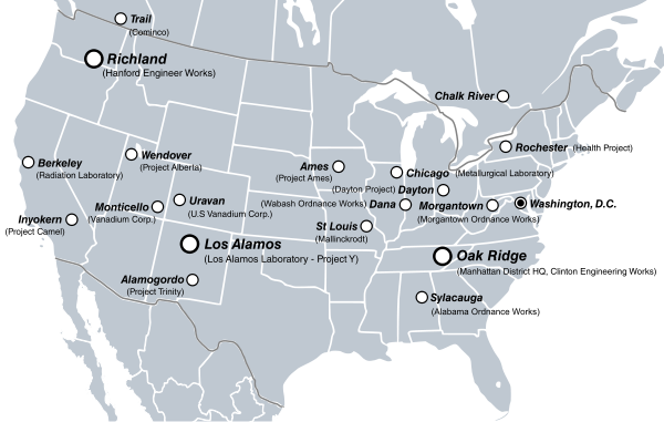
Manhattan Project clickable site map
Voting period is over. Please don't add any new votes. Voting period ends on 11 Jul 2011 at 04:40:01 (UTC)
- Reason
- Very high EV. Use of a visual in an important FAC that is almost portal like (both the article and the image) to many subsidiary stubs and shorter article. Work done recenty to add Canada and tweak some other technical aspects. Plus, I love the information density and functionality. Lot of work involved in getting the site locations and then arranging them in the map.
- Articles in which this image appears
- Manhattan Project
- FP category for this image
- Wikipedia:Featured pictures/History/World War II
- Creator
- Fallschirmjäger
- Support as nominator --TCO (talk) 04:40, 2 July 2011 (UTC)
- Oppose Basic map, no additional information that sets it apart from any most other maps. Image mapping is not FPC-reviewable as it's wikicode written into the article, and nothing to do with the file. (I've left additional reasoning on this nomination's talk page because it's a bit too big for here) Matthewedwards : Chat 07:53, 2 July 2011 (UTC)
- Oppose Nice clickable locations, but I see no reason why Mexico isn't on the map and Canada is (The two sites in Canada aside). No caption describes difference between all sizes of circles. - Blieusong (talk) 11:59, 2 July 2011 (UTC)
- Comment: Not sure if this belongs here. Are we voting for the map itself or the clicking mechanism? We should probably encourage this type of functionality since it requires a certain amount of relatively thankless effort, but this is probably the wrong place to do it since an FP will probably get displayed in several sizes and the clicking data would have to be rescaled each time for it to work (afaik). Also, some of the links point to labs or test sites while others point to cities; this seems inconsistent to me.--RDBury (talk) 14:26, 2 July 2011 (UTC)
- PS: Some of the information here seems to be unsourced. For example Sylacauga is not mentioned in the article and there is no reference given that it was involved in the Manhattan Project. There doesn't seem to be any source for the information given on the file description page either.--RDBury (talk) 14:38, 2 July 2011 (UTC)
- voting for the clicking. Just like on some pics, the caption is an important part of the thing, that is not in the image ourself, but is part of our criteria. I'm fine with it never running on the front page. Actually, maybe I can put the clicking code in the file description page (half a loaf?). (I should probably do that at times with captions that give more info than the file desc page has.) I'm going to go clikc on all those links. Don't worry, keep opposing...am actually happy that you all looked at it so carefully. :-)TCO (talk) 17:38, 2 July 2011 (UTC)
- There are five additional articles that are linked to that aren't mentioned in the page, and something like four or five articles that don't mention the Manhattan Project when you get to them. Cf my additional comments at Wikipedia talk:Featured picture candidates/Manhattan Project clickable site map Matthewedwards : Chat 21:10, 2 July 2011 (UTC)
- PS: Some of the information here seems to be unsourced. For example Sylacauga is not mentioned in the article and there is no reference given that it was involved in the Manhattan Project. There doesn't seem to be any source for the information given on the file description page either.--RDBury (talk) 14:38, 2 July 2011 (UTC)
- Actually there are newer ways of doing this, ways that don't prohibit our blind users and their screenreaders from coming to a screeching halt when they hit our weird coding. WP:ACCESS has more details, but this kind of mapping is a bit depreciated, so they should be highlighted instead. Without doubt it's a good theory, the image itself needs to be interactive, rather than adding text within the article. If that were to ever happen I could be persuaded Matthewedwards : Chat 21:10, 2 July 2011 (UTC)]
- Actually there are newer ways of doing this, ways that don't prohibit our blind users and their screenreaders from coming to a screeching halt when they hit our weird coding.
- Oppose per Matthewedwards. I can see something like this becoming standard at FPC in the future but I do not feel the coding used here is appropriate subject matter for FPC. J Milburn (talk) 19:25, 4 July 2011 (UTC)
- Support Very useful clickable map that shows the location of each site clearly--Someone35 (talk) 14:18, 5 July 2011 (UTC)
Not promoted --Makeemlighter (talk) 20:11, 11 July 2011 (UTC)
ORP Grom
Voting period is over. Please don't add any new votes. Voting period ends on 9 Jul 2011 at 22:46:53 (UTC)
- Reason
- proper quality, reasonable EV, not unpleasant as far as aesthetics is concerned
- Articles in which this image appears
- Fast Attack Craft
- FP category for this image
- Wikipedia:Featured pictures/Vehicles/Water
- Creator
- Łukasz Golowanow
- Support as nominator --(air)Wolf (talk) 22:46, 30 June 2011 (UTC)
- Support. Good EV and well captioned (my bugaboo). Has the pixels. Good view of the armaments and the angle shows things a little better than a pure perpindicular shot. Like that you got it with the flags.TCO (talk) 23:13, 30 June 2011 (UTC)
- Support - Solid EV, great level of detail and entirety of the vessel is shown clearly, even the aerials aren't cut off. Would have preferred image without the flags as they don't illustrate its normal appearance but its no biggie. Plus we don't have many FPs of modern military ships. ✉ 12:10, 2 July 2011 (UTC)]
OpposeNeutralThe image is copyrighted making the image ineligible unless it is released under a free license.-Vcelloho (talk) 03:02, 3 July 2011 (UTC)- You are joking, right? (air)Wolf (talk) 08:11, 3 July 2011 (UTC)
- Mind you, the image you nominated is copyrighted as well. (air)Wolf (talk) 08:14, 3 July 2011 (UTC)
- I'm not joking. The featured picture selection criteria reads, "Has a free license. It is available in the public domain or under a free license. Fair use images are not allowed." The image I nominated is released under both a Creative Commons and a GNU Free Documentation License, both of which are free licenses. This image falls into a gray zone since it isn't released under a free license and it's copyright isn't being used under fair use. I examined the archive of photos and couldn't find precedence for a featured picture selected with this type of licensing. If this type of objection is cleared I'll retract my objection.-Vcelloho (talk) 16:08, 3 July 2011 (UTC)
- Let's get this straight: the license of this picture is CC-BY. As simple as that. Only that it's paraphrased in favor of people who are not license-savvy. CC-BY means:
- You are free: to Share — to copy, distribute and transmit the work
- You are free: to Remix — to adapt the work
- You are free: to make commercial use of the work
- Under the following conditions: You must attribute the work in the manner specified by the author or licensor (but not in any way that suggests that they endorse you or your use of the work).
- Now compare: The copyright holder of this file allows anyone to use it for any purpose, provided that The Konflikty.pl website is stated as the source of the image. Thus, if this photo were to be denied on the basis of beingn non-free, the same would have to happen with any image not in the public domain, and especially CC-BY-SA and GFDL, as their terms of use are more restrictive, thus less free. The image in question is available under a free license, not one of the template licences, but a custom license (eg. it frees the user from having to decide whether to attribute by nickname or real-life name) whose wording, however, corresponds directly to CC-BY. (air)Wolf (talk) 17:03, 3 July 2011 (UTC) PS. File:F-16 Solo Display Team Radom 2009 b.JPG, File:Let L410UVP-E16 Góraszka 2008 edit2.JPG, File:HMCS St. John's Gdynia.JPG, File:Ursus Darłowo 2009.JPG.
- Let's get this straight: the license of this picture is CC-BY. As simple as that. Only that it's paraphrased in favor of people who are not license-savvy. CC-BY means:
- I'm not joking. The featured picture selection criteria reads, "Has a free license. It is available in the public domain or under a free license. Fair use images are not allowed." The image I nominated is released under both a Creative Commons and a GNU Free Documentation License, both of which are free licenses. This image falls into a gray zone since it isn't released under a free license and it's copyright isn't being used under fair use. I examined the archive of photos and couldn't find precedence for a featured picture selected with this type of licensing. If this type of objection is cleared I'll retract my objection.-Vcelloho (talk) 16:08, 3 July 2011 (UTC)
- Mind you, the image you nominated is copyrighted as well. (air)Wolf (talk) 08:14, 3 July 2011 (UTC)
- You are joking, right? (air)Wolf (talk) 08:11, 3 July 2011 (UTC)
- Support. And in my opinion Vcelloho joke is not funny. PMG (talk) 08:58, 3 July 2011 (UTC)
- Support -- George Chernilevsky talk 13:11, 3 July 2011 (UTC)
- Support--Mbz1 (talk) 18:21, 4 July 2011 (UTC)
- Caption issue: Per Eustress talk 12:47, 9 July 2011 (UTC)]
- Just add the fragment in parentheses from the original caption and you have my full support for your version. (air)Wolf (talk) 13:43, 9 July 2011 (UTC)
- Oh, and one more thing, I do believe the correct term is dressed, not adorned, when referring to a ship and those little flags. I am not 100% sure, but my Google search seems to have proved that it should really be dressed. (air)Wolf (talk) 13:47, 9 July 2011 (UTC)
- Weak oppose Just doesn't feel like this would fall among Wikipedia's best work to me. The position of the sun drowns out the vibrancy of the colors in the picture, and the fact that the watercraft is docked decreases the EV of the pic as a "fast attack craft" to me. Comparing to other pics in its Eustress talk 12:57, 9 July 2011 (UTC)]
Promoted File:ORP Grom (korweta) 2.JPG --Makeemlighter (talk) 20:13, 11 July 2011 (UTC)
Botnet Diagram
Voting period is over. Please don't add any new votes. Voting period ends on 11 Jul 2011 at 22:19:55 (UTC)

1. A botnet operator sends out viruses or worms, infecting ordinary users' computers, whose payload is a malicious application — the bot.
2. The bot on the infected PC logs into a particular command and control (C&C) server (often an IRC server, but, in some cases a web server).
3. A spammer purchases access to the botnet from the operator.
4. The spammer sends instructions via the IRC server to the infected PCs, causing them to send out spam messages to mail servers.

- Reason
- Accurately succinctly conveys how botnets are created and operated. The diagram is also effective across language barriers.
- Articles in which this image appears
- Botnet
- FP category for this image
- Wikipedia:Featured_pictures/Engineering_and_technology/Electronics
- Creator
- Tom-b
- Support as nominator --Vcelloho (talk) 22:19, 2 July 2011 (UTC)
- Support. Functional diagram to illustrate complicated relationships. TCO (talk) 00:26, 3 July 2011 (UTC)
- Comment. The caption and image page are inconsistent with the image. They say "4. The spammer sends instructions via the IRC server ...", but the diagram clearly shows the botnet operator sending the spam. Which is correct? --jjron (talk) 11:23, 3 July 2011 (UTC)
- Comment 2. I don't really get the significance of the horse in the 'first' image. Is that meant to signify a Trojan horse, and if so, why aren't Trojans ever mentioned in any captions, while viruses and worms are? I mean, the horse is really obvious and significant, and Trojans do make sense in terms of botnets. --jjron (talk) 11:33, 3 July 2011 (UTC)
- Comment: No references are given for the information, either in the article or the file information page.--RDBury (talk) 13:56, 3 July 2011 (UTC)
- Comment I wondered the same about the horse as jjron before I even read his comment. The image implies people know about trojan horses, viruses etc. Maybe they do, but maybe they don't and we shouldn't assume. Also agree that sourcing is required in both places though, otherwise how do we know the image is correct? The one thing going for it is that the wording in the article about the operation is pretty poor, but the diagram does help in understanding it. Not ready to commit yet until these things get sorted. Matthewedwards : Chat 22:47, 3 July 2011 (UTC)
- Comment Hi, creator here. jjron, you are right, it's a mistake. They should be reversed, the gray spammer should be activating it, with the red operator looking on. Maybe even delete the operator and keep only the spammer. I've fixed it. Yes, the horse represents a trojan. I used layered meaning — my thinking was: the space is too small to unambiguously show that this is a trojan and explain what trojans are. People who know what they are immediately get it, people who don't, don't get distracted by extraneous detail like little wheels on the horse legs etc. — they see a image with a virus 'hidden' inside it, notice how the recipient sees only the horse head. No, I don't have sourcing for this. I was looking for processes to illustrate as an exercise and this one seemed interesting, so I just made a diagram of what the article said. Since it's an exercise, suggestions for improvement are very welcome! Thanks for the critique. Also, please suggest other process descriptions (sourced) that would be helped by a diagram in comics form. Tom-b (talk) 21:20, 6 July 2011 (UTC)
- CommentI know what a trojan is - and now it's been explained that is what the horse represents it's obvious, but initially I didn't catch the allusion. This is my first visit to featured images so I'm not making any vote. EdwardLane (talk) 09:21, 8 July 2011 (UTC)
Not promoted --J Milburn (talk) 21:26, 12 July 2011 (UTC)
Female nut Coco de Mer
Voting period is over. Please don't add any new votes. Voting period ends on 13 Jul 2011 at 18:17:42 (UTC)

- Reason
- high resolution and quality, adds EV to the article
- Articles in which this image appears
- Legends of the Coco de Mer
- FP category for this image
- Wikipedia:Featured_pictures/Plants/Others
- Creator
- Mbz1
- Support as nominator --Mbz1 (talk) 18:17, 4 July 2011 (UTC)
- Comment I resized the image in Coco de Mer? Aaadddaaammm (talk) 18:54, 4 July 2011 (UTC)]
- Thanks, well ]
- OK that's a fair enough reason for it only to be in this article, in which it does have fantastic EV. But I'm still not convinced it's a particularly technically, compositionally, and asthetically good image. Put me down as neutral while I think about it. Aaadddaaammm (talk) 10:59, 6 July 2011 (UTC)
- Comment: The caption makes a fuss about how big it is but there is nothing to give scale. To me the foam is a distraction; I'm looking at it and asking "What's that white stuff?" rather than looking at the nut. The subject is off-center and at an angle, also a bit of a distraction.--RDBury (talk) 23:28, 4 July 2011 (UTC)
- Oppose original The thing that bugs me about this image is that half of the nut is not wet at all, even though it is in the waves. It looks too posed. Neutral on Alt1 - it's better, but I actually miss the presence of the waves, and the composition is quite plain. Good quality. --99of9 (talk) 01:33, 5 July 2011 (UTC)
- Support This image makes the article far more interesting and valuable in my view. JJ Harrison (talk) 09:21, 6 July 2011 (UTC)
Not Promoted --Makeemlighter (talk) 20:26, 13 July 2011 (UTC)
Water drop on DWR-treated fabric
Voting period is over. Please don't add any new votes. Voting period ends on 13 Jul 2011 at 20:45:20 (UTC)


- Reason
- Cool physical phenomenon. Put into several articles. We lacked any good picture of beading on DWR until this image was created (was an awful pic from afar of a gray jacket, but you could not see beading). Plus pretty-looking with the blue fabric and the shiny water.
- Articles in which this image appears
- FP category for this image
- Wikipedia:Featured pictures/Sciences/Materials science
- Creator
- Mbz1
- Support as nominator --TCO (talk) 20:45, 4 July 2011 (UTC)
- Comment: Could use some cropping; there a lot of fabric in the image and that's not what we're interested in. I'd say making it a square would be about right.--RDBury (talk) 23:13, 4 July 2011 (UTC)
- Good point, on both, was wondering that. Could you do it? I trust your eye. Please? (On the square, they are nice for looking at as isolated pics, but as an article writer, I have a bias to short y axis becuase of the interaction with sections on text wrapping.TCO (talk) 23:45, 4 July 2011 (UTC), although in article I really care about, it is out of the text wrapping, so square could work fine...TCO (talk) 23:47, 4 July 2011 (UTC)
- Weak Oppose - I'm not sure I see the EV of this shot... maybe better for Commons? ceranthor 01:08, 5 July 2011 (UTC)
- It's a fundamental physical phenomonon caused by the fluorines at the end of the fluorosurfactant molecule. Read the article on contact angle and on fluorosurfactant for the physics and chemistry. We had not a single picture of this (despite how seemingly simple it looks.) It's a $billion+ industry btw and has environmental controversy.TCO (talk) 01:16, 5 July 2011 (UTC)
- Question I'm not up with my lingo, but the caption reads "near spherical", but it doesn't look remotely near "near spherical". Wouldn't "near oblate" or something like that be a little more suitable? – Kerαunoςcopia◁galaxies 04:59, 5 July 2011 (UTC)
- Weak support Great EV, is a very clear illustration of a non-wetting surface (that linked article could use a practical picture like this as well). My only concern is the saturated starbursts of light from the sun, but I suppose it's unavoidable due to the reflective nature of the fabric and the need for an intense direct light to show the shadow illustrating the extreme curvature of the drop. -RunningOnBrains(talk) 17:35, 8 July 2011 (UTC)
- Weak oppose Definitely a candidate for valued picture, but it is a reasonably common phenomenon, and with a better camera a much better photo could be taken. Aaadddaaammm (talk) 08:22, 10 July 2011 (UTC)
- I agree. The amazing thing is we had nothing in Commons! (posted by TCO Aaadddaaammm (talk) 10:10, 10 July 2011 (UTC))
- Oppose I'd like to see the surface perpendicular or very nearly so to the lens. Then we could see the contact angle and so on better. Surface_tension#Puddles_on_a_surface might interest some looking to see a (mathematical) description of the shape. JJ Harrison (talk) 08:21, 14 July 2011 (UTC)
Not Promoted --Makeemlighter (talk) 11:12, 14 July 2011 (UTC)
Fumihiko Maki
Voting period is over. Please don't add any new votes. Voting period ends on 13 Jul 2011 at 19:42:31 (UTC)
- Reason
- Charismatic and technically strong portrait.
- Articles in which this image appears
- Fumihiko Maki
- FP category for this image
- Wikipedia:Featured pictures/People/Others
- Creator
- jeanbaptisteparis
- Support as nominator --J Milburn (talk) 19:42, 4 July 2011 (UTC)
- Support. After adding some "why should we care" to the caption.TCO (talk) 20:13, 4 July 2011 (UTC)
- Comment The head is off center and tilted to one side which make the photo kind of odd looking. Also, it looks like there are depth of field issues; apparently he was leaning forward as well as to the side.--RDBury (talk) 23:20, 4 July 2011 (UTC)
- I think that's one of the reasons I like it. It seems natural, humanized. If the photographer posed him, it certainly doesn't look like it. Support Matthewedwards : Chat 04:23, 5 July 2011 (UTC)
- He is on stage, leaning across a lectern; the photographer is off-centre. The blurry bit of white you can see just coming in at image right is someone else's head between the photographer and subject. --jjron (talk) 10:29, 6 July 2011 (UTC)
- That blur is a little bit distracting to me. Does it bother anyone else? Other than that, quite an evocative picture. Not sure whether or not the blur can be cleaned up? —Eustress talk 20:34, 6 July 2011 (UTC)]
- That blur is a little bit distracting to me. Does it bother anyone else? Other than that, quite an evocative picture. Not sure whether or not the blur can be cleaned up? —
- Support Engaged pose and facial expression. Nice colours too. Have no issues with the non-symmetrical composition. --Elekhh (talk) 23:38, 4 July 2011 (UTC)
- Support JJ Harrison (talk) 05:54, 5 July 2011 (UTC)
- Support - I like the composition; it adds some dynamism, some character. --Ser Amantio di NicolaoChe dicono a Signa?Lo dicono a Signa. 13:50, 5 July 2011 (UTC)
- Support Aaadddaaammm (talk) 12:57, 9 July 2011 (UTC)
Promoted File:Fumihiko Maki 2010 alt.jpg --Makeemlighter (talk) 11:13, 14 July 2011 (UTC)
A beach in Maine on a clear day
Voting period is over. Please don't add any new votes. Voting period ends on 14 Jul 2011 at 10:35:57 (UTC)
- Reason
- I think it should be a featured picture because it is in high resolution and looks very good.
- Articles in which this image appears
- Beach, Maine, Acadia National Park
- FP category for this image
- Landscapes
- Creator
- Someone35
- Support as nominator --Someone35 (talk) 10:35, 5 July 2011 (UTC)
- Oppose. It looks like a lovely place, but I am not convinced that the image has a particularly high encyclopedic value (EV). I do not see how this picture adds a great amout to any of the three articles in which it is used. Furthermore, the horizon is very tilted. J Milburn (talk) 10:55, 5 July 2011 (UTC)
^^^The horizon is the islands of Maine, I didn't edit this picture at all--Someone35 (talk) 11:07, 5 July 2011 (UTC)
- I don't suspect it was edited, I'm saying I don't think the camera was straight. Horizons, even those with islands, do not dip like that. J Milburn (talk) 11:11, 5 July 2011 (UTC)
- Oppose EV. For Acadia National Park which would be most important, the image is just down in a gallery of pictures. Also unclear why the composition with a part of the shoreline like that and then the water and sailboat.TCO (talk) 13:11, 5 July 2011 (UTC)
that sailboat was just there, it has nothing to do with me, i didn't make it be there, the order of the image is because it's just like that and i can't make it be otherwise (you want me to take a picture with the order of sky, land,shoreline and then horizon or what???) and there is also a picture that was on the main page (it's called misty mornining or something) and it also has nothing to do with anything that's not a gallery--Someone35 (talk) 17:00, 5 July 2011 (UTC)
- It's just I don't see how this is serving the article (much). It's not like it is a part of a two para section on sailing or the like. Or that it is really showing us some feature described within the article. Don't feel bad. I voted for your panorama picture. The reason I like that, is it really does show me something and help me understand the article topic better.TCO (talk) 17:15, 5 July 2011 (UTC)
- Oppose tilted horizon. Also, I don't think this should be in the article beach, because the rocks are not "loose particles" per the definition of a beach in that article. --99of9 (talk) 05:01, 13 July 2011 (UTC)
Not Promoted --Makeemlighter (talk) 11:14, 14 July 2011 (UTC)
New hampshire in autumn
Voting period is over. Please don't add any new votes. Voting period ends on 14 Jul 2011 at 11:05:48 (UTC)

- Reason
- because it shows the new hampshire forests in a special time of the year
- Articles in which this image appears
- New hampshire
- FP category for this image
- Landscapes
- Creator
- Someone35
- Support as nominator --Someone35 (talk) 11:05, 5 July 2011 (UTC)
- Oppose EV. Not sure what is special. Also the image was dropped into New Hampshire today without an edit summary and in such a fashion as to mess up the text wrapping.TCO (talk) 13:06, 5 July 2011 (UTC)
- It might not be mentioned in the article but New England is known for brilliant fall foliage. We do have language in the FP criteria designed to discourage people from the nominating a picture they just uploaded, it's just a guideline though.--RDBury (talk) 16:08, 5 July 2011 (UTC)
- True there is no minimum timeframe for a picture to be in an article before nomination, but generally if it's dropped in immediately before the nomination and in a sloppy useless way, with very little EV contribution, or even worse when people replace infobox images of a picture FAR better with their own picture it won't last long and doesn't give a good impression. This picture has zero EV for the article New hampshire and that the pictures in Autumn be greatly GREATLY reduced. — raekyt 21:39, 5 July 2011 (UTC)]
- True there is no minimum timeframe for a picture to be in an article before nomination, but generally if it's dropped in immediately before the nomination and in a sloppy useless way, with very little EV contribution, or even worse when people replace infobox images of a picture FAR better with their own picture it won't last long and doesn't give a good impression. This picture has zero EV for the article
- It might not be mentioned in the article but New England is known for brilliant fall foliage. We do have language in the FP criteria designed to discourage people from the nominating a picture they just uploaded, it's just a guideline though.--RDBury (talk) 16:08, 5 July 2011 (UTC)
- Oppose In addition to EV issues, background appears overexposed. —Eustress talk 20:08, 6 July 2011 (UTC)]
- We do have an article Autumn leaf color where this would be appropriately encyclopedic, but Oppose on grounds of poor resolution and exposure [edit: Chromatic aberration is the term I was trying to think of]. It's an amazing view, I would love to see a better picture of this same scene. -RunningOnBrains(talk) 01:39, 7 July 2011 (UTC)
- I'm only 14 years old and I'm using a digital camera and this place is 12 hours of flight from my city so I can't come back there to take another photo of this place (at least not in the next few years) — Preceding unsigned comment added by Someone35 (talk • contribs) 18:58, 8 July 2011 (UTC)
- It's an amazing view, but unfortunately it's something that lots of people take photos of, so it would need to be seriously "wow" for a featured picture. Don't be discouraged, as you say, you're only 14 so you'll have lots more chances to take that 12h flight and retake the picture! Aaadddaaammm (talk) 08:59, 9 July 2011 (UTC)
Not Promoted --Makeemlighter (talk) 11:14, 14 July 2011 (UTC)
Panorama from Har HaAri
Voting period is over. Please don't add any new votes. Voting period ends on 14 Jul 2011 at 10:12:00 (UTC)

- Reason
- because it isn't similar to most existing pictures of the galilee in wikipedia and is unique and in high resolution and because it shows things that cannot be seem otherwise (for example har kamon, the hill in the middle of the picture, is shown clearly and in relation to other places like the village rameh)
- Articles in which this image appears
- Har HaAri, Upper Galilee, Rameh, Galilee
- FP category for this image
- Landscapes
- Creator
- Someone35
- Support as nominator --Someone35 (talk) 10:12, 5 July 2011 (UTC)
- Support, EV. Is used prominently in the articles and shows features that are best displayed from on high and with the panaroma. (Not qualified to comment on technical aspects.)TCO (talk) 13:14, 5 July 2011 (UTC)
- Comment: It appears that "Har HaAri" was created by the User:Someone35 solely to have a place to put this picture. This user has uploaded and nominated for FP three pictures in one day; I don't think this type of self aggrandizement should be encouraged.--RDBury (talk) 16:16, 5 July 2011 (UTC)
- ^so you are basically against making new articles and uploading pictures? so what if i made a new page? is it bad?--Someone35 (talk) 16:53, 5 July 2011 (UTC)
- I agree with Someone35; there's only something wrong with doing that if there's something wrong with the article. I've certainly created articles specifically to house my own pictures before- see Mycena arcangeliana. J Milburn (talk) 21:41, 5 July 2011 (UTC)
- We're DEFINITELY NOT against creation of new content and articles, don't get that impression. We're glad your doing that, glad your uploading images and contributing, so don't get the wrong impression. But to claim EV on an article you just created for a nomination the nomination should probably meet the requirements of a ]
- The picture is used prominently in three other articles that are more clearly notable. I did a search on that hill and couldn't find much in English. But don't think we should worry about that issue here. You can still evaluate the use of the photo for the other articles, say the town in particular.TCO (talk) 03:27, 6 July 2011 (UTC)
- the hill behind it isn't really special as there are many hills and mountains in that area. again the reason that this picture has an EV is because you get an aerial view of the galilee and you can also see in that image things that you wouldn't see from the ground. Also I added now a Geographic Location template to make it more clear where is each thing--Someone35 (talk) 06:15, 6 July 2011 (UTC)
- It could have decent EV for the city that is in the valley or the valley if it has a name... just as options for places to put the picture that would have good EV for... Unless this valley/city is notable and relevant for the whole Upper Galilee or Galilee then it contributes little to those articles. Your best bet for EV is to improve and show notability for Har HaAri or find out and see if we have an article for if not create one for the valley... I don't think it contributes greatly to Rameh due to the majority of the city being obscured by the trees and terrain. — raekyt 15:56, 6 July 2011 (UTC)
- the hill behind it isn't really special as there are many hills and mountains in that area. again the reason that this picture has an EV is because you get an aerial view of the galilee and you can also see in that image things that you wouldn't see from the ground. Also I added now a Geographic Location template to make it more clear where is each thing--Someone35 (talk) 06:15, 6 July 2011 (UTC)
- The picture is used prominently in three other articles that are more clearly notable. I did a search on that hill and couldn't find much in English. But don't think we should worry about that issue here. You can still evaluate the use of the photo for the other articles, say the town in particular.TCO (talk) 03:27, 6 July 2011 (UTC)
- We're DEFINITELY NOT against creation of new content and articles, don't get that impression. We're glad your doing that, glad your uploading images and contributing, so don't get the wrong impression. But to claim EV on an article you just created for a nomination the nomination should probably meet the requirements of a ]
- I agree with Someone35; there's only something wrong with doing that if there's something wrong with the article. I've certainly created articles specifically to house my own pictures before- see Mycena arcangeliana. J Milburn (talk) 21:41, 5 July 2011 (UTC)
- Weak Oppose Stitching issues (curved horizon namely), and the stuff in the distance seems out of focus. Good EV in my view though. JJ Harrison (talk) 09:24, 6 July 2011 (UTC)
- The stitch is fine, how else did you want me to stitch it? I took photos and connected them together, the panorama itself is seamless, also it shows Mediterranean vegetation which also adds to the EV--Someone35 (talk) 13:43, 6 July 2011 (UTC)
- A bowed/curved horizon is a stitching error, that can be corrected for in a decent stitching program... — raekyt 15:56, 6 July 2011 (UTC)
- How can it be fixed? In order to fix it I'll have to leave black parts in the edge of the picture and then you'll complain about it too...--Someone35 (talk) 17:07, 6 July 2011 (UTC)
- Don't know what software you used, but Hugin (software) can do it. It stretches, expands and distorts as needed so you don't get black bars to keep something like the horizon straight... — raekyt 18:13, 6 July 2011 (UTC)
- I used the regular stitching software that comes with Canon cameras (zoom browser), and if that software distorts and stretches the image doesn't it ruin the quality of the image?--Someone35 (talk) 18:32, 6 July 2011 (UTC)
- Every panorama stitch involves distortion of some sort, that doesn't mean it ruins the quality. Jujutacular talk 19:53, 6 July 2011 (UTC)
- I used the regular stitching software that comes with Canon cameras (zoom browser), and if that software distorts and stretches the image doesn't it ruin the quality of the image?--Someone35 (talk) 18:32, 6 July 2011 (UTC)
- Don't know what software you used, but Hugin (software) can do it. It stretches, expands and distorts as needed so you don't get black bars to keep something like the horizon straight... — raekyt 18:13, 6 July 2011 (UTC)
- How can it be fixed? In order to fix it I'll have to leave black parts in the edge of the picture and then you'll complain about it too...--Someone35 (talk) 17:07, 6 July 2011 (UTC)
- A bowed/curved horizon is a stitching error, that can be corrected for in a decent stitching program... — raekyt 15:56, 6 July 2011 (UTC)
- Neutral Last I checked, the horizon is curved, so making it a straight line is actually an unrealistic distortion. I'm of course being facetious, but I think it would just be personal preference as to whether or not this kind of shot has a curved horizon; I can't see a way to avoid it when looking down the town from such an angle. The only things I'm not a fan of is that the valley and beyond are ever so slightly out of focus, and I don't like how hazy the background is. Any chance of going back on a clear day to get the same shot? -RunningOnBrains(talk) 01:52, 7 July 2011 (UTC)
- Also, allow me to echo the sentiment that we are very supportive of new contributions of encyclopedic pictures and articles. Also, that Hugin is an amazing (and free!) software, and I highly recommend it for panoramas.-RunningOnBrains(talk) 01:54, 7 July 2011 (UTC)
- It's about 3 hours driving from my house and I'm not old enough to drive a car on my own, but I think I'll go that area in late August so I'll take a picture of that place again. I'll download now that Hugis and restitch the panorama so it won't be curved--Someone35 (talk) 05:11, 7 July 2011 (UTC) EDIT: ok here it is, is this one better?:
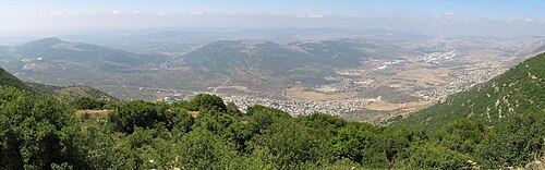
fixed image
- It's about 3 hours driving from my house and I'm not old enough to drive a car on my own, but I think I'll go that area in late August so I'll take a picture of that place again. I'll download now that Hugis and restitch the panorama so it won't be curved--Someone35 (talk) 05:11, 7 July 2011 (UTC) EDIT: ok here it is, is this one better?:

- On the issue of the haze, you might want to try a UV filter. -Vcelloho (talk) 02:28, 8 July 2011 (UTC)
- I don't think a UV filter does anything for digital. A polariser is more helpful, but you do get some uneven brightness in the sky.
- Most of the curved horizon here is caused by the presumably cylindrical projection. Adjusting hugin so the midpoint is near the horizon would fix the problem. All panorama stitchers will warp the images etc. JJ Harrison (talk) 03:53, 8 July 2011 (UTC)
- I don't think a UV filter does anything for digital. A polariser is more helpful, but you do get some uneven brightness in the sky.
- On the issue of the haze, you might want to try a UV filter. -Vcelloho (talk) 02:28, 8 July 2011 (UTC)
- I can't find that option or a tutorial explaining how to do that, is that a serious problem or the new picture I uploaded is good enough?--Someone35 (talk) 09:00, 8 July 2011 (UTC)
- Its getting pretty close, but I'd like to see it fixed. If you upload the individual images somewhere I can have a go if you like. JJ Harrison (talk) 08:11, 9 July 2011 (UTC)
- ok, here are the links to the 4 images, first second third fourth. thank you very much. — Preceding unsigned comment added by Someone35 (talk • contribs) 08:34, 9 July 2011 (UTC)
- File:Panorama_from_Har_HaAri_restitch.jpg is my own attempt made on the presumption that the cloud band should be roughly level. JJ Harrison (talk) 09:19, 11 July 2011 (UTC)
- How did you do it? I can clearly see the difference between your stitch and my stitch but where in Hugin can you do that? Where is the option that you can use to make a straight panorama?--Someone35 (talk) 09:56, 11 July 2011 (UTC)
- Have a look at this. JJ Harrison (talk) 08:16, 14 July 2011 (UTC)
- ok, here are the links to the 4 images, first second third fourth. thank you very much. — Preceding unsigned comment added by Someone35 (talk • contribs) 08:34, 9 July 2011 (UTC)
- Its getting pretty close, but I'd like to see it fixed. If you upload the individual images somewhere I can have a go if you like. JJ Harrison (talk) 08:11, 9 July 2011 (UTC)
- I can't find that option or a tutorial explaining how to do that, is that a serious problem or the new picture I uploaded is good enough?--Someone35 (talk) 09:00, 8 July 2011 (UTC)
Promoted File:Har Ari panorama.jpg --Someone35 (talk) 10:46, 14 July 2011 (UTC)
Not promoted --Makeemlighter (talk) 11:17, 14 July 2011 (UTC)
- Support < 5 Makeemlighter (talk) 11:17, 14 July 2011 (UTC)
you voted after the voting ended, there were 2 supports against 1.5 opposes (a weak oppose counts as 0.5 oppose), therefore my picture is promoted.--Someone35 (talk) 15:50, 14 July 2011 (UTC)
- Read the promotion rules for FPC, to be promoted you need AT LEAST 5 supports, and do you have that here? No. — raekyt 15:57, 14 July 2011 (UTC)
so now i'm supposed to wait till 5 people support this photo?--Someone35 (talk) 16:18, 15 July 2011 (UTC)
- No. It didn't reach the minimum number of supports within the 9-day time period, so it was not promoted. You're welcome to re-nominate it at some point in the future. Apologies for not being clear earlier.
Makeemlighter (talk) 16:30, 17 July 2011 (UTC)
- but there is another picture of space or something like that below this one that is from april and it still didn't over, was i supposed to reach 5 supports in an 9 days period?--Someone35 (talk) 07:15, 18 July 2011 (UTC)
- Sometimes if an image is EXACTLY at 2/3rds majority and/or regular closers have voted and can't close and/or it's not clear which image should be promoted if there is alts, it will sit in the waiting area until it gets closed, sometimes for a long time... but in this case this is a clear cut case where it didn't receive enough supports. — raekyt 21:43, 19 July 2011 (UTC)
- but there is another picture of space or something like that below this one that is from april and it still didn't over, was i supposed to reach 5 supports in an 9 days period?--Someone35 (talk) 07:15, 18 July 2011 (UTC)
Bunch of meanies. It passed 2.0-1.5! A squeeker! ;-) TCO (reviews needed) 22:59, 19 July 2011 (UTC)
Hayley McFarland
Voting period is over. Please don't add any new votes. Voting period ends on 14 Jul 2011 at 18:19:02 (UTC)

- Reason
- Candid, good resolution, critical to the subject's biographical article, only cast pic on the TV show's article
- Articles in which this image appears
- Hayley McFarland, Lie to Me
- FP category for this image
- People/Entertainment
- Creator
- Aaron Delani
- Support as nominator --—Eustress talk 18:19, 5 July 2011 (UTC)]
- Support. Seems to have EV as only pic and is a clear picture. Leave the other details to others.TCO (talk) 18:53, 5 July 2011 (UTC)
- Support Has a nice candid feel to it. JJ Harrison (talk) 09:18, 6 July 2011 (UTC)
- Support. Something a little different, but very nice. J Milburn (talk) 10:07, 6 July 2011 (UTC)
- Weak oppose It looks like the photographer just happened to be walking down the street and spotted her and asked for a photo. The result is very touristy and snapshoty. Matthewedwards : Chat 01:14, 7 July 2011 (UTC)
- Support Wonderful. No clue who she is, but I love the picture. The whole "touristy" and "snapshoty" feel is summed up nicely by JJ Harrison as "candid", but it's still extremely well done with good exposure. Very nice. – Kerαunoςcopia◁galaxies 04:11, 7 July 2011 (UTC)
- Support per above. Very nice. Ahirwav (talk) 04:33, 7 July 2011 (UTC)
- Support - it's a very good portrait. --Ser Amantio di NicolaoChe dicono a Signa?Lo dicono a Signa. 13:34, 7 July 2011 (UTC)
- Support Aaadddaaammm (talk) 08:57, 9 July 2011 (UTC)
Promoted File:Hayley McFarland cropped.jpg --Makeemlighter (talk) 19:08, 14 July 2011 (UTC)
Featured picture candidates/STS-134 launch
Voting period is over. Please don't add any new votes. Voting period ends on 15 Jun 2011 at 03:12:30 (UTC)
- Reason
- A very high quality video of the last launch of the Space Shuttle Endeavour. It shows what a lauch looks like very well.
- Articles in which this image appears
- Rocket launch
- FP category for this image
- Wikipedia:Featured pictures/Space/Getting there
- Creator
- NASA
- Support as nominator --Guerillero | My Talk 03:12, 6 June 2011 (UTC)
- Question Is it my machine or is there a brief loss of sound half way through, and a jump in picture just the the shuttle starts to move? My computer isn't the greatest but it doesn't normally lose sound randomly and I've played the video about 5 times in a row without leaving the page so there shouldn't be a buffering issue... gazhiley.co.uk 11:38, 6 June 2011 (UTC)
- It dosen't happen to me --Guerillero | My Talk 21:10, 6 June 2011 (UTC)
- Just tried in on a different machine and it works fine now, so I'll Support as it can never be retaken, is great quality, and I love all things space... gazhiley.co.uk 22:18, 6 June 2011 (UTC)
- It dosen't happen to me --Guerillero | My Talk 21:10, 6 June 2011 (UTC)
- Support Aaadddaaammm (talk) 20:22, 7 June 2011 (UTC)
- Support Took forever to load on my crappy computer, but the video is irreplaceable and the quality and enc are good. SpencerT♦C 02:35, 14 June 2011 (UTC)
- What a shame... I assume only 4 supports isn't enough to promote this despite the lack of opposes? gazhiley 08:30, 15 June 2011 (UTC)
- I would like to support this nomination, with the concession that it is technically past the voting period. To the community: keep in mind that participation is pretty lacking in nominations as of late. That said, I would not complain if the closer ignores this vote. Jujutacular talk 03:55, 16 June 2011 (UTC)
- Permission granted, plus another support. For EV. Also to promote videos. BTW, I think our usage of videos is atrocious (the whole format kerfuffle) and that we are way behind just blogs and stuff. That said, my hope is that giving some prominence to what we do have, starts to build more an awareness of using videos.TCO (talk) 02:32, 29 June 2011 (UTC)
- support wonderful footage of a historic event.--Thecheesefiles (talk) 11:02, 21 June 2011 (UTC)
Promoted File:STS-134 launch 2.ogv --RunningOnBrains(talk) 22:44, 14 July 2011 (UTC)
Clock Tower Graz by night
Voting period is over. Please don't add any new votes. Voting period ends on 15 Jul 2011 at 07:52:00 (UTC)

- Reason
- high resolution nice view of the structure and the surrounding of this clock tower
- Articles in which this image appears
- Graz
- FP category for this image
- Wikipedia:Featured pictures/Places/Architecture
- Creator
- the creator of the image, where possible using the format Wladyslaw
- Support as nominator --– Wladyslaw (talk) 07:52, 6 July 2011 (UTC)
- Support. Used in lead.TCO (talk) 13:56, 6 July 2011 (UTC)
- Oppose I don't know what happened with the picture in the left middle, but it's clearly non consistent with the other ones, and it's visible even on the thumbnail. - Blieusong (talk) 20:43, 6 July 2011 (UTC)
- What are you seeing that is off? Sky color? TCO (talk) 20:48, 6 July 2011 (UTC)
- The source picture in the left middle (this looks to be a multi segment picture) is a bit paler than the others, and the transition with the left lowermost picture can be seen. I believe this is a fault. Issue was raised on Commons FPC (maybe their explanations are better than mines). - Blieusong (talk) —Preceding undated comment added 05:17, 7 July 2011 (UTC).
- left hand of the stairs are the strong flood lights that illuminates the tower, the effect comes from reflections and is also in the single shots visible and has nothing to do with a fault --– Wladyslaw (talk) 12:02, 7 July 2011 (UTC)
- The source picture in the left middle (this looks to be a multi segment picture) is a bit paler than the others, and the transition with the left lowermost picture can be seen. I believe this is a fault. Issue was raised on Commons FPC (maybe their explanations are better than mines). - Blieusong (talk) —Preceding undated comment added 05:17, 7 July 2011 (UTC).
- What are you seeing that is off? Sky color? TCO (talk) 20:48, 6 July 2011 (UTC)
- Support This needs to be viewed full size to do it justice. My guess is that Blieusong refers to the stairs which do seem a bit light and could do with a burning. That is probably just because of some tone mapping though and doesn't bother me much. JJ Harrison (talk) 22:26, 6 July 2011 (UTC)
- Oppose It is a spectacular photo at full zoom, but the artefact in the bushes to the left of the stairs (as mentioned by Blieusong) is definitely from stitching, it requires acknowledgement and correction. Aaadddaaammm (talk) 08:55, 9 July 2011 (UTC)
- Oppose Between the busy foreground and the expansive sky, the essence of the picture (the tower) is a bit lost for me. —Eustress talk 12:36, 9 July 2011 (UTC)]
- Comment in the article the pictures has no caption, nor is the clock tower mentioned in the section that the picture appears. The only mention of the clock tower is further down ("The belltower and the civic clock tower, often used as the symbol of Graz, were spared after the people of Graz paid a ransom for their preservation"). To me this suggests that the image as used doesn't really aid the readers understanding of the topic. Guest9999 (talk) 03:00, 11 July 2011 (UTC)
- Would be good if s.o. complete the article. But what has this to do with the picture candidate here? --– Wladyslaw (talk) 06:46, 11 July 2011 (UTC)
- It's being used as the iconic lead symbol. Then later text says that the tower is often a symbol for the city. Personally I think reader is getting exactly his money's worth and image used properly just based on placement. Think often lead image serves better without a caption. I think that aspect is fine. And I'm an "article guy", not a "photo guy".TCO (reviews needed) 08:33, 11 July 2011 (UTC)
- In response to User:Taxiarchos228, criterion 5 of the Wikipedia:Featured picture criteria, states that a featured picture "helps readers to understand an article.". Guest9999 (talk) 00:13, 15 July 2011 (UTC)
- It's being used as the iconic lead symbol. Then later text says that the tower is often a symbol for the city. Personally I think reader is getting exactly his money's worth and image used properly just based on placement. Think often lead image serves better without a caption. I think that aspect is fine. And I'm an "article guy", not a "photo guy".TCO (reviews needed) 08:33, 11 July 2011 (UTC)
- Would be good if s.o. complete the article. But what has this to do with the picture candidate here? --– Wladyslaw (talk) 06:46, 11 July 2011 (UTC)
Not Promoted --Makeemlighter (talk) 17:14, 15 July 2011 (UTC)
Dilma Rousseff
Voting period is over. Please don't add any new votes. Voting period ends on 29 May 2011 at 04:04:24 (UTC)

- Reason
- High Ev as lead image in article. Vauled image on Commons and Featured on Turkish wiki.
- Articles in which this image appears
- Presidential sash, etc..
- FP category for this image
- Wikipedia:Featured pictures/People/Political
- Creator
- Roberto Stuckert Filho
- Support as nominator --Spongie555 (talk) 04:04, 20 May 2011 (UTC)
- Support Great quality and EV. A double attack on systemic bias! Jujutacular talk 04:21, 20 May 2011 (UTC)
- Support JJ Harrison (talk) 09:44, 20 May 2011 (UTC)
- Oppose oversharpened face, overexposed background, very poor background with columns which were coming out of her head. --kaʁstn 11:46, 20 May 2011 (UTC)
- Overexposed background? I suppose this one has an overexposed background as well? We're concerned that the subject be in good exposure. Concerning the columns: I'd be more annoyed if it was a single column coming out of her head. As it is however, it does not distract. Jujutacular talk 15:29, 20 May 2011 (UTC)
- Oppose Poor background, and limited EV as by any staged official portrait. --Elekhh (talk) 22:34, 21 May 2011 (UTC)
- Support Fantastic EV, as a staged official portrait of an official... Aaadddaaammm (talk) 09:06, 23 May 2011 (UTC)
- Fantastic in showing the subject of the article as she wants to be seen. It wouldn't be neutral for her to write her own article yet we feature the official staged photo. Regardless, for a staged official photo of a high official this is very poor composition, considering the spectacular architecture they have there. --Elekhh (talk) 12:08, 23 May 2011 (UTC)
- Support. J Milburn (talk) 10:09, 23 May 2011 (UTC)
- Oppose. Oversharpening gives her skin a real scary appearance. Not a fan of the b/g per above, especially given that being an official portrait they've actually chosen it. --jjron (talk) 15:21, 23 May 2011 (UTC)
- Support BG is fine by me, I believe it is actually the Brazilian Presidential Palace, so it makes sense to have a photo of her there. Cowtowner (talk) 17:18, 23 May 2011 (UTC)
- Overdue support. Not sure why this is sitting here. Lots of supports. Is it in the copyright checking penalty box? I like it. Great descriptive image.TCO (talk) 02:34, 29 June 2011 (UTC)
Promoted File:Dilma Rousseff - foto oficial 2011-01-09.jpg --RunningOnBrains(talk) 09:26, 17 July 2011 (UTC)
- I guess someone's got to step up and close this... Thought about it for a while, weighed the arguments, and I believe that the main opposition view was a relatively minor concern about the background; no effect on the subject of the photo. RunningOnBrains(talk) 09:26, 17 July 2011 (UTC)
- That's somewhat questionable, given that out of three straight opposes, mine was clearly predominantly based on the oversharpening, and Carschten also listed that as his first concern. Yes, the background's bad, but that's not the biggest issue. And the oversharpening very definitely affects the subject. --jjron (talk) 11:35, 23 July 2011 (UTC)
Cosmic Calendar
Voting period is over. Please don't add any new votes. Voting period ends on 6 Apr 2011 at 21:19:04 (UTC)

- Reason
- This is a valuable teaching tool for putting cosmology, evolution, and written history in context. In addition to dates of important events, dates for availability for different types of evidence are shown. The image is designed to be used in school classrooms with projectors to ground discussion. I found no other high quality images for the Cosmic Calendar in searching with Google, although Discovery Channel has a low quality version with typos.
- Articles in which this image appears
- Cosmic Calendar
- FP category for this image
- Sciences
- Creator
- Eric Fisk
- Support as nominator --Efbrazil (talk) 21:19, 28 March 2011 (UTC)
- Comments. The arrow from month to minute should be positioned beneath "11:59 PM" and the minute should be highlighted somehow (colored in red or blue perhaps). Otherwise it is difficult to understand the transition from the middle chart to the bottom chart. Also, the bitmapping around the stopwatch looks bad. Kaldari (talk) 22:10, 28 March 2011 (UTC)
Opposethe image looks good, except for the first row: (1) so the Big Bang took 1.5 months? (2) there are just too many empty months.Nergaal (talk) 23:58, 28 March 2011 (UTC)]- The most important events are included for the purpose of discussion. The big bang background radiation I resized to fit in January, so it's clear it is an event in that month instead of multi-month. --Efbrazil (talk) 23:17, 29 March 2011 (UTC)
- Please don't make the big bang picture round. Keep the same proportions as in Nergaal (talk) 17:05, 30 March 2011 (UTC)]
- The distortion was my mistaken attempt to fix the fact that the cosmic background radiation picture isn't very recognizable at such a small size. To fix things I switched the image out for the big bang image that shows expansion. I think it fits more nicely into the month by month layout- the rectangular projections appear to flip into the months. Does that work for you?--Efbrazil (talk) 06:40, 31 March 2011 (UTC)
- Please don't make the big bang picture round. Keep the same proportions as in
- The most important events are included for the purpose of discussion. The big bang background radiation I resized to fit in January, so it's clear it is an event in that month instead of multi-month. --Efbrazil (talk) 23:17, 29 March 2011 (UTC)
- Note, previous nomination: Wikipedia:Featured picture candidates/Cosmic Calendar. Jujutacular talk 00:04, 29 March 2011 (UTC)
- Support Gives all the information relevant to the concept in an effective manner. Only complaint might be the pixelized stopwatch; I think removing it may be the easiest solution. Cowtowner (talk) 01:22, 29 March 2011 (UTC)
- Comment Can you please link the source for the two background images (tree and city), or specifically note if they are your own work? As it stands, this image is at risk of being deleted as a copyvio derivative work. --99of9 (talk) 00:17, 29 March 2011 (UTC)
- Thanks- done! The picture of shanghai is from wikipedia and I updated sources to point to it. The picture of the tree I updated to be a redwood forest from wikipedia and I updated sources to point to it as well. --Efbrazil (talk) 23:17, 29 March 2011 (UTC)
- Thanks for changing the tree background to a freely licensed one, and for providing the link to the city. The stopwatch you've changed to and linked is not free unless it explicitly says so, so I think you need to find a new (free) stopwatch, or otherwise your work is still a copyvio. --99of9 (talk) 00:24, 30 March 2011 (UTC)
- Also, what is the source for the picture of cells with a nucleus? --99of9 (talk) 00:27, 30 March 2011 (UTC)
- Thanks for bearing with me on this. The stopwatch image I changed to be the standard wikipedia stopwatch image and the cell was the standard eukaryotic cell in wikipedia. I have updated the description page to include the links.--Efbrazil (talk) 04:33, 30 March 2011 (UTC)
- Ok, good job, I think you're now safe on the copyright front! The new stopwatch has an unfortunate reflection on it :-(. --99of9 (talk) 04:42, 30 March 2011 (UTC)
- Yeah, that bugged me too but I was being lazy- thanks for being my conscience, I smudged out the glare.--Efbrazil (talk) 04:56, 30 March 2011 (UTC)
- Ok, good job, I think you're now safe on the copyright front! The new stopwatch has an unfortunate reflection on it :-(. --99of9 (talk) 04:42, 30 March 2011 (UTC)
- Thanks for bearing with me on this. The stopwatch image I changed to be the standard wikipedia stopwatch image and the cell was the standard eukaryotic cell in wikipedia. I have updated the description page to include the links.--Efbrazil (talk) 04:33, 30 March 2011 (UTC)
- Thanks- done! The picture of shanghai is from wikipedia and I updated sources to point to it. The picture of the tree I updated to be a redwood forest from wikipedia and I updated sources to point to it as well. --Efbrazil (talk) 23:17, 29 March 2011 (UTC)
- What was the multicellular life in November? But ignore Nergal with his second point. That's the point of the whole thing! I'm sorry if the evolution wasn't exciting enough for you - maybe we should head back there and add some pretty colours or racetracks to keep it interesting! :P Aaadddaaammm (talk) 20:09, 29 March 2011 (UTC)
- The dates are mostly derived from the "Timeline of Evolution" in wikipedia, which places multicellular life at 1 billion years. The image is of red algae, which wikipedia places as being similar to life 1.2 billion years old. Multicellular life is one of the most tricky dates to firm up, as some forms trace to 2.1 billion years ago (see news articles from last December), but the Cambrian explosion 600 million years ago is when most fossil evidence emerges. --Efbrazil (talk) 23:17, 29 March 2011 (UTC)
- Conditional support, three things: keep the CMBR map at normal proportions, per Nergaal above, italicize Homo erectus, per convention, and change to "Human evolution" (lowercase 'e'), as it is not proper. Other than that, very nice work. I remember this concept very distinctly from a cosmology class I took in college, it is very notable and interesting. Jujutacular talk 02:42, 31 March 2011 (UTC)
- Thanks! All fixed. See comment to Nergaal about the picture switch at the beginning.--Efbrazil (talk) 06:40, 31 March 2011 (UTC)
- I don't see "evolution" and "Homo erectus" changed? Jujutacular talk 11:55, 31 March 2011 (UTC)
- Sorry- I must have uploaded the wrong version. Fixed.--Efbrazil (talk) 15:47, 31 March 2011 (UTC)
- Thanks! Looks good to me now. Jujutacular talk 19:41, 31 March 2011 (UTC)
- Sorry- I must have uploaded the wrong version. Fixed.--Efbrazil (talk) 15:47, 31 March 2011 (UTC)
- I don't see "evolution" and "Homo erectus" changed? Jujutacular talk 11:55, 31 March 2011 (UTC)
- Thanks! All fixed. See comment to Nergaal about the picture switch at the beginning.--Efbrazil (talk) 06:40, 31 March 2011 (UTC)
- Support Very cool! NYer 22:30, 1 April 2011 (UTC)]
- Support, while not quite ideal yet, I think this image is a great addition to wikipedia. Good quality and really high EV. Nergaal (talk) 18:47, 2 April 2011 (UTC)]
- Comment: the time given to "Peak of last glacial period, humans on every continent" seems fine for the Last Glacial Maximum (~20,000 years ago), but I gather "humans on every continent" isn't likely to have occurred exactly then. Of course this depends on the definition of continent. If you count the Americas as one continent, maybe it's okay, but even then the range of dates for humans arriving in Alaska (40,000-16,500 years ago according to Americas#Settlement) is centred much earlier. If you count Africa-Eurasia-America as one continent (as it would have been during most ice ages), the date goes back even further to the settlement of Australia (~48,000-42,000 years ago). But I think most en wiki readers would interpret "humans on every continent" as meaning they had reached South America, and I believe the earliest dates for that are around 15,000 years ago (35 seconds to midnight on your scale) - see e.g. Monte Verde. A difference of more than ten seconds seems quite large to gloss over. --Avenue (talk) 02:28, 5 April 2011 (UTC)
- Further comments: If it's not too difficult, it would be great to have a version without text (except perhaps numerals) to make it easier for anyone wanting to translate this, and in case any corrections are needed in the future. Also, I appreciate the need to keep the text brief, but one item seems so brief that it's misleading: "... megafauna dies out" (at 11:59 pm). This is too sweeping a statement, since much Eurasian megafauna survived a lot later than this item indicates (e.g. mammoths, aurochs, Irish elk), to say nothing of New World and island megafauna. One option would be to say "some megafauna" instead, if there's room. --Avenue (talk) 01:56, 6 April 2011 (UTC)
- Thanks for taking the time to review this and being so helpful! The "humans on every continent" I pulled for "humans migrate to the Americas" as I think it gets the Siberian land bridge idea across and avoids the issue of Antarctica. I also think it's vague enough to be interpreted as Alaska or central North America or South America, depending on where all the pre-clovis debate ends up. Regarding "megafauna die out", that's meant to capture that Neanderthals were one of many larger species wiped out by the spread of humanity. Your point about time frame and scope I tried to include by changing the text to the more complicated (but also more accurate) "megafauna stressed" (if I had more space I'd say "megafauna extinctions begin"). If I get this as a featured image then I'll upload a text-free version and a few more resolutions- let me know if there's a good example of that. Thanks again!--Efbrazil (talk) 20:08, 7 April 2011 (UTC)
- Comment: A few tweaks: "Old Testament" needs to be capitalized. The "1 second to midnight" should probably have the 1 spelled out as "one". SpencerT♦C 22:08, 11 April 2011 (UTC)
- Both issues fixed. Thanks!--Efbrazil (talk) 18:12, 11 May 2011 (UTC)
- Sorry, this was the first time I looked at this, I have a few more for you. There seems to be an extra space between "Neanderthals" and "die" at 11:59 PM. The name "Mohammed" should probably be "Muhammad". Maybe "Jesus of Nazareth" or "Jesus Christ" instead of just "Christ". Makeemlighter (talk) 04:58, 12 May 2011 (UTC)
- Both issues fixed. Thanks!--Efbrazil (talk) 18:12, 11 May 2011 (UTC)
- After deadline oppose. (saw this sitting here.) Great diagram and love this sort of thing. But don't see how to use it in an article. This would make more sense as a Commons FP where they have maybe more interest in a poster sized image.TCO (talk) 07:00, 30 June 2011 (UTC)
Not Promoted --Makeemlighter (talk) 16:29, 17 July 2011 (UTC)
- Nothing happening with this image. Makeemlighter (talk) 16:29, 17 July 2011 (UTC)
Uranium reduction at Ames during the Manhattan Project
Voting period is over. Please don't add any new votes. Voting period ends on 17 Jul 2011 at 22:14:05 (UTC)
-
 A "bomb" (pressure vessel) containing uranium halide and sacrificial metal, probably magnesium, being lowered into a furnace
 -
 After the reaction, remnant slag coats the interior of a bomb.
 -
 A uranium metal "biscuit" from the reduction reaction


- Reason
- Encyclopedic value: critical chemical engineering advance for the first atom bomb, process still used today for uranium refining.
- Composition: left-right process flow and use of pictures vice words to communicate to non-chemists.
- Outreach: Director, Public Affairs, Ames donated larger images and clarified copyright
- Articles in which this image appears
- Manhattan Project, Ames process
- FP category for this image
- Wikipedia:Featured pictures/History/World War II (could also be material science or engineering)
- Creator
- unknown government photographer, TCO (upload and layout)
- Support as nominator --TCO (reviews needed) 22:14, 8 July 2011 (UTC)
- Comment: Great work on getting hold of bigger copies. However, we aren't in the habit of promoting .tif files- we'd need to see them converted to jpg. J Milburn (talk) 00:23, 9 July 2011 (UTC)
- Files converted. Also some improvement of rotation and crop done on the images. (Since no one had voted, just changed the original.)TCO (reviews needed) 03:49, 9 July 2011 (UTC)
- OTRS note: Pursuant to VRTS ticket # 2011070810013625 the three images are confirmed as public domain. — Cirt (talk) 02:11, 9 July 2011 (UTC)
- Support per nomination. JJ Harrison (talk) 08:10, 9 July 2011 (UTC)
- Support. Good stuff. Aaadddaaammm (talk) 08:56, 9 July 2011 (UTC)
- Support. J Milburn (talk) 11:31, 9 July 2011 (UTC)
- Support. Fascinating images.--Wehwalt (talk) 23:14, 9 July 2011 (UTC)
- Thanks, uber-vet. I feel that the caption for the first image needs a little skinnying somehow.TCO (reviews needed) 23:41, 9 July 2011 (UTC)
- Support. Nice,
I suppose there are no colour ones?, 1945 b/w then. Regards,talk) 18:41, 10 July 2011 (UTC)] - Support. Ticks all the boxes, nice to have a sequence of images, solid ev. What's the plan for this as a FP, each image separately or combined as one file? ✉ 21:20, 10 July 2011 (UTC)]
- It's the assembly. I don't think they are as compelling as individual shots. To me, its the implicit process flow diagram, where you can really see. them. make. uranium!
- P.s. I thought about doing some table or collage or even having block arrow and plus sign, but the default gallery (which I usually hate) works pretty decent here. Am re-using same layout method in the "Occurence" section of Fluorine". TCO (reviews needed) 00:41, 12 July 2011 (UTC)
- support very interesting images--Thecheesefiles (talk) 08:00, 12 July 2011 (UTC)
Promoted File:Ames Process pressure vessel lower.jpg --Makeemlighter (talk) 22:36, 17 July 2011 (UTC) Promoted File:Ames Process pressure vessel remnant slag after reaction.jpg --Makeemlighter (talk) 22:36, 17 July 2011 (UTC) Promoted File:Ames Process uranium biscuit.jpg --Makeemlighter (talk) 22:36, 17 July 2011 (UTC)
- As a set. Makeemlighter (talk) 22:36, 17 July 2011 (UTC)
F-15E Strike Eagle
Voting period is over. Please don't add any new votes. Voting period ends on 18 Jul 2011 at 15:29:56 (UTC)

- Reason
- Sharp, high quality image which is a featured picture on Commons
- Articles in which this image appears
- McDonnell Douglas F-15E Strike Eagle
- FP category for this image
- Wikipedia:Featured pictures/Vehicles/Air
- Creator
- Senior Airman Brett Clashman
- Support as nominator --talk) 15:29, 9 July 2011 (UTC)]
- Oppose Very strange composition; cramped in the bottom right corner, and the angle of the background. Aaadddaaammm (talk) 10:12, 10 July 2011 (UTC)
- Oppose. Would not always be against showing the ground at an angle, but here it was just confusing.TCO (reviews needed) 16:12, 10 July 2011 (UTC)
- Oppose Confusing composition, per comments above. --Elekhh (talk) 06:32, 12 July 2011 (UTC)
- Neutral Don't really have a problem with the composition, but then again it's not really "WOW"ing me either. The quality is good, but again, it's not a "WOW" level of good. We're crawling with fighter jet photos, so I'd really want to see it stand out to Support. -RunningOnBrains(talk) 04:21, 14 July 2011 (UTC)
- Weak oppose and agree with Brains comment about this being good but not great. Pine (GreenPine) t 05:04, 18 July 2011 (UTC)
Not Promoted --Makeemlighter (talk) 10:48, 18 July 2011 (UTC)
Venetian Gondola on the Grand Canal
Voting period is over. Please don't add any new votes. Voting period ends on 19 Jul 2011 at 20:53:53 (UTC)

- Reason
- High resolution, high quality image of an iconic aspect of Venitian life and culture.
- Articles in which this image appears
- Venice Gondola
- FP category for this image
- Wikipedia:Featured_pictures/Vehicles/Water
- Creator
- Saffron Blaze
- Support as nominator --Saffron Blaze (talk) 20:53, 10 July 2011 (UTC)]
- Oppose, composition. Appreciate the submission, but I think the boat is too small. Hard to see the details of the boat's construction or height above water or such. Kind of prefer an image of the boat in a narrower canal and just show the Grand Canal without the boat like that. Not crazy about seeing the back of the gondolier as well. (I am not an expert though.)TCO (reviews needed) 21:01, 10 July 2011 (UTC)
- Comment It seems you want two separate pictures... one of the canal and one of a gondola. That is fine for cataloguing, but it is the two combined that creates the drama that makes this picture eye catching and the way it contributes to the two articles in which it has been featured. Saffron Blaze (talk) 02:26, 12 July 2011 (UTC)]
- Comment It seems you want two separate pictures... one of the canal and one of a gondola. That is fine for cataloguing, but it is the two combined that creates the drama that makes this picture eye catching and the way it contributes to the two articles in which it has been featured.
- Support Maybe it is too small for Gondola, but its pretty good for Venice in my view. JJ Harrison (talk) 22:51, 12 July 2011 (UTC)
- Support Context is important to Encyclopedic Value. Here we can see all the essential parts of the Gondola (especially at full resolution), but we also see how it is used and in what context; to me, that is more important than seeing the grain in the wood in the
oarrèmo. As far as seeing the back of the Gondolier, it certainly avoids any possible privacy issues for random strangers who don't like having their picture on random websites. Great technically and, IMHO, encyclopedic value is great.-RunningOnBrains(talk) 04:32, 14 July 2011 (UTC) - Support and agree with other supporters' comments. Pine (GreenPine) t 05:03, 18 July 2011 (UTC)
- Oppose just not that impressive an image. Venice is one of the most photographed places in the world and this image simply doesn't do much for me. It is reasonably descriptive, but I would echo TCO's concerns about composition. Currently about 40-50% of the image is dull water. I'm positive a more descriptive and attractive image can (and has been made), it isn't as if this is an image of a rare occurrence. --Daniel 17:29, 18 July 2011 (UTC)
- comment If there is a more evocative picture it isn't on Wikipedia and quite frankly I'd put this up against anything that shows up in Google. Saffron Blaze (talk) 20:11, 18 July 2011 (UTC)]
- comment If there is a more evocative picture it isn't on Wikipedia and quite frankly I'd put this up against anything that shows up in Google.
Not Promoted --Makeemlighter (talk) 22:39, 19 July 2011 (UTC)
- Only 4 of a required 5 support votes. Makeemlighter (talk) 22:39, 19 July 2011 (UTC)
Spilosoma canescens caterpillar
Voting period is over. Please don't add any new votes. Voting period ends on 20 Jul 2011 at 05:58:21 (UTC)

- Reason
- Subject is in sharp focus, and detailed enough to see the details of the hairy caterpillar. I think the colours and composition are nice. There's no comparable image on commons to illustrate the larval form of this species, and it's active and non-studio, so it has high EV IMO.
- Articles in which this image appears
- Spilosoma canescens
- FP category for this image
- Wikipedia:Featured pictures/Animals/Insects
- Creator
- 99of9
- Support as nominator --99of9 (talk) 05:58, 11 July 2011 (UTC)
- Support. I like the partially-eaten leaf expecially. We only have two other caterpillar FPs so it's not like the flowers and mushrooms and table fruits. This species is not as colorful as the other two and the pic a little different in being less of a blowup on the animal, but I really like the "leaf and bug" together duality. And blowing up more on this thing would not be as exciting as one of the ones with lots of color variation. TCO (reviews needed) 08:40, 11 July 2011 (UTC)


- Good catch. Only the 4th shows leaf-eating (and seems crowded and bizarre). I think your photo is a bit more of an "action shot" than a pure species ID pic. But that's good. We need action shots too. I am a fan.TCO (reviews needed) 11:25, 11 July 2011 (UTC)
- Support Nice shot with obvious encyclopaedic value. Would be good to expand the article to more than a stub (great opportunity for a DYK). --Elekhh (talk) 06:36, 12 July 2011 (UTC)
- Support JJ Harrison (talk) 07:30, 12 July 2011 (UTC)
- Support This is on par with other current FPs of insects. Pine (GreenPine) t 17:41, 18 July 2011 (UTC)
Promoted File:Spilosoma canescens caterpillar.jpg --RunningOnBrains(talk) 10:20, 20 July 2011 (UTC)
Crater Lake National Park, Oregon
Voting period is over. Please don't add any new votes. Voting period ends on 20 Jul 2011 at 15:43:46 (UTC)

- Reason
- I'm told that the most striking thing about the lake is the stillness of the water; a friend of mine described it as like looking into a pool of blue Jell-o. This image seems to capture that well. (According to the file information page some polarizing filters were used which may explain why the sky seems darker than normal.)
- Articles in which this image appears
- Crater Lake, Franklin B. Sprague
- FP category for this image
- Wikipedia:Featured pictures/Places/Landscapes
- Creator
- Jeffrey Johnson, uploaded from Flickr by Tiptoety
- Support as nominator --RDBury (talk) 15:43, 11 July 2011 (UTC)
- Support. Can see the rim of the crater well and just looks cool.TCO (reviews needed) 15:53, 11 July 2011 (UTC)
- Weak oppose. It's very pretty, but there's an awful lot of noise, and I worry about the accuracy of the colours. J Milburn (talk) 21:06, 11 July 2011 (UTC)
- Oppose - Far oversaturated; grainy as well. Juliancolton (talk) 02:13, 12 July 2011 (UTC)
- Oppose Over processed. JJ Harrison (talk) 06:54, 12 July 2011 (UTC)
- Weak oppose. I don't think it's over-processed at all; the colors are probably due to the polarizing filter. At thumbnail size the picture is amazing, however, the noise is quite extensive; if someone could clean it up I may change to Support. -RunningOnBrains(talk) 04:07, 14 July 2011 (UTC)
- Oppose - Very noisy, not up to standard, and fairly low resolution for an image of it's type. JFitch (talk) 11:35, 14 July 2011 (UTC)
- Oppose and agree with other comments about the colors. Pine (GreenPine) t 04:57, 18 July 2011 (UTC)
Not Promoted --Makeemlighter (talk) 21:31, 20 July 2011 (UTC)
Les Demoiselles d'Avignon, second nomination
Voting period is over. Please don't add any new votes. Voting period ends on 21 Jul 2011 at 23:58:57 (UTC)

- Reason
- Image is of a high resolution, historically significant, and used on numerous articles (including lead image in 3). Colour is good, and it is a fine representation of cubism
- Articles in which this image appears
- Category
- Wikipedia:Featured pictures/Artwork/Paintings
- Creator
- Painted by Pablo Picasso, uploaded by Olpl
- Support as nominator --Crisco 1492 (talk) 23:58, 12 July 2011 (UTC)
- Original nomination was denied due to copyright concerns. It seems to me that such concerns have been settled, with the work being reproduced in 1910 and being distributed for public display in 1916, both of which would make it public domain. The original nomination can be found here. Crisco 1492 (talk) 23:58, 12 July 2011 (UTC)
Tentativesupport. I looked at the evidence and it does look like it was in that one 1910 publication. (although would feel better with a pdf than the online thingie). What I would do is just nominate it for Deletion to tee up the debate. (Not meant as any kind of abuse, but I have found this helps us decide what we are comfortable with as a Project. After that, I think FP should just go with wherever the community came out. And then it is not the end of the world if there is some take-down. After all, it IS already being shown on our website. That's the bigger concern, not if we put a gold star sticker on it.) I can even ask some of the Commons shmarties like Dcoetzie, Darwin, Clindburg, Jack Lee to stop by the en-Wiki discussion and give their take.TCO (reviews needed) 00:16, 13 July 2011 (UTC)- Hopefully they can help us clear it up once and for all. Crisco 1492 (talk) 00:20, 13 July 2011 (UTC)
- I just reread the debate. I'm comfortable with it. If someone here is not, he should put it into PUF or even just FFD.
- Hopefully they can help us clear it up once and for all. Crisco 1492 (talk) 00:20, 13 July 2011 (UTC)
- Support We only need to follow the US rules here as far as I know. JJ Harrison (talk) 08:15, 14 July 2011 (UTC)
Oppose. I'm still not comfortable with rejecting the copyright claim on this work. The version that was published in Architectural Record was in black and white, and thus a separate derivative work. Since the original color version was still copyrighted in France in 1996, then its copyright in the US would be restored under the URAA, while the black and white derivative would remain public domain. I'm not a lawyer, so I don't know if this analysis holds water, but neither do I feel sufficiently comfortable with any of the other analyses. I would at least like to hold off until Golan v. Holder is decided and then revisit if necessary. Kaldari (talk) 01:33, 15 July 2011 (UTC)- Does the publication have to be in its original format, or would the publication of a derivative work count as publication of the image itself? I doubt that's spelled out in the law or case law, but... Crisco 1492 (talk) 02:49, 15 July 2011 (UTC)
- If this fails FPC, I'm re-running it through deletions and getting input from the "heavies" that I mentioned.TCO (reviews needed) 02:53, 15 July 2011 (UTC)
- I don't think the colors matter; The Copyright Office says that "The regulation also prohibits registration of multiple colored versions of the same basic design or work." and made a "close, narrow" decision to give new copyright to the colorization of a whole movie.--Prosfilaes (talk) 16:28, 16 July 2011 (UTC)
- Does the publication have to be in its original format, or would the publication of a derivative work count as publication of the image itself? I doubt that's spelled out in the law or case law, but... Crisco 1492 (talk) 02:49, 15 July 2011 (UTC)
- I don't completly understand. Feels like the first part of what you say "doesn't matter" conflicts with the second part. Also, I think there is a different situation here. In the cited case, a new work of art was produced (painting colors onto a black and white photo). Here Kaldari raises the question of whether a black and white photo constitutes publication of the original image. (BTW, would think the much bigger issue is our usage of the work in 19 articles, some pretty high hit count, rather than gold star sticking on. So if peeps here really don't like it, why isn't it not getting thrown back into PUFD? On the other hand if we did the best we could, had the community examine it and the decision was "OK", then I think we ought to just evaluate it here, based on EV/art. I think this is a very different situation than an obscure image where our process here for the first time raises questions abou rights.)TCO (reviews needed) 16:37, 16 July 2011 (UTC)
- The Copyright Office dislikes using color differences so much that creating a new colorized movie was a narrow decision; you're talking about the differences on one picture. Turning it black and white doesn't make a new copyright (as that page says), so the painting has to have the same copyright.--Prosfilaes (talk) 18:15, 16 July 2011 (UTC)
- I think I'm getting you. Basically, you are saying B&W publication "is publication" of the original image. No?TCO (reviews needed) 18:30, 16 July 2011 (UTC)
- The Copyright Office dislikes using color differences so much that creating a new colorized movie was a narrow decision; you're talking about the differences on one picture. Turning it black and white doesn't make a new copyright (as that page says), so the painting has to have the same copyright.--Prosfilaes (talk) 18:15, 16 July 2011 (UTC)
- I don't completly understand. Feels like the first part of what you say "doesn't matter" conflicts with the second part. Also, I think there is a different situation here. In the cited case, a new work of art was produced (painting colors onto a black and white photo). Here Kaldari raises the question of whether a black and white photo constitutes publication of the original image. (BTW, would think the much bigger issue is our usage of the work in 19 articles, some pretty high hit count, rather than gold star sticking on. So if peeps here really don't like it, why isn't it not getting thrown back into PUFD? On the other hand if we did the best we could, had the community examine it and the decision was "OK", then I think we ought to just evaluate it here, based on EV/art. I think this is a very different situation than an obscure image where our process here for the first time raises questions abou rights.)TCO (reviews needed) 16:37, 16 July 2011 (UTC)
- A black and white version would not have enough expression to be a derivative work. And really, when a black-and-white photo is published by authorization, it's pretty hard to argue an unpublished status of the original I think. This copyrightdata.com page basically says the same thing -- in their "indisputably published" category (based on court decisions over the years), they have: Sale of authorized copies to the public (These needn’t be full size — may include postcards, black-and-white photos of color paintings, 3D paperweight reproductions of large sculptures). Courts have also made sure that a movie could not maintain unlimited copyright by virtue of being a derivative of an unpublished screenplay -- the original is deemed published, at least as much as was incorporated in the movie. Arguing on the colors is pretty thin, in my opinion. If the 1910 publication was authorized, that would seem to be it (and it may even cause the U.S. to be considered the country of origin, or at the very least mean the work is not eligible for URAA restoration). Carl Lindberg (talk) 19:00, 16 July 2011 (UTC)
- Well, I guess since they specifically list black-and-white photos of color paintings I can't argue with that. Striking my oppose vote. Hopefully the Supreme Court will strike down the URAA and we won't have to worry about this any more, although I suppose that is something of a long shot. Kaldari (talk) 19:00, 17 July 2011 (UTC)
- A black and white version would not have enough expression to be a derivative work. And really, when a black-and-white photo is published by authorization, it's pretty hard to argue an unpublished status of the original I think. This copyrightdata.com page basically says the same thing -- in their "indisputably published" category (based on court decisions over the years), they have: Sale of authorized copies to the public (These needn’t be full size — may include postcards, black-and-white photos of color paintings, 3D paperweight reproductions of large sculptures). Courts have also made sure that a movie could not maintain unlimited copyright by virtue of being a derivative of an unpublished screenplay -- the original is deemed published, at least as much as was incorporated in the movie. Arguing on the colors is pretty thin, in my opinion. If the 1910 publication was authorized, that would seem to be it (and it may even cause the U.S. to be considered the country of origin, or at the very least mean the work is not eligible for URAA restoration). Carl Lindberg (talk) 19:00, 16 July 2011 (UTC)
- Support unless someone comes up with a good reason why the image is copyrighted (I am convinced by the public domain arguments so far). Technically good, can find no flaws in the digitization. -RunningOnBrains(talk) 04:26, 17 July 2011 (UTC)
- Comment I have asked Moonriddengirl for her opinion regarding the copyright status of the image. Crisco 1492 (talk) 04:56, 17 July 2011 (UTC)
- This could be complicated. :/ Robert M. Kunstadt in "Can Copyright Law Effectively Promote Progress in the Visual Arts" wrote that "publication of black and white photographs of a painting surely could not effect publication of the painting's color scheme; when the black and white photographs entered the public domain, copying of the underlying painting's color scheme would still be prohibited by common law copyright." (Reproduced in volume 25 of Copyright Law Symposium (1980; Columbia University Press; ed. American Society of Composers, Authors and Publishers, p. 171) He acknowledges Letter Edged in Black Inc., v. Public Building Commission of Chicago, cited at [1], but correctly notes that this was a reproduction on a grander scale without other creative element. What seems to concern him here is that the color scheme is a creative artifact in itself. He doesn't indicate whether this is his interpretation or based on actual precedent. Does anybody know of any precedent for this at all? --Moonriddengirl (talk) 13:11, 18 July 2011 (UTC)
- Letter Edged in Black Inc., v. Public Building Commission of Chicago does seem to be the closest... and yes, those were photographs distributed by themselves, so it is not quite the same. The case your author cites, Alfred Bell v Catalda Fine Arts, was about whether a mezzotint of a public domain painting added enough originality to be separately copyrightable (it did), but that has little bearing on this question. If you have a black and white original, and colorization done later (particularly by another author), that is a different situation. Also, the "common law copyright" your source uses no longer exists; that was extinguished by the 1978 Copyright Act (it previously existed for unpublished works). As an academic note, I also don't think it would have applied to someone doing a colorization unless they had access to the original, color version -- otherwise it was their own separate work. We can undoubtedly use a black-and-white version of the painting -- that much was definitely published -- and given the day and age, when color reproductions were relatively rare, I'm not sure that the distinction was all that important. The s:American Tobacco Co. v. Werckmeister case ruled a painting was not "published" only by virtue of taking care that photographs and other copies were not allowed to be made during an exhibition; the direct implication was that by allowing photographs to be taken of a painting (which would have all been black and white in those days), even during an exhibition, the painting itself would have been deemed published. In this case, the author presumably allowed such a photo to be published in a magazine. Carl Lindberg (talk) 16:59, 18 July 2011 (UTC)
- I agree that undoubtedly the black and white copy of the painting is free for use. I'm afraid that I can't give a clear opinion of whether I think the color painting is okay or not. The case you cite above predates in particulars, if not decision, the advent of the Autochrome Lumière; technology can change legal interpretations.
- Letter Edged in Black Inc., v. Public Building Commission of Chicago does seem to be the closest... and yes, those were photographs distributed by themselves, so it is not quite the same. The case your author cites, Alfred Bell v Catalda Fine Arts, was about whether a mezzotint of a public domain painting added enough originality to be separately copyrightable (it did), but that has little bearing on this question. If you have a black and white original, and colorization done later (particularly by another author), that is a different situation. Also, the "common law copyright" your source uses no longer exists; that was extinguished by the 1978 Copyright Act (it previously existed for unpublished works). As an academic note, I also don't think it would have applied to someone doing a colorization unless they had access to the original, color version -- otherwise it was their own separate work. We can undoubtedly use a black-and-white version of the painting -- that much was definitely published -- and given the day and age, when color reproductions were relatively rare, I'm not sure that the distinction was all that important. The s:American Tobacco Co. v. Werckmeister case ruled a painting was not "published" only by virtue of taking care that photographs and other copies were not allowed to be made during an exhibition; the direct implication was that by allowing photographs to be taken of a painting (which would have all been black and white in those days), even during an exhibition, the painting itself would have been deemed published. In this case, the author presumably allowed such a photo to be published in a magazine. Carl Lindberg (talk) 16:59, 18 July 2011 (UTC)
- I do want to note, though, that from a legal standpoint here the best we can do is give educated guesses as to how a court would treat this. :) The only way to be sure how a case would come out in court is to note how it came out in court. Precedent is a very helpful predictor, as is expert opinion (although even those aren't guarantees). I can't find anything current. :/ --Moonriddengirl (talk) 11:33, 20 July 2011 (UTC)
- Absolutely -- there is very rarely a sure thing... we are trying to make a best guess based on available evidence ;-) We can't do anything more than that. But while technology can definitely change things, the Werckmeister decision was in 1907 and we need to determine if it this was "published" by 1910 standards -- not sure the situation changed that much in three years, particularly if the technology was still under the control (patent) of one company and not widely used. Granted the copyright law itself changed in the meantime, but I'm not sure that particular area did, as the "publication" concept (without further elaboration) was used in both the existing and 1909 laws. If Congress disagreed with the Werckmeister decision they had ample opportunity to make that change in the 1909 law, and did not. Carl Lindberg (talk) 14:47, 20 July 2011 (UTC)
- I do want to note, though, that from a legal standpoint here the best we can do is give educated guesses as to how a court would treat this. :) The only way to be sure how a case would come out in court is to note how it came out in court. Precedent is a very helpful predictor, as is expert opinion (although even those aren't guarantees). I can't find anything current. :/ --Moonriddengirl (talk) 11:33, 20 July 2011 (UTC)
Not Promoted --Makeemlighter (talk) 12:47, 22 July 2011 (UTC)
- Not enough support. It looks like we need a definitive answer about the copyright status. Makeemlighter (talk) 12:47, 22 July 2011 (UTC)
Ten Thousand Miles of the Yangtze River
Voting period is over. Please don't add any new votes. Voting period ends on 20 Jul 2011 at 06:06:29 (UTC)
- Reason
- A fascinating piece of art depicting the Yangtze Riverduring the Ming Dynasty. What this lacks in placement, it more than makes up for in size and quality. It is by far the most impressive image on that page, and one of the most impressive I've seen on Wikipedia, which is why I brought it here pretty much the moment I saw it.
- Articles in which this image appears
- Yangtze River, Scroll
- FP category for this image
- Wikipedia:Featured pictures/Places/Panorama
- Creator
- Contested; originally attributed to Xia Gui, Ke Jiusi is also considered a possible author.
- Support as nominator --Wha? 06:06, 11 July 2011 (UTC)]
- Support. Stunning image. Love scanning it from left to right. I works well as shown in the article with the L-R scroll bar at 5000px. And given rivers are long and thin, the shape of the image and scrolling along it feels like a river journey. It's actually BETTER with a scroll bar...sort of like When I Am King. Here is at 10000px (although works fine at half that, just like looking a it). TCO (reviews needed) 09:52, 11 July 2011 (UTC)
- Comment: Interesting how they've got humans pulling the boat up the river while the mules are scampering around somewhere else.--RDBury (talk) 15:04, 11 July 2011 (UTC)
- Support: Quite an epic piece of work; I wish I knew Chinese to be able to read it. I feel like it would be useful to have a translation on the image page. Also, is there a way to get this featured more prominently in the article? Right now the article could really use an image trim as it is quite saturated with images, but I don't really know which to lose and which to keep. -RunningOnBrains(talk) 06:58, 12 July 2011 (UTC)
- Support Article placement needs a bit of work though. JJ Harrison (talk)
- Which section do you want it in? Across the bottom of Geography? (As far as the rest of the images, doing some tryptichs (little galleries of 3 below or above sections) will allow including more images. Probably also some thoughts on which images show what. Geography realy ought to be a longer sectionm just in content, with sections for the different major parts of the river (and then an appropriate image for each section of the river). No way Names should be longer than Geo. I would think the scroll image ought to also have some use in Chinese painting, perhaps in Ming Dynasty, and perhaps in some article on scrolls or scroll painting. I did look at the Chinese painting one, but it needs layout attention as well.TCO (reviews needed) 23:53, 12 July 2011 (UTC)
- I just added it to the "China" section of "Scroll" itself. No layout conflicts there and the article could really use a painting and an actuall image that you...scroll.TCO (reviews needed) 00:01, 13 July 2011 (UTC)
- The entire page needs a rewrite, which may or may not become part of a future China collaboration of the month. (I found the image because Yangtze River came up as a possible collaboration.) There needs to be a historical perspective (i.e. this is why the river is so bloody important) and maybe an artistic perspective (i.e. this river gets drawn a lot), this would make an excellent section lead for either. TCO's addition is also good. Wha? 01:37, 13 July 2011 (UTC)]
- Yeah, I would hesitate (me) to go messing with that page given how important it is. Also would be a little concerned if it has owners. Thing could really use some work though. Very important geographic feature and we do a disorganized job of covering it. Not National Geographic level of quality.TCO (reviews needed) 05:11, 13 July 2011 (UTC)
- There are Ming Dynasty and Ming Dynasty Painting as spots for the work. Do you know what date it was painted? Is it famous itself as a work of art? I can't read the Chinese website. Bunch of funny writing that looks like houses and stick figures.TCO (reviews needed) 05:11, 13 July 2011 (UTC)
- Just be WP:BOLD. I was at least partially referring to aesthetics as much as article content. See this] for how it appears on my computer when viewed at 1920 pixels wide. JJ Harrison (talk) 08:06, 14 July 2011 (UTC)]
- I added it to "Scroll" already boldly. For the Ming stuff, I'm ready to add it, but need a little more information to do so (it is not just about plopping it down as made sense in "Scroll". Need to know the timing of the artwork, to really integrate it into the Ming Dynasty articles. For the China Painting article, thing needs a lot of layout work to get this painting in. Not gonna do it (not my article of interest). For you, if you add a little {sp} template under the Yangtze River usage, think it will take care of the left image clash. Probably better for you to do it though.TCO (reviews needed) 08:16, 14 July 2011 (UTC)
- Just be
- There are Ming Dynasty and Ming Dynasty Painting as spots for the work. Do you know what date it was painted? Is it famous itself as a work of art? I can't read the Chinese website. Bunch of funny writing that looks like houses and stick figures.TCO (reviews needed) 05:11, 13 July 2011 (UTC)
- Yeah, I would hesitate (me) to go messing with that page given how important it is. Also would be a little concerned if it has owners. Thing could really use some work though. Very important geographic feature and we do a disorganized job of covering it. Not National Geographic level of quality.TCO (reviews needed) 05:11, 13 July 2011 (UTC)
- The entire page needs a rewrite, which may or may not become part of a future China collaboration of the month. (I found the image because Yangtze River came up as a possible collaboration.) There needs to be a historical perspective (i.e. this is why the river is so bloody important) and maybe an artistic perspective (i.e. this river gets drawn a lot), this would make an excellent section lead for either. TCO's addition is also good.
- I just added it to the "China" section of "Scroll" itself. No layout conflicts there and the article could really use a painting and an actuall image that you...scroll.TCO (reviews needed) 00:01, 13 July 2011 (UTC)
- Which section do you want it in? Across the bottom of Geography? (As far as the rest of the images, doing some tryptichs (little galleries of 3 below or above sections) will allow including more images. Probably also some thoughts on which images show what. Geography realy ought to be a longer sectionm just in content, with sections for the different major parts of the river (and then an appropriate image for each section of the river). No way Names should be longer than Geo. I would think the scroll image ought to also have some use in Chinese painting, perhaps in Ming Dynasty, and perhaps in some article on scrolls or scroll painting. I did look at the Chinese painting one, but it needs layout attention as well.TCO (reviews needed) 23:53, 12 July 2011 (UTC)
- Support. Superb. Jujutacular talk 00:32, 13 July 2011 (UTC)
- Support This is an outstanding image with very strong EV Nick-D (talk) 08:52, 13 July 2011 (UTC)
- Oppose Though I am clearly in the minority here, I think that this image has weak EV. In Yangtze River it is hardly (not at all) discussed. It just happens to be a historical image in the history section. For me, that doesn't translate to value. In scroll, it's the same thing. Just an image of a scroll in an article about them with no discussion. For me, it adds little to both. If it were in an article about its maker, or its own article, I would have an easier time with this. Cowtowner (talk) 23:26, 13 July 2011 (UTC)
- Oppose Agree with Cowtowner. This isn't adding much (if anything) to either article. Makeemlighter (talk) 19:06, 14 July 2011 (UTC)
- Oppose and generally agree with Cowtowner, including the suggestion about the other image. Pine (GreenPine) t 04:59, 18 July 2011 (UTC)
- The Wha? 04:49, 19 July 2011 (UTC)]
- The
- I prefer this work to the other picture. The longer form seems to work better for a long river and for a "scrolled" scroll in the article on scroll. Also, I like the art better. Then again, I swim upstream ;-) TCO (reviews needed) 05:52, 19 July 2011 (UTC)
- Regretful oppose for lack of EV for the articles in which it appears. I'd support if: (1) it were illustrating an article about this specific document (or, perhaps, about the creator of the document); and (2) if the image page contained an English-language translation of the text in the document. Spikebrennan (talk) 16:31, 22 July 2011 (UTC)
Not promoted --J Milburn (talk) 14:33, 23 July 2011 (UTC)
Bush Stone-curlew
Voting period is over. Please don't add any new votes. Voting period ends on 23 Jul 2011 at 07:52:26 (UTC)

- Reason
- Meets criteria imo
- Articles in which this image appears
- Bush Stone-curlew
- FP category for this image
- Wikipedia:Featured pictures/Animals/Birds
- Creator
- JJ Harrison
- Support as nominator --JJ Harrison (talk) 07:52, 14 July 2011 (UTC)
- Weak support sizing from the infobox usage still pissing me off. TCO (reviews needed) 08:29, 14 July 2011 (UTC)
- Isn't that really an issue for the manual of style? JJ Harrison (talk) 09:31, 14 July 2011 (UTC)
- If we HAVE to use the pic in this format, than we have to have pics that display well at that size. I personally don't think we should have Infoboxen so much, but they are really spreading and I even hear people talk about them as required. Just taking a practical view on how the pics are used in article. If it's only used in one article, only likely to be used in one article, and only likely has one placement in the article...this becomes an issue of usability, EV, integration with the text, whatever you want to call that. I realize others may not agree (I swim upstream), so please don't feel you have to vote the way I do. But let my vote stand. People have different views on importance of relation to the article and I am more of an "article guy" than a "picture guy". And if the box and stub and pic are all being put in by same person (as seems to happen sometimes), then that really is all on the FP nom's shoulders anyways. (Even if not, I still think it a valid issue.) TCO (reviews needed) 09:38, 14 July 2011 (UTC)
- Perhaps an extreme example might be an FP that would only be usable, printed and put on the wall (a super detailed Gant chart) or a city map with all the streets or something. (there is an example down the page, where I voted against a popular choice for that reason.) Think in that case, Commons FP might make sense...since the image might have real value printed on a plotter...but I would vote against it if used in article.TCO (reviews needed) 09:44, 14 July 2011 (UTC)
- Wikipedia is a website, not a printed book. You work on the presumption that people don't click on images if they want to see more detail. The fact is that they do. If you were to follow your logic through there would be no point in uploading anything over 300px wide. JJ Harrison (talk) 10:02, 14 July 2011 (UTC)
- Part of it being a website makes images different here. I already gave the example of a detailed poster plotted on blotter paper which would be great in a "war room" on the wall, but unusable on the computer (at all). Also, many people (real, normal readers not Wiki editors do not click on pics. Besides that...it is a pain in the ass to click on pics. I hear the same thing from people who do excess wikilinking or write in needlessly technical language such that you end up having to click and read 100 pages to understand one. Surely if the pic works without clicking on it, that is superior to needing to click on it.TCO (reviews needed) 10:14, 14 July 2011 (UTC)
- This is sufficiently clear for an ID from the thumbnail. I'd wager that more real, normal readers do click on pics than don't - this isn't 1995, people are internet competent. On the technical language front I disagree. Every field of human knowledge uses specialised language, sometimes it is required. Furthermore, Some things are not even possible to understand without clicking and first understanding those 100 pages you mention. JJ Harrison (talk) 12:01, 14 July 2011 (UTC)
- Part of it being a website makes images different here. I already gave the example of a detailed poster plotted on blotter paper which would be great in a "war room" on the wall, but unusable on the computer (at all). Also, many people (real, normal readers not Wiki editors do not click on pics. Besides that...it is a pain in the ass to click on pics. I hear the same thing from people who do excess wikilinking or write in needlessly technical language such that you end up having to click and read 100 pages to understand one. Surely if the pic works without clicking on it, that is superior to needing to click on it.TCO (reviews needed) 10:14, 14 July 2011 (UTC)
- Wikipedia is a website, not a printed book. You work on the presumption that people don't click on images if they want to see more detail. The fact is that they do. If you were to follow your logic through there would be no point in uploading anything over 300px wide. JJ Harrison (talk) 10:02, 14 July 2011 (UTC)
- Perhaps an extreme example might be an FP that would only be usable, printed and put on the wall (a super detailed Gant chart) or a city map with all the streets or something. (there is an example down the page, where I voted against a popular choice for that reason.) Think in that case, Commons FP might make sense...since the image might have real value printed on a plotter...but I would vote against it if used in article.TCO (reviews needed) 09:44, 14 July 2011 (UTC)
- If we HAVE to use the pic in this format, than we have to have pics that display well at that size. I personally don't think we should have Infoboxen so much, but they are really spreading and I even hear people talk about them as required. Just taking a practical view on how the pics are used in article. If it's only used in one article, only likely to be used in one article, and only likely has one placement in the article...this becomes an issue of usability, EV, integration with the text, whatever you want to call that. I realize others may not agree (I swim upstream), so please don't feel you have to vote the way I do. But let my vote stand. People have different views on importance of relation to the article and I am more of an "article guy" than a "picture guy". And if the box and stub and pic are all being put in by same person (as seems to happen sometimes), then that really is all on the FP nom's shoulders anyways. (Even if not, I still think it a valid issue.) TCO (reviews needed) 09:38, 14 July 2011 (UTC)
- Support increased image size in article. IMO, that should not count towards the review process here though --Muhammad(talk) 15:32, 14 July 2011 (UTC)
Weak opposeComment technically excellent but artistically I'm less convinced. Do technically great photos of every species have enough EV to justify FP? Pine (GreenPine) t 19:50, 19 July 2011 (UTC)- On the basis of the "Common law" established here any subject notable enough for an article is notable enough for a FP. As far as artistic merit is concerned, we should remember that the goal here is ultimately to provide an incentive structure which improves the pictorial quality of Wikipedia. Artistic merit is nice and it does affect the outcome of nominations, but a clear illustration of the subject is more important. JJ Harrison (talk) 22:59, 19 July 2011 (UTC)
- Weak support I'm willing to be convinced in this case. Technically excellent. Pine (GreenPine) t 08:11, 20 July 2011 (UTC)
- On the basis of the "Common law" established here any subject notable enough for an article is notable enough for a FP. As far as artistic merit is concerned, we should remember that the goal here is ultimately to provide an incentive structure which improves the pictorial quality of Wikipedia. Artistic merit is nice and it does affect the outcome of nominations, but a clear illustration of the subject is more important. JJ Harrison (talk) 22:59, 19 July 2011 (UTC)
- Support Jujutacular talk 03:58, 21 July 2011 (UTC)
- Weak support Wish the feet were visible. Otherwise, a great photo.-RunningOnBrains(talk) 15:12, 21 July 2011 (UTC)
- Note that this is up to 4.5 votes in favor and none opposed. If there are no more votes, please count mine as full support to push this to the required 5. Because there is no opposition so far and only one day of voting remains. I wouldn't want this to fail on a half-vote when there is no opposition. Pine (was GreenPine) talk 18:18, 22 July 2011 (UTC)
- I thought I read that five votes are required, but is it four? Maybe this isn't necessary if only four are required. Pine (was GreenPine) talk 18:23, 22 July 2011 (UTC)
- Five supports is nominator inclusive. JJ Harrison (talk) 22:17, 22 July 2011 (UTC)
- I thought I read that five votes are required, but is it four? Maybe this isn't necessary if only four are required. Pine (was GreenPine) talk 18:23, 22 July 2011 (UTC)
Promoted File:Burhinus grallarius - Daintree Villiage.jpg --Makeemlighter (talk) 17:24, 23 July 2011 (UTC)
Straw-necked Ibis
Voting period is over. Please don't add any new votes. Voting period ends on 23 Jul 2011 at 07:54:37 (UTC)


- Reason
- Shows the feather iridescence pretty well.
- Articles in which this image appears
- Straw-necked Ibis
- FP category for this image
- Wikipedia:Featured pictures/Animals/Birds
- Creator
- JJ Harrison
- Support as nominator --JJ Harrison (talk) 07:54, 14 July 2011 (UTC)
- Oppose. Hard to really use the pic to see details of the bird, but not an "action shot" (showing a behavior) either. Something about the size of the bird and the lack of tight crop, along with small size in article. Full size, the pic is stunning, but just doesn't seem to work well in article (in contrast, the little brown bird works pretty decent as a description picture).TCO (reviews needed) 08:28, 14 July 2011 (UTC)
- (The same argument as Bush Stone-Curlew). I'd add that this is a big bird, and consequently the head and eyes are proportionately smaller in the frame creating some of the effect you describe caused by the small thumbnail size. JJ Harrison (talk) 10:02, 14 July 2011 (UTC)
- I know, I'm a bastard. But at least I am expressing a point of view about how images are used (even if it's wrong!) Count me as neutral to the crop, provided if it wins FP, that the crop goes in the infobox (actually you should do that regardless...it will just work better given the literal "box you are in" haha!) I see this as somewhat similar (not as extreme, agreed) to the situation Tony1 brought up about images that are stunning but are too detailed to work at the sizing on DYK hooks.TCO (reviews needed) 15:48, 14 July 2011 (UTC)
- (The same argument as Bush Stone-Curlew). I'd add that this is a big bird, and consequently the head and eyes are proportionately smaller in the frame creating some of the effect you describe caused by the small thumbnail size. JJ Harrison (talk) 10:02, 14 July 2011 (UTC)
- Support good picture --Muhammad(talk) 15:29, 14 July 2011 (UTC)
- Comment The crop is too tight at the bottom at the location of the feet. --Elekhh (talk) 21:56, 16 July 2011 (UTC)
- I modified the crop JJ Harrison (talk) 00:38, 17 July 2011 (UTC)
- Support original good quality, good framing, nice colours. --Elekhh (talk) 01:22, 17 July 2011 (UTC)
- Support original and agree with Elekhh. Pine (was GreenPine) talk 19:42, 21 July 2011 (UTC)
- Support original. I normally prefer a tighter crop but the original is fine. Excellent detail. Ðiliff «» (Talk) 17:38, 18 July 2011 (UTC)
Promoted File:Threskiornis spinicollis - Centenary Lakes.jpg --Makeemlighter (talk) 17:26, 23 July 2011 (UTC)
Dusky Honeyeater
Voting period is over. Please don't add any new votes. Voting period ends on 23 Jul 2011 at 07:56:20 (UTC)

- Reason
- Nice image of this species
- Articles in which this image appears
- Dusky Honeyeater
- FP category for this image
- Wikipedia:Featured pictures/Animals/Birds
- Creator
- JJ Harrison
- Support as nominator --JJ Harrison (talk) 07:56, 14 July 2011 (UTC)
- Support. Somehow I've become won over to the every species an FP argument. Also, starting to get interested in the damned birds! Article does have description and pic is useful to refer to while reading the description. Minor point is that I hate how the combination of an infobox with a picture drives to smaller lead pics. (and in the abscence of an infobox, lead pics are usually somewhat decent sized.) If that article ever gets long, perhaps a wider infobox can be done (have seen it with some animals).TCO (reviews needed) 08:24, 14 July 2011 (UTC)
- Support. Hooray, we have TCO on side! The composition draws the eye, even though this bird isn't the most striking. Love the pollen around the face. J Milburn (talk) 08:30, 14 July 2011 (UTC)
- Oppose Eye cancer from the flower in the foreground! Aaadddaaammm (talk) 11:56, 14 July 2011 (UTC)
- Support --Muhammad(talk) 15:23, 14 July 2011 (UTC)
- Support. Awesome shot from Daintree, an amazing place! Agree with J Milburn about seeing the pollen. The flower may be bright but that's its natural colour so I see no probs there. ✉ 16:19, 14 July 2011 (UTC)]
- Support per others. I only wish I could see the flower that the pollen came from (the pink one doesn't seem to be it). 99of9 (talk) 05:56, 15 July 2011 (UTC)
- Oppose and agree with Aaadddaaammm, that flower is too bright relative to the principal subject of the photo. Pine (was GreenPine) talk 19:46, 21 July 2011 (UTC) (sig fixed)
- Oppose The colour matched twig emenating from its head is a distraction that shouldn't allow for FP status. Saffron Blaze (talk) 00:22, 20 July 2011 (UTC)]
- Photoshop it out?TCO (reviews needed) 00:42, 20 July 2011 (UTC)
- Support this works for me. Jujutacular talk 05:42, 22 July 2011 (UTC)
Promoted File:Myzomela obscura - Daintree Villiage.jpg --Makeemlighter (talk) 17:28, 23 July 2011 (UTC)
Porifera cell types 01.png
Voting period is over. Please don't add any new votes. Voting period ends on 24 Jul 2011 at 16:55:01 (UTC)

- Reason
- Shows the cells of all sponges except for Glass sponges, which are shown further down at Sponge#Glass_sponges.27_syncytia. At a size that is easy to see and, in an article, uses Template:Annotated image/Porifera cell typesgiving colour-code for easy identification of features.
- Articles in which this image appears
- Sponge
- FP category for this image
- Wikipedia:Featured pictures/Diagrams,_drawings,_and_maps/Diagrams
- Creator
- Philcha
- Support as nominator --Philcha (talk) 16:55, 15 July 2011 (UTC)
- Comment This type of diagram works better as an SVG. Makeemlighter (talk) 16:25, 17 July 2011 (UTC)
- Oppose. Got to agree with the above, and, of course, it's tiny. I'd want to see something significantly more impressive than this for FP status. J Milburn (talk) 10:03, 18 July 2011 (UTC)
- Oppose. We had a biological diagram, File:Leaf Tissue Structure.svg, promoted recently and I think it demonstrates the standard we should be expecting here. This image seems cartoonish by comparison. I also agree that it should be an SVG. I do appreciate that a reference is given though.--RDBury (talk) 15:22, 18 July 2011 (UTC)
- It's cartoonish to make it easy to see the cell types. It's sized to give all the information without minimal squeezing of the article's text. I don't know how to makes SVGs. Is there an easy conversion tool, and would this make any difference to the result? --Philcha (talk) 15:59, 18 July 2011 (UTC)
- See Wikipedia:Preparing images for upload#Diagrams for the why's. It's not a rule that this an image of this type must be SVG, but it's widely recognized that it should be and many are listed in Category:Images that should be in SVG format. The leaf image was done with Inkscape and that's a popular choice for WP.--RDBury (talk) 17:26, 18 July 2011 (UTC)
- The easy conversion tool: Wikipedia:Graphic Lab TCO (reviews needed) 01:57, 19 July 2011 (UTC)]
- The easy conversion tool:
- See Wikipedia:Preparing images for upload#Diagrams for the why's. It's not a rule that this an image of this type must be SVG, but it's widely recognized that it should be and many are listed in Category:Images that should be in SVG format. The leaf image was done with Inkscape and that's a popular choice for WP.--RDBury (talk) 17:26, 18 July 2011 (UTC)
- It's cartoonish to make it easy to see the cell types. It's sized to give all the information without minimal squeezing of the article's text. I don't know how to makes SVGs. Is there an easy conversion tool, and would this make any difference to the result? --Philcha (talk) 15:59, 18 July 2011 (UTC)
- Comment I added an SVG diagram of (what appears to be) the same concept. It would be fairly easy to translate, but I'm not really sure if this diagram is really FP quality. Makeemlighter (talk) 23:26, 18 July 2011 (UTC)
Not Promoted --Makeemlighter (talk) 21:07, 24 July 2011 (UTC)
Tbilisi
Voting period is over. Please don't add any new votes. Voting period ends on 24 Jul 2011 at 00:53:35 (UTC)

- Reason
- Good quality and resolution, nice EV
- Articles in which this image appears
- Tbilisi
- FP category for this image
- Wikipedia:Featured pictures/Places/Panorama
- Creator
- Ggia
- Support as nominator --Jujutacular talk 00:53, 15 July 2011 (UTC)
- Comment. Would be more worthwhile if the picture caption in article described which mountains or hills we are seeing, or the orientation of the shot. (Is a lot of discussions of different surrounding mountains in that Geo section.) Also, as used now, there is a text squeeze going on. Suggest to display centered and a bit wider, above or below that section.TCO (reviews needed) 02:37, 15 July 2011 (UTC)
- Support The geocoding helps. JJ Harrison (talk) 07:31, 16 July 2011 (UTC)
- Support Great overview of the city, its topography and architecture. I moved it to the infobox, where I think it does a better job than in the geography section. --Elekhh (talk) 21:48, 16 July 2011 (UTC)
- Oppose Not every high resolution panorama is automatically a FP. This picture is, to be honest, boring. Composition is really bad, and the lighting is dull. Aaadddaaammm (talk) 07:31, 17 July 2011 (UTC)
- Oppose and agree with Aaadddaaammm. Pine (was GreenPine) talk 19:44, 21 July 2011 (UTC)
- Oppose Unfortunate sky. It really draws attention away from the point of the work. Saffron Blaze (talk) 00:19, 20 July 2011 (UTC)]
Not Promoted --Makeemlighter (talk) 21:08, 24 July 2011 (UTC)
Ani
Voting period is over. Please don't add any new votes. Voting period ends on 24 Jul 2011 at 00:46:26 (UTC)

- Reason
- High quality, good overview of the ruins, very valuable to the 'pedia.
- Articles in which this image appears
- Ani
- FP category for this image
- Wikipedia:Featured pictures/Places/Panorama
- Creator
- Ggia
- Support as nominator --Jujutacular talk 00:46, 15 July 2011 (UTC)
'Support'. Usage seems good. Nice layout and superior connection to text as to the Tblisi shot.TCO (reviews needed) 02:42, 15 July 2011 (UTC)- Oppose. A girl can change her mind. I just can't see enough detail of the standing structures. foreground issue or aspect ration or whatever. — Preceding unsigned comment added by TCO (talk • contribs)
- I respectfully disagree. Sorry, I should have responded to your concern earlier. My opinion is, the structures do seem detailed enough to warrant a closer image for maximum EV. This view gives an overall view of the area, while its high resolution gives the amount of detail that is necessary. Jujutacular talk 04:20, 24 July 2011 (UTC)
- Oppose. A girl can change her mind. I just can't see enough detail of the standing structures. foreground issue or aspect ration or whatever. — Preceding unsigned comment added by TCO (talk • contribs)
- Support Was going to nominate it myself at some point. JJ Harrison (talk) 07:31, 16 July 2011 (UTC)
- Support but do we need so much foreground? Aaadddaaammm (talk) 07:26, 17 July 2011 (UTC)
- In my opinion, yes. Cropping the foreground would lead to a very undesirable composition in my opinion: it would be extremely wide in comparison to its height, and the horizon would no longer follow the rule of thirds. Jujutacular talk 12:02, 20 July 2011 (UTC)
- Support Great resolution, very pleasing composition, and to answer Adam, I believe that the foreground is part of the ruins; they certainly appear to be old bricks, as opposed to just random stones. -RunningOnBrains(talk) 06:41, 18 July 2011 (UTC)
- I supported, but it is a bit hard to see any detail of the buildings, standing part of the ruins. Wonder if closer shots would have been better. Even if the rubble filled meadow is part of the ruins technically, it is not intersting and we can't get much out of it (maybe an overhead shot would though).TCO (reviews needed) 15:59, 20 July 2011 (UTC)
- Support --kaʁstn 22:20, 23 July 2011 (UTC)
Promoted File:20110419 Ani North Walls Turkey Panorama.jpg --Makeemlighter (talk) 21:09, 24 July 2011 (UTC)
Coins
Voting period is over. Please don't add any new votes. Voting period ends on 25 Jul 2011 at 05:53:57 (UTC)
- Reason
- Image is stunning, interesting and detailed. Also very high image quality and resolution.
- Articles in which this image appears
- Coin
- FP category for this image
- Wikipedia:Featured pictures/Culture, entertainment, and lifestyle/Culture and lifestyle
- Creator
- Egrian
- Support as nominator --Yahboo 111 (talk) 05:53, 16 July 2011 (UTC)
- Oppose (sorry) Pretty pic but hard to see the details of the coins in very back and the one in right front (focus). Also some are obscuring parts of each other.TCO (reviews needed) 05:58, 16 July 2011 (UTC)
- Oppose Poor lighting, blown highlights, too shallow depth of field, poor framing. - Zephyris Talk 16:52, 16 July 2011 (UTC)
- Speedy close. It's a nice idea but unfortunately this is never going to pass FP standards, it doesn't have great EV and the quality isn't all that, per comments as mentioned above. ✉ 23:22, 16 July 2011 (UTC)]
- Plus the coins are of mixed denominations, not showing for example 1 dollar, 1 pound etc, its got 1 penny alongside much higher value mixed currencies which has little value imho. Also they are on a random surface. ✉ 08:02, 17 July 2011 (UTC)]
- Count me in the Opposes, but it is listed on the Coin article...which would be illustrated by this. -RunningOnBrains(talk) 09:01, 17 July 2011 (UTC)
- Weak support Not a candidate for speedy close, does a good job of showing coins in their natural habitat. Aaadddaaammm (talk) 07:27, 17 July 2011 (UTC)
- Oppose Artistic, but Encyclopedic Value (i.e. how well the picture illustrates the topic) is of utmost importance in Featured Pictures at Wikipedia. This would probably be a better candidate at blown highlights are issues here. We certainly appreciate your nomination, Yahboo, and I hope you will take this not as rejection, but as constructive criticism. -RunningOnBrains(talk) 09:01, 17 July 2011 (UTC)]
- Oppose but agree with Brains. Pine (was GreenPine) talk 19:45, 21 July 2011 (UTC)
Not Promoted --Makeemlighter (talk) 00:18, 25 July 2011 (UTC)
Time Lapse series of Lunar Eclipse
Voting period is over. Please don't add any new votes. Voting period ends on 1 Aug 2011 at 21:38:56 (UTC)

- Reason
- meets all FPC criteria, additionally shows the progression of the moon thru the sky and the progression of a lunar eclipse above a picturesque landscape.
- Articles in which this image appears
- Lunar eclipse
- FP category for this image
- Space
- Creator
- Mactographer
* Support as nominator --
- Withdraw nomination. Based on feedback here I think it is safe to assume that the image is confusing because of the overexposed still, which looks like the sun to the average user. Also based on this feedback it no longer has an associated article. I'll try to find a home for it somewhere though (portrait pictures though, take up a lot of space and this one needs to be fairly big to show any detail without having the user click through). I can't put it in the gallery because it is a portrait. --talk) 23:34, 25 July 2011 (UTC)]
- Oppose. The captioning just gives place and time, but no explanation of what is going on (this is a photo serving as a technical diagram). Article doesn't help much either. I'm sure I could spend time, research it, and nuke it out. But the point of an illustration is to help make that easy...to give me info fast. what's with the bright light? is this an eclipse of sun or moon? TCO (reviews needed) 21:57, 23 July 2011 (UTC)
- After nominating it, it occurred to me the picture was the hook of the wrong article. It is now the hook of talk) 22:18, 23 July 2011 (UTC)]
- Tweaked caption based on your feedback. --talk) 22:44, 23 July 2011 (UTC)]
- I think a more helpful caption would call attention to and explain the change in darkness on the moon's face. Realize eclipes are geometrically complicated. This is a photo that should serve mcuh as an explanatory diagram, not just a "pretty picture of the event". Also, the bright moon overexposure should probably disqualify the image, just as a fault in general...but also because it totally looks like the sun and makes it confusing to know if this is lunar or solar eclipse (and recall the geometry is already a little confusing, so no need to add more confusion from a fault...the image should be teaching us how the lunar eclipse works). If we had the same sequence, sans the "sun" and had a caption that said something like "time lapse over one hour [or whatever the time was] shows darkening and then lightening of the moon during a lunar eclipse. Partial illumination is a result of [earthshine or whatever] that would get my vote for FP, no problem. TCO (reviews needed) 12:12, 25 July 2011 (UTC)
- After nominating it, it occurred to me the picture was the hook of the wrong article. It is now the hook of
- Comment: I'm a bit confused by this image. This was taken of the moon during a lunar eclipse, so the sun should be behind the camera, yet the sun is clearly visible at the beginning of the series. It would be nice to have some information about how far apart the exposures were, when they began and ended, etc. Also, the image width is less than the 1000 pixels required in the FPC criteria. This image was nominated before and was not promoted, not sure what would have changed since then to make a difference. It is a striking picture though and does help illustrate the different phases of an eclipse.--RDBury (talk) 08:07, 24 July 2011 (UTC)
- Why is the prior nomination not on the discussion page? I never would have wasted my time. Anyways the sun is nowhere to be seen. There is unfortunately one overexposed still. What you see is an overexposed moon, not the sun. Also the talk) 10:08, 24 July 2011 (UTC)]
- I see now, it certainly looks like the sun though. The criterion seems ambiguously worded to me, maybe it should read "either the width or the height should be at least 1000 pixels." I found the other nom in the File links section, otherwise it looks like non-promotions aren't indicated.--RDBury (talk) 15:48, 24 July 2011 (UTC)
- Weak oppose because of that overexposed still. In an illustration of this subject, that overexposure is a big problem IMO. Pine (was GreenPine) talk 03:02, 25 July 2011 (UTC)
- That's true. If people think it's the sun that's no good. I can see why it is there now. It was at the point and time when the background that you see looked best in the photographers eyes, but to capture it he had to use an exposure which was fine for the background, but which completely overexposed the moon. Interestingly, if one were to attempt a similar photo, I think they would be faced with the same problem. Do you think a note in the caption like "2nd frame is overexposed to capture the background" would help? --talk) 11:14, 25 July 2011 (UTC)]
- I don't think so, because this is an illustration of a scientific concept. I think this image fails its primary objective. It might be a good photo for someone's desktop image but that won't make it worthy of FP, IMO. I would prefer a bad background to a bad primary subject, similar to my comments on on other FP nominations about focus issues. Pine (was GreenPine) talk 05:03, 26 July 2011 (UTC)
- That's true. If people think it's the sun that's no good. I can see why it is there now. It was at the point and time when the background that you see looked best in the photographers eyes, but to capture it he had to use an exposure which was fine for the background, but which completely overexposed the moon. Interestingly, if one were to attempt a similar photo, I think they would be faced with the same problem. Do you think a note in the caption like "2nd frame is overexposed to capture the background" would help? --
- Why is the prior nomination not on the discussion page? I never would have wasted my time. Anyways the sun is nowhere to be seen. There is unfortunately one overexposed still. What you see is an overexposed moon, not the sun. Also the
- Comment This image has been nominated before (previous nomination). The reason it was not promoted before is that an old version of the photo had a copyright watermark. At least that's what a good portion of the Opposes were based on. -RunningOnBrains(talk) 20:49, 24 July 2011 (UTC)
- Thanks for the link. Clarification: the opposition wasn't because of a copyright problem, but because the copyright was advertised on the image. Pine (was GreenPine) talk 02:59, 25 July 2011 (UTC)
- Comment I think this is a great image (assuming it is what is says it is), but it only meets the bare minimum resolution requirement, and it’s been removed from the page (Lunar eclipse) that it’s supposed to feature on. TehGrauniad (talk) 23:39, 25 July 2011 (UTC)
- Comment by the photographer I just found out about this nomination. No it's not the sun, just an over exposed moon. After a shaky start, the photos were taken 5 minutes apart. Let me break down the description for those who are confused. "Lunar eclipse time lapse composite photo taken over Hayward, California." That simply means, this photo is a lunar eclipse time lapse composite photo taken over Hayward, California. More explanation needed? Okay, Lunar means moon. Eclipse is what happens when the earth gets in the way of the sun and casts a shadow on the moon. Time Lapse is what happens when you take many photos over a period of time. Composite is what happens when you composite all the time lapsed photos into ONE photo. Taken over Hayward, California means I took the photos over Hayward, California. Did that help any? --Mactographer (talk) 07:48, 26 July 2011 (UTC)
- No. You failed to address the problem of the overexposed still, which looks like the sun to a lot of people and cause cognitive dissonance or confusion. And your condescending reply is not gong to bring the nom back from the grave. --talk) 11:01, 26 July 2011 (UTC)]
- What part of "No it's not the sun, just an over exposed moon" didn't explain the overexposed still? And pardon my "condescending reply", but it was mostly in reply to the condescending comments of others making uneducated judgments, guesses and pronouncements about an image I didn't put up for a critique. It's like some @sshole volunteering his opinion that you are fat when you weren't asking for his opinion in the first place. Next time, try asking the photographer's permission before putting up his photo for public ridicule and scrutiny. --Mactographer (talk) 07:43, 27 July 2011 (UTC)
- Why is it overexposed? And no next time I will not ask, that is not part of the process. Anyone may nominate any picture. Everything you put on Wikipedia is "up for public ridicule and scrutiny" including your own comments. if you can't handle that, what are you even doing on Wikipedia? --talk) 11:26, 27 July 2011 (UTC)]
- Why is it overexposed? And no next time I will not ask, that is not part of the process. Anyone may nominate any picture. Everything you put on Wikipedia is "up for public ridicule and scrutiny" including your own comments. if you can't handle that, what are you even doing on Wikipedia? --
- What part of "No it's not the sun, just an over exposed moon" didn't explain the overexposed still? And pardon my "condescending reply", but it was mostly in reply to the condescending comments of others making uneducated judgments, guesses and pronouncements about an image I didn't put up for a critique. It's like some @sshole volunteering his opinion that you are fat when you weren't asking for his opinion in the first place. Next time, try asking the photographer's permission before putting up his photo for public ridicule and scrutiny. --Mactographer (talk) 07:43, 27 July 2011 (UTC)
- No. You failed to address the problem of the overexposed still, which looks like the sun to a lot of people and cause cognitive dissonance or confusion. And your condescending reply is not gong to bring the nom back from the grave. --
- Well, Timmy, if publicly ridiculing someone who didn't ask for the attention floats your boat, then by all means, keep up the good work. I'd call you a c-cksucker, but I hear you are trying to quit. Where I come from those kinda jerks were called cowards and bullies, and usually couldn't find any girlfriends. But maybe NOW you know why I don't do much here anymore ... cuz of dolts like you and other self appointed "experts" who think they have ANY idea how to judge the merits (scientific and/or aesthetic) of someone else's work. Oh, and by the way, this same image was found on another spot on the net and was subsequently used by an academy professor teaching survival skills to military students and he found it quite "scientifically" useful to help train his students to triangulate their earth position by the azimuth of the moon. And, oddly enough, he had NO problem with the overexposed still. In fact, somehow, he actually figured out all on his own, without ANY help from his mommy or anyone else that it was just an over exposed moon. But that guy was ONLY a trained expert who trains OTHER experts ... I'm sure you and the other kibitzers here know a whole lot more than he does. So take a few more pot shots if you like, since it thrills you, but I'm finished here. --Mactographer (talk) 08:31, 29 July 2011 (UTC)
- The caption should mention how long the sequence took. Also, should specifically mention darkening of the moon (took me a sec to realize that). This pic will be used to help illustrate an article for people who don't know what a lunar eclipse is already, but want to learn. Also the "sun" completely ruins it as a clarifying diagram.TCO (reviews needed) 14:41, 27 July 2011 (UTC)
Not promoted --
Burial at Sea 2011
Voting period is over. Please don't add any new votes. Voting period ends on 27 Jul 2011 at 05:19:48 (UTC)
_prepare_to_cast_ashes_overboard_during_a_burial_at_sea.jpg)
- Reason
- High quality photo, and its very recent date is helpful for the article
- Articles in which this image appears
- Burial at Sea
- FP category for this image
- Wikipedia:Featured_pictures/People/Military
- Creator
- U.S. Navy Mass Communication Specialist Seaman Jesse L. Gonzalez
- Support as nominator -- Pine (GreenPine) t 05:19, 18 July 2011 (UTC)
- Support. Great composition, moving subject, high EV showing a number of details of the burial at sea ceremony. Dcoetzee 05:38, 18 July 2011 (UTC)
- Oppose I don't think the image is very instructive compared to other images in the article. JJ Harrison (talk) 06:06, 18 July 2011 (UTC)
- JJ, I disagree. This photo shows parts of the ceremony that aren't included in the other photos. As with each of the photos in the article, this photo adds unique value, maybe not greater than the other photos, but certainly equal to them. I feel that this photo's relatively large size, composition, and feeling of dignity make it worthy of FP status. I'm with Dcoetzee regarding this photo. Pine (GreenPine) t 06:54, 18 July 2011 (UTC)
- Weak oppose I'm not crazy about the encyclopedic value. It isn't immediately obvious that the black box contains the deceased's remains. Also, there are some weird defects near the woman's arm, and the overall quality isn't superb. -RunningOnBrains(talk) 06:36, 18 July 2011 (UTC)
- I agree that the photo could be even better technically, but I think that the photo serves its purpose very, very well, and that this overcomes the minor technical issues. Pine (GreenPine) t 06:44, 18 July 2011 (UTC)
- Oppose. Great topic, but I just don't feel the composition adds much. Kind of confusing to tell what they are really doing. We don't see the ship well, or the sea, or the crowd at parade rest.TCO (reviews needed) 17:52, 18 July 2011 (UTC)
- Oppose As per TCO Hariya1234 (talk) 06:59, 19 July 2011 (UTC)
- Oppose Picture doesn't really seem to carry a surplus of encyclopaedic value. Talk to the hand!) 15:07, 19 July 2011 (UTC)]
- Oppose as per TCO. Saffron Blaze (talk) 18:38, 19 July 2011 (UTC)]
Not Promoted --Makeemlighter (talk) 23:12, 26 July 2011 (UTC)
American icons 2
Voting period is over. Please don't add any new votes. Voting period ends on 27 Jul 2011 at 16:23:40 (UTC)
- Reason
- This pic went through FPC back in 2006 and was not promoted primarily because it was deemed "cheesy." However, the test of time has shown the EV of this pic, as it has graced high visibility articles like United States for years. The article Cultural icon goes so far as to set it side by side with Coca Cola, Elvis Presley, and Marilyn Monroe as icons of the country. I'm requesting another evaluation of this pic as its composition is superb and its historical EV supports my feeling that the pic is not cheesy but instead warm and iconic.
- Articles in which this image appears
- United States (GA), Culture by region, Apple pie, Cultural icon, Americana, Cuisine of the Thirteen Colonies
- FP category for this image
- Culture and lifestyle
- Creator
- Scott Bauer
- Support as nominator --—Eustress talk 16:23, 18 July 2011 (UTC)]
- Support because of the image's use in multiple articles, and the technical quality is good. Pine (GreenPine) t 17:37, 18 July 2011 (UTC)
- Oppose. Just my artistic impression, but seems a bit gimmicky. Also, rather have just a baseball rather than 3 objects of baseballness, rather have a slice of apple pie where we see apples, not top of a pie and 3 apples next to it. Also, I think of something a bit grittier and Norman Rockwelly or Remingtonish as more American icon. Plus it's missing the cowboy and indian and all that.TCO (reviews needed) 17:43, 18 July 2011 (UTC)
- I don't see how your argument maps onto the Eustress talk 19:16, 18 July 2011 (UTC)]
- Having an excess of objects (apples and pie, 3 baseball objects) is poor illustration. Not being gritty and being too clean is not illustrating the iconic frontier aspect of the country. This is NOT a descriptive illustration, but intentionally a symbolic one. I am quite fine with doing that, per se. but then I can opine on how well the symbolic allusions are pulled off. To me the average Chevy truck ad on NFL sunday games feels more iconically American. It's just a data point. But it's mine. (I'm not going to do some wiki rule debate, criteria F-9 or the like...don't swing that way. I try more to think about impact on the reader.) Don't sweat it...if it is a great illo, you'll get the votes. It's just my honest perspective on the piece from a reader standpoint. Good luck! TCO (reviews needed) 19:26, 18 July 2011 (UTC)
- P.s. I voted for hot Hayley, so I've been in your corner before...TCO (reviews needed) 19:28, 18 July 2011 (UTC)
- Having an excess of objects (apples and pie, 3 baseball objects) is poor illustration. Not being gritty and being too clean is not illustrating the iconic frontier aspect of the country. This is NOT a descriptive illustration, but intentionally a symbolic one. I am quite fine with doing that, per se. but then I can opine on how well the symbolic allusions are pulled off. To me the average Chevy truck ad on NFL sunday games feels more iconically American. It's just a data point. But it's mine. (I'm not going to do some wiki rule debate, criteria F-9 or the like...don't swing that way. I try more to think about impact on the reader.) Don't sweat it...if it is a great illo, you'll get the votes. It's just my honest perspective on the piece from a reader standpoint. Good luck! TCO (reviews needed) 19:26, 18 July 2011 (UTC)
- I don't see how your argument maps onto the
- One thing is not like the others, and that's the apple pie. Not associated with the US outside the country. Baseball, Coke, Elvis, Marilyn, yes, those are. 146.232.75.208 (talk) 23:28, 18 July 2011 (UTC)
- "American as apple pie" 75.41.110.200 (talk) 00:17, 19 July 2011 (UTC)
- Oppose The EV isn't there even though it is used in multiple articles. I feel the picture needn't be there, its just been inserted there. Hariya1234 (talk) 04:43, 19 July 2011 (UTC)
- Oppose as above. Not at all convinced about the EV of this. J Milburn (talk) 14:19, 19 July 2011 (UTC)
- Oppose Pure kitsch. Saffron Blaze (talk) 18:33, 19 July 2011 (UTC)]
- Comment: Where do "kitsch" appear in the Featured picture criteria? Can kitsch not be featurable? This is supposed to be about encylopedic value and high quality, not subject matter, I think. Rmhermen (talk) 20:54, 19 July 2011 (UTC)
- Comment: What is the value in contrived sentimentality? Saffron Blaze (talk) 00:16, 20 July 2011 (UTC)]
- Presuming that is a response to my comment, I would ask: Where does "contrived sentimentality" appear in the Featured picture criteria? Can contrived sentimentality not be featurable? Rmhermen (talk) 03:28, 20 July 2011 (UTC)
- Ah...grasshoppa...you needed to use it to illustrate "kitsch". ;-) TCO (reviews needed) 03:39, 20 July 2011 (UTC)
- Presuming that is a response to my comment, I would ask: Where does "contrived sentimentality" appear in the Featured picture criteria? Can contrived sentimentality not be featurable? Rmhermen (talk) 03:28, 20 July 2011 (UTC)
Not Promoted --Makeemlighter (talk) 00:11, 28 July 2011 (UTC)
Mona Lisa
Voting period is over. Please don't add any new votes. Voting period ends on 27 Jul 2011 at 10:39:09 (UTC)

- Reason
- I'm a little surprised this isn't featured already. My only complaint is that the lighting tends to exaggerate the cracks, but its still pretty good.
- Articles in which this image appears
- Mona Lisa, ... (many)
- FP category for this image
- Wikipedia:Featured pictures/Artwork/Paintings
- Creator
- Leonardo da Vinci
- Support as nominator --JJ Harrison (talk) 10:39, 18 July 2011 (UTC)
- Comment I'm on the fence, leaning support. Obviously an important painting and having a high-quality digitization of it is great in the EV department. But the way the light reflects off the cracks is really distracting at full resolution (a flaw which you point out). Any chance there's a better digitization floating around Commons? -RunningOnBrains(talk) 13:05, 18 July 2011 (UTC) sub-comment I had no idea the painting was in such bad shape. I suppose 500 years takes its toll. -RunningOnBrains(talk) 13:05, 18 July 2011 (UTC)
- I think it'd be very difficult to light without getting reflections. Probably the only way to get rid of them is to spend hours cloning them out. JJ Harrison (talk) 23:53, 21 July 2011 (UTC)
- Support mostly because of the high file size (along with everything else).TCO (reviews needed) 17:40, 18 July 2011 (UTC)
- Support Wonderful image, something from which Wikipedia would really benefit having a featured picture of. Talk to the hand!) 15:06, 19 July 2011 (UTC)]
- Oppose Size shouldn't matter. If it is of poor quality it shouldn't be a FP. The reflections ruin the work. Saffron Blaze (talk) 18:35, 19 July 2011 (UTC)]
- Oppose per above --kaʁstn 22:18, 23 July 2011 (UTC)
- Oppose Sadly. Reflections on the left arm. Ceoil 20:58, 24 July 2011 (UTC)
Not Promoted --Makeemlighter (talk) 00:12, 28 July 2011 (UTC)
Organofluorine compounds
Voting period is over. Please don't add any new votes. Voting period ends on 27 Jul 2011 at 06:35:19 (UTC)
- Reason
- EV (several accurate structures) and composition (organized order and doesn't take text wrap space)
- Articles in which this image appears
- Fluorine
- FP category for this image
- Wikipedia:Featured pictures/Sciences/Materials science
- Creator
- Ben Mills, Pi.1415926535
- Support as nominator --TCO (reviews needed) 06:35, 18 July 2011 (UTC)
- Comment: I think I'd want to see this in svg format. J Milburn (talk) 09:59, 18 July 2011 (UTC)
- Conversion in progress. It's not trivial because of the gradients and such.TCO (reviews needed) 19:47, 18 July 2011 (UTC)
- Comment: We probably have hundreds of space-filled molecular models; I ran across this just yesterday. While they good and valuable work, I'm not sure what criteria would be applied to select a particular few for FP. I doubt there's any reason that this could not be done in SVG, and it would probably be better if this and similar images were in that format. It would be more than a matter of converting the format since SVG is infinite resolution and the resolution can only be decreased in in a format conversion. The best way of doing it would be recreate the image in whatever software was used to create the original. There are dozens of such software packages available, see List of molecular graphics systems.--RDBury (talk) 14:37, 18 July 2011 (UTC)
- I agree we have a lot of space filling molecule drawings. I would not for instance nominate the BF3 that is in article. I think the layout and content and such are special. Little something new with common tools. And if you read the article, there is a huge content of relevant topics incorporated in one visual (and I include captioning as an aspect of the figure). You may still not agree, not trying to sway you, but to answer the question, that was my rationale.TCO (reviews needed) 15:40, 18 July 2011 (UTC)
- Comment: Well it's interesting. Perhaps the color scheme could be changed to make it more obvious which is fluorine (OTOH the picture is by itself in this case without the context of the article). It's already kind of obvious, but took me a bit to realize what was going on. Other than that though, while it's quite interesting, it's not beautiful, nor particularly novel, which is what I look for in featured pictures. Very good work, nonetheless. --talk) 19:53, 22 July 2011 (UTC)]
- Good point on the color. I still think the layout and org and information density is special and much better than the typocal, where we would just have one of those suckers sitting like random on the page and not ginving any insight. I think you get a lot from the set of them and the caption and the inherent grouping. And I edit chem articles and had not seen it before. And I actually am interested in sort of Powerpoint-like methods of info transfer. Not just walls of text with pretty pictures. But...I lose! :) TCO (reviews needed) 19:56, 22 July 2011 (UTC)
- Oppose: Space filling models look cool, but generally obscure molecular structure much more than ball-and-stick models. Also, we really should have this in SVG. 63.225.116.49 (talk) 03:09, 25 July 2011 (UTC)
- perhaps for a single structure, where you want to see geometry. You can see in Fluorine that for the BF3 structure, I did go stick and ball rather than space filling as it clarifies the trigonal planar geometry more. I think for this sort of array, the space filling is more space economical and we are not zooming on on each one of these but comparing them to each other. (Also more "correct" to real life.)TCO (reviews needed) 12:53, 25 July 2011 (UTC)
- Support While SVG is the format of choice for skeletal formulae and similar, it is not for space-filling models. High resolution PNG is the best solution there. --Leyo 17:37, 26 July 2011 (UTC)
SVG unlikely here. I corresponded with the original uploader, who does a huge amount of these images (he said):
- Hello there,
- I don't have a way of making these images as SVGs - sorry. It is possible to re-draw such an image as SVG if you have appropriate software and crazy amounts of spare time, but I think it's a waste of time. Why not just use PNG? Tell the FA people to get over themselves. No molecular graphics software that I know of exports SVG.
P.s. I really think the png looks great and worry that we are being formulastic. We tried a conversion and it looked like crap because of the radial gradients. Evidently exporting in .svg is not so easy either!TCO (reviews needed) 02:37, 27 July 2011 (UTC)
Not Promoted --Makeemlighter (talk) 00:12, 28 July 2011 (UTC)
Comma (2nd nomination)
Voting period is over. Please don't add any new votes. Voting period ends on 27 Jul 2011 at 06:53:30 (UTC)
- Reason
- Seems like FP had a lapse in activity for a while, and this nomination (originally nominated by User:Jujutacular) slipped through the cracks with no opposes, but unfortunately only 4 supports. I am re-nominating (with the original closer's blessing) because I definitely would have been the 5th support if I were around: fantastic EV and very good quality. (original nomination)
- Articles in which this image appears
- Polygonia c-album
- FP category for this image
- Wikipedia:Featured pictures/Animals/Insects
- Creator
- Quartl
- Support as nominator --RunningOnBrains(talk) 06:53, 18 July 2011 (UTC)
- Weak support I'm less convinced of high EV but the quality is great. Pine (GreenPine) t 07:07, 18 July 2011 (UTC)
- Weak support. Love the angle of this shot, but unsure if this is really an important butterfly.TCO (reviews needed) 08:10, 18 July 2011 (UTC)
- Why would it have to be an important butterfly? J Milburn (talk) 09:58, 18 July 2011 (UTC)
- If we are going on the front page in purely a queue-based system than I advocate some form of affirmative action for photos where the over-represented subjects have higher hurdles. If the species is very non-notable, and the image only illustrates that one species, and we have a lot of butterflies in general, then that reduces EV to me. If it is just gold star, but not about the front page queue, then I agree this image is great as a descriptional ID photo (well except you can't see the comma, but still this is the part most people will see). I guess more notable article, more EV.TCO (reviews needed) 13:57, 18 July 2011 (UTC)
- I've said this before, and I'll likely have to try and make this point again, but, the front page is not FPC's issue. POTD is a separate project. Opposing, or supporting, an image because you think it deserves to be in the queue before or after another kind of image is not a valid criteria to evaluate the image on. If you think that there should be an alternative system for selecting Today's Featured Picture talk about it with Howcheng at POTD. Cowtowner (talk) 02:02, 19 July 2011 (UTC)
- Fair enough. Consider it notability then. I think there is more EV in a photo of the moon landing than of [2] (what I got when I clicked random article). A "vital article" has more EV than a stub on something with 20 views per day. you don't get a photography pulizer for something non-notable. (I know many people disagree with me on this...but many people agree. Leave it as a point of view.)TCO (reviews needed) 02:15, 19 July 2011 (UTC)
- I've said this before, and I'll likely have to try and make this point again, but, the front page is not FPC's issue. POTD is a separate project. Opposing, or supporting, an image because you think it deserves to be in the queue before or after another kind of image is not a valid criteria to evaluate the image on. If you think that there should be an alternative system for selecting Today's Featured Picture talk about it with Howcheng at POTD. Cowtowner (talk) 02:02, 19 July 2011 (UTC)
- If we are going on the front page in purely a queue-based system than I advocate some form of affirmative action for photos where the over-represented subjects have higher hurdles. If the species is very non-notable, and the image only illustrates that one species, and we have a lot of butterflies in general, then that reduces EV to me. If it is just gold star, but not about the front page queue, then I agree this image is great as a descriptional ID photo (well except you can't see the comma, but still this is the part most people will see). I guess more notable article, more EV.TCO (reviews needed) 13:57, 18 July 2011 (UTC)
- Why would it have to be an important butterfly? J Milburn (talk) 09:58, 18 July 2011 (UTC)
- Support. EV and quality seem to be of FP level. J Milburn (talk) 09:58, 18 July 2011 (UTC)
- Support as before. Jujutacular talk 12:47, 18 July 2011 (UTC)
- Support. Cowtowner (talk) 02:02, 19 July 2011 (UTC)
- Support. Hariya1234 (talk) 06:58, 19 July 2011 (UTC)
- Comment(s) First of all, thank you for nominating and considering one of my images here. I just found this page per accident. Let me remark a few things on the notability of the pictured species:
- As mentioned in the original nomination, the hyphen in the latin name is very unusual. Actually, all diacritics are forbidden in the International Code of Zoological Nomenclature, with just one exception which applies here. When a single latin letter describing a feature of the taxon is joined with some further description, both have to be separated with a hyphen (Article 32.5.2.4.3). In this case c-album refers to the "white c" visible on the underside of the wings. Besides this species there are a few more cases where this exception applies (two more in the genus Polygonia), but there are very few.
- The Comma is one of a select group of butterflies called Anglewingswhich are characterized by their jagged wings which together with their cryptic underwing coloring aid their concealment especially in winter. Actually, the specimen shown in the picture is of the summer generation (forma hutchinsoni) which show brighter colors and a less jagged outline than the hibernating generation.
- It is one of the species profiting from climate change and has been extending its range northwards in the last decades. However, the northern boundary of its distribution fluctuates strongly, as has been observed in Britain.
- There are many more notable facts about this butterfly, if you are interested just read the featured article in the Dutch Wikipedia. This probably applies to all species once enough is known about them. Each and every one is special in its own way, so you shouldn't worry too much about their non-notability. The article here could be improved, though.
- Btw., is there a reason why there are actually two articles (Comma (butterfly) and Polygonia c-album) on the same species here?
- Best wishes, --Quartl (talk) 20:09, 19 July 2011 (UTC)
- How about staying en-Wiki and editing here? Our gain and Holland's loss.TCO (reviews needed) 20:17, 19 July 2011 (UTC)
- I'm not Dutch, so no loss for them ;-). --Quartl (talk) 20:33, 19 July 2011 (UTC)
- Good point about the duplicate article. The Comma (butterfly) article was only created less than two months ago, but strangely the creator (who at a quick look appears to be a regular editor of these types of articles) simply duplicated the content of the Polygonia c-album article with no explanation as to why. He clearly knew about the existing article, so I don't get why he'd knowingly create a duplicate. I've done a merge and redirect on the Comma article. --jjron (talk) 13:58, 20 July 2011 (UTC)]
- Good point about the duplicate article. The
- I'm not Dutch, so no loss for them ;-). --Quartl (talk) 20:33, 19 July 2011 (UTC)
- How about staying en-Wiki and editing here? Our gain and Holland's loss.TCO (reviews needed) 20:17, 19 July 2011 (UTC)
- Oppose wrong focusing --kaʁstn 22:17, 23 July 2011 (UTC)
- Weak Support I think it just about meets the 8 criteria. TehGrauniad (talk) 00:22, 26 July 2011 (UTC)
Promoted File:Polygonia c-album qtl2.jpg --Makeemlighter (talk) 04:33, 28 July 2011 (UTC)
Kiril Lazarov
Voting period is over. Please don't add any new votes. Voting period ends on 28 Jul 2011 at 04:34:13 (UTC)

- Reason
- High Ev as lead image of the article and featured on Commons
- Articles in which this image appears
- Kiril Lazarov
- FP category for this image
- Wikipedia:Featured pictures/People/Sport
- Creator
- Kuebi
- Support as nominator --Spongie555 (talk) 04:34, 19 July 2011 (UTC)
- Oppose, EV Only being used in a single article that is stub length. (not notable...minor sport of minor country...this is not Nadia Comenici's perfect 10.) Great photo though. If there were more usage, e.g. justified and well-integrated placement in some more articles (team, sport, etc.) than I might reconsider.TCO (reviews needed) 18:22, 19 July 2011 (UTC)
- Comment If we're allowing minor plant and animal species to get FP status, I don't see why a different EV standard applies to minor sports players. Pine (was GreenPine) talk 19:45, 21 July 2011 (UTC) (sig fixed)
- Yeah, I'm kinda trying to converge and figure out even a consistent position for myself. And I know it will be different than the traditional FP nature shooters (OK though, please don't ban me...we can all have different priorities...vive la difference). I'm kind of OK with the minor sport, but the minor country adding onto that, plus the articl itself being so minimal and no
shameless pimpingthoughtful and justified integration into overall handball articles, argues against it.TCO (reviews needed) 20:11, 19 July 2011 (UTC)- FWIW 12 out of 21 images in Wikipedia:Featured pictures/People/Sport are American baseball players (along with more American baseball images in other categories). Baseball is a relatively minor sport on a world scale - for example how many other sports have a so-called "World" Series held in a single country? By comparison, the world's most popular competitive sport Association football (soccer) is represented by a single FP. But that's OK; after all why should we feature anything from Macedonia? Hmmm. I guess there's nothing like addressing Systemic bias is there. --jjron (talk) 14:24, 20 July 2011 (UTC)
- Yeah, I'm kinda trying to converge and figure out even a consistent position for myself. And I know it will be different than the traditional FP nature shooters (OK though, please don't ban me...we can all have different priorities...vive la difference). I'm kind of OK with the minor sport, but the minor country adding onto that, plus the articl itself being so minimal and no
- Support <IMHO>Featured Pictures is not the place to decide notability. If a topic is deemed notable enough to have its own article, and the picture illustrates the subject well (in this case, a person), then EV is good to go.</IMHO> The picture looks good technically, especially for what is presumably an action shot. -RunningOnBrains(talk) 01:34, 20 July 2011 (UTC)
- Weak support after considering comments from TCO, Brains, and J Milburn (on a separate FPC). Ignoring the EV issue, it would be better if the player's face was clearer on the full size image. Colors and pose are good, and I like the angle of the player's body relative to the frame. Pine (GreenPine) t 08:05, 20 July 2011 (UTC)
- Weak support. The EV is fine, and TCO's arguments are clearly not based on the featured picture criteria. The composition is excellent, and, at thumbnail, this is a great portrait. However, I suspect this has been cropped, or perhaps not taken with the best camera, and so, quality-wise, it's not quite stunning. FPC, the same as FAC, GA, FLC, whatever, is about judging the quality of the content, not about us making our own little judgements about whether a subject is "worthy" of a bronze star. Much like TCO, I don't really care much for sport, but I do care about a lot of things that others will consider unimportant, and I know that TCO does the same. J Milburn (talk) 21:59, 20 July 2011 (UTC)
- It's a bit of a meta difference. As long as you don't stop counting my votes, I won't begrudge you your opinions. I suspect that you still implicitly consider some of what I consider. For instance, when we have a photo of something very important (high coverage, etc.) we favor it. If we do that, we're implicitly making a difference to the deteriment of others. And...Pulitzer...EV...blabla. But just don't ban me, please. New peeps, new insights :-) TCO (reviews needed) 22:02, 20 July 2011 (UTC)
- I'd certainly rather have decent photographs of important topics, just as much as I love to see FAs on highly important topics. That doesn't mean I'm going to oppose images of/articles on topics I consider unimportant. There's certainly nothing in the criteria that suggests that we should be opposing whatever we deem unimportant. J Milburn (talk) 18:20, 21 July 2011 (UTC)]
- I'd certainly rather have decent photographs of important topics, just as much as I love to see FAs on highly important topics. That doesn't mean I'm going to oppose images of/articles on topics I consider unimportant. There's certainly nothing in
- It's a bit of a meta difference. As long as you don't stop counting my votes, I won't begrudge you your opinions. I suspect that you still implicitly consider some of what I consider. For instance, when we have a photo of something very important (high coverage, etc.) we favor it. If we do that, we're implicitly making a difference to the deteriment of others. And...Pulitzer...EV...blabla. But just don't ban me, please. New peeps, new insights :-) TCO (reviews needed) 22:02, 20 July 2011 (UTC)
- Support mostly per RunningOnBrains. Jujutacular talk 03:41, 21 July 2011 (UTC)
- Neutral It is noisy and front focused, so his face is out of focus. Neutral because quality sports photos seem to be hard to get. Runningonbrains is right though - we should just apply the wikipedia criteria for notability rather than come up with some individual arbitrary standard. JJ Harrison (talk) 23:45, 21 July 2011 (UTC)
- Support --kaʁstn 22:13, 23 July 2011 (UTC)
Promoted File:Kiril Lazarov 06.jpg --Makeemlighter (talk) 11:03, 28 July 2011 (UTC)
A traditional San tribesman
Voting period is over. Please don't add any new votes. Voting period ends on 29 Jul 2011 at 01:12:07 (UTC)

- Reason
- Adds value to several articles, good resolution and photography, non-trivial subject (traditional Sanlifestyle)
- Articles in which this image appears
- ,
- FP category for this image
- Wikipedia:Featured pictures/People/Traditional
- Creator
- Ian Beatty (ibeatty on Flickr) from Amherst, MA, USA
- Support as nominator --hydrox (talk) 01:12, 20 July 2011 (UTC)
- Oppose. Article support. Very important topic and in several articles. Have that nailed. But I really don't see how it illustrates hunting or foraging. Seems like it illustrates the guy smiling and maybe we can see a part of his body type. But even just for some sort of human anatomy "what this tribe looks like" we lack enough perspective or scale or amount of him to really see his size or physique. And I don't see how he's hunting. P.s. Sorry (and I oppose a lot, please don't take as discouraging.)TCO (reviews needed) 01:24, 20 July 2011 (UTC)
- None taken, valid points. I am not nominating this as a hunting or gahering photo, but as a photo of a San physique. It is by far the best picture available in this category, explaining its use in several top-priority articles. --hydrox (talk) 01:35, 20 July 2011 (UTC)
- Probably more of a cross country runner than sumo wrestler, no? ;)TCO (reviews needed) 01:44, 20 July 2011 (UTC)
- None taken, valid points. I am not nominating this as a hunting or gahering photo, but as a photo of a San physique. It is by far the best picture available in this category, explaining its use in several top-priority articles. --hydrox (talk) 01:35, 20 July 2011 (UTC)
- Comment It seems to me that this photo would have a stronger claim to FP if the photo showed the subject from head to toe including garments, footwear, and accessories. Pine (GreenPine) t 08:17, 20 July 2011 (UTC)
- Does not seem to be an issue with many of the previous images. Obviously his upper body is exposed. He is probably wearing something like this over his crotch. (Khomani San, Kalahari, October 2009) --hydrox (talk) 20:56, 20 July 2011 (UTC)]
- Well the caption says "traditional dress" but all we see is a necklace and a bare chest. I don't think the pic is even explaining what the caption says. I like that linked pic much better at doing what your caption says.TCO (reviews needed) 16:44, 21 July 2011 (UTC) (late sig)
- Person who made the comment above, please identify yourself, although I agree with you. Pine (GreenPine) t 09:22, 21 July 2011 (UTC)
- Well the caption says "traditional dress" but all we see is a necklace and a bare chest. I don't think the pic is even explaining what the caption says. I like that linked pic much better at doing what your caption says.TCO (reviews needed) 16:44, 21 July 2011 (UTC) (late sig)
- Does not seem to be an issue with many of the
- Oppose after considering discussion above and a discussion that I had with J Milburn on a different photo awhile back. I think that there are photos that could do a better job for this subject. Pine (GreenPine) t 09:22, 21 July 2011 (UTC)
Not Promoted --Makeemlighter (talk) 03:34, 29 July 2011 (UTC)
Saint Basil Cathedral
Voting period is over. Please don't add any new votes. Voting period ends on 29 Jul 2011 at 22:36:33 (UTC)

- Reason
- A gorgeous monument photographed with a gorgeous light, adding to the article
- Articles in which this image appears
- Saint Basil's Cathedral
- FP category for this image
- Wikipedia:Featured pictures/Places/Architecture
- Creator
- Alvesgaspar (talk)
- Support as nominator --Alvesgaspar (talk) 22:36, 20 July 2011 (UTC)
- Weak support. Very important building. Great photo from clarity and showing the building. Only thing is it might look a teency bit better with more at the bottom (showing the street). Donno. Still full support.TCO (reviews needed) 22:56, 20 July 2011 (UTC) (reduced my vote a half notch. I think the lack of bottom of building is signficant.)TCO (reviews needed) 12:45, 25 July 2011 (UTC)
- Support agree with TCO. Pine (was GreenPine) talk 17:49, 21 July 2011 (UTC) (fixed my sig)
- Oppose Amazing resolution, and an amazing subject, but the composition is awful. So cramped at the bottom that I actually feel uneasy looking at it. Have you cropped this at all, could we try a different composition? Aaadddaaammm (talk) 15:42, 21 July 2011 (UTC)
- Nope, I couldn't shoot it otherwise due to the presence of many people in the foreground. No way around this limitation unless the Red Square was emptied of people in the afternoon... -- Alvesgaspar (talk) 16:00, 21 July 2011 (UTC)
- Aaadddaaammm, I've agreed with you on your opposition of other pics, but in this case I think you strongly overstate the case against this pic. I agree it would be nice to have more of the base, but that's not a reason for denying this FP status, IMHO. Pine (was GreenPine) talk 17:51, 21 July 2011 (UTC)
- I think the composition is very poor, please compare it to other pictures of the same building [3]. We can do better on WP. Aaadddaaammm (talk) 21:32, 21 July 2011 (UTC)
- What is so evil about having people in the frame? JJ Harrison (talk) 23:34, 21 July 2011 (UTC)
- Due to the relatively short shooting distance (see Google Earth), the presence of people would be too distrating (some heads were cloned off though). Also, stitching those parts would have been close to impossible. -- Alvesgaspar (talk) 07:51, 22 July 2011 (UTC)
- Aaadddaaammm, I don't see the difference that you're seeing. Can you link a specific picture or two from Google and explain specifically how they're significantly better than this image? I'm willing to be convinced. Pine (was GreenPine) talk 18:03, 22 July 2011 (UTC)
- What is so evil about having people in the frame? JJ Harrison (talk) 23:34, 21 July 2011 (UTC)
- I think the composition is very poor, please compare it to other pictures of the same building [3]. We can do better on WP. Aaadddaaammm (talk) 21:32, 21 July 2011 (UTC)
- Support Meets criteria imo. JJ Harrison (talk) 05:20, 23 July 2011 (UTC)
Not Promoted --Makeemlighter (talk) 16:28, 30 July 2011 (UTC)
Hurricane Bob
Voting period is over. Please don't add any new votes. Voting period ends on 29 Jul 2011 at 18:40:22 (UTC)
.jpg)
- Reason
- High EV, interesting color and composition, and the fact that despite there being plenty of Hurricane FPs, there's nothing like this featured, have led me to nominate this. In all honesty though, it is the colors that really sold me.
- Articles in which this image appears
- List of wettest tropical cyclones in the United States
- FP category for this image
- Wikipedia:Featured pictures/Natural phenomena/Weather
- Creator
- NOAA
- Support as nominator --Wha? 18:40, 20 July 2011 (UTC)]
- Oppose. Think that even if one buys the "an FP per species" argument, that would not apply for storms as the storms are not really something you can look at and distinguish (one needs the file history to know which storm, not like an animal where picture is actually identifying detail). I actually dislike the colors Sven likes (I guess that is shadow of the sun) as a distraction. The one thing I DO like about the photo is the readily identifiable coastline and how one can see how big the storm is compared to it and it is menacing the country. (Sort of like how shots of the Gulf with a storm filling the whole thing.) Would like it even more with the land even more differentiated from the ocean (dark to north and then sun reflections to upper right probably distract from that comparison.) Ps. I know I always clash with Sven, so please don't take this as personal...take it as TCO being his usual idiot. :-) And it's a weak oppose instead of an oppose oppose since I feel bad for having non common law opinons. ;-) TCO (reviews needed) 19:34, 20 July 2011 (UTC)
- Support. I find TCO's arguments unconvincing. This storm is notable and significant, and it cannot be meaningfully illustrated with a picture of a different storm. The argument that he is unable to differentiate storms visually doesn't mean that pictures are any less worthy of promotion to FP status (equally, all molecules look the same to me, all mushrooms look the same to a lot of people who aren't me, and so on). This particular picture has clear EV, is of high quality, and is clearly freely licensed. As such, I am going to support it. J Milburn (talk) 21:45, 20 July 2011 (UTC)
- Support Nice photo, appropriate for the article, and I like the natural artistry of the colors and textures. Pine (was GreenPine) talk 19:44, 21 July 2011 (UTC)
- Support per nom. Aaadddaaammm (talk) 15:45, 21 July 2011 (UTC)
- Support Good encyclopedic value and aesthetically stunning. Jujutacular talk 01:04, 27 July 2011 (UTC)
Promoted File:Bob 1991-08-19 1226Z (alternate).jpg --Makeemlighter (talk) 16:29, 30 July 2011 (UTC)
Coreopsis
Voting period is over. Please don't add any new votes. Voting period ends on 30 Jul 2011 at 10:30:17 (UTC)

- Reason
- High quality picture, gorgeous flower. The best depiction of the species available, adding to the articles
- Articles in which this image appears
- Coreopsis, Coreopsis grandiflora
- FP category for this image
- Wikipedia:Featured pictures/Plants/Flowers
- Creator
- Alvesgaspar (talk)
- Support as nominator --Alvesgaspar (talk) 10:30, 21 July 2011 (UTC)
- Support per nom. Has wow factor (something I think we should be focusing on more...). Aaadddaaammm (talk) 15:39, 21 July 2011 (UTC)
Support with kvetching.OK, looks like a common flower. And a nice shot. Articles are very lcking in words though. Also, I really think for plant articles we should show the whole plant as well (and have more FPs of the whole plant). We lose a trememdous amount by only having flower closeups all the time. Like just having the head of a bird. TCO (reviews needed) 16:39, 21 July 2011 (UTC)- Oppose. Changed my mind. I just think we have enough flower shots and not enough plant shots. 3 blooms is not well illustrating the subject (used in article for whole plant). If this were for an article on flowers or the structure of the flower or the like would feel different.TCO (reviews needed) 12:43, 25 July 2011 (UTC)
- Weak support agreeing with TCO. Pine (was GreenPine) talk 17:53, 21 July 2011 (UTC)
- Support ■ MMXX talk 21:07, 21 July 2011 (UTC)
- Support It is very difficult to get a featured quality picture of a whole plant, so said pictures have been selected against. I haven't taken any plant pictures for quite a long time, but a whole plant picture (which doesn't need to be a great photo) linked to from the image page would add value for all pictures of this type. JJ Harrison (talk) 23:33, 21 July 2011 (UTC)
- Oppose three centered overlapping flowers on an image with shallow DOF and a disturbing background aren't featured imo --kaʁstn 22:03, 23 July 2011 (UTC)
- This image seems similar to current FPCs in the category Wikipedia:Featured_pictures/Plants/Flowers Pine (was GreenPine) talk 02:39, 25 July 2011 (UTC)
- Support Good enc., and I think that DOF is sufficient. SpencerT♦C 05:14, 30 July 2011 (UTC)
Promoted File:Coreopsis July 2011-2.jpg --Makeemlighter (talk) 21:37, 30 July 2011 (UTC)
Radjah Shelduck
Voting period is over. Please don't add any new votes. Voting period ends on 31 Jul 2011 at 00:00:52 (UTC)


- Reason
- Quite an attractive duck, meets criteria and is the best available image. I was dedicated enough to stand out in the pouring rain for hours that day :P.
- Articles in which this image appears
- Raja Shelduck
- FP category for this image
- Wikipedia:Featured pictures/Animals/Birds
- Creator
- JJ Harrison
- Support as nominator --JJ Harrison (talk) 00:00, 22 July 2011 (UTC)
- Support Widened the infobox. Still not as good as if lead shot only.TCO (reviews needed) 00:47, 22 July 2011 (UTC)
- Support great photo for an encyclopedia, though I wish it had more artistic quality. Pine (was GreenPine) talk 18:06, 22 July 2011 (UTC)
- Comment Can you make the crop a little tighter on the left hand side of the image? The image seems wider than necessary. The extra space on the left isn't adding any value IMO. Pine (was GreenPine) talk 07:52, 23 July 2011 (UTC)
Thank you, I like the copped version better.Pine (was GreenPine) talk 02:41, 25 July 2011 (UTC) Taking another look at this, I don't have a strong preference one way or another, and I think someone said on a different photo that they like having some negative space in front of the subject. Most comments seem to be about the original photo and I have no serious objection to FP for that version. Pine (was GreenPine) talk 21:12, 26 July 2011 (UTC)
- Support. TBH I usually favour a less profile shot (prefer 45° side to front on) and to have some view of the feet, but on the converse, very good lighting control, focus, & overall composition. And besides, people want ducks. --jjron (talk) 11:10, 23 July 2011 (UTC)
- Support seems a bit bright to me and the brown thing in the background should be removed next time, but nice composition and good quality. --kaʁstn 22:07, 23 July 2011 (UTC)
- Comment Unfortanate that it has a beetle on its nose.TCO (reviews needed) 12:48, 25 July 2011 (UTC)
- They are nares (see here), which perform a similar function to nostrils. JJ Harrison (talk) 22:00, 25 July 2011 (UTC)
- Support A great photo, it's a shame we can't see the feet, but such is life. TehGrauniad (talk) 00:11, 26 July 2011 (UTC)
- Support ■ MMXX talk 13:04, 26 July 2011 (UTC)
- Support crop --99of9 (talk) 12:57, 27 July 2011 (UTC)
- Support -- either is fine, but I marginally prefer the original. talk) 15:17, 30 July 2011 (UTC)]
Promoted File:Tadorna radjah - Centenary Lakes.jpg --Makeemlighter (talk) 23:00, 30 July 2011 (UTC)
White-lipped Tree Frog
Voting period is over. Please don't add any new votes. Voting period ends on 31 Jul 2011 at 00:04:03 (UTC)

- Reason
- I haven't seen a frog here in a while.
- Articles in which this image appears
- White-lipped Tree Frog
- FP category for this image
- Wikipedia:Featured pictures/Animals/Amphibians
- Creator
- JJ Harrison
- Support as nominator --JJ Harrison (talk) 00:04, 22 July 2011 (UTC)
- Support but I hate how the danged infoboxes screw over lead photos (make them smaller). Looks much better here than there. And without the box conflict...TCO (reviews needed) 00:42, 22 July 2011 (UTC)
- Weak support the back of the frog is blurry in the full size image, but otherwise this serves its purpose. Pine (was GreenPine) talk 18:09, 22 July 2011 (UTC)
- Support I agree with Pine and I wish the subject was all in focus, but I like this image. ■ MMXX talk 08:48, 23 July 2011 (UTC)
- Support. Been a while since we had a good amphibian, IIRC. A little bit flashed, but pretty good lighting control given the difficulty in getting frogs like this with moist skin in the dark. Taken in the wild? --jjron (talk) 10:58, 23 July 2011 (UTC)
- Yeah, its a wild frog. Because of weight limitations for my flight I couldn't carry elaborate lighting gear etc. JJ Harrison (talk) 05:41, 24 July 2011 (UTC)
- Oppose light, DOF --kaʁstn 22:05, 23 July 2011 (UTC)
- Support -- great work. talk) 11:51, 24 July 2011 (UTC)]
Promoted File:Litoria infrafrenata - Julatten.jpg --Makeemlighter (talk) 03:33, 31 July 2011 (UTC)
Pale-yellow Robin
Voting period is over. Please don't add any new votes. Voting period ends on 31 Jul 2011 at 00:07:16 (UTC)

- Reason
- It is a pleasing image of this small species.
- Articles in which this image appears
- Pale-yellow Robin
- FP category for this image
- Wikipedia:Featured pictures/Animals/Birds
- Creator
- JJ Harrison
- Support as nominator --JJ Harrison (talk) 00:07, 22 July 2011 (UTC)
- Support Good pic and the article is not a stub. I do think you should do a tighter crop since in article you are putting it in the infobox which makes display smaller than when used as a lead photo without an info box.TCO (reviews needed) 00:40, 22 July 2011 (UTC)
- Support. I am not greatly concerned by the crop, but would not object to alternatives being offered. J Milburn (talk) 10:14, 22 July 2011 (UTC)
Weak oppose I had to re-think this one. The image has nice composition and good EV, but it has a lot of blur in various parts. I think we can do better. Pine (was GreenPine) talk 18:13, 22 July 2011 (UTC)- Support Great quality, good EV. Pine: depth of field issues are a fact of life, and this image handles it just fine. Jujutacular talk 19:13, 23 July 2011 (UTC)
IMO this photo fails the FP requirement of being among Wikipedia's best work, because of the DOF. Pine (was GreenPine) talk 02:44, 25 July 2011 (UTC)- Yeah - we got that from your vote :). JJ Harrison (talk) 06:28, 25 July 2011 (UTC)
- Neutral agree with the shallow DOF, but with looking at the meta data it seems not easy to reach a better DOF, so a neutral vote. --kaʁstn 22:10, 23 July 2011 (UTC)
- Weak support there's something I can't quite put my finger on that doesn't feel right with the wing and the bit of the bark that's in focus. Maybe if the resolution were higher this wouldn't be the case, or maybe it's to do with sharpness. Also the tail and left foot are out of focus. The cut-off point between what's in focus and what's out-of-focus is severe, which makes the shot look a little odd on very close inspection (I guess this is what others are referring to as depth of field). However, it's a fabulous photo, it enhances its page hugely, and is well worthy of being a FP. TehGrauniad (talk) 00:03, 26 July 2011 (UTC)
- Neutral persuaded by comments by TehGrauniad not to oppose. Pine (was GreenPine) talk 09:14, 28 July 2011 (UTC)
- Support Good quality--Alborzagros (talk) 12:18, 30 July 2011 (UTC)
- Support -- good picture, all of the key details in focus enough for me. talk) 15:15, 30 July 2011 (UTC)]
Promoted File:Tregellasia capito - Julatten.jpg --Makeemlighter (talk) 03:35, 31 July 2011 (UTC)
Flat-Earth Map by Orlando Ferguson
Voting period is over. Please don't add any new votes. Voting period ends on 29 Jul 2011 at 21:37:27 (UTC)
 Original version |
 Restored version |
|
The main text reads: | |
- Reason
- High-quality image of an extremely rare map of high historical value. (Two known copies exist, this one given to the Library of Congress, and another one lacking the footnotes in some museum). This image is based on Fallschirmjägerrestored using various magic tricks. I have no familiarity with the FPC criteria, but the restored version seems to meet them with flying colors.
- Articles in which this image appears
- Myth of the Flat Earth, could probably be used in others
- FP category for this image
- Wikipedia:Featured pictures/Diagrams, drawings, and maps/Maps
- Creator
- Fallschirmjäger(restoration)
- Support as nominator --books} 21:37, 20 July 2011 (UTC)]
- Support as seconder - ✉ 06:58, 22 July 2011 (UTC)]
- Support. I did think it needed a little work on placement in the FE article (which I did). Unfortunate that the article text does not mention this fellow and his book. But perhaps putting it prominent makes it like a "flag" for the concept, vice an example from the particulars.TCO (reviews needed) 22:15, 20 July 2011 (UTC)
- Support. Very cool. Kaldari (talk) 23:14, 20 July 2011 (UTC)
- Support Wonderful. I love the depiction of the round earth to the right, with those poor guys hanging on for dear life: "These men are flying on the globe at the rate of 65,000 miles per hour around the sun, and 1,042 miles per hour around the center of the earth (in their minds). Think of that speed!" - hilarious. Jujutacular talk 03:53, 21 July 2011 (UTC)
- Support AMAZING! Aaadddaaammm (talk) 15:43, 21 July 2011 (UTC)
- Support Good quality and enc. SpencerT♦C 05:12, 30 July 2011 (UTC)
Promoted File:Orlando-Ferguson-flat-earth-map edit.jpg --RunningOnBrains(talk) 15:26, 31 July 2011 (UTC)