A hotel that was destroyed in the 2005 Kashmir Earthquakle. It was located in the city of Muzaffarabad
The picture is a good representation of the damage caused by the earthquake.;
It appears in the Muzaffarabad article.
Nominate and support. - Admiralakbar 19:09, 23 May 2006 (UTC)[reply]
Oppose, resolution is much too low. --PS2pcGAMER (talk) 19:26, 23 May 2006 (UTC)[reply]
Oppose. It could be cropped a bit more at the top. Definitely too small. --Pharaoh Hound 21:53, 23 May
2006 (UTC)
Oppose, low res. Phoenix2 23:28, 23 May 2006 (UTC)[reply]
Comment - show me the original and I'll try to 'do it up' for you. As it is this is too small to be a feature, nice subject though. —Vanderdecken∴∫ξφ 10:24, 24 May 2006 (UTC)[reply]
Oppose Far too low res --Fir0002www 08:57, 25 May 2006 (UTC)[reply]
Oppose based on low resolution. Bonus Onus 12:48, 25 May 2006 (UTC)[reply]
Oppose, tiny. Could be good if bigger, but I'm not sure. --Golbez 15:30, 25 May 2006 (UTC)[reply]
Oppose. Main objection is the low resolution. --Aude (talk | contribs) 15:36, 25 May 2006 (UTC)[reply]
Oppose It's a nice photo, but the resolution is too low. GeeJo(t)⁄(c) • 11:09, 29 May 2006 (UTC)[reply]
Support It's definetly high quality and displays several features of the peacock very well, but the crop job on it (whether in lens or in Photoshop) means it fails to display a whole lot of the Peacock. Staxringold 19:35, 23 May 2006 (UTC)[reply]
Oppose - this one is not bad but photos of peacocks can be so much more striking. For instance, the Image:040411.JPG from the same article is better. -- P199 21:18, 23 May 2006 (UTC)[reply]
Weak oppose. It could be bigger, however if that's not possible than it doesn't really matter. I don't know why, but this image isn't very striking (something about the angle I think). --Pharaoh Hound 21:51, 23 May 2006 (UTC)[reply]
Support. Its a good a quality picture and shows a lot of detail of the head. Spizzma 01:48, 25 May 2006 (UTC)[reply]
Oppose Agree with P199. Poor background, tail is much better as bg --Fir0002www 08:59, 25 May 2006 (UTC)[reply]
Support - tremendous detail on head. Whole bird is not required if the photo details one part. --Golbez 15:32, 25 May 2006 (UTC)[reply]
Oppose. It's a nice photo of a peacock head, and picture quality and size are fine. But ultimately I don't think it adds much to the article, which is already a bit of a gallery, including another close-up peacock head as mentioned by P199. Overall oppose on lack of encyclopaedic value. --jjron 15:16, 29 May 2006 (UTC)[reply]
Support. Attractive and encyclopedic presentation of subject. --Dante Alighieri | Talk 22:14, 31 May 2006 (UTC)[reply]
Strong Oppose There is a much better image on the same article Swollib 08:12, 1 June 2006 (UTC)[reply]
Not promoted Mikeo 19:48, 1 June 2006 (UTC)[reply]
Comment - If you crop the road out, it should still just squeeze past the size limits (1000x1000). The sky is also very noisy, and I'm sure others will comment on the awkward distortion caused by perspective - the walls seem to push outwards and upwards. Maybe if all these things can be corrected? Stevage 12:42, 23 May 2006 (UTC)[reply]
Comment - While I agree with Steavage, I think that this photo contains one subtle virtue...that the photographer was able to get such a clear photo of the Place de l'Etoile and the Arc itself. Traffic in that area can be nightmarishly thick, and with the exception of a few cars off the the left (which could be cropped out), the lead-in road and the circle are completely empty. Good job with the timing of the photo. Nilington 13:21, 23 May, 2006 (UTC)
Comment - T'was a bit of a chore stopping all the traffic : ) (jk - in fact it was 8am on a Sunday). In looking at the guidelines I tried 'correcting' the perspective; will give it a go again. Or perhaps I'll give it to you 'natural' first - 35mm lens. I do want to leave the street in though. Thanks for the comments; I'll correct and up it again. THEPROMENADER 14:02, 23 May 2006 (UTC)[reply]
Clear your caches; New version in place. This one has no correction to any perspective at all. THEPROMENADER 14:45, 23 May 2006 (UTC)[reply]
What exactly is the history of this image? I see it was originally uploaded by someone else (at high res!) then replaced 6 times by very similar images. It's certainly easier to support high res photos than medium - they have more use to the project, and more scope for image manipulation. Anyway, what exactly did you correct in this version? It might be better to upload to a new file each time so we can see the differences. Also, why do you want to leave the street in? Stevage 15:21, 23 May 2006 (UTC)[reply]
The first line on my user page mentions that THEPROMENADER was formerly known as 'Josefu'. I did decide to 'go photoshop' a few times and remove those streetlamps and tweak the curves a bit, but I wasn't about to fill more HD space for such tiny changes. What do you mean by 'the project'? - this image is 1000px wide. The street denotes the space the arch appears in, which, if I can say, is rare to see in images of this subject. THEPROMENADER 15:53, 23 May 2006 (UTC)[reply]
Support My slightly cropped version. I agree the street is important but I don't think you needed quite so much of it. Staxringold 19:44, 23 May 2006 (UTC)[reply]
Okay, I was thinking horizontal street. I do think your version would be better-suited to an encyclopaedia. Cheers. THEPROMENADER 20:03, 23 May 2006 (UTC)[reply]
Support I like both versions, and the angle and position of the Arc de Triomphe makes it stand out compared to the other pictures of the Arc de Triomphe. -- Je suis 00:27, 24 May 2006 (UTC)[reply]
Please correct - the left side notably leans to the right, and the right side slightly leans left. Where is the usual brigade of "Oh, it's leaning!" people? :) Stevage 11:52, 24 May 2006 (UTC)[reply]
There's more than perspective that has to be corrected here - the distortion of the 35mm must be straightened or it will never look straight. Personally I think the natural perspective makes it look 'monumental'-ly big, which it is - and does not bother the natural framing of the image - cropped, it leans, but uncropped, it looks correct. But FWIW I'll give it another ol' photoshoppy try. THEPROMENADER 12:24, 24 May 2006 (UTC)[reply]
Corrected. lens distortion removed, perspective corrected, slight reframing. Now you can crop it any way you want and it won't look odd. I still prefer the original though... THEPROMENADER 18:59, 24 May 2006 (UTC)[reply]
Oppose It's quite good but just lacking the "wow factor". --Fir0002www 09:08, 25 May 2006 (UTC)[reply]
Comment. For a monument, hard to get more 'wow' without going into special effects, super-long lenses or night shots - and it's rare to see this one as it is presented here. As far as I understood from the guidelines, the goal here was 'informative quality', not fireworks. Granted some subjects do have this naturally. THEPROMENADER 22:05, 25 May 2006 (UTC)[reply]
Oppose. I don't quite get whats good about picturing a usually very busy place completely devoid of any life. Encyclopedic value would be higher if a more usual traffic situation were chosen. And a higher vantage point. --Dschwen 17:31, 29 May 2006 (UTC)[reply]
Abstain out of respect for the work that went into fixing it. I totally don't get a "wow" factor out of this, and I find ludicrous the suggestion that the Arc de Triomph, one of France's most photographed monuments, is boring and unphotogenic. It's a very adequate photo, in any case. Stevage 22:10, 29 May 2006 (UTC)[reply]
Oppose. As per above two reasons Swollib 08:14, 1 June 2006 (UTC)[reply]
Comment - never said the monument was boring, but it sure lacks the complimentary colours our l'il green and yellow snail picture has. I simply don't see the 'encyclopedic value' of traffic - this and photo angle are questions of taste, not quality. THEPROMENADER 15:26, 1 June 2006 (UTC)[reply]
Not promoted Mikeo 19:49, 1 June 2006 (UTC)[reply]
Comment compared to the other two ET featured pics, this one is lacking a lot. The clouds are way overexposed (probably blown out?), leaving the tower itself lacking any kind of colour or detail. Much better to take this kind of photo with the light behind you, or preferably to one side. The sun behind the tower is a recipe for disaster. That said, there are good points - the grass looks good, the water and statues in the foreground are a nice touch, there aren't any tourists doing anything ugly, and the clouds are generally quite attractive (certainly compared to a plain white sky). If you'd taken two shots on different exposure settings, we could combine the two, to have a well exposed tower and city, and less exposed clouds. But as it stands, the glare totally kills what could be a very nice image. Stevage 12:47, 23 May 2006 (UTC)[reply]
Oppose as per Stevage's comment. The sky kills it, it just dominates the picture too much and detracts too much from the tower. Besides, there's already an Eiffel Tower FP, so to get another one through would need something really special. I like the reflections in the pool in front though. --jjron 13:16, 23 May 2006 (UTC)[reply]
Comment - Personally I don't like to get too 'photoshoppy' on my images - I'll see what I can do for the 'cloud glare' but if that doesn't appeal, then let's drop it. BTW, 'already a FP pic like this' is not an argument - otherwise this place would never see anything new. THEPROMENADER 14:11, 23 May 2006 (UTC)[reply]
No, we'll never see anything new if we keep putting through different pics of the same thing ;). I'm all for better pics of the same thing, or alternates, e.g., a night shot. --jjron 14:27, 23 May 2006 (UTC)[reply]
I agree with the 'better' part. I hesitated to upload this 'version' until I saw how through how many pages the 'original' was used - consider this a 'morning variation' from the place in Paris to take the tower. Don't forget also that the entire esplanade was designed to this 'perspective' end... which is kind of obvious from the photo : ) THEPROMENADER 19:15, 23 May 2006 (UTC)[reply]
Well, you may have to start getting photoshoppy - it's fair to say that most FPC's go through a bit of photoshop before they get accepted. There's a bias against cloning out people or defects, but levels and sharpness amongst other setting should certainly be tweaked to improve the image. Fwiw, I wasn't arguing against the image on the basis that there are already other featured pics of the Eiffel Tower. I'm saying that the other ones are *better*, and that they're the standard this should reach before we accept it. WRT to your edit, I can't compare against the old one, but I gather you have darkened the clouds directly behind the tower. Better, but still very glarey in the left. But still, compared to this [1], it's just got nothing to recommend it - exactly the same angle, similar time of day (late morning rather than sunrise). Even this [2] tells us more about the tower. Stevage 15:15, 23 May 2006 (UTC)[reply]
Clear your caches: Edited version in place now. THEPROMENADER 14:42, 23 May 2006 (UTC)[reply]
Oppose - this is not a very striking image of the ET, agree with Stevage. -- P199 15:03, 23 May 2006 (UTC)[reply]
Support. I could understand why some people find this picture uninteresting, but I actually like it. First, the setting is almost geometrically perfect, everything seems so straight. Second, I actually find the picture striking, there's something about the sky and the lighting that I really like, it gives the tower a sense of greatness. And finally, OK, this might be stupid, but although the picture seems to be taken from some small level of altitude, it makes the background city look tiny and the tower huge at the same time.--Enano275 01:39, 25 May 2006 (UTC)[reply]
Oppose I've no problem with multiple FP's of the same subject but they have to be at least of similar quality. And IMO the exisiting one is far superior. --Fir0002www 09:09, 25 May 2006 (UTC)[reply]
Oppose. The currently featured ones are better. enochlau (talk) 05:18, 27 May 2006 (UTC)[reply]
Weak Support. A bit dark, but still a good photo.--Hezzy 01:19, 28 May 2006 (UTC)[reply]
Oppose. blah photo and sky is not very good. jmills74
I,User:Jidanni took this picture in 1989 from an airplane of this unbelieveable Kowloon_Walled_City slum. Won't be flying back in time soon, so only copy I got.
Nominate and support. - Jidanni 04:49, 23 May 2006 (UTC)[reply]
Oppose terrible image quality. chowells 05:05, 23 May 2006 (UTC)[reply]
Oppose Very cool subject, but sorry image is too small and low quality. -Ravedave
Oppose Too low quality to become a FP. However, the picture illustrates very well the article in which it is included, but Jidanni just put a link to it at the bottom of the article. I took the liberty to enhance its visibility by displaying it at the top of Kowloon Walled City. -Glaurung 06:01, 23 May 2006 (UTC)[reply]
Oppose however, as a HongKonger, i'm much drawn to this pic. The drab atmosphere kills me. It's amazing that you were able to capture that image on plane.--K.C. Tang 06:14, 23 May 2006 (UTC)[reply]
Oppose. Terrible quality. Mikeo 06:24, 23 May 2006 (UTC)[reply]
Edit Ok it's too small and fuzzy for FPC, but I edited it anyway: Stevage 10:04, 23 May 2006 (UTC)[reply]
Your edit is interesting, for it improved saturation, but it unfortunately gave an impressionist painting look to the picture when viewed at full size. The original picture is already blurry due to some movement, and your edit causes more details losses. The original picture has therefore more encyclopedic value and I restored it in the article. Glaurung 05:57, 24 May 2006 (UTC)[reply]
Fair enough. I suggest someone just does some basic levels or something to improve the contrast, and possibly crop it a bit. Stevage 07:40, 24 May 2006 (UTC)[reply]
Comment. Are you sure it's taken in 1989? The surroundings look unbelievably barren for that time.
I know nothing but the article says it was destroyed in 1993. What year do you think? Stevage 12:48, 23 May 2006 (UTC)[reply]
Being a Hongkonger, I say it's more like the 1970's. Because HK is too developed in the 80's to have barren land in the middle of Kowloon. The quality of the photo also speaks against the year being 1989.
Oppose, are you serious? Honestly, images like this are an insult to some of the great pics that have to be rejected here because of minor issues. Phoenix2 23:30, 23 May 2006 (UTC)[reply]
There is no reason to make comments like that. -Ravedave 06:09, 24 May 2006 (UTC)[reply]
Technically, he's right - the tecnical quality of the image is very low. However, the photo itself is great - it's a really good angle of a very interesting subject, with the added bonus that the thing has now been destroyed. Just a pity that with the aeroplane window and all getting in the way, and the low res scan it fails our other criteria. Stevage 07:39, 24 May 2006 (UTC)[reply]
Its perfectly fine to think a photo isn't good and state reason why, but there is no reason to put it like that. Please remember
Totally agree, was just trying to find middle ground and explain Phoenix's comment. Stevage 15:00, 24 May 2006 (UTC)[reply]
Sorry guys, I meant no harm by the comment, sorry if it appeared that way. I just think people should more closely adhere to the criteria for featured pictures. Phoenix2 03:57, 25 May 2006 (UTC)[reply]
Oppose, Phoenix is so right, the picture is awful. Max.pwnage 15:19, 24 May 2006 (UTC)[reply]
Oppose Is this a joke entry? Sorry, there's no way I can be kind about this one. Colour and focus are appalling - Adrian Pingstone 20:11, 24 May 2006 (UTC)[reply]
Comment Guys, we're already all agreed that the quality isn't good enough, please be civil and don't bite the newbie (?). Stevage 22:33, 24 May 2006 (UTC)[reply]
Agree with Stevage, and i guess the norminator didn't mean the normination a joke, the pic is not qualified, but has its own charm.--K.C. Tang 01:31, 25 May 2006 (UTC)[reply]
Opppose great subject but poor resolution/size. savidan(talk)(e@) 10:24, 25 May 2006 (UTC)[reply]
Oppose this pic but I would LOVE a high quality photo of Kowloon Walled City. --Golbez 15:33, 25 May 2006 (UTC)[reply]
Yes I took that on 19890327 just like I always name my photos. Jidanni 13:37, 25 May 2006 (UTC)[reply]
Oppose. No way Swollib 08:17, 1 June 2006 (UTC)[reply]
Not promoted Mikeo 19:49, 1 June 2006 (UTC)[reply]
Tropical cyclone prediction model (due to repeated failures to accurately predict Epsilon's behavior) and Tropical cyclone. The image is from NASA
and thus in the public domain.
Nominate and support. —
UTC
Comment - Can we do something about the brightness? This photo could definitely look a bit nicer. --Cyde↔Weys 03:17, 23 May 2006 (UTC)[reply]
I don't have photo editing skills; if someone else could do something, it would be nice. —
UTC
Oppose. I'm a bit torn on this. Yes, it's a great picture, but ultimately we could keep promoting satellite pics of storms endlessly just because they're so fascinating and we can't take them. There are already some as FPs. I think there will be better ones than this in future, and ultimately Hurricane Epsilon itself was not that significant. I'm also not particularly taken with the colours in either version, the original is drab and the edit to me looks unnatural. So sorry, overall I have to oppose. Note that edited version is three times the file size of original at same dimensions - unnecessary. --jjron 11:09, 23 May 2006 (UTC)[reply]
If you read the intro, you'll see that there is only one comparable tropical cyclone image featured (
UTC
Oppose - just not interesting enough in my opinion for a FP. -- P199 21:12, 23 May 2006 (UTC)[reply]
Oppose. A photo that was quite similar (though more interesting) was voted on very recently. --Pharaoh Hound 21:57, 23 May 2006 (UTC)[reply]
Support brightened version. The colors are similar enough to Catarina's for it to be believable. I just wanted to add that I don't think it is a satellite image. I think I remember a caption that said it was from a regular camera aboard the space station. They weren't making a routine pass over the location. They were simply fortunate to have such a good view of the storm while it was still well-organized. Good kitty 06:00, 24 May 2006 (UTC)[reply]
I don't understand the distinction. By all definitions of the word a space station is a satellite just as much as an orbiting telescope is. Any way you look at it it's still a picture taken from space ... whether it was taken by a handheld camera or by a "satellite" seems irrelevant, the result is the same. --Cyde↔Weys 06:11, 24 May 2006 (UTC)[reply]
I was under the impression that the NASA images we're familiar with on Wikipedia were false color and composites of land features, clouds, etc taken from multiple angles. The land forms are always outlined. This is why they are very different from straight photographs. Good kitty 14:01, 24 May 2006 (UTC)[reply]
A "satellite photo" would generally be looking straight down, and as mentioned, is a composite. The term implies that it was taken automatically too. I don't think we would call an astronaut orbiting the earth taking a photo a "satellite" photo as it is taken by hand etc. Anyway thanks for pointing that out, I'd sort of overlooked this fact. Stevage 14:58, 24 May 2006 (UTC)[reply]
Ok, according to the criteria: 1) For a NASA photo, it's not the best. 2) Easily high enough resolution. 3) Not Wikipedia's best work, and certainly doesn't make us unique - there are probably lots of galleries of better satellite images 4) Yep, free licence 5) The other photo at Hurricane Epsilon (2005) is more descriptive. Land features would help a lot with visualising scale - it's quite close cropped 6) I hope so 7) Yep. Summary: It's a nice photo, but it's not special. OpposeStevage 07:47, 24 May 2006 (UTC)[reply]
It's not possible to include land features as the storm never came within 1000 miles of land. —
UTC
Oppose far too similar to existing one. -Ravedave 23:14, 24 May 2006 (UTC)[reply]
Oppose Have you guys forgotten about Image:Cyclone Gafilo.jpg which got featured about two weeks ago? It's heaps better IMO --Fir0002www 09:17, 25 May 2006 (UTC)[reply]
Oppose, nothing sets it apart, it looks very flat. --Golbez 15:34, 25 May 2006 (UTC)[reply]
I took this photo in September 2004 during a visit to the Cemetery. I had planned to send this series of photos back to a history teacher in the US so that he could use it in his class while teaching World War II. I was stunned at how well this photo turned out, and, in a subsequent return to the Cemetery in November, I attempted to recreate it under better light conditions without luck. Feel free to edit it if you think you can better affect the lighting (it was partly cloudy at the time).
Nominate and support. - Nilington 16:01, 26 May 2006 (UTC)[reply]
Support with touchups? - Could the white be made a bit less blinding, and the image be sharpened, and possibly the contrast improved? It's a very nice angle. Stevage 17:52, 26 May 2006 (UTC)[reply]
Edit3 for what it's worth. Stevage 12:57, 29 May 2006 (UTC)[reply]
Comment - See the original at the Jimmie W. Monteith page. I attempted to brighten it a bit for the Cemetery article to give the trees in the background more life...maybe too much?
Support, simply stunning. Phoenix2 22:38, 26 May 2006 (UTC)[reply]
Would prefer edit 3 as it is more vibrant. Phoenix2 17:54, 27 May 2006 (UTC)[reply]
Support my edit I made the white a little less blinding while brightening up the trees in the background a bit - using the original picture mentioned above. This is an important picture for an encyclopedia. Mikeo 08:30, 27 May 2006 (UTC)[reply]
Support any edit I support any of the edits. I also went ahead and edited the picture a little as well. The grass is slightly greener to give the picture more life, the white isn't as blinding, trees in the background are a little lighter than the original image. Overall the image has a little more contrast. -Every1blowz 14:14, 27 May 2006 (UTC)[reply]
Strong Supportfor edit 3, by Every1blowz. Love it, as original. In the edit, I think the richer grass, the slightly bluer white on the gravestone and the better perspective improve it for me. —Vanderdecken∴∫ξφ 18:11, 27 May 2006 (UTC)[reply]
Support Original Great way to show support for those who have fought in WWII. This picture shold have been nominated before so we could have had it featured on memorial day. — Preceding unsigned comment added by BWF89 (talk • contribs)
This image shows a spider of the species Ozyptila praticola. It's only 0.15 inch (3,9 mm) long. These crab spiders are quite hard to catch, because they hide themself quickly and I had to wait very patiently to be able to take a reasonable image of this animal.
The image is now featured on
Crab Spider. -Ravedave 20:13, 22 May 2006 (UTC)[reply
]
Self-nominate and no vote. - Aka 18:12, 22 May 2006 (UTC)[reply]
Support In focus (execpt the front leg), Subject is centered, clean background. Can you upload an even higher resolution? -Ravedave 20:13, 22 May 2006 (UTC)[reply]
Sorry that this is not possible for me, because the spider is really small (please imagine 0.15 inch), this image is already a 100% crop and has been made using a decent macro lens. -- Aka 20:24, 22 May 2006 (UTC)[reply]
Thats a tiny spider. Also the #3 hit for Ozyptila praticola on google. -Ravedave 00:41, 23 May 2006 (UTC)[reply]
Support. Exellent. The resolution isn't great, however this image is otherwise impressive. --Pharaoh Hound 21:03, 22 May 2006 (UTC)[reply]
Support. Now kill it already! --BRIAN0918 22:41, 22 May 2006 (UTC)[reply]
Support man, is it scaring.--K.C. Tang 01:59, 23 May 2006 (UTC)[reply]
Support as per above and factoring in the fact that getting all the legs in focus is nearly impossible. Pegasus1138Talk | Contribs | Email ---- 02:54, 23 May 2006 (UTC)[reply]
Support - And man oh man is that thing cute! --Cyde↔Weys 03:15, 23 May 2006 (UTC)[reply]
Support. A fascinating and lovely photo, even if a tad on the small size. Do you
Crab Spider page the photo is on, as it's pretty light on for information? --jjron 11:30, 23 May 2006 (UTC)[reply
]
Support - Good photo! MosheA 15:26, 23 May 2006 (UTC)[reply]
Oppose. I love crab spiders and this is a great shot but I don't think it's the best way to illustrate a crab spider. An ideal crab spider picture for me would show one camoflaged against a flower, striking the classic pose like or or . Those photos are nowhere near as good as yours but they do tell the viewer about the crab spiders' best known feature, its webless ambush hunting method ~ Veledan • Talk 17:30, 23 May 2006 (UTC)[reply]
You cannot have all at once, and not all crab spiders live camoflaged against flowers ;) -- Aka 18:12, 23 May 2006 (UTC)[reply]
Neutering my vote, fair enough. I'd still love to see one posed like one of the first two examples above, though, but with your picture's quality. Could you possibly try to take one this summer please? ;) ~ Veledan • Talk 20:00, 24 May 2006 (UTC)[reply]
You can use rubbing alcohol vapors to put insects to sleep. So capture one of these guys, gas him, put him where you want him and wait for it to wake up :) -Ravedave 21:40, 24 May 2006 (UTC)[reply]
Support - it's more encyclopaedic than the examples given by Veledan, as for once it *isn't* camouflaged, so we can actually see it. :) Stevage 07:49, 24 May 2006 (UTC)[reply]
Itchy support. - Mgm|(talk) 08:17, 24 May 2006 (UTC)[reply]
Support Brilliant as usual Aka --Fir0002www 09:18, 25 May 2006 (UTC)[reply]
Supper, scary. :( --Golbez 15:35, 25 May 2006 (UTC)[reply]
Support - It is excellent resolution considering how small the spider is. HighInBC 21:12, 26 May 2006 (UTC)[reply]
Promoted Image:Ozyptila praticola - front (aka).jpgKilo-Lima|(talk) 16:18, 2 June 2006 (UTC)[reply]
I came across the Great flood of 1993 article which included only a number of small, lower resolution pictures (except for the satellite image). I found this photograph in FEMA's photo library (photographer: Andrea Booher), and thought it exemplifies the Great Flood of 1993's impact on agriculture. The photograph also looks well composed and aesthetic. --Aude (talk | contribs) 15:18, 25 May 2006 (UTC)[reply]
Oppose Ack howcheng Mikeo 17:13, 25 May 2006 (UTC)[reply]
Comment It's a nice composition, if not the sharpest image. However, I don't get how it shows there's a flood. Is that a tideline around the side of the barn? If not, I, too, am just seeing a barn by a river. Stevage 18:44, 25 May 2006 (UTC)[reply]
Oppose. As above, also the image looks like it's tilting to one side. That can't be natural. --Life is like a box of chocolates 22:05, 25 May 2006 (UTC)[reply]
Oppose - not very special in composition, average at best. -- P199 22:35, 25 May 2006 (UTC)[reply]
I came across the Great flood of 1993 article which included only a number of small, lower resolution pictures (except for the satellite image). This photograph is from FEMA's photo library (photographer: Andrea Booher). In ordinary circumstances, this is a scene that would be familiar to most Americans (and beyond the United States); This context helps one relate to what the flooding was like there. The photograph is also well-composed, in my opinion and suitable as a featured picture. --Aude (talk | contribs) 15:28, 25 May 2006 (UTC)[reply]
Oppose The too-tight crop, and poor sharpness just kills it for me. I do like the "waterfront dining" sign, though. ;-) --Janke | Talk 16:15, 25 May 2006 (UTC)[reply]
Oppose. I really like this image, so much that I took the effort to do color-correction and cleaned up some of the scanning artifacts. However, the highlights are blown out and the loss of sharpness caused by scanning can't be overcome.
Oppose Just not attractive. The colours are unappealing, you can see the elemnts that make up the McDs sign, and the focus of the image isn't clear - is it the sign, the restaurant, or the water? The "open waterfront dining" sign is cute, but not sharp enough to draw the eye. Basically, not a good composition. Stevage 18:47, 25 May 2006 (UTC)[reply]
Oppose as per Stevage. -- P199 22:33, 25 May 2006 (UTC)[reply]
Oppose. per above Mikeo 06:31, 26 May 2006 (UTC)[reply]
Oppose. Too blurry and grainy. --Pharaoh Hound 17:35, 26 May 2006 (UTC)[reply]
Oppose. If some of the problems listed above were fixed or not there, then I think this picture would be excellent! Swollib 08:06, 1 June 2006 (UTC)[reply]
Not promoted Mikeo 07:35, 3 June 2006 (UTC)[reply]
Nice image of the iconic station. Night shot removes all the power cables for the trams.
Support Self Nom. --Fir0002www 09:23, 25 May 2006 (UTC)[reply]
Weak Support. The picture is a bit busy but I like the illumination of the building and the overall angle. Bonus Onus 12:46, 25 May 2006 (UTC)[reply]
Support.Dramatic yet informative lighting. It might benefit from a crop of the left side. --Pharaoh Hound 13:19, 25 May 2006 (UTC)[reply]
Oppose. I'm sympathetic, though, because Flinders Street Station is notoriously difficult to photograph due to the tram stop, power poles and tram power cables, but this one is just too messy/unfocused, and, as mentioned, isn't helped by the framing. Diliff | (Talk)(Contribs) 14:57, 25 May 2006 (UTC)[reply]
Neutral - very sharp picture, which I like, but very crowded and busy. However, Diliff's comments make it seem like it's a very difficult thing to shoot. So it's a good picture of a good subject, but with unavoidable clutter in between. I'm split. --Golbez 15:25, 25 May 2006 (UTC)[reply]
Comment I was going to say the same thing as Diliff. Taking a night shot is a great way of dealing with the overhead cables - they're almost invisible. This image could be touched up, and would IMHO be better off without the headlights on the left, and a tighter crop on the left to remove the Quay West building. For all that, it's a nice photo and it makes me miss home :) Stevage 18:49, 25 May 2006 (UTC)[reply]
Strong Oppose. The picture was taken too low to the ground, and at a very uninteresting "straight-on" angle. This is just a big picture taken at night by an
Well that's not particularly fair as I can't access the high area which the historic image was taken to, given half a chance (or even a quarter) I would have loved to have taken this pic from the same position as the historic one. --Fir0002www 22:19, 25 May 2006 (UTC)[reply]
I also see that as enormously unfair, considering you couldn't even be bothered to log in (if you even have an account). Added to the fact that Fir0002 is most definitely not an amateur. He is one of the best photographers on Wikipedia, with almost 50 featured pictures. If you have something constructive to offer, then fine, but insults like that to one of FPCs most respected contributors are not on. —Vanderdecken∴∫ξφ 10:43, 28 May 2006 (UTC)[reply]
Oppose as per Bcasterline. -- P199 22:32, 25 May 2006 (UTC)[reply]
Oppose. The illumination of the subject is making it difficult to see some important parts of the building. A viewpoint in the middle of the intersection would have been desirable (yet unfeasible). HDR imaging might have helped as well. Mikeo 06:40, 26 May 2006 (UTC)[reply]
Oppose. I'm not quite sure I like the car headlights - the streaks on the bottom left, and the bright circles on the right. enochlau (talk) 05:17, 27 May 2006 (UTC)[reply]
Oppose, this or a similar shot was up on commons some time ago as well. The night shot would need more dynamic range than your digital camera can handle. I'd suggest reshooting at dusk. Also a little higher vantage point would make the picture more interesting indeed (ladder?, any stores on the opposing side of the street?). --Dschwen 17:26, 29 May 2006 (UTC)[reply]
Directly opposite, you have this. This is the view from Flinders St station looking back: Image:Ac.stpauls3.jpgStevage 22:16, 29 May 2006 (UTC)[reply]
Not promoted Mikeo 07:34, 3 June 2006 (UTC)[reply]
File:Light-bulb-and-filament.jpgCool and warm at the same time, showing the form of a light bulb that cannot normally be appreciated while in use...
It's eye grabbing and unique, and shows beauty and complexity to something people take for mundane;
Features in Incandescent light bulb, orignally uploaded by Iantresman.
Nominate and support. - Mewchu11 23:39, 24 May 2006 (UTC)[reply]
Support Despite the fact that it isn't a huge image (348x599) it is very informative to how a lightbulb works and what it looks like and it is a good quality image. Pegasus1138Talk | Contribs | Email ---- 23:56, 24 May 2006 (UTC)[reply]
Oppose. Too low resolution. And as far as I can tell, it's not free content (royalty free != free content). I'll replace this with a clearly free and more encyclopedic alternative, if someone doesn't beat me to it... Anyone care to make some 'feature requests' for the replacement image? --Gmaxwell 00:43, 25 May 2006 (UTC)[reply]
In particular, clear bulb or colored bulb? High key or low key? Thoughts? --Gmaxwell 00:44, 25 May 2006 (UTC)[reply]
Clear and a nicer base too. I dont know if the background should be white or black though. -Ravedave 03:08, 25 May 2006 (UTC)[reply]
I don't see anything at the source (hemera.com) that states its images are CC. 64.128.179.40 13:24, 26 May 2006 (UTC)[reply]
Oppose. Too low resolution. You can't really see what's going on in there, a clear-colored bulb would probably be more informative. --Enano275 01:24, 25 May 2006 (UTC)[reply]
Oppose due to size. Good idea for a FP, though. -- bcasterline • talk 02:52, 25 May 2006 (UTC)[reply]
Oppose. It is a good photo, however the resolution is too low. If a higher resolution version becomes available I would change my vote to support.--Tnarg 12345 06:18, 25 May 2006 (UTC)[reply]
Oppose. Too small, cookie-cutter effect at edge, base tilted & ugly. It also looks like the colors are edited, not real. Let Gmaxwell shoot or find a better one!--Janke | Talk 08:00, 25 May 2006 (UTC)[reply]
Oppose. For the all the reasons above. --Every1blowz 12:11, 25 May 2006 (UTC)[reply]
Oppose for all above reasons, in particular, a much larger shot of this could be taken, and the copyright issue. --Golbez 15:27, 25 May 2006 (UTC)[reply]
A while back I uploaded this photo of the ballistic missile submarine
drydock
significantly adds to the article by providing an example of a naval vessel inside a flooded dry dock, and for this reason I am nominating it for Featured Picture status.
Nominate and support. - -- TomStar81 06:40, 27 May 2006 (UTC)[reply]
Oppose color of vessel blends in with the water. - Mgm|(talk) 14:06, 27 May 2006 (UTC)[reply]
Errm... isn't that the point of a Naval submarine? Do you want the US Navy to paint all their covert infiltration submarines yellow so that we can see them clearly in encyclopaedia photos? At full res it's perfectly distinguishable anyway. Having said that, the tilt of the photo makes me feel a bit woozy, and the JPG compression artifacts (look at the feet of the men standing on the sub) are a bit undesirable. Edit supplied, but in order to leave no blank space in the top left corner after rotating, I've had to crop out what appears to be a metal tube coming from the top of the conning tower. Support. —Vanderdecken∴∫ξφ 17:57, 27 May 2006 (UTC)[reply]
True, that's the point of a submarine, but it doesn't make the image attractive to look at. - Mgm|(talk) 09:40, 31 May 2006 (UTC)[reply]
I am not 100% sure about this, but that "tube" may be the periscope. Its in the right place, and would likely look like a tube or pipe of some sort. TomStar81 20:15, 27 May 2006 (UTC)[reply]
Precisely. I wasn't sure if that was an essential part of the sub. Considering that most of my knowledge of submarines extends from Up, Periscope and Das Boot, it looked a little bit like a chimney from a commercial gas boiler. If it is, as you say, a periscope, then consensus will decide whether they'd prefer to have the top quarter of it or a straightened image. I straightened it by aligning the coast in the background, the concrete arch behind the supposed periscope, and the sides of the buildings on the left. —Vanderdecken∴∫ξφ 10:25, 28 May 2006 (UTC)[reply]
Strong preference for the edit to cure seasickness. The periscope can get knotted. :) Stevage 12:01, 28 May 2006 (UTC)[reply]
Support. Very encyclopedic look at a typical drydock. The sub is clearly distinguishable from the water at full resolution. Redquark 16:44, 27 May 2006 (UTC)[reply]
Weak support edit, good subject, but the photo isn't totally "wowing" me. Support proposal to repaint US Navy submarines pink to improve their pituresqueness. Stevage 07:10, 28 May 2006 (UTC)[reply]
Oppose not striking enough for me. Wolfmankurd 19:04, 28 May 2006 (UTC)[reply]
Support edit. I believe the tube is the snorkel. It is not that important to have it in the frame... Glaurung 05:58, 29 May 2006 (UTC)[reply]
Support edit. I like the angle of the submarine. Definately a very informative and eye-catching picture. --Hetar 06:09, 29 May 2006 (UTC)[reply]
Weak Oppose. Definitely informative and interesting. Unfortunately I don't find it at all attractive which to me means it doesn't satisfy criteria 7 for a FP. I also don't think it's the most informative picture in the
drydock article. Additionally I can't quite reconcile the the overall images. The original has that badly sloping horizon, but to me is far superior to Edit 01 with the cut-off bit (whatever it is) of the sub and the background, especially that boat, all sliced off. Sorry, on the balance cannot support this one. --jjron 14:45, 29 May 2006 (UTC)[reply
]
Oppose either, especially the edit. It crops the subject too close and cuts off the top.
Oppose - not particularly striking, ordinary composition. --P199 20:52, 30 May 2006 (UTC)[reply]
Weak oppose - not worried about the cropping (see today's FP, the cuttlefish), but the blobs in the water and the light reflections are garish enough to significantly get in the way. The jellyfish itself could be a bit sharper too. Still, it's a nice pic. Stevage 11:51, 24 May 2006 (UTC)[reply]
Weak oppose. Dramatic colors, though. If the frame had been moved downward somewhat, catching the whole jellyfish and avoiding the light, I would support. -- bcasterline • talk 12:34, 24 May 2006 (UTC)[reply]
Oppose see Janke Mikeo 17:53, 24 May 2006 (UTC)[reply]
Weak oppose. The colors are pretty awesome but the pictures downfall is that the animal is cutoff. --Every1blowz 18:39, 24 May 2006 (UTC)[reply]
Oppose. I wan't to see the tentacles! Also a little smaller than I would like, however I will consent that it is technically big enough. --Pharaoh Hound 22:00, 24 May 2006 (UTC)[reply]
Oppose. The glass can be seen. Full-body would be better.--Enano275 01:28, 25 May 2006 (UTC)[reply]
Comment. Valid points mostly. Just a few things to clarify. There's no glass. This is a underwater shot, not taken behind a tank. Picture is not cropped. The frame is as it was taken. Regarding comments that the whole tentacles should be shown, I actually do agree. It would be great if I could capture the long tentacles, but underwater shots have quite a bit of limitations. In this case, it would be visibility and lighting. The tentacles was a good 1-2m long, and I would have to get further away to take the shot, and that would mean reduced visibility and a lack of lighting which would make the photo greenish. Good points nonetheless. Probably not suitable for identification purposes such as this. Thanks!! --Sprain 01:44, 25 May 2006 (UTC)[reply]
I bet it takes very expensive equipment to get good underwater photographs, and even then you would have to go somewhere with very clear water like the bahamas. Very commendable effort though, far better than any underwater shot I have taken. -Ravedave 03:14, 25 May 2006 (UTC)[reply]
Thanks Ravedave. I would say trying to take good a underwater shot is a little different from trying to take good shots for the purpose of identification. -- Sprain 03:37, 25 May 2006 (UTC)[reply]
Support Magnificent.--Hezzy 01:18, 28 May 2006 (UTC)[reply]
Support I agree with some of the comments above, but think that this is still Featured Picture worthy. Looks awesome! --Quadraxis 02:20, 1 June 2006 (UTC)[reply]
Support I've had this on my desktop for a few days and the color is just great, the missing tentacles bother me less and less. -Ravedave 18:19, 2 June 2006 (UTC)[reply]
Oppose. Colors are too saturated and the tenticles are cut off. Janderk 22:43, 4 June 2006 (UTC)[reply]
I suggest replacing the feature picture in the Clownfish article with this. I have several different clownfish shots, some showing in much greater detail the clownfish but I thought this picture is much more interesting.
Nominate and support. - Sprain 07:22, 26 May 2006 (UTC)[reply]
Comment Could you include the picture in an article please? That is one of the requirements of a FP. Thanks! --PS2pcGAMER (talk) 07:29, 26 May 2006 (UTC)[reply]
Comment Sorry, it was there but I took it out before I posted this. It's there again now. Thanks!! -- Sprain 07:34, 26 May 2006 (UTC)[reply]
It looks like the focus is more on the anemone. You might add this picture to their article as well. --BRIAN0918 13:21, 26 May 2006 (UTC)[reply]
Support Every1blowz edit No vote. I can't decide right now. There are some really nice things about this picture: I think the angle is great, and it illustrates clownfish in their environment very well. Better, in my opinion, than the current featured picture. At the same time, though, the lighting (especially the clownfish's semi-illumination) is not attractive, and the clownfish is fuzzy around the edges. -- bcasterline • talk 13:58, 26 May 2006 (UTC)[reply]
You might also want to upload this shot, which I'd also say is better than the current FP (and almost the same). -- bcasterline • talk 17:31, 26 May 2006 (UTC)[reply]
Weak Oppose. Poor lighting. It needs cropping to improve the composition. --Pharaoh Hound 17:38, 26 May 2006 (UTC)[reply]
Support because it's good. Josen 20:32, 26 May 2006 (UTC)[reply]
Oppose Sorry, but I think that the overall lighting and visual appeal of the original was far superior. It merely required a slight brightness increase, not a total lighting modification. mcshadypl 22:40, 26 May 2006 (UTC)[reply]
What do you mean "original"? Are you opposing User:Anonymous_Anonymous's edit (this), or Sprain's original nominee (this)? Or both, in which case by original you mean this? -- bcasterline • talk 00:47, 27 May 2006 (UTC)[reply]
From what I understood, the second posted picture is simply the edited version of the current photo, which is represented by the first image. The person who nominated the photo did not include a link to the original that he claimed was being replaced, apparently. That is what led me to believe that the second photo is the proposed replacement of the first. Sorry about the confusion. I have retracted my vote. mcshadypl 05:41, 28 May 2006 (UTC)[reply]
Oppose edit, Supportoriginal nomination, and Support the delisting of the current FP. Sorry, the edit is too bright, smaller, and the colours look a bit synthetic. —Vanderdecken∴∫ξφ 10:32, 28 May 2006 (UTC)[reply]
Weak opposeSupport For a long time I didn't want to vote. Although I liked the image something about the original just didn't rub me the right way so I wasn't going to support it. I finally put some time aside and loaded the image into photoshop to see what I can do with it. There's too many edits to name but, looking back at the original, maybe I got a little too carried away? --Every1blowz 11:00, 28 May 2006 (UTC)[reply]
I thought about it and I have to agree with Stevage on this one. Also, the current clownfish FP needs to be delisted. --Every1blowz 12:35, 28 May 2006 (UTC)[reply]
Weak oppose but strong preference for Every1blowz's edit. The image just isn't that sharp, and looks like it was shot in a fishtank. I mean, it's an ok image, maybe even "good"...but not "striking" or "Wikipedia's best work". Stevage 12:03, 28 May 2006 (UTC)[reply]
Weak support. Compare this with the clownfish that's up for delisting below, and it starts to look very good... --Janke | Talk 05:46, 29 May 2006 (UTC)[reply]
Support Edit 3 I really like this photograph. Swollib 08:03, 1 June 2006 (UTC)[reply]
Oppose — The subject of the photo (the fish) doesn't occupy significant area in the photo. Nice photo, but not very informative about the fish. As far as encyclopedicness is concerned, I find this one better. deeptrivia (talk) 04:17, 2 June 2006 (UTC)[reply]
'Oppose all edits, Weak oppose original. The edits look overly processed. The original's a bit blurry. k.lee 22:39, 2 June 2006 (UTC)[reply]
Note. It is a few months after the delisting, but I finally replaced the small original featured 600px image with a 1600x1200 pixel version. Janderk 09:52, 4 June 2006 (UTC)[reply]
Oppose. While I love to see a clownfish image featured, this ones colors are way too much saturated and hardly representative. Clowfish are not that red and the surface has too much blue. Plus the main subject should be larger. Janderk 09:52, 4 June 2006 *(UTC)
Weak oppose. Its a nice pic, but the colors are a bit off and it's lacking encyclopedic value.
A.C. player Rui Costa stand together while fireworks thrown by supporters disrupt the Milan
derby.
This image appears in the
A.C. Milan article. The image is a creative commons image from flickr taken by Lordcolus
. I think the image shows sportmanship in it's best form. It would be a great picture to feature on the main page during the world cup.
Check the metadata - it was stolen from Reuters. ed g2s • talk 11:19, 6 June 2006 (UTC)[reply]
Nominate and support. - jaco♫plane 02:18, 6 June 2006 (UTC)[reply]
Oppose I am not getting any "Wow" feelings from this photo, and niether of the two men in it are facing the camera. Furthermore, the fireworks in the distance are out of focus. TomStar81 02:40, 6 June 2006 (UTC)[reply]
Oppose. Not very encyclopedic. What is this meant to inform us about? Redquark 03:02, 6 June 2006 (UTC)[reply]
Oppose. Doesn't stand out...its just two guys standing on a soccer field. --Geoffrey Gibson 04:06, 6 June 2006 (UTC)[reply]
Comment it's a pity I don't know either of the two players. They may be well known, but if it was like Ronaldo and Thierry Henry or something, it would be much more interesting. Stevage 06:22, 6 June 2006 (UTC)[reply]
Materazzi and Rui Costa are two very respected footballers in Italy, perhaps you are not that familiar with international football. The importance of the image might be in doubt, not that of the players. I think its a quality picture that shows sportmanship between two really rival teams, though perhaps is not Encyclopedic enough for a featured picture. Mariano(t/c) 07:49, 6 June 2006 (UTC)[reply]
Copyvio. Nomination removed. Speedy deleted from Commons.ed g2s • talk 11:19, 6 June 2006 (UTC)[reply]
This is an antique lithograph from Ernst Haeckel's Kunstformen der Natur, illustrating sea squirts (Ascidiacea or ascidians). I scanned it, touched it up, and uploaded it; Pengo provided the species key.
Nominate and support. - ragesoss 21:18, 26 May 2006 (UTC)[reply]
Just because an artist has a few FP's doesn't mean his other art can't also be featured. There are numerous FPs from NASA. Should we not accept any from NASA in the future? Why not rate the image on its own merits? --BRIAN0918 22:24, 26 May 2006 (UTC)[reply]
yes, we should rate the image by its own merit... but does the image illustrate its subject well? not being familiar with the creature, i have no idea... it's not something like a rose or dragonfly which most peopel have seen, you know...--K.C. Tang 07:42, 27 May 2006 (UTC)[reply]
Support. Can't believe you had one fail. Make sure you notify me next time. These pictures can be a great catalyst to encourage people to write articles about the species depicted, especially for the lesser-known taxa! Let's encourage people to upload more old artwork like this! - Samsara (talk • contribs) 20:41, 27 May 2006 (UTC)[reply]
Ravedave is right I think. Why do we have to put every one of these plates through the FP process here? Virtually all Haeckel's images exhibit complete technical mastery and the scans we have are of very high quality. I propose simply making "The Haeckel Kunstformen der Natur Plate Collection" subsection of the FP page and having a gallery of all the works there. Vote?--Deglr6328 22:03, 27 May 2006 (UTC)[reply]
A lot of the images, particularly the ones with light backgrounds, have some problems and could use better touch-up than what I could do. I never intended to put every one through FPC. I certainly think the whole colletion is something special, though.--ragesoss 22:53, 27 May 2006 (UTC)[reply]
Oppose - I don't feel it illustrates the subject terribly well. Before looking at the article, I thought these might have been Fabergé eggs! On Wikipedia in 2006, we can probably do better than hundred-year-old illustrations as our primary source of images for marine biology. I'm also not fond of the way that the 15 sea squirts are lumped together in the article as "assorted". I suggest you or someone individually identifies them as they are on the image page. So overall, opposing because the image doesn't illustrate the topic well enough, and as a combined image, isn't "useful" enough to us. Stevage 07:15, 28 May 2006 (UTC)[reply]
agree. the image itself may be very pleasing to the eyes, but we also have to consider its encyclopedicity.--K.C. Tang 16:01, 28 May 2006 (UTC)[reply]
Oppose. The illustration is a little too "fantastic" for my taste (quite a bit of "artistic license", I'd say), so I have to agree with Stevage, not the best of encyclopecid illustrations today (in articles that are not about Haeckel or his art). --Janke | Talk 05:34, 29 May 2006 (UTC)[reply]
Oppose Colours seem exaggerated, the pics are over-idealised, and how much better to use actual photos in thr article - Adrian Pingstone 10:01, 29 May 2006 (UTC)[reply]
Oppose, ack Janke, Adrian and Stevage. --Dschwen 17:21, 29 May 2006 (UTC)[reply]
Support. It looks good. It makes people interested in reading more. --Iantresman 22:20, 29 May 2006 (UTC)[reply]
Support. They are very interesting and illuminate the subject better than anything else could.
Comment—I'm torn on this one. I love the plate (and thanks again to Ragesoss for providing the image), but as said above, the organisms are overly idealistic. I added the key so I could compare the drawings to the real thing, but there are few photos of these specific species on the web. It's a shame we don't have any articles on the specific creatures. Here's two pics: —Pengo 08:26, 30 May 2006 (UTC)[reply]
Comment That's exactly what I meant by "too fantastic" - you would never be able to recognize a live specimen using Haeckels litho as a reference. --Janke | Talk 14:23, 30 May 2006 (UTC)[reply]
Neutral. What I liked about the other Haeckel FPs was that the black-and-white images had amazing contrast, while the color images brought all the subjects together in a single lively scene. This is neither. --BRIAN0918 15:13, 30 May 2006 (UTC)[reply]
Support - I could support the whole book and I don't see a problem with that. Renata 01:30, 31 May 2006 (UTC)[reply]
yes, we can support the whole book as a rare work of art and love, but what many of us can't support here is the lack of encyclopedicity of this particular imgae. A FP is supposed to illustrate its subject in an appropiate manner; a FP is not supposed to be a mere adornment to its subject.--K.C. Tang 03:19, 31 May 2006 (UTC)[reply]
Oppose Ack Janke unless someone can prove otherwise. -Ravedave 04:02, 2 June 2006 (UTC)[reply]
Oppose. This drawing, like many other Haeckels, looks cool and colorful, but is too much of a fantasy representation for an encyclopedia. This is not how sea squirts look in the real world. I may have a picture lying around of sea squirts and will see if I can add that to the article. Janderk 09:46, 4 June 2006 (UTC)[reply]
Oppose. The green framing is not needed, and one of the callouts is half in the green. And yes, an SVG would be ideal.--ragesoss 20:53, 26 May 2006 (UTC)[reply]
I have fixed the framing though due to the way the callout is done it is extremely hard to move it around without botching either it or the background so for the moment I have left it as is and will be working a a version with that change later. Pegasus1138Talk | Contribs | Email ---- 21:46, 26 May 2006 (UTC)[reply]
Extremely difficult? I just copied and pasted letters from other words into place. --BRIAN0918 22:29, 26 May 2006 (UTC)[reply]
For the membraneous vesticles? it contains letters not contained in any of the other words and the ones in that section are hard to make use of without overly fading / destroying due to the green background. Pegasus1138Talk | Contribs | Email ---- 05:49, 27 May 2006 (UTC)[reply]
weak oppose for borderless version; there is too much white space around the edge, and (in both versions) the dark green shading doesn't line up with the black outlines, especially on the lower right. If there was color spilling over all around it, in natural-looking ways, this might be stylish; as it is, it looks sloppy. Regarding the callout, I was talking about filamentous cytoskeleton; the one that touches the actual diagram is not a problem, in my opinion.--ragesoss 00:45, 28 May 2006 (UTC)[reply]
Oppose PNG, but I would support SVG. There is absolutely no reason to upload this kind of illustration as PNG other than not knowing how to save it as SVG. What application was used to create the picture? It should be no problem to generate an SVG version from the original (not from the PNG though). --Dschwen 10:44, 27 May 2006 (UTC)[reply]
Support version without green border. There's absolutely no reason to oppose an image just because it's not in an SVG format. That should only be an issue if it affects the quality of the image, which this doesn't. - Mgm|(talk) 14:09, 27 May 2006 (UTC)[reply]
Actually it does affect the quality of this image. If scaled to higher resolutions (e.g. for print) this PNG will not look sharp, whereas SVGs scale infinitely well. Redquark 16:54, 27 May 2006 (UTC)[reply]
Support version without green border. Would prefer SVG version though. --BillC 20:12, 27 May 2006 (UTC)[reply]
Comment - Interestingly, the analogous animal cell diagramis an SVG, as are LadyofHats' other recent contributions. I think we should put this nomination on hold until she has a chance to respond to the request for an improved version. We all agree this is a great diagram, but most people also think it could be better by being an SVG (in which case we could also tweak it further without much trouble). Let's not settle settle for less than the best.--ragesoss 01:03, 28 May 2006 (UTC)[reply]
Comment/Oppose - While this illustration does some things well there are a few iffy things on the science front.
The leukoplast (most commonly spelled leucoplast) is a non-pigemented plastid (i.e. chloroplast) and typically only occurs in non-photosynthetic tissues - which is slightly problematic since this cell also has chloroplasts (and it should since they are a defining character of a "plant cell") - and should probably be removed for simplicity and accuracy.
The membrane around the vacuole is called the tonoplast - this should be added, the vacuole also takes up a lot of the cell - which is not really reflected here. The "wheel of cheese with a wegde removed" seems to be the best way to demonstrate with spatial relatioship between organelles in cells.
The spatial relationship of the rough and sooth ER and the golgi is kind of weird - and might be better illustrated more like this - the smooth ER in the FPC are disconnected in this FPC image - when they are in fact continuous - and I think the "small membranous vesicles" shouldn't be there (vesicles are small membrane bound compartments that move stuff between parts of the cell, especially in the ER - they are not big wormy things). It should probably also be shown that the rough ER is rough because of the association of ribosomes. The golgi is usually just referred to ad a Golgi body.
The filamentous cytoskeleton should probably be a different colour so it's not confused with the ER.
Why does cytosol label point to a red circle? when cytosol fills the whole cell?
Oppose. Shouldn't be featured until Peta's objections are addressed, and no edits seem to be forthcoming. Although there are more support votes than opposes, I think an FAC-style "one actionable objection is enough to sink the nom" standard should be applied in this case. Redquark 19:46, 5 June 2006 (UTC)[reply]
Support updated version. Redquark 23:01, 6 June 2006 (UTC)[reply]
last SVG version
The plasma membrane is a layer that is in between the cytoplasm and the cell wall.
Here is the last SVG version with all the changes you have asked.
to answer to your questions:
the reason why the original is a PNG, is becouse to the time i was new on wikipedia and someone had told me that all diagrams should be in this format. later on someone else told me the same about SVG. and since this last one seems a much more practical format i started to work on it NOTE: there is a proplem with SVG format on wikipedia. the image will must probably do not show on galleries, and depending on the size of the thumb it will show or not on the article. i was hoping this would be fixed soon, meanwhile one can try to fix it by making a thumb instead of a gallery and changing the size of the thumb in one or two pixels.
PNGs can not be converted to SVGs, since one is a pixel based format and the other is a vector based format.
i actually liked the green border and to have the title inside the image becouse it lets the image stand alone without the need of the article; this allows the image to be used inside and outside wikipedia. i had in mind that the image was being released as public domain and that wikipedia images apear in many other websites, so i wanted the image to explain things by itself . this is also a reason why i type the names of the elements and not just numbers as many other people do. Even then i was told already several times that borders are not desired in wiki proyects. so i do not do them anymore :P.
on the elements names and why they apear, i based myself in the examples i had on hand. both in form , position and name. i know is posible there are mistakes and i am always open to fix them. you just had to tell me :)
Thankyou all for taking so much time for one of my images. if you need anything, just leave me a mesage LadyofHats 09:50, 6 June 2006 (UTC)[reply]
Support updated version, although I think the small membrane bound vesicles are an unnecessary and potentially confusing addition.--
Demonstrates several phenomena, looks good at high resolution
Nominate and support. - Iantresman 22:28, 29 May 2006 (UTC)[reply]
Comment Interesting image, but the background is awful. ~MDD4696 01:47, 30 May 2006 (UTC)[reply]
Oppose for the above reason. Great pic of the discharge but the background is really distracting. If this were the only known pic of the phenomenon that would be, but this is a man made phenomenon and as such can be replicated (and photographed against a better backdrop). Sorry.
oppose But the back ground could be blured enough to make it look okay I think. Then it'd be a support. second look and I dont think so.Wolfmankurd 22:58, 31 May 2006 (UTC)[reply]
Oppose. Background needs to be fixed, then I would support. Swollib 07:55, 1 June 2006 (UTC)[reply]
Oppose Poor background. --Windsok 14:30, 2 June 2006 (UTC)[reply]
Oppose because of background, unless taken out and made more interesting. Agree with Lewk of Serthic. --Fbv65edel(discuss | contribs) 03:55, 4 June 2006 (UTC)[reply]
Oppose. Colors look a bit bland, there are visible stitch marks and the subject is cut at the bottom. --Dschwen 17:16, 29 May 2006 (UTC)[reply]
Fix please, let's have some more contrast and saturation and bring this thing to life. Stevage 22:11, 29 May 2006 (UTC)[reply]
Oppose Photo is not currently being used in any article. Unless it can be placed in an article it will be disqualified for failing to meet FPC criteria. TomStar81 22:44, 29 May 2006 (UTC)[reply]
Comment I've uploaded an edit, but I'm not sure if either it or the original is to FP standards. Will decide on my vote later. --Fir0002www 22:51, 29 May 2006 (UTC)[reply]
Comment. Honorable try, but there are still the stich marks in the sky, the cut off gate. And now there is a discrepancy of the weather and the bon-bon-like colors. Also 600px in height is not that great. Especially the roof tiles could use more resolution (moiree banding). There are severely blown out areas in the image and the blue and red channels are pretty noisy. (but all that cannot be fixed with an edit anyway :-) ) --Dschwen 10:55, 30 May 2006 (UTC)[reply]
neutral (was going to be a weak support till I read the above comment) the edit helps a lot, and I like the fact that this panorama has a definite scope - it covers the whole front wall of the forbidden city. So it's not just a random view out of a window, it's a view of a particular thing. Stevage 12:38, 30 May 2006 (UTC)[reply]
Oppose - The gate into it is cut off, and it doesn't actually show anything about the Forbidden City. It just shows the façade of the city. Kilo-Lima|(talk) 17:40, 30 May 2006 (UTC)[reply]
Weak Oppose I can appreciate the effort that went into making this panorama, however, as pointed out above it just isn't quite featured picture material. --Life is like a box of chocolates 00:49, 31 May 2006 (UTC)[reply]
Comment This image is only 50% height and width of the original (so the original is about 1200px in height), the file size gets prohibitively large so I did not upload it (but I can do it if there are requests). As for the color, Beijing is smoggy so this is what you would see if you were there. Forcing high saturation and contrast would not be truthful representation of the subject. Thoughts?--Captain olimar 14:14, 31 May 2006 (UTC)[reply]
support an amazing picture this represents great photography. (the edit- brighter)--Childzy 21:26, 31 May 2006 (UTC)[reply]
Comment Does anyone else think that even though it is a panorama, the image might not have enough height. Also, with the thumbnails that would be displayed on the featured picture section, do you think there is enough visible detail?? Swollib 07:57, 1 June 2006 (UTC)[reply]
Comment The height issue is entirely based on the vintage point from which it was taken. the Jingshan Park is only this high and below where I chopped the picture it's blocked by trees. Maybe it's not feature picture material afterall.--Captain olimar 19:48, 1 June 2006 (UTC)[reply]
Oppose. I don't like this photo. It's to wide.211.30.199.85 22:23, 3 June 2006 (UTC)[reply]
Attention potential closer: There has been a request for the full-rez image to be uploaded. Please give the photographer a bit to upload it and see if that affects the voting. --Dante Alighieri | Talk 16:13, 6 June 2006 (UTC)[reply]
When it becomes this late in the process and there is a fundimental addition made, surely it would make more sense to resubmit? Many potential voters may not even scroll this far down the page. Diliff | (Talk)(Contribs) 07:03, 7 June 2006 (UTC)[reply]
Fair enough, no objection to closing as "Not Promoted". --Dante Alighieri | Talk 16:52, 7 June 2006 (UTC)[reply]
Not promoted . Diliff is right. If the full-res version is uploaded it can be resubmitted. Raven4x4x 09:54, 7 June 2006 (UTC)[reply]
, which is on the hybrid zone of two of these species (Litoria phyllochroa and Litoria nudidigitus). This specimen, along with other Darkes Forest specimens appear to show characteristics of both L. phyllochroa and L. nudidigitus.
This image appears on the
Leaf Green Tree Frog page and was created by Froggydarb
Nominate and support. - Froggydarb 06:25, 28 May 2006 (UTC)[reply]
Support. Is this frog sick though? What's that brown stuff on his body? Incidentally, since we have a few FPs of frogs, would it be fair to agree that we can have lots of FP's of frogs, but we can discriminate against photos of frogs if we already have an FP of exactly that species and variety? Stevage 07:08, 28 May 2006 (UTC)[reply]
This frog isn't sick. The brown on the side of the frog are natural markings. Yeah, I agree with your statement. Froggydarb 07:27, 28 May 2006 (UTC)[reply]
There is currently two FP of frogs, one is my photo of L. caerulea, and the other is the Haekel print. There is also frog spawn. So, I don't really see it is as bad as a lot of other subjects yet, but I do agree with you. --liquidGhoul 07:56, 28 May 2006 (UTC)[reply]
Support This is a great photo, and it is better than your L. gracilenta photo. Good work. You can also see a couple scars on his back which helps towards showing it is wild. --liquidGhoul 07:56, 28 May 2006 (UTC)[reply]
Comment One Litoria phllyochroa that I saw in the Watagans had scars all over it's legs and lower back. It looked like something had attacked it. Froggydarb 08:12, 28 May 2006 (UTC)[reply]
Support. Encyclopedic and cute! --Pharaoh Hound 14:43, 28 May 2006 (UTC)[reply]
Support nice picture, not brilliant but brilliant subject matter make sup for it. Wolfmankurd 19:02, 28 May 2006 (UTC)[reply]
Support Brilliant picture Leidiot 12:46, 29 May 2006 (UTC)[reply]
Support. Promote this cute little critter. Great pic. --jjron 13:30, 29 May 2006 (UTC)[reply]
Support. The frog is nicely focused, however I think the picture is a little dark.--Tnarg 12345 06:26, 30 May 2006 (UTC)[reply]
Weak Support. The focus on the frog is good, but the background seems a little dull and dark. Next time try using a background that compliments the frog a little more. --Mad Max 21:45, 30 May 2006 (UTC)[reply]
Comment. It was either the moss you see in the picture or ugly, grey rocks.Froggydarb 06:02, 31 May 2006 (UTC)[reply]
support. This is a really good photo and I love the way it is a frog not a fish. And that is a very valid reason.220.239.253.3 06:02, 2 June 2006 (UTC)[reply]
New user, only edits are on FPC. — BRIAN0918 • 2006-06-04 03:49
Oppose. Frog's texture is great(The camera quality is great) but the background is too dull and dark. Also the picture it self is too simple and the contrast with the Litoria phyllochroa and the background does not match. The Litoria phyllochroacan be also is too plain boring. Maybe the background can be edited to make the picture interesting and also at the same time make the frog stand out. Other than that I guess I like the Picture.^^ (Good Luck with your feature picture)
The above "Oppose" is written by an anonymous IP address. Froggydarb 12:26, 5 June 2006 (UTC) [reply]
Oppose. I agree with the person above. As a camera expert and a frogs professional i think the picture is not unique enough and the camera work could be improved. Its a great camera so you could get a better result.
Comment As a camera expert how do you suggest my work be improved? Maybe you can upload some of your frog photos so I can learn from you. Froggydarb 12:26, 5 June 2006 (UTC)[reply]
Strong Support. Its a nice picture Brad. Dont get pissed off at me lol.^^ (Good Luck with your feature picture). hpesoj
Strong Support. I love frogs. This is a great photo. The back ground could be a little lighter but the focus is so clear and presice. Awsome photo!!!Philby power 08:04, 7 June 2006 (UTC)[reply]
Promoted Image:Litoria phyllochroa.JPGRaven4x4x 09:56, 7 June 2006 (UTC)[reply]
Nomination of a peer reviewed pic that was sitting there, from the peer review:
I thought that this image, with minor touch-ups, could be a potential candidate for featured picture. The exposure and compostition look to be very good as it is, in my opinion; Picture can be found in the
Neoneo13
.
Nominate and support. - Ravedave 17:05, 4 June 2006 (UTC) (Submitted to peer review by Alexander VII)[reply]
Oppose due to jpeg artifacting. Striking shot, though. -- bcasterline • talk 17:23, 4 June 2006 (UTC)[reply]
Oppose, quality is just a tad low. Phoenix2 19:18, 4 June 2006 (UTC)[reply]
SupportEdit. Amazing looking place. Image quality is boarding on the unacceptable but this is still pretty nice. --Fir0002www 10:16, 5 June 2006 (UTC)[reply]
High Support - Either edit. I wanted to visit Dubrovnik after seeing this photo on the Croatia page. --MosheA 17:08, 5 June 2006 (UTC)[reply]
Oppose. Sorry, that JPEG artifacting is just too awful. Look at the left end of the front row of boats - absolutely horrendous. Unfortunately, it can't be edited out very well. Also, I'd like to see a larger version for something with this much detail. —Vanderdecken∴∫ξφ 18:28, 5 June 2006 (UTC)[reply]
Oppose Like User:Vanderdecken pointed out, the JPEG artifacts are very noticible near the boats. I uploaded an image that shows the artifacts, zoomed in 150% from the first edit. I also don't like the high saturation. —BlackandWhite (TALKCONTRIBS) 20:27, 5 June 2006 (UTC)[reply]
Oppose. Attractive shot marred by technical flaws. --Dante Alighieri | Talk 21:53, 5 June 2006 (UTC)[reply]
Comment I have asked for a higher res less compressed version. I totally missed the artifacting when it was in peer review... -Ravedave 22:04, 5 June 2006 (UTC)[reply]
Oppose The buildings look fantastic, but the water artefacting is just too much. You can see it even in the thumb image page before going to max res... Staxringoldtalkcontribs 01:45, 6 June 2006 (UTC)[reply]
Oppose. I would like to know why this image is supposed to be PD. It was uploaded on November 12, 2005. Smaller versions of this very image are found here and here (different color cast) (linked here). Both images are identical to ours, examine the positions of the boats, the shadows, the cars at the right border, etc. Fuller versions of evidently the same image are here or here (linked at [3]). I don't believe the "public domain" claim. While it would basically have been possible that the first two sites copied the image from us, this is clearly impossible for the fuller version. It rather looks like a promotional image, maybe from the tourist office. Lupo 11:06, 6 June 2006 (UTC)[reply]
User:Neoneo13, probably cropped it and uploaded it to Wikipedia. —BlackandWhite (TALKCONTRIBS) 19:50, 6 June 2006 (UTC)[reply
]
End nomination and move to have image deleted. --Golbez 03:22, 7 June 2006 (UTC)[reply]
I think the image may be up to featured picture standards, and it has encyclopedic value too as it is currently in two articles, snail and White-lipped snail and could probably fit into more. The image was taken by me.
Hello everyone. Since no one has tested out Promenader's idea I took the liberty and did it myself. This edit should keep everyone happy (the field of view and the picture's composition are retained, the bright green leaves aren't as distracting, the blown out sky has been patched up, the size is reasonable for the file’s resolution and the image is slightly sharpened).
I have one request; please be a little more specific as to which edit you'd prefer. I've counted 12 votes so far that do not specify which edit they like so by default those votes count towards the unedited original. 9 votes prefer edit 2. --Every1blowz 13:36, 27 May 2006 (UTC)[reply]
The original seems to have beat all the edits by a few votes, so unless anyone plans to change their vote soon it has been 7 days so I'll go ahead and make the original a featured picture. --Life is like a box of chocolates 10:48, 31 May 2006 (UTC)[reply]
Nominate and no vote. - Every1blowz 18:26, 24 May 2006 (UTC)[reply]
Support. Great detail, color, framing. Redquark 19:46, 24 May 2006 (UTC)[reply]
Support. Not especially intriguing, but encyclopedic. -- bcasterline • talk 20:52, 24 May 2006 (UTC)[reply]
Support Great colors & encyclopedic. -Ravedave 21:43, 24 May 2006 (UTC)[reply]
Support. That snail is so cute! Good saturation, focus, and lighting. One request:could it be cropped more on the right side to eleminate that distracting bright-green patch. --Pharaoh Hound 21:57, 24 May 2006 (UTC)[reply]
Very Strong Support for edit Two. Perfect. --Pharaoh Hound 13:22, 25 May 2006 (UTC)[reply]
Support Stunning, Wikipedia's best work - agree about cropping out the right side a bit. Stevage 22:29, 24 May 2006 (UTC)[reply]
For clarification, my preferences in descending order are edit2, edit1, edit3 and oppose edit 4 ("edited") (which "fixes" blown highlights but does nasty things to the leaves). Stevage 11:21, 7 June 2006 (UTC)[reply]
Support - everything's there, but instead of cropping (which would alter the composition) I'd suggest transposing a few leaves, or their tone, to cover those on the right. THEPROMENADER 22:56, 24 May 2006 (UTC)[reply]
Support Beautiful, love the field of view. --Enano275 01:26, 25 May 2006 (UTC)[reply]
Support and support cropping the right side.--K.C. Tang 01:36, 25 May 2006 (UTC)[reply]
Support Agree with Bcasterline. Good focus and details. Not particularly exciting, but definitely encyclopedic. -- Sprain 02:00, 25 May 2006 (UTC)[reply]
Support It's a beautiful picture. -- Nimakha 05:51, 25 May 2006 (UTC)[reply]
User's only edit --Fir0002 10:07, 7 June 2006 (UTC) [reply]
Support My Edit. Really good image. Slightly sharpened and reduced file size of Froggydarb's edit by over a half (>1mb for that res is ridiculous and inconsiderate). --Fir0002www 09:26, 25 May 2006 (UTC)[reply]
Support Edit 2 - As above. Yeah, I shouldn't save them that large.Froggydarb 09:44, 25 May 2006 (UTC)[reply]
Comment Someone asked me to specify which version I liked. I like almost all of the edits because I just like the picture, but I can't really say any of edits have made the pciture any better. It looks about the same with me, so I'll just support the original untampered picture. --Life is like a box of chocolates 19:36, 8 June 2006 (UTC)[reply]
Support - lovely, Edit 2 is prefered. HighInBC 13:48, 7 June 2006 (UTC)[reply]
Support. Edit 2. Excellent photo.--Hezzy 01:16, 28 May 2006 (UTC)[reply]
Support.Edit 1, great image.--Dakota~ 05:03, 28 May 2006 (UTC)[reply]
Strong Supportfor edit 2 by Fir0002. Lovely photo. I've also made the captions for the edits a little more clear, if you don't mind. —Vanderdecken∴∫ξφ 10:49, 28 May 2006 (UTC)[reply]
I think you got a little confused - I actually created edit 2. Updated captions --Fir0002www 22:31, 28 May 2006 (UTC)[reply]
Support Edit 2 They're all VERY stunning but I like the second edit the most. Great picture!! Swollib 08:09, 1 June 2006 (UTC)[reply]
Support Fir000000002 edit. Janderk 23:57, 4 June 2006 (UTC)[reply]
CommentFroggydarb's edit is the best IMHO - second one down. Nice contrast; full middletones. THEPROMENADER 00:33, 5 June 2006 (UTC)[reply]
Comment: I've been asked to specify which version of the image I support. It's hard for me to tell the differences between them. Could the people who created the later versions please specify the changes that they've made? It's really hard to make a decision otherwise. Without being about to figure out which changes have been made, honestly, I like the first version. I don't see why the bright leaves were cropped out. This is subject to change if people explain why and what they did. savidan(talk)(e@) 16:22, 7 June 2006 (UTC)[reply]
I'm not exactly sure but just by looking it's obvious froggydarb cropped the picture, but otherwise everything else seems about the same. Fir sharpened the picture a little, and there's a slight increase in contrast. In my other edit I just fixed the blown out sky and changed the hue and saturation of the leaves to try out Promenader's idea. Wolfmankurd seems to have changed the color of most of the leaves into a more solid green without the highlights. In any case I went ahead and promoted the original as it had at least one more vote than the rest. --Mad Max 20:03, 7 June 2006 (UTC)[reply]
I'm not so sure. I think Edit 2 has the consensus. Please see this discussion. --Fir0002 12:32, 8 June 2006 (UTC)[reply]
Promoted Edit 2 as per discussion. --Fir0002 09:06, 15 June 2006 (UTC)[reply]
Lower Manhattan Skyline from the Staten Island FerryEdit 1 - Corrected lean and colour/contrast. Also wider on the right side and slightly higher resolution as a bonus ;)
Another image from earlier in the year. This is a 12 segment panorama that I took from the Staten Island Ferry, and is very high resolution (Original 7952x1875, Edit 1 12000x2510). I was surprised that I was able to stitch without any (perceptible?) flaws as the ferry was moving towards Manhattan quite quickly.
Biased support :) Renata 18:30, 31 May 2006 (UTC)[reply]
Support Excellent resolution (as always). At first, I thought this is just an OK picture - then I had a look at the pictures I have taken of the same subject... Mikeo 18:48, 31 May 2006 (UTC)[reply]
Support. This image speaks for itself. --Pharaoh Hound 18:59, 31 May 2006 (UTC)[reply]
Support Hell yes i live in little old England and i must say that the picture and its detail is breath taking--Childzy 21:17, 31 May 2006 (UTC)[reply]
Weak Support. It's stunning, obviously, but I think that a bit more coverage on the sides would have been nice. --Dante Alighieri | Talk 22:17, 31 May 2006 (UTC)[reply]
Support. The lighting could be better, but otherwise great shot. Amazing detail. -- bcasterline • talk 22:31, 31 May 2006 (UTC)[reply]
Weak support The picture is impressive, but I think it lack sthat certian stunning aspect. Wolfmankurd 23:02, 31 May 2006 (UTC)[reply]
Support This is one of the most crystal clear photos on Wikipedia right now. Unfortunately, it's what isn't in the picture that's stunning... Nilington 07:15 1 June 2006 (UTC)
Support Jaw dropping photo as far as I am concerned. TomStar81 02:20, 1 June 2006 (UTC)[reply]
Support, amazing, no doubt about it. Phoenix2 02:55, 1 June 2006 (UTC)[reply]
Support very very good. Missing a few towers just left of center. --Golbez 06:56, 1 June 2006 (UTC)[reply]
Support wish all FPC's were this good. ;) Stevage 08:45, 1 June 2006 (UTC)[reply]
Support Nice image --Scott 11:37, 1 June 2006 (UTC)[reply]
Oppose The buildings on the left are leaning quite significantly. chowells 12:45, 1 June 2006 (UTC)[reply]
True. The colors are also a bit too murky for my taste. Diliff, if you fix these two things, I'll support - because you're so good, I can ask for somewhat higher standards from you... ;-) --Janke | Talk 12:55, 1 June 2006 (UTC)[reply]
Haha, I'm not sure what to think of that. ;) Well, it depends what one defines 'significantly' as.. I just had a look at the image and the far left building on Manhattan has a 2% lean, by the next building across it is 1% and by one-third of the way across it is imperceptible - not what I'd call significant but I accept there is a lean.. I'll give it a re-stitch anyway. As for the colours, what changes would you prefer? I can't change the weather! It was a bit murky... :) No seriously, I'm sure that some auto-levelling can neutralise the slight magenta tint (which I suspect was due to the low sun near the horizon). Give me 24 hours and I'll see what I can come up with. Diliff | (Talk)(Contribs) 14:15, 1 June 2006 (UTC)[reply]
If I may suggest, you might try an "Auto level", then fade that back to 70% - that got me a pleasing result without removing the "atmosphere". (Note that I only uploaded a small test image, and that I'll leave the stitching to the experts... ;-) --Janke | Talk 15:13, 1 June 2006 (UTC)[reply]
How does this one look? I couldn't correct it exactly the same way as you as I re-processed the images from RAW with slightly different colour balance settings but it seems approximate to your edit. Its also probably still not PERFECTLY straight, but a panorama of that size is actually very difficult to work with. To see how each minute change affects the image, you have to let it build the panorama (which can take 15-20 minutes). Diliff | (Talk)(Contribs) 00:08, 2 June 2006 (UTC)[reply]
Support. Now this is worthy of having a Diliff credit line... ;-) Removed my sample, in order not to confuse voters. --Janke | Talk 06:58, 2 June 2006 (UTC)[reply]
Support yes, the 2nd is far more pleasing. chowells 18:45, 2 June 2006 (UTC)[reply]
Support I'll support this image whether or not it's edited although if you go ahead and try Janke's very subtle enhancements that be preferable. --Mad Max 17:41, 1 June 2006 (UTC)[reply]
It's a real shame there was that cloud covering much of the left hand side (I assume that's what makes half of the image darker than the rest). Would there be any way to do a subtle gradient of brightening from right to left, or something like that? zafiroblue05 | Talk 03:53, 9 June 2006 (UTC)[reply]
Question this has been puzzling me for a while: The buildings on the right hand side are noticeably taller. is this because a) They're actually taller b) They're closer, or c) They were taken later in the sequence, when the boat was closer to them. Stevage 23:22, 9 June 2006 (UTC)[reply]
I would say that the left hand side buildings were a combination of being smaller and being further away (due to the shape of Island), but not due to the ferry moving - if there was too much movement, the stitching would have completely failed. All of the frames were taken within about 10-15 seconds so the movement would have been minimal. All I was worried about was some overlapping buildings were sightly (and only slightly) taller between frames and therefore not aligned properly. I just confirmed the view with Google Earth (with 3d buildings turned on) and it basically exactly mirrors the panorama I took. Its accurate. This isn't quite the same perspective (taken from much closer), but it shows you the difference between the left and right sides. Diliff | (Talk)(Contribs) 09:10, 10 June 2006 (UTC)[reply]
Promoted Image:Lower Manhattan from Staten Island Ferry Corrected Jan 2006.jpg ~ Veledan • Talk 09:19, 10 June 2006 (UTC)[reply]
Panorama of San Francisco in ruins from Lawrence Captive Airship, 2000 feet above San Francisco Bay overlooking water front. Sunset over Golden Gate. May 1906.Edit 1 by Vanderdecken. I can also remove the text at the bottom left, if nobody objects.Edit 2 by User:JankeEdit 3 by Fir0002
Excellent view of San Francisco after the earthquake of 1906, with the sun setting over the Golden Gate. I've cleaned up some of the dust/scratches in the image, but it could use a bit more work (maybe even contrast and white level changes), which is easy to do. Consider this a first draft until specific concerns are proposed and addressed.
Nominate and support. - BRIAN0918 17:27, 2 June 2006 (UTC)[reply]
Support. Very encyclopedic. We should resist trying to correct that slight tilt, because that is a part of the historic picture. Mikeo 17:51, 2 June 2006 (UTC)[reply]
Support. Incredible detail(7000px across). Very interesting. erikD 17:55, 2 June 2006 (UTC)[reply]
The original is 11000x4500, but I was hesitant to force such a large file on everyone (10 or 20 MB). — BRIAN0918 • 2006-06-02 18:40
I understand your motivation, but I think that in this case, where the photo is of great historical interest, the added detail available would be invaluable. I think you should upload the full-sized version. --Dante Alighieri | Talk 18:53, 2 June 2006 (UTC)[reply]
I don't think any detail is really lost, though. The full size is blurry close-up. I applied a sharpen filter to bring out the detail, so that should be enough. What's the largest FP we have? — BRIAN0918 • 2006-06-02 18:56
If it's true that no detail is lost (I'll trust your judgment here), then I have no objection to the reduction in file size to create a fully sharp image. --Dante Alighieri | Talk 19:06, 2 June 2006 (UTC)[reply]
If people want to get the fullsize version, it's linked right on the image page (although it's 157MB in size). — BRIAN0918 • 2006-06-02 19:14
Support Enormous historical significance. (And personal, too - my great-grandmother's sister was in San Francisco at that time - did she have stories to tell, back home in Finland - she lived to be 99!) BTW: If no-one else does it, I volunteer to enhance the levels & contrast a bit in a day or two. --Janke | Talk 18:36, 2 June 2006 (UTC)[reply]
This was the original version before I applied level/contrast/gamma changes, but I'm all for improvements. — BRIAN0918 • 2006-06-02 18:43
Support. Historical significance and encyclopedic value outweigh any flaws present here. --Dante Alighieri | Talk 18:51, 2 June 2006 (UTC)[reply]
Support An awe-inspiring shot of San Francisco following the 1906 earthquake. I do have a few reservations about the image quality; however, I do believe that this is one of those rare cases where historical signifigance outwieghs most of the complaints raised over quality. TomStar81 05:02, 3 June 2006 (UTC)[reply]
Oppose. Good but it looks too fake. I know it is real but the lighting and position is to hollywood for my taste.211.30.199.85 07:12, 3 June 2006 (UTC)[reply]
(New user, whose only edits are on FPC, --Janke | Talk 07:26, 3 June 2006 (UTC))[reply]
5 edits on WP, all opposes on FPC. --BRIAN0918 19:17, 3 June 2006 (UTC)[reply]
Added a slightly edited version - more contrasty, with less blown highlights (roads etc) and I managed to remove some of the smudges over the water/docks. I can also remove the text at the bottom left, if nobody objects. And give me a Very Strong Support for any version. —Vanderdecken∴∫ξφ 10:57, 3 June 2006 (UTC)[reply]
The text is fine; other FPs have such documentation in them. — BRIAN0918 • 2006-06-03 13:59
Strong support may as well remove the text because its too small to read. savidan(talk)(e@) 13:00, 3 June 2006 (UTC)[reply]
Uhhh, try looking at the image full-size. It's plenty large enough to read. --Dante Alighieri | Talk 15:53, 3 June 2006 (UTC)[reply]
Support original Janke's edit. Great picture. The edited one is too dark for my taste. Janderk 09:54, 4 June 2006 (UTC)[reply]
The new Janke edit is better than the original. Janderk 07:24, 7 June 2006 (UTC)[reply]
Support original for a couple of reasons. And leave the writing there, it is interesting and quite readable at full-size, and the image has to be viewed full-size to get its real value anyway. --jjron 11:20, 4 June 2006 (UTC)[reply]
I uploaded a new edit, with "curve" correction - I think this brings out more detail in the shadow areas. --Janke | Talk 23:40, 5 June 2006 (UTC)[reply]
Support Any version except the dark one. Nice pic! --Fir0002 09:25, 6 June 2006 (UTC)[reply]
Comment. It would be handy if you guys could describe what changes have been made in the edits, as I'm struggling to see the difference between Janke's and Fir0002's edits. Diliff | (Talk)(Contribs) 11:11, 6 June 2006 (UTC)[reply]
I did a manual adjustment of the greyscale values using the "curve" adjustment - I kept the highligts as in the original, but lightened and increased the contrast in the darker mid-tomes. This kept detail in the shadows, too - a simple contrast or level edit doesn't have as fine control as the "curve" adjustment. Fir probably did the same, but a little more strongly - his "mid-darks" are a bit lighter than mine. Hope this explains... --Janke | Talk 19:54, 6 June 2006 (UTC)[reply]
Support Jane's edit. Superb.--Zambaccian 11:27, 6 June 2006 (UTC)[reply]
Support User:Janke's Edit Incredible size and historical value. —BlackandWhite (TALKCONTRIBS) 20:40, 6 June 2006 (UTC)[reply]
Strong Support: Either Janke's or the original. Very encyclopedic. It's actually kind of moving. Jjmontalbo 14:20, 7 June 2006 (UTC)[reply]
Support Janke's edit. I'd suggest an explicit note in the caption on the article about the high resolution available. -- moondigger 18:08, 7 June 2006 (UTC)[reply]
Note. Not to be a spoiler, but is this picture really public domain? The author, Geo. R. Lawrence, died in 1938 [4]. Add 70 years to that and it means that it will be public only in 2008, which is not that far away, but wikipedia should be accurate. Hopefully somebody can proof me wrong. Janderk 08:09, 8 June 2006 (UTC)[reply]
It was made before 1923, automatically making it public domain. Also, the LOC's description page says "No known restrictions on publication." That's their official code-phrase meaning "appears to be in the public domain." — BRIAN0918 • 2006-06-08 15:48
Good to know. Maybe the pdold template should be tweaked to mention the 1923 year. Janderk 09:04, 9 June 2006 (UTC)[reply]
Support!!!!!!!!!!!!!!!!!!!!!Josen 18:04, 8 June 2006 (UTC)[reply]
Support. Great photo with significant historical importance. I just wish we could've had it for the 100 year anniversary.--Nmajdan 18:21, 9 June 2006 (UTC)[reply]
Promoted Image:San Francisco in ruin edit2.jpg ~ Veledan • Talk 09:35, 10 June 2006 (UTC)[reply]
Probably worth noting none of the images here are the Library of Congress version, which has a brown sepia tint and is also somewhat faded. George Lawrence did see a black and white photo when he developed a print (had to be a contact print, no 4 ft. wide enlargers). But then he added a sepia tint, which was fashionable at the time. And the LofC copy is also faded with time. So these black and white (grayscale) versions are actually probably closer to what Lawrence saw, even if different in appearance from the LofC copy.
Another point: the resolution of an original contact print is substantially greater than any of these images. For example, the Whittell building on Geary St. was under construction. The steel skeleton is blurred in these versions, but the individual girders are sharp and distinct on a contact print. These images are from the LofC 300 dpi scan, would be great to see this photo scanned at 2400 dpi when we might get all the detail it contains.
Nominate and support. - Redquark 22:27, 19 May 2006 (UTC)[reply]
Oppose. Far too small. Somewhat hazy and blurry, even for an image in a church. --Pharaoh Hound 16:45, 20 May 2006 (UTC)[reply]
Weak oppose of the Original. I agree with Veledan, the edit is sharpened too much. I've given some more thought to its size, much smaller than I would like, however I suppose it is technically big enough. Also, I forgot how difficult it is to get a not hazy image in a church. Even with all my reconsiderations I still do not think that it is FP material, I find the image rather boring. --Pharaoh Hound 22:04, 23 May 2006 (UTC)[reply]
Support I do not agree with Redquark's assesment. The image is of reasonable size and clarity. Not to mention it is also beautiful. This is far more than a church -- it is grander than any I've seen. it resembles a small cathedral with wood subsituting for stone. Definetly worthy. Support. -- Jason Palpatine 06:42, 21 May 2006 (UTC) speak your mind[reply]
Support Edit. Nice use of exposure bracketing. What software? Uploaded a sharper edit. --Fir0002www 11:14, 21 May 2006 (UTC)[reply]
Support Edit. Boy these shots are hard to get. This makes we want to go and see the place. Edited version is far sharper and better, have to go with that, would probably oppose original for haziness. I notice that Deanpemberton who took this pic created the page it is on - must say the page itself needs a fair bit of improvement, wonder if he can fix it up. --jjron 11:57, 21 May 2006 (UTC)[reply]
Weak support original; weak because of the small size, so I think we should ask the photographer whether he will upload a larger one. The edit looks good at first glance but I think it's a bit too sharpened - it has introduced jagged edges to the roof beams and the top of the red flag, at least on my monitor. ~ Veledan • Talk 14:32, 21 May 2006 (UTC)[reply]
Request - can someone provide some more background on this image? I understand that it demonstrates high dynamic range techniques, of which I only have the fuzziest understanding. As a church, well, ok I live in Europe, but it's not that exciting. The point of view is to my taste fairly average, with a lot of the frame taken up by pews. Is that image primarily being suggested to demonstrate HDR? Or because it's a nice photo of a church? If the former, would it be possible to make the original photos available, and to explain whether these shots are particularly difficult to make? If the latter, I think we're going to need a higher resolution photo - and maybe some touching up, as the image seems very "soft", like nothing is quite in focus. Thanks. Stevage 15:19, 21 May 2006 (UTC)[reply]
I nommed it primarily as a picture of a church. If we're more interested in HDR as such, the two top pictures on
High dynamic range imaging would probably be more appropriate. I chose the bottom one because it provides a better view of the whole structure. Redquark 13:25, 22 May 2006 (UTC)[reply
]
Support - Good, but is it me or is the image slightly leaning to the left a bit? Kilo-Lima|(talk) 19:53, 21 May 2006 (UTC)[reply]
Comment: This was composed from photos? It looks like CGI to me, almost painted. Fir0002's edit is sharpened far too much.
Support with slight preference for edit, although the original has a nice painting-quality to it. --BRIAN0918 22:44, 22 May 2006 (UTC)[reply]
Neutral It just doesn't do it for me, even if I can objectively appreciate its strengths. Something about the combined exposures leaves the whole thing a bit bland - there are no dark spots anywhere. I feel like I'm in a church lit by fluourescent lights all over the place. Strong preference for the edit. Wouldn't mind seeing the original exposures if they're available. Stevage 12:53, 23 May 2006 (UTC)[reply]
Weak oppose Church is actually incredibly dark? And we're talking about promoting a brightly lit photo of it as being "encyclopaedic". Seems to contradict point number 6 - it's simply not "accurate". Is this the downside of HDR? The image would be more accurate with high contrast, dark points and bright points. Stevage 07:52, 24 May 2006 (UTC)[reply]
Support. The church is incredibly dark both times I've been into it (wedding and a funeral). But wow that is a good photo of it. --Midnighttonight 03:03, 24 May 2006 (UTC)[reply]
Oppose - Picture is too small and it doesn't look like reality. Too much photoshopped. Heilme 06:57, 24 May 2006 (UTC)[reply]
Comment It's not an HDR image, it's a LDR mapping from a HDR image. There is no info on the technique, was the contrast flattened via some form of automated tone mapping or was it just manually blended with masking? I'd like to see a linear full HDR image, and then we could use it to demonstrate multiple methods of tone mapping. If this was done using manual masking I'd be willing to take the orignals and produce a true HDR image via registered comparimetric blending which could then be compressed to LDR for demonstration of tonemapping techniques. --Gmaxwell 13:27, 24 May 2006 (UTC)[reply]
That sounds very interesting! Stevage 15:03, 24 May 2006 (UTC)[reply]
Support Regardless of technicalities, I love the warm wood, also I'm a tad parochial.Alastairgbrown 00:23, 25 May 2006 (UTC)[reply]
Oppose. I don't think it illustrates either the church or HDR well enough to be FPC. Resolution is a little low, too. Diliff | (Talk)(Contribs) 19:14, 28 May 2006 (UTC)[reply]
Support original. Higher resolution would be nice though. GeeJo(t)⁄(c) • 11:21, 29 May 2006 (UTC)[reply]
Biased support. But I do really think this is a great picture and I would have supported it anyway :) Swollib 08:19, 1 June 2006 (UTC)[reply]
Oppose. Not a particularly good example of HDR, especially given the blooming seen in the window area at the right side. It's an attractive interior architecture, but I believe a better version of the image could be made with another try. -- moondigger 18:32, 7 June 2006 (UTC)[reply]
Promoted Image:Old saint pauls 2.jpg Tough to draw a consensus but I make this a pass at 10.5/4, giving half weight to weak votes and counting Pharoah's vote only once ~ Veledan • Talk 10:03, 10 June 2006 (UTC)[reply]
Good photographs of non-US armoured vehicles are not all that common, and so I'd like to nominate this photo of a Land Systems OMC RG-12 armoured vehicle. I feel it adds value to the article by being a clear representation of the subject matter, as well as being fairly pleasing to the eye. It is used in the RG-12 article, and the photo is my own.
Oppose. Shall I be first to say it - it's too small according to
FPC Criterion 2. There's nothing that bad about the picture, though not sure it's that special. Perhaps if you have a bigger version you could upload and try nominating that instead? --jjron 11:10, 30 May 2006 (UTC)[reply
]
Oppose - Not really that interesting. Kilo-Lima|(talk) 17:36, 30 May 2006 (UTC)[reply]
Support I think its an interesting picture and it sure is an unusual looking vehicle. -- BWF89 20:29, 30 May 2006 (UTC)[reply]
Oppose - not interesting or special. --P199 20:50, 30 May 2006 (UTC)[reply]
Oppose. Uninteresting, but great picture nonetheless. I am positive it makes a great contribution to its article. 203.211.68.217 07:51, 1 June 2006 (UTC)[reply]
Support I like the photogrpah, its clear, concise, in focus, and although its reolution is a little low I feel that it still conveys the point. TomStar81 04:53, 3 June 2006 (UTC)[reply]
Oppose Not featured picture quality. Geoffrey Gibson 15:32, 3 June 2006 (UTC)[reply]
Comment — It would appear I misinterpreted the FPC criteria regarding image size, as I assumed this would be adequate. Nevertheless, I understand the objections, even while I personally regard the vehicle itself as far more interesting than other subject matter, such as frogs. Personal opinion, I guess. —
Just to clarify, I find the PICTURE uninteresting, not the subject. --Dante Alighieri | Talk 14:51, 2 June 2006 (UTC)[reply]
Fair enough. My comment was directed more at Childzy's sarcastic "Oooohhh a van how interesting" comment. I'm not even close to being a good enough photographer to believe my photos themselves are uniformly good or interesting. —
I'm right there with you. I have tons of photos I've taken, many of them useful to articles (as is your nice RG12 photo), but none that I'm confident are truly up to FP standards. I guess we'll both have to keep honing our crafts. ;) --Dante Alighieri | Talk 18:50, 2 June 2006 (UTC)[reply]
The "oooohhhh" comment is not new to the FPC process, but if it makes you feel any better a fellow wikipedian wrote "A shiny penny. Ho-hum" during the Licoln Cent FPC and that image still managed to get featured. The important thing to remember is never give up ;) TomStar81 04:53, 3 June 2006 (UTC)[reply]
Heh, I guess I'll have to admit that the photo just wasn't up to it. Ah well, thanks for the comments and the votes guys. Besides, failure's not a bad thing, it's a great way of telling us what not to do. :P —
I haven't nominated anything in a while but it seems like the standard of picture candidates has been slipping a little. ;) Heres a photo I took earlier this year of a Giant Grouper. Its quite high resolution and detailed considering it was shot through a ~1 inch thick sheet of glass. It also shows both the grouper itself as well as the smaller fish that tend to follow it for safety.
Comment. I have a bit of a problem here. In one article this is identified as a Giant grouper (E. lanceolatus), in another as a Goliath grouper (E. itajara). It can't be both. What gives? I quite like the pic, but can't support a pic that's associated with obvious misinformation. --jjron 11:31, 30 May 2006 (UTC)[reply]
Support. I don't like the identification confusion any more that jjron, but the image is strong enough anyway. --Pharaoh Hound 11:51, 30 May 2006 (UTC)[reply]
Support edit 3. It looks even better now. (and by the way, I don't think the fish hideous at all, on the contrary he's very regal looking) --Pharaoh Hound 13:01, 31 May 2006 (UTC)[reply]
Good point. I remember it being identified as a Giant Grouper at the aquarium and added it only to that article - someone else has added it to the Goliath Grouper article. This misinformation is not relevent to the image itself and can easily be corrected. Diliff | (Talk)(Contribs) 14:12, 30 May 2006 (UTC)[reply]
Thanks for fixing up that error Diliff. Yes, I see that it wasn't you that attached this picture to the Goliath Grouper article. Let me just emphasise though that I don't think anyone should be nominating or supporting known erroneous images, after all this is an encyclopaedia, not just a photo gallery. --jjron 09:23, 1 June 2006 (UTC)[reply]
Support (original). Back in the groove, thankfully... ;-) --Janke | Talk 14:21, 30 May 2006 (UTC)[reply]
Support Mad Max's edit. --BRIAN0918 15:08, 30 May 2006 (UTC)[reply]
Support - Horrible (in my opinion) fish, but nice picture. Kilo-Lima|(talk) 17:38, 30 May 2006 (UTC)[reply]
Support original. That's a slick-looking edit Fir, but I don't think the rock hurts the composition and I'm a bit uneasy about adding fake fish to the picture. Redquark 19:06, 30 May 2006 (UTC)[reply]
Switch to Support Mad Max's edit as the colors are much nicer. Redquark 23:03, 30 May 2006 (UTC)[reply]
Oppose - I don't think we get enough of the grouper. He's swimming towards the camera and we don't see enough of it body. -
Support Original I like the picture and I dont' think the rock on the lower right side is hurting anything -- BWF89 20:25, 30 May 2006 (UTC)[reply]
Weak Support. Hello, Every1blowz here (changed my name). I wasn't sure I liked the dull colors or contrast on the original, and it seemed to be tinted an ugly yellow with the small yellow fish taking on an almost yellowish-green color. Although Fir's edit was pretty clever, I also didn't think the rock hurt the composition. In my edit basically everything is the same except the water is actually blue and the yellow fish are actually yellow. I also sharpened the grouper a little. --Mad Max 21:28, 30 May 2006 (UTC)[reply]
Support Mad Max's edit or original. Hideous fish. -- bcasterline • talk 23:33, 30 May 2006 (UTC)[reply]
Support the original is good enough.--K.C. Tang 00:16, 31 May 2006 (UTC)[reply]
Support Fir0002's edit. Phoenix2 03:32, 31 May 2006 (UTC)[reply]
Support Original, oppose edits. The rock is ok, why bother removing it? Whats the idea behind the Mad Max edit? What makes you think the new colors are justified, or even better? --Dschwen 06:37, 31 May 2006 (UTC)[reply]
It's just a matter of asthetics. I think the blue water goes better with the yellow fish; they stand out more, as opposed to the original's teal color. Also, it may be just me, but the teal color seems to give the water a "murky" look, which I'm just not liking. The grouper has also been slightly sharpend in Mad Max's edit so that's good. --Life is like a box of chocolates 09:09, 31 May 2006 (UTC)[reply]
We have been through the argument of aesthetics vs accuracy in the past, but as the original photographer I can confirm that the water WAS a little murky in reality and the original colour is quite accurate. I run all the photos I take through a raw processor and colour-correct if I feel it is necessary. I can understand this is a subjective thing and I can see how the edit by mad max looks 'cleaner' but I don't think that sanitising an image for aesthetics is always as important as people seem to believe. An imperfect subject is equally valid if it is photographed well. For reference, This is a photo taken from the same aquarium (although not exactly the same tank or lighting conditions). Diliff | (Talk)(Contribs) 09:31, 31 May 2006 (UTC)[reply]
I'll change my vote in response to this new information, but it really doesn't matter that much. I don't see how slightly changing the color of water in any way changes the photo's accuracy in any significant way. I mean, the photo illustrates a grouper, and in both photos the grouper is still there, the little fish are still there, and so is the rock, and they're all about the same color (the rock is a little redder but whatever). All that has changed is a slight variation in the waters color, what's the big deal? In fact, I like both the original and the mad max edit about the same, and in fact they are about the same, except as you said mad max's looks slightly "cleaner" and that was enough for me to prefer it. --Life is like a box of chocolates 10:10, 31 May 2006 (UTC)[reply]
Well, I agree that the difference is minimal, but the accuracy is still important IMHO. The colour of the grouper in question has also changed - it isn't just the water and rock. That said, the colour of a fish under water will always be tinted by the surrounding water so it is difficult to see the 'original' colour of a fish without pulling it out of the water. :) Diliff | (Talk)(Contribs) 10:18, 31 May 2006 (UTC)[reply]
True. I'll admit it makes very much sense to keep the water the same color if you plan to use this photo in the Georgia Aquarium article. However, if you're just going to use it to illustrate the grouper in the grouper article, then the difference in the waters color is not a significant issue. On a lighter note I have to commend you on your other photo, very cool shot man--Life is like a box of chocolates 10:27, 31 May 2006 (UTC)[reply]
Support original or MadMax's edit. Oppose removal of rock. - Mgm|(talk) 09:37, 31 May 2006 (UTC)[reply]
Support original. Oppose edits by MadMax and Fir0002. - Samsara (talk • contribs) 21:08, 31 May 2006 (UTC)[reply]
Oppose. Attractive shot, but a very poor depiction of the subject. Seeing a fish in "profile" is much more encyclopedic. --Dante Alighieri | Talk 22:07, 31 May 2006 (UTC)[reply]
Oppose agree with Dante, it's a cool pic, just not the best pic of that subject. -Ravedave 03:57, 2 June 2006 (UTC)[reply]
Support original. Agree with Dschwen, rock is cool and the darker blue is a bit weird. The teal-ish is what makes it unique and the rock sets the environment. --Fbv65edel(discuss | contribs) 03:48, 4 June 2006 (UTC)[reply]
Oppose like with the snapper I prefer shots of animals taken in their natural environement. The colors look artificial, which is probably due to the aquarium light. Janderk 22:52, 4 June 2006 (UTC)[reply]
Note: It was naturally sun-lit. What is it about the colours that look artificial? Normal seawater is usually a similar blue-green colour. Diliff | (Talk)(Contribs) 06:37, 5 June 2006 (UTC)[reply]
From my time spend free-diving and scuba diving the Caribean, the Indian and Pacific oceans the first two look too green and Mad Max edit way too blue. Maybe it's the color of the aquarium wall, the thick glass, or the murky aquarium water condition (as you state above), or just the color levels. Don't get me wrong, it is still a good shot, but to be featured: the colors should be more realistic of a natural environment; the subject a bit more from the side; a bit of natural environment (like a coral reef) should show up and at least some of the small fish should be in focus. Well maybe all of that is a bit demanding. The main reason I am opposing is because it looks like an aquarium shot, which is not that strange considering that it is an aquarium shot. I am Sorry for that. The good news is that it will probably get promoted despite my opinion ;) Janderk 10:51, 5 June 2006 (UTC)[reply]
I edited the picture on an old(er) monitor which doesn't show colors as good as some of the newer models with coloreal technology. Now that I look at both pictures, the original isn't that bad and my edit isn't much better; it is too blue. I was going to go in and fix it but figured it'd be a waste of time since my edit probably won't be promoted anyway. --Mad Max 20:29, 7 June 2006 (UTC)[reply]
Support Mad Max's edit Simply beautiful. It's more fantasy looking than reality.--
Oppose all versions. Just doesn't grab me. -- moondigger 18:25, 7 June 2006 (UTC)[reply]
Support. It grabs me. (I prefer either of the first two over the Mad Max edit, which is too saturated.) zafiroblue05 | Talk 03:59, 9 June 2006 (UTC)[reply]
clear and beautiful image;
should be on the page for
Kamakura, Kanagawa
, japan
Nominate and support. - Jmills74 08:18, 31 May 2006 (UTC)[reply]
Comment. It perhaps should be on that article, but why isn't it already? Being used in an article is a requirement for picture nomination. Diliff | (Talk)(Contribs) 08:39, 31 May 2006 (UTC)[reply]
Comment it's a bit small - only 800px wide. Where exactly did it come from? If it's not contributed by a Wikipedian I'm inclined to reject it. It's pretty, but the small size...hm. Stevage 11:23, 31 May 2006 (UTC)[reply]
Reluctant Oppose. If it was higher resolution I'd have no problems with it. --Pharaoh Hound 13:05, 31 May 2006 (UTC)[reply]
Comment: Submitter appears to be the photographer, and has also been caught redhanded for previous vandalism. Also, is there some sort of policy/rule regarding people with only a few edits/unregistered IPs voting? —Vanderdecken∴∫ξφ 12:21, 1 June 2006 (UTC)[reply]
Oppose. Cool image but unfortunatley it cannot be a featured picture as one of the requirements is an image at least 1000 pixels in size. --Mad Max 17:46, 1 June 2006 (UTC)[reply]
I'm wondering if that should be such a hard limit. I noticed the featured pic on today's main page (the apartheid sign) didn't meet that requirement. Perhaps it should just be a "desirable attribute" like any other. Stevage 18:25, 1 June 2006 (UTC)[reply]
This has been discussed in the past - we've made exceptions for historically significant images where we may not have access to the original. I think that was probably one of those. Diliff | (Talk)(Contribs) 18:33, 1 June 2006 (UTC)[reply]
Oppose Too Small. --Windsok 14:29, 2 June 2006 (UTC)[reply]
Oppose Knees are cut off, and the whole pedestalis missing. -- Chris 73 | Talk 07:48, 3 June 2006 (UTC)[reply]
Paddletail, Melbourne AquariumEdit1 by jjron to bring out tail from backgroundEdit2 by M jurrens bumped up the color, removed water noise, made the water more blue and lush, hammered out contrast.
Hope Diliff doesn't mind me riding the coattails of his Grouper nom, but I like this shot. It illustrates the Snapper article well and was quite difficult to get - as with Diliff's it was taken through thick glass and low lighting which tends to make for difficult conditions.
Support Self Nom. --Fir0002www 12:48, 31 May 2006 (UTC)[reply]
Support. A little blurry, but I can live with that! This image is encyclopedic, clear, and pleasing to the eye. --Pharaoh Hound 13:07, 31 May 2006 (UTC)[reply]
Support edit 1. It's even better now. Edit two has way too much saturation. --Pharaoh Hound 12:18, 3 June 2006 (UTC)[reply]
Weak oppose. Composition is rather plain, and the tail is difficult to distinguish against the background. No serious flaws, but nothing especially notable either. Commons has tons of diagrams of these fish. -- bcasterline • talk 16:02, 31 May 2006 (UTC)[reply]
Yeah, but I think the key word is diagrams. There are no actual photos that look any good. As for the composition, I think it's pretty much ideal for encyclopeadic purposes isn't it? I mean that's the angle all the diagrams are drawn at - persumably for easy identification. I could understand the "plain composition" if this was the Commons FPC where something a little more artistic is required, but for en FPC I think it covers all the points on
Wikipedia:What is a featured picture? quite well. I think even the "head on" angle Diliff used in his Grouper shot was what some people considered a defect - "I don't think we get enough of the grouper". But obviously I'm biased and it up to you guys to decide... --Fir0002www 22:41, 31 May 2006 (UTC)[reply
]
A good photo is superior to a diagram, of course. But this photo, taken in profile against a plain background, is not so different from one -- and yet has less encyclopedic value because a diagram is perfect in ways a photo can't be. I agree that this photo isn't an egregious violation of any of the criteria, so I opposed weakly. I just don't think it's FP material. Is this really going to make a reader want to know more? -- bcasterline • talk 01:38, 1 June 2006 (UTC)[reply]
Neutral. I don't mind at all. Its a sharp, detailed photo of the fish, but the composition is a little underwhelming. Not sure why the others feel it is blurry though, as it certainly appears sharper than my grouper pic. Diliff | (Talk)(Contribs) 16:07, 31 May 2006 (UTC)[reply]
Support - great pic. Renata 18:26, 31 May 2006 (UTC)[reply]
Comment I wonder whether it would tolerate a little more saturation. That might fix the tail fin. - Samsara (talk • contribs) 21:10, 31 May 2006 (UTC)[reply]
Oppose. It's a fine shot, but not really anything special. I'm sure there are better "fish pics" than this. --Dante Alighieri | Talk 22:06, 31 May 2006 (UTC)[reply]
I think you'd be surprised, fish (or at least I've found) are extremely hard subjects to capture. Unless you have an underwater camera you have to shoot through the thick glass and low light of an aquarium. --Fir0002www 22:41, 31 May 2006 (UTC)[reply]
I'm not disputing that there's a great deal of skill/luck involved in managing to capture such a fine representation of a fish like this, but IMO a FP should have a bit of "zazz" that this image lacks. I don't see how THIS image is any more worthy of FP status than any other clear shot of a fish. What makes this image any more "FP material" than this image?--Dante Alighieri | Talk 00:19, 1 June 2006 (UTC)[reply]
Well maybe the example you chose wasn't really that good to argue your point (cut off subject, lack of sharpness, burnt out fluro blues) but I understand your point. Just for my benefit, what exactly is the difference between my photo, and Diliff's photo of the Grouper. Why is that so overwhelmingly support while this pic isn't? Just wondering so that I can improve. --Fir0002www 11:49, 1 June 2006 (UTC)[reply]
Well, I'm not the one to ask, since I voted Oppose on the grouper as well. ;) If I had to speculate on what would make your photo "better" (i.e., what would make me vote Support), I'd say that a bit more of the surroundings might be nice, or a more interesting background. All in all, I'm just not sure that a "vanilla" shot of any fish would do it for me. I don't know what else to say, sorry. Like I said, it's really a good shot of the fish, and invaluable to the article, but ultimately I don't think that it's "the best WP has to offer", although it certainly is the best shot of that fish. ;) --Dante Alighieri | Talk 15:27, 1 June 2006 (UTC)[reply]
Technically, they're both ok shots. However, this pic makes me think "some fish", while the grouper pic goes "what the hell is that?". From an encyclopaedic point of view, they're both fine - but the grouper one is more interesting with the surrounding smaller fish and the space, and the "aquariumness" is less obvious. The grouper is also facing the viewer - a more interesting shot. Anyway, just my $.02 Stevage 18:33, 1 June 2006 (UTC)[reply]
Oppose. Sorry, I just don't think it's the best picture of a fish that we have on Wikipedia. Morgan695 01:10, 1 June 2006 (UTC)[reply]
Oppose. Fish ARE hard to capture, however, the image seems kind of plain, so I have to agree with Dante Alighieri on this one. --Mad Max 09:10, 1 June 2006 (UTC)[reply]
SupportEdit 1. I have edited the image to bring out the tail from the background, as to me that was its main weakness. Have also slightly sharpened it. Agree 'profile' is most encyclopaedic angle for a fish photo, even though it may not make the most exciting photo around. --jjron 10:42, 1 June 2006 (UTC)[reply]
SupportEdit 2'. It needed brightnest, contrast, fresher/cleaner looking water. More color on the fish too.M jurrens 12:12, 3 June 2006 (UTC)[reply]
Oppose Looks too much like an aquaruim shot and I prefer animals to be photographed in their natural environment. Janderk 22:48, 4 June 2006 (UTC)[reply]
Oppose A fish tank photo is pretty ordinary. But that doesn't matter so much because it does not meet the first criteria for a featured image. Fish colors are way too dark, but I still don't like the edits. Good kitty 18:08, 6 June 2006 (UTC)[reply]
Oppose all edits The original is too dark. Edit 1 is slightly better but still lacking that extra something. Edit 2 has an eye-catching background (interesting mix of blue and green) however, now something looks wrong with the tail and everything around it. It's noticeable that someone tried to lighten the background and it looks wrong because of the shadows and lighting on the tail. Plus, the fish looks overly saturated, but I know how that goes, I've gotten carried away many times myself when editing a picture. In any case, I may change my vote to weak support if someone combines edit 1 and edit 2; use edit 1 and apply the colors od edit 2, although slightly desaturated. That should keep the image looking realistic and with sexy colors.--Mad Max 04:47, 7 June 2006 (UTC)[reply]
Oppose. It's not a bad image... it is a routine image of a colorful fish. Nothing about it screams "featured picture." -- moondigger 14:21, 7 June 2006 (UTC)[reply]
File:Red-headed Rock Agama.JPGRed-headed Rock Agama warming itself in the morning sun on a cliff face overlooking Nakuru National Park, Kenya. (August 2005)File:Red-headed Rock Agama( without blow highlights).JPGRed-headed Rock Agama warming itself in the morning sun on a cliff face overlooking Nakuru National Park, Kenya. (August 2005)[edit 1attempted to fix blown highlights]Edit by Fir0002
I saw this picture from Chris huh, and thought it look brilliant. So I nomiated it. I just love the vivid colours. It adds a LOT to the otherwise very dull article. Hope he doesnt mind :D
Nominate and support. - Wolfmankurd 14:05, 31 May 2006 (UTC)[reply]
Oppose (weak - see below). Overexposed (blown highlights), somewhat messy background. --Janke | Talk 15:55, 31 May 2006 (UTC)[reply]
Comment I could be able to fix that. Would that help? I think I should get the permisiion fist though. Wolfmankurd 18:38, 31 May 2006 (UTC)[reply]
Oppose. Blown highlights. If this gets fixed, change my vote to Support. --Dante Alighieri | Talk 22:04, 31 May 2006 (UTC)[reply]
Comment Did my best the it got quite dark in the process, Wolfmankurd 22:55, 31 May 2006 (UTC)[reply]
Hmmm... I'm not sure that that's the "best" that we can manage... anyone wanna give it another shot? --Dante Alighieri | Talk 00:26, 1 June 2006 (UTC)[reply]
You know, the highlights are still blown - but instead of being white, they're now an uniform medium gray - no detail whatsoever in the now darker "highligts". --Janke | Talk 06:57, 1 June 2006 (UTC)[reply]
- even in Fir's otherwise good edit, there are no details in the blown-out tip of the snout and the neck. What is lost in the original, can't be brought back by any edit. Changing to weak oppose, though. --Janke | Talk 13:06, 1 June 2006 (UTC)[reply]
Oppose. I don't think the picture is particularly stunning at all and I don't really like the background 203.211.68.217 07:43, 1 June 2006 (UTC)[reply]
there wasnt enough informtion left in them, I just assumed it was supposed to be white lol. Wolfmankurd 10:14, 1 June 2006 (UTC)[reply]
Oppose both original and edit. Edit is particularly bad. Too underexposed. Diliff | (Talk)(Contribs) 11:21, 1 June 2006
Support edit 2. A bit smaller than I would like, but this image is encyclopedic, and that lizard is really cute! --Pharaoh Hound 12:19, 1 June 2006 (UTC)[reply]
Oppose I changed my mind after reading some of the other comments. The distracting background and highlights are not good enough to make this lizzard featured. Janderk 07:30, 8 June 2006 (UTC)[reply]
Weak oppose original and edits Cool lizard, Fir good job on your edit, however the image itself just doesn't work for me. I agree with Janke. --Mad Max 05:16, 7 June 2006 (UTC)[reply]
Not promoted Fir's edit is obviously supported to supplant the original in articles, but still only 10/8 so not promoted to FP ~ Veledan • Talk 10:22, 10 June 2006 (UTC)[reply]
Nominate and support. - Swollib 09:06, 1 June 2006 (UTC)[reply]
Weak oppose - horizon tilted & murky colors (both can be fixed), but more seriously, the composition isn't very good. I'd like to see a little more of what's below the bottom edge... --Janke | Talk 13:16, 1 June 2006 (UTC)[reply]
Oppose Blurry, uninteresting and very slightly tilted - Adrian Pingstone 13:27, 1 June 2006 (UTC)[reply]
Oppose. Not quite featured picture quality. Neither very good nor very interesting. erikD 17:58, 2 June 2006 (UTC)[reply]
Oppose. Agree with Janke's comments. -- moondigger 18:13, 7 June 2006 (UTC)[reply]
The Iguassu Falls, on the border between Argentina and Brazil.
by Misiones Province's official website (from [5])
In various articles, among them Iguazu Falls.
I think that this captures particularly well the whole area of the Falls, and was Picture of the Day about a year ago. I found it looking though the various World Heritage Sites of Latin America, and hope to put it on the Latin America Portal.
Nominate and support. - Estrellador* 11:11, 1 June 2006 (UTC)[reply]
Withdraw, as too small. (sorry, I couldn't find the size of the picture to begin with, and so thought it was big enough.) -Estrellador* 13:09, 1 June 2006 (UTC)[reply]
Oppose too small to be a featured picture. --Mad Max 18:39, 1 June 2006 (UTC)[reply]
Since it looks like the Flinders St Station candidate from last week won't get through, thought I would nominate the historic 1927 image that so many people said they liked. Some interesting things include the mix of motor vehicles and horse drawn carts on the streets, and it appears the trams are electrified, at least in Swanston St (earlier than I would have thought). To me it is a fantastic picture of the station, has historic and encyclopaedic value, shows how little (and much) the station has changed in eighty years, and is pretty good size and quality for its age. It appears in the
on commons. Don't know the original photographer, but it is in the public domain as it's out of copyright.
Nominate and support. - jjron 11:21, 1 June 2006 (UTC)[reply]
High support - Great encyclopaedic value. MosheA 22:51, 1 June 2006 (UTC)[reply]
Support Did they do Hook turns with the horses? :-) -Glaurung 06:03, 2 June 2006 (UTC)[reply]
I wish they'd make trams do hook turns! BTW, if you were serious, the hook turn article doesn't mention this, but if my memory serves me correct hook turns weren't introduced until somewhere around the early 1980s. Most horses and carts were off the streets by then. :) --jjron 10:19, 4 June 2006 (UTC)[reply]
Support. As per above Swollib 06:11, 2 June 2006 (UTC)[reply]
Support. It's a good and fairly large image, and I couldn't find any similar historical featured pictures with both architecture and people. erikD 16:53, 2 June 2006 (UTC)[reply]
Support. Per nomination. --Mad Max 01:34, 3 June 2006 (UTC)[reply]
oppose. Its abit dull and old. I agree it is good for a historic photo but not good enough for featured pic.211.30.199.85 07:06, 3 June 2006 (UTC)[reply]
(New user, whose only edits are on FPC, --Janke | Talk 07:29, 3 June 2006 (UTC))[reply]
Support A good scan of an old, informative image. --Janke | Talk 08:26, 3 June 2006 (UTC)[reply]
Support. I just love these old photographs. Janderk 09:58, 4 June 2006 (UTC)[reply]
Support Great image. Since my previous nom failed, it's nice to see a Flinder St Station image getting featured. --Fir0002www 10:15, 5 June 2006 (UTC)[reply]
Promoted Image:Swanston and Flinders St intersection 1927.jpg ~ Veledan • Talk 10:38, 10 June 2006 (UTC)[reply]
Cuevas de las manos
Hands at the Cuevas de las Manos in Santa Cruz Province, Argentina.
This is an informative picture of one of the caves at Cuevas de las Manos. It clearly shows the hands, and is pretty too. It has also, against very stiff competition, become one of the images on the World Heritage Site page, and the only Latin American one.
Appears in: Cueva de las Manos; World Heritage Site. By: User:Marianocecowski
Nominate and support. - Estrellador* 11:32, 1 June 2006 (UTC)[reply]
Withdraw, as too small. (sorry, I couldn't find the size of the picture to begin with, and so thought it was big enough.) Estrellador* 13:11, 1 June 2006 (UTC)[reply]
- Find a larger version, and I'll support. This is a captivating image! --Janke | Talk 13:13, 1 June 2006 (UTC)[reply]
I have left a message on the uploader's talk page. This is an incredible image, and I would support it now if it was not withdrawn. And when did the criteria change for size? --liquidGhoul 14:11, 1 June 2006 (UTC)[reply]
For quite some time, the general consensus has been at least 1000 pixels in one dimension - this is 800 by 600, but I'm ready to support it too, if no larger one can be found. The "standards" for FP are evolving all the time, but exceptions can - and should - be made for extraordinary subjects, such as this one. --Janke | Talk 14:34, 1 June 2006 (UTC)[reply]
If I can get support for this, I'm happy to reinstate it. That is, as long as exceptions can be made. Estrellador* 15:48, 1 June 2006 (UTC)[reply]
I will support, and apparently liquidGhoul, too. Yes, please reinstate, and if User:Marianocecowski can provide a larger image, all the better - just overwrite the smaller version! --Janke | Talk 16:10, 1 June 2006 (UTC)[reply]
Errr, I'm sure I have a bigger version somewere. I'll try to upload it tomorrow, ok? Should I do it under the same name? Thanx. Mariano(t/c) 16:58, 1 June 2006 (UTC)[reply]
Done: 1600x1200. Hope you like it. Mariano(t/c) 06:10, 2 June 2006 (UTC)[reply]
This map took long several months of work and now it illustrates Lithuania and Geography of Lithuania. It is a huge map, one of the best (if not the best) maps online. Created by User:Knutux using Inkscape. SVG source is also on commons. If any map is worth FP, this is it.
Nominate and support. - Renata 11:55, 1 June 2006 (UTC)[reply]
Totally support. - eLNuko 12:09, 1 June 2006 (UTC)[reply]
Support, especially considering that it was created by a wikipedian. It looks very professional. --Janke | Talk 12:46, 1 June 2006 (UTC)[reply]
Support. An example of Wikipedia's best work. -- bcasterline • talk 15:02, 1 June 2006 (UTC)[reply]
Comment very impressive, but why not just nominate the SVG version? chowells 15:09, 1 June 2006 (UTC)[reply]
Answer because in many computers svg does not render correctly, for example mine. Renata 16:45, 1 June 2006 (UTC)[reply]
That's a fault in your computer, not the SVG format. ;) --Dante Alighieri | Talk 18:18, 1 June 2006 (UTC)[reply]
Comment Actually, I'm pretty sure the only browser that supports raw .SVG files is Opera. But, that shouldn't matter because Wikipedia servers convert all .SVG images into .PNG images when the that image is requested. The .SVG image of this map is Image:LithuaniaPhysicalMap-Detailed.svg, but the image seems to be corrupt. —BlackandWhite (TALKCONTRIBS) 19:42, 1 June 2006 (UTC)[reply]
Konqueror and the new Firefox also support it. In that spirit violently oppose PNG, weakly support SVG. It is amazing to me that people are still discussing about this no-brainer. Concerning this very map, the height scale bothers me, why clip away such a big rectangle? --Dschwen 17:49, 2 June 2006 (UTC)[reply]
Almost any browser can display SVGs with Adobe's SVG Viewer plugin installed... —Vanderdecken∴∫ξφ 11:15, 3 June 2006 (UTC)[reply]
Comment The file was not corrupt (downloading svg shows it correcty), there were some mediawiki rendering problems. I have re-uploaded the file and now it is rendered, but incomplete renderer does not support some features (for example, specifying system language), so does not render correctly. Knutux 04:14, 2 June 2006 (UTC)[reply]
Oppose. Northern border of Lithuania pierces the edge of the map. --Dante Alighieri | Talk 15:11, 1 June 2006 (UTC)[reply]
Support If The overflowing border is really disturbing. If anyone can photoshop it, or even better, figure out the error in the XML in the .SVG file and edit it from there, I will support it. —BlackandWhite (TALKCONTRIBS) 19:53, 1 June 2006 (UTC)[reply]
Neutral. I'm alright with the overflowing borders, since numerous maps have done this throughout history. My only problem is that the text naming plains and plateaus is nearly unreadable. — 0918BRIAN • 2006-06-01 21:19
Are you alright with slavery since numerous cultures have condoned it throughout history? ;) Seriously though, what reason is there to have the borders overflow the edge in that manner? --Dante Alighieri | Talk 21:51, 1 June 2006 (UTC)[reply]
I just don't see any problem with it. — BRIAN0918 • 2006-06-02 05:19
Could you describe just a bit more the unrreadable part? It looks just fine (just not on a thumb size, of course) to me so I am not sure hopw one could fix it. Also, please bear in mind that the text is transparent so not to shadow smaller names of cities and rivers and lakes which, if bigger, could not be crammed onto the map. Renata 01:20, 2 June 2006 (UTC)[reply]
I know why it's transparent; it's just too transparent to be readable unless you already know what the words say. — BRIAN0918 • 2006-06-02 05:19
Neutral - as per Brian0918 - it's too hard to read some of the features. But it's a pretty good map. I also don't know why the key to the countours is so large. -
Comment. Perhaps the names of the cities should have round dots like most maps to show exactly where the location is? Without the dots and the fact that it is italicized, it was hard for me to distinguish that they are cities, and not regions or something else. Swollib 06:10, 2 June 2006 (UTC)[reply]
In fact, that was my only negative response, too. The "overflow" is so common on maps that I didn't even react to it, originally. --Janke | Talk 07:05, 2 June 2006 (UTC)[reply]
Weak supportSupport The map itself is very good, and the border overflow is only very slightly disturbing. I do think it could use some typographic work though, as not everything is easy to read. City "dots" sounds like a good thing as well. erikD 16:18, 2 June 2006 (UTC)[reply]
Oppose. I just can't justify the northern border. As well as there is some difficulty reading some of the names.say1988 03:55, 3 June 2006 (UTC)[reply]
oppose. Boring. a map shouldn't be featured pic.211.30.199.85 07:09, 3 June 2006 (UTC)[reply]
(New user, whose only edits are on FPC, --Janke | Talk 07:27, 3 June 2006 (UTC))[reply]
Oppose. City names but no dot to indicate exact location?! - Samsara (talk • contribs) 17:25, 3 June 2006 (UTC)[reply]
Oppose. Too many different text styles, often overlapping, make it difficult to look at (as well as the dot issue).--ragesoss 23:08, 3 June 2006 (UTC)[reply]
Oppose Not a big fan of maps as being FP's and can't see this one as particularly outstanding anyway. --Fir0002www 10:14, 5 June 2006 (UTC)[reply]
Any reason why maps shouldn't be featured pictures? Especially this map, as it is of high quality, high resolution(infinite with SVG), certainly is of Wikipedia's best work(you don't find much high quality, free, SVG-maps around) and is highly useful. In fact, on the only account that I can see it failing the featured picture criterias is that it is not as pleasing to the eye as it could be. I think there are several reasons why it could be better. 1: Due to it's semi-transparency the grey/white pattern shines thourgh when looking at the medium size version. This could probably be remedied by simply adding a white background. 2: The map tries to do a lot at once. As such, when viewing the smaller versions, it will look cluttered. However, if you put a designer to work on the colours and the type, that should help a great deal. One change that would help would help is changing the colours in the height-map from going from green to red to going from green to brown, and using colours with low saturation. That way the rivers will stick out better and one could use red for cities. When speaking of cities, smaller cities should probably have icons rather than differently sized and differently coloured dots. For the terrain names like "Southeastern Plain" one should probably use a smaller, heavily letter-spaced serif font. City names should probably also be placed consistently. It's been some time since I've used InkScape, and I've never been an expert, but if noone else is up to it I can try to do some work on the map when the most recent changes find their way over to the SVG version. erikD 15:03, 7 June 2006 (UTC)[reply]
On recent edits to address common complains:
City dots were darkened
Legend added
Dim plateaus removed (they should not have been there) Renata 11:10, 5 June 2006 (UTC)[reply]
Support. Extremely nice work. No reason why maps should be excluded from being featured. Valentinian(talk) 21:55, 5 June 2006 (UTC)[reply]
Neutral, with comments. I'm hesitant about this one because I don't think any of us is qualified to say whether it's accurate or not. Is User:Knutux a cartographer? What source was used to create the map? If it was another map, and that map was copyrighted, then this is a copyright violation, even though it was created and licensed by a Wikipedian. In other words, it is a copyright violation to draw a map if the way you're doing it is by looking at another copyrighted map. -- moondigger 19:18, 7 June 2006 (UTC)[reply]
AFAIK, you can freely redraw a map without infringing copyright. The data on a map is factual, not "artistic", and facts cannot be copyrighted. The coloring, typography and other details can be, so a specific map (or map style) can indeed be copyrighted. But, a caveat: IANAL... --Janke | Talk 20:44, 7 June 2006 (UTC)[reply]
Let me explain what I mean about the copyrights to maps. Many cartographers (at least those in the U.S.) insert a few fake features into their maps in obscure areas. They do this so they can more easily prove copyright infringement against publishers who make maps by copying theirs. If a given feature doesn't actually exist, how can a publisher claim they DIDN'T copy from a competing publisher's map, containing the fake feature? I admit I am not a lawyer, but I am fairly certain that (at least according to U.S. law) you cannot copy a map (by hand or otherwise) unless the source you're copying from is in the public domain or is under a free license. -- moondigger 01:38, 8 June 2006 (UTC)[reply]
CommentSpikebrennan 16:49, 8 June 2006 (UTC) The intersections of international borders are a little sloppy.[reply]
FYI:
TINLA. Maps (other than those produced by the U.S. Government) are copyrighted, and may not be reproduced by any method without explicit permission of the publisher. Map copyright infringers are subject to the same copyright infringement penalties that apply to copyrighted writing. This is U.S. law, and may not apply in other countries. I found several references to this, including one that summarizes the issues pretty well here [6]
.
I don't know how this particular map was produced, and am not making any accusations. But because we don't know from the description how the map was made, it is worth considering. -- moondigger 02:20, 9 June 2006 (UTC)[reply]
Not promoted Even if .png is thought acceptable for a map, it's still only 8/6 not counting Black & White's conditional vote ~ Veledan • Talk 10:59, 10 June 2006 (UTC) ~ Veledan • Talk 10:59, 10 June 2006 (UTC)[reply]
A satellite image of southern Norway with snow shown as red highlights the terrain. Especially the fjords Sognefjorden and Hardangerfjorden are clearly visible.
This image is currently used in Geography_of_Norway. I'm nominating it because it shows the terrain of Norway(and especially the fjords) very well at the same time as it is quite different from most satellite images. I think it is really striking and has great encyclopedic value. I considered adding a cropped version to Fjord, but since that article already has a great satellite image of fjords I decided not to bloat the page with a somewhat similar image.
Nominate and support. - erikD 15:34, 2 June 2006 (UTC)[reply]
Support. I don't really like the choice of red, but the image illustrates the geography very well. -- bcasterline • talk 15:45, 2 June 2006 (UTC)[reply]
Oppose. I don't think this is special enough to qualify as a featured picture. Satellite images of this resolution are quite abundant. I also do not see any need for using red to show snow - white would be just fine. Mikeo 16:07, 2 June 2006 (UTC)[reply]
Oppose I dont like it, if there is a version with more colour? Wolfmankurd 16:19, 2 June 2006 (UTC)[reply]
I'm actually quite curious about the color myself, as colored images are listed as false-color(see this for example), but this one is listed as true-color. Additionaly, this was the only image I was able to find with this much of Norway without clouds. I'm wondering if there is any connection between the amount of terrain detail seen and the red color(comparing with this Greenland image for example), but unfortunately, the information on NASAs image page is sparse. erikD 16:43, 2 June 2006 (UTC)[reply]
I found the original image. OriginalColored. I actually like the apparantly edited one a lot better than the original, or any of the uncolored images of Norway I've seen so far(such as this one, with more color). I can however understand if you disagree. erikD 17:13, 2 June 2006 (UTC)[reply]
Oppose I can't stand that colouring. It detracts from how worhty it is encyclopaedic as well as annoying me.say1988 03:50, 3 June 2006 (UTC)[reply]
Oppose The red snow is really irritating - Adrian Pingstone 15:42, 3 June 2006 (UTC)[reply]
Comment Can someone confirm that this is a standard false colour image (I forget which bands go into which guns). - Samsara (talk • contribs) 17:11, 3 June 2006 (UTC)[reply]
Support. I quite like the colouring! It makes you concentrate on the purpose of the picture - the topography and coastline. Obviously it's not "real" but that doesn't make it any less valid.
Witty lama
09:50, June 4, 2006
Oppose The color is very irritating and takes away from its educational value. --Geoffrey Gibson 17:44, June 4 2006 (UTC)
Oppose The red snow is terrible IMO --Fir0002www 10:13, 5 June 2006 (UTC)[reply]
Just throwing this image into the fray. I accept that it could be more encyclopaedic if the goose was standing up and its whole body including legs were visible, but I feel it is still high enough quality and pleasing to the eye to be worth a nomination.
Oppose. Boring. not as good as a frog.211.30.199.85 07:11, 3 June 2006 (UTC)[reply]
(New user, whose only edits are on FPC, --Janke | Talk 07:27, 3 June 2006 (UTC))[reply]
Support. Sharp, nice colors. How come geese and ducks often have that Mona Lisa expression? ;-) --Janke | Talk 08:16, 3 June 2006 (UTC)[reply]
Oppose. Does not make a good thumbnail due to lack of contrast of main subject (esp. beak!) with nervous background. Also, shouldn't this have been nominated on Commons, since the nominator acknowledges it is not particularly encyclopaedic? - Samsara (talk • contribs) 17:10, 3 June 2006 (UTC)[reply]
Not really; it IS used in an article, after all. --Golbez 17:28, 3 June 2006 (UTC)[reply]
Well, most images don't look that great in a thumbnail, but I think this one looks as good, if not better than most as a thumbnail, and also, I said it could be more encyclopaedic if it was standing up. Not that it wasn't at all encylopaedic. Diliff | (Talk)(Contribs) 18:07, 3 June 2006 (UTC)[reply]
Oppose. This is a lovely photo of the goose, but, for mine, it needs the legs to be truly encyclopaedic. I keep looking at it and thinking it is a really nice pic, but then I keep coming up with the same feeling about the missing legs/lower part of body. Compare it to some of the other (also really good) pics in the article to see what I mean. (BTW, I think the thumbnail looks fine). --jjron 11:11, 4 June 2006 (UTC)[reply]
Oppose. Fantastic shot, but missing legs make it problematic. --Dante Alighieri | Talk 00:06, 5 June 2006 (UTC)[reply]
I think you're making too much out of the "missing legs". Should this image be unfeatured because there are no legs? What's the big deal about bird legs? — BRIAN0918 • 2006-06-05 02:23
I have not carefully considered your pochard picture, but my gut response is that there is a reason for it to be missing the legs, i.e., it's swimming. Similarly if it was sitting on a nest, there would be a reason for legs not to be there, and it would be encyclopaedic for different reasons. To put it bluntly, this goose is just being lazy. --jjron 07:23, 5 June 2006 (UTC)[reply]
Are lazy geese unencyclopaedic and unnatural? ;) The only thing that doesn't help this image is that part of the goose is obscured but I don't think the reason why is particularly important - whether it is swimming or sitting, it is still equally natural. However, I don't feel that a featured picture has to portray a subject definitively and completely if it is assisted by other (perhaps less spectacular) images in the article. A FP is just a lead image to an article, where a more complete overview of the subject can be found. Thats how I see it, anyway. Diliff | (Talk)(Contribs) 08:43, 5 June 2006 (UTC)[reply]
Thought you'd like the jibe about the lazy goose ;). And who said it was unnatural? I agree with what you say about the FP, of course no (or almost no) pic can portray all aspects of a subject. But some of us clearly feel the missing bits do matter in this case, and can't we have that opinion? Also I do think the reason matters, like just as a random example I would probably be far less likely to support a picture of a sleeping lion than a prowling lion, both with the same amounts of body missing. BTW, not sure if you wish to retract the part about FPs being the 'lead image to an article', as I notice lots of FPs and FPCs, even those attracting lots of supports right now (yes, including this one) are NOT the 'lead image' (and yes, I realise this was when you nominated it). But if you stick to that argument everyone here better retract their support right now. (And I said right from the start that I like the picture!). --jjron 06:41, 6 June 2006 (UTC)[reply]
I don't plan on retracting my statement about FPs typically being a 'lead image', but I probably should clarify - I meant to say a lead-in image. I didn't mean they had to be the first image IN the article, I was refering to how most people come across the FP. They see it on the main Wikipedia page as the Featured Picture of the Day and decide to click on it and/or the corresponding hyperlinks to article(s) to find out more. Featured pictures wouldn't exist on wikipedia (at least not on the En Wiki - they would on Commons) without an article to contribute to. Diliff | (Talk)(Contribs) 07:53, 6 June 2006 (UTC)[reply]
Oppose I don't really mind to much the absence of the legs, but I find the strong background very distracting. A little suggestion (which of course you can utterly ignore) is to have shot this with your lovely 20-200m/f2.8 at full 200m at around f/5.6 - f/8. This I think would result in a more pleasing bokeh. Also maybe shooting from ground level may have helped. --Fir0002www 10:11, 5 June 2006 (UTC)[reply]
Funny, I rather like the background. I actually would prefer a deeper DoF, as I think the goose in the field of little flowers is quite attractive and adds a certain something to the image. --Dante Alighieri | Talk 20:17, 5 June 2006 (UTC)[reply]
Comment. In what article(s) is this picture currently used? --Dante Alighieri | Talk 20:20, 5 June 2006 (UTC)[reply]
Was that a rhetorical question? Actually, I just noticed that someone had decided to replace my image in the
Greylag Goose article with an interesting but extremelylow quality image of a goose landing, and decided to remove my image from the article completely, rather than move it to the gallery. This has since been fixed. Diliff | (Talk)(Contribs) 06:28, 6 June 2006 (UTC)[reply
]
Ah. I hadn't realized that the "goose in flight" was a new image. When people started talking about the "lead image", I wanted to check the greylag goose article and couldn't find your photo. I guess I should have just looked at the history. :( --Dante Alighieri | Talk 16:05, 6 June 2006 (UTC)[reply]
Support. Great photo. Missing the legs is hardly a big deal. Iorek85 23:43, 5 June 2006 (UTC)[reply]
Support The legs aren't that bad, as you never see every feature of an animal (something will always be covered) and the background is only a teeny bit distracting. Absolutely great image. Staxringoldtalkcontribs 01:49, 6 June 2006 (UTC)[reply]
Support If I were to see this goose in real life, I would now be able to identify it. A nice, sharp, clear image. ~MDD4696 14:32, 6 June 2006 (UTC)[reply]
Oppose Sometimes I swear that "a great photo" really only equals "used a really good camera". Dull and uninspired image. --
Oppose. What SeizureDog said. Janderk 08:55, 9 June 2006 (UTC)[reply]
Support - That is one beautiful goose! The lack of legs is really not as big of a deal as everyone is making it to be; it is definitely encyclopaedic, clear and natural. -MosheA 14:18, 9 June 2006 (UTC)[reply]
Promoted Image:Greylag Goose in St James's Park, London - May 2006.jpg 15/7 discounting anon votes (please
log in to vote) ~ Veledan • Talk 11:07, 10 June 2006 (UTC)[reply
This is a traditional Batak house in Sumatra Utara (North Sumatra), Indonesia.
Created by myself, it appears in the batak article
Self-Nominate and support. - Vircabutar 08:08, 4 June 2006 (UTC)[reply]
Oppose due to blown out highlights in sky and part of hut wall. Do you have a slightly darker version? --Janke | Talk 08:30, 4 June 2006 (UTC)[reply]
Unfortunately no. Could it be edited?--Vircabutar 08:33, 4 June 2006 (UTC)[reply]
No editing can bring "back" something that isn't in the original image. It can be darkened, yes, but the sky and part of the wall will still be stark white. Sorry... --Janke | Talk 08:41, 4 June 2006 (UTC)[reply]
Oppose, BOH and subject is cut. --Dschwen 10:16, 4 June 2006 (UTC)[reply]
Oppose due to roof being cut-off. A shame, if you had got less of the dirt out front, you could have got all the roof. They're really interesting houses. BTW image is in
Batak (Indonesia) article, not Batak article. --jjron 11:32, 4 June 2006 (UTC)[reply
]
Oppose Very cool subject, bad framing and blown out highlights. I have noticed that on auto settings
Cannon PowerShot cameras tend to have blow-out highlights pretty bad. I was pretty peeved when I dowloaded Image:Starflower.jpg and the flower was blown out. Looked fine on my LCD.-Ravedave 16:29, 4 June 2006 (UTC)[reply
]
Oppose - I like the subject, but yeah, cut off at top, overbright. --Golbez 08:45, 5 June 2006 (UTC)[reply]
Oppose. Framing is the main problem, but image quality is a bit low, too. Diliff | (Talk)(Contribs) 08:47, 5 June 2006 (UTC)[reply]
Oppose As above --Fir0002www 10:13, 5 June 2006 (UTC)[reply]
Oppose Framing and image quality. --Mad Max 04:59, 7 June 2006 (UTC)[reply]
Fantastic subject. Maybe you could retake it, making sure the whole house is in the frame? Oppose for now. - Samsara (talk • contribs) 22:46, 7 June 2006 (UTC)[reply]
Oppose House cut off at uppermost right, overexposed in left part. Try to retake with a better angle. Advanced 17:24, 16 June 2006 (UTC)[reply]
Support. I like this picture, and I think the only thing that could have improved it would be to show the whole roof, but too late! I like this picture anyways though. It's interesting and "encyclopedic" because it shows the housing of another culture. fpwannabe
user only has edits on FPC --Fir0002 07:43, 17 June 2006 (UTC) [reply]
This is one of the most infamous photos ever taken during the Cold War: A U.S. reconnaissance photograph of soviet missile site on Cuba, taken from a Lockheed U-2 spy plane following the Cuban missile crisis.
Nominate and support. TomStar81 02:37, 6 June 2006 (UTC)[reply]
support, If this is what you say it is then great! The historical importance of the pic far outweighs the fact that it is not particularly eye-pleasing. The method of the photo's capture is as important as it's subject.
here, but while its historical significance & value to the article (#5) are beyond question, I don't think that can override the other criteria that it misses on (1, 3 and 7). A picture can be highly valuable to an article without being a featured picture. -- moondigger 14:30, 6 June 2006 (UTC)[reply
]
The first criteria is out of my hands, overhead photographs from this era were black and white and of meduim quality at best. This was the limit of technology, which is one reason why those reading the photos in the old days used magnifing glasses to ID the small stuff. I have no rebutal for criteria #3, this photo is not unique to the internet but it is certainly well recognized. As for criteria #7, this photo is the best illistration of the underlying cause of the Cuban Missile Crisis. Most of the written material for the Cuban Missile Crisis include this particular photo or others like it becuase the overhead photos illistrated the sites in question. TomStar81 16:53, 6 June 2006 (UTC)[reply]
overhead photographs from this era were black and white and of meduim quality at best - Yes, which is why it doesn't meet some of the criteria, IMO. I have nothing against the image per se; it is very interesting. I just don't think it represents the best of what Wikipedia has to offer, according to the
guidelines. Obviously others disagree with me, and that's fine. -- moondigger 00:12, 7 June 2006 (UTC)[reply
]
Support, the enormous historical significance overshadows any technical aspects. I've seen other versions, but this is the highest magnification I've seen so far. --Janke | Talk 19:05, 6 June 2006 (UTC)[reply]
Support Edit Very good historical value. I also uploaded a retouched image by me. —BlackandWhite (TALKCONTRIBS) 20:34, 6 June 2006 (UTC)[reply]
Oppose. It has a lot of historical significance, but I dont think it is feature pic quality. --Geoffrey Gibson 05:00, 6 June 2006 (UTC)[reply]
Support IF the photograph is worked into an article on the Cuban Missile Crisis, and the caption explains the importance of the photograph. — BRIAN0918 • 2006-06-07 06:46
I added the image to the
nuclear war articles. Janderk 07:57, 7 June 2006 (UTC)[reply
]
Support. Frankly, I am astonished to see people discussing the quality of one of the most important U-2 spy plane images ever taken under incredible difficult conditions. The historical importance of this image is so immense that it should be selected if it were 10 times crappier. The
nuclear war! But maybe we should just vote for the 156th bug/spider macro, hurricane picture or Haeckel drawing, because they look so cool. [Sorry for the rant] Janderk 07:46, 7 June 2006 (UTC)[reply
Support Original, Theres alot of historical significence in this picture. -- BWF89 12:25, 8 June 2006 (UTC)[reply]
Support Original version. -- Samirधर्म 02:55, 9 June 2006 (UTC)[reply]
Support original for historical reasons as per above discussion. --jjron 09:19, 9 June 2006 (UTC)[reply]
Comment. This particular scan looks like it is from a half-toned source, such as a textbook or magazine or so forth. It would be really nice if we could find one that didn't have the characteristic texture to it. (No, I don't think it is an artifact of the photography of the age or the circumstances; the text itself ought to be fairly crisp, and it isn't). --Fastfission 13:28, 9 June 2006 (UTC)[reply]
Neutral Everyone seems to be voting for this image on the basis of historical significance, but no one has stated what that historical significance was. This picture was taken after the crisis was over and the sites were being dismantled, so it's not illustrating any of the peak critical moments of the crisis. What's the source of this historical significance that everyone is claiming for the image? You've stated that it was infamous but I can't see why; it wasn't a trigger for the crisis, only one of the many pictures taken to verify its resolution. Night Gyr 14:33, 14 June 2006 (UTC)[reply]
True, but for some reason this particular photo has become the symbol of the Cuban missile crisis, to the point where most books and films use this particular image to illistrate the crisis. I am not sure why it, but every crisis seems to have its one defining picture and most people accept this partucular picture as the defining moment in the Cuban Missile Crisis, to the point where it has sometimes been incorrectly cited as taken during the conflict. TomStar81 18:54, 14 June 2006 (UTC)[reply]
Suggest making note of this fact in the article, and adding a comment to the image info indicating when it was taken. -- moondigger 00:10, 18 June 2006 (UTC)[reply]
Oppose. I agree with observations by moondigger. Besides, it's hard to see anything at all on it unless you enlarge it. Jens Nielsen 10:02, 17 June 2006 (UTC)[reply]
Promoted Image:Cuban missiles.jpg (+10/-4) --moondigger 00:10, 18 June 2006 (UTC)[reply]
This photo is a magnificent photo of the Wedge tailed Eagle and illustrates the article well. It also appears to be high resolution and is more than big enough to fit the size guidelines.
Oppose. It's cropped too tightly on the top and left, though I could overlook that if the beak wasn't totally blown out. Is this your image? If so, was it taken in RAW format? With the original RAW image, detail could probably be drawn out of the beak with careful processing. As things stand now it's a nearly featureless white blob. -- moondigger 01:16, 7 June 2006 (UTC)[reply]
Unfortunately this isn't my image so I don't have the original. Pegasus1138Talk | Contribs | Email ---- 18:57, 11 June 2006 (UTC)[reply]
Oppose. The good news first; I like this picture. Maybe it's because birds of prey are totally freakin sweet, or maybe it something else I can't quite put my finger on. However, the bad news is I agree with moondigger, on the cropping issues and with the beak thing. --Mad Max 04:58, 7 June 2006 (UTC)[reply]
Oppose Totally agree with moondigger. --Janke | Talk 05:19, 7 June 2006 (UTC)[reply]
support. I love eagles. great photoPhilby power 08:00, 7 June 2006 (UTC)[reply]
Weak oppose stunning photo of my favourite bird let down by overexposed beak and poor framing - perhaps cropped just over the "shoulder" would be better? The bit of wing trailing out of shot is just...bleargh. Stevage 13:41, 7 June 2006 (UTC)[reply]
user only has edits on FPC --Fir0002 07:43, 17 June 2006 (UTC) [reply]
Oppose Beautiful picture, but what does it add to the article? The ideal illustration for the article Wedge tailed Eagle is a beautiful picture showing what the eagle looks like, and that simply must include the primary characteristic: the wedge-shaped tail. The head only offers very minimal help in identifying the object. It's got beauty, but it's not informative enough for a FP. Jens Nielsen 09:56, 17 June 2006 (UTC)[reply]
Giant Squid, about 7 meters long, encased in ice, in the Melbourne Aquarium
Although there are some obvious flaws in the clarity of the image, they were unavoidable since the object is frozen in a 3.5 tonne block of ice. The 250kg squid was caught off the coast of New Zealand is approx 7 m long. The photo was taken in the Melbourne Aquarium, who purchased the squid at the cost of more than $100,000. Pretty amazing subject, which adds significantly to the article.
Support Self Nom --Fir0002 10:01, 7 June 2006 (UTC)[reply]
Strong oppose I've seen the picture on your userpage, and it never did sit right with me. For one this, the whole thing is unclear. Can't be helped I know, but it's still not very appealing to my eyes. The other problem is that the sense of scale is non-existant. I never would have thought that it was a gaint squid if you had not have said so. It looks more like it's only a foot long. Sorry Fir0002, but far from your best work IMO. --
Support - despite obvious difficulties in taking picture, this is the best possible picture to illustrate the giant squid article. It clearly shows the giant eye and tentacles, and illustrates the relative size of the various parts of the body. Warofdreamstalk 11:55, 7 June 2006 (UTC)[reply]
Oppose. It's probably the best image of a Giant Squid. But just because it's the best illustration of the subject, doesn't mean that it's FP quality. --Pharaoh Hound 12:58, 7 June 2006 (UTC)[reply]
Support, I've seen this squid at Melbourne Aquarium, and this is an excellent picture of a difficult subject. Something to give a sense of scale would be good though. —Pengo 13:12, 7 June 2006 (UTC)[reply]
Neutral I like the pic, but it's not especially encyclopaedic due to the scale problems. I really can't tell how big this thing is - looks ~2-3 foot long maybe? But for 250kg I must be way off. Also the colours caused presumably by the lighting in the museum are pretty, but a little distracting and inappropriate. Stevage 13:36, 7 June 2006 (UTC)[reply]
Oppose, in agreement with SeizureDog's comments. This is another image that requires information not present in the image itself to render it impressive. It's just a strange, medium-to-low quality image of a squid at first glance. It's only after you read the text and find out why it looks strange (in a block of ice) and the fact that it's 7 meters long that it seems at all impressive. I guess I'm hung up on the idea that a featured picture should be impressive on its own and not require article text to 'make' it impressive. -- moondigger 15:40, 7 June 2006 (UTC)[reply]
Many Wikipedia FP's require captions to explain what you're seeing; they wouldn't have become FPs unless people were told what was special about their content. That's fine, of course, since this is Wikipedia and not Commons. Here, images are invariably tied to articles. If you would like to judge images solely on their aesthetic appeal, Commons has an FPC process as well. — BRIAN0918 • 2006-06-08 04:25
Many Wikipedia FP's require captions to explain what you're seeing; they wouldn't have become FPs unless people were told what was special about their content. That doesn't appear to be true based on looking through
Wikipedia:Featured_pictures_visible, where the majority of the images are arresting at first sight, even if I don't know exactly what they depict at first. This particular image is undoubtedly useful to the article it adorns, but I think it lacks a visual punch that a featured picture should have. However even if we ignore these particular concerns, I still agree with SeizureDog about the lack of clarity (due to the ice) and the absence of a visual clue as to its scale. -- moondigger 22:41, 8 June 2006 (UTC)[reply
]
Oppose. Horrible picture. Ya, we know, it's a hard subject, but don't try and make the photo an FP! --Preyquis 18:21, 13 June 2006 (UTC)[reply]
What is this blurry mess? Surely not a FP!
Another boring photo
Yet another
And another
And one more
Here are a few quick examples. You've already said you wouldn't support the only known photo of Chopin, no matter how important, simply for the lack of aesthetic appeal (which was true for all photos back then). I'd suggest going to Commons FPC, where your stricter criteria would be more at home. — BRIAN0918 • 2006-06-10 04:37
Brian, let's pretend I never said anything in the strikethrough text. I know it really bothers you to think I would use criteria to judge an image that you don't agree with. What's left after we ignore the stuff you're objecting to is still an "oppose." -- moondigger 12:59, 10 June 2006 (UTC)[reply]
That's fine. Just don't selectively read the
Featured Picture criteria in the future. — BRIAN0918
• 2006-06-10 14:16
Oppose Not "pleasing to the eye", it's really gross. I also completely agree with SeizureDog. --Janke | Talk 17:10, 7 June 2006 (UTC)[reply]
Support, no more gross than that conic eye pic we have on FA a few days ago. I like it, impressive. Sadly does not show the scale though. --Golbez 18:00, 7 June 2006 (UTC)[reply]
Oppose. After reading the caption I know the squid is in ice, at first I thought it was swimming in snot. It's pretty disgusting, and the picture is very blurry. --Mad Max 20:36, 7 June 2006 (UTC)[reply]
Oppose. For a start, there is no indication of actual size given. It works very well in the article, but not as an FP. - Samsara (talk • contribs) 22:42, 7 June 2006 (UTC)[reply]
Opppose agree with above. Might be interesting to see a less heavily cropped image. chowells 00:08, 8 June 2006 (UTC)[reply]
Support. The caption now makes it clear how big it is, and that it is encased in ice. The image is definitely striking/shocking, and will pull in readers. — BRIAN0918 • 2006-06-08 04:18
Oppose. No indication of actual object size. Poor quality. Mikeo 06:00, 8 June 2006 (UTC)[reply]
Oppose per SeizureDog . --Dschwen 06:32, 8 June 2006 (UTC)[reply]
Support It's too bad there's no sense of size, but either way it's the best photo of a giant squid Wikipedia is probably going to get for a while. The photo is encyclopedic. --Life is like a box of chocolates 19:54, 8 June 2006 (UTC)[reply]
Don't understand this comment - can't someone just go back there (the Melbourne Aquarium is minutes by foot from Flinders St Station) and take a "better" shot with some foreground elements to show the scale? Sure, giant squids are hard to photograph, but this one isn't going anywhere. Stevage 08:32, 10 June 2006 (UTC)[reply]
It would be easier to simply add a scale in Photoshop, like other featured pictures, such as this. — BRIAN0918 • 2006-06-10 14:20
Agree about adding a scale. Most 'foreground elements' would mess up the picture. What do you want, some smiling relative of fir in front of it? -Ravedave 17:08, 10 June 2006 (UTC)[reply]
Oppose - just because taking a good photo of a giant squid is very difficult to do, doesn't mean that this one should be a FP. We're gonna have to be patient until a better one comes along. Agree with SeizureDog and Pharaoh Hound. --P199 00:05, 11 June 2006 (UTC)[reply]
Support. Striking and interesting picture. It's a prime example of what pixels can look like when placed near each other. +
Oppose I think that a great deal of the people who visit the main page would be sort of creeped out if they were faced with a picture of a (frozen) dead animal, no matter how rare (or giant). Unless you can prove that it is alive (that's even more scary), then I oppose, it would be too weird/wierd/weered/(don't insult my spelling) to have as a featured picture. If i went to a site that everyone had been talking about, and found THAT(!) then i'd probably not come back. Just to clarify, I OPPOSE (but not too strongly, i'd hate to be a POV pusher). Maybe if you go to the aquarium and stick a ruler next to it, you'd get more support. MichaelBillington 00:56, 12 June 2006 (UTC)\[reply]
Not all Featured Pictures need to be on the main page... — BRIAN0918 • 2006-06-14 20:14
Oppose It's an interesting picture, but it's not clear. Anyway, the ideal illustration of such a squid would be a beautiful picture with it in its natural environment, and this picture is neither. Jens Nielsen 09:49, 17 June 2006 (UTC)[reply]
Oppose. Too small, poor quality (not its fault), unencyclopedic, unclear subject, poor composition (not its fault), not a photo but a photo of a drawing. Sorry.
I don't really get what the big deal is about size around here. What's the point of having images that are too large to fit on the screen? Anyways, this will probably get killed by quality buffs, but I still love it for its artistic merit. And how can you seriously say it's unencyclopedic? Anything else I can kinda understand but it is certainly ecyclopedic.--
"The picture should be of sufficiently high resolution to allow quality reproductions." --Dante Alighieri | Talk 23:47, 7 June 2006 (UTC)[reply]
THough I oppose, I would sugggest that if want a picture featured based on its artistic merit or anything like that you should look to the commonssay1988 04:03, 8 June 2006 (UTC)[reply]
Oppose Everything Witty says (but note that a photo of a drawing could well be an FP, there's no prohibition on that account) - Adrian Pingstone 15:52, 7 June 2006 (UTC)[reply]
Oppose. This just isn't FP quality. --Mad Max 20:40, 7 June 2006 (UTC)[reply]
I took this in Lower Antelope Canyon while hiking through. It was briefly a part of the Antelope Canyon article, but has been edited out as there were too many photos in there, making it look like a photography gallery rather than an encyclopedia article. I added it to the article Red, and I think it enhances that article, demonstrating various reddish hues. Note: Janke added it to the sandstone article, and it works very well there.
Self-nominate and support. - moondigger 04:53, 8 June 2006 (UTC)[reply]
Support. A beautiful image, showing both the colors and the shapes. I added it to the
Wikipedia:What is a featured picture?, so please don't oppose only because of the size. --Janke | Talk 05:41, 8 June 2006 (UTC)[reply
]
Janke, I have replaced all of my 1000x667 images with 1231x821 images, increasing overall size/resolution by 50%. Size shouldn't be a concern any longer. -- moondigger 12:25, 8 June 2006 (UTC)[reply]
Oppose. Antelope Canyon is a beautiful subject indeed. Most of the pictures taken there are visually very pleasing. So is this one. I have seen much better pictures of this subject at more interesting angles and less ordinary lighting. This picture is nothing special at all. Mikeo 05:58, 8 June 2006 (UTC)[reply]
Oppose. Mikeo nailed it, you can do much better for this subject. Also, it's more orange than red to me...--Zambaccian 11:07, 8 June 2006 (UTC)[reply]
Comment: Yes, I've seen other great pictures of this subject (in National Geographic, for instance), but can you point to any GFDL ones here on Wiki? --Janke | Talk 11:21, 8 June 2006 (UTC)[reply]
Comment. I think Mikeo and Zambaccian are thinking of Upper Antelope Canyon. I have taken many of the more stereotypical shots in Upper Antelope Canyon, with beams coming down from the top, but that's not what's depicted here. You can't take shots like that in Lower, as it has a completely different character and 'beams' are almost non-existent. This is one of only three shots from Lower Antelope Canyon available on Wikipedia or Wiki Commons. In fact, until I updated the Antelope Canyon article here, one might not have known there even was a different slot canyon called Lower Antelope Canyon, with a different character than Upper. They're not the same place. -- moondigger 12:24, 8 June 2006 (UTC)[reply]
Speaking of which, Upper antelope 2 md.jpg is a better shot, isn't it? This one is a bit...well...you don't really know where you are or what you're looking at. Stevage 13:13, 8 June 2006 (UTC)[reply]
I don't know... I kinda like this one better. I actually like its abstract nature. However the one you mention was taken in Upper, though it's not a stereotypical Upper shot with a beam of light streaming down from above and striking the sand, so I don't know how well it would go over as a featured picture candidate. -- moondigger 13:42, 8 June 2006 (UTC)[reply]
You know, this might not be the place for it, but I just wanted to comment on the stereotypical Upper Antelope picture, with a shaft of light streaming down from above and striking the ground. Almost every one of those photos (or the scenes they depict) is manipulated, and doesn't accurately depict a natural scene. You can't actually see a beam of light from the side naturally. The not-so-big secret is that somebody (usually one of the guides) scoops up sand and throws it in the air in the vicinity of the light beams, then runs out of the shot while photographers snap away. The sand and dust in the air renders the light beam visible from the side.
Now I'm not saying that many of these images aren't striking. They are. But my philosophy is to take pictures of natural scenes in their natural state, so it's not the kind of image I'm going to contribute, especially when there are already several available on Wikipedia and Commons. -- moondigger 14:04, 8 June 2006 (UTC)[reply]
Weak oppose. I don't know if you were in a rush when you took the photo, but maybe if you had stuck around a little more you could have got a better picture with more interesting lighting and angle. --Life is like a box of chocolates 19:39, 8 June 2006 (UTC)[reply]
I did not rush through. I took hundreds of pictures that day, and this one (amongst others) appeals to me a great deal. I wouldn't have nominated it if it didn't. On two photographer's forums it garnered almost universal praise, though I suspect what they're looking for in an image and what Wikipedians are looking for in an image differ. (FWIW, most of them were getting sick of seeing the same typical sunbeam-style Upper Antelope Canyon images over and over.) -- moondigger 20:09, 8 June 2006 (UTC)[reply]
I would *hope* we're looking for different things :) We're an encyclopaedia after all. Hard to say what this is illustrating - you say it's "lower antelope canyon"...well, if you say so. As you say, it's sort of abstract, which is the exact opposite of encyclopaedic :) So, "nice image, what are we supposed to do with it?" Stevage 20:33, 8 June 2006 (UTC)[reply]
To be clear: this is one small part of Lower Antelope Canyon, about 2/3 of the way through the length. Because Lower Antelope is a slot canyon, it is very narrow. (In parts you can touch both sides with your outstretched arms, and it's even narrower when you pass through the opening in this photo - I had to turn sideways to fit through carrying a camera backpack and tripod. If you view the image at full resolution, you can see tread marks in the sand at lower left from sneakers of people passing through.) It took me about three hours to get through the whole thing, stopping frequently along the way to set up the tripod and take photos. The next time I return, I will plan on spending more time inside -- maybe 4 or 5 hours if they don't kick me out.
As for encyclopedic value, I think Janke's idea to put it in the sandstone article was an excellent one. The layering and color of the stone (visible in thumbnail, much more prominent at full resolution) are typical of the sandstone in the southwestern U.S., which is mentioned in the article. -- moondigger 21:03, 8 June 2006 (UTC)[reply]
Support An excellent shot. Brilliant! Mr. Turcottetalk 20:29, 8 June 2006 (UTC)[reply]
Support lovely depiction of sandstone :p Stevage 21:41, 8 June 2006 (UTC)[reply]
Support wonderful--Vircabutar 06:41, 9 June 2006 (UTC)[reply]
Support. Excellent addition to the sandstone article. Not worthy as an Antelope Canyon FP, but superb for the subject at hand. --Dante Alighieri | Talk 08:15, 9 June 2006 (UTC)[reply]
Weak Support Nice depiction of Sandstone, but angle could have been better. Advanced 17:21, 16 June 2006 (UTC)[reply]
Support. Beautiful colors and amazing rock! fpwannabe
user only has edits on FPC --Fir0002 07:42, 17 June 2006 (UTC) [reply]
Support: I love these kind of pictures! This is one of the better ones I've seen. --Nebular110 19:50, 17 June 2006 (UTC)[reply]
Promoted Image:Lower_antelope_2_md.jpg (Note: Ignoring vote by the user who has only contributed on FPC.) Depending on how 'weak' votes are counted, this is either +14/-3 or +15/-4. If it were a closer vote I wouldn't promote my own image, but in this case I don't think it will be a problem, per the advice I got on the FPC talk page. -- moondigger 01:30, 18 June 2006 (UTC)[reply]
CricketPositions
A complete guide to the names of all the fielding positions in the game of Cricket.Edit1 by Stevage to correct minor problems as listed below.
The names of cricket fielding positions are fantastically complicated, and I'd never come close to understanding them until I came across this. It's clear, it's ingenious (a red dot for the basic position, and yellow dots for variations), and it's actually pretty to look at. I can't vouch for its accuracy (the terms "long hit", "long stop" and "long leg" are new to me). Other than that it's just brilliant. Update: I should point out that it's used at fielding (cricket) and adds a lot of value to that article.
Nominate and support. - Stevage 07:51, 8 June 2006 (UTC)[reply]
Comment Can it be made bigger? When I click on the bigger pic I don't get a really big pic, I get a File Download menu. If I then select "Open" my computer says it doesn't know what SVG is (in Windows XP) and won't open it. In any case I don't suppose the downloaded pic would have been any larger than the last - Adrian Pingstone 08:02, 8 June 2006 (UTC)[reply]
It's an SVG - a vector graphic, which is perfect for diagrams - you can make it as large as you like. I don't know what freely available tools exist to edit with, but I can assure you its size is not an issue - in Firefox it expands to two screenwidths for me (and you don't lose detail by expanding further). I do notice the odd typo though, so if someone could edit it, it would be great (in particular "Closer" should be "closer" for case consistency in the legend). Stevage 08:42, 8 June 2006 (UTC)[reply]
For those who can't open SVG files, Adobe has a SVG viewer. I can't compare it with any other programs out there, but it's free, quick and easy. Raven4x4x 10:29, 8 June 2006 (UTC)[reply]
Support as per Stevage. - Mgm|(talk) 09:14, 8 June 2006 (UTC)[reply]
Support even though the only cricket I know anything about is Jiminy... Good diagram, worthy of FP. --Janke | Talk 10:05, 8 June 2006 (UTC)[reply]
Support, Never played Cricket but this is a good diagram -- BWF89 12:22, 8 June 2006 (UTC)[reply]
Support. Very impressive! I have no idea how to play cricket, but I'll assume that this diagram is correct. Pharaoh Hound 15:22, 8 June 2006 (UTC)[reply]
Support edit 1. Excellent. --Pharaoh Hound 21:10, 13 June 2006 (UTC)[reply]
Conditional support can someone who knows the sport actually verify it? -Ravedave 17:02, 8 June 2006 (UTC)[reply]
Well, I know it's not rubbish. This [7] mostly confirms it, but differs somewhat on "short leg" (but that looks like a mistake to me - would be forward square leg maybe). Also it calls "sweeper cover" "cover sweeper" and moves it backward.
This [8] mostly confirms it, but I now realise our image is missing short mid-wicket. Theirs is very generous on the "silly" positions (chickens), but they also interpret "short leg" as being forward of the crease, and "square short leg" as being level with the crease (ours has neither "square short leg" nor "forward short leg" (on the other hand, we have "backward short leg" which they're missing). Their "deep fine leg" is also a bit different. Still no sign of "long stop" or "straight hit". Stevage 19:02, 8 June 2006 (UTC)[reply]
[9] confirms "long stop", but adds the position of "long leg". I'm wondering whether there is another division "leg" between "fine leg" and "square leg" (would make sense for our "backward short leg"). "Square fine leg" sounds suspicious to me - that should possibly be "long leg"? Stevage 19:05, 8 June 2006 (UTC)[reply]
[10] confirms long stop. [11] sort of confirms "straight hit". I see we do actually have "long leg" after all (but it's not in the dangermouse dico). So all in all, seems pretty good, just missing silly mid wicket and there seems to be some confusion about the fine leg area (not surprising, people aren't often positioned there, and it's usually in position to something creative like a someone sweeping a lot or something. I do notice that the "sweeper" position should probably be drawn as an arc, as according to dangermouse it cuts across several boundaries. We could also possibly have one or two colloquial positions like "cow corner" (according to DM it's virtually the same as backward square leg). But these are quibbles. Stevage 19:19, 8 June 2006 (UTC)[reply]
Comment. I'm glad to see that Ravedave has conditionally supported only upon info being verified - caution is important with a diagram like this. Agree with Stevage that diagram does seem essentially correct. Also like Stevage have a few problems with wording and layout (e.g., I would usually think 'wicket keeper' was 'wicketkeeper' or 'wicket-keeper'; the inconsistent labelling of slips (1s, 2s, 3, 4, etc); the relative placement of bowler, wicketkeeper and slips; the runner appears to be permanent place for the batting team; and why are measurements given in yards?). Anyway, some of these may be quibbles. Ultimately the diagram is probably useful for someone that already knows a fair bit about cricket, but of limited use and rather confusing to those that don't. --jjron 09:00, 9 June 2006 (UTC)[reply]
Ok, these changes should be made:
Closer in -> nearer the batsman
very close in -> very near the batsman
toward 90 deg to the pitch -> level with batsman's popping crease
Mid on, mid off -> Mid-on, Mid-off (there's absolutely no consensus anywhere - midwicket, mid-wicket, and mid wicket all seem equally used, but at least we can be consistent within the diagram, hyphenating everywhere)
Brackets around runner: (R*)
Add short mid-wicket: "Short" positioned between mid-wicket and silly mid-on.
Get rid of circles around batsman and non-striker (they're not described in the legend, don't seem to mean much?)
cover sweeper -> sweeper cover (more frequent on google)
Anyone have the tools to do this? Stevage 09:38, 9 June 2006 (UTC)[reply]
Ok, I used Inkscape. Also added stumps and stuff. Stevage 12:12, 9 June 2006 (UTC)[reply]
Support. I love reading about cricket because it even though it's in English, it makes no sense whatsoever. Chickens? Cow corners? Googlies? Heehee.
Chicken - just using in the normal sense, some one who is afraid to risk injury in the name of sport :) Cow corner - a pejorative term. Googly - a real term, just a delivery that turns the opposite way to usual. Stevage 23:18, 9 June 2006 (UTC)[reply]
Oppose - too detailed to be seen clearly without enlarging it by clicking on the picture. IE: it would look bad on the main page - you cant read the text without clicking on the picture. Not a huge deal, but being on the main page is a big part of being a featured picture. -
In the case of featured articles, it is possible for an article to be promoted but with the caveat that it's not suitable for the main page. For example,
X Window core protocol is a great article but too technical for a general audience. It's fine to do the same thing for FPs. Redquark 22:53, 10 June 2006 (UTC)[reply
Support Very nice diagram, though ever so slightly busy. This version is definetly FP worthy, but maybe try bolding the traditional position locations to make them clearer from the variations? Staxringoldtalkcontribs 01:09, 12 June 2006 (UTC)[reply]
I like the idea, but what's "traditional"? I think the red dots are meant to indicate "primary" positions (eg, cover vs deep cover, point rather than silly point). However, some of them (long stop and straight hit in particular) are almost unheard of in the modern game. On the other hand, mid-off should technically be a variation on long off (or perhaps the other way around). It would be weird and misleading to bold terms like long stop...on the other hand, it's quite subjective deciding which ones to bold (should slips and gully be bolded?) Ok, I've had a stab and uploaded over my previous edit. In the end I bolded the most important positions, and made a couple of other tweaks, explained in the image history. Stevage 07:57, 13 June 2006 (UTC)[reply]
SupportVery good, although one slight problem, with relation to the position of the Runner on the diagram. I'm a Qualified Cricket Umpire and the correct procedure with a runner is to place the On side (i.e. at Square Leg) and for the umpire to move to point. It would be easiest to remove the runner completely from the diagram, as otherwise this will make it look messy. Just to then add, when the Injured Striker is off strik, the umpire and he should move to Square Leg. --Wisden17 18:02, 16 June 2006 (UTC)[reply]
Promoted Image:Cricket fielding positions2.svg Promoting Edit1 per discussion of technical accuracy. -- moondiggerdkdksa;kl 02:06, 18 June 2006 (UTC)[reply]
Shrubs form the word "Sentosa", greeting visitors who head towards the island's Visitor Centre.
This picture was photographed by me and it appears in Sentosa, the article. The words are displayed very clearly and not too bright, either. The palms that "flank" the shrubs give a "panoramic" impression.
Oppose - sorry, not gonna pass. Blurry, washed-out colors.--Zambaccian 11:04, 8 June 2006 (UTC)[reply]
Oppose Unsharp in full size, composition not very good. --Janke | Talk 11:07, 8 June 2006 (UTC)[reply]
Oppose Not sharp enough, distracting shadow in foreground (a croup would go a long way), and distracting shadow over the S. What's it a photo *of* anyway? If it's the SENTOSA plants, then it's too far away. If it's the whole entry to the visitor's centre, then it's just not interesting enough - fairly bland flowers, not enough to look at. Stevage 11:26, 8 June 2006 (UTC)[reply]
A crowd is entertained by a performer in front of Covent Garden, LondonEditEdit02
This is a segmented panorama stiched from around 10 images vertically. I like it for a number of reasons. I was really quite happy with the stiching, as there are (as far as I can tell) no stitching faults or even duplication or movement of people between frames, the perspective is interesting, showing the performer in the context of the crowd and the Covent Garden markets. I know that some people may not like the curved (cylindrical) perspective, but this panorama has an angle of view of approximately 160 degrees and is therefore unfortunately difficult to avoid.
Weak oppose Technically brilliant, as all Diliff panoramas, but somehow this doesn't get that "ooh-aah" effect your other shots produce... --Janke | Talk 12:43, 8 June 2006 (UTC)[reply]
Fair comment. :) I know its a 'messy' panorama and not a particularly beautiful scene, but I did like the way there was something interesting happening all the way across the frame. For interest's sake, here is an image of the interior of Covent Garden looking towards the courtyard in the panorama. Diliff | (Talk)(Contribs) 12:52, 8 June 2006 (UTC)[reply]
Oppose. It's a nice shot, and obviously you're very good at taking panoramas, I'm just not sure I dig the lighting in this shot. --Life is like a box of chocolates 19:50, 8 June 2006 (UTC)[reply]
Comment sort of agree with Janke, it's a great, clear shot (and nfi how you avoid stitching errors or clones!) and intertesting in the detail - but the shot at any reasonable resolution isn't that remarkable, and the late evening London sun is a bit of a shame. Could you not cheat and brighten it up a bit? Would make a good wall poster in any case. :) Stevage 13:11, 8 June 2006 (UTC)[reply]
Actually I did just notice one stitch error and one clone.. They're very sneakily hidden. It would be pretty difficult to describe to you which person it is, though. ;) You are right - it doesn't display well as a thumbnail or even anything downsampled enough to fit on the screen, but the detail is there. I don't think its particularly dark though. It could be brightened but it would probably only look a bit washed out. Diliff | (Talk)(Contribs) 13:43, 8 June 2006 (UTC)[reply]
Heh, just found them - guy in a dark jacket walking through the crowd from left to right. Stevage 20:29, 8 June 2006 (UTC)[reply]
Oppose. Very gray, drab, uninteresting. The curvature only hurts it more. (That it can't be avoided does not excuse the fault.) zafiroblue05 | Talk 03:40, 9 June 2006 (UTC)[reply]
Oppose. This one is very impressive when viewed at full resolution, but at a size that fits on most monitors it seems mundane and dark. Panos that impress even at reduced size tend to be those of a more dramatic subject. Maybe a single shot showing the performer in focus in the foreground and a subset of the crowd slightly OOF in the background, reacting to the performance, would work better. Or, the same kind of thing with the performer slightly OOF and audience members in focus, if their reactions were particularly animated. -- moondigger 14:30, 9 June 2006 (UTC)[reply]
Support I like this super picture more every time I look at it, and like most panoramas it is best appreciated at full size. The flat London (evening?) light lets the thumbnail down a little, but the technical virtuosity is astounding and I've never seen so many Londoners smiling at once :-) Diliff, you have created a rod for your own back. Can anyone imagine this picture getting even a single oppose vote as recently as a year ago? ~ Veledan • Talk 22:48, 10 June 2006 (UTC)[reply]
I'm glad you see this image the way I see it. I think that different pictures need slightly different criteria to be judged against. The scene isn't intrinsically pretty, the lighting isn't that great (of course it is gray and drab - this is London! ;) ), and isn't simple enough to look good in a thumbnail, but if you were to look at this image in the context of its strengths, you'd see it as a number of interesting subjects (the markets themselves, the people, and the entertainer )coming together to form a difficult composition. What I'm trying to say is that not all FPs are naturally beautiful, or historically meaningful, or whatever, and we should see the image for what it is, not what it isn't. If that isn't enough for a support, thats fine, but it seems like others were using the wrong criteria for an image of this type. :) Ah well, in the end, an image doesn't have to be a FP to be useful anyway! Its easy to forget that an image isn't hung, drawn and quartered for failing FPC. It still contributes to the article regardless of its success. Diliff | (Talk)(Contribs) 09:54, 11 June 2006 (UTC)[reply]
Hmm, I see FPs according to this formula: pretty + encyclopaedic = FP. This image, which I like a lot, isn't particularly pretty, and it's not hugely encyclopaedic - it adds something to the
street performing better. And it's nice, and very well executed, but not *pretty* - even in London, the sun occasionally shines. Don't take it badly ;) Stevage 14:44, 12 June 2006 (UTC)[reply
]
I agree with the formula in general, but there are occasional exceptions. As for it not 'defining' Covent Garden visually, its pretty difficult for any one image to do that. Covent Garden is technically just a location that happens to have a market in the middle, not a specific building. I totally understand that sometimes a subject is just too difficult to portray in a FP-worthy way and I can accept that. I'm not taking it that badly - I just enjoy the banter. ;) Diliff | (Talk)(Contribs) 11:20, 13 June 2006 (UTC)[reply]
Oppose. Agree with the above. Nice seen but the lighting is pretty ordinary. I've uploaded some edits, but I still don't think they are that good. --Fir0002 00:21, 12 June 2006 (UTC)[reply]
Support second edit. The lighting, as mentioned before, is mediocre, however, the subject is interesting and so is the festive atmosphere. Congrats on becoming an FP photo! Garrett Rock
Oppose, the subject of the picture is one guy off to the left, or a big distorted open space in the middle? Night Gyr 14:25, 14 June 2006 (UTC)[reply]
I think it's an interesting scene, but the composition suffers from the panorama method. It devotes as much space to photographing all the stones of the square as it does to the people watching, and it only looks good if you view portions of it at full resolution. I think if you used just one of the original pictures, or cropped the panorama, you could have a tighter focus and an excellent picture of a street performance. Night Gyr 21:12, 14 June 2006 (UTC)[reply]
Support Edit one. Festive atmosphere/Interesting Subject. Advanced 17:09, 16 June 2006 (UTC)[reply]
This is a stunning picture. I'd love to see it featured. It's on the Dam and Hoover Dam pages. It was apparently created by Lilybay.
Nominate and support. - brabblebrex 05:48, 8 June 2006 (UTC)[reply]
Oppose. Sorry, but this is just a typical tourist snapshot (I have a similar one myself). It's not very encyclopedic, since it doesn't show the whole dam structure. --Janke | Talk 2006-06-08 19:13:30 (UTC)
Oppose. I don't think this shot really captures the impressive size of the dam. SteveHopson 17:34, 8 June 2006 (UTC)[reply]
Oppose. As above. Mikeo 19:50, 8 June 2006 (UTC)[reply]
Oppose As above, I have been there, it's really much more incredible than any photo I have ever seen, especially this one --Ccosta 06:10, 9 June 2006 (UTC)[reply]
I saw this image on the Moscow article and thought it met FP standards. It was taken by Dmitry Azovtsev.
Nominate and support. —Khoikhoi 22:12, 8 June 2006 (UTC)[reply]
Comment Hasn't this one been up for FPC in the past? chowells 22:58, 8 June 2006 (UTC)[reply]
Oops, I just noticed that it has back in January. It is still ok to re-post it? —Khoikhoi 23:01, 8 June 2006 (UTC)[reply]
Its OK to repost imgaes here, so long as enough time has past by since the last nom. TomStar81 19:50, 12 June 2006 (UTC)[reply]
Oppose. I think a similar image would have potential, but the points of interest you mention (skyline, cathedral, Kremlin) are a bit lost in the haze, while the street and cars in the foreground are much clearer, despite being (relatively) unimportant to the image. The sky is interesting. Maybe another exposure on a day with less haze would work better -- possibly a pano that leaves out most of the highway in the foreground. Also, what was modified in the second version? -- moondigger 23:04, 8 June 2006 (UTC)[reply]
Comment. I don't know if there's a guideline, but I would suggest that a given picture should only be elligible for being candidate for FP every six months. Now, this isn't quite six months, but since this isn't policy and just my gut feeling, it should probably stay. --Dante Alighieri | Talk 08:09, 9 June 2006 (UTC)[reply]
Oppose. Agree with moondigger about haze, etc. Also sky at top right is blown right out which is a bit of a concern. Nice suggestion by Dante Alighieri that there should be a time delay on renominations. --jjron 09:35, 9 June 2006 (UTC)[reply]
Neutral I could almost support it, but the composition is just...not there. Sort of a "yeah, but no" image - it has nice elements (the kremlin, the clouds, the sunset, the river), but the overall effect just isn't that great - there's no focal point, the bright sky detracts from the kremlin, the road is too prominent. Sort of the problem of trying to get too much into an image - you end up with nothing at all. Stevage 09:49, 9 June 2006 (UTC)[reply]
Neutral. I like the "vanilla sky" look, however, as other users have pointed out the sky is much too strong for the rest of the photo which looks too dark; this could probably made less evident with some editing however. I also don't mind the blown out sky that much since sometimes it's just impossible to avoid, but the photo isn't very focused among other things. I ultimately agree with Stevage on this one, the photo has some good elements but just barely misses the mark. --Mad Max 04:15, 10 June 2006 (UTC)[reply]
NeutralThe Moskva sky is awesome, but the image just isn't sharp enough and the cars are too prominent. Perhaps editing to sharpen and perhaps crop to remove some of the road.--Dakota~ 17:31, 10 June 2006 (UTC)[reply]
Oppose per last time, taken at the wrong time of day. The architecture is in shadow ~ Veledan • Talk 22:10, 10 June 2006 (UTC)[reply]
Oppose as per Moondigger. --P199 23:44, 10 June 2006 (UTC)[reply]
Neutral. It's a nice shot of Moscow and would probably work during the afternoon, but it was simply taken at the wrong time of day. The sky may add a nice effect, but it's too distracting from the main subject, which is Moscow. The shadow on the buildings also removes a lot of the purpose of the image. It's almost there....just take it 6 hours earlier:P bob rulz 02:06, 16 June 2006 (UTC)[reply]
Hibiscus syriacus, "Blushing Bride" variety, which appears on the Hibiscus syriacus page. I took this photo last summer (2005) while on holiday in Texas. It may require some cropping or other adjustments, but it is provided here in the full-size JPG image as produced by my camera. It may be that the more distant blossom being cut-off will disqualify the photo, but the fact that it is outside the zone of focus may mitigate the defect.
Unfortunately, the blossom had already begun to "fade" for the day when I took this, but I think it is, nevertheless, a beautiful shot of a popular variety of Hibiscus--even if it does not qualify as a featured picture. Before submitting, I searched long and hard for any other "good" photo of this variety of Hibiscus and found none. It is amazing how poor the photography is on most horticulture sites.
Self-Nominate and neutral. - N3RUS 11:18, 4 June 2006 (UTC)[reply]
Uploaded an edit. I changed the framing, cropped it, and made some minor color variations. «
Oppose. Not very sharp, flower past its prime. (PS: Keep non-panoramas to the right and smaller, please. I moved it.) --Janke | Talk 05:42, 9 June 2006 (UTC)[reply]
Oppose. Sorry, I don't think cropping will turn this into an FP. Nice flower, but I think you've probably identified the flaws in the nom. --jjron 09:06, 9 June 2006 (UTC)[reply]
Oppose. Gorgeous plant, but the photo is too blurry. --Pharaoh Hound 11:45, 9 June 2006 (UTC)[reply]
Oppose. The framing and focus/DOF are the biggest issues, I think. If you have access to another Hibiscus syriacus, give it another try. -- moondigger 13:49, 9 June 2006 (UTC)[reply]
Comment. Very impressive, Skywalker. The force is strong with you. :) Still not enough to merit support, IMO, but a big improvement in framing and a reasonable improvement in brightness/color balance. Focus/DOF are still issues. Nice photoshopping, though. -- moondigger 20:45, 9 June 2006 (UTC)[reply]
Comment. Thanks. :) Personally, I think the unfocused blossom is a bit distracting in both the original and my edit, but cutting it out might be a little too drastic. I agree that another shot of the same plant would be good. «
Comment. Thanks very much for the useful input. N3RUS 23:27, 9 June 2006 (UTC)[reply]
Oppose The depth of focus here is my main concern, but the background is also sort of dull among other things. --Mad Max 04:18, 10 June 2006 (UTC)[reply]
The Angel of the North is a modern sculpture by Anthony Gormley which is situated in Gateshead, UK.
This picture has great contrast and the subject is well defined under the blue sky;
created by myself.
Nominate and support. - Calum Tomeny 11:37, 10 June 2006 (UTC)[reply]
Oppose. The suject is cut off. And I don't like the angle. It's much more of an "artsy" image than an encyclopedic image--Pharaoh Hound 13:17, 10 June 2006 (UTC)[reply]
Oppose. As an art image, it's striking, with two main colors (the sculpture and sky) playing off one another. However, I'm not sure how well this works if the image is intended to be used to document the sculpture in an article. In that case, it probably shouldn't be framed in such a way that it cuts it off on the left, right and bottom. More generally, it appears you have some contrast loss in the lower left due to lens flare. -- moondigger 13:32, 10 June 2006 (UTC)[reply]
Oppose Subject is cut off too much. --Mad Max 20:35, 10 June 2006 (UTC)[reply]
Oppose Nice colours and a skilled shot but more appropriate for Commons than here. Encyclopedias will always want the subject in full. ~ Veledan • Talk 21:00, 10 June 2006 (UTC)[reply]
Oppose - Zzzzzzzzz. --P199 23:37, 10 June 2006 (UTC)[reply]
Oppose good picture but really doesn't stand out to be featued.--Andeh 01:24, 11 June 2006 (UTC)[reply]
Oppose This is a good example of a pic where much more needs to be shown so that the viewer can tell the massive size of the statue - Adrian Pingstone 09:16, 11 June 2006 (UTC)[reply]
Oppose. Artsy, but unencyclopedic. Send it to Commons for their FPC. --Dante Alighieri | Talk 17:05, 11 June 2006 (UTC)[reply]
Oppose As above, not encyclopedic enough. Nice picture though.
I find that an image like this is rare to find, especially of this plant breed. Many people do not focus on how beautiful the Camellia plant species can be. Camellia japonica is also used in some Japaneseteas which are rarely found in the US.
It appears in the Camellia article, Fir0002 created it.
Nominate, comment, and support. - Moop stick 21:36, 10 June 2006 (UTC)[reply]
Oppose blown & leaking background highlights, sun, slightly unsharp even at this res. I hate opposing pics taken by Fir because I feel like a right cur considering the outstanding contribution he's making to FP but he does seem to suffer more than his share of pics that he didn't choose to nominate himself getting rejected at FPC. ~ Veledan • Talk 22:05, 10 June 2006 (UTC)[reply]
Oppose per Veledan. --moondigger 22:14, 10 June 2006 (UTC)[reply]
Oppose - not interesting. -- P199 23:34, 10 June 2006 (UTC)[reply]
Oppose per Veledan bad glare and quality. It's a nice picture but I don't think it quite qualifies to be featured.--Andeh 01:16, 11 June 2006 (UTC)[reply]
Oppose The horrendous glare ruins it - Adrian Pingstone 09:14, 11 June 2006 (UTC)[reply]
I'm not sure this is featured picture quality, but the topic is rather important and I think deserves an FP. If you don't support it, please try to give me hints on how to make a better one :-)
Comment regarding the "rainbow pattern": There have been some questions regarding coloring. The rainbow coloring of the two backbones is not arbitrary. In general usage, the 5' end of nucleic acids is colored blue, while the 3' end is colored red, and the intermediate sections vary in a rainbow-like fashion. I didn't make this up, folks ;-) mstroeck 20:20, 11 June 2006 (UTC)[reply]
Response regarding rainbow pattern I've consulted five different university-level molecular biology textbooks, and none use the rainbow pattern in representations of the DNA helix. Though I did not look very hard, I found no different colors for 5' ends vs. 3' ends either (in any case, 5' and 3' coloring could be used only to illustrate direction of strand and would not be suitable in a cyclic pattern like this). In the textbooks, the two strands are given different colors, so they are easily distinguished. Shading of the helix is used to represent twisting state, with same shades at every 360 degree turn of a strand. I agree that such shading makes much more sense than rainbow shading. (see my vote 'oppose' below) Jens Nielsen 09:40, 17 June 2006 (UTC)[reply]
Self-nominate. - Mstroeck 09:25, 10 June 2006 (UTC)[reply]
Support Superb and clear, my only gripe being the lack of info in the caption/image page. Currently, this image is used in an astounding 348 articles in the en wiki, not counting project & talk pages. Pretty useful by anyone's standards :-) ~ Veledan • Talk 11:23, 10 June 2006 (UTC) Bah, it's the genetics stub template of course ~ Veledan • Talk[reply]
Strong Support. Very clear and consise. This image at least meets every requirement, and excedes several. --Pharaoh Hound 13:21, 10 June 2006 (UTC)[reply]
Weak support. The colors of the nucleotide components seem to be keyed to type. That makes sense. However the helix frame has rainbow shading that looks nice but doesn't seem to correspond to anything. I'd suggest that the helix frame should be grey for better educational value. Also, maybe the nucleotides could be more clearly delineated by color, along with a legend showing which is adenine, guanine, cytocine and thymine. I would change my vote to "support" or "strong support" if that were done. Otherwise, this is useful for showing the double helix structure and scale, but not much beyond that. -- moondigger 14:00, 10 June 2006 (UTC)[reply]
Well, it's called "DNA Overview.jpg" for a reason ;-) I understand your concerns, though. I am planning a much more detailed second version of this, but I would like to keep this more or less as it is - as a general overview. Regarding coloring, see the note I added above. mstroeck 20:20, 11 June 2006 (UTC)[reply]
Oppose. I've compared the image with those in my molecular biology textbooks, and I tend to agree with moondigger. The rainbow shading is not very helpful. One backbone strand red and the other blue would be helpful, as it would aid keeping track on each strand. Shading would be ok, but then it should illustrate the 'twisting state' of the strand, and it would have to have same shading for every 360 degree turn. Present picture does the opposite, obscuring rather than clarifying the repeating pattern of the DNA helix. As for the color of the nucleotides, I'd prefer coloring purines in one color, pyrimidines in another. A legend would also be appreciated, as others have argued. Finally, I think this kind of 'stick' DNA representation is somewhat out of fashing in favour of the space filling DNA representations you see in most molecular biology books. In short, it's not a state of the art DNA representation, and not enough for FP. That being said, it is a nice piece of work and I applaud you for the efforts.Jens Nielsen 09:40, 17 June 2006 (UTC)[reply]
Support excellent illustration. What software did you use to make it, by the way?
Oppose. I'd like to change this Oppose to Support, and will do so as soon as a legend keying the base pairs to colors is added. The rainbow shading of the helix doesn't bother me as much. --Dante Alighieri | Talk 17:07, 11 June 2006 (UTC)[reply]
Support - I agree a key of the colours of the bases would be nice, but this is certainly a FP without it. Scott 17:31, 11 June 2006 (UTC)[reply]
Oppose Change to support with a legend and explanation why the helix is rainbow. Can anyone verify that diagram is scientifically correct? -Ravedave 19:07, 11 June 2006 (UTC)[reply]
See above as to why the backbones are rainbow-colored. I am planning to add a very accurate description soon. mstroeck 20:20, 11 June 2006 (UTC)[reply]
Sorry for going off-topic, but Mr. Lefty, that thing on your user-page must be one of the funniest things I've seen on Wikipedia :-) mstroeck 20:29, 11 June 2006 (UTC)[reply]
Support pending, see below. A legend would be nice. --Janke | Talk 22:38, 11 June 2006 (UTC)[reply]
Hi Janke! Do you mean a legend in the picture, or on its page? I'm currently trying to track down the data file I used to make this image. When I have found it, I will add a complete description of the chemical structure to the page. mstroeck 07:06, 12 June 2006 (UTC)[reply]
The legend would hardly be visible in the thumbnail, so better to put it on the image page. Something like on this one: [12] --Janke | Talk 08:27, 12 June 2006 (UTC)[reply]
Support Classic --Fir0002 00:26, 12 June 2006 (UTC)[reply]
A strong biochemist support - Mgm|(talk) 10:43, 12 June 2006 (UTC)[reply]
Support. Please do not add the legend to the image itself, it makes it difficult to edit and translate. Use {{legend}} instead. Zocky | picture popups 23:13, 12 June 2006 (UTC)[reply]
Strong Oppose. I want to support this, but it contains too many errors, at least compared to every other picture/model/description of DNA I’ve ever seen, and that’s lots. Given the number of supports it’s already got however, I am giving it a strong oppose, and am going to be a bit harsh (my apologies in advance, but I really think these diagrams have to be very accurate).
As mentioned several times already, there’s no key/legend – it’s therefore really just a pretty-coloured picture. Perhaps a good start would be the elements, since you’ve gone to the effort of colour coding them (I think). As I see it, blue = nitrogen, green = hydrogen, red = oxygen, purple = phosphorous – am I correct? And, BTW, if that is correct, where’s carbon? I just can’t see that at all. Also not sure how you would then code the molecules, e.g., the bases, though perhaps they would need to be labelled individually.
Why do those purple/red molecules penetrate the helix ‘backbones’? Are they the deoxyribose sugars, or the phosphate groups perhaps, which would give them some reason for being there? I don’t know, because there’s no key! I’m actually assuming they’re the phosphate groups, but if so, they should be bonding in some regular way with the sugars to the form the helices. These don’t all appear to be bonding, although looking very closely most do bond, so it could just be ‘our’ perspective that’s the problem. What is actually bonding with what is also an issue (especially with that missing carbon). Now if the molecules are what I think, the ‘backbone’ shouldn’t then IMO be shown as those solid bands, as it’s the phosphate/sugars that form the backbone – if you want the bands there perhaps they could be semitransparent, as they do help with visualising the thing.
Why are there such huge gaps between some of the base pairs? Some appear to be touching, others you could drive a truck between. Again, is it just our perspective causing the variation? Regardless, I think the hydrogen bonds should be illustrated in some way to show that the base pairs are actually bonded (and how), even if there is a gap between the actual molecules.
You do know what a 3D representation is, right? There aren't different sizes in the gaps; you're just seeing different angles... — BRIAN0918 • 2006-06-13 22:52
Well, the molecule seems to be vertical or with just a slight tilt, so Jiron's comment makes sense to me. --
I’m not convinced that there’s always a purine and a pyrimidine base bonding. Again though, without the key or labelling, it’s hard to tell for sure.
Again it may just be perspective problems, but I swear some of those nitrogenous bases, or at least the sugars, are looping around the outside of the shown helix bands.
The horizontal and vertical scales are inconsistent. If you use the horizontal scale, the vertical height is only just over 3nm, not the 3.4nm it says it is. Is it legitimate to use two different scales in one diagram? IMO it’s not.
I really do like this, and think it has great potential, and apologise for being so harsh because it looks like it would have been a lot of work (and look, some of my assumptions and criticisms may be wrong). But the accuracy of something like this is pretty important. I’m sure I’ve seen it suggested before that maybe there should be a separate page for evaluation of this type of picture as opposed to the usual photos. That may be right, because too many people seem to support these diagrams just because they look pretty, with no regard for their accuracy (the cricket picture a couple of days ago was the same thing). Perhaps some of the criteria for judging these are different. I’ll wait with anticipation for your improved version. Maybe I’m being too picky given that you have said it’s just ‘an overview’, however I don’t think it’s a FP – not yet. --jjron 08:21, 13 June 2006 (UTC)[reply]
Thanks, jiron, for offering your comments. Since I am not a biochemist, I cannot know what is right or wrong. However, if everything can be sorted out, and mstoeck can fix any actual errors, I'll change my vote back to full support. --Janke | Talk 09:11, 13 June 2006 (UTC)[reply]
Strong Oppose Not the best illustration of DNA I have ever seen, and where the heck is the legend? I'd support placing the legend within the picture, rather than outside as a user suggested above (changing the color of a few boxes isn't difficult at all). Whether anyone likes it or not, people will use Wikipedia's pictures and anyone who sees this outside of Wikipedia is going to feel just as lost as I do right now. For example, a while back I created a map showing the global distribution of snakebite morbidity, (just noticed how bad the colors are). If I had not included the legend within the image anyone who saw this outside of Wikipedia would have no idea what was being shown. Not to mention most diagrams have the legend within the picture anyway; its the standard on these things. Anyway, I ultimately agree Janke on this one. --Mad Max 21:14, 13 June 2006 (UTC)[reply]
When the legend is within the picture, it is (a) either unreadable without enlarging the picture, or entirely too large when the picture is enlarged, and (b) very hard to edit and translate (i.e. change the text, not just the colour). Zocky | picture popups 15:27, 14 June 2006 (UTC)[reply]
Oppose. This diagram has a few problems imo.
I notice colors of atoms are different from, for instance, the other drawing in DNA. Is there a standard for atom colors? Probably there can be variations, but it seems to me that green carbons are very unusual. You can also have a look at the Commons category for molecules for more drawings. How can we feature a drawing that detracts so much from conventions?
As Jiron said, it is strange that sometimes the atom bindings cross the helix bands and sometimes not. Also, the whole molecule seems to be leaning on the right toward the top, why? It would be good to have the original molecular data to help understand (a PDB file perhaps?).
I am going to be a bit picky, but the colors in the helix bands are not continuous and the bindings between sections are not clean.
For information, what exactly has been done in Photoshop and what in iMol? Looking at iMol's web page, it seems it can make similar images by itself.
Apart from that, I can see strengths in this drawing: atoms are of a good size, and the black borders help distinguish them. --
Oppose I would * love* to see this go through, but there are too many problems at this point and still no legend. Lets have another go at this pic when it has been cleaned up and the controvercy cleared up. I would suggest the discussion page on this would be a good place to discuss after it is closed. -Ravedave 05:44, 18 June 2006 (UTC)[reply]
oppose i don't like the way the ribbon back bone obscures the ball and stick model. It seems to be a bad compromise between a cartoon and a technical drawing.
Not promoted There are some questions about the accuracy/design philosophy of this diagram. A modified version that addresses at least some of the concerns expressed above would likely be promoted, judging by the comments. The utility of such a diagram is obvious. -- moondigger 16:31, 18 June 2006 (UTC)[reply]
I think this shot captures the unique structure of an ordinary Daffodil. This photograph was taken during a visit to Longwood Gardens, Pennsylvania. This picture appears in the article: "Daffodils."
Support. What an awesome position to take a picture of such a small flower! A little dark, but what an awesome photograph!!!!!! It looks great. I love the detail! Christine
Above user "Polarqueen"/"Christine" is a confirmed sockpuppet. --Aude (talk | contribs) 21:24, 18 June 2006 (UTC)[reply]
Weakly supportOppose. This photograph has bad framing, shadow, and light. Garrett Rock 16:15, 15 June 2006 (UTC)[reply]
Oppose - cropped too tight, ordinary composition. --P199 16:25, 15 June 2006 (UTC)[reply]
Oppose both versions. Grainy, subject cut off, original too dark. --Pharaoh Hound 19:07, 15 June 2006 (UTC)[reply]
Oppose Could have been much better with lighting. I'm tempted to show one of my own daffodils, although it's probably even worse. deeptrivia (talk) 19:34, 15 June 2006 (UTC)[reply]
Comment: Yes, your picture is much worse. Don't criticize me until you have a better picture. Thanks:)
Hey,
be civil. There was no need to be rude. --Pharaoh Hound 20:19, 15 June 2006 (UTC)[reply
]
Comment: You're right, Pharaoh's hound. There should be more peace in this world, like you. Thanks for spreading the love! :) In fact, maybe none of us should criticize each other's work, since none of us are professionals, anyway, and we all have different tastes. — Preceding unsigned comment added by Cd78 (talk • contribs)
If you don't want your photo criticised, this is probably not the right place to promote it. Stevage 10:31, 17 June 2006 (UTC)[reply]
Oppose Picture is way too dark. --Mad Max 21:36, 15 June 2006 (UTC)[reply]
Comment This should be closed, the photo is not going to be promoted and the nominator seems to be using sockpuppets to help boost the pictures support. --Mad Max 21:37, 15 June 2006 (UTC)[reply]
Comment. How do you know? Don't influence other voters please.
I think this is a really neat photograph that captures the size of New York City. This was taken ontop of the Empire State Building. This photograph appears in the article: "New York City."
Nominate and support. - Polarqueen 19:25, 15 June 2006 (UTC)[reply]
Oppose - The city is blurry and the picture is dominated by the pigeon. Not illustrative of NYC (unless you're trying to show that the pigeons are taking over). Night Gyr 19:41, 15 June 2006 (UTC)[reply]
Oppose An OK idea for a shot, but not very encyclopedic -- ie what is the point the photo is trying to illustrate? SteveHopson 20:05, 15 June 2006 (UTC)[reply]
Comment: The photo is actually a philosophical statement. It shows New York through the eyes of the pigeon, an often unappreciated bird (because of its so called common nature), one that is also often overlooked because of the busy life of the average American citizen who has not the time to stop to enjoy it and such a glorious view.
Oppose: Hmm, sadly "philosophical statement" is not really compatible with "encyclopaedic". It would be much more interesting at
pigeon, but overall it doesn't really show either NYC or the humble pigeon well enough for FP. Stevage 08:28, 16 June 2006 (UTC)[reply
]
Comment: Hmm, sadly you don't know how to spell "encyclopedic." — Preceding unsigned comment added by 67.33.193.152 (talk • contribs) 14:13, 16 June 2006
Hmm, sadly you don't know how to indent comments. --Tim1988talk 14:14, 16 June 2006 (UTC)[reply]
Hmm, sadly, both 'encyclopedic' and 'encyclopaedic' are valid depending
which side of the pond you live on. —Vanderdecken∴∫ξφ 15:57, 16 June 2006 (UTC)[reply
]
Oppose Nice idea, but unencyclopedic. deeptrivia (talk) 21:09, 15 June 2006 (UTC)[reply]
Oppose. Not suitable for Wikipedia FP, but head over to Commons and try there, it is a nice shot. --Dante Alighieri | Talk 23:55, 15 June 2006 (UTC)[reply]
Incorrectly nominated, so I have renominated. Awful photo anyway. Oppose. —Vanderdecken∴∫ξφ 09:37, 16 June 2006 (UTC)[reply]
Comment: Do you really think it's awful? :( — Preceding unsigned comment added by 67.33.193.152 (talk • contribs) 14:12, 16 June 2006
1. Please indent your comments properly. 2. Please sign your comments by typing four tildes (~~~~). 3. Yes, I do think it's really quite a bad photo, even as an artsy shot. —Vanderdecken∴∫ξφ 15:57, 16 June 2006 (UTC)[reply]
Comment from Anonymous: Sure, the sky is way too blown out, it's blurry, and the colors in general are too washed out. A nice idea but not well executed. — Preceding unsigned comment added by 24.128.92.108 (talk • contribs) 15:07, 16 June 2006
Oppose, poor quality. Phoenix2 21:24, 16 June 2006 (UTC)[reply]
Neutral This is quite interesting, only problem I have is the cut off tail --Fir0002 09:39, 18 June 2006 (UTC)[reply]
Note that I have had to re-nominate this page because the original nominator didn't do it properly (they created a new section on FPC rather than a subpage). Also note that User:67.33.193.152 (a suspected sockpuppet) removed several negative votes, so I have reverted the page. Please continue voting as normal, placing votes above this notice, but remember to check the history. —Vanderdecken∴∫ξφ 15:57, 16 June 2006 (UTC)[reply]
Comment excuse me, Vanderdecken, but i find it offending that you would call me a sockpuppet.I am my own person. I make my own decisions and have my own opinions. I have nothing to do with "Polarking" or whatever the name is.67.33.193.152
You are a suspected sockpuppet, like it or not. If you disagree, you can argue here, not on FPC. And remember to sign all your comments by typing ~~~~ at the end. To other voters: Please place all votes above my notice. —Vanderdecken∴∫ξφ 11:37, 18 June 2006 (UTC)[reply]
Animation of two stars rotating around each other, with the plane of orbit in line with the viewer, so they eclipse each other. The line at the bottom displays the intensity of light viewed due to the eclipses.
Granted, this is a small image, but I think it does a very good job of illustrating the eclipses of two binary stars and the intensity of light due to that.
Oppose - Nice, but really needs to be bigger. If it were larger, I'd support it. --Golbez 20:31, 10 June 2006 (UTC)[reply]
Oppose although it's good stuff and I think you should move it to the head of Binary star in preference to the black hole accretion pic that's there right now. I can't see how a larger version would add anything other than file size, but I think losing the ecliptic plane in favour of an angular view which showed how the smaller star moves more than the larger one would be more interesting to the reader who hasn't read the article yet. Having read the article, I see that this image illustrates a specific effect: that binary systems whose ecliptic plane happens to be in our line of sight appear to pulse, but if I had to choose an image to illustrate a binary system for our FP collection I'd still prefer an angular view ~ Veledan • Talk 21:25, 10 June 2006 (UTC)[reply]
Oppose, right idea; low resolution. Phoenix2 22:08, 10 June 2006 (UTC)[reply]
Support. Attractive and informative. Additional resolution wouldn't add anything to this picture, and keep in mind that it's already almost 1mb large at this size and last I heard Mediawiki can't handle making thumbnails of animated gifs. In my opinion an angular view wouldn't work as well and I find it clear from this picture that the small star moves much faster. Redquark 22:41, 10 June 2006 (UTC)[reply]
Oppose - this is not FP stuff. Not impressive. -- P199 23:36, 10 June 2006 (UTC)[reply]
Oppose - I don't think animated things belong on the Main Page. --Keeleysam 19:55, 11 June 2006 (UTC)[reply]
Oppose mainly because of possible errors in physics: I think the large star should be red, the small blue (is it a white dwarf?), and the large star should move very little. This assuming the large star is more massive. --Janke | Talk 22:25, 11 June 2006 (UTC)[reply]
Maybe the observer isn't stationary :) The amount of motion is definitely off, although it's fine to exaggerate for the purposes of demonstration. — BRIAN0918 • 2006-06-12 02:24
Nope, it's correct. For stars on the main sequence, the more massive they are, the larger they are, the higher the internal pressure and temperature, and thus the higher the peak emission frequency according to Blackbody laws. Of course, stars in the later stages of their lives after the main sequence can be large and red (red giants) or small and blue (white dwarves), but this image is accurate for the main sequence, which describes the majority of stars. --Cyde↔Weys 14:46, 15 June 2006 (UTC)[reply]
Support IF the dimensions are at least twice what they are now. — BRIAN0918 • 2006-06-12 02:27
Support - nifty little animation explains more than (a huge amount of) words could. I like the smoothness of the animation and the graph below it, showing light/energy output. Good job! We need more of this type of image in Wikipedia!! Madman 20:11, 13 June 2006 (UTC)[reply]
Support. Good image! There's no need for a larger size, it wouldn't add much more value. I don't like the exagerated movement, especially since the background remains stationary. --Pharaoh Hound 00:05, 16 June 2006 (UTC)[reply]
Oppose. It's a great animation, but it's way too small. It needs to be at least twice as large for me to support. bob rulz 01:57, 16 June 2006 (UTC)[reply]
Comment Would it be possible to slow the animation down just a bit? Other than that, I think it's a great animation and illustrates the concept very well. --Nebular110 19:57, 17 June 2006 (UTC)[reply]
Not promoted 3 support,8 oppose Ravedave 02:52, 20 June 2006 (UTC)[reply]
Orchids hanging in one of Montréal Botanical Garden's greenhouses.Moondigger edit
I find that the orchid is a highly beautiful flower and this photo showcases such. Perhaps what is most appealing are the bright colours of yellow, pink, and purple that are speckled on each pedal. This particular photo was taken in one of Montréal's Botanical Garden greenhouses.
Nominate and support. - GarrettRock 01:06, 11 June 2006 (UTC)[reply]
Ones in front are nice, but the rest are a bit blurry.. -Goldom(t)(Review) 01:12, 11 June 2006 (UTC)[reply]
Oppose quality isn't that great, needs brightening up a bit too.
Oppose. I did a quick edit. The original was a little oversharpened, probably due to in-camera sharpening being set a bit too high. It's not terrible, but it's there at 100%, and there's nothing that can really be done with it. Same for the somewhat too-shallow DOF. Stuff in the bottom of the frame (brick wall?) is distracting too. I like the edit better than the original, but I don't think it's FP material. -- moondigger 03:15, 11 June 2006 (UTC)[reply]
Thanks for the great edit; the photo looks much better!
Support This picture takes me back down memory lane when I dated an orchid gardener. This is totally FP material! — Preceding unsigned comment added by User:ButterLips (talk • contribs)
Oppose DOF is a bit low and the background is pretty bad. --Fir0002 00:25, 12 June 2006 (UTC)[reply]
Not promoted 2 support, 3 oppose Ravedave 02:57, 20 June 2006 (UTC)[reply]
Flower Covered Beetle
Flower Covered Beetle in Jardin botanique de Montréal.
Fantastic shot of a Volkswagen Beetle at the Montreal Botanical Gardens.
Nominate and support. - The lorax 07:50, 11 June 2006 (UTC)[reply]
Oppose - Not incredibly encyclopedic and of mediocre technical quality at best. mstroeck 09:02, 11 June 2006 (UTC)[reply]
Oppose - bad focus, blown highlights, glare, overexposed, blurred, poor colours, not at all encyclopedic. —Vanderdecken∴∫ξφ 09:31, 11 June 2006 (UTC)[reply]
Oppose. Not very encyclopedic. --Geoffrey Gibson 16:24, 11 June 2006 (UTC)~[reply]
Oppose. Interesting subject, but the technical flaws as well as stylistic "flaws" (I'd like the shot pulled back a few feet) make it unacceptable. --Dante Alighieri | Talk 17:03, 11 June 2006 (UTC)[reply]
Oppose Made me smile but it's just a snapshot and doesn't meet any
Pinched aluminium can, produced from a pulsed magnetic field created by rapidly discharging 2 kilojoules from a high voltage capacitor bank into a 3-turn coil of heavy gauge wire.Pinched aluminium can (Edited version)File:Aluminium-can-pinched edit.jpgPinched aluminium can Moondigger edit
With an equivalent amount of energy that could kill 250 people, the electromagnetic discharge that distorted this can is quite impressive, and appears in the article on the Pinch (plasma physics)
Nominate and support. - Iantresman 11:00, 10 June 2006 (UTC)[reply]
Oppose. It's poorly light (too dark), and the background is distracting. --Pharaoh Hound 13:13, 10 June 2006 (UTC)[reply]
Oppose. Very impressive concept, but the photo isn't up to FP standards. Poor color saturation, which could be tweaked -- but no point in doing so due to the distracting background. Suggest setting the can on the fence in the background and shooting with the greenery in the background out of focus. Even better would be to shoot the can as if this were a product shot, with a nondescript totally white background, as in this photo: [23] --moondigger 13:42, 10 June 2006 (UTC)[reply]
Comment The purpose of images on Wikipedia is to be informative. Thus we should feature an especially informative image even if it's not the most attractive. That said, where is the apparatus? Does the capacitor bank just look like an outside table? :) --Gmaxwell 16:48, 10 June 2006 (UTC)[reply]
I guess there are differently levels of information; one of the most important characteristics of a pinch is its shape, something which is very difficult to see with magnetic fields. What created the pinch is secondary; a lightnng bolt is equally illustrative, but is it important to show the cloud that somehow formed it? --Iantresman 17:27, 10 June 2006 (UTC)[reply]
Comment - I've now added an edited version of the image below. --Iantresman 15:54, 10 June 2006 (UTC)[reply]
Oppose The photo just looks too grainy and not that well focused. --Mad Max 20:37, 10 June 2006 (UTC)[reply]
Comment I don't think the white background edit works. White background shots usually have to be shot that way in the first place to look "right." I made a pass at editing as well. In my attempt I corrected color balance, saturation, levels, and noise. The can appeared to be underexposed, probably due to the bright background tricking the in-camera meter. That's something that can't be completely corrected in post-processing, because simply raising the brightness beyond a certain point looks unnatural. The color balance was too blue in the foreground due to it being in shade, while the background is in sunlight. With the can correctly color-balanced, the background ends up too yellow. This image is undoubtedly interesting, though I can't recommend it for FP status. I think it should be put into whatever articles it's applicable to, and then replaced with a better version when one comes available. I would support a better image of the same subject for FP status. --moondigger 20:49, 10 June 2006 (UTC)[reply]
Oppose It's a fascinating concept but not a great photo technically and the can on its own lacks any connection with the article: the picture gives no clue as to what caused the distortion. It would be a bit like using a random corpse as an FP for [[Poison]], for example ~ Veledan • Talk 21:37, 10 June 2006 (UTC)[reply]
I don't know -- the corpse of a person who had actually died by poisoning could be instructive, if it showed some characteristic signs that distinguish the death by poison from some other type of death. Likewise this can shows the characteristic damage inflicted by a particular device. Therefore I think it could be instructive, but still oppose FP for this particular image due to image quality concerns. However an image that showed the can and the device (or at least the coil of wire attached to the capacitor bank) in the same frame would be even more instructive, per Gmaxwell.--moondigger 22:22, 10 June 2006 (UTC)[reply]
Oppose - nothing special. --P199 23:41, 10 June 2006 (UTC)[reply]
Oppose per P199.--Andeh 01:18, 11 June 2006 (UTC)[reply]
Strong Support for the first edit. It is a shocking photo and the colors/contrast are in line with each other. --Selevercin 02:17, 11 June 2006 (UTC)[reply]
Oppose I'd want to see the gadget that pinched the can, in the photo as well - Adrian Pingstone 09:19, 11 June 2006 (UTC)[reply]
Support first edit since there is a diagram of the gadget in the article. Renata 12:56, 11 June 2006 (UTC)[reply]
Oppose To me the informational value doesnt overcome that its not pleasing to the eye. -Ravedave 19:00, 11 June 2006 (UTC)[reply]
Oppose Nice subject, but the photo isn't that amazing. --Fir0002 00:26, 12 June 2006 (UTC)[reply]
Support Edit with white background oppose the others. An image of the results of something can be as informative as an image of what did it. Plus, that is something I tke a second glance at. say1988 03:14, 14 June 2006 (UTC)[reply]
Comment: I don't see a problem unless he votes again on one of his users, I did a check so far he has only voted once. PPGMD 15:32, 19 June 2006 (UTC)[reply]
Oppose Photo and subject are unexciting. --James 21:20, 19 June 2006 (UTC)[reply]
Not promoted 5 support 11 oppose Ravedave 03:03, 20 June 2006 (UTC)[reply]
Nice and corrected photo giving some idea about size of the animal.
Photo by
Eurasian Nuthatch
.
Nominate and support. - Jojo 1 09:28, 11 June 2006 (UTC)[reply]
Support. Good photo! As Jojo 1 points out, the hand adds a sense of scale, otherwise the bird might be interpreted much smaller than it actually is. Not too sure about the backlighting, but it isn't really a problem for me. --Pharaoh Hound 12:03, 11 June 2006 (UTC)[reply]
Support Great illustrative photo with good colours. —Vanderdecken∴∫ξφ 12:29, 11 June 2006 (UTC)[reply]
Weak Oppose. I want to like this image but a few things would have to be fixed first. The primary problem is that the subject is in shadow. I also find the obvious cloning marks (where something was eliminated from the background) on the right side distracting. Finally, there is noise visible in the bird at 100%. It's an excellent image to demonstrate the size of the bird, but it needs work before I could support it for FP. (I have downloaded it and am making an attempt at fixing the problems.) -- moondigger 14:52, 11 June 2006 (UTC)[reply]
I made an editing pass, but I'm out of time for now and it's still not right. The bird has been pulled out of the shadows a bit, and the noise has been reduced. Some of the more obvious cloning marks on the right edge of the frame have been eliminated as well. But the cloning marks around the bird's tail are still there and still distracting. I may be able to work on it some more later today, or maybe somebody else could have a go at it. -- moondigger 15:15, 11 June 2006 (UTC)[reply]
Weak oppose A very good pic but not quite good enough for FP in my opinion. Compare our existing featured nuthatch. This nomination doesn't quite have the same feather detail and I have a preference for animal FPs to show the critter in a natural setting ~ Veledan • Talk 17:25, 11 June 2006 (UTC)[reply]
Oppose Agree with Veledan. Nice pic, but it's been superceded. --Fir0002 00:24, 12 June 2006 (UTC)[reply]
Oppose From a technical standpoint, a pretty good picture, but it doesn't have that "wow" factor for me. Spizzma 20:24, 13 June 2006 (UTC)[reply]
Comment: I disagree with both of you, who obviously don't appreciate the fact that he is feeding the wild bird out of his hands! I think that this picture is beautiful, and I would love to frame it and put it on my wall!
Support. I love this picture- look at the detail and the seed in the bird's mouth. Great pic.
Oppose. Subject, size, etc. --jjron 14:07, 12 June 2006 (UTC)[reply]
Oppose boring, not appropriate reason.--Andeh 16:01, 12 June 2006 (UTC)[reply]
Oppose Heh - this is a joke nom. --Janke | Talk 09:15, 13 June 2006 (UTC)[reply]
Not promoted Ravedave 03:07, 20 June 2006 (UTC)[reply]
Dante and Virgil in Hell
W-A. Bouguereau's Dante and Virgil in Hell (1850)
This comes from Commons and is in public domain. It is a scan of an 1850 painting by one of that period's best artists. The image is striking and a good example of his style and the use of the Dante's Inferno as a subject. There may be a problem in the quality of the scan. What do you think?
It is at William-Adolphe Bouguereau.
Neutral. I love the image, but the scan quality is "imperfect"... I wonder if anything can be done via Photoshop? --Dante Alighieri | Talk 17:02, 11 June 2006 (UTC)[reply]
Strong Support - Excellent artistic value. Interesting subject and concept. Kilo-Lima|(talk) 20:37, 11 June 2006 (UTC)[reply]
Support. Good enough quality for me. --Janke | Talk 22:18, 11 June 2006 (UTC)[reply]
Support I agree. I think the name of the neutral voter is somewhat ironic. :D Staxringoldtalkcontribs 01:01, 12 June 2006 (UTC)[reply]
Support. That demon in the background is having a grand ol' time. — BRIAN0918 • 2006-06-12 01:37
I particluarly like the way the kneeling man's back looks like it is made out of clay - the way the other man's fingers are digging into it!
Comment. Can anyone identify what Canto and line this is from? --Dante Alighieri | Talk 15:41, 12 June 2006 (UTC)[reply]
Canto VII, lines 112-114 ("They smote each other not alone with hands,/But with the head and with the breast and feet,/Tearing each other piecemeal with their teeth"
A composite of three images taken from the coastal path at Southerndown. It's a little soft at full resolution, but I think this is a good illustration of wave-cut platform nonetheless. The tide was well out, leaving a large area of the platform exposed. Used in Wave-cut platform and Erosion.
Self-nominate and support. - Yummifruitbat 20:53, 3 June 2006 (UTC)[reply]
Weak oppose. Good image. I have one problem with it: the obvious compression artifacts. If that's resolved I'll support it. --Pharaoh Hound 22:19, 3 June 2006 (UTC)[reply]
Support edit 1. Excellent. --Pharaoh Hound 13:09, 5 June 2006 (UTC)[reply]
Question. What is a compression artifact.211.30.199.85 22:24, 3 June 2006 (UTC)[reply]
It's square blockey artifacts See here:
Wikipedia:What_is_a_featured_picture? (the donkey pic) -Ravedave 23:45, 3 June 2006 (UTC)[reply
]
Oppose. Too boring. Looks fake evn though it's real.211.30.199.85 22:32, 3 June 2006 (UTC)[reply]
New user, all edits on FPC. — BRIAN0918 • 2006-06-04 03:48
Oppose. Not striking. Good image, but it isn't going to draw the eye of readers.--ragesoss 23:11, 3 June 2006 (UTC)[reply]
Support downsampled. Intriguing and encyclopedic, but the quality is a problem. Still seems too sharp, but it's not as bad as the original. -- bcasterline • talk 23:13, 3 June 2006 (UTC)[reply]
Support. I think it's a really interesting topic, and the difference of the sky from the land is quite striking. Also, I may be blind, but where are the compression artifacts? --Fbv65edel(discuss | contribs) 03:58, 4 June 2006 (UTC)[reply]
Support downsampled. Encyclopedic, illustrates subject very well. Downsampling got rid of the edge sharpening (which may be a camera "compression artifact"), giving a crisp, sharp image with practically no loss of detail. Still large enough, at 1595x800. --Janke | Talk 07:48, 4 June 2006 (UTC)[reply]
I have to admit I'd not noticed the edge (too long staring at the damn thing trying to make sure it was straight!) but it's in the original JPEG straight out of the camera (highest quality setting) and all the editing/processing was done in .PSD to avoid over-compression. I'm afraid until I stop being a student and can afford a proper digi SLR, I'm stuck with what my camera gives me! --Yummifruitbat 12:22, 4 June 2006 (UTC)[reply]
Oppose. As per ragesoss Swollib 09:01, 4 June 2006 (UTC)[reply]
Weak support. Personally, I find this image very eyecatching. My only concern is the artefacts in the water, but am still willing to support, and have a preference for original. --jjron 11:43, 4 June 2006 (UTC)[reply]
Comment. I Think this has the potential to be Featured. Is there a way to remove the artifacts (as the edited version claims to have done) but retain the original's colouring? The edited version has been washed out.
I bet you're comparing both tumbnails on a LCD or laptop screen! The colors are exactly the same in both images, but an LCD will show a vertical color/contrast difference over the screen area. LCDs are not the best screens for evaluating color and contrast. If you have a chance to look at this on a CRT, you'll see what I mean. Or, you can load both image pages (not the full-size images) in browser tabs, and switch between them - no visible color change. --Janke | Talk 17:07, 4 June 2006 (UTC)[reply]
You're right. Just by scrolling up/down I can see the images change colour (slightly). I never knew that.
Support Downsampled That looks wonderful. HighInBC 13:56, 7 June 2006 (UTC)[reply]
Weak opposeSupport edited version. Nice image, striking and informative. I must not have viewed this one at 100% before; the oversharpening is obvious and detracts from the image. It is an excellent image for demonstating this particular geological formation, but it really is lacking from a technical perspective. --moondigger 05:17, 11 June 2006 (UTC)[reply]
Oppose - I'm sorry, but I find nothing ecstatic about this image. Kilo-Lima|(talk) 18:58, 7 June 2006 (UTC)[reply]
Like most images, it won't be an FP forever, but I'm willing to give this one a go. Nice formation. Rocks are grey, so what? Support downsampled. - Samsara (talk • contribs) 22:51, 7 June 2006 (UTC)[reply]
Support slight preference for downsampled. Good enough pic, interesting formations. Stevage 11:39, 8 June 2006 (UTC)[reply]
Strong Support This has got to be one of the greatest pictures on Wikipedia. I wish I could see that in real life -- BWF89 12:30, 8 June 2006 (UTC)[reply]
Support. Wonderful. - Darwinek 15:29, 9 June 2006 (UTC)[reply]
Oppose. Beautiful location... but the image is scarred by significant over-sharpening artifacts (Esp white halos in the sky around the rock) which are visible even after significant downsampling. So close... it begs to be done just a bit better. Featuring this would remove the incentive to create a better image, a shame when a better image is so clearly possible. --Gmaxwell 12:25, 10 June 2006 (UTC)[reply]
Weak support edited version - good encyclopedic value, clear and good colour, but ordinary composition. --P199 00:11, 11 June 2006 (UTC)[reply]
Oppose the picture quality is terrifying. It isn't sharp, it looks like a blurry photo that someone tried to sharpen and failed rather miserably... drumguy8800 - speak 04:16, 11 June 2006 (UTC)[reply]
Support Nice depiction of Wave Cut Platform. Advanced 17:25, 16 June 2006 (UTC)[reply]
Oppose artifact-ey. -Ravedave 17:23, 17 June 2006 (UTC)[reply]
Oppose Image quality is not great. --Windsok 06:56, 19 June 2006 (UTC)[reply]
Strong Support Amazing photo, erosion patterns, interesting. -
Weak support. As good quality and well taken as the pciture is, I can't help to fell that the subject just isn't that interesting. -Nauticashades 21:38, 21 June 2006 (UTC)[reply]
User's only contributions are on FPC --Fir0002 08:40, 25 June 2006 (UTC)[reply]
Support edit. Very interesting subject, and a good perspective. — Vildricianus 14:25, 24 June 2006 (UTC)[reply]
Oppose All versions. Subject matter is not too spectacular (IMO) and as mentioned quailty is not so good. --Fir0002 08:30, 25 June 2006 (UTC)[reply]
Not promoted --Fir0002 08:44, 25 June 2006 (UTC)[reply]
This picture beautifully illustrates the bokeh effect produced by large apertures in out-of-focus areas.
Nominate and support. – ∅ (∅), 15:36, 25 June 2006 (UTC)[reply]
Note: readded nomination after being told it was okay to nominate a Commons picture on the 'Pedia. I'm still learning :) – ∅ (∅), 17:54, 25 June 2006 (UTC)[reply]
Oppose Image is non-free (nc-nd). The illumination on the girl is far too harsh, it contrasts with the OOF area in an objectionable way and leaves an ugly shadow, perhaps not a reason to oppose, but it's nice to know that we're losing an image that some Wikipedian could do better. :) I also think that an ideal image demonstrating shallow DOF would be free of the distraction of a human subject. --Gmaxwell 18:11, 25 June 2006 (UTC)[reply]
Striking photograph of some truly bizarre sculptures.
Higher resolution image, uploaded. I am honoured you liked it. Aurbina
Nominate and support. - ˉˉanetode╞┬╡ 12:58, 12 June 2006 (UTC)[reply]
Weak Support. This image is great other than its size, I would rather it be larger. --Pharaoh Hound 13:36, 12 June 2006 (UTC)[reply]
Maybe the uploader has a higher resolution version (although at 750x1000, the pick satisfies WP:WIAFP suggested criterion). ˉˉanetode╞┬╡ 13:53, 12 June 2006 (UTC) Thanks for uploading the hi-rez version, Aurbina. ˉˉanetode╞┬╡ 08:47, 13 June 2006 (UTC)[reply]
Support edit 1. Looks good! --Pharaoh Hound 19:39, 13 June 2006 (UTC)[reply]
Support -- Descriptive, technically proficient, and beautiful -- all the necessary components of a Feature picture. SteveHopson 15:49, 12 June 2006 (UTC)[reply]
Weak oppose Great picture, but... compression artifacts (sky/head). I'll support a less compressed, preferably larger version. --Janke | Talk 15:53, 12 June 2006 (UTC)[reply]
Weak oppose Ditto to Janke. -Ravedave 17:23, 12 June 2006 (UTC) [reply]
Support. Must be me, but if I look at the full high-res version, I can't see any major artefacts. - Mgm|(talk) 08:23, 13 June 2006 (UTC)[reply]
That's because a new, larger & better version has been uploaded! So, full Support, now, for the consensus version! --Janke | Talk 08:32, 13 June 2006 (UTC)[reply]
Support I like! --Mad Max 09:07, 13 June 2006 (UTC)[reply]
Support Edit 2. Have done two edits to try to improve the shadows on the statues and remove some artefacting (which I think was still there in the sky). My personal preference is the cropped second edit, but support any. I love Moai. --jjron 10:02, 13 June 2006 (UTC)[reply]
Support, very nice. --Cyde↔Weys 14:40, 15 June 2006 (UTC)[reply]
Support Edit 2. Cropped image removed the partial shot of the rock? or another statue? Either way, it's a great image. bob rulz 01:52, 16 June 2006 (UTC)[reply]
Don't like the crop much, it makes the statue look like he has his nose up against some glass or something. It also brings out the space at the right hand side too much - the rock doesn't really bother me. Stevage 17:20, 16 June 2006 (UTC)[reply]
Support original... I like the contrast on the face... the other two edits take that away... grenグレン 18:26, 17 June 2006 (UTC)[reply]
Support version 2 or version 3. Something about this photo just speaks to me (no pun intended). TomStar81 05:38, 18 June 2006 (UTC)[reply]
Support original version, weak support for the two edited versions. The contrast and colors in the original seem more lifelike, and although the two other versions bring out more detail in the face and the stone's surface, they just don't ring true. Kafziel 12:55, 21 June 2006 (UTC)[reply]
Support Support the first, colors seem less washed out. Very historical and good contrast (but really only in 1st). -OldMajor 02:07, 23 June 2006 (UTC)[reply]
Promoted Image:Moai Rano raraku.jpg --Fir0002 01:10, 26 June 2006 (UTC)[reply]
Blue Linkia starfish among coral and Anthias on the Great Barrier Reef.
After reading
WP:WIAFP
I feel this picture meets every requirement, it is of high quality, large, and well done;
It appears in Coral reef and Great Barrier Reef, and was created by Richard Ling.
Oppose quality isn't that great, bit dark too.--Andeh 16:02, 12 June 2006 (UTC)[reply]
Oppose. Agree with above - lots of jpg compression artifacts too. Diliff | (Talk)(Contribs) 20:47, 12 June 2006 (UTC)[reply]
Neutral - I like it, but the angle is a bit weird. Also, artifacts galore. --Golbez 23:30, 12 June 2006 (UTC)[reply]
Weak Oppose Dark? On the contrary, the highlights are slightly blown. Underwater photos aren't easy to shoot, this almost qualifies for FP, thanks to the very unusual subject. I didn't know there were blue starfish, but now I do! BTW, there's a license conflict on the image page, both a copyright, and a GFDL. --Janke | Talk 05:16, 13 June 2006 (UTC)[reply]
How can highlights be "slightly" blown? Stevage 11:49, 14 June 2006 (UTC)[reply]
Well actually there are varying degrees of blown, since you asked. There is blown on all three colour channels (ie white) and then there is blown in just one or two colour channels (which results in a rather flat textured blue/red/green highlight. Both are blown, but the white one is going to be more obvious and annoying). I assume Janke meant that parts of the highlights were blown. Diliff | (Talk)(Contribs) 11:56, 14 June 2006 (UTC)[reply]
Weak oppose. I would love to support it and I totally disagree with Andy that it is dark, but unfortunately there are a lot of artefacts in the image which make its focus fuzzy at best.- Mgm|(talk) 08:22, 13 June 2006 (UTC)[reply]
Comment. A 1600 x 1200 with this much detail at 210kB is going to run into compression problems. Is it possible for the photographer to upload a less compressed version? I think it would attract a fair bit of support. Also, as per Janke, have concerns with that copyright conflict. --jjron 09:10, 13 June 2006 (UTC)[reply]
Oppose It's an interesting photo, however, and it might just be me, but the photo seems completely out focus. Looks light someone tried to sharpen it. --Mad Max 09:16, 13 June 2006 (UTC)[reply]
Oppose. Even at reduced size, some problems are evident; at 100% they are pronounced. I wish we could have the original image, as it came out of the camera. It might be possible to make something more suitable out of it. --moondigger 17:58, 13 June 2006 (UTC)[reply]
Support. WOW! Vibrant colors and great angle- I love this picture! And it is unique from the rest being underwater and everything/ I love the blue starfish! Good job. tiger35
Comment Original image now uploaded. I generally avoided this because I cringe at the idea of 700+kB images on every imaginable topic. I usually reduce the resolution and aim for ~100k, though this one clearly does not compress well. Richard Ling
Not promoted --Fir0002 01:15, 26 June 2006 (UTC)[reply]
This Neoregelia traps rainwater in its core to provide nutrients to itself.
This stuning photograph shows a bright purple and green
inflorescences
(the purple flowers) being sustained by trapped rainwater. The colours and proximity of the photo make it especially beautiful.
Nominate and support. - GarrettRock 14:54, 12 June 2006 (UTC)[reply]
Oppose. Somewhat blurry at full resolution. Also, it is probably more encyclopedic to show the whole flower plant. --Pharaoh Hound 15:52, 12 June 2006 (UTC)[reply]
Comment: Neoregelias are plants, not flowers; this picture shows the centre of the plant where water is captured.
Comment: Very well, it's not a flower, but I stand by my original statement about the framing. --Pharaoh Hound 17:05, 12 June 2006 (UTC)[reply]
Support. Interesting photo that illustrates a concept. Very colorful as well. - Dessie
Oppose. Illustrative, but somewhat blurry, details washed out by flash, and not the best composition I've seen. --NoahElhardt 16:48, 12 June 2006 (UTC)[reply]
Oppose Its the kind of photo that only a sockpuppet would love. SteveHopson 01:05, 16 June 2006 (UTC)[reply]
Comment. Feel free to remove this photograph especially with the allegations surrounding so called "sockpuppets." -- Garrett Rock 03:55, 16 June 2006 (UTC)[reply]
Oppose I would prefer a better framing. Advanced 16:56, 16 June 2006 (UTC)[reply]
Support. DO NOT REMOVE THIS PICTURE!! This is GREAT! And encyclopedic! This picture is not only informing, but gorgeous too. I vote keep it on.
user only has edits on FPC --Fir0002 07:42, 17 June 2006 (UTC) [reply]
Comment I think it would be better if it had more perspective to get your bearings... but, it's good... not sure if it's FP material. grenグレン 18:21, 17 June 2006 (UTC)[reply]
Not promoted --Fir0002 01:19, 26 June 2006 (UTC)[reply]
Cutaway view of a Sarracenia flower with anatomical parts labeled
The floral anatomy of Sarracenia (the North American Pitcher Plants) is unusual and the accompanying pollination mechanism is relatively complicated; I created this image to clearly illustrate the morphophysiological features so that the pollination process could be better understood. This image appears on the Sarracenia page, and a version with German labels appears on the corresponding German de:Schlauchpflanzen page.
Self-Nominate and support. - NoahElhardt 17:08, 12 June 2006 (UTC)[reply]
Support. Wonderful diagram of a beautiful flower, very interesting/informing. I translated it into French for you too. - Garrett Rock
Support. Pleasing to the eye and encyclopedic! --Pharaoh Hound 21:14, 12 June 2006 (UTC)[reply]
Support great quality, a better diagram than you get from school text books! Very clear and straight forward.--Andeh 23:25, 12 June 2006 (UTC)[reply]
Conditional Support There's most probably a typo in the legend: "Fillament" should be "Filament", fix that and you can strike the "conditional" in my support. --Janke | Talk 05:01, 13 June 2006 (UTC)[reply]
You're right, thanks for pointing that out! Its fixed now. --NoahElhardt 15:38, 13 June 2006 (UTC)[reply]
Comment - it's a pity that this flower anatomy only applies to this very specific plant. The "Umbrella shaped style catches pollen" irks me a bit - the rest of the labels simply indicate parts of the flower, rather than being descriptive. So I suggest completely deleting that label, or possibly reworking it into the other "style" label (Perhaps as "Style (umbrella shape catches pollen)"). Also, some fact checking would be good, anyone? Stevage 07:32, 13 June 2006 (UTC)[reply]
The umbrella shaped style is the whole reason this image was needed - no other genus has it (that I know of), and a simple description of the flower doesn't do it justice. I could have just labeled it "style", but I used the wording I did so that the unique function of this style is apparent without reading the accompanying text. --NoahElhardt 15:38, 13 June 2006 (UTC)[reply]
Comment. Fact checking - not again ;). Agree with Stevage's take on the 'style' labelling. Also, as per Janke, filament (fillament) is mispelt. I also dislike the inconsistent use of singular/plural, e.g., I'm sure that line is pointing to a single anther (labelled anthers), and why point to two petals, but only one of everything else (e.g., there's more than one sepal and more than one bract in view as well). I will withhold my vote and would encourage a tidy up. --jjron 09:20, 13 June 2006 (UTC)[reply]
I removed the plurality from petal(s) and anther(s), but left it on ovules, as there was no way to point out a single ovule. (Personally I preferred plurals where doing so was convenient (the sepals and bracts weren't close enough together), but this works as well I guess).
New version is also larger size (2048x1536 rather than 1024x768). --NoahElhardt 15:38, 13 June 2006 (UTC)[reply]
Still not happy that "style" is pointed to twice - once plainly "Style", and once descriptively "Umbrella shaped style catches pollen". Why not combine them? In any case, it should be "Umbrella-shaped" (hyphenated). Hmph. :) Stevage 11:48, 14 June 2006 (UTC)[reply]
Support informative diagram, might also prove usefull in illustrating
plant sexuality ˉˉanetode╞┬╡ 04:02, 15 June 2006 (UTC)[reply
]
Promoted Image:Englishtitles2-1.jpg --Fir0002 01:25, 26 June 2006 (UTC)[reply]
Edit 1 - Reduced size a bit to "improve" focus; adjusted color and noise; eliminated a few of the more distracting speckles on the petals.File:Bluewaterlily edit02.jpgEdit 2 - by Fir0002
This beautiful, blue waterlily is shown at the peak of its bloom. I'm pretty proud of how this pic turned out and I think that I finally have something worthy of becoming a Featuring Picture. This image can be found in the articles about
Hodges Gardens, Park and Wilderness Area and Nymphaeaceae
.
Self-Nominate and Support. - GarrettRock 16:32, 13 June 2006 (UTC)[reply]
Oppose'weakly. Sorry, very nice pic, composition and subject, but it's out of focus. Lovely resolution though. And as an afterthought, I don't think userpages qualify for articles pics are used in ;). —Vanderdecken∴∫ξφ 18:51, 13 June 2006 (UTC)[reply]
Support. I disagree with Vanderdecken. The photo is barely out-of-focus and only so at its highest resolution. Really great picture, actually. Dessie
I could see it was out of focus from the thumbnail...—Vanderdecken∴∫ξφ 17:58, 14 June 2006 (UTC)[reply]
Oppose. Out of focus and slightly grainy. --Pharaoh Hound 19:36, 13 June 2006 (UTC)[reply]
Support. If one were to scrutinize every current FP, there would be many that are more out of focus than this. It's a pretty flower with good framing and color. --Preyquis 19:43, 13 June 2006 (UTC)[reply]
This is user's first WP edit. --Aude (talk | contribs) 22:07, 18 June 2006 (UTC)[reply]
Support edit. The pale blue color of the petals is amazing. My edit was an attempt to address some of the concerns expressed above. I think it turned out nice, though it is slightly lower resolution. -- moondigger 23:39, 13 June 2006 (UTC)[reply]
Comment: Thank you SO MUCH Moondigger. The picture look marvelous.
Comment. Once again Fir0002, can you explain what changes you have made in your edit? Diliff | (Talk)(Contribs) 10:27, 14 June 2006 (UTC)[reply]
It looks like a brightened version of Edit 1. A little more saturated, too. -- moondigger 12:03, 14 June 2006 (UTC)[reply]
Support original or edit 1. (Oppose edit 2 - too bright.) --Janke | Talk 12:17, 14 June 2006 (UTC)Striking my support due to sockpuppeting by the nominator (see: Wikipedia:Requests_for_checkuser/Case/GarrettRock.) A pity, it's a pretty good photo, but we can't allow this kind of voting abuse. --Janke | Talk 21:30, 18 June 2006 (UTC)[reply]
Support Excellent photo. Perfect angle, pedals are well-defined and vibrant colours. Excellent spacing and contrast- best photo of a water lily I've seen. Christine
Weak support edit 1 It's an alright photo, just wish the lily were a little more in-focus. --Mad Max 02:25, 15 June 2006 (UTC)[reply]
Weak Oppose It is a very good photo, but it isn't all that exciting. It's just a plain picture of a flower. :) Froggydarb 08:47, 15 June 2006 (UTC)[reply]
Support. Good picture. I like the detailed center and the bright colors.
Oppose Another close-up of a flower? The color is astonishing, but why does every other picture have to be a flower close-ups? Why can't it be a picture of the roots? The leaves? Or the rhizome? --Hecktor 20:32, 16 June 2006 (UTC)[reply]
Support. Excellent picture. Encylclopedic and informing- I think this is a great illustration of what a waterlily looks like in the center. fpwannabe
user only has edits on FPC --Fir0002 07:42, 17 June 2006 (UTC) [reply]
Comment Aside from the possible sockpuppet issues, this picture is very nice but sadly less encyclopedic than I would wish as it lacks a species/variety name. Any chance you could add this info in the description?--NoahElhardt 22:06, 16 June 2006 (UTC)[reply]
Comment As I am in no way affiliated with the so called "sockpuppets," I don't mind if these users are blocked. As for the questions of the encyclopedic nature of this photo, it is part of the family called Nymphaeaceae. There is no more specifics as to genuses, let alone species, of this family on Wikipedia currently. -- GarrettRock 22:54, 16 June 2006 (UTC)[reply]
Actually, check out Nymphaea (the genus). Several species already have their own pages. --NoahElhardt 23:16, 16 June 2006 (UTC)[reply]
Comment. You're right! It's definately a
Nymphaea caerulea. -- GarrettRock 23:43, 16 June 2006 (UTC)[reply
]
Comment. You can never be too sure when it comes to what water lily variety that is. I highly doubt that is Nymphaea caerulea. As you can see, the stamens are different in color and shape. The petals are also different in shape and color. This waterlily is most likely a hybrid with some parentage from
Nymphaea colorata. --Hecktor 08:29, 17 June 2006 (UTC)[reply
]
Oppose Beautiful picture, but it does not enhance the article Water lily compared to existing picture. The defining characteristic of a water lily is the pads which are too discrete in this picture. The existing picture is much better suited as there is instant recognition of the plant. —Jens Nielsen 08:32, 17 June 2006 (UTC)[reply]
Comment. See here: [24]; the first picture on this site looks exactly like the picture here, a
Nymphaea caerulea. -- GarrettRock 15:32, 17 June 2006 (UTC)[reply
]
I would rely on a site like that. One can easily take a picture of a blue-colored waterlily and post it on a site and say it is N. caerulea, but does it mean it actually is? Here are two links to a more reliable source: N. caeruleaN. colorata. This cultivar is possibly one called 'Pamela' but again, it's really impossible to be sure, because there are so many hybrids out there. --Hecktor 09:15, 21 June 2006 (UTC)[reply]
Oppose. Its a pretty good photo, but its species is in question. Also agree with Janke -Ravedave 03:07, 19 June 2006 (UTC)[reply]
Oppose. Doesn't have the extras to be featured. But the cheating from the submitter doesn't help either. Janderk 11:08, 20 June 2006 (UTC)[reply]
Oppose. Cropped too tightly. Agree with Jens Nielsen above. (Forgot to sign Slow Graffiti 16:18, 21 June 2006 (UTC))[reply]
Not promoted --Fir0002 01:36, 26 June 2006 (UTC)[reply]
Canon EOS 350D/Digital Rebel XTEdit 1 - by Fir0002, color corrected
I really like the quality and the fact that it shows a good angle of this type of Canon camera, with a background that complements the subject;
appears in Canon EOS 350D, and Aka created the image.
Nominate and support. - Tewy 22:44, 24 June 2006 (UTC)[reply]
Oppose: Not unique enough. One could get a similar image from the Canon website. --Nebular110 02:26, 25 June 2006 (UTC)[reply]
Oppose. A better depiction of the lens than the camera, though it's difficult to tell from the picture alone which models of camera or lens are depicted. Oversharpened. -- moondigger 02:36, 25 June 2006 (UTC)[reply]
What's wrong with "Canon EOS 350D digital single-lens reflex camera with a Tamron 18-200 f/3.5-6.3 XR Di II LD lens"? -- Aka 06:21, 26 June 2006 (UTC)
[reply]
If the image is meant to be illustrative of a particular camera body (i.e., encyclopedic), then the viewing angle and mounted accessories are big considerations. The only indication we have that this is a 350D is the caption. We can't see a significant portion of the front of the camera (including the model designation) due to the mounted lens, which is more prominent in the image than the camera body. Most of the controls are not visible. Without the caption, all we can really tell is that this is a Canon SLR with a lens mounted, not that it's a 350D. It's not a bad image, but even if it wasn't oversharpened, it's not encyclopedic. -- moondigger 13:05, 26 June 2006 (UTC) [reply]
OK, but you cannot have all at once ;) You cannot show the camera from all sides and with and without a lens within one picture. And there is one more image from the back part of the camera. -- Aka 13:12, 26 June 2006 (UTC)[reply]
You didn't have to remove the nomination. You could have waited for more opinions. I gave my opinion, but that doesn't mean others wouldn't disagree with me. -- moondigger 14:37, 26 June 2006 (UTC)[reply]
Closed - Not Promoted Withdrawn by image creator. -Ravedave 17:33, 26 June 2006 (UTC)[reply]
Hippo pod
A pod of hippopotamuses in Luangwa River, Zambia.A new version with improved color and contrast.Edit by Fir0002
This high quality photograph was taken by
Cetartiodactyla articles. While it does not depict the entire body of the hippopotamus, it does show most of their heads in detail from multiple angles. Another featured picture, Image:Hippo skull dark.jpg
, may show the jaw structure better. This image also shows how the animals group together, and how they swim in the murky river (using their noses for air).
Nominate and support. ~MDD4696 03:22, 30 May 2006 (UTC)[reply]
I support my touch-up. ~MDD4696 17:33, 25 June 2006 (UTC)[reply]
Oppose. Your nom is correct but I do not think this is FP quality. It does not have the arresting quality that an image of one of Africa's
Comment I would support a lightened version - Adrian Pingstone 07:50, 30 May 2006 (UTC)[reply]
I've uploaded a version with improved color and contrast; the white reflection on the hippos' noses makes it difficult to lighten it much. While editing I did notice that the image has some JPEG artifacting, but it's hardly noticeable without zooming in, so personally I don't think it's an issue. ~MDD4696 16:24, 30 May 2006 (UTC)[reply]
Support. The resolution isn't great, however this image has enough other merits to make up for that. --Pharaoh Hound 11:48, 30 May 2006 (UTC)[reply]
Support MDD4696's edit. The photo is rather plain, but it seems to be the only shot of a pod of hippos around. Solid encyclopedic value. -- bcasterline • talk 23:30, 30 May 2006 (UTC)[reply]
Support My edit. As mentioned above, it's not a particularly overwhelmingly great photo, but it is good for it's encyclopaedic value. Uploaded an edit with lightening, sharpening, removal of leaf and reduction of file size by a third (compared to other edit) --Fir0002www 01:23, 31 May 2006 (UTC)[reply]
Comment File size isn't really a concern, is it? ~MDD4696 04:54, 31 May 2006 (UTC)[reply]
Well I feel strongly that it is. You have to have consideration for the less fortunate - ie dialup users! --Fir0002www 12:51, 31 May 2006 (UTC)[reply]
I feel pretty strongly that it shouldn't be. Internet speeds are getting faster all the time, so why should we sacrifice quality when these images will probably be around for a very long time? ~MDD4696 00:50, 1 June 2006 (UTC)[reply]
If detail were being lost, I would agree. But Fir usually manages to cut down the image size without sacrificing quality. -- bcasterline • talk 01:41, 1 June 2006 (UTC)[reply]
Strongly support Fir0002 here. Wikipedia should be an accessible resource for everyone, not just for wealthy westerners living in big cities with access to cheap high-speed broadband. There is NO reason for the image to go from 400kB (original) to 1,300kB (first edit). And as bcasterline has said, Fir0002 and others can get pictures at good quality and a reasonable size. --jjron 09:48, 1 June 2006 (UTC)[reply]
The reason my edit tripled in size is because I saved it with no compression; the original was saved with moderate compression. Not that it's any justification if there's no difference in quality. And getting a bit off-topic here, but I was under the impression that South Korea had much faster internet access at lower cost than many "western" countries. It's definately not cheap in the U.S.! How does having a large original make Wikipedia less accessible...? You can still view thumbnails just fine. ~MDD4696 16:58, 1 June 2006 (UTC)[reply]
Yeah you can view thumbnails fine, but, come on! You seriously saying that an example of wikipedia's best work should only be visible to someone on a slow connection at thumbnail size?! And before you give the mediawiki resizing argument, that still isn't good enough. The picture still takes proportionaly long to load as it's file size since mediawiki uses the original compression of the jpeg. If you don't belive me get on a dialup internet connection and try look at an uncompressed PNG. Also all we get from media wiki is a larger thumbnail. Why shouldn't the fullsize be avialble to all? --Fir0002www 22:31, 1 June 2006 (UTC)[reply]
Because that results in mediocre images. Besides, people will be getting (as time goes by) better and better connectivity, but the pictures will no automatically get bigger. We should preserve (for posterity) the highest possible rez. If you want to make a low-rez version of every FP, feel free. There's no reason to cripple the FP itself. --Dante Alighieri | Talk 14:54, 2 June 2006 (UTC)[reply]
'People' may be getting better connectivity, but not ALL people, and not for a long time. And people certainly do not have this now. Wikipedia should be a resource for all, not just the well off living in the 'right' places. This is my original argument, and I am yet to hear an even vaguely reasonable response. Re South Korea's internet access, I believe you (MDD4696) are correct, and I'm sure other 'non-western' countries also have great access, e.g., Japan, Singapore and others - so what? Identifying other people that are in the same position as rich westerners is no reply, and surely they are less likely to be using English language Wikipedia anyway? And if you think broadband's not cheap in the US, then you should try getting it in other countries. Besides that simply reinforces my argument. If you can't get cheap broadband even in the US, then if you make all images unnecessarily large that cuts out a lot of the population from access to the best resources, the people that probably need access to a great free educational resource the most. Perhaps someone out there wants to answer, 'No, Wikipedia should only be for the wealthy'. I would hope not. And as I said above, if Fir0002 can produce an edit at a third the file size but with the same resolution and an undectable difference in quality as the other edit, then it can clearly be done, so why don't others do it. This is not resulting in 'mediocre images' and is not 'crippling' the FP. --jjron 10:04, 4 June 2006 (UTC)[reply]
If there's no reduction in resolution or picture quality, obviously a smaller file size is preferable. I think it's debatable how much you can truly reduce the file size with "no" loss in quality though. Aside from that, what is wrong with my proposal about creating lower resolution versions of large FPCs as needed? Are you saying we should downsample the San Francisco image up at the top of the page because people on 2400 baud modems in the 3rd world can't download it quickly enough? Why not just create a 1/8 scale image and link to it from the desciption page? That way we don't have to sacrifice the highest quality source and people can still download it even with "poor" connectivity. Again, I'm unconvinced that the "typical" Featured Picture can be drastically reduced in file size without affecting resolution and/or quality. --Dante Alighieri | Talk 17:50, 4 June 2006 (UTC)[reply]
By definition, JPEG is a lossy file format; you'll always get 'some' loss. I'm talking about stuff that a normal user can actually detect. I don't think we are really in that much disagreement. My problem is with people that can't be bothered to consider file size. As I argued here (please read) and above, we need a balance between size and quality. There's nothing wrong with making lower res versions, but Wikimedia already does that type of thing, and as Fir0002 has already said, that is not entirely satisfactory. What's wrong the person uploading the image, who is presumably an expert, at least taking file size into consideration? Do you really think it's reasonable for an edit to more than triple in size from the original? (And BTW, yes I supported the San Fran pic, and yes the file size concerned me, and yes I think some careful saving probably could have reduced it without sacrificing quality; that's part of the reason I supported the original version which was almost 2MB less than the first edit). --jjron 07:19, 6 June 2006 (UTC)[reply]
I agree that we're fundamentally in agreement on the issue. I just think that saying that people "can't be bothered" with file size might be a bit harsh. The explanation given above was a concern for the highest possible quality, not a "willy nilly" disregard for file size. --Dante Alighieri | Talk 16:10, 6 June 2006 (UTC)[reply]
Perhaps harsh, perhaps just to the point. I have seen several users honestly admit in the past that they haven't considered file size when it's mentioned. And MDD4696's first reply to Fir0002's comment on file size (above) was "File size isn't really a concern, is it?". To me that's saying he/she hadn't bothered with it - perhaps I'm misinterpreting what he meant? I know why it tripled in size, I just think the 'experts' need to think about what they're doing, because everyone has to live with the consequences. --jjron 06:35, 8 June 2006 (UTC)[reply]
Comment. As everyone seems to be saying, this image does not meet criteria 3 "Be wikipedia's best work" even though it does meet criteria 5 "add value to the article". This is exemplified by
I generally agree, although the criteria describe what a featured picture should be, not what it must be. Since this seems to be the only shot hippo pod around (here and commons), I think that makes it fairly unique -- satisfying criteria 3. -- bcasterline • talk 15:41, 31 May 2006 (UTC)[reply]
It's my personal preference to err on the side of inclusion. Even though this picture isn't absolutely perfect, it's still pretty neat, and I think most people would be impressed with it. ~MDD4696 00:52, 1 June 2006 (UTC)[reply]
Weak support, Fir's edit. Ten hippos in one shot - that's enough for FP, IMHO. --Janke | Talk 16:02, 31 May 2006 (UTC)[reply]
Weak support as above (3rd edit much brighter)--Childzy 21:23, 31 May 2006 (UTC)[reply]
I support the third version by Fir0002. savidan(talk)(e@) 16:02, 25 June 2006 (UTC)[reply]
Support second version. Original is too dark, Fir's is too bright. Cool pic. :-) --Fbv65edel(discuss | contribs) 03:52, 4 June 2006 (UTC)[reply]
Oppose. Another that seems to gain significance only once additional information not present in the image itself is known. (See below) -- moondigger 18:28, 7 June 2006 (UTC)[reply]
First of all, if that were true, I don't see how that'd be a problem. Where is it written that FP's must be separable from a textual description? Second of all... it's a photo of a hippo pod... and it looks like a photo of a hippo pod... what "additional information not present in the image itself" is it that you're referencing? --Dante Alighieri | Talk 15:58, 8 June 2006 (UTC)[reply]
I didn't say FPs had to be "separable from a textual description." I'm saying that a featured picture should be impressive visually, and not only after somebody has read about it. It should make the viewer want to read about the topic the picture is attached to - and not because they're wondering what it is that qualified a featured picture as 'featured' in the first place.
That said, as I look at it today I find myself agreeing with Witty lama about it just not being arresting enough to be a FP. It's a bunch of hippos. There are no obvious flaws like poor focus or compression artifacts, but that just means it was correctly photographed and processed. If all we're looking for in a FP is a lack of technical flaws and "encyclopedic value," then almost every picture I've seen attached to any article qualifies. In my mind there should be something that separates a featured picture from other properly-exposed, properly-processed images with encyclopedic value. It might be hard to define, but I know it when I see it. I don't see it in this image. -- moondigger 19:52, 8 June 2006 (UTC)[reply]
If you don't think it has that "something special", fine... but you said before that it only gained significance once additional information not present in the image itself is known. I'm still unclear as to what this additional information is with respect to this image. Nothing in the discussion above or the photo's caption or description page seems to indicate anything other than the obvious... this is a photo of a pod of hippos. --Dante Alighieri | Talk 23:25, 8 June 2006 (UTC)[reply]
My fault for not explaining clearly what I was hinting at. Somebody said something about pictures of hippo pods with this many hippos in them being rare. I took that to mean it was unusual to see this many hippos together. Looking back, I don't think that's what was meant, but that's how I understood it at the time. In any case, I still oppose the nomination for the reasons mentioned in my previous post. -- moondigger 01:43, 9 June 2006 (UTC)[reply]
Weak Oppose As per moondigger. If one of the hippos had been gaping, I'd be in favor. Jens Nielsen 10:11, 17 June 2006 (UTC)[reply]
Meta comment: the discussion above about image size is shockingly uninformed. Fir is completely wrong about "mediawiki uses the orignal compression". Go look at the source and you'll see that claim is utter bullshit... in fact that would be terribly difficult to impliment even if we wanted to do so... I'm alarmed that someone we respect is talking out of his ass like that, just right-click the image and view the size of the transmitted thumbs. It is important that our pages are accessable to users on slow links, but what is material for those users are the size of the mediawiki generated thumbnails. In this case Fir's 'smaller edit' actually has a 40% larger thumbnail. This is often caused by non-obvious jpeg artifacts in the orignal making re-compression more difficult. If the user clicks on the image for a larger version fir's edit is still larger: because the image has large enough dimensions, the image page is also displaying a scaled version... and here Fir's 50% larger! It is only when the user has clicked twice to obtain the holy-crap-thats-big orignal image does Fir's version end up being smaller. It's reasonable to expect that when someone has clicked twice that the actually want the highest quality available and won't mind a bit of a download. Generally we advise people to save their JPGs at the highest reasonable quality. This would be 90-95% for things with an libjpeg style control, and either the highest or one step down from make-it-as-big-as-possible setting in most other applications. First priority is to preserve quality in the orignal so that it thumbs well and survives future edits, only after that should we consider size in the interest of not being wasteful. It would appear that the first edit errored a little too much in favor of making the image large, but it appears Fir's version cut the size too far and as a result drastically increased the size of the thumbs. I.e. all of that argument when the smaller image is bigger where it actually counts. --Gmaxwell 05:51, 12 June 2006 (UTC)[reply]
Support. This picture is awesome- what an experience to get so close to a bunch of hippos- and I think this is fp material because it shows a pack of hippos- what more do you want? If you were to get a close up they would criticize you and say that they are sick of "boring" close ups of "ordinary" pictures! Aahh... I would like to see someone else try to photograph a bunch of dangerous hippos. I agree with you, Gmaxwell. fpwannabe
user only has edits on FPC --Fir0002 07:43, 17 June 2006 (UTC) [reply]
Support version 3 Actually it's not so difficult to photograph a hippo pod in the Luangwa as it has very steep banks. It's more difficult to reach the Luangwa though (three hours without a 4X4 from Chipata) ;-) -- Lycaon 16:06, 17 June 2006 (UTC)[reply]
Support 2nd version. A cheerful company in there. 3rd version is a bit too bright. — Vildricianus 14:34, 24 June 2006 (UTC) – Sorry if I was unclear, that is "Hippo pod v2", the "A new version with improved color and contrast", the second picture. — Vildricianus 09:34, 25 June 2006 (UTC)[reply]
Weak oppose—simply not a terribly arresting photo, especially in the smaller format that will appear on the main page.—johndburger 15:33, 25 June 2006 (UTC)[reply]
Actually, the larger image looks pretty cool, especially the second version, but, again, it loses a lot in the smaller size.—johndburger 15:51, 25 June 2006 (UTC)[reply]
Promoted Image:Hippo pod edit.jpg --Fir0002 23:17, 26 June 2006 (UTC)[reply]
A striking piece of work, the Walt Disney Concert Hall, by Frank Gehry, is in my mind unquestionably one of the most innovative pieces of architecture in the world. Seen at Walt Disney Concert Hall, released to public domain by the copyright holder. This is an excellent photograph.
Nominate and support. - Nicholasink 19:18, 13 June 2006 (UTC)[reply]
Support. Nice photo. On my monitor there's a some loss of shadow detail, but I think my monitor is calibrated wrong. I'd like it to be bigger, but this size in acceptable. --Pharaoh Hound 19:34, 13 June 2006 (UTC)[reply]
Comment. It's a tough subject. The reason for the dominance of shadow areas is that there are two blown-out highlight areas in the lower right, and one smaller blown-out area center left. To minimize the blown-out areas, the rest of the photo is darker than we'd prefer or see if we were viewing it directly. (Visual perception shifts as we direct our attention to different areas of the actual building, but doesn't have enough information to work with to do the same thing with a photo of the building.) I'd like to make an attempt at editing it to see if I can bring up the shadow areas a bit without making the blown-out areas any worse than they already are. I'll try tonight. -- moondigger 19:50, 13 June 2006 (UTC)[reply]
One more comment. It also suffers from uneven polarization -- the sky at center is a deeper blue than the sky at right, probably due to using a polarizer on a wide-angle lens. For some people this isn't too objectionable, though it really bothers others. For me it's a matter of severity, and this isn't too severe. It's nearly impossible to correct in post-processing, though. -- moondigger 19:50, 13 June 2006 (UTC)[reply]
Support edit 2. Much improved. I don't mind the polarization problems very much (in fact, I dodn't notice them until you pointed them out). --Pharaoh Hound 12:32, 16 June 2006 (UTC)[reply]
Weak support for Edit 2. It's not perfect (it still has that problem with uneven polarization), but it's better than the other daytime photo from this angle in the article. BTW, this isn't a dusk shot -- based on the reflections the sun is still up in the sky. I'd guess late afternoon. The first edit is closer to how it would really look in the daytime, but I think we lose too much contrast in the sides of the building. (Can't increase contrast overall or we risk blowing the highlights even more.) So I think Edit 2 is a good compromise. The differences between them are more apparent at full resolution than in the thumbs. -- moondigger 23:10, 13 June 2006 (UTC)[reply]
Note: I just noticed two spots in the image that appear to be the result of dust on the camera's sensor. One is in the upper left corner of the front-facing wall over the sidewalk; the other is in the upper right area of the darkest (left-facing) wall. I've removed them from Edit 2. -- moondigger 01:14, 14 June 2006 (UTC)[reply]
Support The highlights don't bother me. Normally I'd say this was a tad too dark, but there is no other good way to show the curves in the building without the shadows. Staxringoldtalkcontribs 22:02, 13 June 2006 (UTC)[reply]
Weak oppose. Forgive me but I had to walk by a building that looked identical to that (also designed by Gehry) for 4 years of my life, and I've grown to despise his "art". It doesn't go over so well when your building costs millions above what was projected, turns into a waterfall during rain, or a death-trap in the icy winter. :) There was also that former employee who came back with a machine gun and started shooting up the place. Even if I liked the building, there are better angles (available by helicopter) for showing off his work, and this image is kind of stale in the lighting/coloring. You don't really get the metallic shine that you do on a bright day. — BRIAN0918 • 2006-06-13 22:28
Support. Good image and building architecture.G.He 03:03, 14 June 2006 (UTC)[reply]
Support edit 2. Blown highlights are almost unavoidable, and they only accentuate the metal. --Janke | Talk 06:53, 14 June 2006 (UTC)[reply]
Oppose its too dull. Its a shiney metal building and it looks like an old pop can. Also there is still noise where the building meets the sky. -Ravedave 19:38, 14 June 2006 (UTC)[reply]
Comment. This is one of my photos. And not one I'm too proud of frankly. The morning sun gave it a odd color balance, and it was wildly underexposed to prevent even more blowouts. And the dust on the lens of course........ On top of that I used Photoshop's highlights feature to bring up the shadows, which made it look slightly "off". We took a lot of great photos that day, but this IMHO wasn't one of them. But.... It's a tough subject indeed. Hmmmm...... On doing some checking I notice Wikipedia is using about ten of the photos we took that one weekend. Maybe it's time to go back to LA for another photo tour huh?--y6y6y6 22:44, 14 June 2006 (UTC)[reply]
That's not dust on the lens. It's dust or dirt on the sensor in the camera. Dust on the lens is way too far outside of the focal plane to show up.
I'll be in Cleveland tomorrow if you care for some photos of the Peter B. Lewis Building, another one of his abominations that I alluded to above. — BRIAN0918 • 2006-06-14 23:13
Support - An awesome piece of architectural work. The contrasts don't bother me in the least. If anything, I like the original picture the best, because it looks more natural. bob rulz 01:48, 16 June 2006 (UTC)[reply]
Comment I'll upload a higher res version of the photo this weekend and try to clean it up real pretty like.--y6y6y6 03:33, 16 June 2006 (UTC)[reply]
Support Original Picture - Original photo is more natural in showing the Architecture detail, and the contrast gives depth to the building and prevents it from appearing too flat. Advanced 16:53, 16 June 2006 (UTC)[reply]
Oppose. Nice image, but such relative easy to shoot subjects should have a higher quality image to be featured. Janderk 11:05, 20 June 2006 (UTC)[reply]
Promoted Image:WaltDisneyConcertHall.jpeg --Fir0002 23:49, 26 June 2006 (UTC)[reply]
Cane Toad Bufo marinusFile:Bufo marinus2.jpgEdit 01. Not cropped as tightly and not as bright.File:Bufo marinus3.jpgEdit 02. Balance lighting, bring out the frog a bit, auto-colored but with only a slight clip on the highlights BRIAN0918
I found this image while look through Froggydarb's gallery, when he had the Litoria phyllochroa up for FPC. It is really clear, looks very good in full resolution and is encyclopedic.
"Philby Power" is not a sockpuppet of GarretRock, I know that for a fact. Froggydarb 22:29, 18 June 2006 (UTC) [reply]
Weak Oppose. The picture seems a little too cropped, but overall the photo quality is alright. Maybe Froggydarb still has the original? --Mad Max 03:28, 14 June 2006 (UTC)[reply]
I'll upload one that isn't cropped as tightly. Froggydarb 06:33, 14 June 2006 (UTC)[reply]
strong support. Great focus. Ugily frog but perfect photo.211.30.199.85 06:15, 14 June 2006 (UTC)[reply]
User is a vandal --Fir0002 00:32, 27 June 2006 (UTC) [reply]
Weak oppose. Sharp, in focus, but that strong flash lighting and stark shadow just kills it for me... --Janke | Talk 06:58, 14 June 2006 (UTC)[reply]
Unfortunately thats what happens when taking pictures at night. Froggydarb 07:11, 14 June 2006 (UTC)[reply]
If it doesn't move too much, could you try a long exposure (eg, 3 seconds?). Or, are they active during the day at all? Stevage 11:42, 14 June 2006 (UTC)[reply]
It would be hard to find one during the day. Froggydarb 14:04, 14 June 2006 (UTC)[reply]
Next time, take a sheet of white paper/plastic, or aluminum foil, set it up on the opposite side of the subject to reflect some flash light into the shadows. (Would it even be possible with these hoppers, are they active or lethargic? ;-) --Janke | Talk 12:14, 14 June 2006 (UTC)[reply]
Na, it wouldn't be all that easy. They do hop around a bit and it just to difficult when you are out in the field to do that. Besides you are too close to the subject for this method to really work, and even if you could get far enough away you couldn't position the reflective surface to bounce the flash under the chin of the subject. The only way this could really work is if I had more than one flash, one on the camera and one on a mount pointing under the chin of the subject. Froggydarb 12:36, 14 June 2006 (UTC)[reply]
What about a flash/long exposure combo ? (forget the exact term for this) Stevage 16:16, 14 June 2006 (UTC)[reply]
Can you still get slave flashes - the ones that have a photocell that trigger them when they "see" the camera's flash? A couple of those would do wonders! --Janke | Talk 20:40, 14 June 2006 (UTC)[reply]
Oppose. The lighting kills it for me. --Pharaoh Hound 12:04, 14 June 2006 (UTC)[reply]
I've added an edit that attempts to balance out the lighting, and I used selective blurring/sharpening to bring out the frog a bit and reduce the distraction of the leaves a bit. If the highlights are still too bright, that can easily be fixed. — BRIAN0918 • 2006-06-14 13:19
It's not the brightness that's the problem so much as the strong shadows, and regardless of editing it will still look like a flash was used (I hate flash, it looks awful). --Pharaoh Hound 19:14, 15 June 2006 (UTC)[reply]
Well that is just discriminating against all nocturnal animal pictures. You need to use a flash, it's that simple. Froggydarb 03:35, 16 June 2006 (UTC)[reply]
Fwiw, you don't technically need to use "a flash", you need to use "lighting" - which could incorporate one or more flashes, or static lighting (presuming that it doesn't scare the creature off). A flash is obviously a hell of a lot more convenient though :) Stevage 17:18, 16 June 2006 (UTC)[reply]
Support. I guess I should support it, it's encyclopedic and (besides lighting) is atractive to look at. --Pharaoh Hound 12:28, 16 June 2006 (UTC)[reply]
Do you mean dark overall (which can be fixed), or just the shadow under the frog? — BRIAN0918 • 2006-06-14 14:42
I'd weak support if the lighting can be fixed even more. Obviously you can't edit the shadow underneath the animal, but I wouldn't mind the picture being slightly brighter. It seems overall too dark. Your first edit Brian is better than the original, but not quite in the ballpark yet. --Mad Max 02:08, 15 June 2006 (UTC)[reply]
Oppose. I do not find anything particularly remarkable about the photograph; it's not really featured image material. Nicholasink 19:20, 14 June 2006 (UTC)[reply]
Support. Great shot! Ugly toad, but that's not your fault:) I like the position of the toad's arms! good shot. tiger35
Support edit02. It really is an excellent photo of one of the most disgusting creatures. A lot of detail can be seen on whole body. Exceptionally encyclopaedic. Stevage 15:30, 15 June 2006 (UTC)[reply]
Support edit 2 - good detail, sharp. --P199 16:36, 15 June 2006 (UTC)[reply]
Oppose. This photo is technically sound (sharp, good resolution) and pertinent to the article it adorns. However, it should have something more than that to be featured, IMO. Maybe a shot of the same subject with a different background or lighting would do it. (I understand this might be difficult to achieve, but that would make such a photo even more FP-worthy.) -- moondigger 17:31, 17 June 2006 (UTC)[reply]
Oppose Agree with Moondigger, flash lighting kills it. --Fir0002 09:41, 18 June 2006 (UTC)[reply]
Can you suggest what lighting should be used. Froggydarb 09:48, 18 June 2006 (UTC)[reply]
Failing daylight I would suggest ideally a macro flash ring or an umbrella flash. This is obviously specialized and expensive equipment but it is probably the only real solution. By using a mounted flash you could direct the flash onto a white piece of paper to get a diffused "reflection flash". Also by using a tripod and relatively slow shutter speed/high ISO you could use some of the ambient light and require less flash --Fir0002 10:57, 18 June 2006 (UTC)[reply]
Support one of the few encyclopaedic up for nom and very good detail Childzy(Talk|Contribs) 20:05, 26 June 2006 (UTC)[reply]
Not promoted --Fir0002 00:34, 27 June 2006 (UTC)[reply]
Weak Oppose. Its not bad, but the resolution isn't all that it could be (yes, it is more than 1000px wide, but its ratio means that it is not very tall or detailed). I get the feeling that it probably isn't the best composition or view, but this is just the impression I get, I have no idea what limitations there are. Diliff | (Talk)(Contribs) 14:51, 15 June 2006 (UTC)[reply]
Weak Oppose. There are two specks in the sky that could either be birds or dust/dirt. Because of the ambiguity they should probably be cloned out, whatever they are. I would be willing to support this if the resolution/sharpness were higher. There's so much detail lost at this resolution. -- moondigger 14:54, 15 June 2006 (UTC)[reply]
Oppose composition really isn't great. There is apparently a river or canal (bay?) in the foreground which has been left out of shot, there are buildings on the right which aren't doing anything, the mast of the boat to the left is distracting (you can't see the whole boat), and the focus of the image isn't clear. Are we looking at the church or the row of houses? If the latter, it's a pity they're half obscured behind a railing, cars and trees. IMHO this photo would be much better if cropped at the bright blue house on the left, at the red house on the left, and with some water showing at the front, so we could understand the view these houses have. Stevage 15:24, 15 June 2006 (UTC)[reply]
Support. Yes, it is somewhat unclear of what the viewers are viewing, but I think it is a great shot. Unique and colorful-
user only has edits on FPC --Fir0002 07:42, 17 June 2006 (UTC) [reply]
Support Bright and colourful, illustrates Cobh well. I believe that this photo is looking out over a small marina or shipping basin (not canal or river, notice the slip way to the right) at the Cobh waterfront, a sleepy fishing community, which I expect is getting more and more dominated by tourism. Great pic -
Oppose Not bad, but 430 odd pixels high is insufficient res --Fir0002 09:41, 18 June 2006 (UTC)[reply]
Is that just a personal feeling? We only set a minimum for the longer side of the image, and this one is wider than 1000px - the 430 is not technically in breach of that restriction. Stevage 09:56, 18 June 2006 (UTC)[reply]
It's mainly a personal feeling, but I think with panoramas the 1000px restriction doesn't apply. I personally think that the restriction should not be in terms of pixels wide but megapixels. As despite having 1400 pixels of width, the picture is only 0.6 megapixels. --Fir0002 11:01, 18 June 2006 (UTC)[reply]
Oppose. I love detailed panoramas, but this lacks something (and it is not sky... ;-) Also, some of the buildings are leaning significantly - even the church. --Janke | Talk 20:10, 18 June 2006 (UTC)[reply]
Support Great looking photo! 134.153.36.181 12:42, 22 June 2006 (UTC)[reply]
Oppose. It is a waterfront, right? Where's the water? Subject is very good, but this would be much better if there were a better balance between the sky and the water. And if it were bigger, as I'd like to zoom in on those houses. I don't know about the technical issues here, but isn't it possible to have a straight horizon instead of a curved one? The spire is indeed about to tumble down. — Vildricianus 14:58, 24 June 2006 (UTC)[reply]
Oppose - Where is the high-res version? I'd really like to see that. --Cyde↔Weys 01:17, 26 June 2006 (UTC)[reply]
Not promoted --Fir0002 00:45, 27 June 2006 (UTC)[reply]
The National Congress Building of Brazil, in BrasíliaEdit 1-The National Congress Building of Brazil, in BrasíliaEdit 2-The National Congress Building of Brazil, in Brasília
I think that this is an image that demonstrates well both the National Congress and the general look of Brasília. I think it is high quality and distinctive. It is big enough and has a free licence. I found it whilst browsing, and thought it looked excellent, so I have nominated it. It is by xenïa antunes, and appears on Brasília, National Congress of Brazil, Politics of Brazil etc. (sorry about the page name - it is a typo).
Nominate and support. - Estrellador* 11:22, 15 June 2006 (UTC)[reply]
Oppose. Far too much road in the foreground and sky on the right, the subject takes up less than a third of the image (more like a sixth), if it was cropped I might change my vote. --Pharaoh Hound 12:53, 15 June 2006 (UTC)[reply]
Agree, experimenting in the browser suggests that it's much more pleasing if you crop to just allow enough of the road to be able to understand the geography of the windows to the right of shot. Stevage 15:26, 15 June 2006 (UTC)[reply]
Just one problem with a crop: the product will probably end up too small unless a higher res version of the original is available. ---Pharaoh Hound 19:10, 15 June 2006 (UTC)[reply]
Well, that means the image is too small then. We want 1000xN pixels of useful content, not just 1000xN pixels of whatever :) Stevage 08:30, 16 June 2006 (UTC)[reply]
Oppose - I have seen better pictures of this subject that provide a better view and angle highlighting the modern architecture. This picture does not demonstrate that well. --P199 16:32, 15 June 2006 (UTC)[reply]
Oppose - Only about 1/4 of the picture is actually focusing on the building. There's way too much open space to the right and way too much road in front. bob rulz 01:42, 16 June 2006 (UTC)[reply]
Anyone know if the long flat building to the right is part of the same building? If so, it should be in the photo (as it is). Stevage 08:30, 16 June 2006 (UTC)[reply]
Yes, it is the actual parliament building itself. It is horribly represented here in all edits (still oppose). --P199 16:57, 19 June 2006 (UTC)[reply]
Oppose. This is a much more interesting and encyclopaedic image, as well as being quite a cheeky and clever image. Surely it is a better photo for the article? Diliff | (Talk)(Contribs) 09:13, 16 June 2006 (UTC)[reply]
I like (Support) the second one. I understand all your points about there being too much road, but the article on Brasília seemed to imply that roads were very important in that city. Oh well. Thanks for the edits. (BTW, Edit two is wll over 1000px.) :-) Estrellador* 07:20, 17 June 2006 (UTC)[reply]
oppose too much of nothing say1988 17:57, 17 June 2006 (UTC)[reply]
Oppose per Diliff. The building should be photographed from the lawn, not from the road. — Vildricianus 14:43, 24 June 2006 (UTC)[reply]
Oppose per other reason + it seems to me like when zoomed in its quite blurry--Childzy(Talk|Contribs) 19:54, 26 June 2006 (UTC)[reply]
Not promoted --Fir0002 00:47, 27 June 2006 (UTC)[reply]
This picture captures the beauty of nature in Ouray, Colorado. I took this picture after a storm while vacationing in Colorado this June. This picture appears in the article "Wildflowers." This photograph is of a Penstemon strictus (Rocky Mountain Penstemon)Scrophulariaceae (Snapdragon Family). It looks blurry since I had to downsize it,but it isn't blurry when you enlarge it .
Nominate and support. - Polarqueen 02:36, 15 June 2006 (UTC)[reply]
What does the flower have to do with the city? You should probably add the picture to an article on the flower. — BRIAN0918 • 2006-06-15 04:43
*Comment I think this is a good photo so, tomarrow I will attempt to determine what type of flower it is an get is placed there, so if people colud hold off for now it would be appreciated. Thanks. -Ravedave 04:58, 15 June 2006 (UTC)[reply]
Oppose - The water droplets just look distracting. -
Weak Support I'm ok with the picture. The water droplets are distracting. Anonymous__Anonymous 11:19, 15 June 2006 (UTC)[reply]
Oppose. I don't mind the watter droplets, but the image is out of focus. --Pharaoh Hound 12:51, 15 June 2006 (UTC)[reply]
Oppose. The depth of field is very shallow, and as a result significant portions of the flower are slightly out of focus. A few drops of rain or dew on a flower can accentuate it nicely, but in this case I think there's too much. It's also cropped just a little too tightly IMO. -- moondigger 14:14, 15 June 2006 (UTC)[reply]
Oppose A wet, blurry, flower :) Much better photos than this have been rejected before...Stevage 15:28, 15 June 2006 (UTC)[reply]
Oppose - Not good focus, and the angle is very unencyclopedic. I couldn't even begin the guess the family/species from this without seeing a better shot of the flower/leaves. --NoahElhardt 15:31, 15 June 2006 (UTC)[reply]
Support. I really like the rain droplets. The blurry background accentuates the colors of the flower. Danielle
Oppose DOF is way too shallow, try playing around with the aperture next time. Also, the background should be blurry, but not most of the flower along with it.--Mad Max 21:42, 15 June 2006 (UTC)[reply]
Oppose Too much water to find a match, so therefore not used in an article - Ravedave 23:30, 15 June 2006 (UTC)[reply]
Comment The picture being voted on is now no longer in the article Ouray, Colorado and was orphaned last time I checked. --ais523 07:27, 16 June 2006 (UTC)[reply]
Comment. The picture has currently been moved to the article "Wildflowers."
Oppose How typical. A close up of a flower. I love flowers, but I feel there is so much more to this world than flower close-ups.
Comment. Why don't you just delete my picture if you don't like it? You don't have to oppose every picture you see just so that yours can win.
Opposing one photo does not make the promotion of another photo any more or less likely. Each photo is judged on its own merits by most of the participants here, even if we don't always agree. People have different opinions and different standards. It might be difficult, but try not to take opposition to your photo personally. -- moondigger 23:45, 17 June 2006 (UTC)[reply]
Not promoted --Fir0002 00:48, 27 June 2006 (UTC)[reply]
An image that very clearly displays the size of the protest and the location, is very striking following some minor clean-up from moondigger, and is used to it's full encyclopedic value IMO now that I've added it to a couple other articles. Worthy of the featured picture tag, IMO.
Support. This image combines three traits rarely seen in one photo: historical significance, high quality, and exelent composition. --Pharaoh Hound 00:00, 19 June 2006 (UTC)[reply]
Weak oppose The only thing I don't like about this photo is the immediate foreground; I find the hat a bit distracting, though I acknowledge that it is otherwise of good quality Tewy 00:06, 19 June 2006 (UTC)[reply]
Comment Might I ask you reconsider your vote? I ask because
WP:WIAFP clearly states for requirements 1 and 7 (Be of High Quality, Be Pleasing to the eye) that "The more historically-important an image is, or the rarer its content, the less aesthetically-pleasing it may be." This image is of a 1963 March (clearly impossible to get new content, coupled with the high resolution making it rare) and very historically important as the site of one of the most famous speeches of modern times. If your opposition is weak and based only on that one style element of the photo, I would ask you consider the WP:WIAFP. Thanks either way! Staxringoldtalkcontribs 00:24, 19 June 2006 (UTC)[reply
]
Okay fine, "
lol," you convinced me to change it to a Weak support. Like i said earlier, I really do like this picture: it's quality, it's significance, etc. BUT, that hat...it's just a bit much. That's the only thing. So don't get me wrong, I do like the picture, "but that hat!" I would give it a Support, maybe even a Strong support IF IF IF the hat wasn't as prominant in the photo. I'm not sure if that can be cropped out though. It would probably take away from the photo significantly. Is it possible there are any alternate versions? That might be a possibility. But then again, this all might just be me, (not liking the hat). Tewy 05:13, 19 June 2006 (UTC)[reply
]
Support. Good historical significance and resolution.G.He 00:47, 19 June 2006 (UTC)[reply]
Support. Historically significant and pretty good quality for its age. - Mgm|(talk) 08:00, 19 June 2006 (UTC)[reply]
Support, though that's a huge hat. ;) --Golbez 09:56, 19 June 2006 (UTC)[reply]
Support, historically significant, and the angle makes you feel like you're there in the crowd. — BRIAN0918 • 2006-06-19 15:00
Support. I uploaded the original, knowing it definitely belonged on WP. I like moondigger's fixes. Davepape 15:32, 19 June 2006 (UTC)[reply]
Weak Support per Tewy. TomStar81 19:00, 19 June 2006 (UTC)[reply]
Suppport. It has a lot of historical significance. --Geoffrey Gibson 04:22, 20 June 2006 (UTC)[reply]
Oppose. A featured image of the 1963 Washinton march should show Martin Luther King. This is were he held his famous
I have a dream speech. There are pictures with both the crowd and MLK on it, like this. I could not find a version though which could be published on wikipedia though. Maybe we should just make the video featured, although that probably has license issues too.Janderk 10:52, 20 June 2006 (UTC)[reply
]
We can have more than 1 FP on a topic, as we already do for other topics. — BRIAN0918 • 2006-06-21 08:16
Weak support despite the big hat. I do believe we're on the stage (steps of the Lincoln Memorial?), not in the crowd as someone said above. My main negative is that going by the number of empty seats up front there, this is either somewhat before or after the speeches have happened, and possibly the entire crowd is not at its full. Still pretty good. Remember also that King wasn't the only speaker so I don't really think he has to be in the pic. --jjron 11:32, 20 June 2006 (UTC)[reply]
Strong Support regardless of the hat, I think it is featured article material.Dark jedi requiem 00:18, 21 June 2006 (UTC)[reply]
Weak support It's a nice pic. But I think we've all seen this so many times, well at least those in the US, and I just don't find it interesting. --Hecktor 09:25, 21 June 2006 (UTC)[reply]
Crop it! - no, I know that would be sacrilege. But the photo would be better cropped to remove the two big heads at the bottom (or at least make them less dominant). And it would still easily meet resolution requirements. Stevage 08:41, 22 June 2006 (UTC)[reply]
Support you really get a sense of being in the middle of the crowd, including with somone obstructing your view. --larsinio(poke)(prod) 21:27, 22 June 2006 (UTC)[reply]
Strong Support It's historical, a good picture, interesting, and encyclopedic. It's a good lead-in to the major article but can stand on it's own. Highly supported. -OldMajor 01:59, 23 June 2006 (UTC)[reply]
Support: The hat is distracting, sure, but it meets the exception criteria for featured images, as it is of great historical significance. Besides, cropping it would remove a large portion of the crowd from the image. –ArmadniGeneral (talk • contribs) 06:01, 23 June 2006 (UTC)[reply]
Support The heads/hats really add to the image aesthetically and really give you a sense of being there. I think cropping would really ruin the overall feel of the image. --Mwhorn 06:50, 23 June 2006 (UTC)[reply]
Support Great picture! I really like it - composition's great, historically important. Should definitely be an FP! Arco Acqua 18:09, 23 June 2006 (UTC)[reply]
Support. That hat may be a wee bit distracting, but without the hat it would just be another dull photograph with lots of people, no matter from where and when. The hat is aesthetically pleasing and gives an original touch to the picture. It just wouldn't be the same without it. Jobjörn (Talk ° contribs) 20:04, 24 June 2006 (UTC)[reply]
Support, and don't crop it. It feels like one is actually there with the two heads prominently featured in the background. Titoxd(?!?) 06:00, 25 June 2006 (UTC)[reply]
Support as is. Great find!--ragesoss 21:08, 26 June 2006 (UTC)[reply]
Promoted Image:March on Washington edit.jpgRaven4x4x 04:47, 27 June 2006 (UTC)[reply]
1993 North American Storm Complex
Cool picture. I think it should be a featured pic.
Oppose Low res, jaggy, and there are already several great (and featured) images of weather systems (setting a calibur this image does not meet). Staxringoldtalkcontribs 19:46, 18 June 2006 (UTC)[reply]
Probably not, unless a better version of the original image is found, otherwise there's almost nothing that can be done to improve the quality. --Pharaoh Hound 00:04, 19 June 2006 (UTC)[reply]
Oppose per Staxringold. However, would be glad to support
1. an image with better resolution, or
2. even better, a high-resolution visible image —The preceding
Oppose.-- as per reasons state above. Geoffrey Gibson 04:19, 20 June 2006 (UTC)[reply]
Oppose - I personally don't like using GIFs for anything except animation, ergo I don't support. Plus I wouldn't exactly call it stunning or massively informative. —Vanderdecken∴∫ξφ 15:42, 20 June 2006 (UTC)[reply]
Support I like it, its easy to read and interpret. TomStar81 20:24, 21 June 2006 (UTC)[reply]
Oppose - Not a very good quality and we get dozens of storms every year -- BWF89 22:56, 22 June 2006 (UTC)[reply]
Strong Oppose - There have already been too many featured articles on storms. Unless they are culturally or historically significant... leave 'em off the main page. -OldMajor 02:01, 23 June 2006 (UTC)[reply]
Comment - read the article. This storm is very historically significant. It was also named the storm of the century. íslenska hurikein #12(samtal) 14:20, 23 June 2006 (UTC)[reply]
Oppose. I personally hate infrared satellite imagery. Hurricanehink (talk) 02:45, 25 June 2006 (UTC)[reply]
Support. I wish the resolution was a little higher and the photo a little more panoramic, but otherwise it's nice. --Mad Max 22:10, 17 June 2006 (UTC)[reply]
Agree with Mad Max. Not sure on my vote. The clouds are a bit over sharpened too. Stevage 23:22, 17 June 2006 (UTC)[reply]
Weak support. Small, but it does meet the requirement. Real problem I see is I am not sure how well it shows the lake... very beautiful picture none the less. say1988 01:25, 18 June 2006 (UTC)[reply]
Oppose. It's a beautiful picture, but tells us more about the sky on that particular day than about the lake itself. In other words, I don't think it's very encyclopedic. -- moondigger 02:38, 18 June 2006 (UTC)[reply]
Support Where ever this was taken is now currently where I wish I was. This is a beautiful shot. TomStar81 05:35, 18 June 2006 (UTC)[reply]
Oppose Not enough detail; it feels so generic. If it was higher resolution and more encompassing, I'd be able to pick out the features specific to the area. I want to be able to see the path on the far side, etc. Night Gyr 05:56, 18 June 2006 (UTC)[reply]
Support. Beautiful picture. Pleasing to the eye. Resolution could be a bit higher, though. Mikeo 09:01, 18 June 2006 (UTC)[reply]
Support Nice photo. Agree with Mad Max's sentiments though. --Fir0002 09:37, 18 June 2006 (UTC)[reply]
WeakSupport - Wonderful photo, would change to a strong support if a higher res version is made available - only the high res would fully justify the unencyclopedic nature. —Vanderdecken∴∫ξφ 10:03, 18 June 2006 (UTC)[reply]
Weak Oppose. This image is very beautiful (so much so I actually set it as my desktop), yes, however I find it to be unencyclopedic per moondigger. SorryGuy 03:42, 20 June 2006 (UTC)[reply]
Neutral It definitely adds a lot to the article it's in...but I still don't feel like I can see much of the lake. I don't know from this photo whether we're seeing half, a quarter, a tenth, a fiftieth of the lake - is this one of the world's biggest lakes, or a mere pond? A camera angle slightly more to the left (to take in the far side and left bank if possible), and slightly retreated (to take in the near edge - though I'm pretty sure we're on the bank as you can see a tiny bit of weed close by) would help in that regard. Lovely photo, just not *quite* encyclopaedic enough for me. Stevage 08:24, 20 June 2006 (UTC)[reply]
Oppose. A little too generic for me. The large portion of the frame dedicated to the reflection doesn't help the composition for me as it is basically an unsharp inverse duplication of the hills and doesn't add a lot to the scene. It does illustrate the landscape but not to the extent I would expect from a FP. Diliff | (Talk)(Contribs) 09:52, 21 June 2006 (UTC)[reply]
Suppoort. It's a beautiful picture and is high resolution. However it would be better if it didn't have the clouds --Geoffrey Gibson 21:46, 21 June 2006 (UTC)[reply]
Support - Lovely. Hope you don't mind, but I've centred the panorama on the voting page - it's tradition to have panoramas centred, as they break up the layout otherwise. —Vanderdecken∴∫ξφ 17:24, 17 June 2006 (UTC)[reply]
I don't mind at all, as long as it benefits the picture. Political Mind 19:25, 17 June 2006 (UTC)[reply]
Support Wonderful! --Nebular110 20:00, 17 June 2006 (UTC)[reply]
Support, the effect of the light on the water is great. The only problem I see is that image might be slightly tilted. The slanted docks don't give a good horizontal reference to check, and it could just be the curvature playing tricks on me. Night Gyr 20:03, 17 June 2006 (UTC)[reply]
Strong Support Simply beautiful. One of the prettiest pictures I have seen in a while. --Mad Max 22:03, 17 June 2006 (UTC)[reply]
Support Well done to photographer. nice Jam 08:30, 20 June 2006 (UTC)[reply]
Support How do they get so good at this :D xxpor ( Talk | Contribs ) 18:03, 20 June 2006 (UTC)[reply]
Strong Support. I was actually going to nominate this pic. There has never been a better picture of Melbourne, anywhere. Beautiful framing, lights, and clarity. Kudos to the photographer in charge. -- GarrettRock 22:46, 17 June 2006 (UTC)[reply]
Comment IMHO (as a Melburnian) this isn't a great photo of Melbourne. It's a good photo of the Melbourne Docklands, but it's essentially a fairly odd mirror-image of the city's panorama from the typical view, since it's taken from "behind the back". It's a good photo, but subjectively I can't help but think, "what an awful part of Melbourne" :/ How bizarre also that there is scarcely a single boat moored at the jetty... Stevage 23:27, 17 June 2006 (UTC)[reply]
Actually, as the photographer, I have to admit that I agree with you about the fact that it isn't a great photo of Melbourne. The image was originally intended only for the Docklands article, but someone else has added it to the Melbourne article. As for the lack of boats, thats because it was freshly built. In fact, it wasn't even complete at the time and was partially under construction. Diliff | (Talk)(Contribs) 23:43, 17 June 2006 (UTC)[reply]
Still, quite a stunning picture! Political Mind 23:47, 17 June 2006 (UTC)[reply]
Support Good view, very encyclopedic, but I think that Diliff's comments should be noted in the write-up, however, just because it isn't extremely pretty doesn't make it any less of a good picture. Besides, despite the fact it might not show the best part of Melbourne, I like it. --OldMajor 02:04, 23 June 2006 (UTC)[reply]
Support Stunning. It grabs my attention, has vivid color, and is of excellent quality. Why do all these wonderful pictures seem to come from Canon? Wow. Tewy 01:31, 24 June 2006 (UTC)[reply]
A panoramic view from the rim, showing the inside of the cone, the city of Waikīkī, and the Pacific Ocean
I've never submitted a picture to FPC before, so sorry if I screw up! This is a rim-to-rim panorama of the inside of the Diamond Head crater, in Hawaii. Like the caption says, you can see the city, the ocean, and the crater's belly...besides which, I just think it's a relatively artistic piece. Let me know what to fix.
Appears in the Diamond Head, Hawaii article. I took the picture. Thanks!
Nominate and support (obviously). - Cathryn 15:42, 17 June 2006 (UTC)[reply]
Neutral - I don't like the people on the right hand side. Kilo-Lima|(talk) 16:50, 17 June 2006 (UTC)[reply]
Support. Neat photo, but the man on the left is a bit distracting. However, I love the way you captured the height of the mountains! Beautiful photo!
Comment - With all the controversy concerning Sockpuppets in voting on images, I checked the photographer's recent edits and found about 20 requests for votes placed on other user pages, see [here]. Is this kind of active campaigning for nominations acceptable on FPCs? SteveHopson 17:09, 17 June 2006 (UTC)[reply]
'Oppose People on the right side are distracting. If you cut them out then you cant see the whole crater. -Ravedave 17:20, 17 June 2006 (UTC)[reply]
Weak support - Obviously, the people on the right may seem to get in the way, but I disagree. Diamond Head is a tourist attraction, and there is nothing wrong with people being there. See here on how you can climb Diamond Head. Anyways, this picture clearly shows the
Kapiolani Community College right behind it, the Pacific Ocean on the right, and the Diamond Head Lighthouse on bottom right corner, which are important.--Endroit 17:35, 17 June 2006 (UTC)[reply
]
Oppose. The image is informative, but not particularly FP-worthy, especially given the presence of the people on the right. -- moondigger 18:20, 17 June 2006 (UTC)[reply]
Oppose. The people ruin this image. --Pharaoh Hound 19:05, 17 June 2006 (UTC)[reply]
Comment: Why do people ruin an image, while plants and animals don't? It's a double standard! :) — BRIAN0918 • 2006-06-17 19:21
Support. This picture is absolutely beautiful! I think the people add to it-they offer a sort of contrast to the far off coast. Dessie
Above user is "Dessie" is suspected sockpuppet Butterlips --Mad Max 22:27, 17 June 2006 (UTC)[reply]
Oppose. The colors are washed out. The focal length, while impression, deprives the photo of depth. One doesn't know whether waikiki is two or twenty miles away. Color correction could help this. However, in this state, it looks like the work of a point-and-shoot. ...
Weak Oppose It's an alright photo Cathryn, however, it seems more like a family vacation picture than anything else. I mean, it isn't like it was impossible NOT to photograph the people. If it weren't for the people I'd probably support it. By the way, silly question I know, but I have to ask; does the young lady in yellow know you're putting her face up on an encyclopedia? --Mad Max 22:27, 17 June 2006 (UTC)[reply]
Support I don't really like some of the people, but everything else is also pretty good and informative...I think. --Alphachimptalk 22:49, 17 June 2006 (UTC)[reply]
Weak Oppose People are just too prominent in the short. say1988 01:28, 18 June 2006 (UTC)[reply]
Weak Oppose It would be FP material if it didn't have the people in it. --Geoffrey Gibson 04:18, 18 June 2006 (UTC)[reply]
Weak Oppose The picture seems somewhat blurry to me. This could just be my monitor though. Otherwise I think it's pretty good. --Nebular110 05:38, 18 June 2006 (UTC)[reply]
Strong Oppose This photo is blurry, the highlights in the sky/ocean at the top are blown out, the colors aren't that particularly striking (the greens and yellows are very flat), and then we've got the Peterson Family from Tulsa wandering around on the right. There are likely dozens of other pictures from Hawaii out there that are far more striking than this one. --Nilington 16:35, 18 June 2006 (UTC)[reply]
Strong Support - I have hiked that trip to the top of the rim and the woman and child make the photograph. (If I had set up the shot I would have hired a model to do just that.) The hike to the top involves narrow climbs, a bizzarre one-person/one-way passage through a crack in the concrete walls at the top and the experience includes other climbers like the one in this photograph. Strong strong support. - Tεxτurε 18:11, 18 June 2006 (UTC)[reply]
Comment: This picture appears to have been taken by a 180-degree
east-northeast, using this camera. Click on the photo (twice) or here, to see the picture in its original size. I commend Cathryn for her ingenuity in choosing this position and angle with this lens. May I ask professional photographers what exactly is lacking in this picture, and what can be done to take better pictures worthy of FP from this position atop Diamond Head?--Endroit 21:35, 18 June 2006 (UTC)[reply
]
Well, image quality is lacking, the horizon is not straight and is partially cropped out of the frame. Those things are major problems in my opinion. It isn't an absolutely terrible photo, but it is hardly high quality either. Since you ask how it could be improved, I would suggest that a better quality camera is used (I don't want to sound elitist but there is a point where image quality from cameras is quite relevent. The image is reasonably high resolution but it is extremely soft and undetailed - you could downsample it by half and probably lose very little in the way of detail) and, if it wasn't done in the first place, take the photos in portrait format rather than landscape. That would give you a wider angle of view vertically and would avoid cutting off the horizon. Finally, better perspective correction would avoid a curved horizon. Some photo stitching programs do this better than others, so I would suggest using a high quality stitcher. Diliff | (Talk)(Contribs) 21:45, 18 June 2006 (UTC)[reply]
Oppose. Just a bit too low in quality. I'm not too phased by the people but it doesn't enhance the image either in my opinion. Diliff | (Talk)(Contribs) 21:37, 18 June 2006 (UTC)[reply]
Oppose Who's the babe? ~MDD4696 03:49, 20 June 2006 (UTC)[reply]
Oppose The tiny people down the bottom right would be ok - but not the massively prominent woman, kid, and guy with his back to us. You'd think the photo was about them. Otherwise, great photo - a real shame. Stevage 08:29, 20 June 2006 (UTC)[reply]
Weak Oppose While on the one hand it is an impressive shot and it captures the beauty of DH wonderfully, I agree that the quality is not what I would consider featured picture status, and the people are extremely distracting. The argument that it is a tourist spot is valid - however if that were the intent of the capture I would have imagined tourists being further in the background, rather than the focal foreground. I don't like the lack of depth, either. Perhaps I will edit the image and repost it. Keakealani 19:56, 21 June 2006 (UTC)[reply]
Waikīkī, Waikīkī is a neighborhood in the city of Honolulu. Also Waikīkī is not shown in the picture, as it is located to the west and not the north. Sudachi 02:58, 22 June 2006 (UTC)[reply
]
FYI: Actually, about 10 buildings of eastern Waikiki, including Liliuokalani Gardens is visible on the far left. Since this is a panorama image, the left edge is in the north-northwest direction and the right edge is in the south-southeast direction.--Endroit 03:15, 22 June 2006 (UTC)[reply]
Honolulu, Oahu would be redundant, since the entire island is Honolulu county anyway. Since it's not using a formal placename address ('Waikīkī, Hawaii' would be incorrect, for example) I don't think it's technically incorrect in the caption. Keakealani 01:53, 25 June 2006 (UTC)[reply]
Support. The picture would be just plain dull if it wasn't for the Unknown Mother and her baby. It offers an aesthetically pleasing contrast to the scenery that is the main motif of the photograph. If nothing else, it shows it's significance as a tourist destination. Jobjörn (Talk ° contribs) 20:10, 24 June 2006 (UTC)[reply]
A very detailed, striking image of the makeshift shelter offered Katrina refugees in the Houston Astrodome. Depending on how you look at it it may be too emotionally cold but it's also very encyclopedic.
Nominate and support. - Zambaccian 10:47, 17 June 2006 (UTC)[reply]
Comment - has already been nominated for a FP (here). Kilo-Lima|(talk) 12:15, 17 June 2006 (UTC)[reply]
oppose nothins interesting to me. Plus all the reasons listed last time.say1988 01:31, 18 June 2006 (UTC)[reply]
Support. --Golbez 04:59, 18 June 2006 (UTC)[reply]
Oppose. I'll cite CapeCodEph's reasons from the last nomination to explain why: Blurry/distorted on the left side, and the emptiness of the stands works against the concepts being illustrated: the cramped quarters and distress of the situation. -- Mgm|(talk) 08:07, 19 June 2006 (UTC)[reply]
Oppose Seems like a normal newspaper picture--Givern 16:49, 20 June 2006 (UTC)[reply]
Oppose, the empty stands kill it. Titoxd(?!?) 06:03, 25 June 2006 (UTC)[reply]
I think this makes a great compliment to the shot by night of the underside of the orb weaver.
Support Self Nom. --Fir0002 08:40, 17 June 2006 (UTC)[reply]
Oppose It isn't that great a photo. It is at an angle, which doesn't work with macro, as most of the spider is out of focus. Also, the spider is so common, there are better photos out there. There are also less common forms (unsure if they are species or just variation within the species), which can look really cool. I will upload some soon. --liquidGhoul 08:47, 17 June 2006 (UTC)[reply]
Here are some of my spider photos. This is a very different pattern, and a pretty good photo if it wasn't for the glare. Here is one of another pattern, with the white stripe down the center. It is a pretty crappy photo, but you can see the diversity out there. This is a St. Andrew's Cross Spider, but you can see how much better it looks straight on than on an angle. --liquidGhoul 09:17, 17 June 2006 (UTC)[reply]
I'm certainly aware that there are many variations, but I don't think finding obscure patterns make the picture any more encylopaedic (maybe even less so because they are not typical of the spider). There is a lot to be said for top down macro-photography such as in the example you show, but it makes the picture (to my mind) rather common and sterile. It may be that I was aiming for something a little too artistic, but I purposely avoided the "standard" top down view (particularly since I had already taken one of that view). --Fir0002 09:44, 17 June 2006 (UTC)[reply]
Your top view is heaps better than this one. This photo only has about 30% in focus, and it isn't a particularly interesting or encyclopaedic section. Also, you already have a FP of an orb spider which looks remarkably similar to this. Yes, it is very important for the article to include the most common form (although I have never seen this one, must be native to Vic), but for a FP, we are looking for stunning, and unfortunately, this one is not that stunning. Some of the other morphs are. --liquidGhoul 10:14, 17 June 2006 (UTC)[reply]
Neutral. Okay, I know this is going to sound crazy but I like seeing a spider's face (even though they always look the same), and in that photo one of the legs is covering a portion of its face up. I don't mind the artistic intentions at all, but that white blob in the background that looks like a truck kind of ruins the background for me. But other than that most of the spider seems to be in good-enough focus, so there's a plus. --Mad Max 09:59, 17 June 2006 (UTC)[reply]
Weak oppose as per Mad Max --NoahElhardt 14:30, 17 June 2006 (UTC)[reply]
Weak Oppose. as per Mad Max. A bit disappointing considering some of your other photography. -- GarrettRock 15:36, 17 June 2006 (UTC)[reply]
Nominated a year ago, this picture had a final tally of 3/1. Since it didn't reach the minimum of 4 support votes it failed it's nomination. I still feel that this is a worthy image, so I resubmit (with two alternatives for extra choice)
Support Self Nom. --Fir0002 08:14, 17 June 2006 (UTC)[reply]
Weak Oppose - Flowers are pretty. Only one of them is clear and it's not even in the center of the picture and it has shadow and water droplets on it. The other flowers are blurred out slightly, if not entirely. --Hecktor 08:24, 17 June 2006 (UTC)[reply]
Personally I find the droplets/off center a good thing. But that's just my taste. --Fir0002 08:41, 17 June 2006 (UTC)[reply]
Weak Support Pretty clear shot of at least one of the flowers, and decent use of the rule of thirds (or at least some sort of variation of that rule). I'm okay with the picture, however, as with your spider above, this may be too artistic for some users. --Mad Max 10:05, 17 June 2006 (UTC)[reply]
Weak Oppose Although it is a well shot photo, it isn't all that exciting IMO. Froggydarb 10:19, 17 June 2006 (UTC)[reply]
Oppose. This photograph reminds me of my picture of orchids which you shot down for similar pitfalls to one in this photo. The back is pretty bad as only one flower is truly in focus and the framing could have been better. Pretty flowers, though -- GarrettRock 15:39, 17 June 2006 (UTC)[reply]
Oppose One flower in focus, out of five, spoils it for me - Adrian Pingstone 20:16, 17 June 2006 (UTC)[reply]
Oppose Per Adrian Pingstone and Anonymous__Anonymous. Morgan695 21:54, 17 June 2006 (UTC)[reply]
Support. It's encyclopedic and very sharp. I like it alot, even if no one else does. :) Spizzma 04:27, 18 June 2006 (UTC)[reply]
Support as per Spizzma. Viridae 13:59, 21 June 2006 (UTC)[reply]
Weak Oppose I personally think there should be enough depth of feel to include the other flowers. I don't like there just being one in focus. Nauticashades 23:24, 21 June 2006 (UTC)[reply]
Neutral Artistically, I like it a lot, but as everyone else has said, the other flowers should be in focus, for encyclopedic value. Tewy 20:40, 26 June 2006 (UTC) says: "It'salmostFriday"[reply]
A photo of the United States Declaration of Independence
This is a high-resolution enhanced image of the United States Declaration of Independence. This image is a version of the 1820s William Stone facimile. This image is from the commons, and can be found in the articles
Human Rights
. I am nominating the image for its historical importance.
Nominate and SupportTomStar81 02:58, 17 June 2006 (UTC)[reply]
Support Very nice scan and there really isn't a better encyclopedic image to display this subject matter. Staxringoldtalkcontribs 04:16, 17 June 2006 (UTC)[reply]
Support. No question this is FP-worthy. -- moondigger 04:23, 17 June 2006 (UTC)[reply]
Strong Support. --Mad Max 10:07, 17 June 2006 (UTC)[reply]
Support. Agree with above. Mikeo 10:50, 17 June 2006 (UTC)[reply]
Support, though I find the slight upward tilt of the lines of writing distracting. Any way you could fix this, or is it a flaw that comes with the original document? --NoahElhardt 14:29, 17 June 2006 (UTC)[reply]
Probably just scanned at an angle, can and should be straightened. Stevage 23:31, 17 June 2006 (UTC)[reply]
It doesn't look like it was scanned at an angle. The edges of the paper line up with the edges of the picture. Maybe it's just a tilt from writing it out by hand. — BRIAN0918 • 2006-06-18 03:06
Support. As reasons above; really excellent. -- GarrettRock 15:43, 17 June 2006 (UTC)[reply]
Strong Support Very high quality picture that is also very "encylopedic". --Geoffrey Gibson 04:22, 18 June 2006 (UTC)[reply]
Support, readable! --Golbez 05:00, 18 June 2006 (UTC)[reply]
Support Very powerful, and I'm not even American! --Fir0002 09:38, 18 June 2006 (UTC)[reply]
High Support - Good historical value. --MosheA 16:28, 18 June 2006 (UTC)[reply]
Support Great image, very valuable to the encyclopedia. --Nebular110 17:37, 18 June 2006 (UTC)[reply]
Support, We're creating an encyclopedia, so this is a natural for FP. --Janke | Talk 20:06, 18 June 2006 (UTC)[reply]
Support, historic document, easily readable at high res, and beautiful handwriting a forgotten skill it seems now.--Dakota~ 15:26, 19 June 2006 (UTC)[reply]
Support. Excellent quality, and historical significance would cover up any quality issues, even though in this case they do not exist. Titoxd(?!?) 06:06, 25 June 2006 (UTC)[reply]
Support Not that I'm American-centric or anything, but..."Don't tread on me"Joe I 13:32, 26 June 2006 (UTC)[reply]
Promoted Image:Us declaration independence.jpgRaven4x4x 04:58, 27 June 2006 (UTC)[reply]
Grabs attention, good color, quality;
Appears in "Fruit", by Daderot.
Nominate and support. - Tewy 00:11, 16 June 2006 (UTC)[reply]
Oppose - Too busy; the fruits run together, though maybe that can't be avoided. ON the other hand, the picture could certainly stand to be sharper: at full resolution it's too blurry. The focus is on the woman, which leaves a good portion of the fruit display out of focus. Not the best when the fruit is what you want to illustrate. Night Gyr 04:11, 16 June 2006 (UTC)[reply]
Weak Oppose Tewy, could you please inform Daderot (talk·contribs) that you have nominated his image as a FPC. Secondly, the image isn't bad but there are as many vegetables in that shot as there is fruit. The photo could also be sharper. The lady on the right side in jeans is kind of distracting, but she isn't bad looking from what I can tell so I don't mind... --Mad Max 06:28, 16 June 2006 (UTC)[reply]
Oppose. Not really FP material --Geoffrey Gibson 13:13, 16 June 2006 (UTC)[reply]
Support. Great photograph- I love the way the person is looking at one fruit when there are stacks and stacks of others around. Interesting idea, and could be "encyclopedic" for fruit stalls and fruit. fpwannabe
user only has edits on FPC --Fir0002 07:42, 17 June 2006 (UTC) [reply]
user's only edit --Fir0002 07:42, 17 June 2006 (UTC) [reply]
Weak Oppose - The colors seems wrong for some fruits. Especially
dragonfruit. Too much saturation? --Hecktor 08:16, 17 June 2006 (UTC)[reply
]
Oppose. The lighting is weird, and the composition is horrendous. --Pharaoh Hound 13:29, 17 June 2006 (UTC)[reply]
Oppose Agree with Pharaoh. -Ravedave 17:35, 17 June 2006 (UTC)[reply]
Support... it could be a little sharper. ... but, I think it's incredibly striking with the colors and I like how the stalls run into each other. I like the lady on the right because it adds to the vastness of the collection since it looks like she is stuck in the produce (an article where it fits very well). grenグレン 18:17, 17 June 2006 (UTC)[reply]
Support, for what it's worth. I think it's a great picture. I like the variety of fruit, the mix of colors, the fact that you can see the store extending into the background, and the fact that it has a shopper in with the main subject. So, now that I've expressed my support, is this the part in the discussion where somebody tries to discredit me as a sock puppet? ;) Kafziel 13:03, 21 June 2006 (UTC)[reply]


 Oppose Far too low res --Fir0002 www 08:57, 25 May 2006 (UTC)


 Oppose It's quite good but just lacking the "wow factor". --Fir0002 www 09:08, 25 May 2006 (UTC)

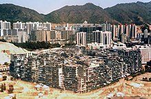

.jpg)


 Strong Support for edit 3, by Every1blowz. Love it, as original. In the edit, I think the richer grass, the slightly bluer white on the gravestone and the better perspective improve it for me. —Vanderdecken∴∫ξφ 18:11, 27 May 2006 (UTC)
 Pro for edit 3. lama 12:41, 30 May 2006 (UTC)]
.jpg)
 or
or  or . Those photos are nowhere near as good as yours but they do tell the viewer about the crab spiders' best known feature, its webless ambush hunting method ~ Veledan • Talk 17:30, 23 May 2006 (UTC)


.jpg)


![[1]](https://commons.wikimedia.org/wiki/Image:Tour_eiffel_at_sunrise_from_the_trocadero.jpg)
![[2]](https://commons.wikimedia.org/wiki/Image:UCPI4.JPG)


,_Croatia.jpg&action=edit&redlink=1)
 Support Edit. Amazing looking place. Image quality is boarding on the unacceptable but this is still pretty nice. --Fir0002 www 10:16, 5 June 2006 (UTC)


.JPG)


 Comment Actually, I'm pretty sure the only browser that supports raw .SVG files is Opera. But, that shouldn't matter because Wikipedia servers convert all .SVG images into .PNG images when the that image is requested. The .SVG image of this map is Image:LithuaniaPhysicalMap-Detailed.svg, but the image seems to be corrupt. —Black and White (TALKCONTRIBS) 19:42, 1 June 2006 (UTC)


 12:50, 11 June 2006 (UTC)


_%27Blushing_Bride%27.jpg)


![[12]](https://en.wikipedia.org/wiki/Image:Walschaerts_motion.gif)
 (just noticed how bad the colors are). If I had not included the legend within the image anyone who saw this outside of Wikipedia would have no idea what was being shown. Not to mention most diagrams have the legend within the picture anyway; its the standard on these things. Anyway, I ultimately agree Janke on this one. --Mad Max 21:14, 13 June 2006 (UTC)
 Neutral This is quite interesting, only problem I have is the cut off tail --Fir0002 09:39, 18 June 2006 (UTC)
![[13]](https://en.wikipedia.org/wiki/Image:Lunar_libration_with_phase2.gif)
![[14]](https://en.wikipedia.org/wiki/Image:User-FastFission-brain.gif)
![[15]](https://en.wikipedia.org/wiki/Image:UK_Roundabout_8_Cars.gif)
![[16]](https://en.wikipedia.org/wiki/Image:Tugra_Mahmuds_II.gif)
![[17]](https://en.wikipedia.org/wiki/Image:Tower_of_Hanoi_4.gif)
![[18]](https://en.wikipedia.org/wiki/Image:Gospers_glider_gun.gif)
![[19]](https://en.wikipedia.org/wiki/Image:Animhorse.gif)
![[20]](https://en.wikipedia.org/wiki/Image:Geneva_mechanism_6spoke_animation.gif)
![[21]](https://en.wikipedia.org/wiki/Image:Lorentz_transform_of_world_line.gif)
![[22]](https://en.wikipedia.org/wiki/Image:4-Stroke-Engine.gif)


.jpg)

_-_Dante_And_Virgil_In_Hell_(1850).jpg)


.jpg)
_edit.jpg)
.jpg)


