Voting period is over. Please don't add any new votes. Voting period ends on 2 Mar 2013 at 07:08:04 (UTC)
This photo was taken at the beach no.3 at Haveleck in the Andaman Islands .
Reason
Is among Wikipedia's best work regarding the Andaman Islands. The other photos of Andaman islands are not as beautiful or show the real beauty of the place. This is the only photo about Andaman which shows the real beauty of the place.
Comment Unless I'm very much mistaken, is this below size requirements? I have double checked and it does actually seem large enough, so I withdraw that comment... Also please note the above support from Rajan was added within 90 mins of the nom being created, and was this user's first edit on wiki... gazhiley 12:59, 21 February 2013 (UTC)[reply]
Oppose. Minimal encyclopedic value in the article in which it appears. Spikebrennan (talk) 15:53, 21 February 2013 (UTC)[reply]
ENCYCLOPEDIC VALUE REGARDING THIS PHOTOGRAPH HAS BEEN ADDED TO THE ARTICLE. — Preceding unsigned comment added by Ritiks (talk • contribs)
I have deleted the newly added text. It was an unattributed copyvio from this travel site. Totally inappropriate. --jjron (talk) 14:07, 23 February 2013 (UTC)[reply]
Comment I think it has some encyclopedic value, and maybe it will have more encyclopedic value if it was also included in the article for the
Another account created in the last two days, with only one edit other than this nom and their userpage. --jjron (talk) 11:02, 23 February 2013 (UTC)[reply]
For the record, I have opened a sockpuppet investigation regarding this behaviour: Wikipedia:Sockpuppet investigations/Ritiks. Suspend the nomination pending this if anyone wants. --jjron (talk) 14:07, 23 February 2013 (UTC)[reply]
Result of the sockpuppet investigation following an admission is that Ritiks has been blocked for one week and Rajan and Shilpa have been blocked indefinitely. --jjron (talk) 09:45, 24 February 2013 (UTC)[reply]
Oppose I looked at other coral images at Commons and found them to be a little more professionally taken, with less haloing. I'm also distracted constantly by the really white area (maybe blown out, but I see some blue in there). Also, I'm not keen on the only reason this is being nom'd is for "good resolution", because then pretty much every high resolution image should be nom'd. – Kerαunoςcopia◁galaxies 05:42, 26 February 2013 (UTC)[reply]
Voting period is over. Please don't add any new votes. Voting period ends on 3 Mar 2013 at 01:35:20 (UTC)
Original – Portrait of a Jicarilla Apache man
Reason
This is one of the clearest and highest resolution portraits of an Apache Indian. It is currently being used in the Jicarilla Apache article, where I replaced a faded, framed, and difficult to see portrait of a Jicarilla female. Although the image itself is available in black & white from the U.S. Library of Congress, it was of a far lower resolution (if this matters to anyone). I kept the sepia coloring because it absolutely pops off the page. I consider this a significant and valuable addition to the article because of its clarity compared to the previous image used, and also in comparison with most of the Apache photographs available for use. I also believe it meets all technical criteria, most importantly within the digital manipulation guidelines. An explanation of the work performed can be found in the image description.
Support as nominator --– Kerαunoςcopia◁galaxies 01:35, 22 February 2013 (UTC)[reply]
Support Having reviewed it, I can see no reason not to support. Nicely done. Adam Cuerden(talk) 08:51, 22 February 2013 (UTC)[reply]
Support - A little soft at full resolution, but I don't consider it a deal breaker. — Crisco 1492 (talk) 06:51, 23 February 2013 (UTC)[reply]
Very true, but I decided against sharpening it. (Normally I would sharpen on the luminosity channel in selective areas, the eyes especially and features on the face.) But something held me back this time, I'm not sure why. It can always be added later, too. – Kerαunoςcopia◁galaxies 07:41, 23 February 2013 (UTC)[reply]
I might have left the contrast where it was--this way you've really deepened the shadow at the bridge of his nose. I consider that a small complaint, though, so full support.
I restored the contrasted version (oops). I'll keep this in mind for future restorations; definitely a mistake on my part to not leave the contrast tweaks for later. – Kerαunoςcopia◁galaxies 07:23, 24 February 2013 (UTC)[reply]
Support Some minor issues per the above but overall a good image. Cat-fivetc ---- 06:38, 24 February 2013 (UTC)[reply]
Weak support sharpness is lacking but I think the historic value makes up for that. --Pine✉ 20:18, 1 March 2013 (UTC)[reply]
Promoted File:A Jicarilla Man, 1904, Edward S. Curtis (sepia restored).jpg --ArmbrustTheHomunculus 05:24, 3 March 2013 (UTC)[reply]
Support as nominator --Ritiks (talk) 12:01, 3 March 2013 (UTC)[reply]
Comment Not again.
Criterion two is your friend; actually, they all are. Unless the candidate fulfils all the criteria, it ain't gonna get promoted (there are exceptions to the rule). Higher-resolution photographs of Mahatma Gandhi exist. Speedy Close129.234.235.108 (talk) 16:40, 3 March 2013 (UTC)[reply
]
Oppose Have to agree with the IP. This is FP, not valued pictures. The image is crap technically and it is trivial to find better copies of this same photograph online, never mind other photographs. Colin°Talk 19:10, 3 March 2013 (UTC)[reply]
Support The painting is definitely showing it's age, bringing forth the argument as to whether a minor cleanup would be a good thing or sacrilege against a work of art, but otherwise it's quite nice. I almost feel like we need a Belgian to oppose on principle though. Cat-fivetc ---- 06:42, 24 February 2013 (UTC)[reply]
It's not a question of sacrilege: it's just that a painting is a material object that exists in the present, and thus should be represented as it actually is, unlike a photograph or a poster, any given print of which is just an instance of an inherently repeatable ideal image.
I could actually see editing photographs of paintings to remove reflections sometimes - occasionally you get a situation where there's a lot of little reflections on the paint, particularly if it's cracked a bit, but these are completely dependent on angle the flash comes from, so not an inherent part of the painting. Never done it, though; it's way too easy to get that wrong. Adam Cuerden(talk) 01:05, 26 February 2013 (UTC)[reply]
In any case, in this case, there aren't any unemphasized cracks that would justify de-emphasizing the ones that are visible. So they shouldn't be edited, and I support alt. Adam Cuerden(talk) 01:08, 26 February 2013 (UTC)[reply]
Support -- King of♥♦♣ ♠ 07:30, 24 February 2013 (UTC)[reply]
Clarifying that I am supporting the alt as well. --King of♥♦♣ ♠ 07:15, 28 February 2013 (UTC)[reply]
Thanks. I'll support alt. I was originally disappointed with the resolution of the painting (yes, it's big, but not massive) and would be neutral about even the alt version, but according to the Commons category, it seems Google Art accepted what they could get, which means this is probably the best scan of the painting available to anyone outside of the gallery. I compared both images and the Google Art image and the colors and resolution seem to match perfectly. (I'm curious how the image was taken from Google Art, and I'm not finding any explanation on Dcoetzee's talk pages yet.) – Kerαunoςcopia◁galaxies 05:34, 26 February 2013 (UTC)[reply]
I think Coetzee has his bot download the individual tiles, then stitch them together. I've done it manually (tool assisted in GIMP) with an image, although I forget which... different site though. — Crisco 1492 (talk) 06:33, 26 February 2013 (UTC)[reply]
(edit conflict)That's definitely a concern of mine, if this is taken from screen captures or actual scan files buried in the Google Art source code. Because to be honest, I can't tell. At Google Art, I can zoom in and take a screenshot and I'm pretty sure it'll look exactly the same. Alt is showing as 96.52 pixels per inch, which seems rather low for a scan. I'm not sure if there's a standard for FP either? (150 ppi or greater?) – Kerαunoςcopia◁galaxies 06:40, 26 February 2013 (UTC)[reply]
WP:FP? only gives number of pixels, not PPI. — Crisco 1492 (talk) 06:45, 26 February 2013 (UTC)[reply
]
Ok, thanks, I wasn't sure if there was some "underground" rule on that. – Kerαunoςcopia◁galaxies 09:12, 26 February 2013 (UTC)[reply]
Note to closer: There are two support !votes indented above. — Crisco 1492 (talk) 07:28, 2 March 2013 (UTC)[reply]
Promoted File:Jacques-Louis David - The Emperor Napoleon in His Study at the Tuileries - Google Art Project.jpg --ArmbrustTheHomunculus 06:52, 4 March 2013 (UTC)[reply]
Support as nominator --Tomer T (talk) 10:57, 23 February 2013 (UTC)[reply]
Comment It is a nice photo. Crop on the RHS a bit tight. But looking at other photographs, it seems too brown and not "ashy-grey" per the article and other photographs linked to by the article. I'm no bird expert, though. Colin°Talk 23:02, 23 February 2013 (UTC)[reply]
Comment Since the sky background is quite uniform, it would be easy to manipulate the photo to add some space on the right... but I wonder if that would go against the guidelines for image editing. The bird does look too yellow in comparison with other photos in the article too.
I've uploaded a new version with better white balance and added more space to the left. -- ~y (talk) 08:25, 24 February 2013 (UTC)[reply]
Oh I really don't like the colour of the sky now. Looks like the bird is in a cheap photo studio. And perhaps too much sky on the right now making the subject centred and almost like he might fall back into the void. Colin°Talk 13:36, 24 February 2013 (UTC)[reply]
Oppose This is very well done in that the chest is sharp enough as to clearly show the difference between the brownish bird and the brownish ground but the sharp right hand cut and the very narrow depth of field ruins it for me. I'm sympathetic to the difficulty of capturing wildlife but the tail and the left talon are very blurry. Cat-fivetc ---- 06:47, 24 February 2013 (UTC)[reply]
I agree the out of focus right leg and tail of the bird is distracting. In those days I would not go beyond ISO 400 for the fear of noise and with the given light the best option was to get a sharp head/beak for a portrait. I've uploaded a new version with more space to the right though. -- ~y (talk) 08:25, 24 February 2013 (UTC)[reply]
Weak oppose lack of sharpness, and the background color looks like a movie bluescreen. --Pine✉ 18:35, 3 March 2013 (UTC)[reply]
Voting period is over. Please don't add any new votes. Voting period ends on 4 Mar 2013 at 11:31:36 (UTC)
Original – Plymouth Rock, inscribed with 1620, the year of the Pilgrims' landing in the Mayflower. Plymouth Rock is an important symbol in American history as the traditional site of disembarkation of the Pilgrims who founded Plymouth Colony in Massachusetts.
Reason
Very high res and high quality photo of an important icon in American History. As far as I can find this is the easily the best photo of Plymouth Rock on the internet, and is also superior to any printed versions I have seen, including those by official bodies. Has been stable as lead image in the main article for 9 months, as well as in other articles for the same length of time.
Support as nominator --jjron (talk) 11:31, 23 February 2013 (UTC)[reply]
Support, with a slight caveat Really wish the coins had been removed before the photo. It somewhat mars the image. Subject is one of the sillier American landmarks, but undoubtedly notable. Adam Cuerden(talk) 13:19, 23 February 2013 (UTC)[reply]
Comment The coins provide a valuable sense of scale, along with the footprints, etc. If you remove them, it is impossible to judge how large the rock is. They also give wry insight into the role of the rock as a tourist attraction. Stigmatella aurantiaca (talk) 09:47, 24 February 2013 (UTC)[reply]
I agree with both points about the pennies, however given this is fenced off from general access I didn't want to climb the fencing to clear them (obviously given the footprints some people don't share that opinion), and also felt that they both gave a sense of scale and showed how tourists use it as a 'wishing well' type thing, so on the balance don't think they're a bad thing. --jjron (talk) 14:51, 24 February 2013 (UTC)[reply]
Question Should the cigarette butt in the top left be removed? – Kerαunoςcopia◁galaxies 19:39, 23 February 2013 (UTC)[reply]
There's a fair bit of debris around there as this is actually still open to the sea through a grate so a lot of stuff washes in and out, along with people being able to toss stuff in from above, so a bit of muck depicts the reality that this is open to the elements and not maintained in a pristine state. I'm not sure there is a butt, but anything there could be cloned out. --jjron (talk) 14:56, 24 February 2013 (UTC)[reply]
Strong Oppose Em, it's a stone on some sand. The image has chroma noise. It is about the dullest composition one can create. The subject hasn't been made presentable (footprints, cigarettes, coins). The lighting isn't anything special. It isn't' "eye-catching" or "among Wikipedia's best work". It is useful for the article, sure. Colin°Talk 22:47, 23 February 2013 (UTC)[reply]
Will ask the local authorities to surround it with some laser lighting and a marching band next time, eh. This depicts the reality of the thing, the mythical Plymouth Rock is "a stone on some sand" as you would put it. For those who couldn't be bothered to look at the article the rock sits at the bottom of this structure and taking it in anything but flat lighting simply gives you streaks of sunlight in heavy shadow, so yes, in fact this is the best lighting. --jjron (talk) 15:05, 24 February 2013 (UTC)[reply]
I agree that direct sunlight produces a poor photo as you say, but a side angle gives a better sense of form and showing more of the darker base helps too. I did read the article, and compared other pictures on Commons and the net prior to commenting. I think a better picture could be taken relatively easily but ultimately, both the subject and its environment prevent a great picture. Colin°Talk 17:36, 24 February 2013 (UTC)[reply]
I've updated my !vote to "strong oppose" for what it is worth. In my view, the FP process is valueless if a photograph has no "excellent" qualities whatsoever, other than those determined by the camera (sensor quality, focus and exposure). Colin°Talk 21:27, 3 March 2013 (UTC)[reply]
Weak support. Regarding it being merely a "stone on some sand", this is a historically significant rock and the
Support I don't like the fact that it's an issue but we need to be at least consistent when it comes to criticizing good images because they're dull. This is a well photographed, well framed, historically relevant object but since it's dull it must be criticized because so many nominations have failed for being dull, well framed, highly encyclopedic pictures. My sarcasm aside, subtract dull and that's why I'm supporting this image. Cat-fivetc ---- 06:50, 24 February 2013 (UTC)[reply]
Is it a good image? We can consider the EV and the qualities as a photograph of a rock with 17th century graffiti. The EV is met largely because it is a picture of the article subject. It is high resolution which is an asset, but the angle of the shot is gives no clue as to the rock's form, size or its location. For example this image or this image or this side view or this side view. As for being the best such photo, I'd argue that this is superior -- showing both the rock form but also with nicely clean sand. And yes, there is little excuse for sand with footprints and cigarettes as the tide and (and probably cleaning staff too) ensure it is fresh every day, as this very similar photo shows. Indeed a Google search shows most tourists managed to capture a similar photo with cleaner sand. So I feel this is an easily taken subject that many folk have captured successfully. I don't think that standing in front of the subject with a half-decent camera is enough to make a FP. And to anyone who's heart isn't stirred by American history, it is just a stone on some sand and "eye-catching" is an FP requirement. Colin°Talk 13:30, 24 February 2013 (UTC)[reply]
The above is an interesting debate—if something cannot be photographed with good lighting and perspective, does that mean we should feature the best we can get?—but there's another question here. Plymouth Rock is, as others have pointed out, essentially a myth; it exists more in nineteenth-century historical imagination than in seventeenth-century historical reality. Thus, I wonder whether the stone itself is even the best way to represent it; the ridiculously overdone neoclassical monument above it might actually be more significant. Anyway, I did go there as a kid and can confirm that it's pretty much surrounded by a giant retaining wall and never gets decent light.
OpposeNeutral. I have to agree with the above comment that "The subject hasn't been made presentable (footprints, cigarettes, coins)." There is only a small patch of sand around the rock that could have easily been smoothed out and the debris removed in 5 or 10 minutes with a simple rake. When you're taking a picture of a small, stationary object, I don't think that is too much to ask. Rreagan007 (talk) 02:51, 27 February 2013 (UTC)[reply]
Well perhaps you should read all the comments if you wish to regurgitate statements that have already been explained. As I clearly pointed out above the rock is in a fenced off enclosure and the public are not permitted to enter that area. So cleaning, raking, etc is not possible, meaning that yes, in fact, it is too much to ask. --jjron (talk) 13:45, 27 February 2013 (UTC)[reply]
Ok, so he's wrong about the photographer cleaning it up with a rake (like everyone carries a rake on their holidays) but clearly some folk have been down there messing up the sand with their footprints and a Google Image search shows that nearly everyone manages to take pictures of this rock with clean sand. So you've been jolly unlucky. Colin°Talk 14:59, 27 February 2013 (UTC)[reply]
Okay, I've changed my vote to neutral. But I still think it should be possible to clean the area. Perhaps you could ask permission to smooth out the sand from whoever is in charge of the area. Rreagan007 (talk) 18:38, 27 February 2013 (UTC)[reply]
Support I will agree the the removal of the debris, pennies, and footprints would make the picture more aesthetically pleasing, but given the difficulty in accomplishing this due to the fence, security, ETC... I don't think a better picture without the pennies and stuff is going to come along anytime soon, so I don't feel those complaints warrant an Oppose. Dusty777 17:43, 1 March 2013 (UTC)[reply]
Neutral I know this is American history, but the article even says "The Rock, or one traditionally identified as it....", and for all we know, this could just be a random rock someone decided to memorialize or be a symbol, which isn't impressive to me. It's more interesting as a rock that was broken in two for some mysterious reason and then cemented back together, then someone decided to carve "1620" into it. It just seems like it was treated as a toy throughout history. (And according to the article, another piece of the rock is on a pedestal elsewhere.) I don't oppose it because it makes a great addition to the top of the article. But not FP for me, sorry. – Kerαunoςcopia◁galaxies 02:34, 3 March 2013 (UTC)[reply]
Oppose I can't get past the litter, sorry. – Kerαunoςcopia◁galaxies 08:48, 3 March 2013 (UTC)[reply]
Weak oppose The dullness doesn't bother me but the coins do. If the coins were on the side instead of on the face of the rock I think that would still provide scale. Also, given the questions about the historical authenticity of this rock, I have difficulty supporting this for FP. --Pine✉ 18:41, 3 March 2013 (UTC)[reply]
Just to clarify here, the above comments about historical authenticity are totally out of line. This is Plymouth Rock as identified by all official bodies, the fact that it may be more mythology than reality doesn't alter the fact that this is an image of the genuinely recognised artefact. Misreading of the article by one voter to be backed by others is rather poor form. Oppose for other reasons if you like, but questioning whether I'm making up whether or not this is the real deal I find a bit offensive TBH. --jjron (talk) 14:15, 4 March 2013 (UTC)[reply]
Oppose upon more careful inspection of the image and comparison to other underwater featured images, I now see the flaws mentioned by Raeky and withdraw my support.
I don't think the nominator being banned has much bearing on a FPC nomination, there's no reason to suspend/close them? — raekyt 18:15, 24 February 2013 (UTC)[reply]
Oppose as for this image, it's just not high enough quality for what we normally except for underwater photography. The whites are blown on the fish, it's not very sharp, and other flaws makes it not exceptional enough for promotion. — raekyt 18:15, 24 February 2013 (UTC)[reply]
Voting period is over. Please don't add any new votes. Voting period ends on 5 Mar 2013 at 00:20:34 (UTC)
Original – A chart showing the chain of inheritence for a recessive gene including the distinction between a non-affected carrier offspring and an affected offspring.
Reason
Hard to believe this hasn't already been nominated. This does an amazing job of showing how recessive genes are passed from the parents to the offspring and the difference between an affected offspring and a non-affected carrier of the recessive gene.
Articles in which this image appears
The highest EV I think is at
Recessive, despite the fact that the article uses smaller preview. Here however
, is the full list of the 165 articles that use this image.
Support as nominator --Cat-fivetc ---- 00:20, 24 February 2013 (UTC)[reply]
Support superb encyclopedic value in illustrating how recessive genes work to laymen without having to use a Punnett square. It is also an SVG of excellent technical standard.
I am in no way attempting to canvas for votes but I'll note that your comment got me to look up the article for Punnett square and nominate the main image from it for FP status here. Cat-fivetc ---- 06:35, 24 February 2013 (UTC)[reply]
Support per above. JKadavoorJee 06:02, 24 February 2013 (UTC)[reply]
Support - I don't usually get behind graphs and charts, but this one looks pretty well done and is fairly easy to follow. — Crisco 1492 (talk) 07:08, 24 February 2013 (UTC)[reply]
Support -- King of♥♦♣ ♠ 07:29, 24 February 2013 (UTC)[reply]
Question. Shouldn't the offspring be half female? I mean 2 of them male and 2 of them female, not all of them hermaphrodites :) Kaldari (talk) 09:54, 24 February 2013 (UTC)[reply]
Good point; but presenting the affected as a girl may not good. :) JKadavoorJee 13:33, 24 February 2013 (UTC)[reply]
I kind of wish they were all hermaphrodites. By making only one a female sort of makes it feel like this is trying to demonstrate
sex-linked inheritance. --jjron (talk) 13:46, 25 February 2013 (UTC)[reply
]
Good point but if they mixed and match the offspring genders then it would be confusing as to what exactly it is trying to show and they had to show one female parent and one male parent (a biological fact, not a social commentary) as the sources of the genes. Cat-fivetc ---- 03:58, 26 February 2013 (UTC)[reply]
If we did male, female, male, female (or female, male, female, male) I don't see how it would be confusing. If they all must be the same gender, I would prefer they were female so we weren't falling into the 'male default' bias. Kaldari (talk) 05:32, 3 March 2013 (UTC)[reply]
Support - Coming from a bio nerd... really kind of neat. ceranthor 23:41, 24 February 2013 (UTC)[reply]
Oppose. For illustrating autosomal inheritance, I think sex should be left out of the diagram altogether (at least for the offspring). Including it is problematic either way: showing all offspring as a single sex will confuse readers as to why the sexual phenotypes aren't normally distributed, and showing a mix of sexes without adding another dimension will confuse readers as to whether the inheritance is sex-linked. (How come there isn't there a sexless human symbol anyway?) --Paul_012 (talk) 00:12, 4 March 2013 (UTC)[reply]
Also, I understand that this is supposed to illustrate a condition which follows classic Mendialian inheritance with complete dominance. If this is the case, I'd prefer that the differences between homozygous unaffected individuals and carriers be much more subtle than blue-vs-purple. The diagram should, after all, show that both are phenotypically identical. (The R overrides the r, not mixes with it making purple.) --Paul_012 (talk) 01:04, 4 March 2013 (UTC)[reply]
Voting period is over. Please don't add any new votes. Voting period ends on 5 Mar 2013 at 00:20:48 (UTC)
Burrowing Owls
, including a less mature specimen
Reason
High resolution, interesting subject, good EV... and cuteeeeeeeeeeeee
Articles in which this image appears
Burrowing Owl
FP category for this image
Birds
Creator
travelwayoflife on Flickr
Support as nominator -- — Crisco 1492 (talk) 00:20, 24 February 2013 (UTC)[reply]
Support Excellent image quality. Composition is fine - it would be ideal, of course, if it was focus-bracketed so that all five owls were in sharp focus, but that would be asking too much. Regarding EV,
Weak Support Purpy Pupple's criticism in mind, it's as good as it can be without all owls in focus. Cat-fivetc ---- 06:51, 24 February 2013 (UTC)[reply]
Neutral It's a frustrating image for me. Really neat subject matter, but really awkwardly cropped (is it tight? I can't tell), and way too much foreground. But it's also an incredible shot. – Kerαunoςcopia◁galaxies 05:46, 26 February 2013 (UTC)[reply]
Support great quality, superb composition. It already had my vote at POTY round 1. --A.Savin (talk) 10:47, 26 February 2013 (UTC)[reply]
Support all the owls should have been in focus, bu nonetheless a great imageRitik
Voting period is over. Please don't add any new votes. Voting period ends on 5 Mar 2013 at 02:13:38 (UTC)
Original – Example of a Punnett square. In this example in peas, the color yellow is determined by the dominant allele Y and the color green is determined by a recessive allele y.
Reason
This is a well done image of a Punnett square that effectively illustrates the topic and has high EV and relevance in the articles that it is used in.
Support as nominator --Cat-fivetc ---- 02:13, 24 February 2013 (UTC)[reply]
Weak Oppose, a Punnett square could be made with any colours and any letter, but yellow upon white is (relatively) difficult to read and the difference between the small 'y' and capital 'Y' is not as great as, say, 'r' and 'R'. Also, it seems to me that, in general, with pigmentation, darker colours tend to be dominant and lighter colours tend to be recessive (intuitively, if the presence of an allele R produces a pigment whereas the allele r does not produce it, then both RR and Rr will be pigmented whereas only rr will not be pigmented). That said, apart from design choices, this picture is technically still very well executed and is quite decent in its own right. --
To an extent I agree with you and if I were to create something like this I would never choose yellow as a valid color choice. That being said at least the creator used dark yellow which makes it a bit easier to look at. While you have a valid criticism, I don't feel so strongly about changing it to edit it and upload a new copy just to get your support though, since it doesn't IMO hurt the EV or usefulness of the image. Cat-fivetc ---- 06:33, 24 February 2013 (UTC)[reply]
I just think that, since it is very easy to make a graphic of a Punnett square, we have every reason to expect the Featured Punnett square to be of the utmost quality with no flaws whatsoever. If I have time later this week I might make one.
If another is made, which genotype would be used? I'd have thought (probably subjectively, mind) that a Rr–Rr cross would have the most EV because it shows that traits not necessarily observable are passed to generations and may show at some random, 25% chance point. 129.234.235.108 (talk) 08:53, 25 February 2013 (UTC)[reply]
The green/yellow pea pod phenotype is symbolic in that it echoes one of Mendel's original experiments, and I think is preferable to some other arbitrary colour choice. However, Purpy Pupple is right in that green should be the dominant trait. (Things are reversed, however, for the seeds.) I also would prefer a Gg×Gg cross as mentioned by 129.etc. --Paul_012 (talk) 23:40, 3 March 2013 (UTC)[reply]
Support, nice clean illustration. -- King of♥♦♣ ♠ 07:29, 24 February 2013 (UTC)[reply]
Oppose current version. I don't like that the colours given to the genotype letters are much more prominent than those of the phenotype illustrations. This is potentially confusing. The pea pods should be bigger in order to illustrate the fact that those (rather than that of the letters) are the actual phenotypic colours. The colours could even be removed from the letters (like most illustrations elsewhere); what the letters represent should be made explicit in the caption anyway. --Paul_012 (talk) 00:01, 4 March 2013 (UTC)[reply]
Comment I've made some new Punnett square pictures for eye colour. Feel free to discuss.
Oppose Verticles aren't straight (seems to have been taken from an angle), fencing is distracting, and the sky seems blown on the viewer's left hand side. — Crisco 1492 (talk) 07:54, 24 February 2013 (UTC)[reply]
Do you think I can change the cable, it is not possible, it is not possible to change the actual view and the sky was like that, it is also not in my control, so sorry Mydreamsparrow (talk) 07:57, 24 February 2013 (UTC)[reply]
You don't have to apologize. We HIGHLY appreciate you and thank you for contributing valuable images to Wikipedia, and hope you continue. Please take criticism here lightly. Image issues are just suggestions on how to improve your photography. A lot of this is exposure, seems over exposed. The automatic exposures on your camera is not always ideal. Extremely bright sunny days can be toned down with neutral density filters or other techniques. Tripods with bubble levels allow you to get more aligned shots, or post-processing in Photoshop to correct tilts. Some distracting features can be cloned out. — raekyt 23:23, 24 February 2013 (UTC)[reply]
The power lines and fence are something that either you'd have to try to capture the building by going in-front of them, or higher elevation so that they're not obscuring the building. Getting a GOOD photo of a building in an urban environment is extremely difficult, and to get a FP quality one of some buildings may not even be possible. — raekyt 23:25, 24 February 2013 (UTC)[reply]
Voting period is over. Please don't add any new votes. Voting period ends on 5 Mar 2013 at 17:48:46 (UTC)
Original – A mother sperm whale and her calf, photographed off the coast of Mauritius
Reason
It is one of the best profile pics of the sperm whale on the Web. Granted, it's a little blurry, but this is natural when photographing large animals underwater, and I'd rather not resort to digitally enhancing it.
Support as nominator --Kurzon (talk) 17:48, 24 February 2013 (UTC)[reply]
Comment. For anyone else that is wondering, this is not the same photo that narrowly failed in this nomination about a month ago, although they were probably taken within seconds of each other (contrary to the date claims on the respective image pages). --jjron (talk) 13:42, 25 February 2013 (UTC)[reply]
Comment. That other picture lost the vote because there was too much digital sharpening (I don't know about this really, I just cropped the images and don't know what the author did to it).
Support — Did a Google image search. This is just about the best large sperm whale image on the web, with good EV. Stigmatella aurantiaca (talk) 04:38, 28 February 2013 (UTC)[reply]
Weak Oppose How is this an acceptable composition? Is the ass-end from above view of it especially notable? — raekyt 23:09, 24 February 2013 (UTC)[reply]
Firstly, the rear of the Porsche 911 is distinctive in its own right -- we are not looking at some bird or animal whose face is prettier than its backside. Secondly, the roof and the steel roll bar which we are looking at here is best seen from this angle. However, I have included an alternate angle for voting. Naturally, in the side view, we are unable to see the top of the roof, nor the "911 T" badge, nor the license plate which indicates its model year (the model year is notable also because 1972 is the only model year for which the oil filler door was installed on the rear right fender).
Porsche_911_classic, I don't see very high EV due to the angle, and the second alt image has even less EV in the first article, and I don't really like side-on shots of cars... — raekyt 23:28, 24 February 2013 (UTC)[reply
Support: The targa is an interesting part of the history of the 911, one of the all-time classic sports cars, and the only other 911 Targa photo I'm seeing has a rollbar that blends in with the roof. This one is much better for illustrating the distinctive rollbar that makes it a Targa. The shiny hardwood floor is an odd setting for a sports car, but I find it rather elegant. As for the Alternative view, too much window glare. –Thatotherperson (talk/contribs) 10:24, 27 February 2013 (UTC)[reply]
We do have some other pictures of the 911 Targa at
Oppose The image is really contrasty and the interior of the car is really dark. There's too much dead space on the top left, though it's probably framed this way due to whatever real-life restrictions there may have been to get this angle. There's also two color temperatures, the top left outdoor light is seeping in, being extraordinarily blue, which is also reflected on the car roof. The house lights are a bit glaring, and finally there are bizarre objects on the right—I'm sure someone smarter than me will know what it is, but to me, it's just a random piece of metal on the ground, and also a wooden slope poking in on the right. As for the alternative, similar issues as listed above (interior of the car lit by blue outdoor light, external glaring with indoor light), and the background is full of strange distractions like reflections and a bird that really wants in. – Kerαunoςcopia◁galaxies 21:49, 5 March 2013 (UTC)[reply]
Voting period is over. Please don't add any new votes. Voting period ends on 5 Mar 2013 at 23:58:36 (UTC)
Original – Swiss rescue helicopter in action. Model BK 117-C2 (EC-145) of Rega with registration "HB-ZRE".
Reason
It is already a Featured Picture on Commons, and German and Spanish Wikipedia. Its prominent usage in English Wikipedia articles makes it deserve English Wikipedia FP status too (I don't know why it isn't yet).
Oppose Partially due to Amadscientist's point, but more due to focus issues, including haloing around the body and tail of the aircraft... gazhiley 14:35, 1 March 2013 (UTC)[reply]
Support To address the above issues: the color of the helicopter contrasts very nicely with the snowy mountains. The halo effect mentioned by gazhiley might be the tail rotor and exhaust fumes.Kurzon (talk) 17:37, 5 March 2013 (UTC)[reply]
Support Not only the best photo we have, I think their marketing department would be hard-pressed to do better. Very nice. Daniel Case (talk) 02:52, 27 February 2013 (UTC)[reply]
Support What a cool picture. – Kerαunoςcopia◁galaxies 09:48, 28 February 2013 (UTC)[reply]
Support. My inclination is to oppose car photos taken at motor shows, but this is very well done without the attendant distractions we so often see; some may think the background overly imposing for an encyclopaedia, but I don't think it's too dominant, especially at full-res. There are some obvious blown highlights on the car from reflections of bright lights, almost unavoidable in these situations, and they're pretty well controlled. A slightly distracting reflection on the windshield, and was tossing up a 'weak support' due mainly to what looks like some minor artifacting in the blacks of the main Mercedes logo in the grille, but overall I'm pretty sold on it. --jjron (talk) 09:27, 2 March 2013 (UTC)[reply]
Support The image has an odd crop but the quality of this image can easily make one overlook that slight issue.--
Voting period is over. Please don't add any new votes. Voting period ends on 6 Mar 2013 at 04:46:42 (UTC)
Original – The Alpine A110, also known as the "Berlinette", was a sports car produced by the French manufacturer Alpine from 1961 to 1977. This Alpine A110 1300G is painted in French Blue.Edited – The Alpine A110, without distracting car in the background.
Reason
Technically high quality; excellent EV as lead image of article. It is a FP on German Wikipedia.
Comment as for the previous nom below, image page needs to be in English to be eligible. --jjron (talk) 06:58, 26 February 2013 (UTC)[reply]
Thanks for reminding me. I accidentally overlooked that since the image description only states the car's model which is not language-dependent. I have added an English description with a link to the
Oppose. Having thought about this a bit, while a decent photo there's just too many factors leading to an oppose. The main issue is that the vehicle is clearly significantly modified; for a featured image in an article on the standard vehicle I think we should try to illustrate vehicles as close as possible to factory standard. Other niggles are the number plate clearly showing (generally preferred to have it removed, or at least blurred out), the other vehicle in the background being a distraction, the driver and navigator clearly being on show, all those stickers on the rear quarter window, and sadly the main badge on the bonnet (one would assume it's meant to be an Alpine badge, though it looks like it may be a Renault badge) being completely blown out. Also there's no indication of the actual model/year of this vehicle which is very useful in terms of EV. --jjron (talk) 13:01, 26 February 2013 (UTC)[reply]
Hmm... now that you point it out, I do see some slight modifications: some parts are painted black (edges around headlights; bonnet hinges; windshield wipers); a roll cage has been installed; a lower air intake under the front bumper; and possibly different wheels. c.f. Google Image Search. The owner may have been attempting to replicate the appearance of the rally car at 1971 in Monte Carlo. The logo does look like a Renault logo judging from
Support as nominator --Hari Krishnan 07:07, 25 February 2013 (UTC)
Comment Image is 1.5 megapixels. Also, the red eye is pixellated. And don't get me wrong, but my understanding is en.wiki FP are supposed to be used in articles and add significantly to them. – Kerαunoςcopia◁galaxies 02:44, 26 February 2013 (UTC)[reply]
Striked out usage comment, it's a long story. – Kerαunoςcopia◁galaxies 02:49, 26 February 2013 (UTC)[reply]
Oppose: It is a beautiful bird, but unfortunately the photo not reach minimum size requirements; does not have good amount of detail; appears to be oversharpened in post-processing; and has a poor background. Please don't be discouraged however, I hope you pursue your passion for nature photography and continue to contribute nice pictures to Wikipedia. For inspiration in bird photography, look towards
Voting period is over. Please don't add any new votes. Voting period ends on 6 Mar 2013 at 14:40:26 (UTC)
Original – World War II American Infantryman, kneeling in front of M3 Half-track, with an M1 Garand rifle wearing HBT first pattern uniform. Fort Knox, Kentucky, June 1942.
Reason
High quality image, good restoration, used in several articles, featured on Commons. Previous nomination here
Support as nominator -- — Crisco 1492 (talk) 14:40, 25 February 2013 (UTC)[reply]
Oppose I have concerns about the accuracy of the colours (esp. of the uniform) after the "histogram fix". Compare with original colours which are a lot less blue: [2]. Notice that on the
Comment/Question. In the previous nomination I raised some concerns on the EV. To save rehashing it all I won't repeat, and while the nominator at the time gave some responses, I'd like to hear your opinion on where you think the EV actually is, given you haven't commented on it in the nom, save to say that it's used in several articles? (In short, I guess I'm saying 'what's changed', esp. in terms of EV?) Some of my other criticisms still stand too, such as not linking to the unrestored version in the 'other versions' section. --jjron (talk) 12:28, 26 February 2013 (UTC)[reply]
Oppose this version definitely; not sure about a re-edit, at least of this particular photograph. Replying to John: Palmer was known for carefully posed, often elaborately lit "staged" photographs. No candid-style military photograph could possibly get this level of quality using color film at the time. That does diminish the EV, but to me it's a product of choosing to take it in color. For me, I'd prefer an unstaged B&W, but it's clear that people are drawn to color photographs from this period. Adam: if you're working on this, please note that there's
Support as nominator -- — Crisco 1492 (talk) 11:13, 26 February 2013 (UTC)[reply]
Oppose It is a great image and justly deserves the Commons FP. However, its EV is low. There is no environment and the dark conditions are a problem: very little of the body is bright enough to see the scales and most importantly it is impossible to tell this has clear fins (hence the name "Clearfin lionfish") rather than just opaque dark fins. See the other pictures in the category at Commons. -- Colin°Talk 12:58, 26 February 2013 (UTC)[reply]
Support as nominator --Hari Krishnan 05:33, 28 February 2013 (UTC)
Photographing the plant suffused with light like this can seem nice at thumbnail size but it's not really a good approach for encyclopedic purposes. The outer petals are completely white; there's no detail visible in them at all. This is a real problem for identification--for example, is the pink tinge on all the petals, but invisible in the outer ones because they're too bright, or is it only on some of them? I can't tell from this photograph. It seems a little out of focus, also.
Voting period is over. Please don't add any new votes. Voting period ends on 9 Mar 2013 at 13:02:47 (UTC)
Original – Female Rusty-naped Pitta (Pitta oatesi), Mae Wong National Park, Nakhon Sawan, Thailand
Reason
Pittas are difficult to see and photograph, but much sought after by birdwatchers. With the exception of the male photo also currently nominated, there are no other photos on commons of this species. This is also true for most Pitta species. This, and the complimentary male shot add a lot to the previously unillustrated article, which I expanded a bit.
Voting period is over. Please don't add any new votes. Voting period ends on 9 Mar 2013 at 13:04:23 (UTC)
Original – Male Rusty-naped Pitta (Pitta oatesi), Mae Wong National Park, Nakhon Sawan, Thailand
Reason
Pittas are difficult to see and photograph, but much sought after by birdwatchers. With the exception of the female photo also currently nominated, there are no other photos on commons of this species. This is also true for most Pitta species. This, and the complimentary female shot add a lot to the previously unillustrated article, which I expanded a bit.
Support. I cannot emphasise enough to non-birders how hard these shots would be to get. Skill and no small amount of luck I imagine, although luck does favour the prepared! Great stuff. Both these images will be on the main pitta page as well soon. Sabine's Sunbirdtalk 22:43, 1 March 2013 (UTC)[reply]
Voting period is over. Please don't add any new votes. Voting period ends on 9 Mar 2013 at 13:09:08 (UTC)
Original – Siberian Rubythroat (Luscinia calliope) male, Pak Chong District, Nakhon Ratchasima, Thailand
Reason
Nice photo of a cool migrant. I got this shot after a tip off from another photographer I met in nearby Khao Yai National Park, where I slept the night on the way to see the Pitta. It involved waiting for a few hours in baking heat in front of a small waterhole in a sugar cane field.
Comment Forget to add it to the page? Page is already pretty overillustrated, probably have to drop both of the previous male images, imho. — raekyt 15:19, 28 February 2013 (UTC)[reply]
Well yes, heh. Does somebody want to suspend this for a week, or just let it run anyway? JJ Harrison (talk) 00:05, 1 March 2013 (UTC)[reply]
It's been there long enough to say it is probably stable now. JJ Harrison (talk) 08:17, 5 March 2013 (UTC)[reply]
Weak oppose I hope it's not sacrilegious to say this cause I know your work is excellent. But it's the background I don't like. I prefer the female image on the same article in terms of clarity. As a large image, I can see the bird fine, but as a thumbnail on a Wiki article, the bird just blends right into the background. :( – Kerαunoςcopia◁galaxies 02:44, 3 March 2013 (UTC)[reply]
Support Great details. The chosen same colour surroundings is part of its survival skills. JKadavoorJee 06:26, 4 March 2013 (UTC)[reply]
Support. There is no problem discerning the bird against the background and it nicely highlights the throat patch.
Mature bull with beautifully shaped tusks in musth (leaking fluids in temporal glands) in typical deciduous forest habitat. With its ears open, the elephant is sniffing the air to check for the scent of the photographer (typical elephant behavior).
Weak oppose Nice shot and the eye is frightening, but I can't get past the busy background (trees coming out of his head) and the foliage in the foreground covering up his legs. With the tree on the left and a strange crop, it feels off-balance too. – Kerαunoςcopia◁galaxies 23:08, 1 March 2013 (UTC)[reply]
Comment: Is it just me, or has the elephant's back right leg been photoshopped? –Thatotherperson (talk/contribs) 23:48, 1 March 2013 (UTC)[reply]
Looks fine to me. An unfortunate stalk of something following the outer edge of the leg, sudden change in coloration, and baggy skin in weird places, but I think it's all normal. Also, the plants in the background go from dark to light just underneath the elephant, also making the leg look weird. – Kerαunoςcopia◁galaxies 00:01, 2 March 2013 (UTC)[reply]
Comment Good behavioral shot with great details (See the eye details compared to our other FP); but the composition is not convincing me. The file size is small for such a big subject and the crop seems unbalanced. You may think about a more generous crop with more space on right. I've no problem with the busy background; it is it's natural habitat. (I think the "white thing" on its back leg is a plant stem.) JKadavoorJee 06:16, 4 March 2013 (UTC)[reply]
There is an uncropped version attached to the square. I prefer the square crops in wikipedia articles as it looks better in the thumbnails. :) -- ~y (talk) 07:58, 4 March 2013 (UTC)[reply]
Wow, I missed that. Support then; prefer that alt. JKadavoorJee 08:48, 4 March 2013 (UTC)[reply]
I added the image Jkadavoor refers to as an alt. Note: image needs a caption.
Support as nominator --Hari Krishnan 16:13, 1 March 2013 (UTC)
Weak oppose I love this picture, it's gorgeously framed, but the berries are way out of focus, and random edges of the leaves are in focus. – Kerαunoςcopia◁galaxies 23:05, 1 March 2013 (UTC)[reply]
Oppose. Poor lighting and leaves show extensive insect damage. Kaldari (talk) 05:24, 3 March 2013 (UTC)[reply]
Oppose. As above, give us a specimen with intact leaves.Kurzon (talk) 20:21, 5 March 2013 (UTC)[reply]
In the article on the genus Piper, this is the only image of the species nigrum. In the article on drupes, too, a number of examples of fruits that are drupes are illustrated of which this is one. In the Piper nigrum article, I think this image shows the drupes better than the other images, with less background distraction. K Hari Krishnan—Preceding undated comment added 03:50, 2 March 2013 (UTC)[reply]
Neutral Image is a bit soft, but it really stands out in the articles. Catchy composition. I will change to support if you can maybe expand the description just a bit more and categorize the image over at Commons. – Kerαunoςcopia◁galaxies 02:41, 3 March 2013 (UTC)[reply]
I have expanded the description and categorized the image. Please tell me if the expansion is too much; I shall reduce it. Thanks. --Hari Krishnan 05:06, 3 March 2013 (UTC) — Preceding unsigned comment added by Kallidaimaniac (talk • contribs)
Support Your categories were vague, so I narrowed them a bit. If you click into a category, you'll see further categories that should be more suitable. – Kerαunoςcopia◁galaxies 20:46, 3 March 2013 (UTC)[reply]
Weak Support I would prefer a bit more Depth of Field. Adam Cuerden(talk) 20:10, 7 March 2013 (UTC)[reply]
Support - Seems fine to me. ceranthor 22:35, 8 March 2013 (UTC)[reply]
Support Looks good to me. Rreagan007 (talk) 05:22, 9 March 2013 (UTC)[reply]
Support Nice Ritik—Preceding undated comment added 12:42, 9 March 2013 (UTC)[reply]
Support as nominator --Hari Krishnan 17:44, 1 March 2013 (UTC)
Oppose Crop is too tight, oversharpened, and busy. – Kerαunoςcopia◁galaxies 02:36, 3 March 2013 (UTC)[reply]
Uploaded newer version of the image with looser crop, and sharpened less, although I feel the earlier image was not oversharpened.--Hari Krishnan 07:26, 3 March 2013 (UTC) — Preceding unsigned comment added by Kallidaimaniac (talk • contribs)
Oppose, too busy. -- mathwhiz29 18:07, 5 March 2013 (UTC)[reply]
Voting period is over. Please don't add any new votes. Voting period ends on 11 Mar 2013 at 10:23:10 (UTC)
American Airlines Arena in Miami, Florida, USA, home of the NBA basketball team the Miami Heat
Reason
Yeah, so I know these images get a bit of a hard time here, but I think this one is pretty well done. No mean feat to get both the jumping basketballer on the big screen on the front windows of the arena (I consider it the highest EV, most aesthetic, and least advertising of the scrolling displays they had) and a break in the traffic on the busy Biscayne Boulevard in front of the building. Otherwise high quality, good light, etc, good time of year with the attractive floral displays. Good EV, has been lead image in the main article for the best part of a year and also widely used in a number of other significant articles and on other wikis.
Support as nominator --Tomer T (talk) 10:50, 2 March 2013 (UTC)[reply]
Oppose While it is a nice image, it looks very un-natural with the animal looking directly at the camera. Makes the face look a little odd. Also the haulted posture loses a leg in the shot and makes the deer look like a tripod.--
Support I think this fancy and eye-catching view is quite part of its stop, listen and run - fearful behavior. JKadavoorJee 06:21, 4 March 2013 (UTC)[reply]
Oppose. A decent picture, but I'm not sold on the oh-shit-is-that-guy-about-to-shoot-me pose. J Milburn (talk) 20:35, 4 March 2013 (UTC)[reply]
Comment I don't think the pose is that artificial. These animals usually make such poses every once a while when taking in their surroundings. --Muhammad(talk) 21:46, 4 March 2013 (UTC)[reply]
When I said un-natural I meant that the animal has clearly been disturbed. I think J Milburn put it a little better.--
Yes; they are very fearful. We've almost no way to approach them without making their eager (alert) attention. JKadavoorJee 05:37, 5 March 2013 (UTC)[reply]
Support a very nice image. There is nothing "unnatural" about this pose. Deer jump at practically every sound they hear and probably strike this pose hundreds of times a day. I actually like the pose here. Being able to see the full head straight on gives a nice perspective. Not every image of a deer needs to be a profile shot with its head down munching on grass. This pose makes it a very engaging image to view. This perspective almost gives you the feeling of being the lion right before chasing down your lunch. In that way, it's a very exciting image. Rreagan007 (talk) 05:39, 5 March 2013 (UTC)[reply]
Oppose I disagree, the alert pose isn't very ideal for wildlife photography. Theres a reason why really high quality wildlife photographers spend extremely long periods of time in blinds and hiding from animals, so they can get natural photographs/videos of animals behaving naturally in their environment. — raekyt 10:36, 11 March 2013 (UTC)[reply]
Voting period is over. Please don't add any new votes. Voting period ends on 11 Mar 2013 at 18:20:39 (UTC)
Original – Updated diagram of a bicycle
Reason
Back in October, a version of this file – File:Bicycle diagram-en.svg, which is still the version used in articles – was nominated which attracted a lot of comment, which can be summarised as saying that the idea was fine but there were problems in the execution. Since then, I've implemented a raft of small changes. Some of them are identified on the file page. There were some suggestions of things to include, but I've concentrated on fixing the flaws in the implementation. After all, I think there's room in our article to have a fairly simple diagram alongside more complex ones. Very instructive in my opinion. (Will update articles if it passes; or maybe even if not.)
Changes include: greyscale the bicycle; change the circle markers to blue; reorganise to avoid annoying overlaps; remove grey boxes; split the seat area section; capitalise labels; redo wheels so that the spokes are radially equidistant.
Articles in which this image appears
The original is in many (and this would, I think, be merely a new version of that same image) including Bicycle
Support as nominator --Grandiose(me, talk, contribs) 18:20, 2 March 2013 (UTC)[reply]
Support Excellent EV. -- King of♥♦♣ ♠ 01:53, 3 March 2013 (UTC)[reply]
Oppose I think the diagram can be improved a bit further (but feel free to debate my points):
The front may be better with a disc brake, firstly to illustrate different types of brakes used on bicycles, and secondly because the left part of the fork has clearly the mounting holes for a disc brake caliper. As it is now, the viewer is left confused as to why the left and right halves of the fork appear different.
The seat tube and seat post are not entirely straight even though they are straight in most frames.
The left crank and pedal are not shown even though it seems to me they ought to be partially seen at that angle.
Now that the colouring has been removed, the awkward pinkish hue that remains on the derailleur and sprocket components seems out of place (and suggests rust).
The lack of perspective on the handlebars is inconsistent with the perspective on the fork, the seat stay, and the chain stay. Maybe it would be better not to have perspective at all.
The shadows underneath the wheels are distracting and unnecessary -- it is obvious the wheels rest on the ground.
The blue pointers are not easily followed due to low contrast between blue and dark grey and due to the many intersecting spokes.
The shading and glossy reflections on the frame are inconsistent and have many glitches. It may be better to remove the shading altogether.
Is Front set a commonly accepted term or something made up for this diagram? I couldn't find the term either in Bicycle frame or in Bicycle. Besides, the head tube is usually considered to be part of the frame.
As a side note, perhaps a well-executed bicycle diagram clearly illustrating the different parts ought to be bigger and shown more prominently on the bicycle article. --
Left pedal added; left crank not visible anyway and neither I think left handlebar (played around with it).
Ligthened the circles under the tyres to be less distracted- actually looks really odd without them though.
"Front set" is not an actual term
Head tube moved to frame per original FPC
Corrected some odd shaping of the seat post and seat tube
What do you mean by teeth, JJ?
The tyre tread on the wheels seem to be unevenly spaced. Also, I just noticed the sprockets are wrong -- the spacing between the teeth should be the same regardless of the size of the sprocket (smaller sprockets have fewer teeth) but in this diagram the smaller sprockets appear to be just scaled versions of the big ones. dllu(t,c) 21:27, 10 March 2013 (UTC)[reply]
Yes, the sprockets were what I was referring to. JJ Harrison (talk) 03:09, 11 March 2013 (UTC)[reply]
Pinkish areas now greyscale as far as I can see (some of them are very subtly coloured but I don't think that's a problem).
With braking systems with was mentioned on the first FPC but I think they merit a separate diagram and could confuse here, because it would be difficult to show how they operated properly.
The shading on the frame is illustrative of its shape. Whether realistic or not, I think it functions fine.
Voting period is over. Please don't add any new votes. Voting period ends on 12 Mar 2013 at 02:14:52 (UTC)
Original – Portrait of an Inupiat Family
Reason
I first noticed an earlier, lighter rendition of this image on our Eskimo article, and it's in fact the image the introduced me to Edward S. Curtis's photography. After replacing this faded image with a slightly larger cleaned-up version I found at the PrintCollection website and noticing no one had deleted it or reverted it, I decided to restore the full size version myself, and this is the final product. The image stands out among Curtis's photographs as one of the best family portraits (he also photographed the kid by him/herself). The Library of Congress's version is unfortunately extremely contrasty, so I tried to lessen it. The image portrays a family in their regular clothing—unfortunately I don't know exactly what it is (otter, perhaps) and until I find out, I can't mention it in the description. The parents seem relaxed, but the kid has a fierce look of strength on his face that I love. I believe the image adds significantly to each article it appears in because it is a clear, close up portrayal of a small family, and it contrasts nicely with other images of these people at work.
Edward S. Curtis (photograph) and Library of Congress (scan); Keraunoscopia (restoration)
Support as nominator --– Kerαunoςcopia◁galaxies 02:14, 3 March 2013 (UTC)[reply]
Could you say more about your process here? The facial tone looks pretty different, beyond what I'd expect from the contrast adjustment. Did you do any blurring or dodging of the skin?
I didn't blur the face. I removed the white flaky crap that was all over the picture, which appears everywhere, from the background, to the fur, to their faces. I didn't consider it a part of the face because It appeared more in focus, "sharper", than the rest of the details in the face. There's still some of it on their faces, I couldn't get rid of all of it. I tried to limit my use of the healing brush tool on the faces because it was softening their faces, but it couldn't be avoided either. You can still see some of this dandruffy-looking stuff at the top of the woman's forehead, where her hair begins, for example. I tried to burn as much of it as I could, on their faces, but used the healing brush on the background. I used the burn tool to remove water stains (that's what they looked like) from their fur as well. The kid's face appears out of focus (his eyes are certainly soft), but the flaky white stuff is in focus. So I removed it. Removing the white does change the appearance of the face, almost like removing highlights. I didn't just fly through this image, I spent two weeks on it, going through it slowly every day, flipping back and forth between the original and the new, and I guarantee I was definitely concerned for the faces. But I'm convinced it's not flaking or peeling skin, especially if it appears all over the image. No dodging was done, either. Tools used were burn, regular clone, and healing brushes. Hope that helps explain a bit? Don't worry, I know exactly what you're talking about with the faces. It's the biggest change (background excluded). – Kerαunoςcopia◁galaxies 04:58, 3 March 2013 (UTC)[reply]
I know you didn't fly through it! The amount of work you've put in and the care you've taken is obvious. As you clearly recognize, there are are gains and losses involved in this kind of work (I try to avoid using the word restoration, since I think we have to acknowledge we are reconstructing something without the possibility of confidently matching the original, not restoring something that once was). The question is ultimately a philosophical one. My own instincts in this regard are extremely conservative, as I'm sure people on this page are tired of hearing about.
Well I'm new here (sort of—new at nominating, I guess), but I greatly appreciate your comments and I'm not tired of hearing of them yet! I consider it all constructive criticism. I hope I didn't come off as defensive above, because I wasn't trying to be. I expect, and will learn from, all comments from across the board, conservative and otherwise. – Kerαunoςcopia◁galaxies 06:04, 3 March 2013 (UTC)[reply]
Support I imagine that the original negative may have been developed under far less than optimal conditions; the crap looks like it is embedded in the original negative. In the old days, we used Spotone to remove these specks on the developed prints. This would have been days of work, and you'd have only the single print... Stigmatella aurantiaca (talk) 05:55, 3 March 2013 (UTC)[reply]
Support Excellent photo for the articles. The image was cleaned with care -- whether others would have done that differently is possible. -- Colin°Talk 08:24, 3 March 2013 (UTC)[reply]
Support per above. --Pine✉ 19:03, 3 March 2013 (UTC)[reply]
This is the poster used for the première of a significant opera, and thus very historically significant, although I will agree it's a little garish. Still, we can't very well go back and get different art made for the opera's première, so I think judgement of the artistic merit is trumped anyway.
This was the last of the Massenet posters I had available, and probably the most damaged, meaning I've literally been working at this for days, trying to fix up everything. Think I got the majority of it, but if you see more, please point it out and I'll fix it.
Support. I've been thinking about this for a while--EV isn't great, given that this represents the performance, not the work itself (and a performance that, according to our article, was not based on the canonical version of the work). But EV for Calvé is pretty good.
Voting period is over. Please don't add any new votes. Voting period ends on 12 Mar 2013 at 18:57:44 (UTC)
Original – "This broad panorama of the Carina Nebula, a region of massive star formation in the southern skies, was taken in infrared light using the HAWK-I camera on ESO’s Very Large Telescope. Many previously hidden features, scattered across a spectacular celestial landscape of gas, dust and young stars, have emerged." - from the ESO description
Reason
Beautiful and encyclopedic ESO image of the Carina Nebula. This is the lead image for the article.
Comment I have just uploaded a new very much larger version of this file at 116 megapixels. Colin°Talk 22:54, 4 March 2013 (UTC)[reply]
Comment — I've added some annotations to the image (visible in Commons) and have expanded the image description somewhat. This may help the EV of the image. Stigmatella aurantiaca (talk) 11:34, 5 March 2013 (UTC)[reply]
Support as per nominated, as it is a beautiful image. --Clarkcj12 (talk) 17:23, 5 March 2013 (UTC)[reply]
Support Thanks for uploading the larger version, I prefer it over the smaller version and obviously over the cropped version. – Kerαunoςcopia◁galaxies 22:01, 5 March 2013 (UTC)[reply]
Support, beautiful and useful image. --Carioca (talk) 20:22, 6 March 2013 (UTC)[reply]
Voting period is over. Please don't add any new votes. Voting period ends on 12 Mar 2013 at 19:16:52 (UTC)
Svolvær, Norway
Reason
Good quality image of a white-tailed eagle in flight. A smaller and cropped version of this image was previously in the article, and I have just replaced it with the larger version.
Support as in Commons. JKadavoorJee 13:24, 4 March 2013 (UTC)[reply]
Comment On a rough observation, the wb seems a bit too blue and there seems to be an overly aggressive noise reduction done on the plumage. --Muhammad(talk) 16:47, 4 March 2013 (UTC)[reply]
Support as per nominated. --Clarkcj12 (talk) 17:23, 5 March 2013 (UTC)[reply]
Support. Great picture. --Carioca (talk) 20:16, 6 March 2013 (UTC)[reply]
Voting period is over. Please don't add any new votes. Voting period ends on 13 Mar 2013 at 06:39:22 (UTC)
Original – Grammodes geometrica on a white background, Bangalore, India
Reason
I found this one on my bed at night. I managed to slide a white sheet of paper underneath it and get a shot before it flew away. Good quality, EV, lighting.
Support per EV and quality. Less chance that it flies away even if you change the position of its antenna to reveal that obscured eye. :) JKadavoorJee 08:58, 4 March 2013 (UTC)[reply]
Oppose The harsh lighting wouldn't matter so much if the moth was in a natural environment, but as a studio "on white" shot it is poor photographically. The strong shadow is distracting. The moth also appears to have an injured leg (missing hair covering at top) -- but I'm no expert. Compare other FP moths either in nature or softly lit on white. -- Colin°Talk 12:58, 4 March 2013 (UTC)[reply]
I don't see how a photograph with harsh shadows clearly on a piece of paper is among "our best work" wrt moth pictures, which is the FP requirement. Great for Muhammad to have captured it when he could but it still doesn't become a great photograph. Colin°Talk 13:53, 4 March 2013 (UTC)[reply]
It seems a bit prejudiced to expect studio type lighting when this was taken 'in the wild' but for the piece of paper. --Muhammad(talk) 15:20, 4 March 2013 (UTC)[reply]
Someone commented recently, on Commons I think, that we cut the regulars more slack and let them get away with images that a newbie wouldn't. Imagine if TonyTheTiger or some other newbie submitted a moth they'd photographed in their bedroom on a piece of paper. They'd be told about the high "bug bar" and to read a book on lighting their subjects properly. Colin°Talk 21:07, 4 March 2013 (UTC)[reply]
I'd like to think that the high bug bar is what it is partly due to my contributions. I consider this amongst my best work, hence the nomination. Jkadavoor, another competent macro photographer attests to this above. Let's not compare the difficulty of shooting a mobile, living, (nocturnal) moth with inanimate items such as lenses, shot with studio lights. --Muhammad(talk)
this, this, and these all suggest an environmental shot is not as impossible as claimed. Colin°Talk 22:36, 4 March 2013 (UTC)[reply]
I can understand and agree with Colin’s argument that it is good to capture live subjects in their natural environment as much as possible. But it is very difficult for a nocturnal. They rest and sleep in natural environment (sometimes under the leaf) or under roof, bed or anywhere they end up when the sun shines. The fly or wander restlessly in nights; refuse to perch anywhere. So many photographers (or researchers) experiment with lights and white papers/clothes to attract them. Here Muhammad succeeded without such tricks. (I just gone through the moth FPs; most of them are attractive day flying ones. This by Fir is focus bracketed. Only a few moth FPs compared to the greater number of species than butterflies; probably due to the less attractiveness and the nocturnal behaviour.) JKadavoorJee 06:48, 5 March 2013 (UTC)[reply]
Nowhere have I claimed that a natural shot is impossible. I have merely asked this not be considered a "studio" shot just because of the white background. --Muhammad(talk) 06:54, 5 March 2013 (UTC)[reply]
Support I don't buy the oppose reasons. Adam Cuerden(talk) 03:55, 5 March 2013 (UTC)[reply]
Oppose I do, natural environment is always preferred, and the lighting is harsh, the side angle doesn't show full wing pattern/detail, etc... — raekyt 15:30, 5 March 2013 (UTC)[reply]
Support : Nothing much to oppose I think Mydreamsparrow (talk) 12:26, 6 March 2013 (UTC)[reply]
Comment I've got no experience with featured pictures at all, but I thought i'd just point this out. Is there a reason the caption includes the location? Is this what usually happens in featured pics? ★★RetroLord★★ 03:02, 10 March 2013 (UTC)[reply]
The caption here is just to let the voters know what they are voting on. For animals, the location sometimes aid in confirming the specie --Muhammad(talk) 05:06, 10 March 2013 (UTC)[reply]
Support I can understand why some reviewers do not like that this image was taken in a controlled environment rather than a natural one, but for a specimen of this type and size, I actually think it is better this way. If you tried to take an image of this type of moth in its natural environment, much of it would almost certainly get lost in a busy background. After all, these types of insects are meant to be camouflaged and hard to see in their natural environment. Because of that, this more sterile environment actually allows you to see much more detail than you would be able to see in a natural environment, and therefore I think the more sterile environment is perfectly appropriate in this case. Rreagan007 (talk) 04:50, 11 March 2013 (UTC)[reply]
Voting period is over. Please don't add any new votes. Voting period ends on 13 Mar 2013 at 22:52:29 (UTC)
Original – The Fourier transform relates the function's time domain, shown in red, to the function's frequency domain, shown in blue. The component frequencies, spread across the frequency spectrum, are represented as peaks in the frequency domain.
Reason
high quality, well paced and comprehensive animation illustrating a wave can be constructed from a series of sine waves, which is what a fourier transform is. Essentially it's an animation of a fourier transform.
Comment (1) Shouldn't the higher resolution file be the one for FP, even if it isn't used directly in the article due to thumbnail problems? (2) I think the way the red and blue graphs are shown vertically stacked at the end is confusing. Their horizontal axes are completely different dimensions, but stacking them like that invites the viewer to think they correspond to each other. --Paul_012 (talk) 08:37, 5 March 2013 (UTC)[reply]
They correspond to each other accurately. The issue is that I just decided to evenly space them across the time domain window, instead of placing them in the accurate x coordinate, otherwise they would be too close together and there would be a large gap to the right. Adding more components would only worsen the situation. — LucasVB | Talk 15:46, 5 March 2013 (UTC)[reply]
Oppose This graph purportedly shows the Fourier transform of . Whilst it might usefully demonstrate some concepts, like the frequency domain, it is flat out wrong as the Fourier transform of . Firstly, Fourier transform of a sine wave is a
purely imaginary valued distribution. The graph might have been OK if it was clear that only the magnitude of the transform was shown, but the Fourier transform of the sine function is also symmetric about the origin. So in some sense, only half the story is there. There are minor issues for Fourier series too, but that is closer to where this image belongs. JJ Harrison (talk) 08:40, 5 March 2013 (UTC)[reply
]
The image was intended to illustrate time and frequency domains, and what each one represents for a function. I agree that the image does belong better in Fourier series, for the reasons you stated. I've attempted to capture the transform in another animation (shown below). Not sure if it's worth including anywhere. It's a hard concept to approach. — LucasVB | Talk 15:46, 5 March 2013 (UTC)[reply]
Oppose — Agree with JJ Harrison. This image has a clever concept, but the image really only has meaning if you already understand Fourier transforms, and if you already understand Fourier transforms, you'd realize that the image leaves out too much that is important. I do a fair amount of scientific illustration on Wikipedia, and I realize that it can be very difficult to walk the line between a completely comprehensible image versus one that is completely accurate. I still agonize over (good? bad?) decisions that I've made in producing images like File:Fabry Perot Interferometer - diagram.png. Although I empathize with the dilemma that the author of the animated image must have faced, I cannot support this image for FP. Stigmatella aurantiaca (talk) 11:24, 5 March 2013 (UTC)[reply]
The point of the image was to illustrate time and frequency domains, not the Fourier transform/series per se. — LucasVB | Talk 15:46, 5 March 2013 (UTC)[reply]
Another attempt at the same concept, this time focusing on the idea of a Fourier transform as opposed to time/frequency domains, specifically.
Oppose As the author, I must say I'm aware of the issues and agree with the points made by JJ Harrison and Stigmatella aurantiaca. However, I must point out that the purpose of this animation was to illustrate time and frequency domains, and what a function may look like in both, and what the peaks in the frequency domain represent. It's very tricky if not impossible to illustrate a complex, continuous Fourier transform the way we would wish to do it. A few artistic liberties must be taken in order to make things visually understandable and clear, and all we can do is hope that will path the way for the deeper understanding of the subject. This is what I try to achieve with my animations. In the end, you have to rely on specific examples and explain the caveats. I try not to sacrifice accuracy for style, but sometimes it isn't totally possible, especially if the animation is to be taken on its own merit without an accompanying article or description. — LucasVB | Talk 15:46, 5 March 2013 (UTC)[reply]
I have also made a continuous version, with the time and frequency domains to scale (shown at right). The cosine components end up being not to scale. Using a different function or a different definition of the Fourier transform creates a whole lot of problems on their own regarding vertical and horizontal ranges. — LucasVB | Talk 15:46, 5 March 2013 (UTC)[reply]
I'm glad you understand. I, too, would oppose nomination of almost every one of my own images, were any of them to come up for FP. (Fat chance!!! :-D ) My images are useful and relevant when carefully integrated with the text of an article, but don't have the sorts of merits that would enable them to stand on their own as a Featured Picture. Scientific illustration is tough. Stigmatella aurantiaca (talk) 16:50, 5 March 2013 (UTC)[reply]
The Bureau of Engraving and Printing (Image by Godot13
).
Support as nominator --Godot13 (talk) 09:17, 5 March 2013 (UTC)[reply]
Comment I kinda doubt you own this bill, it would be worth A LOT, so you're probably not the person who scanned it? So where did you download it, that's address is what you put for "Source" not you. — raekyt 12:46, 5 March 2013 (UTC)[reply]
Under Author it credits the BEP and the Smithsonian Institution (where it currently resides). And I am the source: I did physically handle the note and create the image myself.--Godot13 (talk) 15:23, 5 March 2013 (UTC)[reply]
Please see my talk page, I think some wording changes and maybe an OTRS ticket will clear it up. These are wonderful images, can't wait for more to be uploaded. ;-) — raekyt 15:41, 5 March 2013 (UTC)[reply]
OTRS ticket requested for the future.--Godot13 (talk) 23:40, 5 March 2013 (UTC)[reply]
Let's not have this devolve into infighting... focus on the image / sourcing
The following discussion has been closed. Please do not modify it.
Another case of bureaucratic time waste IMO. The user has personally created this work and unless there is evidence to the contrary, we do not need any OTRS, and this is not the place to discuss this... --Muhammad(talk) 15:46, 5 March 2013 (UTC)[reply]
Considering that this bill is worth tens of thousands maybe even hundreds of thousands of dollars, and is in the possession of a museum, and images of it is not available for download on the museum's website, asking where the source is for
WP:V is not out of the question. Take your bitterness about your licencing issues elsewhere and stop disrupting other nominations. — raekyt 17:29, 5 March 2013 (UTC)[reply
]
Support, very nice. -- King of♥♦♣ ♠ 08:32, 6 March 2013 (UTC)[reply]
As a Smithsonian employee, wouldn't these images be public domain? — raekyt 03:05, 8 March 2013 (UTC)[reply]
So I understand, does the PD Currency supersede the need for CC-BY-SA? My intent was not to suggest that I had copyright but rather to make every effort to make sure attribution of the image as part of the Smithsonian Collection (as entered in Permission) was followed. If this is incorrect I will amend as directed. Thanks--Godot13 (talk) 03:24, 8 March 2013 (UTC)[reply]
OTRS ticket received and attached.--Godot13 (talk) 03:57, 8 March 2013 (UTC)[reply]
There is no harm in releasing uncopyrightable work, but it's probably meaningless, so in that sense, yes, the PD-currency would be the only actionable status. You can and should request attribution, and the Wikimedia projects themselves will of course follow that request, but there isn't a lot you can do to enforce it in the rest of the world. The question Raeky is bringing up is a separate one, whether anything you do at work is automatically public domain because you're a federal employee; my sense is that that depends on your particular status: our article says, "more than two-thirds of the Smithsonian's workforce of some 6,300 persons are employees of the federal government," suggesting that the other third is not. This can get very complicated; I myself am legally a state employee for some purposes and not for others, and you may be in a similar situation. Anyway, support, there's no significant problem here.
Thank you. I am not one of the Federal employees, so I will use the PD money-US template. Understanding that the material is uncopyrightable, I only include the release as an extra effort to have it properly attributed to the Smithsonian (per discussions with them about posting it to Wikipedia/Wikimedia).
Support Myself, and feel free to nominate as many of these wonderful scans as you want. ;-) — raekyt 04:21, 8 March 2013 (UTC)[reply]
Thanks, and there are many more to come..;-)--Godot13 (talk) 04:48, 8 March 2013 (UTC)[reply]
Voting period is over. Please don't add any new votes. Voting period ends on 14 Mar 2013 at 19:01:38 (UTC)
Original – Protesters at Shahbag, Dhaka, Bangladesh demanding the death penalty for Kader Molla and all other war criminals who are currently being tried before the International Crimes Tribunal Bangladesh for the war crimes they committed during the Liberation War of Bangladesh in 1971.
Support as nominator --mathwhiz29 19:01, 5 March 2013 (UTC)[reply]
Weak oppose Because this is a nighttime shot, it's difficult to see exactly what is going on, reducing the image's encyclopedic value. My first thought was that it was some sort of religious ceremony with torches. The bright blue light in the upper left corner is distracting as well. SpencerT♦C 17:39, 8 March 2013 (UTC)[reply]
Support as nominator --Blalonde (talk) 22:18, 5 March 2013 (UTC)[reply]
Support. Excellent image. --Carioca (talk) 20:19, 6 March 2013 (UTC)[reply]
Oppose. Dark, odd composition, feels very tacked-on to the article; I'm not clear on what the value of the image is. J Milburn (talk) 17:53, 10 March 2013 (UTC)[reply]
Support as nominator --JB82 (talk) 23:36, 5 March 2013 (UTC)[reply]
Oppose despite the high resolution, image suffers from numerous flaws such as poor sharpness and, notably, extreme image noise. Furthermore, the composition is arbitrary and tilted. dllu(t,c) 06:47, 6 March 2013 (UTC)[reply]
Support as nominator --Tomer T (talk) 07:27, 6 March 2013 (UTC)[reply]
Weak Oppose On the whole, a fine picture, but there are weird areas of distortion that I don't like. The stairs to the left start horizontal at the top, and are almost 45 degrees by the time you get to the bottom step. The top of the largest funnel on the copper kettle in the foreground also has weird distortion where it joins the ceiling... Neither are huge issues, hence weak oppose, but I can't support it sorry... gazhiley 09:38, 6 March 2013 (UTC)[reply]
Ok, on second inspection, maybe the bottom step isn't 45 degrees, but it's well off straight... gazhiley 09:40, 6 March 2013 (UTC)[reply]
I think this can be fixed with the Photoshop/GIMP perspective tool, but I honestly don't know enough about doing so. Adam Cuerden(talk) 04:03, 15 March 2013 (UTC)[reply]
Technically, this shouldn't have problems; it's featured at Commons. It has extremely high EV for tract housing: nothing's better for illustrating tract housing than a low-altitude aerial shot of such a "neighborhood".
Support as nominator --Nyttend (talk) 16:46, 6 March 2013 (UTC)[reply]
Weak Support -- highlights are blown, but the dynamic range of the scene seems impossible to capture in one photo. The resolution is a bit too low to get my full support. EV is fine. Overall it is a pretty interesting picture. Maybe consider putting it in the article for Markham, Ontario too? It seems somewhat relevant to the section on city issues, urban growth, urban sprawl etc. in Markham. dllu(t,c) 23:52, 6 March 2013 (UTC)[reply]
Good point; done. Nyttend (talk) 04:10, 7 March 2013 (UTC)[reply]
Support Well-done, and I'll accept some blown highlights and size issues in a hard-to-replace aerial shot. Adam Cuerden(talk) 17:23, 9 March 2013 (UTC)[reply]
Support They did this to my home-state too. (Though I'm supporting for image EV than because I can relate to it.) – Kerαunoςcopia◁galaxies 21:54, 9 March 2013 (UTC)[reply]
Promoted File:Markham-suburbs aerial-edit2.jpg --ArmbrustTheHomunculus 16:56, 15 March 2013 (UTC)[reply]
was built between 1901 and 1913. The dome is nearly 100 meters tall and has an observation platform. Access to the platform is via an elevator, which follows a parabolic arched course.
Reason
Good quality image, well capturing the building with night illumination
Support Never been keen on the flaring effect of the lights in this level of darkness, but the picture is such high quality I can look past that... gazhiley 08:57, 8 March 2013 (UTC)[reply]
OpposeLooks HDRd and if so, poorly done. If not, then the glow around the edges of the rock is unnatural. I know how hard it is to photograph Arches or any rock formation under bright sun, and this one doesn't catch my eye. – Kerαunoςcopia◁galaxies 21:44, 9 March 2013 (UTC)[reply]
Let me rewrite that. Instead of HDR, maybe it was simply a matter of curves being used to bring up the shadows. Either way, the colors are not correct, and the image seems to have been corrected for the shadows, but the highlights (the largest portion of the image) is completely overexposed now. Random people walking in the foreground is distracting. I know these places can get swamped with people, and I'd suggest a tripod and multiple photographs taken within a close timeframe to paint out any human beings (without changing the light too much)—though one or two people used as a scale is always a good idea, but they need to be posed in a more impressive manner than looking like they're out of breath, hiking. Again, I know how hard it is to photograph these places and to make them appear as impressive as they really are. In addition, the crop is really tight at the top and the focus seems to be on the person—a family vacation composition as opposed to one displaying the grandeur of the rock. – Kerαunoςcopia◁galaxies 21:50, 9 March 2013 (UTC)[reply]
I would say some sort of tonemapping is going on - there is haloing in the sky. JJ Harrison (talk) 15:01, 10 March 2013 (UTC)[reply]
It really does look that way, doesn't it? I finally checked out these Commons FP comments and he says he used a polarizer and curves for increasing contrast, so the image might've been overexposed to begin with (1/60, ƒ/5 at ISO 100), but the end result looks like it was really tweaked. – Kerαunoςcopia◁galaxies 19:52, 10 March 2013 (UTC)[reply]
Edit People in the foreground removed. Edit 1Ritik—Preceding undated comment added 13:31, 11 March 2013 (UTC)[reply]
Strong Oppose edit -- image size significantly reduced from the original; JPEG artifacts and other technical deficiencies added. dllu(t,c) 18:31, 11 March 2013 (UTC)[reply]
Strong Oppose edit per dllu, completely altered and degraded in every way. Besides, image is still overexposed. – Kerαunoςcopia◁galaxies 20:43, 11 March 2013 (UTC)[reply]
Support. Huge "wow" factor. The EV is not the best, but does help illustrate a good-sized section on the launch. -- King of♥♦♣ ♠ 11:55, 8 March 2013 (UTC)[reply]
Neutral Can I be undecided at the moment? I like this angle and how it shows the foundation beneath the launchpad. I chose two of the images listed by Chick (coincidentally the two that were nom'd simultaneously) as possible replacements: one, because the angle was similar, and two, because it shows the foundation beneath. File:Space_Shuttle_Atlantis_launches_from_KSC_on_STS-132.jpg shows the foundation and is a clear shot of it, but the quality seems kind of low and it's a bit underexposed. But I find this current image to also be of low quality, so I'm assuming this is the fault of NASA's cameras, or maybe they're under a protective covering? But if I were to vote for a delist, it'd be the STS-132 image I linked to. But I prefer its angle of the foundation. – Kerαunoςcopia◁galaxies 21:41, 9 March 2013 (UTC)[reply]
Support. Provides a low angle, close-up shot of launch unlike traditional photographs of shuttle takeoffs. Aesthetically pleasing, well-exposed, adequate resolution; good use of composition to show scale of subject. Memtgs (talk | contribs) @ 03:12, 12-03-2013 UTC 03:12, 12 March 2013 (UTC)[reply]
Weak oppose Good image, but it has very poor usage; it's buried way down a very illustrated article. If it was used in more articles, or more prominently in the one it's in, I'd probably support. File:Endeavour payload bay.jpg might be a better choice, as it's much more prominent in the article, and naturally fits into the articles about any of the payloads which can be seen in the image. Adam Cuerden(talk) 05:30, 12 March 2013 (UTC)[reply]
Voting period is over. Please don't add any new votes. Voting period ends on 17 Mar 2013 at 12:01:44 (UTC)
Original – Attired in training versions of their shuttle launch and entry suits, these seven astronauts take a break from training to pose for the STS-131 crew portrait. Seated are NASA astronauts Alan Poindexter (right), commander; and James P. Dutton Jr., pilot. Pictured from the left (standing) are NASA astronauts Rick Mastracchio, Stephanie Wilson, Dorothy Metcalf-Lindenburger, Japan Aerospace Exploration Agency (JAXA) astronaut Naoko Yamazaki and NASA astronaut Clayton Anderson, all mission specialists.
Oppose Sorry, it's just a bad case of awful Photoshopping. I don't even think they used a green screen. Not that great of quality. – Kerαunoςcopia◁galaxies 07:45, 11 March 2013 (UTC)[reply]
Isn't that just a painted backdrop? Adam Cuerden(talk) 05:34, 12 March 2013 (UTC)[reply]
I really don't think so. I vote green screen (the backdrop shows through the woman's hair in one area). But there's a blue shadow/halo around almost everyone and I don't understand why. I can't find that halo in any other STS crew shot I checked. Some of them are really well done, others not.
STS-132 Almost embarrassingly bad, but super easy "Star Wars cheat" (black background)
STS-131 this one is so awesome, I would support an FP nom of it! – Kerαunoςcopia◁galaxies 05:57, 12 March 2013 (UTC)[reply]
I suppose you're right. I suppose the question, then, is whether each STS mission is important enough to be worth an FP on encyclopedic value alone, since, barring other group photos of the same crew from the mission, these will be hard to replace on the STS-mission scale. Adam Cuerden(talk) 15:10, 12 March 2013 (UTC)[reply]
I don't see why not? But this is kind of treading into territory I don't consider myself familiar enough with—like how many FPs of the space shuttle are !allowed. – Kerαunoςcopia◁galaxies 20:29, 12 March 2013 (UTC)[reply]
I'd be a bit worried about doing that unless the original was measured at the time. While we can certainly do pretty accurate approximations after the fact, adding a scale bar implies a level of precision we probably don't actually have. Adam Cuerden(talk) 00:55, 13 March 2013 (UTC)[reply]
Support if some indication of scale is added. dllu(t,c) 02:23, 10 March 2013 (UTC)[reply]
Support Scale can as easily be given in article text. (e.g. "The average soursop is between xx and yy cm long.") Adam Cuerden(talk) 19:14, 10 March 2013 (UTC)[reply]
Agreed, I think a scale in the description page would be just fine. dllu(t,c) 20:52, 10 March 2013 (UTC)[reply]
Support as nominator --—Bruce1eetalk 15:18, 8 March 2013 (UTC)[reply]
Comment: A bit much noise in the sky. Mind reducing it? -- King of♥♦♣ ♠ 22:36, 8 March 2013 (UTC)[reply]
I'm a bit of a technical neophyte when it comes to picture processing. Is there someone out there who would be so kind as to do this for me? —Bruce1eetalk 08:46, 9 March 2013 (UTC)[reply]
Edit 1 - the photo has been edited and the sky noise is reduced Ritik
Thanks for that, I really appreciate it. —Bruce1eetalk 14:08, 9 March 2013 (UTC)[reply]
Oops, I should have checked the size of Edit 1, and its colours do look a little off. So I guess Edit 1 is inadmissible. —Bruce1eetalk 07:42, 10 March 2013 (UTC)[reply]
Just for clarity, Edit 1 has been removed by the creator. —Bruce1eetalk 04:49, 11 March 2013 (UTC)[reply]
Strong Oppose edit 1: First of all, the edit has been reduced in size to just 800 × 533 pixels, way under the size requirements, and is thus ineligible[1] for FP. Secondly,. I'm sorry, but it's also way oversaturated. I've been to Bristol, I can believe the colours on the first one, given a bit of slightly greyish cloud around (which is very, very typical of Engliand). (and thus Support original), but the edit is completely unbelievable, particularly the bright orange splashes on the river wall, and the glowingly red brick on the left pylon. Adam Cuerden(talk) 17:36, 9 March 2013 (UTC)[reply]
I don't think that edit is a "serious" one. JKadavoorJee 04:36, 10 March 2013 (UTC)[reply]
Oppose per King of♥♦♣ ♠ - I just find this a little grainy throughout... I understand that the weather is typical, but I have been there on a sunny day, so I know a sunny pic is possible - I feel this will just help bring the details out better... gazhiley 11:50, 12 March 2013 (UTC)[reply]
^As I know someone will yell at me if I don't clarify: We only accept images smaller than the suggested size when there's a compelling reason why we shouldn't or couldn't ask for a larger one. Since we have a larger copy, that exception cannot possibly apply, and it's ineligible.
Voting period is over. Please don't add any new votes. Voting period ends on 18 Mar 2013 at 01:57:10 (UTC)
Original – The Series of 1896 United States Silver Certificates were issued in $1, $2, and $5 denominations. Referred to as the "Educational Series", this $2 Silver Certificate depicts the allegory “Science presenting steam and electricity to Commerce and Manufacture” (obverse) and Robert Fulton and Samuel Morse (reverse).
Reason
Very high quality; good EV. This image replaces a much smaller and lower quality image(s) of the exact same design.
Support as nominator --Godot13 (talk) 01:57, 9 March 2013 (UTC)[reply]
Support Looks great to me. Rreagan007 (talk) 05:18, 9 March 2013 (UTC)[reply]
Comment The bills aren't straight. I thought it was an optical illusion at first. Is there a way to correct this? – Kerαunoςcopia◁galaxies 21:28, 9 March 2013 (UTC)[reply]
Thanks for pointing this out. It should be fixed now. There are some instances where the front and back may be off, in which case the image (not the edge of the paper) is used as the anchor.--Godot13 (talk) 00:29, 10 March 2013 (UTC)[reply]
Thanks. So beautifully done, good job. – Kerαunoςcopia◁galaxies 07:42, 11 March 2013 (UTC)[reply]
Support, with a question: I assume the red and blue marks are the threads that were added to the paper used to print U.S. Bills as an anti-counterfeit technique? Adam Cuerden(talk) 19:12, 10 March 2013 (UTC)[reply]
Yes, you are correct. They are silk fibers embedded during the process of making the paper. U.S. Notes still have these fibers but there are very small in modern notes. Anti counterfeiting designs in the 1940s through 1970s proposed some fairly radical changes to notes that were never adopted (e.g., the use of randomly disbursed silver thread, fully colorized notes)--Godot13 (talk) 19:42, 10 March 2013 (UTC)[reply]
Full Support – Kerαunoςcopia◁galaxies 07:42, 11 March 2013 (UTC)[reply]
Voting period is over. Please don't add any new votes. Voting period ends on 18 Mar 2013 at 17:34:50 (UTC)
Stratford-on-Avon
, which burned down in 1926.
Reason
One thing that old photographs - particularly the rarer, coloured photochroms - are especially good for is situations where a structure has changed significantly. In this case, it ceased to exist in a 1926 fire, and this lovely image therefore provides high encyclopedic value. Of course, the theatre and its replacement are handled in one article, which limits the scope of the EV, but I think that it does a really good job at illustrating that section.
Support reasonable EV, good composition, and good technical quality considering how old it is. I wonder, is the text on the bottom right necessary? dllu(t,c) 02:28, 10 March 2013 (UTC)[reply]
Well, the thing is, that's part of the photochrom - effectively the signature - and I don't think we should ever remove parts of an artwork without really good reason. Adam Cuerden(talk) 05:57, 10 March 2013 (UTC)[reply]
Support Funny, I never thought much about the dichotomy of Commons vs. English Wikipedia FP till now. This image is awesome and an important addition to the article, so full speed ahead. But I really dislike the text at the bottom. I don't consider it the signature at all. Photochroms were apparently a big thing in early postcard days and the text would just be something that would've clarified to the card holder what they were looking at. Today, we have captions for that, or image description pages. – Kerαunoςcopia◁galaxies 07:49, 11 March 2013 (UTC)[reply]
Maybe, but all our featured restorations from this company have kept the text so far, and I'd be uncomfortable with the precedent. If something has been an inherent part of an image for over a century, and we're presenting the image as being the one created over a century ago, it's misleading to have removed something without saying so. Adam Cuerden(talk) 12:14, 11 March 2013 (UTC)[reply]
I get what you're saying, but this isn't an image of a photograph-with-text, this is a photograph of the theater and surrounding landscape. I can prove it to you: look at what article it's in. If this image were on a postcard article, I may agree with you. The text is not there in real life, growing out of the grass. The text isn't even there in the original plate. As for the misleading part, I disagree there completely. The text is in the original image which appears in the file upload history. With a {{watermark removed}} tag, the file description page points out that text in the image has been removed. It's an extremely unnecessary part of the image, it's not part of the actual photograph, and it's distracting. – Kerαunoςcopia◁galaxies 20:38, 11 March 2013 (UTC)[reply]
But to remove it a hundred years later? It's one thing to remove a modern watermark meant to unjustly block use of a public domain work. It's another thing to create a new work which never existed in that form: It may not have been on the photographic plate, but there was no colour film at the time, and it was added at the same time as the expert colourization. Adam Cuerden(talk) 23:39, 11 March 2013 (UTC)[reply]
I'm aware that it was added at the original date of creation, but it's not like it's an artist's or photographer's signature. It's basically an on-image caption, and these should probably be moved off the image and into a real caption, now that technology affords us this. We won't see eye to eye on this image, and the text is more difficult to see on the smaller image as it appears on the article. But I do think it can be removed without detriment to the image—it's just grass. I don't consider it so apparent or visible (the main subject is much higher up in the image) as to affect my vote of support, which I wholeheartedly do, but I'd probably feel more strongly about historical images that have more noticeable text. – Kerαunoςcopia◁galaxies 01:21, 12 March 2013 (UTC)[reply]
Comment I, too, would like to see the text removed if possible. I don't consider it to be an integral part of the image, because this image isn't being used as a piece of artwork itself, but rather is being used to illustrate an article about the subject of the image. Rreagan007 (talk) 19:10, 11 March 2013 (UTC)[reply]
Support and please don't mess with the text. Although the photo is used to illustrate the theater, it could just as well be used to illustrate the article on Photochroms, so long as its historical veracity is not destroyed by removal of the signature. Stigmatella aurantiaca (talk) 10:00, 12 March 2013 (UTC)[reply]
I think that's an excellent idea, in fact. The photochrom article shows an unprocessed photochrom, and this one would contrast nicely with it. And I'm okay keeping the text, especially if used to illustrate the photochrom itself. :) – Kerαunoςcopia◁galaxies 11:10, 12 March 2013 (UTC)[reply]
Honestly, we should probably remove the unprocessed photochrom from that article: The Library of Congress don't calibrate their scans, so not doing a colour adjustment on the photochrom is itself misleading. Adam Cuerden(talk) 13:14, 12 March 2013 (UTC)[reply]
Done, I believe. There's a chimney and bit of house just visible behind the tree, but I fixed the top bit. Adam Cuerden(talk) 04:18, 16 March 2013 (UTC)[reply]
Support Looks nice, good EV. SpencerT♦C 06:13, 16 March 2013 (UTC)[reply]
Promoted File:Detroit Publishing Company - Shakespeare's Memorial Theatre, Stratford-on-Avon, England.jpg --ArmbrustTheHomunculus 17:50, 18 March 2013 (UTC)[reply]
Oppose As well sorry, just isn't up there in terms of our quality levels... Also I would suggest a slightly more elevated picture (maybe from a taller ship) to be able to more easily distinguish the pier from the background... All a bit busy sorry... gazhiley 10:34, 12 March 2013 (UTC)[reply]
Oppose So many things wrong in so many ways ... Daniel Case (talk) 02:38, 15 March 2013 (UTC)[reply]
The café at the end of the pier looked better before the post-processing: the color of the roof wasn't so saturated, and the midtones had more detail (look at the middle section of the roof, and the windows under the archway at the left).
Voting period is over. Please don't add any new votes. Voting period ends on 19 Mar 2013 at 13:51:48 (UTC)
Original – English: Official photograph portrait of former U.S. President George W. Bush. Português: Foto oficial de George W. Bush, presidente dos Estados Unidos da América.
Reason
Official portrait of the subject with no defects and the subject is the primary focus of the picture. It appears to meet all the criteria
Oppose — As pointed out by Chick, there are too many artifacts in this photo. Stigmatella aurantiaca (talk) 21:41, 10 March 2013 (UTC)[reply]
Comment — Correct me if I'm wrong, but isn't this photo File:GeorgeWBush.jpg technically superior to the currently nominated photo? If anybody believes it is of sufficient quality for FP, maybe they could nominate it? Stigmatella aurantiaca (talk) 02:35, 12 March 2013 (UTC)[reply]
Very "offical" cookie cutter portraits like that have a history of almost never being promoted. — raekyt 03:41, 12 March 2013 (UTC)[reply]
You'll notice that although I helped RetroLord fix his issue with the missing }}s at the end of his nomination template, that I did not support the photo myself, nor did I nominate the alternative that I noticed. It's the same reason that I spent well over two hours researching, expanding the description for, and annotating File:Carina_Nebula.jpg in Commons without adding my support vote. Sometimes I like helping people out, even if I can't see voting for their cause. (For example, years ago, I helped out with the construction of the New Vrindaban temple in West Virginia, because of a friend. It's a long story...) Stigmatella aurantiaca (talk) 08:51, 12 March 2013 (UTC)[reply]
Wow! You must really like helping people out! Thanks for letting everyone know! If you hadn't told me about your extensive research for the caption of another picture, I never would have known! Can you believe that?
Most of the effort was trying to get oriented so I could annotate it properly. The ESO photo is in the infrared, while most photos of this region are in visible light, so the relative magnitudes of the stars, shape of the nebula, etc. are completely different. Some photos cover only a 15'x15' square area without stating so, while the ESO photo covers several degrees without stating so, so I couldn't even figure out relative scale. Astronomical photos may be oriented north-up, north-to-the-right, or in a completely arbitrary fashion. Eventually I discovered the The STScI Digitized Sky Survey and that finally enabled me to tell which star was which. Thanks to this site, my future annotations should be a lot easier. Stigmatella aurantiaca (talk) 12:33, 12 March 2013 (UTC)[reply]
Next time, don't advertise your "help" please. Adding a }} to a page as an excuse to write an expose on User:Stigmatella_aurantiaca's life of martyrdom and charity isn't contributing much to the wiki. ★★RetroLord★★ 11:14, 12 March 2013 (UTC)[reply]
You're right. I should keep quiet. But I liked doing what I could to help. Incidentally, I've emailed the AV Specialist at the George W. Bush Presidential Library and Museum asking if a high resolution version of your original nomination photo exists that doesn't have the JPEG artifacts. Stigmatella aurantiaca (talk) 12:50, 12 March 2013 (UTC)[reply]
Henri-Simon Thomassin, engraver (1687-1741), from a painting by Jean-Baptiste Santerre (1651-1717). Upload, stitch and restoration by Jebulon
Support as nominator --Tomer T (talk) 14:23, 10 March 2013 (UTC)[reply]
Is anyone else finding the full-resolution version at BNF? I am not. I'd like to compare because I feel like there might be some compression artifacts around the caption and signature at bottom.
It looks to me like over-sharpening. A Gaussian blur with a radius of about a third of a pixel should fix that. Adam Cuerden(talk) 05:38, 12 March 2013 (UTC)[reply]
Comment I haven't touched the white balance; let me know if it's too dark, and I'll curve tool up a lightening at the top end. Adam Cuerden(talk) 12:24, 11 March 2013 (UTC) Probably is. Variant uploaded[reply]
Support - Perfectly fine in my opinion. — Crisco 1492 (talk) 12:00, 17 March 2013 (UTC)[reply]
Support Looks good to me. Rreagan007 (talk) 19:25, 18 March 2013 (UTC)[reply]
Support - a lovely image, well-restored, and very high educational value in Nancy Storace. I wish we had more images of this quality for 18th and 19th century opera singers. Voceditenore (talk) 09:46, 19 March 2013 (UTC)[reply]
Promoted File:Nancy Storace Portrait By Pietro Bettelini 2.jpg --ArmbrustTheHomunculus 05:16, 20 March 2013 (UTC)[reply]
Voting period is over. Please don't add any new votes. Voting period ends on 20 Mar 2013 at 14:29:37 (UTC)
Original – Qutb Minar, Delhi, India.
Reason
A well composed picture which show the entire tower and the nearby mosque/hall with as little distortion as possible. Taken at the golden hour, so the image is very well lit. The few tourists add a sense of scale
Oppose -- The geometric distortion is excessive, sharpness and detail are on the poor side. And the non-free license, of course! -- Alvesgaspar (talk) 15:45, 11 March 2013 (UTC)[reply]
This is a single shot image, not a stitched one. The distortion is what one would expect with such a structure. --Muhammad(talk) 17:15, 11 March 2013 (UTC)[reply]
Oppose per above... Plus the tower looks like it's leaning to me...gazhiley 11:16, 12 March 2013 (UTC)[reply]
Comment Qutb Minar actually leans a little now. Not this photos error. Qutb Minar in reality looks like this.Ritik—Preceding undated comment added 11:21, 13 March 2013 (UTC)[reply]
Thank you for that update... I have edited my response... gazhiley 11:12, 14 March 2013 (UTC)[reply]
Oppose Perspective distortion. Sanyambahga (talk) 07:15, 16 March 2013 (UTC)[reply]
Support as nominator --Pine✉ 05:49, 20 March 2013 (UTC)[reply]
Oppose Great depiction of the area, but the text on the ground is difficult to read, there is no cardinality, altitude is unknown, there are colored lines with unknown meaning, and no legend. Do we have the original 3d model? Maybe we could get a better angle and improve the information the image provides.
Hm, I guess you're right that we could use more information. I'll Withdraw for now. ---Pine✉ 17:47, 20 March 2013 (UTC)[reply]
Voting period is over. Please don't add any new votes. Voting period ends on 21 Mar 2013 at 06:05:06 (UTC)
Original – Crew of STS-131
Reason
Extremely high resolution, professionally done, color-timed, done with a sense of humor, the best STS crew shot I came across in looking at others for the below nom.
Articles in which this image appears
STS-131; (note: I just added this to film poster, but it's not 7-day stable yet. I actually believe its EV may be greater at this article.)
I was doing research on this poster, looking for sources and such, and it turns out there are dozens of these things, including a Harry Potter one (I didn't realize this one was already uploaded; it's missing a category). – Kerαunoςcopia◁galaxies 11:14, 12 March 2013 (UTC)[reply]
I can both agree and disagree with your comment regarding the film poster. I agree that an actual film poster should be used on an article about that—except that there are no free film posters that are even remotely recent. The other posters in the article are dated and have good historical value, but are still unfree. Any film poster could probably suffice, but even if this isn't a poster from an actual movie, in a way, it excels and exceeds most film posters already, including the one it's emulating, Armageddon's, in terms of production value. There's a lot that
WP:OR), that shade of orange, or even the use of orange tinting, is important for action film posters, often used diametrically with a cool blue. Also the formation of the people in a V pattern (here is more like an M) to show hierarchy (the other pattern is a / or diagonal line of people, like in Back to the Future Part III). The split-screen of dark versus light. I was disappointed when I saw the article didn't even touch upon these subjects because they are very common in film posters. So in effect, the EV for this poster can only go up, if someone were willing to expand the film poster to discuss more modern techniques. This poster is also massive and free to print out, so it's great for the kids, too. (ok I'm kidding there.) I trust everyone's judgment on this board, so if you don't think it's ready for FP yet, then maybe I can expand the film poster article at some point farrrrrrrrr into the future and we'll see what happens. I really did do some digging on this poster and I still failed to find the actual PDF source, so I'll contact the latest uploader. But what I'm looking for mainly is how they created the poster, because that would be an important addition—although I'm 100% positive each person was photographed with a green screen (no shadows on any of them) and their compositing is professionally done (I'm assuming a different team worked on these posters than for the official crew posters, which are less than impressive), none of this can really be discussed because it'd be OR. But this image could also be used in the discussion of graphic design, compositing, color for effect (color-timing?), etc. Having said all that, it's a direct inspiration from film posters, done better than most of them, and again the sense of humor adds greatly to it, plus its high resolution, and in a way, it really is one of the best images on Wikipedia, I do think my nom has some relatively good standing as is. – Kerαunoςcopia◁galaxies 20:55, 12 March 2013 (UTC)[reply
]
I suppose I could add that this is technically a historical image now and, like Adam mentioned below in the other STS-131 nom, it can no longer be replaced by any more recent STS missions, but the very important thing here is why it was created, which is to increase the excitement and interest in space exploration and space study. Perhaps this is the true calling for this poster, and maybe I should hunt around for another article on space or NASA or similar for this to be inserted into. That would increase its EV to a third, and perhaps more proper, level. – Kerαunoςcopia◁galaxies 21:01, 12 March 2013 (UTC)[reply]
Support This is the best example of this eccentric but fairly long running NASA tradition I've seen, and I think that it has just enough EV at present. I do agree with Paul's suggestion that a dedicated article on these posters would be a good idea, and this would be my pick for the lead image. Nick-D (talk) 10:34, 13 March 2013 (UTC)[reply]
Oppose. What am I missing here? There is obviously no EV in film poster, as this isn't actually a film poster. The mission is better illustrated by the crew photo, the craft photo or photos taken on the mission, and not this silly poster. The fact that this is just tacked into an unillustrated section in the article is good proof of this. We don't need to feature everything NASA produces... J Milburn (talk) 20:20, 14 March 2013 (UTC)[reply]
Someone had the same thought; it was removed from film poster. I agree it would serve well on the Space Flight Awareness Program since it's directly associated with that. Sorry about the film poster thing, guess that was a bad idea :P – Kerαunoςcopia◁galaxies 22:41, 14 March 2013 (UTC)[reply]
Oppose. Unless this NASA tradition is discussed in detail in the article, a standard crew portrait would have more EV. -- King of♥♦♣ ♠ 23:01, 15 March 2013 (UTC)[reply]
Comment The left melon looks a teensy bit washed out. Perhaps a tweak to the curves? Adam Cuerden(talk) 05:24, 14 March 2013 (UTC)[reply]
Weak Oppose I love the details of the melon section on the right; however, the melon on the left is both washed out and quite out of focus. dllu(t,c) 22:57, 15 March 2013 (UTC)[reply]
Support as nominator --WPPilot 06:33, 13 March 2013 (UTC)
Oppose I'm not seeing strong EV here, and the photo is competent but not anything special - the dull sky and uninteresting composition (including the visible road in the foreground) mean that this isn't of FP standard I'm afraid. I'd note that the caption for the photo in the only article in which it's currently used obviously isn't correct given that it doesn't depict "The Napa Valley". Nick-D (talk) 22:10, 13 March 2013 (UTC)[reply]
Oppose I agree with Nick-D on all points... gazhiley 10:54, 14 March 2013 (UTC)[reply]
Oppose Subject is out of focus slightly (image is very soft anyway), and cut off - to a non-watcher of tennis they might wonder if there is something in his other arm but this picture therefore won't explain that... Would prefer a full body shot... gazhiley 10:47, 14 March 2013 (UTC)[reply]
Oppose There isn't a single thing I like about this image. The facial expression is bad, the racquet is distracting, the crop is poor, the coloring seems off, I just really, really don't like this image.
Oppose because of cropping and facial expression which is unrepresentative of the subject's usual appearance. Blue Rasberry (talk) 19:48, 18 March 2013 (UTC)[reply]
Support as nominator --Tomer T (talk) 22:01, 14 March 2013 (UTC)[reply]
Oppose I know from this angle it can't really be helped, but the trees obscuring the bottom part of the front it not good... From the line of the trees I would like to guess that a front on picture could be taken thus removing this issue... gazhiley 13:06, 15 March 2013 (UTC)[reply]
For the arguably finest and most famous example of Byzantine architecture, I would have expected a better picture. dllu(t,c) 22:54, 15 March 2013 (UTC)[reply]
Thank you for nomination.
Just a comment about the trees. I dont think that the trees can be avoided. The picture was taken from a rooftop, the highest point that you can shoot from. To the right is an archaeological park, which is closed to the public (and there is no high position behind the park, and a picture taken from the closed park would be from a much lower position). On all other sides of the building surrounded by trees. You cant even get a ariel view of Hagia Sophia without tree--ArildV (talk) 12:03, 16 March 2013 (UTC)[reply]
Support It would certainly be nice if the trees weren't there, but short of chopping them down there is nothing that can be done about that. Rreagan007 (talk) 01:37, 17 March 2013 (UTC)[reply]
Support I accept this is the best that can be done, so the EV outweighs the other issues. We can D&R if better turns out to be possible. Adam Cuerden(talk) 00:51, 19 March 2013 (UTC)[reply]
Question Am I wrong in thinking it's underexposed? It just seems to be kind of dark.
Exposure 2012 -0.05
Contrast 2012 +27
Highlights 2012 -22
Shadows 2012 +53
Why were the highlights brought down so much? – Kerαunoςcopia◁galaxies 08:14, 19 March 2013 (UTC)[reply]
I uploaded a new version.--ArildV (talk) 09:16, 19 March 2013 (UTC)[reply]
(edit conflict)Ooh, I didn't mean to upload over the existing version; you have four supports for the darker version. Maybe the lighter version should be uploaded separately and offered as an alt. As for the brighter version, I'm a little bit on the fence, leaning toward support—it may be oversharpened just a skosh, and this is me being picky, but the building might now be just a tad overexposed, but it could be a bright building; I've never seen it. If you think the brighter version best resembles the building in real life, just say so; I'll give it my support. – Kerαunoςcopia◁galaxies 19:42, 19 March 2013 (UTC)[reply]
Support the original, darker version. Weak support for this brighter version. Stigmatella aurantiaca (talk) 00:56, 20 March 2013 (UTC)[reply]
I would almost prefer something in between. So, the darker version really doesn't seem to be underexposed to anyone (even though it was done in post)? – Kerαunoςcopia◁galaxies 01:18, 20 March 2013 (UTC)[reply]
It's a bit underexposed, but that brings out detail in a very light-coloured building. Either version's fine, IMO, though: neither has a strictly natural sky colour, but anything that did have a natural sky colour would wash out the building. Adam Cuerden(talk) 10:02, 20 March 2013 (UTC)[reply]
Sorry I am new to FP here. Should I upload a new version between per Keraunoscopia, or restore the orginal version?--ArildV (talk) 12:59, 20 March 2013 (UTC)[reply]
Support it looks better in the darker version -- the details in the minarets are more easily seen (but probably the best would be somewhere between the bright and dark version). It's a pity that over hundreds of years the red paint has been bleached to a pale pink. The archaeological park is rather an eyesore... ideally, in my opinion, the photo should be an aerial photo from the left like in the aforementioned aerial view. Then again, the archaeological park offers encyclopedic value about the building's surroundings. It does seem that this is the best picture we have, and it would be extremely difficult to get a better one. dllu(t,c) 08:18, 21 March 2013 (UTC)[reply]
Support darker version. I think I'm convinced. The building's what's important, not the sky, not the foreground, etc. And the building really is bright. – Kerαunoςcopia◁galaxies 08:23, 21 March 2013 (UTC)[reply]
Support as nominator --Tomer T (talk) 22:36, 14 March 2013 (UTC)[reply]
Question Very pretty, but I have a few questions, though that maybe the original photographer can answer. Is the brick chimney supposed to be that red? It seems to make sense for the tiled roof or the top of the light, but the chimney must be painted or something to look that saturated. Also, the sharpening has left a thin halo around the objects. And otherwise, I kind of wish we could see more of the light itself. I suppose the only way to do that would be to stand on top of a bus or something. – Kerαunoςcopia◁galaxies 02:19, 15 March 2013 (UTC)[reply]
Support - Striking composition. ceranthor 20:24, 15 March 2013 (UTC)[reply]
Support - Another fine lighthouse from Frank. King of♥♦♣ ♠ 22:59, 15 March 2013 (UTC)[reply]
Weak Oppose The photograph in itself is unable to depict the structure as a lighthouse. Sanyambahga (talk) 07:02, 16 March 2013 (UTC)[reply]
Oppose As this is the only image in the article, and as it doesn't do as good of a job as other images would, for example, File:East_Brother_Island_Light_Station-3.jpg, which puts the light in context. If the article's rejiggered a bit so that this image stops being misleading, I'd support, but don't feel I can when this replaced an image that put the island and the light in context: [3]. Count this as a support if the problem is fixed. Adam Cuerden(talk) 03:59, 19 March 2013 (UTC)Conditional support: I've edited the article, to add a context-giving image. I think this image can serve a useful purpose alongside it, so, as long as the change is stable, I'm fine with this as FP. Adam Cuerden(talk) 05:28, 22 March 2013 (UTC)[reply]
Oppose My questions above weren't responded to, so I find the image flawed. Also, Adam makes a compelling case and that image linked to is superior. – Kerαunoςcopia◁galaxies 04:40, 19 March 2013 (UTC)[reply]
Weak Support the composition is OK, but it seems to me that the reds are oversaturated and the image is quite noisy when zoomed in. Compare with this photo. However, otherwise, the image is a fine depiction of this interesting building. dllu(t,c) 23:35, 22 March 2013 (UTC)[reply]
Promoted File:East Brother Light on a stormy evening in March.jpg --ArmbrustTheHomunculus 22:50, 23 March 2013 (UTC)[reply]
At the time of the closure Adam Cuerden's changes were stable. ArmbrustTheHomunculus 22:50, 23 March 2013 (UTC)[reply]
Neutral I need to look at this tomorrow with fresh eyes, but right off the bat, I wish for slightly more room at the top (the crop is too tight up top) and some columns seem almost blown out, but I need to check. Some of them seem skewed slightly too. Nice picture otherwise, though. – Kerαunoςcopia◁galaxies 09:29, 15 March 2013 (UTC)[reply]
Oppose - The sky on the left side is blown, the building is not level. — Crisco 1492 (talk) 23:48, 15 March 2013 (UTC)[reply]
I don't think the sky is blown at all; there's some clouds, but there's plenty of detail in them. For clouds, anyway. Also, the building is at most 10 pixels or so off of true horizontal from one side of the building to the other, which is about three tenths of a percent. The sign is VERY tilted, but that's reality; the verticals are decent; I think there might be a fairly small amount of perspective distortion, but that's not unexpected in a panorama. On the whole, I really cannot see your points. Adam Cuerden(talk) 10:52, 20 March 2013 (UTC)[reply]
Given the above mentioned issues, would it be out of the question for me to ask you to elaborate on your support reasoning please? If nothing else, to help me in evaluating and voting on this picture... Thank you... gazhiley 10:39, 18 March 2013 (UTC)[reply]
Support per my comments above. I'm afraid Crisco messed up their analysis here. Adam Cuerden(talk) 10:57, 20 March 2013 (UTC)[reply]
Neutral I am inclined to support because of the high encyclopaedic value and interesting architecture, but there are some technical deficiencies: the image is quite oversharpened (notice the white halo around the antennae/lightning rods); the right side of the building is still very soft despite the sharpening; and overall the composition seems slightly off-center... there is more space on the left than on the right, and the sky unfortunately looks quite different on the left and right sides of the image (although I agree with Adam that it is not blown at all). dllu(t,c) 22:38, 20 March 2013 (UTC)[reply]
Voting period is over. Please don't add any new votes. Voting period ends on 24 Mar 2013 at 09:14:02 (UTC)
Original – German Hannover CL.III plane
Reason
I believe this restored image meets FPC criteria because it is of high technical standard and comes from a good original TIFF file that was in focus and of low contrast, allowing freedom in pulling the image together, making it one of the best images of this airplane that we have. The original image was as filthy or deteriorated as any "good" historic image should be (I guess), and I used extreme curve layers (extreme bright/extreme dark) to clean up the entire image, regardless of what you see in the final product, so I consider this image about as print-worthy as it can get. Not every speck was removed; as I was working (top to bottom), I was wondering where all the bullet holes were, and I eventually found a half dozen of them on the undercarriage, and a boatload of them on the front engine area. They are difficult to spot without brightening the image back to the source-brightness, unfortunately, but they are still there—I recognized them as dark (but not pitch black) spots with a small, lighter shade of bent metal next to it. I should point out that I chose this image because another somewhat restored version (albeit a different source, I think?) was simply too dark to appreciate. (Even my final restoration was still too dark, and I reuploaded a brighter version—a difficult image to get even contrast throughout.) This other restored image, which appears skewed and is greatly cropped compared to the source TIFF that I used, was nominated for FPC here, but no one responded. I find the image to have high EV value, is eye-catching, and adds greatly to the articles it's in. Lastly, I replaced the original, darker restored version in articles with this version, so the image subject itself is completely stable.
Articles in which this image appears
Meuse-Argonne Offensive#Second phase: October 4 to October 28
Support as nominator --– Kerαunoςcopia◁galaxies 09:14, 15 March 2013 (UTC)[reply]
Support for obvious EV and quality of the restoration work, but also a Question - Are we seeing a picture of it at the very second it hit the ground? or has it somehow managed to crash front end first without a single dent?! gazhiley 12:55, 15 March 2013 (UTC)[reply]
Well, remember that shooting it down means it loses power - it could probably still glide. What I suspect happened was a fairly rough, but not disasterous landing, unfortunately, during which it hit the tree and upended. Also, Support. Adam Cuerden(talk) 13:11, 15 March 2013 (UTC)[reply]
I came across another photo of a plane crashed in a similar position, upended. I can't find it now, so maybe it was on another website. But here's an Albatross D.III that didn't fair so well: File:Albatros DIII wreck Flanders 1917.jpg. – Kerαunoςcopia◁galaxies 20:02, 15 March 2013 (UTC)[reply]
Here it is. – Kerαunoςcopia◁galaxies 20:19, 15 March 2013 (UTC)[reply]
Yeah that's more what I would expect to see from a plane crash picture! Makes this picture all the more impressive... gazhiley 10:35, 18 March 2013 (UTC)[reply]
Support Cool! I don't see any problems here. Dusty777 16:11, 15 March 2013 (UTC)[reply]
Noone will be shocked to know I'm interested in opera. (Those of you in Edinburgh: The Yeomen of the Guard, King's Theatre, all next week. I play the mysterious Citizen X, alongside the other male choristers who got the other letters from A to Z on the positioning charts.) Really ineffective promotion aside, opera was the popular theatre of its day, and it's good to have high-quality material for it. This is the cover of a newspaper from soon after the opera's premiere, making it a really good contemporary illustration of the work.
I'm afraid that the image is far too large to have a PNG copy uploaded, since I scanned at 600dpi. Sorry!
Support One of the funniest Sullivan operettas I have on my iPod is Cox and Box. I crack up every time it comes on. I'd love to check out these other operas. Great work. – Kerαunoςcopia◁galaxies 20:13, 15 March 2013 (UTC)[reply]
Cox and Box is a lot of fun. Unfortunately, F. C. Burnand's other collaboration with Sullivan, The Contrabandista / The Chieftain, attempted an original plot (Cox and Box has pretty much all its dialogue taken directly from the Morton play Box and Cox) and F. C. Burnand is a decent lyricist, but by god is he an awful playwright. Some gorgeous music though. Adam Cuerden(talk) 04:23, 16 March 2013 (UTC)[reply]
Sullivan's music is divine. I was introduced to his "Irish" Symphony over the radio this past Christmas, immediately got it at the library, ripped it and have listened to it nearly every day this year. I can't say I have the ability to appreciate Gilbert's poetry outside of his librettos. His wordplay is second to none, but my ability to appreciate floral and antediluvian language doesn't extend beyond the operas, unfortunately. I really like this image (the nom). It reminds me of Maurice Leloir's artwork for The Three Musketeers. – Kerαunoςcopia◁galaxies 04:47, 16 March 2013 (UTC)[reply]
Well, remember most of his non-lyric poetry was written right at the start of his career; Outside of the occasional musical piece for which the music is lost, the only major example of not-set-to-music poetry I can think of are the parodies of "artistic" poetry from Patience.
I have a giant full-colour Ruddigore poster published in a newspaper at the time of the first revival in 1920. It's going to be awkward as anything to get it all scanned and stitched together, but I do intend to try. =) En-wiki only, though; it's not going to be out of copyright over here for a LONG time. Adam Cuerden(talk) 07:13, 21 March 2013 (UTC)[reply]
For scanning, you could try something similar to this (youtube). (I'm pretty sure scanners work upside down, so I think he's making a bigger deal than it needs to be; the painting could by lying flat upside-up.) I thought I'd found a book of Gilbert's poetry that was illustrated in that New Yorker sort of way, but I don't remember when and what library. It was difficult as anything to read, in my opinion, lots of that words-out-of-order-to-rhyme thing going on. – Kerαunoςcopia◁galaxies 19:09, 21 March 2013 (UTC)[reply]
Oh, god, luckily it's not nearly that tricky. It's between A3 and A2, so should take about 6 scans. This one was done in two scans, so I at least have the theory. =) Adam Cuerden(talk) 00:19, 22 March 2013 (UTC)[reply]
Support. This looks like a beautiful scan of this image. -- Ssilvers (talk) 19:21, 19 March 2013 (UTC)[reply]
Voting period is over. Please don't add any new votes. Voting period ends on 24 Mar 2013 at 20:29:42 (UTC)
Original – Santiago Calatrava Valls's Auditorio de Tenerife "Adán Martín" in the Canary Islands, Spain, at nighttime.
Reason
Sharp, high-res photo that is encyclopedic and pretty unique. It's used well in the lighting section of the article, though it would probably be fine as a lead image.
Support as nominator --ceranthor 20:29, 15 March 2013 (UTC)[reply]
Support - good EV for the lighting section of the article but it would not be fine as the lead image (since it doesn't depict the overall shape of the building well). Technical quality is good and composition is interesting. dllu(t,c) 22:44, 15 March 2013 (UTC)[reply]
Comment I shuffled the images (and replace one) to get a better understanding about the shape of the building. JKadavoorJee 03:11, 16 March 2013 (UTC)[reply]
Oppose Difficult to comprehend the scale of the building due to absence of a human figure, vehicle or trees. Sanyambahga (talk) 06:53, 16 March 2013 (UTC)[reply]
I feel as though this alone should not completely discredit this wonderful picture. There is a door at the bottom left of the building which I used as a frame of reference, and the windows near the bottom I think also are helpful. ceranthor 00:14, 18 March 2013 (UTC)[reply]
Support Per dllu. --Godot13 (talk) 03:58, 18 March 2013 (UTC)[reply]
Oppose I know it's titled "at night", but this picture is just too dark for me - I would not have known this was a building unless it was mentionned. I would rather see this taken early evening, while there is still naturally lit viewable details... With the false lighting this picture just seems very soft to me, with very limited detail... I agree about the scale issue too - I know there is a door, but due to the lighting I can only take your word for it that a) it is a door, and b) that it is a normal sized door... gazhiley 10:32, 18 March 2013 (UTC)[reply]
Wow. That's an impressive building... And only serves to re-inforce my Oppose on the nom'd picture, as I did not think it looked anything like that based on the softness and missing detail caused by the level of darkness... I would love to see the same angle as this nom, but it daylight... gazhiley 15:50, 18 March 2013 (UTC)[reply]
Oppose I think that this is a decent picture, but this, the rear view, isn't nearly as good as the side view in the daytime picture. It's almost a misrepresentation, but certainly an undersell of the building. If we're going to have one image be the lead, the go to representation for this building, it needs to be the side view.
This image was previously nominated in March 2006, however I've recently uploaded a much better version of this iconic image and I believe it's now worthy of being a Featured Picture. (Please note that the subject of the image has been disputed and that I have requested that the image be moved/renamed. See image description for details.)
OpposeNeutral Does not meet minimum size requirements. — raekyt 00:48, 16 March 2013 (UTC)[reply]
Note: I did the move request though at Commons. — raekyt 00:54, 16 March 2013 (UTC)[reply]
Thank you for completing the move. Please note that according to Wikipedia:Featured picture criteria; "Still images should be a minimum of 1500 pixels in width and height." However, "Exceptions to this rule may be made where justified on a case-by-case basis, such as for historical, technically difficult or otherwise unique images, if no higher resolution could realistically be acquired. This should be explained in the nomination so that it can be taken into consideration." Therefore I submit that this is the highest resolution availiable for this particular historic image. After an extensive online search during the time that I recreated the image, this is now the best version of this image available online. (IMHO!) nagualdesign (talk) 01:03, 16 March 2013 (UTC)[reply]
"sources being "Clarence Augustus Chant, Our wonderful universe: an easy introduction to the study of the heavens, G.G. Harrap & company ltd., 1928, page 92", "William Sheehan, A Passion for the Planets: Envisioning Other Worlds, from the Pleistocene to o the Age of the Telescope, Springer, 2010, page 35"" — (note there's a possible typo after 'Pleistocene'). These books should be available through a university library trading program. Scans of a larger size could possibly be made from these. The image description, while listing these books, actually says the image was constructed from online resources, which could hinder the image size. Just a thought. – Kerαunoςcopia◁galaxies 01:55, 16 March 2013 (UTC)[reply]
The references are only there to show that the earliest known descriptions of this image state that Mr Lowell was observing Venus, and not Mars as later sources would have you believe. They are not the source of the image itself. The image published in A Passion for the Planets is much poorer quality and is heavily cropped. The one in Our Wonderful Universe may be better but the image isn't shown on Google Books, and given that the book was published 85 years ago it may be difficult to get hold of a copy (and I refuse to travel 400 miles to the British Library or fly to the US to visit the Library of Congress!) The original 103-year-old photograph may no longer even exist. nagualdesign (talk) 02:25, 16 March 2013 (UTC)[reply]
Perhaps I ought to point out to those that are unfamiliar with this image that almost all copies of the original photograph suffer from the same problem, which is that the dark areas of the image are so badly burned that the telescope appears as a black rectangle and the various bits and bobs are rendered invisible. In other incarnations there has been some effort to mitigate this by (traditional/pre-digital) dodging around his head and other areas, such that the wall behind him looks almost homogenous and the wooden panelling cannot be discerned. As you can see, in this version the telescope can be seen in all its detail, as well as the panelling, and of course Mr Lowell's head. nagualdesign (talk) 03:10, 16 March 2013 (UTC)[reply]
Where was this higher quality version sourced from? — raekyt 03:28, 16 March 2013 (UTC)[reply]
I reconstructed it using various online sources. There is no single online source of this quality. ..Basically, it's been Photoshopped by me. nagualdesign (talk) 03:33, 16 March 2013 (UTC)[reply]
I consider myself quite advanced in Photoshop, working in graphic arts for ~10 years, I'm unfamiliar of a way to take lower resolution images, and make a much higher resolution image that doesn't appear to be just re-sized. So, I'm slightly confused by what your saying. — raekyt 04:00, 16 March 2013 (UTC)[reply]
I didn't make a hi-res image out of low-res images. Starting with the highest resolution images I could find (forgive me, but it took me a long time to find them and I can't remember where they were from), and with high-quality (well exposed) but lower-resolution images, I used various techniques to restore the high-res images. Parts of good quality images that were either cropped or damaged in other areas were used to overlay poor quality areas. So I kinda used the best bits of each image I could find, either by grafting bits or just to use as a reference when making adjustments. It's admittedly a bit of a chimera, but hopefully a good one. Sorry for being a bit vague but I worked at it for some time, changing my mind, re-doing parts of it and trying different techniques. I can't honestly remember everything I did. The only bit I wasn't entirely happy with was Mr Lowell's head and the eyepiece, but attempting to fully 'correct' those areas seemed to do more harm than good. My main goal (as always) was to leave it looking as if it had never been retouched at all. Of course, if you can find a better image I'd be happy to eat humble pie. ..This isn't an attempt at self-promotion, by the way. I've done lots of images over the years that I'm proud of or fond of. This one just struck me as the best version of this image now available - something which Wikipedia ought to be proud of. nagualdesign (talk) 04:35, 16 March 2013 (UTC)[reply]
Is there any sources to state that the original plates or prints are unknown to exist? — raekyt 04:38, 16 March 2013 (UTC)[reply]
Not that I'm aware of. I was on the lookout for as much information as I could gather but I couldn't even tell you definitively who the original photographer was. nagualdesign (talk) 04:50, 16 March 2013 (UTC)[reply]
The only EV that this picture is contributing to articles is in Lowell Observatory which it's in a gallery which is specifically against FP criteria. The other articles I don't see much EV at all. Without some real evidence that this is the best we can do with the image, and that it's of significant importance to the understanding of Lowell Observatory or Percival Lowell, then I can't see making the exception in the size for this image. — raekyt 05:05, 16 March 2013 (UTC)[reply]
To be honest I don't really understand how the FPC system works, nor do I wish to pour my energy into heavily promoting this image. I do find it odd that if the image were better utilized it would somehow be considered a better image, but I'm not about to start editing dozens of articles in a vain attempt to boost its EV. I'll just leave it to others to vote for or against it. One thing that does strike me is that you're perhaps conflating the nomination criteria. Although it's of low-resolution it certainly is historical, and no higher resolution could realistically be acquired. (This cannot be proved, of course, only disproved!) And having higher EV doesn't affect that. Thank you for your time and effort though. Regards, nagualdesign (talk) 05:51, 16 March 2013 (UTC)[reply]
By the way, since the image was moved/renamed on Commons I repaired all the broken links on the English Wikipedia but there were a lot of foreign Wikis that used this image that now have broken links, and the list of File usage on other wikis no longer shows them! Will the software perform the corrections automatically? If not it may require some attention. nagualdesign (talk) 05:51, 16 March 2013 (UTC)[reply]
To meet the exception for a historic image, it needs to be of EXTREME importance to the articles it's in, proven that we can't reasonably expect better, that kind of stuff. If we have no idea if this is in a museum, where someday a high resolution scan can be reasonably expected, then well it's reasonable to assume at some point. Wikipedia can
WP:WAIT. This is obviously a better improvement over what has been available too us, but to say it's "our best work" when we don't know for sure if there isn't the plate or negative somewhere where it will show up some day. As for what FPC is about, here Encyclopedic Value (EV) is the most important, second is image quality. I don't see strong EV in any of the article's it's in except for the observatory where the it appears to just be tacked on? The article doesn't talk about him... — raekyt 05:59, 16 March 2013 (UTC)[reply
]
Out of interest, how will we know when to stop waiting? Even if we searched every museum and found nothing the original could still be lurking in someone's attic in Arizona, right? Seems illogical to me to accept absence of evidence (that this is the best version available to us) as evidence of absence. That said, I accept your opinion about EV. The last time this image was nominated it was the size of the image that was the problem. I thought I'd solved that issue is all. Kind regards, nagualdesign (talk) 06:12, 16 March 2013 (UTC)[reply]
Support assuming the search has been exhaustive, we have previously made exceptions for such images --Muhammad(talk) 09:09, 17 March 2013 (UTC)[reply]
I'm inclined to think so too, changing to neutral until I think about it some more. — raekyt 10:18, 17 March 2013 (UTC)[reply]
Support. We can D&R if it turns out something can be done to improve it. Adam Cuerden(talk) 00:52, 19 March 2013 (UTC)[reply]
Support Per Adam and Muhammad. Gorgeous photo. – Kerαunoςcopia◁galaxies 08:07, 19 March 2013 (UTC)[reply]
Support - Perfectly acceptable, although the nominator can try to use the LOC's website to see if they have something. — Crisco 1492 (talk) 06:07, 20 March 2013 (UTC)[reply]
There's this and this (is that what you meant?) but there are so few results that I suppose I might be missing something. I'm not familiar with the site. nagualdesign (talk) 11:25, 20 March 2013 (UTC) ...Searched for just "lowell" too (1416 results) but found nothing. Assuming that the LoC is well catalogued I think that's all there is to see. nagualdesign (talk) 11:38, 20 March 2013 (UTC) ...Also searched for "telescope" (228 results) and "observatory" (883 results). No joy. I give up. nagualdesign (talk) 11:47, 20 March 2013 (UTC)[reply]
I gave up after searching Percival Lovell. You've gone far beyond the call of duty. =) Adam Cuerden(talk) 11:50, 20 March 2013 (UTC)[reply]
Unless the curators at the LoC made the same spelling error (easy done, really) searching for Percival Lovell isn't likely to turn up much. nagualdesign (talk) 12:18, 20 March 2013 (UTC)[reply]
Please Note: I mentioned earlier that I wasn't entirely happy with the subject's head. Well I'm not sure if it's the done thing during an FPC submission but I've made a minor alteration. In the interest of fair play I'd like to invite the supporters above to take another look at the image. If any one of you isn't happy with the alteration then please revert it. If everyone's happy then we'll continue with the current image, if that's agreeable. Regards, nagualdesign (talk) 03:40, 21 March 2013 (UTC)[reply]
(edit conflict):I prefer the older version myself—just of his face. I don't mind the darker eyepiece. But now his face is more contrasty. Doesn't affect my vote either way, but having the choice, I would go back, or do a compromise edit. My opinion only, again, doesn't affect my support. – Kerαunoςcopia◁galaxies 03:44, 21 March 2013 (UTC)[reply]
I took your suggestion and reworked the image. You were right, it was too contrasty. The current version is more subtle, so thank you. Regards, nagualdesign (talk) 03:06, 25 March 2013 (UTC)[reply]
A week ago I sent an email to the Lowell Observatory, asking if they knew when this photo was taken, and whether he was observing Mars or Venus. Today I received a reply. He was indeed observing Venus during the daytime, and the image in their database is dated 1914. The Lowell Observatory Archives have the original glass plate negatives! I searched and read this PDF about the Lowell Observatory Archives Image Database then followed the link at the bottom to their website. Do a search for for percival lowell and you'll find images 0004, 0005 and 0007.
So.. we're not allowed to reproduce the low-res image(s) from their website, which we don't, and high-res copies can be bought but not necessarily published on Wikipedia. They said they'd be grateful if we put a credit for the Lowell Observatory Archives on the image page, but there's nothing (yet) to give them credit for, so I thought I'd push the boat out and offer a link to their website in return for them donating a medium-res (>1,500px wide) or high-res scan of the original glass plate to the Commons. No harm in asking, eh?
So I don't know where that leaves the FPC submission. On the one hand we do have the best image freely available, and on the other we may get a better better image for free if they're happy to help. So do we complete the FPC on the current image, then later if I do get a better one we can sort something out? (The new picture will presumably be worthy of FP. If it isn't then the new image changes nothing. Either way we have a worthy Featured Picture Candidate, right?) nagualdesign (talk) 06:31, 21 March 2013 (UTC)[reply]
They may own the negatives, but there is no copyright they can assert control or prevent use for the images though. How much do they charge for the image? — raekyt 13:48, 21 March 2013 (UTC)[reply]
@Raeky, I'm having the same problem with an Australian museum who won't release a high-res PD image unless you pay. I doubt these types of people can really be convinced they can't assert control over the plates or prints because presumably they're paying for the storage of the materials. Still, I'd love to know of a loophole here, for either my or nagualdesign's image.
@nagualdesign, I would just proceed as usual. By the time you get the image and have it cleaned up, this FPC will be completed. You can always, as mentioned above, do a delist/renom and in this case, I doubt anyone would really mind that the older image wasn't allowed a year or so to "breathe". Plus, since this image comprises several parts of multiple images, the higher resolution image may look somewhat different. – Kerαunoςcopia◁galaxies 19:00, 21 March 2013 (UTC)[reply]
Sometimes places like that will require you to sign a contract before they will release the image to you stating what you can and can't do with the image. The validity of the contract is probably suspect and may or may not hold up in court. They couldn't get you for any copyright violations but for contractual breach maybe, if it's even enforceable since they wouldn't have copyright over the image anyway. As for the copyright of the image, if you can get it without signing a contract then there's nothing they can do to you for what you use it for (If you reside in the United States, don't know about laws in every other country). Per Threshold of originality and Sweat of the brow in the United States a faithful reproduction of a 2D artwork that is in the public domain can't be copyrighted the reproduction becomes public domain as well. It seems that the observatory will release an image for $10 I think provided you tell them it's for personal use, like say a student presentation or paper (they may even wave that fee if it's for educational use) and they don't state they require a contract to be signed. Other museums/libraries also may release photos without a fee for stated educational use. Although I don't advocate lying to them to get pictures. *cough*. — raekyt 19:13, 21 March 2013 (UTC)[reply]
Just to be clear, they (she) made no mention of asserting copyright control, only that they'd be "grateful" if we put "a credit for the Lowell Observatory Archives" on the image page. That's just asking for a link. I think they're probably well aware that the image is PD. And though they shouldn't be credited on this image (having had no part in it) I think they certainly ought to be given a link to the 'relevant page' of their choice (even if it were an online shop of theirs selling hi-res prints of this image) if they provided a decent scan of the original. nagualdesign (talk) 00:18, 22 March 2013 (UTC)[reply]
Update: They've declined to donate a scan of the original. Having looked at their website again I can see that the original is 5"×7", so their hi-res (300dpi) scan is only 1500px wide anyway, and I can understand them not wanting to part with the highest resolution image. I'm tempted to ask them to give us the 300dpi scan then re-scan the original at 1200/2400dpi. They could sell poster-size (A1/A0) prints then, and even the click-through from Commons would earn them a modest return IMO. But I think I'll just leave it there. Something will turn up. *cough cough*nagualdesign (talk) 00:59, 22 March 2013 (UTC)[reply]
I see that the voting has been closed even though the stated voting period doesn't end for almost 6 hours. (?) Not that I'm complaining! Thanks for all the support. And I'm sorry that you had to follow me around with a proverbial dustpan and brush! I'll know better next time. All the best, nagualdesign (talk) 03:06, 25 March 2013 (UTC)[reply]
Promoted File:Percival Lowell observing Venus from the Lowell Observatory in 1914.jpg --ArmbrustTheHomunculus 07:17, 25 March 2013 (UTC)[reply]
Voting period is over. Please don't add any new votes. Voting period ends on 25 Mar 2013 at 04:28:17 (UTC)
Original – Since the United States federal government began issuing U.S. Banknotes in 1861, depictions of the female form have appeared in vignettes and allegories most often representing themes of liberty and justice. Fifty-two men have been depicted on United States Banknotes from 1861 to the present. Martha Washington is the only woman.
Voting period is over. Please don't add any new votes. Voting period ends on 25 Mar 2013 at 08:19:34 (UTC)
Original – Crow scout on his horse
Reason
Restored image of a beautiful portrait of a Crow scout on his horse, deep in the Pryor Mountains of Montana, USA. It's the most eye-catching image on its article, where it illustrates a passage about the adoption of horses, which aided in buffalo hunting. Horses also became the "Honda Accords" of their day. The image is nine days stable (though I replaced a color version with the black and white version a few days ago). This was an image I enjoyed restoring; there is a quiescence about the photograph and a depth that pulls the viewer in. This "depth" suddenly became clear to me when I stumbled across a company that has reproduced Edward Curtis images using the orotone process, a process Curtis preferred. I researched this and emulated the colors as best I could in an alternate image (used on the orotone article). There is something else about this "depth"—it's as if the horse and scout protrude from the image, which is what captured my attention in the first place. This could explain the "glow" or aura around the man and the horse, which itself may be explained by dodging and burning on Curtis's part. I never saw the glow around the man until the image came into its final stages, and especially with the orotone image. I went back tonight, retrieved the .psd files, and made sure this was not an error on my part—it's not. I proudly present for nomination (I sound way too formal here, sorry) this restoration, but feel free to look at the other images in the description's gallery and let me know what you think. I chose this image for a very specific reason: the grass in the foreground. Snow is rarely "white" and as I pulled the foreground down to clean it, I found so much more detail in there that I wanted to show this off. Finally, I considered the Reconnaissance article for inclusion, but that article is so military-centric that including it would be pulling a "Film Poster Fiasco", if you know what I mean.
Articles in which this image appears
Crow Nation
FP category for this image
Wikipedia:Featured pictures/People/Traditional (picked over USA History
Support with a caveat Wish there was more detail in the face; it might be worth doing a bit more adjustment there. Adam Cuerden(talk) 20:57, 17 March 2013 (UTC)[reply]
Could you clarify? Your edit summary says "Oh, LoC JPEG is a different levels than the TIFF. Sorry." so I wasn't sure if the edit summary is cancelling out the caveat. The lower portion of the man's face is covered by the fur/cloth wrap, though the left portion of his mouth is revealed. I do wish there were more detail too; I'm not sure if I can bring out any more than what we see. I don't think the LoC images are technically the best possible images because they're not made directly from original negatives. A lot of them seem to be slightly out of focus, which frustrates me. The real professionals (Christopher Cardozo, maybe one other) seem to work from actual negatives. – Kerαunoςcopia◁galaxies 21:51, 17 March 2013 (UTC)[reply]
I had made some irrelevant comments based on differences between this image and the scaled-down JPEG on the LoC site; when the TIFF downloaded, I saw I was wrong, so edited to remove that part of my comment. I'd like to see a bit more clarity around the face, but, as that may not be possible, I'm just mentioning the issue and supporting. Adam Cuerden(talk) 00:41, 20 March 2013 (UTC)[reply]
Support Nice restoration, compelling image. --Godot13 (talk) 03:54, 18 March 2013 (UTC)[reply]
Support This image is an excellent illustration of its subject matter and important as an irreplaceable cultural artifact. Blue Rasberry (talk) 19:43, 18 March 2013 (UTC)[reply]
Support Very nice. I love the image as it shows the subject very well and the quality is somewhat good. TechFilmer (talk) 17:05, 19 March 2013 (UTC)[reply]
Promoted File:The Scout in Winter, Crow, 1908, Edward S. Curtis (restored II).jpg --ArmbrustTheHomunculus 08:46, 25 March 2013 (UTC)[reply]
Support - well produced, already featured on Commons. Shows a lot of detail of running, decent lighting considering the outdoor venue and the demands of high-speed photography. Chris857 (talk) 02:10, 18 March 2013 (UTC)[reply]
Support Despite the fact that this was shot over three days by making a cheetah run on purpose (I prefer my animals au naturel, but who knows what tricks NatGeo has done in the past), the EV is excellent. It's also 100% legal now that the music was removed, thanks to Russavia (nominator) for that :) – Kerαunoςcopia◁galaxies 05:52, 18 March 2013 (UTC)[reply]
Support Great quality video and high EV. Rreagan007 (talk) 16:26, 18 March 2013 (UTC)[reply]
Support Amazing quality and camera tracking skills. TechFilmer (talk) 17:49, 18 March 2013 (UTC)[reply]
Support I wish there was footage like this for every animal. Blue Rasberry (talk) 19:44, 18 March 2013 (UTC)[reply]
Support Brilliant quality and well just simply amazing Davey2010Talk 01:15, 19 March 2013 (UTC)[reply]
Strong Support I don't find this sort of thing in documentries, and the quality is simply amazing, to say the least.
. It was constructed by French archaeologist Jean-Marie Jacques de Morgan in the late 1890s, as a secure base for archaeological exploration and excavation. The Castle is similar to medieval monuments in France.
Reason
It is the historic castle of Susa.is located in the ruins of the ancient city of
Oppose There's a castle in this pic somewhere?! In all seriousness I know it might not be possible to get an unobstructed view of the castle (I have no idea of the local terrain so I can't say for definate), but I cannot support a FP nom of a building, when 3/4 of the building is obstructed by trees... gazhiley 09:00, 18 March 2013 (UTC)[reply]
I am aware of that, hence how I worded my Oppose... And in case it was intended as patronising, please drop the "My Dear"... If that is how you actually speak then fair enough... gazhiley 13:16, 18 March 2013 (UTC)[reply]
I see the "My" part has dissapeared, rendering my comment a little out of place now... You've left the more offensive "Dear" part though... Ah well... gazhiley 09:48, 22 March 2013 (UTC)[reply]
Oppose Composition is nowhere close to FP quality. There seem to be plenty of better angles possible: [4], [5], [6], [7], although in recent photos the trees are larger. Btw here's a free image which could be uploaded to illustrate the article, much better than this nominee does. --ELEKHHT 22:28, 18 March 2013 (UTC)[reply]
Oppose Per Elekhh and gazhiley, also half the image is sky. – Kerαunoςcopia◁galaxies 08:19, 19 March 2013 (UTC)[reply]
Oppose The photographer has done well to get the eyes in focus considering the very narrow DoF. But why so narrow that the nose and ears are out of focus? Because the background is distracting. Better to have posed the subject in a more suitable location. Also, am curious/concerned about provenance of high-resolution copy that didn't come from original uploader (who claims to be "own work"). Colin°Talk 22:26, 17 March 2013 (UTC)[reply]
gstaff looks to be a Bethesda employee[8]. It's pretty likely he is the original author. The second upload is confusing, though. Perhaps the author accidentally uploaded a downscaled version where they also have a higher resolution available. Explosive Hammer (talk) 00:21, 18 March 2013 (UTC)[reply]
Oppose Poor crop, poor background, poor lighting, no proof that high-rez version is even legally released under CC license. How does this user even know about FPC? – Kerαunoςcopia◁galaxies 05:49, 18 March 2013 (UTC)[reply]
Comment I've asked the uploader of the hi-res version to explain the source/permission issue. Colin°Talk 12:31, 18 March 2013 (UTC)[reply]
Voting period is over. Please don't add any new votes. Voting period ends on 26 Mar 2013 at 21:47:00 (UTC)
Original – Just married couples leaving Seattle City Hall are greeted by well-wishers on the first day of same-sex marriage in Washington state.
Reason
This is a good illustration of a historic news event, the promenade outside Seattle's city hall on the first day of same-sex marriage in Washington state. The photo expresses the mood of the impromptu celebration, and the overcast, rainy weather the crowd endured. It does push the bounds of Featured Image quality because of the use of short depth of field to blur the foreground, but this image was chosen specifically because the faces of the two couples on the stairs are obscured enough that they aren't easily identifiable. There is sufficient clarity to see that the couples are same-sex. This is out of an abundance of respect for the principles of
Washington Referendum 74. For comparison, a large number of CC-by-SA images are at Married in Seattle such as [9]. Professional copyrighted image galleries of the event are at Seattle Times and Seattle P-I
Irrevocable Oppose There's something really wrong with this picture. It looks like a photo of a photo, and I went to your Commons talk page and you have apparently been violating copyright by making derivative photos-of-photos. – Kerαunoςcopia◁galaxies 05:43, 18 March 2013 (UTC)[reply]
What the hell? Are you just not used to seeing film photos? I took this with a Leica CL and Kodak Ektar 100. You're right that there's a great many photos on Commons taken with the same equipment. If you are serious about this absurd accusation, I'd be happy to show the negatives to any Seattle Wikipedians I see regularly, such as
Dennis wrote me to ask me to comment. Keraunoscopia, this is a ridiculous accusation. I've been out shooting photos with Dennis and, yes, he shoots film, which does produce somewhat different images than digital photography. I'd prefer if you just withdraw the accusation, but if you really insist, since I live in the same city as Dennis, I can arrange to get together with him, and he can show me the relevant negatives for this and any specific other images where you have this concern. - Jmabel | Talk 16:17, 18 March 2013 (UTC)[reply]
Coming to the party late, but I'm willing to do the necessary to validate the image. I know Dennis personally and am sure this is legit.
Abstain No, this is entirely on me. Maybe I've been staring at digital photographs for too long; I'd actually written an oppose already before I decided I needed to look at your talk page; then I replaced my comments entirely because it seemed to "make sense", so I not only jumped the gun, but I unfairly accused you in the open before even discussing it with you on your en-wiki talk page first. My greatest apologies, and I'm sorry for the accusation. Therefore, I will revoke my "irrevocable" oppose (I really thought I was looking at a photo of a photo, I'm so sorry) and will abstain from !voting completely. However, my initial oppose comments still hold: the image is obviously out of focus, but I don't see how it's an advantage to privacy. The people are still recognizable to me. I feel the man in the yellow jacket behind the couple stands out more than either couple in the foreground or the background. My feeling was there were two layers of out-of-focusness: the original camera's, plus another indescribable layer. I see now you used a Pakon scanner, so obviously this is incorrect. Add the distortion from the lens, and I really it was a photo of a photo. Finally, I had some issues with composition, including part of the building dipping in at the top left and the unfortunate pole in the middle. – Kerαunoςcopia◁galaxies 17:51, 18 March 2013 (UTC)[reply]
Support The picture has historical significance. It is well-composed and well-executed. I support the granting of featured picture status to it.
I like the way that the focus is broken between the foreground and background, and in particular how the married couple's faces are somewhat out of focus. To me, having the married couple out of focus takes the subject matter of this image away from the personal experience of anyone in particular, and makes this image more representative of the community in general. I feel the same way about the out-of-focus cheering crowd; the picture clearly shows that crowds are around, but detail in the crowd does not distract from this picture as an illustration of the connection between marriage and the courthouse in the background. Blue Rasberry (talk) 19:38, 18 March 2013 (UTC)[reply]
Oppose on three grounds. The image adds value to the article but not at the level needed for FP.
Wrt photographic qualities, the image leaves much to be desired. The subject is distant, out-of-focus and partially obscured by the crowd and a bollard in the middle. It is a snapshot and not at feature quality levels imo.
Wrt commons policy on photographs of identifiable people, the issue is that the couple are your subject. If you need consent to photograph the subject and publish that photograph here, then no amount of out-of-focus = not "easily identifiable" hand waving will help. See the examples on that guideline. I'm not convinced you need consent for this photograph (a marriage is very much not a private act and they are in a public space), but if you feel it is needed as a courtesy, and you don't have it, then don't upload it.
Wrt EV, a marriage is a public statement that we typically use the word "celebrate" to describe. Having the identity of the subjects deliberately obscured to some degree rather dents the "public celebration" and gay pride EV. -- Colin°Talk 20:08, 18 March 2013 (UTC)[reply]
Oppose The quality is not good. The main subject is not in focus and there are many distracting objects such as the pole sticking out midframe --Muhammad(talk) 20:22, 18 March 2013 (UTC)[reply]
Oppose quality is simply not of FP standards. Much of the image is way out of focus and the contrast seem rather high to me which leaves the image too dark.--
Oppose --the contrast is fine, and a narrow depth of field would be fine, but focus really needs to be on the lead couple. As a public event in a public place on a day when a lot of media and public photography would be expected, there's no legal need for consent here at least in the US, and I believe the size of the individuals are rendered at would keep the image from being "about the individuals" rather than about the historic event. Unfortunately, having my eye pulled to the area of sharpest focus (some stairs) really leaves this image an "almost" for me. --j⚛e deckertalk 01:14, 19 March 2013 (UTC)[reply]
Oppose Very poor quality. TechFilmer (talk) 17:04, 19 March 2013 (UTC)[reply]
Oppose The nominator's eloquent reasons would be substantially more persuasive if the picture in question actually lived up to the claims made. Unfortunately it doesn't. The problems with focus, composition and contrast have already been pointed out by others but the poor quality is evident to the extent that I must dispute the nominator's specific claim that "There is sufficient clarity to see that the couples are same-sex." The matching suits notwithstanding, I had to look long and hard before I could see not only that they are of the same sex but what sex that actually is. Plutonium27 (talk) 21:23, 25 March 2013 (UTC)[reply]
Voting period is over. Please don't add any new votes. Voting period ends on 27 Mar 2013 at 03:47:03 (UTC)
Reason
Very high quality, good EV (greater EV viewed as a set). Hawaii overprint notes were issued in $1, $5, $10, and $20 denominations through the Federal Reserve Bank of San Francisco during World War II. In the event of a Japanese invasion of Hawaii, all notes with the “Hawaii” overprint would be demonetized. Residents of Hawaii were legally required to exchange non-overprint notes for those with the overprint. In order to possess older paper currency, residents needed to obtain a permit/license which listed the serial numbers of the notes they were permitted to keep. Despite the Series date of 1934 and 1935, the overprinted notes were issued beginning June 25, 1942.
$20 Federal reserve Note (1934-A), depicting Andrew Jackson
Original – Hawaii overprint notes were issued in $1, $5, $10, and $20 denominations through the Federal Reserve Bank of San Francisco during World War II. In the event of a Japanese invasion of Hawaii, all notes with the “Hawaii” overprint would be demonetized.
Support as nominator --Godot13 (talk) 03:47, 18 March 2013 (UTC)[reply]
I have never created a FP set before. Please let me know if I have made any errors. Thanks--Godot13 (talk) 03:49, 18 March 2013 (UTC)[reply]
Support Meets the EV and technical criteria. In my opinion, it's also a paradigmatic case of where FP sets are ideally used and benefit the project. Cowtowner (talk) 06:03, 18 March 2013 (UTC)[reply]
Support A great set of banknotes. Rreagan007 (talk) 16:27, 18 March 2013 (UTC)[reply]
Comment: could we clarify the copyright please? The underlying note is PD, but it doesn't make much sense to put that in a box entitled "hereby publishes it" because it's not a choice of the uploader. That aside, I assume the CC-BY-SA tag relates tot he photograph or scan - is that the case? If so, could you clarify this on the licencing and also indicate whether it's a photograph or scan. If it's a scan, then whilst a CC-BY-SA tag isn't wrong, it is rendered meaningless: the scan is also in the public domain. If it's a photograph these things probably do attract copyright (being 3D, arranged, etc.) and the tag would make sense. Grandiose(me, talk, contribs) 17:22, 18 March 2013 (UTC)[reply]
It is all public domain due to its status as U.S. Currency. The only reason the additional CC-BY-SA tag is attached is to make every attempt to have the image properly attributed to the Smithsonian Institution. They are scans made by me from the original objects. Technically, the choice to upload was mine as these are otherwise unpublished images. Thanks--Godot13 (talk) 17:38, 18 March 2013 (UTC)[reply]
This has been discussed previously. The images are public domain and the CC-BY-SA tag is basically unenforceable. But there is nothing wrong with the uploader adding that tag in an attempt to get reusers to attribute the work to him or the Smithsonian. On a side note, even if these were photographs rather than scans, I do not believe they would give rise to copyright either. These are not 3D objects nor are they arranged in a way original enough to give rise to copyright protections. Rreagan007 (talk) 19:29, 18 March 2013 (UTC)[reply]
Support as per previous discussion. JKadavoorJee 04:46, 19 March 2013 (UTC)[reply]
Support as a set. Obvious support is obvious. — Crisco 1492 (talk) 06:02, 20 March 2013 (UTC)[reply]
Support Of course. — raekyt 02:42, 21 March 2013 (UTC)[reply]
Comment I just discovered this nomination. Is it so old that it can't pass and would need to be renominated? Let's at least get this nomination out of limbo. Nyttend (talk) 14:14, 26 March 2013 (UTC)[reply]
Oppose Doesn't meet size requirements. It's only used in List of United States Marine Corps acronyms and expressions and Thousand-yard stare where I think there's MANY images that could be used to illustrate those. If this particular person had an article or was notable then size requirements might be overlooked, but for such general use on such general articles, it's a problem. There is also other serious technical problems with the image/scan as well, way to dark for instance. — raekyt 14:43, 26 March 2013 (UTC)[reply]
Oppose, suggest 'speedy' close This is a great photo, but there are much better versions available: I agree with Raeky's comments. Nick-D (talk) 10:50, 27 March 2013 (UTC)[reply]
Support as nominator --Tomer T (talk) 21:13, 18 March 2013 (UTC)[reply]
Oppose I dislike the empty foreground, and the portrait framing contradicting the horizontal character of the space. The distortion of the circular lighting system in the top foreground is also massive given the 17mm lens. I think we have several better images from the same photographer, with a better composition and providing a better overview, while at least equally appealing. Furthermore landscape format fits much more neatly into the article layout, so I wouldn't hesitate replacing the current image. My preferred one is Alt1 below. --ELEKHHT 22:00, 18 March 2013 (UTC)[reply]
Alt 1
Alt 3
I agree with Elekhh and Oppose, but would Support Alt 1. Adam Cuerden(talk) 09:57, 20 March 2013 (UTC)[reply]
Oppose My favourite composition is Alt 1; however a close examination reveals that it is noisy and terribly unsharp. dllu(t,c) 22:49, 20 March 2013 (UTC)[reply]
Support as nominator --Tomer T (talk) 21:17, 18 March 2013 (UTC)[reply]
Support Nice overview and lighting, and good EV showing relief and distance to the coast. Expanded caption. --ELEKHHT 22:15, 18 March 2013 (UTC)[reply]
Oppose The picture looks noisy when zoomed. Also can't quite make out the difference between the sky and the sea in the background.
Support it has pretty good EV and is the best picture we have of the village. The composition depicts the subject pretty well. I don't see any significant image noise and I don't see why it is important to discern between the sea and the sky. The blown highlights are annoying though. dllu(t,c) 22:23, 20 March 2013 (UTC)[reply]
Oppose per BNK - I agree that the noise is an issue... And I personally feel that it IS important to be able to discern between sea and sky, as the nom mentions the Med as being in the background - therefore being unable to tell that the Med is in the background is kinda an issue... gazhiley 09:40, 22 March 2013 (UTC)[reply]
This information is not that valuable. I removed it. Tomer T (talk) 10:48, 22 March 2013 (UTC)[reply]
Could you give an example of a region in the image that has visible amounts of noise? I've panned around the image at 100% magnification and still don't see much noticeable noise. It was, after all, taken at ISO 200 on a sunny day. Learning where to look for noise will make me better at giving technical feedback on images, thanks. dllu(t,c) 11:28, 22 March 2013 (UTC)[reply]
I also couldn't find any noise. Tomer T (talk) 12:28, 22 March 2013 (UTC)[reply]
Support as nominator --Tomer T (talk) 21:26, 18 March 2013 (UTC)[reply]
Support - Nice quality and overall looks nice . TechFilmer (talk) 16:57, 19 March 2013 (UTC)[reply]
Comment the sky seems to have been artificially brightened, causing a dark halo around the outline of the building. dllu(t,c) 20:22, 20 March 2013 (UTC)[reply]
Weak Support - Looks off-center to my untrained eye. ceranthor 20:59, 25 March 2013 (UTC)[reply]
Oppose - Appears off-centre to me too. Looks like the photo was taken from the right edge of the doorway. Additionally, something definately looks off about the sky. Has it been artificially brightened as dllu suggested?
Good large image of the plant that provides strong EV. The first photo was already in the articles Potentilla and Olympic National Park. I replaced the lead image of the Potentilla diversifolia article with this one, and I added the second image.
Voting period is over. Please don't add any new votes. Voting period ends on 29 Mar 2013 at 05:58:14 (UTC)
death of Osama bin Laden
Reason
Technically? Nothing special, snapshotty even. But the encyclopedic value of the image, which has gained extensive analysis in its relation to the death of Osama bin Laden, offsets the technical limitations. We certainly can't take this one over again. A previous nomination in 2011 failed, but at the time the image's impact and individual notability was uncertain.
Support This image is immense. Prior nom was probably a good example of nominating too soon. "Snapshotty even": pretty much my thought when I first saw this image blasted on the front page of several media sites—"nothing special here"! But seeing it again brings a sort of surge of emotion now. Just goes to show the meaning behind "a thousand words". I wonder if the pixelled out document isn't a face? I'm sure it's been analyzed by some journalist somewhere. – Kerαunoςcopia◁galaxies 06:16, 20 March 2013 (UTC)[reply]
Support as the previous nom. --Muhammad(talk) 08:44, 20 March 2013 (UTC)[reply]
Support When the photograph it's self has its own article, then obvious promote is obvious. — raekyt 20:28, 20 March 2013 (UTC)[reply]
Support The monumental historical significance overcomes such technical shortcomings as image noise, insufficient depth of field, etc. The oppositions in the previous nomination primarily focused on "we don't know the significance of this photo" and "we don't know what they're looking at", but the unfolding of events and release of information since then has made things clear. dllu(t,c) 22:13, 20 March 2013 (UTC)[reply]
Weak oppose Neither the image itself nor the file information doesn't show what those people are looking at (probably a computer screen). Particularly Hillary's face makes me want to see what she is looking at, but that thing is out and one can only speculate. Brandmeistertalk 22:29, 20 March 2013 (UTC)[reply]
Live feed from a drone, according to the article. I've added this to the description page. — Crisco 1492 (talk) 22:42, 20 March 2013 (UTC)[reply]
The photo is so notable it has it's own article, nothing can be more clear to promote than it. All technical shortcomings are put aside at that point. Case in point, Pale Blue Dot, when you have an article about an image, the image should immediately be a FP... I don't see any way to argue against it, unless we don't have the original image, and in both these cases we do. Obviously this one can get the anti-war, anti-united states, anti whatever crowd who is going to oppose for whatever reasons, but technical issues can't be valid in this case when the image is notable enough to have an article, imho. — raekyt 01:40, 21 March 2013 (UTC)[reply]
That's more or less my opinion as well, although Brandmeister did raise a good point about the description (which I fixed). Changing the image would reduce its EV; the whole point is that the image is the image, with all its shortcomings. — Crisco 1492 (talk) 08:53, 21 March 2013 (UTC)[reply]
Support Competent photo (especially given the constraints which applied to where it was taken), with huge EV in its own right and as a marker of this event. Nick-D (talk) 11:09, 21 March 2013 (UTC)[reply]
Support per above comments. Rreagan007 (talk) 03:29, 22 March 2013 (UTC)[reply]
Support I guess I can finally say, I told you so. Cowtowner (talk) 02:50, 23 March 2013 (UTC)[reply]
Support The perfect English Wikipedia FP candidate. -- King of♥♦♣ ♠ 07:02, 23 March 2013 (UTC)[reply]
Support government heavies?
Saffron Blaze (talk) 23:06, 23 March 2013 (UTC)[reply
]
Perhaps that's an Americanism... heavies, heavyweights (like in boxing), important and powerful people — Crisco 1492 (talk) 23:16, 23 March 2013 (UTC)[reply]
You can't just put historical value aside. From the
WP:Featured Picture Criteria furthermore states that, regarding the criteria for technical standard, Exceptions to this rule may be made for historical or otherwise unique images.dllu(t,c) 23:38, 24 March 2013 (UTC)[reply
]
As the picture has an article on it, this is essentially the same as opposing a notable painting because you don't like the style. Considering Whistler's Nocturne in Black and Gold passed easily... — Crisco 1492 (talk) 10:06, 26 March 2013 (UTC)[reply]
Support Useful picture to explain that event. --C5st4wr6ch (talk) 12:39, 25 March 2013 (UTC)[reply]
Support great image and very high EV but I'm a little distracted on the portion of head in the lower-left corner. Funny thing because it seems that they are watching to our discussion because of their direction, it's nothing important though.
Beautiful panorama of Palm House and a lake at the Royal Botanic Gardens, Kew. The file is technically under the minimum height at 1,307 pixels, but I think the width of 8,201 pixels more than makes up for this issue.
Support as nominator --Pine✉ 18:09, 20 March 2013 (UTC)[reply]
Oppose Per my comments at Commons: Rather low resolution vertically, for a panorama. The cut-off tree and blown sky on the RHS is distracting. In fact the whole RHS doesn't help the composition whereas the LHS makes decent scene round the lake. Also the green bus on the right has some stitching problems. As for the article EV, I think the sense of size of the park would be achieved better with a map as the very wide pano has its own distortions of reality. Colin°Talk 19:57, 20 March 2013 (UTC)[reply]
Oppose unfortunately, there are some technical deficiencies: the lighting is uneven, the horizon is wavy. Please refer to Image Guidelines for Panoramas. Furthermore, there is no central focus or a particularly compelling composition. dllu(t,c) 22:16, 20 March 2013 (UTC)[reply]
Oppose per the reasons above... gazhiley 09:23, 21 March 2013 (UTC)[reply]
Oppose - This picture does not appear to add anything more than any of the myriad pictures on
white balance is poorly adjusted, and the image is not sharp. dllu(t,c) 08:02, 21 March 2013 (UTC)[reply
]
Oppose I love planes, but there is nothing special about this picture sorry, especially with the sharpness issues mentionned by dllu(t,c) - I have seen much higher quality plane pictures here before... gazhiley 08:36, 21 March 2013 (UTC)[reply]
Voting period is over. Please don't add any new votes. Voting period ends on 30 Mar 2013 at 01:38:20 (UTC)
federal service academy located in Annapolis, Maryland. The academy was founded in 1845, and educates officers for commissioning into the United States Navy. In 1924, several facilities existed on the campus that have since been replaced. Noticeable differences include the presence of Thompson Stadium
, and the absence of Ingram Field, the Academy's present track and field stadium.
Reason
This is a high-quality scan of a public domain map, and I feel that it has good EV
the editor with the msitaken name. 01:38, 21 March 2013 (UTC)[reply
]
Support Always liked the look and feel of maps of this era, and this has loads of detail. Adam Cuerden(talk) 02:34, 21 March 2013 (UTC)[reply]
Support It has historical value and the scan quality is quite good. It's fascinating to look at old maps. dllu(t,c) 11:39, 22 March 2013 (UTC)[reply]
Comment the left edge is not entirely vertical. Is it the case in the original or distortion introduced by the scan? If the latter, I will revoke my support. dllu(t,c) 11:42, 22 March 2013 (UTC)[reply]
I believe that this is part of the original map. Observing the map, it is obvious that the left edge is not entirely vertical, but looking closer, several of the lines in the grid following the left edge are also not perfectly vertical. However, the lines progressively become more straight. If you look at the map closely, you will be able to see that, for example, the horizontal line separating A and B in the top right corner dips (for the lack of a better word) before intersecting the line between 30 and 31, and then continues in a slight diagonal way before ending. Remember, this map was made nearly 90 years ago, and was drawn by hand, so mistakes were likely very easy to make.
the editor with the msitaken name. 19:00, 22 March 2013 (UTC)[reply
]
Sounds reasonable. Having done a tiny bit of drafting by hand, I know how easy it is to make such mistakes. I maintain my support then :) dllu(t,c) 20:02, 22 March 2013 (UTC)[reply]
Support Very well done for its age :) TechFilmer (talk) 12:58, 23 March 2013 (UTC)[reply]
Support as nominator --Hari Krishnan 17:33, 21 March 2013 (UTC)
Oppose Used in a gallery on
Cleome hassleriana which is against criteria, that's where any EV comes from, the other article's it's just tacked on and some probably shouldn't be in at all (like Brassicales where it's just dangling at the end of a stub). Doesn't show leaves, which is fairly important for identifying the plant. — raekyt 23:20, 22 March 2013 (UTC)[reply
]
The image offers great EV on the article on Cleome. Made the image as the lead reference image in the article on Brassicales. Also, leaves are visible in the lower part of the photo. However, I have nominated this picture in the 'Flowers' category, where I see many pictures of flowers alone without their leaves. And the photograph has an important place in articles such as Periyar National Park and Gavi, where this comes under the Flora section.--Hari Krishnan 08:58, 23 March 2013 (UTC)
Oppose. Unfortunately the picture resolution is too small – "images should be a minimum of 1500 pixels in width and height" (Wikipedia:Featured picture criteria). —Bruce1eetalk 05:14, 22 March 2013 (UTC)[reply]
I realized this when I made the nomination, but it says exceptions can be made when justified on a case-by-case basis, and given the age of the image, it's unlikely that any higher resolution can be acquired. Given that it exceeds 1500 on one end and is over 1000 on the other, I feel that if size is the only objection, it's a weak one if it meets the other criteria. ProfessorTofty (talk) 05:30, 22 March 2013 (UTC)[reply]
Problem is, Bangie isn't the only Bengal around. Another specimen could be photographed. The justification exception is generally for historic photographs. — Crisco 1492 (talk) 05:54, 22 March 2013 (UTC)[reply]
Oppose Very snap-shotty... Too much going on in this picture to realise that the focus is a cat... Plus as much as it may be the actual name of this particular cat, it took me a while to realise that Bengie isn't actually famous - the way this nom is set, with the title and description mentioned the cat's name, it's as if we should know who Bengie is...... From a neutrality point of view the picture and nom should in my opinion should not contain the name of the cat... gazhiley 09:30, 22 March 2013 (UTC)[reply]
Oppose there is no extraordinary technical merit of this photo or notability of this particular specimen. While I understand that one may be very attached to their pets, one should not expect everyone else to be similarly partial to the organism. As I see it, this photo could easily be replaced by a better photo of a different bengal cat. dllu(t,c) 21:18, 22 March 2013 (UTC)[reply]
Oppose wow, this image is funny and also the nomination itself having a non-famous cat called Bengie. The image is good but as per all the participants have commented above, it's not an image good for the FP status.


.jpg)


 and taking it in anything but flat lighting simply gives you streaks of sunlight in heavy shadow, so yes, in fact this is the best lighting. --jjron (talk) 15:05, 24 February 2013 (UTC)


-SchweizerischeRettungsflugwacht.jpg)
.JPG)
-2.jpg)
_in_Tirunelveli.jpg)

_in_Tirunelveli.jpg)


.jpg)

_fruits.jpg)

.jpg)
.svg)

.jpg)


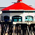 current version
 original
 my version, sharpened and red desaturated


.jpg)


 ..This isn't an attempt at self-promotion, by the way. I've done lots of images over the years that I'm proud of or fond of. This one just struck me as the best version of this image now available - something which Wikipedia ought to be proud of. nagualdesign (talk) 04:35, 16 March 2013 (UTC)

.jpg)


 $1 Silver Certificate (1935-A), depicting George Washington
 $5 Federal Reserve Note (1934-A), depicting Abraham Lincoln
 $10 Federal Reserve Note (1934-A), depicting Alexander Hamilton
 $20 Federal reserve Note (1934-A), depicting Andrew Jackson


 Alt 1
Alt 1 Alt 3
Alt 3

.jpg)
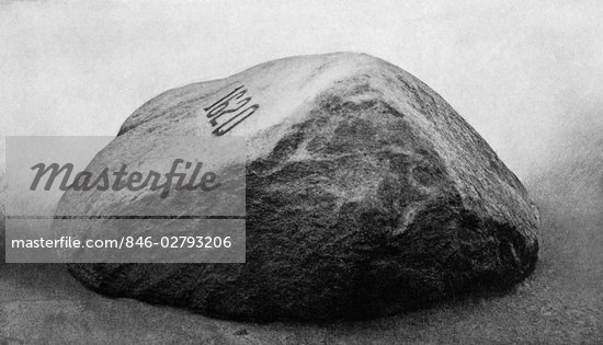
![[5]](http://www.payvand.com/news/10/dec/Shush-Castle2.jpg)
![[6]](https://mw2.google.com/mw-panoramio/photos/medium/63387094.jpg)
![[7]](http://www.payvand.com/news/10/dec/Shush-Castle1.jpg)


_in_Gavi.jpg)
