Original - Males Giraffe are often engage in necking.Necking has been seen in both combat and sexual situations. Battles can be fatal, but are more often less severe. Another function of necking is sexual, in which two males caress and court each other, leading up to mounting and climax.Necking could last from few minutes to more then an hour. In this particular episode of necking the first image was taken at 11:11 a.m., the last at 11:39 a.m. During this time giraffes moved to absolutely different location and continued necking there.Here are few more positions:
Support as nominator --Mbz1 (talk) 03:51, 24 April 2009 (UTC)[reply]
Comment May I please ask you to take a look at this nomination. I, myself strongly supported the image because I did not know what necking is about. Now I do after watching this behavior for almost half an hour. At first I thought it was a courtship dance( it really looked as a dance ) between a male and female. So I asked a zookeeper and he kindly explained to me what I was looking at. I still like the image File:Giraffe Ithala KZN South Africa Luca Galuzzi 2004.JPG very much. It is high quality, high resolution image and most important it was taken in the wild! There's only one problem with the image. It does not show necking.here is drawing of few positions during necking. On April 12 I replaced File:Giraffe Ithala KZN South Africa Luca Galuzzi 2004.JPG with my image in the section necking of Giraffe article. User Mgiganteus1 and user Secret Squïrrel are keeping removing it because they like the other one better. I do too. It is much better, but it just does not show what necking is about while my image does, so please do not be surprised, if you do not see the nominated image in giraffe article. Thank you.
Original - Bluewater Shopping centre in Greenhithe, Kent, England (~20 miles east of London).
Reason
High resolution and detailed (7281 × 2096px), aesthetically pleasing and dusk lighting allows the shopping centre to stand out amongst the surrounding chalk cliffs. This image is derived from 63 frames, as per the image page description)
Strong support I can see this as a potential Featured Picture of the Year nominee.-- mcshadyplTC 17:08, 26 April 2009 (UTC)[reply]
Comment - The part of the picture I prefer is the foreground, including the water, trees and grass. I don't like as much some sections of the building which seem overexposed and with little contrast. A good example is the parking lot at left and most of the windows and openings to the outside. -- Alvesgaspar (talk) 18:23, 26 April 2009 (UTC)[reply]
Comment Looks very good. Could we have a more compressed smaller sized complimentary version as well? --Muhammad(talk) 19:35, 26 April 2009 (UTC)[reply]
Oppose the license message is no longer standard GFDL or CC-by-sa GerardM (talk) 20:11, 26 April 2009 (UTC)[reply]
Can you please explain that one? My 'license message' essentially re-states the main terms of the license in a way that laymen should be able to understand better. It isn't intended to replace the GFDL / CC-BY-SA license. Also, that's a pretty poor reason to oppose. Diliff | (Talk)(Contribs) 20:46, 26 April 2009 (UTC)[reply]
This isn't a valid reason to oppose; the image is clearly licensed properly under GFDL and CC-BY-SA-3.0. On a completely unrelated note, I thought this looked like an artist rendering, which I think gives this a very cool look. And I wonder why I've never seen a park next to a mall here in the States before? ~ ωαdεstεr16«talkstalk» 02:03, 27 April 2009 (UTC)[reply]
Comment Is the pond in the foreground part of the shopping center facility? If not, I'd suggest cropping some out for the sake of EV. Spikebrennan (talk) 15:34, 27 April 2009 (UTC)[reply]
Well, I don't think there are clearly defined boundaries. The shopping centre exists at the bottom of an old chalk quarry and the pond is within the quarry boundaries, but whether it is literally owned by the shopping centre or managed by the local council or something, I don't know. I can't imagine anyone would go to the park/pond without also visiting the shopping centre. The complex is inextricably linked with the geography, really. And I think it gives the shopping centre a bit of context and stops the panorama's aspect ratio being too high. Diliff | (Talk)(Contribs) 17:14, 27 April 2009 (UTC)[reply]
A propos of nothing, here in the United States we use the term "shopping center" to refer to a different kind of structure-- such as a larger example of this, or the kind of stores depicted here: [1]. The facility in your picture is what we'd call a "mall". Spikebrennan (talk) 18:56, 27 April 2009 (UTC)[reply]
I am aware of that (as per
here), but the terminology used should be geographically local. :-) The examples you give would be called retail parks here. Diliff | (Talk)(Contribs) 19:20, 27 April 2009 (UTC)[reply
Sigh, I wonder why you are throwing around these numbers? How are the 63 frames remotely relevant to this candidate? Conservatively I'd expect the result (assuming 50% overlap in either direction) to have approximately 63 Megapixel. The candidate has a "meager" 14. Should we give out extra points for effort even if the project does not get to use the results? --Dschwen 04:21, 1 May 2009 (UTC)[reply]
Sigh. The only time I ever see you around nowdays is when you complain about something or other. I was only throwing them around because I was asked. There are pretty good reasons why this one 'only' has 14 megapixels. And I think you'll find that the project does get to use the results of 63 frames. This is an exposure blended image. If I hadn't taken this many frames, a lot more of the photo would either be too dark or too bright. As for the theorical full resolution, I downsampled it as wasn't particularly sharp at full size (I had to climb a fence and stand in the bushes at the edge of a cliff to get this - even with the tripod, it wasn't rock-solid on the soft ground, so I think there was some small camera movement) and there wasn't any real benefit to increasing the resolution/file size without a tangible increase in detail. Still, I don't think it matters what I could have uploaded. Judge the image on its merits. I wasn't asking anyone to give extra points for effort. Diliff | (Talk)(Contribs) 07:47, 1 May 2009 (UTC)[reply]
Sure, no need to yell. 50% overlap means you can use 20%of the area per frame, 3 exposure levels mean another reduction by 1/3, totaling to 1/12 of the raw material (which is 63*12MP). Anyhow, the camera shake and difficult conditions are a pretty good reason for downsampling, and I should not take my frustration about certain recent licensing incidences out on you, as I see you are still one of the good guys (CC-BY-SA-3.0). --Dschwen 12:29, 1 May 2009 (UTC)[reply]
Support Wow. What a visually stunning picture! Almost makes me want to go there and spend the money i don't have! hehe lovely colours, although is that a "hoodie" i see in the bottom left of the picture?! reminds me of the hoodies you see in GTA San Andreas... Yes I'm a geek... Gazhiley (talk) 11:08, 1 May 2009 (UTC)[reply]
Promoted File:Bluewater Shopping Centre, Kent, England Crop - April 2009.jpgMER-C 08:43, 2 May 2009 (UTC)[reply]
Support. Great macro. Very impressed by Richard Bartz's focus stacking! His macro work reminds me of the ridiculous lengths I occasionally go to with my high res panoramas. :-) I see from the Commons nomination that he used 72 images for this stack. Diliff | (Talk)(Contribs) 08:52, 26 April 2009 (UTC)[reply]
Support Good quality, and informative. Sophus Bie(talk) 09:48, 26 April 2009 (UTC)[reply]
Support - extremely impressive technical quality (magnification, focus stacking), pleasing colours and composition. Minor EV problems in the sense that not the entire tick is shown, but that can be overcome by the details on the head and the fact that the rest of the tick is fairly uninteresting anyway. I'd be interested to see an addition to the caption on the subject of how this tick comes to have the expanded bulgy skin-toned bit behind it as different from this one. —Vanderdecken∴ ∫ξφ 09:09, 27 April 2009 (UTC)[reply]
Support. Hooray! An explicit size reference! Spikebrennan (talk) 15:35, 27 April 2009 (UTC)[reply]
Strong support. Love the measurement, adds a lot to the image. J Milburn (talk) 19:40, 27 April 2009 (UTC)[reply]
I only spelled it right 'cause I saw your comment there :) --Muhammad(talk) 05:09, 29 April 2009 (UTC)[reply]
Support Shame about the cut off tho - but there's sufficient value in the detail shown --Fir0002 05:31, 29 April 2009 (UTC)[reply]
Support great work --AngMoKio (talk) 11:49, 29 April 2009 (UTC)[reply]
Support, probably not necessary to pile on a support, but two reasons: 1) this exceptionaly encyclopedic and technically outstanding work is to me what en.FPC should be about (rather than pretty Hallmark-flower-shots), 2) to counter the apparent belief that I'm just here to complain. --Dschwen 15:06, 1 May 2009 (UTC)[reply]
Promoted File:Ixodus ricinus 5x.jpgMER-C 08:43, 2 May 2009 (UTC)[reply]
Original - In Laurence Sterne's novel The Life and Opinions of Tristram Shandy, Gentleman, the characters' hobby-horses, or particular obsessions, are used for humourous intent. Here, Uncle Toby's obsession with the military leads to him and Trim - who gets caught up in Toby's enthusiasm - to begin acting out military actions and manner. Illustration by George Cruikshank.
Reason
Part of a series of Tristram Shandy illustrations - which I'm really tempted to nominate as a set, MER-C be damned - by a highly notable artist. Interesting, shows a notable aspect of the novel's humour, and useful in several articles. Tristram Shandy is usually considered one of the classic English humourous novels, and originated a lot of tropes, such as stream-of-consciousness narration.
Original - Overview of the main types of viral infection and the most notable species involved.Vector version
Reason
Among all the diagrams in the gallery (
User:Mikael Häggström/Diagrams
), this is probably my favorite. It is descriptive and gives a quick overview of a very broad subject. It has gone through substantial review and expansion since its first appearance.
Comment There is also a vector version. In my point of view, however, it doesn't look as good when rendered in MediaWiki as the screenshot from Inkscape from which the .png-version is derived.Mikael Häggström (talk) 15:49, 25 April 2009 (UTC)[reply]
Comment While excellent, the png does not meet the size requirements. That said, I'm impressed by the gallery you have. Nice job. ~ ωαdεstεr16«talkstalk» 16:13, 25 April 2009 (UTC)[reply]
I derived a new .png, now with a width exceeding 1000px. It might take some time before Wikipedia updates from the version on Commons, however.Mikael Häggström (talk) 17:02, 25 April 2009 (UTC)[reply]
Why not just render it with 2000 or 3000px width? I know it might seem like overkill but it will aid with scaling if published elsewhere. Diliff | (Talk)(Contribs) 17:40, 25 April 2009 (UTC)[reply]
I managed to scale it to same size as the .svg-version. However, I don't know how to make it even larger. The bitmap exporter in Inkscape does a really bad job. In fact, what I do is to take a screen shot of the image in Inkscape and paste into Paint, so the maximal size I can make is dependent on the size of my monitor. Mikael Häggström (talk) 18:28, 25 April 2009 (UTC)[reply]
Support It may be odd, but I actually prefer the SVG version. Sophus Bie(talk) 09:54, 26 April 2009 (UTC)[reply]
All right. Is there any special reason (except for that vector images are easier to magnify and edit)? Mikael Häggström (talk) 04:46, 27 April 2009 (UTC)[reply]
Oppose While I love your diagrams (coincidence : i was reading about them today, and then i came to FPC and stumbled upon this nomination) i think this one is far too cluttered to be a FP. Too much text. The diagram doesnt add much, almost every information is in the text. It could be replaced with a list of infections ordered by organ. Your others diagrams are IMHO a lot more interesting : i can only check a preview, and see which organs are affected by the disease without even reading the text.Ksempac (talk) 08:25, 27 April 2009 (UTC)[reply]
I see a little dilemma there - I was afraid to nominate some of the other images because they, compared to this one, have to little information. It makes me feel like a voting competition among all the images could be an idea. Mikael Häggström (talk) 10:47, 27 April 2009 (UTC)[reply]
Comment "Types A and B" should be "types A and B" (capitalisation), and remove the comma. Narayanese (talk) 09:37, 1 May 2009 (UTC)[reply]
Thanks for noticing! It will be included in the next update. Mikael Häggström (talk) 09:39, 1 May 2009 (UTC)[reply]
Support Either. I am leaning towards the png because the
High resolution image of the building of Rijkmuseum Amsterdam circa 10 years after its opening. Currently the building is under renovation, but the museum is still one the most visited classical art museum in the Netherlands. Its collection contains many paintings of Dutch Masters such as Rembrandt and Vermeer. When viewed in full size, two horse-drawn vehicles and several pushcarts of the late nineteenth century are clearly identifiable.
Comment - I think it could use a tilt. My (currently) not-yet-awakened eye can't tell whether its tilted or not. Ceranllama chat post 11:12, 25 April 2009 (UTC)[reply]
Weak oppose Needs counterclockwise rotation, significant uncorrected banding issues in sky. Would switch to support if these are addressed.DurovaCharge! 14:53, 25 April 2009 (UTC)[reply]
I have uploaded a counter-clockwise rotated version (Edit 1). The darker band in the middle of the sky is also on the original photo, I am not sure whether this should be corrected. If it should, I don't know how and could use some help with that. Rubenescio (talk) 10:42, 26 April 2009 (UTC)[reply]
The thing to do is go in very carefully with the healing brush and blend the banded areas. It's laborious; this wasn't the best candidate for restoration. If you have a pre-histogram version to upload as a TIFF and would like a hand, please provide a link. No guarantees, but I'd give it a try. DurovaCharge! 03:58, 27 April 2009 (UTC)[reply]
I am not sure what file you are asking for, would this one do? Rubenescio (talk) 07:36, 27 April 2009 (UTC)[reply]
Original - Surf zone in an irregular rocky bottom. Atlantic Ocean: Porto Covo, west coast of PortugalEdit 1
Reason
It is an unusual yet encyclopaedic depiction of a coastal surf area, as a high resolution panorama. There are no miracles and the problem posed by the moving subject had to be solved through a detailed and patient cloning job which took profit of the fractal nature of the ocean surface's geometry (as well as of my knowledge of the waves, as an oceanographer...).
Comment I have the feeling that the picture is quite underexposed. My thesis is based on the shadows angle which is rather steep. Even so a very nice picture. --Richard Bartz (talk) 16:43, 24 April 2009 (UTC)[reply]
Maybe a question of taste. What about the edited version? -- Alvesgaspar (talk) 17:42, 24 April 2009 (UTC)[reply]
Maybe. But tastes good. Support Alt1 --Richard Bartz (talk) 18:23, 24 April 2009 (UTC)[reply]
Support Edit 1. A fine illustration of Portugal's Atlantic coast. Mostlyharmless (talk) 04:00, 26 April 2009 (UTC)[reply]
Support Edit 1. I imagine it could also illustrate a local geography article for Porto or Portugal? Diliff | (Talk)(Contribs) 10:32, 26 April 2009 (UTC)[reply]
Thanks for the hint but there is really no article there. Maybe when I write one... Alvesgaspar (talk) 08:07, 27 April 2009 (UTC)[reply]
It's an idea.. Sometimes a good photo acts as a catalyst to improving the article that it lives in. :-) Diliff | (Talk)(Contribs) 08:38, 27 April 2009 (UTC)[reply]
Oppose Sky is blotchy (and indeed needs the black line at the top cropped off), there is a significant stitching error in a wave (~1/4 from the LHS), sharpness is mediocre and the EV in the articles is questionable at best. --Fir0002 05:33, 29 April 2009 (UTC)[reply]
Please chop off the black line. MER-C 11:23, 30 April 2009 (UTC)[reply]
Sorry, I thought it was already done. It is OK now. Alvesgaspar (talk) 14:05, 30 April 2009 (UTC)[reply]
Original - Overview of the main types of viral infection and the most notable species involved.Vector version
Reason
Among all the diagrams in the gallery (
User:Mikael Häggström/Diagrams
), this is probably my favorite. It is descriptive and gives a quick overview of a very broad subject. It has gone through substantial review and expansion since its first appearance.
Comment There is also a vector version. In my point of view, however, it doesn't look as good when rendered in MediaWiki as the screenshot from Inkscape from which the .png-version is derived.Mikael Häggström (talk) 15:49, 25 April 2009 (UTC)[reply]
Comment While excellent, the png does not meet the size requirements. That said, I'm impressed by the gallery you have. Nice job. ~ ωαdεstεr16«talkstalk» 16:13, 25 April 2009 (UTC)[reply]
I derived a new .png, now with a width exceeding 1000px. It might take some time before Wikipedia updates from the version on Commons, however.Mikael Häggström (talk) 17:02, 25 April 2009 (UTC)[reply]
Why not just render it with 2000 or 3000px width? I know it might seem like overkill but it will aid with scaling if published elsewhere. Diliff | (Talk)(Contribs) 17:40, 25 April 2009 (UTC)[reply]
I managed to scale it to same size as the .svg-version. However, I don't know how to make it even larger. The bitmap exporter in Inkscape does a really bad job. In fact, what I do is to take a screen shot of the image in Inkscape and paste into Paint, so the maximal size I can make is dependent on the size of my monitor. Mikael Häggström (talk) 18:28, 25 April 2009 (UTC)[reply]
Support It may be odd, but I actually prefer the SVG version. Sophus Bie(talk) 09:54, 26 April 2009 (UTC)[reply]
All right. Is there any special reason (except for that vector images are easier to magnify and edit)? Mikael Häggström (talk) 04:46, 27 April 2009 (UTC)[reply]
Oppose While I love your diagrams (coincidence : i was reading about them today, and then i came to FPC and stumbled upon this nomination) i think this one is far too cluttered to be a FP. Too much text. The diagram doesnt add much, almost every information is in the text. It could be replaced with a list of infections ordered by organ. Your others diagrams are IMHO a lot more interesting : i can only check a preview, and see which organs are affected by the disease without even reading the text.Ksempac (talk) 08:25, 27 April 2009 (UTC)[reply]
I see a little dilemma there - I was afraid to nominate some of the other images because they, compared to this one, have to little information. It makes me feel like a voting competition among all the images could be an idea. Mikael Häggström (talk) 10:47, 27 April 2009 (UTC)[reply]
Comment "Types A and B" should be "types A and B" (capitalisation), and remove the comma. Narayanese (talk) 09:37, 1 May 2009 (UTC)[reply]
Thanks for noticing! It will be included in the next update. Mikael Häggström (talk) 09:39, 1 May 2009 (UTC)[reply]
Support Either. I am leaning towards the png because the
Buddha at Borobudur as it appeared in 1895, before restoration and before designation as a UNESCO World Heritage Site. Restored version of File:Borobudur lantern slide.jpg
Original - "The Tiburtine sibyl and the Emperor Augustus" by Antonio da Trento. Illustrates one of the many weird, prophetic myths about the sibyl popular in mediaeval Christianity. - In this case, the sibyl showing the Roman emperor Augustus a vision of the Christian heaven.
Reason
I think that a 16th-century work is interesting in its own right, but this one also illustrates a fascinating bit of mediaeval Christian mythology. It is the only high-quality image in Tiburtine Sibyl.
Support As the nominator said, it illustrates an interesting bit of mythology. Sophus Bie(talk) 09:51, 26 April 2009 (UTC)[reply]
Comment I'm having difficulty determining the importance of Antonio da Trento. Not even the Italian Wikipedia has an article about him; the only reference at all is in de:Parmigianino, which awards him a red link. What I find frustrating is that people will nominate images without having apparently taken the time to establish the encyclopaedic foundation that their nomination case ideally should rest on. This applies to many nominations by many contributors here. How are we supposed to evaluate something that you've given us hardly any information about? Papa Lima Whiskey (talk) 09:05, 29 April 2009 (UTC)[reply]
Original - "The Smoking Batteries": In this scene from Laurence Sterne's The Life and Opinions of Tristram Shandy, Gentleman, Uncle Toby's colonel invents a device for firing multiple miniature cannons at once, based off a hookah. Unfortunately, he and Toby find the puffing on the hookah pipe so enjoyable that they keep setting the cannons off. Illustration by George Cruikshank.
Reason
Tristram Shandy is an odd novel with a strange, stream-of-consciousness writing style and a subversive humour. I think this illustration brings out some of the odder, more surreal aspects of the novel well.
Original - Swine flu masked train passengers in Mexico City.
Reason
High resolution and detailed, it is a good example of the current measures which have taken place to prevent the spread of the swine flu, people in Mexico City wear the masks on a train due to swine flu outbreak throughout the surrounding region.
Support - timely and well composed. Could benefit with some NR, I'd bet. deBivort 18:44, 26 April 2009 (UTC)[reply]
Oppose - Not being a difficult subject I see no mitigating reason for the poor image quality. Maybe a VP. -- Alvesgaspar (talk) 18:48, 26 April 2009 (UTC)[reply]
Oppose - Not really special, quality is also poor. Is this picture just nominated because of the masks being worn? Applytheneed1 (talk) 19:24, 26 April 2009 (UTC)[reply]
Support Lighting and resolution is good. I haven't viewed full size but the image passes when viewed at 1000px. The mood is very much similar to one in 24. --Muhammad(talk) 19:31, 26 April 2009 (UTC)[reply]
Oppose Besides poor quality, the picture itself explains nothing to me without a context - but that's not the way a good press picture works. It could be a very good picture when one of the persons would hold a newspaper with a huge headline about swine flu in his hands. Think about a march - a crowd without signs has absolutely no context --Richard Bartz (talk) 22:46, 26 April 2009 (UTC)[reply]
Oppose I thought about nominating this when I saw it on the Main Page. But it's just not high enough quality. It's definitely got a chance at Valued Pictures, though. Makeemlighter (talk) 06:05, 27 April 2009 (UTC)[reply]
Oppose They're wearing masks on a train...so what exactly is the EV of this picture? I just don't see any. Not to mention, quality-wise, it looks as if it was taken with a cell phone camera.-- matt3591TC 20:33, 27 April 2009 (UTC)[reply]
Oppose there are thousands wearing this right now. Why this person at this place in particular? I'd like to see a better photo in a Mexican-style setting (or atleast showing Mexico City's skyscrapers) for people to better recognize the situation. More importantly, I prefer an image showing more people than this. It is a huge issue right now, so maybe a picture that shows a whole street with people wearing the masks will make people think "Oh my god, what is happening here!". This image misses all that. Also, you mentioned only the mask, but what is that around her neck, a headphone set?
Comment I believe that what motivated me to nominate the picture is it's composition. The image definitely does not show an "Oh my god, what is happening here!" feeling, instead it only portrays how swine flu or other viruses can interfere with our every day activities. During the first days of its "discovery" people, specially in Mexico, continued to live their lives with masks as the government had adviced it's citizens to do. The woman in front seems to be wearing headphones, which at the moment she is not listening; this also shows that even though there are problems in life which sometimes makes us feel like giving up or locking ourselves in a room we can still deal with them through adaptation. I also want to make sure that there are no more comments on pictures with "crowds", it is easy to understand that people should stay inside their homes in Mexico and therefore there will not be many people together making it hard for someone to capture an image of a "crowd" avoiding being sick with masks. Please, "value this picture for what it shows, not for what you want to see". Staticbullet (talk) 10:12, 28 April 2009 (UTC)[reply]
If you encourage me to "value this picture for what it shows, not for what you want to see", then nominate at Valued pictures. They focus more on EV and how the image is illustrated than quality, unlike here where quality is important.
Original - The town of Orthahisar, Turkey, in the Cappadocia region, showing the interesting geological and man-made features of the region. Note the tunnels carved into the rock.
Reason
Stunning wotk by Mbz1. One of the most stunning photos I've seen on Wikipedia in a long time, and given the high-quality of work here, that's saying something. Note to Closer: Please make sure to notify User:Mbz1 if this passes: I don't need credit for being able to spot excellent work of other people, but she deserves credit for her excellent work. Shoemaker's Holiday (talk) 00:35, 27 April 2009 (UTC)[reply]
Comment. Either the minaret in the background is leaning, or the image needs very slight counterclockwise rotation. Great picture. Spikebrennan (talk) 15:25, 27 April 2009 (UTC)[reply]
Support Very good (perhaps not excellent) photograph of an exotic and intriguing place. The way the houses are integrated with the tunnels....--HereToHelp(talk to me) 23:37, 27 April 2009 (UTC)[reply]
is one of the iconic images of the Civil War, having been used on book covers, etc. Sorry, I'm not feeling so hot. I'll poke at this description in the morning.
Reason
One of the iconic images of the American Civil War. I'd love it if we could get it even bigger, but it's still of a reasonable size.
Oppose colours are off, there is no reason why we should not have the full sized tiff file as well. GerardM (talk) 04:45, 27 April 2009 (UTC)[reply]
I converted the Tiff to PNG, which is smaller but still lossless. Some of us do not have lightning-fast connections. Mine has a tendency to fail during larger uploads, forcing me to try to repupload several times. Converting TIFF to PNG - all the information! half the file size! - is a sane option, and insisting that TIFF be used, which provides no advantage, merely file-size bloat and an inability to see the image - PNG will display at this resolution - is not sensible. Sure, with these smaller files it's not so much a problem as it is with bigger ones, but seriously... Shoemaker's Holiday (talk) 08:27, 27 April 2009 (UTC)[reply]
Converting to png breaks the provenance of the picture. You are using the jpg anyway for the actual viewing of the picture and consequently there is no benefit. As to tiff not showing, I understand that the German Verein is paying for a developer to fix this. GerardM (talk) 05:48, 29 April 2009 (UTC)[reply]
I'm sorry, Gerard, but I see no good reason to use TIFF, particularly when A. PNG is half the filesize; B. I'm having trouble with uploads timing out, which becomes worse with increasing file size; C. support for them is still a pipedream for the foreseeable future; and D even if we get them so that thumbnails can be used on Wikipedia, no modern browsers can show TIFF, so viewing the non-thumbnailed versions requires downloading the file and opening it with a program dedicated to the task. PNGs can be opened by all modern browsers. Shoemaker's Holiday (talk) 08:10, 29 April 2009 (UTC)[reply]
Provenance trumps any of your arguments as it is not the technical merits that matter really. Thanks, GerardM (talk) 07:46, 1 May 2009 (UTC)[reply]
That's like saying that if I don't copy-paste the LoC description provenance is lost. It's an entirely meaningless claim. Shoemaker's Holiday (talk) 10:55, 1 May 2009 (UTC)[reply]
Weak Support Could probably stand a levels adjustment. Whether the image was uploaded in your favorite format really has nothing to do with the FPC criteria. — JakeWartenberg 02:43, 1 May 2009 (UTC)[reply]
Always find these smaller ones without colour boxes a bit fiendish to levels adjust. Shoemaker's Holiday (talk) 10:52, 1 May 2009 (UTC)[reply]
Weak Support. The compression seems a bit high for this image though. The bokeh in the background seems a bit posterised - jpeg compression artifacts? Diliff | (Talk)(Contribs) 14:39, 27 April 2009 (UTC)[reply]
I am not sure so I have uploaded another version made from the original without any compression. --Muhammad(talk) 09:03, 28 April 2009 (UTC)[reply]
It is much improved, although now there is some noise in the background that could be removed. :-) Do you have good noise reduction software (Neat Image, Noise Ninja, etc), or would you like me to have a go at it? Diliff | (Talk)(Contribs) 09:21, 28 April 2009 (UTC)[reply]
I use PS for NR. I would be grateful if you could upload an edit. Uploading over Edit 1 should be fine --Muhammad(talk) 11:34, 28 April 2009 (UTC)[reply]
The software I mentioned above is far better than PS for noise reduction. It might be worth looking into. I'll have a go at the edit tonight. Diliff | (Talk)(Contribs) 12:14, 28 April 2009 (UTC)[reply]
Thanks for the edit. Noise Ninja seems good, I have downloaded the trial --Muhammad(talk) 13:51, 29 April 2009 (UTC)[reply]
Oppose Diliff's edit fixes the noise but there doesn't seem to be much detail - it looks somewhat "smudgy". It also seems to have an inconsistent focus plane - was this a focus stack? --Fir0002 05:29, 29 April 2009 (UTC)[reply]
I think a nice illustration of the Chiang Kai-shek memorial hall in Taipei. There are only few tourists which is rare. Those people who are on the pic are not disturbing and help to get a feeling for the size of the building.
Support as nominator --AngMoKio (talk) 17:48, 27 April 2009 (UTC)[reply]
Support I supported it on Commons, and photo has plenty of encyclopedic value for Wikipedia. Fg2 (talk) 03:59, 28 April 2009 (UTC)[reply]
Support. Good composition in terms of EV. Slightly boring composition/subject and hence lacking that elusive wow factor though. Diliff | (Talk)(Contribs) 09:28, 28 April 2009 (UTC)[reply]
Weak Oppose Seems to be below building photography standards in terms of sharpness (easy to retake). Also some issues with CA --Fir0002 05:27, 29 April 2009 (UTC)[reply]
Weak Oppose I have to agree with Fir; there are some sharpness issues. I'm not entirely happy with the lighting either, the building itself is pretty light, IMO.
Support. Perhaps the crop is a bit tight on the right side, but I guess you might have been cropping out a distracting angle? Diliff | (Talk)(Contribs) 14:08, 28 April 2009 (UTC)[reply]
Not fussed, but if NS says there is a tint, I'll take his word for it, not having measured it. Diliff | (Talk)(Contribs) 20:44, 3 May 2009 (UTC)[reply]
Promoted File:Palazzo Cavalli-Franchetti WB.jpgMER-C 08:06, 5 May 2009 (UTC)[reply]
Neither article had a lead image. Wasn't easy to locate suitable material; technically quite a difficult original to work with. Here's hoping the result meets our standards. Restored version of File:1918_flu_outbreak.jpg.
Articles this image appears in
1918 flu pandemic
Creator
National Photo Company
red cross nurse are practising their tecniques
on a toy person... —Preceding unsigned comment added by 222.154.88.21 (talk) 06:35, 6 May 2009 (UTC)[reply]
Oppose I'm just not seeing much EV in this picture - it just looks like a generic contagious disease training exercise. Something like this is a far more effective illustration (even this is better because it shows that this pandemic wasn't just concerned with hospitals/nurses but was felt everywhere) --Fir0002 05:25, 29 April 2009 (UTC)[reply]
Support This material does illustrate the subject. Your argument only means that we need more pictures on the same subject. Argument against the room with patients, it could be any outbreak of a disease.. The notion that pictures of ordinary people is good ... they could be bankrobbers. No, imho your arguments against fail to impress. GerardM (talk) 21:34, 29 April 2009 (UTC)[reply]
Oppose per Fir. Not terribly interesting subject matter, as far as the 1918 flu goes. Doesn't do anything to illustrate the scale of the pandemic, or show precautions or victims. Both of Fir's linked photos are much more engaging. I also like this one, which shows rows of beds, the nurses' face masks, and a patient looking like he's feeling pretty crappy. Calliopejen1 (talk) 13:39, 2 May 2009 (UTC)[reply]
Original - Panoramic view of the Ostrachtal near Bad Hindelang on a sunny summer day
Reason
High resolution and detailed (10,000 × 2,500 pixels), aesthetically pleasing the photo gives a view of the municipality of Bad Hindelang in southern Bavaria, Germany in the Northern Limestone Alps during a summer day.
Support. Great detail and quality. Not a huge fan of the composition with curving hills on either side, but still very good EV. Diliff | (Talk)(Contribs) 20:55, 28 April 2009 (UTC)[reply]
Support Nice - per Diliff. It seems that there's a bit of a yellow cast tho on the grass (particularly on the side of the near slope on the RHS of the image) --Fir0002 05:23, 29 April 2009 (UTC)[reply]
Support as nominator --Kaldari (talk) 18:37, 28 April 2009 (UTC)[reply]
Oppose Overall too soft and DOF is unnecessarily low - both issues I think can be attributed to the IMO poor choice of f/3.5. Also noise in the background could/should be fixed --Fir0002 05:23, 29 April 2009 (UTC)[reply]
CommentSupport - Inclined to support, but the focus stacking might need some touch-up. Specifically, the top-right petal is a bit blurry where it overlaps the upper stem, although the stem is in sharp focus. This plays tricks with my eyes as it seems that the upper stem should be in front of the petal. In fact the more I look at it, the more unsure I am if the stem is overlapping the petal or the petal is overlapping the stem. If you could either sharpen that top-right petal or blur the stem a bit, I think it would help. Kaldari (talk) 15:04, 29 April 2009 (UTC)[reply]
No tricks, the stem is in front. I'd think about blurring the stem but it'd look a bit odd since the seed pod is in focus. Oh, I'd also add that the petals are sharp except perhaps right at the gap between the two. I'll see if I can do anything tomorrow.
The picture deserves to be nominated as the contrast definitely attracts the readers attention to know about the site, which in this case is a farm area in the Chatham Islands.
Oppose unfortunately. This is not the best illustration to show Chatham Islands. Its primary subject here is a farm, not the island. The weather seems unusual as well. Is it always cloudy like this? I'd like to see the island's natural resources (not human-made) or atleast a farther view to prevent me from thinking "what's over that hill?". Also, I am somewhat seeing a "glow" effect when zoomed upclose. This leaves me puzzled, as the file details show no software used for effects. Maybe Chromatic aberration???
Comment. The light is definitely strange down there, with an eeery glow sometimes. That said, I suspect this is a combination of early morning light in the
Roaring forties for nothing), and the background appears to show some pretty windswept sea. Mostlyharmless (talk) 06:14, 30 April 2009 (UTC)[reply
]
Reply It is almost certainly an artefact of HDR tone mapping - in fact I could probably pin point it further as created in Photomatix (it is at least typical of Photomatix output) --Fir0002 07:28, 30 April 2009 (UTC)[reply]
Support. Definitely not chromatic aberration. Composition is fine, with the only technical problem being a very small section of blown whites in the sky. DurovaCharge! 05:26, 30 April 2009 (UTC)[reply]
Oppose Oversharpened, possibly after initial motion blur. Papa Lima Whiskey (talk) 21:22, 30 April 2009 (UTC)[reply]
Oppose per PLW. Decent enough EV since the place is mostly pasture; just not high enough quality. Makeemlighter (talk) 04:19, 1 May 2009 (UTC)[reply]
Oppose The lack of sharpness looks like a badly done HDR to me.
I'm not positive that it's HDR. The dynamic range does look fairly wide in the scene, but it looks more like soft focus/spherical aberration to me. The patch of darker sea could be the result a shadow cast by the clouds... Then again, it could be HDR. I just wouldn't be too quick to assume though. Diliff | (Talk)(Contribs) 07:33, 1 May 2009 (UTC)[reply]
Not outright - you implied. ;-) And my reply was sort of to everyone who was discussing what the cause of the lack of sharpness/haloes might be, not specifically just to you. Diliff | (Talk)(Contribs) 08:03, 1 May 2009 (UTC)[reply]
I was right to imply though. On flickr it is in the user's set "HDR".
Oooh yeah, and tagged with Photomatix too. Okay, credit where credit is due. Fir0002 wins the prize. Diliff | (Talk)(Contribs) 08:30, 1 May 2009 (UTC)[reply]
Off-topic discussion of Photomatix
I wouldn't bag photomatix too much though. It is capable of very reasonable results set correctly.
The trick is setting it correctly. I find the controls quite counter-intuitive and the way it creates haloes and artifacts in areas where there is slight movement between frames is quite annoying. I find exposure blending gives far more realistic images - sometimes lacking in contrast, but if you blend them to create a 16 bit image, you can do any alterations you need in Photoshop (add contrast, saturation, masking etc) without posterisation... Just my preference though. And we're starting to spam the nomination. ;-) I'll have Dschwen on my case asking what this has to do with the image again. Sigh. Diliff
Oh my bad, I just tried to nominate this, and got *really* confused about how fast all these comments popped up, before realising it's been nominated and shot down before. But 2 nominations isn't worth anything? Aaadddaaammm (talk) 17:29, 12 October 2010 (UTC)[reply]
Antigenic shiftOriginal - Antigenic shift is the process by which a virus can spread from one animal to another. This illustration shows how a virus can become a pandemic strain. This can occur in three ways: through direct transfer from an animal, through an intermediary animal host, or through an animal host in which genetic mixing occurs.
Significantly contributes to understanding of the concept of Antigenic shift by illustrating clearly and attractively. The shifts are understandable at thumbnail, and the text provides context for the processes at larger sizes. Also very timely, would be nice to have featured media on this high visibility subject.
Support Probably should be SVG, but the resolution is high enough to mitigate that problem. Quite a relevant image given the potential near future swine influenza pandemic.
Comment. I did think about the JPG/SVG issue, but it's not something I can fix today, and I thought that timeliness was more important (and still featurable as JPG). If anyone wants to have a go at replacing it I'd be thankful. Mostlyharmless (talk) 02:43, 28 April 2009 (UTC)[reply]
Conditionnal Oppose. I'm not an expert on influenza, but from what i read in Antigenic shift, the diagram doesn't seem right. The article seems to indicate that the shift is specifically what happens in step A3. On the other hand the diagram seems to say "they are three types of shift : A, B and C". The diagrams doesn't show antigenic shift, it shows ways to pass influenza from a bird host to a human host, one of which involves antigenic shift. Ignore this vote if I'm wrong. Ksempac (talk) 08:19, 28 April 2009 (UTC)[reply
]
The article is poorly written and under referenced at this stage imo. However there is specific discussion further down regarding pigs (A-1/A-2). A-4 seems to be covered too.
I'm not sure I understood what you said, but what i mean is A1 to A4 is obviously transmission through antigenic shift (which happens in step A3). However, as I understand it, B and C are direct transmission without modification of the virus, therefore without shift. Yet the top text on this image states that a jump from one specie to another is an "antigenic shift". Ksempac (talk) 11:40, 28 April 2009 (UTC)[reply]
Oh I see, I'd trust an external source to validate the other two methods, not the WP article. I would have thought that the author of that image was pretty reliable.
It seems i was wrong : " Antigenic shift refers to an abrupt, major change to produce a novel influenza A virus subtype in humans that was not currently circulating among people (see more information below under Influenza Type A and Its Subtypes). Antigenic shift can occur either through direct animal (poultry)-to-human transmission or through mixing of human influenza A and animal influenza A virus genes to create a new human influenza A subtype virus through a process called genetic reassortment. Antigenic shift results in a new human influenza A subtype. A global influenza pandemic (worldwide spread) may occur if three conditions are met: 1 A new subtype of influenza A virus is introduced into the human population. 2 The virus causes serious illness in humans. 3 The virus can spread easily from person to person in a sustained manner." http://www.cdc.gov/flu/avian/gen-info/flu-viruses.htm We really need some good input on this oneKsempac (talk) 13:12, 28 April 2009 (UTC)[reply]
Conditional Support - as the others have said, this really should be SVG. Usually diagrams here that should be SVG are PNG instead, but JPG is even worse. However, thankfully this has been saved using low JPG compression (high quality setting), and is both high resolution and very encyclopaedic. Therefore, pending confirmation of the accuracy (as raised by Ksempac), I will support this version only if it is made a high priority candidate for redrawing as SVG, and as soon as a suitable SVG is made it is nominated for delisting and replacement with the SVG as the featured image. Phew, long sentence. —Vanderdecken∴ ∫ξφ 10:48, 28 April 2009 (UTC)[reply]
Oppose, doesn't have to be SVG but should be PNG. The image itself is fine... but when we have MediaWiki auto scale it it gets artifacts and looks a lot worse and rarely will we be viewing it at native resolution. grenグレン 14:53, 28 April 2009 (UTC)[reply]
Comment. Should I withdraw this then until someone can turn this into a PNG or SVG? Mostlyharmless (talk) 00:48, 29 April 2009 (UTC)[reply]
Not sure, I'd just let it run its course because I'm not sure if others will agree with me. As far as JPGs go it is very good quality and my main worry is about resizing problems not about native resolution. grenグレン 17:00, 30 April 2009 (UTC)[reply]
I've converted to PNG here (no idea this was at FPC, though). Please don't support the JPG version—those artifacts are nasty. Fvasconcellos (t·c) 21:30, 30 April 2009 (UTC)[reply]
Waiting to hear if Ksempac still opposes. Please do not close until user comments. Other !votes are still welcome until that point in time (only fair). ~ ωαdεstεr16«talkstalk» 05:49, 6 May 2009 (UTC)[reply]
I believe the condition is met. "Ignore this vote if I'm wrong" and he later said "It seems i was wrong".
Yup, even though I would have liked some expert's advice on this one, you can go on. If i find some time for that (unlikely but still...), i will try to research this and complete the article since both NIAID and CDC websites agree on this matter Ksempac (talk) 08:34, 6 May 2009 (UTC)[reply]
Russell FallsOriginal - Russell Falls, Mount Field National Park, in Tasmania, Australia
Alternate
Reason
Probably the most notable waterfall in Tasmania, appearing on much tourist documentation and so on. It replaced another more obscure waterfall in the Tasmania article. The upper curtain isn't easily accessible but is partially visible in the background.
Comment. Have to admit, from memory it isn't the best photo of this falls that I've seen - the tourist brochures typically show the upper curtain much better, I think... That said, having done a quick search I haven't found any that match my mind's eye of it. Think I'd prefer to see an angle a bit more like this one though. Diliff | (Talk)(Contribs) 13:15, 29 April 2009 (UTC)[reply]
Alternate I have one too :-) And the park is named after me? Mfield (Oi!) 05:45, 30 April 2009 (UTC)[reply]
Wow, practically an identical photo, except with slightly different white balance and seemingly more distortion (the path of the water isn't as straight at the edges as NS's). Amazing how little has changed in a year. Diliff | (Talk)(Contribs) 09:19, 30 April 2009 (UTC)[reply]
The waterfall has been around for 170 million years, so it probably hasn't changed much in a long time (apart from when the area was logged iirc)! I think that the best shot I have seen was with a wide angle from the left hand side over the fence. There are usually too many people to go climbing/swimming though, and the enc would suffer with that angle.
Weak Support This one is a tough call for me. While i agree that the purple and yellow mix is great, somehow the blurred purple background (especially the bottom left) distract me from the main subject. I had to set it as a wallpaper to decide between a weak support and a weak oppose. Ksempac (talk) 09:40, 30 April 2009 (UTC)[reply]
Comment A crop off the bottom would reduce the distracting OOF flower. --Muhammad(talk) 16:27, 30 April 2009 (UTC)[reply]
Oppose, the purple background colouration, unconnected with this species (petals of another plant?), is too prominent and distracting. Melburnian (talk) 13:05, 1 May 2009 (UTC)[reply]
Oppose I am not happy with the angle of the shot. You can't really recognized how the shape of the flower actually is. Slightly from the side would have been better. --AngMoKio (talk) 15:02, 2 May 2009 (UTC)[reply]
Pink TulipOriginal - A pink tulip of the Triumph cultivar - this particular color is known as "Burns"
Reason
The image is of high quality, the image is very sharp, the focus is good, it has good contrast, accurate exposure, and it has no noise and good composition.
Comment You replaced an existing featured picture in the article when placing this image. I have fixed that. In order to establish some encyclopaedic value for this image you really need to identify the cultivar in my opinion. --
Comment Through my research, I have identified this tulip as a Triumph cultivar. I have also identified this particular color is called "Atilla." That information has been added in. I apologize for overwriting the featured picture, I honestly didn't take the time to look and see if it was featured, sorry about that. -- Bettycrocker (talk) 03:45, 1 May 2009 (UTC)[reply]
I will agree with the Triumph group, but I am not convinced that it is "Atilla". Atilla looks morepurpleto me. Is it possible to ask your neighbour for a definitive ID? If not, you may like to ask at
I did a little more research, and according to this page, the color most similar to this one is "Burns." It is only a color found in the Triumph cultivar which convinced me further. Thanks for the catching that. -- Bettycrocker (talk) 05:33, 1 May 2009 (UTC)[reply]
Per the supplied reference the cultivar 'Burns' has fringed petals, this one doesn't. It's a very difficult task to identify such a cultivar, there are many hundreds of tulip hybrids, a matching colour on its own doesn't establish the identity. -- Melburnian (talk) 12:46, 1 May 2009 (UTC)[reply]
The tulip had fringed petals believe it or not, I think the saturation of the colors may have blotched the fringes, or the lighting (overcast) flattened the fringes. I'm not sure. It's very difficult to identify this specific tulip, so I'm just gonna call it a pink Triumph. -- Bettycrocker (talk) 15:42, 1 May 2009 (UTC)[reply]
Oppose Nothing special about this composition. Rubenescio (talk) 09:03, 5 May 2009 (UTC)[reply]
High resolution quality illustration; very high EV–shows various aspects of this mildew's life cycle far better than a single photo could. This is my first 'restoration', which in this case involved removing the page yellowing and cleaning up afterwards. Props to all the restorers here, I can now sympathize with the monotony of point-click-point-click several hundred times... There are several dozen other high quality images like this I'd like to upload (and write articles for), so any opinions on how to improve my technique would be greatly appreciated (and implemented in future uploads). Thanks!
Support as nominator --Sasata (talk) 03:25, 2 May 2009 (UTC)[reply]
Support Great illustraton ... talk to Durova, GerardM (talk) 06:56, 2 May 2009 (UTC)[reply]
Comment. Nice restoration, and I'm sure it is informative, but I have no idea what I'm looking at. I think the caption needs some work perhaps with reference to the numbered parts. The articles don't shed much light on it. |→
GMT)
Ok, have added the info from the image description. Sasata (talk) 15:00, 2 May 2009 (UTC)[reply]
Is this a restoration? No documentation at all of edits performed. If it's a simple scan then that's fine, otherwise I'd strongly oppose until the unrestored version is uploaded, cross-linked from both the hosting file and the nomination, and the specific edits performed are documented. DurovaCharge! 17:18, 2 May 2009 (UTC)[reply]
Have uploaded the original at Commons as requested and added information about the edits performed. I'm not sure how to do the cross-links though. Sasata (talk) 17:57, 2 May 2009 (UTC)[reply
]
Thank you for the edit notes, and thanks to Michel for the crosslinks. :) Support; good work. DurovaCharge! 22:00, 2 May 2009 (UTC)[reply]
Support. I've added the crosslinks for you. :) -- Michel Vuijlsteke (talk) 20:27, 2 May 2009 (UTC)[reply]
Ah ok... "Other versions" ... I understand now. Thanks! Sasata (talk) 21:34, 2 May 2009 (UTC)[reply]
Oppose I don't see why a historic picture should be used to illustrate the article. Surely, a coloured SVG drawing can be made. --Muhammad(talk) 09:33, 3 May 2009 (UTC)[reply]
I suppose, if someone has the skill and inclination to offer their services for free to do such a task... are you offering your services? :) BTW, on which of the FP criteria is your oppose based? Sasata (talk) 10:15, 3 May 2009 (UTC)[reply]
LadyofHats has made numerous illustrations, perhaps she can be approached. As for the criteria, #3. --Muhammad(talk) 15:57, 3 May 2009 (UTC)[reply]
It would still depend on her having a specimen and microscope available. Illustrations like this should be prepared directly from specimens, not from other people's drawings. Papa Lima Whiskey (talk) 00:31, 6 May 2009 (UTC)[reply]
Oppose - A good restoration, but I don't think the fact it's a historical restoration benefits the article at all, and I don't think it's a particularly clear illustration to begin with. I believe a more modern illustration could potentially made with improved legibility and encyclopedic value serving the same purpose using both vector graphics and colour. Useful, but not Wikipedia's best work, hence my oppose. -Halo (talk) 17:27, 5 May 2009 (UTC)[reply]
I'm afraid I don't agree with these last two opposes. What does it matter if it's a "historical" restoration or not? Would it have made a difference it it were drawn in 1980 rather than 1890? In either case, it's an accurate representation of what the fungus looks like microscopically. About it being not clear, have you looked at it at full size? I thought it was quite clear, one of the reasons I put the work in to clean up the image. I also printed out the image on 8.5x11 paper and it looks great (to me). The oppose seems to be based on a hypothetical image that does not exist. So let's say I take the time to learn how to draw vector graphics, acquire the software to do so, and spend my time instead rendering this image in SVG format, complete with inaccurate/meaningless, but pretty colors. One could then just as well oppose that image because "a more modern and accurate image could potentially be made using electron microscopy". The reality is the images won't get restored at all, and those articles on plant pathogenic fungi will remain without any illustrations. (end rant) Sasata (talk) 18:57, 5 May 2009 (UTC)[reply]
The 'unclear' comment is a reference to the confusing presentation of the image where each of the stages seem to overlap, mix-and-match scales, the use of shading that distracts from the image, and the poor legibility of the labels, not the resolution. If you take away the historical context and consider it on its own merits, you get a rather old-fashioned badly laid-out illustration that isn't particularly exceptional, lacks colour, makes poor use of shading, isn't particularly striking or exceptional to look at, and has hand-drawn lines that detract from its purpose of an illustration. I don't think this image would past muster in a modern full-colour textbook or a modern encyclopedia published today, for example. The oppose /is/ based on an hypothetical image, one that I think would be an 'ideal' illustration and thus represents in my mind the third criterion "Wikipedia's best work", therefore that's the standard I'm judging this illustration on. The standard that you seem to want me to judge this on is "the best image that Wikipedia currently has on the given topic" instead. I'm not saying it's not useful, I just don't think it's exceptional. -Halo (talk)
I guess we'll just have to agree to disagree then. Thanks for the clarification. Sasata (talk) 20:04, 5 May 2009 (UTC)[reply]
Oppose Unconvinced because of the low level of visual detail. We're also missing a scale. Papa Lima Whiskey (talk) 00:31, 6 May 2009 (UTC)[reply]
Oppose - Not an especially great illustration IMO. Would prefer a modern full-color SVG. Kaldari (talk) 17:53, 6 May 2009 (UTC)[reply]
Support. Ideally, the wings would be sharp as well, but that's almost impossible in a hoverfly. I'll just trust your identification, although I wonder how you got to species level. Hover flies are a bit of a nightmare usually. Papa Lima Whiskey (talk) 21:28, 30 April 2009 (UTC)[reply]
I had an expert identify it. With my little experience, I have found that almost all my pictures of hoverflies have been id'd to species level. It is usually the wasps, bees and ants that are more difficult. --Muhammad(talk) 05:59, 1 May 2009 (UTC)[reply]
Oppose Much 2 harsh flashlight. The eyes are definitely not with a black frame and the natural appearance isn't metalic. The harsh flashlight is at the expense of value.--Richard Bartz (talk) 00:27, 3 May 2009 (UTC)[reply]
Weak oppose per Richard Bartz.--ragesoss (talk) 23:51, 7 May 2009 (UTC)[reply]
House sparrow portraitOriginal - A juvenile house sparrow has a pink bill and an obvious nestling gape - the soft, swollen base, which becomes harder and less swollen as the bird matures.
Reason
Good quality and EV, the only juvenile house sparrow picture in the article. The bird was app 5 inches long, the head around an inch or two. QI and already feaured at commons without any opposition.
Support A couple weeks ago, one of those birds for some reason flew to my pants and just hung there with its claws penetrating my pants and scratching me. Weird.
Support Would liked an image of the whole bird where the detailed head is a part of for an encyclopedia. But it is good enough --Richard Bartz (talk) 00:34, 3 May 2009 (UTC)[reply]
Promoted File:House sparrow portrait.jpgMER-C 02:01, 8 May 2009 (UTC)[reply]
Its a unique panaroma that shows one of the support functions that enable these craft to remain on the scene of a major fire for extended periods of time along with the precautions taken during refueling. The image has already been through peer review with all concerns addressed.
Neutral focus is not just off on the helicopter, but it changes between all the images in the pano, which makes the image look very odd. This should have been shot with either manual focus to prevent the AF from changing the focal plane, or a smaller aperture. Anyhow, composition is very nice, and it is an interesting shot. --Dschwen 14:59, 1 May 2009 (UTC)[reply]
Support - I can see the focus changes Dschwen and NS note but at a reasonable resolution it looks very good and I think that this composition works well with the subject. - Peripitus(Talk) 13:03, 5 May 2009 (UTC)[reply]
Support per my comments at PPR. --jjron (talk) 08:14, 6 May 2009 (UTC)[reply]
Support The focus could be better, but this is a panorama, not a macro! It shows everything well (perhaps not very well), and extremely high enc value.--HereToHelp(talk to me) 20:30, 6 May 2009 (UTC)[reply]
Promoted File:Refueling panorama gnangarra.jpgMER-C 02:01, 8 May 2009 (UTC)[reply]
Enrico Caruso is considered to have been one of the most significant singers of the past 200 years in any vocal category, and a key pioneer in the field of recorded music.[2] As the Collector's Guide to Victor Records[3] says: The question has been asked: Did the phonograph make Caruso, or did Caruso make the phonograph?
Articles this image appears in
Enrico Caruso discography (CD)
Creator
Unknown photographer; Bain News Service, publisher. Restored by Michel Vuijlsteke
Comment As far as portraits of Caruso go, this is a better choice, has better composition, and sharpness on the subject (although ineligible for FP because of overall size). Papa Lima Whiskey (talk) 12:06, 1 May 2009 (UTC)[reply]
Support per nom. Responding to PLW: Yeah, but this image has superb EV for the "Recording" section of the Enrico Caruso article. I quote: "He and the disc phonograph (also known as the gramophone) did much to promote each other in the first two decades of the 20th century." Spikebrennan (talk) 16:28, 1 May 2009 (UTC)[reply]
Support per nom. If Papa Lima Whiskey would like to locate and restore a sufficiently high resolution version of a different photograph, we can consider it when he nominates it. DurovaCharge! 20:24, 1 May 2009 (UTC)[reply]
Very good. Just be sure to indicate which article you're supporting for. Regards, Papa Lima Whiskey (talk) 20:32, 1 May 2009 (UTC)[reply]
Excuse me? That's not a requirement. I'm supporting per nom. DurovaCharge! 17:24, 2 May 2009 (UTC)[reply]
Support - Not only an excellent picture, but it definitely has encyclopedic value. Caruso's recording of Vesti la giubba (in its various versions) was the first to sell a million copies. Voceditenore (talk) 11:23, 7 May 2009 (UTC)[reply]
Support great photo, puts Caruso in context. Disagree with PLW - this picture is much more interesting and compelling than the plain traditional portrait. Calliopejen1 (talk) 15:25, 7 May 2009 (UTC)[reply]
Promoted File:Caruso with phonograph2.jpgMER-C 02:01, 8 May 2009 (UTC)[reply]
Oppose. A pretty good photochrom and a potential featured picture, but it looks as if nothing was done to this other than simple levels and color adjustment. Not quite correctly either: the sky has a green tinge. Worse, there is zero documentation of edits performed. The original could become a featured picture, but I'd sooner support an unaltered original than this type of edit. DurovaCharge! 17:23, 2 May 2009 (UTC)[reply]
Oppose. It is quite a nice macro photo technically, but two major issues. It is difficult to discern the shape of the butterfly as the photo is actually of two butterflies overlapping each other. It also has to already be in an article to be eligible for FP.
Oppose Too much empty space for an encyclopedia. Portrait format would have fit better. Focus is ok. --Richard Bartz (talk) 00:29, 3 May 2009 (UTC)[reply
]
Comment. Would support a cropped version. I think this is of a high quality and does a good job. Too little of the picture is butterfly in this version however. Mostlyharmless (talk)
Oppose I would have to say, there is nothing really too convincing about this composition. The image on its own would've been plenty sharp, but you way oversharpened the shot, that the butterflies are developing sharpening artifacts, and the background, which should be smooth, in fact actually has granular noise. The poor butterfly is actually sprouting halos on its antennae. In my opinion, it's also a tad small to be a featured picture. I would say, get the original shot, sharpen it SUBTLY and do it selectively for the butterflies only, crop it a little bigger, get rid of the slight yellowish cast on the butterflies and the bark, and upload it. I would suggest nominating it for a QI rather than an FP. It's just doesn't have that FP impact to me. Spectacular capture otherwise. -- Bettycrocker (talk) 15:55, 6 May 2009 (UTC)[reply]
. Digital image recovered from released emulsion layer of original 5x7 acetate negative: in 2004, the Library of Congress contracted with Chicago Albumen Works to preserve this deteriorating acetate negative by removing and relaxing the emulsion layer (the pellicle) and producing duplicate negatives and digital files.
Strong Support - excellent image, beautifully restored (with a lot of effort on the part of the LoC as noted above), wonderful size and quality (expected from the LoC), highly encyclopaedic, pleasing composition and contrast and historic image of historic location. I've updated the Commons image page with some information, added categories and geotagged with heading. —Vanderdecken∴ ∫ξφ 16:51, 2 May 2009 (UTC)[reply]
Support. Please be sure to link directly to unrestored versions at restoration noms and clearly state that the nomination is a restoration. DurovaCharge! 17:13, 2 May 2009 (UTC)[reply]
straight up now tell me 20:07, 2 May 2009 (UTC)[reply
]
It is by no means the same - the resolution is barely larger, but still more faithful to the original, and Michel has done additional restoration work, as noted on the image page. I also fail to understand your point in mentioning this - are you suggesting that him removing your image affects the nomination? —Vanderdecken∴ ∫ξφ 21:21, 2 May 2009 (UTC)[reply]
I think it was only fair to bring this up. Some credit should have been given to APK for his earlier effort. Papa Lima Whiskey (talk) 00:23, 6 May 2009 (UTC)[reply]
Sorry about that, APK. Contacting you would've been the polite thing to do. Mental note made. -- Michel Vuijlsteke (talk) 22:00, 2 May 2009 (UTC)[reply]
Comment - can anyone give a source proving that the photo was taken from the DuMont building? If they can, I'll need to update the geotag for the image which I (seemingly incorrectly) added to the Commons image page earlier. I had assumed it was the next building along SSW. My bad for not reading the Google Maps street numbers correctly >.<. —Vanderdecken∴ ∫ξφ 21:21, 2 May 2009 (UTC)[reply]
The image is titled "Rockefeller Center and RCA Building from 515 Madison Ave." at the Library of Congress[4]. As far as Wikipedia tells me, 515 Madison Avenue is the DuMont Building. :) -- Michel Vuijlsteke (talk) 21:58, 2 May 2009 (UTC)[reply]
Support High encyclopaedic value per nom, also showing leaf/venation detail; location information given. Nice lighting, reads well as a thumbnail too. Melburnian (talk) 12:09, 1 May 2009 (UTC)[reply]
Comment. It's a bit messy composition-wise. Kaldari (talk) 14:52, 1 May 2009 (UTC)[reply]
I'd assume you are referring to the leaves, which are coming from the stem just behind the flower. The article says "[the flowers are] perhaps hidden by the leaves in the early stages". I think that it'd be difficult to get both the flower, and the others at various stages all in one frame without leaves and things present. Certainly no where near as difficult as some Hakea species though. I wonder about the other image in the article, it almost looks like a cultivar or subspecies the filaments (guess) are much redder. Google images has quite a few sample images of this species. It would be nice to move the opening flower a bit, but I lucked out on the arrangement as is.
Support. I like the various stages all being shown, good to get them in focus also. Slight shame the main flower is slightly impinged by the other but nature isn't perfect. Nice. |→
Oppose original per Kaldari, Noodle snacks. Unfortunately, the auto white balance blows out the blue channel on the wing, and red channel on the branch. Papa Lima Whiskey (talk) 17:52, 7 May 2009 (UTC)[reply]
Support, especially if someone does a partial white balance. The color balance problem is relatively minor; the composition and overall quality make up for it, and partial white balancing could be done without blowing any channels.--ragesoss (talk) 23:49, 7 May 2009 (UTC)[reply]
Which version? MER-C 02:03, 8 May 2009 (UTC)[reply]
The original, unless someone does a subtler edit for color balance.
Looks like the original is the preference. Promoted File:Sybilla_pretiosa_Cryptic_mantis_Luc_Viatour.jpg ~ ωαdεstεr16«talkstalk» 06:15, 9 May 2009 (UTC)[reply
]
Rijksmuseum Amsterdam
.
Reason
This pen painting shows a naval battle during the First Anglo–Dutch War. The Commonwealth of England and the Dutch Republic were fighting over a trade dispute in the North Sea. This 1653 battle involved 227 ships and took place near the Dutch coast. Although the painting was finished years after the battle, its painter Willem van de Velde the Elder was actually present during the battle, of which he made sketches at the time. The painting gives an impression of the naval power of the two republics during the Age of Sail. The technique of the pen painting – oil and ink on canvas – enabled the artist to show the ships with a lot of details. Counting the individual ships on the painting is hard due to the smoke, but one could find up to at least one hundred ships.
Weak Support Pretty cool picture. Good enough EV. Wish there was little more detail on the ships, though. Makeemlighter (talk) 06:11, 8 May 2009 (UTC)[reply]
Promoted File:De slag bij Terheide - The Battle of Schevening - August 10 1653 (Willem van de Velde I, 1657).jpg ~ ωαdεstεr16«talkstalk» 06:15, 9 May 2009 (UTC)[reply
]
Sock productionOriginal - Advertisement for a late nineteenth century hosiery firm that depicts its factory floor with workers using knitting machines. Published 1886.
Reason
An attractive piece of nineteenth century commercial artwork that gives several views of sock production, both by hand and in a factory setting. Very high resolution. Restored version of File:Stocking factory.jpg. Compressed courtesy copy available at File:Stocking factory2 courtesy copy.jpg for viewers with slower connection speeds.
Oppose alt. This isn't Commons, guys. The alt image isn't used in the article and shouldn't be unless the article is significantly expanded (right now its a stub). The top picture has more EV and thus gets priority for the article. The bottom picture looks better, but has less EV. To be a featured picture, however, the image must be used in the article. Kaldari (talk) 17:17, 4 May 2009 (UTC)[reply]
The alt if featured, will replace the original in the article; at least that's what usually happens. --Muhammad(talk) 19:44, 4 May 2009 (UTC)[reply]
Personally, I would prefer that the original image remain in the article, as it has much higher EV. It gives you a much better idea of the shape and typical appearance of the bug. Do you guys really want the alt to the be the only image of this bug in its adult form in the article? Kaldari (talk) 20:37, 4 May 2009 (UTC)[reply]
The website says: When downloading these images, you are asked to acknowledge the U.S. Government's right to retain non-exclusive, royalty-free license in and to any copyright covering this material, and the following acknowledgment must be included in your version when this information or a reproduction of it is used: "Credit is given to Lawrence Livermore National Security, LLC, Lawrence Livermore National Laboratory, and the Department of Energy under whose auspices this work was performed." 68.52.22.108 (talk) 15:52, 4 April 2009 (UTC)[reply]
What about derivative works? I don't think the (C) info is specific enough for us to use. MER-C 07:48, 7 April 2009 (UTC)[reply]
Unfortunately, you're probably right :( Kaldari (talk) 15:28, 7 April 2009 (UTC)[reply]
Support - hate the painting but its a brilliant scan --Thanks, Hadseys 13:21, 4 May 2009 (UTC)[reply]
Comment. We can't have naked people on the front page. I suggest this version instead. Thanks Durova. Mostlyharmless (talk) 03:18, 5 May 2009 (UTC)[reply]
Lol i love it, venus the manifestation of love dressed like a nun, haha. Thanks for making me smile mostly harmless --Thanks, Hadseys 22:37, 6 May 2009 (UTC)[reply]
Support Good quality of an important painting. Wish it were in better shape. Makeemlighter (talk) 06:18, 8 May 2009 (UTC)[reply]
Promoted File:La nascita di Venere (Botticelli).jpgMER-C 10:31, 11 May 2009 (UTC)[reply]
Wool spinningOriginal - A man from Ramallah spinning wool. Hand tinted photograph from 1919, restored.
Reason
A remarkable early photograph of daily life from the early twentieth century. Hand tinted, so brush strokes are visible at full resolution. Restored version of File:Ramallah spinner.jpg.
Support. Iconic image. Shame about the lack of sharpness on the yarn. Papa Lima Whiskey (talk) 15:25, 3 May 2009 (UTC)[reply]
Weak oppose this version. An excellent photograph and a great find, but the histogram adjustment seems to go rather far, introducing a level of contrast that suits contemporary aesthetics but is not ordinarily seen in tinted photographs of this era. Perhaps an intermediate adjustment would work better.
That's a pretty good way of putting it, ZooFari. It would probably require a chemical analysis of the pigments used at this print to achieve a really accurate restoration on the color: this was artificial color painted on, and some pigments fade more than others. DurovaCharge! 15:15, 6 May 2009 (UTC)[reply]
Support Great picture with a great value about the traditions in Palestine at the beginning of the 20th century. The elements in the picture capture the theme perfectly. --Banzoo (talk) 15:46, 4 May 2009 (UTC)[reply]
Support I'd be unhappy about the significant tilt, changes in background and change in white balance from the original, but it isn't illustrating an artist or an artwork at all and it looks pretty good in this format.
Ohhhhh. Much better angle than the alternative. Reminds me of an action-movie-helicopter-fly-by. Support. And to fulfill some expectations, a few complaints: DOF on the low side, resolution only a meager 1.6MP. --Dschwen 18:56, 4 May 2009 (UTC)[reply]
Support Bit oversharpened and small - but uhhm, yes. --Richard Bartz (talk) 23:00, 5 May 2009 (UTC)[reply]
Support alt I think in this case, the "wow" isn't too much worse on the more encyclopaedic alternative shot, even though I do like how it looks as though the bee on the original is using its 2nd pair of legs to help support the pollen baskets. Papa Lima Whiskey (talk) 00:07, 6 May 2009 (UTC)[reply]
Question What's in the background in the original? Papa Lima Whiskey (talk) 00:20, 6 May 2009 (UTC)[reply]
They are flowers of a
Elaeis guineensis the bee was pollinating. --Muhammad(talk) 04:02, 6 May 2009 (UTC)[reply
Support original The "wow factor" is probably what makes me prefer the original, but the alt also have some minor imperfections that i dislike : the rope-like thing on the foreground at the top, which cut the subject, and the fact that the subject is not at the center of the frame. Ksempac (talk) 09:21, 7 May 2009 (UTC)[reply]
Yeah, I had the same dilemma. About the rope-like thing: in the original we can't really see the wings at all, so I'm not sure that's a good criterion. Papa Lima Whiskey (talk) 17:23, 7 May 2009 (UTC)[reply]
Well IMO the original has better controlled blur on the wings, and as it is the wings can be seen in other pictures of the bees. --Muhammad(talk) 18:43, 7 May 2009 (UTC)[reply]
Support original. This is, I think, the best shot Muhammad has put forward for FPC.--ragesoss (talk) 23:44, 7 May 2009 (UTC)[reply]
Support Either Don't make me choose! They're both very good. EV about equal, I think. Makeemlighter (talk) 06:24, 8 May 2009 (UTC)[reply]
Question. Ummm, how do either of these differ from the nomination above (apart from the fact that these are flying, obviously). I was considering opposing because in these the bee takes up only a small part of the frame (although I wondered if that was just being harsh), and then I saw your above nomination. Mostlyharmless (talk) 08:04, 8 May 2009 (UTC)[reply]
The obvious reason is why. Very few people probably get to see a flying bee up close. This image shows how the bee flies, how it holds its legs, pollen basket and so. The above nomination on the other hand, shows pollination, foraging and overall has a different EV. --Muhammad(talk) 16:15, 9 May 2009 (UTC)[reply]
Weak support original, per Richard Bartz. Mostlyharmless (talk) 01:40, 10 May 2009 (UTC)[reply]
Promoted File:Apis mellifera flying.jpgMER-C 10:31, 11 May 2009 (UTC)[reply]
the Netherlands. It is yearly held at the 30th of April. On this day the Dutch celebrate their monarchy. I've tried to capture as many elements of Queen's Day and Amsterdam as a location in this panorama as I could, such as the canals of Amsterdam, boats, crowds, trash lying around and of course the orange
Weak oppose The technical quality of this image is really good, but I am not sure about the encyclopedic value of this composition, because the orange-colored people are mostly in the background. I think
The dragonfly looks spectacular (reminds me of solarisation). The picture quality however is so so compared to the tons of dragonfly FPs we already have. --Dschwen 04:08, 6 May 2009 (UTC)[reply]
I was personally quite impressed with the sharpness - the DOF seems just about right for the circumstances. I don't like systemic bias either, and I understand that we're not covering all the insect groups equally, but Muhammad has done a lot of work on Diptera and Hymenoptera (even recently a Hemipteran), so I'm not sure that criticizing this on systemic bias grounds has energy flowing in the right direction. The slightly sharper and larger picture we already had of this species is fairly noisy by comparison, but one *could* try cleaning it up if there's a preference. Papa Lima Whiskey (talk) 10:32, 6 May 2009 (UTC)[reply]
You are certainly right about the systemic bias. The sharpness however is not impressive at all, given the rather small size of this image. --Dschwen 12:40, 6 May 2009 (UTC)[reply]
I could only find four dragonfly FPs in the collection and the sharpness of all is very much similar, if not inferior to this one. --Muhammad(talk) 17:36, 6 May 2009 (UTC)[reply]
ORLY?! Counterexample (yeah sorry, my own is the first that comes to mind). Check out commons for a few more, this being a nice example. And if you dismiss them for not being featured here yet, prepare for a nomination flood ;-). The bottom line is that higher technical quality is possible, and in fact we have better pictures in the project. --Dschwen 18:39, 6 May 2009 (UTC)[reply]
Before nominating this image, I checked out yours to be sure it met the standards. I wouldn't want to get into a discussion of the sharpness of your image (I nominated it for FP some time ago) but I think my picture has a slightly larger DOF achieved by a smaller aperture and sharpness may thus have suffered. Nonetheless, I don't think there are significant differences in the sharpness. The other image is a damselfly and these are a lot easier to photograph; I will be nominating a few of mine soon which I managed to focus stack even at 1:1 using a tripod! --Muhammad(talk) 19:44, 6 May 2009 (UTC)[reply]
I'll be looking forward to see these, in the mean time the crazy colors earn this one at least a weak support from me. --Dschwen 20:03, 6 May 2009 (UTC)[reply]
High resolution portrait of this unknown 26-year-old man portrayed by Dutch painter Frans Hals. The embroidery on his clothes and the lace of his collar are painted in much detail.
Oppose The claimed source has a completely different rendition: different white balance, more canvas (?) texture. Either someone has heavily edited this without saying so, or it's come from somewhere else. FWIW, Jlorenz1 is the uploader. Papa Lima Whiskey (talk) 00:17, 6 May 2009 (UTC)[reply]
I have notified the user on Commons, and the English and German Wikipedia. Rubenescio (talk) 08:19, 6 May 2009 (UTC)[reply]
Not promoted MER-C 10:32, 11 May 2009 (UTC)[reply]
D-Day
for special services and prayer.
Reason
The Library of Congress has several photographs from houses of worship on D-Day. The sign above the entrance on this example makes the occasion unmistakable. There's something in the faces of these three people; an understated image. Restored version of File:Synagogue D-Day.jpg.
Oppose per Calliopejen1. --Banzoo (talk) 22:26, 8 May 2009 (UTC)[reply]
Support. It's a useful contribution to the articles it's in, and an interesting (if not particularly compelling, composition-wise) shot.--ragesoss (talk) 03:16, 9 May 2009 (UTC)[reply]
No consensus MER-C 10:25, 11 May 2009 (UTC)[reply]
StoneflyOriginal - Eusthenia sp. (possibly E. costalis), Marriott Falls Track, Mt Field National Park, Tasmania, Australia
Reason
According to the identifying entomologist all four Tasmanian species in the Eusthenia genus look very similar. I'd be about 90% confident that it is E. costalis. The exact ID isn't so important given that the order Plecoptera has minimal quality photo coverage.
Support I would have loved this line and sinker if you'd managed to get the tails (I'm sure there's a technical term...) into the plane of focus. A good shot nonetheless. When are we going to start including scales? *nudge* Papa Lima Whiskey (talk) 17:26, 7 May 2009 (UTC)[reply]
Support I would not have wanted to get so close to this thing. Makeemlighter (talk) 06:26, 8 May 2009 (UTC)[reply]
Support Would have liked a side view but this good too. --Muhammad(talk) 06:38, 8 May 2009 (UTC)[reply]
Strong Support This picture is absolutely phenomenal. The focus is spot on, the composition of the sand works extremely well with the muted colors of the grasshopper, and the fact that you captured it laying its eggs in such spectacular detail really made this shot for me. Well done! -- Bettycrocker (talk) 15:47, 6 May 2009 (UTC)[reply]
Question Is it laying eggs in the sand? --Muhammad(talk) 17:36, 6 May 2009 (UTC)[reply]
Support This is just awesome. Excellent EV too. Makeemlighter (talk) 06:27, 8 May 2009 (UTC)[reply]
Support per Bettycrocker. Amazing capture. Is it their typical behavior to raise one leg towards photographer to show their frustration that you are intruding into their territory, or am I thinking too much? - DSachan (talk) 19:04, 9 May 2009 (UTC)[reply]
H. Rider Haggard's series of novels about Allan Quatermain are classics in the boy's adventure novel genre. Allan Quatermain is a big game hunter in Africa, who faces magic, adventure, lost cities, and, in the end, the realisation that his hunting is helping to destroy the continent he loved - and yet forms his only possible source of income. The books have several strong black characters; I have a second image of one of them, but I'll need to work up a few articles to fill in some missing coverage before it's ready for here - our coverage of this genre isn't all that great at present.
Articles this image appears in
Henry Rider Haggard
. I plan to create an article on this book soon; but our coverage of Haggard's works is somewhat limited at present to the first couple in each series, which, honestly, rather surprised me.
Support Haven't viewed full size but looks good at smaller size, EV is good and picture is quite interesting --Muhammad(talk) 14:58, 7 May 2009 (UTC)[reply]
Support Good EV. Image description especially useful. Makeemlighter (talk) 06:31, 8 May 2009 (UTC)[reply]
Promoted File:Thure de Thulstrup - H. Rider Haggard - Maiwa's_Revenge_- Fire, you scoundrels.jpg --wadester16 | Talk→ 03:47, 13 May 2009 (UTC)[reply]
African oil palm
, in Dar es Salaam, Tanzania.
Reason
Good quality and EV. Much better then the current FP
Support. Agree that the quality is better of yours than the existing FP, but the existing FP has better colour (yours is quite monochromatic) and a more interesting composition. I think there's room for both, though. Diliff | (Talk)(Contribs) 12:47, 8 May 2009 (UTC)[reply]
Oppose - I don't like the dull flash lighting and colours. Composition is not the best either. Alvesgaspar (talk) 08:42, 11 May 2009 (UTC)[reply]
What do yo mean by dull flash lighting? --Muhammad(talk) 21:36, 11 May 2009 (UTC)[reply]
The picture shows little volume, everything looks like projected in a flat surface. Look at this old FP: small and not technically perfect but a far better composition and lighting. A little advice, if I may: since you have already dominated most of the essential macro technique, I think you should now invest on composition and aesthetics, that is were some of your photos fail. Alvesgaspar (talk) 22:33, 11 May 2009 (UTC)[reply]
Oppose Lighting could be better, but I really think 1250x1250 is a bit small for a very common subject. I wonder about the white balance too, the specular highlights are yellow, not white as you'd expect.
1250x1250 is abt 1.6mp, what Fir usually uploads. If it were to make your vote change, I can upload a higher res. --Muhammad(talk) 21:29, 12 May 2009 (UTC)[reply]
Not promoted MER-C 03:17, 15 May 2009 (UTC)[reply]
Sant'Ignazio CeilingOriginal - Andrea Pozzo's painted ceiling in the Church of St. Ignazio. This is an illusion painted on a barrel-shaped surface.
Alternate - The dome is also a trick of perspective.
Support as nominator --.froth. (talk) 04:01, 8 May 2009 (UTC)[reply]
Comment The composition of the alternate is much more valuable, but the saturation is different. Which one is more accurate?--HereToHelp(talk to me) 21:48, 8 May 2009 (UTC)[reply]
Not promoted MER-C 03:17, 15 May 2009 (UTC)[reply]
Baron PalaceOriginal - The reverse side of Baron Empain Palace.
Reason
There are no other high quality images existing of this magnificent, if eccentric, palace. Illustrates the reverse side of the palace not seen in any existing photo on Wikipedia. Composition allows us to see the area surrounding the palace as well, giving an idea of context.
Oppose. The barrel distortion is too distracting.--ragesoss (talk) 03:06, 9 May 2009 (UTC)[reply]
I understand that it is distracting, it is distracting to me too, but it is not so much barrel distortion as it is the ground in Cairo. Baron Palace is actually built on plates, it was built so that it can rotate in a way that the front door is always facing the sun. Since it was abandoned it had become derelict, and consequently appears to have shifted slightly. It appeared "wonky" to my eye, not just the camera lens. The streets in Cairo are traditionally quite distorted too, which is why the white building on the right appears to be leaning inwards. This is actually just a perspective problem in the way the street leans away from the camera. The focal length the photo was taken at is 34mm and the lens used is 18-50mm. As I said, it's a problem with the plates underneath the building shifting over time and negligent care, as the building appears to lean to the naked eye. If there is a way I could fix it, I would be more than happy to.JasmineElias (talk) 03:49, 9 May 2009 (UTC)[reply]
Oppose due to odd composition. An encyclopedic photo of a building should be centered. Cacophony (talk) 20:16, 9 May 2009 (UTC)[reply]
Looking through other Featured Pictures I thought this would be okay since many photos of historic buildings appear to be off-centre: (Broadway Tower), (Lichtenstein Castle), (Vaduz Castle), (Saltbox Concord),(Companile). Even the (Arc de Triomph) is not dead centre. I am a newbie, so forgive me for being slightly confused but I was under the assumption that composition must portray the subject in an interesting way - here I chose to show the the classic rule of thirds to bring portray Baron Castle as it stands, in the middle of the city. JasmineElias (talk) 21:33, 9 May 2009 (UTC)[reply]
Comment While i agree that the building shouldn't always be dead center, your composition has, IMHO, 2 major defects. 1: The main subject is a bit too small...it took me several seconds to understand what was the important building. 2: What surround the building isn't appealing..Several small trees and a rather ugly building. If you compare that to the FP you mentioned, they tend to have beautiful surroundings (mountains, forests, snowy countryside, etc...). Also, the rule of thirds isn't completely right...the Baron Palace should be more to the right. I think one way to correct both problems would be to crop the right side of the image : no more ugly building and a main subject more visible Ksempac (talk) 10:10, 11 May 2009 (UTC)[reply]
But you need to correct the distortion first. MER-C 10:35, 11 May 2009 (UTC)[reply]
Oppose per my above comment. Ksempac (talk) 10:10, 11 May 2009 (UTC)[reply]
Comment: I would consider supporting if the right side of the image were cropped, perhaps to the left edge of the white building. On the other hand, the subject is cut-off at the base, which is unfortunate. Do you not have another view of this building?
Cartagena de Indias, ColombiaOriginal - View of the Santa Cruz de Manga Islands, Boca Grande and Castillo Grande and Tierra Bomba seen from Cerro de la Popa. Cartagena de Indias, Colombia.
Reason
A very attractive composition, a great view, and well-executed processing. It's very saturated and a little on the oversharp side, but it is also an eye-grabbing image. I noticed it on reddit, where one of the comments puts it well: "Ladies and gentlemen, I present HDR and tone curves done right." We should be able to figure out the coordinates it was taken from, although they aren't on the image page yet.
Support as nominator --ragesoss (talk) 22:42, 7 May 2009 (UTC)[reply]
Weak support Colors seem a bit dull though and I don't see why the cross should be there --Muhammad(talk) 07:30, 8 May 2009 (UTC)[reply]
Weak oppose The saturation is a bit too high for me and I don't like the oversharpening (causing a few JPEG artifacts). Also it's lower resolution than we've come to expect for FP panoramas (though I appreciate it's still twice the size limit and good enough to see most details), and the cross detracts slightly from EV in the article. Just too many little things that wouldn't make an oppose on their own. Time3000 (talk) 14:54, 8 May 2009 (UTC)[reply]
Oppose It looks very oversharpened to me. The oversharpening has caused a "gritty" look, particularly obvious on the largest version of this photo (and the colours are odd). "HDR and tone curves done right" it certainly is not - Adrian Pingstone (talk) 16:54, 8 May 2009 (UTC)[reply]
Weak oppose per Time3000 and Adrian Pingstone. HDR effect is over-cooked, prominent JPEG artifacting and oversharpening. Kaldari (talk) 17:33, 8 May 2009 (UTC)[reply]
Not promoted MER-C 03:17, 15 May 2009 (UTC)[reply]
I think that the paintings are stunning, it's contemporaneous to the publication of Grant's memoirs, and, although it was nominated before, I'm sorry, I simply do not accept the complaints from last time that a Victorian layout is cause to oppose an image from the Victorian period about a Victorian, created by one of the major illustrators of the American Civil War. In addition, it's been selected for the American Civil War Portal, has remained stable in the Ulysses S. Grant article, and has been featured on Commons in the interim.
Oppose substantively (per previous nom) and procedurally - it's totally inappropriate to renominate something a week after it failed its last nomination. We don't go on extending nominations until by chance it's closed at a moment favorable to the nominator. Calliopejen1 (talk) 15:15, 7 May 2009 (UTC)[reply]
Your opposition was based on the claim that it looked good at FP, but not in articles. But it's been very stable in the article, so I don't see how your opposition stands. In any case, I have no intent of hacking a historic work to pieces because people dislike historic layouts. Shoemaker's Holiday (talk) 15:39, 7 May 2009 (UTC)[reply]
I still think it looks bad in the article. Just because it's stable doesn't mean it's Wikipedia's best work. I don't see how users' comments are somehow nullified by its continued placement in the article. Calliopejen1 (talk) 15:44, 7 May 2009 (UTC)[reply]
Oppose per Calliopejen1. Meniscus (talk) 17:56, 7 May 2009 (UTC)[reply]
Oppose. I have to agree. This illustration just doesn't belong in an encyclopedia article. It really sticks out like a sore thumb. It's a beautiful restoration though. Maybe it could be featured on Commons. Kaldari (talk) 18:19, 7 May 2009 (UTC)[reply]
I cannot believe that you are seriously arguing that contemporaneous images, likely made in response to Grant's memoirs, by a person who made many of the iconic images of the Civil War, should not appear in an encyclopedia article. What is this, bizarro world? I'm sorry, but.... WHAT THE HELL?! Are you simply completely unaware of the historical method, which encourages use of contemporaneeous images made by people who lived through the events - as Thure de Thulstrup did, he was one of the major illustrators of the Civil War - or do you somehow think that if we avoid contemporary images, we can pull ones out of thin air to replace them? Shoemaker's Holiday (talk) 18:49, 7 May 2009 (UTC)[reply]
Regarding "sticks out like a sore thumb" - please see criterion 3: "A featured picture is not always required to be aesthetically pleasing; it might be shocking, impressive, or just highly informative. Highly graphic, historical and otherwise unique images may not have to be classically beautiful at all." —Ed 17(Talk / Contribs) 04:22, 8 May 2009 (UTC)[reply]
I'm just pointing out that I can't get any useful information out of this picture at thumbnail size and scaling it up to the proper size in the article would require crowding out everything else on the page. It's already big enough in the article to break the page formatting for me. Kaldari (talk) 17:12, 8 May 2009 (UTC)[reply]
Support Probably should have supported this last time too. I agree with Shoemaker; this is a reputable form of art and I think it's used well in the article. It's not like it's the lead or anything. ~ ωαdεstεr16«talkstalk» 18:41, 7 May 2009 (UTC)[reply]
I don't know.. my gut feeling is that it would illustrate the article on the author of the painting better than the subject that it depicts... Not to say it shouldn't be in the article on the subject at all, just that it doesn't contribute to the understanding of that article as well as it would in the authors article. I'd welcome other thoughts though. Diliff | (Talk)(Contribs) 19:43, 7 May 2009 (UTC)[reply]
Because we have so many other colour images of Grant.
Oh, wait: This is pretty much the only one. Never mind.
WT:MILHIST) - beautiful restoration with high encyclopedic value; it shows the very notable and famous subject in nine of the important events of his life. Frankly, these opposes are ridiculous and I am totally bewildered by them. How does this not "belong in an encyclopedia article"? If anything, the fact that this is a contemporary painting increases the encyclopedic value. —Ed 17(Talk / Contribs) 20:46, 7 May 2009 (UTC)[reply]
Thanks for drawing attention to the nominator's wholly inappropriate canvassing. Shoemaker, you've been around for some time, you know better than this. Calliopejen1 (talk) 23:09, 7 May 2009 (UTC)[reply]
STRONG SUPPORT - per comment by the ed17, especially with emphasis on the opposes are ridiculous. The scenes are all about major points in Grant's life, so how is NOT illustrative of his life?!Camelbinky (talk) 22:41, 7 May 2009 (UTC)[reply
]
Oppose. I didn't vote on the last nomination, and I should have. I think that this is a very good engraving, and I understand Shoemaker's frustration at not having it passed. It's a high quality piece of period illustration, and does a reasonable job of illustrating some events in his life - but not so well as an illustration of these that I think it passes.
This is ultimately subjective, but as someone unfamiliar with much of the Civil War, it doesn't really tell me anything. There are many Civil War FPs we have which do a fine job of telling the casual reader things they did not know. It fails to illustrate either
Ulysses Grant as an FP (considering he already has an FP, it should illustrate something different about his life, or illustrate him better, and I think this does neither). If it was illustrating an artistic technique, or the artist, as a highly exemplary work, I'd probably support.
I don't have a problem with MilHist notifications - provided that the voters are informed of the Featured Picture Criteria, and explain how they think the picture fits these. As per usual 'I like it' !votes should be discarded. Also, Shoemaker has not brought any new reason for renomination - other than "it's of high quality" - an argument that was considered last time.
And a final word; it's a pain having things rejected (or not adequately reviewed in a few of SH's recent cases).I thought the PNG edit of my last nomination clearly passed (although I should have nominated in a different file format), but FP isn't always fair or rational.Mostlyharmless (talk) 03:46, 8 May 2009 (UTC)[reply
]
Comment. Further to my comment, if this had been renominated after use in Thure de Thulstrup, " one of the major illustrators of the American Civil War" in SH's words - as it clearly illustrates his work well, I'd probably be supporting. It would significantly increase the encylopedic value of this picture. At this stage I suggest a procedural close. Mostlyharmless (talk) 07:52, 8 May 2009 (UTC)[reply]
re Grant's other FP: what in the world does Grant having another FP have to do with anything? A FP is a FP; the fact that there is another one of him should have no bearing on the status of this one.
re 'I like it' - my !vote addresses my opinion on criterion 5; should I add to it? It isn't meant as an 'I like it'... —Ed 17(Talk / Contribs) 04:22, 8 May 2009 (UTC)[reply]
The other one is an appallingly bad FP by the way, it's from 2006, a horrible crop, and has big patches of damage all over grant's face visible even in thumbnail.
WP:FPC: "Featured pictures are images that add significantly to articles, either by illustrating article content particularly well, or being eye-catching to the point where users will want to read its accompanying article." This picture does neither of those. Makeemlighter (talk) 06:07, 8 May 2009 (UTC)[reply
]
Are you serious? How in the world does it not illustrate the accompanying article content well? It shows the most important events in Grant's life! With regards to "eye-catching"—take another FP for instance, File:House sparrow portrait.jpg. Why in the world is this eye-catching? It's a close-up of a bird. However, it was apparently enough for some people. My point is that beauty is in the eye of the beholder; just because you aren't a fan of the image doesn't mean that it shouldn't be a FP. —Ed 17(Talk / Contribs) 07:02, 8 May 2009 (UTC)[reply]
Yes, I am serious. The pictures are far too small and lack the detail to illustrate those portions of Grant's life. Other than saying "this is somehow part of Grant's life", the picture does nothing to explain his involvement or the importance of those events. As for being eye-catching: this is mostly a matter of opinion. To my eyes, it's far too cluttered to catch my interest. I don't think it's fair to compare featured pictures with one another. Each should be evaluated based on its merits, NOT in comparison to what is already featured or what is nominated. By the way, I don't think it's productive to question whether evaluators are serious. Nor do I find it appropriate to "simply ... not accept" evaluators' critiques. We're a community; let's respect each other's opinions. Makeemlighter (talk) 16:34, 8 May 2009 (UTC)[reply]
Oppose I don't think that FPC 6 is met. Grant appears to be more formally dressed in the depiction of Appomattox than he states he was in his memoirs (where he says he was in 'rough garb' and 'wore a soldier's blouse for a coat, with the shoulder straps of my rank to indicate to the army who I was') and the depiction of him with Lincoln doesn't depict the scene as it was described in the memoirs ('It was delivered to me at the Executive Mansion by President Lincoln in the presence of his Cabinet, my eldest son, those of my staff who were with me and and a few other visitors'). That said, I agree with the above editors who suggested that this image be a featured image on Commons rather then here: it's an interesting image and a great restoration.Nick-D (talk) 09:39, 8 May 2009 (UTC)[reply]
Clearly, noone has bothered to read my statements, since it is featured on Commons, and I said so at the top, yet a few people have directed me there. Shoemaker's Holiday (talk) 10:12, 8 May 2009 (UTC)[reply]
Sorry, I didn't see that - I've just struck that part of my comment. Nick-D (talk) 10:42, 8 May 2009 (UTC)[reply]
Oppose, regretfully. It's a great image, but I don't see the encyclopedic value in the articles it's in. Would be great in a Thure de Thulstrup article though, and then I'd support without hesitations. -- Michel Vuijlsteke (talk) 22:54, 8 May 2009 (UTC)[reply]
Strong support - I don't see how this is lacking in EV, in fact I see tons of EV, and it is a good quality image. Great restoration work, too. —
Oppose. I see the lack of EV in the articles as a result of the fact that it's a painting/engraving and inherently subjective. As has been mentioned above, some elements of the picture are demonstratably not accurate. As I said above, I believe it would illustrate the author far better than the subject, because (among other things) the issue of subjectivity would be negated. Diliff | (Talk) misalignment (Contribs) 11:22, 9 May 2009 (UTC)[reply]
Support per Gerard's comment on the last FPC: "Historic material in its original setting.. In many ways, the way people were portrayed in their time reflects how people were perceived. When this is different from our current vision, it is all the more reason to understand this difference." NW(Talk)(How am I doing?) 19:29, 9 May 2009 (UTC)[reply]
Support Unbelievable. Everyone agree that this image is technically perfect, yet some oppose on EV ground ? "The image as no EV because it is biaised" ? Are you serious guys ? This means you consider propaganda/political poster [6], ad for companies [7], etc... have no historic or encyclopedic value ? If the image is biaised, you may say so in the caption or description. But for it is both : 1- interesting to discover the important facts of life of Grant (which I hardly know) 2- See how it was perceived/promoted in his time and how it may be biaised (which also tell a lot about his time).Ksempac (talk) 08:08, 11 May 2009 (UTC)[reply]
Comment However I must say i dislike the way you nominated it twice in two weeks and that's why I didn't vote right away. Ksempac (talk) 08:08, 11 May 2009 (UTC)[reply]
I can't speak for everyone, but I'll tackle your issue. If we were to feature a historical ad for a company, it would be because it illustrated the historical advertising of the company or of the products it made, because advertising is inherently biased and we're documenting that advertising bias just as much as we're documenting the art used in it. I see it as quite different to a similarly biased image of a person and his history in a biographical article. In a biography, we should be aiming to document that person's history accurately with as little room for interpretation as possible. Bias/incorrect details would be fine for an image illustrating the author of the image because that accurately reflects the author's bias and we're not attempting to present it as fact as we would in a biography. I agree, that at the very least we should make any bias or incorrect details clear in the caption, but I still feel it has far less EV in Ulysses S. Grant as a result of the aforementioned bias. Diliff | (Talk)(Contribs) 08:29, 11 May 2009 (UTC)[reply]
Not promoted MER-C 03:17, 15 May 2009 (UTC)[reply]
In Norse mythology, Thor's battles with the giants make up most of the myths surrounding him. This is one of the two or three most famous: Thor, Loki, and Thor's servant, Þjálfi, are tricked by Skrymir's illusions, and tricked into engage in contests against metaphors made flesh; for instance, Þjálfi is challenged to a foot-race against thought, and Thor is asked to pick up a cat, which is (simplifying slightly) the world. See the article on Útgarða-Loki, an alternative name of Skrymir, for full details.
Support as nominator I recognize that it's dark, but the flash obliterated the pulp tissue --DRosenbach(Talk | Contribs) 19:51, 14 May 2009 (UTC)[reply]
Oppose The flash obliterating the pulp tissue is not an exception I'd take to support. Perhaps taking the image at a brighter location would have been better, or using a software, like
Oppose Too dark and blurry, and the composition leads my eyes away from the pulp. There's probably not enough data here to allow it to be post-processed to FP standard. If you find any more of these things crawling around, I'd go for a smaller aperture and a longer exposure. Also, the image page could use some more detail, such as how old was the patient, is this healthy tissue or diseased, male/female, when was the photo taken, and what kind of camera. Wronkiew (talk) 05:10, 15 May 2009 (UTC)[reply]
{{Wikipedia:Featured picture candidates/Apollo 11 liftoff from launch tower camera (second nomination)}
Chacaltaya Ski ResortOriginal - The glacier was Bolivia's only ski resort and claimed to be the world's highest, the northernmost ski area in South America as well as the world's most equatorial. It melted in 2009.
Reason
High technical standard, is of high resolution and is among Wikipedia's best work.
Oppose HDR is overdone. A single exposure would be more natural and encyclopedic. Cacophony (talk) 05:38, 11 May 2009 (UTC)[reply]
Oppose Image size is very small. Personally, I like the HDR effect though --Muhammad(talk) 05:52, 11 May 2009 (UTC)[reply]
Support Yes, the image is a little small, but the colors and texture are just beautiful and the EV is extremely high due to the strong connection to global warming - I daresay this is the best picture on Wikipedia on the subject. JovanCormac (talk) 06:33, 11 May 2009 (UTC)[reply]
Support Just dropping in on the Featured Picture candidates, noticed this one, saw it didn't have nearly as many approving votes as it should. To Muhammad and JovanCormac: for some reason the copy of the image here on Wikipedia is not the full resolution. Perhaps the nominator should see about getting it replaced with the full 1600 x 1073 version from Flickr? --69.180.21.6 (talk) 06:39, 11 May 2009 (UTC)[reply]
Oppose - Not the right place for this type of artsy pictures. As said above HDR is overdone and doesn't add to the potential EV of the image. Alvesgaspar (talk) 07:31, 11 May 2009 (UTC)[reply]
Oppose Very odd looking indeed. Most unpleasant to look at in the larger versions, like a strange painting! - Adrian Pingstone (talk) 10:31, 11 May 2009 (UTC)[reply]
Oppose, and would probably oppose it being in the article too, except that there isn't an equivalent non-HDR image on commons to replace it with... Diliff | (Talk)(Contribs) 12:07, 11 May 2009 (UTC)[reply]
Oppose HDR is way overdone. Kaldari (talk) 15:38, 11 May 2009 (UTC)[reply]
Neutral Very intriguing and valuable image, but the HDR is too strong. It kind of looks oversaturated, but not exactly...sort of too-real.--HereToHelp(talk to me) 21:33, 11 May 2009 (UTC)[reply]
Oppose. May please the flickr crowd, but this has no place here. The image Chick Bowen links to is better suited and more intriguing even without the sensationalist HDR. --Dschwen 03:29, 12 May 2009 (UTC)[reply]
Oppose, Noodle Snacks said it well. --Aqwis (talk) 08:52, 12 May 2009 (UTC)[reply]
Did he? I found his statement more confusing than enlightening... Overbaked is fairly obviously a negative adjective, but 'HDR being HDR' has no intrinsic negative or positive connotations, I don't think. It all comes down to whether HDR tools have been used appropriately (although I guess we're mostly in agreement here). Diliff | (Talk)(Contribs) 09:13, 12 May 2009 (UTC)[reply]
I think he meant that it seems like HDR for HDR's sake - it makes the sky stunning, for example, but might distract from the encyclopaedic value of the image. —Vanderdecken∴ ∫ξφ 13:22, 12 May 2009 (UTC)[reply]
Or that he dislikes HDR no matter how it's done...? --jjron (talk) 14:31, 12 May 2009 (UTC)[reply]
That's how I would have interpreted it too, except that I know for a fact that he does use HDR tone mapping/exposure blending in most of his landscapes here... Diliff | (Talk)(Contribs) 19:11, 12 May 2009 (UTC)[reply]
Ha, I wouldn't read into it too much, just a silly internet idiosyncrasy. Though, if something is obviously HDR, then it hasn't been well done.
Support as nominator --jjron (talk) 14:42, 10 May 2009 (UTC)[reply]
Support. Agreed, highly encyclopaedic with good composition, and pretty good image quality too. Diliff | (Talk)(Contribs) 18:53, 10 May 2009 (UTC)[reply]
Support. EV would be improved by a caption explaining why the pilgrim is dripping wet, and what those guys are doing on the roof of the temple. Spikebrennan (talk) 18:24, 12 May 2009 (UTC)[reply]
Done. I wrote 'ritual bath' for lack of the right name. As for those guys on the roof, i have no idea. I didn't notice them until i looked closely at the photos. On later pictures they're done installing that spike...--Alllexxxis (talk) 22:07, 12 May 2009 (UTC)[reply]
Support per Diliff. --Banzoo (talk) 16:38, 13 May 2009 (UTC)[reply]
Promoted File:Sikh pilgrim at the Golden Temple (Harmandir Sahib) in Amritsar, India.jpgMER-C 03:55, 17 May 2009 (UTC)[reply
]
File:Church of St. Andrew, Alfriston, England - May 2009.jpgOriginal - St Andrew's Church in Alfriston, East Sussex, England. Built in 1360, it sits on a small, flint-walled mound in the middle of "the Tye" (the local village green), overlooking the River Cuckmere, and is surrounded by a flowered graveyard.
Edit 1 - Vertical perspective correctedEdit 2 - Cropped version of original
Reason
High resolution, clear view (as clear as possible, given the trees) of the church and grounds.
Comment Very nice as usual, but there appears to be some sort of perspective distortion (vertical). Take a look at the chimney of the church for example. --Massimo Catarinella (talk) 09:42, 11 May 2009 (UTC)[reply]
I'm not sure what you mean. I can't see any significant distortion in the chimney... Diliff | (Talk)(Contribs) 09:57, 11 May 2009 (UTC)[reply]
Oh, I see what you're saying now. Well, it's possible that additional slight perspective correction was needed, but it's so minimal. It's quite difficult to know for sure unless you measure known vertical lines (there aren't many, particularly when it's an old church like this). I'd be happy to support the edit if that's what people prefer, though. If anyone bites at all, that is ;-) Diliff | (Talk)(Contribs) 12:04, 11 May 2009 (UTC)[reply]
It is hard to tell for sure as you say, but I was thinking something similar. Just looking at the original thumb, it looked to me that the church has some perspective distortion, but the trees don't, which looked a bit odd - I didn't know if might be a stitching issue. The file is a bit big for me to download though atm, so didn't want to spoil the nom by being the first to question it on a thumbnail impression (though I've just done a 2000px preview, and the trees, especially at the right look like they might be leaning towards the centre too). Just tell me if I'm mistaken. --jjron (talk) 13:51, 11 May 2009 (UTC)[reply]
FWIW, was just thinking that the composition may be a tad stronger if it was cropped at right about halfway in the space between the big trees, taking out that half-tree. --jjron (talk) 13:55, 11 May 2009 (UTC)[reply]
Yep, I think you could be right about a crop taking out the far-right tree. I had considered it, but wanted to include as much of the graveyard as possible, but I agree it does unbalance the composition a little. I think that there may be a very slight inward lean of the building (a matter of a few pixels, perhaps, but in a scene like this you have to guess the horizon which in turn 'corrects' the verticals), but it's hard to say if the trees are leaning one way or the other as they don't tend to grow to geometric ideals. I agree the right-hand trees look to be leaning slightly to the left, but I think this may actually be because they've been trimmed on the left or otherwise inhibited in some way by the other tree without leaves. Too many ambiguous factors to be sure about any angles in this photo. I think any perceived lean is likely to be 80% optical illusion and 20% truth. :-) Diliff | (Talk)(Contribs) 14:24, 11 May 2009 (UTC)[reply]
But if all trees have the same lean it would tend to indicate something... It is fairly ambiguous though in this scene. I understand the concept of trying to keep in as much as possible, but what's a few headstones between friends? :-) Take off the right, and I'd probably support. Just to be clear, I'd personally crop midway between the curved headstone and the cross where there's a bit of a gap, taking out the three far right crosses and the tree. --jjron (talk) 07:55, 12 May 2009 (UTC)[reply]
Done. I don't think all of the trees DO have the same lean though - some lean in, some lean out, some appear to have a leafy bias toward one side but are otherwise straight, and even if they did have the same lean, it could also be explained by uneven ground, prevailing winds, etc ;-). Oh, and I hadn't paid close attention to Massimo's edit until I went to upload a cropped version of his image, but he's actually overcorrected it as far as I can see, and now the building seems to be leaning outwards at the sides (the only line that seems straight is the chimney, and I wouldn't be convinced that it's the best vertical line to correct for). Most of the other formerly almost-straight verticals ended up being less straight than before. I had uploaded edit 2 based on edit 1's perspective first, but I've re-uploaded over the top of it with a crop of the original image. Diliff | (Talk)(Contribs) 08:50, 12 May 2009 (UTC)[reply]
Support Edit 2 per above. Fair enough. I can't be sure on the perspectives either really - comparing Edit 1 with the others was starting to make me dizzy without achieving much, and I agree I don't think I'd rely on an old chimney as a determinant of verticals. Probably too hard to call. --jjron (talk) 14:39, 12 May 2009 (UTC)[reply]
Support Edit 2 also per above. You're right about the fact that the difference in perspective is minimal. I just wanted to bring it to your attention, might you have missed it :). --Massimo Catarinella (talk) 15:31, 12 May 2009 (UTC)[reply]
Support Original - I prefer the wider crop. -Halo (talk) 16:54, 12 May 2009 (UTC)[reply]
Support either: though I do prefer the original, on account of the break in the clouds. In Edit 2, it is too far to the right and seems to be more of an imbalance than the trees. Either way, though, beautiful image and technically faultless.
I haven't viewed at a larger res, file size is too big --Muhammad(talk) 07:09, 16 May 2009 (UTC)[reply]
Promoted File:Church of St. Andrew, Alfriston, England Crop - May 2009.jpgMER-C 03:55, 17 May 2009 (UTC)[reply]
Dalziel Brothers.
Not for voting - unrestored image, showing all the staining I had to carefully levels-adjust away in several hundred little selections (though perhaps not so much at thumbnail size).
Reason
A couple reasons. First, it's a great engraving for Sir Walter Scott's novel, which was unillustrated before. It also adds value to our page on the engravers, the
Dalziel Brothers, who are highly notable, but lacked a really high-res illustration. Sir Walter Scott was probably the most popular and important novelist - in English at least - of the early 19th century, with the possible exception of Jane Austen
, who didn't come anywhere near his popularity at the time, but grew on people.
Oppose All I can see is the back of a few heads and the silhouette of the preacher. It really doesn't tell me anything about the characters or novel much.
Oppose per Noodle snacks. Lycaon (talk) 23:37, 16 May 2009 (UTC)[reply]
No consensus MER-C 03:55, 17 May 2009 (UTC) Back to the FPC page, needs further discussion -- Alvesgaspar (talk) 11:16, 21 May 2009 (UTC)[reply]
Since it's been reopened, allow me to explain the scene: This happens about 2/3rds of the way through the book, which is full of intrigue and conspiracy. We see Francis Osbaldistone in 3/4, but, as can be guessed from the quote, Francis will not actually meet Rob Roy for a while yet, so showing his face would make this a much poorer illustration of the scene. This scene captures the mood of the book up until the last third very well, and shows a pivotal scene, which leads to several of the subplots being wrapped up, and sends Francis, after an exciting scene at the jail, fleeing to the highlands to meet up with the rebels. I fail to see an accurate drawing of an important scene in the book as unencyclopedic. Shoemaker's Holiday (talk) 11:25, 21 May 2009 (UTC)[reply]
Mind you, not that I expect it has the slightest chance of a fair run after the circus that this page was turned into. Shoemaker's Holiday (talk) 00:57, 23 May 2009 (UTC)[reply]
Comment - Relisting this picture was a mild and civilized way of dealing with a gross closing mistake. After this agressive striking action, the question is: shall we continue with the poll or just promote the picture, as it should have been done before? -- Alvesgaspar (talk) 19:55, 21 May 2009 (UTC)[reply]
Stop the presses. Invalid strikethroughs performed without permission or notification. Prejudicial and tainted relisting with thorough disregard for reviewers and established procedure.DurovaCharge! 20:58, 21 May 2009 (UTC)[reply]
Striking objection; thank you for the restorations. DurovaCharge! 23:07, 21 May 2009 (UTC)[reply]
Oppose per Noodle Snacks. --jjron (talk) 03:58, 22 May 2009 (UTC)[reply]
Oppose per Makeemligher per Jjron per Lycaon per Noodle snacks.
Io son l'orecchio e tu la bocca: parla! 13:41, 28 May 2009 (UTC)[reply
]
I withdraw the nomination - I suspect the reactions to the relisting are pretty much knee-jerk, as I said, I doubted it had any chance of a fair shake after what this nom went through. Archiving.
Porto Covo, main squareOriginal - The main square of Porto Covo (Praça Marquês de Pombal) is a ex-libris of the village and illustrates beautifully the typical houses of the Alentejo region, in Portugal. It was built at the begining of the eighteenth century, by the Baron of Porto Covo.
Alternative
Reason
High resolution and good quality photograph, the best available depiction of the typical houses of the Alentejo region and of the main square of the village of Porto Covo
Comment. It is a nice 'simple' scene, but I feel like the composition is a bit wrong as the top of the building is cut off on the left side and I th ink it should have more sky visible. I instinctively wish to 'look up' beyond the top of the frame. Diliff | (Talk)(Contribs) 14:43, 9 May 2009 (UTC)[reply]
The original is a far better composition (of course except for the cropping of the sky) IMO. The alternative looks a bit too plain. Diliff | (Talk)(Contribs) 17:02, 9 May 2009 (UTC)[reply]
Comment Was it possible to get this wider? The composition seems very cramped frankly.
Sure, but it will have to wait some time and I doubt I can find the place empty again... Alvesgaspar (talk) 22:32, 16 May 2009 (UTC)[reply]
Not promoted MER-C 03:55, 17 May 2009 (UTC)[reply]
Double entendreOriginal - An 1814 engraving. He: "My sweet honey, I hope you are to be let with the lodgins!" She: "No, sir, I am to be let alone." In period usage, "let" could mean "to rent".
Reason
An engraver we haven't featured yet. Interesting sexual wordplay suits the double entendre article, which previously had no illustration. Restored version of File:Let alone.jpg.
Comment That's a pretty awful caption: "to let" still means "to rent" in British English. Otherwise, I'm willing to support. Shoemaker's Holiday (talk) 08:42, 7 May 2009 (UTC)[reply]
Feel free to adjust as you consider appropriate. DurovaCharge! 21:04, 7 May 2009 (UTC)[reply]
Comment I'm not really convinced of the EV in double entendre - even assuming people understand "let" (which I agree is not too hard) what on earth is "lodgins"? I'm guessing lodgings, implying he hopes she's a prostitute but this requires significant effort to make out, and in any event isn't an amazing pun. Not an easily understandable example of a double entendre for a contemporary audience. Also at thumbnail res (or even at image page res) it's not terribly easy to see the words at all, making it a poor illustration. EV is obviously there for Charles Williams (caricaturist) but I have no basis to think this a particularly outstanding work by him. Calliopejen1 (talk) 15:19, 7 May 2009 (UTC)[reply]
Also, how is this even a double entendre at all? There is no double meaning in either of their statements. The double-ness is just that each is using the word in a different manner (Antanaclasis i guess). I don't think this is a double entendre - correct me if I'm wrong. Calliopejen1 (talk) 23:13, 7 May 2009 (UTC)[reply]
"I am to be let alone" is the double entendre - it means both "I am to be left alone" and "I am to be rented". The first meaning is the straightforward meaning and the second one is risque, inappropriate meaning. Without a doubt, this is a double entendre.
Not just, "I am to be rented", but "I am to be rented separately from the lodgings."--ragesoss (talk) 23:41, 7 May 2009 (UTC)[reply]
Should this be put somewhere in the caption or image description? Seems like the picture doesn't have any EV if few can understand it. Makeemlighter (talk) 06:35, 8 May 2009 (UTC)[reply]
Comment (Full disclosure: Durova consulted me when she was writing this image description since I have written FAs about the literature of this time period.) I don't think we should sell our readers short - this is a clear example of double entendre. I don't think "lodgins" is any more difficult to figure out than a word such as "nuthin". Calliopejen1 almost seems to be implying that we should illustrate the article with contemporary examples, which would exacerbate
Support. Although the text is a little soft for liking; it might look better selectively darkened and/or sharpened.--ragesoss (talk) 23:41, 7 May 2009 (UTC)[reply]
Weak support. I think it's a good image for something that would be otherwise difficult to illustrate. However, a weak support, because I think it could do with an improved caption that actually explains the double entendre (i.e. the use of 'let' to mean both "rent" and "left"), and perhaps could be improved by a restoration. -Halo (talk) 19:18, 9 May 2009 (UTC)[reply]
My bad. It is a restored version; forgot to link to the original in the nom. description. DurovaCharge! 19:31, 9 May 2009 (UTC)[reply]
Complaint. Sorry, but this image and its quote are too dated. One has to look up several terms to find out what it's saying and by that point, even if there was a double-entendre hidden away, it seems more like you finished translating than reading something witty.
Promoted File:Let alone2.jpgMER-C 03:55, 17 May 2009 (UTC)[reply]
Comment Looks like you have a stitching error on the ceiling where the third light on left (from foreground) connects to the ceiling. ~ ωαdεstεr16«talkstalk» 19:24, 10 May 2009 (UTC)[reply]
Ooh, thanks for spotting that. Have fixed it. It was taken hand-held, so some minor parallax errors crept in. Diliff | (Talk)(Contribs) 20:15, 10 May 2009 (UTC)[reply]
Support per nom. Is the triangular formation a distortion? --Muhammad(talk) 19:32, 10 May 2009 (UTC)[reply]
Yes, it's almost a 180 degree viewing angle there, so there is distortion. It's a rectangular room. Diliff | (Talk)(Contribs) 20:02, 10 May 2009 (UTC)[reply]
Support - A fascinating picture taken in difficult conditions. Clearly adds to the articles. Alvesgaspar (talk) 08:38, 11 May 2009 (UTC)[reply]
Comment per a
Mid-Atlantic States; though if that affects your vote... I'm not sure what to say. :-) wadester16 | Talk→ 15:42, 12 May 2009 (UTC)[reply
]
You bastard! ;-) No, I thought it was a bit silly too, but hey, the process asked me to list the articles it was in, so I did... Diliff | (Talk)(Contribs) 19:04, 12 May 2009 (UTC)[reply]
Support. Handheld!?! Great job.--ragesoss (talk) 18:51, 12 May 2009 (UTC)[reply]
Comment Is it blue or green? The white balance is totally different in each image. Pretty good otherwise though. I can't support either until I know which is accurate.
IMO the bottom one has the truer WB. I tried adjusting the WB for the original (uploaded edit over existing file name). Is it better? --Muhammad(talk) 19:25, 12 May 2009 (UTC)[reply]
Now the top one looks pretty good to me and the bottom seems to have a very blue/green tinge. You say the bottom is better though. Was the tail orange or blueish orange?
Both are males. The body should be orange with some parts green, but I can't seem to get it right. Would you like to give it a go, or should I chuck the bottom one out? --Muhammad(talk) 09:17, 15 May 2009 (UTC)[reply]
Done. If you shoot raw, then I'd adjust the WB for each of these images exactly the same during processing. If you don't, then custom white balance and a grey card is probably sensible for accuracies sake.
Support top: In the bottom picture, the V of the plants in the background draw your attention (and your attention shouldn't be on the plants in the background). In the top picture, the plant/sky creates what's almost a neutral gradient patter -- almost invisible and lets the Ceriagrion Glabrum draw your attention. Banaticus (talk) 05:05, 17 May 2009 (UTC)[reply]
Support, prefer alternate, which has better composition and a deeper background.--ragesoss (talk) 18:53, 12 May 2009 (UTC)[reply]
Comment. FWIW I don't think these are particularly good in the
Sexual dichromatism questionable. They have suitable EV for the species articles though. --jjron (talk) 14:52, 13 May 2009 (UTC)[reply
]
Color issues seem to be fixed, and addressed in the nom below. As for sexual dimorphism, the body pattern and colour illustrate pretty well IMO. It would be hard to get both the male and female in one picture unless they are mating and that I haven't seen of these damsels yet. --Muhammad(talk) 17:43, 13 May 2009 (UTC)[reply]
Which may simply mean this is unlikely to be a suitable animal to illustrate sexual dimorphism with. One of the most common differences in sexual dimorphism is the different sizes between male and female, but we are unable to accurately judge them here. Or if I was to put another way, this is probably the weakest 'image' in the sexual dimorphism article in terms of EV, as all others show both male and female in a single image. --jjron (talk) 08:09, 14 May 2009 (UTC)[reply]
I see your point. Anyway, some image is better than none, right? However, if you feel strongly then feel free to remove the images, but as you mentioned, the images do illustrate the other two articles so the nomi shouldn't be affected. --Muhammad(talk) 12:12, 14 May 2009 (UTC)[reply]
I wouldn't necessarily say EV is so bad that it should be pulled from the article; was just trying to make the point that the EV wasn't so good in the sexual dimorphism articles, so should be judged in terms of its value to the other articles. :-) --jjron (talk) 14:58, 14 May 2009 (UTC)[reply]
Support original The light is softer, so the details are a bit easier to see.
Support alternative1: I thought the yellow in the top picture was part of the "ceriagrion glabrum" creature (a dragonfly)? I think the bottom picture does a much better job of illustrating exactly what it is. Banaticus (talk) 05:02, 17 May 2009 (UTC)[reply]
Promoted File:Ceriagrion_glabrum_female.jpg --wadester16 | Talk→ 19:57, 17 May 2009 (UTC)[reply]
Elder Edda, where the gods finally say enough to Loki's schemes and insults, and bind him to a rock, with a snake dripping venom above. It is said that his wife tried to catch the venom in a bowl, but when she left to empty it - as here - his writhing from the drips of venom created earthquakes.
Not for voting - This one didn't require too much cleanup; mainly just had to fix the bits on the left where the book's spine pulled the page off the scanner, and some light cleanup elsewhere. Note the page number, which I cropped as irrelevant to anyone who doesn't have my book.
Reason
I believe most people know who Loki is, though I believe that few are aware of the Prometheus-like torments he underwent when the gods finally got sick of him running around, creating monsters, killing Baldur, and so on. Mind, he created monsters through sex, and sometimes played the female, as with Sleipnir. So maybe this is just Viking S&M with the snake as the dominatrix?
Support I support the one captioned the Original, even though I think that was the restoration. The one that no longer has the page number and is straight. Banaticus (talk) 05:03, 17 May 2009 (UTC)[reply]
Sorry, yes, "Original" is the default wording attached to an FPC nom, and means "Original nomination". I've expanded that out. Shoemaker's Holiday (talk) 05:10, 17 May 2009 (UTC)[reply]
Pineapple FlowerOriginal - A pineapple flower in Iriomote, Japan, illustrating the multiple, helically-arranged flowers in "multiple fruits."
Reason
This image is magnificent and adds considerably to the article. Furthermore, seeing this image would make me - and did make me - want to read more about pineapples. It illustrates a unique feature of pineapples - they are an example of "multiple fruit."
Cortinarius archeriOriginal - Cortinarius archeri, Marriott Falls Track, Mt Field National Park, Tasmania, Australia.
Reason
Good quality. One of the few fungi images that I have taken where a definitive ID seems possible. Article is stubby, but genus, family and order all had minimal quality photo coverage, so reasonable encyclopaedic value is there.
Support. Technically very good as always. I think a bit of the top could easily be cropped without cramping the composition though. Diliff | (Talk)(Contribs) 08:04, 15 May 2009 (UTC)[reply]
Support Excellent quality, very clear, mushroom is very clearly depicted. -FASTILY(TALK) 07:06, 16 May 2009 (UTC)[reply]
Support Nicely focused, very clear, it really stands out. Love the nice detail!--GeForce3 (talk) 21:20, 16 May 2009 (UTC)[reply]
Support I would prefer a cropped version though --Muhammad(talk) 08:48, 18 May 2009 (UTC)[reply]
Support as nominator --Raul654 (talk) 17:47, 12 May 2009 (UTC)[reply]
Support. Nice work. Whoever write a program to automatically create composites from those zoom interfaces gets a barnstar or three.--ragesoss (talk) 18:44, 12 May 2009 (UTC)[reply]
Note - I have figured out how to automatically unzoomify images. Instructions posted hereRaul654 (talk) 21:48, 13 May 2009 (UTC)[reply]
Support I don't know who would want to view such an image through a peep hole as on the source site.
Support as nominator --Banzoo (talk) 19:04, 12 May 2009 (UTC)[reply]
Comment This picture really needs some clean up. GerardM (talk) 04:49, 13 May 2009 (UTC)[reply]
Apart stitching, I preserved the original quality, color, and exposure of the frames. One should note that the frames are albumen prints, and the photos have not been taken in the same moment, hence, with different lighting conditions (when examining shadows on different frames). That might explain the exposure differences. --Banzoo (talk) 16:31, 13 May 2009 (UTC)[reply]
Comment: I would support this original, but for encyclopaedic completeness I think it would be a good idea to have a second version of this in grayscale, with corrected white balance and adjusted levels. Obviously the heavy yellow cast and low contrast are an effect of the albumen print and I think it's right to preserve these, but it's also good to see in addition more of the detail in an enhanced version of the photo (which does not supersede this). —Vanderdecken∴ ∫ξφ 19:49, 13 May 2009 (UTC)[reply]
Edit - not for voting - Grayscale version with adjusted levels
Following your comments I added a grayscale version with adjusted levels. --Banzoo (talk) 23:07, 13 May 2009 (UTC)[reply]
Question Why the arabic name? Wouldn't an English transliteration be more suitable to this wiki? --Muhammad(talk) 12:05, 14 May 2009 (UTC)[reply]
I uploaded it to Commons which has no specific language in preference, I originally used it (but not exclusively) in Arabic Wikipedia. But I don't believe the naming is a problem, since all Wikipedias share media with different languages than their original one. --Banzoo (talk) 15:51, 14 May 2009 (UTC)[reply]
Are you suggesting the use of the grayscale version? To note that the Jerusalem panorama is not an albumen print and has been taken around 30 years later, the other Gaucho picture is grainy and blurred in full resolution (normal since it's an albumen print). The stitched dance picture is not an albumen print, the exposure and brightness are almost the same in both frames, which is not the case for this older photograph. What kind of changes do you suggest for this one?--Banzoo (talk) 12:51, 17 May 2009 (UTC)[reply]
Grayscaling isn't a substitute for getting in at 200% resolution and clearing out dirt, etc. DurovaCharge! 06:02, 18 May 2009 (UTC)[reply]
Diagram of an ICBM with MIRVs from launch to detonationOriginal - Diagram depicting the different stages of a Minuteman III missile path from launch to detonation, as well as the different basic stages of the missile themselves. 1. The missile launches out of its silo by firing its 1st stage boost motor (A). 2. About 60 seconds after launch, the 1st stage drops off and the 2nd stage motor (B) ignites. The missile shroud is ejected. 3. About 120 seconds after launch, the 3rd stage motor (C) ignites and separates from the 2nd stage. 4. About 180 seconds after launch, 3rd stage thrust terminates and the Post-Boost Vehicle (D) separates from the rocket. 5. The Post-Boost Vehicle maneuvers itself and prepares for re-entry vehicle (RV) deployment. 6. The RVs, as well as decoys and chaff, are deployed during backaway. 7. The RVs and chaff re-enter the atmosphere at high speeds and are armed in flight. 8. The nuclear warheads detonate, either as air bursts or ground bursts.
Reason
Informative diagram that explains how an ICBM with MIRVs works, covering the sequence from launch to arrival and detonation over a target. High encyclopedic value.
I lack the technical expertise to do so, but I left a message on Fastfission's talk page with a link here. He is listed as semi-retired, so I am unsure if he will get the message in time to help. Sorry, its just the best I can do :-/ TomStar81 (Talk) 09:10, 21 March 2009 (UTC)[reply]
Neurolysis it looks better this way. It actually makes the land look like land rather than flat colour ;-)--Pattont/c 11:34, 21 March 2009 (UTC)[reply]
Support. Nice illustrative image of something that lends itself to pictorial format. Also, I like the land as is. |→
GMT
)
Comment. I like it, tending to support, however have a couple of concerns. All other stages have diagrams illustrating them, but stage 1 is simply labelled as the Number 1 without showing the whole missile launching from the silo. Possibly more significantly, the image page/caption says "2. About 60 seconds after launch, the 1st stage drops off and the 2nd stage motor (B) ignites. The missile shroud is ejected." Firstly the missile shroud, which I assume is the yellow thing, is in no way labelled (along with a few things later). Secondly, while the 1st stage motor has dropped off per the description, it shows the missile shroud both on the missile and also off the missile after being ejected. It shouldn't be both - either it should be in the ejected position in the stage 3 illustration, or it shouldn't be shown on the missile in stage 2. Also we have "7. The RVs and chaff re-enter the atmosphere...", yet we're not told when it ever leaves the atmosphere, and the article doesn't appear to provide any info on this - perhaps the level of the atmosphere should be shown on the diagram? --jjron (talk) 13:42, 25 March 2009 (UTC)[reply]
Suspended pending these concerns. MER-C 08:11, 26 March 2009 (UTC)[reply]
Okay, it's been almost 2 months now–would we like to close this and renominate later?
A sharp high-resolution photo successfully employing two-thirds composition, good use of depth setting (f-value), colours and lighting. The picture works great for grabbing the reader's attention. (See no:Leopard for an example)
Support as nominator --EverGreg (talk) 09:17, 18 May 2009 (UTC)[reply]
Info - Need to be in a en:WP article. Otherwise, speedy close. -- Alvesgaspar (talk) 09:37, 18 May 2009 (UTC)[reply]
I guess it would be cheating to only now include it in a en.wiki article, so I've nominated it on commons instead EverGreg (talk) 10:44, 18 May 2009 (UTC)[reply]
Weak oppose - I don't like that its right hand paw is cut off --Thanks, Hadseys 11:39, 18 May 2009 (UTC)[reply]
If you mean outside the image border, then it's not. It's 7 o'clock relative to the face. But it is partly hidden by the whiskers. EverGreg (talk) 12:23, 18 May 2009 (UTC)[reply]
Oppose It is a captive animal, so its EV in a non-zoo article would be limited, for a start. Beyond that, it's not sharp when viewed at full res, and the whiskers particularly look artefacted (haloing?). Obviously, if it's not in an article it's not even eligible, full stop. Papa Lima Whiskey (talk) 12:01, 18 May 2009 (UTC)[reply]
(far left), and refuses to offer any defence of himself. By the end of the chapter, he faces his imminent execution.
Reason
Another of the major works of Sir Walter Scott, pretty much the inventor of the
Richard the Lionheart
. It's probably worth mentioning that Scott was the major author of the early 19th century, and had a great influence on most of the Victorian authors who followed. So, yes, I do think that we need to try and get images for all his novels, which are currently very poorly illustrated. In any case, once I finally have the FPC reviewers knowledgeable about Scott, it would be a shame to give everyone time to forget about him =)
Oppose - I read Walter Scott was I was a boy and remember this particular novel. But the engraving doesn't seem extraordinary in any aspect. Alvesgaspar (talk) 07:35, 11 May 2009 (UTC)[reply]
Well, it's by a major engraving family, and I think illustrates the novel quite well. Shoemaker's Holiday (talk) 12:41, 11 May 2009 (UTC)[reply]
Support. Illustrates the articles well. Mostlyharmless (talk) 03:14, 13 May 2009 (UTC)[reply]
If we're going to illustrate books, it's going to have to be an illustration of a scene from the book, more or less. If we're going to say that that's not enough, I don't see how we will ever feature another image related to literature again, except maybe incidentally. Shoemaker's Holiday (talk) 17:30, 18 May 2009 (UTC)[reply]
Promoted File:Dalziel_Brothers_-_Sir_Walter_Scott_-_The_Talisman_-_Sir_Kenneth_before_the_King.jpg --wadester16 | Talk→ 17:51, 19 May 2009 (UTC)[reply]
Lake SealOriginal - Lake Seal in Mt Field National Park, Tasmania, Australia. Mt. Bridges centre, Platypus Tarn in the foreground. Lake Webster in the background. The Rodway Range and the Tarn Shelf are partially visible on the left. The rock in the foreground is Dolarite. The remains of a cirque glacier are visible in the walls around lake seal.
Edit1 - Hard Grad ND effectEdit 2 by User:Diliff. Not for voting as I didn't give the selection mask much time/effort. Reduced contrast and brightness of clouds in sky and reflection so highlights don't look blown and clouds look more realistic
Reason
High quality/resolution. Illustrates the geology of the Wellington range well. The only image available illustrating some of the terrain up above Mt Field (rather than the waterfalls at lower altitude). I wish the remainder of the walk was more successful, the weather turned sour unfortunately. I'd add it to the MFNP article in the future if it had more content. The approximate FOV is 110*180 degrees.
Weak Support. Good EV, although the scene seems a bit flat (owing to the exposure blending/overcast sky, I guess) but at the same time the rocks on the left make my eyes hurt! Maybe local contrast has been bumped up a bit too much? Just a guess. Also, surely with exposure bracketing you could have done more to hold those blown highlights? Easier said than done, I concede. Otherwise though, I do like it. Diliff | (Talk)(Contribs) 11:09, 12 May 2009 (UTC)[reply]
Since they aren't blown in the strict sense I did an edit which just emulates a grad ND. I think the edit is an improvement.
Sure, in the strict sense they're not blown but they do seem for all intents and purposes to be - you don't really see any detail above values 245ish. I had a quick play (PS Elements at work and dodgy LCD monitors) and I think that decreasing the contrast and brightness of the clouds slightly makes the brighter parts look more like clouds and less like blown highlights without darkening the darker parts excessively. I think you'd have to do it with the raw files ideally though, I got a bit of posterisation here, but it could well be the monitor rather than the image. Diliff | (Talk)(Contribs) 13:11, 12 May 2009 (UTC)[reply]
Comment. I noticed a stitching error about 4/5th of the way across, running all the way from the mountains on the horizon down to the rocks... It's subtle and I won't change my vote. I think some creative cloning would mask it nicely, since there's no detail of any significance to retain, just textured forest. Diliff | (Talk)(Contribs) 21:09, 12 May 2009 (UTC)[reply]
Fixed it in the original. Posterised or not i wouldn't mind seeing an edit as to what you mean with the sky.
Added Edit 2 to demonstrate. Very rough but this was what I had in mind. The clouds aren't as punchy but they look more like real misty clouds IMO. At least they do here on aforementioned crappy work monitor. I have no idea what they look like on a decent monitor. You tell me.. I'll check when I get home tonight. Maybe I'll cringe and upload a new one. Or give up. :-) Diliff | (Talk)(Contribs) 09:29, 13 May 2009 (UTC)[reply]
Edit 2 looks much more realistic to my eyes. Of course I wasn't there though :) Kaldari (talk) 16:18, 13 May 2009 (UTC)[reply]
I'd pick edit 1 on realism. The clouds were fairly dark. The contrast is mostly because they are backlit. The bright reflection on the lake should really be there too.
Fair enough. The reflection on the lake is still bright in edit 2 IMO, as are the clouds (although yes the darker parts are not as dark). The edit mainly served to decrease the brightness of the highlights so that they didn't appear to look blown. Just my tastes though. Diliff | (Talk)(Contribs) 07:21, 14 May 2009 (UTC)[reply]
Support Original Edit 1 + correction of stitching error and Oppose Edit 2 Edit 2 is very dull and is more of a photoshop job than a picture. It almost removes the fact that it is sunny on the far away valley. The bright lake seems like a promise, a hope for a better weather. I'm not a photographer so i probably have no business talking about technical aspects but if it isn't blown it should stay as it is. Real sunlight is bright, sometimes even blinding, it shouldn't be "corrected" for sake of "correctness" Ksempac (talk) 09:28, 14 May 2009 (UTC)[reply]
It isn't direct sunlight though, it's light filtered through the clouds. Furthermore, I didn't touch the brightness of the valley, only in the sky, so I don't see how it "removes the fact that it is sunny on the far away valley". It isn't, strictly speaking anyway - as far as I can tell it's mostly overcast, although the dark and light patches exist of the thickness of the clouds vary. In any case, if there were no clouds, the sky would be blue, not white, and only a tiny patch on the right is blue. Look, I'll respect your opinion without biting too hard, but clearly ALL of the photos images in this nomination are 'photoshop jobs'. None of them look remotely like what you'd get if you simply pointed the camera and pressed the shutter, and that's often what separates an ordinary picture from a good one. Without the exposure blending that Noodle Snacks did, the sky would like be much MORE blown, and the rest of the scene would be darker. The whole point is that 'photoshop' work can actually improve a photo. It can also make it look worse when done badly, but I think you overstate the changes in edit 2 and understate what has been done in the original and edit 1. Diliff | (Talk)(Contribs) 09:44, 14 May 2009 (UTC)[reply]
First, note that I've been here for quite a long time (although it's always as a sloth : on and off) so I know most of the shots are photoshopped, and I do understand they can improve the original shots (the correction of the stitching error is one more example of that). Second, I understand your point and I think the main problem is that we disagree on what really happened. You seem to think it was a almost uniformly grey overcast sky, whereas I think it's a mix of white and black clouds overcast. I've seen myself that both phenomenons may happen. So, if you think the sky was grey, then Edit 2 makes sense. If you think, as I do, that it was black and white, then Edit 2 seems like a distortion of reality and Edit 1 looks even better. Noodle seems to confirm it when he says Edit 1 is more realistic...I was actually about to change my vote to Edit 1 + correction of stitching error when you answered. Ksempac (talk) 10:02, 14 May 2009 (UTC)[reply]
It is an exposure blend. I'd say the original is most realistic (but two looks the best). The clouds were blackish towards the top and brightened near the horizon as the density was lower there. The water was very bright on the RHS of seal lake and platypus tarn too.
Fair enough. As I said to NS above, the intent in Edit 2 was not so much to brighten the darker clouds as to darken the lightest clouds, so that they don't look blown, and although they are not in the technical sense, I would dispute that they are absolutely accurate as I suspect that during the exposure fusion process, huge swathes of the highlights in the clouds have been flattened on the exposure curve just above blown (levels of ~245-250 where 255 is pure white). As it was a rush job, my edit also had the side effect of lowering the contrast of the darker clouds, making them lighter which as I said wasn't my intention as such. If NS says they were darker than my edit, I'll accept that, but I still think that the clouds should be visible and not disappearing into pure white (which simply doesn't happen in reality - our eyes don't see it that way). Anyway, 'nuff said. :-) Diliff | (Talk)(Contribs) 10:22, 14 May 2009 (UTC)[reply]
Weak Support - I'm not sure which version, and find some of the discussion confusing, so I don't want to say version or go beyond weak. Shoemaker's Holiday (talk) 05:21, 18 May 2009 (UTC)[reply]
Support original for preference, but any, really (as long as the stitching error is fixed in Edit 1): In thumbnail, this doesn't look that good! But it certainly is excellent in detail, and I appreciate the EV. I do think is there is a bit too much rock in the foreground and too much sky. I'd crop a bit top and bottom, but I'm not so set on it that I can't support as it is.
Promoted File:Lake Seal Mt Field NP edit.jpg --wadester16 | Talk→ 17:57, 19 May 2009 (UTC)[reply
]
Don't mean to be a pain wadester, but you promoted the edit that contains the stitching fault. Everyone that supported edit 1 specifically (except Spencer who did not mention it and supported it more weakly than the others) did so on the proviso that the stitching fault was fixed (and it wasn't). On that basis, I think the original should have been promoted. Perhaps down the track, if Noodlesnacks could then incorporate a version that corrected the stitching fault in Edit 1, he could just overwrite the original file. Diliff | (Talk)(Contribs) 07:43, 20 May 2009 (UTC)[reply]
I didn't notice that. I'd guess on a pure numbers game the original had it actually.
I'm confused. You did notice it because you uploaded an edit over the top of the original with the comment "fix stitching error". I can still see what seems to be a vague seam line just below where it was fixed (I assume you did some cloning work on the horizon as it looks a bit fuzzy at that point), but other than that, it was fixed, but this fix was done after you created Edit 1, so the fix was not incorporated into that edit. Diliff | (Talk)(Contribs) 11:24, 20 May 2009 (UTC)[reply]
Oh, sorry! Well I agree. Original has it by consensus/numbers - just. The stitching fault issue just pushes it more firmly towards the original, given the work needed to fix Edit 1 probably just isn't worth bothering with. Diliff | (Talk)(Contribs) 12:32, 20 May 2009 (UTC)[reply]
Okay, fixed. It's late here and I need sleep, so rather than switching out all the uses of the edit, I overwrote the edit with a copy of the original and overwrote the original with a copy of the edits. That means that the file named edit (Edit 1, which was promoted) is now actually the original. Confusing, but it was easier and all is right again with the world. wadester16 | Talk→ 05:15, 21 May 2009 (UTC)[reply]
support shows many stages, great colors. deBivort 00:59, 15 May 2009 (UTC)[reply]
Comment. Looks a bit overexposed to me; I tried some adjustments in Photoshop that helped make that look a bit better, but then I'm not sure that it looked entirely natural. Can you comment? --jjron (talk) 07:50, 15 May 2009 (UTC)[reply]
It's not overexposed, I'm pretty sure. It's lit by a ring flash; that may account for the not very natural shadows. The background is a purple-green christmas rose, no colour corrections there. -- 92.48.160.220 (talk) 11:51, 15 May 2009 (UTC)[reply]
May just be the colour of the the background - it looked like the leaf of the plant which made it an odd colour, but is it rather a petal? --jjron (talk) 07:33, 17 May 2009 (UTC)[reply]
Support Great color, clear, has wow factor, informative, why not? -FASTILY(TALK) 07:04, 16 May 2009 (UTC)[reply]
Oppose No quality. There are several better files about these creatures. MULAZIMOGLU (talk) 09:34, 16 May 2009 (UTC)[reply]
Comment I have to kind of agree on the quality issues mentioned above. That said, this image absolutely reeks of EV. Definite shoe-in at VPC once it meets the time requirement (if it hasn't already). wadester16 | Talk→ 20:38, 16 May 2009 (UTC)[reply]
Oppose per above. Not a good choice of background. I believe it is a petal or something?
Oppose - Valuable but not extraordinary. A good candidate for VP though. -- Alvesgaspar (talk) 10:35, 17 May 2009 (UTC)[reply]
Neutral: I love the fact it has so many different stages. Technical quality isn't enormous, and the composition is a little boring, but I do think it's a very valuable picture. I would strongly support this if nominated at VPC. J Milburn (talk) 16:28, 17 May 2009 (UTC)[reply]
Oppose per Spikebrennan. This picture would be a second in the article about the shipyard, if there were a first that showed a dock up close or the docks in daylight or anything that a reader could use to picture this as a shipyard. On the other hand, we should have a most gorgeous image on wikipedia category, in addition to EV, and, for that, it's a strong support. --KP Botany (talk) 17:35, 15 May 2009 (UTC)[reply]
Oppose per Spikebrennan and KP Botany. Kaldari (talk) 00:26, 16 May 2009 (UTC)[reply]
Opppose, per above. Looks like it would make a lovely postcard, but it isn't really an encyclopedic illustration. J Milburn (talk) 16:25, 17 May 2009 (UTC)[reply]
Lomatium parryiOriginal - The flower of Lomatium parryi plant, native to west North America. Native Americans used to consume these (read Lomatium). Image was shot in Red Rock Canyon National Conservation Area.
Reason
Acceptable DOF, high quality macro, and distinguishable foreground.
The following discussion is closed. Please do not modify it. Subsequent comments should be made on the appropriate discussion page. No further edits should be made to this discussion.
Weak support - could benefit from a little sharpening. Stevage 00:39, 27 February 2009 (UTC)[reply]
Note: this is actually Lomatium parryi not Lomatium bicolor, which doesn't occur in southern Nevada. Stan (talk) 14:19, 27 February 2009 (UTC)[reply]
Thanks for letting me know. I did further research and it appears to be that you are right. Just in case, I communicated with a tourist and requested varification. As soon as I get a reply, I will add it as a source.
Support Per nom - but I must say that it does have the 'wow factor' about it. -Fastily(talk) 07:09, 2 March 2009 (UTC)[reply]
Comment. It's a little concerning that supports are still rolling in despite the apparently valid doubts on species ID. I'd probably suggest this should be suspended until a confirmation on the species occurs (and I'm not sure "a tourist" is a reputable source for this). --jjron (talk) 07:51, 3 March 2009 (UTC)[reply]
Seriously, did anyone review this one at full size? If you did, you would see that it's full of JPEG artifacts, which were made worse/more apparent by the edits (also not mentioned here). Not promoted MER-C 08:27, 12 March 2009 (UTC)[reply]
The discussion above is closed. Please do not modify it. Subsequent comments should be made on the appropriate discussion page. No further edits should be made to this discussion.
Back to the FPC page, this is a clear promotion to me -- Alvesgaspar (talk) 11:18, 21 May 2009 (UTC)[reply]
Worth noting that the current file version and the one at the time of nomination are different, so the votes above don't really count.
Oppose and Speedy Close Technical quality is far below standard, MER-C's original closure was correct in the circumstances IMO --Fir0002 14:05, 21 May 2009 (UTC)[reply]
Comment Images shouldn't be reviewed at full sizes only. Downsampled to around 1500px, are the artefacts still visible? If not then the picture shouldn't be opposed. --Muhammad(talk) 16:30, 21 May 2009 (UTC)[reply]
Oppose what Fir said. Not that it makes it ineligible, but this is a VP now, so it's not like ZooFari's feelings are hurt or anything. wadester16 | Talk→ 19:07, 21 May 2009 (UTC)[reply]
Comment - Relisting this picture was a mild and civilized way of dealing with a gross closing mistake. After this agressive striking action, the question is: shall we continue with the poll or just promote the picture, as it should have been done before? -- Alvesgaspar (talk) 19:56, 21 May 2009 (UTC)[reply]
Stop the presses. Strongly object to the strikethrough of my previous support. That action (as well as, probably, other strikethroughs) was taken without permission or notification and creates a false and prejudicial impression of massive withdrawal of support. This present FPC is therefore tainted and invalid. Please do not make a bad situation worse by creating further problems in what is already a procedural nightmare.DurovaCharge! 20:50, 21 May 2009 (UTC)[reply]
Although I still have concerns that unauthorized strikethroughs prejudiced this relisting, the removals are appreciated; thank you. DurovaCharge! 23:05, 21 May 2009 (UTC)[reply]
Oppose per Fir. --jjron (talk) 03:59, 22 May 2009 (UTC)[reply]
The behaviour of do the original votes count yes-no-yes-no has ruined any chance of this having a fair run anymore. Per talk page, provisionally promoting per original votes, but listing as a delist nom. Promoted File:Lomatium parryi.jpg --Shoemaker's Holiday (talk) 15:51, 22 May 2009 (UTC)[reply]
as the major seacoast light for the Dry Tortugas. The tower walls are six feet thick at the base, tapering to four feet thick at the top, and the light is shown 157 ft above the water; a radio room is attached to the base. The lighthouse was automated in 1988. Its beacon can be seen to 28 miles at sea.
Reason
Excellent, high-resolution view not only of the original light tower, but of the station outbuildings as well, providing a nice idea of the station layout. It also shows the effect weathering has had on the structure.
United States Coast Guard, Petty Officer 2nd Class Jennifer Johnson; uploaded by
Io son l'orecchio e tu la bocca: parla! 01:24, 3 April 2009 (UTC)[reply
]
The following discussion is closed. Please do not modify it. Subsequent comments should be made on the appropriate discussion page. No further edits should be made to this discussion.
Support Excellent clarity, cannot see any noticeable noise or artifacts... Intruiging picture too as I assume this was taken from the sea, however there is no bluriness which I would expect from a sea based viewpoint due to the "motion of the ocean" to coin a phrase... Gazhiley (talk) 10:18, 3 April 2009 (UTC)...[reply]
Taken at 1/750s, I feel you'd want to be on pretty rough water to get a motion blur. --jjron (talk) 14:32, 3 April 2009 (UTC)[reply]
It's very flat water (as far as these things go), so a boat is going to be very stable. Mostlyharmless (talk) 10:32, 5 April 2009 (UTC)[reply]
Support -Ooh this is a lovely image good find!. Very distinctive great atmosphere. Very clear. Dr. BlofeldWhite cat 15:39, 3 April 2009 (UTC)[reply]
Oppose (Not quite a full oppose, but a little more than a weak oppose). Though good enc., I just don't think the quality is quite there–there's more noise than I'd prefer (mostly in the sky), sharpness overall is a tad lacking, and the beach and white buildings are a bit too bright, IMO. In addition, I'd prefer a slight crop on the left to remove the cut-off palm tree.
Oppose: Well, I'm with Spencer on this one. And I think I spot some over-saturation (palm trees, dock), though someone could feel free to refute that if I'm wrong.
Artifacted => not promoted MER-C 04:04, 10 April 2009 (UTC)[reply]
The discussion above is closed. Please do not modify it. Subsequent comments should be made on the appropriate discussion page. No further edits should be made to this discussion.
Relisted for further consideration, and/or editing to deal with the problems pointed out.Shoemaker's Holiday (talk) 11:11, 21 May 2009 (UTC)[reply]
For the record, I've been to the Dry Tortugas in November, and don't believe this is oversaturated. Shoemaker's Holiday (talk) 11:27, 21 May 2009 (UTC)[reply]
Comment - Relisting this picture was a mild and civilized way of dealing with a gross closing mistake. After this agressive striking action, the question is: shall we continue with the poll or just promote the picture, as it should have been done before? -- Alvesgaspar (talk) 19:57, 21 May 2009 (UTC)[reply]
Stop the presses per above. Invalid strikethroughs performed without permission or notification of reviewers.DurovaCharge! 20:59, 21 May 2009 (UTC)[reply]
I believe this has been corrected: It was rather arbitrarily done by Wadester some time after the relisting. Shoemaker's Holiday (talk) 22:48, 21 May 2009 (UTC)[reply]
Striking objection; thank you for the restorations. DurovaCharge! 23:08, 21 May 2009 (UTC)[reply]
Oppose. Technical quality on this was always weak, but evidently not detected by first 5 voters. --jjron (talk) 04:00, 22 May 2009 (UTC)[reply]
The behaviour of "do the original votes count yes-no-yes-no" has ruined any chance of this having a fair run anymore in this page. Hence, per talk page, provisionally promoting per original votes, but listing as a delist nom. Promoted Image:Dry Tortugas Lighthouse 2005.jp --Shoemaker's Holiday (talk) 15:51, 22 May 2009 (UTC)[reply]
Obviously illustrative of the inside aspect of the building, "Valued Image" on Commons for the scope "Cathédrale Saint-Pierre et Saint-Paul de Nantes (interior)".
The following discussion is closed. Please do not modify it. Subsequent comments should be made on the appropriate discussion page. No further edits should be made to this discussion.
Support – Has all the features an FP needs. Well done. Jerry teps (talk) 02:06, 10 March 2009 (UTC)[reply]
Oppose. Though illustrative of the inside of the building, the technicals aren't good enough, IMO. The image is tilted (look at the left along the side of the image), the upper right side is really bright, and I feel it obscures the detail in that area and detreacts a bit from image as a whole. In addition, sharpness is a tad lacking.
Perspective distortion => Not promoted MER-C 03:33, 15 March 2009 (UTC)[reply]
The discussion above is closed. Please do not modify it. Subsequent comments should be made on the appropriate discussion page. No further edits should be made to this discussion.
Reopened and relisted: Perspective distortion is easily fixable, closing an image 24 hours after an easily fixable problem is brought up as an overrule-not promote is simply unforgivable. Shoemaker's Holiday (talk) 11:09, 21 May 2009 (UTC)[reply]
Comment - Relisting this picture was a mild and civilized way of dealing with a gross closing mistake. After this agressive striking action, the question is: shall we continue with the poll or just promote the picture, as it should have been done before? -- Alvesgaspar (talk) 19:57, 21 May 2009 (UTC)[reply]
The behaviour around "do the original votes count yes-no-yes-no" has ruined any chance of this having a fair run anymore. Per talk page, provisionally promoting per original votes, but listing as a delist nom. Promoted File:Cathédrale de Nantes - nef.jpg --Shoemaker's Holiday (talk) 15:51, 22 May 2009 (UTC)[reply]
Weak support Don't care strongly about this, but I see the need for someone to give some input, so here's some for you. Papa Lima Whiskey (talk) 22:53, 18 May 2009 (UTC)[reply]
Thank you. I mainly just want to try and overturn a little systemic bias when I can =) Shoemaker's Holiday (talk) 23:07, 18 May 2009 (UTC)[reply]
Support The article has many images but this one is probably the most eye-catching --Muhammad(talk) 05:00, 19 May 2009 (UTC)[reply]
Comment Thinking about Wikipedia's thumbnailing issues with engravings, I've prepared a suggested usage. It's very effective, I think you'll agree, but it is unusual, so I think I need to mention it here, since I intend to use this method in articles. Shoemaker's Holiday (talk) 05:51, 19 May 2009 (UTC)[reply]
Support Looks like a version I can learn to draw with :)
Support must have been so colourful and loud!Lilaac (talk) 11:50, 21 May 2009 (UTC)[reply]
Support Great photo, very clear and precise, although it doesn't really catch your eye.Guyhug 14:02, 21 May 2009 (UTC) —Preceding unsigned comment added by Guyhug11 (talk • contribs)
Oppose. Great subject and composition, but the technical quality is quite lacking. Lots of oversharpening haloes, not much detail in the texture of the building. Sorry to say, but I don't think the camera used is quite up to scratch (not sure what was used, but doesn't seem to be a DSLR, as the per-pixel sharpness/detail is usually much better than this one), as the bar is set fairly high for architectural shots like this. Diliff | (Talk)(Contribs) 10:29, 16 May 2009 (UTC)[reply]
Rethinking, and maybe I've been too hasty. It still has visible haloes and seems a bit too contrasty (shadows very dark) even when downsampling it to 50% original res. The image does look much better downsampled, but there will be those who see it as unjustifiable... I guess I shouldn't be too elitist though. :-) I just happen to appreciate good detail at 100%, and this image just doesn't have that. I'll stay Neutral for now instead. Diliff | (Talk)(Contribs) 10:37, 16 May 2009 (UTC)[reply]
Weak support per Diliff, though I don't see that contrast is a big issue.
Support edit 1. I probably shouldn't support my own edit but I will anyway ; ). All I've done is undo some of the oversharpening and then sharpen it a bit more. Time3000 (talk) 16:59, 16 May 2009 (UTC)[reply]
Question Is it just me or is there a slight tilt to the right?
I thought it looked tilted too. --jjron (talk) 13:22, 17 May 2009 (UTC)[reply]
Support Original I think the original looks great nice and bright and detailed -- edit #1 looks kind of, um, washed out. Just my opinion. Banaticus (talk) 04:56, 17 May 2009 (UTC)[reply]
Oppose suffering from barrel distortion that is visible even in the thumbnail. Mfield (Oi!) 21:34, 17 May 2009 (UTC)[reply]
Oppose. This makes me wish for the days when we promoted images because they were great photographs, not because their resolution was an integer of considerable magnitude. We've got harsh shadows, oversaturated colors (my guess is as good as yours, right?), and a small blue cast. The photographer positioned himself so as to avoid the harsh shadows as much as possible, and in the process, garnered a significant amount of reflection off the picture center panel of the roof. The central problem here though is that it doesn't draw me in at all, and I don't expect it to do much more for others. (edit conflicted with Mfield earlier, so have not looked into distortion much) Papa Lima Whiskey (talk) 22:39, 17 May 2009 (UTC)[reply]
Comment I'm not able to give a coherent view on the aspects brought up above, but I think we can agree that, whatever the problems that keep this from FP quality, having this image is still highly valuable until we can get even better. Shoemaker's Holiday (talk) 01:30, 21 May 2009 (UTC)[reply]
I will when it's been there a month. wadester16 | Talk→ 04:58, 22 May 2009 (UTC)[reply]
Weak support - Not particulary excellent, but a very good, illustrative and beautifying image. - Damërung...ÏìíÏ..._ΞΞΞ_. -- 19:49, 23 May 2009 (UTC)[reply]
Oppose per Mfield. Avoidable distortion is not tolerable in architectural photos. P.S. who's going to close this? MER-C 13:01, 25 May 2009 (UTC)[reply]
Alternative 1 added. Requesting feedback on it as well. --Muhammad(talk) 12:28, 20 May 2009 (UTC)[reply]
Oppose Great as a thumbnail, but under closer observation, image is out of focus, especially around the Dragonfly's eye. -FASTILY(TALK) 05:06, 23 May 2009 (UTC)[reply]
Oppose per above. Comment on the alt: composition is rather awkward.
For thousands of years the Great Sphinx of Giza was partially buried by desert sands. Excavation began with Napoleon in the early nineteenth century and continued into the twentieth century. A high resolution photograph of the partially excavated sphinx. Restored version of File:Sphinx partially excavated.jpg. See also File:Sphinx partially excavated2 courtesy copy.jpg (compressed for viewers with slow connection speeds).
Comment No lossless uploads? I wanted to poke at it since it seemed a bit dark, but it appears only JPEGs exist. Shoemaker's Holiday (talk) 10:54, 18 May 2009 (UTC)[reply]
The TIFF didn't fit under the upload limit. You can get it here (102 MB) MER-C 14:42, 18 May 2009 (UTC)[reply]
Due to licensing reasons this is uploaded locally, and en:wiki doesn't support TIFFs. DurovaCharge! 15:16, 18 May 2009 (UTC)[reply]
If it's only just over 100 megs as a TIFF, it should certainly be uploadable as a PNG, which has better compression schemes. Shoemaker's Holiday (talk) 16:37, 18 May 2009 (UTC)[reply]
It's a question of project scope: en:wiki is not an image archive. DurovaCharge! 17:14, 18 May 2009 (UTC)[reply]
Well, in any case, it's clearly out of copyright, so could be put on commons: "Egyptian Law states that photos paintings and drawing are protected for 25 years starting from the publication date, after which they are in public domain." --Commons:Commons:Licencing
This was not published in Egypt, and please move procedural discussions unrelated to FPC candidacy merits to talk. DurovaCharge! 23:38, 18 May 2009 (UTC)[reply]
Support. This is a fascinating historical representation of the Sphinx as it was being excavated. This shot cannot be recreated, and it is of superb quality. It is a shame that the English Wikipedia does not support tiff files, but this JPEG version is very fine indeed. Great work. PeterSymonds (talk) 16:38, 18 May 2009 (UTC)[reply]
Support facinating to see how a tourist attraction of today used to be largely under the sand. GerardM (talk) 14:24, 19 May 2009 (UTC)[reply]
Support - Great find and beautiful restoration. Kaldari (talk) 16:56, 19 May 2009 (UTC)[reply]
Support (with EV issue). Great find. I don't think I've ever seen an image of the sphinx being excavated before, and didn't know there were any. Grumbles on description/EV though - first I think it would be better at Great_Sphinx_of_Giza#Restoration than Great_Sphinx_of_Giza#Name where it's hard to see any relevance to the text. Secondly the only description of the 'modern' excavation says "In 1817 CE, the first modern archaeological dig...uncovered the Sphinx’s chest completely. The entire Sphinx was finally excavated in 1925." The image page/caption says this was taken "between 1867 and 1899". Where's the correlation between article text and image? That's one of my big frustrations with a lot of the historical material we see here (well frankly a lot of the material we see here regardless), that editors don't ensure that the picture gels with the article text. And on a minor point, both articles have in the caption on the actual article page that it's an "albumen print" - do article readers care? If they do, they'll check the image page for that sort of information (which, for the record, does not provide that information when it should). --jjron (talk) 13:33, 20 May 2009 (UTC)[reply]
The original source says the image was "Created/published" between 1867 and 1899, which doesn't provide much clarification. :( Kaldari (talk) 16:01, 20 May 2009 (UTC)[reply]
The first link I just found in a quick Google search provides a bit more information - see here. It mentions an excavation in 1858, another in 1885, and says the 1925 excavation referred to in the article wasn't actually completed until 1936. Clearly the Wikipedia article is lacking in this respect, but that's largely my point - between them, the article and image aren't providing enough info and they don't correlate well. --jjron (talk) 01:52, 21 May 2009 (UTC)[reply]
Support The critera for featured pictures asks for candidates that follow the adage, "A picture is worth a thousand words". This certainly fits that description - this high quality picture captures the wonder one must have felt when first uncovering and excavating the monolith. That sense of wonder is what motivated archaeologists to excavate the figure and is what enthralled the minds of so many during "The Great Exploration". Today, everyone has scene a picture of the sphinx, fully excavated, surrounded by scaffolds or tourists. Witnessing the partially-buried sphinx, with the pyramids as well, revives the mystique it once had before submitting to the scrutiny of the whole world; the mysteriousness of Egypt that captured the public's interest can certainly be considered a zeitgeist. And a photo that can give a modern day viewer an idea of the times is definitely what wikipedia is looking for in a featured picture. Having explored the featured picture section myself, I say this should absolutely be included. helmchief (talk) 01:19, 21 May 2009 (PDT)
Oppose Colours way too dark, sorry. This is a desert scene, and the shadows aren't very long, hence, it's around mid-morning, early afternoon. There should be a lot more light. I would have fixed it myself, but no lossless uploads makes that impossible. Shoemaker's Holiday (talk) 09:12, 21 May 2009 (UTC)[reply]
Impossible? It's getting pretty silly frankly if you're complaining that 25MB files are too small. --jjron (talk) 03:05, 22 May 2009 (UTC)[reply]
Support Anyone who's seen modern images or been to Egypt will find this picture amazing, so much more has been excavated behind the sphinx, a corridor of temple leading to the pyramids which are behind. Now there are tourists, crowds, its one of the world's crowd pullers, impossible to photograph without human presence... whereas this picture, is from another time, when the Egyptian civilization was forgotten, buried under, the whole area deserted... This picture will generate interest to read further on the egyptian civilization..Lilaac (talk) 11:45, 21 May 2009 (UTC)[reply]
Support. Expertly executed, but we're still missing a scale. Papa Lima Whiskey (talk) 22:30, 18 May 2009 (UTC)[reply]
About 60mm high. I'd prefer not to add it to the image itself, but I will add it to the caption. I wish canon would store the lens focus distance in the exif (the camera does have access for E-TTL2), it would make accurate calculation of size possible.
Yes, that would be good. Maybe we should write to Canon, Nikon, Sony et al about this. Thanks for the comment. Papa Lima Whiskey (talk) 08:18, 19 May 2009 (UTC)[reply]
Support As I was browsing down the list of nominations, this picture just caught my attention and I scrolled back up wondering what it is, truly an eye catcher! Lilaac (talk) 17:50, 20 May 2009 (UTC)[reply]
Support - I think that it illustrates the subject in a compelling way, making the viewer want to know more. - Damërung...ÏìíÏ..._ΞΞΞ_. -- 19:31, 23 May 2009 (UTC)[reply]
Support Reasonable resolution, otherwise close to perfect. Can we have an indication of scale, please? Papa Lima Whiskey (talk) 22:33, 18 May 2009 (UTC)[reply]
Rooster crowingOriginal - A close-up view of a rooster, Gallus gallus crowing at sunrise. Sharp teeth like structures in the rooster's mouth called papillae help it hold and move food around.
Comment Can you please reference what you wrote about the papilla in the bird anatomy article? It's the only mention of it that I was able to find in a short time. Papa Lima Whiskey (talk) 22:23, 18 May 2009 (UTC)[reply]
I had asked Lycaon before writing about it. I have asked him for a reference --Muhammad(talk) 03:31, 19 May 2009 (UTC)[reply]
Oppose Unfortunately, I really don't like neither the perspective nor the composition. — Aitias//discussion 20:08, 20 May 2009 (UTC)[reply]
Weak oppose. Lighting and composition could be better. Kaldari (talk) 18:31, 22 May 2009 (UTC)[reply]
Oppose Mostly on lighting grounds, considering this is probably a domestic chook. Perfect timing though.
Support. Beautiful. Convention says that there should generally be more space in front of rather than behind an animal, though. Sharpness and DOF is really good in this one, as is the contrasting background. Diliff | (Talk)(Contribs) 20:43, 18 May 2009 (UTC)[reply]
Support but please let's start adding scales now. Thank you. Papa Lima Whiskey (talk) 22:34, 18 May 2009 (UTC)[reply]
Presence of scale would require the exact size of the insect to be known. Not feasible with natural macro shots taken at other than 1:1 --Muhammad(talk) 03:40, 19 May 2009 (UTC)[reply]
It may not be so easy in this particular setting, but what's commonly done is to use a well-known object such as a match to give an idea of size. Standard size matches seem to be pretty much the same size the world over, probably all made in the same factory somewhere in China; okay, I'm kidding, but the standard size varies by less than 20% in length and hardly at all in width. Ball point pens are also quite good, as are lighters. Coins are commonly used but actually not that useful because they can be very different in size from place to place, and I shouldn't expect the reader to be familiar with my particular currency. File:MarienkäferEier 03.JPG gives an example of using a match for size. Also, Noodle snacks made a good suggestion in another current nomination, which would be great if it were followed up. Papa Lima Whiskey (talk) 09:21, 20 May 2009 (UTC)[reply]
Support how pretty. Sure meets the criteria! — JakeWartenberg 01:10, 19 May 2009 (UTC)[reply]
Support but there is a mild focus stack artefact on top of the wing in the form of a halo with a well defined edge.
I don't see what you're referring to, but are there not quite a few dust spots that need to be cloned out? Diliff | (Talk)(Contribs) 09:53, 19 May 2009 (UTC)[reply]
Do see at least one dust spot now you mention it. [9] is the area I am referring to, on the edge of the green and the wing. The faint haloing is usually experienced with slight camera movement in my personal experience.
Weak support - This one is very good but the weak composition should be punished (have more free space ahead of the critter!) ;-) -- Alvesgaspar (talk) 20:42, 21 May 2009 (UTC)[reply]
Support Meets Criteria - and well done! -FASTILY(TALK) 05:09, 23 May 2009 (UTC)[reply]
Very high technical standard: great composition, lighting and focus, good illustration of its subject and high resolution. Breathtaking photograph I expected to already be featured when I clicked the image link. Currently only on the Bernini page, but deserves to be included in other articles.
Comment I get no sense of scale from this. I rather suspect this may be because some of the blur was added post hoc. Papa Lima Whiskey (talk) 22:28, 18 May 2009 (UTC)[reply]
Oppose the composition is not so good, and the lighting isn't equal. I also agree that there is artificial blurring to it, when the aperture should do it itself.
oppose manifest manipulation. The blur was clearly added in post processing. You can see the blurred out streams of water coming from some of the spouts. Also, as PLM says, the blur eliminates any sense of scale. Also looks tilted. deBivort 22:37, 18 May 2009 (UTC)[reply]
Can I ask why tilt shifting or messing with the sense of scale disqualify this as a featured picture? IMO that's what makes it a great image. I also see no evidence of artificial blurring. plattopustalk 22:52, 18 May 2009 (UTC)[reply]
Well FP is for high quality images, not justthe beautiness. And if zoomed close, the sharpeness of the artificial blurring is visible.
Also, I assume the fountain is larger than the 12 inches across that it looks here. This is a failure of encyclopedic value. deBivort 02:20, 19 May 2009 (UTC)[reply]
I don't know the size, I was assuming the figures could fit my palm?
oppose Blur aside, the image is tilted Richard Bartz (talk) 01:43, 19 May 2009 (UTC)[reply]
Oppose Highly reproducible images such as this should have better lighting. Cacophony (talk) 05:10, 19 May 2009 (UTC)[reply]
Strong Oppose - artificial blur fails. Also at full res it's easy to see how poorly the image was cut out - there are corners all over the place where the wrong bit has been selected, or the magic wand tool hasn't been able to deal with a tight angle e.g. under the elbows of the leftmost figure, the top edge of the leftmost crescent pool on the top level, the curve of the back of the leftmost figure (which has been cut out with three straight lines ≠ a curve), the the right of the right index finger of the central character, between his left leg and the kneeling foreground figure and between his legs, and the areas around the two bollard-shaped brown objects (lamps) at right of the image. Even if the selection was done properly, the effect is overcooked, not a lens-style aperture blur and leads to perceptual problems of scale. —Vanderdecken∴ ∫ξφ 11:02, 19 May 2009 (UTC)[reply]
Oppose, and I call
WP:SNOW. With the processing, it looks like a miniature model of the fountain (or perhaps the buildings in the background were moving). Spikebrennan (talk) 13:17, 19 May 2009 (UTC)[reply
]
Oppose. Artificial blur is distracting. Kaldari (talk) 16:26, 19 May 2009 (UTC)[reply]
Comment Apparently Wikipedians need to read up on the artistic merits of tilt shift photography.
true tilt-shift lens, it would stand a far better chance of being voted in. These are some examples of artificially tilt-shifted images that do it well: Oregon State Beavers Tilt-Shift Miniature Greg Keene.jpg, Train tilt shift.jpg, Jodhpur tilt shift.jpg. I even think that the original shot of this, without any addition or blur or other postprocessing, would stand a better chance than this version, since it's a sharp photo and a nice scene with historical value. —Vanderdecken∴ ∫ξφ 08:28, 20 May 2009 (UTC)[reply
]
I personally like the blur, it isolates the subject. But the problems pointed out break it. Probably difficult to fake without a real TS-E lens.
USS West Virginia (BB-48)Original - Sailors in a motor launch rescue a man overboard from the water alongside the burning West Virginia (BB-48) during or shortly after the Japanese air raid on Pearl Harbor.
Reason
A small boat rescues a man overboard (foreground, right of center) from the heavily damaged and sinking ship. The USS West Virginia settled to the bottom shortly after the attack on Pearl Harbor and was later raised reconditioned, to be decommissioned in 1947.
question could you explain how you came to that genus ID? It doesn't strike me as a dark spored mushroom, and there are lots of little white mushrooms that look like that. Mycena comes to mind. deBivort 20:51, 19 May 2009 (UTC)[reply]
I wrote to David W. Fischer of http://AmericanMushrooms.com. I suspected it to be Amanita sp, but he replied, "This appears to be not an Amanita, but a Parasola (this genus was recently split off from Coprinus based on DNA studies)." --Muhammad(talk) 02:56, 20 May 2009 (UTC)[reply]
This does seem a good source. And I agree with him that it is almost certainly not an amanita. deBivort 07:34, 23 May 2009 (UTC)[reply]
Support Assuming the id is fine. I've photographed quite a few Mycena species and this one doesn't strike me as particularly close in appearance to them. I'd expect Debivort to know more than I do though. The identifying mycologist looks reasonably reputable however.
Skeptical I'll allow myself to wonder whether the ID and EV would have been improved by photographing from below the cap. Papa Lima Whiskey (talk) 12:45, 20 May 2009 (UTC)[reply]
My tripod couldn't go any lower and hand held with flash blew out the fine details --Muhammad(talk) 15:06, 20 May 2009 (UTC)[reply]
Camera on ground + remote switch? MER-C 04:43, 22 May 2009 (UTC)[reply]
Focus stack probably wouldn't work quite as well, and the top of the cap wouldn't be seen as well as it is now. --Muhammad(talk) 11:48, 22 May 2009 (UTC)[reply]
The underside wouldn't necessarily solve it. Many mushrooms have immature gill colors that are different than their mature colors, and that would be key character here. Parasola has dark spores at maturity, and Mycena has light spores. deBivort 07:34, 23 May 2009 (UTC)[reply]
neutral technically fine, but the key characters which would make an identification straight forward are not visible, due to the angle and the immaturity of the speciment. Generating highly encyclopedic photos of mushrooms in situ can be nearly impossible when they have a generic appearance from above. In my own mycophotography, I often just topple them over to show the characters at the expense of aesthetics. Of course, those images would have no chance here. deBivort 07:34, 23 May 2009 (UTC)[reply]
If it provides any info, the specimen dried out and withered within a few hours --Muhammad(talk) 18:44, 23 May 2009 (UTC)[reply]
Week support - Good quality and composition but I would prefer another position of the wings -- Alvesgaspar (talk) 23:13, 19 May 2009 (UTC)[reply]
I would have liked the same but it did not place its wings in another position apart from this one. Even after it flew away from one spot to another, it still had the exact same wing position --Muhammad(talk) 02:48, 20 May 2009 (UTC)[reply]
Support per nom. Slight issue with contrast regarding the wing position, but interesting to see how this insect's wings bend. DurovaCharge! 00:26, 20 May 2009 (UTC)[reply]
Neutral There are lots of dragonfly FPs. Raising the camera position a bit would have cleared the eyes of the wings. You have dust spots too.
Support The wings really don't obscure the subject too much, I mean they're, what, 98% transparent? At least this way, the wings come out quite sharp. Papa Lima Whiskey (talk) 17:46, 20 May 2009 (UTC)[reply]
HypotrochoidOutThreeFifthsOriginal - The red curve is a hypotrochoid drawn as the smaller black circle rolls around inside the larger blue circle (parameters are R = 5.0, r = 3, d = 5).
Reason
An excellently made animation that instantly communicates the concept of a hypotrochoid.
Support as nominator ---- BlastOButter42SeeHearSpeak 22:51, 19 May 2009 (UTC)[reply]
Weak support - Very clear and illustrative, I only think there is no need to graduate the axes. -- Alvesgaspar (talk) 23:09, 19 May 2009 (UTC)[reply]
Support In my opinion, graduating the axes make the example a little more concrete: It would be far easier to reproduce the figure with the grid than without. Shoemaker's Holiday (talk) 23:43, 19 May 2009 (UTC)[reply]
Support - wow, an encyclopedic image illustrating what hypotrochoid is—
Support This is what online learning is about, wikipedia can lucidly describe a concept using animation technology, while a traditional book/blackboard can't! Lilaac (talk) 17:44, 20 May 2009 (UTC)[reply]
Comment I only just realized that there's actually a lot of similarly excellent animations made by
Support. Everything an encyclopedic animation ought to be. DurovaCharge! 23:23, 21 May 2009 (UTC)[reply
]
Support, highly educational and encyclopedic. –Juliancolton | Talk 17:54, 22 May 2009 (UTC)[reply]
Support Very encyclopedic/informative. Very helpful in explaining such a complex topic. -FASTILY(TALK) 05:04, 23 May 2009 (UTC)[reply]
Support - This image is of the bests in matters of encyclopedic, teachful and creative aspects, my congratulations to the creator! - Damërung...ÏìíÏ..._ΞΞΞ_. -- 19:04, 23 May 2009 (UTC)[reply]
Support this is really cool! — JakeWartenberg 22:33, 24 May 2009 (UTC)[reply]
Promoted File:HypotrochoidOutThreeFifths.gif --wadester16 | Talk→ 18:42, 26 May 2009 (UTC)[reply]
Sir Walter Scott. Illustration by N. M. Price.Alternative 1 - No attempt to correct for half-toning.
Not for Voting - unadjusted original scan. I turn auto-levels off when scanning, then adjust against the original, so this is rather inaccurate compared to Alt 1.
Reason
This work probably requires a little discussion: It has half-toning. Unfortunately, once you get past 1890 or so, books, save those republishing older editions, almost invariably use it, particularly for colour art.
Unless the originals are available in some form - and for book illustrations, they usually aren't - I think that we may have to accept that it's possible to be a great image - and also half toned.
This image was scanned at 1200 dpi, then Gaussian blurred (radius 5, I believe), followed by reduction to about 400 dpi. This should help prevent undue artefacts in Wikipedia's thumbnailing tool, and the unadjusted image remains available (if un-colour-adjusted and slightly tilted: I'll make a full-res, unblurred colour-adjusted image if desired.)
Also, the colours should be right: I carefully compared it against the original, and think I've got it pretty much spot on.
Conditional Support - the technique of blurring and downsampling gives a much clearer view of the scene, but a much more inaccurate depiction of the work (you can't see the halftoning). Therefore, I support the blurred version but only if the original (perhaps straightened and cropped) is very prominently linked to on the image page and in the caption. —Vanderdecken∴ ∫ξφ 09:01, 15 May 2009 (UTC)[reply]
How does not being able to see the halftoning make it inaccurate? Halftoning is from the printing method; it's not a part of the original. And anyhow, halftoning looks awful on electronic screens and causes serious problems when reprinting. Thegreenj 01:48, 16 May 2009 (UTC)[reply]
Halftoning does look awful on a computer screen at full res and makes the image (the actual scene) hard to see, but removing the halftoning makes it an inaccurate depiction of the object (the piece of paper on which the scene is printed). —Vanderdecken∴ ∫ξφ 08:02, 16 May 2009 (UTC)[reply]
I'd say that the picture itself, and not this particular print, is the object, so removing the halftone would not be misleading. After all, the picture has relevance to the article; the print doesn't. But I see what you're saying. Thegreenj 03:59, 17 May 2009 (UTC)[reply]
In any case, there's a clear link in the image description page, and I'll encourage the closer to add a link to the halftoned original on the FP page. The caption here is somewhat meaningless - it won't be seen again after this closes, as far as I'm aware - but I'll ask Howcheng to mention the changes when it comes time for the mainpage run. I trust that will suffice? Shoemaker's Holiday (talk) 04:23, 21 May 2009 (UTC)[reply]
If anyone wants to have a go, download the lossless PNG version of Alt 1, and manipulate at will. This was scanned at 1200 dpi - a quite large resolution - so it's probably not exactly comparable to the George IV bust, which appears to be at much lower resolution, where the half-toning is less visible. All I would ask is that, if we do get a lot of alternatives, that this go into "Nominations needing further input" if more time is needed to work it through. Shoemaker's Holiday (talk) 02:01, 16 May 2009 (UTC)[reply]
Support original: I actually thought I had already supported this one, as I recall studying the original and alternative. I see no issue at all with the corrections made to avoid the appearance of half-toning. Good quality and perfect for the article it's in.
It's now been ten days, and this has unanimous support. Is there any reason why it's still open? Shoemaker's Holiday (talk) 13:01, 25 May 2009 (UTC)[reply
]
Support original per nom and comments above. Good restoration.
Oppose These cut-off things often don't impress me on the EV scale, and this has enough blur on about half the subject that I'll oppose. Papa Lima Whiskey (talk) 17:53, 20 May 2009 (UTC)[reply]
Oppose. Just not particularly good composition/photographic technique on this one. Detail is good though and would still serve its purpose in the article though. Diliff | (Talk)(Contribs) 14:12, 27 May 2009 (UTC)[reply]
Weak Oppose. Good, but not great IMO. I know you have to get muddy for some of these shots and I appreciate what you go through, but I'm not convinced by the composition of this one. It's hard to tell whether this is tilted, whether you're looking down at it or side-on, whether it's growing on the side of a hill or on flat ground etc, so the context is a bit limited. Also, I'm not suggesting you alter reality by removing its natural environment, but could you not have shifted the bark/leaf at the base of it so it was a slightly more complete view? Diliff | (Talk)(Contribs) 12:45, 20 May 2009 (UTC)[reply]
Add leeches to the list :D. Camera is level, Taken side on (wouldn't be able to see the gills if it wasn't), side of a mild hill. I have moved debris before, but I don't think it is obscuring anything of significance in this case. How would you suggest that the context be improved without reducing the amount of detail in the mushroom itself?
Finding faults is easier than finding solutions... I'm not sure - perhaps find a more photography-friendly fungus? ;-) It wouldn't really work as a FP, but I could imagine this close-up macro shot being complemented by a wide angle shot, showing the greater environment, with a little 'zoom box' like this might aid in context. Just an idea. Diliff | (Talk)(Contribs) 08:10, 21 May 2009 (UTC)[reply]
Weak support DOF could be better and composition is a bit messy but good EV --Muhammad(talk) 19:51, 23 May 2009 (UTC)[reply]
Weak oppose. I think the composition could be better. The vertical something (not sure) on the left is distracting, as is the twig on the mushroom. And FWIW, the license is less than ideal (now that we're migrating), although I don't think that's actionable. Are mushroom pictures really that much in demand? :P Kaldari (talk) 22:28, 26 May 2009 (UTC)[reply]
Oppose - Not the best time of the day for this kind of shot. If the subject is indeed the traditional boat (not the sunset or the mood) then it should well lit, detailed and pin sharp. Alvesgaspar (talk) 10:17, 22 May 2009 (UTC)[reply]
Oppose per Alvesgaspar. Highly encyclopedic subject, would love to see a better timed shot of this type of scene. DurovaCharge! 15:50, 22 May 2009 (UTC)[reply]
Who cares if you can read it to be honest? Mean where the hell do you get off mate — Preceding unsigned comment added by Hadseys (talk • contribs) 11:00, 23 May 2009 (UTC)[reply]
It was unilateral to remove this nomination from the archive, but I still keep the Speedy Close. Sorry, but if it was your case, we'd have a lake of candidates. Not to mention the poor quality as well. If it is worth "checking out", you might as well nominate at
I'm going to assume good faith and hope that wasn't a personal attack, but comments like that (Hadseys') are not constructive nor welcome at FPC. You've been here long enough to know that. —Vanderdecken∴ ∫ξφ 17:20, 23 May 2009 (UTC)[reply]
Oppose - too small, bad colour, compression artifacts and unwanted border. —Vanderdecken∴ ∫ξφ 17:20, 23 May 2009 (UTC)[reply]
Ye but to be fair how is it good faith to remove something I worked on without telling me? --Thanks, Hadseys 21:03, 23 May 2009 (UTC)[reply]
Nobody deleted the image, though the nomination closing was a bit hasty. More votes should have been gathered before applying
WP:SNOW - although I predict that it will snowball into a close without promotion. —Vanderdecken∴ ∫ξφ 21:43, 23 May 2009 (UTC)[reply
]
A nom should be closed if it obviously fails the criteria, or atleast that's what I think. I don't see how keeping the nom for more votes is useful, when it is obviously going to fail. But that's just my 2 cents.
Oppose. Yeah, unfortunately this image clearly does not have enough resolution as per the criteria. As mentioned by Vanderdecken though, it should have stayed on the page a little longer or at the very least, you should have been notified that it happened. It will never pass with less than 1000px, as we would not make an exception for a document that could be reproduced. In fact, looking at the source, it actually is (in a round about way) available in a much higher res - however, you can only scroll around it rather than download it as a file, which is unfortunate. Diliff | (Talk)(Contribs) 22:20, 23 May 2009 (UTC)[reply]
Comment Raul has directions on how to unzoomify images so if anyone here is running Linux they can get they high-res version. See here. Calliopejen1 (talk) 22:55, 23 May 2009 (UTC)[reply]
Very reluctant oppose per size and quality issues: blown whites at center, uncorrected fade. If anyone gets their hands on a better resolution original it'd be an honor to edit and renominate. Superb ev, a perfect candidate for document FP. DurovaCharge! 00:13, 24 May 2009 (UTC)[reply]
Oppose Its sharp enough and the lighting is reasonable. The encyclopedic value suffers due to insufficient depth of field. If repeatable then I'd recommend that you learn how to do a focus stack. You could also afford to stop down a fair bit more (say F11).
CommentThis tutorial explains the basics of focus stacking if you want to try it out. --Muhammad(talk) 19:36, 23 May 2009 (UTC)[reply]
Oppose varied background makes it less informative in thumbnail (hard to see where leaves start and end). Calliopejen1 (talk) 22:59, 23 May 2009 (UTC)[reply]
Conway colour coded racetrackOriginal - A racetrack in which a glider moves around, bouncing off reflectors and spaceships and triggering guns. In the image guns are green, gliders are yellow, spaceships are red, reflectors are violet, gobblers and other live cells are blue.
Reason
Maybe I'm being a bit greedy here as the Conway's Game of Life article already has two featured images (a simple monochrome glider gun and a breeder). This is a racetrack; a macroscopic oscillating pattern in which a glider “races” around the circuit transforming into a LWSS, bouncing off reflectors, cancelling other gliders and LWSSs, triggering a gun and finally returning to its starting position.
I think this should be featured because, more than the others, it allows the behaviour of individual patterns be seen clearly by colour coding them. I chose the colours carefully. Now the movement of LWSSs and gliders stand out and the guns are easy to pick out due to their bright green colouring. I also think it a nice illustration for the paragraph beginning “It is possible for gliders to interact with other objects in interesting ways”.
Comment It looks fantastic, but I don't suppose you could make a second version at a somewhat larger size: GIF scales reasonably well, but it'd be much clearer on the file information page at, say, three times the horizontal and vertical size. Shoemaker's Holiday (talk) 22:00, 17 May 2009 (UTC)[reply]
If you click on the image you see it's slighlty larger. In this version 1 cell = 1 pixel, I think that gives the best output (like the featured breeder image). --Simpsons contributor (talk) 22:28, 17 May 2009 (UTC)[reply]
It would be nice to have the option of 1 cell = 3x3 pixels, though: With monitors continually increasing in resolution, pixels are getting pretty tiny. Shoemaker's Holiday (talk) 22:32, 17 May 2009 (UTC)[reply]
The problem is that I'll have to reprocess all images in the string using a nearest neighbour interpolation algorithm (I make these images using my own Java programs) and recombine them into another animated gif. That might take quite a bit of time to create. --Simpsons contributor (talk) 22:40, 17 May 2009 (UTC)[reply]
I've found a 2x NNI scaler. Would doubling width and height suffice? That would be relatively easy, although it might take a while to process all images. Since its an NNI scaler it will come out as a series of 2x2 pixel “blocks” rather than smooth and continuous. The blocks are more appropriate for a GoL image, so this isn't a big problem. --Simpsons contributor (talk) 22:59, 17 May 2009 (UTC)[reply]
Thanks. I'm sorry about the strange artefacts in the scaled up image; that's the result of the gif quantizer that's based on a neural network. --Simpsons contributor (talk) 00:03, 18 May 2009 (UTC)[reply]
Honestly, they aren't noticeable unless you're really, really looking. Shoemaker's Holiday (talk) 00:39, 18 May 2009 (UTC)[reply]
Comment. Caption could be a little clearer that this image depicts multiply Game of Life constructions, not one big one. Why not simply separate images of the different Game of Life constructions? Spikebrennan (talk) 13:20, 19 May 2009 (UTC)[reply]
It is one big one: the smaller constructions are all interconnected by having a glider interact with them in ways that send it on a track around the board. Watch it carefully. This is the essence of higher-level work on the Game of Life: interactions between the lower-level processes. One of the most interesting things about this racetrack is that the "racer", for lack of a better term, interacts several times with the same type of objects, but because it does so from slightly different positions, has radically different effects. My favourite is the top left, where it destroying another glider results in a glider being released. Shoemaker's Holiday (talk) 21:04, 19 May 2009 (UTC)[reply]
Took me a while to see what you were talking about- I guess I didn't let the animation run long enough. Support. Spikebrennan (talk) 17:10, 20 May 2009 (UTC)[reply]
Edit Still example
Comment First i would like to say one word : WOW. I've known the GoL for quite a long time but never saw a huge structure like this one. Second, i expanded the summary, because someone might stumble upon the picture without seeing your caption first, and then it would be hard to understand what happens. Third, I'm not entirely sold regarding the nomination. It took me quite a long time to notice the racer, and if you don't know the GoL beforehand, it's quite hard to understand that what is happening here aren't random/separate processes. Therefore, i wonder if we could put some sort of legend at the bottom right which is all black. One way to do it would be to use this space to note when our racer interact with an element : We could put captions in the image such as "Glider + Glider = Spaceship". Moreover, we could go one step further and add a zoomed version (slow-motion ?) of the interaction. Maybe I'm asking too much, especially since others picture in the article don't have any sort of legend whatsoever. However, theses focus on one tiny/medium structure so you can understand right away that this represent one integrated structure whereas in this nomination it isn't obvious from the get go. Ksempac (talk) 08:51, 20 May 2009 (UTC)[reply]
What about a yellow circle around the glider starting position with "glider" written next to it in the first opening frames?
That would be the minimum to do IMHO (although i would prefer to write "racer" rather than "glider" since the caption keep talking about the racer, and the racer itself change shape). On this one, i ask the advises of others wikipedians as to what is the best combination of "EV + readibility VS difficulty" (moreover i probably won't be there for the next few days, so i won't be able to comment on possible solutions). Last thing : I noticed you changed the summary and removed indigo, so you should remove it from the caption. Moreover, what is a gobbler ? it isn't described in the GoL article. I gather that's the 2 structures that "eat" the line of spaceships but it would be nice to explain it in the summary. Ksempac (talk) 11:34, 20 May 2009 (UTC)[reply]
I like to keep the captions as short and simple as possible. I think I can add a moving circle that follow the glider along the start of the racetrack. I will add a moving label too. I'll upload this image separately so we can keep the original image and compare which one looks best. --Simpsons contributor (talk) 15:24, 20 May 2009 (UTC)[reply]
I think tracing the glider racer is going to be a bit too tricky and time consuming for a custom made Java applet. How about the simpler version with this still attached to every image? I haven't processed it into an animated gif yet because I'm having some trouble with the alpha channel during bulk processing of the images. --Simpsons contributor (talk) 20:51, 20 May 2009 (UTC)[reply]
Edit1 Channel example
The colours might need changing (problem with the gif quantizer) but is this an improvement? (Simpsons contributor, 20 May)
Nor am I; I think it would be better just to stick to the original. --Simpsons contributor (talk) 00:10, 21 May 2009 (UTC)[reply]
What if you could make the racer a different color from everything else? Yes, you'd lose the consistency with showing when it's a glider and when it's a space ship, but it would be easy to identify.--HereToHelp(talk to me) 00:25, 22 May 2009 (UTC)[reply]
I think that would make it more confusing. Maybe we could use some blinkers to trace out the path? It wouldn't be so distracting if it was real GoL objects. Shoemaker's Holiday (talk) 00:35, 22 May 2009 (UTC)[reply]
The colour-coded animated gif exists as a string of images that has been processed many times (to highlight the different patterns, the original GoL string was black/white) just adding an array of non-oscillating still life patterns in exactly the right place on every image won't be a trivial task. I'll give it a try though. I'll colour them blue, in accordance with the present colour coding scheme.--Simpsons contributor (talk) 11:22, 22 May 2009 (UTC)[reply]
Actually, it's probably not actually necessary. If it's that much work, skip it. Shoemaker's Holiday (talk) 11:29, 22 May 2009 (UTC)[reply]
Thanks. I think it may make the pattern look cluttered and messy too. The reason I chose the “racetrack” pattern was because it supplemented the paragraph describing the interesting interaction between gliders and other patterns and yet was small and relatively simple to colour code. Other patterns (like a 36,549 cell Turing machine) truly highlighted interesting glider interactions but would be far too large and complex. --Simpsons contributor (talk) 11:39, 22 May 2009 (UTC)[reply]
On the other hand, the Turing machine would be REALLY FREAKING COOL.
Hows about this? I myself think this is an improvement: it shows the racetrack path, the colour code isn't compromised and it's a fully valid GoL pattern even with the track laid out. --Simpsons contributor (talk) 21:06, 22 May 2009 (UTC)[reply]
Not bad, and yes, still lives are certainly better than extraneous markings. Just say what they are in the caption.--HereToHelp(talk to me) 23:41, 22 May 2009 (UTC)[reply]
Support - I believe this is an awesome animation, showing the results of a good job. - Damërung...ÏìíÏ..._ΞΞΞ_. -- 19:44, 23 May 2009 (UTC)[reply]
Support Edit 2 A great image for illustrating GoL's complexity. The racetrack of still-lives adds clarity without a foreign element. HereToHelp(talk to me) 01:23, 26 May 2009 (UTC)[reply]
Support Edit 2 Congratulations ! This is perfect ! It links all elements together, show the path or the racer and improve focus on it, while managing to stay a GoL-valid pattern. Note : you made a mistake when you named your file. Should be "Color coded racetrack large channel.gif" Ksempac (talk) 11:09, 26 May 2009 (UTC)[reply]
Can I just change the name directly and leave all links to it intact? --Simpsons contributor (talk) 13:31, 26 May 2009 (UTC)[reply]
I had no idea so i did a quick search, and it doesn't seemyou can rename file. You have to re-upload under a new name and ask an admin to delete the old file. Ksempac (talk) 14:19, 26 May 2009 (UTC)[reply]
I switched files for this nomination. Pls ask an admin for the deletion of the old file (Olor coded racetrack large channel.gif) Ksempac (talk) 19:24, 26 May 2009 (UTC)[reply]
Edit 1 Scale made thinner and retouched minor blown out ares
Reason
Good quality, EV, lighting and aesthetics. Probably one of the most frightening beetles I have seen. It killed small 1-2mm long ants and did not even feed on them. Like a battlefield as seen through my lens.
Support as nominator (edited version) --Muhammad(talk) 09:11, 24 May 2009 (UTC)[reply]
Support. Wow, excellent macro - one of your best, I think. Good DOF and it really stands out in its environment. LOL at your description of it. Sounds like it kills just for the fun of it - Reminds me of a robotic tripod from computer game like Half Life 2 or something. I don't think I've ever seen a beetle with long legs like that before. Diliff | (Talk)(Contribs) 09:28, 24 May 2009 (UTC)[reply]
Neutral for now. Very good Muhammad, but please add some more space in front and on top of the warrior. Also, the scale is a bit intrusive. A thin non-divided line is enough. Alvesgaspar (talk) 09:44, 24 May 2009 (UTC)[reply]
I can not add more space as this is not a crop. I can make the scale thinner but will it be seen as clearly in thumbnails as viewed in the articles? --Muhammad(talk) 13:03, 24 May 2009 (UTC)[reply]
Support I can't entirely disagree with Alvesgaspar, but I think Muhammad should be given plenty of credit for including a scale at all. Well done! Papa Lima Whiskey (talk) 11:14, 24 May 2009 (UTC)[reply]
Suppport edit 1 although probably the optimum prominence of the scale would be somewhere in between the two edits. Papa Lima Whiskey (talk) 08:57, 25 May 2009 (UTC)[reply]
Agreed. Perhaps a little closer to the original than the edit - I'd rather overdo it than underdo it, and remember some people have older eyes than we do.--HereToHelp(talk to me) 20:39, 26 May 2009 (UTC)[reply]
Support Is he walking on a slanted surface or did you rotate it?HereToHelp(talk to me) 13:32, 24 May 2009 (UTC)[reply]
It was on a small hill of sand --Muhammad(talk) 16:07, 24 May 2009 (UTC)[reply]
Support. Superb. One of your best. And thank goodness it's atop something more pleasant than some of the surfaces your insects have perched upon. DurovaCharge! 16:27, 24 May 2009 (UTC)[reply]
Support Edit Picture is excellent. Scale is a bit ugly imo. I'd prefer something similar to the scale on that tick of Richard's.
Support edit 1original consensus version per opinions expressed above and below. Although I think you should have just thinned down the scale, not changed it completely. The 'ruler' type scale was better and it shouldn't be in a fancy font; original font choice was better. Would support an Edit 2 addressing those things more :-). Again regrets on no species ID. --jjron (talk) 08:55, 28 May 2009 (UTC) Change of version supported. On second thoughts the scale in the edit is really botched - the original is much better, but would prefer it not being so heavy. --jjron (talk) 14:42, 28 May 2009 (UTC)[reply]
Feedback I can upload an edited version over edit 1 tomorrow but a few things to be figured out. It seems consensus is in favour of a slightly thicker scale. Can I please have feedback on the font and 'ruler' type scale? jjron in favour of ruler like and Noodle and Alves against it. Anybody else? --Muhammad(talk) 16:52, 28 May 2009 (UTC)[reply]
Don't mind ruler or not, but a thickness somewhere in between I think would be ideal. Re font these things should be in a plain, usually sans serif font, and really should be zeroed, that's probably the main thing. --jjron (talk) 05:58, 29 May 2009 (UTC)[reply]
Uploaded edit over edit1. 2px thicker scale and changed font --Muhammad(talk) 07:13, 30 May 2009 (UTC)[reply]
No zero? Otherwise better, and maybe you don't want to edit and upload again on the slow link, so probably not a big issue. Though I believe these scales should always be zeroed. --jjron (talk) 13:20, 30 May 2009 (UTC)[reply]
Support Good EV and quality. Scale doesn't matter to me. Makeemlighter (talk) 23:11, 28 May 2009 (UTC)[reply]
Support Good work - prefer edit 1 --Fir0002 14:22, 31 May 2009 (UTC)[reply]
Oppose - Not the best position of the critter and quality is not good enough. -- Alvesgaspar (talk) 11:16, 25 May 2009 (UTC)[reply]
The lighting is good and this is one of the sharpest dragonfly images on wikipedia. I am not sure I follow regarding the "not good quality". Re the position, the dragonfly was in this position. Can you explain?--Muhammad(talk) 13:17, 25 May 2009 (UTC)[reply]
For this small size it ought to be pin sharp, which it isn't, especially the head. The position is poor because the wings are really not shown and spoil the composition. The point is the insect bar is quite high. Though I do not expect every bug FP to reach Richard Bartz's level, they should at least be technically excellent: well lit, detailed, sharp and with a good composition. Every FP's is supposed to be part of la crème de la crème (the cream of the cream), not just another nice picture. -- Alvesgaspar (talk) 13:41, 25 May 2009 (UTC)[reply]
Its 2mp, much larger than the required 1000px on largest side. Compared to this dragonfly FP of yours, the sharpness on mine is a lot greater and apart from the wings the rest of the body is in perfect focus. This dragonfly perches in such a position, that when I had a rotated version shown to an expert, he was doubtful of the position right away. There was only one other alternative for the composition, to take from opp the wings. That version was less dynamic and eye catching. We can't apply the same rule of composition for all dragonflies. Oh, the head in this is also much sharper than in your darter. Sorry, if I have pinpointed to your example but I feel you have personally made the macro criteria very high recently --Muhammad(talk) 16:35, 25 May 2009 (UTC)[reply]
No problem pointing to my darter except that the picture was taken almost two years ago ... and was donwsampled by Fir. (anyway, I beileve it has a great composition) Yes, my macro criteria have raised because the overall quality of the nominations raised too! That is a good thing IMO though I'm also affected by it! Notice that I almost stopped nominating insect pictures. In your case, my opinion is that you can easily reach the present bar (you already did, with some picturs) if you pay more attention to composition -- Alvesgaspar (talk) 17:27, 25 May 2009 (UTC)[reply]
Support I had to take a leap of faith with this one, because the wings are almost completely blurred out, and somewhat obstructing. However, in every other respect, it's an outstanding picture, and it would be unrealistic to expect such brilliant color and sharpness on a retake. Papa Lima Whiskey (talk) 13:32, 25 May 2009 (UTC)[reply]
Oppose Several spaces are really blurry, like the white spot at the top, the top of the branch, and the wings. (GeForce3 (talk) 19:04, 25 May 2009 (UTC))[reply]
User has only 2 edits at FPC and a total of 70 edits --Muhammad(talk) 04:32, 26 May 2009 (UTC)[reply]
White spot at the top is the sky. You can't seriously expect that to be sharp in a macro shot! In macro pictures the DOF is very shallow and I request you to familiarize yourself with some macro pictures before opposing. --Muhammad(talk) 04:18, 26 May 2009 (UTC)[reply]
Oppose. Quality is very good - I have no complaints there, although I would agree with Alvesgaspar that the composition isn't ideal. I think if you took it so that one wing was clearly to the right of the body and one wing was clearly to the left, the wings (even if they were very blurry) would be more defined. In this image, the near wing is jumbled up along the body which confuses the viewer a little. Diliff | (Talk)(Contribs) 08:00, 26 May 2009 (UTC)[reply]
Oppose Sorry that I have to oppose an image with a fairly good technical quality. Because of the missing of the clearly recognizable wings there is a lacking three-dimensionality here, which isn't unsustainable for an excellent encyclopedical picture. The in a 90 degree angle splayed out wings, which are very important for this order are peculatet through an awkward angle. Nearly lateral plan view which is the easiest strategy to get a fairly good DOF result doesn't work on every insect species. Insects whose wings are laid out backwards are fine for lateral plan view shots. Take a christian cross as example, do you think it's a good idea to make a excellent picture with a nearly lateral plan view ? ... an exeption - if someone would hanging on it ;-) . --Richard Bartz (talk) 21:56, 26 May 2009 (UTC)[reply]
Neutral: (Supporting instead). Ok, it's hard to disagree with you guys who "know" what you're talking about, so even though I don't personally think the wing issue is that important, it's enough to stop me supporting. But Muhammad, that light! This creature has taken an ethereal, surreal quality; the colours are so smooth and creamy and the hairs on his thorax look like silk. And every square millimetre of his body looks in focus. I'm sorry if that was all a little too effusive, but I really really like it.
Then, you should support and disregard the opinion of the wise guys... -- Alvesgaspar (talk) 16:48, 27 May 2009 (UTC)[reply]
I completely agree. Different people place different importance on different things, and your opinion is as valid as ours when it comes to things like this. Diliff | (Talk)(Contribs) 17:09, 27 May 2009 (UTC)[reply]
As Diliff, and I would like a support after all the wonderful praise :-) --Muhammad(talk) 11:55, 28 May 2009 (UTC)[reply]
Ok then, I happily support. Thanks for the encouragement, ;-)
Weak support. The wings issue is my only complaint, but it's an interesting, useful and elegant shot.--ragesoss (talk) 19:07, 27 May 2009 (UTC)[reply]
Support Wings don't bother me too much, only really give a sense of movement. Looking at the eyes I'm guessing this was a combination of ambient and flash?
Support It is either the wings or the body. As per Alvesgaspar, is he supposed to cut the wings off to fill in your needs? If you take the image looking up, the composition will bring down EV. If he takes the image looking down, the wings will come into focus rather than the body. Nothing is perfect, and I like the fact that this one has clear quality on the abdomen/head. If there was another chance of taking the image again exactly with the dragon at this position, how would you have taken it?
Oppose From what I've been told from entomologists regarding my own images, the wing structure is an important identifier so this loses out on EV. And you yourself have taken several dragonflies with better poses than this recently and it's not impossible. Just an unfortunate angle just IMO --Fir0002 14:22, 31 May 2009 (UTC)[reply]
True, wing structure is important but there are several keys for identification and wing structure is used for very specific identification, of species for instance. This dragonfly was identified due to its vibrant orange colors and the wing structure was not even required by the entomologist. How does it then lose out on EV? A different angle loses out on the body pattern and some of the fine details such as the hairs. FWIW, I have an alternative with the wings in focus but it is not as eye catching as this and has some other faults I previously mentioned. --Muhammad(talk) 16:24, 31 May 2009 (UTC)[reply]
Not promoted No consensus. --wadester16 19:09, 31 May 2009 (UTC)[reply]
Oppose per Spencer. Should probably be removed from van gogh article to free up room for artwork by van gogh. Calliopejen1 (talk) 12:58, 26 May 2009 (UTC)[reply]
Not promoted No quorum. --wadester16 19:09, 31 May 2009 (UTC)[reply


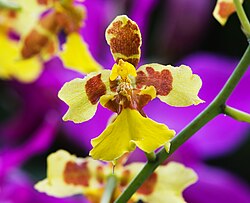


.jpg)


![[6]](https://en.wikipedia.org/wiki/File:Vote_number_1b.jpg)
![[7]](https://en.wikipedia.org/wiki/File:Stocking_factory2.jpg)


_in_Amritsar,_India.jpg)


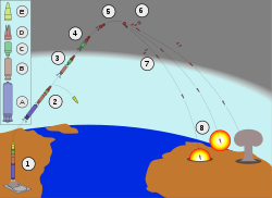


 plattopustalk 21:50, 18 May 2009 (UTC)


