
Wikipedia talk:Manual of Style/Images
| This is the talk page for discussing improvements to the Manual of Style/Images page. |
|
| Manual of Style | ||||||||||
| ||||||||||


| Wikipedia Help NA‑class High‑importance | ||||||||||
| ||||||||||

inactive . |
|
Archive 3 | ||
| Archive 4 | Archive 5 | Archive 6 |
| Archive 7 | Archive 8 | Archive 9 |
| Archive 10 | Archive 11 |
This page has archives. Sections may be automatically archived by Lowercase sigmabot III when more than 5 sections are present.
AI upscaling
Is the AI upscaling of a blurry or historical portrait considered to be unremarkable (serving to improve the presentation without materially altering the content
) or something to avoid or flag (where a reader needs to know about them to properly interpret the image
)?
As the technology becomes cheaper, I've been seeing an increasing amount of this on Commons, where a user thinks that running a low res portrait through a free upscaler like MyHeritage to add some convincing but semi-imaginary detail to the eyes, nose and mouth is a helpful thing to do. I don't know if we're yet at the tipping point where this needs an explicit clarification in Wikipedia's MOS.
The example that led me here was the Raj Kapoor article, where the low res 1959 film still File:Raj Kapoor in Anari.jpg is being replaced with an AI's upscaled interpretation File:Raj Kapoor in Anari enhanced.jpg. Belbury (talk) 10:06, 9 May 2023 (UTC)
- Absolutely, positively needs to be noted on the img description page and in captions. EEng 10:38, 9 May 2023 (UTC)
- I would argue that we should not accept AI upscale images, save for specific demonstrations of the techniques, due to the questions on copyright of the process. Its not mechanical like image reduction, but instead adding info that wasn't there before, like colorization. Which means that that new information may have been gleaned from one or more additional sources of which copyright is uncertain. Masem (t) 13:26, 9 May 2023 (UTC)
- I'd like to note that image reduction is not mechanical and results do differ based on the chosen algorithm. In addition, image reduction takes away info that was there before. So at the risk of pointing out that other stuff exists, if these are the things that we are worried about, then there's a lot more to look at than AI upscaling, considering that image reduction happens on nearly every page with an image. Orange Suede Sofa (talk) 02:51, 19 May 2023 (UTC)]
- I'd like to note that image reduction is not mechanical and results do differ based on the chosen algorithm. In addition, image reduction takes away info that was there before. So at the risk of pointing out that
- AI alterations of an image should always be in a separate upload and clearly marked on both captions and image description page. A colorized version of an original black and white is not an improved version of the same image, it is something new and completely different. In your example, the AI made nicer looking eyebrows but the ear is now worse than before if you ask me. Misleading images like this should be avoided. —Kusma (talk) 20:27, 9 May 2023 (UTC)
Are there any objections to updating Wikipedia:Manual of Style/Images#Editing images to explicitly say that AI upscaled images "should not usually" be used on Wikipedia, in the same phrasing as for colorisation? The guideline currently cautions against colorisation on the grounds that it is WP:OR, but AI upscaling is as much if not more of a problem.
(I've just found a new behaviour on Commons where a user takes a freely licenced but low resolution celebrity photo, crops it to a close-up portrait and asks an AI to have a guess at what that person might look like at a higher resolution, to use in a Wikipedia infobox.) --Belbury (talk) 09:43, 16 July 2023 (UTC)
Trying for a wording on this, does AI upscaling software should generally not be used to increase the resolution or quality of an old or low-resolution image. Original historical images should always be used in place of AI upscaled versions. If an AI-upscaled image is used in an article, this fact should be noted in its caption.
seem reasonable, as a paragraph after the one on colorisation? --Belbury (talk) 09:07, 19 August 2023 (UTC)
- That reads well to me, and is good advice. This isn't FakedImagePedia. — SMcCandlish ☏ ¢ 😼 13:57, 19 August 2023 (UTC)
- I've now added this paragraph to the page. Belbury (talk) 17:22, 26 August 2023 (UTC)
- The correct way to do resolution reduction is well known in the Digital signal processing world. That said, less correct algorithms are often used, as they are faster. The correct process for upscaling is Deconvolution.[1] The algorithms aren't quite as well defined as downscaling, though, but they also don't use AI. It is often used on scientific data, such as in spectroscopy. It was also used in the early Hubble Space Telescope images. Gah4 (talk) 03:09, 2 October 2023 (UTC)
References
- ISBN 0486453251. Retrieved 2 October 2023.
Add disclaimer/note about different screen settings
Lately I've seen a lot of disruptive drive-by edits to articles with long-standing image layouts, based on this or that reading of image placement guidelines. But what appears to be happening is that some editors assume that what they see, for example specific instances of
- That seems like a pretty reasonable idea, along with additional advice to test at multiple browser widths and on different devices. — SMcCandlish ☏ ¢ 😼 04:17, 29 August 2023 (UTC)
thumbnails rendering at 170px by default, not 220px?
Does anyone know why, for me at least, the thumbnails at Dundas station (Toronto) are rendering at 170px and not 220px when both |upright and |thumb are set? Isn't the default for |upright = 1? —Joeyconnick (talk) 05:29, 12 June 2023 (UTC)
- No, the default is .75. See the warning in the Size section: "But upright alone, with no =scaling factor ... is equivalent to upright=0.75". This has caused confusion before, see the "Question" section above. I'm going to add some text. GA-RT-22 (talk) 12:54, 12 June 2023 (UTC)
- I question the need for the upright tag on those photos in that article. They are not large photos. BilCat (talk) 17:45, 12 June 2023 (UTC)
- Indeed. Except for very tall and narrow images, we should avoid fixing below the 220 px default, which is what using "upright" without a number achieves. Johnbod (talk) 17:55, 12 June 2023 (UTC)
- I suspect whoever added the "upright" tags was confused in the same way that OP in the "Question" section was, and assumed that "whenever possible" meant "always" and not "when an image must be scaled to something other than the default size". I hope my edit to the MOS has cleared this up. GA-RT-22 (talk) 19:46, 12 June 2023 (UTC)
- Wouldn't it make more sense to have a bot go through and change existing plain "upright" to "upright=0.75" and then make upright with no value = 1? I don't understand why it would default to 0.75. I am clearly not the first person to not know this weird default value.
- If 0.75 was some magic value that would fix all potentially large images, then sure. But it's not. Sometimes 0.75 will be too much and sometimes it won't be enough, so shouldn't it just do nothing by default unless someone has actually picked a value that has the intended effect? —Joeyconnick (talk) 03:57, 13 June 2023 (UTC)
- It actually is some magic number that fixes the majority of images. 4:3 is the most common aspect ratio for still photos. Take one of these and turn it on its side, and you will need to multiply the width by .75 to get an image of the same area as the original. I would be opposed to changing the default, because I don't want to have to remember that .75 is the right number to use. GA-RT-22 (talk) 04:19, 13 June 2023 (UTC)
- Agreed. And if it were changed, all the extant uses of it would have be bot-replaced to specify .75, because for many of them this size was chosen on purpose (or rather the
|upright=was used because it had this particular result). I know I only use it when the image is vertically too large, and using it produces an image of reasonable height in relation to the rest of the images on the page usually without further adjustment. — SMcCandlish ☏ ¢ 😼 18:45, 19 August 2023 (UTC)
- Agreed. And if it were changed, all the extant uses of it would have be bot-replaced to specify .75, because for many of them this size was chosen on purpose (or rather the
- @Joeyconnick: Getting the behaviour of plain
|uprightchanged isn't something that we can do here, it would require a change to the MediaWiki software, and would affect all wikis using that software - almost a thousand WMF wikis, and then there are all the non-WMF wikis as well. You could try filing a ticket at phab: and see what they say. --Redrose64 🌹 (talk) 22:26, 13 June 2023 (UTC)- Thanks but yeah, no: sounds pretty hopeless. I'll just adjust. —Joeyconnick (talk) 03:34, 14 June 2023 (UTC)
- It actually is some magic number that fixes the majority of images. 4:3 is the most common aspect ratio for still photos. Take one of these and turn it on its side, and you will need to multiply the width by .75 to get an image of the same area as the original. I would be opposed to changing the default, because I don't want to have to remember that .75 is the right number to use. GA-RT-22 (talk) 04:19, 13 June 2023 (UTC)
- I question the need for the upright tag on those photos in that article. They are not large photos. BilCat (talk) 17:45, 12 June 2023 (UTC)
Syntax style
I want to discuss the style of content that readers don't see: the syntax or coding style.
The 'Syntax' section gives this as an example:
[[File:Siberian Husky pho.jpg|thumb|alt=A white dog in a harness playfully nuzzles a young boy |A [[Siberian Husky]] used as a pack animal]]
I would say that this is easier to read:
[[File: Siberian Husky pho.jpg | thumb | alt = A white dog in a harness playfully nuzzles a young boy | A [[Siberian Husky]] used as a pack animal]]
For the same reason that
A Siberian Husky used as a pack animal
is easier to read than
ASiberianHuskyusedasapackanimal
additionally,
[[File:Siberian Husky pho.jpg |thumb |alt = A white dog in a harness playfully nuzzles a young boy |A [[Siberian Husky]] used as a pack animal]]
is more difficult to read than the aforementioned, for the same reason that
lA lSiberian lHusky lused las la lpack lanimal
is more difficult to read than the aforementioned.
I often see people following the example on this page and eschewing any space that is not between two words. Not only that, but many editors see spaces used in code and remove them. I'm not sure what is being improved. Do they quickly read the content, decide it doesn't need to be read again, and want it to take up less space?
To be sure, some parts of computer code do not need spaces between them (series of rote tags that everyone ignores anyways). But some code can slightly differ from use to use, and it needs to be easy to read.
It isn't just image tags with this problem, to be sure. But this page must be fairly popular and get a lot of different viewers, so I figured I'd bring it up here. Wizmut (talk) 12:45, 1 July 2023 (UTC)
- I wish we had some kind of rule discouraging changing white space. Not outright prohibiting it. When someone makes a 500 line change, with 499 lines of white space changes and one line of hard-to-see typo, that's not an improvement. GA-RT-22 (talk) 13:09, 1 July 2023 (UTC)
- I'm glad we don't, and a general one would run afoul of WP:LDR) into the middle of a paragraph, making it hard to understand the paragraphization, or when people do daft things like]
{{Cite book| title =Yadda Yadda| last =Foo| first =Bar| date =2023| ...}}— SMcCandlish ☏ ¢ 😼 14:12, 19 August 2023 (UTC)
- I'm glad we don't, and a general one would run afoul of
- Our documentation should reflect what editors typically do (especially since people tend to copy-paste from the doc and change the details). And, well,
[[File: Name | thumb | alt = Whatever | More Whatever]]is not it. The prevalent styles are[[File:Name|thumb|alt=Whatever|More Whatever]]and[[File:Name |thumb |alt=Whatever |More Whatever]], to mirror typical formatting of templates. And "File: Name" is just weird. No one does that, any more than they refer to "Wikipedia: Administrator's noticeboard" or "MOS: IMAGES". — SMcCandlish ☏ ¢ 😼 14:12, 19 August 2023 (UTC)
Image stacking
We really ought to add guidance that you shouldn't stack images.
[[File:1]]
[[File:2]]
[[etc...]]
Lorem ipsum dolor sit amet, consectetur adipiscing elit...
This displays on mobile as a centered continuous stack of images, and not a neatly cascading set of images beside the text. I've seen articles where on mobile, you had to scroll through like five screens of images to get to the text. This is covered a bit in Help:Pictures, but not in the MOS and not specific to mobile. GMGtalk 11:19, 29 July 2023 (UTC)
- Yes - it is in there but should be strengthened. Mind you, in my experience most high-traffic articles have now been converted. I'd also like to see discouragement of "mosaic" multiple images, especially large ones. These are bad both on mobile and desktop. Johnbod (talk) 14:21, 19 August 2023 (UTC)
- What we should say is that there shouldn't be more than "a few" images in a
rowstack like that. There are plenty of cases where 2 or 3 or 4 in arowstack makes perfect sense (especially if some are left and some are right -- and please, I don't need to hear about SANDWICHing), and there may be places where even more (small?) images in arowstack might makes sense. Explain the reason and leave it to editor judgment. Please let's not have one more absolutist rule giving self-appointed roving enforcers another excuse for making pests of themselves. EEng 15:45, 19 August 2023 (UTC)- Oh well, maybe it isn't there - I can't find it, & if you can't, it probably isn't. We're not talking about "row"s here, but stacks or columns - let's not confuse ourselves. It should be in there - at the minimum all we need to say is to move images lower down to break up a stack. It used to be a sensible and very common tactic to stack all the images at the top of the article, so that there would be a continuous flow of images at the right of the screen, whatever the screen size or settings. With mobiles this doesn't work at all, as you get Pinterest before any text. We should advise against this. With the multiple images syntax you don't even get captions (there is an ongoing discussion re this at Talk:Prodigy_house#Multiple_Image). Johnbod (talk) 16:31, 19 August 2023 (UTC)
- Obviously stacking all of an article's images at the start of the article is no good. But stacking two images, relevant to a give section, at the start of that section is often better than having one image at the start, floated next to text, then a few whispy lines of text with no image floated next to them, then another image floated next to text. This usually looks awful.I'll say again: the important thing is to warn against big stacks. Modest stacks are OK. EEng 18:19, 19 August 2023 (UTC)
- Oh well, maybe it isn't there - I can't find it, & if you can't, it probably isn't. We're not talking about "row"s here, but stacks or columns - let's not confuse ourselves. It should be in there - at the minimum all we need to say is to move images lower down to break up a stack. It used to be a sensible and very common tactic to stack all the images at the top of the article, so that there would be a continuous flow of images at the right of the screen, whatever the screen size or settings. With mobiles this doesn't work at all, as you get Pinterest before any text. We should advise against this. With the multiple images syntax you don't even get captions (there is an ongoing discussion re this at Talk:Prodigy_house#Multiple_Image). Johnbod (talk) 16:31, 19 August 2023 (UTC)
- Images should be inserted at the point in the source that they belong to (that way they make sense in mobile). To avoid stacking, alternate images right and left and ignore all sandwiches (which are rarely a problem on desktop and never a problem on mobile). —Kusma (talk) 16:39, 19 August 2023 (UTC)
- I find sandwitching to be a problem on desktop. I also find overly rigid staggering that ignores article layout (especially left first - right, irrespective of headers) to worsen readability.—Alalch E. 17:53, 19 August 2023 (UTC)
- I use larger than default images on a wide screen, which almost guarantees that sandwiching will happen whenever there are any left-aligned images. It is nearly impossible to illustrate an article well without sacrificing something: the gallery and multiple images options do not support automatic resizing to larger thumbnail sizes. I personally prefer sandwiching to having to use fixed image sizes. —Kusma (talk) 18:13, 19 August 2023 (UTC)
- "It is nearly impossible to illustrate an article well without sacrificing something" - Agreed. "the gallery and multiple images options do not support automatic resizing to larger thumbnail sizes." That will probably be fixed some day, and those layout tools still make sense in various cases (e.g. gallery at Regimental tartan#Late 18th century diversification, where the list isn't even complete yet, and where using a table with regular
[[File:...|thumb|]]markup would waste a lot of space). — SMcCandlish ☏ ¢ 😼 18:41, 19 August 2023 (UTC)
- "It is nearly impossible to illustrate an article well without sacrificing something" - Agreed. "the gallery and multiple images options do not support automatic resizing to larger thumbnail sizes." That will probably be fixed some day, and those layout tools still make sense in various cases (e.g. gallery at Regimental tartan#Late 18th century diversification, where the list isn't even complete yet, and where using a table with regular
- "I also find overly rigid staggering that ignores article layout (especially left first - right, irrespective of headers) to worsen readability." Definitely. It can make it hard to tell where sections/subsections start and what the heading depth is. As for "I find sandwitching to be a problem on desktop." What kind of problem? Can you link to an example? Are you on some really tiny monitor or something? — SMcCandlish ☏ ¢ 😼 18:41, 19 August 2023 (UTC)
- I use larger than default images on a wide screen, which almost guarantees that sandwiching will happen whenever there are any left-aligned images. It is nearly impossible to illustrate an article well without sacrificing something: the gallery and multiple images options do not support automatic resizing to larger thumbnail sizes. I personally prefer sandwiching to having to use fixed image sizes. —Kusma (talk) 18:13, 19 August 2023 (UTC)
- I find sandwitching to be a problem on desktop. I also find overly rigid staggering that ignores article layout (especially left first - right, irrespective of headers) to worsen readability.—Alalch E. 17:53, 19 August 2023 (UTC)
- Are we ready for a draft? I think we are boadly in agreement, but I think there are still a good number of editors for whom "stacking all of an article's images at the start of the article is no good" is not yet obvious. I'm ok with two or more in a stack, if there is a good reason, but usually there isn't. Otherwise there's no reason not to space them out a bit, and we should say so in a non-absolutist way. I used to stagger left & right, but now I generally only put images that strongly "face into the page" on the left. That's enough for now, but one day we should update WP:GALLERY, which has hardly changed for 15 years, and doesn't even mention the use of "mini-galleries" placed around the article in visual subjects. Johnbod (talk) 22:15, 19 August 2023 (UTC)]
- The "good reason" is actually quite common, and it's a long lead and/or ToC, producing a huge block of whitespace on the right (in a regular browser view; not sure about on mobile). — SMcCandlish ☏ ¢ 😼 04:20, 29 August 2023 (UTC)
- If it's a long lead the images for that should be spaced out, between paragraphs. For those still on the old desktop default, a long TOC is a reason to stack, but what proportion of our readers are still viewing like that? You had to be registered, and to override the new default. Johnbod (talk) 02:34, 2 September 2023 (UTC)
- The "good reason" is actually quite common, and it's a long lead and/or ToC, producing a huge block of whitespace on the right (in a regular browser view; not sure about on mobile). — SMcCandlish ☏ ¢ 😼 04:20, 29 August 2023 (UTC)
Dragable image comparisons


In Fleetwood Park Racetrack, I've got two maps showing the same area in 1885 and today. Is there some way to build a composite image which lets you drag a slider to expose one or the other, in the style of https://web-toolbox.dev/en/tools/image-compare-slider? RoySmith (talk) 16:25, 28 August 2023 (UTC)
- I don't think this exists. We're just now starting to even have interactive maps. Wiki is always 5-10 years behind the rest of the internet in technological capabilities, unfortunately. ɱ (talk) 17:06, 28 August 2023 (UTC)
Flags
We have a problem, highlighted at
Dispute over censoring an image
At
- I am a believer in ]
How to put image in the correct section?
I added an image to the "History" section of an article, but it appears in the next section. How do I get the image to appear in the correct section? Thank you, Cunard (talk) 11:47, 8 October 2023 (UTC)
- That one's got me stumped. I have no idea why it's moving down to the section below that. — SMcCandlish ☏ ¢ 😼 13:01, 8 October 2023 (UTC)
- @Cunard: It's easy to explain. The article begins with a
{{Infobox restaurant}}immediately followed by a{{Infobox Chinese}}, and these are both floated boxes. Images are also floated boxes; and the top edges of all floated boxes must occur in sequence down the page. So because the image is after the{{Infobox Chinese}}, the top edge of the image cannot be any higher than that of the second infobox. --Redrose64 🌹 (talk) 20:09, 8 October 2023 (UTC)- Thank you, Redrose64 (talk · contribs). I guess there's no way to fix this with these two infoboxes. I don't think
{{Infobox Chinese}}can be emedded with{{Infobox restaurant}}, which lacks a "module" parameter like Template:Infobox person has. Cunard (talk) 23:07, 8 October 2023 (UTC)
- Thank you, Redrose64 (talk · contribs). I guess there's no way to fix this with these two infoboxes. I don't think
- @Cunard: It's easy to explain. The article begins with a
edit request
Please change
- ... can create a distasteful text sandwich
- Wide images opposite one another...
to
- Wide images opposite one another...
- ... can create a distasteful text sandwich
from View source:
- {{anchor|Sandwich}}{{Shortcuts|MOS:SANDWICH}}{{-}} [[File:The suicide of Cleopatra; the asp is wriggling up the left a Wellcome V0041560.jpg|thumb|330px<!--fixed width to guarantee "sandwiching" effect (in small- to moderate-sized windows) regardless of user preference settings; this is a bit tricky because if screen is too narrow, then text will be squeezed out completely from between images and the effect is nullified-->|... can create a distasteful text sandwich (depending on platform and window size).]] [[File:Harvard Theatre Collection - Sarah Bernhardt TCS 2 (Cleopatra) (cropped).jpg|thumb|left|330px<!--see note to prior image re size-->|Wide images opposite one another{{nbsp}}...]]
Thanks. 173.67.42.107 (talk) 12:47, 8 October 2023 (UTC)
 Fixed. The images are now in the proper order to both display the intended effect, and render sensibly in text-only or text-to-speech mode. — SMcCandlish ☏ ¢ 😼 13:05, 8 October 2023 (UTC)
"Mos:LEADIMAGE" listed at Redirects for discussion
![]() The redirect Mos:LEADIMAGE has been listed at redirects for discussion to determine whether its use and function meets the redirect guidelines. Readers of this page are welcome to comment on this redirect at Wikipedia:Redirects for discussion/Log/2023 October 11 § Mos:LEADIMAGE until a consensus is reached. Utopes (talk / cont) 23:45, 11 October 2023 (UTC)
The redirect Mos:LEADIMAGE has been listed at redirects for discussion to determine whether its use and function meets the redirect guidelines. Readers of this page are welcome to comment on this redirect at Wikipedia:Redirects for discussion/Log/2023 October 11 § Mos:LEADIMAGE until a consensus is reached. Utopes (talk / cont) 23:45, 11 October 2023 (UTC)
Value of a color vs. black and white infobox portrait
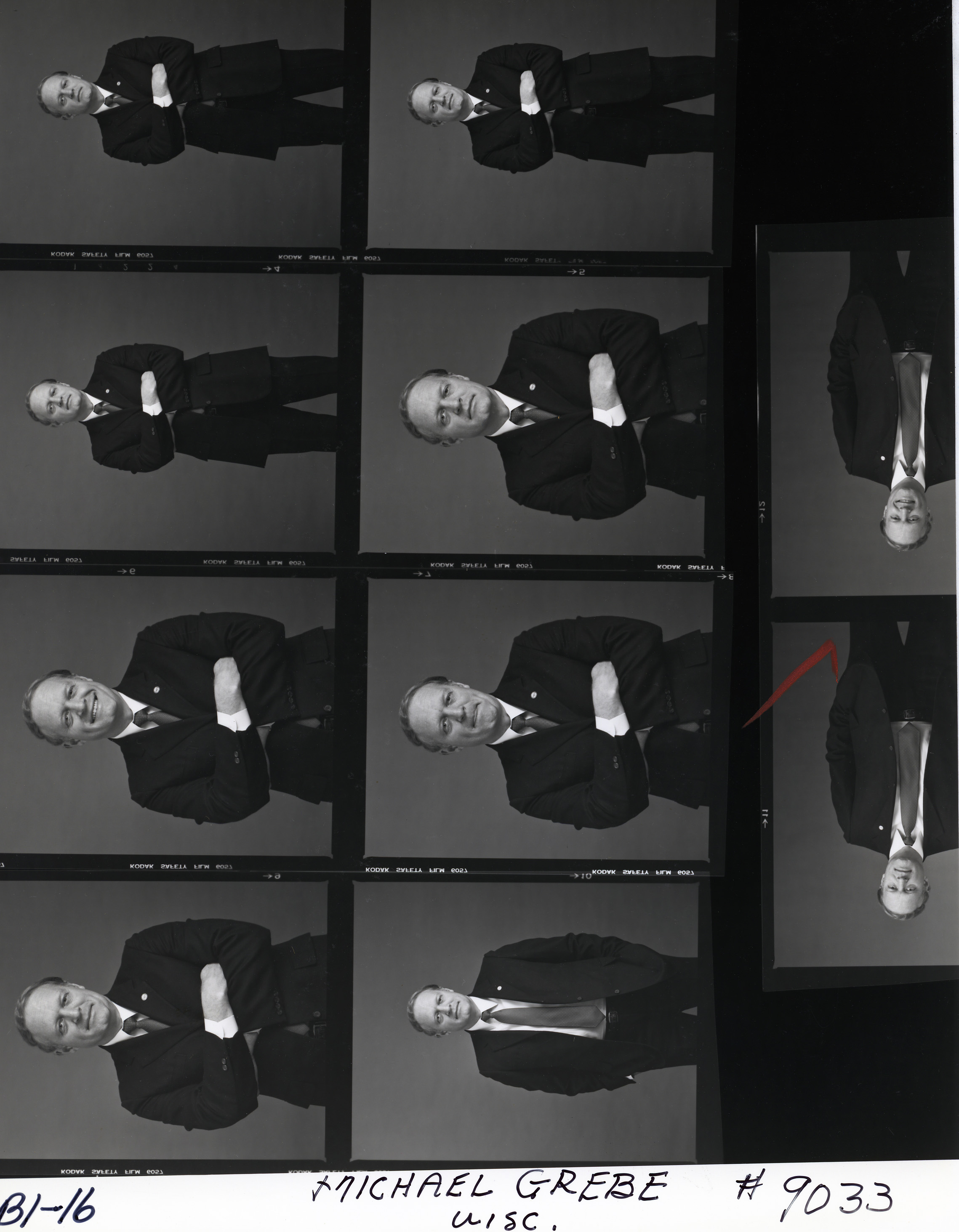
I'm in the process of prepping a few hundred 1980s U.S. government photos for upload to Commons for use in biographies, mostly as infobox photos. While most of the photos are black and white, about 15% of the subjects have both a single color portrait and a set of black and white portraits to choose from. With a few exceptions, the subjects with a color portrait have a visibly higher-quality black and white alternative (file size doesn't necessarily mean much, but fwiw, the color portraits are mostly in the 25-40kb range, as opposed to 50-100kb for the black and white portraits). Is there some sort of guideline to follow on choosing one over the other, or is this simply a judgment call? Bios almost never need two portraits from the same portrait session, so is having a higher-quality image worth the cost of not having a color image of the individual on their page? Star Garnet (talk) 18:12, 26 October 2023 (UTC)
- Might be helpful to see examples, to get an idea of the relative image qualities. — SMcCandlish ☏ ¢ 😼 18:54, 26 October 2023 (UTC)
- A pretty representative example would be for Michael W. Grebe: color vs. b&w Star Garnet (talk) 20:17, 26 October 2023 (UTC)
- Well, since they're otherwise essentially identical, I would use the color one, but crop it a whole lot so it's just a bust image. — SMcCandlish ☏ ¢ 😼 12:09, 4 January 2024 (UTC)
- A pretty representative example would be for Michael W. Grebe: color vs. b&w Star Garnet (talk) 20:17, 26 October 2023 (UTC)
- Assuming that all options are freely licensed I would look to which photo does the best job of putting the person in a respectable pose. Black and white portraits are often aimed for this capacity, but otherwise we don't place any extra value for color over b&w Masem (t) 19:16, 26 October 2023 (UTC)
MOS:SANDWICH
I'm writing this on mobile so any oddities can be brought down to that While in a discussion over on the Discord,
- My guess is because it makes paragraphs pretty narrow on monitors that aren't wide screen. Magnolia677 (talk) 13:56, 1 November 2023 (UTC)
- Of course it's that. I've never heard anyone support "heavy" sandwiching, though mild partial sandwiches are not the end of the world for most screens. Mobiles avoid it completely, no? Johnbod (talk) 15:09, 1 November 2023 (UTC)
- But Blaze Wolf's question was a good one. So often there are other reasons that aren't obvious. Magnolia677 (talk) 16:48, 1 November 2023 (UTC)
- @Johnbod: Yes mobiles avoid sandwiching completely. But that wasn't why it was brought up. Someone had said they were proud of an article in which there was sandwiching issues. ― Blaze WolfTalkblaze__wolf 18:11, 1 November 2023 (UTC)
- And it is good to peridiocally review this sort of claim, anyway. Mobile browsers have come a very long way in a few years, the average monitor size on desktops has gotten larger, and so on. See also discussions at WT:LENGTH about revising/removing various obsolete technical-considerations claims that were being made. — SMcCandlish ☏ ¢ 😼 19:05, 1 November 2023 (UTC)]
- Fine, but I certainly don't think this is obselete, nor will it be until they pry my keyboard from my cold, dead hands .... Johnbod (talk) 21:03, 1 November 2023 (UTC)
- Text fragmentation is a big concern for those with disabilities. Size of paragraphs would be the next concern. As for length of articles.... at minimum we should fallow academic recommendations. Moxy-
 21:46, 1 November 2023 (UTC)
- Text fragmentation is a big concern for those with disabilities. Size of paragraphs would be the next concern. As for length of articles.... at minimum we should fallow academic recommendations. Moxy-
- Fine, but I certainly don't think this is obselete, nor will it be until they pry my keyboard from my cold, dead hands .... Johnbod (talk) 21:03, 1 November 2023 (UTC)
- Of course it's that. I've never heard anyone support "heavy" sandwiching, though mild partial sandwiches are not the end of the world for most screens. Mobiles avoid it completely, no? Johnbod (talk) 15:09, 1 November 2023 (UTC)
- It's long past time to retire MOS:SANDWICH, at least for images opposite infoboxes. It's a relic of a time when screens were much smaller, browsers didn't handle differing widths well, and mobile devices didn't even exist. It's particularly a problem with infoboxes, because it effectively prohibits any inline image in shorter articles (stubs and most start-class) that have infoboxes. 40% of articles have infoboxes; 80% of articles are stub or start class. It does our readers a massive disservice to say we can't have inline images in ~30% of articles. Pi.1415926535 (talk) 05:29, 10 November 2023 (UTC)
- I strongly disagree.
The average monitor size on desktops has gotten larger
– maybe, but I'm not alone in regularly viewing Wikipedia articles on tablets not using the mobile site, when sandwiching is a real problem. The screen size on laptops has not increased. My solution for small articles is to use "center" to place images centrally. Peter coxhead (talk) 11:17, 10 November 2023 (UTC)- Well, Pi.1415926535's central point is correct, that it is better to have a short article illustrated at all than to avoid illustrating it because the layout isn't perfect for every class of user. The resolution of laptops and tablets has increased, which amounts to an effective increase in screen size. But this centering idea might be worth integrating into the guidance if it is useful without negative side effects for other users. I.e., let's get to a compromise, work-around solution. — SMcCandlish ☏ ¢ 😼 17:04, 10 November 2023 (UTC)
- I strongly disagree.
"horrifying"
A recent edit changed trigger warning culture", anything that might offend or shock anyone for any reason could be PoV-pushingly mischaracterized as "horrifying" and be subject to editwarring to remove it, even if it would not be of concern to most readers. Medical articles in particular are already subject to frequent attempts to censor images from them of injury types and disease results, and I can certainly see such a broad concept as "horrifying" also being abused to censor material on sexuality; religious ideas like depictions of Hell; historical material on wars and weapons, medieval torture, etc; blood sports; the entire subject area of the horror genre; among others. — SMcCandlish ☏ ¢ 😼 02:33, 2 December 2023 (UTC)]
- Hmm, I'm inclined to see how it plays out, registering that there is no established consensus for the change. I don't really edit this sort of stuff, but I think there is a case for boxes or whatever with a "show" button. Johnbod (talk) 02:43, 2 December 2023 (UTC)
- 'a case for boxes or whatever with a "show" button' is something very few editors would support, so using that as a rationale for why to keep this change seems rather dubious. Is there something about it, on it's own merits, or is it just because it aligns with a "show box" scenario that isn't likely to ever happen? — SMcCandlish ☏ ¢ 😼 08:19, 2 December 2023 (UTC)
- I'm not sure I agree with the addition, but I think most of the potential objections to images you mention could already occur under the banners of vulgar and obscene (and as you note, attempts to censor images already occur). Nikkimaria (talk) 02:46, 2 December 2023 (UTC)
References
RfC on removal of image collages from Year articles.
There is an ongoing RfC that may be of interest to editors here regarding the removal of image collages from individual year articles at Wikipedia talk:WikiProject Years § RfC: Removal of image collages. voorts (talk/contributions) 00:26, 24 December 2023 (UTC)
Photo of a tombstone
Your input would be appreciated at Talk:Morristown, Tennessee#Photo of a tombstone, where there is a content dispute regarding a photo of a tombstone. Magnolia677 (talk) 23:37, 26 December 2023 (UTC)
Updating permanent link

This edit request has been answered. Set the |answered= or |ans= parameter to no to reactivate your request.
Requesting that the link to Special:PermanentLink/460749801 in Wikipedia:Manual of Style/Images#Images for the lead be changed to Special:PermanentLink/1192743397 (or any such recent version). The currently linked version has a redirect template redlink and what is now a navbox at the top of the article, making it less obvious which image is being referenced. hinnk (talk) 02:52, 2 January 2024 (UTC)
 Done. — SMcCandlish ☏ ¢ 😼 12:05, 4 January 2024 (UTC)
WP:USERG portraits
I know I've seen discussions on the theme "No, we don't want your artistic vision in WP-biographies", but is there something written on that in a guideline somewhere? Should something be mentioned at Wikipedia:Manual_of_Style/Images#Making_images_yourself? Gråbergs Gråa Sång (talk) 09:44, 4 January 2024 (UTC)
- This seems more like a WT:IMAGEPOL. — SMcCandlish ☏ ¢ 😼 11:59, 4 January 2024 (UTC)]
Drawing instead of photo in the image section
Would there be a problem if, out of lack of an available picture, but as in a photography of a person, to use a drawing of this person in the image section? Kayy kay (talk) 04:02, 9 January 2024 (UTC)
- @Kayy kay: See above. There have been similar questions in the past, and IIRC the answer was always "no thanks". --Redrose64 🌹 (talk) 14:42, 9 January 2024 (UTC)
- Could someone let me know whether it would be ok, if we are talking about a cyberoffensor, potentially dangerous, over 40 years old, free, who is not yet posted on Wikipedia? 188.146.110.234 (talk) 15:10, 9 January 2024 (UTC)
"Upright"?
Whatever the original reasons there were for the image width parameter to be called "upright", it's a poor name for that feature (either nonsensical or counterintuitive) and likely yet another small issue in
WP:NEWBIES &c. — AjaxSmack 15:24, 20 January 2024 (UTC)]
- The original reason seems to be that it was intended for 'upright', i.e. portrait-oriented, images to reduce the size when the user's default width was used. But I agree that it's a poor name now; "scale" might be better. (Note that "upright" is used elsewhere, e.g.
|image_upright= in taxoboxes.) Peter coxhead (talk) 16:54, 20 January 2024 (UTC)
- The
|upright=n feature isn't like a template parameter where we would discuss and then just amend the template code. It's part of the MediaWiki software, and hence is not just outside the scope of this page, it's also not something that English Wikipedia can decide without involving all the other wikis that use MediaWiki (more than a thousand different websites). You need to file s change request at phab:, but be warned, they may throw it out as being years too late. --Redrose64 🌹 (talk) 23:22, 20 January 2024 (UTC)
Proposed addition to the list of unacceptable image uses
The following is copied from my inquiry at WT:NFC/Archive 74:
I'd like to propose a new addition to
]
- Not sure about other markets, but at one time in the UK it was rare for a single to have its own particular sleeve (whether picture and text or text-only); until the 1970s most singles were sold in a paper (not card) sleeve having a circular hole for the label to be seen through - the sleeve itself was either plain white, or a generic design of the record company - Decca's orange-and-white sleeves are an example. The Beatles released 22 singles between 1962 and 1970 - of these, 16 came in a generic Parlophone sleeve, five in a generic Apple sleeve (black with green lettering), and only one ("Penny Lane"/"Strawberry Fields Forever") had its own dedicated picture sleeve. Indeed, in the early 1980s many singles were sold in two forms in parallel: plain sleeve or picture sleeve, the latter having a higher price and often a limited print run (early copies of "Golden Brown" had gold lettering, later copies had white lettering). --Redrose64 🌹 (talk) 23:43, 8 February 2024 (UTC)
- Count me opposed to throwing out a picture sleeve with artwork or photographs in favor of a simple textual record label. Binksternet (talk) 06:26, 16 February 2024 (UTC)
- WP:NFCC#1:
Non-free content is used only where no free equivalent is available, or could be created, that would serve the same encyclopedic purpose.
- I believe that simple textual record labels could be used for
the same encyclopedic purpose
as the main use of official picture sleeves (identification in infoboxes without critical commentary). If an article were to include critical commentary on a single cover itself (and not the song), that would be a different case. JohnCWiesenthal (talk) 06:54, 16 February 2024 (UTC)
- Not this again...: Wikipedia talk:WikiProject Songs/Archive 25#20th-century vinyl singles (sleeves vs labels) Tkbrett (✉) 16:58, 16 February 2024 (UTC)
Mezzelune
Hi. I don't know where to place the "Mezzelune with seafood and pesto" image; according to the Manual of Style's rules, which is the most suitable place? JacktheBrown (talk) 18:49, 27 March 2024 (UTC)
Discussion on use of palaeoart
FAC discussion which could be relevant to editors here[1], and perhaps the MOS for images should have a note on how to deal with
]
- Hmm, I'm inclined to see how it plays out, registering that there is no established consensus for the change. I don't really edit this sort of stuff, but I think there is a case for boxes or whatever with a "show" button. Johnbod (talk) 02:43, 2 December 2023 (UTC)
- 'a case for boxes or whatever with a "show" button' is something very few editors would support, so using that as a rationale for why to keep this change seems rather dubious. Is there something about it, on it's own merits, or is it just because it aligns with a "show box" scenario that isn't likely to ever happen? — SMcCandlish ☏ ¢ 😼 08:19, 2 December 2023 (UTC)
- I'm not sure I agree with the addition, but I think most of the potential objections to images you mention could already occur under the banners of vulgar and obscene (and as you note, attempts to censor images already occur). Nikkimaria (talk) 02:46, 2 December 2023 (UTC)
References
RfC on removal of image collages from Year articles.
There is an ongoing RfC that may be of interest to editors here regarding the removal of image collages from individual year articles at Wikipedia talk:WikiProject Years § RfC: Removal of image collages. voorts (talk/contributions) 00:26, 24 December 2023 (UTC)
Photo of a tombstone
Your input would be appreciated at Talk:Morristown, Tennessee#Photo of a tombstone, where there is a content dispute regarding a photo of a tombstone. Magnolia677 (talk) 23:37, 26 December 2023 (UTC)
Updating permanent link
This edit request has been answered. Set the |answered= or |ans= parameter to no to reactivate your request. |
Requesting that the link to Special:PermanentLink/460749801 in Wikipedia:Manual of Style/Images#Images for the lead be changed to Special:PermanentLink/1192743397 (or any such recent version). The currently linked version has a redirect template redlink and what is now a navbox at the top of the article, making it less obvious which image is being referenced. hinnk (talk) 02:52, 2 January 2024 (UTC)
- Done. — SMcCandlish ☏ ¢ 😼 12:05, 4 January 2024 (UTC)
WP:USERG portraits
I know I've seen discussions on the theme "No, we don't want your artistic vision in WP-biographies", but is there something written on that in a guideline somewhere? Should something be mentioned at Wikipedia:Manual_of_Style/Images#Making_images_yourself? Gråbergs Gråa Sång (talk) 09:44, 4 January 2024 (UTC)
- This seems more like a WT:IMAGEPOL. — SMcCandlish ☏ ¢ 😼 11:59, 4 January 2024 (UTC)]
Drawing instead of photo in the image section
Would there be a problem if, out of lack of an available picture, but as in a photography of a person, to use a drawing of this person in the image section? Kayy kay (talk) 04:02, 9 January 2024 (UTC)
- @Kayy kay: See above. There have been similar questions in the past, and IIRC the answer was always "no thanks". --Redrose64 🌹 (talk) 14:42, 9 January 2024 (UTC)
- Could someone let me know whether it would be ok, if we are talking about a cyberoffensor, potentially dangerous, over 40 years old, free, who is not yet posted on Wikipedia? 188.146.110.234 (talk) 15:10, 9 January 2024 (UTC)
"Upright"?
Whatever the original reasons there were for the image width parameter to be called "upright", it's a poor name for that feature (either nonsensical or counterintuitive) and likely yet another small issue in
- The original reason seems to be that it was intended for 'upright', i.e. portrait-oriented, images to reduce the size when the user's default width was used. But I agree that it's a poor name now; "scale" might be better. (Note that "upright" is used elsewhere, e.g.
|image_upright=in taxoboxes.) Peter coxhead (talk) 16:54, 20 January 2024 (UTC)- The
|upright=nfeature isn't like a template parameter where we would discuss and then just amend the template code. It's part of the MediaWiki software, and hence is not just outside the scope of this page, it's also not something that English Wikipedia can decide without involving all the other wikis that use MediaWiki (more than a thousand different websites). You need to file s change request at phab:, but be warned, they may throw it out as being years too late. --Redrose64 🌹 (talk) 23:22, 20 January 2024 (UTC)
- The
Proposed addition to the list of unacceptable image uses
The following is copied from my inquiry at WT:NFC/Archive 74:
I'd like to propose a new addition to
]- Not sure about other markets, but at one time in the UK it was rare for a single to have its own particular sleeve (whether picture and text or text-only); until the 1970s most singles were sold in a paper (not card) sleeve having a circular hole for the label to be seen through - the sleeve itself was either plain white, or a generic design of the record company - Decca's orange-and-white sleeves are an example. The Beatles released 22 singles between 1962 and 1970 - of these, 16 came in a generic Parlophone sleeve, five in a generic Apple sleeve (black with green lettering), and only one ("Penny Lane"/"Strawberry Fields Forever") had its own dedicated picture sleeve. Indeed, in the early 1980s many singles were sold in two forms in parallel: plain sleeve or picture sleeve, the latter having a higher price and often a limited print run (early copies of "Golden Brown" had gold lettering, later copies had white lettering). --Redrose64 🌹 (talk) 23:43, 8 February 2024 (UTC)
- Count me opposed to throwing out a picture sleeve with artwork or photographs in favor of a simple textual record label. Binksternet (talk) 06:26, 16 February 2024 (UTC)
- WP:NFCC#1:
Non-free content is used only where no free equivalent is available, or could be created, that would serve the same encyclopedic purpose.
- I believe that simple textual record labels could be used for
the same encyclopedic purpose
as the main use of official picture sleeves (identification in infoboxes without critical commentary). If an article were to include critical commentary on a single cover itself (and not the song), that would be a different case. JohnCWiesenthal (talk) 06:54, 16 February 2024 (UTC)
- Not this again...: Wikipedia talk:WikiProject Songs/Archive 25#20th-century vinyl singles (sleeves vs labels) Tkbrett (✉) 16:58, 16 February 2024 (UTC)
Mezzelune
Hi. I don't know where to place the "Mezzelune with seafood and pesto" image; according to the Manual of Style's rules, which is the most suitable place? JacktheBrown (talk) 18:49, 27 March 2024 (UTC)
Discussion on use of palaeoart
FAC discussion which could be relevant to editors here[1], and perhaps the MOS for images should have a note on how to deal with
]