
File:TIF graph.pdf
Original file (1,650 × 1,275 pixels, file size: 8 KB, MIME type: application/pdf)
Summary
| This image was SVG format, as plain text in an article, or (rarely) in JPEG format.If the information is encyclopedic, please integrate its text and information into an article, or consider copying its contents to Wikisource if it is freely licensed. If the contents are unencyclopedic or a copyright violation, please consider proposing it for deletion using {{subst:Proposed deletion|concern=reason for proposed deletion}}. For more information, see Wikipedia:Preparing images for upload. |
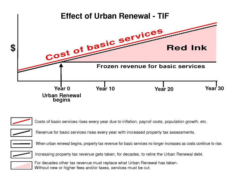
This graphic is the most accurate and unbiased representation of most uses of TIF. Contrary to the constant distortions by conflicted TIF proponents. The area marked as red ink is clearly the value lost by the diverting of all property tax revenue increases to urban renewal debt instead of the municipal services that would otherwise be getting the proceeds needed to help keep pace with rising costs. Any slight variation which may occur with some municipality is an insignificant exception. Suggesting some hypothetical possibility that the loss may be only a percentage of what is labeled as red ink is the kind of fog often commonly used to deliberately confuse the perception of TIF.
Essentially every municipality engaged in the use or promotion of TIF uses a TIF graphic that purposefully omits the long term losses to the pre-existing property tax beneficiaries and fails to note how the loss cripples the ability to meet rising costs. Graphman-Creator of the TIF Graph.
Licensing
| This file is made available under the Creative Commons CC0 1.0 Universal Public Domain Dedication.
The person who associated a work with this deed has dedicated the work to the public domain by waiving all of his or her rights to the work worldwide under copyright law, including all related and neighboring rights, to the extent allowed by law. You can copy, modify, distribute and perform the work, even for commercial purposes, all without asking permission. |
 | This file is a candidate to be copied to Wikimedia Commons.
Any user may perform this transfer; refer to Wikipedia:Moving files to Commons for details. If this file has problems with attribution, copyright, or is otherwise ineligible for Commons, then remove this tag and DO NOT transfer it; repeat violators may be blocked from editing. Other Instructions
| ||
| |||
File history
Click on a date/time to view the file as it appeared at that time.
| Date/Time | Thumbnail | Dimensions | User | Comment | |
|---|---|---|---|---|---|
| current | 00:59, 14 September 2011 |  | 1,650 × 1,275 (8 KB) | Graphman2 (talk | contribs) | This graph has been created with TIF experts and lawyers. Despite the dishonest efforts by TIF beneficiaries and Urban Renewal planners to cast it as bias, it is an accurate representation of most uses of TIF. In stark contrast nearly every municipal |
You cannot overwrite this file.