
File talk:H1N1 Australia Map.svg
<
| This file does not require a rating on Wikipedia's content assessment scale. It is of interest to the following WikiProjects: | |||||||||||||||||
| |||||||||||||||||
| Articles for creation | |||||||
| |||||||

Accuracy of the map?
I wish to question the accuracy of this map. On it it says suspected cases in Victoria and South Australia. I have heard absolutely nothing on these states having the suspected virus. New South Wales and TAsmania do have suspected cases and I have no problems with that on the map. However, Western Australia and Queensland do have suspected cases, especially Queensland.
So why is this map so WRONG? Can we have some justice here?
--Diddy29 (talk) 06:52, 30 April 2009 (UTC)
- People did not know how to update the map, now User:Markhurd is keeping it up to date. Graeme Bartlett (talk) 10:13, 24 May 2009 (UTC)
New legend
From User talk:Markhurd#File:H1N1_Australia_Map.svg:
Hi Mark, now that there are starting to be some interesting numbers of cases of swine flu in Australia, perhaps we can pick colours to indicate the number of confirmed cases in each state in File:H1N1 Australia Map.svg. Perhaps the scheme used inFile:H1N1 Canada Map by confirmed cases.svg is satisfactory. What do you think? Graeme Bartlett (talk) 10:24, 24 May 2009 (UTC)
- I know it its not logarithmic, but to be optimistic, I suggest a complete legend with slightly lower steps (not necessary to update existing ledgend until the colours are used -- I changed from named colours so I know what numbers to use in the svg file):
- #000000 deaths
- #8B0000 100+ cases
- #CC3300 20+ cases
- #FF6666 5+ cases
- #FF9999 1+ cases
- #FF9900 suspect cases only
- #B9B9B9 no cases
- Updated 14:35, 24 May 2009 (UTC) just so I don't need to edit this page to copy the colour codes into the svg file. Mark Hurd (talk) 14:35, 24 May 2009 (UTC)
- Mark Hurd (talk) 10:50, 24 May 2009 (UTC)
- That looks to be a better idea! I was not too sure about firebrick coeds myself! As the number changes, the scale can change, as long as there are reliable statistics. Graeme Bartlett (talk) 10:56, 24 May 2009 (UTC)
- There's a big problem with the new map version, no one has updated the other languages to take into account the new colour key. It should just have been created as a new image file instead. This file is used in multiple Wikipedias, not just the English one. 70.29.208.129 (talk) 15:19, 24 May 2009 (UTC)
Variants
-
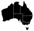 H1N1 Australia Map.svg
hybrid map -
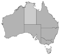
 H1N1 Australia Type Map.svg
case type map -
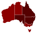 H1N1 Australia Confirmed Map.svg
confirmed cases map -
 H1N1 Australia Death Map.svg
deaths map


