
Joan Michaël Fleischman
Joan Michaël Fleischman | |
|---|---|
type designer |
Joan Michaël Fleischman (1707–27 May 1768,
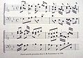
Fleischman worked in the Baroque period of design and his roman typefaces have been described as "transitional" in style, more stylised and sharply cut than was common before.[4][5][6] Perhaps his most notable design was his complex music font, that was later used to decorate the edges of documents, including the first bank note of the Netherlands called the "roodborstje" or robin.
Biography
He was born in Wöhrd, Nuremberg,[1] but moved to Amsterdam, where he worked for Izaak van der Putte and Hermanus Uytwerff before opening his own type foundry in 1735.[citation needed]
Fleischman was unable to continue the type foundry on his own, and Rudolf Wetstein ran the business for him, while he continued to work for him as a punchcutter. After Rudolf died in 1742, his son Hendrik Joris Wetstein sold the company in 1743 to

Fleischman lived in Amsterdam until the end of his life, dying there in 1768.
Fleischman's typefaces were received with great popularity in his lifetime and Enschedé's lavish type specimen "of 1768" evidently became something of a memorial to him (it is dated to 1768 on the title page, but all copies known were apparently finished the following year; Fleischman's portrait is dated 1769).[1][12][13] John A. Lane, who has prepared an edition and commentary on it, notes that "Enschedé scrupulously saved Fleischman's own account book and other documents, including even his passports, so that his career can be reconstructed in remarkable detail."[1] Fournier also thought that his work had brought "considerable accessions" to the reputation of the Enschedé foundry.[13] He was also commemorated by the Ploos Van Amstel Brothers' type foundry in the introduction to their specimen following his death.[14]
Music font
When Breitkopf developed the first typeface for music in 1755, Enschedé wanted to improve on the idea, and hired Fleischman to create a more flexible and accurate system. Soon after, the first Haarlem songbook Haerlemsche Zangen was published with this font. Previous songbooks had had their music engraved on copper plates by musicians. The new font was designed to be used by publishers in the same way that typeface could be used to print words, but this idea was not successful, as the musicians who wrote the music needed training in order to use the font. An innovative musician who used the Enschedé-Fleischman font was
Posthumous reputation
Flesichman's typefaces have a high
Interest in Fleischman's work has been greater in the digital type period, and numerous digital type designs have been influenced by Fleischman's work.
Gallery
-
 Handheld moulds like the ones he is holding in Cornelis van Noorde's engraved portrait of him
 -
 Parel Muziek font
 -
 First Dutch banknote in 1814, called Roodborstje, with Fleishman's music font recycled for the decorative edging.
 -
![Two modern digital fonts influenced by Fleischman: Joshua Darden's Freight Text Book and GFS Fleischman by George D. Matthiopoulos.[27]](//upload.wikimedia.org/wikipedia/commons/thumb/7/7e/Influence_of_Fleischman.png/120px-Influence_of_Fleischman.png) Two modern digital fonts influenced by Fleischman: Joshua Darden's Freight Text Book and GFS Fleischman by George D. Matthiopoulos.[27]
Two modern digital fonts influenced by Fleischman: Joshua Darden's Freight Text Book and GFS Fleischman by George D. Matthiopoulos.[27]


![Two modern digital fonts influenced by Fleischman: Joshua Darden's Freight Text Book and GFS Fleischman by George D. Matthiopoulos.[27]](/File:Influence_of_Fleischman.png)
Notes
- ^ Note that according to Lane and Lommen the date on this image is incorrect. Several dates of birth have been reported for Fleischman. 15 June 1707 is the date recorded for what is presumed to be his baptism record in Nuremberg, although he reported himself to be a year older at the time of his marriage.[1]
- ^ Spelling modernised to avoid confusion. Carter wrote "fount", the usual spelling in British English at the time.
References
- ^ ISBN 9070386585.
- ^ a b "Aanmerkelyke Zaken". Maandelijkse Nederlandsche Mercurius. 1768. Retrieved 4 June 2020.
The 27th of [May 1768] in Amsterdam, Mr. Joan Michaël Fleischman died, born in Neuremberg, at the age of about 67 years, who was in life the most skilled punchcutter that has ever been in the world since the invention of the printing press.
- .
- ^ ISBN 978-90-6450-460-0.
- ISBN 978-0-300-21929-6.
- ^ ISBN 9789070386948. Retrieved 1 August 2017.
- ^ Carter, Harry (1937). "Optical scale in type founding". Typography. 4. Retrieved 15 September 2019.
- .
- .
- ^ Janssen, Frans, ed. (1994). Fleischman on Punchcutting. Aartswoud: Spectatorpers.
- ^ a b Mosley, James (1995). "Book Reviews: The Enschede Type Specimen of 1768 and 1773 & Fleischman on Punchcutting". Bulletin of the Printing Historical Society: 13–17.
- ^ Proef van letteren, welke gegooten worden in de nieuwe Haerlemsche Lettergietery van J. Enschedé. Haarlem: J. Enschedé. 1768. Retrieved 3 June 2020.
- ^ a b c Updike, Daniel Berkeley (1922). Printing Types, Their History, Forms, and Use: A Study in Survivals, Volume 2. Cambridge, MA: Harvard University Press. pp. 31–43.
- ^ Vervolg van de Proef van letteren, bloemen, tekenen, en verdere vereischte voor eene drukkery; welke gegoten worden op de lettergieteryen van de Gebroeders Ploos Van Amstel. Amsterdam. c. 1769.
We have the honor to send you a sequel to our large font sample, in which you will find several scripts by which we have enriched our type foundries; we particularly recommend the [c. 20pt] script typeface in which this missive is printed, being, as the artist himself assured us shortly before his death, the final and not the least piece of art of the great J. M. Fleischman, the loss of whom cannot be made up for, except by keeping the man's works in high regard.
- ^ Grondig onderwijs in het behandelen der viool, reprint of 1766 publication by Leopold Mozart, A. Oosthoek's uitgeversmaatschappij, 1965
- ^ Steyart, Kris; Edge, Dexter. "The first Dutch edition of Leopold Mozart's Versuch einer gründlichen Violinschule". Mozart: New Documents. Retrieved 28 September 2017.
- ISBN 978-0-521-00192-2.
- ^ Reynolds, Dan; Breitkopf, Johann Gottlob Immanuel. "Breitkopf on Punchcutting and Typefounding". Academia.edu. Retrieved 26 May 2020.
- ISBN 0-300-11151-7.
- ^ Kupferschmid, Indra. "Alternatives to DTL Fleischmann". Alphabettes. Retrieved 26 February 2019.
- ^ Berry, John (21 February 2005). "Sparkle, Sparkle, Little Type". Creative Pro. Retrieved 28 September 2017.
- ^ "Big Fleischmann Bake-Off Imminent". Typophile. Retrieved 28 September 2017.
- ^ Peters, Yves. "Fleischman". Bald Condensed. Archived from the original on 1 December 2006. Retrieved 28 September 2017.
- ^ Sowersby, Kris (15 January 2013). "Playing Favourites, Part One". Klim Type Foundry. Retrieved 27 June 2018.
- ^ Twardoch, Adam; Carter, Matthew (2005). "Typo Interview: Matthew Carter" (PDF). Typo (18): 18–37.
- ^ Kaiser, Erhard. "Schriftmuster der DTL Fleischmann" (PDF). Dutch Type Library. Retrieved 28 September 2017.
- ^ Berry, John (30 May 2005). "Hauling Freight". Creative Pro. Retrieved 10 October 2018.
- Enschede aan het Klokhuisplein, by Just Enschedé, Joh. Enschedé, 1991, ISBN 90-6076-341-6
- Joh. Enschedé anniversary publication, produced on the occasion of their 150th anniversary in 1893
External links
- Proef van letteren, Enschedé type specimen of 1768. Apparently partly intended as a memorial to Fleischman: his typefaces are specifically identified as his work and dated. An annotated edition with commentary has also been published authored by John A. Lane. Also lower-quality scan on Google Books
- Joan Michaël Fleischman on bibliopolis.nl
| International | |
|---|---|
| National | |
| Artists | |
| People | |