
Wikipedia:Graphics Lab/Illustration workshop/Archive/Oct 2012
 archive of requests for October 2012.Please do not edit the contents of this page. You can submit new requests here . |
Stale
New York Knicks logo

Article(s): New York Knicks
Request: Could somebody vectorize this logo? Edgars2007 (talk/contribs) 04:24, 6 September 2012 (UTC)
- Here is logo at de wiki, but that is the old one. --Edgars2007 (talk/contribs) 08:29, 8 September 2012 (UTC)
Graphist opinion(s):
Logo of Companies

|
Article(s):
Request: Vectorize.--♥ Kkm010 ♥ ♪ Talk ♪ ߷ ♀ Contribs ♀ 15:45, 8 September 2012 (UTC)
Graphist opinion(s):
The Imperial Seal of Korea
-
 The Imperial Seal of Korea

Article(s): Korean Empire, House of Yi, Imperial Seal of Korea
Request: Please convert to a clearer
Graphist opinion(s):
![]() Done: It's done already Malyszkz (talk) 04:47, 28 September 2012 (UTC)
Done: It's done already Malyszkz (talk) 04:47, 28 September 2012 (UTC)
Coat of Arms vectorization
Article(s): Serbia and Montenegro
Request: Can someone vectorize this coat of arms... Drax90 (talk) 13:49, 17 September 2012 (UTC)
Graphist opinion(s):
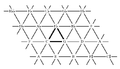
Trois châteaux
-
Description of image
-
2nd image (If there is one)
-
Don't request too many at once, though
Article(s):
Request: Will someone be so kind to draw version of Kastrioti Coat of Arms presented in the below two sources:
- OCLC 1303130,
Castriot-Scanderberg porte de gueules au pal d'azur à enquérir , chargé de trois châteaux d'or maçonnés de fable, accofté de quatre pattes de griffons affrontées d'argent. Michaeli, à Venife, porte fafcé d'azur & d'argent.
- OCLC 781309799,
Castriot dit Scanderbeg — Albanie, De gu. au pal d'azur, ch. de trois tours sommées chacune de trois tourelles d'or, maçonnées de sa.; le pal accosté de quatre pattes de griffon'd'arg., affr en pals.
- Here is how unknown author drawn it at imageshack. Here is how http://www.blason-armoiries.org presented it. Thanks in advance. Antidiskriminator (talk) 20:31, 17 September 2012 (UTC)
Graphist opinion(s):
Resolved
Trim music accidentals
-
 Triple flat
 -
 Half flat
 -
 Alternative flat and a half


Article(s): Flat (music)
Request: Could we get the space at the bottom of these images, used by Template:Music, trimmed off? For example, ![]() and
and ![]() display at different heights. I contacted the person who uploaded it at commons but they haven't been active since 2010 (and I don't have the capacity to work with svg). [for consistency you could also do File:Llpd0.svg, File:Llpd+1.svg, File:Llpd+2.svg, File:Llpd-1.svg, File:Llpd-1½.svg, File:Llpd-2.svg; not used the English by Template:Music] Hyacinth (talk) 03:19, 20 September 2012 (UTC)
display at different heights. I contacted the person who uploaded it at commons but they haven't been active since 2010 (and I don't have the capacity to work with svg). [for consistency you could also do File:Llpd0.svg, File:Llpd+1.svg, File:Llpd+2.svg, File:Llpd-1.svg, File:Llpd-1½.svg, File:Llpd-2.svg; not used the English by Template:Music] Hyacinth (talk) 03:19, 20 September 2012 (UTC)
Graphist opinion(s):
- Sure we can. How much? Zero space below? (How are these the images used in Flat (music)?). -DePiep (talk) 20:28, 25 September 2012 (UTC)
- I don't know how to measure the space in an image (I assume its measured in pixels), but File:Doubleflat.svg has a small amount of space below it (and above). File:Llpd-3.svg etc. however, have no space above and a large space below. The images are used inline, as in my request description above. Hyacinth (talk) 10:09, 26 September 2012 (UTC)
 Request taken by DePiep. 13:28, 26 September 2012 (UTC) Of course, you gave good example
  here already ;-)
- Just done the bbb. HAd to adjust template {{music}} too, since this bbb was set to 16px height (lots of white); now 12px height (as flat is). So your example here is off now. Will do the others. -DePiep (talk) 14:40, 26 September 2012 (UTC)
- Thanks! It will look much better displayed inline, and if it is ever displayed not inline (floating, thumbed, or framed) it will look much better as well. Hyacinth (talk) 05:19, 27 September 2012 (UTC)
 Done OK? Changed 7 files, all used by {{music}}.


 . Margins are 6px each side, at a height of 200px. In the template, I have set their height to
 x12px(preceding "x" sets height, not width). This way they line up with regular text (on my screen). In general, they show a bit smaller then before, now they are as big as regular letters (not pushing the line higher). Other edits: see {{music}} talkpage later on. Note: these images are used in many WPs. Please take a look around, and check for strange effects. -DePiep (talk) 14:37, 27 September 2012 (UTC)- Actually, the image sticks a bit low: _♭_, below the baseline. So not like a font character. This is not ideal, but higher (and smaller) makes the image illegible I think. -DePiep (talk) 22:08, 27 September 2012 (UTC)
- I think the exact display depends on your system and/or browser (per discussion at Template talk:Music#Scale degrees). Hyacinth (talk) 03:37, 29 September 2012 (UTC)
- Thanks! It will look much better displayed inline, and if it is ever displayed not inline (floating, thumbed, or framed) it will look much better as well. Hyacinth (talk) 05:19, 27 September 2012 (UTC)
- Just done the bbb. HAd to adjust template {{music}} too, since this bbb was set to 16px height (lots of white); now 12px height (as flat is). So your example here is off now. Will do the others. -DePiep (talk) 14:40, 26 September 2012 (UTC)
- I don't know how to measure the space in an image (I assume its measured in pixels), but File:Doubleflat.svg has a small amount of space below it (and above). File:Llpd-3.svg etc. however, have no space above and a large space below. The images are used inline, as in my request description above. Hyacinth (talk) 10:09, 26 September 2012 (UTC)
Blank when thumbnailed/sized
-
 neo-Riemmanian Tonnetz
 -
 PNG version


Article(s): Neo-Riemannian theory#Graphical representations
Request: The image displays as a blank white or black rectangle when thumbnailed or sized, but it displays properly on the file description page and on articles when not thumbnailed and sized. Any idea what's wrong and how to fix it? Hyacinth (talk) 08:41, 20 September 2012 (UTC)
Graphist opinion(s):
- Might be an issue due to the JPEG encoding used (LZW, see the metadata). There are obvious JPEG artefacts on the image, but I've had a go at a conversion to PNG from this anyway. The file size is smaller, even though the dimensions are the same. I've also uploaded a JPEG version with a different encoding, just in case it matters. gringer (talk) 15:05, 26 September 2012 (UTC)
File:Coat of arms of the Central African Federation.svg need improvements
-
 Coat of arms of the Central African Federation
.svg)
Article(s): Federation of Rhodesia and Nyasaland
Request: The Coa need some improvements... See [1] and [2] or try to use the antelope of File:Coat of arms of Rhodesia.svg Antemister (talk) 21:19, 16 September 2012 (UTC)
Graphist opinion(s):
Simple world map vector
The simple world map is missing the whole continent of Australia. — Preceding unsigned comment added by 112.205.174.27 (talk) 20:04, 4 October 2012 (UTC)
![]() Not done and not likely to be done. Not relevant to Wikipedia. -DePiep (talk) 13:03, 5 October 2012 (UTC)
Not done and not likely to be done. Not relevant to Wikipedia. -DePiep (talk) 13:03, 5 October 2012 (UTC)
Olt county CoA
-
 CoA of Olt County (RO)

Article(s): Request: The svg is ok if you click on it, but it only shows one tower in thumbnail. Please fix and then tell me what the problem is and how not to do it again (I work in Inkscape). Thanks. ArnoldPlaton (talk) 14:43, 2 October 2012 (UTC)
Graphist opinion(s):
![]() Request taken by DePiep. 10:12, 4 October 2012 (UTC)
Request taken by DePiep. 10:12, 4 October 2012 (UTC)
Done. This is what I did & found: I copied all 6 elements on a new canvas, chacking for the error after each step. Repeating while zooming in on troublesome details (bg color? tower? black areas? etc.). Then the hatchings in the tower clearly caused the problem. It appeared: when a hathing block is on the canvas, every next element (2nd tower, shove, cross, a fresh new circle element) copied onto the canvas was invisible when in thumbnail (I assume after the blue shield you copied the first tower, OK, and all copies after that went invisible). So I removed the hatchings from the tower, then started once more on a new canvas and here it is. In the process, I had to reconfigure (so relative positions might have changed a bit), and of course leave out the hatchings (four in total). Somehow I had to redraw the black windows, and recolor black, white and yellow backgrounds. Note 1: I could check every Inkscape saved version (all my steps) by opening that svg file in GIMP2, which shows the thumbnail. Note 2: How to prevent? Prevent the hatchings pattern clearly. Looks like a bug in Inkscape. It's manual has warning notes on exactly this. -DePiep (talk) 16:03, 4 October 2012 (UTC)
- Done. OK? -DePiep (talk) 00:56, 6 October 2012 (UTC)
- Thank you! Perfect. - ArnoldPlaton (talk) 19:10, 9 October 2012 (UTC)
Please change basketball key for FIBA
-
 Different shapes of thew:NCAA, w:FIBA.
 -
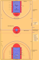 Illustration used at Basketball court
 -
 New drawing


.svg)
Article(s): Key (basketball)
Request: FIBA basketball key has changed since 2010, see Key (basketball) so this image (one part of it) is not correct. It looks like this now: http://www.sharksbasketball.co.uk/res/img/news/new_court_layout.png I know that an image is on wikimedia site, but please help with this issue AirWolf (talk) 22:03, 11 September 2012 (UTC)
Graphist opinion(s):
- Like the white lines in the top half of the composite illustration above? I drew that one, so if it’s still correct I could easily extract the FIBA key elements.—Odysseus1479 (talk) 05:26, 25 September 2012 (UTC)
- (Answered on my talk page.) Request taken by Odysseus1479. 19:56, 25 September 2012 (UTC)
- (Answered on my talk page.)
![]() Done; article updated—Odysseus1479 (talk) 00:12, 7 October 2012 (UTC)
Done; article updated—Odysseus1479 (talk) 00:12, 7 October 2012 (UTC)
Graphs
Article(s): Alkali metal, Alkaline earth metal
Request: Please redraw the three graphs (as separate images) from page 1730 (page 79 of the pdf) of this book if it is OK to do so. The sources for the original data are given in the captions. Also, the vertical labels need to be changed to "Electron affinity (eV)" (top left), "Ionization energy (eV)" (top right), and "Atomic radius (Å)" (bottom). Double sharp (talk) 11:19, 4 October 2012 (UTC)
It would also be good if the original data was included beside the data points the way the chemical symbols currently are. Double sharp (talk) 12:59, 4 October 2012 (UTC)
- if it is OK to do so [copying this from a book], you ask correctly. My readings of WP:COPY did not give an answer. {{Wikipedia copyright}} shows the angles of entrance. For now, I pause in this. -DePiep (talk) 20:31, 4 October 2012 (UTC)]
- I have asked for clarification at Wikipedia:Media_copyright_questions#Reproduce_a_graph_from_a_book. -DePiep (talk) 16:26, 5 October 2012 (UTC)
- if it is OK to do so [copying this from a book], you ask correctly. My readings of
Graphist opinion(s):
![]() Request taken by DePiep.. Question 1: I plan to use Uue not 119 etc., right? 16:49, 5 October 2012 (UTC)
Request taken by DePiep.. Question 1: I plan to use Uue not 119 etc., right? 16:49, 5 October 2012 (UTC)
- Question 2: the caption notes a difference between experimental and by X calculation. I suggest: I will mark these different in the graph too (e.g. different square when calculated), + describe this in the legend. -DePiep (talk) 17:54, 5 October 2012 (UTC)
- @Question 1: It doesn't matter, although I do prefer "119" because that's how scientists more commonly refer to it. @Question 2: Yes, that would be a great idea. Double sharp (talk) 01:49, 6 October 2012 (UTC)
- 1. Atomic radius

Any improvements? -DePiep (talk) 12:14, 6 October 2012 (UTC)
- Looks very good to me. (Actually, using "Uue", "Ubn", "Uhp" and "Uhh" makes it easier to write the text. Could you please change it?) Double sharp (talk) 14:23, 6 October 2012 (UTC)
- I'll change. And I suggest we remove those lighter colors, only use red and salmon. With these small squares the color difference gets lost. The DS calculation note is by (...) brackets only. -DePiep (talk) 16:34, 6 October 2012 (UTC)
- OK, that looks even better. Double sharp (talk) 01:51, 7 October 2012 (UTC)
- I'll change. And I suggest we remove those lighter colors, only use red and salmon. With these small squares the color difference gets lost. The DS calculation note is by (...) brackets only. -DePiep (talk) 16:34, 6 October 2012 (UTC)
- 2. Electron affinity

File:Electron affinity of alkali metals.svg Could not find definition of DF CCSD, will it be explained in article text? Note: What do you mean by original data [to be] included beside the data points (OP)? -DePiep (talk) 20:03, 7 October 2012 (UTC)
- I believe the request is for the value represented by each point to be shown in figures, along with the element symbols. IMO this is not generally advisable, creating visual clutter: better to add a table if the exact figures are important. (Note that there is a template for this property.) Faint horizontal lines behind the graph, corresponding to the ticks on the vertical axis, would help the viewer estimate the values. Furthermore I don’t think the lines connecting the points are necessary (indeed they’re misleading in the sense that the elements are discrete), and eliminating them would allow more consistent positioning of the labels.—Odysseus1479 (talk) 01:23, 8 October 2012 (UTC)
- I agree about not putting the values (it's not really that important). But the lines connecting the points do help show the respective trends for each group, which are quite important.
- DF CCSD will (soon) be explained in the article. Double sharp (talk) 05:32, 8 October 2012 (UTC)
- re numbers: not in the graph OK. re connecting line: fwiw, I understand (appreciate) the "show the trend" argument by Ds to keep them in. re horizontal (grey) grid lines: could do, no opinion. I'll read here what the outcome is in this. re positioning of labels (element symbols): I think it is acceptable now, and sure we do not want to trade "better positioning" versus "show the trend information" (in other words: the slight irregular positioning of the labels is not important enough to make us change which information is presented). re DF/DS legend notes: maybe there is a better way to add that clarification. As it is now in the article, there is some repetition. But how? rm that legend text line and write it all in the caption? re myself: I'll revisit the first one (atomic radii) to improve font sizes. -DePiep (talk) 08:52, 8 October 2012 (UTC)
- About DF CCSD: DF = Dirac-Fock, CC = coupled cluster, CCSD = single-double coupled cluster excitations (see p. 1670 (pdf p. 19)). Double sharp (talk) 05:34, 10 October 2012 (UTC)
- Thanks. You still want that text in? In Alkali metal this is repeated in the caption you wrote (also adding references). Maybe we could decide to strip it from the graph, and have all this in the caption? -DePiep (talk) 06:41, 10 October 2012 (UTC)
- About DF CCSD: DF = Dirac-Fock, CC = coupled cluster, CCSD = single-double coupled cluster excitations (see p. 1670 (pdf p. 19)). Double sharp (talk) 05:34, 10 October 2012 (UTC)
- re numbers: not in the graph OK. re connecting line: fwiw, I understand (appreciate) the "show the trend" argument by Ds to keep them in. re horizontal (grey) grid lines: could do, no opinion. I'll read here what the outcome is in this. re positioning of labels (element symbols): I think it is acceptable now, and sure we do not want to trade "better positioning" versus "show the trend information" (in other words: the slight irregular positioning of the labels is not important enough to make us change which information is presented). re DF/DS legend notes: maybe there is a better way to add that clarification. As it is now in the article, there is some repetition. But how? rm that legend text line and write it all in the caption? re myself: I'll revisit the first one (atomic radii) to improve font sizes. -DePiep (talk) 08:52, 8 October 2012 (UTC)
I propose:
- In the legend (in the graph), simply: "(...) by calculation"
- In the caption, where we can use wikilinks: all other info, including the ref and calculation names (DF, DS, etc., written long form).
If otherwise, please point out what text should be in the graph (legend). The colored squares are unaffected. -DePiep (talk) 08:43, 10 October 2012 (UTC)
- Your proposed wording sounds very good to me. Double sharp (talk) 11:49, 11 October 2012 (UTC)
- Actually, now it is "(...) predicted by calculation" as you might have seen. -DePiep (talk) 11:59, 11 October 2012 (UTC)
 Thank you Double sharp (talk) 09:09, 12 October 2012 (UTC)
- Actually, now it is "(...) predicted by calculation" as you might have seen. -DePiep (talk) 11:59, 11 October 2012 (UTC)
- 3. Ionization energy

File:Ionization energy of alkali metals and alkaline earth metals.svg