Wikipedia:Featured picture candidates/Brussels Great Marked Square
Brussels Great Marked Square

- Reason
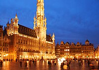
- This image is a truly exemplary shot of the ]
- Proposed caption
- The at the left.
- Articles this image appears in
- Brussels, Metropolis
- Creator
- Ssolbergj from Commons
- Support as nominator —Animum (talk) 01:07, 22 November 2007 (UTC)
- Pssst I don't think it looks too good, given the fact that the tower is cut off. Brace yourself. Nice colours though, if not a little over-exposed. --antilivedT | C | G 06:51, 22 November 2007 (UTC)
![]() Oppose Cut off and would have preferred it darker with less blown out areas. Maybe I'm being a bit cynical here but it's interesting the different treatment of users - "psst = oppose?" --Fir0002 07:04, 22 November 2007 (UTC)
Oppose Cut off and would have preferred it darker with less blown out areas. Maybe I'm being a bit cynical here but it's interesting the different treatment of users - "psst = oppose?" --Fir0002 07:04, 22 November 2007 (UTC)
- Well it's obvious enough from my tone... --antilivedT | C | G 07:09, 22 November 2007 (UTC)
- Oh come off it fir; you should consider it a compliment that people know you well enough to be brutal with their criticism instead of babying you for fear that you'll leave. You know how it works- LIKE: support praising some random good thing, DISLIKE: oppose with some technical flaw or find some other reason to reasonably oppose. More brutal criticism doesn't mean the pic is worse than another, it just means people are freer with their tongues (fingers?), or like scrutinizing a well-respected photographer's work for any error at all and triumphantly sharing it with everyone. A common psychological phenomenon. Also, not sure where this is going --ffroth 18:10, 22 November 2007 (UTC)
- Well it stops being a compliment when you've spent several hours making an image you think is great only to find others don't, but yeah I guess that's the drill. Thanks Dr Froth for the psychological analysis :) --Fir0002 01:00, 23 November 2007 (UTC)
- Certainly, Orderly Fir. Now get that patient back into his straitjacket- his yearly exposure to sunlight is nearly over and I grow tired. And send in the physician to bleed him a bit, he seems of sickly pallor lately. --ffroth 21:32, 23 November 2007 (UTC)
- Well it stops being a compliment when you've spent several hours making an image you think is great only to find others don't, but yeah I guess that's the drill. Thanks Dr Froth for the psychological analysis :) --Fir0002 01:00, 23 November 2007 (UTC)
- Oppose, tower is cut-off. Deserves a panorama. --Aqwis (talk) 07:13, 22 November 2007 (UTC)
- Comment. This'll be opposed for composition, but I love the colors! --ffroth 18:05, 22 November 2007 (UTC)
- Oppose Dreaming of spires. Samsara (talk • contribs) 01:23, 23 November 2007 (UTC)
- Oppose per Fir0002. Composition really is the breaker and it is a bit over-exposed (and maybe shot just a tiny bit too late) which is a shame, cos the colours (and pretty much everything else) are just lovely. --mikaultalk 18:57, 23 November 2007 (UTC)
- Oppose Appears too digital. Blurry light. SilkTork *SilkyTalk 21:48, 26 November 2007 (UTC)
- Oppose Nice colours but the cut part... H92110 (talk) 11:11, 27 November 2007 (UTC)
Not promoted MER-C 02:47, 28 November 2007 (UTC)
