Rudolf Koch
Rudolf Koch | |
|---|---|
| Born | November 20, 1876 |
| Died | April 9, 1934 (aged 57) |
| Occupation(s) | typeface designer, professor |
| Known for | Neuland, Kabel |
| Movement | Offenbach School |


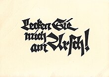
Rudolf Koch (20 November 1876 – 9 April 1934) was a German type designer, professor, and a master of lettering, calligraphy, typography and illustration. Commonly known for his typefaces created for the Klingspor Type Foundry, his most widely used typefaces include Neuland and Kabel.
Overview
Koch spent his teenage years working in
Koch was deeply spiritual and a devout Lutheran, spending much of his time working on religious publications and manuscripts, of which he completed nearly a hundred in his lifetime. Koch viewed the alphabet as humanity's ultimate achievement.[3] He died prematurely of a heart attack in 1934, aged 57.
Career and influences

Koch greatly admired William Morris. Speaking at a meeting in London, he expressed his disbelief that Morris was not of German descent: "I feel such a closeness to him that I always have the feeling that he cannot be an Englishman, he must be a German."[4]
The teachings of Morris and the
Koch lectured at the
Many of Koch's blackletter typefaces, such as Kochschrift and Willhelm Klingspor Gotisch, were greatly influenced by hand-written manuscripts and Gothic letterforms,[8][9] a style that originated in Germany. Known also for his nationalistic ideology, he wrote in Der Deutsche, "Even as a boy I wanted to become a proper real German. I hated anything that was foreign, and even as I was growing up I felt this was a sign of true loyalty."[10]
Koch frequently defended Germanic blackletter script in the journals and publications he contributed to. He also held exhibitions with his group Offenbach Schreiber, which promoted hand lettering and calligraphy, and in these, he expressed the revival of traditional lettering. Koch worked closely with bookbinder Ignatz Wiemeler, and together they created the "Offenbach Typography Style" of bookbindings.[11][12]
Koch's dedication to Gothic script may have limited his recognition in English-speaking countries.[13] His work was also part of the painting event in the art competition at the 1928 Summer Olympics.[14]
Koch wrote a book containing 493 old-world symbols, monograms, and runes entitled The Book of Signs (reprinted in 1955, in the Dover Pictorial Archive Series). Hermann Zapf was a huge admirer of Koch, and took great inspiration from his work after acquiring a copy of his book Das Schreiben als Kunstfertigkeit (Writing as a Skill).[15]
Typefaces
Koch's first non-blackletter typeface was the delicate
Koch designed the Neuland typeface in 1923. Taking a more experimental turn, the typeface counterpoints his preferred traditional style with a more contemporary feel. Dr Klingspor called it "unbearably ugly", despite its great commercial success.[18]
Koch introduced his first sans-serif typeface, Kabel, in 1927, which is similar to Paul Renner's Futura,[19] designed the same year. The differences between the two typefaces are most noticeable in Kabel's far-reaching terminal on the 'a' and the 'e', as well as the slanted crossbar and the loop of the 'g'.
Typefaces designed by Koch include:
- Claudius (1931–1934)
- Deutsche Anzeigenschrift (1923–1924)
- Deutsche Schrift (1908–1921)
- Deutsche Zierschrift (1921)
- Grotesk-Initialen (1933)
- Holla (1932)
- Jessen (1924–1930)
- Kabel (1927–1929)
- Koch Antiqua / Locarno (1922), sold by Continental Type in the United States as Eve
- Koch Current (1933)
- Marathon (1930–1938)
- Maximilian Antiqua (1913–17)
- Neufraktur (1933–1934)
- Neuland (1922–1923)
- Offenbach (1928)
- Prisma (1931)
- Wallau (1925–1934)
- Wilhelm Klingspor-Schrift (1920–1926)
- Zeppelin / Kabel Inline (1929)
Notable publications
Some of Koch's most well known works include:
- Das Schreiben als Kunstfertigkeit [Writing As A Skill]. Leipzig, Germany: Verlag des Deutschen Buchgewerbe-Verein. 1921.
- Das ABC-Büchlein (The Little ABC Book)
- Das Blumenbuch (The Flower Book)
- Das Zeichenbuch (The Book of Signs)[20]
- Klassiche Schriften (Classic Lettering)
References
- ISBN 0-500-23395-0.
- ^ Fabian, Nicholas. "Rudolf Koch. Calligrapher, Type Designer, Punch Cutter, teacher". Type Design, Typography & Graphic Images. Archived from the original on December 10, 2000. Retrieved 14 October 2014.
- ISBN 978-3-8365-4480-1.
- ISBN 0-7123-4659-7.
- ISBN 9789063690519.
- ^ ISBN 0-471-69902-0.
- ISBN 978-0131842663.
- ISBN 978-3-8365-4480-1.
- ISBN 0-470-16873-0.
- ISBN 0-7123-4659-7.
- ^ "Ignatz Wiemeler and his ingenious bindings. A highlight in the collections of the Klingspor Museum Offenbach". Association of European Printing Museums. Retrieved 2021-02-08.
- ^ "Typography and Calligraphy". Klingspor-Museum Offenbach, Museum for Modern International Book Art. Retrieved 2021-02-08.
- ISBN 0-7123-4659-7.
- ^ "Rudolf Koch". Olympedia. Retrieved 26 July 2020.
- ISBN 978-0-471-69902-6.
- ^ Shaw, Paul (10 February 2011). "Overlooked Typefaces". Print magazine. Retrieved 2 July 2015.
- ISBN 9781567922400. Retrieved 19 December 2016.
- ISBN 0-7123-4659-7.
- ISBN 9781856696944.
- OCLC 509534. Retrieved 25 May 2021.
collected, drawn and explained by Rudolf Koch ; translated from the German by Vyvyan Holland. An unabridged republication of the English translation first published ... in 1930.
