
Swash (typography)

A swash is a typographical flourish, such as an exaggerated serif, terminal, tail, entry stroke, etc., on a glyph.[1][2][3] The use of swash characters dates back to at least the 16th century, as they can be seen in Ludovico Vicentino degli Arrighi's La Operina, which is dated 1522. As with italic type in general, they were inspired by the conventions of period handwriting.[4] Arrighi's designs influenced designers in Italy and particularly in France.[5]
Typefaces with swashes
Most typefaces with swashes are serif fonts, among which (if present) they are often found solely in italics. Advanced digital fonts often supply two italic designs: one with swashes and a more restrained standard italic.
Among
Among transitional typefaces, Baskerville's original design has swashes on J, N, Q and T. Some revivals remove these, while others may add more. Mrs. Eaves has a particularly large number.[10]
Didone fonts with swashes include Surveyor and ITC Bodoni.[11][12]
Sans-serif fonts with swashes are rarer, but some were released in the
As swashes are based on period handwriting, script typefaces with swashes are common, and include Zapf Chancery and Zapfino, both by Hermann Zapf.
Some historical revivals add optional swashes to designs that did not originally have them to produce a more varied design. For example, Adobe Garamond Pro's swash design is based not on the printing of Claude Garamond himself but on designs by his younger contemporary Robert Granjon.[18] The original Caslon italic had swashes only on the letters JQTY; others have been added since by revivals of his designs.[19][a]
-
 Extensive use of swashes in a 1560 edition of Calvin. Swashes are used on capitals throughout and on many letters at the end of words too. This use would probably now be considered excessive.
 -
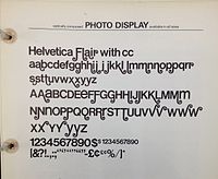 Helvetica Flair, a redesign of the sans-serif font Helvetica with swashes
 -

.jpg)


References
- ^ Henry, Frank S (1917). Printing: A Textbook For Printers' Apprentices, Continuation Classes, And For General Use In Schools. New York: John Wiley & Sons, Inc. p. 82.
- ^ Schwartz, Christian. "Back with a flourish". Eye Magazine. Retrieved 31 March 2018.
- ^ Tracy, Walter (1991). "The Alternatives". Bulletin of the Printing Historical Society (30).
- ISBN 9780132701365.
- ISBN 978-0-87923-333-4.
- ^ "Adobe Caslon glyph list" (PDF). Adobe.
- ^ Duffner, Georg. "EB Garamond: Features". Retrieved 30 August 2014.
- ^ "Minion" (PDF). Adobe Systems. Retrieved 30 August 2014.
- ^ Majoor, Martin. "My Design Philosophy". Retrieved 30 August 2014.
- ^ Wolson, Andrew. "Baskerville". Font Slate. Retrieved 1 September 2014.
- ^ "Surveyor: Overview". Hoefler & Frere-Jones. Retrieved 1 September 2014.
- ^ "ITC Bodoni 72 Swash Book Italic". MyFonts. Linotype. Retrieved 1 September 2014.
- ^ Schwartz, Christian. "Back with a flourish #5. Christian Schwartz on swaggering swashes". Eye. Retrieved 31 March 2018.
- ^ Di Lena, Leonardo. "Semplicità". Studio Di Lena. Retrieved 18 April 2017.
- ^ Yasuhiro, Yamaoka. "Classiq". YOFonts.
- ^ Simonson, Mark. "Interview with Phil Martin". Typographica. Retrieved 30 August 2014.
- ^ Puckett, James (5 March 2012). "Helvetica Flair (photo of specimen book)". Flickr.
- ^ "Adobe Garamond Pro" (PDF). Adobe. Retrieved 30 August 2014.
- ^ Berkson, William (November 2010). "Reviving Caslon". I Love Typography. Retrieved 21 September 2014.
- Matrix. 20: 1–7.
- Notes
- ^ According to Justin Howes, the swash capitals sold by the H.W. Caslon Company in the late 19th to 20th centuries with the Caslon type were "based rather closely on François Guyot's [popular c. 22pt] italic of around 1557 ... found in English printing until the early years of the eighteenth century."[20]
| Page | |||||||||||
|---|---|---|---|---|---|---|---|---|---|---|---|
| Paragraph | |||||||||||
| Character |
| ||||||||||
| Typeface classifications |
| ||||||||||
| Punctuation | |||||||||||
| Typesetting | |||||||||||
| Typographic units | |||||||||||
| Digital typography | |||||||||||
| Typography in other writing systems |
| ||||||||||
| Related articles | |||||||||||
| Related tables | |||||||||||