
Plot (graphics)
A plot is a
Overview
Plots play an important role in statistics and data analysis. The procedures here can broadly be split into two parts: quantitative and graphical. Quantitative techniques are a set of statistical procedures that yield numeric or tabular output. Examples of quantitative techniques include:[1]
- hypothesis testing
- analysis of variance
- point estimates and confidence intervals
- least squares regression
These and similar techniques are all valuable and are mainstream in terms of classical analysis. There are also many statistical tools generally referred to as graphical techniques. These include:[1]
- scatter plots
- spectrum plots
- histograms
- probability plots
- residual plots
- box plots, and
- block plots
Graphical procedures such as plots are a short path to gaining insight into a data set in terms of testing assumptions, model selection, model validation, estimator selection, relationship identification, factor effect determination, outlier detection. Statistical graphics give insight into aspects of the underlying structure of the data.[1]
Graphs can also be used to solve some
Types of plots
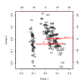
- Biplot : These are a type of graph used in statistics. A biplot allows information on both samples and variables of a data matrix to be displayed graphically. Samples are displayed as points while variables are displayed either as vectors, linear axes or nonlinear trajectories. In the case of categorical variables, category level points may be used to represent the levels of a categorical variable. A generalised biplot displays information on both continuous and categorical variables.
- Bode plots are used in control theory.
- Box plot : In descriptive statistics, a boxplot, also known as a box-and-whisker diagram or plot, is a convenient way of graphically depicting groups of numerical data through their five-number summaries (the smallest observation, lower quartile (Q1), median (Q2), upper quartile (Q3), and largest observation). A boxplot may also indicate which observations, if any, might be considered outliers.
- Carpet plot : A two-dimensional plot that illustrates the interaction between two and three independent variables and one to three dependent variables.
- Comet plot : A two- or three-dimensional animated plot in which the data points are traced on the screen.
- Contour plot : A two-dimensional plot which shows the one-dimensional curves, called contour lineson which the plotted quantity q is a constant. Optionally, the plotted values can be color-coded.
- scatterplotoften used in particle physics to represent the relative frequency of various (kinematically distinct) manners in which the products of certain (otherwise similar) three-body decays may move apart
- Drain plot : A two-dimensional plot where the data are presented in a hierarchy with multiple levels. The levels are nested in the sense that the pieces in each pie chart add up to 100%. A waterfall or waterdrop metaphor is used to link each layer to the one below visually conveying the hierarchical structure. Drain Plot.[4]
-
-

-

-

-
 Contour plot
 -
 Logarithmic plot
 -


- scatterplot of treatment effect against a measure of study size. It is used primarily as a visual aid to detecting bias or systematic heterogeneity.
- quantitative, univariate data. Data points may be labelled if there are few of them. Dot plots are one of the simplest plots available, and are suitable for small to moderate sized data sets. They are useful for highlighting clusters and gaps, as well as outliers.
- randomized controlled trials. In the last twenty years, similar meta-analytical techniques have been applied in observational studies (e.g. environmental epidemiology) and forest plots are often used in presenting the results of such studies also.


- Galbraith plot : In statistics, a Galbraith plot (also known as Galbraith's radial plot or just radial plot), is one way of displaying several estimates of the same quantity that have different standard errors.[7] It can be used to examine heterogeneity in a meta-analysis, as an alternative or supplement to a forest plot.
- Heat map
- Lollipop plot
- Nichols plot : This is a graph used in signal processing in which the logarithm of the magnitude is plotted against the phase of a frequency response on orthogonal axes.
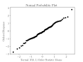
- Normal probability plot : The normal probability plot is a graphical technique for assessing whether or not a data set is approximately normally distributed. The data are plotted against a theoretical normal distribution in such a way that the points should form an approximate straight line. Departures from this straight line indicate departures from normality. The normal probability plot is a special case of the probability plot.
- automatic control and signal processing for assessing the stability of a system with feedback. It is represented by a graph in polar coordinates in which the gain and phase of a frequency response are plotted. The plot of these phasor quantities shows the phase as the angle and the magnitude as the distance from the origin.
-
-
-
 Nyquist plot


- Partial regression plot : In applied statistics, a partial regression plot attempts to show the effect of adding another variable to the model (given that one or more independent variables are already in the model). Partial regression plots are also referred to as added variable plots, adjusted variable plots, and individual coefficient plots.
- Partial residual plot : In applied statistics, a partial residual plot is a graphical technique that attempts to show the relationship between a given independent variable and the response variable given that other independent variables are also in the model.
- Probability plot : The probability plot is a graphical technique for assessing whether or not a data set follows a given distribution such as the normal or Weibull, and for visually estimating the location and scale parameters of the chosen distribution. The data are plotted against a theoretical distribution in such a way that the points should form approximately a straight line. Departures from this straight line indicate departures from the specified distribution.
- Ridgeline plot: Several line plots, vertically stacked and slightly overlapping.
- random sample has been taken and a comparison distribution. An example of the kind of differences that can be tested for is non-normalityof the population distribution.
- Recurrence plot : In descriptive statistics and chaos theory, a recurrence plot (RP) is a plot showing, for a given moment in time, the times at which a phase space. In other words, it is a graph of

- showing on a horizontal axis and on a vertical axis, where is a phase space trajectory.


- Scatterplot : A scatter graph or scatter plot is a type of display using variables for a set of data. The data is displayed as a collection of points, each having the value of one variable determining the position on the horizontal axis and the value of the other variable determining the position on the vertical axis.[8]
- Shmoo plot : In electrical engineering, a shmoo plot is a graphical display of the response of a component or system varying over a range of conditions and inputs. Often used to represent the results of the testing of complex electronic systems such as computers, ASICs or microprocessors. The plot usually shows the range of conditions in which the device under test will operate.
- Spaghetti plots are a method of viewing data to visualize possible flows through systems. Flows depicted in this manner appear like noodles, hence the coining of this term.[9]This method of statistics was first used to track routing through factories. Visualizing flow in this manner can reduce inefficiency within the flow of a system.


- non-parametric statistics.
- Star plot: A graphical method of displaying multivariate data. Each star represents a single observation. Typically, star plots are generated in a multi-plot format with many stars on each page and each star representing one observation.
- Surface plot : In this visualization of the graph of a bivariate function, a surface is plotted to fit a set of data triplets (X, Y, Z), where Z if obtained by the function to be plotted Z=f(X, Y). Usually, the set of X and Y values are equally spaced. Optionally, the plotted values can be color-coded.
-
 Star plot
 -
 Surface plot


- equilateral triangle. It is used in petrology, mineralogy, metallurgy, and other physical sciences to show the compositions of systems composed of three species. In population genetics, it is often called a de Finetti diagram. In game theory, it is often called a simplex plot.
- Vector field : Vector field plots (or quiver plots) show the direction and the strength of a vector associated with a 2D or 3D points. They are typically used to show the strength of the gradient over the plane or a surface area.
- Violin plot : Violin plots are a method of plotting numeric data. They are similar to box plots, except that they also show the probability density of the data at different values (in the simplest case this could be a histogram). Typically violin plots will include a marker for the median of the data and a box indicating the interquartile range, as in standard box plots. Overlaid on this box plot is a kernel density estimation. Violin plots are available as extensions to a number of software packages, including R through the vioplot library, and Stata through the vioplot add-in.[10]


Plots for specific quantities
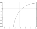
- Arrhenius plot : This plot compares the logarithm of a reaction rate (, ordinateaxis) plotted against inverse temperature (,abscissa). Arrhenius plots are often used to analyze the effect of temperature on the rates of chemical reactions.
- Dot plot (bioinformatics) : This plot compares two biological sequences and is a graphical method that allows the identification of regions of close similarity between them. It is a kind of recurrence plot.
- Lineweaver–Burk plot : This plot compares the reciprocals of reaction rate and substrate concentration. It is used to represent and determine enzyme kinetics.


3D plots

Examples
Types of graphs and their uses vary very widely. A few typical examples are:
- Simple graph: Supply and demand curves, simple graphs used in economics to relate supply and demand to price. The graphs can be used together to determine the economic equilibrium (essentially, to solve an equation).
- Simple graph used for reading values: the bell-shaped normal or Gaussian probability distribution, from which, for example, the probability of a man's height being in a specified range can be derived, given data for the adult male population.
- Very complex graph: the psychrometric chart, relating temperature, pressure, humidity, and other quantities.
- Non-rectangular coordinates: the above all use two-dimensional polar coordinates, sometimes in three dimensions, is the antenna radiation patternchart, which represents the power radiated in all directions by an antenna of specified type.
See also
- Chart
- Diagram
- Graph of a function
- Line chart
- List of charting software
- List of graphical methods
- Plotting software
- Plotter
- List of plotting programs
References
![]() This article incorporates public domain material from the National Institute of Standards and Technology
This article incorporates public domain material from the National Institute of Standards and Technology
- ^ a b c NIST/SEMATECH (2003). "The Role of Graphics". In: e-Handbook of Statistical Methods 6 January 2003 (Date created).
- JSTOR 2987937.
- S2CID 2844897.
- .
- ^ R. J. Light; D. B. Pillemer (1984). Summing up: The Science of Reviewing Research. Cambridge, Massachusetts.: Harvard University Press.
- PMID 9310563.)
{{cite journal}}: CS1 maint: multiple names: authors list (link - ^
Galbraith, Rex (1988). "Graphical display of estimates having differing standard errors". Technometrics. 30 (3). American Society for Quality: 271–281. JSTOR 1270081.
- ISBN 0-534-39402-7
- ISBN 978-1-84882-999-2. Retrieved 2011-02-17.
- .
External links
- Dataplot gallery of some useful graphical techniques at itl.nist.gov.