An excellent photograph, which captures both the building and the sky well, and also illustrates its article, in addition to being one of the world's foremost examples of
Nominate and support. - Jdhowens90 20:31, 17 September 2005 (UTC)[reply]
Comment: It is cut off at the top and the bottom, there must be better pics of Westminster Abbey to nominate.
Comment: To my mind, it is not necessary for the entire tower to be included in the picture. What matters, and makes this picture special, is its capturing of the stunning architecture from a dynamic angle, giving a genuine impression of the awesome scale of the building, and the detail of the Gothic Revival towers.
Comment. Users may want to consider
this past nomination. Enochlau 02:26, 22 September 2005 (UTC)[reply
]
Oppose - I've seen better photos. JoJan 20:56, 22 September 2005 (UTC)[reply]
Oppose - I realise a photographer might be frustrated waiting for British weather to provide anything better than this flat grey lighting under a brooding grey sky, but even if you forgive that, this image is just too small. Sorry ~ Veledan • Talk+ new 20:15, 23 September 2005 (UTC)[reply]
Oppose. I too feel there must be better photos of such an incredible building. I consider the angle haphazard, not "dynamic," and the frame very limiting. CapeCodEph 23:33, 23 September 2005 (UTC)[reply]
Oppose -- Too small and an uncomfortably high amount of the building is cut off chowells 06:08, 26 September 2005 (UTC)[reply]
Oppose. 1. Size. 2. Cut off at bottom and more importantly, top. When taking pictures of soaring, vertically- imposing architecture, cutting off the peak seriously damages the composition, methinks.—encephalon 04:51, 28 September 2005 (UTC)[reply]
I feel you're over-reacting a little about the top being cut off. I mean, it's just one of those little spire things, a very minor part of the structure I would think, and it's still half there anyway. Another five identical spires are also visable. It would be different if the entire left hand side tower was cut off, then I would agree with you, but as it is I don't honestly understand your reaction. However, I'll still have to oppose, as the image doesn't really grab me, and it's a little small. Raven4x4x 13:31, 29 September 2005 (UTC)[reply]
Perhaps, Raven, but I don't agree. This is my first ever oppose vote on FPC, and the cut-offs at both ends impact it a lot for me. The spire that was cut is the highest and most prominent one from this angel. Pictures of architecture should never cut off a piece of it in this manner. When you consider that this could have been so easily remedied, it's apparent that this wasn't a well-executed shot, and is not a good FP candidate. IMO, only moving to oppose if the entire left side was cut off is setting exceptionally low standards for FP. I agree with your thoughts on size.—encephalon 10:48, 30 September 2005 (UTC)[reply]
Too bad this might be too late supportRichardkselby 19:48, 29 September 2005 (UTC)[reply]
Not promoted BrokenS 01:20, 1 October 2005 (UTC)[reply]
Uploaded and nominated by me, but under the mistaken assumption that the Image is PD from a US NAVY server, while it appears the image is originally Non-Commercial Non-Derivatives from the Australian NAVY. Details on Image:Mark 48 Torpedo testing.jpg. Delist because of inadequate license. -- Chris 73Talk 20:58, 16 September 2005 (UTC)[reply]
Unfortunately Delist. Great photos, but it looks like you did your homework. It's sad that this got by everyone the first time around. It was a POTD too. That's rough. --Lord Voldemort(Dark Mark) 14:07, 20 September 2005 (UTC)[reply]
Delist --Wulf 19:55, 20 September 2005 (UTC)[reply]
Regratable Delist -- This sucks; however, it has to be done. TomStar81 01:45, 23 September 2005 (UTC)[reply]
Delist Unfortunate, but necessary. CapeCodEph 23:36, 23 September 2005 (UTC)[reply]
delisted BrokenS 01:29, 1 October 2005 (UTC)[reply]
Original versionA flyless version edited by Veledan. I've also lifted the level of shadow a smidgen
I nominated this article because right when I saw it I was in a state of "awww" (because I thought that it was really cute); the article it is in is the Hijab article, the person who created the image is Christian Briggs.
Nominate and support. - Richardkselby 23:50, 19 September 2005 (UTC)[reply]
Comment What exactly is this supposed to be illustrating? --Wulf 20:04, 20 September 2005 (UTC)[reply]
Voting hasn't started yet. I'll unstrike when voting is enabled. --Lord Voldemort(Dark Mark) 20:05, 20 September 2005 (UTC)[reply]
Sorry, forgot it was new, changed to comment. --Wulf 20:11, 20 September 2005 (UTC)[reply]
Quite alright, just wanted to be fair to nominator. It illustrates the Hijab. And obviously a fly on the top of her head. --Lord Voldemort(Dark Mark) 20:14, 20 September 2005 (UTC)[reply]
Oppose; the top of the hijab is cut off. —
Cryptic (talk) 12:10, 22 September 2005 (UTC)[reply
]
Oppose. The top half is cut off... and the fly! Enochlau 14:10, 22 September 2005 (UTC)[reply]
I will support the edited version. Enochlau 00:17, 24 September 2005 (UTC)[reply]
I think I'll support this one. The fly doesn't bother me, and the picture does a great job at letting people know what the hijab is, even if a tiny piece (much less than half) is cropped. Also hijab can be a concept or idea rather than an actual object. It has only adopted this specific meaning recently. --Lord Voldemort(Dark Mark) 20:53, 22 September 2005 (UTC)[reply]
I understand your comments that perhaps it's illustrating an idea rather than an object, but even with that in consideration, the fly is most unfortunate. That is, unless flies are an inalienable part of Iraq, and it is most reasonable for there to be a fly. Enochlau 10:54, 23 September 2005 (UTC)[reply]
Support This one has that 'X-factor' as far as I'm concerned. The detail is beautiful, as are the girls' smiles. The composition and cropping may be unusual, but they bring the viewer right into the scene and the overall effect throws a warm and positive light over a cultural subject that is often given short shrift by western commentators. The fly? Well, I wouldn't be sorry to see it photoshopped, but I don't think it detracts from the power of the image at all. ~ Veledan • Talk+ new 15:32, 23 September 2005 (UTC)[reply]
support - Agree it has the X-factor. Have sympathy with argument that it doesn't necessarily illustrate hijab very well. But could easily be placed in girl (a recent collaboration of the week) or even something like emotion or happiness. --bodnotbod 18:07, 23 September 2005 (UTC)[reply]
Edit I've prepared and uploaded a flyless version in case people prefer it, although personally I still love the original as much as I do my edited version! ~ Veledan • Talk+ new 19:40, 23 September 2005 (UTC)[reply]
Support, there is some very real emotion in this picture. But it is probably a better allustration of smile than Hijab; I have added it to the smile article. I slightly prefer the edited version over the original with the fly. Thue | talk 08:30, 24 September 2005 (UTC)[reply]
Oppose, No 'X factor' in my opinion, hardly contributes a massive amount to hijab. No great photo. --81.154.236.221 22:12, 24 September 2005 (UTC)[reply]
Support in my personal opinion it is prefect. I am not an artist. I am just a computer user. --Mattwj2002 09:15, 24 September 2005 (UTC)[reply]
Supoort Either one is fine with me. Cheers, Christiaan 16:41, 25 September 2005 (UTC)[reply]
Oppose - nothing special imho.--Deglr6328 17:54, 25 September 2005 (UTC)[reply]
Oppose - Though this is a nice, well-balanced photograph, it fails to illustrate the topic in a particularly unique or striking way. CapeCodEph 20:41, 25 September 2005 (UTC)[reply]
Oppose - I like the pic but IMO there's a problem regarding NPOV. Ericd 14:37, 26 September 2005 (UTC)[reply]
In what sense do you feel it is NPOV? --bodnotbod 15:06, 26 September 2005 (UTC)[reply]
For many people the hijab is perceived as a representation of an inferior condition of women. I believe it's not neutral to show a cute little girl smiling. Ericd 17:26, 26 September 2005 (UTC)[reply]
Are you kidding around? Christiaan 22:25, 26 September 2005 (UTC)[reply]
I'm very serious. But I may have been misunderstood. The picture shows an happy little girl. I think NPOV should lead to illustrate the article with a model that has a neutral expression. Ericd 17:07, 27 September 2005 (UTC)[reply]
Eric, can you point me to the policy page that has lead you to believe this? Christiaan 10:52, 1 October 2005 (UTC)[reply]
Hey I just thought it was a good picture I didnt want to get all political! I mean can you put your political views aside and look at it and see that it is a good (and cute) picture?Richardkselby 22:06, 27 September 2005 (UTC)[reply]
I don't want get political but normally a picture isn't featured only because it's a good picture but also because it illustrate well an article. Ericd 21:37, 28 September 2005 (UTC)[reply]
Oppose. It's a cute picture and all, but this just doesn't effectively illustrate the concept of hijab, which should be the real concern here. Of course I have no problem with her smiling- for not a few people high heels are 'perceived as a representation of an inferior condition of women', should women wearing those not be allowed to smile either? :)--Pharos 02:47, 28 September 2005 (UTC)[reply]
A bikini picture was not promoted for that kind of reasons.... Ericd 21:40, 28 September 2005 (UTC)[reply]
As a photographer I think that is a very good picture. supportKathy1 00:02, 29 September 2005 (UTC)[reply]
Oppose. The cut off faces are too annoying. --ScottyBoy900Q
support well I auctually like it,Somerandomgirl 15:13, 2 October 2005 (UTC)[reply]
My second Raphael nomination. It is used in his article, as well as oil painting. Beautiful artwork, well brushed.
I support this image of course. The only thing that made me hesitate to add my vote is that we would only want a limited number of pics on FP from any particular artist, and this isn't one of Raphael's best-known ones. But given the fact that we're probably not going to be able to use the School of Athens nom below (or in fact any decent pics of his frescoes taken since the various rounds of cleaning in the last 20 years), I think we should snag this one for FP! Come on people, don't let the chance go by :-) ~ Veledan • Talk+ new 17:36, 24 September 2005 (UTC)[reply]
Oppose. I don't know if its the image or the painting itself, but looks too grainy to me. I also think its extremely dull. --ScottyBoy900Q[[User
Rafael
He is a great artist, i believe this is his lover for she is another picture of him which i cant remember the name and she is dressed very intimately. Or should i say not dressed. I love the way he used color and he put in every single detail like the loose string of hair coming out of her head. Its one of my favorite paintings and i don't even like renaissance art. It is oil on canvas and it is displayed at the Galleria Palatina in Florence, Italy. I say good on him.
The School of Athens Well, I'm not smart enough to remember who uploaded the image, but it is a famous painting by Raphael (the painter, not the Ninja Turtle). It's only around 500 years old, so I'm not sure of the Public Domain status. It is used in Raphael Rooms and a few other pages.
Support - Great painting, I saw it when i went to the vatican. --ZeWrestlerTalk 03:57, 21 September 2005 (UTC)[reply]
You lucky little bast... ion of traveling knowledge. What did you think I was gonna say? 8^) --Lord Voldemort(Dark Mark) 14:44, 21 September 2005 (UTC)[reply]
Neutral - I'm not sure about the copyright tag. This painting is to be found in the
Vatican Museum. It is strictly forbidden to take photos inside this museum. What is the origin of this image ? This must be cleared up first. JoJan 20:52, 22 September 2005 (UTC)[reply
]
I do not know the exact origin of this specific capture of the fresco (whoever uploaded it might know), but what exactly would that have to do with the copyright? I think the tag says it all, no? Maybe Italian copyright law is different. --Lord Voldemort(Dark Mark) 14:10, 23 September 2005 (UTC)[reply]
Where it came from matters a lot, I'm afraid (because I'd love to have this as an FP on Wikipedia). The {{PD}} template quoting Bridgeman vs Corel is completely invalid for more than one reason, but the clearest one is that the subject of this image is simply not two-dimensional, even if the bit we are most interested in is flat (a lot of the apparent non-flatness is cleverness by Raphael, but the top right and left corners are genuinely arching towards the camera). Also, creativity and imagination went into the lighting of this (well above average) picture photograph, and copyright can certainly subsist in that. I guess from the fact that the uploader quoted Bridgeman vs Corel in support, that this image is in fact copyright and illegal on Wikipedia. :-( I'll leave a comment on the uploader's talk page asking for the source. ~ Veledan • Talk+ new 16:45, 23 September 2005 (UTC)[reply]
p.s. having re-read my comments, I want to make it clear that I'm not implying anything but good faith on the part of the person who took the trouble to upload this great image and made the effort to justify its presence on Wikipedia. This is always worthy of praise, even if it turns out that the effort suffers from a misunderstanding of a technicality. ~ Veledan • Talk+ new 17:02, 23 September 2005 (UTC)[reply]
I got the image from a google image search for "school of athens". Doing the same search, and looking for the dimensions of this picture, it seems one link at least is here, with the image itself here. I'm not sure if this is the original source or not, as there's no other information at that site. For all I know, they might have pulled it from Wikipedia. I uploaded the pic thinking that as a (really) old 2d painting, it is public domain. Of the 10-12 pictures I could find on google image search, this was the clearest (others had more resolution, but were blurry, etc.). Hope that helps. If it's decided that it isn't public domain, I'm sure a shout out to wikipedians could dig up a high-resolution, clear, appropriately copyrighted version. --jacobolus(t) 20:45, 25 September 2005 (UTC)[reply]
Note: the detailed pictures shown below the whole painting, at School of Athens, were taken from a different source. I don't remember where though. I found them on the same google search. These are certainly 2-dimensional portions of the painting. --jacobolus(t) 20:49, 25 September 2005 (UTC)[reply]
Not promoted The rules require four or more supporting votes. If the copyright issue was to be sorted out I'm sure this would attract more votes if resubmitted. Raven4x4x 06:16, 3 October 2005 (UTC)[reply]
Nominate and support. - Oblivious 22:29, 21 September 2005 (UTC)[reply]
Oppose This vote will not change to a support when it is cropped closer. Thelb4! | Talk to me 07:14, 23 September 2005 (UTC)[reply]
Oppose. Not striking. Enochlau 10:57, 23 September 2005 (UTC)[reply]
Oppose. Sorry, not of FP caliber. CapeCodEph 23:26, 23 September 2005 (UTC)[reply]
Oppose - Uninteresting.--Deglr6328 07:36, 24 September 2005 (UTC)[reply]
Neutral not bad photo but just not that interesting. --Fir0002 09:37, 27 September 2005 (UTC)[reply]
Oppose. I agree with the previous comments...It's not a bad photo, just doesnt seem impressive or striking. --ScottyBoy900Q∞ 04:00, 30 September 2005 (UTC)[reply]
Not promoted Raven4x4x 09:37, 5 October 2005 (UTC)[reply]
This article appears in Saint Mary Lake, and illustrates it well. I know all of the sizists out there are going to complain, but even at this small size, it is quite stunning. Besides, in the past, FPC never had to be very big.
The lake seems a little dark... how about this?PiccoloNamek 21:39, 21 September 2005 (UTC)[reply]
Yes that is correct, all the 'sizists' are going to complain. It just happens to be that larger pictures look better, and when we ask if the picture is available in a larger size, it is because we like it and would like to support it at a larger resolution. Obviously FP's did not need to be large in the past because monitor resolution capabilities were less. Phoenix2 22:59, 21 September 2005 (UTC)[reply]
Severe compression artifacts in the sky. —
Cryptic (talk) 12:08, 22 September 2005 (UTC)[reply
]
I think those (only visible on the second picture) are due to the level correction in PS. The original picture does not have this problem Glaurung 16:13, 22 September 2005 (UTC)[reply]
They're worse in the second image, but still quite visible in the first. —
Cryptic (talk) 16:37, 22 September 2005 (UTC)[reply
]
Oppose. (And just to be clear, I mean the 8-pixel blocking where the mountains meet the sky, not the banding in the second image.) —
Cryptic (talk) 15:25, 24 September 2005 (UTC)[reply
]
Oops, perhaps I shouldn't have edited it in 8-bit mode...I'll have to fix that. Also the levels correction was not applied to the sky at all. I used a gradient map so that only the lake was affected. Changing the levels in 8-bit mode must've posterized the image. How about this? (#3) PiccoloNamek 17:46, 22 September 2005 (UTC)[reply]
Neutral. Nice, but bordering on small. Enochlau 10:59, 23 September 2005 (UTC)[reply]
Oppose - Ridiculously small. Where did you get the image from? If it was the forest service or something I'm sure they will send you the full size version if you ask. --Deglr6328 07:31, 24 September 2005 (UTC)[reply]
Oppose Could have been good but far too small. --Fir0002 09:38, 27 September 2005 (UTC)[reply]
Oppose. It's beautiful, but the sharpness is off and its pixilated-looking around the edges of the mountains and the sky looks streaked and not quite focused to me. --ScottyBoy900Q∞ 04:02, 30 September 2005 (UTC)[reply]
Come on! Support! This is brilliant! It's... Thelb4! 15:40, 30 September 2005 (UTC)[reply]
Not promoted Raven4x4x 09:37, 5 October 2005 (UTC)[reply]
Freud CouchThis image, featured at the bottom of the Sigmund Freud article and created by Konstantin Binder for the Wikimedia commons is a real gorgeous one which immediately found its way to my desktop background. Konstantin writes about it in his blog (in German!) for those hungry for background info on the image itself. The couch itself is on display at the London Freud Museum.
Nominate and support. - Nixdorf 19:01, 21 September 2005 (UTC)[reply]
Support - unusual subject so invites you to learn more about it. I like the way the lighting brings the couch forward. The only problem I have with it is that the composition draws my eye into the dark area of the background with all the busts, which are a rather murky area of the picture. Perhaps cropping differently would stop that. --bodnotbod 17:44, 23 September 2005 (UTC)[reply]
Oppose - I just can't get excited about a picture of a couch. Sorry.--Deglr6328 07:38, 24 September 2005 (UTC)[reply]
Support. Not a visually stunning image, but the topic is interesting. Thue | talk 10:41, 25 September 2005 (UTC)[reply]
Support. Interesting (once you know what it is). Enochlau 23:31, 26 September 2005 (UTC)[reply]
( − ) Oppose As Deglr6328 --Fir0002 09:39, 27 September 2005 (UTC)[reply]
Support. Doesn't look like what I would have imagined, so the picture is both educational and attractive. Jkelly 02:42, 28 September 2005 (UTC)[reply]
Support. Good quality photograph of historically-significant object. It seems to me that saying it's not interesting because it's a couch is something like saying a picture of the White House will not be interesting because it's a picture of a house. It may indeed literally be that, yes; in both cases, however, notability lies in their historical significance. This couch would not be sitting in a museum if it did not have that significance.—encephalon 04:29, 28 September 2005 (UTC)[reply]
Oppose. Makes me want to read the article less knowing this is waiting for me at the bottom. Just kidding, sorta. --Lord Voldemort(Dark Mark) 21:26, 30 September 2005 (UTC)[reply]
Oppose. The psychiatrist's couch in an archetypal image in our culture today--how fascinating to see the origin of that archetype. It would be kind of like having a photo of the telescope which Galileo first trained on the heavens (which I have seen pictures of , but was disappointed was not in Wik.) Okay, now maybe I'm talking myself out of this. Perhaps it's enough that it's included in the article on Freud. Unschool 18:27, 1 October 2005 (UTC)[reply]
So, is that a support, neutral or oppose vote? We can't count it as it is because I can't figure out your opinion. Raven4x4x 01:05, 2 October 2005 (UTC)[reply]
Clarification. I have altered my entry.Unschool 08:45, 3 October 2005 (UTC)[reply]
Cool, thanks. Raven4x4x 09:31, 3 October 2005 (UTC)[reply]
Not promoted Raven4x4x 09:37, 5 October 2005 (UTC)[reply]
Comment Excellent! I contacted the original photographer, User:Nichalp, to see if he has a higher resolution version to supplement the nomination. It would be nice to have the highest resolution file available. CapeCodEph 23:45, 23 September 2005 (UTC)[reply]
Note: The image is scanned from the negative. =Nichalp«Talk»= 12:37, 24 September 2005 (UTC)[reply]
Oppose. The foreground is washed out and has no detail. Enochlau 10:54, 24 September 2005 (UTC)[reply]
Is there any technique to rectify this? =Nichalp«Talk»= 15:11, 25 September 2005 (UTC)[reply]
Oppose - Poor image quality.--Deglr6328 17:13, 25 September 2005 (UTC)[reply]
( − ) Oppose Blurry and over exposed highlights --Fir0002 09:36, 27 September 2005 (UTC)[reply]
Can't this be photoshopped? =Nichalp«Talk»= 11:08, 27 September 2005 (UTC)[reply]
Support: I am supporting on the ground that such pictures are rare. --Bhadani 14:46, 26 September 2005 (UTC)[reply]
Oppose. blurry all around. --ScottyBoy900Q∞ 03:58, 30 September 2005 (UTC)[reply]
Oppose over exposed foreground, blurry mountains and forrest Glaurung 07:45, 30 September 2005 (UTC)[reply]
Support, agreeing with
Bhadani's reasoning. Unschool 18:19, 1 October 2005 (UTC)[reply
]
Oppose. -
JtkieferT | @ | C ----- 22:40, 6 October 2005 (UTC)[reply
]
European Hornet
European Hornet
I am nominating this because it vividly demonstrates what a hornet is and what it looks like. You can make out every detail of her body, from the hair on her abdomen to the dimples on her ugly face, from the teeth on her legs to the veins in her wings. And the picture itself is fairly large to boot. The hornet was alive at the time this picture was taken. I took this. I used an Olympus C-5050 Zoom in super macro mode. Through careful use of lighting and perspective, I used a single piece of unfolded white foam board as both the floor and the background. The light itself was a 100W equivalent 6500K compact flourescent.
Nominate and support. - PiccoloNamek 08:59, 23 September 2005 (UTC)[reply]
Sensational! One of the best Featured Pics ever I think. Very well done! - Adrian Pingstone 20:05, 23 September 2005 (UTC)[reply]
Technically amazing and every bit as vivid as you say, but I note you felt the need to mention that it was alive at the time... I agree it does look somewhat dead and that would be a problem for me. If you live near hornets, I'd consider trying to replicate your success with a more obviously live subject if there are still a few around. ~ Veledan • Talk+ new 21:41, 23 September 2005 (UTC)[reply]
That stinks. I've never actually seen one of these outside where I can get them. It was only by sheer chance that this one flew in to my house the other night.PiccoloNamek 22:00, 23 September 2005 (UTC)[reply]
It doesn't look dead at all to me, but then I'm not an expert on what living hornets are supposed to look like. I think it's a fantastic picture. Raven4x4x 01:23, 24 September 2005 (UTC)[reply]
I withdraw my comment. It is a fantastic picture ~ Veledan • Talk+ new 09:41, 24 September 2005 (UTC)[reply]
Support - I don't really care that it's dead, it can't very well be expected that an image of this quality be taken of a LIVE hornet!! However, from a scientific perspective, the absence of any scale is somewhat of a drawback. On the other hand, adding any kind of scale now would likely reduce the aesthetic quality of the image, so perhaps a note in the description of this specimen's size is enough. --Deglr6328 07:47, 24 September 2005 (UTC)[reply]
Support -- Great pic. Ericd 14:34, 26 September 2005 (UTC)[reply]
Support. Enochlau 23:30, 26 September 2005 (UTC)[reply]
Support Dead or alive, fantastic picture. --Cactus.man>Reply 07:52, 27 September 2005 (UTC)[reply]
( + ) Support Good photo, but the insect must have either been dead or very close to it - as I find it hard to believe it waited for you to set up your lighting. Not that I consider that a drawback in anyway, so good photo and glad to see it in jpeg format! --Fir0002 09:36, 27 September 2005 (UTC)[reply]
Support Beautiful image with stunning detail. I'm currently using this as the wallpaper on my laptop! -- uberpenguin 21:16, 27 September 2005 (UTC)[reply]
Comment. The white foreground looks very pixelly. Can something be done about that? As to whether it's dead or alive, it may well be alive, but the very significant axial flexion leads me to suspect it was clobbered over the head with a swatter and placed on the table for the pic. :) Yes? Or perhaps you shot it the second it was in an unusual pose (but I don't think so ;)) Count this as support if the foreground can be improved.—encephalon 04:41, 28 September 2005 (UTC)[reply]
I don't mean to be rude, but what the H? Very pixelly? I'm completely open to all comments and criqitues, even negative ones (perhaps especially negative ones) but I have no idea what you're talking about. Do you mean pixellated? Or do you mean image noise? Now that can be fixed, although I don't see how much if it would show up in a white area. On my monitor, the image has an almost completely smooth gradiation from the white foreground to the black background, except for some minor color noise in the black and gray areas. There is some residual noise in the foreground, but I have to load it into photoshop and completely darken the midtones to see it. It is invisible at normal brightness levels, at least on my monitor. Man, I hope nobody else is having the same problem as you. Now I'm all worried! PiccoloNamek 04:55, 28 September 2005 (UTC)[reply]
Hey there. It sounds like you might be a little upset, PiccoloNamek, but don't worry please, there's no need to be. I thought I'd simply tell you what I see on my monitor; I should have described it better. The white foreground does not have a smooth gradation. It has concentric, roughly circular layers as it heads toward the back, with the width of the layers gradually decreasing until, at the gray-black region at the back, it's hardly perceptible. Maybe it's my monitor (Dell, UltraSharp Flatpanel LCD), but I don't think so because I'm not having any problems with other backgrounds of any color, and on those images where other editors point to problems (eg. Cryptic's comment about the St mary lake photos) I see precisely the same thing. The actual wasp though is perfectly sharp and clear.—encephalon 07:57, 28 September 2005 (UTC)[reply]
If by upset you mean upset at your comment, then certainly not. If by upset you mean upset that there might be a problem I missed in my own photo, then yes indeed. You mentioned you're on an LCD monitor. I wonder if that could be it. I'm on a CRT right now and I can't see the problem you're describing at any brightness or contrast setting. I noticed that when I changed my color depth to 16-bit, I can see the exact problem that you're describing. However, the problem does not exist when I switch back to 24-bit color. What color depth are you running at? The fact that visible color banding appears when I change to 16-bit color leads me to believe this might be your problem. If not, then I don't know what to do.PiccoloNamek 08:25, 28 September 2005 (UTC)[reply]
32. But wait, I think I know what's up. Old fashioned problem.—encephalon 08:35, 28 September 2005 (UTC)[reply]
LOL! Yeah. Cache, buddy. It must not have loaded right for me the first time and that version got cached. Doh! My bad.:) Remarkable that it was that way in both the thumb as well as the full mag. But no matter. Full support. :)—encephalon 08:42, 28 September 2005 (UTC)[reply]
Heh! I had a feeling it might have been something like that. It's happened to me before as well. Glad to have it cleared up.PiccoloNamek 08:45, 28 September 2005 (UTC)[reply]
Support. To be honest I didn't notice anything wrong with the original image, still I'm glad you could sort the problem out. Raven4x4x 08:41, 29 September 2005 (UTC)[reply]
Oppose - Blurry/distorted on the left side, and the emptiness of the stands works against the concepts being illustrated: the cramped quarters and distress of the situation. CapeCodEph 20:51, 25 September 2005 (UTC)[reply]
Oppose for above reasons. Enochlau 23:29, 26 September 2005 (UTC)[reply]
Oppose too empty is my main problem --Fir0002 09:34, 27 September 2005 (UTC)[reply]
Oppose. Don't know what it is, just don't like it. Isn't something that sticks out as shoking to me or worthy of being a FP. --ScottyBoy900Q∞ 03:56, 30 September 2005 (UTC)[reply]
Not promoted Raven4x4x 00:15, 8 October 2005 (UTC)[reply]
false-colour image since x-rays are invisible to the human eye.
What looks like a microscopic biological cell, is in fact a huge Supernova Remnant. But it's no coincidence; as a huge ball of exploding plasma, it was Irving Langmuir who coined the name plasma because of its similarity to blood plasma, and Hannes Alfvén
who noted its cellular nature.
The image can be found on the page about plasma, was sourced from Nasa, and is credited to Credit: NASA/CXC/Rutgers/J.Warren & J.Hughes et al.
Nominate and support. - Iantresman 12:43, 24 September 2005 (UTC)[reply]
Support. Particularly informative. Shows something most people don't get to see. - Mgm|(talk) 21:06, 24 September 2005 (UTC)[reply]
Fake colors picture or real colors ? Ericd 18:09, 25 September 2005 (UTC)[reply]
all pictures of this type use "fake" colors --jacobolus(t) 20:53, 25 September 2005 (UTC)[reply]
This is a
false-colour x-ray image in which the energy levels (in keV) of the x-rays have been assigned a colours as follows: Red 0.95-1.26 keV, Green 1.63-2.26 keV, Blue 4.1-6.1 keV. All x-rays images must use processed colours since x-rays (as are radio waves, infra-red) are invisible to the human eye. But they are not invisible to suitable equipment, such as x-ray telescopes. --Iantresman 21:23, 25 September 2005 (UTC)[reply]
Support - I will marginally support with the caveat that the KeV-color correlation data is added to the image description page.--Deglr6328 18:23, 26 September 2005 (UTC)[reply
]
Comment - Love the picture, but need to add something about the "false colors" to the caption, in addition to the full information given on the image page. CapeCodEph 21:49, 26 September 2005 (UTC)[reply]
Added comment to caption and more detailed information to the image's description page. --Iantresman 08:42, 27 September 2005 (UTC)[reply]
Oppose. I usually love space pictures, but this one doesn't do it for me somehow. Raven4x4x 07:14, 29 September 2005 (UTC)[reply]
Oppose. The same, I've seen better space pictures. Enochlau 23:31, 29 September 2005 (UTC)[reply]
Oppose. I have to agree, there's many more striking space images. This doesn't do it for me at all. --ScottyBoy900Q∞ 03:50, 30 September 2005 (UTC)[reply]
Support - This is a spectacular view of unleashed forces in the universe. Let's not get smug by saying 'I've seen better'. JoJan 19:40, 30 September 2005 (UTC)[reply]
I'm not being smug. I'm just saying I don't particularly like the picture. Raven4x4x 02:18, 1 October 2005 (UTC)[reply]
Add your reasons for nominating it here;
say what article it appears in, and who created the image.
Self-nom. I like this one. The perspective is unusual and it shows that the Mole can be colorful in the morning light. Ericd 12:35, 25 September 2005 (UTC)[reply]
A bit Average. It would have been nice to see the dome, it seems to be the most prominent feature of the Mole Antonelliana.
Not exactly, the dome and the tower above is what you see from the heights around Turin. In the city you will mainly see the tower. Near the Mole you can't see the building has a whole, you can barely see the dome, you look ahead and notice it's very high. Ericd 17:36, 25 September 2005 (UTC)[reply]
Uncomfortable angle, lamp post in the way -- does absolutely nothing for me I'm afraid chowells 06:00, 26 September 2005 (UTC)[reply]
Oppose as per Chowells. Enochlau 08:50, 27 September 2005 (UTC)[reply]
( − ) Oppose Uninteresting to start with and the angle doesn't work IMO --Fir0002 09:33, 27 September 2005 (UTC)[reply]
oppose - daring angle doesn't work for me. I feel ideally an encyclopedic image shouldn't require me to twist my neck to take in any meaningful info unless it's additional to that absorbed in the normal view. --bodnotbod 17:13, 27 September 2005 (UTC)[reply]
That building requires you to twist your neck. I've been there three times and I still don't know what is the "normal view".... Ericd 19:55, 27 September 2005 (UTC)[reply]
OK "normal view" wasn't a particularly helpful phrase, I grant you. I mean a face on view from a greater distance, taking in a facade of the building. Plus a greater distance would give you an insight into how it is possible to view a building without bowing to its seeming demand that you stress the upper part of your spine. --bodnotbod 20:03, 5 October 2005 (UTC)[reply]
That view doesn't exist this is a very high building surrounded by narrow streets. From a distant point of view you can see the top of the building with a "normal" perpective, but you can't see the whole building with a "normal" perspective. That's one of the reasons why I posted this view, this is a very strange architecture IMO. Ericd 09:14, 8 October 2005 (UTC)[reply]
sorry, but I lige like it supportRichardkselby 00:34, 29 September 2005 (UTC)[reply]
Oppose - Nothing wrong with an image being "artsy" but it should never be at the expense of the presentation of the subject to be shown and here, I think it is. --Deglr6328 22:36, 29 September 2005 (UTC)[reply]
Not promoted Raven4x4x 01:59, 9 October 2005 (UTC)[reply]
Oppose You can't really tell what the picture is meant to depict without a caption. I realize that it would be hard to get a wider shot of the building, but I think that's necessary. --Kerowyn 05:08, 29 October 2005 (UTC)[reply]
Sydney Harbour BridgeA view of Sydney Harbour, with the Sydney Opera House on the left, the central business district in the image centre and Sydney Harbour Bridge on the right
Gorgeous photo, beautiful colours and high resolution
Nominate and support. - chowells 05:48, 26 September 2005 (UTC)[reply]
Support - Oh. My. Crap..... unequivocally stunning in every possible respect. --Deglr6328 06:36, 26 September 2005 (UTC)[reply]
I would really like to see Diliff comment on the images he's uploaded. Either how he took them, or if he is a professional or what. Its not that I have any reason to suspect that the images aren't really PD and from him, its just that they are all [1] of such[2] unbelieveably[3], shockingly[4] high quality[5] and [6] so positively enchanting.....I'd just like to hear from the person himself. I've not seen anything quite like this here before. --Deglr6328 00:37, 27 September 2005 (UTC)[reply]
Truly amazing photograph. Mind-blowing. -Branddobbe 06:55, 26 September 2005 (UTC)[reply]
Holy crap! How sharp and well exposed! And what a lack of noise! It almost looks like it was taken with EOS 1DS. Not to mention that it's just plain beautiful.PiccoloNamek 08:42, 26 September 2005 (UTC)[reply]
Feel free to include my support once voting starts. Stunning image. - Mgm|(talk) 09:26, 26 September 2005 (UTC)[reply]
Incredible night shot. Phils 14:12, 26 September 2005 (UTC)[reply]
Great pic. With a great lens for this kind of photography on of those that renders light spots as stars, I wish to have some technical datas. Ericd 14:26, 26 September 2005 (UTC)[reply]
Holy s&!t that is one beautiful pic(from a photographer's point of view) Richardkselby 20:09, 26 September 2005 (UTC)[reply]
Hey guys. Thanks for all the nice words. :) Well, to answer a few of the questions, I'm a strictly amateur photographer from Melbourne, Australia who just enjoys providing high quality photos for as many wikipedia articles as I can. The photo of the Sydney Harbour Bridge was taken with a Canon 10D and 17-40mm f/4 lens, stopped down to around f/8 or so from memory, and is the result the stitching of around 10 images that were taken in portrait format, to maximise the angle of view. So that hopefully explains the detail that I was able to achieve! Diliff 06:01, 27 September 2005 (UTC)[reply]
And with that, the last of my qestions are answered! :) Your images are easily on par with some of the best professional work out there. --Deglr6328 07:19, 27 September 2005 (UTC)[reply]
Fantastic sharpness and color. The long exposure on the water looks nice. I think (in reference to Ericd's comments) that the star effect is done by a filter. Diliff? Anyway really good work. --Fir0002 09:32, 27 September 2005 (UTC)[reply]
Thanks. Actually the star effect is usually, but not always, the result of a stopped down aperture that is not perfectly circular. I am not entirely sure why the 17-40mm results in a 10 pointed star, as it only has a 7 blade aperture, but it does :) Diliff 11:06, 27 September 2005 (UTC)[reply]
The number of aperture blades has a influence on bokeh but I don't think it has have any influence on the "stars". Ericd 17:17, 27 September 2005 (UTC)[reply]
You could be right, I tried to do some research to confirm it but couldn't find anything specifically. Frrom my experience, though, generally the number of aperture blades is the number of points on the stars (eg my 24-85mm f/3.5-4.5 has 6 blades and gives 6 pointed stars. It makes sense too, since inperfections in the 'circularity' of the aperture (at the point where the blades meet the incoming light) would let points of light pass through which would then spread at a particular angle (the specific angle would depend on what the aperture itself was). And that matches my observations. The tighter the aperture, the more acute the angle of the dispersion of each arm of the star eminating from the source of light. :) So while I have no evidence or proof, thats how I've always understood it. I'll see if I can find out more since I'm curious now! Diliff 00:12, 28 September 2005 (UTC)[reply]
For those who are curious, here is the explanation from a thread on www.dpreview.com [7]. A lens focuses light from a circular aperture into a point spread function. A point spread function IS the Fourier transform of a circular aperture. So, in effect, the process of focusing light is to take the Fourier transform of the incident wave function of light with respect to the linear aperture. The star effect (spikes) is what happens when the aperture is noncircular, or when the aperture is partially opaqued (like the spider vanes in reflecting telescopes). When the aperture is opaqued accross the aperture, the Fourier transform creates spikes at +90 degrees to the aperture blade and at -90 degrees to the aperture blade. When an aperture is opaqued at the edge, the fourier transform creataes a single spike rather reminisent of 'flare' from one side of a point-like object. When there are an odd number of blades evenly spaced around the aperture, there are twice as many spikes as there are blades. When there are an even number of blades around an aperture there are still twice as many spikes, but pairs of them line up, so you see the number of spikes equals the number of blades.. Simple, no? ;) Diliff 00:20, 29 September 2005 (UTC)[reply]
Utterly spectacular - please go out into the world immediately, take pictures of everything encyclopedic you can find and upload them into Wikipedia. --bodnotbod 17:28, 27 September 2005 (UTC)[reply]
Holy f***. Um. Wow.—encephalon 01:42, 28 September 2005 (UTC)[reply]
I echo the sentiments of my fellow editors, including the expletives :) Support. Enochlau 03:33, 28 September 2005 (UTC)[reply]
Support. If you went ahead and printed posters of this shot, I'm sure you can sell millions to Sydney tourists. But I want 10% for the idea. CapeCodEph 05:11, 28 September 2005 (UTC)[reply]
Support -- Wow... TomStar81 05:15, 28 September 2005 (UTC)[reply]
Support, words really cannot describe this image. Phoenix2 00:29, 29 September 2005 (UTC)[reply]
well here it goes supportRichardkselby 00:32, 29 September 2005 (UTC)[reply]
SupportGlaurung 06:36, 29 September 2005 (UTC)[reply]
Support and concur completely with everything that has been said here. Raven4x4x 07:07, 29 September 2005 (UTC)[reply]
GenuflectSupport. First time I've ever been speechless ~ Veledan • Talk+ new 22:53, 29 September 2005 (UTC)[reply]
Support. Cooooooooooooool. --ScottyBoy900Q∞ 03:43, 30 September 2005 (UTC)[reply]
Support - spectaculat view JoJan 19:34, 30 September 2005 (UTC)[reply]
Support. I've never seen this angle before--including the Opera House in the background and to the side like that; the angle alone makes it work. But the color is outstanding too. Unschool 18:15, 1 October 2005 (UTC)[reply]
Support Holy cow!!! So much goodness in one image!
Support Looks like something from an expensive postcard. --AllyUnion(talk) 21:15, 1 October 2005 (UTC)[reply]
Support Definite must! --Hohohob 08:41, 2 October 2005 (UTC)[reply]
Support Superb addition to FP. EZG 10:46, 2 October 2005 (UTC)[reply]
Oppose non-dynamic, boring and colorless! BrokenS 19:23, 2 October 2005 (UTC)[reply]
You can't be serious, I'm colorblind and the colors jump out at me! If there's one thing the image isn't, its colorless.--Deglr6328 19:58, 2 October 2005 (UTC)[reply]
I was joking actually, I like it quite a lot. (I suppose I should have made my html comment more visible) BrokenS 20:01, 2 October 2005 (UTC)[reply]
In that case could you please change your oppose to a support. Raven4x4x 05:34, 3 October 2005 (UTC)[reply]
Bah, it's in a comment in the source code. We can assume he's supporting... doesn't really matter though, I think this picture's going through :) Enochlau 23:57, 3 October 2005 (UTC)[reply]
Yeah, I know that. It's just me wanting everything to be perfect, as usual :) Raven4x4x 08:58, 4 October 2005 (UTC)[reply]
Um, the flags on the bridge are blurred. Um, who cares. Support. --Spangineer(háblame) 01:46, 5 October 2005 (UTC)[reply]
Support. We've previously had several FPCs on Sydney Harbour Bridge - this one takes the crown. Perhaps more a picture of Sydney Harbour than just the bridge, but then it illustrates Sydney nicely too. -- Solipsist 18:44, 6 October 2005 (UTC)[reply]
Support - looks great. --Loopy 04:27, 8 October 2005 (UTC)[reply]
Support - spectacular. --Msoos 13:48, 8 October 2005 (UTC)[reply]
Support - What everyone else said. --Haon 15:46, 8 October 2005 (UTC)[reply]
Support See comment above --Fir0002 02:13, 9 October 2005 (UTC)[reply]
Oppose. This deserves to be more than a Featured Picture. (That means Support, by the way.) Titoxd(?!?) 05:33, 10 October 2005 (UTC)[reply]
Promoted Image:Sydney Harbour Bridge night.jpg in probably the most popular nomination I've ever seen here. Not without good reason, I might add. Raven4x4x 06:08, 10 October 2005 (UTC)[reply]
Incredible. Best photograph I've ever seen in my life. Janipewter 01:09, 20 July 2007 (UTC)[reply]
This is an image I found on Wikimedia Commons through the German Wikipedia, and I loved it so much I put it in the English article on Borkum. I think it's a charming and really quite fascinating image of the town and island. Also, the high angle the shot was taken from is pretty uncommon, at least from what I've seen. According to the Commons page the photographer was Peter Hudec; the uploader was Conny.
Nominate and support. - Branddobbe 06:45, 26 September 2005 (UTC)[reply]
Support. I really like this one, quite an interesting angle. Raven4x4x 07:02, 29 September 2005 (UTC)[reply]
Comment. Well, they are a bunch of houses and buildings, yes. And there's a body of water in the horizon that I suspect is a sea. By the same token, Diliff's Sydney pic is of a bunch of buildings on the horizon and a harbour and a bridge. Point is (in my very humble opinion) they're both good pictures of buildings and houses and stuff. This one illustrates the town of Borkum. I think it's a good picture because the colors are lovely, the image is sharp, the angel and composition are interesting, there are no flaws that I can see, and it illustrates the town well. If you're going to take a picture of a town, and make it descriptive with just one photograph, this seems like a pretty good way to do it. Anyway, that's just what I think.:) (And if you all don't agree with me you're just cruel ;))—encephalon 04:06, 1 October 2005 (UTC)[reply]
Fantastic photo of Mount Kinabalu taken from Kundasan; it's found in the Mount Kinabalu article and I'm using it for the Featured Picture section of the Malaysian Portal. The photo is taken and uploaded by User:Sltan.
Nominate and support. -Andylkl(talk) 10:37, 26 September 2005 (UTC)[reply]
This isn't the most amazing mountain (or mountain photo) I've ever seen, and I'm not sure it stacks up to the other Mountain FP's out there. Any thoughts? CapeCodEph 05:05, 28 September 2005 (UTC)[reply]
I agree the photo isn't quite up to FP's "beautiful, striking, shocking, impressive, titillating, fascinating, incredible, or in short just brilliant" standard.—encephalon 23:33, 28 September 2005 (UTC)[reply]
I disagree, i think that it exceeds the standards, so I support. — Preceding unsigned comment added by Richardkselby (talk • contribs)
Oppose. I don't like those power poles. Enochlau 00:44, 29 September 2005 (UTC)[reply]
Oppose. The road and power lines in the bottom left are a bit distracting and to me kind of ruin the rest of the picture. --ScottyBoy900Q∞ 03:40, 30 September 2005 (UTC)[reply]
Oppose - Too hazy imho.--Deglr6328 04:11, 1 October 2005 (UTC)[reply]
support. It show the harmony blend of development and nature — Preceding unsigned comment added by Xinghuei (talk • contribs)
Support. What a landscape! -Branddobbe 18:41, 2 October 2005 (UTC)[reply]
Support. Too good to pass by. The mountains in my opinion overpower the power lines. --Bash 22:45, 5 October 2005 (UTC)[reply]
support. i think it's beautiful, but not the best picture i've seen of this mountain. and its Kundasang, not kundasan — Preceding unsigned comment added by 218.111.210.25 (talk • contribs)
I'll give it a belated support. I don't mind the power poles at all, and I love the lush green-ness of the mountain. Raven4x4x 01:53, 9 October 2005 (UTC)[reply]
Oppose - Dislike the haziness, powerlines, and don't feel it stacks up to other FPs of similar subjects. CapeCodEph 17:34, 9 October 2005 (UTC)[reply]
Not promoted Raven4x4x 08:38, 10 October 2005 (UTC)[reply]
I'm nominating this image because it adds significantly to the CPU article I'm currently rewriting from scratch. It wonderfully illustrates the construction of the type of typical discrete component transistor computer that was common during the late 60s and early 70s before the advent of the Integrated circuit
.
The quality of the image isn't pristeen, but it's pretty good overall and is phenominal in comparison to most other photographs of minicomputer internals. I think both the rarity of this kind of image in this high quality, and its significance to the CPU article are very strong arguments for its nomination.
The photo was taken by Robert Krten for his online PDP-8 computer museum and was released to public domain upon my request.
Nominate and support. -- uberpenguin 19:55, 26 September 2005 (UTC)[reply]
Comment - Love the picture. Is it possible to put in a scale, though? I'm assuming the idea is that these components are monstrous compared to today's standards, but without a point of reference (perhaps a |----1"----| or other appropriate number in the lower right after some research is done to confirm it), this idea is lost. CapeCodEph 21:40, 26 September 2005 (UTC)[reply]
Well, the fans do give SOME sense of proportion, but you have a definite point... It would be really cool if I could convince the original author to take a picture of one of the flip-chip modules next to a modern microprocessor die for proportion (I'll get on that). Each of the flip chip modules (the cards that plug into the backplane that you are seeing) are 2.5×5.0" (6.4×12.7 cm). I dunno how I feel about adding a scale to the image; I think it's a less effective way of making the point. I appreciate any more input on this matter! -- uberpenguin 23:57, 26 September 2005 (UTC)[reply]
Is it in a 19" rack? If so, the scale is built in. Fg2 11:16, 27 September 2005 (UTC)[reply]
I really love historical images of scientific and technological devices but have unfortunately found [8] that unless the image is of truly exceptional quality and composition, most people just don't really care. I think here, focus and lighting will be issues.--Deglr6328 00:17, 27 September 2005 (UTC)[reply]
I was kinda worried this might be the case, but with images like this you have to take them as they come... Anyway, I figured it's worth giving the image a shot. -- uberpenguin 00:44, 27 September 2005 (UTC)[reply]
Support. The picture quality is average, but the subject is fascinating. Enochlau 00:48, 29 September 2005 (UTC)[reply]
Oppose. YUCK. I can appreciate the subject matter, but its so ugly to look at. I can't see this as a FP. --ScottyBoy900Q∞ 03:38, 30 September 2005 (UTC)[reply]
Please see my comment below. BlankVerse∅ 12:15, 4 October 2005 (UTC)[reply]
Support. Nice core.
Oppose. Not striking, very boring picture. Old computer parts? Cmon, at least provide a contrast.
JediMaster16 10:06, 30 September 2005 (UTC)[reply]
Comment. Sure, old computer parts. Perhaps the subect matter isn't interesting to you, but the image is historical and plenty of folks have an interest in the history of computing. You wouldn't reject a rare picture of some interesting historical building or antique auto on the grounds that they are 'old,' would you? -- uberpenguin 12:24, 30 September 2005 (UTC)[reply
]
Touché. However, the photo just isn't striking enough for Featured Pics.
Support. Important subject that is used well in the CPU article. BlankVerse∅ 05:35, 1 October 2005 (UTC)[reply
]
Oppose. Interesting subject, but the picture is ugly --Chozan 18:30, 2 October 2005 (UTC)[reply]
Comment. It's not the picture that's ugly, it's the PDP-8 CPU that's ugly, which is a very important distinction. The picture gives a very good idea of what they looked like—they were cramped, cluttered and butt-ugly. Featured Pictures can't just be pretty sunsets and nice macro shot of flowers. I think that it is an important subject and an interesting picture, and that's it's worthy of FP consideration. BlankVerse∅ 12:13, 4 October 2005 (UTC)[reply]
I can see what you're saying, and I can appreciate what it does for the article, but that still does not make it FP worthy. It not only has to illustrate the subject matter it's talking about, but it should do so while "being eye-catching to the point where users will want to read its accompanying article." This picture actually makes me NOT want to read the article. If I had to read an article based on seeing a picture, this would be far from the top of my list. That's how I judge FP's. I don't mean to say its a bad picture, I just don't think its striking in any way, shape, or form. I do think there are examples of FP's that aren't the pretty sunset type pictures, I don't think there are any as ugly as this though. Just look at my voting record...I'm very picky. --ScottyBoy900Q∞ 03:10, 6 October 2005 (UTC)[reply]
Things can be strikingly ugly as well as strikingly beautiful. A VLSI microprocessor die can be exceedingly ugly if you know what to look for, or exceedingly pretty if you just happen to like things that cause optical dispersion and interference. Frankly, pictures of old tube and relay computers are pretty dang ugly looking too, but that doesn't change history, nor does it (in my opinion) detract from the picture's value to the relevant article(s). -- uberpenguin 14:02, 6 October 2005 (UTC)[reply]
I will support because, well, I'd be a hypocrite if I didn't :) but I'd really like to see some explanation in the image description of what is what here. Without a more descriptive explanation I can't tell where each of the parts are in the image.--Deglr6328 00:27, 4 October 2005 (UTC)[reply]
I'm not sure, but I think the different colors identify the different components of the CPU. BlankVerse∅ 12:13, 4 October 2005 (UTC)[reply]
Here is the marked version... I was contemplating using this one, but I think the labels are kinda distracting. -- uberpenguin 00:12, 5 October 2005 (UTC)[reply]
Oppose. Looks bland and the computer doesn't look too nice either. --Bash 22:41, 5 October 2005 (UTC)[reply]
Comment No offense, and not meaning to sound like a broken record, but one of the requirements for featured picture is not 'is it pretty.' I'll echo BlankVerse's above sentiment that featured pictures should be more than super macro shots of flowers and pretty landscape photos. Those are nice, but come on, break out of the cliche photo box a bit... Your opinion is your own, but I think it's utterly silly to reject a picture because the subject isn't something really sleek or strange looking. -- uberpenguin 13:58, 6 October 2005 (UTC)[reply]
Comment I'm not against pictures that aren't pretty landscapes; Image:Mouse-mechanism-cutaway.png is featured because it looks nice and is informative, and the computer mouse isn't considered to be the most exciting thing out there. This picture may seek to inform, but is not striking. --Bash 03:01, 8 October 2005 (UTC)[reply]
Not promoted Raven4x4x 08:38, 10 October 2005 (UTC)[reply]
Photo of McCoy Tyner from 1973. Nicely composed available light photo of notable jazz musician. The photo is taken and uploaded by User:Gisle.
Nominate and support. -- Egil 10:56, 26 September 2005 (UTC)[reply]
This was apparently uploaded by the person who took the photograph in 1973, Gisle Hannemyr. It states Copyright (c) 1973 Gisle Hannemyr. But it also has an Attribution-ShareAlike 2.5 CC tag. Is this compatible with FP guidelines?—encephalon 04:17, 28 September 2005 (UTC)[reply]
The FP guidelines say: "GNU Free Documentation License [GFDL] or a similar license." The CC Attribution-ShareAlike 2.5 is identical in scope to the GFDL. If it is the copyright notice that bothers you, please note that the GFDL and the CC licenses relies on the copyright-holder granting the license. A GFDL or CC-license is only valid if the image is copyrighted and the license is granted by the copyright-holder. — gisle h. 08:42, 29 September 2005 (UTC)[reply]
Comment. This photo would look much better if you cropped it down to just a square area around Tyler himself and got rid of that distracting spotlight.
Thanks gisle, that answers my question. As to the picture, the size is the nagging "detractor" for me, but its historical significance just about nudges me over the line to support—encephalon 08:20, 2 October 2005 (UTC)[reply]
Comment. Thanks for your support! I'll try to upload a larger version when I can find some time. The negative is badly scratched, so I need to do some repair work for a larger version to be good enough for publication. As for cropping, I prefer the present composition. I think the spotlight adds ambience to the scene, but YMMV. gisle h. 08:13, 4 October 2005 (UTC)[reply]
Support. I love the lighting in this picture. This is something you could only do in black and white. -Branddobbe 18:41, 2 October 2005 (UTC)[reply]
Oppose - Not special enough for FP.--Deglr6328 20:02, 2 October 2005 (UTC)[reply]
Support. This is a lovely picture of a musician at work. Lupin|talk|popups 01:34, 4 October 2005 (UTC)[reply]
Oppose as per Deglr6328. Enochlau 10:06, 4 October 2005 (UTC)[reply]
Support. There's something that jumps out at me when I see this. --Bash 22:38, 5 October 2005 (UTC)[reply]
Support. Superb composition. Image size is less than I'd like, but sufficient. —
Support. We don't have enough FPs of people, and this one has the bonus of capturing a mood nicely. -- Solipsist 18:48, 6 October 2005 (UTC)[reply]
Support. Captures the emotion of the scene perfectly. DO'Иeil 06:41, 8 October 2005 (UTC)[reply]
Promoted Image:Mccoy_Tyner_1973_gh.jpgRaven4x4x 08:42, 10 October 2005 (UTC)[reply]
Crosby beach
Self-nomination. I think it's a pretty cool picture.
Nominate and support. - chowells 02:41, 27 September 2005 (UTC)[reply]
My first admittedly pedantic thought was that this animal is still alive, making the title "seashell" dubious (paired bivalve shells are rare to come by unless the mollusk is still alive, and judging on how tightly closed it still is, that's my guess). On a more useful note, however, I did a little internet investigation and tried to identify the shell. Specifically, this appears to be of the genus Acanthocardia (perhaps Acanthocardia aculeata, though I can't be sure with my amateur knowledge), but it is at least a common cockle. Compare some pictures: [9] and [10]. This information may come in handy (at least the "cockle" reference) in some of the captions. Perhaps "A seashell, specifically a live cockle, found on Crosby Beach"? CapeCodEph 04:54, 28 September 2005 (UTC)[reply]
Oppose. I would prefer to see the entire subject in focus here. Enochlau 23:29, 29 September 2005 (UTC)[reply]
Weak oppose. It's cool and the view is interesting, just not particularly striking. --ScottyBoy900Q∞ 03:35, 30 September 2005 (UTC)[reply]
Oppose. Interesting, informative, but nothing special. And a little out of focus. Neutralitytalk 13:55, 8 October 2005 (UTC)[reply]
Support. I like the focus of it, call me eccentric.... beautiful! (If it is alive, then to me it makes sense to focus on the opening and not the entire shell behind it... at any rate, it's a very nice shot anyway.) –Uris 02:14, 11 October 2005 (UTC)[reply]
Not promoted Raven4x4x 11:11, 11 October 2005 (UTC)[reply]
Ship Commissioning
, then later placed it in the USS Ronald Reagan page. I think it does a good job of illustrating a ship commissioning ceramony.
Nominate and Support -- TomStar81 04:57, 27 September 2005 (UTC)[reply]
Comment. Is it just me or are there blotches in the sky? Enochlau 00:51, 29 September 2005 (UTC)[reply]
Now that you have pointed that out, I do see some unexplained black spots in the sky. Maybe the camera lense was dirty, or they could be birds of some sort. In any case, I lack the photoshop expertise to edit them out. TomStar81 01:59, 29 September 2005 (UTC)[reply]
It's digital reflex, this is dust (or water as we are on a ship) on the CCD. Ericd 12:21, 4 October 2005 (UTC)[reply]
Oppose. Bland. Enochlau 23:28, 29 September 2005 (UTC)[reply]
Oppose. It's cool, but i'd like to see more of the ship. --ScottyBoy900Q∞ 03:21, 30 September 2005 (UTC)[reply]
Oppose. Far too bland and colorless, and the ship's own shadows detract from the photo.
I still think this picture has what it takes to be featured. Last time it was nominated the main issues were the small size of the picture, the odd angle of the plane, the person in the picture, the odd coloring of the plane and its ability to blend into the background. This version of the photo is supersized, and has been rotated to fix the slight slant of the plane. The guy is still in the picture, but there are guys in this featured picture too, and it still made the cut. As for the fact that the plane seems to blend into the background... its a stealth bomber. Thats the whole point of having the plane shaped and colored in this particular way. It makes the plane unique, and from my perspect the plane should be praised for this ability and not put down for it.
Nominate and Support -- I said it before, and I'll say it again: It seems that everyone has a picture of the B-2 or F-117 flying... in the blue sky... at high noon... in plain sight. Its just so...depressing. This picture, on the other hand, shows what the B-2 was really built for: Stealth. Were it not for the eriely cool runway lights playing off the B-2's belly the craft would be practically invisible. That makes this shot worthy enough, in my opinion, to be a featured picture. TomStar81 03:05, 27 September 2005 (UTC)[reply]
Oppose. I stand by my comments at the
Cryptic (talk) 03:41, 27 September 2005 (UTC)[reply
]
A fisheye lens was used ? Ericd 17:58, 27 September 2005 (UTC)[reply]
Support. Although I respect their greater expertise in photography, I don't concur with some of the opposers in the previous nom. The man standing there doesn't detract from it, IMHO; he's a nice break away point from what might otherwise be a monotonous composition. The slant was easily corrected. The composition itself, the perspective, the night-time shot, all this adds to the picture in my view, because it showcases the nature of the beast. I'd support this.—encephalon 02:20, 28 September 2005 (UTC)[reply]
I also disagree with previous assertions that the man takes away from photograph. I think he gives a great sense of scale, and I second Encephalon's thoughts. CapeCodEph 04:08, 28 September 2005 (UTC)[reply]
I think this a good photo. But I'm quite sure the perscpective is distorted by the use of a fisheye lens. IMO it's a step too far in "special effects" for an encyclopedia. Ericd 21:24, 28 September 2005 (UTC)[reply]
Forgive me for my ignorance on the matter, but what exactly is a "fisheye lense"? And how does that relate to this picture? TomStar81 02:02, 29 September 2005 (UTC)[reply]
I suppose it could have been taken with a fisheye lense; however, I'm not sure that the lense —if it was used— is responsible for distorting the plane. According to the History Channel, Secret Weapons of the Cold War, various studies on stealth technology, and an ex-soviet mathamatical theory the distortions of the plane could easily be explained as having been engineered into the bomber to help make it stealthy. With all do respect to your position the US Government still maintains a tight leash on its stealth fighters and bombers, so jumping directly to the conclusion that the lense used is somehow distorting the picture may not be factually true. TomStar81 04:50, 29 September 2005 (UTC)[reply]
Yeah Right, if the stealth bomber's technology is even able to distort the ground in front of it, then I am really impressed by its technology! The picture is clearly taken by a fisheye lens as can be seen on the horribly distorted straight lines in the foreground's concrete. Fisheye lenses are OK as long as there aren't any visible straight lines, but on that picture it is very disturbing. Glaurung 06:30, 29 September 2005 (UTC)[reply]
Oppose Neutral for original version. I am personally not fond of fisheye effect, and I prefer the defished version, which I support. Glaurung 09:53, 2 October 2005 (UTC)[reply]
I never said anything about the camera distorting the runway, only about the plane; furthermore if your only reason for opposing the picture are the distorted runway lines I have to ask why the (this parted censored) you bothered editing the page in the first place. TomStar81 07:14, 29 September 2005 (UTC)[reply]
Calm down please. Fisheye effect affects the whole picture, the runway and the plane, but is more visible on the runway straight lines. You can not consider the plane only. Your FPC nomination concerns the whole picture. I dont like to see features I expect to be straight being completely bent. Glaurung 08:23, 29 September 2005 (UTC)[reply]
Oppose. I don't mind the fisheye lens, or the person in the photo, I just wish the bomber itself was more clearly defined and contrasted from the background. Raven4x4x 06:59, 29 September 2005 (UTC)[reply]
I DEMAND AN EXPLANATION FOR THIS FISHEYE LENS BULLSH*T!It never mattered to anybody eight weeks ago that the photo may have been taken with a fisheye lense and now all of sudden its an internation incident. What changed in eight weeks, huh? You Answer me that! TomStar81 07:17, 29 September 2005 (UTC)[reply]
What changed is that I saw the pictures and I noticed than the runway lines are distorded, nothing else. Ericd 07:55, 29 September 2005 (UTC)[reply]
What also changed was that different people are commenting this time, people with different opinions to last time. Personally I don't care about the lens, I'd just love to see the bomber itself more clearly. 144.137.226.238 11:01, 29 September 2005 (UTC)[reply]
Oops, that was me. I'm sure I was logged in. Obviously not. Raven4x4x 11:07, 29 September 2005 (UTC) [reply]
This page can be a bit rough. To get through, a pic usually doesn't just have to be a great pic, it has to be seen to be an important contribution to an article, and I guess the problem with this one is that (a) not enough of the plane is visible and (b) the fisheye is an intended distortion. If it fails here, it might well do better as an FPC on commons. That said, I think the photographer here knew what he was doing and the pic isn't only really attractive, it does a good job of illustrating an aspect of the plane's stealth - the face it presents to an enemy radar. There are several other, less striking, pics in the article showing more surface detail. Support ~ Veledan • Talk+ new 23:24, 29 September 2005 (UTC)[reply]
Support. My opinion hasn't changed. Other people are just cruel. Enochlau 23:28, 29 September 2005 (UTC)[reply]
Thanks, folks. I needed to here that. It makes me feel a little bit better. I suppose I owe you an apology for exploding like that to. Understand that I'm not a photographer, and because of that I feel left out over all this fisheye lense buisness. Worse, because I don't really understand it I feel like the photo is being discriminated against for something beyond my control. It nerve-racking to know that something your suppose to be helping is beyond your help. TomStar81 01:27, 30 September 2005 (UTC)[reply]
Support, the photograph is superb. Еdit 01:29, 30 September 2005 (UTC)[reply]
FIrst off I ave little photographic knowledge and have no idea what a fisheye lens is so I cannot oppose based on that.Though a new reason for opposition could come up, maybe people didn't notice that because they were focusing on other things or as stated before, new people. I still have to oppose though. I hate the lighting, the colouring just seems weird. Also some people like the person there, but for me it is the second thing to see, after the strut for the front landing gear where it is really bright, before i look at the plane itself. Your comment about the other featured picture, I would have opposed that if given the chance. It also seems to show the plane at a weird angle. And I am not just being "cruel".say1988 02:17, 30 September 2005 (UTC)[reply]
I didn't vote when this last came up just because I didn't feel like getting into an argument, but I have to say this is one of the coolest B2 pictures i've ever seen anywhere. I still have to oppose though. I don't like the huge foreground and the guy drives me crazy. When I look at the picture, I can't stop looking at that man instead of the plane. I wish he was more to the side so he could be cropped out, he just drives me crazy though. Those are my only complaints. And you're right TomStar81, it is something out of your control, that doesn't change the fact though that there's an incredibly annoying little man that ruins the whole picture. --ScottyBoy900Q∞ 03:33, 30 September 2005 (UTC)[reply]
Oppose. Photo is colorless and taken from weird angle.
Comment : I've uploaded a processed image with correction of the fisheye effect. It is still not perfect, but this shows that distortion can be corrected. Glaurung 09:54, 1 October 2005 (UTC)[reply]
Interesting. Good work. I'm more than happy to support the edited version too. Enochlau 13:40, 1 October 2005 (UTC)[reply]
This does mean that you're soon going to plop down a vote to support, right? Right? ;) Oh, and great work on the "de-fisheyeing". I'm supporting both.—encephalon 08:14, 2 October 2005 (UTC)[reply]
Yep, after carefully reading all the arguments, I think there is no reason not to support the picture. Except for the distortion that was bothering me, I think the picture is great Glaurung 09:53, 2 October 2005 (UTC)[reply]
Oppose. This is the first time that I've ever looked at the picture voting process in Wik. Seems to me that the one universal requirement is that a picture (which after all does not require one to undergo lengthy analysis in order to have strong feelings) must acheive a consensus, almost upon first glance. There truly are a lot of neat, even unique qualities to this picture. But it obviously doesn't "do it" for most people here. Am I wrong in how I'm seeing this situation? Unschool 18:11, 1 October 2005 (UTC)[reply]
The main rule is that you vote based on the above stated criteria, namely does the picture add signifigantly to the article, or articles, in which it resides. Some vote on what they feel, not what the community feels. Other people with a more photographic background vote on even higher criteria, as evidenced by Ericd when he oberved that a fisheye lense was used in this case. Normally one would only oppose if there was something wrong with the picture or the lisence; however, since featured pictures should make one think "wow!" when first seen there are some other considerations as well. The community consesus is required to promote a picture to featured status, but please don't vote on what the community thinks. You're an individual, I trust you can think for youself. Come up with your own critera and use it to measure the worth of a photograph. TomStar81 20:56, 1 October 2005 (UTC)[reply]
Yes, please vote on individual grounds, not on how others have voted. Otherwise, why don't we just take the first 5 votes and go home? Enochlau 23:04, 1 October 2005 (UTC)[reply]
On a related note: Unschool, could I ask you either to change your vote or to give a specific reason for opposing? In the case of the former, you need not nessicarily vote support, but the way your text is phrased at the moment sounds more a like a "comment" or a "neutral". In the case of the latter, a solid reason for opposing (ie: to dark, the person, the odd lines, etc) would help firm up the oppose vote some. TomStar81 04:01, 2 October 2005 (UTC)[reply]
Neutral. The matter of opinions reflected on this page is a matter if they look at the picture and say: "WOW! What a great picture!" This picture is interesting, but it does not particularly excite me in any way. --AllyUnion(talk) 21:12, 1 October 2005 (UTC)[reply]
Comment. Looking over the comments on my "vote", I can see that I did not make myself clear. It's not that I was voting "no" because the group was voting no. Like others have stated, to be a featured picture one would think that the picture causes a "Wow" reaction, drawing one to the article. I was merely making the observation that almost no one making comments seems to be super-excited about the picture, and that perhaps it was a lost cause. Now, as to my own feelings about it? In its small representation on this page, frankly, I find it unimpressive. However, when linking up to the high resolution full-size picture, I do find it quite interesting.
I suspect that most of us who choose to spend time not only writing and editing articles on the Wik, but even commenting on these articles (and pictures), are, by and large, a group of rather large-egoed individuals. At least, I am. While I will always be humble in the face of factual information that contradicts a previously-held position of mine, when it comes to matters of opinion, I do not need nor desire to follow others. Still, having the ability to have an independent opinion does not always mean that one will have an opinion. On this particular picture, I am ambivalent, except to say that I prefer the non-fisheyed version. Unschool 06:27, 2 October 2005 (UTC)[reply]
I can see the merits of your argument. In fact, looking at that picture once again, WOW, this is fantastic, I love this photo. Enochlau 14:24, 2 October 2005 (UTC) (I am being facetious, but the support votes (at least mine) here supported last time, and the excitement has... perhaps worn off? In any case, it's a subdued picture, and that's where it's beauty lies, so maybe that explains the lack of "wows" as well. Enochlau 14:26, 2 October 2005 (UTC))[reply]
Support - For what it's worth this late in the voting, I too believe the photo is well done, interesting (not distracting or misleading) in its coloration and contrast, and possesses a "Wow" factor at first glance deserving of FP status. CapeCodEph 08:13, 5 October 2005 (UTC)[reply]
Strong Oppose. As an
F-117 Nighthawk. The angle from which this picture is taken is pretty unflattering, because it does not show any of its special features. The fact that it was a fisheye does not have anything to do with it, it's just a bad picture. If you want a nice picture, nominate Image:Usaf.b2.spirit.750pix.jpg. Titoxd(?!?) 06:01, 9 October 2005 (UTC)[reply
]
Just for organizational purposes...Votes in Support:8, Oppose:7, Neutral:3 (As of 03:17, 6 October 2005 (UTC))
Oppose. This is a bad photograph, and it does nothing to illustrate what makes the B-2 remarkable. This plane is not built to "blend into the background" (as suggested in the nomination), but to be invisible to radar. This has to do with the shape of the plane, which is not even shown in this badly lit photograph from an awkward angle. gisle h. 15:06, 10 October 2005 (UTC)[reply]
Not promoted
This has been a heavily contested nomination, but with the lack of consensus I cannot promote the image. I know the fisheye lens has been removed, but it also seems to me that the majority of the oppose votes were due to the man, the angle or the colouring, not the fisheye lens. Raven4x4x 12:11, 11 October 2005 (UTC)[reply]
I think that's a pretty good pic of a Boeing 747 taking off, the plane's angle in the image is perfect; Image is found in the Malaysia Airlines article and it was taken and uploaded by User:Arpingstone.
Nominate and support. - Andylkl(talk) 07:29, 28 September 2005 (UTC)[reply]
Comment, can something be done about the background? It's bland and causes the white plane not to contrast like I believe it should. - Mgm|(talk) 10:26, 28 September 2005 (UTC)[reply]
Oppose. Bland. Enochlau 04:00, 30 September 2005 (UTC)[reply]
Oppose - not sharp enough; otherwise good picture, but not extraordinary. JoJan 19:20, 30 September 2005 (UTC)[reply]
Oppose - Dull, cut off wing, grey depressing sky.....--Deglr6328 03:48, 1 October 2005 (UTC)[reply]
Oppose - and I took it!! I've got far better airline pics than this on WP (and its landing, not taking off) - Adrian Pingstone 22:33, 1 October 2005 (UTC)[reply]
Oppose. Nothing interesting here that would distinguish it from other photos. --Bash 22:37, 5 October 2005 (UTC)[reply]
Not promoted Raven4x4x 07:30, 12 October 2005 (UTC)[reply]
Yarra Panorama A panorama of Melbourne's Yarra River by night, showing the Central Business District on the left and the Southbank entertainment district on the right.
Twilight version.
Another Diliff spectacular. At full magnification is ever so slightly less sharp than it perhaps could be (cf. the similar Image:Sydney Harbour Bridge night.jpg), but this seems to me to be of such a minor degree it's hardly an issue. The figures might be a problem. I thought I'd put it up for you experts to decide. Appears in Yarra River, illustrates it very well.
Nominate and support. Both.—encephalon 02:06, 28 September 2005 (UTC)[reply]
Interesting, like the composition. Phoenix2 03:08, 28 September 2005 (UTC)[reply]
NOTE. I've just discovered a second Diliff work on the Yarra, this one taken at twilight (looks like late twilight to me): Image:Melbourne yarra twilight.jpg. It looks as good IMHO, and I think both deserve FP noms. When voting, perhaps editors could state their preferences for "Night" and/or "Twilight"; is a separate nom necessary?—encephalon 07:54, 29 September 2005 (UTC)[reply]
I've added the twilight image to this page as well. As they have almost identical subjects, I don't think creating a seperate nomination page should be necessary. Raven4x4x 08:47, 29 September 2005 (UTC)[reply]
Thanks, Raven. Nicely done.—encephalon 00:27, 30 September 2005 (UTC)[reply]
Support -- both of them are awesome, although I prefer the full night shot myself. TomStar81 03:07, 30 September 2005 (UTC)[reply]
Support Either of them; they both look great. --Loopy 04:26, 8 October 2005 (UTC)[reply]
Support the twilight image. I think it's lit better. DO'Иeil 06:42, 8 October 2005 (UTC)[reply]
Support Both. Twilight version looks better but is at lower res, so I think they're equally worthy. --Fir0002 02:13, 9 October 2005 (UTC)[reply]
Support wow Nixdorf 21:00, 10 October 2005 (UTC)[reply]
Support both and make Diliff our official Wikimedia photographer! Titoxd(?!?) 01:48, 11 October 2005 (UTC)[reply]
Promoted Image:Yarra Panorama.jpgPromoted Image:Melbourne yarra twilight.jpg
It looks like both of them were popular. Raven4x4x 08:04, 12 October 2005 (UTC)[reply]
I'm nominating this image because of the way it feels. I like the clouds hanging overhead, I like the color of the grass, and I love the bikepath cutting through the plant life at that angle. The man on the bike and the hills or trees on the horizon give it a sense of scale. I think this is really quite a marvelous landscape shot. Photographed and uploaded by Jan van der Crabben (Jvdc).
Nominate and support. - Branddobbe 06:53, 26 September 2005 (UTC)[reply]
I like the colors, but the picture is small, and the horizon does not look like it's really horizontal. Phils 14:15, 26 September 2005 (UTC)[reply]
I don't see why it matters if the horizon is horizontal. -Branddobbe 19:43, 26 September 2005 (UTC)[reply]
I agree horizontal isnt too important, but a lot of people don't. I can understand why they would want a horizontally aligned picture in an encyclopedia as it can throw off the slope of things, especially pictures with structures. So I advise you try to correct the hoizontal before voting, along with the size if possible.
Oppose - Small size and mostly washed out sky are big drawbacks.... --Deglr6328 23:56, 26 September 2005 (UTC)[reply]
I don't see how the sky is washed out. Also, is large size a requirement for this or something? I think it's a decent size for a picture. -Branddobbe 03:27, 27 September 2005 (UTC)[reply]
Neutral. I like it, but it's bordering on small. Enochlau 06:21, 28 September 2005 (UTC)[reply]
Support - A fine landscape - First, I live in a large European city, and when I'm not travelling, I forget places like this even exist. Second, what kind of lanscape has such curiously thin stone paths running into the horizon - to me this is exotic. Third, compositionally interesting, with the perspective lines (including the clouds) converging on the bike-path, and the natural grassy expanse on the right providing contrast to the man-made on the left. More contrast in the color of the grass, and the color of the clouds, and in the size of the figures in relation to the landscape. Fourth, this image made me discover the Featured picture candidates section. - Tdiew 11:22, 2 October 2005 (UTC)[reply]
I am the photographer and will just comment on what is said without voting. If you look closely, the picture is horizontal. Take something rectangular, align it onto the edge of the photo on your screen, and you'll see that it's 99% horizontal. Or, go into photoshop and draw a line. The non-horizontal-ness is an optical illusion due to a) a slight spherical effect from the lens and b) the footpath, which is angling away to the left -- the eye likes to think that it's straight and "adjusts" the horizon accordingly. As I scanned this from a slide, I don't have a bigger version of this right now, but could get one once I hae moved into my new flat and have my slides back. Thamis 13:21, 4 October 2005 (UTC)[reply]
Not promoted although it was very very close. If Thamis can get a larger version of the image it would probably pass if it was nominated again. Raven4x4x 23:53, 12 October 2005 (UTC)[reply]
Nominate and support. - Lsorin 13:08, 29 September 2005 (UTC)[reply]
I note this is your own photo Lsorin: nice work, but before voting starts, I'd recommend you re-crop it for perfect symmetry and rotate or skew it very slightly to correct the vertical. ~ Veledan • Talk+ new 16:12, 29 September 2005 (UTC)[reply]
Breathtaking study of the cathedral. Perfect alignment. Beautiful light and shadow work. Crystal clear. I'm simply left speechless by this guy's talent.
Nominate and support.—encephalon 07:31, 29 September 2005 (UTC)[reply]
Support. Oh man... Raven4x4x 02:16, 1 October 2005 (UTC)[reply]
Support of course - Who says there's no such thing as perfection in photography?--Deglr6328 03:52, 1 October 2005 (UTC)[reply]
Support. of course. Enochlau 04:23, 1 October 2005 (UTC)[reply]
Support. An absolutely astounding photograph. DO'Иeil 12:39, 1 October 2005 (UTC)[reply]
Support -- Beautiful. TomStar81 04:03, 2 October 2005 (UTC)[reply]
Support - simply stunning. — ceejayoz★ 23:37, 3 October 2005 (UTC)[reply]
Support. Is it really aligned? To me it seems to tilt to the right a bit, but it could be just my two lazy eyes. --Lord Voldemort(Dark Mark)|My RfA 14:05, 4 October 2005 (UTC)[reply]
Support. --Bash 22:35, 5 October 2005 (UTC)[reply]
Support Beautiful --Fir0002 02:12, 9 October 2005 (UTC)[reply]
Support, although it does look a bit tilted... Titoxd(?!?) 05:50, 9 October 2005 (UTC)[reply]
Comment. Voldy and Tito are right, there is an ever-so-slight tilt, with the right lower than the left. I checked on my humble microsoft photo editor (stop snickering, you in the back :)); a vertical line right down the center shows the slight tilt (it's less than one milimeter at 100%). Can someone with Photoshop rotate it counter clockwise, please? Although I wonder if this is not a more complex 3d rotation that occured when the picture was taken, not a simple r-l tilt. Also, my understanding is that rotating an image permanently alters its quality. Is this true, and in what way? Thanks encephalon 11:54, 9 October 2005 (UTC)NB. None of this alters my support though. This is still one of the best pictures on WP, IMHO.[reply]
Hey guys, well it isn't perfectly aligned, you're right. From memory and from having a quick look at it, I think it was because I wasn't perfectly centred in the cathedral. If you fix it by rotating it slightly, you will only accentuate the misalignment elsewhere. I think it is going to require a slight perspective shift. Is it really worth it though? :) Far be it for me to judge its perfection, but most people aren't going to notice. We're just a bunch of pixel peepers here, but thats ok! Diliff 08:43, 10 October 2005 (UTC)[reply]
(Snickering at Encephalon :P) Yeah, it seems like you were a little bit to the left of the central axis of the cathedral, but judging on the other merits of the image, it passes with flying colors. Titoxd(?!?) 01:46, 11 October 2005 (UTC)[reply]
(scoffing airily at Tito ;)) Diliff, I quite agree that it isn't a simple x-y axis tilt, but a 3d rotation, as I said earlier. Which is why I'm not sure simply rotating it to the left will work. I'm quite happy with it as it is; the little stuff is the handprint of the human master, as opposed to a souless drone. Keep the pictures coming! :) encephalon 08:32, 12 October 2005 (UTC)[reply]
Promoted Image:St Vitus stained glass.jpg
Yet another featured picture for Diliff. Again, it's well deserved. Raven4x4x 09:08, 13 October 2005 (UTC)[reply]
See how it's beautiful when greenish mediterranean vegetation meets the various blue colors of this uncontaminated sea in Sardinia, Italy. This photo was taken on June 2005.
Nominate and support. - Paolo2K5 16:11, 1 October 2005 (UTC)[reply]
Oppose. Ordinary, and there's that yellow thing on the bottom left. Enochlau 04:48, 3 October 2005 (UTC)[reply]
I will still oppose the edited version. It's overly cliched. Enochlau 10:38, 7 October 2005 (UTC)[reply]
The cropped one is better, but what makes this pic special? Isn't it just an ordinary rocky-type beach? --Lord Voldemort(Dark Mark)|My RfA 19:21, 4 October 2005 (UTC)[reply]
I've added a cropped version that removes the yellow thing. I will support the new version. Raven4x4x 08:54, 4 October 2005 (UTC)[reply]
Oppose - Yellow dot aside, this photo lacks a particular subject and, though beautiful and indeed colorful, is quite boring as a result. CapeCodEph 07:43, 5 October 2005 (UTC)[reply]
Oppose - where have I seen this before? Oh, yes, in every travel brochure! It's... Thelb4! 20:27, 5 October 2005 (UTC)[reply]
Support. I like it. It's nice to look at and beautiful. --ScottyBoy900Q∞ 02:51, 6 October 2005 (UTC)[reply]
( − ) Oppose Nothing special to me. --Fir0002 02:11, 9 October 2005 (UTC)[reply]
Not promoted BrokenS 03:22, 15 October 2005 (UTC)[reply]
I was looking for a picture of Baker Beach when I found this panorama. The over exposed area in the center is very dramatic.
Nominate and support
Yikes, overexposed highlights detract from image quality, people. Only very, very rarely can it be made to actually add to the quality of a photo. --Deglr6328 23:04, 1 October 2005 (UTC)[reply]
Comment -- This is an appropriate liscense, right? TomStar81 04:02, 2 October 2005 (UTC)[reply]
An anon changed the license from "Copyrighted Free Use" to "Public Domain"; I reverted the change. Both are perfectly acceptable. don't be scared by the big word "Copyright", "Copyrighted Free Use" is actually more permissive than any other license.--
Oppose. Overexposed highlights — Preceding unsigned comment added by Enochlau (talk • contribs) 22:47, October 2 2005 (UTC)
Oops, sorry! Enochlau 23:54, 3 October 2005 (UTC)[reply]
Oppose. Ahhhhh...the sun...I'm blind. --ScottyBoy900Q∞ 02:50, 6 October 2005 (UTC)[reply]
( − ) Oppose As ScottyBoy --Fir0002 02:11, 9 October 2005 (UTC)[reply]
Oppose. The sun really messes up this one. Titoxd(?!?) 05:49, 9 October 2005 (UTC)[reply]
Not promoted BrokenS 03:22, 15 October 2005 (UTC)[reply]
superconductors
.]]
An image of the
superconductor. This image has its problems, its a scan so the dynamic range leaves a bit to be desired, there is still a bit of speckle and dust left even after having been cleaned up, some may object to the centering, and focus is just off at the subject. However, the very striking and unusual nature of the phenomenon, the large size of the image, the clear bubbly liquid nitrogen and wispy nitrogen/freezing water vapor and the nice vibrant contrasty colors make up for it I think.--Deglr6328 22:51, 1 October 2005 (UTC)[reply
]
Nominate and support. - Deglr6328 22:51, 1 October 2005 (UTC)[reply]
Looks good, but one question: is this a true or false-colour image? Raven4x4x 00:59, 2 October 2005 (UTC)[reply]
Like many laboratory "publicity" images, this is almost certainly a true color image (no reason for false color use) however, the subject was probably lit with different colored spot lighting in order to make the image more interesting. eg. [11]--Deglr6328 02:22, 2 October 2005 (UTC)[reply]
Cool, just making sure. It's a very impressive effect. Raven4x4x 04:10, 2 October 2005 (UTC)[reply]
Support, if this doesn't bring across the nature of the Meissner Effect, nothing will. - Mgm|(talk) 22:01, 3 October 2005 (UTC)[reply]
Support. --Bash 22:32, 5 October 2005 (UTC)[reply]
Oppose. Kind of boring to me. While it does a good job illustrating its topic, I just don't see anything particularly special about it. --ScottyBoy900Q∞ 02:49, 6 October 2005 (UTC)[reply]
But its an object levitating in mid air! :D I think that's pretty special! --Deglr6328 03:47, 6 October 2005 (UTC)[reply]
Support. Is it genetically modified? :P --Andylkl(talk) 06:29, 6 October 2005 (UTC)[reply]
Oppose. Its a nice picture, but we already have Image:GEM corn.jpg as an FP in the same Maize article. This one shows fewer varieties of corn, is smaller and has a somewhat less interesting composition. -- Solipsist 18:28, 6 October 2005 (UTC)[reply]
( − ) Oppose Agree with Solipsist and add that it is slightly blurred --Fir0002 02:12, 9 October 2005 (UTC)[reply]
Oppose current FPid better Circeus 15:22, 13 October 2005 (UTC)[reply]
Oppose current FP is superior BrokenS 14:40, 14 October 2005 (UTC)[reply]
Support - Bevo 22:19, 14 October 2005 (UTC)[reply]
Two previously failed noms - 1 and 2 - both times the major objection was the bodybuilder in the upper-right corner. That has now been replaced, and I think it's FP material now.
Nominate and support→Raul654 02:38, 2 October 2005 (UTC)[reply]
Comment - Not to dredge up old ghosts, but the photo of the man is still distracting, mostly because it is a square photo with defined edges while the other important parts of the image are dynamically arranged sketches/diagrams. Would it be possible to use a sketch of an bicep, so as to blend that level with the rest of the image? CapeCodEph 06:12, 2 October 2005 (UTC)[reply]
Oppose. That man... argh! Enochlau 10:03, 4 October 2005 (UTC)[reply]
Um, could you be a little less vague please? →Raul654 20:19, 4 October 2005 (UTC)[reply]
I still think the man is distracting, because it is in such stark contrast with the rest of the image - it feels out of place. I think Capecodeph's idea of using a sketch is a good idea. Enochlau 06:38, 5 October 2005 (UTC)[reply]
Oppose -I agree - lose the photo. I also find the way you follow the increasing magnifications around in an arc a bit off-putting. I think I'd prefer it as a long strip. --bodnotbod 19:37, 5 October 2005 (UTC)[reply]
Oppose. See my comment above for Airport_traffic_pattern.jpg. --ScottyBoy900Q∞ 02:47, 6 October 2005 (UTC)[reply]
Oppose - for one, the drawings would be much more revealing if they were coloured, as you might see in an anatomy textbook. — ceejayoz★ 12:25, 7 October 2005 (UTC)[reply]
Oppose - Either a diagram or a photograph, but never both. –Uris 02:00, 11 October 2005 (UTC)[reply]
Not promoted Raven4x4x 02:09, 16 October 2005 (UTC)[reply]
I poked recent changes, and saw this stunning picture of one of the 2005 California wildfires. I like it because of the way it completely blocks out the sun, and that nearly opaque wall of smoke approaching. Nerval took this picture.
Oppose It lacks detail, and the cloud looks grainy / out of focus. Even though it's smoke, it should come more out clearly. Cliffhanger407 18:51, 8 October 2005 (UTC)[reply]
Oppose. A very bland photograph of a dramatic event. It simply does not capture the magnitude of the disaster. gisle h. 14:49, 10 October 2005 (UTC)[reply]
Not promoted Raven4x4x 02:09, 16 October 2005 (UTC)[reply]
Image:Bentley badge and hood ornament-BW.jpgA Bentley badge and hood ornament atop a 1960 S-2 4-Door Salooncolor version
I really like the way this looks. The black and white makes it look dramatic and reduces the glare off of the hood, but I provide both for your judgement (please specify which you are voting for). The color version was nominated here (the B&W version was introduced only at the end). The picture was taken by User:Rdsmith4
.
Nominate and support. - BrokenS 16:48, 2 October 2005 (UTC)[reply]
Comment - I like both pictures alot, but I like the color best. The wings blend into the hood slightly on the black and white, and the color looks more "modern". --
I prefer the black and white version. It's just so sleek and smooth and sharp looking. It must be the artist in me. ;) The color version is just "eh" but the BW version just screams "Style!".PiccoloNamek 09:03, 3 October 2005 (UTC)[reply]
Reflections huh? I think the reflections are what make it look so cool.PiccoloNamek 03:38, 4 October 2005 (UTC)[reply]
Oppose as I did last time. Cropping uncomfortable. Enochlau 10:02, 4 October 2005 (UTC)[reply]
Neutral - Though I hate voting this way, I'm uncomfortable with the photographer's reflection (in the lower left) and the pedestrian (in the lower right). I prefer the black and white version because it minimizes these distractions and brings out the excellent metallic sheen of the photo, but not enough to convince me to vote to support. CapeCodEph 08:01, 5 October 2005 (UTC)[reply]
Oppose. I gotta agre with the other comments. Its just a bit unsettling to look at. Cool...but the reflection is too distracting. --ScottyBoy900Q∞ 02:46, 6 October 2005 (UTC)[reply]
Support - Well, I like it. The Black and white one, that is.PiccoloNamek 04:17, 6 October 2005 (UTC)[reply]
Support the black and white version. The reflections are much less distracting in that one. DO'Иeil
Support B&W version it destroys the distractions of the colour version while enhancing the dramatic and beautiful sheen Tekana (O.o) Talk 16:32, 6 October 2005 (UTC)[reply]
Support B&WGlaurung 06:10, 7 October 2005 (UTC)[reply]
Support B&W — ceejayoz★ 12:22, 7 October 2005 (UTC)[reply]
Support for the black and white one! --Loopy 04:26, 8 October 2005 (UTC)[reply]
Support color version. Metal is shiny. Neutralitytalk 13:51, 8 October 2005 (UTC)[reply]
( + ) Support B/W only. Much more classy --Fir0002 02:10, 9 October 2005 (UTC)[reply]
Support B&W. I think both would be dramatically improved if the photo were taken without the reflection of the building/man on the hood, although the current B&W very surprisingly makes that less notcieable. Is access to the car, uh, not a problem :)? Could you take the photo again with a clear background? encephalon 12:05, 9 October 2005 (UTC)[reply]
No, sadly, I don't own a Bentley! I took the photo at a car show in Indianapolis during the US Grand Prix this summer, so it can't really be recreated. If I go to any similar events in the future, I'll have my camera in hand, of course. — Dan | Talk 23:09, 10 October 2005 (UTC)[reply]
Support B&W ONLY I agree with Capecodeph, as in the colour actually detracts from the photo by diverting your attention to the reflection. With the B&W they are less defined and more like shadow. I also think the general shadows look more defined and the reflections less. —Vanderdecken℘ζξ 19:17, 13 October 2005 (UTC)[reply]
Promoted Image:Bentley badge and hood ornament-BW.jpgRaven4x4x 02:18, 16 October 2005 (UTC)[reply]
Image created by ericg for traffic pattern. Clear, attractive, and nicely illustrates the concept.
Nominate and support. - — ceejayoz★ 23:32, 3 October 2005 (UTC)[reply]
Clear, unfortunately low resolution compared to other FP diagrams. Phoenix2 23:46, 3 October 2005 (UTC)[reply]
ericg has uploaded a larger version. — ceejayoz★ 23:56, 3 October 2005 (UTC)[reply]
Support - My first thought was to oppose because I had to read the article to determine that upwind, crosswind, downwind etc were in reference to "legs" of the trip regardless of wind direction. However, alongside the information in the article, this picture adds significantly to its effectiveness, and quite well done. CapeCodEph 07:54, 5 October 2005 (UTC)[reply]
Oppose. I say it every time a diagram/chart comes up for nomination. I just don't like them. Not for FP's anyway. Maybe we need a Featured Diagram kind of thing. I just don't see diagrams as striking or anywhere near as beautiful as some of our FP's. --ScottyBoy900Q∞ 02:44, 6 October 2005 (UTC)[reply]
Nevertheless, diagrams are able to become FPs on wikipedia because they "add significantly" to an article. Indeed, they may not be as striking as beautiful landscapes, but until a featured diagram category is available, opposing valid FP candidates on the grounds of "just don't like them" seems in poor taste. CapeCodEph 07:12, 6 October 2005 (UTC)[reply]
I like the idea of having a new section or page for featured diagrams, but I don't see how that would help you. If you don't like diagrams, wouldn't you then vote against them on the "Featured Diagram Candidates" page? I you don't want to see them, I'm sure you can easily avert your eyes from the respective nominations.
See the discussion on the Talk page for more about this topic. The way I look at it is like this...To me, graphs/charts/diagrams are in a totally different category as pictures. I don't think that ANY of the FP's that are charts stand up as equal to any of the other images that have been deemed FP's. Now I know people don't like this stance as a FP is really only supposed to illustrate its topic, but that's kind of the reason I think a Featured Diagrams index would be a good idea. I wouldn't necessarily vote no against a chart if I knew all it was being compared to was other charts. I just think comparing a chart to a picture is ridiculous as they are not the same thing. I certainly feel that they need an opportunity to be featured though, just not as featured pictures. It's possible for charts/diagrams to be interesting and captivating and thoroughly illustrate their topic, but as far as FP's are concerned, I think we need to take into account its artistic, striking, captivating value as well as how well it illustrates its topic. --ScottyBoy900Q∞ 16:53, 6 October 2005 (UTC)[reply]
Comment: Would you take someone's FPC vote seriously if they voted "oppose" on every butterfly photo because they don't like 'em? — ceejayoz★ 19:35, 6 October 2005 (UTC)[reply]
Yes, if it was a bad photo. I'm not trying to cause a problem here...I'm simply stating that I don't think charts/diagrams meet the requirements of being FP's, and i'll continue to vote as such until I see one I feel is deserving. --ScottyBoy900Q∞ 20:16, 6 October 2005 (UTC)[reply]
Support. It is a most delightful contribution... and I love those shadows! Enochlau 15:50, 6 October 2005 (UTC)[reply]
Support. comment: Scotty, ceejayoz was asking if you'd take someone seriously who rejected butterfly photos purely because they were butterflies, quality being completely ignored. You responded 'if it was a bad photo' - which isn't an answer to the question. ericg✈ 22:24, 6 October 2005 (UTC)[reply]
Ah...I see what you mean. That's a totally different story though. There's a big difference in voting no because you simply don't like a particular image, and voting no because you don't think that image meets the proper criteria.--ScottyBoy900Q∞ 22:47, 6 October 2005 (UTC)[reply]
Support A simple diagram to show a simple concept that may be hard to understand for some folks, especially those not familiar with the subject. bjelleklang 23:00, 6 October 2005 (UTC)[reply]
Support but why not PNG? —jiy (talk) 22:48, 15 October 2005 (UTC)[reply]
Support. Very nice image; I like how everything is nice and clean. --Bash 00:29, 17 October 2005 (UTC)[reply]
discussion
Sure...some might. No one's refuting that. --ScottyBoy900Q∞ 23:31, 6 October 2005 (UTC)[reply]
And, as I asked you before, which of
these criteria does this one not meet? — ceejayoz★ 12:23, 7 October 2005 (UTC)[reply
]
Specifically...the requirement that it be pleasing to the eye, but also those are not the only criteria it needs to meet. Conveniently since I made this suggestion, the definition of what a FP is located on the
WP:FP page has been changed, but still includes these criteris: that it be particularly beautiful, shocking, and/or impressive. --ScottyBoy900Q∞ 14:43, 7 October 2005 (UTC)[reply
]
You seem to have omitted the bits about it including diagrams, and including informational stuff too. The criteria on that page certainly don't state that they must be all of "beautiful, shocking, impressive and informational". — ceejayoz★ 15:37, 7 October 2005 (UTC)[reply]
Ah, but that's not what you asked...I didn't omit anything. You asked what I had specifically wrong with THIS image and I don't feel it meets any of the criteris i listed in my last post. And the way it reads now...it does make it seem that the image needs to meet all of those criteria. --ScottyBoy900Q∞ 16:47, 7 October 2005 (UTC)[reply]
Will you be voting
Wikipedia:Featured_picture_candidates/Corn_cobs down, then, on the basis that they are not shocking? How many currently featured pictures fulfill all of those criteria? — ceejayoz★ 16:51, 7 October 2005 (UTC)[reply
]
Are you saying you consider them to be not shocking? I believe I voted "yes" for them because I feel they adequately fulfill the requirements. --ScottyBoy900Q∞ 18:21, 7 October 2005 (UTC)[reply]
I'd say it takes a rather large stretch of the definition of "shocking" to find a photo of ears of corn "shocking", yes. If ears of corn are shocking, anything is. — ceejayoz★ 18:45, 7 October 2005 (UTC)[reply]
Well, by the definition provided on the FP page, you must seem to find something particularly "shocking" about a diagram of little planes flying around or you wouldn't be voting to support it. I wouldn't be so hung up on that one word...when put together with the rest of the definition, thats what makes a FP worthy of its status. (Perhaps if we want to continue this discussion we should move it off this page? It's starting to not so much reflect this one individual candidate)--ScottyBoy900Q∞ 23:07, 7 October 2005 (UTC)[reply]
Well, by the definition provided on the FP page, you must seem to find something particularly "shocking" No, you're still misreading me. I'm the one who believes that the criteria are "one of", not "all of the above", not you. Thusly, I'm fine with the corn photo. You, however, are arguing that a picture must fulfill all of those criteria, in which case your support vote for the corn photo seems inappropriate. — ceejayoz★ 23:21, 7 October 2005 (UTC)[reply]
My vote in support seems inappropriate because I think it meets all the criteria???...yeah...that makes a lot of sense. And I certainly DO think it should meet ALL of the criteria. If it didn't there would be hundreds upon hundreds of FP's as some would certainly meet one criteria and not another. They would also be worthless as there would be so many of them. Using the word and to me indicates they should have to be all of those things. If i'm misreading you, try to explain your position a little better please. You're the one who seems to be focusing on the word "shocking," I see all of the qualities listed above in those candidates not only that one. --ScottyBoy900Q∞ 02:09, 8 October 2005 (UTC)[reply]
Your position seems to be that it must fulfil all of those criteia. My objection is that I find it difficult to apply "shocking" to a photo of corn, yet it is certainly still featured picture quality. — ceejayoz★ 03:09, 8 October 2005 (UTC)[reply]
I'm not sure why you aren't understanding this point ScottyBoy. You feel that a featured picture should meet all of the criteria: "beautiful, shocking, impressive and informative". We are just wondering how Image:Corncobs.jpg, which you supported for featured picture, meets the 'shocking' criteria. That's all we are asking: for you to explain to us how you think the corn photo is shocking. Raven4x4x 04:28, 8 October 2005 (UTC)[reply]
I don't know why you people are so focused on the 'shocking' factor. As I mentioned in my last post, its not me who keeps bringing up the word shocking. I never pointed that factor out as the most important reason i like that picture. Also, as a whole, i think the image collectively meets all of the criteria. It's an awesome photograph. It's colorful, vibrant, balanced, and...surprisingly beautiful (which if you look up the definition of shocking, surprising is a key part of the definition). If you would like to continue the discussion of that candidate, I suggest we discuss it under that image instead of this one. The issue brought up here was the one of being a diagram, so let's get back to that so this image isn't bogged down with talk of corn. See the discussion here for that issue. Lets try to keep the talk on the voting page geared towards the images. --ScottyBoy900Q∞ 04:48, 8 October 2005 (UTC)[reply]
Promoted Image:Airport traffic pattern.jpgRaven4x4x 05:22, 17 October 2005 (UTC)[reply]
My reasons for nominating this are the same as the reason I nominated the photograph of the hornet: sheer, vivid detail. You can see all of the individual scales on his skin, around his eyes, even the expression in his eye. If you look closely enough, you can even see part of his tympanic membrane. Also of note are the cyan-colored scales near the eye. The lizard was perched on the end of my finger when I took the photograph. I realize there is already a featured picture with one of these creatures in it, but this one is pretty good too, ne? This is the kind of picture that when someone loads up and article and looks upon it for the first time, they say "Oh, look at that!". And is that what we want here?
Nominate and support. - PiccoloNamek 04:42, 4 October 2005 (UTC)[reply]
I can see one problem. The full-size image is slightly blurry. It doesn't appear to be motion blur. I chalk it up to a natural artifact of the demosaicing algorithms used to construct bayer filter CCD images. Here is a much smoother, (albiet smaller) resampled version:
Resampled Version, Half-sizeResized to 2000 wide and unsharpened
It's a Macro shot and IMO it is slightly blurry out of the focus plane. There's no need of Bayer filter and CCD to explain this. Ericd 12:16, 4 October 2005 (UTC)[reply]
I disagree. I know my camera's capabilities, and the lizard was well within the camera's macro focusing range. Anyway, the other Anole picture is significantly blurrier than this one, and it was promoted, so I don't think I should be knocked too hard for it. Oh, and for the record, I wasn't talking about blurring from a lack of depth of field, there's nothing I can do about that, I was already at my camera's smallest possible aperture. I was talking about an overall lack of definition, most likely arising from the demosaicing and anti-aliasing performed on the image. Resampling helps to remedy these problems, and the resampled picture is here is significantly sharperPiccoloNamek 12:27, 4 October 2005 (UTC)[reply]
Edit: Reading that, I want to apologize if it sounds like I'm angry. I was just trying to give my photo a little defense. I have never become angry at a critique, and I don't plan to start now, not even if every single person who votes votes "Oppose". I hope I didn't sound too unreasonable.PiccoloNamek 12:56, 4 October 2005 (UTC)[reply]
Relax ! The focus is on the eye just where it has to be. The photo is just fine IMO, I don't see in what sense lower resolution is an improvement. However it gets out focus behind the focus plane and that's OK IMO as it adds depth to the picture. BTW My attempts in macro have proven my incompetence in handling DOF issues. Ericd 20:42, 4 October 2005 (UTC)[reply]
When my monitor shrinks the first image to fit it properly on my screen (I'll admit I don't have the higest resolution in the world), I can see no difference whatsoever between the two images. It's only in full size (which is about twice as big as it needs to be for my monitor) that I can notice any blurryness. Raven4x4x 08:48, 5 October 2005 (UTC)[reply]
Support either version. As I explain above, the blurryness is totally invisible to me on my computer. Raven4x4x 00:34, 7 October 2005 (UTC)[reply]
I've had a couple failed nominations here before, but I've been taking some photographs for the Mayo Clinic articles and this one turned out especially well.
Thanks for your comments. Unfortunately, I don't really know how to do those things, so if they are going to be a problem then I will withdraw this nomination. — Knowledge Seekerদ 03:57, 6 October 2005 (UTC)[reply]
Oppose. Ordinary. Enochlau 05:00, 9 October 2005 (UTC)[reply]
Oppose. A little to much so Enochlau. I agree. --ScottyBoy900Q 22:27, 10 October 2005 (UTC)[reply]
Oppose Sorry but this just not interesting to look at - Adrian Pingstone 19:06, 16 October 2005 (UTC)[reply]
Support I don't know why - but somehow this strikes me as a very good picture. It's just so bright and clear and the composition is good. The subject matter is not inherently striking so I think we can put this down to fortuitous weather conditions and the skill of the photographer. - Haukur Þorgeirsson 21:45, 17 October 2005 (UTC)[reply]
Not promoted Raven4x4x 02:56, 19 October 2005 (UTC)[reply]
Michoacan
, Mexico in January 2001. It illustrates the incredibly striking blue sky in Mexico at that time against the statue as well as the size of the statue contrasting the two people below.
Nominate and support. - Dmetzger 03:03, 6 October 2005 (UTC)[reply]
It's a beautiful photo, but far too small. Do you have a larger version? —
Looks great, the clouded sky gives it a nice and dramatic feel. Any chance the people on the far bottom can be cropped out? - Mgm|(talk) 08:33, 6 October 2005 (UTC)[reply]
Support the cleaned version. - Mgm|(talk) 21:55, 8 October 2005 (UTC)[reply]
It does look great, but for me the security camera (or whatever it is) ruins the picture for me Tekana (O.o) Talk 16:23, 6 October 2005 (UTC)[reply]
I tried cropping the people out, and I tried cropping the camera out. And without the whole picture for the whole effect, it just didn't look right. I have another edition from another angle I'd be willing to post, but I don't have time. It still has a lightpole along the side, however. I couldn't exactly ask the Mexicans to remove the security camera just so I could take a picture, and the back side of Morelos isn't near as impressive. I enjoy this photo for the outstanding sky, the grandiosity of the statue, and the contrast to the people below. I think that the people in the picture are important, because it shows that no matter how small one is compared to the greatness of this world, you can still make a very large contribution to life, just as Jose Maria Morelos did. Thanks. Dmetzger 03:06, 7 October 2005 (UTC)[reply]
Support this new, camera-less and people-less image. —DO'Иeil 10:36, 8 October 2005 (UTC)[reply]
Support this new, camera-less and people-less image --Msoos 13:39, 8 October 2005 (UTC)[reply]
Support this new, camera-less and people-less image --Haon 15:44, 8 October 2005 (UTC)[reply]
Oppose. It's a cool statue, but do you have a shot where the hand isn't cut off? Also I think the details are a tad dark. --ScottyBoy900Q∞ 16:05, 8 October 2005 (UTC)[reply]
Oppose. Cuting off less important parts has already disqualified many other pictures. Also, from this angle the statue looks like a large ludo game piece. --Dschwen 18:20, 8 October 2005 (UTC)[reply]
Oppose. It's a spectacular work of photography, except that the "climax" (hand, fist, whatever it might be) is missing. A fatal flaw, to me. –Uris 00:23, 9 October 2005 (UTC)[reply]
Support second version. Nice shot. TomStar81 00:30, 9 October 2005 (UTC)[reply]
( − ) Oppose Agree with ScottyBoy. It is also overall a little too blue --Fir0002 02:16, 9 October 2005 (UTC)[reply]
Oppose. It's quite nice, but as mentioned above, the features are a little too dark. Enochlau 05:02, 9 October 2005 (UTC)[reply]
Oppose - Agree with Fir.--Deglr6328 05:31, 9 October 2005 (UTC)[reply]
Oppose. Great sky, but the features of the statue are too dark. The fact that it does not show the entire statue also bothers me. I like the original version (where the people lend scale to the monument) slightly better, but not enough to support it. gisle h. 14:41, 10 October 2005 (UTC)[reply]
Support the first image. I love the sense of scale given by having the people in the picture. And I love the color of the sky. Hey, sometimes it does look like that, you know. Unschool 02:51, 16 October 2005 (UTC)[reply]
Oppose the cloned-out version. Gentlemen, this is encyclopedia. We cannot create reality by cropping out street lights just because it looks more nice. We are to describe reality, not alter it. Halibutt 22:50, 16 October 2005 (UTC)[reply]
Support second version. Bevo 02:39, 17 October 2005 (UTC)[reply]
and I believe it does a wonderful job of showing exactly what Jacob's Ladder style Crepuscular rays look like. It is both scientifically accurate and artistically pleasing. I took this a long time ago with my mom's old Olympus D-460 zoom. I believe it was 3 or 4 pictures assembled together in Panorama Factory.
Nominate and support. - PiccoloNamek 10:50, 6 October 2005 (UTC)[reply]
Oppose. I would prefer a colour version, and I wish the rays themselves were a bit more prominent. I agree that Image:Crep.jpg makes a better illustration of the subject. Raven4x4x 03:14, 9 October 2005 (UTC)[reply]
I'd like to add the other image to this page, but those aren't Jacob's Ladder rays. JL rays come down from holes in the clouds, not out from behind them. Perhaps I should withdraw this nomination... I wonder, would it be OK to move this page to "Wikipedia:Featured picture candidates/Crepuscular Rays"? That way I could put the other pic up for consideration. As for color, well, there was no color. The entire sky was covered in nimbostratus clouds except for that one area. :(PiccoloNamek 03:56, 9 October 2005 (UTC)[reply]
Oppose. I too would prefer it in colour. Enochlau 05:00, 9 October 2005 (UTC)[reply]
I support the second one. It's stunning and illustrates the topic well. Enochlau 07:16, 13 October 2005 (UTC)[reply]
Support the second image. much better than the first. --ZeWrestlerTalk 00:31, 10 October 2005 (UTC)[reply]
Support second image. Very spectacular indeed. Raven4x4x 08:32, 10 October 2005 (UTC)[reply]
Support second image. Almost heavenly. Only that I'm a bit concerned about the filename. Could it be renamed to "Crepuscular_rays_color.jpg or something similar? Why? Because it can easily be overwritten by something completely unrelated, (like a 4-letter abbreviation of something) due to its short name. Titoxd(?!?) 01:39, 11 October 2005 (UTC)[reply]
I could re-upload the same picture under a different name and just have the old one deleted. And done.PiccoloNamek 06:25, 11 October 2005 (UTC)[reply]
( + ) Support Crepuscular Rays - great colors/handling of exposure --Fir0002 09:27, 11 October 2005 (UTC)[reply]
About the exposure. This is actually a high dynamic range image, a combination of 5 differently exposed images in this case. I had to adjust the final output so that the darks were dark enough, but not black, and so that the lights were bright enough, but not blown out. I also used a "Digital Velvia" action on it in the end.PiccoloNamek 09:31, 11 October 2005 (UTC)[reply]
Support both. Second is better, but first is a feature qualityas well. You may want to nominate other pictures from that article, all are stunning. --Piotr Konieczny aka Prokonsul PiotrusTalk 15:19, 12 October 2005 (UTC)[reply]
Oppose both. While this would be a fine subject for BW photography, the first picture doesn't convey it at all to me. And the second one, in my opinion, does not show the crispness that I am looking for. Not crispness of photography--that's fine--but rather, it doesn't show the sharpness of the phenomenon to the extent that I expect. There have got to be better shots out there. Unschool 02:49, 16 October 2005 (UTC)[reply]
She could be the first celebrity to be in the featured picture. I don't think any celebrity has ever been a Featured Picture before and this could be the opportunity. This photo is to show that an American Artist talents are recognised internationally as this photo shows a good example of her getting an Award from a foreign country. (The Brit Awards is in the UK).
The use of this image on this page is a copyright violation, we can not claim fair use here. The reason that there are not celebrity pictures featured here is because Wikipedians aren't getting off their butts and taking any. ;) --Gmaxwell 05:27, 22 October 2005 (UTC)[reply]
Even if we can cite it for fair use, only free photos can be sent to FPC. Zach(Sound Off) 05:29, 22 October 2005 (UTC)[reply]
And besides, everyone knows she's not an artist. :) — BRIAN0918 • 2005-10-22 06:29
I could do without this ever being a Feature Picture here. Lets focus on original works contibuted by wikipedians—Gaffταλκ
Give us a free picture like this and we will feature it. — Sverdrup 09:14, 22 October 2005 (UTC)[reply]
Removed - inappropriate nomination ed g2s • talk 13:23, 22 October 2005 (UTC)[reply]
This is a fine, if unassuming, image uploaded by Chris 73 for use in the hard hat article; it is also currently used to illustrate job stubs.
Nominate and support. - Anetode 23:50, 17 October 2005 (UTC)[reply]
Oppose. It's a great picture of a yellow hard hat, and will - I'm sure - illustrate and add wonderfully to one or two articles on head-gear and so on. However, the humble hard-hat will always struggle to achieve the "wow!" factor on its own. --bodnotbod 06:52, 19 October 2005 (UTC)[reply]
comment: This is precisely why I nominated it. As you stated, this is a great picture and illustrates its article wonderfully. The "wow" factor seems like a bit of a jaded judgement though, since it deprecates the subject (...of hard hats). For instance, would you vote against the (already featured) picture of a Nikon lens because lenses generally lack that certain je ne sais quoi? --Anetode
Although I understand that the FP criteria does not demand that pictures contain a "wow" factor, there must be something that sets this image apart from an ordinary picture. For a photograph of an object, I would suppose that there must be something in the photograph itself that is beautiful or extraordinary or "wow"-ing; otherwise, every clear picture of an apple, a tree or a table will get promoted as an FP. I think this is slightly distinguished from the Nikon camera lens picture you linked to; the camera lens picture contains interesting details in the numbers, whereas this picture of a hard hat unfortunately does not enlighten me further than that a hard hat is a) a hat b) hard and c) can come in yellow. Enochlau 11:23, 19 October 2005 (UTC)[reply]
Oppose. I concur with Botnotbod. Enochlau 07:04, 19 October 2005 (UTC)[reply]
:) Lightning hat eh? Enochlau 13:44, 19 October 2005 (UTC)[reply]
Oppose - I think that an image needs to engage the reader and somehow interest the reader and compel them to read on about the subject matter which is depicted. This can be achieved many ways, the "wow" factor, artistic composition, shocking or titillating subject, historical rarity, etc. With skill, you can even make what would ordinarily be a boring thing (camera lens, as noted above) into something substantially more intriguing and even evocative of the function with which it is involved, in that particular case it is the use of interesting lighting techniques. This, is...well....just a hardhat. It illustrates the subject at hand satisfactorily but goes no further than that and that is why I can't support it for FP. --Deglr6328 08:11, 19 October 2005 (UTC)[reply]
Oppose. From the user that created it's page on the stockxchng site "The sale of the images is prohibited. It is prohibited the use of the images in works promoting intolerance, hate or racism.". The sites license is ambigious, and uploaders are not forced to view it. Thus the image is unfree. I have a nice white hardhat and could easily make a compariable picture, but it wouldn't be as striking as the yellow one. --Gmaxwell 05:32, 22 October 2005 (UTC)[reply]
Also from the users page: "Nearly all my images are without restrictions.
You can include them in your personal or commercial works.
The sale of the images (for example: the inclusion in a commercial stock photos collection) is prohibited."
I have sent an e-mail to the artist asking for clarification concerning the licensing of this image, the image is possibly unfree. --Anetode 06:47, 22 October 2005 (UTC)[reply]
excerpted: At http://www.sxc.hu/browse.phtml?f=profile&l=brokenarts you state that: Nearly all my images are without restrictions.You can include them in your personal or commercial works. The sale of the images (for example: the inclusion in a commercial stock photos collection) is prohibited. It is prohibited the use of the images in works promoting intolerance, hate or racism.
This policy is a little confusing, would you consider Wikipedia's use of this image to be consistent with your policy concerning commercial works?
Received reply:
From: broken-arts.com <broken-arts.com>
To: <anetode>
Date: Oct 22, 2005 4:38 AM
Subject: Re: Use of "Protection helmet" image
Wikipedia id ALWAYS consistent with my policy. :)
Davide Guglielmo (brokenarts) --Anetode 12:40, 22 October 2005 (UTC)[reply]
Withdraw nomination, as per Gmaxwell. — BRIAN0918 • 2005-10-22 06:35
Removed - inappropriate nomination ed g2s • talk 13:25, 22 October 2005 (UTC)[reply]
Blue-crowned Motmot
. I hope it's not rude to nominate both. I think having both illustrates the articles better than either on its own, and I can't decide which I prefer. But of course, you can discuss them individually, or combine them into one nomination if that's more appropriate.
A slight lack of sharpness may be a problem, but I like this one a lot. Raven4x4x 02:05, 9 October 2005 (UTC)[reply]
It is a bit too blurry at full res, I'd suggest to resize it down to lessen the blur. I have uploaded an edited version which is still at full res. --Fir0002 05:43, 9 October 2005 (UTC)[reply]
Thank you very much for brightening up the colours, Fir0002. I think it's a definite improvement. But could you explain your comment about reducing the size to lessen the blur? I agree that it has a very slight lack of crispness at full size which is not visible at smaller sizes. But I assumed that it was better to upload the full-size version, which could then be scaled at viewing time, rather than make the original smaller. Am I wrong? -- Stephen Turner 07:38, 9 October 2005 (UTC)[reply]
No worries Stephen, glad to help. Personally I'd resize an image to make the blur less visible (if you have a look at Carolina Anole Close-up nomination you can see what I mean by resizing the image to reduce blur) but I don't know what others think. As you said the lack of crispness is not visible on a lower res, and it can sometimes spoil an image if you see it at full res and it's not perfectly in focus. Just my opinion though --Fir0002 11:10, 9 October 2005 (UTC)[reply]
I'll support the third image. It like the colours a lot. Raven4x4x 09:52, 11 October 2005 (UTC)[reply]
Oppose all 3 Nothing about the images is too bad, but the beak is out of focus even in the 3rd picture. Cliffhanger407 00:50, 12 October 2005 (UTC)[reply]
Oppose all. I have problems with the focus as well as per Cliffhanger407, and it's a little too grainy in the full sized image. Enochlau 13:08, 15 October 2005 (UTC)[reply]
Support. Blurriness at full res is undeniable, but catches the eye when viewed as part of an article; either the 2nd or 3rd works for me. Unschool 02:43, 16 October 2005 (UTC)[reply]
( + ) Support 3rd Version --Fir0002 10:23, 16 October 2005 (UTC)[reply]
Oppose all 3 I just think they're all pretty boring and just a tad blurry. --ScottyBoy900Q∞ 19:58, 16 October 2005 (UTC)[reply]
Well as you say they haven't much "wow" factor, but if you take into consideration how hard it is to get a photo of a wildbird (I'm assuming this one is wild?) I think it is acceptable. --Fir0002 21:06, 17 October 2005 (UTC)[reply]
Yes, it's a wild bird, but it's a bit of a cheat too. It's beside a hotel where they feed the birds once a day. The funny thing is, feeding time hasn't yet started, but a few birds have started gathering in anticipation. Somehow they know what's going to happen. Stephen Turner 09:04, 18 October 2005 (UTC)[reply]
Support most recent image. - Bevo 07:04, 22 October 2005 (UTC)[reply]
Not promoted Raven4x4x 00:32, 23 October 2005 (UTC)[reply]
Blue-crowned Motmot in Tobago — front viewEdited version
Comment- Not too sure about this one (or the one beneath for that matter). They're good pictures, but the size has made them out of focus. The colors don't show up too nicely either. I don't know if this is how these birds really look, but I don't think it's anything spectacular. Cliffhanger407 18:49, 8 October 2005 (UTC)[reply]
I have to agree, there is a bit too much shadow on this one for the colours to show properly. Raven4x4x 02:08, 9 October 2005 (UTC)[reply]
Uploaded an edited version. I think the same comments I said on other photo apply to this one aswell. --Fir0002 05:44, 9 October 2005 (UTC)[reply]
These are a lot better, but I still agree with Fir002 that if you downsized the overall image size, it would look a lot crisper. Having a big image is nice sometimes, but it's a little disconcerting when you zoom in and it's just that little bit out of focus. Cliffhanger407 02:57, 10 October 2005 (UTC)[reply]
Thanks. Half-size version added. Stephen Turner 09:39, 10 October 2005 (UTC)[reply]
I'll have to oppose. I much prefer the back view in this case, as the bright colours of the bird are less prominent here. Raven4x4x 09:55, 11 October 2005 (UTC)[reply]
Support Even though the tail is a little out of focus, it isn't as bothersome in this one as the face in the other. Colors and general focus look nicer. Cliffhanger407 00:54, 12 October 2005 (UTC)[reply]
( + ) Support 3rd Version --Fir0002 10:23, 16 October 2005 (UTC)[reply]
Weak oppose. The tail is still out of focus in the third version and the artificial twig is annoying. Enochlau 22:33, 20 October 2005 (UTC)[reply]
Support most recent image. - Bevo 07:02, 22 October 2005 (UTC)[reply]
Not promoted Raven4x4x 00:31, 23 October 2005 (UTC)[reply]
This is a close-up view of the quadriga high atop the Soldiers' and Sailors' Memorial Arch at Grand Army Plaza in Brooklyn, New York City. Access to the top of the Arch is pretty rare, so I took advantage of a recent opportunity with Open House New York. I've never submitted anything here before, so advice would be helpful; this is the first photo I've taken that seems roughly in the FP league. I am utterly ignorant of photo-editing software, so the current image has lost some quality with rotation; if I could e-mail someone the original(eh, it's good enough, we can just edit the existing image) to process it properly, that would be great. I realize there are some "imperfections" with the photo, but I think that, particularly in high res, it really shows off the energy of the horses and the sublimity of the heralding Victory, aspects which cannot be appreciated from a street-level view.
Nominate and support. - Pharos 04:12, 10 October 2005 (UTC)[reply]
Can you perhaps increase the contrast. It's quite hard to make out details at the bottom of the picture. - Mgm|(talk) 10:58, 10 October 2005 (UTC)[reply]
I can say it does look better in high res. I've tried a higher contrast, which just seemed worse to me, but as I said I don't really know about these things. I've posted a lightened and monochromed version which might be a direction worth considering... lightening deals with the details at the bottom, and it was pretty darn monochrome to start with anyway (with the bonus that now noone will be disappointed by the lack of blue sky and the slightly discordant red brick apartment building).--Pharos 03:21, 12 October 2005 (UTC)[reply]
An excellent first effort but probably (since you ask for comment) doomed to mostly "Opposes" because of the blank sky. It's a shame we can't dial into our camera the sky we'd like! - Adrian Pingstone 11:50, 10 October 2005 (UTC)[reply]
Good try, but there's a new problem. There's now a white border all round between the sculpture and the blue sky - Adrian Pingstone 14:05, 13 October 2005 (UTC)[reply]
That's OK, because I wasn't seriously suggesting it as a replacement, hence the winking eye face... ;)PiccoloNamek 14:12, 13 October 2005 (UTC)[reply]
Apologies, I didn't spot the winking smiley - Adrian Pingstone 20:59, 13 October 2005 (UTC)[reply]
Nice :)... it does beg the question, though, of the real value of another Big Beautiful Blue sky background. Some of the other changes you made are quite legit, and I would appreciate someone uploading a high-res alternate version with the "imperfections" corrected.--Pharos 02:56, 12 October 2005 (UTC)[reply]
I changed it a bit (enhanced, adjusted the contrast...) in a different file. It's... Thelb4! 18:39, 12 October 2005 (UTC)[reply]
Great potential here. I personally think the featureless sky is the perfect backdrop to the statue. I'd support the lightened and monochromed version if it were made horozontal, like it is in Piccolo's blue sky version. encephalon 11:38, 14 October 2005 (UTC)[reply]
Great. Can someone make a good horizontal version? (I don't have the software or know-how.) Thanks.--Pharos 16:55, 14 October 2005 (UTC)[reply]
I don't understand, how is PiccoloNamek's "blue sky" version horizontal? Like all the rest of the Grand Army Plaza pics here it's in vertical format (often called portrait format). The format couldn't be changed or there would be huge areas of white (or blue) either side of the pic. What do you mean by horizontal? - Adrian Pingstone 17:48, 14 October 2005 (UTC)[reply]
He means make the horizon horizontal. And I did just that. I used the measure tool to determine the proper angle and then rotated it in photoshop. Unfortunately, parts of it were cropped off, but this is really unavoidable. I also did a custom desaturation and sharpening job, I think it looks much more striking now.PiccoloNamek 18:05, 14 October 2005 (UTC)[reply]
Nice job, but I wish the margin, particularly on the left, wasn't slightly cut off. Given that this is a free-standing piece on a white background, couldn't you just widen the area a bit before you rotate it? Either that, or copy the marginal area before and paste it, rotated and enhanced appropriately, into the final image. Isn't this possible? I would argue we don't even need the hardly visible 'ground' base if that's what's getting in the way.--Pharos 18:51, 14 October 2005 (UTC)[reply]
Ok then, how about this?PiccoloNamek 22:55, 14 October 2005 (UTC)[reply]
Yes, thanks so much, Piccolo, for your fine help and forbearance.--Pharos 08:09, 16 October 2005 (UTC)[reply]
Oppose. This statue could be anywhere. Some background to put it into context would have been nice. --Dschwen 14:42, 18 October 2005 (UTC)[reply]
Oppose. It doesn't have any content that makes it contribute significantly to the article. I need to see some of the arch, and ideally the feeling that it is indeed elevated significantly above the surrounding area. - Bevo 10:11, 20 October 2005 (UTC)[reply]
Not promoted Raven4x4x 07:59, 24 October 2005 (UTC)[reply]
Nominate and support. - TomStar81 07:45, 14 October 2005 (UTC)[reply]
Comment. The licence seems a bit uncertain. Stephen Turner 08:40, 14 October 2005 (UTC)[reply]
I was worried about that too, but I decided to take a chance. When I hit the "edit" button the text for the license read {{PD-USGov-NARA}}. I figured that if it said PD it was probably ok; however, I could be wrong about that. TomStar81 20:08, 14 October 2005 (UTC)[reply]
We could confirm if it is PD, but the link is dead... BrokenS 00:00, 15 October 2005 (UTC)[reply]
I got it: Click here, then look for link #127. It should read: "127. "The USS ARIZONA burning after the Japanese attack on Pearl Harbor." December 7, 1941. 80-G-32420." This picture is the one that they link to, although their photo is not as clean as ours. TomStar81 20:55, 15 October 2005 (UTC)[reply]
Support. Superb capture of the aftermath of Pearl Harbor. Corporal 03:50, 16 October 2005 (UTC)[reply]
Support. Great picture and good historical background. User:Joseverde 22:35 15 October 2005 (UTC)
Oppose Good subject matter, but too small - 600 pixels wide just isn't enough --Fir0002 10:22, 16 October 2005 (UTC)[reply]
There is a supersized version of the picture in the archives website if you want a larger shot, but I beleave it will have to be cleaned up some before we vote for it. TomStar81 15:47, 16 October 2005 (UTC)[reply]
Oppose both. If a clearer and less grainy version of the first image could be foung I might support. I don't like the zoomed in one at all. --ScottyBoy900Q∞ 20:00, 16 October 2005 (UTC)[reply]
Oppose. I would have to oppose unfortunately; as Fir0002 said, it's too small. The second one's most unclear. Enochlau 07:47, 17 October 2005 (UTC)[reply]
Not promoted Raven4x4x 11:26, 28 October 2005 (UTC)[reply]
Support. For the same reasons that Cryptic opposes :) - Haukur Þorgeirsson 19:09, 18 October 2005 (UTC)[reply]
Weak support - It's absolutely lovely, but I'm not sure which article it would readily add something to that couldn't be better illustrated in a more mundane way. It wouldn't illustrate the article on that train very well. The tall buildings - are they all in an area we have an article on, eg Bangkok financial district or something? --bodnotbod 07:03, 19 October 2005 (UTC)[reply]
Good points there. It does show the way the trains are elevated along the middle of the roads in Bankok though. I don't think it should necessarily be featured purely because it is pretty, but because it provides a good view of the financial district and a view of the train system that operates in the area at a particularly vivid time of day. Thats just my opinion. Diliff 03:41, 25 October 2005 (UTC)[reply]
I added it to "golden hour (photography)" which I think it illustrates masterfully.--Deglr6328 08:16, 19 October 2005 (UTC)[reply]
Support. The warm glow is inviting to a picture of a city better known for pollution. Enochlau 07:05, 19 October 2005 (UTC)[reply]
Support - Dilff, you're ruining us all from objectively judging all the other slightly less than mindblowing images here! :oD I would love to see higher resolution though....--Deglr6328 08:16, 19 October 2005 (UTC)[reply]
Full support. Amazing colors, great balance of natural and artificial lighting. I really like the motion blur, makes it even more vivid and dynamic. --Dschwen 12:15, 20 October 2005 (UTC)[reply]
Support. I usually dislike artificially warm skies but it works here. Rhobite 01:01, 24 October 2005 (UTC)[reply]
Actually, it isn't artificially warm. That is pretty much as I saw it - an amazing sunset. I could show you a photo taken towards the sunset, rather than away from it, but it isn't particularly encyclopaedic, just pretty. Then again, we DO have a sunset article Diliff 03:41, 25 October 2005 (UTC)[reply]
You didn't play with the white balance at all (not that there's anything wrong with that)? Wow! Rhobite 05:10, 25 October 2005 (UTC)[reply]
No, no adjustments to the white balance at all. This is the photo I took facing the opposite direction to this (at approximately the same time, anyway. The sunset went through various phases starting with the amazing golden colour, to dark orange/red to red/purple over the course of about 15 minutes). You can see the photo I was referring to here [[13]]. I will admit that in this second photo, I brought the shadows out quite a lot as the foreground was originally quite dark, but the sky was left largely as-is. Diliff 15:19, 25 October 2005 (UTC)[reply]
An astronaut floats serenely above Earth in peaceful solitude. IMNSHO this is one of the most awe inspiring and beautiful images in the entire history of human spaceflight. What else needs to be said? :o).
Nominate and support. - Deglr6328 05:50, 16 October 2005 (UTC)[reply]
It's... well... not striking and a bit boring. Also, there's too much of the Earth, so there's less room for the astronaut. It's... Thelb4! 10:13, 16 October 2005 (UTC)[reply]
??! Wow, no accounting for taste I guess but jeez, remind me to kill myself if I ever become so jaded as to think of floating in space hundreds of miles above the earth as being "boring". --66.66.219.142 22:04, 16 October 2005 (UTC)[reply]
Hmm I have to say that boring is not one of the adjectives that comes to mind when I see this. eh, oh well. --Deglr6328 04:38, 17 October 2005 (UTC)[reply]
( + ) Support. The photo quality is good, and I like how the background is divided between space and Earth. Not striking...I wonder. Have we got used to this by now? I am sure it would have been striking few decades ago.--Piotr Konieczny aka Prokonsul PiotrusTalk 18:25, 16 October 2005 (UTC)[reply]
Support, absolutely astonishing. Halibutt 23:22, 16 October 2005 (UTC)[reply]
Hmm, I find it fascinating, and I would have no qualms about supporting, although from an artistic point of view, I think the fact that the dividing line is in the middle is a little odd (rule of thirds). What do others think? Enochlau 07:50, 17 October 2005 (UTC)[reply]
And support. Enochlau 00:00, 22 October 2005 (UTC)[reply]
Support. I don't care in the least whether it's 'artistically correct' or whatever, I just care that it looks good. Raven4x4x 08:44, 18 October 2005 (UTC)[reply]
Support. What Raven said. :-O=== Great pic. Artistically correct my rear end, it just looks good, and that's what being an FP is about. It's just fascinating. Vanderdecken℘ζξ 10:57, 18 October 2005 (UTC)[reply]
I agree about this picture...it's awesome, but as recent discussions have made clear, that is not only what being an FP is about. --ScottyBoy900Q∞ 01:42, 19 October 2005 (UTC)[reply]
Support. How could you not support this though? A classic photo. And I would say it is close to artistically and technically perfect. Its 'cover of National Geographic' quality to me. Diliff 12:48, 18 October 2005 (UTC)[reply]
Meh - anyone can float in space. It's not floating that's the hard part. Only kidding. Support. I have to admit it doesn't entirely float my boat because it does strike me as something I feel I've seen many times before - it's iconic. However I think such pictures look great associated with encyclopedias and will undoubtedly help draw in younger, less jaded, readers. --bodnotbod 07:12, 19 October 2005 (UTC)[reply]
SUPPORT. Directly above me is a poster of this exact photograph. Need I say more? — BRIAN0918 • 2005-10-22 06:36
Oppose. Seen it a million times before. Lets find original contributions for the Featured Article page, to encourage wikipedians who are driven to contibute to this project.—Gaffταλκ 07:29, 22 October 2005 (UTC)[reply]
I don't think the fact that a particular image was not actually taken by the uploader is reasonable grounds for opposing. Many images, like this one, are impossible for us to take!--Deglr6328 16:05, 22 October 2005 (UTC)[reply]
Obviously, the solution is a special outreach program to astronauts. We can launch gift bags into orbit to encourage them them to be bold. — BRIAN0918 • 2005-10-22 16:59
Good points. I'll change to support. It is a classic image and would make a wonderful featured picture.—Gaffταλκ 18:42, 22 October 2005 (UTC)[reply]
It's too beautiful to say no, I support it. — Sverdrup 09:19, 22 October 2005 (UTC)[reply]
( + ) Support Edit. Original was way too hugh file size for my pathetic dial up connection, so have dropped the quality a bit and reduced the 7 meg file to 2 meg, plus some levels adjustments.
This edit is really pixelated. You might just reduce the size of the image to 2000x? or 1500x?, that'll drop the filesize down enough without having to lose any quality to pixelation. — BRIAN0918 • 2005-10-23 09:08
Also the Earth now looks VERY unnaturally blue.--Deglr6328 17:27, 23 October 2005 (UTC)[reply]
Imagine being that guy! I'd literally die of fright! Anyway, supportez-vous. Oops, I forgot to sign. Kid Apathy 13:13, 23 October 2005 (UTC)[reply]
Support either version. Its an old school photo, but its still awesome. TomStar81 00:11, 24 October 2005 (UTC)[reply]
Weak support original, oppose edit. The Edit almost blows out the entire astronaut, quite a loss in details, I think the original exposure was just fine. As for the 7meg vs. 2meg, mediawiki scales down the image for you, why would you want to ruin the full experience for broadband users? No one forces you to download the fullsize version. Then again only weak support for the original. Yeah, it was a striking pic 20 years ago, but it it is sort of worn-out now, plus I think FPC sould be more of an encouragement to original wikipedia contributors, not pros who shoot these pictures anyways. --Dschwen 06:55, 25 October 2005 (UTC)[reply]
I've just added a second edit. You're completely right, the edit by User:Fir0002 is pretty bad. It has merely bumped up the luminosity and colour noise and made the photo look very washed out and unrealistic. I think my edit is a good balance. I've increased the contrast slightly (but only slightly - I double checked and there are no highlights blown), reduced the size to 2000x2000 (as the original at 3072x3072 was quite soft in the first place and there is no appreciable loss of detail in scaling down slightly), sharpened slightly and recompressed to ~700kb. I think this is the one that should be used. All the features of the original while using up 10 times less space. Diliff 14:03, 25 October 2005 (UTC)[reply]
Promoted Image:Bruce McCandless II during EVA in 1984.jpgRaven4x4x 12:14, 30 October 2005 (UTC)[reply]


 Neutral not bad photo but just not that interesting. --Fir0002 09:37, 27 September 2005 (UTC)
 Oppose Could have been good but far too small. --Fir0002 09:38, 27 September 2005 (UTC)


 Support See comment above --Fir0002 02:13, 9 October 2005 (UTC)

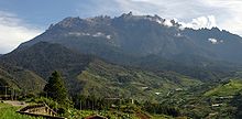


_landing_at_London_Heathrow_Airport_in_2004_(1).jpg)


 22:46, 2 October 2005 (UTC)


![[1]](https://commons.wikimedia.org/wiki/Image:Blue_mountains_-_three_sisters.jpg)
![[2]](https://commons.wikimedia.org/wiki/Image:Bangkok_skytrain_sunset.jpg)
![[3]](https://commons.wikimedia.org/wiki/Image:Zion_mount_carmel_highway_view.jpg)
![[4]](https://commons.wikimedia.org/wiki/Image:Daintree_National_Park.jpg)
![[5]](https://commons.wikimedia.org/wiki/Image:Yarra_Panorama.jpg)
![[6]](https://commons.wikimedia.org/wiki/Image:St_Vitus_stained_glass.jpg)


 Oppose Good subject matter, but too small - 600 pixels wide just isn't enough --Fir0002 10:22, 16 October 2005 (UTC)

![[13]](https://commons.wikimedia.org/wiki/Image:Bangkok_sunset_burning_sky.jpg)


.jpg)
