Support Good quality, great composition, wonderful isolation, fantastic eye. Best bird picture I have seen. --Muhammad(talk) 03:21, 23 January 2009 (UTC)[reply]
Support. Definitely prefer to see it facing more towards you rather than away, but good shot. You must have got a mouth full of sand for this one. Diliff | (Talk)(Contribs) 08:24, 23 January 2009 (UTC)[reply]
Comment Be aware that if this image becomes FP, the image will lose its Valued picture status. I think it is better as VP, because it has a high educational purpose more than it has the criteria to become a FP.
Since when can a file not be a VP and FP at the same time? A file can be a QI and FP at the same time... --Massimo Catarinella (talk) 19:52, 24 January 2009 (UTC)[reply]
Comment Well, I'm a medical student, so is the creator of the file and according to him...it has been dubble checked by a professor. I don't now if that's enough verifiability though. --Massimo Catarinella (talk) 01:35, 25 January 2009 (UTC)[reply]
CommentGerardM (talk) 19:47, 25 January 2009 (UTC) I have asked a person knowledgeable if this is good educational material. It is !![reply]
Sublime, striking and beautifully-reproduced group portrait by one of
Sir Joshua Reynolds
visited Amsterdam in 1781, he praised the painting as "perhaps, the first picture of portraits in the world, comprehending more of those qualities which make a perfect portrait than any other I have ever seen". On June 25, 2006, Hans-Joachim Bohlmann intentionally damaged the painting by spraying lighter fuel onto the surface and lighting it.
Could be. One thing's for sure, they liked their meat fresh in those days... mikaultalk 11:56, 30 January 2009 (UTC)[reply]
Turkeys were introduced into Britain in 1526 (by the trader William Strickland) - so I don't see why the people of Holland couldn't be enjoying a turkey more than 100 years later! (Although, to be fair, roasted goose was much more common at the time...)--Tufacave (talk) 13:33, 30 January 2009 (UTC)[reply]
Promoted File:Bartholomeus van der Helst, Banquet of the Amsterdam Civic Guard in Celebration of the Peace of Münster.jpgMER-C 07:10, 2 February 2009 (UTC)[reply]
Original - De Magere Compagnie ("The Meagre Company", 1637) by Frans Hals, a Dutch portrait painter. This is typical of one of Hals' large group portraits, which often featured guardsmen.
Reason
I think this is a superb reproduction of a work by a painter that, frankly, we lacked very good illustrations for before.
Comment I've taken the liberty of rescaling the thumbnail a bit; it is a rather wide landscape. Also, because of the confusion lately about my works - this isn't one I worked on, I just think that really good painting reproductions should be seen on our front page. (It ain't one Durova worked on either.) Shoemaker's Holiday (talk) 12:05, 25 January 2009 (UTC)[reply]
Support It don't need working on, it's a superb example of "golden age" painting, despite some tiny marks etc. Incidentally, great EV for period costume. More like this! mikaultalk 12:42, 25 January 2009 (UTC)[reply]
Long story. Suffice it to say that I figured I'd better disclaim involvement, lest, in an attempt to make up for crediting my works to others on
WP:FP, they began presuming others' work was mine. =) Shoemaker's Holiday (talk) 12:54, 25 January 2009 (UTC)[reply
]
Hey, no-one's saying you're no good with a brush, just born 350 years too late :)) mikaultalk 13:26, 25 January 2009 (UTC)[reply]
[[File:|250px|alt=|Use the scrollbar to see the full image.]]
[[:File:| ]]
Original - Moscow's Ostankino Tower was the tallest freestanding structure on Earth from 1967-1976, surpassing the
Burj Dubai
has overtaken first place. Among the communication systems Ostankino hosts are transmitters for nineteen television stations and seventeen radio stations.
Reason
technically good, either by hand or photoshop, extremely compelling and detailed, illustrative of modern design and life, worth well over 1000 words... may need to be scaled down to be used on front page
Support - Looks kind of washed out, but definite wow and good technicals. Ceran→//forge 13:05, 25 January 2009 (UTC)[reply]
Comment I was actually working on a vertical scroll template, so I've put this image inside it. It really is brand new - I just finished getting it to usable status today - but it seems to work fine, and should mean there's no problems on the main page. Tweak the template at will. Shoemaker's Holiday (talk) 13:20, 25 January 2009 (UTC)[reply]
It doesn't seem to work on Safari, I only get the top 1/4 of the image via the scrollbar? Mfield (talk) 17:46, 25 January 2009 (UTC)[reply]
Well, it works in Firefox and IE, and I have no way to check Safari to fix it. =/ Shoemaker's Holiday (talk) 19:14, 25 January 2009 (UTC)[reply]
[1] There is a PC version if that helps. Mfield (talk) 19:26, 25 January 2009 (UTC)[reply]
I am also only getting the upper portion of the image using Safari, however what is does show the scrollbar is working fine. 72.0.187.239 (talk) 23:05, 25 January 2009 (UTC)[reply]
Oppose an impressive image but the distortion (artefacting?) around the tower is a bit distracting, especially at the top and - in my opinion - the level of clarity and detail doesn't compare to other
Oppose Artefacting. But I am interested to see where this nom goes given that my failed nom for a giant KXJB mast panorama Wikipedia:Featured_picture_candidates/Kxjb_tv_mast_pano.jpg got opposed for being an extreme aspect ratio that wouldn't fit on the main page. Mfield (talk) 17:46, 25 January 2009 (UTC)[reply]
That shouldn't have happened. Articles can be featured even though they might not get on the front page. Images should be treated the same. - Mgm|(talk) 11:57, 30 January 2009 (UTC)[reply]
Comment (by nominator) after reading the previous KXJB tower discussion I can see that discussion is probably heading to a question of making the pic smaller, which will help with the artefacting I hope, if that becomes such a problem. I am not against doing that, but since I just found the pic on its own, I don't know what the rules are on editing someone else's pic. And the image is of a quality that even smaller it will not detract from the technical details of a tower and microwave dishes, antennas catwalks etc which I think is why this shot is really great. and yes this is my IP, I only used my login because I had to create a new page for the discussion. 72.0.187.239 (talk) 23:05, 25 January 2009 (UTC)[reply]
I certainly don't think downsizing will help at all. I just tried putting the original version through a workflow to attempt to clean up the artifacting, but I don't think the result was enough of an improvement to pass FP so I didn't upload it as an Alt, I can if anyone thinks its worthwhile/would like to see it. There is so much artifacting and noise a downsize to mitigate them would have to be so significant as to severely compromise the detail. I wonder whether the artifacting was not so bad in the component images and was compounded by extra saves in the original stitching and PP. I also note there are severe bands in the sky where the stitcher didn't blend the images together well, and these are really brought out by properly correcting the levels. I think it needs to be reshot really, there's just too many issues that are impossible to fix after the fact. Mfield (talk) 23:47, 25 January 2009 (UTC)[reply]
Oppose Artifacting and lack of sharpness. SpencerT♦C 02:09, 26 January 2009 (UTC)[reply]
Oppose because too much of the bottom of the tower is obscured by trees. A propos of nothing, Mfield, maybe now that we have this vertical scroll bar capability a re-nomination of your mast photo might fare differently. Spikebrennan (talk) 20:41, 27 January 2009 (UTC)[reply]
Oppose due to technical aspects mentioned above. Sasata (talk) 04:34, 28 January 2009 (UTC)[reply]
Oppose because of artefacts.- Mgm|(talk) 11:57, 30 January 2009 (UTC)[reply]
Not promoted MER-C 07:11, 2 February 2009 (UTC)[reply]
Support as nominator --Fir0002 10:56, 24 January 2009 (UTC)[reply]
Support Well done, as usual. The extra view certainly helps the enc value, although it should not be used against other studio shots without it. However, all of these studio shots (we have
FeaturedPictureSet}} because there is no logical lead image, no way to complete or even properly define the set ("here's all the fruit we have; more may come later!"), and each image is worthy of featured status by itself. (Are they?) The best solution, then, would be to create a subpage of natural shots vs. studio shots, but even that is hard to qualify sometimes. I'm also worried about inundating the Main Page with all of these similar images.--HereToHelp(talk to me) 18:17, 24 January 2009 (UTC)[reply
]
Inundating the Main Page should not be a worry, since we produce plenty of FPs to keep up an not every one has to appear on the Main Page. We can simply skip these ones (or postpone them to spread them out) when their turn comes.--ragesoss (talk) 20:38, 24 January 2009 (UTC)[reply]
Support, even though it should be a crime to make Red Delicious apples look good, since it's such an inferior variety.--ragesoss (talk) 20:38, 24 January 2009 (UTC)[reply]
Support Inferior? This looks quite tasty to me! Makeemlighter (talk) 02:54, 25 January 2009 (UTC)[reply]
Support --Avala (talk) 18:46, 25 January 2009 (UTC)[reply]
Comment This apple seems to have more debris on it than the pink lady in the other nom. Also, the lighting seems harsh and intense to me. Spikebrennan (talk) 20:45, 27 January 2009 (UTC)[reply]
Promoted File:Red delicious and cross section.jpgMER-C 07:11, 2 February 2009 (UTC)[reply]
Support as nominator --Fir0002 10:56, 24 January 2009 (UTC)[reply]
Support Well done, as usual. Please see my comments on the nature of all of these studio shots in the Red Delicious nom.--HereToHelp(talk to me) 18:19, 24 January 2009 (UTC)[reply]
Support I think the extra view at the top is fine. Good job. SpencerT♦C 02:19, 28 January 2009 (UTC)[reply]
Question how does the average person know just from the picture that this is a Pink Lady, and not some other pink-red-green apple such as a Braeburn? Matthewedwards (talk • contribs • email) 08:35, 28 January 2009 (UTC)[reply]
How does the average person know how to distinguish between a Pink Lady and a Braeburn in the first place? If there's an obvious distinguishing feature, then of course that should be illustrated in the photo, but otherwise, I think photos should be seen as complements to the text, not to be taken wholly on their own. After all, it's hard to tell who the subject of a portrait is if you don't already know how the subject looks, but in context of an article, they serves as good illustrations on how the person looks. Thegreenj 15:02, 28 January 2009 (UTC)[reply]
Promoted File:Pink lady and cross section.jpgMER-C 07:11, 2 February 2009 (UTC)[reply]
Support as nominator --Fir0002 10:56, 24 January 2009 (UTC)[reply]
Support Well done, as usual. Please see my comments on the nature of all of these studio shots in the Red Delicious nom.--HereToHelp(talk to me) 18:18, 24 January 2009 (UTC)[reply]
Support per nom. The extra view is a good addition. Cacophony (talk) 18:54, 24 January 2009 (UTC)[reply]
Support per nom. I suggest that the comment say what kind of orange this is (juice, navel, etc.) Spikebrennan (talk) 20:46, 27 January 2009 (UTC)[reply]
Support as nominator --DurovaCharge! 20:57, 23 January 2009 (UTC)[reply]
Support - Beautiful image and nice restoration. Do we know anybody who could translate the written caption? ~ ωαdεstεr16«talkstalk» 21:50, 23 January 2009 (UTC)[reply]
Oppose. Too verbose. Just indicate energy at appropriate arrows, and give a legend or labels to identify IR vs. broad spectrum. Papa Lima Whiskey (talk) 02:16, 24 January 2009 (UTC)[reply]
The incoming solar radiation (or energy) is 343 Watts per m2. So basically the numbers come from the sun's solar energy, starting at what is coming through the atmosphere, which is described as "incoming".
Oppose Sorry but apart from being quite cramped and there being little to differentiate the Earth, the atmosphere and the greenhouse gas layer I just think I've seen more attractive, clearer images of the subject matter. Guest9999 (talk) 05:02, 24 January 2009 (UTC)[reply]
Oppose The arrows are wack and the majority of the text is badly placed. Try reading some articles on typography and re-submit. For example the vertical height of "Atmosphere" "Earth" "Greenhouse Gasses" should be uniform and the text is especially hard to read across the horizon line.Teque5 (talk) 06:43, 2 February 2009 (UTC)[reply]
Not promoted MER-C 07:12, 2 February 2009 (UTC)[reply]
Original - The FAA Phonetic and Morse Chart, showing each of the 26 letters of the English Alphabet and the numbers 0-9, along with their Morse code signal and their phonic pronunciation.
Reason
The FAA Phonetic and Morse Chart, showing each of the 26 letters of the English Alphabet and the numbers 0-9, along with their Morse code signal and their phonic pronunciation. Its an interesting find, and illustrates how a letter or number can be translated into Morse code and how each letter is pronounced by radio technicians. This is an svg image, so it should be easy to resize if size is an issue.
Made in INKSCAPE by Jaime A. Sanchez. Edited to correct letter H by Richard G. Clegg. Uploaded to the commons by Rgclegg.
Support as nominator --TomStar81 (Talk) 03:07, 23 January 2009 (UTC)[reply]
Comment - Very similar to this, which failed. There is even a tabular version of this image in the article (it lacks the dots and dashes, but they're easy enough to add to the table: • • • • | • • | — — | — — — | — — !) ~ ωαdεstεr16«talkstalk» 03:44, 23 January 2009 (UTC)[reply]
Oppose per Wadester16, no need for an image here at all
Oppose. A number of the pronunciations do not appear to be correct. Papa does not rhyme with Oscar. Tang-go? See-air-rah? Rmhermen (talk) 17:57, 23 January 2009 (UTC)[reply]
Yeah, the pronunciations really need to be given in accurate IPA. Respelling really is an incredibly poor method. Thegreenj 00:40, 24 January 2009 (UTC)[reply]
Oppose This is one of those images on Wikipedia that should be in Images for cleanup in the subcategory of Images that should not be images. The information in this image would do best if it was to be recoded as
Oppose It would be better if this was wikicoded and made into a featured sound by turning it into a spoken article. - Mgm|(talk) 12:03, 30 January 2009 (UTC)[reply]
Not promoted MER-C 07:12, 2 February 2009 (UTC)[reply]
The flies are very small and maintaining a good DOF at this high level of maginification is very difficult. Good quality and lighting of a very rarely seen and photographed incident (according to the one who helped identify the subject). This picture is the first picture on wikipedia which shows the mating of these wasps.
Support This image is a macro action and IMO is interesting enough to get FP status. The image made me go to the article and read more about the insects.--Mbz1 (talk) 20:04, 21 January 2009 (UTC)[reply]
Support per nom. Where do you find all these insects having sex? Do you just randomly run into them when you have your camera? ~ ωαdεstεr16«talkstalk» 21:30, 21 January 2009 (UTC)[reply]
I chanced to find these insects. As I was leaving home for Friday prayers, I saw some movement around the leaf of a plant in the garden. I rushed in, got my camera and photographed the incident :) --Muhammad(talk) 06:22, 22 January 2009 (UTC)[reply]
Original - Japanese river boat. Painted photograph from Japan, dating from before 1886, according to a written note on the album containing the photographs. Presumed Author of the original photographs: Adolfo Farsari.
Reason
Old, original, being an example of a Japanese river boat as well as being a presumed photograph taken by Adolfo Farsari.
Support as nominator. I'd like to nominate dozens of images in that gallery, but this is a good start. --Mikael Häggström (talk) 17:37, 25 January 2009 (UTC)[reply]
Oppose Not used in any real wikipedia articles --Muhammad(talk) 18:50, 25 January 2009 (UTC)[reply]
Could perhaps be used in Sampan. I think it might be such a boat type. Mikael Häggström (talk) 19:33, 25 January 2009 (UTC)[reply]
OpposeGerardM (talk) 19:35, 25 January 2009 (UTC) The picture is PD and the text says that atribution is required.. Licensing info is incorrect[reply]
Oppose per above. In addition, I believe this is a scan? I may be wrong, but the dust, scratches, borders, and that scribbled "A" looks a bit suspicious.
How else do you propose to get it into the computer? Papa Lima Whiskey (talk) 03:38, 27 January 2009 (UTC)[reply]
My Point is that the original image was mistreated and had particles on it that the true image would not have (dust, scratches, "A"s), therefore I would prefer a scan of a cleaner version.
Actually this condition is above average for an unrestored image c. 125 years old. Compare to this which is about 30 years younger. It took considerable effort to restore to featured condition. And attempting to clean a historic original before scanning would be a serious mistake: that can damage the original permanently. DurovaCharge! 00:21, 30 January 2009 (UTC)[reply]
That's not an "A", that's a stick sticking out of the water. rspεεr (talk) 08:25, 30 January 2009 (UTC)[reply]
Oppose Needs some work - blue spots on the right, green blurs behind trees, the dirty smudge on the lower left, dust & scratches, maybe some color adjustment, etc. Sasata (talk) 04:03, 28 January 2009 (UTC)[reply]
Not so sure about that, maybe part of the EV is that it's a painted photograph whose colors aren't accurate? Papa Lima Whiskey (talk) 16:52, 28 January 2009 (UTC)[reply]
Comment Source information is inadequate. Scanned photo from what publication? This has potential, though. First the uploader needs to correct the sourcing and licensing statements. Then select an image with clearly encyclopedic use and get an uncompressed version for restoration. Based upon the current filesize, an uncompressed TIFF would be about 6MB--on the small side but enough to work with. 10-20MB would be better if possible. Ping me if there's serious prospect of this moving forward. DurovaCharge! 00:14, 30 January 2009 (UTC)[reply]
Not promoted MER-C 03:59, 3 February 2009 (UTC)[reply]
Support as nominator --DurovaCharge! 05:35, 25 January 2009 (UTC)[reply]
Question Are all these recent LOC uploads from the same batch? They appear to have a distinctive colour cast, probably due to poor calibration when they were scanned. I checked the first one I could see had and page white (the Zaandam nom which appears below) and having corrected for that, the paper stock tone looks much more likely. mikaultalk 11:43, 25 January 2009 (UTC)[reply]
They come from a variety of different printers and come in a variety of different tones, most of which are yellowed because the youngest of them is 80 years old. The printers tended to be regionally based and I am assisting a featured portal drive for Portal:Finger Lakes. If you're curious, browse a bit.[2]DurovaCharge! 16:38, 25 January 2009 (UTC)[reply]
Yeah, that's why I thought there was a common source for the scans; a colour shift in paper is unlikely to give such a consistently yellow-magenta hue across multiple docs, much more likely a mis-calibrated monitor somewhere, or some kind of aesthetic affectation. The fact is, when a (fairly) reliable white reference is avaialable (as it is on the Zaandam map) it corrects out to a more neutral, natural tone. mikaultalk 20:34, 25 January 2009 (UTC)[reply]
Very surprised you view this as a confirmation. Degradation traits for bird's eye panoramas varies by publisher. And the publisher that used the best paper (Currier and Ives) experiences the least aging--which would be explained by paper chemistry, not scanner settings. In support of the featured content drive for Portal:Finger Lakes I have been restoring material for a limited geographic region, selecting the originals that had the least degradation. So the images that have been going up at FPC are no random sampling. DurovaCharge! 21:02, 25 January 2009 (UTC)[reply]
Mikaul has continued putting forth the idea at another candidacy, so following up. What he has actually noted is not a scanner calibration error but the characteristic fade pattern of material from the L.R. Burleigh publishing company, which served upstate New York.[3][4][5][6][7][8] Other publishers from the same collection exhibit different fade patterns. See Hughes & Bailey,[9][10] and Currier and Ives.[11][12] The difference is the paper, not the scanner. If you are confused in the future, Mikaul, please ask questions on talk instead. DurovaCharge! 08:36, 26 January 2009 (UTC)[reply]
Point taken. Paper fades, and similar papers fade in similar ways. This doesn't alter the possibility that these scans are from the same source and have a common calibration issue. This whole hypothesis is based on the availability of a white balance reference at the Zaandam original upload. A similar reference is available on the Japanese Archer original upload, also currently listed here. It's an observation, nothing more, a simple correction and and one you haven't yet accepted as a possibility. Oh, and if you want to get personal in future, drop me an email, don't do it here. mikaultalk 19:51, 26 January 2009 (UTC)[reply]
Nothing personal here, although it does get a bit frustrating to explain the same thing three times in succession. Tonal qualities within the bird's eye cityscapes collection obviously correlates to printers. Even if a machine were miscalibrated (which is unlikely; LoC is the best archive around in terms of its digitization practices), it's very unlikely that two random items from unrelated collections would go through the same scanner before such an error were identified: the LoC site hosts hundreds of thousands of images. Of course if you write to their reference department and confirmation of the calibration idea, I'll apologize just as openly. DurovaCharge! 00:31, 27 January 2009 (UTC)[reply]
Weak, reluctant oppose I don't know the terminology, but the thing he's holding is cut off. The other technicals are acceptable, but not excellent enough to make up for that distracting loss of detail.--HereToHelp(talk to me) 17:34, 24 January 2009 (UTC)[reply]
Teeth-gnashing oppose per HereToHelp. Darn, I'd like to support this one. DurovaCharge! 01:20, 25 January 2009 (UTC)[reply]
Not promoted MER-C 04:00, 3 February 2009 (UTC)[reply]
Original - Male Albino Bennett's Wallaby (Macropus rufogriseus rufogriseus) on Bruny Island, Tasmania, Australia. A population of Albino Bennett's Wallabies live on Bruny Island
Reason
There is a spreading population of albino wallabies on Bruny Island, adds value to both articles in my view. Bennett's Wallaby is the name given to the Tasmanian subspecies of the Red-necked wallaby.
burdocks bother me, but I guess it makes it more natural. Now I know why Rocko was so light skinned (furred?). Also, do red-necked wallabies watch Nascar? ~ ωαdεstεr16«talkstalk» 05:12, 23 January 2009 (UTC)[reply
]
Support Good shot... shame about the red eye! (j/k!!) --Fir0002 05:46, 23 January 2009 (UTC)[reply]
Support Great shot! Wish it had more resolution, but one of the better wildlife photos I've ever seen. Omnibus (talk) 05:37, 24 January 2009 (UTC)[reply]
Support Good quality and composition --Muhammad(talk) 18:57, 25 January 2009 (UTC)[reply]
Promoted File:Albino Macropus rufogriseus rufogriseus.jpgMER-C 04:00, 3 February 2009 (UTC)[reply]
Located another cache of historic World War I photography from the Middle Eastern theater, so rolling up the sleeves and restoring the best of them. Here's an Ottoman camel cavalry unit from 1915 at Beersheba during the First Suez Offensive. Encyclopedic material, well composed. Restored version of File:The camel corps at Beersheba.jpg.
Support as nominator --Fir0002 09:52, 22 January 2009 (UTC)[reply]
Support this is a very good photo series. --Avala (talk) 11:10, 22 January 2009 (UTC)[reply]
Support an excellent set-very clear,simple and consistent. I'm becoming very impressed with Fir's photographs! Lemon martini (talk) 12:48, 22 January 2009 (UTC)[reply]
Weak Oppose This one is more eye catching of a subject but my feeling still stand per the other fruit and veg noms. I think there is strong encyclopedic merit to seeing the fruit attached to its tree as well/instead. Mfield (talk) 01:13, 23 January 2009 (UTC)[reply]
Comment I don't understand all these opposes based on fruits unattached to trees. Probably most consumers of any given fruit never see it attached to a tree. The tree has little to no connection to the culinary aspect of a fruit, which is probably the most important aspect of commercially important fruits like these. That is not to say there is no place for a tree photo somewhere in the article, but opposing a fruit photo because it does not contain a tree is like opposing a photo of meat because you don't see the cow too. Calliopejen1 (talk) 17:01, 23 January 2009 (UTC)[reply]
The very reason that most consumers never see the fruit attached to a tree provides a reason for the most encyclopedic shot of the subject to be taken under the natural conditions. FWIW, I don't remember seeing any featured pictures of meat :-) --Muhammad(talk) 17:51, 23 January 2009 (UTC)[reply]
I guess the distinction (IMHO) comes between food photography and nature photography. You have to chose to capture the plant in its environment or the plant as food. If the latter I think the image may be more appealing with the subject in more of a still life setting rather than on the clinical white background which is helpful for designers etc. but does not necessarily make for visually engaging and feature-worthy photographic illustration. I think if they were shot on a nice plain non distracting complementary background with a simple plate/knife to provide some sense of scale my opinion would be different. Mfield (talk) 19:26, 23 January 2009 (UTC)[reply]
Weak support Excellent technicals, but a passionfruit at the appropriate degree of ripeness for eating is much wrinklier on the surface (like this). My lips are puckering just looking at the photo! Calliopejen1 (talk) 17:04, 23 January 2009 (UTC)[reply]
Actually it was quite good - perhaps not the sweetest I've ever eaten but definitely ripe --Fir0002 10:36, 24 January 2009 (UTC)[reply]
Support I can taste the passionfruit by viewing this. Very nice. SpencerT♦C 21:13, 23 January 2009 (UTC)[reply]
Support per nom. The only thing that I'd even consider adding is some kind of size reference (which could even go in the caption). Spikebrennan (talk) 20:48, 27 January 2009 (UTC)[reply]
Promoted File:Passionfruit and cross section.jpgMER-C 04:01, 3 February 2009 (UTC)[reply]
Support I'd agree with shoemaker on the "glowy", a black background would probably give better separation, good enough though. I don't like the slightly uneven crop however.
Weak Oppose I just don't think that the photographing of a common everyday object on a white background is FP material. Sure it's sharp and well exposed, but once you are set up you can switch in and out thousands of subjects that will all be sharp and well lit but does that make them interesting to have on the front page? Hope you see my point, it's nothing against the images themselves, but where does it end, will we have an FP fruit month with a different fruit on every day?! I don't see people rushing to read Granny Smith when seeing this. I think there is strong encyclopedic merit to seeing the fruit attached to its tree as well/instead. Mfield (talk) 01:05, 23 January 2009 (UTC)[reply]
Question how does the average person know just from the picture that this is a Granny Smith, and not some other green apple? Matthewedwards (talk • contribs • email) 08:31, 28 January 2009 (UTC)[reply]
I doubt that even a perfect picture would allow this. It's hardly as if Granny Smith apples are strikingly different. vlad§ingertlk 03:27, 3 February 2009 (UTC)[reply]
Promoted File:Granny smith and cross section.jpgMER-C 04:01, 3 February 2009 (UTC)[reply]
Support as nominator --Ariovistus (talk) 15:18, 21 January 2009 (UTC)[reply]
Comment Feels over-saturated. Given that this is a flickr image, would someone contact the author and ask for the unedited version? Papa Lima Whiskey (talk) 15:51, 21 January 2009 (UTC)[reply]
Oppose. Looks over-saturated to me as well. If you look at the levels, the blue is blown out, for example. Also should probably be cropped tighter, although it probably wouldn't meet the size requirement if it was. Kaldari (talk) 19:15, 22 January 2009 (UTC)[reply]
Oppose Too much sky (artistic consideration) which left very little detail of the fort itself (limiting EV) --Fir0002 00:36, 22 January 2009 (UTC)[reply]
Conditional Support I will support this once it's straightened (right side is higher than left - unless it there is actually a slight slope?). While it may show a lot of sky, what do you gain from lowering the camera - more sand? The fact that this incredible sky is incorporated so well in the photograph adds a lot of "wow" factor to an otherwise not-so-"wow" site. In this instance, the entire fort is shown, so no EV is lost by cropping off the building, so all other criteria are met. Very cool. ~ ωαdεstεr16«talkstalk» 06:10, 22 January 2009 (UTC)[reply]
Yes but for a building shot it should have more than 0.2MP (~700px wide * 300 px high) of actual building detail!
Comment Could we contact the Flickr user and see if they'd release it a bit bigger? Shoemaker's Holiday (talk) 20:53, 22 January 2009 (UTC)[reply]
Not promoted MER-C 04:01, 3 February 2009 (UTC)[reply]
Weak Oppose I just don't think that the photographing of a common everyday object on a white background is FP material. Sure it's sharp and well exposed, but once you are set up you can switch in and out thousands of subjects that will all be sharp and well lit but does that make them interesting to have on the front page? Hope you see my point, it's nothing against the images themselves, but where does it end, will we have an FP fruit and veg month with a different one on every day?! I don't see people rushing to read Apricot when seeing this. I think there is strong encyclopedic merit to seeing the fruit attached to its tree as well/instead. Mfield (talk) 01:08, 23 January 2009 (UTC)[reply]
Weak Oppose I just don't think that the photographing of a common everyday object on a white background is FP material. Sure it's sharp and well exposed, but once you are set up you can switch in and out thousands of subjects that will all be sharp and well lit but does that make them interesting to have on the front page? Hope you see my point, it's nothing against the images themselves, but where does it end, will we have an FP fruit and veg month with a different one on every day?! I don't see people rushing to read Muskmelon when seeing this. I think there is strong encyclopedic merit to seeing the fruit attached to its tree as well/instead. Mfield (talk) 01:05, 23 January 2009 (UTC)[reply]
I think you are confusing Picture of the Day with FP. All POTDs are FPs but not all FPs are POTDs. Cacophony (talk) 03:38, 23 January 2009 (UTC)[reply]
Yeah Cacophony is right FPC and POTD are separate projects and you shouldn't be judging nominations with POTD in mind - that's a byproduct. I agree that this probably hasn't got mind-boggling wow factor, but this being an encyclopaedia the technical and EV make for an FP IMO. Also I was actually quite surprised at how hard it was to actually take these. I did initially think that once I'd got the first one right it would be relatively simple to do this series, but it was surprisingly time consuming to get a good cross section and to get it to stay upright (blu-tac was useful) and post processing also was relatively lengthy. All the shots were done as three-shot focus stacks (sometimes more); the texture of the white paper needed to be removed; the background had to be whitened without blowing any highlights on the subject or washing it out too much or creating harsh lighting etc etc. As for seeing it attached to the tree - well you can't have everything in a single shot! How else would you be able to get a cross section? --Fir0002 05:12, 23 January 2009 (UTC)[reply]
I am aware of the distinction between FPC and POTD, although my wording may have implied that I was not. I do think that for something to be FP though one has to consider its ability to incite interest in the viewer to read the accompanying article, and POTD happens to be an obvious place for that to take place. I do feel that if we are creating featured content then there has to be some limits to how many essentially identically composed and lit shots can be featured, there are after all a million items in the grocery store that could be swapped in, and it doesn't necessarily mean they illustrate the subject particularly well for enc. purposes. I am not belittling the work to create these images, I shoot a lot of this kind of work myself commercially, both stills and for ObjectVR. (If you want to save yourself some work, you need to get the subject a good deal further away from the background - not only to push it properly beyond DOF to lose the texture/folds in cloth but it will help separate the subject and background lighting and reduce issues with shadows and help contrast on the edges of the subject). See also my comments on the passion fruit nom re. food photography and sense of scale etc. to save me repeating them again. Mfield (talk) 19:37, 23 January 2009 (UTC)[reply]
I appreciate your concern but I do think it's important to keep in mind that an encylopedia is primarily there to inform people who are already to looking for information rather than to try inspire new readers. I also think that you're placing too much value on POTD as a tool to incite interest - the image will only be on the mainpage once for 24 hours - should that really be an FP's main purpose in life? For the rest of its days it's just going to be serving its home article - that's what you should have in mind not POTD. Also there really isn't much in the criteria to support this objection, because as you'll note in criterion 3 "A featured picture is not always required to be aesthetically pleasing; it might be shocking, impressive, or just highly informative." Also the incite interest objection would bar all reproductions of artwork from being FPs despite
this category. --Fir0002 10:52, 24 January 2009 (UTC)[reply
]
I find toothpicks work better than blutack actually.
Support per nom. The only thing I'd add is some kind of size reference. Spikebrennan (talk) 20:49, 27 January 2009 (UTC)[reply]
Weak support I agree with the above, size reference would be nice. From the picture it looks to be about the same size as the apples (above). —Preceding unsigned comment added by Boatsdesk (talk • contribs) 03:13, 31 January 2009 (UTC)[reply]
Promoted File:Canteloupe and cross section.jpgMER-C 04:01, 3 February 2009 (UTC)[reply]
Original - "Shōki zu" (Shōki striding), by Okumura Masanobu, c. 1741-1751. The figure from Taoist mythology known as Shōki in Japan (Zhong Kui in China), was a slayer of demons.
Reason
One of the more striking Japanese prints from the mid-eighteenth century. Thanks go to Shoemaker's Holiday for creating a scrolling template to display the unusual aspect ratio--which was actually one of the standard formats of traditional woodblock printing in its country of origin. Very high resolution. Restored version of File:Shoki.jpg.
Support wow amazing quality, looks great at full resolution, I usually never have to wait for pictures to load but this took a good 3-4 seconds. —Krm500(Communicate!) 05:17, 30 January 2009 (UTC)[reply]
Support Beautiful, probably the best example of its type we'll ever have. mikaultalk 11:19, 30 January 2009 (UTC)[reply]
SupportGerardM (talk) 12:00, 30 January 2009 (UTC) This picture is shockingly big. This obviously shows best the quality of the work and of the restoration. For normal use a slightly smaller version might be better..[reply]
Support per above M.K. (talk) 13:45, 30 January 2009 (UTC)[reply]
Original - An African-American man climbs stairs to a theater's "colored" entrance, Mississippi, 1939. The door on the ground level is marked "white men only".
Reason
A week ago during President Obama's inauguration, some of the older commentators on one of the broadcasts remembered the racial discrimination they had witnessed early in their lives and wondered how a new generation could understand how far things have come without seeing how bad they were. One way to convey that memory is to restore its record. Not all history is pretty; this deserves the front row treatment the man on the stairwell may never have received.
Support as nominator --DurovaCharge! 06:47, 29 January 2009 (UTC)[reply]
Support. This high resolution image depicts the darker times of American history. obentomusubi 17:54, 29 January 2009 (UTC)[reply]
Strong Support - How moving. I wish it included the price for white entry, just out of curiosity. ~ ωαdεstεr16«talkstalk» 19:26, 29 January 2009 (UTC)[reply]
Support decent quality, high EV value. —Krm500(Communicate!) 05:21, 30 January 2009 (UTC)[reply]
Support Strong EV, good enough quality. Makeemlighter (talk) 07:27, 30 January 2009 (UTC)[reply]
Question Can we get these old images geotagged? Papa Lima Whiskey (talk) 09:30, 30 January 2009 (UTC)[reply]
Maybe if someone knew local Mississippi history well enough to identify the exact location of the theater. DurovaCharge! 18:25, 30 January 2009 (UTC)[reply]
It's a shame geotags don't allow for ranges to be given (or perhaps they do?), otherwise this could at least be tagged to Belzoni, and so it would get linked to Google Maps/Earth etc. on here. At least people would be able to find out quickly where this town is. Papa Lima Whiskey (talk) 01:02, 31 January 2009 (UTC)[reply]
Support Her best image by far and a striking, valuable document to boot. Could maybe use a little sharpening, but no biggie. mikaultalk 11:29, 30 January 2009 (UTC)[reply]
Comment: It's a shame the White Men Only sign is so small-larger print would make the point more obviously Lemon_martini who cannot identify himself as this duff keyboard does not print tildes....
Original - Kitagawa Utamaro, "Ase o fuku onna" (woman wiping sweat), 1798.
Reason
Bijinga refers to beautiful women in Japanese art, particularly ukiyo-e woodblock printing. Kitagawa Utamaro was one of the most important artists in the genre and we're fortunate to have a very high resolution example of his work. Restored version of File:Ase o fuku onna.jpg
I was quite surprised to find that there was not a single picture in the isthmus article. Whilst not particularly notable, the isthmus is of a size suitable for photographic illustration. It is also an important geographical feature of Bruny Island.
Support edit 1 Gorgeous ˉˉanetode╦╩ 02:24, 22 January 2009 (UTC)[reply]
Surprised I didn't develop it as sRGB in the first place, must have had the raw processor set wrong for some reason (my camera is set to sRGB). I'm not so sure about the yellow cast correction though, the sun was just over the horizon.
Support edit 1Wow. The fix was very helpful -- mcshadyplTC 04:54, 22 January 2009 (UTC)[reply]
Support edit 1Lovely scenery and good EV + technicals --Fir0002 10:04, 22 January 2009 (UTC)[reply]
Support Original I'll trust the photographer on the colour rendition --Fir0002 11:33, 2 February 2009 (UTC)[reply]
Support edit 1 - Draws you into the scene wonderfully - Peripitus(Talk) 10:11, 22 January 2009 (UTC)[reply]
Support both --Avala (talk) 11:13, 22 January 2009 (UTC)[reply]
Question If the bodies of water on each side were ponds, would this still be an isthmus? Makeemlighter (talk) 19:25, 22 January 2009 (UTC)[reply]
I'm not sure but I would say probably not. The other side of the land bridge would not be considered a separate land mass, and indeed, you could just walk around the pond to get to the other side. However it seems like largely a matter of degree and I'm not sure where you would draw the line. Fletcher (talk) 23:05, 22 January 2009 (UTC)[reply]
Funny living on the surface of a sphere, innit? Papa Lima Whiskey (talk) 01:12, 23 January 2009 (UTC)[reply]
If that's the case, I have to go with Strong Oppose because I cannot tell looking at the picture that the strip of land is connecting two separate land masses. That fact, IMO, takes away all EV from this picture. An overhead shot would probably be the best way to illustrate Isthmus. Makeemlighter (talk) 02:27, 23 January 2009 (UTC)[reply]
The geocoding of the image would let anyone doubtful check for themselves.
But if someone looks at the article to find out what an isthmus is, this picture will mislead them. Or at least not give them the whole picture. And if they didn't know what an isthmus is to begin with, they aren't going to be doubtful and check the geocoding. Makeemlighter (talk) 06:20, 23 January 2009 (UTC)[reply]
To be honest, I think the caption takes care of that. But I'm sure a satellite image wouldn't be mutually exclusive with this one. They could jointly illustrate the article. But it seems that you're okay with the image illustrating Bruny Island. So the question you're raising seems to be not about whether this picture should be featured (its inclusion in Bruny Island would be enough), but whether it should be included on isthmus at all, never mind what its status should be. Is that correct? Papa Lima Whiskey (talk) 15:10, 23 January 2009 (UTC)[reply]
Actually, I think the picture shows far too little of Bruny Island to have substantial EV there. I don't mind its inclusion in Isthmus (although I think a better image can be found) since it's the only thing we have now. I just don't think it meets criterion 5: "Adds value to an article and helps readers to understand an article." Rather than enhancing understanding, I find that this picture misrepresents isthmuses and may cause the reader to think that any strip of land between bodies of water is an isthmus. Makeemlighter (talk) 02:48, 25 January 2009 (UTC)[reply]
The isthmus is a defining characteristic of the island and has enc in the article context. Furthermore Bruny Island is about an hours drive from one end to the other, not really possible to get a photograph of the lot.
The answer to this question should have been yes, there's even an example of this listed in the Isthmus article, namely Madison Isthmus. Kmusser (talk) 17:11, 28 January 2009 (UTC)[reply]
Support original if that's how NS remembers the colors. It doesn't look unnatural to me, depending on the time of day. Fletcher (talk) 23:05, 22 January 2009 (UTC)[reply]
Comment As of now, both images are sRGB converted for better judging the differences between edits. Papa Lima Whiskey (talk) 23:41, 22 January 2009 (UTC)[reply]
Support with preference to the one that the creator feels has the true colours --Muhammad(talk) 10:50, 24 January 2009 (UTC)[reply]
Support original. There's no reason to assume the colors in the original were unnatural making an edit unneeded. - Mgm|(talk) 12:08, 30 January 2009 (UTC)[reply]
To whoever is closing this, don't forget to take into account most of the initial edit supports were prior to the sRGB conversion of the original.
Original - Mass burial of the dead after Wounded Knee Massacre, 1891. Because of a misunderstanding between the chief and the commander of the American group, fighting broke out. Twenty-five troopers, along with 200 of the Sioux's men, women, and children lay dead. This site is now designated as a National Historic Landmark.
Reason
High enough res. Extremely high EV, just look at how they treated Native Americans back then. Also significant to our interactions and how they progressed over time with Native Americans. Editing is IMO, unnecessary.
Comment Would it be possible to get a higher resolution version? This is worth a restoration, but the current file is too compressed to really work on. DurovaCharge! 18:33, 22 January 2009 (UTC)[reply]
Comment The copyright mark in the middle, although likely historic, would have to be removed to satisfy FP requirements. Papa Lima Whiskey (talk) 11:12, 23 January 2009 (UTC)[reply]
FP requirements are that the image not be under copyright. They don't specifically require the removal of expired copyright marks, although I doubt this image at its current resolution would qualify on other grounds. DurovaCharge! 03:26, 25 January 2009 (UTC)[reply]
Comment Have located another file of the subject. Not exactly the same shot; the field. If anyone want to share work on the restoration and conominate, please leave word. Strong stomach required: they hadn't cleared the bodies yet. DurovaCharge! 08:42, 27 January 2009 (UTC)[reply]
Oppose. Technically not up to snuff.--ragesoss (talk) 03:01, 31 January 2009 (UTC)[reply]
Not promoted MER-C 04:34, 4 February 2009 (UTC)[reply]
Edit 1 - Removes the blatant stitching error on the bottom right corner (cropped).Some of the main errors I can see
Reason
High quality panorama of South Beach in Miami. Went through peer review first, where it went through some edits to bring the quality up. This image shows the length of South Beach taken from the jetty at the very southern tip. The beach is sparsely populated for a warm winter day (compare to this), which shows the bare beach (apparently uncommon).
Comment. Cropped kind of close to the top of the tall building. Also, half of the beach is in shadow-- would photographing at a different time of day enable the entire beach to be lit? Spikebrennan (talk) 19:53, 21 January 2009 (UTC)[reply]
That must have been a cloud. There is nothing south of this point to cause a shadow. Though I think it kind of adds a cool effect. ~ ωαdεstεr16«talkstalk» 21:25, 21 January 2009 (UTC)[reply]
Comment Beautiful resolution and colors. Is this the best location and angle? At far left is a distracting dark patch, then an unsightly fence. Makes me want to carry that camera northward and get the art deco hotels instead. Agreeing with Spikebrennan about the shadow and the skyscraper. There's a featured picture to be had at South Beach, maybe several featured pictures. This one comes so close I tried cropping. Please keep shooting. DurovaCharge! 21:32, 21 January 2009 (UTC)[reply]
What can I say? Construction happens. The location was chosen because it's the southern-most point of South Beach. I walked out about 100 ft on the jetty. See the coordinates listed on the file page to see what I mean. I have another Miami Beach image, but I still need to do some work on it. ~ ωαdεstεr16«talkstalk» 21:51, 21 January 2009 (UTC)[reply]
Support crop The rocks bottom left don't bother me, nor does the fence. Looking more closely there is a stitching error in the water near the right hand side that needs to be either be fixed by a cloning jedi or chopped off entirely.
Very good catch. I uploaded a cropped version. Also, now less of the jetty is visible. ~ ωαdεstεr16«talkstalk» 05:53, 22 January 2009 (UTC)[reply]
Weak Oppose Nice scene but I can see a lot of stitching errors in the ocean (I can upload an edit with highlights if you want). Perhaps this could have been taken with a single shot rather than a pano? Also I don't like the overcast section of the beach --Fir0002 00:41, 22 January 2009 (UTC)[reply]
Support both --Avala (talk) 11:15, 22 January 2009 (UTC)[reply]
Support crop illustrates the beach and the presence of the buildings probably give an idea of where the beach is --Muhammad(talk) 09:24, 26 January 2009 (UTC)[reply]
Comment All of the stitching errors that fir has pointed out could be removed by another crop, but it'd be hard to call it miami beach if one did so. Personally I am not too fussed about stitching errors in surf.
An important actor in the role that made him a star. Fortunately, public domain due to a gift of the photographer. Restored version of File:Brando van Vechten.jpg.
Articles this image appears in
A Streetcar Named Desire (play)
Creator
Carl van Vechten
Support as nominator --DurovaCharge! 00:00, 25 January 2009 (UTC)[reply]
Support Quite grainy and not hugely sharp but probably sufficient given its age
Support Agree with Noodle snacks about the quality. Excellent EV. Makeemlighter (talk) 02:56, 25 January 2009 (UTC)[reply]
Oppose. Not the quality we're looking for. The face is lacking in detail to an extent I'd say this has been upsampled three or four times. Papa Lima Whiskey (talk) 11:59, 25 January 2009 (UTC)[reply]
Oppose Agree with previous comment, although there is evidence of sharp grain it doesn't appear to be a first-generation copy. The late 40's weren't exactly the photographic dark ages, either. A more passable version might come out of shading the top and bottom to even out the flare/fading tones and beefing up the contrast a touch, but I'm not sure the EV is that strong it would make much difference FP-wise. mikaultalk 12:16, 25 January 2009 (UTC)[reply]
This was scanned from a faded print. Anyone know of a better public domain portrait of Brando? DurovaCharge! 16:27, 25 January 2009 (UTC)[reply]
Actually it is a photograph of Brando in character from the play, one of several from the play's original run. DurovaCharge! 08:09, 26 January 2009 (UTC)[reply]
weak Oppose per PLW and mikaul. It's nice and big, but there's just too much grain and fadedness and I don't think it has enough historical one-of-a-kindness to overcome the technical faults. Matt Deres (talk) 20:59, 27 January 2009 (UTC)[reply]
Oppose per Matt Deres. --
Eustress (talk) 02:32, 28 January 2009 (UTC)[reply
]
Not promoted MER-C 04:34, 4 February 2009 (UTC)[reply]
Weak oppose. Good choice of subject, but I worry about the many little reflections off the body, as well as the cut off hindleg. Papa Lima Whiskey (talk) 19:47, 28 January 2009 (UTC)[reply]
I have uploaded a less cropped version which shows the hindlegs over the original version. The reflections are there because the bug's body is covered with small hairs. The reflections are unavoidable, and IMO encyclopedic, as they shows that the body is covered with hair. Without the reflections, the hairs would not have been seen. --Muhammad(talk) 04:46, 29 January 2009 (UTC)[reply]
Since I don't know this animal very well, I'll give it the benefit of a doubt that the reflections are really unavoidable. Thanks for the new upload! Papa Lima Whiskey (talk) 13:38, 29 January 2009 (UTC)[reply]
Thank you and you're welcome --Muhammad(talk) 17:11, 29 January 2009 (UTC)[reply]
Support Color contrast could be better, but with this depth of field that's no problem at full resolution. DurovaCharge! 17:51, 29 January 2009 (UTC)[reply]
Oppose Poor lighting, (hard on axis flash) causing the effects mentioned by PLW.
Weak Oppose - The background really gets to me. It's both distracting and sometimes difficult to discern from the flower. I would support this as a VP though. ~ ωαdεstεr16«talkstalk» 22:03, 25 January 2009 (UTC)[reply]
Comment Seems a bit darkly-lit. Maybe a levels adjustment would help pull this up to FP quality? Shoemaker's Holiday (talk) 04:30, 4 February 2009 (UTC)[reply]
The original (edited version) had a levels adjustment done --Muhammad(talk) 05:18, 4 February 2009 (UTC)[reply]
Regretful oppose bright section at upper right throws off the levels. Otherwise excellent. DurovaCharge! 05:20, 4 February 2009 (UTC)[reply]
Question Is the stalk really that bare or are the stumps on it the remnants of leaves? --Fir0002 08:50, 4 February 2009 (UTC)[reply]
When the flowers begins to bloom, there are several of them together in clusters. Most of the flowers fall down before complete maturity. The stumps are remnants of flowers. --Muhammad(talk) 09:37, 4 February 2009 (UTC)[reply]
Not promoted MER-C 07:09, 5 February 2009 (UTC)[reply]
Casualties of World War I removed, see note below Guest9999 (talk) 05:14, 24 January 2009 (UTC)[reply
]
Creator
American Colony Jerusalem
Support as nominator --DurovaCharge! 04:33, 23 January 2009 (UTC)[reply]
Comment This is a difficult one. The coat-hanger bothers me, although without it, we may not be able to recognize the outline of the priest's face at all, given the low contrast in highlights. Looking at the picture with EV goggles, the best illustrated feature I can make out is the oriental rug, second would be the lamp (but with not enough pixel count). The focus is on the group of men in the background, who are dressed in a variety of garments, mostly mid-tone shirts with asymmetric buttoning, and wear mustaches. But I'm left with the feeling that if the EV is mostly on the furniture and dresses, we should have a different (set of) photograph(s) for this. Furthermore, this is the third photograph on
Casualties of World War I, as the casualties are not the central subject of this picture (I'd say the priest is, if anything, in spite of the focus problem). This is a better photo to illustrate casualties. Maybe someone can see more EV than I can. I'd be grateful. Papa Lima Whiskey (talk) 11:33, 23 January 2009 (UTC)[reply
]
Note I've removed the image from
Casualties of World War I because - in my opinion - the previous image was a better depiction of casualties in World War I and there is no mention of military hospitals or religious services in the article. Guest9999 (talk) 05:14, 24 January 2009 (UTC)[reply
]
You could have just said that you agree with me. ;) Papa Lima Whiskey (talk) 03:22, 25 January 2009 (UTC)[reply]
Oppose I'm not totally convinced by this, as per the above, and nobody has brought forward a defending argument, and I think the default should always be to not promote images when there isn't a good reason for promoting them. Papa Lima Whiskey (talk) 13:07, 1 February 2009 (UTC)[reply]
Weak Oppose Decent quality (proving historical images can meet a quality bar) but I'm also not convinced that it has the necessary EV - I prefer the scene in this image for Military Chaplain --Fir0002 09:06, 4 February 2009 (UTC)[reply]
Not promoted MER-C 07:09, 5 February 2009 (UTC)[reply]
. Rembrandt is known in his work for the great compassion he felt with ordinary people, which is fully evident here in the detail devoted to minor characters in the scene.
Reason
I actually thought this was featured and just now discovered it wasn't.
Support Very nice digital reproduction; could use a more succinct caption, per
Eustress (talk) 00:07, 25 January 2009 (UTC)[reply
]
Oppose This works out to only about 160dpi, way below the necessary level to bring out all the detail in an etching by a master artist. Several of the figures are made significantly more indistinct than they should be by the low resolution. I'd want at least 300 dpi. I think we should be able to do better - a google image search finds a slightly larger copy (2800x2000), though, alas!, now deleted. For now, I'd suggest this would be an excellent choice for Valued images, and we should certainly keep an eye out for better ones. Shoemaker's Holiday (talk) 12:39, 25 January 2009 (UTC)[reply]
OpposeDoesn't meet all criteria. It doesn't have good resolution of the subject, nor does it have much quality. I see this image in Valued Pictures, as it is very educational.
Regretful oppose We already have an FP of Rembrandt's work in File:The Anatomy Lesson.jpg. There's certainly room for more FPs from this great artist, but this borderline resolution file does not thumbnail well. Please keep looking. :) DurovaCharge! 05:25, 4 February 2009 (UTC)[reply]
Not promoted MER-C 07:09, 5 February 2009 (UTC)[reply]
Support as nominator --Exlibris (talk) 02:20, 26 January 2009 (UTC)[reply]
Weak oppose Depth of field a bit shallow, top leaf slightly clipped. Sasata (talk) 03:57, 28 January 2009 (UTC)[reply]
Weak support Demonstrates how the fruit grows during two different stages of growth, technically adequate although not superlative. DurovaCharge! 05:27, 4 February 2009 (UTC)[reply]
Oppose Technically insufficient - particularly the saturation looks overcooked --Fir0002 09:18, 4 February 2009 (UTC)[reply]
Not promoted MER-C 07:09, 5 February 2009 (UTC)[reply]
Eustress (talk) 19:51, 22 January 2009 (UTC)[reply
]
Oppose originalThis version from the same set (and same photographer) is more encyclopaedic. Is there any chance that he/she will release it under an appropriate license? Papa Lima Whiskey (talk) 20:08, 22 January 2009 (UTC).[reply]
Brilliant. Support alternate. Well done Eustress for getting permission, and thanks to the photographer for giving it! Papa Lima Whiskey (talk) 23:40, 29 January 2009 (UTC)[reply]
Oppose Both original per PLW, zoomed out a bit this would have much greater EV. Alternate isn't close to the technical standards I'm afraid. Thanks for getting the image, it is better than the other one in the article.
Weak support original, oppose alternate. A bit too centered for really good composition, but good contrast and ev. DurovaCharge! 05:22, 4 February 2009 (UTC)[reply]
Weak Oppose Original, Oppose Alt Per NS - since this is a building shot I'm guessing that it'd be pretty easy to redo with the rest of the islet in frame --Fir0002 08:56, 4 February 2009 (UTC)[reply]
Not promoted MER-C 07:09, 5 February 2009 (UTC)[reply]
File:Peterleeboxes.jpgOriginal - Peterlee was designated as a New Town in 1948 and the building of flat-roofed homes (a design inspired by Mediterranean houses) started two years later. This picture, taken in the early 1960s, shows the "little boxes with little topses." By the 1970s, major design faults had been discovered with the houses - in that the roofs let in water. Today the flat roofs have been replaced with normal ones.
Reason
Historic shot, as the flat roofs have been replaced with slanting ones now
Support as nominator --Tufacave (talk) 16:16, 3 February 2009 (UTC)[reply]
Comment The file hosting page is missing a lot of data. No description, no authorship attribution, no date. Are you really the copyright holder? Did you shoot this photograph decades ago? DurovaCharge! 18:29, 3 February 2009 (UTC)[reply]
Who is Tony Colling? Fletcher (talk) 02:40, 4 February 2009 (UTC)[reply]
Oppose The big board running across is very distracting. There is also no source information. The odd viewpoint seems unncessary. Not among Wikipedia's best work. Cacophony (talk) 04:02, 4 February 2009 (UTC)[reply]
Oppose per above. Sasata (talk) 07:07, 4 February 2009 (UTC)[reply]
Deleted (G7) MER-C 07:23, 5 February 2009 (UTC)[reply]
A historic view of the main railway station in the capital of the Netherlands, as it appeared about 110 years ago before extensive construction altered the area. Compare to a recent version of the same scene.[13] Restored version of File:Amsterdam Centraal Station.jpg.
Articles this image appears in
Amsterdam Centraal railway station
Creator
Detroit Publishing Company
Support as nominator --DurovaCharge! 00:35, 29 January 2009 (UTC)[reply]
Support even though the Central Station is still there, the environment has changed almost beyond recognition. GerardM (talk) 15:24, 29 January 2009 (UTC)[reply]
Original - Aftermath of the Wounded Knee Massacre, January 1891. Three weeks after the event several bodies remain in the foreground partially wrapped in blankets on the snow.
Support as nominator --DurovaCharge! 02:24, 28 January 2009 (UTC)[reply]
Oppose I don't see the subject well. It took me a while to distinguish the bodies, especially since it is black and white. I think I would prefer this image to be VP. Consider nominating this at Valued Pictures, which may definitly be promoted if it meets the criteria.
Oppose As above, hard to distinguish the lumpy blankets as dead bodies. Sasata (talk) 03:41, 28 January 2009 (UTC)[reply]
Support per nom. A rare image and the fact that that it may take the viewer a bit of looking to distinguish the bodies in a photograph shot in such high contrast conditions so long ago is not a problem. Images don't have to to be easy to completely interpret at a glance to be powerful and evocative. Mfield (talk) 17:58, 28 January 2009 (UTC)[reply]
Support many people have romantic visions about cowboys and indians, kids play with their toys like I did. The cruelty of how it was is captured in material like this. This shows a reality that people rather forget. GerardM (talk) 20:23, 28 January 2009 (UTC)[reply]
Support: At last, a picture that is really worth "a thousand words." Support all the way.-- Myosotis Scorpioides 20:33, 28 January 2009 (UTC)[reply]
Click on show to view the contents of this section
For all commenters: Remember, Valued pictures now exists on Wikipedia. It is time to start realizing what Valued pictures are and Featured pictures. It may qualify for both, but the best should be chosen.
ZooFari's pursuit of this particular image is unreasonable. He has been made aware of an alternate FPC of the same subject:
Wikipedia:FPC#Wounded_Knee_Massacre. Yet instead of requesting that image for the VP program, he redoubles his efforts to get this one (with 50 times greater file size). <spanstyle="color:#009">DurovaCharge! 17:44, 29 January 2009 (UTC)[reply
]
If that is the case then it would be bordering on
WP:POINT. The desires and outcomes of other projects should have no bearing here. We are voting on this image with respect to this project only. Mfield (talk) 17:50, 29 January 2009 (UTC)[reply
]
Support Sad. Kind of reminds me of the Gaza situation. :( --Muhammad(talk) 05:06, 29 January 2009 (UTC)[reply]
Oppose per ZooFari and Sasata. As perviously stated above, it is quite difficult to distinguish the bodies in the image and I don't think such an issue should occur in a Featured Picture. Nominating this at Valued Pictures would be the best bet, I think. Cheers, Abraham, B.S. (talk) 08:03, 29 January 2009 (UTC)[reply]
Regretful Oppose per above. Definitely a strong valued picture candidate because of the great EV, though. Makeemlighter (talk) 07:25, 30 January 2009 (UTC)[reply]
Support per nom. Perhaps amending the caption to read something like: "...the bodies of several Lakota Sioux (covered by blankets)..." would make it more obvious what this is. Spikebrennan (talk) 20:41, 30 January 2009 (UTC)[reply]
Support - also, it's clear to me that those are bodies (in reply to Oppose #1). The "subject" is scattered all over the battlefield, and I think that's obvious.
Xavexgoem (talk) 09:45, 2 February 2009 (UTC)[reply
]
That which is clear and obvious to you may not be so for others. When I look at this picture, I just see a bunch of blankets. Makeemlighter (talk) 06:40, 6 February 2009 (UTC)[reply]
Support A rare picture of a sad truth, there's no need of gore pictures to see that.--Jf268 (talk) 11:08, 4 February 2009 (UTC)[reply]
Eustress (talk) 02:26, 28 January 2009 (UTC)[reply
]
Support. Has clarity, good composition, and wow. Sasata (talk) 03:37, 28 January 2009 (UTC)[reply]
Comment There is something a bit odd going on with this image. Firstly, the studio lighting, the camera is set at F11, 1/500th (max sync speed), and there are what appear to be three softboxes relatively close to the birds going from the
Going by the rest of his photos, he takes them in the wild with a feeder, but this is the third photo in his stream, so it might be an exception. Some museums have displays like this, but I'm having a hard time believing that the feathers would be in such good order on a dead bird. Papa Lima Whiskey (talk) 19:54, 28 January 2009 (UTC)[reply]
I work sometimes with museum skins and mounts, and if those were mounts they would be exceptional. In particular the eye of the lower one looks damp, the skin around the mouth means if they are mounts they are really really fresh, and the facial expression on the top one would be really difficult to get on a skin. I wouldn't call myself an expert but I would be exceptionally surprised if these were anything other than alive. Sabine's Sunbirdtalk 01:11, 29 January 2009 (UTC)[reply]
There's quite a long string of metadata. The poses are engaging, and appear natural. but it does appear to be slightly oversharpened. Could the original photographer be persuaded to release an unedited version? DurovaCharge! 18:58, 29 January 2009 (UTC)[reply]
Original - The white coral fungus, Clavulina cristata.
Reason
Image is clear, fits nicely in article of same name, shows much more detail than any other Clavulina species photos available on Wikimedia Commons, and there's a dearth of fungi-related FP's
Original - The Red Wattlebird is a honeyeater, a group of birds found mainly in Australia and New Guinea which have highly developed brush-tipped tongues adapted for nectar feeding.
What do you mean 'for once'? Most of my images, as an example, are pixel sharp, and far higher res that this one. I'm not putting this image down by any means, but it certainly isn't unique in terms of sharpness. Diliff | (Talk)(Contribs) 15:15, 28 January 2009 (UTC)[reply]
Here's a chance for another FP for a significant artist: a high resolution etching by
James Abbott McNeill Whistler of Zaandam in the northern Netherlands, with a view of some of the many windmills that city had during the late nineteenth century. Restored version of File:Zaandam.jpg
Comment I'd like to sort out the white balance issue I think this and other similar noms have, before I can support. See question posted at Pulaski, New York, 1885 up the page. I've posted an edit here, based on the page white of the original uncropped scan, which I think is probably closer to the true colour of the artwork. mikaultalk 11:51, 25 January 2009 (UTC)[reply]
Note the paper grain. Whistler had this printed on an unusual paper, possibly to give the etching the appearance of an original sketch. Papers of that grain would have had a distinct brownish tint. DurovaCharge! 16:33, 25 January 2009 (UTC)[reply]
If it's an unusual paper, how has it faded to the same hue as other LOC scans? The original file has a white border, possibly from a scanner but certainly not the same paper, which has the same hue. I can't imagine why an archivist would choose a yellow-magenta paper for this purpose, so I'd conclude the scan has a cast, possibly due to mis-calibration somewhere, which should be corrected for historical accuracy. mikaultalk 20:44, 25 January 2009 (UTC)[reply]
This is becoming disruptive. Mikaul supposes that a scanner was miscalibrated at the Library of Congress, and even though the hypothesis does not fit the evidence within the collection where he first hypothesized it he now extends the notion to completely unrelated material. If anyone is confused, please do refer to the other discussion. DurovaCharge! 08:29, 26 January 2009 (UTC)[reply]
If I'd wanted to be disruptive, I'd have commented on more than two noms. The hypothesis fits the evidence as far as I can see. If you don't want to see a problem, fine. Just don't twist it into some kind of personal vendetta. The crux of the issue, fwiw, isn't here, it's on my talk page. mikaultalk 20:12, 26 January 2009 (UTC)[reply]
Support as nominator --Benjamint 10:23, 21 January 2009 (UTC)[reply]
Oppose I can see this at Valued Images, but not here. The composition is very plain, and the lighting and DOF choices are sub par. Probably to blame is the setting, but the grass and atrophy/emasculation of this animal couldn't make it more obvious that this is in a zoo (as the caption on one of the articles states, but please put it on the image page for others to use, esp. when translating). Compares unfavourably with other images at both lion and white lion. I can't help thinking this image belongs on animal welfare, but this would require us having more detailed information on how the animal is kept. Papa Lima Whiskey (talk) 15:50, 21 January 2009 (UTC)[reply]
Yes, I don't see anything wrong with it being a captive animal: "white lions remain rare in the wild ... The greatest population of white lions is in zoos where they are deliberately bred..." From the article it sounds as though they're so rare in the wild they may as well not exist. I can't see anything wrong with the DOF. It's definitely a better image than the others on the White lion article though: there's only the noisy shot of the face and OOF one of the cub. What is it exactly that my image "Compares unfavourably with"? Benjamint 06:46, 22 January 2009 (UTC)[reply]
Support I think quality is good showing an unusual animal in a realistic, if not natural, setting. I don't think the fact that it's in a zoo really detracts that much from its EV, given that apparently the majority of white lions are bred in zoos these days. Fletcher (talk) 02:29, 23 January 2009 (UTC)[reply]
Weak support I find the composition could be improved but this is what we have and EV is definitely there. --Muhammad(talk) 04:21, 25 January 2009 (UTC)[reply]
Weak support Agree with Fletcher and Muhammad. ~ ωαdεstεr16«talkstalk» 22:01, 25 January 2009 (UTC)[reply]
Oppose, more or less per PLW. The composition especially strikes me as uninteresting. I think the majesty of this animal could be captured much better, even in another zoo shot. Calliopejen1 (talk) 18:07, 26 January 2009 (UTC)[reply]
Weak Oppose per PLW. SpencerT♦C 00:35, 5 February 2009 (UTC)[reply]
Support as nominator --Mbz1 (talk) 15:25, 20 January 2009 (UTC)[reply]
Support, though the caption may have slightly the wrong tone. ("It is interesting", for instance.) Shoemaker's Holiday (talk) 21:54, 20 January 2009 (UTC)[reply]
Thank you for the suggestion about the caption. I tried to improve it. May I please ask you what do you think?--Mbz1 (talk) 23:25, 20 January 2009 (UTC)[reply]
Better, but "The arms of the cross are becoming gradually narrower toward the end." is a bit confusing, as they appear to get narrower towards the middle. A better phrasing might be "Like the Maltese cross, the arms of the cross grow wider as they move away from the centre."
I've changed it. Thank you!--Mbz1 (talk) 14:10, 21 January 2009 (UTC)[reply]
I guess I am reluctant to support my own image & I am flattered that Mbz1 considers it worthy. I set out to capture both the cross (one of a series which I am trying to get - there should be an article in it as they mark an ancient trackway) and to get a feel for a fairly remote area of the UK. So Support with thanks I guess! --Herbytalk thyme 19:02, 21 January 2009 (UTC)[reply]
Promoted File:Crazywell cross 1.JPGMER-C 07:05, 6 February 2009 (UTC)[reply]
Support I love the way the cross stands out against the landscape. Colours are also spot-on (shame about all the clouds, though) and it captures the hills/tors, as well as the resevoir and its trees. JollyΩJanner 16:37, 22 January 2009 (UTC)[reply]
Support Nice foto with gothic atmosphere.--Umnik (talk) 18:54, 31 January 2009 (UTC)[reply]
Original - Black-faced Cormorant (Phalacrocorax fuscescens), KetteringAlternate - Shows birds roosting where they might more naturally, but less individual detailAlternate 2 - More tail
Reason
Quality is reasonable and only a very small quantity of photographs exist on wiki of the species.
Support Original - Definitely a great photo. I like the look of the water in the background as well. These things have some cool eyes. ~ ωαdεstεr16«talkstalk» 05:06, 23 January 2009 (UTC)[reply]
Comment I have two little niggles with this picture. First, do you have a version with less DOF? I find the background a bit nervous and distracting, and it won't be particularly easy to adjust the lighting in post-processing since the same hues are used throughout the picture, bird or sea! The second problem is that the Mr. Bird's tail vanishes behind the plank. Knowing the length and shape of the tail turns out to be quite useful as a rough guide to cormorant species, so I feel it would be a shame not to have it. Papa Lima Whiskey (talk) 15:45, 23 January 2009 (UTC)[reply]
I have quite a few alts to go through for the first one, so I'll have a look a bit later. I have to stop down with the teleconverter to get things tack sharp generally (hence not much BG blur).
Just out of curiosity how come the EXIF doesn't match up with your description? --Fir0002 11:49, 24 January 2009 (UTC)[reply]
It does for shutter speed/iso, doesn't match on focal length or aperture since I taped the pins on my teleconverter in order to get some degree of autofocus at F8 (Slow but works fine in plenty of light).
Ah well that's a handy tip! I'll have to try that out... Any side-effects/warnings about the operation? --Fir0002 12:52, 24 January 2009 (UTC)\[reply]
I think the AF system in the 400D is the same as the 20D. It works best if you manual focus pretty closely then use AF to fine tune it. Sometimes it will oscillate around the focus point if there isn't enough contrast.I wouldn't bother with it unless you have very bright sunlight and a tripod, optimum sharpness is achieved stopped down, and F11 isn't very fast!. I've gotten some shots that I wouldn't otherwise have been able to get though. I don't really use the TC as often as I should, since I prefer to go walking with the 400 in my hands rather than lugging about a tripod.
Oh yeah, I'd use it in one shot mode when using this trick, tends to hunt and muck about too much in AI servo and its too slow to track a moving target anyway. I also suspect some AF inaccuracy is the reason it looks better stopped down (my 70-200 looked better with a teleconverter wide open)
Oppose Lacks snap and just doesn't stand out to me. Whereas some of your other work really does. Like the next candidate below. Omnibus (talk) 05:33, 24 January 2009 (UTC)[reply]
Support IP user never came back to sign in... Papa Lima Whiskey (talk) 16:57, 28 January 2009 (UTC) I like this picture. It correctly illustrates the animal and is a very high quality picture (technically speaking). Not only could this be a featured picture but it would make as a good Picture of the Day some time. —Preceding unsigned comment added by 96.18.217.236 (talk • contribs) [reply]
Support original Visible ripples communicate that this is a waterfowl. DurovaCharge! 01:28, 25 January 2009 (UTC)[reply]
Oppose The case has been made that the original is to be preferred; photographically, it's the better picture, but many pictures have walked the plank here for having part of a subject cut off or obscured, and this, unfortunately, will be another one. And while I sympathise with the idea that it's desirable for the background to communicate proximity to water, I think a little more bokeh would have helped here as well. Papa Lima Whiskey (talk) 00:56, 31 January 2009 (UTC)[reply]
Question The picture is bright on the right and a bit dull on the left. Is this change of lighting naturally like that r is it due to uneven lighting when the photograph was taken? --Muhammad(talk) 14:24, 23 January 2009 (UTC)[reply]
I'm sorry, I've only seen this in photos, and usually far worse than this one. I honestly couldn't say.Shoemaker's Holiday (talk) 20:42, 23 January 2009 (UTC)[reply]
Weak Oppose I think this image needs some croping. The outline is distracting, especially when this image is used in a wiki thumbnail box. I support if it gets cropped...
Support edit 1, agree with Durova. Excellent image of what is probably one of the most famous fossils ever discovered. Spikebrennan (talk) 22:07, 23 January 2009 (UTC)[reply]
Oppose both I looked at this earlier and thought it looked a bit odd. Did a little surfing and found the original specimen is actually framed and (as I suspected) much more detailed. I can't be certain cos I've never seen it, but the one we have nominated here is probably a facsimile, the original having only quite recently been exhibited publicly, AFAIK. The lighting is probably available light, as another shot here has the same, and appears along with other, much better shots of the original. Check the link, decide for yourself. mikaultalk 12:27, 25 January 2009 (UTC)[reply]
All the pictures of it framed were taken after this one (with the only exception of "Mike the bird guy" whose pictures were taken "behind the scenes", in early 2006). Do you have any further evidence that the original was framed at the time this was taken? Papa Lima Whiskey (talk) 17:05, 25 January 2009 (UTC)[reply]
The museum website suggests the original has only recently been publicly displayed and a facsimile would have been displayed before that. The rash of flickr shots late 2007 suggests this happened around then, after the shot here was taken. Not evidence as such, just using my eyes :) mikaultalk 20:53, 25 January 2009 (UTC)[reply]
Alright, that would also be consistent with the slightly plastery appearance of this exhibit. Papa Lima Whiskey (talk) 02:09, 26 January 2009 (UTC)[reply]
No consensus MER-C 05:23, 7 February 2009 (UTC)[reply]
Comment For the record, the quality of the original was so high that there wasn't really any point in editing it. Paris 16 deserves the credit here for finding this. Shoemaker's Holiday (talk) 15:10, 31 January 2009 (UTC)[reply]
PNGs are acually better for engravings: JPEGs are optimised for pictures. Shoemaker's Holiday (talk) 09:45, 3 February 2009 (UTC)[reply]
Support Looks like a real photograph. It's not, is it ;) --Muhammad(talk) 09:33, 4 February 2009 (UTC)[reply]
Comment The geometry looks kind of odd. Is there actually an angle from which the Coliseum looks like this? Spikebrennan (talk) 11:50, 4 February 2009 (UTC)[reply]
As far as I can tell, yes. The Colloseum is actually ovoid (either that, or a lot of diagrams on Google image search are coincidentally making the same error), and has some odd use of external walls. Of course, if Piranesi did include errors, it'd be pretty understandable given the thing was horribly overgrown with trees at the time. Shoemaker's Holiday (talk) 14:37, 4 February 2009 (UTC)[reply]
Promoted File:Giovanni Battista Piranesi, The Colosseum.pngMER-C 05:51, 7 February 2009 (UTC)[reply]
Support any as nominator --Mbz1 (talk) 02:56, 31 January 2009 (UTC)[reply]
Almost-support comment Please provide the date when this was recorded. DurovaCharge! 04:47, 31 January 2009 (UTC)[reply]
Done. Thank you.--Mbz1 (talk) 06:10, 31 January 2009 (UTC)[reply]
Support They may be deadly carnivores but they sure look cute. DurovaCharge! 07:00, 31 January 2009 (UTC)[reply]
Fwiw, support either. Prefer alternate. DurovaCharge! 02:29, 2 February 2009 (UTC)[reply]
Comment is it difficult to fix the underexposure? Everything looks very grey, rather than white atm.
Xavexgoem (talk) 06:19, 1 February 2009 (UTC)[reply
]
Comment If you Internet connection is slow, it is better to watch the video in preview at this page than in full resolution. Thank you.--Mbz1 (talk) 00:14, 2 February 2009 (UTC)[reply]
Support as nominator --Cirt (talk) 02:26, 30 January 2009 (UTC)[reply]
Oppose - I dislike the White House logo in the introduction and conclusion (these can obviously be cut out). Also, the video bounces throughout most of its length, which is annoying. I'd prefer a version from the front. Many videos were taken from the front at greater zoom. They may not be free, but they are better quality than this, which is another reason why I oppose. ~ ωαdεstεr16«talkstalk» 06:09, 2 February 2009 (UTC)[reply]
That said, the video still jostles through most of the speech. Maybe run it through some stabilization first? ~ ωαdεstεr16«talkstalk» 15:24, 2 February 2009 (UTC)[reply]
If I had the software. Any volunteers? DurovaCharge! 03:32, 4 February 2009 (UTC)[reply]
Comment I'd also like to see the "titlecards" edited out. They're very distracting and not necessary. Matthewedwards (talk • contribs • email) 03:46, 3 February 2009 (UTC)[reply]
Not promoted MER-C 05:51, 7 February 2009 (UTC)[reply]
Comment I'd like to see the "titlecards" edited out. They're very distracting and not necessary. Matthewedwards (talk • contribs • email) 03:46, 3 February 2009 (UTC)[reply]
Comment I just saw this... I think my original upload had the initial credits edited out as much as I could. That could be reverted to... is that one any better? I think it has a bit less at the beginning and end than the current version, but also may have been converted at a slightly worse loss level. Carl Lindberg (talk) 18:04, 5 February 2009 (UTC)[reply]
Not promoted MER-C 05:51, 7 February 2009 (UTC)[reply]
Broccoli and cross sectionOriginal - Broccoli and a cross section on a white background. Broccoli is approx 15cm tall
Edit 1 by Fir0002 - reduced exposureNot for voting Hard light comparison
Oppose Cultivar not identified (shouldn't be too hard). Nice to see your umbrella turned up, but the fine detail shows up better with hard light in this case. It also looks over exposed to me.
I disagree - the hard light, at least in your sample shot, looks too harsh and the broccoli is left looking unrealistically dark. I'm not sure what colour the original of yours was, but the broccoli I photographed was relatively pale. That said you're probably right that the original is a bit bright and the edit looks the most realistic. As for the cultivar I suppose I could go ask at Coles, but I suspect from this it's Calabrese --Fir0002 05:02, 23 January 2009 (UTC)[reply]
Weak Oppose I just don't think that the photographing of a common everyday object on a white background is FP material. Sure it's sharp and well exposed, but once you are set up you can switch in and out thousands of subjects that will all be sharp and well lit but does that make them interesting to have on the front page? Hope you see my point, it's nothing against the images themselves, but where does it end, will we have an FP fruit and veg month with a different one on every day?! I don't see people rushing to read Broccoli when seeing this. I think there is strong encyclopedic merit to seeing the fruit attached to its tree as well/instead. Mfield (talk) 01:06, 23 January 2009 (UTC)[reply]
But broccoli doesn't grow on trees you know ;-). --jjron (talk) 06:24, 23 January 2009 (UTC)[reply]
Oppose per Mfield and Noodle snacks. The exposure problem at least should be fixable. Papa Lima Whiskey (talk) 01:08, 23 January 2009 (UTC)[reply]
Support as nominatorSee clarification below as to which. --Shoemaker's Holiday (talk) 03:44, 18 January 2009 (UTC)[reply]
Support Was the picture published somewhere, or just here? (I couldn't spot it in "The Anatomy and Taxonomy of Protein Structure") Narayanese (talk) 08:18, 18 January 2009 (UTC)[reply]
Well, it certainly did appear here. I believe it was originally published in a black-and-white version, though. Shoemaker's Holiday (talk) 09:46, 18 January 2009 (UTC)[reply]
The color version was also published in Biophys.J. (1992) 63:1186 doi 0006-3495/92/11/1186/24. Dcrjsr (talk) 22:27, 18 January 2009 (UTC)[reply]
Strong, Strong Support Wow. I can't stop coming back to this great educational image. EV is A+ and then some. Omnibus (talk) 07:34, 19 January 2009 (UTC)[reply]
Support Nice, but there is a blemish in the upper left hand corner that should be taken care of first. --Pstanton 07:35, 19 January 2009 (UTC) —Preceding
Comment Thanks - done! On Wikimedia Commons is a fixed version called TriosephosphateIsomerase Ribbon pastel.png, which I have just replaced here since it's a very worthwhile but minor change. Dcrjsr (talk) 18:28, 19 January 2009 (UTC)[reply]
SupportGerardM (talk) 21:47, 19 January 2009 (UTC) This is so cool[reply]
Comment I have re-photographed the original drawing and put a higher-resolution version on Commons as shown below Higher-resolution version re-photographed. That is now the version linked on the Jane S. Richardson and Ribbon diagram Wikipedia pages. Would it be appropriate to replace the candidate image above with the new high-res version? 71.111.205.107 (talk) 18:25, 27 January 2009 (UTC)[reply]
Please comment on the high resolution versionWronkiew (talk) 06:42, 28 January 2009 (UTC)[reply]
Support high-res version. The only real critique is that it might look better witht he black point slightly higher; charcoal grey lines are easily interpreted by the eye as blurred black ones, while I'm pretty sure they're actually as sharp as you could ever wish for. But I'm not entirely convinced that the manipulation is desirable in this case, as it could lose some detail. Shoemaker's Holiday (talk) 11:43, 28 January 2009 (UTC)[reply]
CommentThis is delightful. Is there any chance of getting an uncompressed version of the new upload? Would like to try a touch of work on it. Otherwise support the new version. Best, DurovaCharge! 00:44, 29 January 2009 (UTC)[reply]
Comment The original was only cropped, not downsampled. Had originally corrected the lens distortion to straighten the mat edges, and warmed the color balance a little. I recently tried fixing the slight vignetting and darkening the black lines, but ended up with a slightly less good image for the main drawing, so my preference is for the hi-res version here. Anyone should feel free to play with it, of course. Dcrjsr (talk) 02:45, 3 February 2009 (UTC)[reply]
Comment This "upgraded" version doesn't really pass mustard for me. At full zoom, the edges look awfully blurry, and scream "Vectorize ME!" If others think it's worth the effort, I could probably turn it into a good SVG. Redoubts (talk) 23:00, 19 November 2009 (UTC)[reply]
A ruined building, a child's face, and a flag: the World War II bombings of London in one image. This one is right on the edge in terms of size and resolution, but the composition made it worth a try. Restored version of File:London V2 Frissell.jpg.
'Strong Support - not the best res, but man what a pic. Shows the devastation in two ways with the ruined, bombed-out building and the child behind. —Ed 17(Talk / Contribs) 20:31, 5 February 2009 (UTC)[reply]
Strong Oppose I don't see any EV for this in any of the articles, meaning that this picture fails criterion 5. I'd say "speedy close" but a couple supports already probably means that's not going to happen.Makeemlighter (talk) 06:48, 6 February 2009 (UTC)[reply]
To elaborate: I see this as more of an artsy picture, the kind you'd see in a documentary or something. It doesn't do anything for me in
Vergeltungswaffe. If the intent is again to show the destruction caused by the bombing, my above objections apply here as well. This is a good photograph, but there just isn't the EV to make it an FP. Makeemlighter (talk) 06:57, 6 February 2009 (UTC)[reply
]
Comment Great image. I'd support it if it found its way onto the Toni Frissell page; would tip the EV into positive territory I think. mikaultalk 13:57, 7 February 2009 (UTC)[reply]
If you can find a good place for it, by all means do. She's better known for her wartime photographs of the Tuskegee Airmen, so replacing that one seemed kind of tough. DurovaCharge! 04:18, 8 February 2009 (UTC)[reply]
Not promoted MER-C 03:29, 9 February 2009 (UTC)[reply]
Frozen Twigs (Jan 09 Midwest Ice Storm)Original - During the January storm, most outdoor surfaces were thickly coated in ice. These are frozen twigs just before melting began. This picture was taken in Floyd County, Indiana.
Reason
subject is sharp, footprints define the backround, interesting situation, the footprints and twigs kind of form a dynamic pattern.
Support as nominator --Juowikis (talk) 02:34, 2 February 2009 (UTC)[reply]
Oppose - Minimal EV and the article is literally 28 words of prose. The image quality is not all that impressive and no part of the image implies its location or consequence. No relation between the article and the image. ~ ωαdεstεr16«talkstalk» 05:54, 2 February 2009 (UTC)[reply]
Comment If the scene can be reshot, try it in portrait orientation with fewer branches and frame it so the background snow is undisturbed by footprints. DurovaCharge! 06:29, 2 February 2009 (UTC)[reply]
Oppose per above, and snow is white, not grey. F10 is too narrow for a p&s, the whole thing is soft. 58.6.103.48 (talk) 14:38, 2 February 2009 (UTC)[reply]
Oppose per reasons above. Sasata (talk) 07:21, 4 February 2009 (UTC)[reply]
Oppose per above. Also, there's a white blemish(?) in the top, left of centre. Can this be retouched? Microchip08 21:50, 4 February 2009 (UTC)[reply]
Not promoted MER-C 03:30, 9 February 2009 (UTC)[reply]
Historic photochrom print approximately 110 years old of a landmark hotel. A panorama from this angle is no longer possible due to subsequent development. Restored version of File:Hotel Del c1900b.jpg.
Support as nominator --DurovaCharge! 19:14, 1 February 2009 (UTC)[reply]
Support per nom. I'm looking forward to celebrating my tenth wedding anniversary there next year. Spikebrennan (talk) 00:42, 2 February 2009 (UTC)[reply]
Support - I've been there! Never new it had its own railroad tracks. Great image; cool to see it so long ago. ~ ωαdεstεr16«talkstalk» 05:56, 2 February 2009 (UTC)[reply]
Support Excellent work for the time period; still retains great EV.--HereToHelp(talk to me) 00:19, 3 February 2009 (UTC)[reply]
Regretful oppose, sorry, but the composition (the field in front) is not that great. Renata (talk) 03:20, 3 February 2009 (UTC)[reply]
Support per nom. Sasata (talk) 07:26, 4 February 2009 (UTC)[reply]
Promoted File:Hotel Del c1900b.jpgMER-C 03:30, 9 February 2009 (UTC)[reply]
Oppose - Poor lighting. Needed faster exposure and fill light - much of the background is disturbingly blown to pure white - Peripitus(Talk) 21:06, 1 February 2009 (UTC)[reply]
Comment - I disagree, the blown background is irrelevant to the subject except to isolate from the otherwise cluttered foliage, Uploaded alternatives without such white backgrounds, prefer alt 1. - Flying Freddy (talk) 03:40, 2 February 2009 (UTC)[reply]
The blown background looks weird and unnatural when it occupies such a large part of the image. While I like the composition and light for alt2 I think it might be affected by camera shake and it's not as good a species illustration as File:Phylidonyris_novaehollandiae_Bruny_Island.jpg (nominated somewhere else here ?) For such a common species we should expect to promote a tack sharp and well lit image - Peripitus(Talk) 10:25, 2 February 2009 (UTC)[reply]
Oppose Sorry, blown whites are a problem at FPC unless the area affected is really minimal. Excellent shot of the bird; please come back with another. DurovaCharge! 06:32, 2 February 2009 (UTC)[reply]
On second thought, support alt 2. The page cache must not have purged yet; didn't see the new submissions until after hitting save. Better background; small but not too small. DurovaCharge! 06:34, 2 February 2009 (UTC)[reply]
Questions Can we sort out what happened with the flash in these images? ISO varies from 160 to 400, but flash fired in all of them according to EXIF data (and all with 1/200 seconds exposure). Alt 1 has high noise ratio for an ISO 200 with this camera (Nikon D80). How much sharpening and exposure correction has been applied? Papa Lima Whiskey (talk) 21:11, 2 February 2009 (UTC)[reply]
Comment On all images on board flash was used. As the camera will only sync with the onboard flash down to 1/200 that was set (camera was on tripod for all shots so motion blur was unlikely), then aperture set as appropriate for DOF and sharpness. Actual exposure was controlled to a ballpark figure by adjusting iso to within about half a stop of correct as measuerd my camera, then used flash as fill. As such exposure correction would've been at most maybe half a stop. I think the high noise to signal ratio comes from shooting in raw, when shot in .jpg I believe NR is automatically applied which sacrifices detail. Frankly noise is a non issue to my eyes in any of these shots as compared to File:Phylidonyris_novaehollandiae_Bruny_Island.jpg for instance. Sharpening was applied in photoshop as is the norm with 90% of images submitted here, it was kept to a minumum as downsampling raised apparent sharpness. - Flying Freddy (talk) 01:20, 3 February 2009 (UTC)[reply]
My opinion, forget the fill (since you can't get above 1/200th) and just wait until you get one sitting in the sun.
Oppose all - just. I don't see the "blown highlights" of the original submission as a big technical problem, but the white background makes the composition displeasing to my eye - bright background and dark foreground doesn't work too well. There's also what looks like sharpened blur. In alt2, the blur on the leaves (motion blur? boku? hard to tell) is just slightly too distracting. It's close though. Stevage 04:43, 3 February 2009 (UTC)[reply]
Oppose. I don't think we can accept these, if only to remain consistent with previous decisions. The resolution on subject is borderline for each of these images; orig has unfortunate composition (tail on branch); personally I'm not too outspoken about blown highlights. Alt 1 has high noise levels. Alt 2 suffers from some motion blur (particularly on the branch and feet - windy? would also explain lack of sharpness on breast feathers). If the good features from all these images had come together in one image, it doubtless would have made it, especially since I'm not sure (didn't check) if we have an FP that shows a bird attending to its wing. Papa Lima Whiskey (talk) 23:12, 5 February 2009 (UTC)[reply]
Not promoted MER-C 03:30, 9 February 2009 (UTC)[reply]
hachures
. Digitally restored from pen-and-ink and pencil manuscript on tracing linen, mounted on paper (original 41cm x 41cm). Scale [1:63,360].
Support - LoC has some interesting images, don't they...great job again, Durova, and my apologies for not getting ere sooner. 20:28, 5 February 2009 (UTC)
Promoted File:First Manassas map2.jpgMER-C 03:30, 9 February 2009 (UTC)[reply]
The lower 8th of the bird and around the edge of the head/neck area looks blurry to me, which is unfortunate because the rest of him seems so detailed. Is there an image of the entire bird? This doesn't show what the shape or size an Albatros fuligineux is, or whether the coloring of the head continues over the rest of the body. I have to oppose on these factors, I'm afraid. Best, Matthewedwards (talk • contribs • email) 08:04, 29 January 2009 (UTC)[reply]
Weak support Seems to be a bit compressed for such large dimensions, but no problem with the depth of field issue. This bird isn't likely to be identified by its shoulder. DurovaCharge! 17:49, 29 January 2009 (UTC)[reply]
Oppose The image is nice, but it is severely lacking in encyclopedic value. It doesn't show enough of the bird to be informative enough. - Mgm|(talk) 11:53, 30 January 2009 (UTC)[reply]
Comment - I am puzzled by this as a reason for opposing. The image is without question the best image we have of the head of an albatross. It is not uncommon for reference works to include profiles of the head in addition to the whole body, and in fact this isn't even the only head shot we would have featured. This image isn't the only one we have of this species, and no one image can cover every aspect of a species. We have images of the whole bird in flight which shows different things from the one we have of a bird on the nest which in turn shows different things to this one, and it happens to be this one that is of sufficient quality to nominate here. As an example of what that quality brings to the image and to Wikipedia, it shows clearly the differing levels of darkness around the dark plumage of the face; albatrosses have darker spots in front of the eyes to prevent reflections, which is easier to see on a Laysan Albatross but harder to see on a darker birds. Sabine's Sunbirdtalk 23:52, 30 January 2009 (UTC)[reply]
Support as nominator --DurovaCharge! 23:45, 22 January 2009 (UTC)[reply]
Support Edit - Very fine image. I also added the LOC-image template to the original on Commons. ~ ωαdεstεr16«talkstalk» 15:38, 23 January 2009 (UTC)[reply]
Weak Oppose Original, Oppose Edit 1, Support Edit 2 Edit 1 is too contrasty - particularly at thumbnail. Since this is meant to be a restoration I don't see why it should be so tinted - sure retain a bit of the "aged hue" but it doesn't need to be so conspicuous. --Fir0002 09:20, 4 February 2009 (UTC)[reply]
Support original, weak support edit 2, oppose edit 1 Edit 1 looks too dark, edit 2 kind of looks washed out. --Muhammad(talk) 09:44, 4 February 2009 (UTC)[reply]
Fir0002 did an excellent edit. DurovaCharge! 07:50, 5 February 2009 (UTC)[reply]
No, he didn't. There's still dead space in the histogram. Oppose all existing versions. Can someone please try again? Papa Lima Whiskey (talk) 01:37, 6 February 2009 (UTC)[reply]
MER-C asked for opinions, and that is mine. Let's not quarrel. Best wishes, DurovaCharge! 02:49, 6 February 2009 (UTC)[reply]
Opposing for "dead space" in a histogram is extremely ignorant. That's like saying that all images should have at least one blown highlight and one clipped shadow. Many but not all images are improved in terms of overall lighting and aesthetics by some minor clipping; but it's certainly not a requirement for a good image. Check out the histogram on this and other historic Getty images if you don't believe me... --Fir0002 03:27, 6 February 2009 (UTC)[reply]
Comment Unfortunately this needs to be noted. Edit 1 was done by Papa Lima Whiskey.[15] PLW, is there a reason you submitted a proposed alternate to this candidacy and then later opposed all versions? It would really be better to openly acknowledge that you are opposing your own work. DurovaCharge! 21:10, 6 February 2009 (UTC)[reply]
If you check the edit history, you'll see that "edit 1" was originally titled "edit suggestion" and was never meant to be voted for. Unfortunately, nobody took up the suggestion. @Fir: Yes, all images should have decent contrast. Thank you. Papa Lima Whiskey (talk) 18:21, 7 February 2009 (UTC)[reply]
Then your intention was unclear. It seems like some of our FPC candidacies have played out on a general level (how a histogram ought to be managed, what should be FPC requirements), and that gets a bit frustrating for all sides. Ideally, individual candidacies should be about individual images--and our tastes may differ. But meta-discussion creeps in sometimes. Would you be willing to try mediation for the meta-issues? DurovaCharge! 20:13, 7 February 2009 (UTC)[reply]
So I guess it's edit 2 then...? MER-C 07:11, 5 February 2009 (UTC)[reply]
Would another support for edit 2 swing it? It's a great image, nicely restored, only needed a little sharpening and the tint removal is a bonus. mikaultalk 14:04, 7 February 2009 (UTC)[reply]
Promoted File:Machine gun corps Gaza line WWIb edit2.jpgMER-C 03:31, 9 February 2009 (UTC)[reply]
"Cloudy" LemonadeOriginal - "Cloudy" Lemonade, a mixture of lemon juice, sugar, and uncarbonated water
Reason
Right, now food/drink nominations are out of control
Weak oppose Quality is good, but I don't see the EV of such a picture. Does Lemonade really need to be illustrated? --Muhammad(talk) 04:13, 25 January 2009 (UTC)[reply]
Support Apparently there are several different varieties of lemonade that vary by geographic region. Good demonstration of the way pulp behaves in homemade lemonade. DurovaCharge! 05:38, 25 January 2009 (UTC)[reply]
Comment I think something went wrong with the upload because I'm still seeing the hair in the neck of the bottle --Fir0002 07:50, 25 January 2009 (UTC)[reply]
You might have to purge the cache or refresh a few times to get it to go
Support Sure, why not? It's very good quality and well-done. Shoemaker's Holiday (talk) 12:35, 25 January 2009 (UTC)[reply]
Oppose sorry but I just don't think this is the best possible way to depict lemonade. I considered myself to be pretty familiar with lemonade but wasn't 100% sure what the contents of the bottle was just by looking at the picture, I think this could be made clearer. Guest9999 (talk) 14:39, 25 January 2009 (UTC)[reply]
Yeah, but then it wouldn't be cloudy lemonade would it :P. The image could also find EV in
Oppose per Muhammad. I don't see how this picture is extraordinary from its technical aspect either. I just see a very blurry bottle. -- mcshadyplTC 21:58, 25 January 2009 (UTC)[reply]
Weak support Of the three this is the one which comes closest to providing a pleasing support shadow. Pretty good EV IMO --Fir0002 08:04, 26 January 2009 (UTC)[reply]
Weak support It's interesting, but the top of the bottle is a bit difficult to differentiate from the background. SpencerT♦C 22:57, 26 January 2009 (UTC)[reply]
No consensus MER-C 02:33, 9 February 2009 (UTC)[reply]
I believe the image meets all of the criteria for featured picture status on Wikipedia. It is entirely free use, a very large resolution and illustrates brilliantly what is possible with Apophysis and fractal flames in general.
Question: Are the sides (namely the bottom) of the fractal supposed to be cut-off? SpencerT♦C 00:17, 5 February 2009 (UTC)[reply]
Well, no, but zooming out would obviously cause the whole thing to get smaller. I can give it a whirl if you'd like to see the bits that didn't render?
Can you upload it as a different file? Looking at the image it only looks slightly cut-off, but if there's a lot more too it, I'd like to see it. SpencerT♦C 00:28, 6 February 2009 (UTC)[reply]
Yeah, sure. I'm rendering it now, should take about an hour.
Oppose original, Weak oppose edit 1. I have to agree with Sasata below, and additionally us in a gallery in Apophysis (software) doesn't have too much enc. SpencerT♦C 21:37, 6 February 2009 (UTC)[reply]
Weak oppose Interesting pattern and good resolution, but as one who's seen many fractal pics, this one doesn't have the wow I'd expect for a fractal FP. Sasata (talk) 03:02, 5 February 2009 (UTC)[reply]
Support--Mbz1 (talk) 17:08, 5 February 2009 (UTC)[reply]
Weak oppose Per Sasata, I don't think it's quite there.--HereToHelp(talk to me) 22:10, 6 February 2009 (UTC)[reply]
No consensus MER-C 02:15, 11 February 2009 (UTC)[reply]
Black Phoebe
, photographed in Los Angeles, California. Subject is around 5 inches (13 cm) in size. The species is identifiable by its strongly contrasting plumage between head and belly.
Reason
a sharp, nicely lit, uncluttered image that well illustrates the subject in profile with good feather detail.
Weak Oppose Nice, but I prefer having more of a background to connect the animal to its environment. There are also a few smudges that could be removed (over the head and to the right of the beak) and an interesting dark streak (shadow?) at the bottom. Fletcher (talk) 03:48, 5 February 2009 (UTC)[reply]
The spots are gone. I don't think the faint and v fuzzy shadow on the wall is distracting so I am leaving it unless more people think it an issue. As for the background, well it is his environment, he's a city boy :) Problem is you can't really have clear and unobstructed view of a small bird without the background being plain or being so far out of DOF as to be uninformative anyway. No one plant or tree in particular is going to be informative about the entire species as far as enc value goes, this is a species found in a wide range of places. Alternately, framing looser and showing more of the background generally would result in much less detail with a bird this small, it was difficult enough to get 8 feet from this little one to fill enough of the frame even at c. 600mm. I have seen so many bird FPs shot down for cluttered backgrounds or things in the way that I chose this as a more illustrative shot (instead of the many more in tree shots I had that showed less of the bird due to obstructions). Anyway enough wombling on - I am not being defensive just thinking out loud. Mfield (talk) 04:24, 5 February 2009 (UTC)[reply]
Support - Can't really find any reason to oppose. ~ ωαdεstεr16«talkstalk» 05:27, 5 February 2009 (UTC)[reply]
Support my cat Samantha has a different idea of what would make a good natural environment for this shot. I told her to retract her claws and rate this as excellent work. DurovaCharge! 07:54, 5 February 2009 (UTC)[reply]
Weak Support - Nice clear image, sharp as well. But yes what is that in the top left hand corner. Also where is the camera data. Adam (talk) 06:45, 10 February 2009 (UTC)[reply]
It's just a small patch of sunlight on an otherwise shady wall. Mfield (talk) 06:52, 10 February 2009 (UTC)[reply]
Thanks. What about the camera date, I have noticed a few others of yours that do not have it. Adam (talk) 06:54, 10 February 2009 (UTC)[reply]
It's a consequence of doing a save for web from PS which I don't do most of the time. It was not a conscious effort to hide anything but now you mention it, I do sort of feel that EXIF information is overvalued by everyone else when it is only really of interest to/the business of the photographer. Does it diminish the image to not know those details? FWIW, this was ISO 400, 1/320s, f9, 300mm+1.4x TC, fill flash. Mfield (talk) 07:05, 10 February 2009 (UTC)[reply]
No it doesn't I was just curious as to why it was not there. I know that when I run some of my images through photoshop and ptgui the camera data dissapears but the camera date table is still there with some minimal information. Like this image for instance. Adam (talk) 07:13, 10 February 2009 (UTC)[reply]
I think as Photoshop defaults to leaving the copyright info in place in SFW, it probably leaves enough EXIF/IPTC data in place that would cause the table to appear, even though it does not transfer the camera data. It would probably all vanish if you changed that default. Mfield (talk) 07:28, 10 February 2009 (UTC)[reply]
300mm +1.4x = 420mm. You mentioned above c. 600mm. Does the c stand for something or am I missing something ;)? --Muhammad(talk) 20:31, 10 February 2009 (UTC)[reply]
It was shot with a 1.6x crop body so its the FOV equivalent of 1.6 x 420mm = 672mm, and the image is slightly cropped so I am guessing around 600mm in 35mm equivalent FOV. Mfield (talk) 20:34, 10 February 2009 (UTC)[reply]
Promoted File:Black phoebe sayornis nigricans.jpgMER-C 02:24, 11 February 2009 (UTC)[reply]
Mexican-American War
. A United States flag indicates the outcome of the battle.
Weak Support Doesn't depict the actual battle, but it's colorful, engaging, and still encyclopedic. Fletcher (talk) 03:56, 5 February 2009 (UTC)[reply]
Edit 1 - Cropped out shadowy people on the bottom of image & darkened the highlights a bit
Reason
I have always thought that this image was very exciting. A sea of people extending as far back as the camera can see! It is also a great depiction of Sanja Matsuri, a large Japanese Shinto festival.
Support (Edit 1.) Love the detail and the fact that you can see the expressions on everyone's face in the crowd; almost gives the impression of being there. Sasata (talk) 07:00, 4 February 2009 (UTC)[reply]
Oppose both For composition, the framing is awkward with the pillar/wire and the mikoshi where is is, a few feet to left or right for a better angle would have made the difference. Mfield (talk) 02:47, 5 February 2009 (UTC)[reply]
Oppose Wires, the bane of all photographers. Agree with Mfield. Can be cropped very tightly but I'm not sure it'll survive the surgery. Fletcher (talk) 03:54, 5 February 2009 (UTC)[reply]
Not promoted MER-C 02:25, 11 February 2009 (UTC)[reply]
An das deutsche Volk!Original - Negotiations for a peace treaty that would have ended World War I opened in December 1916, when the Germans offered to end the war, declaring themselves the victors. However, the Allies rejected the offer. This German poster from January 1917 quotes a speech by Kaiser Wilhelm II lambasting the Allies for their decision.
Reason
An interesting document with pretty good art, showing a side of the propoganda of WWI that we don't get to see as often: The Germans'. I've done a little levels adjustment on this - it makes it a lot more readable - but wanted to keep some of the signs of its age, so didn't do too much.
Oppose - I don't think it adds much to either article. I also would rather see it in the articles for a bit longer before nomination. Cacophony (talk) 03:57, 4 February 2009 (UTC)[reply]
Not promoted MER-C 02:25, 11 February 2009 (UTC)[reply]
Another high quality image of Charles Darwin. This one does have some jpeg artifacting (especially in the darker areas), but the high res and EV should make up for it.
Support as nominator --Kaldari (talk) 01:18, 4 February 2009 (UTC)[reply]
Weak Support Not as iconic, but encyclopedic, to see him without the beard when he was younger. Wish it was better quality, but it's old, and it's Darwin. Fletcher (talk) 02:55, 4 February 2009 (UTC)[reply]
How about nominating that one? It did pretty well when it was tagged onto the nomination of a different image last year. Papa Lima Whiskey (talk) 23:15, 5 February 2009 (UTC)[reply]
Oppose I have to agree with Smooth...though there's good EV, the quality is too bad for me personally, and File:Charles Darwin 01.jpg is an example of what better quality could possibly look like. SpencerT♦C 00:21, 5 February 2009 (UTC)[reply]
Additionally, for the odd background shading as well. SpencerT♦C 00:26, 6 February 2009 (UTC)[reply]
Support Remember your dates, people: a photo from 1860 (or earlier - the actual date given on the page is "1850s", but Kaldari says he was 51, let's presume she knows) is going to look worse than one from nearly a decade later, simply because this was a period of rapid improvement in photographic equipment. The younger Darwin probably could not be taken any more accurately. Shoemaker's Holiday (talk) 17:04, 6 February 2009 (UTC)[reply]
Oppose This looks like a calotype (date seems about right) so is naturally "soft" looking and will always appear inferior to the definition of other processes of the time. Agree with above comment, I can't see any point in judging these as we would digital pics; there's little point in looking at them in minute detail as they were a lot smaller than your average monitor at full size. Nonetheless I also agree File:Charles Darwin 01.jpg is a much better, more erm, Darwinesque portrait of the man and one I'd support over this candidate. mikaultalk 12:25, 7 February 2009 (UTC)[reply]
Oppose. This version is significantly cropped compared to some other versions of the same photo, and there are some weird artifacts/smudges on this one as well. Incidentally, I think File:Darwin - John G Murdoch Portrait restored.jpg is the best photo we have of Darwin, but obviously I'm a bit biased having helped restore it. As for the date, I'm not entirely sure; different places give different ones. I think the "age 51" comes from an early 20th century book, but isn't necessarily accurate.--ragesoss (talk) 01:29, 10 February 2009 (UTC)[reply]
Not promoted MER-C 02:25, 11 February 2009 (UTC)[reply]
Great white shark at his backOriginal - Great white sharks sometimes roll over on their back to capture a wounded or dead prey item. It is possible that this behavior is utilized when feeding upon carrion, like a dead whale.
Support as nominator --Mbz1 (talk) 02:06, 3 February 2009 (UTC)[reply]
Support the caption makes all the difference. DurovaCharge! 05:57, 3 February 2009 (UTC)[reply]
Oppose The scene depicted is quite fascinating, but from a technical standpoint, this image could be a lot better. It is not nearly sharp enough, it is impossible to tell what the shark has in its mouth, and actually it is not very clear what the shark is even doing here. Mainly though, the subpar overall quality of the image is most bothersome. -- mcshadyplTC 07:38, 3 February 2009 (UTC)[reply]
Oppose I'm at a loss as to why so many of your photos come out with an almost black ocean. I suspect you've got some kind of contrast setting way too high --Fir0002 09:34, 3 February 2009 (UTC)[reply]
Comment Thank you all for votes! The image is a digital picture of my old film picture. Of course lots of quality is lost because of this. Yet IMO the the image is quite unique to maybe look at it like as it is some kind of historic image and overlook some quality issues. It is not an aquarium shot. --Mbz1 (talk) 12:15, 3 February 2009 (UTC)[reply]
You mean you took a photo of the print? I was puzzled why the image has EXIF data from a Canon dSLR. Would it be better to run the print through a scanner, if you could find one? Fletcher (talk) 02:47, 4 February 2009 (UTC)[reply]
Yes, I did the same with many of my old prints. I have no scanner. Thank you.--Mbz1 (talk) 04:44, 4 February 2009 (UTC)[reply]
Oppose My 4-year old son loved it, but alas, not FP quality. Sasata (talk) 07:17, 4 February 2009 (UTC)[reply]
Thank you for letting me know about your son opinion!--Mbz1 (talk) 00:47, 7 February 2009 (UTC)[reply]
Oppose for technical reasons as outlined in previous opposes. Sorry; very cool though. ~ ωαdεstεr16«talkstalk» 06:49, 7 February 2009 (UTC)[reply]
There's nothing to be sorry about. It was interesting that after spending hours in the cage, I took the best shots, when I got out, but as I said the images are digital pictures of my old (good quality) prints. Thank you all for votes and for comments!--Mbz1 (talk) 14:44, 7 February 2009 (UTC)[reply]
Not promoted MER-C 02:25, 11 February 2009 (UTC)[reply]
leopard shark
(Triakis semifasciata) swimming in a kelp forest.
Reason
A nicely lit, sharp and illustrative image of the species in a not obviously captive environment.
Support as nominator --Mfield (talk) 01:34, 3 February 2009 (UTC)[reply]
Weak Support It's a decent aquarium shot but there are two issues I'd like to see fixed before I full support. 1) Speck/spot removal. 2) Some chromatic noise reduction on the shark. --Fir0002 09:37, 3 February 2009 (UTC)[reply]
The only specks that I didn't remove are things floating in the water hence why I left them in, unless you are seeing something else? I thought it would look a bit too clinical if I removed all of them. Mfield (talk) 21:34, 4 February 2009 (UTC)[reply]
Good job on the edit --Fir0002 02:04, 8 February 2009 (UTC)[reply]
Comment Though the captive environment is indeed not too obvious, it would still be nice to know in which aquarium the picture was taken. Lycaon (talk) 14:27, 4 February 2009 (UTC)[reply]
Scripps in La Jolla, California - Added to image description. Mfield (talk) 05:56, 5 February 2009 (UTC)[reply]
One more thing, could you also mention the name of the two other guests in the background? Lycaon (talk) 11:50, 5 February 2009 (UTC)[reply]
I can't ID them, I'll try and see if I can email Scripps and ask them, but they aren't the subject of the image so I don't think it should count against this nom. Mfield (talk) 05:01, 10 February 2009 (UTC)[reply]
Comment There seems to be a horizontal streak at upper left. DurovaCharge! 21:11, 4 February 2009 (UTC)[reply]
Yes there is, i'll fix him for sure. Mfield (talk) 21:34, 4 February 2009 (UTC)[reply]
Support thanks for the edit. DurovaCharge! 07:52, 5 February 2009 (UTC)[reply]
Comment new version uploaded over old to address issues above. Mfield (talk) 05:56, 5 February 2009 (UTC)[reply]
Support good technicals given the location, high enough quality, etc. ~ ωαdεstεr16«talkstalk» 06:51, 7 February 2009 (UTC)[reply]
Support. Looks a bit too 'clean' to be totally natural, but still natural enough for me. Probably the best of both worlds as the visibility wouldn't be as good in 'the wild'. Diliff | (Talk)(Contribs) 10:56, 10 February 2009 (UTC)[reply]
Promoted File:Leopard shark in kelp.jpgMER-C 02:25, 11 February 2009 (UTC)[reply]
Vanity Fair
, September 1871.
Reason
As
Vanity Fair. Is there room for two FPs on him in different styles and media? You decide. Restored version of File:VanityFair-Darwin.jpg
Support a greatly improved image of this cartoon, not quite as nice as the 1880 photo, but great if we can have both. . dave souza, talk 21:08, 20 January 2009 (UTC)[reply]
Support, excellent restoration. TAway (talk) 03:54, 21 January 2009 (UTC)[reply]
Support, although I wouldn't mind a bit wider crop so the black borders of show on the left and right.--ragesoss (talk) 16:54, 21 January 2009 (UTC)[reply]
A lot of pre-twentieth century borders are a hair off from true parallel and perpendicular, which looks awkward to viewers in our era. DurovaCharge! 19:04, 21 January 2009 (UTC)[reply]
Regretful oppose - there's a texture to this that doesn't look quite right from what I've seen of Vanity Fair. Not much that can be done about that, either. I also don't think it's as good of a caricature as Vanity Fair normally managed. Shoemaker's Holiday (talk) 18:46, 22 January 2009 (UTC)[reply]
Support per nom. Question: is there a limit to how many FPs can portray one subject? I'm kind of joking, but also kind of not... ~ ωαdεstεr16«talkstalk» 09:00, 5 February 2009 (UTC)[reply]
Request This candidacy has been open since 20 January and has received plenty of responses. Requesting closure before Darwin Day? DurovaCharge! 08:12, 6 February 2009 (UTC)[reply]
Support--Mbz1 (talk) 18:46, 6 February 2009 (UTC)[reply]
Weak oppose per Shoemaker. SpencerT♦C 21:54, 6 February 2009 (UTC)[reply]
Oppose Not the greatest quality. And not a particularly good caricature. Makeemlighter (talk) 06:57, 10 February 2009 (UTC)[reply]
Not promoted MER-C 02:26, 11 February 2009 (UTC)[reply]
New Holland HoneyeaterOriginal - New Holland Honeyeater, Bruny Island, Tasmania feeding on an introduced Phormium tenax. The yellow forehead is caused by pollen.
Reason
I was pretty pleased with the composition and final result, especially considering the marginal light. I'll ask what its feeding on at WP:PLANTS soon.
Support cute little dude. DurovaCharge! 01:08, 25 January 2009 (UTC)[reply]
Strong Support Love the composition. Good EV. Makeemlighter (talk) 02:58, 25 January 2009 (UTC)[reply]
Comment The picture is 1400px wide. If some of the unnecessary(?) space was cropped out, it would probably fall below the 1000px requirement. Do you have a larger version? Muhammad(talk) 04:23, 25 January 2009 (UTC)[reply]
its only 10% below all of fir's non composite (eg insect or bird) nominations, and the plant adds EV too (hence receives some of the framing).
Weak Oppose Nice scene but seems to suffer the same quality issues as my brown treecreeper... Close but I suppose you couldn't get close enough! --Fir0002 07:54, 25 January 2009 (UTC)[reply]
Actually its a 50% downsample; the slightly weak technicals are because of the ISO 1600 and low light.
Strong support for its excellent encyclopedic value of the specific bird and evidence of its engagement in a common activity. It's lovely to have a good shot of the full shape, plumage, and coloration of the bird, with the dusting of pollen. The image is also colorful and attractive to look at. I would like to see it added to the Phormium article, also, as the description of the flowers would be better enhanced by this image than the ones now in the article. Plus second Durova, "cute little dude." --KP Botany (talk) 09:06, 25 January 2009 (UTC)[reply]
Oppose. Sorry, the quality is not there. And I don't see it feeding much. Papa Lima Whiskey (talk) 23:05, 25 January 2009 (UTC)[reply]
I do have a shot with the head in one of the flowers, but then there'd be complaint that the beak and so on wasn't clear.
I know what you mean. A photograph is not always the best way to illustrate something, which is why we occasionally promote video clips as well. This might be one of those cases. Papa Lima Whiskey (talk) 01:44, 26 January 2009 (UTC)[reply]
Comment - lovely image... but from an encyclopaedic point of view the two species pictured (the honeyeater and the the flax) have non-overlapping distributions (OZ and NZ respectively) meaning that the flax is either introduced or in a garden, which should perhaps be noted somewhere. And at least for the flax article a
What about adding it to pollinator? The article states "Birds, particularly hummingbirds, honeyeaters and sunbirds also accomplish much pollination, especially of deep-throated flowers" and in the New Holland article "are key pollinators of many flowering plant species", so it seems like some illustration of a bird would be useful.
I think it is appropriate for the article on the New Holland Honeyeater, and would be fine in many other places, but the Phorium article would be better served with a native bird, and the Tui galleries on the commons have many images of tui on flax (for example File:Tui on Phormium Tenax.jpg). I'm also not saying it shouldn't be promoted, I am just pointing out that the encyclopaedic value mentioned by KP Botany is slightly diminished by the non native status if that status is not mentioned. Sabine's Sunbirdtalk 01:42, 26 January 2009 (UTC)[reply]
The plant has a cosmopolitan distribution as a horticulture plant--it may even have been planted to attract honey eaters. I didn't check the bird, but, yes, the encyclopedic value is diminished by the pollinator and plant not being native to the same areas. --KP Botany (talk) 04:05, 26 January 2009 (UTC)[reply]
Weak Oppose for the two species not normally coming into contact in the natural world. Omnibus (talk) 16:49, 27 January 2009 (UTC)[reply]
I don't think it is a reason to oppose. So long as it is noted and not pretending to be 100% natural it is still of value. You couldn't argue that this image is 100% natural, yet it is still a featured image. Sabine's Sunbirdtalk 01:21, 28 January 2009 (UTC)[reply]
Yes, I don't consider it a reason to oppose, but I would like to see the bird in a usable specific context, such as, is the plant a common garden plant to attract honeyeaters, like us folk in California plant hummingbird bushes. A bird feeder is different than a non-native plant, because it's easier to put in context that it was placed to attract the bird. I love the picture, and it would be eye-catching on the front page. I would like more encyclopedic context, though. --KP Botany (talk) 03:44, 28 January 2009 (UTC)[reply]
Support Per KP. Maybe a tiny crop from the right would firm up the composition but this is a great illustration. I really don't don't find the grain objectionable at all. mikaultalk 12:22, 30 January 2009 (UTC)[reply]
Weak support Nice clear image. Might be a bit grainy though but still clear enough for me. Adam (talk) 06:50, 10 February 2009 (UTC)[reply]
Support. The introduced plant doesn't bother me, as this is noted properly and not misleading. High EV and illustrative value. Mostlyharmless (talk) 01:32, 12 February 2009 (UTC)[reply]
Manuscript plan of attack for a strategically important battle of the French and Indian War. The victory contributed to the British conquest of Canada in the mid-eighteenth century. Restored version of File:Ticonderoga attack plan.jpg.
Support any as nominator --Mbz1 (talk) 23:20, 6 February 2009 (UTC)[reply]
Oppose all for composition and harsh lighting. Its confused as to whether it is an image of the rocks or a landscape - the rocks are too small to be a primary subject yet as a landscape the composition does not draw your eye into the image, the tor is centered and there is too much foreground and that ridge that you can't see over. It lacks depth as a result and does not capture the expanse nor the bleakness of the moors. Mfield (talk) 23:29, 6 February 2009 (UTC)[reply]
Oppose Weak oppose edits The subject is too far and most of the image is sky and grass.
Comosition has increased improvement. However, cropping results in low quality. If not promoted, it may have a chance at Valued Pictures if it has been in an article for atleast one month.
Comment The subject of the image is the atmosphere of the place - the grass, the rock, the sky, the hills and the shadows and the mystery behind this all. Mfield, you said the image "does not draw your eye" . I do not think I could agree with this statement. IMO two opposes in 40 minututes after the nomination show just the opposite. When one image of mine was here for 7 days and did not get any vote at all, it showed to me that it "did not draw any eye". Thank you for your votes!--Mbz1 (talk) 00:23, 7 February 2009 (UTC)[reply]
I was referring to the composition not drawing the eye in or leading the eye around. There are several compositional choices that have caused this. If the image drew rapid oppositions then that is not a good reflection on those choices surely. Mfield (talk) 00:31, 7 February 2009 (UTC)[reply
]
Ah, I see. Still for me the oppose votes are better than no votes at all. At least somebody took the time to oppose :)--Mbz1 (talk) 00:40, 7 February 2009 (UTC)[reply]
Comment. I think the edit is an improvement on the composition. It definitely makes it a more interesting picture, not sure why, but it does :) Kaldari (talk) 01:05, 7 February 2009 (UTC)[reply]
Thank you very much for the kind comment, Kaldari! I cannot explain why, but I not only see the image, I also feel it. For example I could feel the wind. The image helps me to understand better what Watson felt, when he saw Sherlock Holmes on the tor.--Mbz1 (talk) 03:16, 7 February 2009 (UTC)[reply]
Weak support edit 1 Lighting isn't the best, but the crop definitely is an improvement. Simpler composition, plus that ol' rule of thirds. Decent ev. DurovaCharge! 04:56, 7 February 2009 (UTC)[reply]
I'm intriged - how would lighting be improved in the natural environment? Thanks --Herbytalk thyme 14:34, 8 February 2009 (UTC)[reply]
It's all about timing - overcast conditions or early morning/evening would have done it. MER-C 01:58, 9 February 2009 (UTC)[reply]
Well, this is a dangerous place to go. As the article says: "This wide expanse of peat bog continues to be dangerous to walkers, especially after heavy rain.On the flank of Fox Tor stands Childe's Tomb - according to local legend, the last resting place of Childe the Hunter, an unfortunate traveller who died there during a blizzard." Early morning/evening means going there or coming back in the darkness of the nights.--Mbz1 (talk) 04:48, 9 February 2009 (UTC)[reply]
No pain no gain :) Most of the best landscape photography demands getting up very early in order be in place at the best time. Flashlight, cell phone, sturdy boots and a flash of coffee recommended, and maybe some bog adapters for the tripod feet are in order. Mfield (talk) 05:18, 9 February 2009 (UTC)[reply]
Oh, Mfield next time, next time..., but now in the Edit # 2 your oppose reasons are gone aren't they. So, if you're not ready to support Edit 2 maybe you could change your oppose vote to oppose original? :). Thank you.--
Oppose Very interesting, but lacks enough "weight" to be featured, also starting to posterise due to heavy compression. A solid VP candidate though. mikaultalk 11:16, 7 February 2009 (UTC)[reply]
Weak oppose needs a clean up per Noodle snacks. Mfield (talk) 03:16, 9 February 2009 (UTC)[reply]
Not promoted MER-C 03:27, 13 February 2009 (UTC)[reply]
Question The off-white background is "authentic"? Papa Lima Whiskey (talk) 01:31, 6 February 2009 (UTC)[reply]
An off-white/cream paper is typical for prints such a these. The original maybe be a bit aged however. I uploaded an edit with the paper whiter than the original upload. --TorsodogTalk 02:22, 6 February 2009 (UTC)[reply]
Ukiyo-e uses white ink. (See Ryu sho ten below, where it's a little clearer because of a less tight crop). If it didn't use a coloured paper this wouldn't show. That said, the ink could stand to be whiter than in the original. Support edit. I'd even go a bit farther than that edit, if I were doing it. Shoemaker's Holiday (talk) 03:16, 6 February 2009 (UTC)[reply]
Support edit per Shoemaker's, definite improvement, possibly still a bit "flat" but good enough. I'm liking the face of the bloke at the window :) mikaultalk 11:44, 7 February 2009 (UTC)[reply]
Promoted File:Kiyonaga bathhouse women-2.jpgMER-C 03:27, 13 February 2009 (UTC)[reply]
Support as nominator --Mbz1 (talk) 17:04, 5 February 2009 (UTC)[reply]
Support - Beautiful, but if it were to fail here, Commons would be great. Ceran→//forge 21:42, 5 February 2009 (UTC)[reply]
Comment. Saturation looks overcooked at first glance. Any comments on the post-processing? Kaldari (talk) 21:55, 5 February 2009 (UTC)[reply]
Here's what some people might consider a reputable reference [16]. I'd say yes, it looks a little too saturated against the reference, especially the red around the edge. Papa Lima Whiskey (talk) 01:49, 6 February 2009 (UTC)[reply]
Dear Papa Lima Whiskey, thank you for comparing my image to the National Geographic one! This comparison might not be exactly valid IMO. The National Geographic image is an aerial view looking directly down at the spring while my image is not. Besides National Geographic photographer took his image from the safety of a helicopter while I was literally trying not to loose my balance at the very loose ground I was standing and at the same time constantly looking out for bears :) May I please offer to your attention another reference taken from more or less the same place I took my image? The colors of the water deppend very much of the time of the day the image was taken. Kaldari, I did not do anything special. I did adjust colors in Adobe. Having said all this I'd like also to add that yes, the image might be a little bit too saturated. Please do feel free to oppose it because of this. Thank you.--Mbz1 (talk) 05:49, 6 February 2009 (UTC)[reply]
What is interesting that while looking for the refference I found this one with my own image from Wikipedia, the nominated one. It got 789 diggs. Not bad! Somebody even felt bad for Wikipedia.Here's what he/she said while talking about my image:
"Anyone else feel bad for Wikipedia when such ultra-high-res photos are submitted to Digg? IMO, either post it on Flickr/Imageshack/Photobucket or some other for-profit site, or give a link to donate to the non-profit site we love so much: http://wikimediafoundation.org/wiki/Donate"
So, I hope that if the image is not promoted, at least it made somebody to donate to Wikipedia. :)--Mbz1 (talk) 06:02, 6 February 2009 (UTC)[reply]
After comparing against other images, I'll support it. I guess the super saturation is natural in this case. Kaldari (talk) 20:36, 6 February 2009 (UTC)[reply]
Support - very cool... another place I'll have to go visit. Sasata (talk) 01:21, 6 February 2009 (UTC)[reply]
Support Interesting. Made me find out something new. --Muhammad(talk) 18:59, 6 February 2009 (UTC)[reply]
Support either with personal preference for original. Love the colors. ~ ωαdεstεr16«talkstalk» 06:54, 7 February 2009 (UTC)[reply]
Support: Prefer the original by far as it doesn't have the dirt in the foreground or a tree obscuring the orange . . . stuff. Streams? Interesting subject matter.
Support Great EV for this artist. Fletcher (talk) 02:35, 4 February 2009 (UTC)[reply]
Support--Mbz1 (talk) 17:09, 5 February 2009 (UTC)[reply]
Support edit 1 Wonderful piece, clear EV for multiple articles. Hope you don't mind the edit, but that colour cast is probably due to an uncorrected scan and was obscuring a good deal of subtle colour. mikaultalk 12:08, 7 February 2009 (UTC)[reply]
Um, Ukiyo-e are almost inevitably done on yellowish paper. Your edit doesn't look bad, but it's almost certainly not accurate, at least to the colour of an aged Ukiyo-e. Shoemaker's Holiday (talk) 23:56, 7 February 2009 (UTC)[reply]
Ok, I've returned a little warmth to the mix (overwritten edit 1) not so much that you lose the more delicate hues but nearer what may be a more authentic tone. mikaultalk 10:25, 8 February 2009 (UTC)[reply]
I could support either this or the original. Both are reasonable guesses as to what's correct. Shoemaker's Holiday (talk) 20:30, 8 February 2009 (UTC)[reply]
Support edit 1 per Shoemaker and Mikaul. DurovaCharge! 06:06, 11 February 2009 (UTC)[reply]
Support original IMO, original version colors are more accurate. The yellowish color is intentional as the original paper color can be seen in the snow and fog.--Jf268 (talk) 11:25, 12 February 2009 (UTC)[reply]
Promoted File:Ogata Gekko - Ryu sho ten edit.jpgMER-C 03:28, 13 February 2009 (UTC)[reply]
Coriolanus. Engraved by James Caldwell from a painting by Gavin Hamilton.Edit 1 - colour cast removed
Edit 2 - re-sampled
Reason
We need good-quality images for all of Shakespeare's works, in my opinion. This is an excellent-quality image of Coriolanus. Hence, I think that it was both worth working on, and worth featuring.
Gavin Hamilton. The restoration should be credited to the uploader on Commons.
Support original or Edit 2 as nominator, oppose edit 1 --Shoemaker's Holiday (talk) 09:36, 3 February 2009 (UTC)[reply]
By the way, there's also an excellent Troilus, and several other Shakespeare works. Expect to see a few more, in between the Doré. Figured that, while I don't want to stop doing engravings, I can mix 'em up a bit =) Shoemaker's Holiday (talk) 09:47, 3 February 2009 (UTC)[reply]
Support edit 1 edit 2 At the distinct risk of sounding like a cracked record... I realise it's not crucial to a monochrome image, engraving or otherwise, but it just looks more authentic without the cast. I've shifted the colour on this to roughly the same extent as other LoC scans with reliable white references and hope you agree it appears to "reveal" something in the resulting image that was clouded before. Lovely illustration, either way. mikaultalk 13:54, 7 February 2009 (UTC)[reply]
Um... Mikaul? This one had a colourbox. The white was not yellow-tinted. I also work with a lot of original engravings from this perid - I own several hundred - and this is pretty normal paper tone.Shoemaker's Holiday (talk) 01:49, 8 February 2009 (UTC)[reply]
Sorry, my mistake. But this did have a white table under it, if no colour box, and the table wasn't yellow-cast. The edit just isn't believable colours for a book of this period with the paper such books tend to use - if we were going down that route, it'd be better to remove the paper grain entirely and call it a printable version. Hence Oppose edit 1.
Er, no, my mistake! Your dead right, I'm not sure how, but I missed out a crucial step (ie sampling the LoC original) and made a rather sweeping edit as a result. I've gone back and – carefully! – sampled it and cross-referenced your original, which has led to edit 2. Really sorry to mess you around; I can only recommend this edit as a very critical edit probably way beyond what it really needs (aka nitpicking :/) but... well, there it is. Discussion at talk page, if anyone's still interested. mikaultalk 06:36, 8 February 2009 (UTC)[reply]
Well, the image itself looks pretty good in Edit 2, but, in my experience working with originals, the colours of my original are pretty typical, but I haven't seen paper take a pinksh tone. Maybe nudge the hue a little more towards yellow? Remember that most paper *does* yellow when it ages, so a bit of yellow is expected. Shoemaker's Holiday (talk) 06:54, 8 February 2009 (UTC)[reply]
It looks pretty good because it's nigh-on the same as your original image! It's not appreciably less yellow than your original, but it was quite a bit less green: sampling the original white border on the LoC image, a green cast was the one thing that needed correcting, along with a small highlight clipping. I've taken out a little more magenta and uploaded over the old edit 2, which might deal with the pinkishness you're seeing. Quite honestly this is almost irrelevant now anyway, as the minute differences between edits is probably less than the difference in hues between our monitors, let alone everyone else's... mikaultalk 07:59, 8 February 2009 (UTC)[reply]
Support original. The yellowing looks more authentic. ~ ωαdεstεr16«talkstalk» 08:00, 8 February 2009 (UTC)[reply]
Support any Going wishy-washy here. Not certain which version is preferable and willing to blow with the winds, but this is certainly a highly encyclopedic image that deserves an FP nod. DurovaCharge! 05:47, 10 February 2009 (UTC)[reply]
Support - with a preference for edit 2 - I don't think it needs the yellowing Peripitus(Talk) 03:13, 12 February 2009 (UTC)[reply]
Support original --Jf268 (talk) 11:36, 12 February 2009 (UTC)[reply]
Promoted File:Gavin Hamilton - Coriolanus Act V, Scene III edit2.jpgMER-C 03:28, 13 February 2009 (UTC)[reply]
Frauenkirche in Munich, Germany is the biggest church in this Bavarian city. It is a prominent landmark and its towers can be seen from far away.
Oppose the composition is not up to FP standard: the bottom of the church is obscured by the buildings in the foreground and the horizon just above the line of the roof is distracting. Time3000 (talk) 12:22, 27 January 2009 (UTC)[reply]
This is the most complete, and the only practical view possible of the church, short of hiring a balloon or a helicopter. I respect your opinion and points raised though - not every subject is a practical candidate for FP due to the limitations of the environment and difficulty of capture. Diliff | (Talk)(Contribs) 17:52, 27 January 2009 (UTC)[reply]
Torre Agbar - Similar existing FP
Exactly my words, though I believe this is one of those pictures, which is a practical candidate for FP. Further more, I would like to add, that we have featured similar pictures in the past, so I don't see any reason why we should stop now. See example on right. --Massimo Catarinella (talk) 18:39, 27 January 2009 (UTC)[reply]
Oppose - while it is certainly true that taking a FP-quality photo of this subject may be difficult, that does not change our standards or the fact that this photo is not especially compelling. FP should be used for photos that provoke a "wow" reaction, that represent our best work compared to all photos on WP, not just compared to other photos of that particular subject. (I suspect a better photo of this subject could be taken at a different time of day, in any case; the near-overhead lighting in this image detracts from the photo by flattening the contrasts.) —Steven G. Johnson (talk) 23:59, 27 January 2009 (UTC)[reply]
Can I suggest that you are actually inventing the 'wow' criteria, though? While I admit that this seems to be something that many people apply to FPC nominations, it is not in the agreed criteria and it is not for individuals to decide what criteria to apply to nominations. That said, I'm sure that the point I'm making will have no impact on voting, as people will either apply or choose to ignore the set criteria at their own discretion. :-) Diliff | (Talk)(Contribs) 10:15, 28 January 2009 (UTC)[reply]
Oppose I agree with the reasons given above. Sasata (talk) 03:45, 28 January 2009 (UTC)[reply]
Support If this is the best possible angle to shoot from, I wonder why the complaints. Lighting IMO is pretty good. --Muhammad(talk) 10:25, 28 January 2009 (UTC)[reply]
Support A more "traditional" shot from the front of the building would obscure the way the neighbouring roofs are so similar in design to the roof of the church. Although, I am curious why the time on the clock doesn't match the time in the file data. I smell the work of the cabal!Matt Deres (talk) 12:56, 28 January 2009 (UTC)[reply]
OK OK, I admit it. You caught me! I photoshopped the image to change the time on the clockface, and to make it look like daylight. It really was exactly midnight when I took it, as evidenced by the timestamp! ;-) And for the record, the 'traditional' view from ground level would look much like this image from the article. I know which view I find prefereable... Diliff | (Talk)(Contribs) 14:16, 28 January 2009 (UTC)[reply]
Weak support - Weak because its on the borderline of being a subject that is just impossible to get a FP quality image of. Support because it is a technically excellent image and, for all intents and purposes, as good as we are going to get of this subject. Cacophony (talk) 03:27, 29 January 2009 (UTC)[reply]
Support Edit 1. My two cents on the issue: No image is capable of capturing every aspect, angle and detail of a subject. This is especially true of the subject in question where it is surrounded on all sides by other buildings, so a good ground level view is not possible. That said, I don't feel that you are really missing much in this view. Sure, you don't get the detail at ground level, but you get a much better idea of the architecture and the way it sits within it's surroundings. Diliff | (Talk)(Contribs) 09:22, 29 January 2009 (UTC)[reply]
Oppose. Automatic haze removal filters are at most two clicks away in any respectable photo editing application. Papa Lima Whiskey (talk) 13:45, 29 January 2009 (UTC)[reply]
Hide lengthy white balance discussion
And your point being? Are you suggesting that we fake the sky to make it prettier? I am the first to admit that sometimes a bit of contrast/saturation adjustments makes a big difference to the aesthetics but I don't see why it is necessary to falsify the reality. It isn't even particularly hazy IMO. You show me a modern city that has blue sky from horizon to horizon. Diliff | (Talk)(Contribs) 14:35, 29 January 2009 (UTC)[reply]
Maybe you're in need of a new monitor, but I don't see any haze at all. The subject is well lit and extremely sharp. --Massimo Catarinella (talk) 16:07, 29 January 2009 (UTC)[reply]
On any image that either of you plan to nominate, *please* first run an automatic white balance filter. If the result is drastically different from your image, maybe that's trying to tell you something. Papa Lima Whiskey (talk) 22:51, 29 January 2009 (UTC)[reply]
Your photographic credentials are practically non-existent based on what you've contributed to Wikipedia, so I find it difficult to take your advice seriously. Experienced photographers are generally far better at selecting their own white balance than relying on a camera's or image editing software's white balance. Besides, white balance is not an exact science so there is no absolute right or wrong choice - merely what looks realistic to the photographer's eye (and also the viewer's eye). I haven't seen any other complaints on that issue apart from you. Anyway, how did the discussion move from haze to white balance? They are two distinctly different issues. Diliff | (Talk)(Contribs) 08:31, 30 January 2009 (UTC)[reply]
You didn't just go there, did you? I'll just assume you didn't really just say that people who don't upload photos to WP can't !vote at FPC. For your claim that haze doesn't cause colour shifts, I refer you to the article, haze. Papa Lima Whiskey (talk) 09:27, 30 January 2009 (UTC)[reply]
I didn't say that at all. You seem to specialise in loosely paraphrasing people to stir up an arguments and put words in people's mouths. What I did essentially say was that I don't trust your photographic experience enough to take advice regarding basic image-processing, when I feel I have a decent enough grasp of it. Simple good faith is assumed of course, and that applies to anyone regardless of whether they contribute images or not but beyond that, respect is earned, IMO. There are a number of contributors whose photographic experience is fairly well documented and I therefore take their advice and opinions more seriously than others. It is my FPC equivalent to articles requiring citations for the verification of written content. ;-) Diliff | (Talk)(Contribs) 10:21, 30 January 2009 (UTC)[reply]
And as for the haze and colour shifts, again I never claimed haze didn't cause colour shifts. I did say that white balance is a completely different issue to haze though, and I stand by it. Hypothetically, if haze caused a blue sky to turn bright red, then that would be the correct colour to represent the sky. You wouldn't change the white balance to shift the entire scene in the direction of blue to correct for the haze, would you? Likewise, if the haze causes a blue sky to change colour slightly, then so be it. This is not a white balance issue at all! ARGH! Diliff | (Talk)(Contribs) 10:35, 30 January 2009 (UTC)[reply]
This is nonsense. First of all, we're not talking about a picture of the sky, we're talking about a building, and the most encyclopaedic depiction has proven to be a trichromatic image taken with equal weight given to the spectral frequencies hitting the three different sensors, i.e. whitish daylight, which is what human vision is attuned to. You're telling us that this image is encyclopaedic because it depicts the church, not because it depicts the haze (you didn't nominate it for that article, did you, now?) So with a bad white balance, you're either failing because EV suffers, or because you manipulated the image to bring about a strange balance of colors. Papa Lima Whiskey (talk) 10:47, 30 January 2009 (UTC)[reply]
I'm actually not following the bulk of your argument here. I don't deny that there is some haze near the horizon, as that is quite normal, but clearly it is not the ideal photo to illustrate haze because it is minor and secondary to the main subject, as you allude to. And It doesn't matter whether the subject is the sky or a building - if there is a colour change as a result of haze, it still shouldn't affect the white balance of the scene unless (and this is a big unless) the sunlight is being filtered through the bulk of the haze (such as at sunrise/sunset, and even then a lot of the time it is aesthetic to keep the warm cast that results, because that is what our eyes see) and a colour cast is created. As you can see, the sky is fairly clear and as such, with the sun being high in the sky, the colour cast is neutral and no correction for the haze on the horizon is necessary IMO. And for the record, I didn't actually nominate the image at all by the way. It was Massimo. Is enough enough yet, or do we need to continue this? Diliff | (Talk)(Contribs) 11:07, 30 January 2009 (UTC)[reply]
Funny you should ask that, given that you just served up two new replies, and are vigorously attacking anyone that says something about this image, even though you did not nominate it. There's no need to argue about physics here. We both know that the light goes through the haze on the way to the church and then again after the bounce. I've stated my opinion about using light that is as white as possible in our images, or doing the necessary corrections. If you don't agree, that's your problem. I've stated my reasoning very clearly, and no edit has been brought forward that addresses the issue. Papa Lima Whiskey (talk) 14:52, 30 January 2009 (UTC)[reply]
I am not vigorously attacking anyone - mainly just yourself. ;-) And I'm really just attacking the arguments by the way, not the people, although sometimes I feel it necessary to get somewhat personal to describe the things that I see you are doing. Yes, I know you have stated your opinion regarding white light, but I don't think you have actually produced an accurate method of 'using white light' to 'correct' the image. The ideal method is of course using a grey card to get a measurement of the light, but in the absence of that, using an object within the scene that is believed to be grey-white is usually the next best thing (although even this is often not helpful if you cannot be sure of said object's neutrality, as it could be off-white and there is no way to be sure after the event). Using an 'auto correct' tool is fair way down the list IMO. And if nobody else except you has had a problem with the white balance of the image or has produced an edit to 'correct the fault', then perhaps a bit of introspective soul searching is needed to discover why this is? Diliff | (Talk)(Contribs) 15:59, 30 January 2009 (UTC)[reply]
Support per Diliff. Although tempted to weak support per Papa Lima Whiskey's comment, there's something to be said for keeping the natural element here. Ideally this would get shot shortly after a rainshower when the sky is at its clearest (that's practically the only way to get certain cities in California), but until a better original becomes available this is worth promoting. Pollution element is minor and EV significant. DurovaCharge! 21:50, 29 January 2009 (UTC)[reply]
Hide another lengthy discussion
Even if both this image and this one had been taken at sunset (which he says the Oxford one wasn't), then you'd have to ask whether that is encyclopaedic lighting. Given the evidence presented so far, I have a feeling Diliff may want to review his choice of RAW software. Papa Lima Whiskey (talk) 00:23, 30 January 2009 (UTC)[reply]
Review my choice of RAW software?? I use one of the most highly respected packages in the professional industry (Adobe Lightroom 2). If there genuinely is an issue with white balance (and as I said above, there is no absolute right and wrong), 99% of the problem would be my choice of white balance rather than the software used, as I almost always manually correct it - particularly with panoramic/mosaic images where each frame in the set often has a different camera-selected white balance. Diliff | (Talk)(Contribs) 08:57, 30 January 2009 (UTC)[reply]
I was offering you a chance to get out of this without saying your white balance is bad. You didn't take it, so I feel free to now inform you that your white balance is bad. Congratulations. Papa Lima Whiskey (talk) 09:27, 30 January 2009 (UTC)[reply]
I freely admit that there is a chance of this - we're all fallible. But could it be that your idea of white balance is bad instead? You seem to see the world as if you're the centre of it, and we all revolve around. In any case, rather than throw accusations, perhaps you could point out exactly what you think is definitively wrong with the white balance of this image? Diliff | (Talk)(Contribs) 10:16, 30 January 2009 (UTC)[reply]
No, I use algorithms provided with photo editing software to test for bad white balance. I don't write these algorithms, they're the result of decades of research into properties of the visible spectrum as well as what looks like an authentic photo to a human subject. And in this case, the difference between the original and the corrected image is sufficiently great to confirm my suspicion that this image has a warm-toned cast. And the fact that I complain about *your* images far more than anybody else's might lead an introspective person to reconsider the white balance of these images, and whether this may be something to do with the settings or software they use, in general. I'm not making any judgements about Lightroom in particular, I've read the tests, and there isn't a RAW development software whose default settings work perfectly in all situations. Regards, Papa Lima Whiskey (talk) 10:36, 30 January 2009 (UTC)[reply]
I don't think any of the people who write the algorithms would have any notion that they are the most accurate methods of ensuring correct white balance. It is a well-known fact that relying on auto correct white balance functions in editing programs/cameras is problematic at best and very foolish at worst. Diliff | (Talk)(Contribs) 11:07, 30 January 2009 (UTC)[reply]
No, but if the image looks wrong on four different displays, and the auto white balanced version is a drastically different image, you would think you're onto something, and I definitely believe that's the case for this image. See my comments about white light, above. In the end, we don't rely on the opinions of blogs either, which are not
The image might look wrong to you on four different displays, but you still haven't discounted the possibility of you being the common factor. ;-) And you're right, my source would probably not be acceptable as a citation in an article, but that was not my intention - it was merely to get you to read and understand the logic behind why you can't rely on the white balance algorithms for accuracy, and that blog does a pretty good job. If you refuse to acknowledge it, so be it. Diliff | (Talk)(Contribs) 15:59, 30 January 2009 (UTC)[reply]
I still maintain that the polution/haze in this image is quite minor, though. All skies become less blue approaching the horizon due to natural haze (not necessarily pollution). Sounds like a mountain-molehill situation, to me... Diliff | (Talk)(Contribs) 08:57, 30 January 2009 (UTC)[reply]
Whew, hadn't realized this much had broken out since my review. For the record, Support either. Auto settings are worth a looksee and sometimes do better than manual adjustment, but actual conditions vary so much that it's really best to try both ways. Also, different choices can feel correct to different people depending on which artistic vision they prefer. Let's keep it friendly, fellas. DurovaCharge! 07:23, 31 January 2009 (UTC)[reply]
Support Can't do much about the obscured bottom of the church, unless someone here has a wrecking ball, but dust off the old clone tool and clean your sensor Diliff (upper right corner) ;) —Krm500(Communicate!) 05:35, 30 January 2009 (UTC)[reply]
Ah, I do religiously clone out dust from my images (fighting a losing battle really), but sometimes miss the odd speck. :-) There would have been more of them otherwise. Could someone else do the needful here? I'm temporarily without internet access (moved house recently) so have to do my Wiki'ing from work at the moment. Diliff | (Talk)(Contribs) 09:06, 30 January 2009 (UTC)[reply]
Support edit 1 I removed the dust and took the liberty of rotating the image slightly to vertical, which was driving me nuts ;). Incidentally, there's absolutely nothing wrong with white balance here, according to my eyes/monitor/Lightroom2 etc. mikaultalk 11:12, 30 January 2009 (UTC)[reply]
Weak oppose It's good enough technically, it's just one of those subjects that doesn't really have an FP angle. It feels like the subject has been crept up on from behind. Mfield (talk) 03:06, 5 February 2009 (UTC)[reply
]
Support edit 1 Good technicals, good enc. With the layout, I understant this is the best location from the ground to take the picture, and I take that into account. Good job, SpencerT♦C 01:28, 11 February 2009 (UTC)[reply]
Support per nom.--Mbz1 (talk) 15:07, 12 February 2009 (UTC)[reply]
Promoted File:Frauenkirche Munich - View from Peterskirche Tower2.jpgMER-C 03:28, 13 February 2009 (UTC)[reply]
social, colorful, diurnal and build conspicuous silk
Support as nominator --Mbz1 (talk) 00:32, 14 February 2009 (UTC)[reply]
Technical errors I'm talking about Red- cloning errors Yellow- Blurred/not focused Purple- Caterpillars underneath or what is this?
Strong oppose Though it makes an interesting picture, there are some visible technical problems. The subject (which I believe is the caterpillar bundle) is not entirely in focus and the lighting is not equal. In particular about the lighting, the background is brighter than the object, therefore making it visually distracting. Some caterpillars are lit (the orange hairs glow) and is due to the lighting as well.
Also, was the clone tool used for this image? It seems like there are multiple images overlapping. You can tell by looking at the lower left caterpillar and the blurred branch on the top right side of the bundle. Because this image suffers many problems, I'm afraid this may not pass FP.
I have added an image with identified errors I'm talking about.
Well, strong oppose is much better than no votes at all. No votes is boring. You are right about the problems.Withdraw and sorry for the work I created for you.--Mbz1 (talk) 03:44, 14 February 2009 (UTC)[reply]
You didn't put me into hard work. I literally enjoy working here at FP and "teaching" photographers how to improve. Everyone makes technical mistakes and you learn from them, and the next nomination would always be better :)
Yes, if there are votes, then I could learn, but with no votes or almost no votes one cannot learn. For example, I still do not know what was wrong with this nomination Wikipedia:Featured picture candidates/Grand canyon that did not get a single vote for 7 days! After all I think Tufacave was right and most of my images are "completely boring" even to loose the time to oppose.Thank you.--Mbz1 (talk) 04:09, 14 February 2009 (UTC)[reply]
It's really weird. What exactly is going on there? Stevage 03:45, 14 February 2009 (UTC)[reply]
Support as nominator --Mbz1 (talk) 19:19, 11 February 2009 (UTC)[reply]
Comment A similar image File:Lava channel with overflows edit 4.jpg was featured already, but while current FP shows only Pāhoehoe lava flow, the nominated image shows two different types of the flow side by side.Thank you.--Mbz1 (talk) 19:23, 11 February 2009 (UTC)[reply]
Comment Hi, everybody. I let it go on the other image I nominated and nobody voted for or against it, but with this image I would like to know why. May I please ask you to tell me what is wrong with the image? Is it too boring to loose the time to even oppose on it? Maybe the problem is that a similar image was featured? If this is the case, may I please ask you to take a look at this example: We have two beautiful FPs: File:Drone fly feeding on marigold.jpg and File:Drone flies mating.jpg. They are of the same insects, but while in the first image there's one insect, in the second image the insects are mating. The same with my lava flows. The current FP has only one lava flow while the nominated image has two. Of course lava flows do not mate or do they? I always think about Pāhoehoe with all her stretching as of feminine side of Pele. ʻAʻā is rough and angular.To me he represents masculine side of Pele. It is a poetry of lava flows... So once again may I please ask you to comment on the image and tell me what's wrong it. Thank you for your time.--Mbz1 (talk) 14:34, 12 February 2009 (UTC)[reply]
Weak oppose Technically this picture is really good, but I don't think it is up to the same visual impact standard as the existing FP because the interesting bits occupy a smaller area of the photo. I think the second type of lava as the main subject may stand more of a chance.Terri G (talk) 19:51, 12 February 2009 (UTC)[reply]
I withdraw the nomination.--Mbz1 (talk) 20:33, 13 February 2009 (UTC)[reply]
That's no reason to not support it, AFAIK... personally I'm not sure it's a really great image, looks like a very early monochrome copy of a decent watercolour, the way the blacks have bled out. Not sure that's a deal breaker, just an observation. mikaultalk 11:40, 7 February 2009 (UTC)[reply]
Support per nom, what a ship she would have been, although CV-2 was nice as well. -MBK004 20:44, 14 February 2009 (UTC)[reply]
Promoted Image:Lexington_class_battlecruiser2.jpg --SpencerT♦C 02:15, 15 February 2009 (UTC)[reply]
Wallowing Behavior of American BisonsOriginal - Bisons wallow is a shallow depression in the soil, whichis used either wet or dry. Bisons roll in these depressions, covering themselves with dust or mud. Past explanations and current hypotheses suggested for wallowing behavior include grooming behavior associated with shedding, male-male interaction (typically rutting behavior), social behavior for group cohesion, play behavior, relief from skin irritation due to biting insects, reduction of ectoparasite (tick and lice) load, and thermoregulation.
Edit 1
Reason
An interesting behavior shot. Adds value to the section of the article
Comment As I said in the introduction it is a behavior shot, which means that this shot was not ment to show sharp, still bison. This image that was taken in the wild does show what it intended to show - wallowing behavior (IMO).--Mbz1 (talk) 19:32, 8 February 2009 (UTC)[reply]
Support as nominator --Mbz1 (talk) 19:28, 8 February 2009 (UTC)[reply]
Oppose Weak support Quality is low and it seems to have high saturation in the grassy areas, which tends to make it more distracting with its grainy appearance. You mentioned that it is not ment to be sharp. To me, it actually seems oversharped, but I guess it is because of the saturation. Also, when zoomed close, it doesn't have the EV for a FP especially the grass.
Thank you! The image is used in two articles. I observed this behavior very often, but it is really hard to photograph. IMO the image dos have EV. IMO we do need behavior shots too.--Mbz1 (talk) 05:53, 9 February 2009 (UTC)[reply]
Oppose, reluctantly, because I understand the difficulties of photographing animal behaviour. But it is possible to take photos of this behaviour that are better composed and make it much clearer what is going on. This image while not as technically good, would have more EV (since it is much clearer what the animal is and what it is doing) and is better composed. I take the point that the image still has EV as is, perhaps it would be better as a valued image? Sabine's Sunbirdtalk 21:27, 9 February 2009 (UTC)[reply]
I disagree, though I do agree that this image shouldn't be featured (though I am abstaining). Definitely a VP candidate. However, not my point; in that image you linked to the individual "wallowing" is cut off. Ceran→//forge 23:15, 9 February 2009 (UTC)[reply]
It is what I do not like, when to oppose an image a low resolution, not a free license image is used to compare. I bet we could find better images for 80% of our FP somewhere on the NET, but sorry with no free license. Besides I believe my image is better because it shows the dust.Thank you for your vote.--Mbz1 (talk) 23:40, 9 February 2009 (UTC)[reply]
The image I linked to was to help explain why I opposed, not to say "this is better" (it clearly isn't). As for showing dust...yes, dust is good, but there is such a thing as too much of a good thing. Sabine's Sunbirdtalk 02:36, 10 February 2009 (UTC)[reply]
Oppose - I very much appreciate the effort, but it's extremely difficult to even see what's going on. I agree that the example image that Sabine's Sunbird linked to would pass if it were up to quality. ~ ωαdεstεr16«talkstalk» 06:12, 10 February 2009 (UTC)[reply]
oppose not clear enough for me. Adam (talk) 06:53, 10 February 2009 (UTC)[reply]
Not promoted MER-C 02:30, 15 February 2009 (UTC)[reply]
Boletus reticulatusOriginal - The "summer cep", mushroom species Boletus reticulatus.
Reason
FP on the Slovenian Wikipedia, good composition and clearly shows reticulation of the stem.
Its pretty, but good enc as well, the wide perspective gives both close-up detail and a wider view of the scene and helps to display the structure of the concave pans. I tried to stitch a panorama, but parallax caused problems with the stitching and the geometry of the rock was distorted with anything but a rectilinear projection.
Strong Support A really good image of an interesting rock formation.--Mbz1 (talk) 14:49, 1 February 2009 (UTC)[reply]
Strong Support Fascinating subject and the image portrays it perfectly. ~ ωαdεstεr16«talkstalk» 06:04, 2 February 2009 (UTC)[reply]
Updated to strong support per Durova. It really is outstanding. ~ ωαdεstεr16«talkstalk» 23:43, 12 February 2009 (UTC)[reply]
Strong support excellent illustration of an encyclopedic subject. Also high esthetic merit. You outdid yourself, Noodle snacks. :) DurovaCharge! 06:37, 2 February 2009 (UTC)[reply]
Oppose While pretty I think the angle in this shot works much better for EV as it's hard to get an idea of the scale of the pavement from this image --Fir0002 09:38, 3 February 2009 (UTC)[reply]
The closer foreground allows both detail and a wider view to be simultaneously seen, where as the view from the lookout only really gives an overview of what is going on. The alternate also misrepresents the scale, there are too many trees around the lookout to get a high up shot of the lot (the pavement extends along the shore a fair way). Furthermore, the tessellated pavement article is really about the geological feature ("Tessellated pavement is a rare erosional feature formed in...", "The pan formation is a series of concave depressions in the rock, and typically..."), only a passing mention is given to this place specifically. You could also argue that the EV is better in this image for Eaglehawk Neck as the sides of Pirate's bay are shown if you really wanted to.
Support Pretty picture and high EV. --Jf268 (talk) 10:45, 4 February 2009 (UTC)[reply]
Support I'm going to have to disagree with Fir0002 (hi!) on this one. I had a look at Tessellated pavement and tried to imagine each of these images being the lead photo. I think this one works better. He may be right that "it's hard to get an idea of the scale", but for this geological feature, I think detail is more important than scale. It's not like Uluru or something. Btw, how come I've never heard of this, I must have driven past it :( Stevage 21:30, 4 February 2009 (UTC)[reply]
Weak, Weak Oppose. Though of good quality, I have to agree a bit with Fir. I don't get a size indication with this image like I do with File:Tessellated Pavement post Sunrise.jpg, and I think that image also shows how large the pavement actually is. SpencerT♦C 00:27, 5 February 2009 (UTC)[reply]
Oppose given the light conditions, I think information regarding colour and - to a lesser extent - texture is missing which could add value to the image. I also agree that a different image could better show the scale of the feature. Guest9999 (talk) 14:57, 5 February 2009 (UTC)[reply]
Support - been there a few times and taken quite a few photos. While the angle Fir0002 points out gives a better plan view it does not, from the point of view of a person who's stood on it, give a better feeling of scale. What Noodle's picture does is make me go WOW, want to fly back, see it again and know more about how the thing came about. It gives me enough of a scale feeling and does it for me - Peripitus(Talk) 21:37, 6 February 2009 (UTC)[reply]
Comment I've changed my vote to strong support and I will support the other image too, if it is used in an article. This place is so interesting and so unusual that I see no problem, if two images are promoted. Thank you.--Mbz1 (talk) 16:40, 9 February 2009 (UTC)[reply]
Oppose No sense of scale. Distracting lighting. Makeemlighter (talk) 07:02, 10 February 2009 (UTC)[reply]
Support. Have been there and photographed this place myself. Sure there are interesting features that this picture doesn't capture (like the 'loaf' formations which if anything I find more interesting), but not every picture has to capture every feature of a place, and to me this shows enough and serves to draw the reader in. --jjron (talk) 14:02, 14 February 2009 (UTC)[reply]
Promoted File:Tessellated Pavement Sunrise Landscape.jpgMER-C 02:30, 15 February 2009 (UTC)[reply]
Biograph Studios was a New York-based film production company during the twentieth century that had several incarnations. Its article had no illustration until this high resolution poster turned up from the Library of Congress archives. Restored version of File:Biograph poster.jpg.
Support as nominator --DurovaCharge! 21:23, 6 February 2009 (UTC)[reply]
Support Very impressive -- mcshadyplTC 21:31, 6 February 2009 (UTC)[reply]
Support per nom.--Mbz1 (talk) 00:44, 7 February 2009 (UTC)[reply]
Support Good EV. Would love to see more like this. Makeemlighter (talk) 03:04, 7 February 2009 (UTC)[reply]
Comment Any reason why it's not in Three Friends? Nice scan but a lot more EV for the film than the studio. mikaultalk 11:11, 7 February 2009 (UTC)[reply]
Good catch. So many early films don't have articles that I didn't think to look for it. DurovaCharge! 17:06, 7 February 2009 (UTC)[reply]
Promoted File:Biograph poster2.jpgMER-C 02:30, 15 February 2009 (UTC)[reply]
My first flower FPC. I consider this a high quality, high resolution photo of a Calliandra emarginata. Shows the detail of the flower well and cropped square to frame the spherical flower best.
Support Difficult to get a good depth of field on that type of flower. Nicely done. DurovaCharge! 04:54, 7 February 2009 (UTC)[reply]
Oppose Nice, quite graphic but low on EV for this species, IMO; creativity over illustrative value. mikaultalk 11:06, 7 February 2009 (UTC)[reply]
Support per Durova.--Mbz1 (talk) 14:45, 7 February 2009 (UTC)[reply]
Weak Support Could have probably squeezed a little more depth of field out of it with a slightly narrower aperture. Focus stacking wouldn't work with such a structure. The EV is there for Calliandra emarginata since the different members of the genus would mostly be differentiated by flower. I would have liked to see a bit more of the centre of the flower in focus, the stamens are the same wherever you look
Promoted File:CalliandraEmarginata.JPGMER-C 02:30, 15 February 2009 (UTC)[reply]
HamletOriginal - A poster, c. 1884, for an American production of Hamlet (starring Thomas W. Keene), showing several of the key scenes
Edit 1 - colour balanced
Reason
A fine, high-quality theatrical poster showing many of the key scenes from Hamlet. The scan wasn't perfect, but I think I've managed to conceal the few highly-localised artefacts of the scanning. Obviously, I'd rather have this somewhat larger, but I think it's probably acceptable, and I'm happy take this to Valued Pictures instead, if the remaining problems are too much.
Support Illustrative of the play; consistent costuming aids in identification of characters. I didn't find any glaring quality errors, but some of the more picky reviewers wait a day or two…--HereToHelp(talk to me) 22:06, 6 February 2009 (UTC)[reply]
Comment Someone called for a picky editor ;) just a white balance tweak, posted up as Edit 1. I'm wavering on support due to the huge predominance of the actor's name over the play's. Not that it changes the value of the image so much , but should it really be right up there as the lead image? Who is he, anyway? mikaultalk 11:33, 7 February 2009 (UTC)[reply]
That version looks pretty good, though I suspect yours is nearer to how it looked when new, and mine to its current appearance. I can support either. As for Thos. W. Keene - This is his obituary. Shoemaker's Holiday (talk) 20:39, 8 February 2009 (UTC)[reply]
Support I like both versions, but actually prefer the first. Sophus Bie(talk) 23:46, 9 February 2009 (UTC)[reply]
Support either with preference for edit. I typically prefer the original yellowing, but in the case, the edit looks much nicer. ~ ωαdεstεr16«talkstalk» 06:20, 10 February 2009 (UTC)[reply]
Promoted File:Thos. W. Keene in Hamlet.pngMER-C 02:31, 15 February 2009 (UTC)[reply]
Germany general mapOriginal - A general map of Germany, showing both physical and political features. Germany is a large country in Central Europe, stretching from the Alps, across the North European Plain to the North Sea and the Baltic Sea. Because of its central location, Germany shares borders with more European countries than any other country on the continent.
Reason
A high quality, detailed but neat map with high enc. in the article it illustrates
Support as nominator --SpencerT♦C 02:15, 8 February 2009 (UTC)[reply]
I just found out that I need to mention that I'm participating in the
WikiCup. Thanks, SpencerT♦C 21:15, 8 February 2009 (UTC)[reply
]
Comment Is there any way this could be SVGified? (Though I assume with the elevation embedded as a raster image.) That would make edits and translations much easier. Calliopejen1 (talk) 13:42, 9 February 2009 (UTC)[reply]
I'm not sure. I'm pretty horrible at working with SVGs, and I sent some messages over to the creators on de.wiki. SpencerT♦C 00:18, 10 February 2009 (UTC)[reply]
NordNordWest left a comment on my talk page. To summarise up a long paragraph, NNW says its possible, but there would be font and rendering issues, and finished by saying, "It's a decision about what you prefer: a translatable map or a map with a better graphic design." I have to agree with this assessment, and because this is FPC, I'd prefer better graphic design over translatability, (not saying that translatability is bad. Thanks, SpencerT♦C 21:46, 10 February 2009 (UTC)[reply]
Support meets all the criteria. DurovaCharge! 05:43, 10 February 2009 (UTC)[reply]
Support per nom whether it becomes SVG or not. Good luck with the WikiCup! ~ ωαdεstεr16«talkstalk» 06:18, 10 February 2009 (UTC)[reply]
Promoted File:Germany general map.pngMER-C 02:31, 15 February 2009 (UTC)[reply]
Dahlia GracelandOriginal - Dahlia cultivar 'Graceland'. There are 30 species of Dahlia and 20,000 cultivars
Reason
Technicals etc are pretty good. Someone replaced it in the article for an inferior (cut off, low res, unsharp, unidentified) image from flickr the other day, but it was in the article for quite a period before hand.
Support Good contrast, sharp. The water drop is a nice touch. DurovaCharge! 16:00, 12 February 2009 (UTC)[reply]
Support Simply gorgeous! Terri G (talk) 19:44, 12 February 2009 (UTC)[reply]
Support: I'm not sure I can say much about this without heavy reliance on superlatives. I'll try to be simple and not too effusive: This is really excellent.
Weak Support Quality shot but are the stalks/bg leaves meant to be such a bluish hue? If so my vote is a full support --Fir0002 07:49, 13 February 2009 (UTC)[reply]
Support Nice. Sasata (talk) 08:24, 13 February 2009 (UTC)[reply]
Oppose. I can't understand why you would photograph such a ragged specimen. Something's seriously been getting into this, most of the petals have been munched half-way to oblivion. Perhaps that's why someone swapped it in the taxobox, and the other one also seems a bit more of a 'generic' dahlia. Or am missing something that everyone else seems to get? --jjron (talk) 14:18, 14 February 2009 (UTC)[reply]
Hmm, I'd be quite surprised if something had munched on it, the photograph was taken on the day it opened (in fact its not quite completely open yet) and the condition was more or less pristine. It also seems extremely improbable that a bug would munch all the way around the edges but leave the rest completely intact, it'd be a waste of energy. Most of the caterpillars, for example, that I have seen tend to much in a straight line as they travel along.
Given the nature of the munched petals even in the middle that haven even quite opened yet, I suspect it was munched before it actually opened. Are you suggesting this is the 'natural' shape of these petals? Come on! --jjron (talk) 15:38, 14 February 2009 (UTC)[reply]
I think Jjron has a point. It looks like something started eating this when it was still a bud. Many of the inner (unopened) petals come to a point, while even some of their neighbors don't. I think something happened to this before it opened. ~ ωαdεstεr16«talkstalk» 18:51, 14 February 2009 (UTC)[reply]
This is something that happens in nature. I don't understand how it could be considered "negative". Perfection comes in greenhouses. It does not detract from the flower; it would be like considering a superb portrait of a person "flawed" because they have too many wrinkles. In any case, I almost see it as an opportunity for added encyclopaedic value, as mention can be made of the likely type of insect that made this its lunch.
Aye, seems as if some insect had a munch when it was closed then. Pity I couldn't nom shortly after shooting (no id), there were others to choose from, but all wilted now.
Oppose per Jjron, systematic bias against half eaten flowers must be maintained :) Mfield (talk) 07:36, 15 February 2009 (UTC)[reply
]
Oppose. Unfortunately agree with other opposers. Very well taken, but if we're going to feature a flower, it makes sense to show it in all it's glory without anything missing. Yes, this happens in nature but it would be like featuring an insect with half its legs missing. Enc, yes, but not the right kind of enc. :-) Diliff | (Talk)(Contribs) 11:51, 15 February 2009 (UTC)[reply]
Support as nominator --DurovaCharge! 18:20, 9 February 2009 (UTC)[reply]
Support - Durova, these old images you dig up always make me wonder what made these people take time out of their days to sit (stand) for a portrait, especially when they probably had the thought of, "Why would you take a picture me?" at the time. Very cool. ~ ωαdεstεr16«talkstalk» 06:10, 10 February 2009 (UTC)[reply]
Support:Like it--Tufacave (talk) 21:55, 10 February 2009 (UTC)[reply]
Support as nominator --J Milburn (talk) 23:08, 9 February 2009 (UTC)[reply]
Weak Support - (Changed from support) Blur at the bottom. I knew I saw something. Ceran→//forge 23:13, 9 February 2009 (UTC)[reply]
Oppose The top is blown and it appears that the camera only focused on the sides and not in the middle. The bottom, however, is blurry from the edges and the lighting is not equal. It is noticeable as a thumbnail, and definitely noticeable when zoomed.
Weak oppose due to blown highlights and shadows detracting from the image, still useful though.Terri G (talk) 20:03, 12 February 2009 (UTC)[reply]
Oppose. To put ZooFari's comments in different terms, the DOF is simply too shallow, with front and centre quite out of focus. I liked the thumb, but was disappointed with that aspect of it at full res. Sorry. --jjron (talk) 14:14, 14 February 2009 (UTC)[reply]
Not promoted MER-C 01:39, 17 February 2009 (UTC)[reply]
Lycoperdon umbrinumOriginal - The puffball mushroom Lycoperdon umbrinum, photographed in Gala, Norway.
Reason
Excellent detail of surface topology viewed close up.
Oppose: zzzzzzzzz --Tufacave (talk) 21:53, 10 February 2009 (UTC)[reply]
Support, great shot of a rather interesting looking puffball. I like the fact there are three, I like the way they are nestled among various plants without being obscured. J Milburn (talk) 18:11, 11 February 2009 (UTC)[reply]
Weak support I think the depth of field isn't quite as good as I'd like, but appreciate better may not be possible. This would perhaps have been even better if one of them had been chopped in half to show the inside. Terri G (talk) 20:02, 12 February 2009 (UTC)[reply]
Promoted File:Lycoperdon umbrinum.JPGMER-C 01:40, 17 February 2009 (UTC)[reply]
JerusalemOriginal - Panorama of Jerusalem, c. 1900-1940 by American Colony Jerusalem.
Support as conominator --DurovaCharge! 01:39, 10 February 2009 (UTC)[reply
]
Support as conominator — JakeWartenberg 01:40, 10 February 2009 (UTC)[reply]
Support Excellent historic photo of the Holy City. Adam (talk) 02:30, 10 February 2009 (UTC)[reply]
Comment Is there a modern day equivalent to this image. I would mind seeing if some of those old building are still there. Adam (talk) 03:07, 11 February 2009 (UTC)[reply]
Support--Mbz1 (talk) 04:42, 10 February 2009 (UTC)[reply]
Support - Nicely done. But is it really so unidentifiable that the date ranges 40 years? ~ ωαdεstεr16«talkstalk» 06:06, 10 February 2009 (UTC)[reply]
That's what the bibliographic notes report. DurovaCharge! 00:12, 11 February 2009 (UTC)[reply]
Yea, that's what I figured. I guess the scene didn't change much in that time anyway so nobody'd be able to ID a more exact time period anyway... ~ ωαdεstεr16«talkstalk» 06:49, 11 February 2009 (UTC)[reply]
SupportGerardM (talk) 08:24, 11 February 2009 (UTC) gives a perspective on how much Jerusalem is different now compared to such a relatively short time ago.[reply]
Promoted File:Jerusalem panorama early twentieth century2.jpgMER-C 01:40, 17 February 2009 (UTC)[reply]
Support as nominator --Mbz1 (talk) 02:05, 10 February 2009 (UTC)[reply
]
Support original per nom. DurovaCharge! 05:53, 10 February 2009 (UTC)[reply]
Support either, though somehow I like alternative 1 better, might be the more serene colours. Narayanese (talk) 05:58, 10 February 2009 (UTC)[reply]
Support Alt - I like the fact that the whole body is shown, in addition to apparent camouflage. Did you leave with all your fingers? He doesn't look too happy to see you! ~ ωαdεstεr16«talkstalk» 06:05, 10 February 2009 (UTC)[reply]
Yes, he was not happy at all, but I did not care about the danger. The only thing I was thinking about was how to take a better shot for Wikipedia :). What is interesting that although the eels do bite, the biggest offender there is a beautiful and relatively small Picasso trigger fish. Here's the image of a bitten finger I took File:Triggerfish bite.JPG--Mbz1 (talk) 16:19, 10 February 2009 (UTC)[reply]
It is not my finger. I did learn from this. Few people around me were bitten. One woman was screaming like she was bitten by a shark. Ever sinse, when I swimm in the area I hold my arms together at my chest using only my feet covered by flippers to get around. Of course, when I take pictures, I forget about everything except the camera in my hand.:)--Mbz1 (talk) 04:19, 14 February 2009 (UTC)[reply]
Neutral it probably cannot be helped, as the photos are underwater, but the image is unpleasantly distorted and blurry in some parts. Its not bad but enough to be irritating, the whole photo is kind of like using glasses that are not the correct prescription. It is a very interesting photo however. Icewedge (talk) 07:12, 10 February 2009 (UTC)[reply]
Support alt quality isn't perfect but rarity does it for me --Muhammad(talk) 20:25, 10 February 2009 (UTC)[reply]
A high-resolution photo of an unique crust fungus. Shows the velvety indigo-blue surface, the paler-colored margin, and different stages of growth (eg. the younger discrete circular spots and the larger confluent area).
Martin Bemmann. Uploaded by user Hagen Graebner (German WIki).
Support as nominator --
WikiCup) (talk) 04:46, 10 February 2009 (UTC)[reply
]
Weak oppose Good enc. and resolution, depth of field too shallow. DurovaCharge! 05:39, 10 February 2009 (UTC)[reply]
Weak oppose. Love the picture, but parts of the fungus itself are extremely blurry. J Milburn (talk) 18:29, 11 February 2009 (UTC)[reply]
Oppose Depth of field and harsh lighting. Mfield (talk) 22:51, 11 February 2009 (UTC)[reply]
Weak oppose Depth of field just not quite there, sorry.Terri G (talk) 19:58, 12 February 2009 (UTC)[reply]
Not promoted MER-C 01:40, 17 February 2009 (UTC)[reply]
bracket fungi
.
Reason
An excellent image of a wood-decay fungus with good EV. Original was cropped, and I added very slight brightness and contrast. Fits well in the article I made for it :) (p.s. I'm in the
Oppose Rather major issues with sharpness and artifacting right on the fungus itself. SpencerT♦C 01:32, 11 February 2009 (UTC)[reply]
Weak oppose: It doesn't look great at high resolution. Is there a way to fix that? J Milburn (talk) 18:25, 11 February 2009 (UTC)[reply]
Oppose per Spencer. It also feels underexposed (despite the damn and gloomy nature of fungi hangouts) and it feels like the white balance is off. Mfield (talk) 22:53, 11 February 2009 (UTC)[reply]
Oppose Weak support Too dark to distinguish detail easily.Terri G (talk) 19:57, 12 February 2009 (UTC)[reply]
Looking at this on a different screen seems to have improved this picture, so I'm withdrawing my oppose, I think there may be a bit of softness though.Terri G (talk) 16:05, 16 February 2009 (UTC)[reply]
Not promoted MER-C 01:40, 17 February 2009 (UTC)[reply]
A very high quality photograph with excellent resolution. Have added#2 to the FPC title so I wouldn't have to overwrite an older (failed) FPC nom of the same species.
Question How big is he/she? The article doesn't talk about sizes and I've never seen that plant before that I recall - Plantago lanceolata gives the massive range of 10–40 cm for the flower stems so that doesn't help. Mfield (talk) 05:49, 11 February 2009 (UTC)[reply]
According to one website, the male is 10–13 mm, the female 12–15 mm. Sasata (talk) 06:38, 11 February 2009 (UTC)[reply]
Comment: Is the fact that the spider is off-center an issue? I think the actual spider looks great (I was wondering about it being quite small-looking, but I now see it is a small species) but the composition has thrown me a little. J Milburn (talk) 18:17, 11 February 2009 (UTC)[reply]
Support Nice clear picture.Terri G (talk) 19:56, 12 February 2009 (UTC)[reply]
Support: As much as I hate looking at spiders, this is a superb image. The whole of the spider is so clear and sharp. For what it's worth (being not much of a photographer or reviewer), I actually like the subject slightly off-centre. Not for everything; but it works here. So many macros/close-ups are dead centre, which can become a little dull.
Support as nominator --DurovaCharge! 19:34, 10 February 2009 (UTC)[reply]
Oppose: Completely boring, non-descript tourist picture. My poodle could do better. And has!--Tufacave (talk) 21:50, 10 February 2009 (UTC)[reply]
Your poodle must be both very talented and very, very old. (Perhaps you didn't realize the picture was taken in 1902? :)) --TorsodogTalk 22:47, 10 February 2009 (UTC)[reply]
Strong Support to overwrite oppose by Tufacave.--Mbz1 (talk) 00:49, 11 February 2009 (UTC)[reply
]
Obvious Support another Durova treasure. Size is insane; slowed me down for a few seconds. ~ ωαdεstεr16«talkstalk» 06:29, 11 February 2009 (UTC)[reply]
Support - historic. I also would support a motion to have all of Tufacave's votes struck from any FPC discussion until he can learn to be civil. —Vanderdecken∴ ∫ξφ 13:25, 11 February 2009 (UTC)[reply]
Support - strong technically and good EV for the history articles noted. Peripitus(Talk) 03:06, 12 February 2009 (UTC)[reply]
Comment - Possible set with this? Do we know if they are taken from near the same point? ~ ωαdεstεr16«talkstalk»
Different aspect ratio, but seems to be pretty darn similar. DurovaCharge! 01:31, 13 February 2009 (UTC)[reply]
Support An excellent image with meets all the FP criteria. Nick-D (talk) 09:47, 13 February 2009 (UTC)[reply]
Promoted File:Montreal from Mount Royal4.jpgMER-C 01:41, 17 February 2009 (UTC)[reply]
Battle of ShanghaiOriginal - Shanghai's South Station after a Japanese bombing run: A terrified baby found under a pile of wreckage and placed on a platform by a rescue worker. This terrified baby was almost the only human being left alive in Shanghai's South Station after the brutal Japanese bombing. China, August 28, 1937.
version 2
Reason
Sadly, this image in not quite up to the minimum required of an FPC, and despite my searching I have yet to locate a higher resolution version (in fact of the versions I have found on the net ours is and remains the largest). Thankfully, our FPC guidelines state that exceptions are made for images of historical quality, and I feel this image qualifies. The Battle of Shanghai marked the end of minor so called "incidents" between the Imperial Japanese Forces in China and the Chinese forces on the mainland, and brought China and Imperial Japan into a full blown total war which would last for nearly eight years. The Japanese attacks in Shanghai were brutal, as the Japanese forces often made no distinction between civilians and combatants. In the aftermath of one such attack this baby was very nearly the only person left alive, and I feel this powerful and disturbing image clearly conveys such a historically important moment, thus I nominate this image for feautured status. Two different version are submitted here for community consideration: the original, and a retouched version by Bellhalla (talk·contribs).
Original image credited to: Office for Emergency Management. Office of War Information. Overseas Operations Branch. New York Office. News and Features Bureau. Image now in the hands of the National Archives and Records Administration.
Support as nominator --TomStar81 (Talk) 19:51, 10 February 2009 (UTC)[reply]
Very regretful oppose This is the sort of photograph that ought to be featured. It grabs the viewer's attention and interest in a way a thousand words can't. Unfortunately the technical specs of this file simply aren't adequate by minimal standards. Urging fellow Wikipedians to communicate with their local libraries, archives, and museums and persuade them to release media to the same high standard as the Library of Congress scans. I really hope to see this on Wikipedia's main page someday. DurovaCharge! 00:09, 11 February 2009 (UTC)[reply]
Comment. This picture was very significant in history. I understand that it was widely printed in the American media and was one of the reasons why the US public supported American sanctions against Japan for its aggression in China. There must be a better copy of it somewhere. Cla68 (talk) 01:12, 11 February 2009 (UTC)[reply]
I keep telling myself that, but my searches have all ended in vain. Perhaps someone with a greater knowlage of images and thier databases could find an improved version, but alas, I know not whom that may be. TomStar81 (Talk) 04:38, 11 February 2009 (UTC)[reply]
Oppose, it's just too small. J Milburn (talk) 18:31, 11 February 2009 (UTC)[reply]
Support version 1: It explicitly says in the FP criteria about technical quality and resolution: "Exceptions to this rule may be made for historical or otherwise unique images. If it is considered impossible to find a technically superior image of a given subject, lower quality may sometimes be allowed." Pretty sure this satisfies that. -- BlastOButter42SeeHearSpeak 02:21, 12 February 2009 (UTC)[reply]
Weak oppose - This is below the technical requirements but I dearly hope a better res version can be found (per CLA68). This is such a compelling image and it brings tears to my eyes - Peripitus(Talk) 03:05, 12 February 2009 (UTC)[reply]
Comment: I don't see why everyone is opposing this based on technical quality. It clearly falls under the exception delineated in the FP criteria. -- BlastOButter42SeeHearSpeak 03:18, 12 February 2009 (UTC)[reply]
Exceptions can be made in the case of exceptional EV and quality/size that's at least passable. But both the quality and size here are just too far from the requirements for an exception. Makeemlighter (talk) 04:06, 12 February 2009 (UTC)[reply]
Comment Have you tried contacting the National Archives? You'd be surprised how often just asking works. Shoemaker's Holiday (talk) 04:12, 12 February 2009 (UTC)[reply]
Not promoted MER-C 01:41, 17 February 2009 (UTC)[reply]
United States Army Center of Military History. (1994) The Campaigns of MacArthur in the Pacific, Volume I. Reports of General MacArthur., p. 24 Uploaded by Cla68 on February 10, 2009. Image file contains link.
Support as nominator --Cla68 (talk) 01:02, 11 February 2009 (UTC)[reply]
Oppose not the best compression, could be larger, better as SVG or PNG. Also, is it me or is BURMA missing its 'R'? grenグレン 02:34, 11 February 2009 (UTC)[reply]
Yes, doggone it, Burma is missing an "R". If the image gets a couple more opposes, I'll probably withdraw it. I think it's a beautiful and highly-educational map, but it may not be up to featured standards. Cla68 (talk) 02:38, 11 February 2009 (UTC)[reply]
Putting a piece of black paper behind the page to be scanned helps to eliminate the ghost text. Help:Scanning contains good advice on how to produce potentially featurable reproductions. MER-C 06:04, 11 February 2009 (UTC)[reply]
I wasn't the one who scanned the image. The image was scanned by whoever put the source book onto the web for he US Army's military history center, but they should have followed your advice. Cla68 (talk) 07:23, 11 February 2009 (UTC)[reply]
With the ghost text, and as the source is apparently not particularly notable in and of itself, it may be worth going to
WP:GL/IMPROVE and asking them to make an SVG of it. They're usually quite happy to help, and the extra details could be added at that time. Shoemaker's Holiday (talk) 16:04, 12 February 2009 (UTC)[reply]
Oppose due to the ghost text. Spikebrennan (talk) 23:14, 12 February 2009 (UTC)[reply
]
Question: Can the slight tilt be fixed? SpencerT♦C 00:29, 13 February 2009 (UTC)[reply]
Oppose Like the rest of MacArthur's reports, the maps in the books are useful, but contain annoying inaccuracies. For instance, the map wrongly shows that the Japanese posed a 'potential threat' of invading northern Australia: MacArthur knew that this
Toowoomba is - Brisbane is on the coastal plain, not in the hills as shown). In short, this is a useful image (I've used a different upload of the same map in Military history of Australia during World War II), but it was sloppily designed and is not suitable for a FP. Nick-D (talk) 09:12, 13 February 2009 (UTC)[reply]
Not promoted MER-C 01:41, 17 February 2009 (UTC)[reply
Oppose due to the shadows. It just doesn't look very natural. J Milburn (talk) 18:14, 11 February 2009 (UTC)[reply]
Support I'm going to go against the flow of opinion here. There is obviously artificial lighting here, but I think it makes it a bit more dramatic, and it has definite Enc.Terri G (talk) 19:55, 12 February 2009 (UTC)[reply]
Oppose: Enc. yes, and eye-catching, but it looks over sharp and, agreeing with J Milburn, the lighting isn't natural enough. I imagine a better, more natural, picture could be taken of this subject. Well, someday!
Support - I think this is a great photo of an extremely interesting subject. I think it meets quality criteria and while the lighting is definitely artificial, I notice very few shadows and I think the lighting is perfect for the situation. Agree strongly with Terri G. ~ ωαdεstεr16«talkstalk» 23:35, 12 February 2009 (UTC)[reply]
Not promoted MER-C 01:41, 17 February 2009 (UTC)[reply]
A pretty good restoration. Admittedly, this is my first photo restoration, and I'm kind of hoping someone will step in and fix the remaining (hopefully quite minor) flaws, but I think it's pretty good.
Support per nom.--Mbz1 (talk) 15:02, 12 February 2009 (UTC)[reply]
Regretful oppose. Superb ev. Unfortunately a mundane composition in poor focus. A snapshot of a famous composer. Strongly recommend uploading an unrestored version and cross-linking between them for review purposes, plus linking to the unrestored version in the nomination. DurovaCharge! 16:09, 12 February 2009 (UTC)[reply]
There's two others from that photoshoot available 12 - would I have been better off with those? (Also, I'll get the original sorted, but I did the work at Uni so I have to sort a couple things out to do so.) Shoemaker's Holiday (talk) 16:35, 12 February 2009 (UTC)[reply]
The background is distracting in all three. It's a shame because the subject deserves a featured picture. But you know the archival searching rule (only about 1 in 1000 has the stuff for FP, even with the best restoration). DurovaCharge! 20:18, 12 February 2009 (UTC)[reply]
Comment. Have you been busy selectively dodging and burning? The wall behind him looks distinctly darker on the left side (his right). It could be vignetting or a shadow but it looks a bit uneven. Diliff | (Talk)(Contribs) 19:30, 12 February 2009 (UTC)[reply]
Comment If you have time, I'd offer up the first alt you linked to in place of this one. It's a good, sharp, well-composed portrait, where this one is poorly framed and looks as if he moved his head during the exposure. mikaultalk 20:24, 12 February 2009 (UTC)[reply]
Ah, just checked again and it appears to have a large chunk of emulsion missing around his chin, too big to restore I think. Shame, as the other is covered in fingerprints and just isn't as good. mikaultalk 20:30, 12 February 2009 (UTC)[reply]
Oppose. As has been mentioned, just not really up to scratch as a FP. Not to say the restoration isn't welcome or appreciated. :-) Diliff | (Talk)(Contribs) 22:01, 15 February 2009 (UTC)[reply]
Regretful Oppose per Durova and Comment: I wonder what ship he's on? Spikebrennan (talk) 12:29, 16 February 2009 (UTC)[reply]
Not promoted MER-C 01:42, 17 February 2009 (UTC)[reply]
The image is of excellent quality, and uniquely shows the 'Crooked Spire' draped in snow, surrounded by the mature trees which are also white. The image shows the church clearly, from ground to tip of the spire.
Support as nominator --Kiano789 (talk) 18:53, 16 February 2009 (UTC)[reply]
Strong Oppose and suggest Speedy Close seems like a snapshot. Not very sharp; building is cut off on both edges and covered by trees in most of the view. Sorry, not for FPC. ~ ωαdεstεr16«talkstalk» 21:56, 16 February 2009 (UTC)[reply]
Not promoted MER-C 01:42, 17 February 2009 (UTC)[reply]
Female Macropus rufusOriginal - Macropus rufus, female in conservation reserve, Blue Mountains, Australia
Speedy close: Diliff is correct. Take a look at the tail and the tail is "black/grey" (Female Eastern Grey) were as File:Female Red Kangaroo (Macropus rufus).jpg photo shows a fatter tail and also a "red/grey" (Female Red). Bidgee (talk) 01:08, 17 February 2009 (UTC)[reply]
Not promoted MER-C 02:01, 17 February 2009 (UTC)[reply]
Strong Oppose and Speedy Close Snapshot, poor lighting, poor location, bad set up, etc. Have a read over the
featured pictures, and see if you can find some that meet the criteria throughout Wikipedia. ~ ωαdεstεr16«talkstalk» 03:27, 17 February 2009 (UTC)[reply
]
Oppose, but funny enough. I like the pose. User's only contributions are to nominate this picture. --jjron (talk) 07:40, 17 February 2009 (UTC)[reply]
support for the courage nominating this picture ;) but opporse for the picture itself --
Not promoted MER-C 12:29, 17 February 2009 (UTC)[reply]
Polyporus alveolaris poresOriginal - The pore surface of the hexagonal-pored polypore, Polyporus alveoplaris
Reason
High resolution, good frame, and clear details. High EV: photo shows characteristic pore shape, decurrent attachment to stem, thinness of cap surface; deterioration of pore structure with age, all mentioned in species article.
Support as nominator --Sasata (talk) 10:32, 13 February 2009 (UTC)[reply]
Oppose. Not quite at FP level. A bit noisy and soft and the composition isn't spectacular. Diliff | (Talk)(Contribs) 17:39, 15 February 2009 (UTC)[reply]
Oppose Noise issues. SpencerT♦C 21:35, 15 February 2009 (UTC)[reply]
Not promoted MER-C 02:25, 19 February 2009 (UTC)[reply]
Oppose grainy at full resolution Sasata (talk) 08:13, 13 February 2009 (UTC)[reply]
Support - historic, great restoration. High enc. The graininess at full size is a property of the original print, not something that anyone at WP has induced or can get rid of. At least it means we're not losing any data - the image is higher resolution than the original print. —Vanderdecken∴ ∫ξφ 09:18, 13 February 2009 (UTC)[reply]
Comment recusing from supporting or opposing because I coached the nominator in this restoration, but Vanderdecken is correct about the photochrom process. DurovaCharge! 00:39, 14 February 2009 (UTC)[reply]
Comment. Updated the EXIF information with the coordinates and added the {{location}} template. --Chasingsol(talk) 19:03, 15 February 2009 (UTC)[reply]
Promoted File:Quays Waterford2.jpgMER-C 02:25, 19 February 2009 (UTC)[reply]
Pachypodium lealiiOriginal - The Bottle tree (Pachypodium lealiiWelw.) is a species of plant included in the genusPachypodium. The scientific name derives from the 19th century PortuguesegeologistFernando da Costa Leal, who described the Bottle tree during an exploration in southern Angola.This species can be either a shrub or a tree up to 6 meters tall and is characterized by the thick bottle-shaped trunk, which is almost branchless until the top.
Reason
High resolution, great quality image of a very unusual tree photographed in the natural habitat. Big EV
Support as nominator --Mbz1 (talk) 14:47, 12 February 2009 (UTC)[reply]
Weak Oppose. Great EV, but not a very interesting picture. Kaldari (talk) 21:40, 12 February 2009 (UTC)[reply]
SupportGerardM (talk) 21:59, 12 February 2009 (UTC) These are extraordinary plants and having pictures of them in their natural environment is really special.[reply]
Weak Oppose Agree with Kaldari - a very interesting plant in habitat. I think as an image though it is more of a VP than an FP, it is let down by the horizon cutting through it and the lighting which has left it looking a little flat. Mfield (talk) 00:20, 13 February 2009 (UTC)[reply]
Weak oppose per Kaldari. Here's wishing it had been taken with the sun a bit lower in the sky and shot from a lower angle. The textures in this plant must be fascinating, and this shot only hints at them. DurovaCharge! 07:05, 13 February 2009 (UTC)[reply]
Not promoted MER-C 02:26, 19 February 2009 (UTC)[reply]
Weak oppose per above opposes. Sasata (talk) 08:19, 13 February 2009 (UTC)[reply]
Gypsum var. seleniteOriginal - Gypsum var. selenite from Andamooka Ranges - Lake Torrens area, South Australia
Reason
The number and variation of gypsum formations is quite surprising.
Strong Support This is a great photo. Any reason you didn't make it the main photo? ~ ωαdεstεr16«talkstalk» 15:44, 12 February 2009 (UTC)[reply]
Support Good ev, clear illustration of image. DurovaCharge! 15:58, 12 February 2009 (UTC)[reply]
Weak support Could have done with the slightly darker background used below, but otherwise really good. Terri G (talk) 19:43, 12 February 2009 (UTC)[reply]
Weak support as per Terri G. Something about white and pale brown is a sickly combination. Or maybe it's that crystals, coming from underground, look weird exposed to harsh bright light. But it's good enough. Stevage 00:12, 13 February 2009 (UTC)[reply]
Comment There appears to be a stitching (?) line in the shadow on the left hand tip of the gypsum --Fir0002 07:45, 13 February 2009 (UTC)[reply]
Support good work on the hard subject.--Mbz1 (talk) 15:01, 12 February 2009 (UTC)[reply]
Support agree with the background choice. Support per nom. DurovaCharge! 16:01, 12 February 2009 (UTC)[reply]
Support Much clearer than the one above.Terri G (talk) 19:45, 12 February 2009 (UTC)[reply]
Support: Very good and very interesting, with good detail and focus throughout. On a side (probably irrelevant) note, can the background be less "pink"? Perhaps something more neutral would not clash so much with the orange subject?
Oppose Interesting formation but not convinced this is up to "studio" standards. I'm not 100% sold on the grey background but more significantly there is a lot of unpleasant texture in the (somewhat deep) shadow. If this can be fixed my vote changes to a weak support (not keen on the pale grey bg - it's a bit half hearted) --Fir0002 07:47, 13 February 2009 (UTC)[reply
Promoted File:Crocoite from the Dundas extended mine, Dundas, Tasmania, Australia.jpgMER-C 02:26, 19 February 2009 (UTC)[reply
]
Support per nom. Sasata (talk) 08:25, 13 February 2009 (UTC)[reply]
Brooklyn BridgeOriginal - This is a view of the Brooklyn Bridge from the 21st floor of 140 Cadmen Plaza West. Or, more concisely: Brooklyn Bridge, spanning the East River, in 2007.
Reason
Depicts the Brooklyn Bridge, an important New York City landmark, and surrounding area very well, therefore has high encyclopedic value; high-resolution and also quite striking visually
Support as nominator ---- BlastOButter42SeeHearSpeak 02:23, 12 February 2009 (UTC)[reply]
Weak oppose Excellent subject, good resolution, but flat lighting. Reviewed our FPs when this nom came up because I thought we already had a shot of the Brooklyn Bridge. Apparently not. Thank you very much for nominating; I think we can do better. DurovaCharge! 16:04, 12 February 2009 (UTC)[reply]
Support Not sure what could be done about the lighting when it's a clear blus sky already (not that I think it's an issue anyway), so as a good quality picture of the subject I think it qualifies.Terri G (talk) 19:47, 12 February 2009 (UTC)[reply]
Oppose, just not nearly crisp enough for an FP. Look at Diliff's shot of the Sydney Harbor Bridge. That's approaching the crispness we'd need but since this is a day show we should be able to do even better. grenグレン 22:19, 12 February 2009 (UTC)[reply]
Oppose unflattering composition. It's a good photo, and very useful for Wikipedia. But no wow. Stevage 00:13, 13 February 2009 (UTC)[reply]
Oppose ditto on the crispness and composition noted above. And more importantly, where's Spiderman? Sasata (talk) 08:29, 13 February 2009 (UTC)[reply]
Oppose Composition; bridge towers lay on top of cluttered buildings, no contrast between subject and background. --Bridgecross (talk) 14:56, 19 February 2009 (UTC)[reply]
Weak oppose I actually like the composition, but the quality is lacking. It looks as if it was taken with a low-quality camera. It is a great shot, and would get my complete support if it was more 'crisp', as discussed. -- mcshadyplTC 18:52, 15 February 2009 (UTC)[reply]
Unfortunately the angle obscures one of the most distinctive architectural features of the bridge: the Gothic arches on the masonry towers. DurovaCharge! 17:18, 16 February 2009 (UTC)[reply]
Not promoted MER-C 02:26, 19 February 2009 (UTC)[reply]
University of Nebraska in 2008.First Crop - Fans and catcher's mitt removed per User:Spencer.Second Crop - More space around Cistera, but fans and catcher's mitt removed, per User:Stevage
Oppose per Ceran. For what it's worth, I prefer the version with the catcher's mitt, although I don't mind losing the fans. Makeemlighter (talk) 04:10, 12 February 2009 (UTC)[reply]
Comment How exactly would you show a home run? A ball going over the fence? I think this is just about as informative as it gets as far as the mechanics of a home run, or just hitting (balance, head, bat, grip on bat, etc.). Brandonrush Woo pig sooie 22:16, 12 February 2009 (UTC)[reply]
Not every subject can be an FP, or we'd have a million of them. Ceran→//forge 02:31, 13 February 2009 (UTC)[reply]
Not all subjects can be well-illustrated by a photo. In this case, a video or an animation would have significantly higher EV. The big problem with this picture is that there is nothing to let the viewer know that this is what a home run looks like as opposed to a ground out to second base. Makeemlighter (talk) 02:34, 13 February 2009 (UTC)[reply]
Neutral would prefer an intermediate crop, if anything. Cut the mit and fans, leave the space in front of and below. And a bit more space over his head - this is just too tight. Stevage 00:15, 13 February 2009 (UTC)[reply]
Support original I think the glove is brilliant. Papa Lima Whiskey (talk) 15:49, 14 February 2009 (UTC)[reply]
Support. After thinking this over, agree with Papa Lima Whiskey. A few words are appropriate: a bit of blur is normal for sports photography and actually sought after as part of the subgenre's esthetic. This photograph is conservative in that regard. Given the nature of baseball as a sport this is actually the most exciting moment that could be captured in a single frame. The inclusion of the catcher's mitt and a few fans is appropriate for the setting. The presence of fans demonstrates that this occurred during the pressure of actual game time rather than during practice. Timing is really excellent: to explain for reviewers outside North America, in professional baseball a ball may travel at over 100 miles per hour (over 160 kilometers per hour). This is a professional quality photograph. DurovaCharge! 17:32, 16 February 2009 (UTC)[reply]
Not promoted MER-C 02:27, 19 February 2009 (UTC)[reply]
Aseroë rubra, commonly known as the anemone stinkhorn and sea anemone fungus, photographed in Springbrook, Queensland
.
Reason
High resolution, high quality image of a rather strange looking fungi (not your standard little brown/big white mushroom). The composition is excellent, allowing differentiation between younger and older specimens, without a distracting background. The image is already featured on Commons and the Turkish Wikipedia.
Support disgusting. ;) DurovaCharge! 18:49, 11 February 2009 (UTC)[reply]
Support Interesting!--Mbz1 (talk) 19:27, 11 February 2009 (UTC)[reply]
Support(pity they don't still have the gleba-goo on them) great contrast and composition. Disclosure: I am a WP fungi member...Casliber (talk·contribs) 20:17, 11 February 2009 (UTC)[reply]
Support I also thought this was already featured... ~ ωαdεstεr16«talkstalk» 22:04, 11 February 2009 (UTC)[reply]
Support Really nice and unusual picture.Terri G (talk) 19:53, 12 February 2009 (UTC)[reply]
Support I'm fungi-biased, but this photo is awesome.
Gasteromycetes are cool. Sasata (talk) 08:34, 13 February 2009 (UTC)[reply
]
Support per above. EV especially good since it appears to be on mulch, as mentioned in the article. Makeemlighter (talk) 04:27, 17 February 2009 (UTC)[reply]
Support per above. Excellent image overall. Though I have one criticism, in that the picture is shot from such a high angle that you hardly see the stipe and don't get a sense of the fruiting body as an elevated structure. Peter G Werner (talk) 15:58, 17 February 2009 (UTC)[reply]
Promoted File:Stinkhorn Springbrook.jpgMER-C 02:27, 19 February 2009 (UTC)[reply]
Support as nominator --DurovaCharge! 18:29, 11 February 2009 (UTC)[reply]
Support--Mbz1 (talk) 19:51, 11 February 2009 (UTC)[reply]
Weak Support, good restoration as usual. However, I have to say that usage in college baseball is rather weak, IMO. SpencerT♦C 02:02, 12 February 2009 (UTC)[reply]
Vote changed to weak support per jjron. SpencerT♦C 22:10, 18 February 2009 (UTC)[reply]
Oppose. Not overly sold on EV, and to be honest the image itself really does nothing for me. If this was a photo we'd be complaining about the player's feet being cutoff and the expression on his face being unengaged and unconvincing. --jjron (talk) 14:38, 14 February 2009 (UTC)[reply]
Oppose As mentioned, this doesn't really have much EV in College baseball. I find this picture rather dull too. Makeemlighter (talk) 04:24, 17 February 2009 (UTC)[reply]
Not promoted MER-C 02:27, 19 February 2009 (UTC)[reply]
Majesty of the SeasEdit 1 - Remove barrel distortion, sharpen, crop, mild levels
Reason
This image was taken from a tender on my way back from a port of call. I had initially aimed to take three images and stitch them together, but it was impossible due to the fact that we were moving toward the boat and swaying up and down. For the circumstances, I think this is a high quality image of a cruise ship in a prime spot (i.e. not at port, but anchored off shore so there's no distractions). It's also pretty encyclopedic since it's being used in many articles.
Support Per nom!--Mbz1 (talk) 17:47, 11 February 2009 (UTC)[reply]
Support Slightly soft (focus looks like it's at the front, so much of the ship is slightly out of focus), but good. Would prefer a crop with less ocean though. Stevage 00:21, 13 February 2009 (UTC)[reply]
Support Edit 1 - I get the slight impression that the saturation in your camera may be set a tad high, but that is still within an acceptable range.
Support E1 Good EV for the cruise ship and good quality. I think I would prefer a little more negative space near the bow to balance it out, but that's minor. Fletcher (talk) 23:47, 18 February 2009 (UTC)[reply]
Promoted File:MSMajestyOfTheSeasEdit1.JPGMER-C 02:27, 19 February 2009 (UTC)[reply]
the Netherlands. Situated along the river Amstel it caters to the rich and famous of the Netherlands and abroad. This 19th century building was built by Samuel Sarphati
Comment This is the best angle to shoot the picture from. Housing boats block the view of the hotel directly across from it. --Massimo Catarinella (talk) 23:21, 8 February 2009 (UTC)[reply]
Support - I actually think I'd like this angle better than straight on anyway. ~ ωαdεstεr16«talkstalk» 06:11, 10 February 2009 (UTC)[reply]
Support Good technicals, good enc in InterContinental Amstel Amsterdam. SpencerT♦C 21:41, 15 February 2009 (UTC)[reply]
Support per Spencer. Unfortunately the main article for this pic is in bad shape with some OR and no sourcing, but I don't think we hold that against the nom. Hope it can get cleaned up a little if it's used as a POTD. Fletcher (talk) 00:00, 19 February 2009 (UTC)[reply]
Promoted File:AmstelHotelAmsterdam.jpgMER-C 02:27, 19 February 2009 (UTC)[reply]
A major landmark in Tel Aviv, photographed shortly after it was built according to Bauhaus principles. Subsequent development has changed the vista substantially. Restored version of File:Dizengoff Square Tel Aviv.jpg.
Support as nominator --DurovaCharge! 03:45, 8 February 2009 (UTC)[reply]
Support encyclopedic and very interesting!--Mbz1 (talk) 19:10, 8 February 2009 (UTC)[reply]
Support Nifty! Good EV. Sophus Bie(talk) 23:41, 9 February 2009 (UTC)[reply]
Support - So glad we have veered from that architectural paradigm. ~ ωαdεstεr16«talkstalk» 06:17, 10 February 2009 (UTC)[reply]
Oppose - Nah - no better than my war ones that you sneered at... Especially the Roosevelt one, which was waaaaaay more encyclopaedic than this. This is just borrrrring!--Tufacave (talk) 21:58, 10 February 2009 (UTC)[reply]
Weak oppose Technically seems fine and apparently has EV, but it just doesn't seem to wow me.Terri G (talk) 20:08, 12 February 2009 (UTC)[reply]
Weak Oppose It's a nice restoration and it has good enc., but the quality is just not good enough for FP, imo. As you said, Durova, "only about 1 in 1000 has the stuff for FP, even with the best restoration", and I feel this just doesn't have good enough quality. SpencerT♦C 17:11, 14 February 2009 (UTC)[reply]
No consensus MER-C 02:25, 19 February 2009 (UTC)[reply]
Canadian victory bond poster in French. Depicts three French women pulling a plow. Lithograph, adapted from a photograph.
The same poster in English, with subtle differences in text. The French version roughly translates as 'All the world can serve' and 'Let's buy victory bonds.'
Unknown lithographer, based upon a photograph by Brown Bros.
Support as nominator --DurovaCharge! 20:07, 12 February 2009 (UTC)[reply]
Support the notion of having to send the same message in multiple languages ... great example. GerardM (talk) 21:30, 12 February 2009 (UTC)[reply]
Comment: doesn't the French version translate differently? I'm reasonably sure, even with the differences in Canadian French, that "Tout le monde peu servir" doesn't mean "How can I server Canada?" - surely 'tout le monde' is 'the whole world'. "Elles servent la France" is a direct translation though. —Vanderdecken∴ ∫ξφ 22:10, 12 February 2009 (UTC)[reply]
Yes, the French version is slightly different. 'All the world can serve' or 'Everyone can serve'. Less specific about who is being served. DurovaCharge! 22:49, 12 February 2009 (UTC)[reply]
In return, the caption at the bottom is first person: "Let's buy victory bonds" (or literally, "let's subscribe to the borrowing of victory"). Stevage 00:10, 13 February 2009 (UTC)[reply]
Pas une autre peinture de français! Not another French painting! (err, lithograph) I can confirm Stevage's translation, and while it sounds stuffy literally, it it idiomatic in French.--HereToHelp(talk to me) 00:47, 13 February 2009 (UTC)[reply]
As long as this difference is noted in the captions (so we don't get more people asking the question I did), Support. —Vanderdecken∴ ∫ξφ 09:31, 13 February 2009 (UTC)[reply]
It isn't often one locates a photograph of African cultural history that has the right specs for restoration. These Moroccan snake charmers are the only historic photo of snake charming in the article. Restored version of File:Snake_charmers.jpg.
Support as nominator --DurovaCharge! 08:00, 13 February 2009 (UTC)[reply]
weak support Picture quality seems a touch low (e.g., white specs are visible in darker areas), but high EV and very cool pic. Sasata (talk) 08:11, 13 February 2009 (UTC)[reply]
Support. Quite an engaging and interesting photo, quality seems OK. Question though - the original looks to be sepia; why the change to B&W? I'm not sure I don't prefer the toning in the sepia version. --jjron (talk) 15:05, 14 February 2009 (UTC)[reply]
Basically because mfield detected an incorrect scanner calibration on some of the LoC older scans, and this has the same color profile as the ones that were affected by that problem. Their staff confirmed his suspicion via email. DurovaCharge! 03:37, 15 February 2009 (UTC)[reply]
Support Good Ev, captured my attention --Muhammad(talk) 20:09, 16 February 2009 (UTC)[reply]
Promoted File:Snake charmers2.jpgMER-C 02:47, 21 February 2009 (UTC)[reply]
. It shows the famed Genbaku Dome in the center left of the image that was partially destroyed by the atomic bomb explosion. The bomb's intended target—the "T"-shaped Aioi Bridge—can been seen in the left of the image.
Support as nominator ----TorsodogTalk 17:45, 13 February 2009 (UTC)[reply]
Support Clear and well-composed. Sasata (talk) 20:25, 13 February 2009 (UTC)[reply]
Weak oppose banding issues in the sky. DurovaCharge! 00:36, 14 February 2009 (UTC)[reply]
Support Encyclopedic in showing the relationship between the targeted bridge and the building that symbolizes the destruction. Fg2 (talk) 04:46, 14 February 2009 (UTC)[reply]
Support. Looks good to me, well composed, good quality, informative; can't see any obvious issues in the sky that Durova refers to. --jjron (talk) 15:45, 14 February 2009 (UTC)[reply]
Looks at how the sky is shaded...it gets dark in spots and lights in others. SpencerT♦C 21:34, 15 February 2009 (UTC)[reply]
Oh yeah, if that's what she means. I wouldn't have called that banding. Still doesn't look that serious to me, probably not enough to oppose on. Admittedly it is a bit tight cropped at top though, so find another grumble and I might change. --jjron (talk) 07:22, 17 February 2009 (UTC)[reply]
Weak oppose as Durova. --Muhammad(talk) 15:57, 16 February 2009 (UTC)[reply]
Question: Can the two specks in the sky above (slightly to the left) of the stone building in the middle be cloned out? SpencerT♦C 01:42, 18 February 2009 (UTC)[reply]
Weak support edit 1 A little better, and weak oppose original. Sky shading issues, but not quite enough to prevent me from supporting the edit. SpencerT♦C 03:07, 20 February 2009 (UTC)[reply]
Support.--Avala (talk) 12:51, 18 February 2009 (UTC)[reply]
Promoted File:HiroshimaPeaceMemorialPanorama-2.jpgMER-C 02:47, 21 February 2009 (UTC)[reply]
Antarctic Treaty.
Edit1 - disotrions fixed, shapren and crop b
Reason
I think this is an excellent picture of the ceremonial South Pole with the new (and now completed) South Pole research station in the background. Witness United States Tax dollars at work in the harshest of environments. I think people will be enriched be viewing a vista that they are not likely to see themselves. Currently "tourist" flights to the South Pole cost about $40,000
U.S. Antarctic Program, National Science Foundation photo posted to WikiCommons by Azoreg
Support as nominator FYI, This previous nomination of a different picture (by a different person) failed. --Azoreg (talk) 16:54, 13 February 2009 (UTC)[reply]
Support per nom and for the place the image was taken.--Mbz1 (talk) 20:31, 13 February 2009 (UTC)[reply]
Weak support edit1 It is a shame that the flags and building are cut off - there should have been plenty of space to step backwards with nothing for a few thousand miles. If someone wants to reshoot we can delist and replace ;) I created an edit to fix the distortions, slight sharpen and crop for composition. Mfield (talk) 21:45, 13 February 2009 (UTC)[reply]
I personally agree with you... I think stepping 40ft back or so would have made a much better picture... but alas I do not work in Antarctica, and this was the best photo I found of the finished new station among the various NSF photos. The station is now 2 stories tall and houses 150 people. It's impressively big for being in the middle of nowhere. Azoreg (talk) 02:06, 14 February 2009 (UTC)[reply]
Oppose. Doesn't seem to have the quality expected of an FP. Composition is a bit of quandary, building is cutoff, some flags are partially cutoff, and we can't see all twelve of them which would possibly be nice, even if we didn't get the whole building (given the flag issue, I actually wonder if this wouldn't look better cropped cleanly to just the middle four?). Also looks to have been overly compressed leading to a fair bit of artifacting. --jjron (talk) 15:24, 14 February 2009 (UTC)[reply]
Oppose. I don't think it adequately illustrates the base. I've seen many photos of the station, and most show much much more than this (which is a shame - a good photo). Mostlyharmless (talk) 00:57, 16 February 2009 (UTC)[reply]
Oppose for comp. Fletcher (talk) 03:38, 16 February 2009 (UTC)[reply]
Support.--Avala (talk) 12:51, 18 February 2009 (UTC)[reply]
Not promoted MER-C 02:48, 21 February 2009 (UTC)[reply]
EV, high resolution, adds value to the articles; IMO the image is interesting because it shows that rainbows could appear over steam that makes them steam bows.
I corrected the bottom one. It will take some time to display a new version. Thank you.--Mbz1 (talk) 01:56, 14 February 2009 (UTC)[reply]
Than in that case, support original :)
Actually I'm not certain about this. Check the waterline; it seems like perhaps the original could use about a tenth of a degree of counterclockwise rotation. Or does the shoreline at left give a deceptive impression? DurovaCharge! 03:33, 15 February 2009 (UTC)[reply]
A BLP image that I came across just by chance. The detail is excellent, there are no distractions in the background, it's naturally lit. I think it's a great photo, and I think it meets the criteria.
Support That's quite a face. DurovaCharge! 00:32, 14 February 2009 (UTC)[reply]
Support, high quality portrait. J Milburn (talk) 12:12, 15 February 2009 (UTC)[reply]
Support. I think ideally it would have less sky and more tie, but quality nonetheless. Diliff | (Talk)(Contribs) 17:24, 15 February 2009 (UTC)[reply]
Support Very nice quality, good focus. SpencerT♦C 21:31, 15 February 2009 (UTC)[reply]
Weak Oppose Poor lighting. Too much sky. Makeemlighter (talk) 04:31, 17 February 2009 (UTC)[reply]
Oppose: I agree that it's a decent enough photo, but I don't see high encyclopaedic value here. His article is short, and he's a presenter on only a small branch of the BBC's many limbs. His co-anchor doesn't even have an article. Apparently he did some minor acting when he was young. To me it all seems rather dull, and wouldn't be of interest to many outside of northern England.
There is no deadline. So the article's crap today. It may become featured itself given time. Matthewedwards (talk • contribs • email) 19:48, 18 February 2009 (UTC)[reply
]
I don't disagree with that point, although my application of it in this instance is that the picture can become featured at a later date. I assume that, just as one can de-list a current featured picture, one can also nominate the same picture more than once.
I get what you're saying, that the image could become renominated and featured at a later date, but unlike the article that can be edited and improved 1000 times, this image will not change between this nomination and any possible future nomination. It is what it is. Now, tomorrow, and in three years' time. Matthewedwards (talk • contribs • email) 05:56, 20 February 2009 (UTC)[reply]
Neutral Whilst being of good quality IMO, I don't think it carries much EV. If it appeared on the main page, would anybody want tor read more? --Muhammad(talk) 17:58, 18 February 2009 (UTC)[reply]
Today's Featured Picture and Featured Pictures are different things completely. Matthewedwards (talk • contribs • email) 19:48, 18 February 2009 (UTC)[reply]
I know that and that's why I didn't oppose, but still I can not support. --Muhammad(talk) 04:11, 19 February 2009 (UTC)[reply]
Promoted File:Peter Levy BBC.jpgMER-C 02:48, 21 February 2009 (UTC)[reply]
Oppose I would have liked to see a more uniformly lit image. The left third is simply too dark to distinguish any detail, and the left side of the stone is too blurry. A black background is not ideal for this type of image, IMO. -- mcshadyplTC 18:50, 15 February 2009 (UTC)[reply]
Promoted File:Ottoman surrender of Jerusalem restored.jpgMER-C 02:48, 21 February 2009 (UTC)[reply
]
Lady Barron FallsOriginal - Lady Barron Falls is a cascading waterfall located within a few kilometres of Russell Falls in the Mount Field National Park. The waterfall is named after Lady Clara Barron, wife of Sir Harry Barron
Reason
The view from the lookout is pretty bad, there were fallen trees (somewhat like this) in the way and branches obscuring the right hand side and most of the top set of falls. I went climbing and then swimming to take this shot (well, shots, its a 4 image panorama). The nomination may get in trouble for the longish (2.5s) exposures but a number of existing waterfall FPs are similar in time, and frankly it looks better. It could illustrate a cascading waterfall better than the current waterfall article image too.
Weak Support. I don't have a problem with the exposure length. I agree that generally waterfall exposures show the path of water better that way, although coincidentally I just uploaded a photo I took in the Blue Mountains which was a fairly short exposure and still worked well due to the sunlight lighting up the droplets of water. I may consider nominating it a bit later actually. Anyway, the 'weak' in the support comes from the framing. You cut off the right hand waterfall, and showed more of the left side than was necessary IMO. Diliff | (Talk)(Contribs) 23:11, 14 February 2009 (UTC)[reply]
Support Beautiful image of a beautiful place( been there).--Mbz1 (talk) 01:50, 15 February 2009 (UTC)[reply]
Neutral agree with Diliff on the composition - too much of that log on the left side. The shutter speed is ok for me, but the image is slightly on the bright side for my taste. A bit darker might hide the fairly boring patches of dirt better. Stevage 10:30, 16 February 2009 (UTC)[reply]
Support I usually don't like a long exposure on waterfall shots (at least for encyclopedic FPs), but for this I'll make an exception. ~ ωαdεstεr16«talkstalk» 00:11, 18 February 2009 (UTC)[reply]
Promoted File:Lady Barron Falls Mt Field National Park.jpgMER-C 02:49, 21 February 2009 (UTC)[reply]
Franklin Delano RooseveltOriginal - Head-and-shoulders portrait of Franklin D. Roosevelt in December 1933.
Reason
High EV, seems remarkably high quality considering its age (1933). I can't imagine a better image of FDR exists. I should probably mention this is my first FPC, so please tell me if I do anything wrong.
Strong Support Nice find; great EV and the quality and size are amazing. Welcome to FPC! ~ ωαdεstεr16«talkstalk» 22:00, 16 February 2009 (UTC)[reply]
Reluctant, Very Weak Oppose Durova's right. I didn't notice the artifacting first time. How disappointing. ~ ωαdεstεr16«talkstalk» 04:04, 17 February 2009 (UTC)[reply]
Support Although it looks like it could benefit from dust and scratch removal, the facial detail is quite good for the time.--HereToHelp(talk to me) 01:13, 17 February 2009 (UTC)[reply]
Oppose bad artifacting. DurovaCharge! 03:39, 17 February 2009 (UTC)[reply]
Oppose per Durova -- mcshadyplTC 03:54, 17 February 2009 (UTC)[reply]
Speedy Close Fails criterion 1 because of artifacts. Makeemlighter (talk) 08:28, 18 February 2009 (UTC)[reply]
Not promoted MER-C 02:49, 21 February 2009 (UTC)[reply]
assassination
.
Reason
Crowd shot of the final public address by United States President William McKinley on the day before his assassination in 1901. McKinley stands under the gazebo, hatless, wearing a tuxedo and holding speech notes in his hand. A lower resolution closeup of the same speech is available at File:McKinley's last address2.jpg (which we could put up for voting if people prefer it). Neither version is technically ideal, but both are competent photographs with high encyclopedic value. Restored version of File:McKinley's last address wide.jpg.
Support as nominator --DurovaCharge! 00:28, 14 February 2009 (UTC)[reply]
Support per nom.--Mbz1 (talk) 00:49, 14 February 2009 (UTC)[reply]
Support I was worried he would be just barely identifiable, but he's definitely there and large enough to recognize. How did they give speeches like that before microphones; I mean really! ~ ωαdεstεr16«talkstalk» 18:32, 14 February 2009 (UTC)[reply]
Support I don't know either, Wadester, but this image helps explain how they tried. There isn't an article on the history of public speaking or something you can add it to? And I'd like for one of our restorers to take a look at it, so see if they can improve it.--HereToHelp(talk to me) 22:13, 14 February 2009 (UTC)[reply]
Oops, fixed the link to the unrestored version. There's how it started. DurovaCharge! 22:22, 14 February 2009 (UTC)[reply]
Promoted File:McKinley's last address wide2.jpg --Wronkiew (talk) 18:24, 23 February 2009 (UTC)[reply]
Paul Cuffee
in 1812.
Reason
Massachussetts businessman of Ashanti and Wampanoag descent who sought to improve the lives of fellow African-Americans by repatriating several dozen of them to Freetown, which would later become the capital of Sierra Leone. His efforts at repatriation were a forerunner to the American Colonization Society, which in turn played a key role in the history of Liberia. Restored version of File:Paul_Cuffee.jpg
.
Articles this image appears in
Paul Cuffee
Creator
Engraved for Abrm. L. Pennock by Mason & Maas., From a drawing by John Pole, M.D., of Bristol, Eng.
Support as nominator --DurovaCharge! 04:31, 16 February 2009 (UTC)[reply]
Support--Mbz1 (talk) 21:47, 16 February 2009 (UTC)[reply]
Oppose. It's a silhouette, I can tell nothing of the man from this. Your 'reason' talks about the man, while giving no reason whatsoever why this should be an FP, and I personally can't think of one. Not being facetious, but this wasn't a joke nom was it? --jjron (talk) 07:33, 17 February 2009 (UTC)[reply]
Getting high resolution historic images that pertain to sub-Saharan Africa is quite difficult. Silhouette was an accepted form of portraiture during this era, and this includes a period ship. He owned a small fleet and it was his repatriation efforts that really had the greatest impact. Considering that his work precipitated the founding of a modern country, it comes as a surprise that any FPC regular would question whether this is a serious nomination. DurovaCharge! 19:00, 17 February 2009 (UTC)[reply]
You seem to be misinterpreting what is meant by 'Reason', which is what I find surprising, given that in your many other noms you clearly know what should be in there. I therefore can't help but think you were struggling to come up with a valid reason yourself. As I said above you've given no reason in the nom for why this image is FP-worthy. I don't question that this is an encyclopaedic person, but we're evaluating the quality/value of the pictures here, not the value of the subject of the picture per se. And hey, if nothing else, at least it's helped to draw in some more opinions :-). --jjron (talk) 14:32, 20 February 2009 (UTC)[reply]
Weak Oppose. Not a whole lot of EV here I'm afraid. The silhouette doesn't give us much information. Kaldari (talk) 18:56, 17 February 2009 (UTC)[reply]
Support: The silhouette isn't the best way to show the person, but the picture of the ship helps the EV, and the quality is high enough for this to be an FP. DendodgeTalkContribs 19:09, 17 February 2009 (UTC)[reply]
Support:GerardM (talk) 22:46, 17 February 2009 (UTC) important historical image.[reply]
Oppose Rarity and historical value do not make up for the lack of value in a silhouette. Close to no useful information can be taken from this; it's of marginal value to its article. Thegreenj 03:40, 20 February 2009 (UTC)[reply]
Pile-on-oppose. Too little EV in these articles. However, if it turned out that this graphical work is a typical example of a whole genre on which we have an article, I might reconsider. Papa Lima Whiskey (talk) 16:36, 23 February 2009 (UTC)[reply]
Not promoted --SpencerT♦C 22:04, 23 February 2009 (UTC)[reply]
Scarlet RobinOriginal - Male Scarlet Robin (Petroica boodang) in the Meehan Range, Tasmania, Australia
Crop
Reason
High quality and informative. I've included a bit of a crop since there could be some demand.
Support Crop. I'd support either but my preference is always for a tight crop if possible, as I don't usually find the space around an animal adds much to the composition (unless it is necessary to show environment), and just means you don't get as much detail in the thumbnail. I know there are others who disagree though. Diliff | (Talk)(Contribs) 13:38, 16 February 2009 (UTC)[reply]
Support: with a preference for the crop (thought it's a bit tight), as it has cut out the eye-catching bright colours at the top right. By the way, I love the creamy blues and greens in the background. What a perfect backdrop for such a beautiful bird! →
Support as conominator — JakeWartenberg 03:22, 15 February 2009 (UTC)[reply]
Support as conominatorDurovaCharge! 03:25, 15 February 2009 (UTC)[reply]
Weak Support Not terribly exciting, but great historical value. Fletcher (talk) 03:42, 16 February 2009 (UTC)[reply]
Weak Oppose I appreciate the historical value of this video. And for someone doing in-depth research on Ellis Island and immigration, it might be valuable. But for anyone else, I just don't think this has much EV. It just shows too little of the whole Ellis Island immigration process. Makeemlighter (talk) 03:33, 23 February 2009 (UTC)[reply]
Oppose Good historical value, but a missed opportunity for restoration. Many frames show noticeable degradation, the black level is off, frames jitter back and forth, and the exposure level is inconsistent. Combined, it gives the video a "raw" feel that falls short of the high technical standard and the best work criteria. Sorry, I know how time-consuming video editing is. Wronkiew (talk) 03:41, 23 February 2009 (UTC)[reply]
Support meets all eight criteria, though criteria 1 is as an exception in the technical quality but which is eaily offset by the historical nature which of the video. Gnangarra 03:57, 23 February 2009 (UTC)[reply]
Weak, Weak Oppose Quite historic, but as Wronkiew says, the quality just isn't there. SpencerT♦C 22:10, 23 February 2009 (UTC)[reply]
Weak oppose per above. Quality is no where near at FP, but very great historic value. (So it seems half and half) Maybe Valued pictures? Cheers
Looks like I dragged my feet for too long with this! I had a nice set of a male and female pair I was lucky enough to get good shots of last year but NS has beaten me to the male - I guess I'll just have to settle for the duller female! ;)
Support as nominator --Fir0002 12:40, 16 February 2009 (UTC)[reply]
Support I don't have to go chasing the female at the location now. I may go back anyway to try and get within reach of some of the other stuff (big list) though.
Support. Another good shot. I like the crop/composition but I guess greater DOF is always nice on photos like this. Out of interest, when are we going to start seeing some 5D MK2 shots? I'm probably still 6 months + away from a purchase. I haven't had much time for photography lately anyway, and winter is pretty limiting in terms of weather/sunlight. Diliff | (Talk)(Contribs) 13:41, 16 February 2009 (UTC)[reply]
Well without wanting to say too much it'll be on a specific and fitting day this year :) --Fir0002 09:07, 17 February 2009 (UTC)[reply]
Hehe indeed I do! :) --Fir0002 12:45, 21 February 2009 (UTC)[reply]
Support male and female FPs for bird species with clear gender differences: we should have more of these. Meets all the criteria. DurovaCharge! 17:07, 16 February 2009 (UTC)[reply]
Support--Mbz1 (talk) 21:46, 16 February 2009 (UTC)[reply]
Weak Support Complements the male picture below very well. Neither one is perfect, but together they show me everything I want to see. Makeemlighter (talk) 05:59, 18 February 2009 (UTC)[reply]
Promoted File:Female scarlet robin.jpgMER-C 07:38, 24 February 2009 (UTC)[reply]
InchmanOriginal - Inchman (Myrmecia forficata) feeding on a flowering Corymbia ficifolia. Approximate length is 25mm.
Reason
Probably one of my least favourite insects (I manage to get bitten a few times per year), but I didn't know that they eat honeydew, seeds, fruit, fungi, gums, and nectar in addition to small insects until I saw this one then read about it in the relevant article.
Support Despite a depth of field a bit shallow for the subject, color contrast is excellent and it clearly demonstrates the insect's foraging behavior. DurovaCharge! 17:05, 16 February 2009 (UTC)[reply]
Support. Great capture. I'm always astounded by how good your macro work is considering you're using a non-specialist macro lens with extension tubes. FYI, the Myrmecia Forficata article is a bit messy, with someone deciding to paste the contents of a citation directly into the article below a 'citation needed' template. Diliff | (Talk)(Contribs) 17:44, 16 February 2009 (UTC)[reply]
Support Looks good to me. The flower is a very interesting background. ~ ωαdεstεr16«talkstalk» 18:54, 16 February 2009 (UTC)[reply]
Support--Mbz1 (talk) 21:44, 16 February 2009 (UTC)[reply]
Support Very good. Would like to see this ant myself --Muhammad(talk) 17:55, 18 February 2009 (UTC)[reply]
support I like the detail, I do think the colour is slsghtly over staturated for the flower but its not an issue. Gnangarra 04:08, 23 February 2009 (UTC)[reply]
Promoted File:Myrmecia forficata.jpgMER-C 07:38, 24 February 2009 (UTC)[reply]
Hawaiʻi Volcanoes National Park.The sky is not overexposed. It is vog from the erupting volcano
Support as nominator --Mbz1 (talk) 21:39, 16 February 2009 (UTC)[reply]
Weak oppose support Here are some of my analysis for FP:
The water has an unattractive reflection and is in the grey scale, not the blue scale (I am assuming it is because it is cloudy or there is vog from the volcano you mentioned)
Most of the image is beach and water; the turtle lays at the bottom of the image
It is not the Sea turtles natural habitat (preferred in sand)**The reflection of the turtle's shell matches with the water
There is no sun (turtles bask in the sun, so this image is not the best example of basking)
Added after some consideration Even though turtles are common on that beach, it distracts from the normal subject.
Moments later: Oops, I had thought the turtle was the subject of this image. However, I have added an additional analysis, as it matches with my confusion I made. I have changed my Oppose to Weak oppose.
After some further consideration, I prefer alt, as it shows the beach more precise than the turtles and keeps its common turtle sight in the image. However, I think it needs some straightning.
Fari
02:34, 17 February 2009 (UTC)
Perhaps an attempt at Valued pictures might work.
Well, if somebody has a time and a wish to post process the originals, please let me know and I will upload them. Thank you.--Mbz1 (talk) 02:38, 17 February 2009 (UTC)[reply]
Oppose alt 1 Tilted horizon, deemed unfixable (would need filler cloning to keep turtle in frame) unless this is a crop. Papa Lima Whiskey (talk) 14:29, 20 February 2009 (UTC)[reply]
Support original, oppose alt 1. It's the textures that give the original its impact. Except for the palms and a touch of orange on the turtle it's almost totally desaturated, which gives this a starkness without affectation (there's a fad for overprocessed work that approximates this effect). Look at the weather and the grayness makes sense; look again and it's a demonstration of natural camouflage--having rocks right next to the turtle is a plus for ev. So in spite of a large section of nearly blown whites in the sky, this is one occasion where that element works compositionally. Recommend adding this photo to the article about the species, and kudos for submitting an FPC about a beach that presents a different vision from a fantasy paradise. DurovaCharge! 07:27, 24 February 2009 (UTC)[reply]
Not promoted MER-C 07:38, 24 February 2009 (UTC)[reply]
USA
.
Reason
High quality, with fantastic contrast and colours. Looks great at high resolution, and is highly encyclopedic as a great illustration of a specific species.
Support as nominator --J Milburn (talk) 17:17, 17 February 2009 (UTC)[reply]
Weak oppose The big blurry object in the lower middle is quite distracting. SpencerT♦C 21:10, 17 February 2009 (UTC)[reply]
What do you mean? The trunk? The branch? J Milburn (talk) 21:55, 17 February 2009 (UTC)[reply]
Right below the lichen in the center. There's some blurry object that's quite destracting. SpencerT♦C 01:44, 18 February 2009 (UTC)[reply]
The gap between the branch and the tree? Or the inside of the trunk below the branch? Sorry if I'm being dense, but I really can't see what you are talking about. J Milburn (talk) 10:00, 18 February 2009 (UTC)[reply]
I see what he is referring to - its the background between the branch and the tree but the halation around the out of focus area per my comments below is making that area look like a blurry object in front of the tree rather than just an oof area behind. Mfield (talk) 16:01, 18 February 2009 (UTC)[reply]
Right, I can kind of see what you are getting at. Oddly, that doesn't bother me at all. J Milburn (talk) 17:49, 18 February 2009 (UTC)[reply]
Oh, that's the background? Still a weak oppose per Mfield's comments. SpencerT♦C 22:12, 20 February 2009 (UTC)[reply]
Oppose suffering from some pretty unpleasant halation and chromatic abberation, especially on the branch and the bits of the fungus/lichen itself that are on the edge of the DoF. Either way it is distracting. At F8 on a Casio EX-Z1080 I am not sure whether it is purely the lens or if it is compounded by diffraction on a sensor that small. It is obviously not well suited to plant photography at this distance/magnification though. Mfield (talk) 22:25, 17 February 2009 (UTC)[reply]
Weak oppose - No idea what is going on with that blurry object bottom-center. The 2nd lichen is very aesthetically distracting, as well. —
As was noted above, the "blurry object" is part of the background! The branch-trunk forms an arch that you can see through. Fletcher (talk) 03:08, 19 February 2009 (UTC)[reply]
Oppose per Mfield. Fletcher (talk) 03:08, 19 February 2009 (UTC)[reply]
Conditional support A crop will take care of both objections. Papa Lima Whiskey (talk) 14:22, 20 February 2009 (UTC)[reply]
Not promoted MER-C 07:38, 24 February 2009 (UTC)[reply]
Support. Very nice macro. Good composition, but shame the background isn't more contrasty and bright. Diliff | (Talk)(Contribs) 12:25, 19 February 2009 (UTC)[reply]
Support--Mbz1 (talk) 18:16, 19 February 2009 (UTC)[reply]
Support. Good shot, agree with Diliff re contrast, especially at thumb, but at bigger sizes it's not such an issue. --jjron (talk) 14:44, 20 February 2009 (UTC)[reply]
A good quality picture with good EV. The lighting in the mountains was not very good with all the thick vegetation. The fly was sitting on a mosses and by the time I finished taking its picture, I was covered with the plant as well. The blending of colours of the fly and the dried out moss was such that my cousin good not even see the fly even after I pointed it out to him, and IMO this picture does a good job of illustrating that fact.
Support better than ending up covered in some of the other stuff that the flies you've photographed were perched on. Thank you for taking the extra effort. DurovaCharge! 23:53, 18 February 2009 (UTC)[reply]
Support - great photo. Stevage 00:07, 19 February 2009 (UTC)[reply]
Weak support. Good photo, but can't get a full species ID can we? --jjron (talk) 14:41, 20 February 2009 (UTC)[reply]
Unfortunately, this was the best the experts could provide --Muhammad(talk) 17:51, 20 February 2009 (UTC)[reply]
Too bad. Did they give a reason, like was it that they couldn't tell from the photo, or that this is perhaps an as yet 'unofficial' species of this genus? --jjron (talk) 13:28, 22 February 2009 (UTC)[reply]
I think because they are not specialized in African diptera. I have written to one specialist who may be able to help. If I get the species name, I will update the image page. --Muhammad(talk) 05:24, 23 February 2009 (UTC)[reply]
Its a beautiful river scape of the grossly under-rated spot of Gent, Belgium
Proposed caption
A beautiful afternoon on the bridge at ghent. (It's a view into the waterways and the riverside cafe's. )
Articles this image appears in
links to the articles that use this image
Creator
Thomas Mathew (--Tmat80 03:39, 24 October 2007 (UTC)tmat80)[reply]
Support as nominatorTmat80 03:38, 24 October 2007 (UTC)[reply]
This image was never listed. However I'm not going to list it because it doesn't appear in any articles and has bad artifacting. Not promoted MER-C 06:03, 24 February 2009 (UTC)[reply]
Size of planets and starsOriginal - An illustration of the comparative sizes of planets and stars. Starting with the planet Mercury at the top left we follow a growing sequence of planets and then a growing sequence of stars until we reach the second largest known star VV Cephei in the bottom right.
Reason
It's a mind-blowing sequence. The viewer is invited to reflect on stars so large their size strains the limits of comprehension. It's a high resolution, accurate and thought-provoking image - certainly a worthy candidate.
Comment I'm glad the projections have been fixed since this, but what's going on with the small earth (in section 2)? It looks oblong. ~ ωαdεstεr16«talkstalk» 18:52, 16 February 2009 (UTC)[reply]
Comment. Antares (in section 5) seems to be pixelated along it's left edge. Rambo's Revenge(talk) 19:44, 16 February 2009 (UTC)[reply]
Comment While this image is most effective in that it illustrates huge numbers to the human mind, would it be possible to add some sort of unit for scale, perhaps
Strong Support pending verification and referencing of data used to construct the image - assuming it's all true, this is an incredible valuable image to illustrate the sheer size of objects in the Universe. People think Earth is big, then Jupiter is quite a bit bigger, then the Sun's a bit bigger than that - but when you realise the Sun would be about 2 pixels square in the last image the mind boggles. —Vanderdecken∴ ∫ξφ 12:19, 17 February 2009 (UTC)[reply]
Support few issues raised, but its still mind blowing.
Support - makes you feel really, really small - Peripitus(Talk) 04:47, 23 February 2009 (UTC)[reply]
Support. "Space is big. Really big. You just won't believe how vastly hugely mind-bogglingly big it is." - Douglas Adams. Conditional on size information being available with the image, preferably in description. Mostlyharmless (talk) 23:49, 24 February 2009 (UTC)[reply]
Image Data (obtained from NASA and Wikipedia):
Image Data for Planets and Stars
Sun
 ( ) Radius: 695500 : 2230 = 311.883408 = r
 (E) Relative: 109.046723
 (J) Relative: 9.72836122
 -> Sun Dist: 0

Mercury
 ( ) Radius: 2440 / r = 7
 (E) Relative: 0.376293509
 -> Sun Dist: 57909175
 (R) Sun Dist: 0.57909175

Venus
 ( ) Radius: 6051 / r = 19
 (E) Relative: 0.948730009
 -> Sun Dist: 108208930
 (R) Sun Dist: 1.08208930

Earth
 ( ) Radius: 6378 / r = 21
 (E) Relative: 1
 -> Sun Dist: 149597890
 (R) Sun Dist: 1.49597890

Moon
 ( ) Radius: 1737
 (E) Relative: 0.27234

Mars
 ( ) Radius: 3397 / r = 11
 (E) Relative: 0.532612104
 -> Sun Dist: 227936640
 (R) Sun Dist: 2.27936640

Jupiter
 ( ) Radius: 71492 / r = 229
 (E) Relative: 11.2091565
 (J) Relative: 1
 -> Sun Dist: 778412020
 (R) Sun Dist: 7.78412020

Saturn
 ( ) Radius: 60268 / r = 193
 (E) Relative: 9.44935717
 -> Sun Dist: 1426725400
 (R) Sun Dist: 14.26725400

Uranus
 ( ) Radius: 25559 / r = 82
 (E) Relative: 4.00736908
 -> Sun Dist: 2870972200
 (R) Sun Dist: 28.70972200

Neptune
 ( ) Radius: 24764 / r = 80
 (E) Relative: 3.88272186
 -> Sun Dist: 4498252900
 (R) Sun Dist: 44.98252900

Sun
 (S) Relative: 1

Wolf 359
 (S) Relative: .1725
 (J) Relative: 1.70246321

Sirius
 (S) Relative: 1.711
 (J) Relative: 16.6354977
 (Si) Relative: 1
 (C) White with bluish tinge ("white")

Pollux
 (S) Relative: 8
 (Si) Relative: 4.76190476
 (C) Light orange ("orange")

Arcturus
 (S) Relative: 15.9
 (Si) Relative: 9.46428571
 (C) Light orange ("orange")

Aldebaran
 (S) Relative: 25
 (Si) Relative: 14.8809524
 (Al) Relative: 1
 (C) Light orange ("orange")

Rigel
 (S) Relative: 70
 (Al) Relative: 2.8
 (C) Bluish-white ("blue-white")

Betelgeuse
 (S) Relative: 650
 (Al) Relative: 26
 (C) Reddish orange ("red")

Antares
 (S) Relative: 700
 (Al) Relative: 28
 (An) Relative: 1
 (C) Reddish orange ("red")

S Doradus
 (S) Relative: 1000
 (An) Relative: 1.42857143
 (C) Bluish ("blue")

KY Cygni
 (S) Relative: 1420
 (An) Relative: 2.02857143
 (C) Reddish orange ("red")  —Preceding unsigned comment added by Thangalin (talk • contribs) 19:31, 17 February 2009 (UTC)

VV Cephei A
 (S) Relative: 1900
 (An) Relative: 2.71428571
 (C) Reddish orange ("red")[reply]
Where "(S) Relative:" denotes size relative to our Sun. Thangalin (talk) 18:30, 17 February 2009 (UTC)[reply]
Comment - I don't see the point of the "table" that all the objects are resting on. Also, Antares has a pixelation problem as mentioned by Rambo's Revenge. Kaldari (talk) 18:53, 17 February 2009 (UTC)[reply]
Comment - Fixed Antares texture map seam (the "pixelated" problem) in sections (5) and (6). Fixed spherical mapping for Earth, Saturn, Neptune, and Jupiter in section (2). Thanks for pointing these out! Changed tilt for Jupiter to reflect reality. The table provides context for positional depth (a visual plane for level); without the table, it would be difficult to discern how the spheres are aligned along the horizontal. The shadows also help with visual alignment. Thangalin (talk) 20:12, 17 February 2009 (UTC)[reply]
Support - Being one of the main editors involved in
WP:SOLARSYSTEM (and also all of space), I think this is very, very, encyclopedic. Like it better than the planet sizes pic, actually. Ceranthor 01:34, 20 February 2009 (UTC)[reply
]
Support - A remarkable image; it serves as a dramatic and accessible showcase of the differing scales of objects in our universe, even before we approach the galactic scale. Furthermore, most of the comments previously raised seem to have been addressed. Duminda Dahanayake (talk) 00:11, 25 February 2009 (UTC)[reply]
Promoted Image:Star-sizes.jpg --SpencerT♦C 02:24, 25 February 2009 (UTC)[reply]
Upper Wentworth FallsOriginal - Upper Wentworth Falls, the first section of Wentworth Falls waterfall near the town of the same name in the Blue Mountains of Australia. The falls are in two drops, with Lower Wentworth Falls below.
Reason
Admittedly, there isn't an article on the waterfall itself (something that should be remedied in the future IMO), but it is a grand and important waterfall in the Blue Mountains region of Australia. The image itself is very high res and sharp, the composition (IMO) is good and probably the best available detailed view of it (an alternative view is available from distant lookout that shows the falls from across the valley, but too far away to get good detail)
Comment: I'd highly recommend that an article on the waterfall be created. Enc. in
Blue Mountains (Australia) is just okay. SpencerT♦C 19:12, 16 February 2009 (UTC)[reply
]
I agree that the enc in the town article is limited, but it illustrates the Blue Mountains just like any other featured waterfall picture illustrates a region or National Park (of which there are a number). Diliff | (Talk)(Contribs) 09:51, 17 February 2009 (UTC)[reply]
PS. I created the article stub as a start. Although it is a large and well visited waterfall in the area, there seems to be surprisingly little information about it on the internet, which means making a good sized article is difficult. Diliff | (Talk)(Contribs) 12:08, 17 February 2009 (UTC)[reply]
I'd take it the other two tiers aren't really possible to get in one shot?
Not really, no. As I said, there is a distant viewpoint that has somewhat obscured views of the falls - this shows two of the tiers, but is too far away for a detailed shot like the nom (I didn't even take the 70-200mm for weight/space reasons, let alone your 400mm beast, although there were times when I did regret it) and was more obscured by foreground trees when I was there. This is a good view but I'm assuming it was taken by helicopter/plane, so it is unrealistic to expect that to be replicated... In any case, the intent wasn't to show the falls from a distance - this one is an exposure blended panorama with a focus on detail of the upper falls (the more interesting part of the falls IMO). I think took a photo taken from the distant lookout too though, so I'll upload that too when I get a chance. Diliff | (Talk)(Contribs) 14:10, 17 February 2009 (UTC)[reply]
Okay, uploaded the other image and added it to the Wentworth Falls (waterfall) article. It complements the other image IMO but isn't what I'd call FP material. Diliff | (Talk)(Contribs) 22:15, 17 February 2009 (UTC)[reply]
Support. Very nice image, and good enc. in the article. SpencerT♦C 01:53, 18 February 2009 (UTC)[reply]
Support - We can have more than one photograph of this beautifully scenic area featured, so I don't agree with NS's objection. The photo itself is stunning. Shoemaker's Holiday (talk) 08:03, 24 February 2009 (UTC)[reply]
In my opinion, it isn't oversharpened at all. It is sharp, yes, as it has been downsampled quite a bit, but don't confuse this for being oversharpened, in which there are typically haloes around areas of contrast. Do you see any? I've had a good look and I don't... Diliff | (Talk)(Contribs) 20:30, 25 February 2009 (UTC)[reply]
Promoted File:Upper Wentworth Falls, NSW, Australia - Nov 2008.jpg --Wronkiew (talk) 04:16, 26 February 2009 (UTC)[reply]
NGCOriginal - This is a unique view of the disk galaxy NGC 5866 tilted nearly edge-on to the line-of-sight. The Hubble Space Telescope's sharp vision reveals a crisp dust lane dividing the galaxy into two halves. The image highlights the galaxy's structure: a subtle, reddish bulge surrounding a bright nucleus, a blue disk of stars running parallel to the dust lane, and a transparent outer halo. Viewed face on, it would look like a smooth, flat disk with little spiral structure. It remains in the spiral category because of the flatness of the main disk of stars as opposed to the more spherically rotund (or ellipsoidal) class of galaxies called "ellipticals." Such S0 galaxies, with disks like spirals and large bulges like ellipticals, are called lenticular galaxies.
Edit 1 An attempt at a crop; mostly cut from the bottom.
Reason
A high resolution, high quality Hubble image. It has excellent enc., and seems to tick the various boxes.
Support as nominator --SpencerT♦C 19:06, 16 February 2009 (UTC)[reply
]
As the nominator, I'd like to note that this image is a PNG. The equivalent JPG image, File:Ngc5866 hst big.jpg, is at a much lesser quality. (The original NASA image was a TIF). I have replaced the JPG instances with the PNG image. Thanks, SpencerT♦C 19:09, 16 February 2009 (UTC)[reply]
Support--Mbz1 (talk) 21:43, 16 February 2009 (UTC)[reply]
Support - Darn, the only galaxy pic Jerry and I missed! ;) Ceran→//forge 22:00, 18 February 2009 (UTC)[reply]
Comment The current framing feels odd. Any possibility of a centring crop?
One moment, I'll upload a cropped one. SpencerT♦C 21:51, 22 February 2009 (UTC)[reply]
It's proving somewhat difficult...do you want the star in the upper right or not? If I take it out and then center, the image feels too narrow and restricted. I can, however center it to the top and bottom, but then some of the bottom "lighter halo area" gets cut off while the top remains intact. SpencerT♦C 22:00, 22 February 2009 (UTC)[reply]
I've uploaded a crop. I cropped mostly from the bottom to get an equal distance from the top of NGC to the top of the image and the bottom of NGC to the bottom of the image. Personally, I still prefer the original, although the crop I uploaded may be a tad too liberal. SpencerT♦C 02:30, 23 February 2009 (UTC)[reply]
Support original only, oppose crop - the glowing, um, cloud of stars? extends to the bottom, and so should the crop. Shoemaker's Holiday (talk) 08:00, 24 February 2009 (UTC)[reply]
Weak support original, support crop shame we couldn't get the whole thing in.Terri G (talk) 13:15, 25 February 2009 (UTC)[reply]
Support crop: Very interesting. Really like the star in the upper right, too. Don't think the crop has cut off anything critical and it's better centred.
Image high resolution, clear details on both stem and cap, and good EV: clearly shows feature which distinguishes it from the closely-related species Phallus impudicus (i.e. the pinkish volva remnant at the base of the stem).
Support as nominator --Sasata (talk) 05:04, 17 February 2009 (UTC)[reply]
Comment: Firstly, this looks far better in high resolution that it does in the thumbnail. Secondly, the twig at the bottom is rather distracting- perhaps that could be cropped out? J Milburn (talk) 18:12, 17 February 2009 (UTC)[reply]
Twig cropped. Sasata (talk) 09:15, 18 February 2009 (UTC)[reply]
Thanks; much better. J Milburn (talk) 10:18, 18 February 2009 (UTC)[reply]
Question: Is the fungus typically tilted like that? SpencerT♦C 21:08, 17 February 2009 (UTC)[reply]
Because of its rather unique small head, this species isn't constrained spatially by the presence of a large cap like other 'typical' mushrooms, so this non-vertical orientation is well within the limits of normal. Besides, it's phallic. Sasata (talk) 09:15, 18 February 2009 (UTC)[reply]
Support I agree it does look better full size. The twig doesn't bother me and this seems to meet the criteria. ~ ωαdεstεr16«talkstalk» 00:03, 18 February 2009 (UTC)[reply]
Support; this picture looks a lot better to me now. I would still support cropping out the twig, but even if it is there, I'm happy. J Milburn (talk) 00:10, 18 February 2009 (UTC)[reply]
A high quality image of the microscopic features of fungi, taken with high quality equipment. This sort of image is hard to come by, and having such a high quality and freely licensed image is brilliant. The image is already featured on Commons.
Support as nominator --J Milburn (talk) 14:21, 17 February 2009 (UTC)[reply]
Support as creator -- I'll note as an additional comment that this image is also a nominee for a WikiMedia Picture of the Year in the Plants and Fungi category. Peter G Werner (talk) 15:48, 17 February 2009 (UTC)[reply]
Support To noone's surprise that saw me suggesting it to J Milburn as a great photo of Fungi =) Shoemaker's Holiday (talk) 05:38, 21 February 2009 (UTC)[reply]
Comment It's a very nice picture. But is there some way of giving it a sense of scale, like stating in the image description the diameter of an ascus? Narayanese (talk) 22:42, 23 February 2009 (UTC)[reply]
This probably just reflects my complete ignorance in the area, but does "40x objective" not mean that it has been magnified to 40 times its actual size? J Milburn (talk) 22:43, 23 February 2009 (UTC)[reply]
° Actually, it depends on the magnification of the eyepiece. the 40x objective is usually coupled with a 10x eyepiece, for a 400x magnification... but here we're taking a photograph down the microscope, so we've probably changed the eyepiece for a camera attachment... and now have to figure out the camera magnification.
Luckily, our task is made easier: We don't know the scaling up applied by the user's monitor, so we literally cannot say the magnification level.
However:
“
Morchella elata... Asci are 200-300 x 15-22 μm and contain 8 elliptical ascospores 24-28 x 12-14 μm which produce a cream spore sprint.
I'd suggest working that into the descriptions and Image description page. Shoemaker's Holiday (talk) 01:37, 24 February 2009 (UTC)[reply]
40X objective only means that a 40X objective was used when taking the photograph. Additional magnification in excess of 10X was added by the camera. However, making a statement about actual magnification of an image is problematic, because unless you know what size the image is displaying at, you simply don't know how much the magnification showing in the image is. It is possible for me to add a scale bar to this image, its just that I thought it looked better without one. Peter G Werner (talk) 05:13, 24 February 2009 (UTC)[reply]
Unless the scale bar could be made completely accurate - which is probably difficult at this point - I think it's probably better to just describe the size of what's being shown.
Support (moral or otherwise) as a wp:fungi contributor - lovely, crisp and detailed photo. Well done. Casliber (talk·contribs) 13:10, 26 February 2009 (UTC)[reply]
Promoted File:Morelasci.jpgMER-C 07:43, 26 February 2009 (UTC)[reply]
Hospital at ScutariOriginal - An 1856 lithograph of the Semiliye barracks as a hospital during the Crimean War.
Support this is where modern nursing started ... really encycopaedic !! GerardM (talk) 17:35, 19 February 2009 (UTC)[reply]
Support - It looks, excellent and seems to me like it matches the
FPC. Also, under the first black man on the right's bed, it looks like there is something there. Is it possible to sharpen that image so that we could see that? NuclearWarfare(Talk) 00:20, 20 February 2009 (UTC)[reply
]
Hi, I assisted Jake with this restoration and worked on that area at high resolution (200-400%). It appears to be an early version of a bedpan. DurovaCharge! 00:34, 20 February 2009 (UTC)[reply]
Sorry Durova, I actually meant the thing that is closer to the wall. It is probably nothing, though. NuclearWarfare(Talk) 17:44, 22 February 2009 (UTC)[reply]
Support I am certain I remember this from one of my old history books at school. Excellent. Mfield (talk) 19:26, 20 February 2009 (UTC)[reply]
Oppose original, Weak support edit 1 I'm not at all convinced by the colours of this - it seems to have an unnatural amount of blue, which creates ugly artefacting at full res, and makes all the sick patients look pretty zombie-ish. I've uploaded a second version, but if you could get me your untweaked version, I'd like to play with it and see if I can get it even better. Shoemaker's Holiday (talk) 06:04, 21 February 2009 (UTC)[reply]
Blue in shadows is natural. And hospital patients aren't likely to have a healthy glow. Checked the color balance on this myself from the pre-levels, pre-color corrected file. Jake's color correction seems right to me. And if not, it isn't possible for a color balance issue to generate artifacts. DurovaCharge! 17:42, 22 February 2009 (UTC)[reply]
Sure it is. IT looks posterised where the overly-bluish paper intersects with the parts where the yellow was slightly meore intense and thus didn't switch over. I'm not alking about the shadows: I'm talking about *highlights* Shoemaker's Holiday (talk) 19:34, 22 February 2009 (UTC)[reply]
Maybe you'd like to request the pre-histogram, pre-color adjusted version before reaching a final determination? Your skepticism is understandable; this restoration ended with a surprise. Among other things, the textures in the floorboards come out richer by retaining the blue. Even if you're not convinced, your tweaks would come out better starting from that. Best regards, DurovaCharge! 00:35, 23 February 2009 (UTC)[reply]
Here is the last save before the histogram and color levels. It has some other issues, though. — JakeWartenberg 00:58, 23 February 2009 (UTC)[reply]
Promoted File:Hospital at Scutari 2a.jpgMER-C 07:43, 26 February 2009 (UTC)[reply]
Chorus girlsOriginal - The "Gaiety Dancers" of Rice & Barton's Big Gaiety Spectacular Extravaganza Company, an early American theatrical company, an example of an early chorus line.
Comment Soft focus due to the intermediary film copy. Would you upload a version prior to histogram and color adjustments? There are a few tweaks I'd like to try. Best, DurovaCharge! 04:43, 19 February 2009 (UTC)[reply]
I'm sorry, Durova, but I'm having trouble with disk space, and the pre-histogram and colour tweaks were a relattively small amou8nt of work in this case - maybe 15 minutes, compard to an hour and a half after. Shoemaker's Holiday (talk) 06:07, 19 February 2009 (UTC)[reply]
Please link to the unrestored version from your nomination. DurovaCharge! 22:06, 19 February 2009 (UTC)[reply]
Done for SH by me. SpencerT♦C 03:11, 20 February 2009 (UTC)[reply]
Weak support Would prefer sharpening and a few other tweaks, but it's good enough as is. DurovaCharge! 17:10, 25 February 2009 (UTC)[reply]
Support per nom.--Mbz1 (talk) 04:09, 22 February 2009 (UTC)[reply]
Support Risqué. Sasata (talk) 07:19, 23 February 2009 (UTC)[reply]
Support Good restoration: High res and good detail. However, I'm a bit weak with the enc., because there's no actual article about the group. In this case, though, I don't find that to be much of a problem. SpencerT♦C 11:41, 25 February 2009 (UTC)[reply]
Promoted File:Rice & Barton's Big Gaiety Spectacular Extravaganza Co. - Gaiety Dancers.pngMER-C 07:43, 26 February 2009 (UTC)[reply]
A good quality picture with very good EV, showing features of the butterfly rarely seen in a photograph. The cut-off antennas are not an issue in my opinion as showing the entire antennas does not allow enough room for the rest of the features in thumbnail. The DOF is good, showing the required areas well. The blur in the remaining part of the image is IMO not distracting and not possible to avoid.
Support The detail is great. GerardM (talk) 17:34, 19 February 2009 (UTC)[reply]
Weak support A little less bend in the proboscis might have enabled more to be in focus, but perhaps that was not possible without harming the animal. Papa Lima Whiskey (talk) 18:33, 19 February 2009 (UTC)[reply]
The picture was taken in a natural environment. Trying to reduce the bend might have made it fly away ;) --Muhammad(talk) 17:52, 20 February 2009 (UTC)[reply]
Perhaps if you'd chosen another moment, the proboscis would not be bent. Papa Lima Whiskey (talk) 00:38, 23 February 2009 (UTC)[reply]
Oppose Poor composition leading to very shallow DOF - I don't think taking it from this angle improves enc at all. The same features could be shown from a semi side on angle (eg this) with much improved detail for the rest of the body. This shallow DOF also means that it's EV in Hypolimnas misippus is quite low. --Fir0002 12:42, 21 February 2009 (UTC) Incidentally you never cease to amaze me PLW [reply]
This view of the image shows the head better and in a compelling way IMO. For instance, the picture shows the labial palps. Those palps are mustache-like scaly mouthparts of adult butterflies that are on each side of the proboscis. They are covered with sensory hairs and scales, and test whether something is food or not. They also secrete a mucus that entangles suspended food and nutrient particles within the water to produce a ball of food and mucus called a bolus. Afterward, cilia on the palps direct the bolus into the mouth. These structures would not be visible from any other angle. I understand that EV in the Hypolimnas misippus article is low and hence its addition to the butterfly article. --Muhammad(talk) 15:20, 21 February 2009 (UTC)[reply]
Because of the symmetry of nature you don't actually have to see both of the palps to illustrate them IMO - you could still get these in with a 45 degree composition and improve overall DOF (and incidentally eye detail). --Fir0002 00:44, 23 February 2009 (UTC)[reply]
Weak oppose for composition and DOF limitations. Sasata (talk) 07:12, 23 February 2009 (UTC)[reply]
Comment and weak oppose Surely this could go in proboscis? Although it would be better if it were actually feeding. Think I lean towards weak oppose. Terri G (talk) 13:13, 25 February 2009 (UTC)[reply]
Regretful Oppose: I actually like the angle and find it quite interesting and unusual. Unfortunately, I agree with
Not promoted MER-C 07:43, 26 February 2009 (UTC)[reply
]
damselflies
.
Reason
Good quality and EV, contributing to an article without any image. Slight motion blur on one of the legs is IMO not distracting. Good details can be seen, including the projections from the legs.
Support It could do with better lighting, but I can still support. ~ ωαdεstεr16«talkstalk» 19:05, 20 February 2009 (UTC)[reply]
Weak Support Fairly good but the composition isn't brilliant - particularly from the perspective of the thumbnail the damselfly doesn't stand out much and you mainly just get the surrounding leaves. I'd suggest a side on view for damselfly photos --Fir0002 12:35, 21 February 2009 (UTC)[reply]
Weak support Also agree the composition might be better, but technically very good. Sasata (talk) 07:01, 23 February 2009 (UTC)[reply]
Promoted File:Phaon iridipennis.jpgMER-C 07:44, 26 February 2009 (UTC)[reply]
Cunningham's SkinkOriginal - Large skink species native to southeastern Australia. They have a distinctive keel on each scale, which gives them a slightly spiny appearance. Lives on rocky outcrops or fallen logs in woodland
The Coloured part is all the same bit of wood
Reason
Good quality shot of (almost) the whole animal, the first time I've managed this since they tend to hide in crevices. First good shot for the article too
Weak support - Awesome quality, but loses large amount of EV since it is a skink and their tails are what makes them special. Ceranthor 01:30, 20 February 2009 (UTC)[reply]
Yeah, I dare say there's a bit of false advertising going on here. "Whole animal" this is not. Papa Lima Whiskey (talk) 14:17, 20 February 2009 (UTC)[reply]
PLW: You're right, you can't see the belly, left side of the face or front left leg either! </facetious> Get over it, ~2 inches of tail is a whole lot less animal missing than that of a lot of FPs, look at Wikipedia:Featured_pictures/Animals/Reptiles and only ~50% of the photos show the whole subject. Re: "false advertising", although they were perhaps an unfortunate use of words they were not intended to mislead; I assume everyone looks at the image full size before voting ... ? Benjamint 04:55, 21 February 2009 (UTC)[reply]
"their tails are what makes them special", (you mean "... most ... skinks, the tail will drop if grasped roughly"?) these don't drop their tails Benjamint 04:55, 21 February 2009 (UTC)[reply]
Weak Support I agree that it's not crucial to see the whole tail (other photos can provide that info for the article) but the composition is still somewhat lacking - even if you couldn't see the tail I'd like to have had more on the LHS (even at the expense of the RHS). Also there are few areas in the photo I find a bit odd - the first it the rock on its tail? The second is that section of shadow - what's causing it? Maybe I'm missing some kind of outcrop but to me it doesn't seem quite right... --Fir0002 12:32, 21 February 2009 (UTC)[reply]
weak oppose Not quite feeling the wow. This splendid creature deserves to be represented with photographic brilliance, not adequacy. Sasata (talk) 06:59, 23 February 2009 (UTC)[reply]
Weak oppose Also not quite feeling the wow, but I think it's because the lighting is very bright, presumably sunlight, and difficult to change seeing as that's why the lizard is there, would also like to see the tail.Terri G (talk) 13:24, 25 February 2009 (UTC)[reply]
Not promoted MER-C 07:44, 26 February 2009 (UTC)[reply]
chromolithograph of the Statue of Liberty published in 1885. Depicts the statue's original copper-bronze hue, but situates it facing southward instead of eastward. Manhattan and the Brooklyn Bridge
Support as nominator --DurovaCharge! 02:55, 19 February 2009 (UTC)[reply
]
Weak SupportVery nice period depiction. Especially good EV for original color. Weak only because it's not facing the right way. Makeemlighter (talk) 04:19, 19 February 2009 (UTC)[reply]
They may not have known which way it would face when they published this print, since the statue didn't go up until a year later. DurovaCharge! 04:44, 19 February 2009 (UTC)[reply]
Support Good EV as long as the caption mentions the wrong direction. --Muhammad(talk) 09:29, 19 February 2009 (UTC)[reply]
Support--Mbz1 (talk) 18:14, 19 February 2009 (UTC)[reply]
Support Fantastic EV, despite inconsistency noted in caption -- mcshadyplTC 04:12, 20 February 2009 (UTC)[reply]
Weak support. I like the way they (presumably) thought it was going to face a different direction, but wonder why they cut off the base in the picture. That impact on composition, and the excessive file size limiting usability, lead to the 'weak'. --jjron (talk) 14:39, 20 February 2009 (UTC)[reply]
The file size enhances usability; it is always a feature to save a reduced version. You cannot add to the size. GerardM (talk) 18:03, 20 February 2009 (UTC)[reply]
Excessive filesizes don't enhance usability - you may need to look up definitions. 32.56 MB for a single image is NOT usable for a lot of people, and the only other option is the 377 × 600 px image page version. --jjron (talk) 13:24, 22 February 2009 (UTC)[reply]
Whether its more or less usable depends on who you are and what you intend to do with it, but the fact is that usability is not a criterion, and therefore not to be judged on. Thegreenj 22:49, 22 February 2009 (UTC)[reply]
I have no objection to linking a scaled-down courtesy copy from the image hosting page for people who have slower connections. This was a high resolution scan, restored at high resolution. Might as well feature the best version we've got. As technology improves in coming years, large files are likely to remain Wikipedia's best work the longest. DurovaCharge! 01:25, 23 February 2009 (UTC)[reply]
I must say I view or 'vote' on very few of Durova's noms these days because of their now generally excessive filesizes, i.e., not usable (oh for the days when people understood downsampling on the internet). And I must say I'm even more nonplussed by a few supports I've seen in some noms recently with reasons along the lines of them supporting solely because of the huge filesize. However if you want to be pedantic about it (greenj), I can change to an oppose based on composition, as stated in my original vote - would that make you happy? --jjron (talk) 07:24, 23 February 2009 (UTC)[reply]
Support. Excellent. I think the wrong-facing direction adds to this pic's EV. Sasata (talk) 07:06, 23 February 2009 (UTC)[reply]
Promoted File:Currier and Ives Liberty2.jpgMER-C 07:44, 26 February 2009 (UTC)[reply]
John Fitzgerald Kennedy
, 12 September 1953.
Reason
Jacqueline Bouvier Kennedy Onassis tossing the bouquet at her first wedding. A bit grainy due to the technical constraints of film photography indoors under natural lighting, and slightly cut off at the elbow, but otherwise lovely and irreproducible. Used at her biography article. Restored version of File:Jacqueline Bouvier Kennedy Onassis.jpg.
This photo has been in her biography (at lower resolution) since April 2007.[19] It's hard to suppose what would be more encyclopedic for the section about her marriage to John Fitzgerald Kennedy than a wedding picture. DurovaCharge! 00:05, 19 February 2009 (UTC)[reply]
Perhaps a picture where Jackie is more clearly identifiable and where her husband is visible. Makeemlighter (talk) 04:09, 19 February 2009 (UTC)[reply]
You are asking for a picture that is not available to us, a picture that cannot be made??? Really :( GerardM (talk) 22:10, 19 February 2009 (UTC)[reply]
Makeemlighter gives a valid reason. Or are you suggesting that this is the only photo taken at the wedding, or the only photo of Jackie O? --jjron (talk) 07:38, 20 February 2009 (UTC)[reply]
I am not suggesting that it is the only picture taken. What I am suggesting is that this is probably the best of the few that are available under a free license. We need the best illustrations we can get !! Thanks GerardM (talk) 15:38, 20 February 2009 (UTC)[reply]
I note there are five photos of Jacqueline with JFK in the article... (not wedding photos, but the section isn't specifically about their wedding). That doesn't mean any of them should be featured, but it isn't the case that free images fitting Makeemlighter's requirements don't exist. TSP (talk) 14:53, 22 February 2009 (UTC)[reply]
Support If only to offset the lack of appreciation for a picture that was already used and is now available in a much better quality.. Restorations gives us new material, improved material about a time that people cannot appreciate; it is about a different culture. Illustrations really help !! GerardM (talk) 22:12, 19 February 2009 (UTC)[reply]
Support. High quality, good EV for this part of her life. Mostlyharmless (talk) 23:08, 22 February 2009 (UTC)[reply]
Oppose per Makeemlighter. Makes complete sense to me. No EV -> no FP. Papa Lima Whiskey (talk) 00:55, 23 February 2009 (UTC)[reply]
Support - per Mostlyharmless. Were there an article about the wedding, separate from the article about Jackie O, I'd understand the opposes.
Xavexgoem (talk) 04:41, 23 February 2009 (UTC)[reply
]
Huh? That doesn't make sense. --jjron (talk) 07:31, 23 February 2009 (UTC)[reply]
Would you care to elaborate on your reasoning, Xavexgoem? Papa Lima Whiskey (talk) 04:06, 27 February 2009 (UTC)[reply]
Apologies for not replying sooner (I thought I had! Oops). I'll rephrase the above: As this image is in the article about Jackie Onassis, and because it's a particularly fine image, I support it. It has encyclopedic value, and it has strong emotional value. It occurs before the cheating, the distance between her and her husband, and the assassination. Kennedy is not in the picture, which unintentionally adds to that. That's just imo, but I do believe the image would have another dynamic were he in it. If this doesn't address your confusion, please reply.
Xavexgoem (talk) 20:39, 28 February 2009 (UTC)[reply
]
Comment My reply to the above discussion: I remain unconvinced of the EV of this picture. What exactly does this picture add to the article? What does it show/tell us that words cannot? Does seeing her in a wedding dress (without her husband) really enhance the article? Perhaps some, but not a great deal. There are two ways for a picture to have exceptional EV in a biographical article: by clearly identifying a person, showing what they look like, as in a portrait; and showing them doing something that is illustrative of their lives (for example, a golfer golfing). This picture does neither. As I said above, having her husband in the picture would help EV, but it's still just her in a wedding dress. Wedding pictures are not particularly encyclopedic. I realize that it's nice to have pictures accompanying an article, but I hardly think this really enhances anyone's understanding of Jacqueline Kennedy Onassis. So, until someone can show otherwise, this picture fails criterion 5 and, thus, should not be featured. Makeemlighter (talk) 13:26, 25 February 2009 (UTC)[reply]
That query would make sense if this were simply a pose in a wedding dress; this is a shot of her throwing the bouquet at her wedding. The symbolism of that act makes it inherently encyclopedic at her biography for the section about her marriage. It's very surprising that a photograph which has been stable at the article itself for two years gets challenged on ev at FPC. Other images have been added and removed from the article while this stayed. DurovaCharge! 17:15, 25 February 2009 (UTC)[reply]
Support: This was a significant event. A remarkable woman marries one of the most historically memorable presidents of the United States, and in that also becomes one of the most historically memorable first ladies. She may have been "privileged" and may have found limelight in some other capacity, but this is a snapshot in time of the critical event that really shaped her life. This photograph has more content and interest than a portrait of her would. And I don't think it's important that JFK isn't in the photograph; after all, most of the females who look at this picture will be hooked by what she's wearing, not him. By the way, it's a gorgeous wedding dress!—which brings me to point out that this photograph could be used on the page for the designer
Excellent suggestion; done. DurovaCharge! 18:45, 25 February 2009 (UTC)[reply]
Support as the one who dug this up and added it to the article two years ago (glad to see that it stuck around!). Technical quality is acceptable for the time, good composition, and excellent EV (probably the defining moment in this woman's life). Glad to see we have an article about the dress designer--I agree that it is still gorgeous, after all these years. Calliopejen1 (talk) 20:34, 25 February 2009 (UTC)[reply]
You're right: this probably is the defining moment in her life. But it's defining because of who she married! So the absence of JFK in this picture greatly detracts from its EV. How can a picture be encyclopedic for a marriage if it only shows the wife and not the husband? Makeemlighter (talk) 20:49, 25 February 2009 (UTC)[reply]


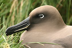


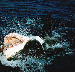


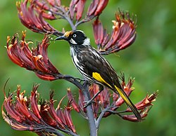

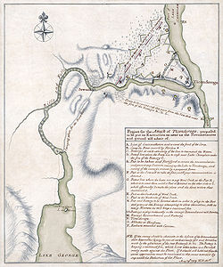


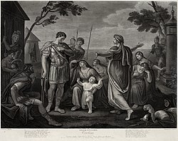
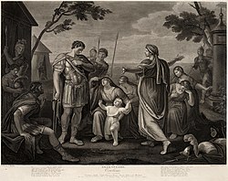


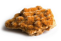


 Canadian victory bond poster in French. Depicts three French women pulling a plow. Lithograph, adapted from a photograph.
 The same poster in English, with subtle differences in text. The French version roughly translates as 'All the world can serve' and 'Let's buy victory bonds.'


.jpg)


