A very pleasant photo which illustrates the visual style of the Chinese Garden of Friendship. It is clear and colourful and is of much higher quality than the other photo in the article. It was taken by Greg O'Beirne (Gobeirne) earlier this year and is licensed under GNU Free Documentation 1.2.
Nominate and support. - Fipe 06:29, 23 September 2006 (UTC)[reply]
Oppose - poorly composed image, with too much distracting action on the side of the (off-center) main subject.--ragesoss 14:44, 23 September 2006 (UTC)[reply]
Oppose - the trees in the background distract the viewer from the main subject. --Ineffable3000 15:47, 23 September 2006 (UTC)[reply]
Oppose If the subject is the garden, then it is out of focus. If the subject is the statue, then the people next to it are distracting. HighInBC 16:39, 23 September 2006 (UTC)[reply]
Weak oppose. It's too busy; would a crop help? --Tewy 03:39, 24 September 2006 (UTC)[reply]
Oppose per HighinBC. Either it doesn't display the subject well or it needs recropping and highlight work for the statue. Staxringoldtalkcontribs 00:56, 25 September 2006 (UTC)[reply]
Not promoted --Fir0002 07:47, 3 October 2006 (UTC)[reply]
A photograph of a Nishi tribal taken during sunrise in Arunachal Pradesh. Appears in the Nishi article and another article depicting the people of the region. More information about the subject on the Image page.
Nominate and support. Preference for Janke's edit. - doniv 18:21, 23 September 2006 (UTC)[reply]
Strong support Wow, technically excellent, encyclopedic, good depiction of subject, and a funny hat! HighInBC 19:40, 23 September 2006 (UTC)[reply]
Support any version - slight preference for SG's or Janke's. Excellent portrait - good composition and quite an emotional image in addition to being encyclopaedic. Diliff | (Talk)(Contribs) 21:27, 23 September 2006 (UTC)[reply]
Support - Nice portrait. Iorek85 01:14, 24 September 2006 (UTC)[reply]
Support - getting my vote in before somebody shouts "OMG blown sky!!!!!111" - this is a superb, encyclopaedic and refreshingly human image; agree with Diliff about the emotional impact. --YFB¿ 01:52, 24 September 2006 (UTC)[reply]
Weak support — either edit. Blown sky!!!!!111 ;-). I'd strong support with a better exposure. --Tewy 03:35, 24 September 2006 (UTC)[reply]
Why do people care about blown highlights so much? For example, what information would otherwise appear there? A shallow gradient of sky color? Debivort 08:30, 24 September 2006 (UTC)[reply]
I completely agree with you there. There are times when blown highlights can ruin a landscape image, but I generally think it is not nearly as important as people suggest. Sometimes it is literally impossible to avoid SOME blown highlights and still capture a specific scene. Sometimes selective overexposure/underexposure actually helps you to isolate a subject, in the same way that good composition does. Diliff | (Talk)(Contribs) 09:28, 24 September 2006 (UTC)[reply]
People care about blown highlights because they are a distracting flaw in most photographs that contain them. You might consider the information that would otherwise appear there unimportant, but that doesn't mean the blown areas aren't distracting. Blown highlights were almost nonexistent when 95% of all photographs were taken on negative film, and the 5% that were taken on slide film were shot by working pros who were careful about overexposure. Now the majority of photos seen on the web are shot with digital cameras, which react to light more like slide film - easy to overexpose and a narrower dynamic range than negative film to begin with. I don't think the presence of a few 255, 255, 255 pixels necessarily means a photo can't be featured. It's when those pixels are an obvious distraction to me that I oppose an image because of them. -- Moondigger 12:36, 24 September 2006 (UTC)[reply]
I do see your point, and I agree with much of it, but its the idea of what constitutes an obvious distraction that there is some subjectivity in, I guess. For example, while I wouldn't nominate this image for FPC by any means, I don't feel that the very obviously blown highlights in the background truely distract that much. Yes, you notice them, but since the background isn't the focus of the image, it isolates the foreground and thats what I was refering to previously. Diliff | (Talk)(Contribs) 12:51, 24 September 2006 (UTC)[reply]
The image smoothly gradiates into a small band of overblown sky near the horizon. I think it looks good. HighInBC 13:49, 24 September 2006 (UTC)[reply]
Support beautiful, top notch quality --
PlaneMad|YakYak 08:02, 24 September 2006 (UTC)[reply
support per above. Debivort 08:30, 24 September 2006 (UTC)[reply]
Neutral. This is indeed a great portrait, marred by the gigantic swath of blown pixels across the center. My first thought upon seeing this image was, "nice portrait, too bad about the background exposure." The viewer's attention should be on the subject of the photo, but even folks who supported this image have to admit they were at least temporarily distracted by the blown area. That said, the portrait is so good that I can't oppose - so I'm Switzerland on this one. -- Moondigger 12:36, 24 September 2006 (UTC)[reply]
Oppose. I don't like the angle much, and I cannot possibly support something with so many blown highlights. Clearly I'm the only person that feels this way, but the image isn't very striking for me. --Pharaoh Hound(talk) 12:44, 24 September 2006 (UTC)[reply]
Oppose as per Pharaoh Hound. --mstroeck 14:05, 24 September 2006 (UTC)[reply]
Support for me, the quality of the image in the foreground completely makes up for any blown highlights, especially as those highlights seem to be an area around the setting sun. The head is practically a silhouette but still contains amazing detail in the face and clothing. Blow a few highlights if you must. --Bridgecross 15:16, 24 September 2006 (UTC)[reply]
Comment - I could have uploaded this photo, but it wouldn't have been encyclopaedic. With a sunrise in the background, there are bound to be blown highlights. But for portraits, I think it sometimes accentuates the subject. I do agree that the blown highlights are distracting in the FPC image, and was hesitant to nominate it. But then I thought it was a great portrait too. doniv 18:07, 24 September 2006 (UTC)[reply]
Oppose IMO it doesn't show the subject clearly. The highlights are very distracting because they are on the ecuator of the picture and with that angle i have a hard time figuring out how that headwear is suppoosed to look. Very artistic, but not very encyclopedic.Nnfolz 18:49, 24 September 2006 (UTC)[reply]
Support Great photo, and remember people the subject is the headdress, not the particular person (not a bio photo). Staxringoldtalkcontribs 00:53, 25 September 2006 (UTC)[reply]
Oppose. If the subject is supposed to be the headdress, it does not show it clearly at all. And the photo itself hurts my eyes a bit.--DaveOinSF 02:15, 25 September 2006 (UTC)[reply]
My oppose vote applies to all three versions now on this page.--DaveOinSF 19:44, 29 September 2006 (UTC)[reply]
Support — Incredible detail! Even with the bright sky, I still support this photo. However, I've uploaded an edited version to make the sky easier on the eyes, though I support any version. ♠ SG→Talk 03:48, 25 September 2006 (UTC)[reply]
Support. per Diliff and others Mikeo 07:16, 25 September 2006 (UTC)[reply]
Support original my edit... ;-) Blown highlights - Duh! - he's looking into the sunrise! That gives a nice lighting effect on the face. Here, the 255-255-255 pixels are a plus, not a minus. --Janke | Talk 15:36, 26 September 2006 (UTC)[reply]
Sunrises don't have to be blown -- in fact, they look far better when they're not. -- Moondigger 15:51, 26 September 2006 (UTC)[reply]
Sure, but the subject here is not the sunrise. Had the exposure been for the sky, the face would have been a silhouette. Fill flash would have destroyed the feeling - the solution is perhaps a white or sivered reflector card, say 2 by 2 ft, but who carries something like that around all the time... --Janke | Talk 07:54, 27 September 2006 (UTC) PS: Uploading a lightened version for those who think original is too dark. I used only the Curve adjustment, which means the highlights aren't affected. --Janke | Talk 08:05, 27 September 2006 (UTC)[reply]
A proper background exposure for a portrait, however difficult it might be to obtain, is an important factor in what separates a good portrait from a great one. An off-camera shoe cord and a flash positioned to the left for fill would have done it, and it would have still looked as if the sunrise was the light source for his face. A reflector to the right (behind the subject) would have provided some needed light on the headdress. This is an excellent, moody image if we consider only the man's face. But the lack of fill lighting for the headdress and the overexposed background prevent me from supporting the image. I'm not opposing, but I'm not supporting either. -- Moondigger 12:41, 27 September 2006 (UTC)[reply]
Support Janke's edit. Very encyclopedic, nice hat, good detail if the sky is ignored, which is supposed to happen as it is not the main subject |
Comment - To all those who have opposed this on the premise of the subject not being clear, let me clarify that it covers all the elements. The
monkey hair, the brass skewer through the hair bun and the cane weaving. As for the lighting, it's taken care of by Janke's edit - do check it out at full size. Please do explain if it still isn't encyclopaedic - doniv 16:58, 30 September 2006 (UTC)[reply
]
Well, I'm glad you pointed out what's supposed to be in that picture, because I sure can't tell... --DaveOinSF 06:47, 1 October 2006 (UTC)[reply]
The above description has been along with the image all the time. Also, if you could tell what these elements are at first glance, there would be nothing unique about them, no? Exactly the reason why people brave non-existent roads, nature and spend a lot of time to get such images - doniv 07:09, 1 October 2006 (UTC)[reply]
No, I'm saying that I cannot tell what part of the photo is the headdress and what part of the photo is the woman's hair. It's very unclear.--DaveOinSF 08:20, 1 October 2006 (UTC)[reply]
It's a man! Actually I'm surprised about what you said, since the headdress is the half-cup cane woven part. His hair is black with white streaks. The bun up ahead is tied up with string. Anyone else facing this problem? Or are you pulling my leg? doniv 09:16, 1 October 2006 (UTC)[reply]
Weak Support Edit 2 - Good photo but doesn't make me think WOW! Arad 02:35, 1 October 2006 (UTC)[reply]
Help! - It's been over 7 days, and there is an FP consensus. But I'd prefer to go with Janke's edit on this one. Unfortunately, I don't know the procedure. Can someone help or tell me what needs to be done? doniv 05:25, 3 October 2006 (UTC)[reply]
Promoted Image:Nishi_tribal_lightened.jpg It seems to be the consensus --Fir0002 07:53, 3 October 2006 (UTC)[reply]
Kings Creek in Lassen Volcanic National ParkEdit 1 - Fixed what was fixable. Downsampled (happy now?), and lightened (that was actually a reasonable suggestion). Of course it still has the unsurmountable stigma of uneven polarisation. Sorry I just couldn't do better.Edit 2 - Separately corrected the sky with a gradient to compensate for the uneven polarisation
A panoramic shot of Kings Creek which appears in the Lassen Volcanic National Park article. The park, home to Mt. Lassen, a volcano which last errupted about 90 years ago, is a lesser known park in northern California, and its article was lacking a picture which truely conveys the magnificent landscape. Oh, and it is taken by me, so fire away.
Nominate and support. - Dschwen 17:34, 6 September 2006 (UTC)[reply]
Comment - won't vote yet, this is too dark on my calibrated monitor. Needs some curve or level correction, to remove the "sooty" feeling from the greenery. Some downsampling would be nice, too - a teeny bit fuzzy in full size... --Janke | Talk 19:23, 6 September 2006 (UTC)[reply]
I don't get the downsampling. Too fuzzy at full size? Don't look at it in full size! Downsampling always looses information. Always! If anyone needs a downsampled version, its no big deal, create one, but why replace the original with a downsampled picture? --Dschwen 19:27, 6 September 2006 (UTC)[reply]
Oppose Way too dark on my CRT monitor - Adrian Pingstone 20:52, 6 September 2006 (UTC)[reply]
Support It does not look dark on my laptop monitor. I looks like a great picture. HighInBC 22:47, 6 September 2006 (UTC)[reply]
Would support a lightened version. Great picture, and the overexposed snow isn't enough for me to oppose. Plus it's so difficult to not overexpose the snow. --Tewy 23:15, 6 September 2006 (UTC)[reply]
Will support if someone brightens it.Nnfolz 00:38, 7 September 2006 (UTC)[reply]
Oppose for now. Way too dark on my calibrated monitor. I would change to support if a much lighter version was made available. --Nebular110 00:43, 7 September 2006 (UTC)[reply]
Oppose The image is dark on my monitor as well, and somewhat unsharp at full resolution. These might be adjusted, but the uneven polarization across the sky is nearly impossible to correct. The left side is significantly brighter than the right side. -- Moondigger 02:00, 7 September 2006 (UTC)[reply]
Which picture did you look at? Sorry, but this comment is just ridiculous. Slightly blurry maybe, I used a G3 to take the pics. But very blurry implies out of focus parts or motion blur, and the pic has neither. Look at the grass, is that blurry, no! --Dschwen 07:44, 7 September 2006 (UTC)[reply]
Blurry - no, but soft - yes. You probably could have safely downsampled without losing much/any detail [Ah, I see you did, sorry]. Also, did you notice you have a horizontally recurring hot pixel/spec of dust in the sky near the top of the frame? Diliff | (Talk)(Contribs) 09:29, 7 September 2006 (UTC)[reply]
Uh oh, dead pixel, I totally missed it! --Dschwen 10:51, 7 September 2006 (UTC)[reply]
Oppose uneven polarization of the sky. Glaurung 05:44, 7 September 2006 (UTC)[reply]
Impossible to fix. And I've only seen this complaint cone befor, yesterday. Is this a new thing? --Dschwen 08:18, 7 September 2006 (UTC)[reply]
Well, uneven polarization has always been an aesthetic bugbear, which is why it is not recommended to use for wide angle/panoramic photography. Whether it is enough to oppose the photo all depends on the extent of the polarization and the way it affects the sky. Hazy skies are not affected as much and the effect is minimal. Diliff | (Talk)(Contribs) 09:29, 7 September 2006 (UTC)[reply]
Support Edit 1. Downsampled image is still high resolution and alleviates most of the faults, but you're right, the polarization is not really fixable. Diliff | (Talk)(Contribs) 09:33, 7 September 2006 (UTC)[reply]
Comment; Sure it is fixable - I'd do it, but I'm busy building steam trains in my workshop now... But, here's how to do it in Photoshop: Use the selection tool with a suitable value, additively select several spots in the blue sky. The, use "select similar", and the whole sky and is selected. After that, you can use an adjustment level or other tools such as gradients to lighten the darker portions of the sky... Greetings, --Janke | Talk 11:56, 7 September 2006 (UTC)[reply]
I think there'd be a better chance of success (more natural looking) if the sky was adjusted with a new layer and a layer mask using the gradient tool on the mask itself. I said it was nearly impossible to fix uneven polarization in my previous comment -- and that's usually true for most images. But given the large, uninterrupted blue expanses in this one, it stands a better chance of success. I could give it a try later on... -- Moondigger 14:58, 7 September 2006 (UTC)[reply]
Well, ok, it is, in theory, fixable in the same way that you can fix a landscape blemished with power lines by removing them. ;) To use a gradient means falsifying the sky by guesswork... I'm not saying I'm completely against the idea in theory, but usually you would end up flattening the sky, removing cloud texture and random variations. As moondigger said, it is as a general rule unfixable but you do have options. Diliff | (Talk)(Contribs) 15:53, 7 September 2006 (UTC)[reply]
"To use a gradient means falsifying the sky by guesswork..." Not if you apply the gradient to a layer mask over a sky which has merely been levels-adjusted, which is why I suggested it. The analogy to removing power lines is applicable to Janke's method, but not to mine. Mine uses the actual sky captured in the image, including minor variations and cloud texture, and does nothing more to it than levels-adjust it. Then we vary the transparency of the layer mask using the gradient tool, such that the levels are unaffected on one side of the sky but progressively adjusted across the sky to the other end. The trick (and the primary problem, really) is making the layer mask adjust at an inverse rate to the change in the sky due to polarization. For many images with uneven polarization, the rate of change is not regular, and the gradient tool cannot simulate the proper rate of change on the layer mask. In those cases the only solution is to just select the entire sky and replace it with the sky from another image or with a paint-bucket dump of sky blue color. But doing something like that is no solution at all IMO, for the reason you mention -- it's akin to changing the actual content of the image rather than simple brightness/contrast adjustments of what's there. This image looks as if it might lend itself to the layer mask method. -- Moondigger 17:27, 7 September 2006 (UTC)[reply]
By mentioning gradients, I didn't mean you should dump a blue greadient over the sky, no, no, use the gradient as a tool (you can adjust the linearity of it, so a good match can be achieved), for masking (or whatever) the original sky. I don't want to spend an hour or more on it, but it can be done, I bet. --Janke | Talk 18:40, 7 September 2006 (UTC)[reply]
Thanks for the clarification. However, even though you can adjust the linearity of the gradient you apply, I believe the change still has to be mathematically "regular" -- either linear or logarithmic. If the uneven polarization is not regular (a possibility given the fact that this is a stitched pano), even small imperfections in the layer mask gradient will be visible. -- Moondigger 18:56, 7 September 2006 (UTC)[reply]
I'll try the following: Creating a layermask by subtracting red and green channel from the blue channel and adjusting curves (Yields a sky only mask). Then applying a gradien on the mask (from left to right, modulating the mask transparancy) and and adding the unbrightened sky to the brightened image using the aforementioned layermask. This should preserve structure while reducing the polarisation effect. Stay tuned. --Dschwen 20:31, 7 September 2006 (UTC)[reply]
But let me mention that I actually like the gradient in the sky... --Dschwen 20:32, 7 September 2006 (UTC)[reply]
Uneven polarization in the sky can be an interesting effect sometimes, but doesn't represent what skies actually look like when you're viewing the scene in person. It is almost universally frowned upon by professional photo editors, even if it isn't mentioned here often. -- Moondigger 20:58, 7 September 2006 (UTC)[reply]
Oppose Per above. If a version eventually address the polarization I might change my vote. But Edit 2 doesn't. --Fir0002 12:20, 9 September 2006 (UTC)[reply]
Great, I whish I'd have been told before I wasted my time editing it. Sorry, but this is just ridiculous. Thanks for the constructive input, but if even edit 2 doesn't satisfy the new fad I withdraw the nomination. It's a slap in the face if on the same page pictures with worse issues get nothing but support.
Many featured pictures of this, I know, but I feel like this particular angle shows the mallard's face in a different fashion from the others. Staxringoldtalkcontribs 22:01, 25 September 2006 (UTC)[reply]
Nominate and support I should probably do this, as noted by Arad. Staxringoldtalkcontribs 22:49, 25 September 2006 (UTC)[reply]
Weak Support I love the photo but i think it lacks something. Maybe it's those little blown highlights or the focus? I'm not sure but still it's a good photo. By the way aren't you going to support your own nomination? (And i hope your not going to strike my weak. :-D) Arad 22:08, 25 September 2006 (UTC)[reply]
Oppose Blurred feet, as much shadow as duck. HighInBC 22:23, 25 September 2006 (UTC)[reply]
The feet are not blurred in the original, but I couldn't find an effective way to balance the background blur (so you didn't focus on the grass) with the feet (so there weren't these blocks of focus surrounded by out of focus grass). If I gave you the original, think you could give me a better idea? Staxringoldtalkcontribs 22:49, 25 September 2006 (UTC)[reply]
Oppose. Sorry, the large shadow really ruins it for me. Stephen Turner (Talk) 22:37, 25 September 2006 (UTC)[reply]
Oppose. Head isn't in focus (and that's what is being portrayed), poor angle, DOF, blown highlights. --Tewy 03:30, 26 September 2006 (UTC)[reply]
Oppose per all above, but mostly the poor DOF. This shot should not have required an unusual aperture setting, since the duck is not in motion and it's not low light. No reason for the feet to be out of focus. This in spite of it being a really cool duck (it's at UConn=defacto cool). --Bridgecross 13:58, 26 September 2006 (UTC)--160.79.219.133 13:56, 26 September 2006 (UTC)[reply]
The Answer to The Ultimate Question Of Life, the Universe and Everything
, I feel that this picture is way beyond qualified to be a Featured Picture.
Nominate and SupportTomStar81 (Talk) 02:15, 27 September 2006 (UTC)[reply]
Oppose I'm as big a fan of Douglas Adams as the next guy, but... you've got to be kidding. --Paul 02:48, 27 September 2006 (UTC)[reply]
Oppose This IS a joke, right? Arad 03:15, 27 September 2006 (UTC)[reply]
Yes, this is a joke. There is no way that this will pass, and I knew that when I placed it here. Still, though, it is good for a cheap laugh (and I really need one right now ;) TomStar81 (Talk) 06:17, 27 September 2006 (UTC)[reply]
Support opposition! In all honestly, the image could easily (and should) be converted to SVG format. ♠ SG→Talk 04:48, 27 September 2006 (UTC)[reply]
Oppose 42?? Well, everybody knows that is is what you get when you multiply 6 by 9! Glaurung 06:07, 27 September 2006 (UTC)[reply]
Oppose 6*9=42? It does in base 13 I guess. I feel this subject is better depicted using the 2 bytes 4 and 2. HighInBC 13:59, 27 September 2006 (UTC)[reply]
But then you don't get the cool crepuscular ray effect. ;-)
Oppose. I do hope this is a joke. NauticaShades(talk) 17:32, 27 September 2006 (UTC)[reply]
speedy close We don't like base thirteen around here. Night Gyr (talk/Oy) 18:24, 27 September 2006 (UTC)[reply]
You are going to get lynched, d'you know that? Spot the obvious mistake and I'll give you a wikicookie. Answers on a talk page, please. —Vanderdecken∴ ∫ξφ 09:51, 28 September 2006 (UTC)[reply
]
Well.... Base seven is much more fun, if you ask me...but at least the picture is blue... --Tewy 04:17, 29 September 2006 (UTC)[reply]
Strongly Oppose Shouldn't this be removed as even the nominator has said it is a joke? And what's Base 13? |
I first saw this image when I was looking for a picture of a Long Island Rail Road train to replace the one that had been at the top of the Long Island Rail Road article (Image:LIRRtrain.JPG). It immediately struck me as the perfect picture for the article. It provides an excellent visual, since it's a clear, direct shot of an LIRR train. But it also struck me as a great piece of photography. The scene is very serene and quiet, a quality I like in a picture. The color balance is exceptional; the yellow strip on the platform compliments the shade on the side of the train perfectly, and combined with the dark blue sky and the red light on the back of the train, it makes the image stunning.
It's also used on the page describing the type of train it is, an M3 (M1/M3 (railcar)) made by the Budd Company. Photos are especially important in articles like ones about train cars because description often isn't enough, and this picture is a perfect illustration of an M3 car. It's also used in the Budd Company article as an example of a car made by them.
When I found the image, it was licensed as "Non-Commercial," so I glumly began to look for another, but there was absolutely no image anywhere of anything approacthing this quality. So, I emailed the person who took the picture, Eugene Wei, and he happily cooperated and changed the license to what it is now.
Nominate and Support per above. Robert 05:21, 27 September 2006 (UTC)[reply]
Oppose. Even though I'm a train buff myself, I find nothing in this image making it special. You need a "wow factor" for a FP, and this shot, even thoug nice, hasn't got it. --Janke | Talk 07:10, 27 September 2006 (UTC)[reply]
Oppose per Janke. -- Moondigger 12:46, 27 September 2006 (UTC)[reply]
Oppose per Janke, and quality, size issues. --Bridgecross 14:24, 27 September 2006 (UTC)[reply]
Comment The image meets the Wikipedia criterion for
resolution for a featured picture - it is exactly 1,000 pixels wide. Robert 01:09, 28 September 2006 (UTC)[reply
]
Comment This isn't just a matter of numbers. The size requirement is in place to ensure that images capture sufficient detail to portray their subject well in a reproduction. This image doesn't show a lot of details, and that isn't helped by the low resolution. Night Gyr (talk/Oy) 02:23, 28 September 2006 (UTC)[reply]
Oppose, grainy and not showing much detail, which isn't helped by the low resolution. Night Gyr (talk/Oy) 18:22, 27 September 2006 (UTC)[reply]
Oppose per Janke SOADLuver 01:19, 28 September 2006 (UTC)[reply]
Oppose Unacceptably grainy, for an example have a look at the front window with the wiper on it (on the largest pic) - Adrian Pingstone 14:38, 28 September 2006 (UTC)[reply]
Oppose. Well below resolution requirements, and oversharpened. -- Moondigger 12:28, 27 September 2006 (UTC)[reply]
Oppose. Too small for FP. Find a larger, better version, and I'll support. --Janke | Talk 12:29, 27 September 2006 (UTC)[reply]
Oppose Far to small. HighInBC 14:00, 27 September 2006 (UTC)[reply]
Oppose nice photo but per all above oppose. --Bridgecross 14:23, 27 September 2006 (UTC)[reply]
Oppose. It is unfortunately too small. I really like this image otherwise, though. NauticaShades(talk) 17:43, 27 September 2006 (UTC)[reply]
Oppose To small to be a featured image, I personally believe. SOADLuver 01:18, 28 September 2006 (UTC)[reply]
Oppose - sorry, too small. If you can find a higher res version, I'd happily support it, it's very encyclopaedic. —Vanderdecken∴ ∫ξφ 09:36, 28 September 2006 (UTC)[reply]
Oppose - lovely photo but it's too small to be an FP. - CountdownCrispy(? 18:47, 1 October 2006 (UTC)[reply]
A great picture that exemplifies both the breed Maltese and the rich diversity that is in the dog species.
Nominate and support. - [[--Tobyw87 00:01, 28 September 2006 (UTC)]][reply]
Oppose Nice doggy, but the photo is not encyclopedic. We'd need to see the whole dog in a pose that would add some significant information to an article - and this picture isn't in any! --Janke | Talk 06:47, 28 September 2006 (UTC)[reply]
Awww, he's so cute! OPPOSE!!! (per Janke) --Bridgecross 13:06, 28 September 2006 (UTC)[reply]
First of all the picture is in two articles. Dog and Maltese as a matter of fact. And secondly I think it adds a great deal to both of these articles because it really makes the breed appealing to individuals who have never heard of the breed or have not considered owning a maltese. Its up to you but I think its a great picture and perfectly encyclopedic. --Tobyw87 13:57, 28 September 2006 (UTC)[reply]
I cannot see that this image is in any article. Another version of it is (an uncropped image with a time stamp), so technically, this nomination is in error. Please replace the stamped image with the one you nominate here. --Janke | Talk 19:53, 28 September 2006 (UTC)[reply]
Oppose cute pic but, not encyclopedic. An "encyclopedic" image of a Maltese would show the entire body so that the chariciteristics of the breed could be seen. Bridgecross dont be a jerk. This is Tobyw87's 1st nom (AFAIK), no wonder we are running out of pics for the front page when people who submit pictures are treated like that. -Ravedave(help name my baby) 15:26, 28 September 2006 (UTC)[reply]
Oppose, with a heavy heart. Scores top marks in the cute factor, but it also looks like a cute head lying on the ground. Also, for reasons already stated, not encyclopaedic - doniv 17:27, 28 September 2006 (UTC)[reply]
Oppose cute dog but I don't think its featured image worthy Trashking 21:29, 28 September 2006 (UTC)[reply]
In all my months of using this site, I have not seen a picture that does a better job of capturing the moment of action, and I think it certainly meets and exceeds all the criteria in
Wikipedia:What is a featured picture?
.
Nominate and support. - Marvin 05:41, 28 September 2006
Oppose I realize that the blurriness reflects the motion of the animals, but the background is blurry too, e.g. the rocks, so the blur due to motion is harder distinguish. If the background were razor sharp, I might vote for an FPC that had a blurry primary subject. Debivort 01:22, 29 September 2006 (UTC)[reply]
Oppose per Debivort. In addition to the focus and blur issues, the color is not that dynamic or striking, and I have a feeling that the white balance may be off (things that may be correctable after editing).--Andrew c 01:41, 29 September 2006 (UTC)[reply]
Oppose per Debivort. This was shot at 1/40 second according to the metadata, and had to be zoomed in quite a bit as I don't believe the photographer would get too close to two fighting bears. A significant amount of blur can be attributed to motion of the camera during exposure. The image is also very noisy, probably due to underexposure, high ISO, or both. That would also explain the lack of vibrant color. This is an interesting image, but it doesn't have the technical quality necessary to be a featured picture, IMO. -- Moondigger 02:30, 29 September 2006 (UTC)[reply]
Oppose. Mostly because of the heavy blur. --Tewy 04:37, 29 September 2006 (UTC)[reply]
Oppose. Far too blurry even considering the subject matter. --Nebular110 20:55, 29 September 2006 (UTC)[reply]
Oppose Is this a joke? Sorry to sound rude but putting a pic of this quality up for FPC is just ridiculous - Adrian Pingstone 19:11, 30 September 2006 (UTC)[reply]
Oppose. Interesting subject but far too blurry. RFerreira 06:03, 3 October 2006 (UTC)[reply]
Comment. I was actually pretty close to the bears but I hardly knew how to use my camera so it turned out the way it did :) Thanks for nominating it though. Mackan 09:18, 5 October 2006 (UTC)[reply]
US Capitol Building at night, January 2006. A mosaic image of around 10 segments taken with a Canon 5D and 24-105mm f/4L IS lens. Author: User:MarklesDiliff
I feel the clarity of this image is stunning. Its content has immense historical value;
the image currently appears in the United States Capitol article. It was taken and uploaded by User:MarklesDiliff.
Nominate and support. —Aiden 16:50, 28 September 2006 (UTC)[reply]
Strong Support I think this is a flawless image that is defintely FI worthy. Blind14 19:57, 28 September 2006 (UTC)[reply]
Support Very clear image with lot of detail. SOADLuver 19:58, 28 September 2006 (UTC)[reply]
Support, spectacular level of detail, excellent illustration of the subject. Night Gyr (talk/Oy) 20:45, 28 September 2006 (UTC)[reply]
Comment. For the record, this was taken and uploaded by me, not Markles.. ;) Diliff | (Talk)(Contribs) 21:13, 28 September 2006 (UTC)[reply]
Support Nearly perfect image Trashking 21:28, 28 September 2006 (UTC)[reply]
Support very nice, though I can see a hair or similar on the bottom left sky area. chowells 22:08, 28 September 2006 (UTC)[reply]
You're right. Its probably dust on the sensor that I had missed cleaning. I can see a minor stitching fault on the right side, so I think I will try to re-stitch this weekend, and remove that dust blemish while I'm at it. Diliff | (Talk)(Contribs) 08:41, 29 September 2006 (UTC)[reply]
Strong Support Upon viewing at the highest resolution, I believe I can read the badge numbers of the officers on the Capitol steps! I was just in Washington this summer, and there is more detail in this photo than I was able to see in person. Outstanding. --Bridgecross 23:32, 28 September 2006 (UTC)[reply]
Support Diliff strikes again! Debivort 01:38, 29 September 2006 (UTC)[reply]
Strong support. Brilliant work. --Tewy 04:24, 29 September 2006 (UTC)[reply]
Support - Great image illustrating the building very well, and at a good moment. - doniv 04:32, 29 September 2006 (UTC)[reply]
Support. Those street lights (and the cell phone guy) are a bit disracting, but that can't be helped. NauticaShades(talk) 07:40, 29 September 2006 (UTC)[reply]
Strong Support Well, it's tilted about 1 degre, and is slightly right of center, I'm sorry Diliff, but I had to give this a Strong Support. |
Support - AAAH! Diliff Again?! I'm tired man, half of FPs are made by Diliff. He's creating a monopoly. I'm looking for flaws... AHA. Tha guy is really annoying on the bottom and there is also blown highlights. ;-). Good job. Arad 02:03, 30 September 2006 (UTC)[reply]
Haha, well actually Fir0002 is still beating me. I have 27 and he has 51 according to his page. Diliff | (Talk)(Contribs) 12:49, 30 September 2006 (UTC)[reply]
51 photos that he took himself or have nominated? Although Fir0002 has many amazing photos no one can really beat the quality of your pictures specially your panoramas. Arad 19:55, 30 September 2006 (UTC)[reply]
Support wow theres just so much detail! The corinthian columns on this thing are beautiful. IS IT LEANING...? that might want to be resolved? Looks like its dipping to the right. drumguy8800CT 07:27, 5 October 2006 (UTC)[reply]
As far as I can tell, there is no perceptible lean. Have you tried to actually measure the lean, or are you going by your own vision? Sometimes visual perception is flawed. Diliff | (Talk)(Contribs) 11:21, 5 October 2006 (UTC)[reply]
I haven't measured it, I just thought it looked like it. However, I was just showing your work to a friend and we noticed that there is a flaw in the stitching along the right side of the portico columns.. and into the wall to the right. (that is, underneath the pediment.. the main columns you walk underneath) drumguy8800CT 16:25, 5 October 2006 (UTC)[reply]
Photo showing the textures of a Snowdrift on the Long Mynd, ShropshireOption Two. Same Time Same Place! More of a wideshot!
This photo I took myself early on the 24th of February 2005. Taken on the Shropshire Hills or Long Mynd in England. I thought it would be a nice addition to the article on Snow and to add a bit more description to the Snowdrift stub. As I couldn't find any other images of snowdrifts on Wikipedia. I know the image has a bit of a blank foreground at first glance, but it shows the amazing texture of the drift, which appears to be piled up to the horizon, actually caught in the heather. I took the photo squatting down to get a more interesting angle. The contrast with the dark sky I think its something else, as the sun was on the point of coming out at the time. I have two other photos as different options for nominations as 'snowdrifts' taken at the same place around the same time. If you wish to see them I will put them up as you ask. I thought it might also be a good idea to put a snowy nomination up for the impending northern winter :) !
I added the Second Option! Less texture in the drift itself, but slightly more interesting colouring. Grey blue snow? lol
Self Nominate and support. - Sean the Spook - See above!
Oppose. - Koolgiy 23:01, 29 September 2006 (UTC) Now i'm not being mean, or saying you stink at photography. But its not the most interesting of pictures. Try to get snow with a dramatic light like sunset, or something. Plus the cameras facing down, grey sky, and some noise on the picture.[reply]
NeutralOppose I like it, but it's not a great picture; the detail keeps me from giving it an oppose. Perhaps the other 2 are better? |
Oppose In principal, I like the idea of a low-contrast high-quality photo to illustrate snowdrifts. But it's remarkably hard to pull off. Maybe catch it in better light, with a higher resolution. --Bridgecross 00:34, 30 September 2006 (UTC)[reply]
Author Comment Thank you for your comments, I would just like to say the photos were indeed taken in a funny light, with an hour to go before sunset, cloudy etc. Its quite difficult to catch snow with the quality camera I have got, and with the conditions present at the time. Do you want to see Option Three? Sean the Spook 11:22, 30 September 2006 (UTC)[reply]
Oppose both. Uninteresting composition, subject not very well depicted. doniv 14:45, 30 September 2006 (UTC)[reply]
Oppose, it took me a bit to figure out what the subject was, uninteresting. -- Lego@lostRocks Collide! 20:06, 30 September 2006 (UTC)[reply]
Oppose both. The angle and composition are good, but both are grainy and slightly out of focus (probably because of the DOF). I don't think you need interesting lighting to display the concept of a snow drift; just an improvement on the technical aspects of the photograph. --Tewy 20:44, 1 October 2006 (UTC)[reply]
A few points about these photographs: They were taken in a funny light as snow reflects light back powerfully, without adjustable camera settings it is impossible to capture it with a perfect exposure. Also I dont think you realise just how rare snow in the British Isles can be, even on high ground in the winter. This not only shows a very rare sight in Britain, it shows it in its 'natural settings', maybe this coming winter, the natural settings will be completely in my favour. And in yours... Sean The Spook 18:57 2 October 2006.
Oppose both/either. Uninteresting. Photos like this have to be taken in superior lighting conditions to work, and these don't. --S0uj1r0 10:45, 3 October 2006 (UTC)[reply]
Photograph taken by Matthew Trevithick (Myself). Photo of a very red flower. If anyone knows what the flower may be called, would you please say. I'm no good with flowers.
Nominate and support. - Koolgiy 22:34, 29 September 2006 (UTC)[reply]
Oppose. Unexceptional image (albeit attractive enough), and unacceptable noise. --Dante Alighieri | Talk 22:45, 29 September 2006 (UTC)[reply]
Oppose... err. well, where do I start? The photo isn't actually in an article (which is a requirement), contains a very prominent watermark (which, while not against policy, is definitely frowned upon), it is not actually very sharp at all and is very noisy. The composition could also be improved by cropping the right side of the frame as does not contribute to the image but this would not really redeem it, unfortunately. This is an encyclopedia, and therefore images need to have encylopedic value. This one just doesn't - particularly as you are not even sure what sort of flower it actually is. Sorry. Diliff | (Talk)(Contribs) 22:47, 29 September 2006 (UTC)[reply]
Ah I stand corrected. I was refering to FPC policy not specifically prohibiting watermarks, but its good to see that Wiki takes a stand on it, too. Diliff | (Talk)(Contribs) 23:47, 1 October 2006 (UTC)[reply]
Comment. You have a good point. I'll take a picture, relevant to an article. And I won't put a watermark on if i'm submitting a Featured Image. Is there noise? Koolgiy 22:49, 29 September 2006 (UTC)[reply]
Yes, there is quite a lot of noise (like film grain, a speckled texture most visible in the background). And I wouldn't put a watermark on any image you put on wikipedia.. It detracts from the photo and since you're releasing it to the public domain, anyone can do whatever they like with it (including removing the watermark if neccessary), so trying to retain attribution is a bit pointless. :). Diliff | (Talk)(Contribs) 23:26, 29 September 2006 (UTC)[reply]
If you view it in full, its actually a very sharp picture. And ya, but I don't want people stealing images by me, so I put the watermark on. It's happened before, and that's why I have started. Koolgiy 23:36, 29 September 2006 (UTC)[reply]
Hang on - you don't want people "stealing" your images, yet you've released them into the public domain? Do you understand the problem with what you've just said... If you don't want people "stealing" you're pictures, don't release them under a free license. If you don't want people using them without attribution, or claiming them as their own, use a cc-by or similar license. If you still insist on watermarking all your images, then please don't upload them to Wikipedia - we don't want them. ed g2s • talk 09:17, 30 September 2006 (UTC)[reply]
That's inaccurate and, frankly, quite rude. Wikipedia will gladly take watermarked images. In almost all cases the watermark can be removed if need be. --Dante Alighieri | Talk 08:47, 1 October 2006 (UTC)[reply]
Oppose Diliff has said it all - Adrian Pingstone 23:08, 29 September 2006 (UTC)[reply]
Comment I think I'll take this off before people start to make me feel like I suck. Koolgiy 23:12, 29 September 2006 (UTC)[reply]
How about this instead: Please only provide contructive comments below. Then when the nom runs out it will be closed. Good? -Ravedave(help name my baby) 00:51, 30 September 2006 (UTC)[reply]
You can see exiting featured pics for flowers at
Wikipedia:Featured_pictures_visible#Plants_2. Now that this came up I am actually studying them myself as I could use some work with my flower photography (see my attempt: Image:Starflower.jpg, which has blown highlights). -Ravedave(help name my baby) 00:58, 30 September 2006 (UTC)[reply
]
Comment - It's a
carnation - doniv 16:33, 30 September 2006 (UTC)[reply
]
Actually, it's dianthus. I've grown dianthus and carnations several times, and this is unequivocally dianthus. --Pharaoh Hound(talk) 18:34, 30 September 2006 (UTC)[reply]
Oppose. I think Diliff has said it all. --Tewy 20:54, 1 October 2006 (UTC)[reply]
Oppose. Flower pictures have to be truly exceptional. Although the flower itself is well-displayed, the big yellow petals in the foreground and the background of the fence/gate are distracting. Plus, as has been stated before, it needs to be put in an article.
Oppose per above. Definitely too noisy. --S0uj1r0 10:46, 3 October 2006 (UTC)[reply]
Comment Ok then. So your all for nos then. I will take a better, sharper, and more high resolution picture of a flower or something, relevant to an article on Wikipedia. Koolgiy 13:57, 3 October 2006 (UTC)[reply]
A good photo of a fine animal. Illustrates it's article perfectly. And for those who are wondering, this was taken on a slope, and yes it is straight!
Support Self Nom. --Fir0002 06:14, 29 September 2006 (UTC)[reply]
Oppose Sorry, all the junk in the picture kills it for me. --Janke | Talk 07:20, 29 September 2006 (UTC)[reply]
Weak Support. I'll have to disagree wiht you on that, Janke; I really don't find it distracting. The reason for my weak support is the strage angle the goat is taken at (and how it casts a shadow on itself). NauticaShades(talk) 07:50, 29 September 2006 (UTC)[reply]
Comment. I don't mind the strange angle of the goat, but I do find that the composition is a bit lacking. The elements on the right (other goat, farm equipment etc) of the foreground goat aren't necessary and don't really add anything to the image (except the concept that domestic goats tend to congregate in groups and live on farms, I suppose). Diliff | (Talk)(Contribs) 08:53, 29 September 2006 (UTC)[reply]
Well if you don't mind me saying so, you've effectively made your commment on the composition redundant - those elements were necessary to show that it was a domestic goat for precisely the reasons you just mentioned. --Fir0002 12:06, 30 September 2006 (UTC)[reply]
I disagree, you don't need to show the environment to demonstrate that it is a domestic goat, but it could help. However, if in doing so, you make the composition unappealing, then that makes the benefits of context redundant for a FPC, as it is less likely to be supported. Diliff | (Talk)(Contribs) 10:47, 3 October 2006 (UTC)[reply]
Weak SupportOppose My only complaint is the shadow, aside from that, it's fine. |
Oppose - Harsh lighting, lack of subject highlighting, composition. doniv 16:38, 30 September 2006 (UTC)[reply]
Weak oppose - personally I like the unusual camera angle and the goat's pose, even with that slightly irritating shadow - it certainly stands out amongst FPCs which are sometimes manicured to the point where they lose their character. What spoils the picture for me is that odd building in the background and the other undesirable gubbins. - CountdownCrispy(? 18:38, 1 October 2006 (UTC)[reply]
Weak support. While the harsh lighting is distracting, I don't think it's distracting enough to prevent this image from becoming a FP. --Tewy 21:11, 1 October 2006 (UTC)[reply]
Oppose Heavily tilted according to the plank thingies behind the smaller goat. I know most voters here aren't bothered but leans annoy me a lot - Adrian Pingstone 18:52, 4 October 2006 (UTC)[reply]
If you'd read my initial description you'd have found out that this pic was taken on a hillside. That shed behind the goat is not straight - it is on the same plane as the hillside. The image infact is (near) perfectly straight --Fir0002 05:57, 5 October 2006 (UTC)[reply]
Aplogies for not reading the intro. I change my comment to "the apparent slope spoils it for me" - Adrian Pingstone 09:18, 6 October 2006 (UTC)[reply]
Oppose. Agree with Janke an doniv. --Dschwen 09:45, 6 October 2006 (UTC)[reply]
This is a page from "Little Nemo in Slumberland", which ran from 1905 to 1914. Winsor McCay was able to create sequential art that is still striking even a century later. This is a prime example of how he was a master of flat-color comics, and, above all, a master of form and composition.
Nominate and support. - Metabaron5 02:44, 29 September 2006 (UTC)[reply]
Weak oppose - I'd certainly support a good Nemo image; my problem with this one is the language - the text is not English (Dutch, at a guess). That implies that this copy was not published in the U.S., which could confuse the copyright status. Regardless of that question, McCay wrote in English; a featured image ought to be the original McCay work in English. Including a foreign version in the article is fine, to illustrate the spread of Nemo's publication, though this image needs more details on the source. --Davepape 03:40, 29 September 2006 (UTC)[reply]
Oppose, a featured image of a comic written in english on the english wikipedia should be in english. Night Gyr (talk/Oy) 04:00, 29 September 2006 (UTC)[reply]
Oppose Agree with above. (Yes, it's either Dutch or maybe Afrikaans? Can anyone say for sure?) --Janke | Talk 07:24, 29 September 2006 (UTC)[reply]
Comment It is Dutch (except for the title). The expiry term for copyright is 70 years in the EU as well. Preslav 12:22, 30 September 2006 (UTC)[reply]
Weak oppose. If the language of the original comic was English, then an example of the comic should also be in English. However, it's not a bad image in technical merit. --Tewy 21:21, 1 October 2006 (UTC)[reply]
Washington Crossing the Delaware - George Washington's army crossing the Delaware River
Although not the highest quality of picture I think the historical significance makes this image Featured Images worthy.
Nominate and support. - Trashking 01:10, 29 September 2006 (UTC)[reply]
Oppose - relatively small, heavy moire due to low-res image pre-scan? Debivort 01:27, 29 September 2006 (UTC)[reply]
Oppose, fails resolution requirement, we should be able to get a better version of such a major image. Night Gyr (talk/Oy) 03:06, 29 September 2006 (UTC)[reply]
Weak oppose, on the grounds that a better scan may not be available. But if there are larger, better images out there, i.e., better nominees, then I oppose. --Tewy 04:34, 29 September 2006 (UTC)[reply]
Weak Oppose. This picture deserves a better scan. NauticaShades(talk) 07:45, 29 September 2006 (UTC)[reply]
Oppose As this one is just under 1000 px, it shouldn't be impossible to get a larger/better version. BTW, didn't we have a couple of other versions nominated some time ago? --Janke | Talk 08:02, 29 September 2006 (UTC)[reply]
I agree with you, but after perusing Google I have found nothing bigger than this one (except a reproduction). NauticaShades(talk) 17:06, 29 September 2006 (UTC)[reply]
CommentSupport as per SOADLuver. These are the same objection I got when I nominated the painting, and as you said this is as big as it gets. Its really to bad, this definatly deserves to be featured. TomStar81 (Talk) 20:44, 29 September 2006 (UTC)[reply]
Support One of the most signifcant images in American history in my opinion.It's as big as it gets.Get use to it.SOADLuver 20:47, 29 September 2006 (UTC)[reply]
What are you talking about? The original is 149inches by 255 inches. It is *not* as big as it gets. -Ravedave(help name my baby) 01:31, 30 September 2006 (UTC)[reply]
No it is the biggest available.If you can get a bigger scan than do so.SOADLuver 02:03, 30 September 2006 (UTC)[reply]
"biggest on the internet" != biggest available. Night Gyr (talk/Oy) 05:40, 30 September 2006 (UTC)[reply]
Buy the poster and scan that.[1] This pics quality is too low, I can wait. -Ravedave(help name my baby) 15:45, 30 September 2006 (UTC)[reply]
How about his one?[2]Trashking 19:42, 30 September 2006 (UTC)[reply]
It's bigger, but I hate to say there are blown highlights... on a painting. NauticaShades(talk) 06:16, 1 October 2006 (UTC)[reply]
Appears to be a heavily photoshocked image... --Janke | Talk 06:43, 1 October 2006 (UTC)[reply]
Weak Oppose - I have to vote against this, but the resolution requirement is preventing me for supporting this. --ZeWrestlerTalk 15:07, 1 October 2006 (UTC)[reply]
Beautiful contrast between the twilight sky and the aircraft parked on the tarmac. Official USAF photograph (PD).
Included in
KC-135 Stratotanker
article.
ted the image.
Nominate and support. - rogerd 01:03, 29 September 2006 (UTC)[reply]
weak support - a beautiful image, but my enthusiasm only goes so far for several reasons 1) seems over-saturated, potentially as much of a data loss as blown highlights, 2) sodium vapor lighting looks very unnatural, almost as if the planes are actually yellow 3) I wonder if an image showing the American military presence in Afghanistan won't stir up the POV/NPOV issue. But to stay consistent with my stance in the Great Flying Spaghetti Monster Debate of 2006, I am voting on the image merits. Debivort 01:36, 29 September 2006 (UTC)[reply]
Weak oppose, like the F/A-18 below, it's very pretty but doesn't convey much information. There are tons of pictures of KC-135s out there that show it in natural light and even in action...so why use one that is rather blurry and grainy when looking at the plane itself? Night Gyr (talk/Oy) 04:01, 29 September 2006 (UTC)[reply]
Oppose. The colors are unnatural and don't show how the planes really look, and the overall image is grainy. --Tewy 04:26, 29 September 2006 (UTC)[reply]
A spectacular image of a Male Mallard duck in midflight. Particularly difficult because the duck is travelling towards the photographer, and therefore rapidly moving out of focus.
Nominate and Support --Fir0002 01:41, 26 September 2006 (UTC)[reply]
Support Good shot, tricky. HighInBC 03:01, 26 September 2006 (UTC)[reply]
Weak support. A little small, but I appreciate the difficulty. --Tewy 03:23, 26 September 2006 (UTC)[reply]
Weak oppose. I really don't like the pespective foreshortening, with the head "stuck tight to the body" - furthermore, the usual way of depicting/identifying flying birds is a side view (bottom view for preying birds), which would be more encyclopedic. Nice shot though, but not quite up to FP, IMHO. --Janke | Talk 06:37, 26 September 2006 (UTC)[reply]
You're thinking too narrowly...this picture is being used to illustrate Flight, as well as the duck itself.--DaveOinSF 05:57, 29 September 2006 (UTC)[reply]
Weak oppose. Per Janke. Additionally, it's somewhat grainy. --12:49, 26 September 2006 (UTC)
Support per Tewy --James 19:44, 26 September 2006 (UTC)[reply]
Oppose. The angle is too weird -- makes the duck's head look abnormally small.
Maybe the duck's head IS abnormally small :) Weak support by the way, per Tewy --Bridgecross 23:51, 26 September 2006 (UTC)[reply]
Weak Oppose - Tricky indeed. But the duck's position and the way it's flying (the wings) makes it look like a dead duck hung up to the roof by invisible wires. It lacks something for me, maybe because I find it unnatural. The blur, grain and the size doesn't help either. But as mentioned above, I appreciate the difficulty too. Arad 03:18, 27 September 2006 (UTC)[reply]
Kind of odd that you're calling nature in all its wonder "unnatural"...--DaveOinSF 06:01, 29 September 2006 (UTC)[reply]
Support I think it's definetly FP quality, and the bird's wings (if anything) show that flight isn't a perfect flapping of wings in unison to a beat. Staxringoldtalkcontribs 23:05, 28 September 2006 (UTC)[reply]
Oppose per Janke and Arad. I appreciate that it's a tough shot to take, but it doesn't feel like it's FA quality. --theSpectatortalk 01:12, 29 September 2006 (UTC)[reply]
Strong Support beautiful photo. Could be used in an article about the duck or even about flight itself.--DaveOinSF 01:37, 29 September 2006 (UTC)[reply]
Indeed it is. I didn't realize it when I wrote that comment, but indeed it is being used to illustrate Flight.--DaveOinSF 05:57, 29 September 2006 (UTC)[reply]
Strong Support Does picture perfect mean the same thing as perfect picture? In any case, this one is both! |
Support Not only the picture is high quality and must be hard to take, as Staxringold pointed out, it also shows an important detail of flight and demonstrates how nature is different from the idealizations in illustrations. at0 12:21, 30 September 2006 (UTC)[reply]
Support - Good illustrative photograph. The only thing that looks a bit unnatural to me is the bokeh. Is the photograph unmodified from the original? - doniv 15:07, 30 September 2006 (UTC)[reply]
Support - Howard? I'm starting to get pissed off. I just wanted to nominate this one too. It's obvious from the support that it got in Commons it'll probably be well supported here. Good job beating me again. ;-) Arad 22:01, 25 September 2006 (UTC)[reply]
Support Excellent, informative. HighInBC 22:25, 25 September 2006 (UTC)[reply]
Support Great way of showing how a zipper works. Lets you see what happens inside since it's a little hard in real life. OrfenUser Talk 00:07, 26 September 2006 (UTC)[reply]
Support — Excellent work! Hats off to DemonDeLuxe for another great image. ♠ SG→Talk 03:17, 26 September 2006 (UTC)[reply]
Support. Good colors, encyclopedic, and interesting. --Tewy 03:32, 26 September 2006 (UTC)[reply]
Support Very informative. --Janke | Talk 06:39, 26 September 2006 (UTC)[reply]
Support. Clear, detailed, and informative. NauticaShades(talk) 10:12, 26 September 2006 (UTC)[reply]
Support Clear and concise, makes you say "so THAT'S how a zipper works!" --Bridgecross 14:00, 26 September 2006 (UTC)[reply]
Support Very clear and illustrative. Nevit 18:20, 27 September 2006 (UTC)[reply]
Support, like the radial engine picture, it's exactly what a featured picture should be. Night Gyr (talk/Oy) 18:26, 27 September 2006 (UTC)[reply]
Support Very clear and informative. SOADLuver 22:52, 27 September 2006 (UTC)[reply]
Support Fantastic pic, congrats to whoever drew it - Adrian Pingstone 14:48, 28 September 2006 (UTC)[reply]
SupportWhen a problem comes along, you must zip it!TomStar81 (Talk) 20:54, 29 September 2006 (UTC)[reply]
Here's what I think: Besides letting time pass, the only two ways to get rid of a song that’s stuck in your head is to either (1) get a new one stuck in your head, or (2) to pass it on to someone else by singing it out loud. --Tewy 22:07, 29 September 2006 (UTC)[reply]
Support --Golbez 11:52, 1 October 2006 (UTC)[reply]
Support - very illustrative. --HappyCamper 11:12, 2 October 2006 (UTC)[reply]
Support per the above comments. RFerreira 06:04, 3 October 2006 (UTC)[reply]
Support. Good and informative. - Darwinek 08:36, 3 October 2006 (UTC)[reply]
Promoted Image:Zipper animated.gif --Fir0002 10:09, 7 October 2006 (UTC)[reply]
This is a double nomination: (1) nomination of Image:Flounder Camo md.jpg for Featured Picture status and (2) nomination of Image:Camouflage.jpg, a current Featured Picture, for delisting. Both are of the essentially the same topic (a sea creature camouflaged among rocks), but the upper one is of far better quality (photo by User:Moondigger). The lower one has a center composition, a distracting reflection above the cuttlefish, and some shadow in the lower left corner.
Nominate and support flounder pic. Delist cuttlefish pic.
Replace the current FP by the edit made by Arad. Support I wanted to nominate the same image by Moondigger as soon as I could and now I see Howard beat me to it. does it make a difference anyway? Good photo. Arad 21:54, 25 September 2006 (UTC)[reply]
Comment I hadn't spent any time working on this image before today -- I uploaded it because it seemed encyclopedic and useful to a couple of articles, but didn't pay much attention to sharpness, contrast, etc. When I discovered it had been nominated, I fixed it up a bit. Apparently while I was working on it, Fir0002 submitted an improved edit as well, addressing some of the same problems that I fixed. If Fir's doesn't look much different than mine now, that's only because we've both made edits. They're both improvements over the original version. -- Moondigger 02:49, 26 September 2006 (UTC)[reply]
Support either version, with a preference for mine. Suggest nominating the cuttlefish image for delisting separately in the regular Delist section. If not, I'm neutral on the delisting. -- Moondigger 02:49, 26 September 2006 (UTC)[reply]
Support my version - the purpose of the picture is to illustrate camoflauge, and the cuttlefish is clearly better camoflauged into the sand. Raul654 02:56, 26 September 2006 (UTC)[reply]
Comment - your image is already a featured picture. It's being nominated for delisting (i.e., to lose featured status), so a "Keep" vote is more appropriate than a "Support." People are being asked to decide on two separate questions here: 1. Do you support or oppose promotion of the flounder image to featured status? And 2. Do you want to delist or keep the cuttlefish image in featured status? Personally I'm neutral on the idea of delisting yours, and think it unlikely a consensus to delist it will be reached, whatever the outcome of my nomination is. -- Moondigger 04:00, 26 September 2006 (UTC)[reply]
After having gone through the lengthy "discussion" on Wikipedia:Featured picture candidates/Muybridgehorse, I suggest that the delisting of the cuttlefish picture be seperate from the nomination of the flounder picture. Therefore, I oppose the delisting on this nomination page. That should be left for individual consideration on a delisting page. However, I think the flounder image is FP material, so I will supportMoondigger's edit (the original nomination) on its sharpness, saturation, and encyclopedic value. --Tewy 04:21, 26 September 2006 (UTC)[reply]
Yeah, this was kind of a test case. Since we decided not to ban replacement nominations, I thought I'd test it with a similiar-themed replacement. Guess this was stretching the boundary a bit.
Support Moondigger's edit. Sharp, large, nice colors, and depicts camouflage very well. Abstain from the discussion on the delisting of the older FP picture. --theSpectatortalk 04:49, 26 September 2006 (UTC)[reply]
Support Moondigger's version, move delisting to its proper place - note that FPCs are independent of each other, and should be judged so, unless basically the same image - which these aren't. --Janke | Talk 06:41, 26 September 2006 (UTC)[reply]
Support New Image, Abstain On Delisting. I support either edit of the new image. The delisting of the old one should be seperated and moved down. NauticaShades(talk) 10:19, 26 September 2006 (UTC)[reply]
Promoted Image:Flounder camo md.jpg --Fir0002 10:09, 7 October 2006 (UTC)[reply]
support What is your subject? Denver or lightning? I cannot vote unless I know this. The image only appears in the Denver article, so if Denver is the subject I must oppose as Denver is not well depicted. However if this image was used on the lightning article, I would probably support it as lightning is very well depicted. HighInBC 16:06, 25 September 2006 (UTC)[reply]
Comment If this were used in the Climate section of the Denver article, I think that then it would be fine.--DaveOinSF 17:00, 25 September 2006 (UTC)[reply]
I was thinking Denver, so I updated my introduction. Either one would be appropriate. RoyalbroilTalkContrib 13:03, 26 September 2006 (UTC)[reply]
Support Moved to the "Climate" section of Denver per above (good idea!) and added to Thunderstorm. Staxringoldtalkcontribs 18:01, 25 September 2006 (UTC)[reply]
Support I was very pleased to have discovered this image at the commons. I think that it is well depicted and really just a cool photo in general. Editor19841 (talk) 23:18, 25 September 2006 (UTC)[reply]
Support. Not a bad representation of a lightning strike, but is it the best Wikipedia has to offer? I'm sure there are better lightning images out there. --Tewy 04:32, 26 September 2006 (UTC)[reply]
Support. When viewed at large, the dark buildings contrast the bright and striking lightning bolt.--theSpectatortalk 04:39, 26 September 2006 (UTC)[reply]
Support even though there are blown highlights ;-) Debivort 04:44, 26 September 2006 (UTC)[reply]
Weak Support. This is realively good quality and encyclopedic. However, I am sure that better lightning images exist. NauticaShades(talk) 10:23, 26 September 2006 (UTC)[reply]
Weak oppose. I like the image, but it neither illustrates Denver or Thunderstorm well. The best thing it illustrates is
Oppose both. Purple fringes on left mountaintop, not very sharp in full size. Panorama suffers from "3x255-syndrome" at right, i.e. overexposed, blown highlights. --Janke | Talk 15:40, 26 September 2006 (UTC)[reply]
Oppose both per Janke. Also, blown highlights are prominent in both images, not just the pano. -- Moondigger 15:57, 26 September 2006 (UTC)[reply]
Oppose both per above; mottled pixelation in sky, blown highlights on treetrunks. They are nice big pictures, but not so sharp. --Bridgecross 20:41, 26 September 2006 (UTC)[reply]
Oppose both. Per above; blown highlights are too big of a problem. Stitching is apparent in the sky of the second image. --Tewy 21:48, 26 September 2006 (UTC)[reply]
Strong support, especially for the panorama -- there's more to a picture than pixelation, guys. This picture is exceptional. Robert 06:07, 27 September 2006 (UTC) *[reply]
Except that the first two criteria for FP are specifically that; 1:high quality and 2:high resolution. Item 1 immediately mentions JPG artifacts and graininess in the first sentence. Agree that this composition is very nice, and in a higher quality would be an FP. --Bridgecross 14:33, 27 September 2006 (UTC)[reply]
Support first one, very good picture, even though some users believe there are some artifacts in the HighRes. -- Chris 73 | Talk 13:45, 28 September 2006 (UTC)[reply]
Weak Support I like the first one (the one on the top) better. Could have been better, but we are worse off not nominating it. |
Weak Support Both Very good picture. I like it a lot and specially since it's from Canada, it's even better. It's true a higher quality would have gain a full support. But the nominator forgot to mention that this also appears on the back of the old 1979 20$ bills of Canada. ;-) Arad 12:17, 29 September 2006 (UTC)[reply]
Yeah, exactly, 1978. I like the old bills better than the new ones. Arad 17:07, 1 October 2006 (UTC)[reply]
Support Purple fringes? There is a shadow there in the top image, and with the way ice and glaciers can reflect light, sometimes glaciers appear bluish and shadows can appear purplish. Does this image value to an article? This scene, as mentioned above, was once pictured on the Canadian $20 bill. It's an iconic scene, likely one that Banff National Park is best known for and adds a great deal to the article. The top image is high quality, with lighting that captures the reflections in the water. --Aude (talk) 20:36, 1 October 2006 (UTC)[reply]
The "purple fringes" are an artifact of the camera lens & CCD. Rahter common in highligts on low-end digital cameras (and some better ones, too). --Janke | Talk 12:42, 3 October 2006 (UTC)[reply]
bivalve Donax variablis show high variability in their shell pigmentation and patterning. This illustrates the concept of phenotypic variability, a perequisite for evolution by natural selection.Edit with background texture reduction.
I feel this is an aesthetic image that shows the diversity of form capable within a single species, a concept that is critical for evolution by natural selection. Plus, shells are pretty. The image appears in the Donax and phenotype articles. Shells collected, imaged and uploaded by me user:debivort
.
Nominate and support. - Debivort 02:16, 29 September 2006 (UTC)[reply]
Neutral. I really like the idea and it has great encyclopedic value, but there's too much noise in the picture for me to support. I may change my vote as input from other users comes in. --Tewy 04:31, 29 September 2006 (UTC)[reply]
Ah this is kind of interesting. I assume you are referring to the background. What looks like noise is actually texture on the surface I photographed them on (anodized aluminum). I'll make an alternative version in which the appearance of noise is reduced. Debivort 04:57, 29 September 2006 (UTC)[reply]
Abstain. I'd still like to see a little more noise reduction in the background. NauticaShades(talk) 07:47, 29 September 2006 (UTC)[reply]
Weak oppose. Good illustration of phenotypes. Yes, the original background "grain" is very distracting. The edit is better in that respect, but still suffers from there being too many shells, many look almost identical (especially in thumb size). I think a better image would contain only a few, say, four to six, very different shells, seen in much greater detail. I'd like to compare the striations and ruffled edges really close up! So, since you could do better, I give a No Go on this one... --Janke | Talk 08:26, 29 September 2006 (UTC)[reply]
What would you think if there were the same number, but the image was much larger, i.e. 3x larger on each axis? or does your concern about too many shells also arise in the thumbnail? Debivort 22:04, 29 September 2006 (UTC)[reply]
Weak Support Not bad, could be better per Janke. I'd say about ten shells would be good, six are too few (IMHO). |
All 20 types are pretty different. One possibility is treating a new version as a panorama - taking hardcore macro images and then stitching them together. Matching the backgrounds would become a problem though, and one might have to just set it to white, and make the thing more of an illustration. Debivort 18:58, 29 September 2006 (UTC)[reply]
Weak oppose I like the topic but for some reason the picture is meh. Is it just me or does it seem like its taken at a slight angle? Also can the lighting used be improved? there are reflectiosn on some of the shells. -Ravedave(help name my baby) 01:29, 30 September 2006 (UTC)[reply]
Doubt much can be done about the reflections. The shells are shiny, and I only have point sources. Doesn't seem like it's worth sinking much effort into a re-shoot. Does anyone think otherwise? Debivort
What are you using for lighting? Simple things like a bedsheet can be used to change lighting. -Ravedave(help name my baby) 15:42, 30 September 2006 (UTC)[reply]
Weak Oppose Subject is very nice and has good encyclopedic value, but the photo has problems. White background distracts from the subject. Something dark and diffuse would be better. Lighting is messed up by highlights: a diffuse source would probably help. Also, since there are no actual paired shells, don't present them arranged in pairs. If you could do a less slanted, more uniform grid that would be good. I encourage you to try again. Dgies 21:19, 3 October 2006 (UTC)[reply]
They are paired - inside and outside of same individual
Abstain on principle. I can't support it given the attempt at stealing the photo credit. If you are in fact, Photographer’s Mate Airman Apprentice Ricardo J. Reyes, then I apologize.
Your forgiven.Just remember to vote for me on the commons page (It's nominated now)Blind14 20:14, 29 September 2006 (UTC)[reply]
oppose. While a beautiful picture, it does not strike me as very encyclopaedic. Still a great photo though. say1988 00:45, 28 September 2006 (UTC)[reply]
thank you,but may I ask what you mean by "encyclopedic" Blind14 00:52, 28 September 2006 (UTC)[reply]
"Encyclopedic" roughly equates to pedagogical (educational) value. This seems to be a more artistic or impressionistic image. Something that is high on encyclopedic value but low on artistic value would be a well-drawn map, for example. Or a photo of a machine that clearly shows the working components -- boring, maybe, but highly educational. That said, many featured pictures have both. Personally, I'm still undecided on this one. -- Moondigger 03:53, 28 September 2006 (UTC)[reply]
Support Great picture all in all. Okay to all of the hardline "encyclopedic" image people... look the current picture of the day and tell me that it is not a lil artistic? Open your standards a bit. There are many awesome pictures out there that add to the value of wikipedia. Who cares if they are completly encyclopedic or not. As long as they are great pictures and add to the overall articles value. --Tobyw87 14:20, 28 September 2006 (UTC)[reply]
"Add value to an article and help complete readers' understanding of an article in ways other pictures in the article do not." From What is a featured picture
What does this picture add to the article? Sure it makes it look nice, but it has absolutely nothing to do with anything around its location in the article (it does nothing to show the speed required for takeoff or gliders). The picture of the 737 demonstrates the basic process of taking off better, so it doesnt pas this criteria. If fact I would say this image detracts from the article by distracting the reader from the subject at hand. This image was just stuck somewhere so it was elligable for FPC. say1988 00:27, 29 September 2006 (UTC)[reply]
Support Very impressive picture SOADLuver 01:06, 28 September 2006 (UTC)[reply]
Weak Oppose per Say1988. In addition, the plane and the deck are both too dark to make out any details, which I feel kinda detracts from the photo. TomStar81 (Talk) 03:25, 28 September 2006 (UTC)[reply]
Weak oppose, doesn't actually impart any information. Night Gyr (talk/Oy) 17:46, 28 September 2006 (UTC)[reply]
actually it does, it shows an airplane taking off of an aircraft carrier. Blind14 19:52, 28 September 2006 (UTC)[reply]
What do you know about a carrier launch after seeing that picture that you didn't know before you saw it?Night Gyr (talk/Oy) 20:33, 28 September 2006 (UTC)[reply]
Many things-
1.planes have wings 2.planes have an engine. So really you do get something out of this picture.So really this objection is incorrect. Blind14 21:03, 28 September 2006 (UTC)[reply]
Comment: I have doubts about the sourcing information on this image. Blind14 has claimed images that he obviously didn't take as his own work before. See Image:Loken03.jpg. Night Gyr (talk/Oy) 20:39, 28 September 2006 (UTC)[reply]
yes I forgot to nominate that for deletion.I couldn't find the copyright info and accidently put that tag on there, but I can promise you I did take this picture. Blind14 21:03, 28 September 2006 (UTC)[reply]
Support The darkness adds intrest and makes it unique in my mind.I also believe it's very "encyclopedic" (open your minds guys think outside the box maybe this isn't the best picture for description when it comes to a plane taking off of an aircraft carrier.It could show many things.C'mon this is an encyclopedia.)
P.S.If this user wanted to steal an image off a website just so he could nominate it here why would he pick this one?Trashking 21:36, 28 September 2006 (UTC)[reply]
WOW!Thanks!! Blind14 21:47, 28 September 2006 (UTC)[reply]
I suspect you did steal it.. from here. Given you have no respectable history, I can't say I believe you are the original photographer of this image. Diliff | (Talk)(Contribs) 22:08, 28 September 2006 (UTC)[reply]
I did take this picture, but since it is on that website I will change the copyright information.Blind14 22:19, 28 September 2006 (UTC)[reply]
It seems you have been caught in the act my friend lol Trashking 22:21, 28 September 2006 (UTC)[reply]
Oppose Cool image, but I agree with the above on it being non-encyclopedic, and let me explain why. If the subject is the plane, the picture is both far too dark and not currently used in a plane article. If the subject is the takeoff, you see almost nothing of the actual launching gear and the plane isn't even off the carrier. It either doesn't display the plane at all properly, or doesn't display the take-off. Staxringoldtalkcontribs 23:04, 28 September 2006 (UTC)[reply]
Support I can't tell if he did take this nice picture or not, but it's still worthy of FP status. |
Oppose. This is more like a still from Top Gun than an encyclopedic image. It has plenty of emotional power, but doesn't serve our purposes exceptionally well.--ragesoss 16:12, 29 September 2006 (UTC)[reply]
Oppose. This would do much better on Commons, try it there. On another note, I have nominated a more encyclopedic takeoff picture. NauticaShades(talk) 17:09, 29 September 2006 (UTC)[reply]
Support - I think this is encyclopaedic material since it depicts the following(do correct me if I'm wrong) - Afterburners, Take-off (assuming that the afterburners are pushing away), a carrier deck, the open ocean in front and an unmistakable F-18 silhouette. Plus, no harm looking like a Top Gun still - this is poster material, and I think the grain actually works in favour. - doniv 14:51, 30 September 2006 (UTC)[reply]
The F/A-18 is at such an angle that it doesn't really show what it looks like. Thetiny fraction of the flight deck visible is black and shows no detail. You can hardly tell the Ocean from the sky so you don't get a look at it. I don't think a still can really show a plane taking off very well. Maybe this picture shows afterburners working, but that would be much better shown from a greater angle. And when it comes to showing those things, it doesn't matter, as it is not in those articles. As for it being poster material: definately, but it isnt encyclopaedia material. BTW the earlier edit was by me, forgot to sign it. say1988 19:01, 30 September 2006 (UTC)[reply]
Nominate and support. - Mgiganteus1 16:30, 27 September 2006 (UTC)[reply]
Support. Outstanding. -- Moondigger 17:37, 27 September 2006 (UTC)[reply]
Support. Very encyclopedic. However, you might want to add to the caption a little bit. Much better. NauticaShades(talk) 17:45, 27 September 2006 (UTC)[reply]
Support. (What would you think of adding a scale to the image? I ask because the subject is foreign to most, the pic has a suitable background, and it would be "encyclopedic".) –Outriggr§ 05:05, 28 September 2006 (UTC)[reply]
Neutral, leaning towards weak support. Am I seeing blown highlights? ;-) Seriously, half a stop less exposure would have fixed that. --Janke | Talk 06:55, 28 September 2006 (UTC)[reply]
Preliminary Neutral - would support a version with a scale bar (and expanded caption). Debivort 22:02, 28 September 2006 (UTC)[reply]
Support nice pic. A scale bar would be ugly but a text description of the subject's size would be nice. -Ravedave(help name my baby) 01:35, 30 September 2006 (UTC)[reply]
Support - Very nice. - doniv 16:41, 30 September 2006 (UTC)[reply]
Support Excellent anatomical image. HighInBC 22:47, 6 October 2006 (UTC)[reply]
Promoted Image:Loligo vulgaris.jpg --Fir0002 23:58, 7 October 2006 (UTC)[reply]
Western GullAlternate version
A stunning photograph, both technically and visually, taken by Dschwen. It greatly illustrates the features of a gull's head. Do not oppose this photograph; you could potentially offend the birds
.
Nominate and support. - ♠ SG→Talk 05:25, 27 September 2006 (UTC)[reply]
Update: I've removed the caption; the red dot isn't the main purpose of the image, but rather the entire head. I've noticed that many people just nominate photos without captions at all. I try to have decent captions, but the one it had was the best I could come up with. I've also added the image to the Gull article. ♠ SG→Talk 17:11, 27 September 2006 (UTC)[reply]
Weak Support: great shot, though hardly unique, but certainly eye-catching. Robert 05:36, 27 September 2006 (UTC)[reply]
Weak Oppose. It is a very good image, but AFAIK it isn't used on any articles. If placed on an appropriate article I'll reconsider my vote. -- Moondigger 12:32, 27 September 2006 (UTC)[reply]
Weak Support for high detail and iconic image. -- Weak Oppose per Howcheng and Moondigger. The caption refers specifically to the red spot, an important feature on Herring Gulls Western Gulls for feeding their young. --Bridgecross 16:46, 27 September 2006 (UTC)[reply]
Oppose. Unfortunately the most important part of the picture, the spot, happens to be in the shadow.
Support The fact that this is a detailed,large,and nicely taken picture overshadows it's criticisms in my mind. SOADLuver 20:04, 28 September 2006 (UTC)[reply]
Support alternate only. It is much more encyclopedic and generally more interesting. NauticaShades(talk) 19:56, 4 October 2006 (UTC)[reply]
Support. Well.. ..if I may. If I wouldn't find both of them supportworthy I wouldn't have uploaded them in the first place. Too bad that somehow the discussion evolved around the red dot so much. Certainly not protocol to cram a second pic into the nomination either. And both pics appear in articles now, so what about that oppose from Moondigger? --Dschwen 09:49, 7 October 2006 (UTC)[reply]
That's largely my fault, as I made the caption. I've since removed the caption, as it was really useless and just distracting people from the photo. However, the above people who voted against because of the red dot caption haven't changed their votes, so I don't know. Anyhow, the other picture needs to be moved into its own FP nomination. ♠ SG→Talk 18:09, 7 October 2006 (UTC)[reply]
Oppose Obviously I'm probably biased, but I prefer the existing seagull FP to either of them. --Fir0002 23:21, 7 October 2006 (UTC)[reply]
Not promoted I renominated the second version seperately. --Fir0002 23:57, 7 October 2006 (UTC)[reply]
Earlier this year, I made an older version
of this animation (184x135px). The picture is used in
High speed photography
. It is Wikimedia Commons featured picture.
The old version was nominated here (Wikipedia:Featured picture candidates/Muybridgehorse). In the meantime I could get better copies, so I made a new version of the animation (300x200px) which I want to nominate. It can be used in the above mentioned articles instead of the old version. Here you can see the full size of both versions at the same time.
Muybridge's photos where taken between 1878 and 1887. The animation is made of 15 frames (nr. 2-16). Muybridge wrote that the exposure time he used for horses at full speed was between one six-hundredth and one eight-hundredth of a second each. The interval of time between successive exposures was 31 thousands of a second. As one sequence of 15 pictures takes about 1.5 seconds, the animation shows about 1/3 of normal speed.
Nominate and support. --wau> 20:55, 30 September 2006 (UTC)[reply]
Support. Immensely important historical photo series, well done gif animation, encyclopedic. You can't get a much better scan than this. (I assume this is from the printed plates in one of the books, and not the original photos.) --Janke | Talk 06:23, 1 October 2006 (UTC)[reply]
Support. It's nice to see this image nominated on it's own. It also much better quality than the smaller one, so this one gets my vote. NauticaShades(talk) 06:45, 1 October 2006 (UTC)[reply]
Support. Of high quality, historically significant, and encyclopedic. --Tewy 20:32, 1 October 2006 (UTC)[reply]
Support Per Tewy HighInBC 19:55, 6 October 2006 (UTC)[reply]
Support I am suprized this pic only got this many votes considering the raging debates we have had in the past over related images. -Ravedave(help name my baby) 05:48, 7 October 2006 (UTC)[reply]
Promoted Image:Muybridge_race_horse_animated.gif
B-1 Lancer
.
Nominate and SupportTomStar81 (Talk) 20:49, 29 September 2006 (UTC)[reply]
Weak Support. A tiny bit grainy, but the quality is otherwise pretty good, as is the encyclopedic value and pleasingness to the eye. You might want to expand the caption a bit however. NauticaShades(talk) 20:55, 29 September 2006 (UTC)[reply]
Weak oppose graininess, but mostly because I like the F16 take off picture below more, and it looks like it will reach FPC consensus. Why have there been so many military pictures recently? Debivort 22:07, 29 September 2006 (UTC)[reply]
First of all its an F-18, not an F-16. Secondly, our supply of military FPs sucks (to the extent that an FP can suck), and I for one am getting tired of having the same images rotate through the War Portal in a never ending cycle. In oder to get into the FP roation in the War Portal the image has to be featured, which means running it through here first and having the nomination(s) systamically torn apart by the viewing public. TomStar81 (Talk) 22:16, 29 September 2006 (UTC)[reply]
Sir yes sir! An F18 Sir! A more direct approach to this problem might be to relax the standards of the War Portal image rotation. Just a thought? I guess it is easy to find military pics in the public domain as well... Debivort 00:40, 30 September 2006 (UTC)[reply]
Why have there been so many flower bird pictures lately as well? There have been lots of nominations... Each should be judged on its own. -Ravedave(help name my baby) 01:15, 30 September 2006 (UTC)[reply]
Since beginning of September, there have been 3 nominations with flowers (one of which was primarily a picture of a bee), 5 military craft nominations, and about a dozen bird nominations. I think my question was legitimate. Debivort 02:52, 30 September 2006 (UTC)[reply]
Strong Support I love a picture with good coloration. Also, the altitude at which this was taken is astounding (or perhaps I should fly more often):-). |
Support Excellent pic, I love it - Adrian Pingstone 23:11, 29 September 2006 (UTC)[reply]
neutral, excellent technically, but I'd support an angle that shows a bit more of a side view/profile and shows the engines. The shape of the plane isn't quite clear from this angle. Night Gyr (talk/Oy) 02:45, 30 September 2006 (UTC)[reply]
Actually, I think the plane's shape is very visible here; maybe you meant the silhouette? From this angle, you can even see that the wings are expandable. |
Support - Excellent photograph, and very encyclopaedic as well. Would have strongly supported if the nose was lined up in the center. - doniv 15:04, 30 September 2006 (UTC)[reply]
Strong Support. Absolutely stunning quality, and very encyclopedic. By the way, it's taken by Diliff. NauticaShades(talk) 15:11, 29 September 2006 (UTC)[reply]
Comment Ah, yes, the master of photograghy; I suspected it was he. |
Oppose, blurry at full res. It's very nice, but we can do better. The lines of the blocks that make up the monument are very blurred when I look at it full size. Night Gyr (talk/Oy) 18:25, 29 September 2006 (UTC)[reply]
Oppose Nice photo, but kind of boring to me. Unlike the Capitol or Big Ben architectural images, the detail visible at high res isn't all that interesting to me. Debivort 19:04, 29 September 2006 (UTC)[reply]
Also, the sky seems way to dark at the top - is that a polarization effect? Debivort 19:05, 29 September 2006 (UTC)[reply]
I don't know about the polarization, but I think that this is the best possible picture of the Washington Monument. In other words, it would be hard to find a more encyclopedic photograph of it. NauticaShades(talk) 20:57, 29 September 2006 (UTC)[reply]
Hypothetica alternatives for the monument that I would consider more interesting could be a photo of it during construction showing building techniques of the time, or a diagram showing its interior design. Or a DC panorama taken from its observation deck. That said, of its exterior, this photo is about as good as I could imagine. Debivort 22:10, 29 September 2006 (UTC)[reply]
Not a polarization effect, just the twilight ambience. Diliff | (Talk)(Contribs) 22:02, 29 September 2006 (UTC)[reply]
Support The motion of the flags is the only part that appears blurry to me and that's not enough for me to oppose. The light-colored rock of the monument looks just amazing against the dark blue sky. If only my computer monitor were vertical, this would be my wallpaper in an instant. --Nebular110 20:53, 29 September 2006 (UTC)[reply]
CommentAnswer Debivort. It's true that under construction it would be more encyclopedic, but this (IMHO) is more impressive. A panorama would also be nice. |
Support - Great architectural photograph. Good lighting too - doniv 15:00, 30 September 2006 (UTC)[reply]
Support. I think the overall sharpness makes up for the slight blur mentioned by Night Gyr (though I am on the verge of weak supporting because of that). --Tewy 21:02, 1 October 2006 (UTC)[reply]
Comment Answer Nebular110. I believe I know what you mean about the vertical monitor, but, in Windows XP anyways, there is a way around it. You have to right click the image, and select "set as wallpaper", which would leave to your problem. To fix this, you have to go to your Desktop, and right click there. Select "Properties", and clik the tab that says "Desktop". You should see a box that says either "center", "tile", or "stretch". Select center, and click OK. This should fix your problem, unless I am confused and you meant something else. |
I thought they meant if only the actual monitor were shaped in a portrait format rather than a landscape format (otherwise you get that ugly solid color to the sides). --Tewy 01:12, 2 October 2006 (UTC)[reply]
It doesn't look so bad in black. I already have it on. |
Yeah, I realize that I could just center the image but then I get that somewhat annoying solid color background. Andonic is right though, this one still looks pretty good with a dark blue or black background --Nebular110 14:52, 6 October 2006 (UTC)[reply]
Oppose Agree with above. Also the sky seems to suffer from either posterization or jpeg compression. -Fir0002 08:24, 3 October 2006 (UTC)[reply]
Support. The colorful contrast between the monument and the sky more than makes up for the blurry flags at the base. I don't notice any compression artifacts. --S0uj1r0 10:50, 3 October 2006 (UTC)[reply]
Support. Great composition and timing. --Dschwen 09:43, 6 October 2006 (UTC)[reply]
Weak support dull building, good photo HighInBC 22:45, 6 October 2006 (UTC)[reply]
Promoted Image:Washington Monument Dusk Jan 2006.jpg --Fir0002 00:03, 8 October 2006 (UTC)[reply]
(also taking off) is failing, I thought I would try this one. This one may not look eye-catching as the other one, but it is much more detailed and encyclopedic. This was taken Navy Photographer's Mate 3rd Class Jonathan Chandler. On a side note, the uploader was French, so I had a fun time trying to translating words like "featured" and "promote".
By the way, I support either the orginal or edit, with slight preference for the original, because the edit is a bit oversharpened. NauticaShades(talk) 10:42, 3 October 2006 (UTC)[reply]
Oppose — This image really isn't sharp enough, especially considering the resolution. ♠ SG→Talk 13:18, 29 September 2006 (UTC)[reply]
Really? I would say it was pretty sharp myself. Anyway, I woulnd't consider that ruling it out completely. NauticaShades(talk) 15:09, 29 September 2006 (UTC)[reply]
If you don't agree with the sharpness, how about the JPEG artifacts? I like the shot itself, but from a technical point of view, I can't support the image. ♠ SG→Talk 22:11, 29 September 2006 (UTC)[reply]
Strong Oppose edit 1 — Sharpening it proves my point: too many JPEG artifacts. ♠ SG→Talk 11:34, 4 October 2006 (UTC)[reply]
Support. This is the sort of image that supports the takeoff article! Clear, sharp (relatively), and pretty good composition/framing. Diliff | (Talk)(Contribs) 16:25, 29 September 2006 (UTC)[reply]
Weak Support. A nice, and uncommon view of and F/A-18. Shows the landing gear and side of the plane quite well. This image is teh in F/A-18 article and should be judged on its place there, and it is good. say1988 19:08, 29 September 2006 (UTC)[reply]
Strong Support Yes I like this image a lot more than the one I took. Blind14 19:46, 29 September 2006 (UTC)[reply]
Weak Support From an encyclopedic view point I would prefer to see more of the catapult launch area, so that poeple could better judge the short distance the plane has to go from zero to airborne, and this photo cuts that part out; however, it is nicely detailed and does show a take off rather well. TomStar81 (Talk) 20:42, 29 September 2006 (UTC)[reply]
Support anyone have a guess how close its rear wheels are to the deck? Debivort 22:11, 29 September 2006 (UTC)[reply]
Support EXCELLENT find. This is everything I was looking for (and opposed the other for missing). Gonna' put in take-off as well. Staxringoldtalkcontribs 00:31, 30 September 2006 (UTC)[reply]
Support - Illustrates take-off, and sharp enough IMO - doniv 14:57, 30 September 2006 (UTC)[reply]
Strong Support - Very unique photo that you don't see every day, excellent positioning and timingUser:Nicholas.tan 18:17, 30 September 2006 (UTC)[reply]
Weak support. It's a little blurry, though I do suppose that the subject is moving at a *fairly* high rate of travel. --Tewy 21:07, 1 October 2006 (UTC)[reply]
Support per the above comments. RFerreira 06:05, 3 October 2006 (UTC)[reply]
Support Either with preference for Edit 1. As above --Fir0002 08:25, 3 October 2006 (UTC)[reply]
Oppose, no sense of motion (it looks like it's just floating there) Strong oppose edit 1, the brightening has left the shadows looking extremely unnatural. Night Gyr (talk/Oy) 04:28, 4 October 2006 (UTC)[reply]
Edit 2 by Diliff. Similar processing as Edit 1, but higher quality noise reduction (Neatimage) and lower JPEG compression = better resultEdit 3 by Diliff. Same as Edit 2, with additional cropping. There is basically nothing of interest in the background sky so why not crop a little more to maximise the thumbnail view?Edit 4 by Fir0002Edit 5 by Fir0002, removed "halo". Personally I don't feel it's neededEnlargements of key areas of selected edits. View at 100% size for analysis and see discussion for further comments.
I think this is a pretty nice illustration of a Spitfire -- you can even see the pilot's helment and mask. I took the photo at an air show at Duxford last month.
Note: Edit 1 also exists. It has been removed for the sake of clarity (and that it has not recieved much support). If you think it should be reinstated, feel free to put it back.
Nominate and support edit 3. Strong oppose edit 4 and 5 due to loss of detail, over compression, and over saturation. - chowells 10:44, 30 September 2006 (UTC)[reply]
Strong Support edit 2. Support original or edit 3. Weak Support edit 1. As Diliff mentioned, edit 4 has a halo effect, and I believe edit 5 didn't help much in removing it Therefore, I Oppose both. As for the picture, it has great quality, good encylcopedic value, and it's pleasing to the eye; it's got it all. NauticaShades(talk) 12:25, 30 September 2006 (UTC)[reply]
Support edit 2 or edit 3. Excellent shot, and everything Nauticashades has said before me. Ideal lead image for the article. Diliff | (Talk)(Contribs) 12:33, 30 September 2006 (UTC)[reply]
Support It's a very nice picture, and a great angle too, but, is it just my monitor settings, or is this photo dark?Strong Support edit 4 With those edits, this picture is 100% marvelous! I support Fir's edit; it is clearly the best. |
It is slightly dark on the forground side twards the tail. Where is Fir0002 when you need him? :) -Ravedave(help name my baby) 15:49, 30 September 2006 (UTC)[reply
]
I dunno where Fir is, but I can do an edit to make it brighter. Just give me a few minutes to work on it and I should have it up soon. --Pharaoh Hound(talk) 18:16, 30 September 2006 (UTC)[reply]
There, done. As you can see from the caption, I brightened it, adjusted the contrast somewhat, and removed some noise. I would recommend looking at the edit at full res, there are some details missing in the original that are visible in my edit, but only at full res. --Pharaoh Hound(talk) 18:29, 30 September 2006 (UTC)[reply]
Unfortunately there are rather a lot of JPEG artifacts in your edit. chowells 18:37, 30 September 2006 (UTC)[reply]
Really? I can't see any. At any rate, I saved it under the maximum quality setting in photoshop elements. Either they were there before, or something else happened (can't imagine what). --Pharaoh Hound(talk) 18:41, 30 September 2006 (UTC)[reply]
Well judging by the difference in file size, it can't be the maximum quality - or if it is, then Elements doesn't have a particularly conservative compression slider. In reducing noise, you will also have reduced the information required in the JPEG, but I reduced noise a little further in my edit(s) and the filesize was still ~2500kb. Diliff | (Talk)(Contribs) 21:35, 30 September 2006 (UTC)[reply]
I'm sorry, I mis-typed. What I should've said was that I saved it on "one of the highest quality settings," not the maximum. Now that I look a bit closer I do see the artifacts. --Pharaoh Hound(talk) 12:09, 2 October 2006 (UTC)[reply]
Support Edit 4 Fantastic! doniv 14:32, 30 September 2006 (UTC)[reply]
Support change to Strong Support edit 4. Never, was so much, owed so many, by Fir0002. Excellent photo of one of the most important aircraft ever flown. --Bridgecross 15:25, 30 September 2006 (UTC)[reply]
What exactly does that comment mean regarding Fir0002? Theres a few too many commas in there - I'm confused. :) Diliff | (Talk)(Contribs) 10:08, 5 October 2006 (UTC)[reply]
Strong Support - edit 4 Excellent (and detailed!) photo especially since it was taken by a wikipedian. (and Fir's edit is makes an excellent picture awsome)-Ravedave(help name my baby) 15:49, 30 September 2006 (UTC)[reply]
Mild support - a brilliant photo that should definitely be featured, but it would definitely benefit from Fir0002 or someone else with his level of skill sorting out the colour balance and brightening the whole thing up a bit. Otherwise, cracking stuff.Strongly support, edit 4 in particular - the third edit loses a small sense of movement and grace which edit four captures perfectly, and with vivid colour to boot. A truly fantastic photo. - CountdownCrispy(? 16:11, 30 September 2006 (UTC)[reply]
Support - I especially like the propellor. Debivort 18:16, 30 September 2006 (UTC)[reply]
Support very nice shot. (edit 2 looks best to me!) InvictaHOG 21:21, 30 September 2006 (UTC)[reply]
Support Beautiful picture, great depiction of one of the most important aircraft in history. Akubra 23:14, 30 September 2006 (UTC)[reply]
Comment Diliff; I actually like your edit 2 a little better. By cropping the plane closer to the prop and tail, it seems to lose something, perhaps a sense of forward motion. It might just be me, but that's my preference. --Bridgecross 00:29, 1 October 2006 (UTC)[reply]
Support any version. "To the heavens" -- TomStar81 (Talk) 01:43, 1 October 2006 (UTC)[reply]
Support Edit 4 or original. Sorry for the delay ;-) --Fir0002 02:39, 1 October 2006 (UTC)[reply]
Support I like all the versions, I've really no preference. Beautifully taken picture. WikipedianProlific(Talk) 12:50, 1 October 2006 (UTC)[reply]
Support edit 2. Terrific shot, but the way there's more sky on the top than on the bottom just bugs me. I think it's because the subject is "facing" the edge of the photograph, and not the center (like in portraits, if the subject is off-center, they should be looking across the photograph, not at the edge they're closest to). --Tewy 21:39, 1 October 2006 (UTC)[reply]
Support edit 2. Very nice. High res, fairly sharp, encyclopedic. I don't like the cropping in edit 3, and Fir's (edit 4) is way too saturated in the sky, and looks artificially sharpened in excess. --Pharaoh Hound(talk) 12:09, 2 October 2006 (UTC)[reply]
Obviously this doesn't mean much, but just for interest I actually did not touch the saturation at all in terms of using the Hue/Saturation tool in Photoshop. I achieved that effect through a few rather unconventional techniques which worked well on this image because of the blue sky (enabled me to get an almost perfect cut out through the blue channel). Obviously I can't tell what the pic looks like on your monitor or what color of the sky you think is "normal", but personally I think it's just the prefect hue for that kind of sky (high above the horizon). Anyway that's just for interest; as obviously saturation is a percieved strength of the colors, not just adjustment through the hue/saturation tool, but through any means of boosting the colors. --Fir0002 12:20, 2 October 2006 (UTC)[reply]
Although I do sometimes disagree with the sentiment and results of some of your edits, I have to admit that you do yourself no favours by uploading an edit without any explanation of what you have done (except in circumstances like this when you feel the need to explain it). Sometimes it is obvious, but other times, subtle adjustments that you have made can be missed because we aren't aware we should be looking for them. In this case though, I'm not sure exactly what you are trying to say you did to the image, but it almost looks to me like you painted the sky - There is a distinct lack of contrast around the aerial (it 'fades' into the sky compared to the original and other edits) above the R and around the canopy, and a strange halo around the blurred propellor blades. Diliff | (Talk)(Contribs) 13:24, 2 October 2006 (UTC)[reply]
Well see this is why I don't usually explain what I do in my edits because it is usually a complex process. In this particular image, I extracted the blue channel as a seperate layer. I then applied levels until I had the sky a pure white and the plane a dark black. I painted over the blue markings on the plane in black. I then inverted that layer. Then I used levels to reduce the white point to a gray (about 1/3 down the slider by memory). Then I put that layer into softlight ontop of the original, and bang! It looks good. --Fir0002 22:22, 2 October 2006 (UTC)[reply]
Well fair enough but bang! It has also introduced haloes around the propellers and removed detail from the areas I mentioned above. I don't think it is as good as you think it is - too many side-effects. Diliff | (Talk)(Contribs) 07:00, 3 October 2006 (UTC)[reply]
Fair enough about the aerial (minor detail), but I really can't see where you get your haloes from. Several images you've mentioned haloes where I can't seen any. Oh well I guess it's impossible to determine what the average person would see on an average monitor. You're free to think it's not very good, but I hope I'm also extended the right to think it is good. The only side effect I'm getting is the less prominent aerial - something I personally am quite willing to sacrifice in the face of the huge improvements elsewhere. --Fir0002 08:33, 3 October 2006 (UTC)[reply]
Well, I urge you to compare the propellers in your image and the others. There are definitely artifacts, particularly on the far left side. The problem I see is that you didn't need to sacrifice anything if only you had masked the plane better when you were working your black magic. And as for average people seeing things on average monitors, I can't imagine how anyone could miss it on any monitor if only they lookd closely, as it isn't at the light or dark end of the spectrum here - as long as you can see mid-range detail, you should be able to see the faults I mentioned. If you still can't see it, I will go ahead and create an image with the faults magnified side-by-side later, but I can't at the moment as I'm at work. And yes, I extend you the right to think whatever you like, but I'll try to point out the flaws in your logic if they're presented in FPC ;-). This is about creating the best final image, when it comes to it. Diliff | (Talk)(Contribs) 09:58, 3 October 2006 (UTC)[reply]
I've just added some elargements to highlight the haloes and strange effects that your edit has had, as well as strong noise visible. I feel that the canopy above the pilots head lacks definition in Edit 4. Diliff | (Talk)(Contribs) 18:29, 3 October 2006 (UTC)[reply]
Gentlemen, one question (maybe dumb, certainly impertinent): Why are you so "hot" on making (often unrequested) edits, many of them rather pointless (example: Zanzibar)? Sure, you've both done a lot of good edit work, but I think edits should be held to a minimum number, since too many make the closing of a nom really hard - remember all the previous talk, and the re-voting requests by closers. Of course, when an edit is requested, then it's time to act, but do we really need four edits, thus five versions to vote on, for a simple picture like this? BTW, Fir, I must agree with Diliff, especially after seeing the enlarged example - the cockpit cover has a "cookie-cutter" edge in edit 4, and there are indeed artifacts around the prop. --Janke | Talk 07:34, 4 October 2006 (UTC)[reply]
Moved discussion to talk page, as this has definetly left the realm of this nomination. --Fir0002 07:42, 4 October 2006 (UTC)[reply]
Support edit 4 consensus editfor nice crop and color (would like to see the noise reduction added again!). –Outriggr§ 03:22, 3 October 2006 (UTC)[reply]
Support, with a personal preference for the fourth version. RFerreira 06:04, 3 October 2006 (UTC)[reply]
Support edit 3. There's considerably too much uninteresting blue sky in the other versions, no matter how saturated it's supposed to be. --S0uj1r0 10:43, 3 October 2006 (UTC)[reply]
Abstain, too many versions to choose from. See talk page. --Janke | Talk 07:34, 4 October 2006 (UTC)[reply]
Support edit 2, unless consensus favors edit 3. Oppose 4 and 5 due to edit artifacts. More on talk page. --Janke | Talk 07:43, 5 October 2006 (UTC)[reply]
Support any and all of these. Nice lighting, good angle, and good detail. Composition is more documentary than artistic (you can choose whether that is good or bad). The original is rather fine, most of the edits are marginally better. -- Solipsist 21:03, 6 October 2006 (UTC)[reply]
Support Edit 4. I think it is the clearest.Akubra 00:02, 8 October 2006 (UTC)[reply]
Support Edit 3. This is a great, encyclopedic photo; but I think that Fir's edits, while they do make some of the detail clearer, deviate too far from the original photo in this case. TSP 13:51, 8 October 2006 (UTC)[reply]
Promoted Image:Supermarine_Spitfire_Mk_XVI_NR.jpg. I have promoted the second edit. There was quite a bit of support for edits 2, 3 and 4; however, there was also quite a bit of opposition to edit 4 and 5. So, that brought it down to 2 vs 3; a straight vote count gave edit 2 the lead. ♠ SG→Talk 03:27, 9 October 2006 (UTC)[reply]
Changed edit promotion as per discussion here. Final tally: Original - 2
Edit 1 - 0
Edit 2 - 6
Edit 3 - 3
Edit 2/3 - 1
Edit 4 - 8
Edit 5 - 0
Any edit - 3 --Fir0002 10:03, 14 October 2006 (UTC)[reply]
Edit promotion changed back to original closer's decision, per discussion here. -- Moondigger 22:19, 17 October 2006 (UTC)[reply]
General Pulaski Skyway in New Jersey.Alternate version: larger, more aggressive sharpening
This beautiful picture is a very high quality and illustrates the Pulaski Skyway
perfectly. I know it is in black and white, which slightly detracts for the image, butI think that the image has enough going for it that it could still be Featured.
Weak Support - could be any of a thousand bridges. (OT: At least you could have shown the entrance in Kearny used in the opening of the Sopranos, just north of where Western Electric used to be, by the Terminal Diner.) BellCurve 12:19, 1 October 2006 (UTC)[reply]
Neutral. There are some blown highlights and blur issues, but considering when this was taken it's not bad. --Tewy 21:48, 1 October 2006 (UTC)[reply]
Oppose Can't see any reason why this is in b/w, and personally I do think that detracts a lot from the image in this case. B/w when used well can make exceptional images (an example is the card shuffling), however in this case it does nothing for the image --Fir0002 08:18, 3 October 2006 (UTC)[reply]
It's in b/w because it's an archival image created in 1978 for the
Oppose per User:Fir0002. Insufficient contrast and busy subject matter for black and white. Also, the full size image appears to have some kind of blur or compression artifacts. --S0uj1r0 10:36, 3 October 2006 (UTC)[reply]
Show me. Look at the histogram and point me to a lack of contrast. Explain to me how you're going to take a large-format image that's perfectly crisp everywhere under short exposure times (the cars are frozen), bellows movement to achieve critical focus on the bridge itself, not to mention haze. Regarding the alleged "compression artifacts", there is no color subsampling in a b/w image and the JPEG quality was set to above 0.9. --MarkSweep(call me collect) 21:51, 3 October 2006 (UTC)[reply]
Sharp, natural environment and I love the soft lighting.
Nominate and Support --Fir0002 06:00, 1 October 2006 (UTC)[reply]
Weak Support. It's a very good picture, but the shallow depth of field, the other Dowitcher in the background, and the very white water are slightly take off from it. NauticaShades(talk) 06:49, 1 October 2006 (UTC)[reply]
Very weak oppose, because of the messy background, it lessens encyclopedicity (esp. in thumb size). I know it's the natural habitat, but the dark bg behid the dark beak and the light water behind the light belly is just the wrong way around... --Janke | Talk 07:28, 1 October 2006 (UTC)[reply]
Weak Oppose too. I agree with Janke, despite it being the natural habitat, the composition is a bit messy. At full size, it looks a bit better but it just doesn't stand out (both the bird and the image). Diliff | (Talk)(Contribs) 11:01, 1 October 2006 (UTC)[reply]
Oppose Yes, the background is unfortunate - Adrian Pingstone 12:02, 1 October 2006 (UTC)[reply]
Oppose echoing everyone else, it's a wonderful photo of the bird but with far too distracting a background. I'm not sure whether someone competent with Photoshop could clean it up at all but for now I definitely oppose. - CountdownCrispy(? 18:33, 1 October 2006 (UTC)[reply]
Neutral. The subject itself is very clear, but as others have mentioned, the background hurts the image; I'm just not sure how much it hurts, so I don't know where to stand on this one. --Tewy 20:24, 1 October 2006 (UTC)[reply]
Support. I think the background looks fine, and the focus on the subject is solid. The composition is bound to be a bit messy with that kind of scenery, but it's a very good photo. --S0uj1r0 10:39, 3 October 2006 (UTC)[reply]
Support I don't think the background is too distracting; the bird looks great though. I guess if anyone has any real problems with this background, he should imagine it's camouflage. ;-)
Edit 1 - Slightly wider view. Reprocessed from RAW with better colour balancing and corrected for tilt
I thought this was just a good overall shot of the skyline, so I thought I would give it a shot at FP. I like it because it's very sharp and detailed;
it stands prominently in the Jersey City, New Jersey article, and Diliff created the image.
Nominate and support - edit 1. - Tewy 00:52, 2 October 2006 (UTC)[reply]
Oppose, Tilted, dully lit with little contrast against the gray sky, and not really eye catching overall. Night Gyr (talk/Oy) 07:25, 2 October 2006 (UTC)[reply]
Yeah, I have to admit, its not one of my better images. It was taken on the same Staten Island Ferry as this panorama but the lighting was a little better in that direction. As it stands, it isn't bad for the article but not FPC material for me. Diliff | (Talk)(Contribs) 09:19, 2 October 2006 (UTC)[reply]
I've added a reprocessed and restitched version of this panorama with a bit more TLC added to the mix. It still isn't visually mindblowing, but it is a little more polished than the previous version. Diliff | (Talk)(Contribs) 22:51, 2 October 2006 (UTC)[reply]
Weak(ish) Support Not tilted! Difference of a pixel... 30 Hudson Street Building is even at the angle it should be! Sean the Spook 18:35 2 October 2006 (UTC)
Sorry, you're wrong! First, the tilt is obvious to the eye (I checked with my two sons and they both agree). Secondly, bringing the largest version into Photoshop and adding a vertical rule shows a very obvious slope of about 7 pixels between the top and bottom of the tallest building. The slope of this building is visible even on the thumbnail - Adrian Pingstone 18:18, 2 October 2006 (UTC)[reply]
I checked it myself, its not tilted, its an optical illusion with false perspective. The river front on the left is closer to the camera than the right. Sean the Spook 19:55, 2 October 2006 (UTC)[reply]
Don't you see the
leaning tower of Jersey in the original? Weak oppose, not too stunning, would also benefit from some contrast/brightness enhancement. --Janke | Talk 07:07, 3 October 2006 (UTC)[reply
]
Tilt has nothing whatever to do with perspective. Tilt is where the camera was not held level, as in the first picture. If there was no tilt, how come the second picture has corrected it! - Adrian Pingstone 08:09, 3 October 2006 (UTC)[reply]
False perspective is an optical illusion where a part of the image seems closer than the other, making the distance look smaller to the foreground? The tilt is not 'obvious' as there is no tilt, any tilt comes from it been taken on a ferry, and despite this fact pointed out by the author, I have counted the exact same amount of
pixels (13) on the thumnnail, along the river, at five different intervals, I have also gone onto 'paint' and sqaured up the buildings using black squares, the slight lean (1pixel) on the 30 Hudson Street Building, comes the photo been taken at an angle from the building, showing a 3D image of it. Not only is this image an interesting 'new skyline' photo (building completed 2004) for the New Jersey City Article, it would be extremely difficult to top it any other way? Still I give it weak support! Sean the Spook 13:19, 3 October 2006 (UTC)[reply
]
Hey, you can't measure tilt by the shoreline! You must look at the verticals only. In the original, the largest building is clearly tilting to the right, both sides of it. If it were due to perspective only, the sides would converge towards the top, and the right edge of the building would tilt to the left. Look at the full-size image, make a square - or just scroll a wall to the display's edge, and you'll see what we're talking about... --Janke | Talk 13:08, 3 October 2006 (UTC)[reply]
Sorry Sean, but I have to agree with Janke. There was a slight tilt to the right across the whole image. You are also right that the shoreline appears to be tilted due to the perspective but this is a different phenomenon to what Janke And Apingstone have been referring to. Sean, have you been viewing the image at 100% resolution? There was more than 1 pixel of tilt on the building. It wasn't excessive by any means but it was there. The edit corrected this tilt and it is (virtually) straight now. As Janke suggested, zoom in (to 200-300% if you like - that accentuates the tilt allowing you to see it easier) and scroll it across so that the edge of the building almost touches (maybe 2-3 pixels away) the edge of the window. If there is any tilt, you will see it there. Diliff | (Talk)(Contribs) 14:40, 3 October 2006 (UTC)[reply]
Weak Oppose I think the photo captures the look and feel of Jersey City, so is great for the article, but not eye-catching enough for an FP. --Bridgecross 15:35, 3 October 2006 (UTC)[reply]
Weak Support. Good picture but not so very impressive.
Weak support, it's an excellent illustration of the concept, but the shading of the shadows in a few cases is very confusing and distracting from the actual shapes involved. Night Gyr (talk/Oy) 08:10, 2 October 2006 (UTC)[reply]
Oppose Despite watching the animation many times I still can't understand the creation of the circles so, for me, it's too confusing and doesn't add value to the article - Adrian Pingstone 14:55, 2 October 2006 (UTC)[reply]
Maybe so, but the average person would be viewing this alongside of the article, and would most likely understand it. NauticaShades(talk) 15:12, 2 October 2006 (UTC)[reply]
Weak oppose. Maybe it is the article going over my head, but I have the same problem as above. I took a long time see the circles. I would suggest highlighting the circles when the animation is frozen at the end. I would support then. say1988 19:07, 2 October 2006 (UTC)[reply]
Oppose as the per the reasons above. Part of the problem is that I have trouble following the movement of the torus. I think the object needs more texture to aid in this. As it is, as it slides around, I have trouble visualising the movement in three dimensions so when it finally stops, I'm a bit puzzed by the angle I'm viewing, and what its significance is. Diliff | (Talk)(Contribs) 19:30, 2 October 2006 (UTC)[reply]
Comment. It's good to hear opinions about the animation coming from people not familiar with this sort of thing, because that's exactly the kind of people the animation should be helping. You guys made good points, though. The animation needs better reference points and the lighting is creating confusing shadow patterns. I'm working on an improved version that should fix these issues :) Just give me a few mins. ☢
Oppose. Per Say1988. The red highlights show very poorly against the gray, it took me several times watching to even notice that they were there. I would suggest a shade of bright green like
aqua or bright yellow would be my suggestion for second colour) would be would make the circle pattern easier to notice. --Pharaoh Hound(talk) 21:31, 2 October 2006 (UTC)[reply
]
New version
Support new version it fixes the flaws and illustrates the concept well. Night Gyr (talk/Oy) 22:16, 2 October 2006 (UTC)[reply]
Support new. Good job! --Janke | Talk 22:24, 2 October 2006 (UTC)[reply]
Strong support. This is in a whole new league compared to the old version. say1988 23:37, 2 October 2006 (UTC)[reply]
Support. Very interesting and illustrative. --BRIAN0918 03:55, 3 October 2006 (UTC)[reply]
Support, very nice. Please, please, please add the source, budding Pov-rayers like me need all the source we can get. -Ravedave(help name my baby) 04:45, 3 October 2006 (UTC)[reply]
Strong support. Very classily done, earns its place on Wikipedia. - Vague | Rant 05:48, 3 October 2006 (UTC)[reply]
Support the version currently presented. RFerreira 06:03, 3 October 2006 (UTC)[reply]
Support That's much much clearer - Adrian Pingstone 07:52, 3 October 2006 (UTC)[reply]
Support --Fir0002 08:15, 3 October 2006 (UTC)[reply]
Strong Support. Absolutely perfect. NauticaShades(talk) 10:27, 3 October 2006 (UTC)[reply]
Support Ooo! Now I understand! --Bridgecross 13:22, 3 October 2006 (UTC)[reply]
Support Yippee! Wikipedia is on its way towards having another featured picture that's math related!! --HappyCamper 14:38, 3 October 2006 (UTC)[reply]
Strong support. Yay for collaboration and constructive criticism. This is far superior to the original and very feature-worthy. Diliff | (Talk)(Contribs) 14:42, 3 October 2006 (UTC)[reply]
Support, but (not that it's pertinent to this nomination) I'd really like to know if there's some sort of practical application to Villarceau circles, or what exactly is important about these.
Support. Multiple details are handled well. (1) The plane slices in from the side so that the tangency is apparent. (2) The cut-away reveals the cross-section clearly. (3) The rotation brings the plane perpendicular to the viewing direction so that the circles project as circles, not ellipses. (4) The choices of colors, textures, and proportions are both visually pleasing and easy to “read”. We get 3D rendering, animation, mathematics, and art — all in one. Well done. --KSmrqT 01:15, 8 October 2006 (UTC)[reply]
Four nominations for the price of one! All four illustrate the ice plant article, are high res, not blown out, and generally aesthetically pleasing. The first was shot by Carsten Niehaus and is a commons image (does that change anything?), and the latter three were taken/uploaded by me, user:debivort. All have GFDL licenses.
Nominate and support any one. Thoughts: the first is a bit lower-res, but has greater DoF. Option 4 has a nice mix of colors, but not much of a view into the flower. Personal pref is for number 2. Debivort 01:56, 29 September 2006 (UTC)[reply]
Support options 1, 2, and 4. Oppose option 3. These are nice flowers, and great colors, however option 3 is cut off. |
request this is moved to picture peer reiview or photos are individually nominated. -Ravedave(help name my baby) 01:29, 30 September 2006 (UTC)[reply]
I don't know what picture peer review is. I nominated multiple ones figuring 1) we are in a pinch for FPs, 2) people post "second versions" all the time that are different photos, rather than edits, and 3) if more than one received a consensus, the strongest single one would be elevated. Would it have made more sense to nominate multiple images of the same subject? Debivort 02:44, 30 September 2006 (UTC)[reply]
I now know what picture peer review is. I am fine with it being moved. Debivort 03:13, 30 September 2006 (UTC)[reply]
Oppose I'd not say it is very encyclopedic. Indian Ocean? No, just some (any) water here. Zanzibar? No, I see nothing specific to that country. Dhow? No, picture is shot from the wrong viewpoint. Artistic? Yes. Score: 3 to 1, so No Go. --Janke | Talk 07:24, 3 October 2006 (UTC)[reply]
Oppose per Janke. Also, edit 1 is way too blue. --DonES 21:58, 3 October 2006 (UTC)[reply]
Strong Oppose edit 1 far too saturated. The shadow around the boat has turned bright blue! Oppose original. Could be a photo of anywhere. chowells 14:03, 4 October 2006 (UTC)[reply]
Anywhere? It would take me at least 24 hours of driving to get somewhere that looks anything even close to this. -Ravedave(help name my baby) 14:42, 4 October 2006 (UTC)[reply]
I think the sentiment was that while it obviously isn't a seascape typical of anywhere, it is not identifiable as anything specific to Zanzibar - it is a pretty-but-generic tropical beach scene with little encyclopaedic value. Diliff | (Talk)(Contribs) 10:21, 5 October 2006 (UTC)[reply]
Neutral The original is too dull; the edit is too blue as DonES said. I might support a better edit. |
Comment I don't think you could edit this to make up for the bleak colors. Fir way overdid it and the colors are still mediocre in his edit. --DonES 05:42, 8 October 2006 (UTC)[reply]
Oppose Not interesting. Dull colors. HighInBC 19:47, 6 October 2006 (UTC)[reply]
Yes, I realized that, but, does that affect this nomination? I though pictures were individually nominated, but if it is inelegible because of the other picture, please go ahead and erase this one. |
It's not ineligible, but with such a similar subject as an existing FP, you kind of have to equal or better the other one's quality. This one doesn't. Oppose per Janke.
Oppose Cute, but the heads just make a mess together, especially in thumb size, which lessens encyclopedicity (hey, can we invent a shortcut for that word? "NCTY"? ;-) --Janke | Talk 18:51, 3 October 2006 (UTC)[reply]
Oppose per Janke. The heads are just too distracting as they blur together with the lack of contrast.--Andrew c 21:13, 3 October 2006 (UTC)[reply]
Oppose Second chick mixes with first chick and is not in focus. HighInBC 19:51, 6 October 2006 (UTC)[reply]
DLP Rainbow EffectPhoto demonstrating the rainbow effect present in single-chip DLP projectors
This is used in the article DLP projectors to illustrate the rainbow effect that can be seen when a single-chip projector is displaying a moving image. The photographer is waving his hand in front of a projector in a darkened room. Taken by Damien Donnelly. The image is high resolution, GFDL, and vividly illustrates the color strobing present in single-chip DLPs. There is some blurriness which is probably unavoidable as it is a motion shot under low light.
Nominate and support. - Dgies 20:43, 3 October 2006 (UTC)[reply]
Oppose the chair and the projector are blurred, and since the meta data says the speed was 1/6, I imagine it is motion blur from hand holding the camera. While the rambow effect is demonstrated, I feel the way the hand motion was captured is distracting. It's a good photo and serves an encyclopedic purpose, but I feel it falls a little short of FA requirements.--Andrew c 21:18, 3 October 2006 (UTC)[reply]
Oppose. Blurry. Good idea -- next time, use a tripod.
vibrissae (whiskers) on its nose and above its eyes.
This is a nice and artistic close-up picture of a Culpeo
, or Patagonian fox, a charismatic animal found in South America. The image has a high resolution, is very sharp, has a nice DOF and doesn´t have any distracting elements.
Nominate and support. - Exlibris 21:44, 3 October 2006 (UTC)[reply]
Oppose Too tightly cropped, relatively small resolution --DonES 21:56, 3 October 2006 (UTC)[reply]
Comment. I´ve uploaded a new version of the image with a higher resolution. It has 1900x1425 pixels now. Exlibris 22:46, 3 October 2006 (UTC)[reply]
Oppose. Excellent detail on the face, but way too tightly cropped. Not particularly helpful if I'm trying to identify the species.
Support; much better than the cat photo that used to be in Vibrissae. --Davepape 04:20, 5 October 2006 (UTC)[reply]
Support in this context. --Janke | Talk 07:09, 5 October 2006 (UTC)[reply]
Oppose way too tightly cropped, doesn't show in profile or anything (for anatomical reference), so it isn't exactly encyclopedic. It also appears to be in a cage per the reflection in its eyes? (..not that that encouraged my opposition.) Images like this are fairly easy to come by, it could be executed far better.drumguy8800CT 07:18, 5 October 2006 (UTC)[reply]
Note that the picture is now used to illustrate Vibrissae NOT patagonian fox, so the subject is not cut off. -Ravedave(help name my baby) 13:19, 5 October 2006 (UTC)[reply]
Support Okay, maybe I should've found out what vibrissae were first before I opposed ;) stupid me drumguy8800CT 16:18, 5 October 2006 (UTC)[reply]
Support. It works much better in its current location NauticaShades(talk) 10:24, 5 October 2006 (UTC)[reply]
Chicago Skyline stretching from Shedd Aquarium to Navy Pier taken from Adler Planetarium
This image was taken October 1st from Adler Planetarium. This image is a composite of 8 high resolution images. The current image of the Chicago skyline is fuzzy and a little out of date. Chicago is a gorgeous city and has so much to offer.
I spent a lot of time working on alignment and stitching with hopes that it would be more to every one's liking. I also reduced the amount of air and water that occupy the image.
There are 3 new versions available including the one above. The one which I like best has much more air and water. Also I put up a version which eliminates Shedd and Navy Pier.
Old Version
First of all, it needs to be in an article. Until then, it's ineligible.
Oppose due to curved horizon and stitching errors. --Janke | Talk 07:12, 3 October 2006 (UTC)[reply]
Oppose. Stitching discoloration and misallignment very noticeable. The horizon curvature might be less noticeable if the area of the photo taken up by lake Michican was reduced. However, Image:Chicago_Skyline_at_Sunset.png is already a featured picture and, while a bit blurry, is still better. --S0uj1r0 10:24, 3 October 2006 (UTC)[reply]
Oppose 50% of photo taken up by water. If you had the same series with sharper focus on the buildings and perhaps only 20% water, it might change my vote. See this skyline. --Bridgecross 13:18, 3 October 2006 (UTC)[reply]
Weak Support. This is much better, but you might want to cut off a bit from the right hand side. NauticaShades(talk) 11:10, 4 October 2006 (UTC)[reply]
Support. Good quality, though the right hand side could be cut. Glaurung 12:35, 4 October 2006 (UTC)[reply]
Comment. Should I cut off Navy Pier (last 1/4 of the image) or just the sail boat and empty water? Note: Navy Pier is an important historical landmark and tourist attraction of Chicago.
Support. I like it, this picture fits perfectly in the Chicago article and it shows how beautiful the Chicago skyline is. Also it needs the right part because Navy Pier is a very important part of Chicago and the lake is beautiful.Dbhatt4 16:26, 4 October 2006 (UTC)[reply]
Cut the sailboât at the very least. I realized that the navy pier is worth keeping. NauticaShades(talk) 05:55, 5 October 2006 (UTC)[reply]
Weak oppose. Stitching errors (for instance the sky isn't a smooth gradient), blown highlights, and it could be sharper. Good picture, but not FP in my opinion. --Tewy 02:46, 5 October 2006 (UTC)[reply]
Oppose still. The stitching is too obvious in the sky.
Weak Oppose The new crop is much better, and it's a good photo, but I would like the detail in the buildings to be a little more crisp. Can't do that without re-taking the whole sequence again of course. If the sequence were taken without the water in the first place, zoomed in closer to the skyline, you could pull it off. --Bridgecross 18:06, 5 October 2006 (UTC)[reply]
Oppose per stitching. HighInBC 19:27, 6 October 2006 (UTC)[reply]
Oppose I took it:) I'll have a better version sometime soon.Buphoff 01:21, 9 October 2006 (UTC)[reply]
PCNA, which is a processivity factor that increases the speed and efficiency of DNA replication. In the assembled replication complex, the clamp encircles the DNA, which passes through the central pore.Edit 1. Colored by polypeptide chain.
I think this image is nice looking, interesting and enclopedic. It is a DNA clamp rendered by user Opabinia regalis using VMD ([3]
Support, would strongly support if any useful labels are added. --BRIAN0918 03:53, 3 October 2006 (UTC)[reply]
No idea what that means but I'll pass it on to opabinia. -Ravedave(help name my baby) 04:17, 3 October 2006 (UTC)[reply]
Unfortunately there isn't really much to label. The most obvious and useful improvement would be to show the actual PCNA-DNA complex, but unfortunately the two molecules have not been co-crystallized. I added some explanatory text to the caption to give a better sense of what this thing does outside the context of the articles. Opabinia regalis 05:01, 3 October 2006 (UTC)[reply]
Comment - I can see no reason to have the multiple colors on this image. If the goal is to show the individual domains, wouldn't it would be more informative to show the individual trimers in either three different colors or to have the equivalent sections of each of the trimers in the same colors? This could alternatively be done by adding labels to the individual trimers. Also, svg would be nice. InvictaHOG 05:33, 3 October 2006 (UTC)[reply]
I tend to agree about the domains, as is - the colour look neat, but doens't actually add anything informative to the image.--
It's colored by atom index, which honestly is mostly used for visual effect, but in this case I liked the way it highlights the pseudohexagonal symmetry, which is an unusual feature of these molecules. I'm not aware of a way to convert a raytraced image to SVG - it can be rendered even larger, but surely there's a point at which file size and scaling artifacts become a problem? Opabinia regalis 01:03, 4 October 2006 (UTC)[reply
]
FWIW I uploaded an alternative version colored by polypeptide chain. Opabinia regalis 01:32, 4 October 2006 (UTC)[reply]
Support edit colored by chain! InvictaHOG 02:02, 4 October 2006 (UTC)[reply]
Support. Great quality, great encyclopedic value, very encyclopedic caption, too. NauticaShades 17:45, 12 October 2006 (UTC)[reply]
I know it's the archive, but just have to apologise for not looking at 100%. I always do but I thought this one was fine since it was very close to being nominated last time. NauticaShades 07:15, 13 October 2006 (UTC)[reply]
Oppose. While the informative caption and the frog's expression are lovely, the image is very noisy and blurred. --KFP (talk | contribs) 19:25, 12 October 2006 (UTC)[reply]
Opposse. The thumbnail is very nice, however, the image is technically problematic at 100%. Color noise, shallow depth of field puts the nose out of focus, the image isn't that sharp to begin with.--
Don't be so hard on yourself. It is a very stunning image at smaller sizes. Some people are more picky than others when it comes to detail at 100%. It is my understanding that for FP, that sort of thing does matter, but if it didn't, I would have supported this image myself.--Andrew c 00:28, 13 October 2006 (UTC)[reply]
The point being that I've been doing this for a little while, I should have known better. Wasn't thinking on this one -- it was so close to being promoted the last time around that I just assumed the full-size version was fine when in fact it's just too blurry and noisy. For some reason viewing the full-size images at my office is ridiculously slow, so I didn't bother with examining it until after I read the above comments.
Oppose — The resolution is far too low for a satellite image. There is really nothing special about this image, except for the fact that there is a lot of smoke coming out of Manhattan. You've also made me realize that this shot of Antarctica needs to be delisted. ♠ SG→Talk 19:17, 4 October 2006 (UTC)[reply]
reluctant Oppose I was ready to go for this one based on the thumb, but the full size looks oversharpened and low res, and grainy in the smoke. Debivort 19:40, 4 October 2006 (UTC)[reply]
Support this image is not something that we can just go out and take a better picture of. It is related specifically to a one time event. Therefore, I believe, taking this under consideration, the noise and other technical issues are outweighed by the encyclopedic value. It provides a unique view of the result of the attack, and illustrates the size/coverage of the smoke/debris cloud. If I am mistaken, and there are better satellite photos of this out there, then I would oppose this image, but barring that, I feel that this could be the quintessential satellite image for this topic.--Andrew c 21:27, 4 October 2006 (UTC)[reply]
Oppose It's just not a very special photograph. There are much better photo's illustrating 9/11 than this one, and there are much better satellite photo's too. Iorek85 22:22, 4 October 2006 (UTC)[reply]
Comment All photographs are special, otherwise they would not be worth a thousand words, as the old saying goes. This is is worth even more because it is an event that will (hopefully) never happen again. I would encourage people not to list "its not a very special photograph" when opposing; if you insist on opposing, cite some tangible thing that hiderns the image’s promotion. TomStar81 (Talk) 00:48, 5 October 2006 (UTC)[reply]
Comment - As I understand it, Featured Pictures are supposed to be 'special' in that they are above and beyond the rest of the photos we have. As for 'never to be repeated', no event is ever (technically) repeated. My objections still stand - as a photo it isn't exceptional enough to qualify for FP, IMO.
Support This is a once in a life time shot. They didn't take a higher-res picture. Trust me, i've looked, and asked. And this is as good as it gets. Plus it shows one of the most memorable moments in world history Koolgiy 02:35, 5 October 2006 (UTC)[reply]
Neutral. It's sad; I agree with Debivort, but I can't get past the significance of the image. --Tewy 02:51, 5 October 2006 (UTC)[reply]
The full size copy from Goddard is double the resolution of the proposed image. I've
classified sources. I don't believe anything's been done to the image beyond the standard Landsat processing (and I kept the JPEG setting at fairly high quality); it's just at the limits of the satellite. That said, I'm Neutral, as per Tewy. --Davepape 03:52, 5 October 2006 (UTC)[reply
]
Oppose Just because we can't ever get it again doesn't mean its a fairly low quality satellite image. Featured pictures must meet several criteria.. the one this has going for it is encyclopedic value and that isn't enough to go make it an FP. drumguy8800CT 07:12, 5 October 2006 (UTC)[reply]
Weak support Has quality issues, but is very historical. If a better image from a similar perspective can be found I would support this being delisted in favour of it. HighInBC 19:34, 6 October 2006 (UTC)[reply]
Oppose You can't even see the site properly. NegativeNed 23:12, 6 October 2006 (UTC)[reply]
Oppose. I don't believe this picture has any value. Sure it is of a historic event, but what does this say about the event? There was lots of smoke. Any big fire could create smoke, so this isn't special in that way. Sure the picture is an interesting novelty, but not useful. say1988 01:20, 7 October 2006 (UTC)[reply]
Oppose, can't see anything but smoke. Ground shots would be much more illustrative. —Pengotalk · contribs 23:56, 7 October 2006 (UTC)[reply]
Oppose. A satellite picture of a big building fire would look exactly the same.
The spectacular view from McMillans Lookout in Benambra, Victoria. Clearly shows the effects of deforestation on the area
Support Self Nom --Fir0002 07:36, 3 October 2006 (UTC)[reply]
Support. Great and encyclopedic photo. - Darwinek 08:30, 3 October 2006 (UTC)[reply]
Support. Another fantastic photo from User:Fir0002. --S0uj1r0 10:20, 3 October 2006 (UTC)[reply]
Weak Support. I little bit too much grain for me, but the beauty and encyclopedic value of this image outweigh it in my opinion. NauticaShades(talk) 10:31, 3 October 2006 (UTC)[reply]
Weak Support per Nauticashades et al. --Bridgecross 13:17, 3 October 2006 (UTC)--160.79.219.133 13:12, 3 October 2006 (UTC)[reply]
Weak oppose. Looks like there is a lot of colour noise (colour blotchiness) in the shadow detail. The image is pretty but a bit generic and doesn't really contribute significantly to the article as there is an obvious cutoff in density but there are still plenty trees elsewhere. I don't think the deforestation here is quite as dramatic in scale or distinct as the aerial shot of Bolivia in the article (although obviously that image is not good enough to be FP either). A deforestation FP can do better. Diliff | (Talk)(Contribs) 16:26, 3 October 2006 (UTC)[reply]
Oppose. While this is indeed a lovely pic, I don't see how this shows deforestation. Honestly, it looks like a lot of the open spaces in California (wide swaths of grass punctuated with random trees).
Because if this weren't touched by humans, it would be a huge sclrophyll forest. You can see the forests on the mountains in the background. It hasn't lost a little bit of density, it has lost almost all of it. It is useless to most forest wildlife now. I wouldn't compare anything like this to California, what you described was probably forest at one stage as well. --liquidGhoul 00:24, 4 October 2006 (UTC)[reply]
I don't doubt that the area was deforested, I'm just saying that it's really difficult to tell from this picture. Perhaps a before-and-after comparison would work better (not that that's possible). Or maybe a picture where the line of demarcation between unsullied-by-humans area meets the deforested area to see the contrast. Otherwise, there's nothing to suggest that it's not naturally like this.
Weak Support Man! How many of your images are featured? Geez im jealous. Anyway, I kinda support, it but I don't know where in an article you would use it. Koolgiy 20:06, 3 October 2006 (UTC)[reply]
Comment - Wow, deforestation sure is beautiful! Kaldari 05:37, 4 October 2006 (UTC)[reply]
Oppose. The colour of the sky is just unnatural. I have never seen before a sky which changes colour so dramatically in a photo. Near the horizon it's reasonable pale, and at the top, extremely blue. chowells 10:54, 5 October 2006 (UTC)[reply]
Oppose. Sky looks fake, photo is pretty but has little encyclopedic value. This region/spot of the planet is already way overrepresented here anyways. --Dschwen 09:32, 6 October 2006 (UTC)[reply]
Oppose. Visible noise in clouds. Redquark 20:02, 5 October 2006 (UTC)[reply]
Oppose. It's a pretty photo, but I am failing to see the encyclopedic value. What exactly does it illustrate? Because of the sunset, the detail of the water and mountains are lost in shadow.--Andrew c 20:23, 5 October 2006 (UTC)[reply]
Support. Edit 1. First time being nominated here. Don't have too much knowledge on this process, but am happy to see it caught someone's eye. I took Redquark's comments into consideration and removed as much of the noise as possible in the first edit. Just a limitation of a digital camera from 2001 I guess. As for encyclopedic value, I can definitely see Andrew c's point, but I think it does have value in both the sunset and lake articles. The editors of Wikipedia:WikiProject Lakes seem to also think it has enough value to put it in several templates. Whatever the outcome, I'll appreciate learning this process in my attempt to be a good editor and Wikipedian. Roguegeek (talk) 20:51, 5 October 2006 (UTC)[reply]
Weak oppose Very nice, but I agree with Andrew c that the shadows do detract from the image a little bit. BTW, any idea what lake this is? --Nebular110 03:50, 6 October 2006 (UTC)[reply]
Oppose. Unencyclopaedic. It adds somewhat to the articles but nowhere near enough to be FP. It is just far too generic looking. We don't even know what the name of the lake is or where in Arizona it is?? Diliff | (Talk)(Contribs) 09:25, 6 October 2006 (UTC)[reply]
Oppose. Even the edit has much too much noise. NauticaShades(talk) 10:38, 6 October 2006 (UTC)[reply]
Oppose Soft focus, lack of uncyclopedic value. HighInBC 19:38, 6 October 2006 (UTC)[reply]
Edit 2 - adjusted tilt, & halo over right statueEdit 1, by Andrew c
This is an image I took in July this year but only successfully stitched it very recently. The main thing that people may find a problem is the perspective. Due to the extremely wide angle view in this image, I needed to stitch it with spherical perspective, meaning the left side curves around. I have tried to minimise the distortion and I feel this is still a worthy image with plenty of detail and great architecture - The Roman Baths at ground level (only the bath itself and the column supports are Roman - the rest of the structure was built in the 18th century when it was re-discovered) and Bath Abbey in the background.
Support original, oppose edit 1 I noticed this on the Bath article a few days ago and thought it was excellent. A few more of the images on Bath are also FPC worthy IMO. Edit 1 looks unnatural. chowells 14:34, 5 October 2006 (UTC)[reply]
Support. Perfect quality, good encyclopedic value. NauticaShades(talk) 17:07, 5 October 2006 (UTC)[reply]
Support edit 1. Edited for color, contrast, and to 'polarize' the sky.--Andrew c 17:38, 5 October 2006 (UTC)[reply]
Support per above - boy that water looks ... therapeutic. Debivort 20:44, 5 October 2006 (UTC)[reply]
Support. (I am amazed by the variety and quality of photos you offer.) Having recently read of the dangers of too many versions, I have nevertheless offered an "edit 2" (of the original, placed below it because it's more similar than "edit 1") that, to me, has a "straighter" horizon; I also noticed a halo over the righmost statue's head, and a spot in the sky, that have been cloned into submission. Not wanting to go overboard, I have adjusted nothing else, although I am for a somewhere-between-Diliff-and-Fir/Andrew adjustment to levels/saturation. Finally, if this improves nothing, feel free to remove the edit for simplicity. –Outriggr§ 05:58, 6 October 2006 (UTC)[reply]
Thanks for that edit, it looks good. I didn't notice the halo above the head of the statue until now - I think it may have been a glitch in the stitching. I'm not sure that the panorama needed straightening, but perhaps it did - I didn't measure it exactly. The saturation of the sky was a touchy thing while I was processing it. I had to decrease the contrast a little to bring out the very deep shadows on the bottom right side without blowing the sky out with overexposure, but I think the sky perhaps suffered in the process. Your edit 2 seems about right - Edit 1 is a bit over saturated. Diliff | (Talk)(Contribs) 14:26, 6 October 2006 (UTC)[reply]
I still feel edit 2 is a bit dull in the sky and on some of the distant stonework. Would it help if I worked on that edit, but less saturated than edit 1? I'm new to this, and seeing FP like this, this, and this and basically every other FP, I figured a bit of a faux-polarization, and beefing up the saturation wasn't problematic. All that said, I still think the current edit is a little on the dull said and personally wouldn't mind a minor edit (even if less dramatic than my first).--Andrew c 16:09, 6 October 2006 (UTC)[reply]
Support edit 2, edit 1 has too "flashy" sky color. --Janke | Talk 16:38, 6 October 2006 (UTC)[reply]
Support Despite a small amount of lens distortion. HighInBC 19:37, 6 October 2006 (UTC)[reply]
Oppose. Maybe I don't get it, but this picture does nothing for me. --Dante Alighieri | Talk 00:00, 7 October 2006 (UTC)[reply]
Support edit 2. Edit 1 is oversaturated. NauticaShades(talk) 07:32, 7 October 2006 (UTC)[reply]
Neutral Great looking scene, but I feel it would have been better taken as a single shot and avoiding the rather significant bending in you panorama. Also seems oversharpened. For the record though, I personally think Edit 1 is a significant improvement, although it would benefit from the rotation of Edit 2 --Fir0002 11:34, 7 October 2006 (UTC)[reply]
Perhaps you underestimate the angle of view in this image. If you took just a single photo, you would end up with something like this, the previous image of the baths. To truely incoporate all the elements of this image into a single shot, you need either an ultra-wide angle, probably fish-eye, and then you end up with the same 'faults' as this image, minus the clarity of a high resolution stitch. As long as the viewer doesn't literally expect that the baths are really that shape (and there are enough visual cues to suggest it is just spherical perspective distortion), I don't think the curves are a big problem. Diliff | (Talk)(Contribs) 18:15, 7 October 2006 (UTC)[reply]
Yes I may have underestimated it, but just out of interest, what focal length did you use for each frame in the panorama? Because I think with your full frame sensor and the 17-40L you would have got pretty close to that angle of view. --Fir0002 23:15, 7 October 2006 (UTC)[reply]
Weak Support. Would prefer a combination of Edit 1 & 2 as well. Also, I know you've acknowledged there's a curve on the left, but is it just me or is the curve bigger at the water level than at the window level above? That's a little offputting. --jjron 13:05, 7 October 2006 (UTC)[reply]
The curve is only greater at water level because it has a larger deviation from the horizon (the horizontal focal point of this panorama). Likewise, the vertical centre of the frame is the vertical focal point, so the curve is also accentuated as the view extends from the centre to either side. Its just the effect of perspective. Diliff | (Talk)(Contribs) 18:08, 7 October 2006 (UTC)[reply]
OK, thought that may have been the case - just glad I'm not seeing things. --jjron 07:59, 8 October 2006 (UTC)[reply]
Support original, oppose edits. The original is fine, no need to tamper around and juice up the colors etc. --
Foz Do Iguaçu Waterfalls Panorama
Panoramic picture of Foz Do Iguaçu Waterfalls located on (or around) the Brazil/Argentina border, they are considered one of the 'top' waterfalls. From the article:
The water falling from Iguazu in peak flow has a surface area of about 1.3 million square feet whilst Victoria in peak flow has a surface area of over 1.8 million Square Feet (Niagara has a surface area of under 600,000 square feet). Victoria's annual peak flow is also greater than Iguazu's annual peak (9.1 million litres per second versus 6.5 million. Niagara's annual peak flow is about 2.8 million), though in times of extreme flood the two have recorded very similar maximum water discharge (well in excess of 12 million litres per second. Niagara's all-time peak was about 6.8 million). Surprisingly, Niagara discharges the most water per year as its water flow does not vary greatly. Iguazu and Victoria fluctuate enormously in their flow rate, and can almost disappear in the dry season. Mist rises between 100 and 500 feet from Iguazu's Garganta del Diablo, and over 1,000 feet above Victoria (sometimes over 2,000 feet).
The picture is located in the Iguazu Falls article and was taken by Giacomo Miceli on 2006/06/17. It has been released to the public domain by the author.
Nominate and support. - Gammell 01:15, 5 October 2006 (UTC)[reply]
Comment.This image is relatively enyclopedic and relatively aesthetically pleasing (and has a free license, high resolution, accuracy, etc). As for quality. The sharpness of detail is average, the highlights are fairly blown. The crop is a litte off because a majority of the river in the foreground is missing, and the way the river runs off to the far right contrasted with the shadowy area in the far left seem unbalanced. I want to throw this image through photoshop and see if the color balance, shadow/highlights can be adjusted. --Andrew c 01:54, 5 October 2006 (UTC)[reply]
Support I too was a bit disappointed that the bottom of the image cuts off, but this is a very impressive photo and if there is any foreground, it probably is not in focus since the majority of the rest of the photo is. drumguy8800CT 07:09, 5 October 2006 (UTC)[reply]
Weak oppose Blown out highlights, i.e. loss of detail in water, also composition could be better, not as cut off. --Janke | Talk 07:59, 5 October 2006 (UTC)[reply]
Weak Oppose. The blown highlights are too much.
Oppose. Nice scene but not the best composition by any means. It is cropped too heavily on both the top and bottom, and although I have no idea if the viewpoint was the only choice available, I feel as though there is room for improvement there. Diliff | (Talk)(Contribs) 11:23, 5 October 2006 (UTC)[reply]
Comment, I couldn't do anything for the cropping, but I adjusted the color and highlights, see edit 1.--Andrew c 15:56, 5 October 2006 (UTC)Not workable, poor crop, blown highlights. same as above.--Andrew c 20:44, 6 October 2006 (UTC)[reply]
Oppose Overblown water, a bit hazy. HighInBC 19:35, 6 October 2006 (UTC)[reply]
Oppose. Blown highs, seems too "crowded". --Dante Alighieri | Talk 00:02, 7 October 2006 (UTC)[reply]
European honey bee at workA European honey bee extracts nectar from a flower using its proboscis. Tiny hairs covering the bee's body maintain a slight electrostatic charge, causing pollen from the flower's anthers to stick to the bee, allowing for pollination when the bee moves on to another flower.
Honey Bees are very fasonating insects. This is the first image I've put forward as a featured photo.
The image appears in the article bee. Having read the FP critera, I believe it includes all the relevant technical merits, and does an excellent job of visually illustrating the bee's role both in gathering necter and in plant pollination. The only flaw I can find is the extremely shallow depth of field, which results in parts of the bee and flower drifting out of focus. However, I would add that every other photo on the bee page (including two that have been selected as FP) has the same problem, which is a nearly unavoidable consequence of extreme close-up photography.
I took this photo myself and have released it into the public domain.
I look forward to your comments and criticism.
Nominate and support. - Severnjc 05:40, 4 October 2006 (UTC)[reply]
Support Even though there is already to FPs of bees. -Glaurung 12:30, 4 October 2006 (UTC)[reply]
Weak oppose. Well composed. Alas, It's a bit blurrier than I would like, and the DOF is too narrow. THE MOON IS MADE OF CHEESE! --Pharaoh Hound(talk) 12:34, 4 October 2006 (UTC)[reply]
Weak oppose. I like it and in isolation I would say it was a good photo but the fact that you used a flash straight-on means the reflections are a bit of a distraction. I don't know if an external flash was used but if so,:HI! bouncing or diffusing it would have helped. Macro photography is a tricky thing to do well and the standards can be high for the 'typical' bug shots. Diliff | (Talk)(Contribs) 14:42, 4 October 2006 (UTC)[reply]
There actually was no flash used in this photo -- the highlights you see on the bee (particularly its eye and carapace) are reflections of the sun.Severnjc 15:36, 4 October 2006 (UTC)[reply]
Then I apologise, they look a lot like flash reflections. Either way, they are a bit distracting though. ;) Diliff | (Talk)(Contribs) 17:56, 4 October 2006 (UTC)[reply]
Oppose it's a cool shot, but between the DOF and other blur, it's just not clear at full size. If the whole bee was sharp and in focus, then I'd support. Night Gyr (talk/Oy) 19:50, 4 October 2006 (UTC)[reply]
Neutral. I really like the composition, but the combination of bluriness and DOF put me right in between Weak support and Weak oppose. --Tewy 02:57, 5 October 2006 (UTC)[reply]
Weak support Wonderful picture, focus issues. HighInBC 19:32, 6 October 2006 (UTC)[reply]
Support. I like it, and find it better than most of the existing bee FPs (which incidentally I count as four, not two). THE MOON IS MADE OF CHEESE!!!! :) Can I however suggest that you give your pictures for Wikipedia real filenames rather than this jumble of numbers and letters - it is good practice and makes it somewhat easier to search for. --jjron 14:17, 7 October 2006 (UTC)[reply]
Sorry about that. The jumble is a VIRN number, the standard convention the military uses to name graphic files. I'll give future files more descriptive names.
Cool looking picture, but also encyclopedic. I had no idea about the range of fluoresing rocks. It appears in Fluorescence and Ultraviolet. It was created by User:Hgrobe
Support - Very nice! InvictaHOG 06:38, 3 October 2006 (UTC)[reply]
Support Brilliant! --Janke | Talk 07:10, 3 October 2006 (UTC)[reply]
Support Good work --Fir0002 08:14, 3 October 2006 (UTC)[reply]
Support A bit unorganized, but overall an incredible picture. NauticaShades(talk) 10:33, 3 October 2006 (UTC)[reply]
I wish the caption had a legend to identify the minerals, but it's super kewl, so Support. --Bridgecross 13:17, 3 October 2006 (UTC)[reply]
Weak oppose - I hate to be the first to oppose this picture but I just feel that, for all its beauty and encyclopaedic value, it is too disorganised and perhaps a little too messy to be a featured piccy. - CountdownCrispy(? 18:03, 3 October 2006 (UTC)[reply]
Weak oppose I agree with Countdown Crispy. It is encyclopedic in that it shows that various unknown minerals glow in different colors under various UV lighting. I want more organization. How can I figure out which materials glow in what color and why? Overall, it is very busy, and its encyclopedic value is limited.--Andrew c 21:08, 3 October 2006 (UTC)[reply]
Oppose per CountdownCrispy and Andrew c. --KFP (talk | contribs) 21:44, 3 October 2006 (UTC)[reply]
I'd like to "oppose your opposes" - the image has different captions in the articles (no mention of ABC), and itdoesn't illustrate the minerals - thus no labels needed. I think it's a good image for the articles in question. --Janke | Talk 07:01, 4 October 2006 (UTC)[reply]
Extremely weak Support Great colors, good for the article too. My problem is also the organization, as the minerals are almost overlapping. Some names would not be ill recieved either. |
Oppose. Seems very cluttered. A single image of different minerals flourescing (did I spell that right?) under a single UV wavelength would be preferable to a mosaic such as this. --Nebular110 04:03, 6 October 2006 (UTC)[reply]
It is a single picture, not a mosaic. Are you saying you'd want one UV-A one UV-B and one UV-C? -Ravedave(help name my baby) 05:47, 6 October 2006 (UTC)[reply]
Yes, I realize it is a single picture, but it does look rather like a mosiac at thumbnail size. I'm just saying that the encyclopedic value would be much greater if all three UV wavelengths were not lumped together as
Peta mentioned above. --Nebular110 14:42, 6 October 2006 (UTC)[reply]
Lumped together only here. Different captions in the articles! --Janke | Talk 16:39, 6 October 2006 (UTC)[reply]
Support This looks great, and it gives information in an encyclopedic manner. I don't think it is cluttered at all. HighInBC 19:48, 6 October 2006 (UTC)[reply
Oppose nice idea, but the encyclopedic value is near zero if the content is not explained with a caption. What exactly are we seeing on this image? And it definately is too cluttered, it isn't even possible to tell where one specimen ends and the next one begins. That makes a caption enumerating the stones from top to bottom impossible. Please reshoot with less minerals more spacing and write a detailed caption, then it'll be a really great picture. --Dschwen 10:43, 7 October 2006 (UTC)[reply]
Oppose. Cool colors, but there's little encyclopedic value here with so many specimens. Cluttered composition; sharply cropped on either side. The image is also grainy and only softly focused in high resolution. --S0uj1r0 19:16, 8 October 2006 (UTC)[reply]
Additional comment - I've already opposed above but want to add a comment in a place where it will be prominent and read by all who are interested. Could this image be neatened up, like the Coquina variations above? That would surely need all new pictures, but it's the only way in my opinion to make this picture the quality necessary to be an FP. - CountdownCrispy(? 06:42, 11 October 2006 (UTC)[reply]
Some would have to contact the creator then. NauticaShades 07:20, 13 October 2006 (UTC)[reply]
He can be reached on the DE wikipedia [[4]]. I left him a note about the names and he says he will add them. If someone wants him to re-do the pic go ahead. I like its current version. -
Newton's cradleNewton's cradle in motion. One ball is set in motion and soon collides witht the rest, conveying the energy through the rest of the balls and eventually to the last ball, which in turn is set in motion.
Alternate option 1.Alternate option 2.
This animated .gif, yet again by DemonDeLuxe, is not only very good quality and aesthetically pleasing, but also quite encyclopedic. It (obviously) appears in the article Newton's cradle, but I'm sure other uses could be thought up for it. I've also added two of his other (older) versions for your consideration.
Weak oppose The animation seems extremely unrealistic on all of them, although the third is a little better than the first two. I'd rather it was more apparent that they were following the acceleration of gravity and didn't look like they were just following a preset path (which I'm guessing is how the animation was made) Night Gyr (talk/Oy) 16:42, 2 October 2006 (UTC)[reply]
Support Excellent Animation showing perfectly a well known law of physics! Sean the Spook 18:50, 2 October 2006 (UTC)[reply]
Support the first one, the other two are too small and much less realistic. I get the impression the ball sets off slightly before the other one hits but that doesn't bother me - Adrian Pingstone 18:07, 2 October 2006 (UTC)[reply]
It does bother me, so oppose until a correction is made. There should be a slight delay while the impulse propagates through the row of balls - like in real life. In option 2 again, the pause is too long going one way, OK the other. Never satisfied... --Janke | Talk 21:09, 2 October 2006 (UTC)[reply]
I doubt there is a remarkable delay (a question that can be answered by a physicist). In the original version, the frame 17 shows the ball at the left side a short moment before it hits the next one. The frame 18 shows the moment, when the left ball is close to the others and the ball at the right side has already moved a bit away from its neighbour. A film shows pictures at certain intervals. In my opinion there is no need to show the moment when all balls are close together to make it look natural. The animation is correct, if the distance of the left ball in frame 17 plus the distance of the right ball in frame 18 is equal to the distance a ball would run through during the interval of time between frames 17 and 18 at the velocity shortly before hitting (approximately, because it is an accelerated movement). In the shown animation (original) I think that the added distance of the 2 outside balls is a bit too long. Nevertheless I support it. --
Comment Is this Povray-traced? In this case (and even in others) it would be good to have the source. I would like to inspect closely the balls trajectory. At present it does not seem realistic to me and I'm not sure why. --Bernard 22:00, 2 October 2006 (UTC)[reply]
Comment The balls never come to a rest... If I were seeing this for the 1st time I'd wonder if this was a perpetual motion machine or what.-Ravedave(help name my baby) 00:10, 3 October 2006 (UTC)[reply]
Support version 2 though I would love it if it were as big as the first one. —Jared HuntOctober 3, 2006, 00:18 (UTC)
Oppose. The animations are unrealistic, and there's a very odd acceleration just before the impact. The last version (on Mars?) looks totally out of sync. Is the movement being based over the proper equations? — If motion is fixed on the first image, then I'd be more than glad to support. ☢
Oppose. There are frames missing immediately before impact. It's especially easy to see in the slower version. Redquark 04:19, 3 October 2006 (UTC)[reply]
Oppose. Unrealistic motion, as others note. Also, the need for computer animation, as opposed to just recording a real Newton's Cradle, is not obvious. --Davepape 04:27, 3 October 2006 (UTC)[reply]
It is to me. How long would it take to setup the 1st scene with correct lighting etc? I certainly do not have the equipment to do it. Also the file size for this animation is probably alot smaller than an anm gif of a movie would be. -Ravedave(help name my baby) 14:29, 3 October 2006 (UTC)[reply]
Support Original - very stylish! --Fir0002 08:14, 3 October 2006 (UTC)[reply]
Oppose Original and alternate 1 have major problems with the accuracy of the motion. Even alternate 2 is a little inaccurate (more noticible in the right ball at the top of its movement). Alternate 2 also is not cropped well enough. Cropping in original was best. Also, running this animation in a loop suggests perpetual motion, which is a BAD demonstration of physics. Dgies 20:59, 3 October 2006 (UTC)[reply]
Support You mean its not a perpetual motion machine/apparatus? :-) Ok, I'll be serious. I like the alternatave option 2, and feel that these complaints on the three options' motion is because of their position. Anyways, I like alternative option 2 because it is slower, and doesn't seem "rushed". The "wood surface" also looks better than white. |
shuffle, in which it is the header image. The image author is Todd Klassy
. Both very detailed and high resolution while displaying the way the shuffle is performed, both in hand positioning and due to the blur of the card that had just been shuffled along with the intertwining cards below. The image is taken during a game at a bar need Madison, Wisconsin.
Nominate and support. –– Lid(Talk) 14:56, 2 October 2006 (UTC)[reply]
Oppose, extremely low depth of field means only one hand is in focus. The cards aren't just blurry from the motion, they're out of the focus of the camera. The fine focused details are on his left knuckles, bringing attention to them instead of the cards. The photo is arty instead of encyclopedic, and as far as resolution, it's nothing special. Night Gyr (talk/Oy) 15:23, 2 October 2006 (UTC)[reply]
Oppose Per Gyr. I usually have no problem with narrow DOF as long as the intended subject is clear, but one hand is barely in focus. Could be more encyclopedic if it were an animation showing shuffling technique. --160.79.219.133 16:14, 2 October 2006 (UTC)[reply]
Weak Support. I love the picture, but the DOF and black and white really don't help the encyclopedic value. NauticaShades(talk) 16:29, 2 October 2006 (UTC)[reply]
Support The blurred hand is fine by me because the shuffle is so beautifully displayed - Adrian Pingstone 18:35, 2 October 2006 (UTC)[reply]
Comment, What's the copyright status on this image? The flickr page states "all rights reserved" and nowhere does it mention a special permission for wikipedia. Night Gyr (talk/Oy) 21:25, 2 October 2006 (UTC)[reply]
The photographer's profile says "My photographs were once licensed for general use through Creative Commons, however, some people abused those rights." It looks like this was uploaded before he changed the license, so technically it's valid to continue using it under CC-BY, though it makes verification more difficult. --Davepape 04:18, 3 October 2006 (UTC)[reply]
Weak support - the DOF is imperfect, but not to the point of completely killing the encyclopedic value. --Davepape 04:23, 3 October 2006 (UTC)[reply]
Support Great image, has a real character to it. Would like to see it in higher res though. --Fir0002 08:15, 3 October 2006 (UTC)[reply]
Oppose, much too dark. I believe there could be a much better picture of this type of shuffle. Not FP standard.--Andeh 16:37, 3 October 2006 (UTC)[reply]
Support. Great pic, and geez it's always the same chant about DOF, how does it lessen the encyclopedic value? It doesn't it enhances it, by making pats that matter clearly stand out! --Dschwen 09:36, 6 October 2006 (UTC)[reply]
The part that matters is the cards, and that's out of focus...so it's drawing attention away from them. Night Gyr (talk/Oy) 19:09, 6 October 2006 (UTC)[reply]
The cards are out of focus??? Huh? Sorry, I cannot confirm this observation. The right side has a tad of motion blur, but if you look at the top line shadow/brightness transition you'll have to concur that it is perfectly in focus! --Dschwen 10:39, 7 October 2006 (UTC)[reply]
compare the sharpness of the near hand, the cards, and the far hand. the sharpest focus is on the near knuckles, dropping off from there. That draws attention away from what we're trying to show. Night Gyr (talk/Oy) 11:01, 7 October 2006 (UTC)[reply]
Night Gyr, you may want to add in my humble opinion, given that your views are not representative of the wikipedia community Ahadland 20:59, 7 January 2007 (UTC)[reply]
A previous version of this image was nominated for FP; several objections were raised. A workshop was operated, concerns aired, and a great many changes made.
Some prior objections, with comments:
badly needs antialiasing
Antialiasing is essentially clever blurring of an image. This is not always wise when presenting a geometric design; it leads to inaccuracy. Antialiasing does not really improve the (generally poor) resolution of your monitor; it just fools your eye into seeing more than there is.
Images are always tradeoffs between quality and file size. The latter concern is aggravated by animations, which contain much more information than the equivalently sized static image; this animation contains 45 distinct frames.
JPEG photos are handled well by MediaWiki but not animated GIFs. This format depends for small file size on a palette of indexed colors; this particular animation economizes still further by sharing one palette across all frames. The palette is very small: only 8 colors are used, therefore 3 bits are sufficient to specify any pixel. Antialiasing works by blurring the image which creates a range of "in-between" colors. This greatly bloats the color palette. Thus, a fully anti-aliased version might in theory be double in file size. In practice, the penalty is about +50%. This version is already 64 Kb.
the box should be removed, simpler to ignore the area question, the rectangle is the culprit Many users objected to the final display of a rectangle in the proportions of π.
The final rectangle is gone and with it, an entire sequence of frames. Now, once the wheel has rolled out of sight, the show is over. Having established a linear unit, we now treat π exclusively in terms of position on the number line.
For the odd swamp-dweller (me) who liked the rectangle, the entire graphic is now in the rough proportions of π (360px x 114px). Also easter egg in that the final frame is held for a duration of 3.14 seconds.
Heart-shaped plumb bob says Pi is for Girls!
Given the shortage of women in Mathematics... anyway...
A distinguished spoke or marker at the start point on the wheel has long been requested; previously deferred due to workload.
The plumb bob is gone in favor of a system of diamond markers. A wheel spoke is so distinguished.
better choice of colors, color scheme
A proposed palette was edited on workshop. Most of the current palette has had broad exposure and general endorsement. Not everybody agrees on all colors but we have a decent compromise.
should look slick and professional
Not sure exactly what slickness is desired but if this comment is driven by the usual mass-media, 3D, CGA eye candy, sorry. For one, I have neither the tools nor the time to do advertising-spot-quality animations; for another, the final product would be a gigantic file. Every refinement has a price; this is the "cheapest" version that still works.
The frames were all produced in FreeHand and exported as industry-standard EPS files. This is a vector file format and can be scaled to any desired size. So, if you like, we can exchange the frameset and you can convert them to high-resolution video; we can even link to an OGG.
I still think for maximum accessibility, the smallest possible file size is best and most professional.
I realize that we all have concerns and I've done my best to address all of them. Inevitably, that means that some editors will not get everything they wished for. Sorry. I've tried to balance all comments made against technical restraints and proven principles of professional graphic design. Hope it's okay now.
Nominate and support. - John Reid 02:03, 6 October 2006 (UTC)[reply]
Support. Minor quibble: the distance looks more like 3.15 to me. joke –Outriggr§ 04:36, 6 October 2006 (UTC)[reply]
The original was designed with a unit of 1 inch at the assumed resolution of 72 ppi. The big one's unit is 144px; π is shown at 452px or 3.13888... units. If it makes you feel better about it, anti-aliasing in the big one blurs the line out a smidge to the right so, if you squint, you might say it's exactly at π units. John Reid 09:03, 9 October 2006 (UTC)[reply]
Comment. Antialiasing is not blurring: both antialiasing and the unantialiased rasterization you are using are methods for going from some idealized high resolution image to a low resolution pixelization, but antialiasing is a more accurate reflection of the original image, and not the same as blurring an unantialiased image. I still think your unantialiased text is ugly, though I don't care so much about the division lines etc. But I have no strong opinion on whether the improved appearance of antialiasing is worth the file size blowup. —David Eppstein 04:50, 6 October 2006 (UTC)[reply]
Well, the file size penalty is what stopped me. John Reid 06:12, 6 October 2006 (UTC)[reply]
File size is not that big of a deal. Just anti-alias the whole thing, post both versions, and let the community choose whether the size drawback outweighs a better product or not. NauticaShades(talk) 07:08, 6 October 2006 (UTC)[reply]
The entire topic of anti-aliasing an animation is beyond a simple FP nom; I'm sorry I got into it. If you want to get into the gears and wheels, I'll pick up the discussion at Image talk:Pi-unrolled.gif. John Reid 11:56, 6 October 2006 (UTC)[reply]
Support, I think it's awesome. But is there an svg version? I'm sure you've thought of that, which leads me to assume it would be ill-fitting, and I'm curious why. --Masamage 05:54, 6 October 2006 (UTC)[reply]
Thank you. I don't have SVG tools. You're welcome to take the workfiles and come up with something in that line. I don't know if animated SVGs are correctly handled by MediaWiki. John Reid 06:12, 6 October 2006 (UTC)[reply]
*STRONG oppose - those are not circles! They are 74 x 65 pixel ovals!!! --Janke | Talk 07:04, 6 October 2006 (UTC)[reply]
Support - excellent. Though I had to purge the page cache twice to get the new version to show, it looks great, and addresses those concerns I had with the previous version. Thanks for making the effort! -- Moondigger 13:46, 6 October 2006 (UTC)[reply]
Weak oppose and comment:
MediaWiki handles GIF files just fine, they just can't have optimization of frame animation (it has to store all frames on the whole). Most programs tend to optimize by default, but a good GIF editing program can unoptimize existing optimized files and fix this loslessly (I have done so with several Wikipedia images already).
About the additional colors for anti-aliasing, they wouldn't bring a big difference in file size at all. Compare with my currently FPC on Villarceau circles, which is a full 3D render with lots of shades. It uses a whole color pallete for EACH of the 39 frames, and the full-sized file is only 582 kB in size, and it has 4.2 times more pixels per frame than this one does. That means that, with this resolution and a much simpler and constant color pallete, the file size wouldn't go much beyond 100 kB, and I dare to guess it would stay at the 90 kB mark. I do think anti-aliasing is a must-have here because of clarity and smooth-ness of shapes, and as I just explained, file size would hardly be an issue.
Given this, I'm enamoured with the concept of this animation and I think it's an excellent visual demonstration of pi, but I just think this COULD be a lot better than it is. I just believe the reasons for not making it better don't really make much sense. ?
Support Good illustration. HighInBC 19:41, 6 October 2006 (UTC)[reply]
Comment: There is probably a wiki bug loose - there was a severe problem to get the new image on a PC that had never earlier loaded or displayed the old version. Suggestion: Temporarily save new image under another name, delete original, re-save. Would this fix it? --Janke | Talk 19:53, 6 October 2006 (UTC)[reply]
Support! You indicated this would be the last version because of the effort and time it took to create a new version, and I think that you really came through on this one. You addressed all the concerns as listed above, and the result is an attractive, highly encyclopedic image (I especially like the colors). Someone unfamiliar with the concept of π could take a look at this and say, "Oooh...so that's how it is...". Nice work, John. --Tewy 22:04, 6 October 2006 (UTC)[reply]
I prefer the larger version; see below. --Tewy 20:21, 7 October 2006 (UTC)[reply]
Oppose A wagon wheel could never be a perfect circle. NegativeNed 23:11, 6 October 2006 (UTC)[reply]
Support - I'll take a slice :) Kaldari 23:46, 6 October 2006 (UTC)[reply]
Support absolutely awesome animation. Many thanks to John Reid, especially for creating the file, and additionally for persistence in getting around software limitations. Fg2 02:10, 7 October 2006 (UTC)[reply]
Support (again). Illustrates the subject perfectly.Nnfolz 07:10, 7 October 2006 (UTC)[reply]
Support Does a nice job illustrating the concept and is well-designed. Thank you for your hard work! InvictaHOG 14:39, 7 October 2006 (UTC)[reply]
Oppose this version, support any of the antialiased versions. Redquark 16:10, 7 October 2006 (UTC)[reply]
STRONG Support - this image is brilliant Lofty 17:38, 7 October 2006 (UTC)[reply]
Comment - the antialiased version below looks so much nicer. The objection to antialiasing (that it's just a "trick"?) seems pretty spurious. Would love to see this version antialiased and promoted. Stevage 08:37, 11 October 2006 (UTC)[reply]
Support Excellent job John. The filesize is slightly on the big side, but with the visual improvements (size & smoothness) and the high average connection speed I see no issue with that trade-off. CharonX/talk 11:46, 7 October 2006 (UTC)[reply]
This version? OK, nice, big, antialiased, great! But: Can it be scaled down to a useful format, or will the small one be the one to put in articles? --Janke | Talk 13:43, 7 October 2006 (UTC)[reply]
Um, when I posted the big one, I also showed you thumbnails at 2/3, half, and 1/3 size -- 480, 360, and 240 px. I don't know where they went but before I went to sleep, they looked okay. Half size for the 720px version is same size as original. John Reid 19:25, 7 October 2006 (UTC)[reply]
thumbnail image
No problem! We just use thumbnail code for that, alike so -->
You know, I tried that, but got a redlink. Maybe a Wiki problem relating to the sluggish response I've seen the past few days? My support above is for this version, of course. Great work! --Janke | Talk 17:18, 7 October 2006 (UTC)[reply]
Strong support for either antialiased version. Much prettier. —David Eppstein 16:26, 7 October 2006 (UTC) Edited to add: I'm leaning towards the big one. Size does matter, but also it has the best colors of all three versions (the darker unrolled rim and lighter background look good to me). I like Kieff's number font a little better than this one but the numbers in this one are ok too. —David Eppstein 19:31, 7 October 2006 (UTC)[reply]
Support new, slick version. The version with aliasing looked terrible. I'm so glad someone took the time to rework this. This attention to detail is the sort of thing that I feel is required for FP. I don't think technical limitations (or laziness, not saying that is the case here) are good enough reasons to excuse poor quality. Great work!--Andrew c 17:39, 7 October 2006 (UTC)[reply]
Strong Support for this version. I never had a problem with the anti-aliasing (or lack thereof) of the original, but this looks phenomenal compared to past versions. Excellent work! ♠ SG→Talk 17:56, 7 October 2006 (UTC)[reply]
support, this version, the aliasing was just always bugging me. Night Gyr (talk/Oy) 18:19, 7 October 2006 (UTC)[reply]
I already supported, but that definitely goes for this big slick one. Phenomenal. --Masamage 19:47, 7 October 2006 (UTC)[reply]
Strong support. Great size, colors, detail, encyclopedic value, overall feel... --Tewy 20:19, 7 October 2006 (UTC)[reply]
Support either anti-aliased version, strong oppose to the version without it. --Hetar 02:45, 8 October 2006 (UTC)[reply]
Support this version. Antialiased version is sleek and less "crayon-y" than original. --theSpectatortalk 04:15, 8 October 2006 (UTC)[reply]
Support this version, looks much more professional, although the text can do with some hinting? --antilivedT | C 05:01, 8 October 2006 (UTC)[reply]
Strong Support Very well animated and a good display. It shows pi very well. I wish my grade 8 math teacher had this. It would have made learning alot easier. --Midnight Rider 22:47, 8 October 2006 (UTC)[reply]
Support this version, illustrates the concept and it looks good. --
Support. Simple, easy to understand, illustrates the concept beautifully. Nice color choice. Strongly support the featuring.Hearth 03:50, 9 October 2006 (UTC)[reply]
Support. Yes, this one is very, very nice! mstroeck 13:35, 9 October 2006 (UTC)[reply]
Support. Very illustrative, and a much better version.
Support - that anti-aliasing was necessary to make a good picture into a great (and now surely featured) picture. Top marks. -- CountdownCrispy(? 06:37, 11 October 2006 (UTC)[reply]
Having said that, I reckon the font should be Arial, like the picture further up - much easier to read. - CountdownCrispy(? 20:06, 13 October 2006 (UTC)[reply]
Support Big and slick version, although thumbnail is most appropriate for the article. Terri G 12:00, 11 October 2006 (UTC)[reply]
Support. Historically significant; there is so much to explore under the surface of this photo - thus good for an encyclopedia. –Outriggr§ 04:46, 6 October 2006 (UTC)[reply]
Oppose. Just a group shot like a million others. Not striking, and I fail to see what information this conveys other than the gender and skin color of the astronauts. Just because an image has a connection to a famous historical event doesn't mean it deserves to be featured. Redquark 19:08, 6 October 2006 (UTC)[reply]
Oppose per redquark. HighInBC 19:39, 6 October 2006 (UTC)[reply]
Support - a fine photographic with plenty of encyclopedic and historical value.--ragesoss 20:13, 6 October 2006 (UTC)[reply]
Support - An amazing picture per what outriggr said. To me it is not just a photograph of a group of people before their mission. But a picture indicative of the ideals of scientists and NASA in general. They knew the risks of becoming astronauts,,, they gave their lives for it. And if you look at the picture you can see it on their faces. That alone I think should allow this picture to become a featured pic. --Tobyw87 23:17, 6 October 2006 (UTC)[reply]
Oppose. This image simply is not iconic in the same way that the existing FP of the explosion is. --Dante Alighieri | Talk 23:57, 6 October 2006 (UTC)[reply]
Oppose per Redquark & Dante. No "wow" factor. --Janke | Talk 06:31, 7 October 2006 (UTC)[reply]
Oppose Even though it is kind of encyclopedic, it is still really quite boring. There is nothing out of the ordinary about this picture and it is not really appealing to look at. --Midnight Rider 22:49, 8 October 2006 (UTC)[reply]
Support Very encyclopedic, historical, and all around important. |
Just a group shot like a million others. Not striking, and I fail to see what information this conveys other than the gender and skin color of the astronauts. Just because an image has a connection to a famous historical event doesn't mean it deserves to be featured.
Oppose Not striking, not a great photo. HighInBC 19:40, 6 October 2006 (UTC)[reply]
Support - a fine photographic with plenty of encyclopedic and historical value (as with the other).--ragesoss 20:13, 6 October 2006 (UTC)[reply]
Support per other photograph --Tobyw87 23:19, 6 October 2006 (UTC)[reply]
Even thought it is kind of encyclopedic, it is still really quite boring. There is nothing out of the ordinary about this picture and it is not really appealing to look at.
Support Very encyclopedic, historical, and all around important. |
History of San Francisco, California, and Arnold Genthe
.
Note: This nominatation is older than 7 days, but a decison has not been reached. Supporters, please clarify which version you prefer. Older opposers, please consider the alternate version.
Nominate and support. - DaveOinSF 17:13, 24 September 2006 (UTC)[reply]
Withdrawn and closing FP candidacy.--DaveOinSF 22:31, 16 October 2006 (UTC)[reply]
Certainly I support Version 2 in addition to Version 1, if consensus can be arrived around Version 2. I do caution that Version 2 is the original scan from which Version 1 was created, and do not see a substantial difference in the number of alleged artifacts. (Mainly because I honestly don't see very many at all.) Those who see these artifacts, please help us clarify whether it is indeed the original scan or whether it is the subsequent contrast correction that is at fault. --DaveOinSF 22:00, 4 October 2006 (UTC)[reply]
Support (Both) - Certainly a candidate for one of the greatest photos of the last 100 or so years. Paul 18:20, 24 September 2006 (UTC)[reply]
Support - It's got my vote. I'm a sucker for historical significance.
Oppose Historical signifigance is great, but it doesn't wholly remove the quality requirement. The resolution is nice, but there are just far too many artifacts for what was clearly a non-digital work to begin with (scan must not have been very HQ). Staxringoldtalkcontribs 00:51, 25 September 2006 (UTC)[reply
]
"was clearly a non-digital work" Right. They didn't have digital cameras in 1906. The Kodak Brownie was five years old.--Paul 10:33, 25 September 2006 (UTC)[reply]
Its the same image, only darker and cropped. It still retains the faults of the FPC. Diliff | (Talk)(Contribs) 07:10, 25 September 2006 (UTC)[reply]
I meant that this version has much les JPEG artifacts. NauticaShades(talk) 10:33, 25 September 2006 (UTC)[reply]
You are right. The artifacts in the smoke were evidently caused by a Photoshop contrast correction, as the source for the uploaded image was the one you linked. I still prefer the higher contrast version. I don't usually view pictures @ 400% magnification.--Paul 11:08, 25 September 2006 (UTC)[reply]
That was kind of the whole point, Paul. The non-digital version, ie the original, clearly doesn't have those artifacts, meaning the photo being "historically signifigant" doesn't wash away those artifacts because they damage said historical signifigance. Staxringoldtalkcontribs 13:06, 25 September 2006 (UTC)[reply]
Oppose both. Artifacts; historically significant pictures should at least be scanned well. --Tewy 03:01, 25 September 2006 (UTC)[reply]
Oppose Ouch, all those jpeg artifacts! --Janke | Talk 06:29, 25 September 2006 (UTC)[reply]
Support (brighter version). The historical significance outweighs any quality issues here. This picture does a good job in conveying the atmosphere in the days after the quake. It is of great value for a number of articles. It is 100 years old - a good picture for that period of time, considering the rather dynamic scenery. Mikeo 06:59, 25 September 2006 (UTC)[reply]
Comment from
What is a featured picture? Please note...
Be of high quality. It should be sharp and of pleasing colour balance, contrast and brightness, free of compression artifacts (such as in highly packed JPEG
files), burned-out highlights, graininess, and other distracting factors.
The exception to this rule is the rarity or importance of the image being depicted. The more historically-important an image is, or the rarer the content of the scene, the lower the quality that can be allowed. For example, the first photograph ever taken is of poor quality, but is one-of-a-kind, whereas NASA has a surplus collection of high-quality images.
This image is from the online archive of California, managed by the University of California who performed the scan. This wasn't scanned on a $50 scanner in somebody's attic. I doubt that anyone can find a better quality example of this image. It is essentially one-of-a-kind and qualifies under the exception.--Paul 10:14, 25 September 2006 (UTC)[reply]
First, web issued absolutely can be low quality. Hell, a lot of White House shots aren't bigger than 500px or so. The artifacts clearly are not in the original, making this a crummy scan. And the historical signifigance, as I said above, is nullified by the crummy scan. Signifigance is specifically stated to allow the IMAGE to be of poor quality, but here that IMAGE is FP quality, just the particular uploaded representation that isn't so great. Staxringoldtalkcontribs 13:08, 25 September 2006 (UTC)[reply]
Okay. Please upload a FP quality jpeg of the Genthe image.--Paul 13:24, 25 September 2006 (UTC)[reply]
If I had one I would. I do not. This being the best we have, if it is not anywhere near the best possible and not particularly good in it's current form, it is not a FP simply because it's "what we've got". Try noogying around in Photoshop with the darker version Nautica linked to. Staxringoldtalkcontribs 17:52, 25 September 2006 (UTC)[reply]
Just to clarify what you mean - the version that was linked to is the same version that was used as the source for this image. I just want to know whether the "original" version ("original" meaning the one here) is unsalvageable or whether it was the subsequent photoshopping/cropping/whatnot that rendered it unacceptable.--DaveOinSF 19:01, 25 September 2006 (UTC)[reply]
Oppose due to poor digitization. HighInBC 16:03, 25 September 2006 (UTC)[reply]
Support (original) per Paul, Mikeo. I'm just not seeing the "horrible" artifacts. –Outriggr§ 03:27, 26 September 2006 (UTC) & 01:25, 5 October 2006 (UTC)[reply]
a quote: "On 18 April 1906, the morning of the great San Francisco earthquake, Genthe, with his cameras and studio destroyed, borrowed a hand-held camera and photographed the destruction across the city. Of his over 180 surviving, sharp-focus photographs of San Francisco, probably his most famous image is "San Francisco, April 18th, 1906," which shows a view from Nob Hill, down Sacramento Street. Enormous clouds of smoke ominously approach, buildings' facades have collapse from the quake, and residents stand and sit in the street, in a stupor, calming watching the approaching fire. "Steps that Lead to Nowhere" (also known as "After the Fire") depicts the barren remains of a large house with the lights of the Mission District in the background." Mel Byars, N. Elizabeth Schlatter. "Genthe, Arnold"; American National Biography Online Feb. 2000.
Support per Paul's comment "This image is from the online archive of California, managed by the University of California who performed the scan. [...] It is essentially one-of-a-kind and qualifies under the exception." TransUtopian 17:28, 26 September 2006 (UTC)[reply]
Support. I understand the opposes, being able to see the artifacts if I zoom in, but I think it's overall an amazing photograph of an important historic event and therefore support. MeekSaffron 14:37, 28 September 2006 (UTC)[reply]
Support per MeekSaffron SOADLuver 20:10, 28 September 2006 (UTC)[reply]
Oppose, far too artifacted, we can wait until someone gets a better scan or better compressed version. Night Gyr (talk/Oy) 20:47, 28 September 2006 (UTC)[reply]
You may wait a long time. People don't have original copies of this print lying around in their attics. The best known digital copy available is from the University of California here: Genthe 1906 Fire which is the one we are using. The San Francisco Library has a far worse one click here. Editors do not have the option of uploading a better image, as the existing prints (and who knows how many exist? 10? 20?) are in libraries, and the good libraries have provided a digital version, and the bad libraries haven't digitized it at all. Several editors have now suggested that we should just upload a better scan, that it is possible to have better digital version of this image. Theoretically, that is true. Practically, it is false. It is one-of-a-kind. This is a unique historic artifact. It has scratches and blotches. It is over 100 years old. Instead of complaining that it wasn't shot with a 10 megapixel digital camera and uploaded as a raw tiff, we should be marveling that it is available at all, that we have it at 1300 x 740 resolution, and that we have the privilege to envision what it was like on the morning of April 18, 1906 in San Francisco, and to share that experience with others here on Wikipedia.
Those voting no are letting the perfect be the enemy of the great, and are willfully ignoring the exception granted to rare and historic images.
P.S. Do any of the oppose votes ever watch old B&W films??--Paul 22:13, 28 September 2006 (UTC)[reply]
The point is that better quality is possible, and we should strive for that, especially when the flaws here significantly detract from the image. Night Gyr (talk/Oy) 00:04, 29 September 2006 (UTC)[reply]
How is better quality possible? Can you upload a better version? If not, how do you expect me to upload a better one? Who has a better version? Insisting that something is possible is not the same as actually bringing it into being.--Paul 17:14, 29 September 2006 (UTC)[reply]
I could call up the historical society and work something out to scan the image. Our exceptions for "irreproducible" images apply because the image is of a historical event that's not going to be recreated. The hindenberg isn't going to crash again, the soviet union isn't going to conquer nazi berlin again. However, this image is still in their archives and can still be scanned again, just like either of those iconic images could be. We don't accept a blurry, poorly compressed version because it is possible to produce a better version. The image itself can't be retaken, but the physical print can be rescanned. We hold featured content to a high standard here, and laziness (not wanting to bother to go through the trouble of getting a copy and rescanning this image) is no excuse to lower that. Night Gyr (talk/Oy) 20:32, 29 September 2006 (UTC)[reply]
From the California Historical Society website:
"Do you provide digital scans or images for purchase? No" "May I photograph or scan Library materials myself? By arrangement and at the discretion of library staff, you may take digital photographs for reference use only, using your own camera. Flash is not permitted. A $1.00 per image fee applies. Scanning is not allowed."
If you want to continue to believe that "laziness" is what prohibits other editors from "obtaining a copy" of this photogragh, or that a superior image of this photograph can be easily obtained, go ahead.--Paul 22:48, 29 September 2006 (UTC)[reply]
I never said it would be easy. The standard for irreproducibility is not ease, though, but possibility. It might be hard to find a rare bird when we only know of two in a zoo somewhere--but the birds are still there to take a better picture of them. Night Gyr (talk/Oy) 02:38, 30 September 2006 (UTC)[reply]
I uploaded the version I had linked to earlier. NauticaShades(talk) 12:57, 30 September 2006 (UTC)[reply]
Support. Striking view of the fire with all of the onlookers. — BRIAN0918 • 2006-09-29 04:30Z
Weak Oppose. If there are copies in various libraries, then this could be replaced with a technically superior version. Nobody is complaining that this wasn't taken with a 10 megapixel camera... only that the scan, which was made with modern equipment, is lacking. Historical significance offsets technical deficiencies because in most cases those technical deficiencies cannot be overcome. In this case, those technical deficiencies that people are concerned with can be overcome. I agree that this is a compelling image, but would like to see a better scan of it. -- Moondigger 11:17, 29 September 2006 (UTC)[reply]
Support - Adds volumes to the subject. When (and if) a better quality version comes along, it can replace this. doniv 15:39, 30 September 2006 (UTC)[reply]
Comment 13 support and 7 oppose is still one short of the 2/3rds usually taken as a supermajority consensus around here. Given the fact that none of the objections have been addressed, only dismissed, I don't think this image deserves to be promoted. Night Gyr (talk/Oy) 20:42, 4 October 2006 (UTC)[reply]
This is a bit disingenuous. The objections raised were of a nature that is technically impossible to address - it was alleged that the image was scanned badly - and the comments made in response to the "oppose" votes were made to make clear that addressing such an objection is impossible. Indeed, in an effort to confirm that it was indeed the Historical Society's scan and not my subsequent edit and contrast correction that rendered the image unacceptable, I did ask whether the original scan from which Version 1 was created (linked above and which has since been uploaded as Version 2) has fewer of these alleged artifacts. --DaveOinSF 22:00, 4 October 2006 (UTC)[reply]
and since it's fundamentally flawed, we shouldn't promote it until we can get a better scan. Night Gyr (talk/Oy) 22:03, 4 October 2006 (UTC)[reply]
There's quite a bit of disagreement on this, if you read this thread. Apparently there are some people who objected to Version 1 but not to Version 2, which suggests that in some people's view, the alleged artifacts are not due to the scan, and thus it is not fundamentally flawed. If this can truly clarify this issue, we can actually get somewhere. --DaveOinSF 22:11, 4 October 2006 (UTC)[reply]
Comment It is perhaps a bit beyond disingenuous for some editors to continue to insist on waiting for "a better scan" when it has been pointed out that this is almost impossible. I know of two physical copies of this photo. The one in the SF library is of inferior quality, and the one at the Historical Society cannot be rescanned. Nor, of course, can someone take another photo of this event. There are far fewer artifacts in the second version, and that is likely to be the best version we will ever have. My take is that since we have a majority in favor, the administrator should promote the image anyway, as opposing voters are disregarding a fairly clear exception, and have been proposing remedies that are not possible. --Paul 22:31, 4 October 2006 (UTC)[reply]
The problem is that many people who opposed at the beginning may not be aware of the new version and have not taken it into considereation. In my opinion, they should be contacted and told to modify their vote (or choose not to), and then the votes shuld be re-tallied later. At any rate, this should not be closed yet, as even most of those who support haven't clarified which version they prefer. NauticaShades(talk) 10:14, 5 October 2006 (UTC)[reply]
Oppose. The scan is flawed. While it is regrettable that it is difficult to obtain a superior scan, the existing image is poor enough quality to refrain from granting featured status. --Dante Alighieri | Talk 23:56, 6 October 2006 (UTC)[reply]
Strong Support The historical significance outweighs and petty compression/scanning issues. It's very good quality compared to some of the other pictures that could be found on wikipedia! Jellocube27 14:34, 14 October 2006 (UTC)[reply]
Neutral - Historically important but not very imporant plus the quality is not really good. Can't support, but can't oppose. Arad 04:29, 16 October 2006 (UTC)[reply]
Oppose. Interesting picture, but the quality is too bad. I might support a better scan. --KFP (talk | contribs) 13:28, 16 October 2006 (UTC)[reply]
There are no better scans. Period. NauticaShades 14:48, 16 October 2006 (UTC)[reply]
Not promoted --DaveOinSF 22:33, 16 October 2006 (UTC)
This image was traced from Walker (1953) and all versions have been deleted from Wikipedia for copyright violation[reply]
Dragonfly MorphologyEdit 4 - more wing adjustments
I am self nominating a peice of my own work which shows the basic morphology and anatomy of a female dragonfly (specifically a Green Darner). I created it for the Dragonfly
article which is extremely lacking in any kind of anatomical or scientific detail, riddled with errors and inaccuracies. This article is accompanying several major updates I plan to make to the article to bring it up to featured article status. I believe articles like those on the cat, horse, dog, wasp, ant, etc have a high chance of being selected for FA status and so am focusing my efforts on bringing them up to a good standard. I believe this diagram qualifies for FP because:
It was created exclusively for Wikipedia by me.
It is of high resolution and detail (I do not plan to make an SVG version as the setup of my computer will not allow for an SVG program, however it is about 3000 pixels by 2000 so its as large as anyone will ever need it to be.)
Aesthetically pleasing and simple to follow
Anatomically correct and useful for all kinds of people researching wasps
Common to all species of dragonfly and also damselflies.
As I've said before with these mainstream article diagrams, I can just imagine kid having to go and research dragonflies at school and coming back with this image and a report on them based on my work. And thats just the best feeling, that somewhere, someone will learn something from this. And what more can we ask for a diagram and an article! So I hope you'll join me in wanting to give this featured picture status. Ta!
Nominate and support. Please do not count this vote when tallying the end result as I am self nominating. Thanks! - WikipedianProlific(Talk) 12:42, 1 October 2006 (UTC)[reply]
Weak support. I like this diagram a lot, but I have to ask the question: Why exactly does your computer setup not allow for an SVG program? Just about any computer, in theory, can create an SVG file. Obviously Adobe Photoshop cannot, but there are others that can. The issue that many of us have is that SVGs are much smaller in filesize and can be scaled far better than a bitmap. Diliff | (Talk)(Contribs) 15:58, 1 October 2006 (UTC)[reply]
Support Edit 2. Fixes the only issue I had with the diagram. Good job! Diliff | (Talk)(Contribs) 12:00, 5 October 2006 (UTC)[reply]
Weak support. It's another case of the SVG/PNG issue. And I don't believe that this image is as large as anyone will ever need it to be, because the standards keep going up. Eventually this may be considered a small image. Why create something in limited PNG when you can create it in virtually unlimited SVG (in terms of size)? But, I have to support because just as the wasp image, this meets all the requirements for FPs. --Tewy 19:12, 1 October 2006 (UTC)[reply]
In answer to your questions, I use a graphics tablet to draw from. Sadly one of the core components of every SVG program I've come across to date conflicts with the tablet software and causes the machine to crash. Finding a work around for it has so far been unsucessful. In the future when I replace this tablet I will likely convert to SVG based programs for this style of drawing. I appreciate rising size standards for images, and it is a fair point especially given the abundance of HD technology. WikipedianProlific(Talk) 20:39, 1 October 2006 (UTC)[reply]
Support vector version. Yaaay vectors! Now i really like it :-D. Good job WikipedianProlific, and thanks Gustavb! --Tewy 02:38, 5 October 2006 (UTC)[reply]
Support. Very well done. The resolution is fairly large, and if the need for an even larger version should ever arise, it shouldn't be too much work to vectorize the image. mstroeck 20:41, 1 October 2006 (UTC)[reply]
Support. Edits 1-4. I really don't mind the PNG/SVG issue. NauticaShades(talk) 10:35, 2 October 2006 (UTC)[reply]
The discussion below involving a cooperative effort to fix an error in the image is a great example for the advantages SVG has over PNG for this kind of illustrations. --Dschwen 07:22, 9 October 2006 (UTC)[reply]
Support. Very nice. Encyclopedic, high resolution, pleasing to the eye. Definitely exemplifies the best that Wikipedia has to offer. --Pharaoh Hound(talk) 12:02, 2 October 2006 (UTC)[reply]
Oppose "Ovipositor" spelt wrong (it's spelt "ovipositEr" on the diagram) - Adrian Pingstone 15:02, 2 October 2006 (UTC)[reply]
A google search yields both results. Ovipositor is more abundant but none the less ovipositer also seems to be prolific. I will however change it as the wikipedia article is for Ovipositor. WikipedianProlific(Talk) 15:07, 2 October 2006 (UTC)[reply]
No, not prolific. OVIPOSITER gets 1270 results and OVIPOSITOR gets 218000 results. I also checked www.dictionary.com and all the 37 dictionaries that the site accesses say ovipositor is correct - Adrian Pingstone 18:50, 2 October 2006 (UTC)[reply]
Comment. There seems to be an extra slash at "Hind// Aft Wing". Also, shouldn't the word "ocellus" be capitalized for consistency? --KFP (talk | contribs) 15:47, 2 October 2006 (UTC)[reply]
Oppose (edits 1, 2; inaccuracies). Very nice work as with all your stuff, but I already made some comments on the hindwing shape inaccuracy [5]. You recognized this problem in text on the description page, but I feel the image itself must be fixed. As I mentioned, the precise hindwing shape is important because it is one of the key distinguishing features between damselfly and dragonfly. Until this is correct, I cannot approve FP and I ask the other voters to reconsider on this issue. I know it's a pain to have to go back to the "drawing board" (ouch), but it'll be worth it. --Chinasaur 18:35, 2 October 2006 (UTC)[reply]
Support edit 3 or similar variation (as per comments immediately above). Great work guys, and great collaborative effort. --Chinasaur 03:53, 9 October 2006 (UTC)[reply]
Support Great diagram. I would have liked it more if the font was a bit larger. —Jared HuntOctober 3, 2006, 00:20 (UTC)
Support Preference for Edit 1. Very professional - good job. --Fir0002 08:16, 3 October 2006 (UTC)[reply]
Support. Quality illustration. --S0uj1r0 10:33, 3 October 2006 (UTC)[reply]
Support. Would be nice if an SVG version was available, but ... oh well. Brilliant drawing. Hope to see more. —Pengotalk · contribs 02:10, 4 October 2006 (UTC)[reply]
Question. How difficult would it be to address the above text concerns? --Tewy 02:37, 4 October 2006 (UTC)[reply]
It would be fairly considerable sadly. Not impossible but it would take about as long as it would to just draw it again. Which was why the concerns were addressed in the text rather than changing the diagram. Personally I feel the likeness is close enough and the wing situation is explained in enough depth to prevent any potential cofussion, but I do see where concerns are coming from. In any case its made fairly clear the wings are only in it to give it a sense of proportion (it didn't look right without them). Its really more about the parts of its body than the shape of the wings. WikipedianProlific(Talk) 09:48, 4 October 2006 (UTC)[reply]
Comment I've made an edit which I think has corrected any text problems. If there are more that I missed, just tell me what needs to be changed.
Comment I drew a vector version. The labels are the same as in Edit 1 (I hope) but the font is different, this was needed as I wanted to keep the strings as text in the SVG. – Gustavb 00:46, 5 October 2006 (UTC)[reply]
The reason I changed the size is that Mediawiki has a size limit set to 1024 for rasterization of SVGs. If I make it larger than that, and the the user has a max thumbnail size bigger than 1024 (e.g. 1280x1204), the rasterized image will be scaled up to that size on the image description page though it's still only 1024. The result looks really ugly (I started with uploading a 3000x2000 version, see the image history). Check this image for instance with your max thumbnail size set to more than 1024. But anyway, it's a vector image, so the size only affects how it's rendered on Wikipedia, it doesn't tell anything about the actual resolution of the image… –Gustavb 08:05, 5 October 2006 (UTC)[reply]
Support SVG version (3). Great illustration! --Dschwen 09:42, 6 October 2006 (UTC)[reply]
Do we really have to vote whether a factually incorrect version (all except edit3) or the corrected versions should be promoted? --Dschwen 07:22, 9 October 2006 (UTC)[reply]
Support SVG, another awesome diagram. Night Gyr (talk/Oy) 19:13, 6 October 2006 (UTC)[reply]
Oppose per Chinasaur. It's a very nice diagram, however, if it is inaccurate and there needs to be text in the image description to correct the errors, this is unacceptable. Now that we have a vector version, can someone just adjust the line segments in the wings? --Andrew c 20:50, 6 October 2006 (UTC)[reply]
Well they could do I suppose, although that will take additional time, and I wouldn't say the wings are that incorrect personally. Its a bit of artistic/anatomical difference of opinion I think. If one looks at the photo in the description its pretty clear that its only the hind/aft wing which is elongated at its base which isn't clear. It could be elongated at its base in the diagram, its not clear if thats the case because its not clear if the wings are flat facing the viewer of the image or at an angle to them, obsuring their exact shape. I do see where this point of concern comes from... however, its not a diagram to show the wings of the Dragonfly, but rather a diagram to show the morphology of the dragonflies body. The wings are only shown for proportion which is clearly pointed out. Changing it seems tantamount to asking Leonardo da Vinci to change Mona Lisa's hand because its 'too big and not anatomically correct to the human female form' at what point does anatomical detail v's aesthetics take over?. WikipedianProlific(Talk) 22:18, 6 October 2006 (UTC)[reply]
From what I understand, this morphological feature is one of the defining things between dragonflies and damselflies. It's not like someone is going to look at the Mona Lisa's hand and think it's a painting of a chimp, while someone could look at these wings and think its the wrong species. And seriously, when I get home I will try to edit this myself. If the image has been turned into vectors, it shouldn't take more than 5 minutes of editing. I'm not sure what program you use or how you created this, but I'm familiar with Illustrator and Freehand, and making these kinds of changes are not complex or time consuming. And I want to tell you that this is a very beautiful diagram. The color choice and design is nice, the image clean and illustrative. It just seems that an image with a known error that could confuse what species is in question that could be fixed in 5 minutes shouldn't be promoted until it is fixed.--Andrew c 22:47, 6 October 2006 (UTC)[reply]
Ok, so how does it look with the wider wing? Is that more accurate? (side note, how come my file size is 1MB, and Gustavb's was 100kB? Any ideas what I did wrong? I was using illustrator to edit and save the file.)--Andrew c 03:47, 7 October 2006 (UTC)[reply]
Ok, I was just comparing mine to Gustavb's and I totally messed up somehow. All the strokes got a lot thicker, and the italic type was lost. Any suggestions?--Andrew c 03:49, 7 October 2006 (UTC)[reply]
Fixed. –Gustavb 11:26, 7 October 2006 (UTC)[reply]
Right nice work so far. It needs to taper in more though, so where the hind wing is slimest at its base, it needs to be even slimmer and less curved on the right hand edge. It then needs to taper out longer, and it needs to be less rounded on the elongated edge. But its an improvement. Though none of this changes the fact the dragonflies wings don't usually sit that high except when its on its 'high' stroke in flight.WikipedianProlific(Talk) 12:09, 7 October 2006 (UTC)[reply]
Ok, I'll be able to work on this again in a few hours. I think I know what I need to change, but I'm a little confused by "less curved on the right hand edge... taper out longer... less rounded on the elongated edge". Sorry, I just want to make sure I get this right. Do you know of an image that shows the wings from this angle? Or any other pointers? (What I think I need to do is to make the base/wing attachment area skinnier, get rid of the little curve before the wide part on the right hand side close to the base/attachment area, and lessen the curve between the attachment and the wide area, so the wide part starts much closer to the wing base/attachment). Thanks for your help.--Andrew c 13:24, 7 October 2006 (UTC)[reply]
I tried my best to go on what was said above. Please look at edit 4 and tell me if that is ok, or more specifically what needs to be changed. Thanks!--Andrew c 15:45, 10 October 2006 (UTC)[reply]
I think edit 3 was closer. The elongation is correct but the wing doesn't start to expand outwards until its further from the body, theres a sort of 'wing stem'. But it doesn't matter. I think version 3 will be best as we are in the process of beating a horse which if not dead, certainly soon will be. WikipedianProlific(Talk) 17:48, 10 October 2006 (UTC)[reply]
I don't mind working more to make it accurate. I just didn't understand what needed to be fixed about version 3. I mean, you could take the image and use a basic paint program and draw a very rough outline or something to illustrate what needs to be changed. Or if version 3 is good enough, so be it.--Andrew c 17:53, 10 October 2006 (UTC)[reply]
I think version 3 is accurate enough for FP. Now that it's vector we can make some minor additional changes but let's not worry about it for the purposes of this vote. --Chinasaur 22:24, 16 October 2006 (UTC)[reply]
I agree, its an anatomical diagram not a precise dimensioned schematic. For that reason version 3 seems best. WikipedianProlific(Talk) 09:28, 17 October 2006 (UTC)[reply]
Looking at the votes in context, it seems safe to me to confirm FP for edit 3, but I'm not familiar with how this process works. Can someone move this forward? --Chinasaur 00:28, 18 October 2006 (UTC)[reply]
Oppose Technically, Odonates do not have petioles. What you call "petiole" is actually comprised of the first 3 abdomenal segments. You have also given male claspers ("anal appendage" and "paraproct") to a female. Either delete the anal appendages (called "cerci" and used in grasping the female during copulation) or delete the ovipositor. There is also no stinger - dragonflies do not sting. The "sting" is actually the male paraproct, with an epiproct located slightly below the cerci and not present in your drawing. --luckynutmeg c 18 December 2008 (UTC) —Preceding unsigned comment added by Luckynutmeg (talk • contribs)
problematic wings from a taxonomic perspectiveI really liked this diagram and was most impressed. Kudos to WikipedianProlific for creating it and the other similar insect graphic art diagrams.
However I would like to suggest that the wings be modified to reflect the correct taxonomy. I believe these wings are some type of Hymenoptera (wasp or bee). Odonate wings are much more complex -which is probably why they were not used in the first place. So given I am not a graphic artist I leave that up to someone else how to correctly simplify the wings.
Here are some terms and the correct wing venation on another dragonfly:
Lastly, odonates don't sting. Hence it is odd to see a diagram on dragonfly morphology with it labeled as such. What is labeled sting is actually called a stylus. What is labeled anal appendage are technically called cerci, though they are anal appendages. Here is a site with correct morphological terms:
http://www.ucpress.edu/books/pages/9442/anatomy.pdfMoscow999 00:49, 23 May 2007 (UTC)[reply]
Very Strong Oppose. I'm no entomologist but it took me about a quarter of a second to think "why does this dragonfly have a stinger?" I note that the artist said this would be "useful for all kinds of people researching wasps". I'm probably not the only here to note that wasps are hymenoptera rather than odonata like dragonflies and damselflies. They are as different as dogs and cats. Very good drawing but better understanding of the subject was needed. House of Scandal (talk) 13:45, 24 March 2008 (UTC)[reply]
Weak oppose There are heavy jpeg artifacts on it. This causes a lack of sharpness. HighInBC 14:49, 9 October 2006 (UTC)[reply]
Oppose - Moderate artifacting. Look on the edges of the clouds and the flat area of the tail. —Vanderdecken∴ ∫ξφ 16:51, 9 October 2006 (UTC)[reply]
Weak oppose Oppose per above. Added zoomed-in view of left tail fin to show what we're talking about. Severnjc 17:03, 9 October 2006 (UTC)[reply]
Oppose per all above, especially jpg artifacts in blue sky, and lack of crisp detail on the aircraft. --Bridgecross 18:18, 9 October 2006 (UTC)[reply]
Oppose. Not as sharp as it could be, artifacts, and blown highlights in the clouds. --Tewy 21:54, 9 October 2006 (UTC)[reply]
Oppose. There are so many good jet pictures out there, and this one is too small and has too many artifacts to be featured. NauticaShades 10:14, 10 October 2006 (UTC)[reply]
Oppose - not sharp; bad picture in general. --Ineffable3000 20:51, 10 October 2006 (UTC)[reply]
A shot of the Washington Monument with Fourth of July fireworks in the background, very eye catching and stands out from all of the Washington Monument photos.
Nominate and support. - antilivedT | C 04:46, 9 October 2006 (UTC)[reply]
Oppose since it is unsharp in full size, and doesn't give a very good impression of the monument itself - the uneven floodlighting makes it look "dirty". --Janke | Talk 07:47, 9 October 2006 (UTC)[reply]
Oppose. The quality is much too bad in full size. NauticaShades(talk) 10:33, 9 October 2006 (UTC)[reply]
Oppose per above. Night photography can be tricky, especially when dealing with slow shutter speeds, but I feel the quality suffers too greatly in this image. Besides, the recently nominated Washington Monument image is amazing compared to this from an encyclopedic POV, and this doesn't really illustrate the concecpt of fireworks as well as a FP should.--Andrew c 12:44, 9 October 2006 (UTC)[reply]
Oppose Heavy grain on monument. HighInBC 14:51, 9 October 2006 (UTC)[reply]
Oppose - out of focus, colour noise. —Vanderdecken∴ ∫ξφ 16:50, 9 October 2006 (UTC)[reply]
Oppose. Per above; way too grainy and depicts neither fireworks nor the Washington Monument well. --Tewy 21:51, 9 October 2006 (UTC)[reply]
Oppose per above, if this were to demonstrate fireworks then it would be distracted by the Washington Monument. If it were to demonstrate the Monument then it would not be so good because of the fireworks. T REXspeak 01:46, 14 October 2006 (UTC)[reply]
mollusk species Donax variabilis show diverse coloration and patterning phenotypes.
This is a follow up nomination to this one. It addresses concerns from that nomination, including, fewer shells, black background, higher res, diffuse light sources, etc. Illustrates phenotype
Created by me, User:debivort.
Nominate and support. - Debivort 02:07, 8 October 2006 (UTC)[reply]
Support, while I enjoyed the first version, this one clears up a number of the voiced concerns. The image is beautiful by itself, it illustrates the concept, and the technical aspects, such as resolution, color, exposure, are all fine.--Andrew c 05:48, 8 October 2006 (UTC)[reply]
Support Addresses the problems in the earlier version. Awesome, despite a bit too shallow DOF. Well done! --Janke | Talk 07:25, 8 October 2006 (UTC)[reply]
Support. I liked the original, and this is better. Well done. I can't help but think that this may also be a good illustration for one of the articles on Biological variation too. --jjron 09:50, 8 October 2006
Hi Nautica, thanks so much for spreading the image, but I am afraid I removed it from that page, as I don't know if the variation in pigmentation is genetic or environmental. I'll restore it if I can find a source though. Debivort 21:53, 8 October 2006 (UTC)[reply]
That's what I thought too, which is why I didn't add it myself. I was hoping someone else may know for sure and slot it in where appropriate. --jjron 08:22, 9 October 2006 (UTC)[reply]
Support. I like this one much better. NauticaShades(talk) 11:45, 8 October 2006 (UTC)[reply]
Support. Attractive and illustrative. —Cuiviénen 15:04, 8 October 2006 (UTC)[reply]
Support It looks like it belongs on a poster! InvictaHOG 16:14, 8 October 2006 (UTC)[reply]
Support. Good improvement from the first nomination. I like how sharp it is, along with the contrast between the shells and the background. Very nice. --Tewy 17:39, 8 October 2006 (UTC)[reply]
Support. Very nice indeed. Some of the shells look a bit sharper than others, but this is a minor issue as they are easily high enough resolution for the required detail. Diliff | (Talk)(Contribs) 20:32, 8 October 2006 (UTC)[reply]
Some definitely are sharper than others, largely because I had to take a separate image for each one. But interestingly, much of the appearance of sharpness seems to come from the texture/slight translucency of the shells themselves. For example, the shell in column 2, row 3, is in decently sharp focus (note the ridges at the top and crispness of the light reflection), but looks more blurred through the middle. I think this may be because of the diffuse lighting going through the slighly transparent shell. Debivort 21:48, 8 October 2006 (UTC)[reply]
Support - a lovely picture which clearly and concisely shows its subject in a tidy and encyclopaedic manner. Great work. - CountdownCrispy(? 06:35, 11 October 2006 (UTC)[reply]
Support Looks like my vote isn't needed, but it's a good picture of a scientific subject, which obviously took a lot of work. Terri G 11:46, 11 October 2006 (UTC)[reply]
Comment: See how great the FPC process is - a previous good (but not great) image is re-shot and receives 100% support! :) Greetings, --Janke | Talk 17:44, 11 October 2006 (UTC)[reply]
Support a good picture, thought its encyclopedic value is dubious. Nonetheless, support. Jellocube27 14:20, 14 October 2006 (UTC)[reply]
Support! That looks very nice. --Masamage 20:47, 15 October 2006 (UTC)[reply]
Support. White is the traditional background, but black is fine in this case. The arrangement is nice, with similar ones next to each other. There's also more detail on each one. All around superior image.--HereToHelp 01:45, 17 October 2006 (UTC)[reply]
Victoria crater and the rover Opportunity just released by NASA. I've included the two versions because, though I think the Where's Waldo aspect of Version 1 is cool, Version 2 may have more encyclopedic value. Also, Version 1's caption is lifted directly from NASA, I'm not sure if this is allowed so I've upload also Image:MarsVictoriaCrater1.jpg
with an original caption. Please advise concerning this caption issue and Help find a place for Version 2 on wikipedia.
Nominate and support. - Cody.Pope 22:15, 7 October 2006 (UTC)[reply]
Strong support either. Too bad Mars only looks this pretty in fale color. Debivort 22:45, 7 October 2006 (UTC)[reply]
Support, preferably the one without words, to illustrate just the crater. Beautiful picture. --theSpectatortalk 04:13, 8 October 2006 (UTC)[reply]
Support, The image with the labels is perfectly encyclopedic. Adding information about Opportunity (on day 960 of a 90day mission!!) and HiRISE to the summary would be a good idea.Buphoff 06:56, 8 October 2006 (UTC)[reply]
Support without labels, but a closeup of the rover could be included on the image page, with explanation. (Incredible image - saw this on BBC web yesterday, was about to nominate it myself.) --Janke | Talk 07:03, 8 October 2006 (UTC)[reply]
Support. This is very encyclopedic, and has some historical (or potentially historical) value also. Like Janke said, a closeup might be nice. NauticaShades(talk) 11:48, 8 October 2006 (UTC)[reply]
Support Terrific photograph, very encyclopedic. Hello32020 12:31, 8 October 2006 (UTC)[reply]
Support unlabeled version. Comment about caption of Version 1 being taken directly from NASA: AFAIK NASA-created texts are subject to the same licensing as NASA's images, so if we already use this image we can as well use its NASA caption. --Bricktop 13:33, 8 October 2006 (UTC)[reply]
Support version 1. Good, sharp image. I like Janke's idea of a seperate image pointing out the rover's location. --Tewy 17:48, 8 October 2006 (UTC)[reply]
Comment Without the labels it is just another picture of a Martian Crater. Not all that impressive. I feel the labeled version is much more interesting.Buphoff 01:19, 9 October 2006 (UTC)[reply]
Comment Hmm, as the long as the caption is clear, I think the unlabeled version is better. Having the back reference via both the caption and description page should be enough. --Cody.Pope 05:42, 9 October 2006 (UTC)[reply]
Support A great image of historical importance. HighInBC 14:57, 9 October 2006 (UTC)[reply]
Support unlabelled version, and request a good explanation in the description page. It's a very striking picture with a great sense of human achievement to it. ☢
Support version 1. - Darwinek 08:58, 10 October 2006 (UTC)[reply]
Support version 1. For aesthetics, version 1 is a very good image. IMHO nominating the close up with the labels should result in a second FP, as it's encyclopedic value is higher and it is still good quality. Terri G 11:51, 11 October 2006 (UTC)[reply]
Support version 1. Very nice. However, the labels are distracting on V. 2 and the caption fufills its purpose.
Oops! I forgot to sign! Thegreenj02:34, 14 October 2006 (UTC)[reply]
Support version 1. Wow. MER-C 04:27, 14 October 2006 (UTC)[reply]
Support version 1 and Janke's idea. --Steven 00:56, 17 October 2006 (UTC)[reply]
'Support first version. Another great one from NASA.--HereToHelp 01:42, 17 October 2006 (UTC)[reply]
Support version 1. It looks so interesting to see these things from above. —Khoikhoi 01:45, 17 October 2006 (UTC)[reply]
Support. Excellent image, quality-wise, and also iconic to boot. Titoxd(?!?) 02:18, 17 October 2006 (UTC)[reply]
Support. Version 1 Calibas 18:31, 18 October 2006 (UTC)[reply]
This photo illustrates the sharp, powerful jaws and strong cage of the Umbrella Cockatoo as well as its 92% tame personality. People new to cockatoos and other kinds of parrots seem to think the birds can be carried on the shoulder. However, that is not a good idea because the creatures are sometimes in a bad mood.
What article it appears in: Umbrella Cockatoo &Wikipedia:List of images/Nature/Animals/Birds
Who created the image: User:Chuck Marean
Nominate and support. - Chuck Marean 20:42, 11 October 2006 (UTC)[reply]
Oppose. Please read the requirements for a FP. This is way too small, and has many other shortcomings. --Janke | Talk 20:45, 11 October 2006 (UTC)[reply]
Oppose per Janke and insofar as, notwithstanding the image's general deficiencies, I am unable to appreciate why the image is thought to merit FP status, if only because the nominator provides absolutely nothing consistent with
Wikipedia:What is a featured picture?, is not of high quality (the cage is a distracting feature; were the image to be tightly of the cage and the bird situated therein, there might be some justification, but here the image means to depict the bird and is unnecessarily complicated by the cage), is not particularly unique and surely not representative of Wikipedia's best work, is not particularly pleasing to the eye (in view of its graininess and lighting, which I suppose also fit under the not of high quality objection), and doesn't include a particularly useful caption (this surely can be remedied—People new to cockatoos and other kinds of parrots seem to think the birds can be carried on the shoulder. However, that is not a good idea because the creatures are sometimes in a bad mood could surely use work—but the other problems are more severe). Joe 20:58, 11 October 2006 (UTC)[reply
]
Oppose Falls far short of FP requirements. (Nominator should compare
other bird images which have achieved FP status) --ZimZalaBim (talk) 21:24, 11 October 2006 (UTC)[reply
]
Oppose This is a joke picture I think. This doesn't meet a single guideline for being a featured picture.
good faith lack of understanding of policy (given nominator's edit history). --ZimZalaBim (talk) 08:08, 12 October 2006 (UTC)[reply]
Strong Oppose. Absolutely abismal. Please familiarize yourself with the FPC process before nominating this kind of thing. NauticaShades 09:22, 12 October 2006 (UTC)[reply
]
Comment. Is this the first time an image has been nominated both for Deletion & FP at the same time (other than for copyright reasons)? Actually, in response to some of the above comments, I think that it may have been nominated here partly to avert deletion, rather than as a joke. No vote. --jjron 13:11, 12 October 2006 (UTC)[reply]
Oppose Utterly ridiculous nomination - Adrian Pingstone 14:19, 12 October 2006 (UTC)[reply]
Oppose Cage bars not parallel. --Bridgecross 15:57, 12 October 2006 (UTC)[reply]
Oppose It's called a white crested Cockatoo, but I don't see a crest. Also everything above. Severnjc 18:39, 12 October 2006 (UTC)[reply]
Oppose Looks like a snapshot from a home video of a pet bird. --Midnight Rider 01:49, 13 October 2006 (UTC)[reply]
As ridiculous as a white chocolate smelting furnace -
April fools is 6 months away, mate. Even so, the photo was taken on 17 April this year - can you decide whether you were late or early? —Vanderdecken∴ ∫ξφ 09:46, 13 October 2006 (UTC)[reply]
I feel this image fulfills all of the FP criteria apart from perhaps quality, although at a downsampled size it displays nicely. It adds more to the article than the other images because of the angle, which depicts the body of the butterfly instead of just the wings.
Self-Nominate and support. - Chrisbayley 17:17, 12 October 2006 (UTC)[reply]
Oppose Extremely narrow depth of field, lower right wings and upper left antennae out of focus. Could be a bit crisper for such a tight shot. --Bridgecross 17:29, 12 October 2006 (UTC)[reply]
Oppose Kinda blurry in certain areas. Did they fail to use the macro lense? --Midnight Rider 01:48, 13 October 2006 (UTC)[reply]
Oppose. Blown highlights on the subject, shallow DOF, and not as sharp as it could be. Quality is a big factor in FP, so despite the good composition of this image, I don't think it's FP-worthy. --Tewy 02:48, 13 October 2006 (UTC)[reply]
This is one of the most stunning pictures I have ever seen. I think it really speaks for itself, but it certainly meets and exceeds all the criteria in
Wikipedia:What is a featured picture?
. I am blown away by the overall effect of this picture -- its composition and balance, and the color of the sky are remarkable.
Nominate and support. - Robert 23:47, 11 October 2006 (UTC)[reply]
Oppose. Lens flare reduces contrast, noise prominent throughout the image, white balance obviously off, overall unsharp and not terribly encyclopedic. In thumbnail it's pretty (other than the white balance), but at full resolution it's not FP material. -- Moondigger 00:51, 12 October 2006 (UTC)[reply]
Oppose per Moondigger. I agree completely. I don't see how a backlit subject and a blown out sun is encyclopedic. --Andrew c 02:45, 12 October 2006 (UTC)[reply]
The mad scientist picture is a caricature that represents a stock fictional character. It perfectly exemplifies the stereotypical mad scientist. Thus, it's encyclopedic. This image shows a backlit Statue of Liberty. No detail on the statue can be seen. No information about its location in relation to Manhattan be determined. You can't even tell it's on an island. It's certainly pretty, however, so its emotional impact (especially given your preconceptions about the statue) is strong, but its encyclopedic value is almost nil.
Oppose. Black and white is bad enough at removing encyclopedic value, but sepia? Also, the lens flare is much too distracting. NauticaShades 09:25, 12 October 2006 (UTC)[reply]
I don't think it's been sepia-toned. The combination of full sun in the frame, backlighting, and incorrect white balance make it look almost sepia, though. -- Moondigger 15:27, 12 October 2006 (UTC)[reply]
Oppose. While I agree that the composition and color are interesting, I don't think this image is either sharp or encyclopedic enough to become a featured picture. --Tewy 02:39, 13 October 2006 (UTC)[reply]
Oppose. While this is a fine picture, it does not really contribute anything nor explains anything. And i think those are some of the requirements for a picture to be a featured picture. DifiCa 21:50, 13 October 2006 (UTC)[reply]
Oppose per above. It's not that great. We shoud send
Weak oppose. It's a pitty resolution is so bad. I think the composition is great. -- Alvesgaspar 20:48, 17 October 2006 (UTC)[reply]
Oppose it could have been a perfect one, but there is glow under the lady's feet and low resolution makes it not-crispy clear Towsonu2003 22:41, 18 October 2006
Oppose. Not very encyclopedic, its a bit on the small side, and there's noise throughout the entire picture. Marblewonder 00:44, 20 October 2006 (UTC)[reply]
The image was photographed by NASA and therefore is public domain.
Nominate and support. - Michaelas10 (T|C) 18:10, 11 October 2006 (UTC)[reply]
Oppose. Below the resolution requirements. The amounts of editing that NASA has done possibly detracts from the encyclopedic value of the photo. --Pharaoh Hound(talk) 18:39, 11 October 2006 (UTC)[reply]
Oppose. Much too small. NauticaShades 18:42, 11 October 2006 (UTC)[reply]
I've uploaded a higher resolution image. Michaelas10 (T|C) 18:58, 11 October 2006 (UTC)[reply]
Still below the requirements.--Andrew c 21:16, 11 October 2006 (UTC)[reply]
Yeah I am aware of it. Is there any way to increase the resolution of the picture without lowering it's quality? Michaelas10 (T|C) 21:19, 11 October 2006 (UTC)[reply]
Unfortunately, no. There is a finite amount of information coded digitally as colored pixels in each image. If an image gets bigger, there is no way to create more new information to fill in the gaps. As the WIAFP page states, NASA has a vast quantity of high resolution images, so it is surprising that this one is so small (which makes me think there may be a bigger version somewhere). Here is a list of all the Saturn V images that I could find, with multiple resolution options. I couldn't find this image.--Andrew c 21:49, 11 October 2006 (UTC)[reply]
I see.. none of these image, however, are of featured quality. Michaelas10 (T|C) 21:58, 11 October 2006 (UTC)[reply]
Not to mention it's not in any article. NauticaShades 20:21, 16 October 2006 (UTC)[reply]
I found this image while browsing Wikipedia and was relatively surprised it wasn't featured. It is high resolution and high quality and doesn't have any obvious flaws, but most importantly it captures the subject, the sculpture, at an angle so perfect that it is nearly impossible to find the "break" in the sculpture, which is actually completely disjoint. The only problems I can see is that the info page might need a bit of work, and it could be retouched/cropped as needed.
Oppose. Not the fault of the photographer, but the background spoils the image. Since you can't take this photo from another viewpoint, it's hard to do anything about it. Oh, by the way, the left corner of the triangle has a strange irregularity, so it's certainly not "perfect". --Janke | Talk 15:08, 11 October 2006 (UTC)[reply]
I guess that's true. I didn't consider the background for exactly that reason: there's no other viewpoint the photo can be taken from. — DarkShikaritalk/contribs 15:51, 11 October 2006 (UTC)[reply]
Oppose. First of all, for encyclopedic purposes, it would be very helpful to have a side by side shot of the profile, in addition to the facing view (so the reader can understand how the illusion is created). I agree the background is also distracting. A solution may be to use a telephoto lens to help blur the background, and focus in on the subject. In addition, this photo is cropped poorly if the subject is the triangle.--Andrew c 16:08, 11 October 2006 (UTC)[reply]
Oppose Editing damage on left side of photo. See the 'Impossible Lamppost' --Bridgecross 16:13, 11 October 2006 (UTC)[reply]
Oppose. Per Bridgecross. NauticaShades 18:41, 11 October 2006 (UTC)[reply]
Oppose Building in the background distracts from the subject. --Midnight Rider 01:50, 13 October 2006 (UTC)[reply]
Support. I think that's delightful. Unless there's a better image of a physically-created impossible triangle? Whatever the specific image, I think this concept is definitely cool enough to be featured when done well. --Masamage 20:44, 15 October 2006 (UTC)[reply]
Comment I think this image would get a lot more support if someone cropped it to eliminate the flaw on the left side and some of the distracting background. — DarkShikaritalk/contribs 21:03, 15 October 2006 (UTC)[reply]
Any word from the guy who uploaded it? --Masamage 00:03, 16 October 2006 (UTC)[reply]
Woah! I can't believe I missed that for over a year! I've fixed it now. - Gobeirne 06:39, 24 October 2006 (UTC)[reply]
Oppose The cut up lamppost on the left rules it out for FPC - Adrian Pingstone 08:39, 16 October 2006 (UTC)[reply]
Oppose. Yep, someone slipped with the smear brush :-). Apart from this glitch the picture is fairly unexciting, has a busy background which makes the subject hard to see. It's a decent pic to illustrate the subject but not FP in my opinion. --Dschwen 12:57, 17 October 2006 (UTC)[reply]
PosttowerNew version with increased midtones and sharpness
Nominated because it shows - in an very well done photograph - a wonderful example of modern skyscraper architecture (designed by Helmut Jahn). The picture appears in the Deutsche Post article (not all that fascinating an article in itself). It was created by Thomas Robbin (German wikipedia user).
Support Looks good to me, but I'm no expert. Terri G 11:40, 11 October 2006 (UTC)[reply]
Oppose, a backlit subject kills the details on the subject. Way too much shadow for an enyclopedic photo (look at the trees in the bottom left, to bad you can't have fill flash on a structure so large, ha). The airplane trail, and the leaves at the top don't help either.--
Weak support - while I feel that 1) the shadowing only affects the trees which are not the subject of the image, 2) the leaves contribute to the framing as MMDog indicated, I also feel that 3) the subject matter is of everyday experience, 4) it is by no means a stunning image of a building, and 5) I'm not sure it would generate all that much interest in an article. Leads me to weak support. Debivort 10:03, 12 October 2006 (UTC)[reply
]
Oppose. For an image of a single building to be featured, it would usually be a pretty outstanding photo of a fairly unique building. I'm not sure that either of these apply. I don't mind the 'framing' leaves, but I don't like the placement of the tree on the left - a better angle could probably have been found if the photographer wasn't trying to hide the sun behind the building. --jjron 13:46, 12 October 2006 (UTC)[reply]
Support - New version with increased midtones and sharpness. Trees frame the off-center image nicely. —dogears (talk • contribs) 00:21, 15 October 2006 (UTC)[reply]
Oppose and Comment - Actually this photo is not really bad, but as mentioned above, a picture of a single building should be really amazing to be FP. The leafs and the clouds are no problem, but the quality is not really good and the edit made it worst. By the way, this form of architecture is not MODERN anymore. Actually the modern architecture is really different now. --Arad 04:26, 16 October 2006 (UTC)[reply]
Weak Oppose per Andrew c and jjron. Good picture and all, but, it lacks something. I don't like the tree on the left; the one on the upper right corner actually adds to the picture, though. Overall, just misses FP status. |
Oppose The edit is horrible, look at the grass and the quality of the leaves on the tree. The first picture isn't so bad, it just isn't awe-inspiring enough to be an FP. drumguy8800CT 03:02, 18 October 2006 (UTC)[reply]
Weak oppose original, oppose edit 1. The original isn't very detailed, and the backlit lighting doesn't help. And the edit did strange things to the grass and other areas. --Tewy 01:30, 20 October 2006 (UTC)[reply]
Edit 1, brings out details in pelvic finsEdit 2, I think this is what Janke wanted
Closing some noms today and realized just how few fish FP's there are. This pic shows a Pennant fish in the Melbourne Aquarium. It's sharp and has a nice background (not easy in an Aquarium!) and shows an interesting (at least I think) fish.
Support Self Nom. --Fir0002 11:15, 7 October 2006 (UTC)[reply]
Support. I only like the orginal though, the edits are too pixelated. Great encyclopedic value and good quality. The only issue is the slight blown highlights, but those are hard to avoid considering the fish reflecting scales. NauticaShades(talk) 11:22, 7 October 2006 (UTC)[reply]
Support edit 1 2 (see my comments further down). I brought out some detail in the pelvic fins, which are almost black in the original. Nice fish! Edible? ;-P PS: Horrible problems with wiki tha past two days - up & downloads stall or break, has anyone else noticed? --Janke | Talk 13:16, 7 October 2006 (UTC)[reply]
PPS: Fir, I liked your first version better (on commons image page), the unsharp masking you used to bring out the scales did strange things to the background! If you can get back the original background and still keep the better scales, I could make new fins for you... ;-) --Janke | Talk 13:28, 7 October 2006 (UTC)[reply]
Nice edit... I mean that doesn't look realistic at all! ;-)--
Moorish Idol, and its mention in that article, it's not even in the same Family. Until there's an article on Heniochus, or this actual species, Butterflyfish is about as close as I can find on Wikipedia. --jjron 13:47, 7 October 2006 (UTC)[reply]
As mentioned, I brought detail to the black fins (and the scales above them). However, this can be seen only when viewed in full size (I hope you did), on a properly calibrated monitor (I hope yours is)... --Janke | Talk 17:11, 7 October 2006 (UTC)[reply
]
No, I mean I literally can't see Edit 1, even when I try to open just its image page, but it must just be me for some reason cos obviously others can see it (can see Edit 2). --jjron 07:51, 8 October 2006 (UTC)[reply]
Do you see three (or even four) dark gray circles in the calibration image? If not, your monitor doesn't display shadow detail well. --Janke | Talk 07:59, 8 October 2006 (UTC)[reply]
Support edit 1 edit 2 — I told you already, man. Try a career in photography. ♠ SG→Talk 17:49, 7 October 2006 (UTC)[reply]
Weak oppose. Its not a bad photo and I agree that they're difficult take good photos of, but I can't help but think that the background bokeh isn't realistic looking. Is that really how it looked out of camera or did you blur it, Fir0002? Diliff | (Talk)(Contribs) 18:20, 7 October 2006 (UTC)[reply]
No blur applied, that's how it looked. Can't tell you off hand, but I'd have been using a pretty large aperture due to the low light which would have contributed to the bg blur I suppose. --Fir0002 23:08, 7 October 2006 (UTC)[reply]
I think the BG looks manipulated in the original, too. To me, it appears to be unsharp masking with large radius, to bring out the scales. Fir fixed it in edit 2. --Janke | Talk 08:02, 8 October 2006 (UTC)[reply]
Support either original or edit 1. I opened two windows and flipped back and forth between the original and the edit, and the only visible difference I see (at full size) is the lightening of the fins. If there really is a difference in the two backgrounds, my monitor isn't properly calibrated, because I don't notice a thing. Oh, and Janke, Fish are friends, not food. --Tewy 20:38, 7 October 2006 (UTC)[reply]
PS: The bg is the same in original and edit 1, see comment below. --Janke | Talk 08:24, 8 October 2006 (UTC)[reply]
Support edit 2. Better background, and the fins are shown. --Tewy 17:27, 8 October 2006 (UTC)[reply]
Support edit 2 nice pic, the edit is nice cause you get to see the fins. -Ravedave(help name my baby) 03:21, 8 October 2006 (UTC)[reply]
Comment: Yes, edit 2 is what I "wanted". Fir: if you can get all supporters of edit 1 to switch to edit 2, you can remove my edit 1, since the change there is incorporated in edit 2, even if not quite as clearly. Tewy: edit 1 is done from the displayed original, but there was an earlier version which is in edit 2 now - I definitely like the background better in that one. I think edit 2 also addresses Diliff's concern. --Janke | Talk 06:44, 8 October 2006 (UTC)[reply]
article. Just a really nice image and I think it depicts the article well.
Nominate and support. - Code E 21:03, 13 October 2006 (UTC)[reply]
Note: I have just uploaded the full-quality version from the DOD website; there are no JPEG artifacts anymore.♠ SG→Talk 12:38, 14 October 2006 (UTC)[reply]
Support - Very dramatic, sharp focus. Flash is saturated, but I don't really mind. (And: he just totally r0x0rd the dood next to him ZOMG!)Debivort 21:29, 13 October 2006 (UTC)[reply]
Oppose. The blown highlights are unavoidable, but there are still JPEG artifacts, and the rocket launcher isn't clearly depicted (only the projectile and its backblast). --Tewy 23:52, 13 October 2006 (UTC)[reply]
Wait, I'm confused. You think the projectile and blast are clear, but the launcher isn't? It seems the complete opposite for me. The jpeg artifacts you see, are they places outside the sky? If they are only in the sky, they could be easily fixed. Debivort 02:50, 14 October 2006 (UTC)[reply]
The launcher is obscured by the person holding it, the other part (I'm not sure what it is) is obscured by the hill, and the second person is distracting from the subject. Sure, you can make out that a projectile is escaping at a high rate of speed, and that a soldier is holding it as the backblast shoots out of the back, but I'd like to see more details of the launcher itself (what's to say this isn't a different kind of launcher?). But that wasn't the main reason for my oppose. If you look around the edges of the soldier using the rocket launcher, you'll see the artifacts I'm talking about. --Tewy 03:12, 14 October 2006 (UTC)[reply]
After looking over the image more carefully, I've decided that the problems I've pointed out aren't that serious, so I'll change my vote. --Tewy 03:12, 14 October 2006 (UTC)[reply]
Weak oppose. --Tewy 03:12, 14 October 2006 (UTC)[reply]
Well, it is an AT-4 rocket launcher (as stated in the source provided in it's description) but I don't think it's that hard to tell it isn't anyway. Also, the article it's used in is about Shoulder-launched missle weapons, not just that specific model. One of the main reasons I chose it because I thought it represented the article well.
As for the jpeg artifacts, there is a little there, yes, but it's not very noticeable in my opinion. Code E 12:01, 14 October 2006 (UTC)[reply]
Strong Support — Excellent shot! I've just replaced the image with the unedited original from the DOD website, so the above concerns should now be addressed. ♠ SG→Talk 12:38, 14 October 2006 (UTC)[reply]
Strong Support It is an very nice picture where you can actually see the power in these weapons in the picture. --Mailerdaemon 17:08, 14 October 2006 (UTC)[reply]
Oppose. The timing is good but in my opinion the composition is not. --KFP (talk | contribs) 19:53, 14 October 2006 (UTC)[reply]
Oppose. Still JPEG artifacts, bad composition. NauticaShades 21:07, 14 October 2006 (UTC)[reply]
Support The artifacts that I can see are very minor, and besides, this isn't something that you can just go out and snap another photo of. Severnjc 22:09, 15 October 2006 (UTC)[reply]
Support The photo is very dramatic, good quality, and very encyclopedic. Hello32020 01:58, 16 October 2006 (UTC)[reply]
Strong Support Composition is very much a matter of opinion. I think that the encyclopedic value of this image well overrules any aesthetic flaws someone else may see in it. Jellocube27 14:39, 16 October 2006 (UTC)[reply]
Support A very good picture. |
Oppose. Poor composition. Redquark 21:20, 16 October 2006 (UTC)[reply]
Support The blown highlights are unavoidable in a shot like this. Seano1 21:31, 16 October 2006 (UTC)[reply]
Oppose. The composition makes it look like the soldier is firing the missile into the ground. Spebudmak 02:08, 17 October 2006 (UTC)[reply]
Mason beesdetail of what seem like oddly colored regions
Another lovely insect image from User:Aka of two Mason bees (presumably) mating, along the same lines as his Anthomyiidae picture. Clear, sharp, good exposure. What more could you ask for? Oh, and it's featured on Commons too.
Comment - I like the subject alot, but it seems like there is something funky with the bit-depth, it's like the image is only made with 32 colors or something. Do we have access to the original?Debivort 01:21, 13 October 2006 (UTC)[reply]
I did not reduce the number of colors, but it's a little bit noisy. -- Aka 08:56, 13 October 2006 (UTC)[reply]
Support Depicts the subject clearly and pleasently. It looks to have the full color gamut, not sure what Debivort is refering too. HighInBC 03:47, 13 October 2006 (UTC)[reply]
Look closly at the abdomen of the lower bee, and you might see what he means. NauticaShades 07:31, 13 October 2006 (UTC)[reply]
Yeah, I included a full-size crop of the odd areas. Debivort 21:21, 13 October 2006 (UTC)[reply]
Oppose. While there is some amazing detail, the blown highlights on/through the hair, particularly on the top bee is very offputting. As Debivort said, I also find the colours a little unusual, but not sure what the cause is, it could well be natural. Aka does such great photos I don't like opposing them, but for mine, this is not up with his best. --jjron 08:23, 13 October 2006 (UTC)[reply]
Oppose I don't like being critical on such a lovely photo but, for me, the focus is not quite good enought for FPC - Adrian Pingstone 09:48, 13 October 2006 (UTC)[reply]
Neutral Not bad, but not all that great either. As for "mating (presumably)", if I can remember correctly, all bees are female, exept the occasional male, who (or which) mates only with the queen, dying soon after. If one of these bees is a queen, I can't tell. |
Support this thing is really great. Nielswik(talk) 10:46, 17 October 2006 (UTC)[reply]
Support, inspite of not being perfectly focused and because this is a great subject and uncommon (rare?) oportunity. -- Alvesgaspar 15:44, 17 October 2006 (UTC)[reply]
*Neutral, with caveat I would like verification of the "alleged mating" part before I put in my vote for Support. If it is what it is, then i'll support it. If not, I will oppose. And I am unanimous in that. --293.xx.xxx.xx 02:25, 18 October 2006 (UTC)[reply]
Oppose Query not answered and verified, opposed on that account. —The preceding
Oppose. While I agree with most of the sentiments above, I find the crop just too tight. In particular I don't like the ears being chopped off. --jjron 08:25, 13 October 2006 (UTC)[reply]
Support Excellent pic. Contrary to what Jjron would prefer a good closeup on an animal is refreshing - Adrian Pingstone 11:13, 13 October 2006 (UTC)[reply]
Support The mask is an important feature of a racoon and this picture clearly demonstraits that feature. -Ravedave(help name my baby) 14:48, 13 October 2006 (UTC)[reply]
Support Very clear and sharp picture. Hello32020 20:24, 13 October 2006 (UTC)[reply]
Support Great detail, visually appealing and adds significantly to the article it is in. T REXspeak 01:35, 14 October 2006 (UTC)[reply]
Weak Support Great snapshot of the face, but it would be nice to see a bigger photo; this looks cropped Thegreenj 02:30, 14 October 2006 (UTC)[reply]
oppose, cropped WAY too tight, even the whiskers are partially cropped if you're trying to illustrate that. Night Gyr (talk/Oy) 17:53, 15 October 2006 (UTC)[reply
There was no cropping, I shot it in that way. Darkone 12:19, 20 October 2006 (UTC)[reply]
Support. If you want uncropped check
Common Raccoon. There are two full body shots. --Dschwen 12:39, 17 October 2006 (UTC)[reply
]
Support. Great picture with superb detail. I think it would loose charm if not cropped only to the face. -- Alvesgaspar 20:46, 17 October 2006 (UTC)[reply]
Promoted Image:Raccoon (Procyon lotor) 2.jpgNauticaShades 21:33, 21 October 2006 (UTC)[reply]
and although did gain some support, many voters did not respecify their vote. So I've renominated it seperately.
Oppose Obviously I'm probably biased, but I prefer the existing seagull FP as it looks more interesting and doesn't have it's highlights blown. --Fir0002 23:21, 7 October 2006 (UTC)[reply]
Weak support. The sky is a little noisy, and the highlights are almost blown, but both are acceptable (barely) by my personal standards. As for redundancy, it looks like a completely different species than Fir's image so that doesn't seem to be a problem either.--Andrew c 05:46, 8 October 2006 (UTC)[reply]
Support. Not only does this illustrate a different seagull, but who's to say there can't be more than one gull FP? NauticaShades(talk) 11:49, 8 October 2006 (UTC)[reply]
Weak oppose. I like the simplicity of the composition, but the blown highlights ruin it for me. --Tewy 17:43, 8 October 2006 (UTC)[reply]
Support, why not. There still is a lot of feather structure in the light parts and the bird was bright, just as the fish scales below were probably bright. And yes, Fir, you are biased, as am I, and thus I prefer this picture which has a more natural setting. --Dschwen 18:47, 8 October 2006 (UTC)[reply]
Weak support Great image, a little over blown. HighInBC 14:55, 9 October 2006 (UTC)[reply]
Comment No offense, but the bird "droppings" in the first gull FP was the first thing in that picture to get my attention, not the bird itself. This is strikingly different. --293.xx.xxx.xx 02:38, 18 October 2006 (UTC)[reply]
Well, we all poop, don't we ;-) --Dschwen 21:38, 19 October 2006 (UTC)[reply]
But seriously, that was the first thing that caught my eye. Not the bird, but the shit. --293.xx.xxx.xx 08:03, 20 October 2006 (UTC)[reply]
Support Fir0002's image appears to be a different species (the beak is noticably smaller and is a different color, the plumage pattern is different, the relative size of the feet are different and the coloration of the feet is different).. and, Fir000w's picture has duller coloration. I'm not sure what's better, piles of bird droppings or concrete.. also, I don't agree that the highlights are blown on this nominee, it is a white bird and what is pure white but.. a highlight? drumguy8800CT 00:35, 19 October 2006 (UTC)[reply]
Support - It is certainly a different species and the photo has great quality. - Alvesgaspar 08:44, 21 October 2006 (UTC)[reply]
Promoted Image:Gull ca usa.jpg - 7/1.5 --NauticaShades 09:45, 22 October 2006 (UTC)[reply]
Leapsecond.ut1-utcPlot showing the difference UT1−UTC in seconds. Vertical segments correspond to leap seconds. Red part of graph was prediction (future values) at the time the file was made.
Graph showing the difference between UTC (based on an atomic clock with leap seconds) and UT1 (based on the movement of the Earth). This graph illustrates the effect of leap seconds, along with why there have been so few leap seconds in the past several years.
Nominate and support. - Billpg 16:04, 14 October 2006 (UTC)[reply]
Weak oppose. It's in SVG, looks good, and demonstrates the concept, but I don't think it's the best Wikipedia has to offer. I also don't like the very short "predicted" segment at the end. It should either have a relatively long predicted segment, or none at all. This type of graph will have to be updated every year or so to remain accurate. --Tewy 17:40, 14 October 2006 (UTC)[reply]
Oppose. Yeah I guess it's encyclopedic, but it's certainly not pleasing to the eye, or at least mine. Robert 23:44, 14 October 2006 (UTC)[reply]
Comment As an idea for a different graph, I'd like to see a cumulative chart of measured deviation from 0 leapseconds, with a second jagged line representing the official UTC time (including the effects of leapseconds). This one just looks like a jittery line, and makes it hard to grasp the actual variance over time. Night Gyr (talk/Oy) 09:01, 16 October 2006 (UTC)[reply]
Oppose. Ordinary science graph. The maximum value of the ordinate axis should be 1.0, not 0.8. -- Alvesgaspar 20:42, 17 October 2006 (UTC)[reply]
Just out of curiosity, what's wrong with the value 0.8? - Adrian Pingstone 07:52, 20 October 2006 (UTC)[reply]
Nothing really wrong as a matter of fact. But it is a common practise in scientific graphs to use "round" numbers whenever possible or adequate, with the aim of facilitating reading and interpretation. It is also a common practise to extend the ordinate axis a little beyond the extreme values, I believe for aesthetical reasons. - Alvesgaspar 10:30, 20 October 2006 (UTC)[reply]
Leap seconds are intended so that the difference never goes beyond +/- 0.9 seconds. --Billpg 12:57, 20 October 2006 (UTC)[reply]
I apologize if this is in the wrong place or I'm doing this wrong, I'm new to editing...But is there a possibility someone could point me to a graph of all the data since 73? I'd be curious to see, in a plain and simple graph, if there are any patterns or trends there. --Curious 10:36, 01 April 2007 (EST)
The sunThe Sun, as seen from the surface of Earth through a camera lens.
Sol, as viewed from under an oxygen/nitrogen atmosphere at 1 AU. I personally prefer the human view of this star rather than the "orange" pictures normally used, such as the recent sun/earth comparison.
Do not, under any circumstances, look directly at the Sun with the naked eye or through any conventional lens or glass.
Nominate and support. - Billpg 14:04, 15 October 2006 (UTC)[reply]
I support this unique image. Mgiganteus1 14:17, 15 October 2006 (UTC)[reply]
Oppose I don't understand the purpose of this image. It dosn't seem to show the actual ball of the sun and only shows optical flare caused by too bright a light shining into the camera. So it's not a picture of the sun but of the rays and other optical artefacts produced in the camera. Sorry, but I can see no encyclopedic value whatever in this picture - Adrian Pingstone 15:09, 15 October 2006 (UTC)[reply]
Oppose Blown highlights in the sun :) j/k. Actually, I can oppose for relatively low resolution and grainy jpg artifacts throughout the image. I have no problem with an image illustrating "the Sun as seen from Earth" if labeled as such. That seems encylopedic to me. --Bridgecross 15:32, 15 October 2006 (UTC)[reply]
Oppose per arpingstone. --Thelb4 19:45, 15 October 2006 (UTC)[reply]
Oppose This image isn't so much the sun as the artifacts produced by the camera when looking at the sun. Also, a part of the encyclopedic value of a photo is that it shows something people normally couldn't otherwise see. Unless they're living deep underground or in England, people can see the sun any time they want. Severnjc 21:50, 15 October 2006 (UTC)[reply]
Oppose There is nothing encyclopedic about this picture because its what we see. If I wanted to see this picture I would go and look at the sun. No information is given from the picture and its not visually appealing. --Midnight Rider 00:12, 16 October 2006 (UTC)[reply]
Oppose As several people have already said, this isn't even the sun, so much as lens flare, aside from the low image quality. Thegreenj 00:21, 16 October 2006 (UTC)[reply]
Oppose. Not the best Wikipedia has to offer. --Tewy 03:19, 16 October 2006 (UTC)[reply]
Strong Oppose A few days ago, someone tried to have a bit of fun with an image of number 42 (supposdly the answer to whatever). When I saw this image, I thought it'll be a good joke for FPC. This image is seriously not unique, poor quality, can be taken from anywhere on earth by any human being alive with any color camera, and it's not the best wikipedia can offer. Maybe this is a joke too? Arad 04:21, 16 October 2006 (UTC)[reply]
I'm quite serious, I assure you. I like this picture. --Billpg 11:41, 16 October 2006 (UTC)[reply]
Strong opposed This isn't a decent picture. 1. It's not unique. 2.It's not the finest work possible of the sun (an actual picture of the sun from Nasa etc would be even better. 3. It does not truely contribute much to the article, everyone has most likely seen this sun to know what a sun is without the picture. Again, a Nasa picture would be more suitable. --Steven 01:01, 17 October 2006 (UTC)[reply]
Comment - wouldn't it be interesting to use a camera obscura to get a good image of the sun? Just an idea--Niro5 18:44, 17 October 2006 (UTC)[reply]
Oppose - Rather boring photo. . 23:57, 18 October 2006 (UTC)[reply]
The Internationan Thermonuclear Experimental Reactor joint international research and development project that aims to demonstrate the scientific and technical feasibility of fusion power. Designed to produce approximately 500,000,000 watts of fusion power sustained for up to 500 seconds.
Oppose this image has eligiablity issues, and has apperently been listed for speedy deletion. TomStar81 (Talk) 01:20, 22 October 2006 (UTC)[reply]
Oppose. Besides the copyright problem, I don't even know what any of those parts do. As far as I can see, there are a bunch of very big parts that do something important. --Tewy 01:54, 22 October 2006 (UTC)[reply]
IMAGE DELETED - it was quite clearly documented as being licensed for non commercial use only, and was thus at odds with our image licensing policies. I've deleted it under CSD I3. └
Reuss River articles. It is going to be a commons FP. Photo taken by Simon Koopmann
Nominate and support. - Digon3 01:04, 15 October 2006 (UTC)[reply]
Oppose Blurry buildings and trees. Focus seems to be on the river and not the town. --Midnight Rider 01:44, 15 October 2006 (UTC)[reply]
Comment While I hate JPEG compression artifacts as much as the next person, this image doesn't seem to have been compressed at all. Surely reducing it to a 9-10 quality will still result in an artifactless image that isn't 6.7MB? Severnjc 22:05, 15 October 2006 (UTC)[reply]
Comment - what's unfortunate is that one of Lucerne's major landmarks [6] is literally just behind those trees. The photo is also right next to a piece of art/historical waterwhel thing. Strange point of view...Stevage 10:56, 16 October 2006 (UTC)[reply]
Oppose. Framing.50% is just water, also ack Tewy. --Dschwen 11:32, 16 October 2006 (UTC)[reply]
Oppose. It wasn't oversharpened or oversaturated, it was just taken with a point-and-click. NauticaShades 11:49, 16 October 2006 (UTC)[reply]
Support. Beautiful composition, lively colours, sharp image. What else is needed? -- Alvesgaspar 17:58, 16 October 2006 (UTC)[reply]
The soft lighting and selective focus makes this quite an interesting image IMO. Makes a perfect lead image on the Onion article
Support Self Nom. --Fir0002 22:21, 16 October 2006 (UTC)[reply]
Comment. I am not voting yet, because I am not on my good monitor, but the image seems too light/bright. I can see that the highlights are not blown, but the amount of contrast between the background and the highlights is distracting. Also the DoF is a little shallow. It looks pretty with the background onions out of focus, but the tip of the foreground onion is blurred. For encyclopedic purposes, it may have been better going for a smaller aperture so we could see the detail on all the onions. The photo looks professional, like stock photography, sure, but I'm torn on if something like that is encyclopedic.--Andrew c 22:55, 16 October 2006 (UTC)[reply]
I have taken a photo to try and address these issues. Since it is one of my first images, I have posted a request for comment (peer review) at Wikipedia:Picture peer review/Yellow onions. Input would be greatly appreciated.--Andrew c 16:35, 17 October 2006 (UTC)[reply]
Support. Another great photo by Fir. As far as the DoF, I think the artistic slant is good and doesn't make the image unencyclopedic. The foreground onion is clean enough -- though there is a bit of detail lost at the tip. Adding the variety to the caption would be good. — Preceding unsigned comment added by Cody.pope (talk • contribs)
Oppose per Andrew c's reasoning. It looks overly bright and DOF is too shallow. Would suggest a similar picture taken at a smaller aperture, less exposure, and maybe have one of the onions peeled or partially peeled? More encyclopedic that way. Compositionally it's very nice, and agree it would make a nice stock photography-type image if the brightness were dialed down. -- Moondigger 00:58, 17 October 2006 (UTC)[reply]
Oh, that sounds good. Maybe cut one of the onions in half to get a cross section? Yeah.--Andrew c 01:36, 17 October 2006 (UTC)[reply]
Weak Oppose It's a good photo, but I think it could better illustrate the concept if there were two onions in focus, rather than just the one. As it is we only get a clean shot of half an onion, while the rest are just background without adding any real information. Severnjc 02:45, 17 October 2006 (UTC)[reply]
Oppose. For encyclopedic porposes it would be nice to have one of them cut in half, and a slightly higher DOF. --Dschwen 06:18, 17 October 2006 (UTC)[reply]
Weak Oppose. Agree with Dschwen about having one of them cut in half to reveal the layers of the onion. Otherwise a pretty classy shot - a minor issue is the texture of the surface in the shadow of the onion but not big problem obviously. Diliff | (Talk)(Contribs) 08:51, 17 October 2006 (UTC)[reply]
Support--James 16:42, 17 October 2006 (UTC)[reply]
Weak oppose. Good composition, but the DOF and lighting could be improved. I'd like to see more contrast, and possibly the inner layers. --Tewy 02:28, 19 October 2006 (UTC)[reply]
Weak support Good picture, but a cross section of the onion would be a very encyclopedic addition. HighInBC(Need help? Ask me) 16:44, 23 October 2006 (UTC)[reply]
Abies conesJuvenile male cones of a fir (Abies nordmanniana)
I nominate these picture for the unusual and lively colours of the cones and leaves, seeming to announce Spring.
The photo was taken by Joaquim Alves Gaspar in April 2005, in a mountainous region of Portugal (Serra da Estrela)
Nominate and support. - Alvesgaspar 17:37, 16 October 2006 (UTC)[reply]
Oppose Unfortunately the only part of this picture in focus is the leaves above the cones and not the cones themselves - Adrian Pingstone 20:42, 16 October 2006 (UTC)[reply]
Oppose - the highlights from the flash are clearly visible giving this a very plasticy look, also there's motion blur in the back and gausian blur in the front. Poor quality. drumguy8800CT 21:00, 16 October 2006 (UTC)[reply]
Oppose per Drumguy. The highlights from the flash clash too much with the white on the underside of the leaves, especially. Severnjc 02:48, 17 October 2006 (UTC)[reply]
Oppose Actual NASA photos are easy to obtain and are of much higher quality than this one -- why not search their site to find a better photo? SteveHopson 17:28, 16 October 2006 (UTC)[reply]
Oppose, unless this is really the best picture of the event. Otherwise, weak support per nom. --Billpg 17:29, 16 October 2006 (UTC)[reply]
Oppose I well remember watching this on UK TV in 1969 but I hope we can get a better picture than this - Adrian Pingstone 20:44, 16 October 2006 (UTC)[reply]
Oppose There is apparently some talk of converting the proprietary format used by the moon lander video cameras into something useable. If that happens then we may get a good quality picture of this.Seano1 21:02, 16 October 2006 (UTC)[reply]
Comment No, nothing turns up looking even remotly similar. Probably because it's a picture of the TV set. |
Oppose The idea is good but the picture is ridiculously bad. I'm sure there is a better picture of this. --Midnight Rider 02:36, 17 October 2006 (UTC)[reply]
Oppose. Per Seano1, NASA has yet to digitize any of the original video (or at least hasn't released it). Here's the low down on the pic: "S69-42583 (20 JULY 1969) --- Astronaut Neil A. Armstrong, Apollo 11 commander, descends the ladder of the Apollo 11 Lunar Module (LM) prior to making the first step by man on another celestial body. This view is a black and white reproduction taken from a telecast by the Apollo 11 lunar surface camera during Extravehicular Activity (EVA). The black bar running through the center of the picture is an anomaly in the television ground data system at the Goldstone Tracking Station." There’s plenty of good pics that aren't this first moment. Because NASA will probably digitize this, we should wait to add it as a featured pic. --Cody.Pope 02:38, 17 October 2006 (UTC)[reply]
Oppose. Poor quality considering there may be better ones out there. If someone finds one and I might reconsider. --Tewy 01:44, 20 October 2006 (UTC)[reply]
Strong oppose Historical value does not change the fact that this is a photograph of a monitor. Originals do exist and will become available. This is replacable. HighInBC(Need help? Ask me) 16:41, 23 October 2006 (UTC)[reply]
Comment I doubt there exists (or will exist) any higher quality version of this image. NASA has realy not yet released original video footage, but this is image from it. --Li-sung 20:44, 29 October 2006 (UTC)[reply]
A picture of various slices of citrus fruits. Taken by Scott Bauer of the Agricultural Research Service. It's relatively good quality, and quite encyclopedic. Appears in Citrus and Sphere packing.
Nominate and support. - NauticaShades 13:02, 16 October 2006 (UTC)[reply]
Support Grapefruits, Oranges, Limes & Lemons, I've tried them all (being from Florida). These look good to me. |
Oppose There is a lot of "dust" on the fruits AND on the white background. The lime on the lower left corner as a bit of a fruit under it that is very displeasing to the eye (that way it is made, it almost look like a stitching error, even if it's not that). This picture feels also like it could use a little more contrast and seems to lack resolution. PYMontpetit 17:10, 16 October 2006 (UTC)[reply]
Oppose this image looks horrid at 100%. Like it has been artificially enlarged and posterized (or maybe it was converted from a GIF or something with a very limited bit/color field).--Andrew c 23:00, 16 October 2006 (UTC)[reply]
Don't be silly. You could have easily looked at the original image (a 1MB JPEG file) to verify that no enlargement has taken place: rather the original image was cropped to its present size, the background was deliberately overexposed to get rid of the film grain, and furthermore it was denoised and sharpened. Had you actually looked at the original image, you would have seen that it doesn't have good contrast and tonal range to begin with (the median pixel value is 216), which is not surprising given that it was shot directly against an illuminated surface. --MarkSweep(call me collect) 02:48, 17 October 2006 (UTC)[reply]
Hey, I was just saying what it looked like. As if it had been enlarged and posterized. We both agree the image was originally poor, and you can't make magic out of something like that. The 'effects' and retouching don't help, so I still oppose it, even if it wasn't actually enlarged (but just looks it).--Andrew c 03:28, 17 October 2006 (UTC)[reply]
Weak oppose -- too much dirt/dust. Clean it up and I'll support.
Guys, This is already a wikipedia featured picture --Vircabutar 04:14, 20 October 2006 (UTC)[reply
]
Are you sure? It's a commons FP, I don't think it's a Wikipedia one. --jjron 07:31, 20 October 2006 (UTC)[reply]
Oppose At first glance I wanted to support this, but a full resolution the noise and dust are too great. And this is not a FP here, but on the commons, which has different FP criteria. HighInBC(Need help? Ask me) 16:36, 23 October 2006 (UTC)[reply]
Nice panorama of the Grand Canyon, meets all requirements;
Appears in Grand Canyon,
Created by Digon3
Nominate and support. - Thegreenj 01:39, 16 October 2006 (UTC)[reply]
Edit - Sharpened, removed grain, slight increase in saturation. drumguy8800CT 03:02, 16 October 2006 (UTC)[reply]
Oppose both. Both are fairly blurry, and I think I see some stitching flaws in the sky. I can understand that atmospheric conditions at the time of the shot would prevent a crystal clear image, but even the very foreground (on the bottom) is blurry. The edit helps to improve some flaws, but not enough for my support. I also don't like the people on the lower left. --Tewy 03:32, 16 October 2006 (UTC)[reply]
(surely right? - anon)
I must not have been paying attention. *lower right* :). --Tewy 21:44, 16 October 2006 (UTC)[reply]
SupportNeutral The bluriness appears to be caused by atmospheric haze, an unavoidable phenomena when you consider that the background in this photograph is probably 10-15 miles distant. This photo does an excellent job of illustrating the scope of the grand canyon. Also, the people in the lower right, if anything, serve to add scale to the image. Severnjc 06:07, 16 October 2006 (UTC)[reply]
After seeing Diliff's I have to agree that this simply isn't the same level of quality. If it's not suitable for FP status, this one certainly isn't. Severnjc 04:08, 17 October 2006 (UTC)[reply]
Oppose The quality is not satisfactory for an FPC. Maybe it is heat haze but that doesn't concern the viewer, who just wants to see a sharp pic - Adrian Pingstone 08:22, 16 October 2006 (UTC)[reply]
Oppose. The grand canyon is a difficult subject to photograph (short of renting a plane and flying down the middle of the canyon, that is) but this image isn't the best that we can offer. I personally subjectively prefer my panorama, also on that article, but I wouldn't necessarily nominate it for FPC as it isn't that good either. Diliff | (Talk)(Contribs) 09:22, 16 October 2006 (UTC)[reply]
Oppose. One of the source images is out of focus (there is a visible transition between a sharp and and a blurry region right of the center), and there is a weird blending error in the sky, looks like a stain due to water spotting. The removal o the people is done badly and is just unnecessary manipulation. If this spot is frequented by tourists, so be it, its part of the message of the picture. --Dschwen 11:28, 16 October 2006 (UTC)[reply]
Oppose. Haze can usually be fixed. - Samsara (talk • contribs) 16:12, 23 October 2006 (UTC)[reply]
Oppose per focus/transition HighInBC(Need help? Ask me) 16:31, 23 October 2006 (UTC)[reply]
For a relatively common bird it is surprising that there are nearly no good photos of it on commons or elsewhere. That said, despite being pretty tame, they are still tricky subjects to photograph. I particularly like the posture of the bird in this image.
Support Self Nom. --Fir0002 08:24, 10 October 2006 (UTC)[reply]
Support. Amazing quality and encyclopedic value. It's featured in my book. NauticaShades 10:16, 10 October 2006 (UTC)[reply]
Support Although I would like to have seen the picture clipped a little more (for me, there's a litle too much dead space on the right) - Adrian Pingstone 15:21, 10 October 2006 (UTC)[reply]
Disagree, it is a completely by the book composition (rule of thirds). The attention grabbing face of the bird is dead on on an intersection point. And it looks balanced. --Dschwen 14:30, 11 October 2006 (UTC)[reply]
My opinion is that on a "record" shot of an animal (which how I see this pic) it should fill the frame. Of course if this pic is regarded as something more artistic than a record shot, then you are correct - Adrian Pingstone 11:26, 13 October 2006 (UTC)[reply]
Weak Oppose - I have seen better. --Ineffable3000 20:50, 10 October 2006 (UTC)[reply]
Ok, where? Because from what I've seen on commons, and the previous image that headed the House Sparrow article (Image:SparrowsMaleFemale.jpg) the alternatives are pretty poor. --Fir0002 22:18, 10 October 2006 (UTC)[reply]
Oppose dito, the background is disturbing. All the time I'm asking myself what it is ;). I have no fantasy :/. Darkone 21:17, 10 October 2006 (UTC)[reply]
Support All right, the House Sparrow is a rather ordinary looking bird. But this is a very high quality photo of said un-interesting bird. Hence it is encyclopedic for the article. I have also seen better pictures (of other subjects). I have no fantasy. --Bridgecross 22:48, 10 October 2006 (UTC)[reply]
Oppose. A fine looking bird, but the background is quite distracting. I can't help wondering what that is back there - a television? Whatever it is, it draws attention away from the subject and seems incongruous. Also, the banding in the out of focus area is distracting. I agree this image is better than what can be found of this subject on Wikipedia and Commons, but it still doesn't seem like FP material to me. -- Moondigger 00:34, 11 October 2006 (UTC)[reply]
Very weak oppose. It's a technically great shot, but the composition, namely the background, ruins it for me. It's tricky to get a neutral background in an urban setting, but it could be better. --Tewy 01:55, 11 October 2006 (UTC)[reply]
Strong Support - the background is unnatural, but the sparrow is largely an urban bird. Just as it would be strange to see a pidgeon or cockroach in front of a field of flowers, so too would it be strange to see a sparrow there. Background, with its industrial look, adds to the encyclopedic value, imho. Debivort 08:51, 11 October 2006 (UTC)[reply]
I have no objection to an urban setting. Rather, I find the background distracting because I can't figure out what that is back there. It looks vaguely like a television, and that's incongruous because televisions wouldn't normally be found outdoors next to a ledge. I realize it's most likely not a television, but nonetheless it is distracting. -- Moondigger 13:30, 11 October 2006 (UTC)[reply]
Comment FWIW, that's actually the headlights of a car --Fir0002 22:14, 11 October 2006 (UTC)[reply]
Aah. I can definitely see them as headlights. I had originally seen it as a TV on something like a patio table, maybe with a brick wall surrounding the table. Maybe we should nominate the background for an article on
Rorschach inkblot tests. I would definitely support the second sparrow image that has been mentioned below. Debivort 10:08, 12 October 2006 (UTC)[reply
]
Support Personally I couldn't care less about the background, when the bird is so sharp it almost looks 3D, how can your eye fail to be drawn to it. Terri G 18:58, 11 October 2006 (UTC)[reply]
Support well, if it is a house sparrow a non natural looking background seems appropriate to me. After all it is blurred enough to make the sharp and detailed bird stand out. The only minor flaw I see is that the shape of the beak is a little obscured in this full frontal view. --Dschwen 14:28, 11 October 2006 (UTC)[reply]
Weak support - A great photo, but I'd prefer a closer crop to eliminate some of that distracting background area and also to focus your eyes on the bird better when at thumbnail size. - CountdownCrispy(? 15:39, 11 October 2006 (UTC)[reply]
Oppose. The sparrow is quite sharp and detailed but I actually prefer the female sparrow taken by Fir0002 from the article. The composition is better and it stands out more against the background than this one, which is one of the main reasons for my opposition to this image, so in that sense I agree with Tewy and Moondigger. Diliff | (Talk)(Contribs) 15:48, 11 October 2006 (UTC)[reply]
Comment I agree that the other image is superior, both for the less-distracting background and for the fact that the profile gives us a better idea of the details of the bird's head and beak. I suggest it be nominated separately. -- Moondigger 17:53, 11 October 2006 (UTC)[reply]
Weak Support. Good resolution and excellent quality, however, just like what CountdownCrispy said, I prefer a closer crop. Acs4b 07:47, 13 October 2006 (UTC)[reply]
Support background is a tad dodgy. But the picture still looks very good and is perfect for articles. Nobleeagle [TALK] [C] 08:16, 13 October 2006 (UTC)[reply]
Support I remember seeing this picture on Fir's user page not too long ago; I was impressed with the quality. As to whether
Strong Support Very appealing composition, very good resolution, very illustrative of a Sparrow! I feel that everyone who is in opposition to this photo commented solely based on personal aesthetic values. Jellocube27 14:17, 14 October 2006 (UTC)[reply]
Of course we are, which is exactly how you too are judging it! - Adrian Pingstone 08:41, 16 October 2006 (UTC)[reply]
Support but crop. --Masamage 20:46, 15 October 2006 (UTC)[reply]
Oppose, but only because you have made a better alternative. The other female photo is heaps better, and it still shows the urban environment. Good work with these, they are great. --liquidGhoul 05:28, 17 October 2006 (UTC)[reply]
(edit conflict)Weak oppose - the white blends in too well with the colour of the bird, and the snow is distracting. Great photo otherwise... --Thelb4 16:15, 16 October 2006 (UTC)[reply]
Support Most of the charm of this picture is the fact it only uses tones of gray and blue. Besides, it is crisp and clear. --Alvesgaspar 18:13, 16 October 2006 (UTC)[reply]
Support. Stunning picture, and good encyclopedic value. A tiny bit of blown highlights, but that's to be expected with snow. If anything, in my opinion, the things Thelb4 talked about make it a better picture. NauticaShades 20:18, 16 October 2006 (UTC)[reply]
Support. Wonderful colors and detail. Redquark 21:16, 16 October 2006 (UTC)[reply]
Weak Support In terms of picture, this is beautiful. However, in terms of how unique it is, I'm not so sure. My own opinion.--Steven 01:04, 17 October 2006 (UTC)[reply]
Support per above. Great detail.--HereToHelp 01:34, 17 October 2006 (UTC)[reply]
Support - amazing! —Khoikhoi 02:17, 17 October 2006 (UTC)[reply]
Support Very nice and pretty. What would make it better is if it was more zoomed in to the bird and less of the surrounding picture is visible. --Midnight Rider 02:39, 17 October 2006 (UTC)[reply]
Support There's a bit of grain when you look closely, but that's pretty much part and parcel to an image at this resolution. Excellent picture. Severnjc 02:49, 17 October 2006 (UTC)[reply]
Support. Amazingly crisp focus on the bird. I don't think I could take a picture like that even if I had $5000 worth of photo gear. (Besides, the bird would probably fly away first.) --Elkman - (Elkspeak) 04:28, 17 October 2006 (UTC)[reply]
Support Superb image - would love to see more of Mdf's stuff on FPC --Fir0002 10:20, 17 October 2006 (UTC)[reply]
Support. Amazing detail of the bird with perfect colouration and focus. Bulbabean 14:16, 17 October 2006 (UTC)[reply]
Support. Nice picture. Since the birds chest is slightly grey it allows a contrast from the snow. (Guess I don't find the snow distracting) Dark jedi requiem 20:25, 17 October 2006 (UTC)[reply]
Support. I've never voted before, but this is such a fantastic shot - I can't resist! tiZom(2¢) 22:54, 17 October 2006 (UTC)[reply]
Support. Amazing picture. Calibas 18:22, 18 October 2006 (UTC)[reply]
Support - Great photo of Blue Jay. Johnny C. 23:56, 18 October 2006 (UTC)[reply]
Support. Crisp and clean, despite the blown highlights on the snow. --Tewy 01:35, 20 October 2006 (UTC)[reply]
Support Very sharp image. Hello32020 20:02, 21 October 2006 (UTC)[reply]
Strong support Wonderful picture, you can see the individual snow crystals on the birds beak. And the downy feathers on it's belly. The tail is soft on focus, but that is forgivable to me.
Support Beautiful, very encyclopedic... brilliant. If I had one qualm it would be the clouds left by aeroplanes in the sky, but other than that... great photo. --Thelb4 16:18, 16 October 2006 (UTC)[reply]
Oppose sorry to be the one to say this. The photo is nearly flawless in regards to exposure, resolution, detail, etc. However, it just doesn't have the wow factor for me. It isn't that interesting or visually stunning. Therefore, I don't see it as a FP, even if it is executed well.--Andrew c 23:04, 16 October 2006 (UTC)[reply]
Support Encyclopedic as well as a nice picture. --Midnight Rider 02:41, 17 October 2006 (UTC)[reply]
Support wooooo I'm very impressed.. so much detail. How entertaining, I feel like I'm there. drumguy8800CT 03:01, 17 October 2006 (UTC)[reply]
Support edit 2 for saturation (and impressionistic appeal). The preceding was in jest. Support original. –Outriggr§ 03:22, 17 October 2006 (UTC)[reply]
Hey, thats what the canals looked like after sampling the local mushrooms (just kidding)! Diliff | (Talk)(Contribs) 08:57, 17 October 2006 (UTC)[reply]
Oppose. I'm sorry, but I agree with Andrew c, thought the photo is technically very good, the subject doesn't have any resonance. If you could get a photo without so many cars (for example) that would make it less busy.
It's a city, I thought the cars juxtaposed against the boats were part of the charm. drumguy8800CT 16:28, 17 October 2006 (UTC)[reply
]
Plus its an encyclopedia, aesthetical reasons for the choice of subject should not distort the view of reality too much. --Dschwen 17:12, 17 October 2006 (UTC)[reply]
Oppose, per Andrew c. --James 16:44, 17 October 2006 (UTC)[reply]
Weak support for the great quality and detail. The thumbnail doesn't make me go wow (which kind of can be read between the lines in
WP:WIAFP). --Dschwen 17:12, 17 October 2006 (UTC)[reply
support Technically excellent picture. HighInBC(Need help? Ask me) 16:33, 23 October 2006 (UTC)[reply]
Oppose - there are just too many messy elements in this photo (the sky and cars for instance). It's not a pretty enough shot. -- CountdownCrispy(? 22:37, 23 October 2006 (UTC)[reply]
I would have said that the cars were part of reality and should therefore be included in the image. To suggest with the photo that the whole city of Amsterdam typically travels by boat would be very misleading. This image is a very typical canal scene demonstrating both means of transport. It might not be the stereotypically 'pretty' Venice canal shot, but Venice isn't Amsterdam. I suppose it depends what you want to show in an image. Pretty is all well and good, but it still has to add value to the article and removing important items because they are messy is unencyclopaedic.
Bentley Snowflake PhotographsSnowflakes by Wilson Bentley, in 1902.
Not only is this image quite exquisite in my opinion, but is carries much historical value. It was taken by Wilson Bentley, the first person known to photograph snowflakes. He did so by catching an individual snowflake on a blackboard, rushing it onto some black velvet, which he would then potograph using a bellows camera he had attached to a microscope. It is used in Water, Ice, Snow, Snowflake, Crystallization, Johnson State College, and Wilson Bentley
of course.
Nominate and support. - NauticaShades 08:59, 15 October 2006 (UTC)[reply]
Support Generally a cool image and of some historic importance. It would be nice if the scan were a little better. --Cody.Pope 19:10, 15 October 2006 (UTC)[reply]
Comment Actually, looking it over more closely, it isn't so much the scan as the original quality of the images. Given the context however, I have no problem with is.--Cody.Pope 19:24, 15 October 2006 (UTC)[reply]
Support, very encyclopedi-c, and just a plain cool photo!. --Thelb4 20:09, 15 October 2006 (UTC)[reply]
Support Excellent encyclopedic and historical value. As an added bonus, it's also very similar to those optical illusions where the white space in the intersections between plates appears darker than the white around it! Severnjc 22:01, 15 October 2006 (UTC)[reply]
Support. Considering the time it was taken, this is a very nice series of photographs. I like the simple layout as well as the variation and relative detail in the individual snowflakes. --Tewy 03:09, 16 October 2006 (UTC)[reply]
Support. When I saw it in the article I assumed it would be a featured picture. Too bad 895 is cut off, though. └
I had taken many pictures of temple last weekend. I am nominiating this one since this one is front-facing one of the lot. It is high resolution, adds greatly to the Malibu Hindu Temple article.
Nominate and support. - Ganeshk(talk) 05:30, 17 October 2006 (UTC)[reply]
I am new to technical side of the photography. Do you have any suggestions to avoid washed out colors. I have a Canon PowerShot 500. Is it even worth it to try FPC with pictures from it? :) Please advise. Regards, Ganeshk(talk) 14:34, 17 October 2006 (UTC)[reply
]
You are certainly up against the 8-ball with a lower quality P&S camera, but it by no means disqualifies you. To avoid washed out colours, you have to be quite selective about the weather and the time of day you photograph in. A photo taken on a day with grey clouds and no blue sky is likely to result in either a washed out white sky or a dark foreground and dull colours. Ideally, you will have blue skies (which are actually darker in relation to the landscape than on a dull grey day, where the clouds are somewhat lit up by sunlight but disperse the light in all directions so less of it hits the ground). If you do take a photo on a sunny day, it helps to take the photo facing away from the sun, so the sunlight is hitting the subject directly and you are less likely to get strong shadows or the sun blowing out the sky in the background of the photo. Hope that helps. Diliff | (Talk)(Contribs) 11:49, 18 October 2006 (UTC)[reply]
Unité d'HabitationReasons for nominating: This is a flattering detail shot of the Unité, providing good detail of the irregular, blocky facade. It is in good resolution, with no visible artifacts, and excellent contrast, also showing the building contrasted against a blue sky. This angled view showcases the colorful walls of the balconies, which a head-on shot would not capture. The composition is centered on the Hotel Le Corbusier on the third floor, which has a distinct yet in-style appearance. The photo's angle also showcases the building's imposing size. Unlike in many photos of brutalist structures, the concrete is bright and has good tone.
The Unité itself is noteworthy as one of French architect Le Corbusier's most famous works, which was replicated by him throughout Europe. His designs, especially that of this building, are credited as starting the Brutalist architecture movement.
Oppose Strange angle, and cuts off part of the building. Sorry. Dark jedi requiem 20:11, 17 October 2006 (UTC)[reply]
Oppose. Subject cut off. --Tewy 23:19, 17 October 2006 (UTC)[reply]
Oppose The building is falling on me (leanage), and the only purpose brutalist architecture serves is to remind us never to go down that road again. drumguy8800CT 03:12, 18 October 2006 (UTC)[reply]
Oppose Not enough of the building shown, I can't get a feeling for its true size - Adrian Pingstone 13:50, 18 October 2006 (UTC)[reply]
Oppose a little too crowded Towsonu2003 22:35, 18 October 2006 (UTC)[reply]
Oppose - per above, its too crowded and can't get a feel of the total building from this photo. N4nojohn 21:30, 19 October 2006 (UTC)[reply]
Oppose Weird angle. The subject is cut off. Duran 03:40, 24 October 2006 (UTC)[reply]
Edit2:Corrected colorsEdit 3 by Diliff - Corrected colours more accurately than edit 2 (which has blown out some of the white) and reduced background noise. Sorry, I know this is getting to be an excessive number of edits again :-/ )Edit 4 by Diliff/Fir0002 - Sharpened version of Edit 3SittingEdit1:Corrected colors, cropped
I took both these images and not sure which to put forth so putting both forth. :) Both appear on Jaguar.
Note: Just so that it's clear, these are two separate photos. The head shot is not a crop of the sitting photo.
Second note: These are not fake nor are they of a stuffed animal. It is a living, breathing Jaguar at the milwaukee zoo at an indoor exhibit with a painted background. And, yes, he stood there just like that for no less than 15 minutes which is why some may think it was stuffed.
Nominate and support. - Cburnett 00:40, 17 October 2006 (UTC)[reply]
So far, I'd go with head shot #2 (with color correction) as my prefered (if I had to pick) one since background is blurred enough that its paintedness isn't as noticable. Cburnett 19:25, 17 October 2006 (UTC)[reply]
Oppose A great subject with good colour and composition but it is a bit too blurry. --Midnight Rider 02:34, 17 October 2006 (UTC)[reply]
Support Sitting - Great photo. I don't see any blurring. Iorek85 04:44, 17 October 2006 (UTC)[reply]
Support Edit 3/4 Head Shot, Edit 1 Standing. I don't really mind which, as they are both good quality and encyclopedic. I do, however, oppose the falsely colored orginals and head shot edit 1. NauticaShades 07:35, 17 October 2006 (UTC)[reply]
SupportEdit 1, Head shotEdit 3 or 4- Top shot, sharp and natural looking despite the zoo setting. --Fir0002 07:40, 17 October 2006 (UTC)[reply]
Good job with the color correction Diliff, but would have liked to see some sharpening, so have applied some. --Fir0002 22:32, 17 October 2006 (UTC)[reply]
Weak Support Head Shot Edit 1.. The headshot minimises the visibility of the somewhat fake looking background, but I think the white balance is a bit off. I know the white fur is not literally white, but it should be a bit less pastey yellow I think. Looks like it was shot indoors with incandescent lighting or something. Would likely support a corrected edit.
This is getting laughable! I should probably not be quite so reactive. Support Head Shot Edit 2. Diliff | (Talk)(Contribs) 13:12, 17 October 2006 (UTC)[reply]
Support Head Shot Edit 3. And I should look at it on a decent display before making a final decision. Edit 2 has blown out highlights and is a little too white - white fur is never quite that pure. —The preceding
Weak support edit 2 head shot. Nice, but a bit blurry. --Pharaoh Hound(talk) 12:27, 17 October 2006 (UTC)[reply]
Oppose . Wow, people regularly oppose zoo shots and based on unnatural surroundings but a stuffed jaguar in front of a photo wallpaper gets nodded through? Not by me. --Dschwen 12:31, 17 October 2006 (UTC)[reply]
It's stuffed? No wonder it had such a blank expression.. ;-) It fooled me at first glance, but I can see your point now. I'm going to have to agree with you. A nicely out of focus fake background was borderline, but dead animal in a fake environment is taking it a bit far, particularly since it doesn't actually disclose it in the image. Diliff | (Talk)(Contribs) 12:44, 17 October 2006 (UTC)[reply]
STUFFED? Are you kidding me? That Jaguar is just as real as any of the other animals I saw at the milwaukee zoo. Just because I took a picture of an animal who was practically posing doesn't mean you have to insult me and call me a liar. What the hell happened to assume good faith around here? Dschwen pulls out this baseless accusation and Diliff joins in before I can even respond... Wow. Cburnett 13:04, 17 October 2006 (UTC)[reply]
I apologise and will reverse my vote again. ;-). At first I was sceptical about Dschwen's claims but you have to admit, it does look a bit stunned. That said, it is a quality photo (shame about the background as he mentioned), and I'm back to a support. Diliff | (Talk)(Contribs) 13:12, 17 October 2006 (UTC)[reply]
Thank you. :) Cburnett 13:31, 17 October 2006 (UTC)[reply]
Yeah, sorry, the verdict was a little half-cocked, but that blank stare totally fooled me. --Dschwen 15:41, 17 October 2006 (UTC)[reply]
Funny I thought the same thing but did some research and decided it was a well posed subject. -Ravedave(help name my baby) 02:32, 18 October 2006 (UTC)[reply]
Support Edit 2 head shot. Oh boy, reading the whole discussion plus the angry reaction on my talk page... ...I just convulsed with laughter. Sorry again. Upon close examination the headshot actually looks pretty good (with color correction) and the photo wallpaper is blurred anyways. --Dschwen 16:11, 17 October 2006 (UTC)[reply]
I stand by edit2 as I feel the color improvement outweighs the tiny blown out parts. Tha cat looks
pink in edit3 and 4. --Dschwen 07:18, 18 October 2006 (UTC)[reply
]
And two other pics in the article support this. The fur also looks white in those. --Dschwen 22:05, 18 October 2006 (UTC)[reply]
Support Edit 4 head shot; Edit 1 sitting. I like stuffed animals (just kidding :-) ) |
Oppose both. Sorry, I don't like the expression of the animal. Also think that background is distracting in all versions. -- Alvesgaspar 11:31, 18 October 2006 (UTC)[reply]
Support edit 2, oppose other edits. Agree with Dschwen -- it's just too pink in the other edits, although I like Fir's sharpening. A sharpened edit 2 would be best IMHO.
Head shot: Weak oppose edit 2; Oppose original, edit 3, and edit 4. I oppose the head shot because there is not yet an edit that I like. The original is a wonderful picture besides the colors, and only edit 2 has corrected this problem. But edit 2 overdid it and has blown highlights. Edits 3 and 4 great except that they haven't done justice to the white fur (there's that pink tinge). --Tewy 01:03, 19 October 2006 (UTC)[reply]
Sitting: Oppose original; Weak oppose edit 1. All this one really does is show the front of the animal (I would prefer to see more of the side), and doesn't have the detail in the face that the head shot does. Once again, edit 1 helps the colors, but has blown highlights. --Tewy 01:03, 19 October 2006 (UTC)[reply]
Comment. For next time I suggest seperate pictures have either seperate nomination pages or seperate headings. This page got a little ugly with all the edits. --Tewy 01:03, 19 October 2006 (UTC)[reply]
This is a mosaic stitched panorama I took of the Radcliffe Camera in Oxford on the weekend. It is one again extremely high resolution (3137x4605) and detailed, clear and quite an interesting view of a beautiful building. There is an existing FP of this building, but I feel that this FPC is far superior in many ways (resolution, exposure) and the old FP would be a good candidate for de-listing should this one be supported (and perhaps even if it isn't - the existing FP is below resolution standards at 500x667).
Strong Support. Amazing quality, good encyclopedic value. But is that tilt I see?NauticaShades 07:40, 17 October 2006 (UTC)[reply]
I don't think so. I didn't take the photo from exactly straight-on so I think it is a perspective illusion rather than tilt. All of the columns/windows seem to be straight, or at least they're tilting on either side by the roughly same degree due to the perspective. Diliff | (Talk)(Contribs) 08:29, 17 October 2006 (UTC)[reply]
You're probably right. NauticaShades 10:34, 17 October 2006 (UTC)[reply]
Comment I don't know if it is an illusion or not but the building seems deformed, as if the shot were made with a wide angle lens. The effect is not very pleasant for me. -- Alvesgaspar 08:45, 17 October 2006 (UTC)[reply]
Well it must be an illusion, as the building is not deformed. ;-) Due to the distance between the viewpoint and the subject, a wide(ish) angle of view is necessary to fit the subject comfortably into the frame. This is unavoidable for the subject. This 'deformity' (it is commonly called perspective distortion) is worse (although different) if you take a photo from ground level. The difference is that we are more used to seeing things from ground level so the distortion we see such photos is generally disregarded. I think this FPC image is a more interesting angle, though. Diliff | (Talk)(Contribs) 09:57, 17 October 2006 (UTC)[reply]
Oppose Incredibly sharp and I like the lighting, however I agree with Nautica, there is a fairly obvious lean. Also agree with Alvesgaspar about the deformity (especially in comparison to the existing FP) - similar to the Roman baths shot, I'm sure this could have been taken as a single shot, avoiding the distortion and still uploaded at a sufficient res (12 megapixel) to more than justify FPC requirements. Just as a side note - any idea why this section is so much sharper than this bit? --Fir0002 10:19, 17 October 2006 (UTC)[reply]
First of all, the lean is not obvious: it's most likely an optical illusion. Secondly, I really don't see the distortion you are talking about. NauticaShades 10:36, 17 October 2006 (UTC)[reply]
There isn't a major difference in sharpness between those two crops that I can see, but it could be explained by a slight focus difference between frames (was set to autofocus, not manual) or perhaps slight blur (it was handheld) but it is reasonably negligible. As for the distortion, the difference between the roman baths image and this image is that there would be no significant difference between taking it with a single shot as opposed to a panorama as they were both stitched with rectilinear perspective. The only distortion in the image is the same distortion you would get with a normal rectilinear lens. The roman baths were stitched with a spherical perspective, meaning the same sort of distortion as a fish-eye lens. In comparing to the existing FP, I can't see any significant difference in the disortion (but of course the existing FP is so small it is difficult to see much detail at all). To summarise, this image has all the same attributes as a single rectilinear photo in terms of perspective distortion so that argument is kinda moot. As for the lean, can you demonstrate and quantify it? As I mentioned previously, if there is an actual lean it is pretty negligible. Any perceived lean is more likely to be due to the photo not being taken directly in front of the doors (so that the doors do not line up with the windows or spire exactly). If there is a lean, it is probably less than 0.5% - likely less than other architectural images that have passed FPC. Is this really a reason to oppose? Diliff | (Talk)(Contribs) 10:46, 17 October 2006 (UTC)[reply]
No I agree the difference in sharpness is neglible I was just interested. My main concern was the tilt/distortion factor. If you're not using Firefox, get it, and then open your image and the existing image in two tabs and flick b/w the two and I think you'll see what I mean by distortion. The existing one looks fairly natural (to me anyway) and your one seems to bulge down the middle/bottom. As for lean I calculate it to be at least 1 degree horizontally and a lot vertically. Vertical lean could be just perspective but still gives the image an unbalanced look - which is definetly not an attribute diserable for an architectural image! Key points in the example - I think that the center of the door in the bottom should be in alignment with the spire at the top - note center verticle line. The bulge at the base can be see on the left and right lines. Line at base of dome shows horizontal lean. --Fir0002 11:03, 17 October 2006 (UTC)[reply]
Well, the crop of the window is not a good basis for comparison because as I mentioned previously, it is not in the centre of the view of the building and as the building is circular, of course it is going to tilt as it is somewhat rotated around. Thats like saying a disc's circumference isn't horizontal when viewed slightly from above. As for the other image, I can see what may be a very slight tilt to the right - I'll re-stitch it tonight (or just rotate the existing image) to see if it will improve things. You are right, vertical lean is perspective and that will be the case with ANY image that is photographed at anything remotely wide angle due to basic laws of physics - any object viewed from angle will result in parallel lines diverging. This can be corrected when stitching by setting the centre point at the horizon but it will then distort other parts of the image as it bends those lines straight. You simply cannot avoid distortion of some kind in photography - you can only minimise it by taking photos with a long telephoto lens at a large distance (not very practical!). I still maintain that it is a pretty petty reason to oppose though, but you're entitled to your opinion ;-). Diliff | (Talk)(Contribs) 11:26, 17 October 2006 (UTC)[reply]
OK fair enough, I not pretending to understand all physics behind stitching panos etc, but the fact remains is that the existing FP manages to get a near perfect straight line from spire to center of door. Perhaps you could have moved position a little? Anyway thanks for agreeing to entitle me with my opinion ;-) --Fir0002 22:24, 17 October 2006 (UTC)[reply]
Support. Note that the picture hasn't been taken from directly in front (compare the sides). This could account for the apparent horizontal lean on the centre window. Either way it's not a big deal. ed g2s • talk 11:14, 17 October 2006 (UTC)[reply]
OpposeNeutral The shooting position is obviously the origin of the apparent distortion of the building and other geometrical problems. I understand that, no matter what solution was adopted (a series of shots or a single shot with a wide angle lens), the result would be basically the same. So, we can't blame the photographer for his choices, except the position of the camera (but I suspect that nothing can be done about that...). But aesthetical considerations, although subjective, are also relevant. And I think the building looks ugly in this picture. -- Alvesgaspar 12:44, 17 October 2006 (UTC)[reply]
I would say that "ugliness" is quite subjective, and I also do not see what you are talking about at all: I just don't see how the Radcliffe looks ugly in this circumstance. NauticaShades 15:14, 17 October 2006 (UTC)[reply]
Neither do I. I don't think this image looks significantly different (aside from quality) than the original FP and it received glowing reviews. Obviously standards have increased a little since then but this is one of the landmark sites of Oxford and I think it looks pretty impressive from any angle, but viewing it from above ground level allows a better view of its position relative to the city. In the end, beauty is in the eye of the beholder, but at least it seems the majority can still appreciate this one. Diliff | (Talk)(Contribs) 15:38, 17 October 2006 (UTC)[reply]
Not really ugly, I must confess (I've changed my vote to "neutral"). The problem is most of your pictures are superb!... --- Alvesgaspar 16:20, 17 October 2006 (UTC)[reply]
Comment - Apparentely, there is some freedom in choosing the camera position. At least, it is possible to center the door! Also, it seems that the existing FP was taken from a slightly lower position -- Alvesgaspar 23:05, 17 October 2006 (UTC)[reply]
Correct, it was possible to center the door, and I thought I was pretty centered at the time. ;-) The problem was that it was a VERY old tower and there was just barely enough room for people to squeeze past me, so I was fairly limited in my ability to take my time and line everything up perfectly. I am happy to admit this image isn't geometrically aligned perfectly, but I still believe that the pros outweigh the cons ;). Diliff | (Talk)(Contribs) 06:57, 18 October 2006 (UTC)[reply]
Support Wow, what a lot of talk! I'll just cut through it and say I like it, even with a few non-worrying leans - Adrian Pingstone 13:57, 18 October 2006 (UTC)[reply]
Support - it certainly is better than the one it is replacing. If someone else wants to get a diliff quality picture that doesn't have a one degree slant, I would support that one in this one's place.--Niro5 19:55, 18 October 2006 (UTC)[reply]
Support. As far as I can tell the distortion is minimal, and may have been unavoidable. --Tewy 00:50, 20 October 2006 (UTC)[reply]
Support - As far as i know, this photo is good. Arad 18:56, 21 October 2006 (UTC)[reply]
Support – very nice picture. If the lean is really a problem, all it would take is a slight rotation and crop to make the edges straight again; I could do it in about 3 1/2 seconds if needed. — Editor atLarge(speak) 17:49, 25 October 2006 (UTC)[reply]
Promoted Image:Radcliffe Camera, Oxford - Oct 2006.jpg --KFP (talk | contribs) 20:35, 26 October 2006 (UTC)[reply]
Weak oppose. It's a beautiful photo of a beautiful bird, but I'm still going to oppose because it doesn't have enough depth of field. The chest and one leg are slightly out of focus, and the tail is completely out of focus.
Oppose Excellent try, but the out-of-focus tail spoils it - Adrian Pingstone 18:55, 18 October 2006 (UTC)[reply]
Oppose - This user has some mutch better pictures, say this one--Niro5 20:02, 18 October 2006 (UTC)[reply]
is it nominated? no?
Support I like the out of focus tail, it gives some motion to the pic Towsonu2003 22:33, 18 October 2006 (UTC)[reply]
I thin the tail is not blurred because it's moving, but just because it's out of focus. Stephen Turner (Talk) 12:27, 19 October 2006 (UTC)[reply]
Neutral. Sorry, but the DOF... --Tewy 02:22, 19 October 2006 (UTC)[reply]
Comment. Darn, didn't notice the DOF when I looked at it, but I definitely see the problem now. Oh well, I'll keep looking. Thanks very much to everyone for the comments. --Pharaoh Hound(talk) 12:11, 19 October 2006 (UTC)[reply]
weak oppose - detail and information are impressive, but stitching seams are obvious and quite frequent. Debivort 22:16, 18 October 2006 (UTC)[reply]
Oppose. I don't think it's stitching per se -- it's probably something to do with the satellite's imaging sensors (especially noticeable in the upper right corner). Compare this to the existing hurricane FP
Support Wonderful image, very important to have as an FP. I honestly thought this was already featured.--Chilifix 01:38, 19 October 2006 (UTC)[reply]
Weak oppose. A significant subject, but the quality isn't what it could be for a hurricane image. --Tewy 02:14, 19 October 2006 (UTC)[reply]
Support. Quite impressive and generally cool. TheJosh 10:11, 19 October 2006 (UTC)[reply]
Support Historically important, generally high quality, impressive scope. I like that the shoreline has been added so you can see the storm does fill the Gulf from FL to the Yucatan. --Bridgecross 13:56, 19 October 2006 (UTC)[reply]
Support. Unlike the image of Catrina, the clouds maintain their color and are distinguishable. Also love the perspective (simple is good) and the wide view of the shoreline.--HereToHelp 00:11, 21 October 2006 (UTC)[reply]
Oppose, the processing artifacts are annoying. The apparent stitching which is most noticeable in the corners is an artifact of the NASA processing, the raw data is available here (large jpg) and is significantly distorted. We have many, many similar images available, (see commons:Category:NASA MODIS images of tropical cyclones). This one is merely average in terms of its quality, we should select the ones without significant processing flaws. In addition to this, the storm is cutoff (the rainbands to the east). The fact this is of Katrina doesn't offset the fact that there are better images of other storms available.--Nilfanion (talk) 08:21, 21 October 2006 (UTC)[reply]
Oppose. It's not centered, and overall quality isn't that good. Hurricanehink (talk) 17:16, 21 October 2006 (UTC)[reply]
Who said anything about it having to be centered? In my opinion, it makes the composition more interesting. NauticaShades 20:48, 21 October 2006 (UTC)[reply]
Weak Support It isn't centered, but what can you do? The picture is significant when one thinks of what's going on while the picture is being taken. And it's visually impressive.
Atlantis paradise islandRoyal towers, beach towers, and coral towers of hotel on Atlantis Paradise Island.
Edit #2: Rotated CCW, cropped, brightened, rm blown highlights on trees
This photo is high resolution, good image quality, and highly encyclopedic. It appears on the Atlantis Paradise Island page, and was created by N4nojohn.
Nominate and support. - Johnnyc21 20:47, 18 October 2006 (UTC)[reply]
Oppose - It needs to be rotated, it isn't exactly clear, and the rock in the front is boring, also the colors are rather washed out. drumguy8800CT 22:25, 18 October 2006 (UTC)[reply]
Oppose. Dull lighting and blown clouds. --KFP (talk | contribs) 23:11, 18 October 2006 (UTC)[reply]
Oppose both. An improvement with the edit, but there's not much that can be done to raise this to FP quality; the lighting is too poor. --Tewy 02:11, 19 October 2006 (UTC)[reply]
Oppose both. Maybe I could live with the poor lighting but not with the tilted verticals. -- Alvesgaspar 10:15, 19 October 2006 (UTC)[reply]
Oppose per above. Not good enough to be featured. | —The preceding
Oppose due to overblown sky. HighInBC 15:42, 19 October 2006 (UTC)[reply]
Oppose Tilted verticals are not acceptable in a longshot. They could have been pulled straight in a photo editor in a few seconds - Adrian Pingstone 16:35, 19 October 2006 (UTC)[reply]
Self-Nominate and support. - Towsonu2003 22:19, 18 October 2006 (UTC)[reply]
Oppose uhmm no, the focus of this photograph is a boat, which it isn't exactly a great picture of; not the island. drumguy8800CT 22:23, 18 October 2006 (UTC)[reply]
Fixed the language, which was confusing you as per "the focus of this photograph is a boat" Towsonu2003 22:43, 18 October 2006 (UTC)[reply]
Ahhh, now I see the problem... It is not the Cunda Island that you're seeing, it is the view *from* Cunda Island. Fixed descriptions now... (English not mother tongue...) Towsonu2003 23:27, 18 October 2006 (UTC)[reply]
Still oppose -- nice vacation picture, but not of featured quality.
SupportWeak support It is a "certain view" of the island and, by the way, a very good picture.--Alvesgaspar 23:33, 18 October 2006 (UTC)[reply]
Oppose. A little grainy, and the subject isn't clear. It demonstrates neither the island nor the boat very well. --Tewy 02:17, 19 October 2006 (UTC)[reply]
Oppose. Ack Tewy and Adrian. On the pro side, the light was nice. Unfortunately I don't like the framing (I'd have pointed the cam down a bit), and I don't think it adds that much to the article. --Dschwen 21:35, 19 October 2006 (UTC)[reply]
Weak support Would look better with a little bit less of sky.--Húsönd 02:51, 21 October 2006 (UTC)[reply]
Oppose I don't think this is great picture 'cause this picture doestn't show island very well only boats and sky. Daniel5127(Talk) 03:13, 21 October 2006 (UTC)[reply]
Oppose - The caption talks about the island, yet the island is in the background. The boat is the main focus of the picture, but not of the description. N4nojohn 16:25, 21 October 2006 (UTC)[reply]
Comment. I'm not sure why people don't read the discussion before voting. Towsonu2003 has already said this is not a photo OF the island, but a photo FROM the island. However, for this reason, the photo is really not very informative about the island. --jjron 10:20, 22 October 2006 (UTC)[reply]
Note: Many of the early oppose votes were due to size. However, a higher resolution version was uploaded. Older voters, please update your votes accordingly.
Nominate and support. - Tdxiang 03:56, 15 October 2006 (UTC)[reply]
Oppose. This is too small. Please familiarize yourself with
Support. High-res version is much better. NauticaShades 20:11, 16 October 2006 (UTC)[reply]
Oppose As Nautica says the pic is too small to be considered, it's only 640 pixels wide, we need at least 1000 - Adrian Pingstone 09:25, 15 October 2006 (UTC)[reply
]
Oppose Very nice composition, if it were 3x size and res it would be a candidate. --Bridgecross 15:34, 15 October 2006 (UTC)[reply]
Support nice composition and color, stands out niceley -dafodil- 3:40, 15 October 2006 (MDT)
OpposeVery nice image, but as noted above, it's just too small. Severnjc 22:03, 15 October 2006 (UTC) Size is fixed, but the new size brings out the tremendous amount of grain, particularly on the leaves. No change to my vote. Severnjc 03:58, 26 October 2006 (UTC)[reply]
Support. I've replaced the 640 pixel version by the 300 dpi copy from the source (USDA web page).
Comment - The image meta data says "(2790x1851, 947 KB)" but it only loads at 640. I like the image a lot and would like to see a large version. Debivort 06:46, 16 October 2006 (UTC)[reply]
This is weird. The preview version on the image page is smaller than the full resolution. How is that possible? NauticaShades 11:55, 16 October 2006 (UTC)[reply]
The "high res" version is not only smaller than the preview version: it is brighter and differently cropped, too. Perhaps re-uploading the high res version would help? --KFP (talk | contribs) 13:34, 16 October 2006 (UTC)[reply]
It seems to work now. For me, anyway. NauticaShades 20:11, 16 October 2006 (UTC)[reply]
Support This is a great picture! Please re-upload it so we can make it a Featured Picture. :] Jellocube27 14:35, 16 October 2006 (UTC)[reply]
Weak oppose - I can see the full version now, and like it a lot, except for the graininess on the leaves, particularly on the left. What is the group-think about down-sampling these days? Debivort 00:47, 17 October 2006 (UTC)[reply]
Oppose. Apart from noise and soft focus (which could be resolved by downsampling, but please don't, the mediawiki software already does it for us) I think the exposure is too crass, and the image all in all is a bit too dark. --Dschwen 17:17, 17 October 2006 (UTC)[reply]
Support This shows everything about fruit Lychee and It would be better like size 640 pixel. Daniel5127(Talk) 03:15, 21 October 2006 (UTC)[reply]
Oppose There are no rings on Jupiter (Saturn has the rings). The pic is of the globe of Jupiter, viewed looking down onto the planet's south pole. Not striking for me, the side views are more interesting and show the clouds even better - Adrian Pingstone 07:39, 20 October 2006 (UTC)[reply]
Actually there are rings on all four of the gas giants in our solar system, but Saturn's are obviously the most prominent. See Rings of JupiterImaninjapirate 00:37, 23 October 2006 (UTC)[reply]
weak Support I don't mind the polar view - it is certainly more unusual, and provides information beyond what is seen in the standard perspective. My hesitation comes from wondering about how much distortion there is near the equator, and how far up the map goes lattitude-wise. btw - Jupiter does have rings, just not charismatic ones. Debivort 08:08, 20 October 2006 (UTC)[reply]
Oppose. I'd prefer another projection. Yes, Jupiter has rings, but they are practically invisible. What you see in this image are the cloud belts. --Janke | Talk 08:38, 20 October 2006 (UTC)[reply]
Comment Yes, that is what I meant, belts (I think they call them bands sometimes too). Sorry for the mistake. |
Comment what is that weird blurry circle at the very center of the image?--Andrew c 15:59, 20 October 2006 (UTC)[reply]
I'm not sure; it seems like it is some kind of supermassive crater or something of that kind (which is of course impossible). It is probably there to cover up something, maybe a gap which none of the Cassini pictures could fill in. |
If I had to guess, it's just a color fill put in by NASA. Remember, the satellite isn't straight below the South Pole looking up at the planet, it's at an angle, so the viewing angle grows more and more extreme the closer the shot gets to the pole (You can see the stitching where they merged the composite images around the pole ). I'm guessing the angle was far too shallow to get any real image data from the pole itself. Severnjc 18:09, 20 October 2006 (UTC)[reply]
Strong Support. Clearly encyclopedic- and if it made NASA's pic of the day it can certainly make Wikipedia's Borisblue 00:05, 22 October 2006 (UTC)[reply]
Yes, that's what I thought when I nominated it; I didn't understand why I hadn't a support yet. |
When we see a planet, we want a perspective that shows it as a 3-D object. This one forces the vision to accept it as a 2-D one. This can be confusing to the viewer. I am not sure many people would relate Jupiter to this image. — Ambuj Saxena (talk) 19:27, 22 October 2006 (UTC)[reply]
Yes, I understand, but then again, should the captions not explain? Are the captions not explaining? Besides, 3-D images are common, a map of a planet is a rarity, at least I've never seen one before. Should a good quality picture that is not too common, and presents an often seen planet in a differant way not be featured? I should think so. |
Weak support There is nothing wrong in utilizing a polar ortographic projection to represent Jupiter. We use it often with Earth and it is the way it really looks when seen from very far away. The problem for me is the colouring of the image which seems dull. Both for aesthetical and reading purposes contrast between the various layers should be enhanced. - Alvesgaspar 22:41, 22 October 2006 (UTC)[reply]
If you look at it closely, you will find a new appreciation for Jupiter's colors. It almost looks like liquified marble; It is far from dull or bland. Look closer, you'll see what I mean. |
Oppose Doesn't illustrate subject clearly. Poor proyection selection to illustrate a planet ( for the same reasons it makes no sense to take a pic of the earth from the pole to illustrate it's features).Nnfolz 22:54, 22 October 2006 (UTC)[reply]
But having Jupiter on a map in the same oval way they portray earth wouldn't be good. Imagine consentric rings on an oval map: it would seem more distorted than earth's, because the streching and bending of the rings would be very obvious, as opposed to continents, which break the curvature. In this manner, these terrible defects are avoided, and unless you would actually like to see a much distorted map of Jupiter, with wavy rings, on the main page, this is the best option. |
To portray a planet I think a view from its ecuator its always best. check this image out to see what I mean: Although not not qualifiying to be a FP due to size i think this image illustrates the subject more clearly. Nnfolz 11:47, 23 October 2006 (UTC)[reply
]
Yes, I understand and accept the fact that that picture is more striking and beautiful, but nowhere near as encyclopedic. I've seen tons of pictures like that one, and I'd like to see more, but this, I've never seen. Since the nominated picture is of good quality, and, as NASA says (see captions), it is "the most detailed map of Jupiter", It surely deserves nomination. By the way, the edje of the map is Jupiter's equater, if that is what it is called, just like polar maps of earth. |
Comment This discussion is meaningless! We use different map projections for different purposes, knowing that geometric distortion is unavoidable. Obviously, the polar regions are much better represented in an azimuthal projection (ortographic or not) than in a cylindrical one. - Alvesgaspar 12:02, 23 October 2006 (UTC)[reply]
Comment I know we use different proyections for different things. I just posted that to illustrate a different point from that one.Nnfolz 12:37, 24 October 2006 (UTC)[reply
]
Comment But don't you think that the best map of Jupiter (or it's southern hemisphere), should be included as the best of Wikipedia? I think the FP criteria fits this picture like a glove. |
We can at least see what the source page on NASA's website has to say about the image. Please mention it on the Image description page. I have struck out invalid concerns raised by me. — Ambuj Saxena (talk) 15:13, 25 October 2006 (UTC)[reply
Comment I checked, and there are already 2 pictures of Jupiter from a "3-d" perspective. Aside from this one, there are no maps of Jupiter (2-d). This one would be better anyways, unless Nasa lied ;-) |
Nomination is pretty self explanatory. This is the only complete and comprehensive map of the Indian national highway network found on the entire web.
Appears in
List of National Highways in India
.
There are two versions, one is just the road network and the other one is imposed on a population density map and appears in
Indian highways
.
Nominate and supportboth versions. -
PlaneMad|YakYak 10:50, 19 October 2006 (UTC)[reply
]
Oppose. Disagree with format of map (svg). A static map like this one shouldn’t be scalable: if you reduce the scale, the lettering and other cartographic symbols might become illegible and the image crowded; if you enlarge it, you are suggesting a precision (and accuracy) that the map doesn’t have. Note that topographic maps of the same region, but with different scales, have different detail and symbology (different levels of “generalization”, as cartographers say). Also, the image available for Wikipedia articles (and for this analysis) is too small to appreciate the details. I will review my opinion if map is presented with a specific size and scale -- Alvesgaspar 11:28, 19 October 2006 (UTC)[reply]
Comment, IMO the advantage of using svg is to pack more details into the file, as an end user can download it and zoom in to see the details which is not possible for a png map. I have used specific sizes for the fonts so that state names, state capitals, commercial cities and tourist towns are visible in the raster version. Only to see the smaller towns do you nedd to open the svg file --
PlaneMad|YakYak 11:37, 19 October 2006 (UTC)[reply
]
SVGs specify a recommended display size; there's no need to use a raster-based format to address this problem. And note that more detail doesn't necessarily mean larger size; on high-DPI printers, more detail is necessary to sharply print the same size, and SVG provides that. Redquark 13:22, 19 October 2006 (UTC)[reply]
This is true, the format is preferable for maps. HighInBC(Need help? Ask me) 00:13, 20 October 2006 (UTC)[reply]
Question and Comment Which is the image under evaluation? If both, please create fresh nomination. As for the size of the images, I'm still complaining that it is not enough for the present purpose (reviewing) and for normal use in an article. As far as I know, the MSI Explorer does not suppor svg and it is not practical to download the file just to look at it (in the case the user has an application capable of reading svg, which I don't). If, as Redquark states, svg's specify a recommended size, that size should be immediately available and a scale should be specified for it. -- Alvesgaspar 15:05, 19 October 2006 (UTC)[reply]
Comment Cannot vote as there are 2 pictures. One picture per nom please.
PlaneMad|YakYak 18:00, 19 October 2006 (UTC)[reply]
Very very few Wikipedia users (not us editors, but the folks who actually use Wikipedia) have SVG support and therefore cannot view this at the proper magnification. MapMaster 21:53, 19 October 2006 (UTC)[reply]
Strong support. This is what a map on Wikipedia should look like. It's very informative and the legend on the description page makes it even better. The SVG format is just perfect for this. –Gustavb 19:12, 19 October 2006 (UTC)[reply
]
Support. Great map, right format! I just cannot believe anyone would ask for a raster version. As stated in the
SVG. Benefits of SVG include easier editing, including translations of text labels (there are more Wikipedias than just the English one), and high quality printing (SVG provides infinite resolution). --Dschwen 21:29, 19 October 2006 (UTC)[reply
]
Support because this is a beautiful map. However, for most Wikipedia viewers it is not at all useful. If you view it on anything but the largest size, you just can't read anything. But in order to view it at the proper size for reading, you need some sort of SVG support/plug-in. In fact, when I try to view at the proper size on my computer without SVG support, my browser (IE6) abends. Nonetheless, the map is beautiful at any size and I believe maps need more support here in Wiki-land. MapMaster 21:53, 19 October 2006 (UTC)[reply]
Support, with hesitation; Alvesgaspar brings up a good point about being overly-precise. But I nonetheless think this is one of the few maps that qualify for FP. It's highly detailed, in SVG, and looks professional. --Tewy 00:00, 20 October 2006 (UTC)[reply]
Comment - I’m not being overly precise. It is easy to agree that this is a beautiful map. But aesthetics is not the only criterion to be taken in consideration (its not even a very relevant one in this context). In Cartography accuracy (positional accuracy and also thematic accuracy) are key quality elements we should consider when evaluating a map. Of course we really don’t have here the means, or the knowledge, to assess the accuracy of maps. But at least we should look at some basic cartographic principles, instead of only beauty, when assigning a FP quality tag to a map. One of the most important is the objective of the map because it has direct consequences on the way it is constructed: is it designed to be put in a wall, to be used in a computer display or to be pasted, as an illustration, in a A4 page? My insistence that a size and a scale should be clearly stated is not a futile obstinacy: I was just trying to get an answer to that question. I don’t really care about the format of the picture file provided it serves well our objectives. It should be clear by now that I’m not an old reactionary trying to avoid the use of superior technologies. I am a map lover and believe, like others, that “maps need more support here in Wiki-land”. - Alvesgaspar 08:56, 20 October 2006 (UTC)[reply]
PS. Another informatiom that should be given in the legend is the map projection. It looks like an azimuthal projection (either equidistant or equal-area) but I'm not sure. - Alvesgaspar 10:16, 20 October 2006 (UTC)[reply]
Comment The map is primarily a computer document, but you need at least an A3 print to see the details, i guess. But the beauty of the format is that however large you scale it up, it wont deteriorate one bit. You must understand that India is one huge country and much like the US but with hundreds of more cities. There is now way i can make a map of the primary road network that can be appreciated in a thumbnail, you have to view the full version to get an idea of the scale of it all, much like
PlaneMad|YakYak 10:44, 20 October 2006 (UTC)[reply]
Weak support very meticulous and detailed map. However, I am not that fond of how the state names are a tint and run across other text. However, it is still encyclopedic, high resolution, and frankly overwhelmingly detailed.--Andrew c 16:01, 20 October 2006 (UTC)[reply]
Comment-I do not understand why the Raster version on the image page is a completely different image than the full size SVG. The state names do not show up, the key is compeltely different, the highway lines are different. What's the deal with that?--Andrew c 16:04, 20 October 2006 (UTC)[reply
]
Comment Apparently a thumbnail cache problem, should be ok now --
PlaneMad|YakYak 07:14, 22 October 2006 (UTC)[reply]
Support. mstroeck 21:49, 21 October 2006 (UTC)[reply
]
Support. Extremely detailed map. Prefessional work by Planemad. An additional legend, with explaination of green, yellow, and red coloured roads would be great. —
Gordon Parks - American GothicAmerican Gothic by Gordon Parks
American Gothic, a portrait of government cleaning woman Ella Watson, is possibly Gordon Parks
' best known photograph. Parks later said of the image:
I had experienced a kind of bigotry and discrimination here that I never expected to experience. ... At first, I asked her about her life, what it was like, and so disastrous that I felt that I must photograph this woman in a way that would make me feel or make the public feel about what Washington, D.C. was in 1942. So I put her before the American flag with a broom in one hand and a mop in another. And I said, "American Gothic"--that's how I felt at the moment. I didn't care about what anybody else felt. That's what I felt about America and Ella Watson's position inside America.[8]
Nominate and support. - Davepape 03:45, 18 October 2006 (UTC)[reply]
Pedantic oppose The only article it's currently used in is Gordon Parks, but as a matter of showing Gordon Parks himself it obviously fails because he's not even in the image. It's a great image, but it needs a better connection to the text, illuminating or informing some aspect. Night Gyr (talk/Oy) 16:39, 18 October 2006 (UTC)[reply]
To me that sounds almost like complaining that Hokusai doesn't appear in In the Hollow of a Wave :) - Parks' significance is in his work, not in what he looked like. But I agree that the photo merits greater discussion in the text, and have now worked to expand that (in Parks' article as well as in American Gothic). --Davepape 20:30, 18 October 2006 (UTC)[reply]
What it basically comes down to is "Do we feature every excellent free work of art in wikipedia?" It's a great image, but what does it add to us as an encyclopedia? If that's the case, there are hundreds of PD paintings that could be featured. This one needs some addition value beyond being an excellent work.
I found several sources, but none so far that go into great detail on its impact. If you want to look some more, JSTOR & Lexis/Nexis provide a few articles; in books, Fleischhauer's Documenting America, 1935-1943 and Biel's American Gothic talk about it a bit. --Davepape 18:10, 19 October 2006 (UTC)[reply]
Support. Good scan of a historically important photograph. NauticaShades 13:00, 19 October 2006 (UTC)[reply
]
Support for the reasons above. We do occasionally feature PD art, and I would like to see us do it more. For all the PD art that is potentially available, the vast majority of it isn't available at the kinds of resolution and quality that we want (i.e., as high as reasonably possible, as in this case).--ragesoss 22:30, 22 October 2006 (UTC)[reply]
article look very good. Along with the previous qualities, it is also infomative. It clearly allows viewers to see a Barred Owl, in a natural setting. The picture was created by
Mdf.
NOTE: a larger version has been uploaded and is (3072x2048) if you dont see this force a refresh in your browser
It's a lovely picture, but it's a little smaller than the generally accepted standard for featured pictures (see
WP:WIAFP). Maybe you could contact the uploader and see if he has a larger one that he would be willing to upload? Stephen Turner (Talk) 21:02, 17 October 2006 (UTC)[reply
]
Oppose This is a wonderful photo, but the resolution just isn't high enough. If high-res version is uploaded, I'll change to support. --Zantastiktalk 22:11, 17 October 2006 (UTC) Change to Support of new, higher-res version.--Zantastiktalk 21:55, 18 October 2006 (UTC)[reply]
Oppose. Size. --Tewy 23:18, 17 October 2006 (UTC)[reply]
Support. It has a high level of detail, good composition, and is encyclopedic. --Tewy 21:53, 18 October 2006 (UTC)[reply]
Oppose. As has already been said, too small, but very nice.Diliff | (Talk)(Contribs) 10:59, 18 October 2006 (UTC)[reply]
Support. I'm still getting the small version when viewing it full sized, but even the preview image looks substantially better. Diliff | (Talk)(Contribs) 19:09, 18 October 2006 (UTC)[reply]
Just clear your page cache, and it should give you the larger version. NauticaShades 19:24, 18 October 2006 (UTC)[reply]
OpposeSupport The pic I get by clicking on the thumb is 800 px across which is fine. However the supposedly big one at 1536px across (which would be big enough) is actually 768 px across (which is not big enough). Is my browser (IE6) playing tricks? Weird! Something has happened in the half hour since I wrote that and now I get the 1536 pic - Adrian Pingstone 13:46, 18 October 2006 (UTC)[reply]
Support I'm getting it at full size (1536px) and it is a great picture! - Alvesgaspar 13:57, 18 October 2006 (UTC)[reply]
Support now that we have a bigger one. Stephen Turner (Talk) 14:19, 18 October 2006 (UTC)[reply]
Comment I'm still just getting the smaller version. Tried clearing the page cache and reloading the photo page itself. If I get to see the higher res version then I'll support. Can someone verify that this has not reverted to the smaller version, or is it my browser? --Bridgecross 15:18, 18 October 2006 (UTC)[reply]
IE6 is giving me the 1536 pic just fine - Adrian Pingstone 15:31, 18 October 2006 (UTC)[reply]
Support - Great photo. N4nojohn 21:13, 19 October 2006 (UTC)[reply]
Support Fantastic photo. Hello32020 19:58, 21 October 2006 (UTC)[reply]
Support for all the points enumerated by the nominator. ~MDD4696 18:02, 22 October 2006 (UTC)[reply]
Support I like the off-center composition, the muted background, and the focus is just in the right plane. --Janke | Talk 16:53, 23 October 2006 (UTC)[reply]
Support Edit 1 and Original I thought a crop can help since much of the space adds nothing to the subject. But still it doesn't make a big difference for me. Also changed the colors a bit --Arad 00:03, 24 October 2006 (UTC)[reply]
Support original, oppose edit 1' — I feel the cropping is excessive; the original shot is perfect as it is. ♠ SG→Talk 06:24, 24 October 2006 (UTC)[reply]
Support original, oppose edit 1' ack SG - Alvesgaspar 08:02, 24 October 2006 (UTC)[reply]
Support original, oppose edit 1 – I like the use of the rule of thirds in the original; it brings a sense of lonliness, quietness, or wildness (as in free animal, not crazy) to the owl which the straight-on crop does not exude. The close crop is good for a scientific discussion of the species, but the original is better to demonstrate their -- character, for lack of a better word. — Editor atLarge(speak) 17:37, 25 October 2006 (UTC)[reply]
Support original, oppose edit 1. The original strikes me as more intersting, compositionally. --Zantastiktalk 06:07, 26 October 2006 (UTC)[reply]
Support original for superior composition. -- CountdownCrispy(? 07:47, 26 October 2006 (UTC)[reply]
Support original i like the full context; lovely.Harborsparrow 19:40, 26 October 2006 (UTC)[reply]
Support original and Oppose Edit 1. The original is so striking, the edit loses my interest.--
Edit 1 by Alvesgaspar.Brightness/contrast adjusted detail showing "transparency" of man's legs.Legs macroLegs scanLegs scan, image rotated 90º
Created by Joaquim Alves Gaspar - uploaded and nominated by Alvesgaspar. I nominate this picture for the simplicity and balance of its composition. The two-dimensional silhouette is brought into 3-D world by the light dimly reflected in the ground. The photo was taken in 1968 with a Rolleicord-type camera, those with twin lenses and square negatives. Because the negative is lost a scanned image of a paper copy was made, only corrected for scratches and white dots. This is a minimalist picture whose only thrill is to guess whether the old man is moving toward us or away from us... In a technically-driven forum like this one, it should have little chances...
Nominate and support. - Alvesgaspar 14:07, 17 October 2006 (UTC)[reply]
Question - what article does this illustrate? Without illustrating an article, and image is ineligible for FPC I believe. Debivort 14:21, 17 October 2006 (UTC)[reply]
Well, the featured pictures criteria really refers to adding value to an article. But are you sure that all FP were taken from existing articles? As far as I know there is no such imposition. In the present case, I think the picture illustrates well the old photographic technique of "contre-jour" (I might write an article on this...). --Alvesgaspar 14:43, 17 October 2006 (UTC)[reply]
I added the image to Contre-jour, which should make it eligible. Redquark 14:57, 17 October 2006 (UTC)[reply]
Merci bien :) -- Alvesgaspar 15:27, 17 October 2006 (UTC)[reply]
Support - good historic picture. --Ineffable3000 22:27, 17 October 2006 (UTC)[reply]
Comment: this picture has no historical value. Redquark 23:13, 17 October 2006 (UTC)[reply]
Weak oppose. I like the composition, and it demonstrates Contre-jour well enough, but a scan from paper is bound to have impurities, and this one just isn't clear enough for me to support. And since this has little or no historical value, I would prefer to see a color image for the encyclopedic aspect. I'm sure there are more examples out there. --Tewy 23:28, 17 October 2006 (UTC)[reply]
Support. It demonstrates Contre-jour very well and the fact that the subject is artistic and describes a concept rather than an object/location means that I don't think it has be clear, accurate or colourful to be a good candidate - only relevent and representative of the concept. The only issue I have is that it could be cropped slightly, but thats just my opinion. Diliff | (Talk)(Contribs) 11:27, 18 October 2006 (UTC)[reply]
Support I like it, it's a very good example of Contre Jour - Adrian Pingstone 13:52, 18 October 2006 (UTC)[reply]
Question - my laptop LCD often lets me see strange detail in image shadows. I noticed that the texture of the tunnel floor is visible through the legs of the person in the photo. Is this transparency a typical effect of Contre-jour? I've illustrated this by selecting the darkest regions of the guy and boosting the brightness and contrast (see detail image). If this aspect is expected using this photographic technique, I will support image. Debivort 20:00, 18 October 2006 (UTC)[reply]
You are kiding, right?... The only translucent part of the silhouette is the top of the man's hat. What you see in your laptop either is magic or ... some artifacts created by the manipulation of the image. You might well support the image just for its beauty.... -- Alvesgaspar 20:31, 18 October 2006 (UTC)[reply]
Well, I can replicate the same 'artifacts' in photoshop, so it is definitely the image and not just his PC. How do you explain that the lines on the path correspond BEHIND the silhouette of the man? I'm assuming good faith for now, but you must admit, it looks fishy. Diliff | (Talk)(Contribs) 21:42, 18 October 2006 (UTC)[reply]
I can't explain. You are the expert. -- Alvesgaspar 22:48, 18 October 2006 (UTC)[reply]
Also, the left foot looks awkward.. the line that I must assume is a highlight on a shiny shoe is a straight line out onto the picture. That would either mean it's been scanned and there was something wrong with the original image (a cut, scrape, etc) or .. I don't know? It was just placed on top of the image? drumguy8800CT 23:37, 18 October 2006 (UTC)[reply]
I say...that Jimbo has been secretly altering key images on Wikipedia. It's all part of his plot to instill subliminal messages into the mind of the viewer. This is simply one of those images—a mind control device. --Tewy 02:53, 19 October 2006 (UTC)[reply]
THIS MESSAGE HAS BEEN CENSORED BY THE
CABAL FOR YOUR PROTECTION. PLEASE GO ABOUT YOUR BUSINESS AS NORMAL. Night Gyr (talk/Oy) 06:16, 19 October 2006 (UTC)[reply
]
Thank you for protecting me from myself, father! Diliff | (Talk)(Contribs) 07:02, 19 October 2006 (UTC)[reply]
You are most welcome. But didn't I tell you so many times not to accuse people of doing bad things without solid evidence? By the way, son, I've noticed that the rules of this place forbid biting newbies. But they say nothing about biting vets, am I right?... -- Alvesgaspar 09:16, 19 October 2006 (UTC)[reply]
Info I'm joining two more images: the first (Legs macro) is a macro photo of the offending detail in the paper copy; the second (Legs scan) is a fresh scan of the same detail. As you can see, the artifacts are quite visible in the scanned version but absent in the macro photo. Conclusion: it is caused by the scanning process. Did any of you ever heard of Occan's Razor? :) -- Alvesgaspar 08:45, 19 October 2006 (UTC)[reply]
Or maybe the old man is just a ghost! Spoooooky... NauticaShades 14:49, 20 October 2006 (UTC)[reply]
Fair enough, but in this case, Occam's Razor might suggest that the simplest explanation is that you manipulated the image so don't invoke it too rashly ;-). The only thing I can think of is that, similar in concept to a laser printer drum keeping an electrostatic 'image' for a short period of time, the scanner's photoreceptors have scanned along the lines and not reset their charges quickly enough for the sharp contrast. But then again, when I think about it, surely 'white' would result in a charge and black in a lack of charge, meaning there would be even less chance of it imprinting the silhouette. I can't really explain it. Diliff | (Talk)(Contribs) 09:04, 19 October 2006 (UTC)[reply]
This is a Canon Lide scanner, which means the light source is made of LED's. Is it relevant? -- Alvesgaspar 09:19, 19 October 2006 (UTC)[reply]
I don't think the light source is relevent, just the photoreceptors and the process of how they record light as the scanning mechanism moves across the photo. Diliff | (Talk)(Contribs) 09:33, 19 October 2006 (UTC)[reply]
Info I have re-scanned the image, this time after rotating it 90º. The artifacts are gone! I think you might be right about the delay of the photo receptors. -- Alvesgaspar 10:04, 19 October 2006 (UTC)[reply]
I'm glad that has solved the problem. I was going to suggest that it might depend whether the lines were parallel or perpendicular to the direction that the scanning head moved. Looks like that was the answer. Have you replaced the original image? As long as it is fundimentally the same (minus the artifacts) then it should be no problem to just overwrite the existing file rather than upload a new one for comparison. Diliff | (Talk)(Contribs) 10:18, 19 October 2006 (UTC)[reply]
I'm afraid that won't be possible, the paper copy doesn't fit in the scanner that way. -- Alvesgaspar 10:36, 19 October 2006 (UTC)[reply]
What if you scan it in halves and put the halves together in Photoshop?
Support (An amazing picture) reason: simplicity, contrast, balance. One of the best photographs I have ever seen Xunex
Neutral - I dislike the presence of the scanning artifact, but would support a version without it. Debivort 19:33, 19 October 2006 (UTC)[reply]
Info - It's fair. I have replaced the original with a slightly edited version in which most of the artifacts were corrected. This is the best I could do. - Alvesgaspar 22:55, 19 October 2006 (UTC)[reply]
In the future, you shouldn't remove the original nomination; just add an edit. And that edit should be uploaded to commons, as was the original. One question: why did you crop the top? ♠ SG→Talk 06:29, 24 October 2006 (UTC)[reply]
OK, I'll do that. Yes, the second version is a little shorter, I'm sorry. The problem is I did not work on the first version but on the original image that came out of the scanner. Anyway, I think it is better this way and I had at least two comments suggesting a crop at the top. - Alvesgaspar 08:12, 24 October 2006 (UTC)[reply]
Support Great image of a person. Dont know why it already isn't a pic of the day already. Bill g
Support – although you can't (I couldn't) immediately tell that it is a photographer holding a camera, the beauty of the shot and the exemplary use of framing, shape, and simplicity make this a very worthy candidate. — Editor atLarge(speak) 17:44, 25 October 2006 (UTC)[reply]
This image appears in the article Rain. It was apparently created by Malene Thyssen, User:Malene on Commons. I found it to be by far the best image in that article. It is in focus, clear, horizon is straight, etc. The best thing about it is that it shows that the rain in the distance is patchy; on the right of the image it is not raining, and on the left it is. It is heavier in some places then others. Where the photographer is standing it is dry. This is the first time I've nominated an image for FP, so I hope I did it right and didn't do anything wrong by nominating someone else's image.
Oppose Read the rules! there's a link to them at the top of the page that took you to this page -"the picture should be of sufficiently high resolution to allow quality reproductions. While larger images are generally prefered, images should be at least 1000 pixels in resolution in width or height to be supported, unless they are of historical significance or animated" This one is 859 pixels across - Adrian Pingstone 18:37, 27 October 2006 (UTC)[reply]
Thank you, I did read the rules. It looked large to me. How do I find out how many pixels the image has? ~ ONUnicorn (Talk / Contribs) 18:59, 27 October 2006 (UTC)[reply]
If firefox, if you Rightclick on the image and select view image, the resolution will be displayed in the title bar. Night Gyr (talk/Oy) 19:01, 27 October 2006 (UTC)[reply]
That image was promoted in early 2005 when the FP criteria were different (its resolution at full size is, in fact 800x767 px). You could try to contact the uploader/creator of this photo and ask if she has a higher resolution version. --KFP (talk | contribs) 19:23, 27 October 2006 (UTC)[reply]
Oppose, I don't see any rain in this picture, just a dark cloud. Night Gyr (talk/Oy) 18:48, 27 October 2006 (UTC)[reply]
...And there is rain falling from that cloud in the distance. --KFP (talk | contribs) 19:06, 27 October 2006 (UTC)[reply]
Oppose. Noisy, oversaturated and obvious ugly artifacts in the water. -- Moondigger 19:07, 20 October 2006 (UTC)[reply]
Oppose. ack Moondiger - Alvesgaspar 19:12, 20 October 2006 (UTC)[reply]
Oppose per Moondigger. --KFP (talk | contribs) 19:19, 20 October 2006 (UTC)[reply]
Oppose for the same reason I opposed it the first two times around: The SOH is a very iconic building and while this is a nice shot, doesn't show where the building is in relation to the rest of the city/harbor.
Zomg, again!? I'm going to oppose my own image this time. After my exams, I'm going to upload some photos of the opera house that I took recently on my shiny new SLR... with minimal noise. enochlau (talk) 09:20, 27 October 2006 (UTC)[reply]
Nominate and support. - Tewy 02:20, 20 October 2006 (UTC)[reply]
Support My only wish is for a tighter crop, the lion would then have had much more impact on the viewer - Adrian Pingstone 07:22, 20 October 2006 (UTC)[reply]
Support Original Edit 2. I uploaded a crop, but I think it loses too much in size, so I'll stick with the original. Edit 2 has improved contrast. NauticaShades 20:50, 20 October 2006 (UTC)[reply]
Support uncropped in==one. Loses contrast on the cropped one.--Húsönd 02:49, 21 October 2006 (UTC)[reply]
Support Original Even looks good with the crop, but it looks better if you stick with the original. Hello32020 19:56, 21 October 2006 (UTC)[reply]
Support Original: Aside from the contrast problem, I think the crop is a bit too tight. - JPM | 04:25, 22 October 2006 (UTC)[reply]
Support original. Cropped one looks tight. — Ambuj Saxena (talk) 19:21, 22 October 2006 (UTC)[reply]
Support original I like the lion's mane contrasted with the grass, and the slight off-center-ness of the original.Harborsparrow 19:31, 26 October 2006 (UTC)[reply]
Support - This is a fucking awesome pic. I would love to see it on the front page. --Marktheprices 23:50, 26 October 2006 (UTC)[reply]
Support the original. Better composition, better resolution. --Lysytalk 12:48, 27 October 2006 (UTC)[reply]
Support Original or Edit 2 - great subject and execution. Would have been nice in slightly higher res, but this is good too. --Fir0002 11:03, 28 October 2006 (UTC)[reply]
Promoted Image:Lion waiting in Namibia.jpg --KFP (talk | contribs) 18:30, 28 October 2006 (UTC)[reply]
Weak oppose. Sharp with minimal grain, but there what look to be stitching erros running vertically across the image. Oh, and why are the stars blue? --Tewy 01:40, 20 October 2006 (UTC)[reply]
Because this is not a visible light photo, Spitzer observes infra-red wavelengths. So there is no reason for the stars to appear in their actual colours - Adrian Pingstone 07:32, 20 October 2006 (UTC)[reply]
Or the stars may just be blue, there are blue stars, such as the
Oppose As Tewy mentions there is a vertical stitching error on the left. This is odd in organisations as expert as NASA/JPL/Caltech but maybe they didn't want to adjust the brightnesses for scientific reasons. However that rules the picture out for me - Adrian Pingstone 07:32, 20 October 2006 (UTC)[reply]
Comment: We can fix that stitching error, if it's the only reason for opposing... --Janke | Talk 09:45, 20 October 2006 (UTC)[reply]
Comment I don't know how to fix a stich error, perhaps one of you (or Fir0002) could do it? |
Comment I'm not sure if I see the stiching errors. I see some a number of vertical bands just above and to the left of the brightest star, and one strange vertical band to the right of that same star. Is that what everyone is talking about?--Andrew c 16:39, 20 October 2006 (UTC)[reply]
Comment: (1) Please add the source URL of the web page where you downloaded this from. (2) Please consider uploading public domain/free use images to the Commons instead. Thanks.
See Wikipedia:Uploading images#How to upload. It basically says that when an image is uploaded to Commons, it can be used on all the wikis, rather than just the English Wikipedia. --Tewy 18:23, 20 October 2006 (UTC)[reply]
Oh, so now I should upload it to the Commons too? |
two featured pictures that are very similar.. & . The first is way better than the candidate, and the second is similar in quality.. but I wouldn't vote the second in now anyway. Beyond that, it does look like a christmas tree. (upside down, of course.) drumguy8800CT 18:52, 20 October 2006 (UTC)[reply
]
That is not a reason to oppose a picture. You should vote on the quality of the image itself, not the fact that two incredibly different shots of the universe exist as FPs already. Besides, we are running low on unique FPs to use as FPD. ♠ SG→Talk 22:50, 24 October 2006 (UTC)[reply]
Comment Ok, it's on the Commons now 2264.jpg. By the way, I like this picture better than the second one you show there Drumguy. |
Support Extremely spectacular, looks brilliant. TheJosh 03:22, 22 October 2006 (UTC)[reply]
Abstain It is a good picture, but I cannot vote for it due to the softness of all the features, the monochromatic nature of the stars, and the stitching problems. HighInBC(Need help? Ask me) 14:47, 27 October 2006 (UTC)[reply]
Black-chinned Hummingbird (Archilochus alexandri.Edit 1 to reduce noise
Per the suggestion of Niro5 on my first nomination attempt, I'm trying again with a different image. It was created by Mdf
, and appears in Black-chinned hummingbird. It's high res, sharp, fairly well lit, and has good DOF ;) Also, it's one of the better images of a female of this species on the net, and is a challenging subject to photograph. It might benefit from an edit to reduce grain.
Support. I wouldn't recommend noise/grain reduction for this image. First, because the noise is not particularly distracting, appearing mostly in the out-of-focus regions. Second, because noise reduction can (in some cases) reduce detail in the image, and this particular image looks like it might be affected that way. Overall, excellent shot as is. -- Moondigger 13:36, 20 October 2006 (UTC)[reply]
Support A bit of grain on the wings, but it is undistracting. |
Comment because of the talk about noise reduction, I made a new edit. No detail was lost in the bird except maybe a little in the wings (which are already blurry). I don't think running it through noise reduction was at all detrimental, but I will leave that up to you all to decide. (and remember to view the image at 100%, maybe with two tabs open of the before and after to see the change).--Andrew c 16:37, 20 October 2006 (UTC)[reply]
It seems to me that the bird lost some color with the edit. Apart from that, the edit is an improvement. --KFP (talk | contribs) 17:03, 20 October 2006 (UTC)[reply]
Yes, I had color noise reduction on as well, and didn't mask the bird. A little blue on the highlight of the beak, and a bit of orange in the shadows of the feathers was lost. I'll re-upload the image with those elements restored. Sorry about that.--Andrew c 17:32, 20 October 2006 (UTC) Ok, it's fixed now. In case anyone was wondering, here is the first upload with the bad color noise reduction. I had 3 tabs open and the differences are slight but noticable. Good catch KFP!--Andrew c 17:38, 20 October 2006 (UTC)[reply]
Support either, with preference for edit 1. --KFP (talk | contribs) 17:59, 20 October 2006 (UTC)[reply]
Support Edit 1. Great work. drumguy8800CT 18:24, 20 October 2006 (UTC)[reply]
Support. I tried to get a picture of a hummingbird in my yard but it won't hold still long enough for me to shoot it. :)
Neutral for Edit 1 It's the loss of detail in the wings I was worried about with the noise reduction, and sure enough Edit 1 has lost detail in the wings (obvious if you open in 2 tabs and switch back and forth between them). The loss of color info is also a concern. I maintain support for the original. -- Moondigger 19:04, 20 October 2006 (UTC)[reply]
Just to let you know, the color issue was resolved. The pixles on the bird itself are unchanged. As for the the detail in the wings, I guess that is a matter of opinion, because how much detail is there really in motion blur? But still, your criticism is welcome.--Andrew c 21:06, 20 October 2006 (UTC)[reply]
Support Edit 1. I don't think that the wings lost too much detail. Besides, noise reduction was needed quite badly. NauticaShades 20:54, 20 October 2006 (UTC)[reply]
Support Original - The noise wasn't distrating at all, especially since it was mostly in the background. Man, I knew I should have nominated it, I am still a nomination virgin!--Niro5 05:19, 21 October 2006 (UTC)[reply]
Support edit 1. Here's another supporting vote. Nice shot. --Tewy 19:45, 21 October 2006 (UTC)[reply]
Support edit 1 Terrific image in the first place, even better with the edit. Hello32020 19:55, 21 October 2006 (UTC)[reply]
Support edit 1 How does he do this?! Noise reduction helped, though. --YFB¿ 01:29, 23 October 2006 (UTC)[reply]
Support edit 1 that's such a cool shot. Valley2city 04:09, 24 October 2006 (UTC)[reply]
Promoted Image:Archilochus-alexandri-002-edit1.jpg --NauticaShades 20:44, 28 October 2006 (UTC)[reply]
Thanx man. ;-) --Arad 05:10, 22 October 2006 (UTC)[reply]
Support Of course! - Alvesgaspar 20:43, 21 October 2006 (UTC)[reply
]
Support. Quite beautiful. NauticaShades 20:59, 21 October 2006 (UTC)[reply]
Support, this image fits all of my criteria and is very interesting. --WillMak050389 22:19, 21 October 2006 (UTC)[reply]
Support coool. --Bridgecross 23:43, 21 October 2006 (UTC)[reply]
Support. Great illustration of a match. Above and beyond the others on the article. Dark jedi requiem 00:09, 22 October 2006 (UTC)[reply]
Support Very well done. All three subjects (smoke, fire and match) are very well displayed. Also it is very visually appealing. --Midnight Rider 00:14, 22 October 2006 (UTC)[reply]
Strong Support. The vote has thusfar been both popular and unanimous and the picture quite impressive. I think we will be seeing this one on the main page quite soon. Valley2city 21:59, 22 October 2006 (UTC)[reply]
An Abrams tank crew, 2nd Battalion, 7th Cavalry Regiment, makes its way off Fort Bliss’ Doña Ana Range after completing their qualification table.
Nominate and support. TomStar81 (Talk) 01:25, 22 October 2006 (UTC)[reply]
Weak oppose. Sharp, but a lot of the subject is hidden behind the dust. I prefer Image:M1-A1 Abrams 1.jpg, on the M1 Abrams article. It looks a little oversaturated, but at least you can see the entire thing. --Tewy 02:04, 22 October 2006 (UTC)[reply]
I thought about your suggested image, but I thought the tank looked a little too beat up. I choose this one from the remaining pics since the view is unconventional; most tanks are photographed with the turret facing forward, not off to one side. TomStar81 (Talk) 04:27, 22 October 2006 (UTC)[reply]
oppose, too obscured by dust to show most of the tank, not enough going on for an action shot--I'd want to see it firing or going over some obstacle that shows off its abilities. Night Gyr (talk/Oy) 03:20, 22 October 2006 (UTC)[reply]
It is going over an obstacle: that is a hill in the foreground. As for action, is this more along the lines of what you were looking for? TomStar81 (Talk) 04:27, 22 October 2006 (UTC)[reply]
Oppose. Most of the tank is obscured. Even the alternate image is not good enough as the blast is very distracting. — Ambuj Saxena (talk) 19:10, 22 October 2006 (UTC)[reply]
Oppose. Not particularly good quality, dull colors, composition distracting, and too muh dust. NauticaShades 07:45, 23 October 2006 (UTC)[reply]
Oppose. There is too much dust, and too much of the tank is obscured. - jlao04 02:54, 30 October 2006 (UTC)[reply]
Pinwheel GalaxyThe galaxy Messier 101 (M101, also known as NGC 5457 and nicknamed the Pinwheel Galaxy) lies in the northern circumpolar constellation, Ursa Major (The Great Bear), at a distance of 25 million light-years from Earth.
This is one of the largest and most detailed photo of a spiral galaxy that has been released from Hubble. The galaxy's portrait is actually composed of 51 individual Hubble exposures, in addition to elements from images from ground-based photos. It is absolutely stunning to see all the star clusters up close at the full resolution. I would highly suggest looking at the full-res version before voting. The only negative thing I can see about it is that since it is made up of many exposures, some parts are blurrier than others, but I don't find them to take away from the picture. It is on the Pinwheel Galaxy page.
Also, I can't seem to get the FPC template tag onto the images page for some reason, could someone do that for me? thank you in advance. :-)Imaninjapirate 00:29, 23 October 2006 (UTC)[reply]
Support - blurry stripes are unfortunate at full res, but invisible in the thumbnail. I was surprised just how much detail there was elsewhere in the image - detail that totally compensated for the blurrier regions. I wish it had a legend though that indicated what objects like stellar nebulae, globular clusters, etc... looked like. Any astronomers out there want to append it? Debivort 01:12, 23 October 2006 (UTC)[reply]
Weak Oppose I'm afraid the blurry stripes really detract from the image IMO. A pity, as the detail throughout most of the image is stunning. --YFB¿ 01:23, 23 October 2006 (UTC)[reply]
SupportLooks good, especially in a thumbnail, which fixes the almost unnoticable fuzzy lines. Dark jedi requiem 06:25, 23 October 2006 (UTC)[reply]
Oppose due to the blurry stripes, kills it for me - it's otherwise so fantastic that I want it to be perfect... In time, we will get a perfect image. --Janke | Talk 16:49, 23 October 2006 (UTC)[reply]
Oppose due to technical problems. It's not enough for the image to look good in thumbnail.
Oppose. Blurry stripes. And is it oversharpened, or are all those really stars? --Tewy 23:29, 23 October 2006 (UTC)[reply]
What looks like oversharpendness (word?) is actually stars, becuase if you look off to the corners, where the galaxy isn't, it doesn't look oversharpened, so it must be the stars.Imaninjapirate 00:33, 24 October 2006 (UTC)[reply]
Oppose. Rather bad quality for a Hubble NASA image. NauticaShades 20:21, 27 October 2006 (UTC)[reply]
I think that this image should be featured because it is clear, simple and balanced. (It can also be used for a background)
Appears in: 3D computer graphics
Created by: TheJosh (talk·contribs)
Nominate and support. - TheJosh 03:30, 22 October 2006 (UTC)[reply]
Oppose. Too dim, unattractive composition, does not illustrate raytracing features clearly enough. Image:3chromeballs.png is a better illustration of a basic raytrace. Redquark 03:40, 22 October 2006 (UTC)[reply]
Oppose What does this image illustrate about 3D computer graphics? Not very much... the example Redquark provided was much richer. ~MDD4696 17:58, 22 October 2006 (UTC)[reply]
Oppose There are many much more "pretty" and illustrative images of raytracing. The all-red of the image is boring and it isn't even that obvious that the image is ray traced - Adrian Pingstone 19:04, 22 October 2006 (UTC)[reply]
Oppose. Too dark and simple, uninteresting. --Tewy 19:52, 22 October 2006 (UTC)[reply]
Oppose Ehh. This doesn't impress me enough to be a featured picture. Sorry. Valley2city 21:56, 22 October 2006 (UTC)[reply]
Strong oppose - Our existing FPs are much, much better illustrations of raytracing than this, sorry. Anyone with a copy of 3DSMax or similar could knock up a picture like this in about 5 minutes.—The preceding
Nominate and support. - NauticaShades 21:21, 21 October 2006 (UTC)[reply]
Weak support. The only thing I don't like is how half of the body is cut off by the water. I suppose it could show the behavior of the animal in the water, but I would still rather see a picture taken on the ground or in the air. --Tewy 23:36, 21 October 2006 (UTC)[reply]
Support per nom. --jjron 10:15, 22 October 2006 (UTC)[reply]
Support. Satisfies all the criteria. — Ambuj Saxena (talk) 19:12, 22 October 2006 (UTC)[reply]
Weak oppose, seems a little dark, with a brightened edit I'd support.--Andeh 00:31, 24 October 2006 (UTC)[reply]
Support very nice, worthy of FP Lycaon 13:07, 24 October 2006 (UTC)[reply]
Support But I wish that the bird could be less tightly cropped. -Gphoto 22:07, 25 October 2006 (UTC)[reply]
Support interesting fine-grained details.Harborsparrow 19:19, 26 October 2006 (UTC)[reply]
Support Good photo. It looks just about perfect to me! Ackatsis 10:00, 29 October 2006 (UTC)[reply]
Weak support The bird itself looks great, but too much of it is obscured by the water. A bit too tightly cropped. - jlao04 02:56, 30 October 2006 (UTC)[reply]
Racial demographics of the United States and was created by Uncle Sam
and is therefore in the public domain.
Nominate and support. - Debivort 03:38, 23 October 2006 (UTC)[reply]
Oppose — Saved as a compressed JPEG when maps MUST always be saved lossless, preferably as PNG images or, if it has a vector source, SVG. That is my only reason for opposing this image; find the original map and resave it, then I'll support this nom. ♠ SG→Talk 04:57, 23 October 2006 (UTC)[reply]
Do you think this version is lossy? If not, does it matter? Debivort 14:24, 23 October 2006 (UTC)[reply]
Yes, it is lossy; you can clearly see the JPEG artifacts. ♠ SG→Talk 06:19, 24 October 2006 (UTC)[reply]
Neutral - This is a nicely done map. The only thing preventing me from supporting it is the lack of a precise explanation of its meaning. What is the "country of origin" of people: the country where their parents were born? or their grand parents? - Alvesgaspar 13:24, 23 October 2006 (UTC)[reply]
It's a good question - My guess is that it reflects what people indicate (on the census survey) as their own national ancestry. I don't know what's going on with the people who say their ancestry is "American" but not "American Indian" Debivort 14:24, 23 October 2006 (UTC)[reply]
An explanation is at http://www.census.gov/prod/cen2000/doc/sf3.pdf but that's for the entire census. Anyway my understanding is that this map is based on the question "What is your ethnic background?" Personally I think the people who say "American" are generally of English or Scots-Irish descent for the most part, they either don't know or don't think it's relevent, as their great-grandparents were probably born in America, so they have little connection to the country their family is from, as opposed to second- and third- generation Americans, whose parents/grandparents spoke the language, remembered the country directly, were still in touch with relatives there, etc. If your family moved to America in the 1760s it's kind of unlikely you know the cousins back in England or wherever.
So ideally people are answering the question "Before they came to America, members of my family lived where?" Which in some cases can require tracing 200-300 years back, and obviously for Native Americans it's impossible to do. I think this is a great image and will try to expand on the information included for it. --W.marsh 14:56, 23 October 2006 (UTC)[reply]
(Edit conflict with last two replies). These problems worries me. It could well be that the answer will depend on exactly what choices were available. (For example, some people might say they were Hispanic, but a more specific nationality if offered, and then it depends what choices were available and how you add them up whether combined-Hispanic wins). And then you have the usual problems of
first past the post voting systems when showing just the "winner". And some ethnicities may hold on to their nationality for longer than others. (Is most of the country really dominated by Germans? Or do they just think of themselves as "Germans" long after other groups have become "Americans"?). And I bet most people are really "bits of this and bits of that" whatever they reply. :-) Stephen Turner (Talk) 14:58, 23 October 2006 (UTC)[reply
]
I'm one of those bits and bits people - one branch of my family is 8 generations American, the other is 1 generation American. I don't know how I would answer this question - probably leave it blank. Maybe the best thing to do is describe the map as "the nationalities with which people identify their ancestry." Debivort 15:38, 23 October 2006 (UTC)[reply]
Support I have tried to clarify that this map represents sample data from the 2000 Census showing the plurality of each county's residents when asked what their ancestry is. I think this is a very interesting map, and while it's true that most people report multiple ancestries, it's still interesting to see what the most common ones in a given part of America are, and it shows the viewer things they might not have realized before, like the large Finish-American population in the Upper Peninsula of Michigan for example, and just gives people a bit more context in understanding America (which is, as the cliche goes, a nation of immigrants). Really interesting and informative stuff. --W.marsh 19:14, 23 October 2006 (UTC)[reply]
Oppose (replaces my previous vote) I went to the web page of the US Census Bureau, whose address is given in the map, and tried to get addicional information about the way it was made. I cannot guarantee that the information is not there but I couldn't find it. This way, without knowing the exact meaning of the data represented, the map is almost useless. Apparentely, and because of its caption(Figure 3), it's part of some report where the origin and meaning of the information should be fully explained. But none of it is depicted in the map. - Alvesgaspar 20:49, 23 October 2006 (UTC)[reply]
Weak oppose. Assuming the Census people knew what they were doing, this is a nice map. But since we don't know exactly what it means, I can't support this and bring it to FP status. Potentially false data should not be made featured. But the biggest problem is the file format. SVG or at least PNG is highly recommended for maps, and this one is in JPEG. Normally the large size would gain a weak support from me, but combined with the conflict in accuracy, I can only give a weak oppose. --Tewy 23:46, 23 October 2006 (UTC)[reply]
Oppose. As stated in the
SVG. Benefits of SVG include easier editing, including translations of text labels (there are more Wikipedias than just the English one), and high quality printing (SVG provides infinite resolution). --Dschwen 06:14, 24 October 2006 (UTC)[reply]
While I agree that SVG offers advantages over other formats, I'm not sure not this "rant" (as your template calls it) is appropriate in this situation because this is not a map created for Wikipedia. If this map met all the FP criteria (which I believe it does not), would you vote against it just because somebody in the U.S. Government created it in JPG? MapMaster 16:53, 26 October 2006 (UTC)[reply
]
Hypothetical question! My comment is directed at this map. Full stop. There are more problems with this nomination which I'm too lazy to point out. Also: loosen up, rant is obviously self-deprecating. --Dschwen 13:47, 28 October 2006 (UTC)[reply]
Oppose. Image should be in SVG format, or at least PNG. Also, trying to keep an open mind about the quality of the data, I followed the link to sf3.pdf to find out what the Census Bureau think it means, but I ended up at a 1200-page document which may or may not have had the information I wanted. Finally, the kerning between sf3.pdf and the closing parenthesis is terrible! So, sorry, it looks as if there's some interesting information here, but at the moment there are both technical faults in the drawing, and a lack of explanation about the meaning. Stephen Turner (Talk) 09:44, 24 October 2006 (UTC)[reply]
Oppose. The map itself is too cluttered by sideboxes, mini-maps, various blocks of text to be a compelling image. The data itself is much too suspect to deserve FP respect (e.g., to the casual reader, "Americans" apparently only live in the upper South and most of the U.S. is occupied by those of German extraction). MapMaster 05:42, 26 October 2006 (UTC)[reply]
Borage flowerFlower of Borago officinalis, known as "Starflower", a culinary herb
I took this photo in an old walled garden at Southerndown in September 2005 and I've been meaning to upload it for ages. It's a sharp, detailed macro shot of a starflower, showing its structure of multiple 5-pointed stars along with the characteristic hairy sepals. I'm probably biased but I think it's attractive and eye-catching too =)
Appears in
Edible flowers
.
Created, uploaded and shamelessly self-nominated by Yummifruitbat
Self-nominate and support - YFB¿ 01:11, 23 October 2006 (UTC)[reply]
Oppose. Sorry about this. The flower is very interesting, and the shot is attractive, but there are some minor objectable details. The depth of field is a bit shallow, so half the flower is out of focus. The way the sky and the out of focus greeny divide the page is a bit distracting. And there is something about the saturation and contrast that is also distracting. If you can recreate this shot, I'd recommend a slightly more neutral background and a smaller aperture.--Andrew c 03:31, 23 October 2006 (UTC)[reply]
Weak support Good picture, but I would like seeing more of the flower in focus. Great picture of the blossum however. Dark jedi requiem 06:28, 23 October 2006 (UTC)[reply]
Weak oppose. The composition is good, but as said above, the DOF is a bit shallow and the background is a bit distracting. It's a nice shot, but not a FP. --Tewy 23:53, 23 October 2006 (UTC)[reply]
Support. That's really an awesome-looking flower. Valley2city 04:17, 24 October 2006 (UTC)[reply]
Oppose nice flower but background is too distracting SOADLuver 00:44, 25 October 2006 (UTC)[reply]
Support. Background is slightly distracting, but it's still a great pic.--ragesoss 01:32, 25 October 2006 (UTC)[reply]
Neutral. I would oppose this picture due to distracting background and shallow DOF, but I just love it too much. NauticaShades 20:23, 27 October 2006 (UTC)[reply]
as well as on a great deal of user talk pages as a gift.
Nominate and support. - Kizor 16:06, 23 October 2006 (UTC)[reply]
Oppose Are those dirt spots? (doesn't look like birds). Picture smaller than FP standard . Beautiful scene?,Yes I agree - Adrian Pingstone 16:22, 23 October 2006 (UTC)[reply]
Oppose Doesn't meet the size requirements for FPs, and also the dark spots that look like dirt. |
Oppose - doesn't meet the minimum FPC size requirements, defects. Good idea, though. —Vanderdecken∴ ∫ξφ 17:07, 23 October 2006 (UTC)[reply]
Oppose I repeat my comment in Commons: yes, it is beautiful, but also dirty and small. I will support the promotion if a clean, high resolution, version is uploaded. -
Weak Support Edit 1 - The resolution is still a problem.Support Edit 2 or 3 Thank you for the high resolution. The birds don't add much to the picture and are ugly. But the people don't make a diffrence for me. --Arad 21:06, 23 October 2006 (UTC)[reply]
Oppose, pretty, but it doesn't tell me much (and the res doesn't help at all) Night Gyr (talk/Oy) 22:17, 23 October 2006 (UTC)[reply]
Oppose. Dirt and size. --Tewy 23:50, 23 October 2006 (UTC)[reply]
I think the dirt is now fixed, right? --Arad 00:22, 24 October 2006 (UTC)[reply]
Weak support larger version. A nice composition, but it's a little blurry, and I don't like the people. --Tewy 01:51, 25 October 2006 (UTC)[reply]
I suspect they don't think much of you after that comment. ;-) -- CountdownCrispy(? 07:36, 26 October 2006 (UTC)[reply]
Oppose the original nomination because of size. --Tewy 18:53, 26 October 2006 (UTC)[reply]
Oppose edit 1 and edit 3 because they removed parts of the original picture. --Tewy 18:53, 26 October 2006 (UTC)[reply]
Weak oppose edit 2 because it's got nice colors, but it also removed the birds. --Tewy 18:53, 26 October 2006 (UTC)[reply]
Very weak support original. This one has dull colors, but at least it hasn't removed anything and it's larger still. --Tewy 18:53, 26 October 2006 (UTC)[reply]
Oppose both. Who says this was dirt? My guess is birds. Any way this nomination might as well be removed with a size this small. --Dschwen 06:17, 24 October 2006 (UTC)[reply]
Author. Thanks everybody! The spots are birds (swallows). I uploaded a bigger image without the birds. Evgord 07:22, 24 October 2006 (UTC)[reply]
SupportLarge versionEdit 4 I personally don't mind the people, but I obviously don't mind removing them either! Terrific image. Is it a HDR? If so great technique. --Fir0002 08:03, 24 October 2006 (UTC)[reply]
Comment: If the spots are birds, then don't remove them, since they "belong" there! I'd support a large version with the birds but only if they can be recognized as such. If not recognizable, they do spoil the picture... --Janke | Talk 13:41, 24 October 2006 (UTC)[reply]
Comment, the new version is licensed BY-NC-ND on the website, which is an unfree license. Who released it to GFDL? Night Gyr (talk/Oy) 14:35, 24 October 2006 (UTC)[reply]
Says who where? We've had people claim credit for images they didn't take before so it wouldn't be unprecendented to see a false release. If he posts a release on the original site then I'd have no doubts. Night Gyr (talk/Oy) 18:46, 24 October 2006 (UTC)[reply]
He had no prior edits so I was suspicious, but now that I've checked and the account's been around since may I'm appeased that it wasn't a new fraudulent creation. Night Gyr (talk/Oy) 04:07, 25 October 2006 (UTC)[reply]
Support, actually. The "Karandila" version. Although I do think it would be better at higher resolution and without the people. --James 18:12, 24 October 2006 (UTC)[reply
]
Support now that resolution issues are fixed. Breathtaking view and perfectly captured! Todor→Bozhinov 18:54, 24 October 2006 (UTC)[reply]
Support — The shot itself makes up for the camera's apparent lack of quality. ♠ SG→Talk 22:47, 24 October 2006 (UTC)[reply]
Supprt - An impressive shot that puts a city in perspective. Can we have the birds back, or was that dirt?--ragesoss 01:41, 25 October 2006 (UTC)[reply]
They were birds, but it looked too much like dirt.
Comment. At the new full resolution, you can definitely tell they are birds. I definitely prefer edit 4, per Janke below.--ragesoss 01:29, 27 October 2006 (UTC)[reply]
Support - bitchin'--Niro5 16:02, 25 October 2006 (UTC)[reply]
Weakened support - weakened only by the people who spoil that side of the glorious image. Any chance of some naughty photoshopping? -- CountdownCrispy(? 07:36, 26 October 2006 (UTC)[reply]
As you please - couldn't resist! :-) --Fir0002 11:49, 26 October 2006 (UTC)[reply]
Lovely work, Fir0002, and I really like it a lot more now, and subsequently support. -- CountdownCrispy(? 18:43, 29 October 2006 (UTC)[reply]
I'm sure you mean edit 3, but could you clarify to ease the closer's job? --
Oppose all falsifying edits. Would like to see the large version with birds. --Janke | Talk 17:34, 26 October 2006 (UTC)[reply]
Comment, Again, I agree. The edited versions seem to have blurred the view, which is gorgeous. I would support a high-res version of the original. Shannernanner 01:53, 27 October 2006 (UTC)[reply]
Comment, Sorry, didn't see the new addition. Shannernanner 04:11, 27 October 2006 (UTC)[reply]
Support edit 4, per above; photoshopping blurred the view, but the original in high-res is beautiful, and clearly shows that the "dirt" is, indeed, birds. Shannernanner 04:11, 27 October 2006 (UTC)[reply]
Support edit 4 only, i.e. the unmodified original. Please hold nom closing until all voters have had a chance to see it. --Janke | Talk 04:57, 27 October 2006 (UTC)[reply]
Weak support edit 4 only. Strongly oppose edit 3, that one is not just naughty but a waste of four dimensions. The support for the original is weak since, yes: the image looks cool, but: any place can be made looking cool with a graded warm filter. This distorts the representation of the place. Well, composition is great and the sky looks spectacular. --Dschwen 14:43, 27 October 2006 (UTC)[reply]
Support edit 4. People and birds make the picture better. Olegivvit 16:43, 27 October 2006 (UTC)[reply]
Support Edit 2 or 4. The people should stay, but I am indifferent about the birds. NauticaShades 20:30, 27 October 2006 (UTC)[reply]
Comment The one who will close this nomination is going to have a hard time counting. --Arad 20:47, 27 October 2006 (UTC)[reply]
Oppose. Yes, this is very attractive and artistic, but I keep looking at it and keep failing to see the encyclopaedic merit. I've even looked at it in the articles and it really doesn't help me understand anything much about the place. I can't help but wonder that with so many versions, whether some people are simply chosing which one to support, rather than evaluating the image itself. Sorry. --jjron 16:08, 28 October 2006 (UTC)[reply]
Weak support edit 4 It's a bit too faded for me. - jlao04 02:50, 30 October 2006 (UTC)[reply]
Promoted Image:Karandila2.jpg --NauticaShades 13:51, 30 October 2006 (UTC)[reply]
Oppose We can only see the central part of the wave system, I would want to see more of the concentric waves as they spread (but a very attractive picture, well done) - Adrian Pingstone 17:22, 23 October 2006 (UTC)[reply]
Weak support This one is on the borderline for promotion due to unsharpness and some noise. But the composition and the theme are great. I also like the metallic look of the water, like mercury. - Alvesgaspar 18:26, 23 October 2006 (UTC)[reply]
Weak oppose. I can't really tell that it's water without an explanation, i.e., I dislike the blown highlights and purple fringing, or whatever that is. And as others have pointed out, there's some distracting grain. It's fairly a attractive photograph, though. --Tewy 23:25, 23 October 2006 (UTC)[reply]
Neutral Visable noise but I still like it enough not to oppose it SOADLuver 00:43, 25 October 2006 (UTC)[reply]
Support - delicious composition. -- CountdownCrispy(? 14:37, 25 October 2006 (UTC)[reply]
Oppose. Not very good quality for a very common subject. NauticaShades 20:25, 27 October 2006 (UTC)[reply]
Oppose. A bit of noise, a bit blurry, would make a pretty wall paper but falls short on encyclopedic value. --Dschwen 18:29, 29 October 2006 (UTC)[reply]


 Oppose Per above. If a version eventually address the polarization I might change my vote. But Edit 2 doesn't. --Fir0002 12:20, 9 September 2006 (UTC)


 Support wow theres just so much detail! The corinthian columns on this thing are beautiful. IS IT LEANING...? that might want to be resolved? Looks like its dipping to the right. drumguy8800 C T 07:27, 5 October 2006 (UTC)


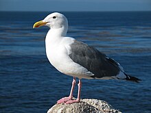


 Neutral Great looking scene, but I feel it would have been better taken as a single shot and avoiding the rather significant bending in you panorama. Also seems oversharpened. For the record though, I personally think Edit 1 is a significant improvement, although it would benefit from the rotation of Edit 2 --Fir0002 11:34, 7 October 2006 (UTC)


.jpg)


 Support, very encyclopedi-c, and just a plain cool photo!. --Thelb4 20:09, 15 October 2006 (UTC)


.jpg)
.jpg)
![[6]](https://de.wikipedia.org/wiki/Bild:Jesuitenkirche_luzern.jpg)
![[9]](https://commons.wikimedia.org/w/index.php?title=Special%3ALog&type=&user=Mdf&page=Image%3AStrix-varia-005.jpg)


