Support original, highly illustrative. The alternative contains some ugly stitching errors. --Aqwis (talk – contributions) 23:54, 27 December 2007 (UTC)[reply]
Support Both encyclopedic and interesting. I see no problems with the technical aspects of the photo. --Sharkface217 06:20, 28 December 2007 (UTC)[reply]
Support original. Interesting, definitely has the "wow" factor. Oppose alternative, errors, fuzzy in treetops. --Janke | Talk 09:17, 28 December 2007 (UTC)[reply]
Support original. The whole world in a little ball. Cooool. --Bridgecross (talk) 15:46, 28 December 2007 (UTC)[reply]
Comment, not fully sure how to judge this kind of picture but the second one has tons of stitching errors which go along with blurriness on one side. Obviously, they might be unavoidable for this type of image but I didn't see them in the first... but, the first isn't quite is astounding. grenグレン 20:52, 28 December 2007 (UTC)[reply]
Neutral Hmm, sorry, but I think it looks very strange... —αἰτίας•discussion•(Happy new year!) 00:05, 29 December 2007 (UTC)[reply]
Yes, that's the point.--Svetovid (talk) 16:09, 29 December 2007 (UTC)[reply]
Support the first one. Mind boggling. Happy New Year!!Malinaccier (talk) 00:09, 29 December 2007 (UTC)[reply]
Support 1st, Oppose 2nd Very enc for stereographic projection, must have taken you a lot of time. However, can you please fix the varied exposure for the Notre Dame one, and I will strong support that one is well. --antilivedT | C | G 10:10, 29 December 2007 (UTC)[reply]
Support no. 1 Well done and original.--Svetovid (talk) 16:09, 29 December 2007 (UTC)[reply]
Support It is interesting!--Mbz1 (talk) 16:22, 29 December 2007 (UTC)[reply]
Support both (more on 1st one) I think I got a slight headache when I first saw the first one heh. Great job, though the sky on top left looks awkward somehow. The latter is good too, but it looks rather common, IMO. — Yurei-eggtart 20:30, 29 December 2007 (UTC)[reply]
Support both These are amazing Teque5 (talk) 23:49, 29 December 2007 (UTC)[reply]
in the roundhouse at the Chicago, Illinois rail yards, 1942. U.S. Government public domain.Alternate 1 Colour balance adjusted
Reason
A large, clear, and beautifully composed photograph of historic steam locomotives. I've cleaned up the artifacts from the original upload at Image:Locomotives-Roundhouse.jpg.
Support, now that it illustrates Roundhouse. Spikebrennan (talk) 22:36, 30 December 2007 (UTC) Comment An attractive image, but is it really encyclopedic of either of the articles in which it appears? Spikebrennan (talk) 17:18, 27 December 2007 (UTC)** It had been completely neglected in the slush pile of US-PD images over on Commons and not used in any article. It would be suitable for several articles, but since many railway topics are already abundantly illustrated (with imho lower quality images) I added this to two pages where illustrations were rare. Seems proper to let another Wikipedian who didn't Photoshop the pic or nominate it for FPC judge where it goes. Certainly has encyclopedic potential. DurovaCharge! 17:54, 27 December 2007 (UTC)[reply]
Neutral. Achingly pretty and old, but technical flaws are rampant and there's just no encyclopedicness to make up for it. --ffroth 19:36, 27 December 2007 (UTC)[reply]
Support Gorgeous scene - can't believe it was taken so long ago and it's as good as it is. Someone should sharpen it tho - I might have a shot later on if no one else does --Abdominator (talk) 22:48, 27 December 2007 (UTC)[reply]
Comment A lovely scene but does it need to be so green ? I adjusted the colour balance and got, in my opinion, a much more pleasing result - Peripitus(Talk) 00:38, 28 December 2007 (UTC)[reply]
Go ahead and upload an alternate if you like. And please add it here if you think it's better (it's simultaneously on Commons FPC so feel free to add there as well). Quality color photographs as old as this are unusual so I've been very conservative in my approach: artifact removal only with no histogram or sharpness adjustments. DurovaCharge! 00:43, 28 December 2007 (UTC)[reply]
Support Both, preferably the Original I prefer the green coloring. However, both images are acceptable due to their stunning nature and encyclopedic value. --Sharkface217 06:20, 28 December 2007 (UTC)[reply]
Support Great quality for 1942. Kodachrome? BTW, I would prefer an even better corrected version. Try a simple photosoup "auto levels" - that will get rid of the green cast in the shadows, still bothering in alternative. --Janke | Talk 09:27, 28 December 2007 (UTC)[reply]
Support Well done. —αἰτίας•discussion•(Happy new year!) 00:08, 29 December 2007 (UTC)[reply]
Support both, preferably the first. Happy New Year!!Malinaccier (talk) 00:09, 29 December 2007 (UTC)[reply]
Support per nom.--Mbz1 (talk) 16:24, 29 December 2007 (UTC)\[reply]
Support Original Second has significant errors in the darker regions. Teque5 (talk) 23:50, 29 December 2007 (UTC)[reply]
Strong Support Prefer original but edit works too. Cat-five - talk 05:27, 30 December 2007 (UTC)[reply]
Support the original one. Great vintage photograph. - Darwinek (talk) 15:10, 31 December 2007 (UTC)[reply]
Support original, meets all the criteria. Chris.B (talk) 18:56, 31 December 2007 (UTC)[reply]
Promoted Image:Locomotives-Roundhouse2.jpgMER-C 03:57, 2 January 2008 (UTC)[reply]
Original - Start of a race at Tachikawa keirin stadium, Tachikawa, Tokyo. Riders start from the blocks and pace up to speed behind the pacer, wearing purple and orange. A judge observes the start in the tower to the right.
Reason
Sharp, colorful image. Full of motion. Displays well the mechanics, holders, and arrangement of the staff involved at the starting line of an Keirin in japan. The judges, officials, and betting fans can also be seen.
Weak Oppose Good pic, but is it really encyclopedic? Clegs (talk) 00:50, 28 December 2007 (UTC)[reply]
Very, very, very weak oppose I think the guy in the tower on the right detracts from the focus of the image (which is the race, I assume). --Sharkface217 06:21, 28 December 2007 (UTC)[reply]
comment: I included him on purpose to show where the officials are arranged
I think the amount that it adds to the encyclopedic relevance makes up for the fact that it's slightly distracting, it would definitely detract from the relevance to not have the official included. Cat-five - talk 05:32, 30 December 2007 (UTC)[reply]
Weak support, definitely encyclopedic... and I like the Judge being there... just not sure this is the best arrangement. grenグレン 20:54, 28 December 2007 (UTC)[reply]
Oppose Per Sharkface217. —αἰτίας•discussion•(Happy new year!) 00:10, 29 December 2007 (UTC)[reply]
Support despite the concern above about the official it is a very nice shot and the official makes sense per my reasoning in my comment above I believe. Cat-five - talk 05:32, 30 December 2007 (UTC)[reply]
Opposealthough encyclopaedic, it is uninspiring. The judge, his tower, and the blurry pipe just to the left of that tower are distracting. sorry.
Support as nominator -- I. Pankonin (t/c) 09:08, 27 December 2007 (UTC)[reply]
Note that we already have a picture of Mars featured, but it's the other side of the planet. MER-C 12:13, 27 December 2007 (UTC)[reply]
Oppose. It's nice enough at thumbnail size, but picture quality at fullsize is quite frankly terrible. I would guess this has been substantially upsampled, which could explain the pixellation. Even a 50% downsample (which leaves it just above minimum size limits) is of poor quality. --jjron (talk) 12:46, 27 December 2007 (UTC)[reply]
Oppose. per above. Hubble is fantastic, but it can't compete with planetary images taken from Mars' orbit. Curious; the currently featured pic is from the Viking program, decades old. We have new orbiters around Mars now, are there not even better available now?--Bridgecross (talk) 15:59, 27 December 2007 (UTC)[reply]
Oppose sorry but the crop is far too tight --Hadseys (talk • contribs) 18:10, 27 December 2007 (UTC)[reply]
I also oppose, but I find your reason odd. A wider crop would just show more empty space, and the current Feature Picture (as shown) has an even tighter crop! It's the first one we are voting on, the second photo is already an FP. --Bridgecross (talk) 15:43, 28 December 2007 (UTC)--[reply]
Strong oppose. Looks really, really, really bad. Like our smudge-picture of Pluto. --ffroth 19:38, 27 December 2007 (UTC)[reply]
Weak Oppose The original FP for Mars seems to be good as it is. --Sharkface217 06:22, 28 December 2007 (UTC)[reply]
Oppose Appears to be upsampled some 300 or 400 %... --Janke | Talk 09:20, 28 December 2007 (UTC)[reply]
Weak Support Looks nice. —αἰτίας•discussion•(Happy new year!) 00:12, 29 December 2007 (UTC)[reply]
Aitias, did you look at the original (i.e. the real candidate) in full size, i.e. 2,400 × 2,164 pixels? You always need to do that... --Janke | Talk 13:20, 29 December 2007 (UTC)[reply]
Yes, Janke, of course I have. But I like the picture in the overall impression. Sorry. —αἰτίας•discussion•(Happy new year!) 22:04, 31 December 2007 (UTC)[reply]
Strong Oppose I won't join the bashing but will suffice it to say that the current Mars FP is much closer to the best Wikipedia has to offer than the current candidate. Cat-five - talk 06:46, 30 December 2007 (UTC)[reply]
File:Fogbow glory spectre bridge edit.jpgOriginal - The picture shows three beautiful Atmospheric Optical Phenomena It is quite rare to see even one of these phenomena. It is much more rarer to see the three of them together. The picture also shows an interesting Fog, which, as you could see, formed below the Bridge, leaving the Bridge alone. Please notice that the picture was taken in such a way that the North Tower of Golden Gate Bridge is seen, that gives a viewer a prospective view of the phenomena against the Bridge.Alternative 1
Support as nominatorMbz1 (talk) 05:32, 27 December 2007 (UTC)[reply]
Comment Original version of this edit was nominated Here. As you could see it not only failed to get promoted, but what was much, much worse than this I made some very incivil comments toward the opposers of the image for what I am sorry. I've decided to nominate the image again because IMO it is an interesting image and not so many people know about these phenomena. The edit was downsampled and I've made some noise reduction, which IMO improved the quality of the image. Thanks.--Mbz1 (talk) 05:32, 27 December 2007 (UTC)[reply]
Oppose. Technical quality is, well, pretty terrible --ffroth 19:41, 27 December 2007 (UTC)[reply]
Oppose both The first one is very confusing; it's hard to tell what you're looking at even after reading the caption. Alternate has bad lighting quality and artifacting. Clegs (talk) 00:54, 28 December 2007 (UTC)[reply]
Strong oppose both by Clegs. —αἰτίας•discussion•(Happy new year!) 00:13, 29 December 2007 (UTC)[reply]
Support (preference for original). Made me go and read three articles and learn some new stuff - surely this is what an FP is really about? Quality is acceptable. Having said which, are you sure that the shadow in the original is strictly a brocken spectre? The alternative is a bit too shadowy, and I like that the GG Bridge in the original gives a good size comparison, and it also shows a good 180° of bow. --jjron (talk) 12:22, 29 December 2007 (UTC)[reply]
Support original but we need to make it clearer exactly what we're looking at and which phenomenon is which; we need to specify what part is fogbow and what part is glory, for example. As with Jjron, I'm not sure that what's here qualifies as a brocken spectre because I'm not sure I see an actual shadow here, just the glory. Matt Deres (talk) 15:48, 29 December 2007 (UTC)[reply]
Thank you for your questions, Jiron and Matt. I believe I'm not very good at explaing my images. am I. Fogbow is the outside white half-circle. The glory is rainbow colored circles in the middle of fogbow. The spectre of the Brocken is my own black shadow inside the glory and, yes I'm sure it was the Spectre of the Brocken. Please take a look at this crop of the original image (Of course nothing good could come out, if one crops the image, which was taken with 8mm fisheye lens :).) May I please ask you to compare it with much better and much clearer image, which was of course taken with a zoom lens. See how similar the shadows (the Spectre of the Brocken) look? Of course in my Original part of my shadow (my Spectre of the Brocken) is covered by the Bridge shadow (could not help it). It is really amazing to see the Spectre of the Brocken in a real life. These shadows are three dimensional and seem to be floating in the air and it feels as I'm myself floating with my shadow too.--Mbz1 (talk)
I wasn't questioning that your shadow was there, I just wasn't sure whether it was a Spectre of the Brocken, largely to do with the size of this shadow as discussed in the article (it talks about them being very large). It sounds a fascinating thing to experience. --jjron (talk) 16:55, 29 December 2007 (UTC)[reply]
Thank you, Jjron. The size of the Spectre of the Broken as the size of the normal shadow depends on the position of the sun. Most Specters are seen, when the sun is low. That's why the size of the Spectre of The Brocken is usually huge. In my situation the image was taken with the sun still being high. I was able to see these phenomena only because I was looking straight down from the bridge. That's why the size of my Spectre of the Brocken was not as big, and once again the image was taken with 8 mm fisheye lens. It is also interesting to mention that everything (fogbow and the glory) is centered around the observer. If a person would stay next to you, you still would see only one (your own glory and only one your own Spectre). If you take a camera out of your eye and move your hand with camera few degrees off, the glory at the image would be centered around your hand, which is holding the camera. Yes IMO it is really fascinating to see. At one point I wanted to travel to Germany to Brocken just to see these phenomena.--Mbz1 (talk) 17:31, 29 December 2007 (UTC)[reply]
Comment I'd also like to share with you this inage . This Spectre was created not by the Sun or by the Moon for this matter, but by the high lights of my own car. That's why you see not just one, but two Spectre of the Brocken. IMO the best way to explain the Spectre of the Brocken is not by its size, but rather by the form of the shadow. As you could see the shadow looks more like rays and it what it really is, just one more form of Anticrepuscular rays. On the other hand as you could see from this image my shadow is very big, but it is a normal shadow and not the Spectre of the Broken. I'd also like to mention that to me much more important is not your support , but your interest to the image.--Mbz1 (talk) 18:06, 29 December 2007 (UTC)[reply]
Comment I do realize that most of you not only never seen a fogbow, but not even ever heard about it. IMO one could think of fogbow and glory as of paintings at the
APOD. I hope that looking at these images may help you to realize that the quality of the nominated images are as good as it gets with such subjects. If I may, I'd also like to mention that I sent my original image to Les Cowely from this atmospheric optics site and he called it "remarkable". He told me as soon as he has time he would add it to his collection of fogbow images.Thank you--Mbz1 (talk) 15:45, 30 December 2007 (UTC)[reply
]
Not promoted MER-C 03:57, 2 January 2008 (UTC)[reply]
Thanks for adding it. Maybe next time you should do that *before* you nominate it. After all, it dosen't add value to an article if it does not appear in an article. Cacophony (talk) 05:37, 27 December 2007 (UTC)[reply]
We usually don't care about that criteria.. usually some time during the process if people support it, then it's added to the article as a matter of course before the final promotion. --ffroth 07:26, 27 December 2007 (UTC)[reply]
Ah, speak for yourself. That's an automatic oppose for mine (or more to the point, an ineligible nomination). It must be in an article before nomination, and also be pretty certain of staying there. --jjron (talk) 12:24, 27 December 2007 (UTC)[reply]
Pah, it's pointless to "conditionally support pending addition to the article" since it's 100% sure that someone will add it at some point before promotion --ffroth 19:43, 27 December 2007 (UTC)[reply]
You're right, that would be a pointless vote, which is why it's an automatic oppose. Cacophony is 100% correct - if it's not in an article it's an automatic fail on Criterion 5. It should not even be considered for nomination if it's not in an article. --jjron (talk) 07:54, 28 December 2007 (UTC)[reply]
Opppose - sides of fireworks are cut off. -Halo (talk) 08:01, 27 December 2007 (UTC)[reply]
Oppose Doesn't add anything to the article it's in-- there are several better pictures in the article. I've taken ones like these, or even better, with my camera at college. Clegs (talk) 01:02, 28 December 2007 (UTC)[reply]
Oppose There are a dozen or so pictures of fireworks in that article, and there's absolutely nothing to make this one stand out above the rest. The composition is not of featured quality, and the fireworks depicted are not particularly spectacular; as Clegs stated, there are better images in the article. -- Mike(Kicking222) 08:18, 29 December 2007 (UTC)[reply]
Oppose Nothing unique about either. It could be fireworks anywhere.
may melt the North Pole for the first time in a million years.
Reason
stunning and informative
Articles this image appears in
Arctic shrinkage
Creator
NASA
Support as nominator. Ferrylodge (talk) 09:07, 26 December 2007 (UTC)[reply]
Oppose. Yes, this is informative, but please check the criteria (Criterion 2). This is only about half the recommended minimum, and contains nothing that could not be relatively easily reproduced. SVGs are usually the preferred format for this type of image (in which case the size would not be such an issue). --jjron (talk) 10:25, 26 December 2007 (UTC)[reply]
Oppose by jjron. —αἰτίας•discussion•(Happy new year!) 03:53, 27 December 2007 (UTC)[reply]
Thanks for reviewing the featured picture nomination that I submitted. I never nominated a picture before. Could you please tell me whether the original NASA picture has enough pixels, and if so can it be uploaded to Wikipedia/Wikimedia without losing the pixels? The original NASA picture is here. Thanks.Ferrylodge (talk) 03:55, 27 December 2007 (UTC)[reply]
The original NASA image is just a satellite view of the north pole, nothing about Arctic Shrinkage --ffroth 07:16, 27 December 2007 (UTC)[reply]
There seem to be two NASA imagesx: the marked-up image, and also a raw image. Can someone more knowledgeable in these matters tell me whether the marked-up NASA image and/or the raw NASA image has enough pixels to qualify as a Wikipedia featured picture? I have no idea. If only the raw image has enough pixels, then perhaps it could be marked up by a Wikipedian while maintaining the picture quality, right? Thanks, and I apologize for my ignorance in matters photographic.Ferrylodge (talk) 07:25, 27 December 2007 (UTC)[reply]
Heh, we're running into one another all over. To answer your question, neither do. You'll need a much higher-resolution image of the area in question for this to pass, in my opinion — it's a good image, but too small. --Haemo (talk) 07:40, 27 December 2007 (UTC)[reply]
Okay, thanks again Haemo. :-)Ferrylodge (talk) 07:51, 27 December 2007 (UTC)[reply]
Oppose per JjronClegs (talk) 01:04, 28 December 2007 (UTC)[reply]
Support. As noted, there are two different NASA images provided. First, allow me to rebutt some of the arguments given above against the nomination of this image. The web size (540 x 405 image) is on the Earth Observatory web site with its accompanying caption. Linked from that page, and cited above, is a "large image format" showing the sea ice extent without the annotations (GIS shapefiles marking previous sea ice minimum extents). In this instance, the name "large image" is potentially misleading insofar as the large image is large only in the sense of having more area included in the image. Both the web size and large images are at the full resolution of the satellite sensor instrument, named 12.5 km per pixel which includes the entire Arctic Ocean in a 540 x 405 size image. In other words, short of a totally new technology for monitoring sea ice, this is as good as it gets. I believe the compelling nature of the image and its unique character and informativeness, potentially qualifies it for consideration under the exceptions provided in Category 2 for images of less than 1000 pixel width resolution. (Disclaimer: AMSR-E actually collects 6.25 km resolution data in several different microwave channels, so a visualization sort of like this could be and has been done with brightness temperature data alone to get higher resolution, but it is not sea ice concentration but a loose proxy thereof, and nowhere near as attractive a visualization.) (Disclaimer 2: I am not the original nominator of this image, but I am the image author.). Now why I support the image, as opposed to why I oppose the opposition. The web image with GIS layers (sure, "it could be easily reproduced": to date the other visualizations of sea ice extent and/or sea ice concentration (see work by the Science Visualization Studio, for example) do not, in my highly biased opinion (See Disclaimer 2 above), show it as well and as cleanly and clearly. I have not see others doing this so well.) conveys the central point elegantly and clearly: the sea ice minimum this past year was remarkably smaller in overall extent than any previous such recorded minimum. The visual does this well and without requiring reference to the caption (itself quite fine, and no, I was not the author of that text). Any person can look at the image and immediately get the message and information of the data. A more sophisticated and knowlegable person can look at the patterns and changes quickly and easily. The overall graphics and image quality is clean, crisp, and informative. I believe this merits consideration as a Featured Picture. —Preceding unsigned comment added by Jsallen1303 (talk • contribs) 14:43, 28 December 2007 (UTC)[reply]
Most people agree that it is a good picture. However, our guidelines indicate that we need pictures to be a minimum of 1000px on at least one side. The image which is centrally composed is about half this size — in my opinion, it's just too small. There are also technical problems with the picture — including noticeable and distracting jpeg artifacting. --Haemo (talk) 20:55, 28 December 2007 (UTC)[reply]
The resolution criteron states "Exceptions to this rule may be made for historical or otherwise unique images." My argument was to the effect that the image merits consideration based on the uniqueness standard. I seem to be in the minority. A TIFF format could be made available if that is the sole stumbling issue, but since it is not standard for display on the web, it's not what the Earth Observatory site provides. —Preceding unsigned comment added by Jsallen1303 (talk • contribs) 22:01, 28 December 2007 (UTC)[reply]
It does seem like a very unique image, and historical too. It blew me away. I hope there might be some way to improve it or otherwise move it into featured status.Ferrylodge (talk) 22:16, 28 December 2007 (UTC)[reply]
I believe "unique and historical" refer to images which cannot be reproduced nowadays — for instance, the image of FDR, Stalin and Churchill at the Yalta Conference might fail size requirements, but still be nominated because it is a unique, historical image. This could very easily be reproduced in a higher resolution using the original images and data, without jpeg artifacting. The artifacts alone are enough to sink it, quite frankly. --Haemo (talk)
It's not an issue of providing it in TIFF - it's not the file size that's the issue, it's the image size. I actually thought this was a diagram, rather than an annotated photograph which Jsallen1303 seems to be saying it is; that is why I made the original comment about these being better as SVGs. It seems to me however that a vector illustration could easily illustrate this information and be just as convincing, as Jeff Dahl also states below, thus removing the issue of size. Therefore, because it could be easily be reproduced in another (better) format, that rather negates the "unique" argument - it may not exist in those formats yet, but easily could with no loss of historical value, and then be more useful. That's not the case for historical photos (which in my opinion are allowed too many 'excuses' by many voters anyway). --jjron (talk) 11:31, 29 December 2007 (UTC)[reply]
Oppose No reason not to have vector version. Just because it's important and informative doesn't mean we should blindly abandon size/quality requirements; just compare to recently featured vector maps for comparison. I also question how the data have been selected, why is there a 21 year median and then pull out two years (2005, 2007) and ignore 2006? Examining every year's data (rather than conveniently selected data) may reveal thaxt the scare-graphic isn't quite as scary as it would seem. The only way to tell whether this is true is to actually look at all the information, something we can't do in this image. But no matter what the data, quality/size is way too low and the map is really not that unique. Jeff Dahl (Talk • contribs) 01:43, 29 December 2007 (UTC)[reply]
Agree. It also doesn't show the Antarctic, which is both cooling and gaining ice.[1] The term "scare-graphic" seems to fit well. -- I. Pankonin (t/c) 07:52, 30 December 2007 (UTC)[reply]
The image shows what it shows. How you react is your business. The fact is, the Arctic Ocean has not been ice-free in more than a million years, but will be very soon at this rate. If the same thing happens to the huge glaciers on Greenland, then there may be a significant impact on sea level.Ferrylodge (talk) 08:14, 30 December 2007 (UTC)[reply]
I don't really understand the comment - there's not many other images here getting knocked because they don't show Antarctica. As Ferry says, it shows what it shows - there's no reason it should show Antarctica. --jjron (talk) 04:28, 31 December 2007 (UTC)[reply]
If it wasn't being used in Global Warming articles, I would agree.
Criteria 8 says featured pictures must be neutral. In the context in which it is used, it is strongly aligned with one side of a huge political debate. The image could be perfect and 4000 pixels wide, and it still shouldn't be featured, because it is a polemic. -- I. Pankonin (t/c) 10:57, 1 January 2008 (UTC)[reply
]
Oppose Why is the caption in French? If it is changed to English I will reconsider my vote, but also per the above. Reywas92Talk 20:49, 31 December 2007 (UTC)[reply]
I'm the nominator, but not the uploader, so I don't know why a French-language version was used. There is an English-language version here.Ferrylodge (talk) 21:33, 31 December 2007 (UTC)[reply]
Not promoted MER-C 03:57, 2 January 2008 (UTC)[reply]
I have never seen a sunrise or sunset anywhere or in any picture that was as spectacular as this sunrise. This is an excellent picture that captures the moment right before the sun appears over the hill in the backround. The silhouetted trees in the foreground add to the effect.
Support as nominatorThingg (talk) 02:10, 4 January 2008 (UTC)[reply]
Oppose Nothing special here. Sorry, but FPC is not a showcase for favorite snapshots... --Janke | Talk 07:17, 4 January 2008 (UTC)[reply]
Comment Is there anything interesting to be said about the clouds? They are the most prominent feature of the photo, and if this photo could be used to illustrate a particular type of cloud it might have more encyclopedic value than it does at Sunrise, which it doesn't really add anything to (it should probably be moved to the bottom of that article, as it adds less encyclopedic value than the images below it). TSP (talk) 12:41, 4 January 2008 (UTC)[reply]
Oppose as per Janke and I agree with TSP's comment that there are better, more encyclopedic, shots in that article already. This image, for example, is surprisingly good for an animated GIF. I don't think there's much in particular to be said about the clouds and since they're not in focus, it's probably not worrying too much about. Matt Deres (talk) 14:21, 4 January 2008 (UTC)[reply]
Oppose Have to agree with Janke here. I've taken better. Clegs (talk) 17:46, 4 January 2008 (UTC)[reply]
Ok, well, I thought I'd give it a shot and see what you all thought. As much as I'm dissapointed, I do have to agree with TSP's point about it not adding much to that article (
Altocumulus undulatus - added to article), but since it was already in Sunrise, I felt that that could be considered photo spamming and I didn't want to give that impression. Comment on Matt Deres's objection: I'm not sure where the clouds are out of focus; could you tell me where? Thanks. Also, is there a procedure for withdrawing my nomination? As much as I hate to say it, you are most likely correct in saying this does not meet the "significantly improves an article" criteria. One more thing, do you this should stay in the sunrise article? or should I remove it? - moved to bottom of page. Thingg (talk) 20:04, 4 January 2008 (UTC)[reply
]
If you really want to withdraw the nom the easiest way is to put a bold 'Nomination withdrawn' at the bottom of the comments and sign it; someone will then close it shortly. --jjron (talk) 06:42, 5 January 2008 (UTC)[reply]
Comment Might pass as a quality image on Commons. There's no limit on sunsets over there. DurovaCharge! 21:06, 4 January 2008 (UTC)[reply]
Not that it matters, but it is a sunrise. Thanks for the suggestion as well. Please note the modifications and notes to my above comment and consider this nomination withdrawn. Thank you all for your input. Thingg (talk) 01:59, 5 January 2008 (UTC)[reply]
Not promoted (Nomination withdrawn). --jjron (talk) 06:50, 5 January 2008 (UTC)[reply]
Support as nominatorCacophony (talk) 22:23, 30 December 2007 (UTC)[reply]
Support Wow! rarely do we get professional quality sports pictures from professional competition. This is very nice. -Fcb981(talk:contribs) 02:40, 31 December 2007 (UTC)[reply]
Weak Support enc. value, but no accurate focus. —αἰτίας•discussion•(Happy new year!) 03:18, 31 December 2007 (UTC)[reply]
Support. Great photo with encyclopedic value and the football spirit. - Darwinek (talk) 15:07, 31 December 2007 (UTC)[reply]
SupportEdit 1 - nice action shot, although the original lacked sharpness. This is fixed in Edit 1. --Fir0002 07:08, 1 January 2008 (UTC)[reply]
Support edit 2 then original as a superb action shot - Fir0002, you also appear to have downsampled (edit 1) significantly and brightened it, making it in comparison a bit washed out left of Okitie - Peripitus(Talk) 09:21, 1 January 2008 (UTC)[reply]
Comment The downsampling was unavoidable in gaining sharpness, the brightening didn't happen AFAIK. The only other thing I did to the image is a mild noise reduction filter. That said, I've uploaded another edit at full res which I think is better than the original, but not as good as Edit 1 --Fir0002 10:05, 1 January 2008 (UTC)[reply]
Weak Oppose Just doesn't look like anything special. Nothing notable going on in it, just a simple save save by a goalkeeper. Not sure it even has much encyclopedic value other than to show what Onka looks like.
I don't play or watch much soccer, so I'm not sure how many times a keeper makes a diving stop with his fingertips in a typical FIFA match, but to capture one with a good angle, using good equipment, with reasonably good composition/focus, and then license it freely is quite exceptional. Sure you can find plenty of better shots from Getty, but none that you can use here. Cacophony (talk) 04:16, 2 January 2008 (UTC)[reply]
Support As to Buc and Cacophony, saves like this happen rarely in the college games I photograph. I've been trying for two years to get one this sweet, and have not yet succeeded. Clegs (talk) 20:13, 2 January 2008 (UTC)[reply]
Support - fulfils all the criteria. We have to be careful will these (I'm talking generally, here) 'nothing special' opposes. The job of the photograph is to illustrate the article, not for every picture to be of an event or object that is incredibly spectacular. Iorek (talk) 02:16, 2 January 2008 (UTC)[reply]
Support All, prefer Edit 2 Looks good, encyclopedic. --Sharkface217 05:05, 2 January 2008 (UTC)[reply]
support excellent action shot Ryan shell (talk) 17:33, 2 January 2008 (UTC)[reply]
Support as nominator -- I. Pankonin (t/c) 09:32, 29 December 2007 (UTC)[reply]
Oppose If accurate, it's good for the article, but as a picture it lacks appeal. --Janke | Talk 13:24, 29 December 2007 (UTC)[reply]
Neutral For me: boring... —αἰτίας•discussion•(Happy new year!) 22:07, 29 December 2007 (UTC)[reply]
Support. Top enc. Labeled very nicely. SVG. All-around pretty. A no brainer! --ffroth 01:26, 30 December 2007 (UTC)[reply]
Comment A bit boring in its current state, more colors would be appreciated. --Sharkface217 02:19, 30 December 2007 (UTC)[reply]
Added 2 alternates. -- I. Pankonin (t/c) 06:16, 30 December 2007 (UTC)[reply]
Support Very nice diagram, I'll take your word on it being accurate since I'm no expert to say the least. Cat-five - talk 05:29, 30 December 2007 (UTC)[reply]
(addendum to my support of original), I support the flags but I think coloring the whole thing is a bit much, I'd definitely like to see an edit 3 with the flags but no coloring if possible and would support that. Cat-five - talk 06:42, 30 December 2007 (UTC)[reply]
Support Edit 3 then. Cat-five - talk 07:04, 30 December 2007 (UTC)[reply]
Supportedit 3 (per Cat-five) - excellent. There's one slight problem - for me in Firefox and IE, the scale renders with the bar for 5 miles protruding through the bottom slightly. If that could be fixed, I think this is a brilliant image. E9T8A8 —Vanderdecken∴ ∫ξφ 11:13, 30 December 2007 (UTC)[reply]
Strong yet conditional oppose conditions met Lycaon (talk) 01:40, 1 January 2008 (UTC) until some names are corrected (e.g. Gembleux->Gembloux, Chatelet->Châtelet, Philippville->Philippeville, Grammont->Geraardsbergen, Hal->Halle). Lycaon (talk) 22:41, 30 December 2007 (UTC)[reply]
Fixed in edit 3.Fixed in all versions. -- I. Pankonin (t/c) 09:34, 2 January 2008 (UTC) Also fixed Louvain→Leuven, Ziethen→Zieten, and D'Erlon→d'Erlon. I'm somewhat embarrassed for not verifying the names before nominating. -- I. Pankonin (t/c) 05:46, 31 December 2007 (UTC)[reply]
Supportedit 3 I didn't mention Louvain, because that is also a recognised English name for Leuven, but maybe it is better like this. Lycaon (talk) 01:40, 1 January 2008 (UTC)[reply]
Not all these names are/where wrong. For example Zieten is also spelt Ziethen in reliable sources, and D'Erlon to d'Erlon depends if it is not at the start of sentence. There is no need to put funny foreign squiggles over words like Châtelet. Also be aware that Belgian towns and villages often have two names and using the French name is not necessarily wrong. One should look at English sources about the Battle of Waterloo not at current map usage. --
I've changed green to black, and I uploaded the edited images under new names - except the original, because it's being used in articles. SVG is a much better format to store this information in. See the SVG article for details. -- I. Pankonin (t/c) 00:10, 2 January 2008 (UTC)[reply]
Comment No flags please as it is unnecessary clutter. --
Because it is an SVG image, it is already as large as you want it, because with SVG images, you can zoom in as much as you want, and it will never be distorted. -- I. Pankonin (t/c) 00:10, 2 January 2008 (UTC)[reply]
But it is nice if images are sized so you can examine the detail without having to resize; this is for the benefit of readers. It's just a balancing act between having them small enough to display conveniently on the screen and legibily. On this image I have no opinion either way on sizing, but I would support with a tinted background; stark white is hard on the eyes and often even a slightly tinted gray or tan can make all the difference. The beige used here is not the best choice, however. Jeff Dahl (Talk • contribs) 04:40, 2 January 2008 (UTC)[reply]
I lightened the background on edits 1 and 2. I think it looks better. I also changed the nominal width on all of them to 1500px. -- I. Pankonin (t/c) 08:42, 2 January 2008 (UTC)[reply]
SupportThe movements are accurate I prefer the beige background otherwise it has my support. Tirronan (talk) 20:59, 1 January 2008 (UTC)[reply]
Support All, Preferably Edits 2 and 3 Finally, they're no longer boring. I like Edits 2 and 3, as they are very nice and highly encyclopedic. --Sharkface217 05:08, 2 January 2008 (UTC)[reply]
Support with preference for the beige. --Malachirality (talk) 16:35, 2 January 2008 (UTC)[reply]
Support anydeBivort 02:49, 3 January 2008 (UTC)[reply]
Promoted Image:Waterloo Campaign map-alt3.svgMER-C 08:00, 5 January 2008 (UTC)[reply]
Oppose per Janke. —αἰτίας•discussion•(Happy new year!) 22:08, 29 December 2007 (UTC)[reply]
Comment The picture needs to be a bit more lively IMO in order to become a FP. In it's current state it's quite boring. --Sharkface217 02:19, 30 December 2007 (UTC)[reply]
Oppose Fails to show relationship of Man aand Channel Isles to Great Britain. Rmhermen (talk) 02:21, 30 December 2007 (UTC)[reply]
How so? They aren't part of the island of Great Britain or its immediate sister islands (like the Isle of Wight)... --Golbez (talk) 04:34, 30 December 2007 (UTC)[reply]
I think what Rmhermen means is that it needs another political circle ("British Crown"?) that goes around the UK, the Isle of Mann, and the Channel Islands to show their political relationship. -- I. Pankonin (t/c) 07:06, 30 December 2007 (UTC)[reply]
Yes. Right now they seem no more related than the Republic of Ireland which the Irish would certainly not appreciate. Rmhermen (talk) 17:45, 30 December 2007 (UTC)[reply]
I changed it to address this concern. -- I. Pankonin (t/c) 10:03, 1 January 2008 (UTC)[reply]
Support I was confused about the British Isles naming dispute, so I looked at this image a few months ago, and it really does communicate the relationships very, very clearly. I don't think it's possible for an illustration of these concepts to be more visually appealing; this is clean, clear, and simple. - Enuja(talk) 02:27, 1 January 2008 (UTC)[reply]
Weak support Informative but not compelling. Extremely helpful if one is already interested, but I don't think it can be used to create interest in the subject. Technically I think it meets
criteria 3. I don't think there's a reasonably better alternative to the term "British Isles" in this context (there are more territories represented here than just the UK and Ireland, and other islands of the North Atlantic exist that are not represented), but I'm open to the possibility. -- I. Pankonin (t/c) 10:03, 1 January 2008 (UTC)[reply
Neutral I find the diagram very useful and informative, but there's just nothing to really grab a viewer. It's not a prerequisite for an Euler diagram, but something like this might be more useful still if the set areas were in a ratio based on population or physical area. Also, Scotland, England, and Wales should have their own areas (as Jersey and Guernsey do), shouldn't they? Or perhaps a different colour of line could be used to distinguish landmasses. I like the idea, but there's too much room for improvement to support it being an FP. Matt Deres (talk) 13:38, 2 January 2008 (UTC)[reply]
Comment- The image is wonky when you click to enlarge it. Just has the new "islands" circle against a white background. hmm. Saudade7 04:23, 4 January 2008 (UTC)[reply]
Not promoted MER-C 08:01, 5 January 2008 (UTC)[reply]
Oppose Technical quality isn't perfect, but that's not my first issue. It doesn't show a pond as much as it shows a tangle of snow-covered brush. I think there are better pictures out there to illustrate this article. Clegs (talk) 20:34, 2 January 2008 (UTC)[reply]
Oppose. Yeah, it doesn't really show the pond. Samsara (talk • contribs) 22:21, 2 January 2008 (UTC)[reply]
I have another version that shows more of the pond. Juliancolton (talk) 22:31, 2 January 2008 (UTC)[reply]
Oppose per above (not encyclopedic for the article for which it is submitted). Spikebrennan (talk) 01:03, 3 January 2008 (UTC)[reply]
Upload the other, Julian, and let's see that one. Clegs (talk) 04:51, 3 January 2008 (UTC)[reply]
Oppose -- framing of the shot could be a lot better. - Longhair\talk 22:09, 3 January 2008 (UTC)[reply]
ok, I will upload the other one. Juliancolton (talk) 16:17, 6 January 2008 (UTC)[reply]
Pond in winter, version 2
Oppose both - low technical quality. You need a better camera for an FP picture in this category.--Svetovid (talk) 14:31, 7 January 2008 (UTC)[reply]
The weather was cloudy and foggy that day, so that could be the reason it doesn't look good. Juliancolton (talk) 14:35, 7 January 2008 (UTC)[reply]
Oppose both The image isnt sharp at full size. Although the first picture is marginally better in quality neither are good enough for FPSeddon69 (talk) 18:18, 7 January 2008 (UTC)[reply]
Not promoted MER-C 02:12, 8 January 2008 (UTC)[reply]
Original - Red blood cells on an agar plate are used to diagnose infection. The plate on the left shows a positive staphyloccus infection. The plate on the right shows a positive streptococcus infection and with the halo effect shows specifically a beta-hemolytic group A. These infections can occur in patients undergoing chemotherapy. Public domain image from Cancer.gov.Edit 1 by Fir0002 - downsample/sharpen
Reason
A well crafted image on an encyclopedic topic. Quality images on medical topics tend to be rare at Wikipedia.
Support We have precious few quality medical photographs and this is a particularly well-lit, descriptive example. --mikaultalk 08:49, 2 January 2008 (UTC)[reply]
Weak support High enc, good looking. Not perfectly sharp in full size, but good enough considering its large size. --Janke | Talk 09:46, 2 January 2008 (UTC)[reply]
Support, very nice image showing the topic clearly. --
Weak support. As Janke says, it might need a sharpening on the right hand side. That said, a slightly downsampled version would still convey all the essential information. Would give full support to a sharpened/downsampled version. Samsara (talk • contribs) 22:24, 2 January 2008 (UTC)[reply]
Weak oppose not super technical quality. Also I think the caption is confusing (not nominator's fault - came from the .gov site) - the colonies on the plate cannot be RBCs (they are non-mitotic) and I would guess they are staph colonies plated onto some sort of RBC media. Not sure what's going on scientifically here. deBivort 02:46, 3 January 2008 (UTC)[reply]
Support both informative and subtly mysterious. -Fcb981(talk:contribs) 22:28, 3 January 2008 (UTC)[reply]
Oppose I honestly cannot see a "halo" on the right plate. I don't like the blurred condensation on the left plate. The image in the agar plate info box shows how plates can be more visually interesting, and I simply don't think that this a high quality, informative image. However, because this looks like it is going to pass, it needs a more explanatory caption. I think adding as a second sentence "Both plates show positive infections." would be helpful. - Enuja(talk) 17:37, 4 January 2008 (UTC)[reply]
comment - i think it might be the soft glow. JaakobouChalk Talk 19:14, 4 January 2008 (UTC)[reply]
The picture features a dramatic composition with a vast array of differing colors and gives an excellent representation of the spectecular sunsets, complete with sun-pillar, that occur when the weather is just cloudy enough but not too cloudy and sun is still able to shine through. The picture was also feautred on the local news, the day it was taken.
Comment Are the clouds clearly defined enough for an FP? I'm not sure. --Sharkface217 05:02, 2 January 2008 (UTC)[reply]
Oppose Very pretty from a distance, but poorly-defined up close. There's a huge pictorial element here which I tend to disregard for FPC, as it's depiction of the subject which is relevant. As such, it's a reasonably good sunset pic, but not an outstanding capture at all and of very dubious value in the California-related articles. The horizon isn't horizontal, btw. --mikaultalk 08:57, 2 January 2008 (UTC)[reply]
OIppose per above. Just a nice sunset, could be anywhere. --Janke | Talk 09:43, 2 January 2008 (UTC)[reply]
Oppose per mickaul, Janke. Cacophony (talk) 23:44, 2 January 2008 (UTC)[reply]
Oppose. A beautiful image, and taken on Christmas, no less. But it's only in a gallery in Sunset, and is not encyclopedic for any of the other articles in which it appears. Spikebrennan (talk) 01:05, 3 January 2008 (UTC)[reply]
Comment. The arguments above regarding its use in CA-related articles are duly noted, but I cannot find a better ocean-sunset picture on the Sunset article; that is I fail to see how any of the other pics, save the perhaps the currently sole FP which dipicts a special type of sunset, does a better job as dispalying a sunset. Happy New Year, Signaturebrendel 07:35, 3 January 2008 (UTC)[reply]
Oppose Per above. Nothing to indicate it from california. BjmanTalk 22:58, 5 January 2008 (UTC)[reply]
Not promoted MER-C 02:13, 8 January 2008 (UTC)[reply]
into a symmetric wye-connected load on the right. The phases have been arbitrarily coloured red, green, and blue. The angular separation between the phases is 120°, or 2π/3 radians. At any point along the transmission line, the net flow is zero at all times during the cycle. The neutral circuit, which would connect between the centre wye points of generator and load, has been omitted. In a balanced system, it would carry no current. The phase sequence is red→green→blue, indicated by the order in which current flows into the three loads in turn.
Reason
Elegant illustration of a somewhat difficult to understand electrical theory.
Thanks very much for the nomination. The image does scale, as it has been here, but it is best seen at its native size, as in the article, or its image page. — BillCtalk 01:47, 1 January 2008 (UTC)[reply]
Support Looks cool and informative. What are the circles with the 's' shape and the rectangles? Suggest making a label or mention in the caption. Also suggest trimming down the suggested caption (of course keeping the full caption on the image description page) and perhaps our image creator could upload to commons and use {{Information}}. The shortened caption could mention what the purpose/use is. Jeff Dahl (Talk • contribs) 03:40, 1 January 2008 (UTC)[reply]
AC generator and resistive load (i.e. your appliances) respectively. MER-C 06:25, 1 January 2008 (UTC)[reply]
Oppose in current form - It looks good but, although I know what this means it is unclear. I've just shown it to a few others and it gives the wrong impression. As it is the 3-phase line looks like the red phase only. Would be much better with the generator/load in the same place/same display but the loads blue/red/green - equally spaced and at the top above the level of the load. This would make it clear that the tranmission line is all-three phases and that the captions for the load and generator do not refer to the blue phase. I think this would also show the phase changes in transmission better - Peripitus(Talk) 09:10, 1 January 2008 (UTC)[reply]
Oppose Gives the false impression that the speed of the current changes. --Janke | Talk 13:00, 1 January 2008 (UTC)[reply]
I don't think I agree. Current doesn't have a speed, let alone one that either varies or is constant. Charge does, however, and its speed does vary in an alternating field, which is what the diagram is representing. In a idealised conductor, the density of free charge, i.e. that available to form a current, is a constant. When an electric field is applied to that charge, it will experience an acceleration of a = qE/m, where q and m are the electronic charge and mass respectively. Since the strength of E is varying sinusoidally, so does a and so therefore does the velocity, and displacement, of the charge. — BillCtalk 13:55, 1 January 2008 (UTC)[reply]
The caption doesn't mention charge at all, only current "flow". See what I mean? --Janke | Talk 09:40, 2 January 2008 (UTC)[reply]
Support Highly illustrative, if a bit confusing. --Sharkface217 02:51, 3 January 2008 (UTC)[reply]
Oppose. Nobody is going to learn 3-phase power from looking at this animation. It's just too complex --ffroth 16:36, 3 January 2008 (UTC)[reply]
Oppose As someone who knows what 3 phase electricity is, i find this diagram extremely confusing. Seddon69 (talk) 19:23, 7 January 2008 (UTC)[reply]
Any suggestions on how it could be improved? Cacophony (talk) 21:28, 7 January 2008 (UTC)[reply]
Not promoted MER-C 02:13, 8 January 2008 (UTC)[reply]
Technically very good photo, encyclopedic. Featured picture on the Commons.
Articles this image appears in
Neon signneon when excited by an electric charge. If the image description page and caption could make this connection, and have better documentation, I would consider supporting. Jeff Dahl (Talk • contribs) 03:45, 1 January 2008 (UTC)[reply]
Oppose No "wow"... Also, if the sign would contain neon, the color should be red, not blue-green... --Janke | Talk 12:59, 1 January 2008 (UTC)[reply]
That statement is incorrect according to Neon. Other colours can be created using mercury vapour and phosphorus, never mind the possibility of using a coloured enclosure that effects the appropriate spectral correction (but would produce additional heat). Samsara (talk •</****Very well put. Given that, should we change it's caption in the article gallery? All it says now is "Neon" and that sounds pretty deceiving to me. --84.90.46.116 (talk) 18:32, 2 January 2008 (UTC) (Of course it'd help to know actually what element was used in there! )[reply]
Above comment was me... didn't know i wasn't in :\ -~-Mad TinmanTC 18:33, 2 January 2008 (UTC)[reply]
I'm not sure you understood my first reply. You do still need Neon, but you may also need to have other reagents present as well. All I'm saying here is straight from the Neon article.Samsara (talk • contribs) 22:27, 2 January 2008 (UTC) See belowSamsara (talk • contribs) 23:58, 2 January 2008 (UTC)[reply]
Oppose, in addition to comments above, the Neon letters itself are way overlit. Personally, I think (even though the size is a bit small),
Comment I just re-read the various articles about Neon, Mercury etc., and it seems that while it's somewhat ambiguous in the Neon article, it may be true that mercury can produce the appropriate glow without any kind of interaction with neon. If anybody knows the details of this, can they please go and make the corresponding articles a bit clearer. Thanks. Samsara (talk • contribs) 23:54, 2 January 2008 (UTC)[reply]
I'll Actually Support this.. Neon tubes ARE bright, which the image shows, and it clearly shows the neon tube w/o any disturbing bg.. And i just love this pic.. have has it as wallpaper for weeks now :) Yzmotalk 00:02, 4 January 2008 (UTC)[reply]
The main concern here is the encyclopedic value of the image. It creates the misleading idea that it's Neon gas in there, while neon gas doesn't produce that colour (this illusion, imo, negates the encyclopedic value). Given the way the gallery is set up in the Neon Sign article, which I agree with, this light sign would be far more encyclopedic if it demonstrated the element in it used. --Mad TinmanTC 19:24, 4 January 2008 (UTC)[reply]
Not promoted MER-C 02:13, 8 January 2008 (UTC)[reply]
An example of what would be a more dynamic and professional composition. -User:Fcb981Close crop with brightness reduced slightly; added by Samsara on request
Reason
Great encyclopedic photo. Featured picture on Commons.
Oppose The lighting is too harsh and the background is rather unappealing. Chris.B (talk) 19:15, 31 December 2007 (UTC)[reply]
Strong oppose by Chris.B. And, sorry, it's not very sharp, either. —αἰτίας•discussion•(Happy new year!) 22:02, 31 December 2007 (UTC)[reply]
Weak Support I think the lighting is quite good personally. The only real problem is the lack of sharpness. --Abdominator (talk) 04:35, 1 January 2008 (UTC)[reply]
Oppose Lighting, as well as a pretty plain composition. -Fcb981(talk:contribs) 05:31, 1 January 2008 (UTC)[reply]
Comment. I'm not sure what sort of composition you envisage without loss of encyclopaedic qualities. It's a picture of Korean Fir cones. What composition would illustrate this subject better than the one you see here? Also keep in mind that composition is less of a criterion here than at Commons. The focus here is more on encyclopaedic quality. Samsara (talk • contribs) 14:39, 1 January 2008 (UTC)[reply]
have a look at the example file I uploaded. While not the nicest piece of art, it illustrates what would be a better image. With background separation for the cones and with a not as boring centered composition. -Fcb981(talk:contribs) 23:37, 1 January 2008 (UTC)[reply]
That's a spectacular rendition, Fcb981 :). In general, I think that centered composition works well with flowers or something like this, which usually lack something to balance the composition. I'd prefer a lower viewpoint and larger aperture (as well as better lighting) to bring out the cones. thegreen J Are you green? 19:58, 2 January 2008 (UTC)[reply]
Thanks for uploading the explanatory image. I didn't doubt the validity of your point about lighting, but on Bokeh and composition, we may have to agree to disagree. In this case, I think bokeh could lower the encyclopaedic value of the image. In fact, it's possible that the composition was deliberately chosen to show the relationship of the cone to the tree. Your suggested semi-profile composition of the pair of cones would not keep the tree trunk in view. Samsara (talk • contribs) 00:06, 3 January 2008 (UTC)[reply]
Perhaps the trunk wouldn't be visible, but in the two versions here it certainly isn't obvious, and the semi-profile, as you tersely put it, could easily show the needles in a compelling way. Anyway, thats just my opinion after all. Your argument is legitimate, not seeing eye to eye is no problem. -Fcb981(talk:contribs) 01:26, 3 January 2008 (UTC)[reply]
Oppose - technical quality of an image of something so easy to photograph should be higher to be featured.--Svetovid (talk) 21:52, 1 January 2008 (UTC)[reply]
Not promoted MER-C 02:13, 8 January 2008 (UTC)[reply]
Weak support The back of the hat is cut off, and there seem to be horizontal lines (striations?) throughout the image.--HereToHelp 13:00, 31 December 2007 (UTC)[reply]
Comment. Is the picture tilted? It looks to me like Dugout Doug is leaning backwards-- maybe this is an illusion caused by the angled background objects. It's hard to tell from this crop. Spikebrennan (talk) 16:29, 31 December 2007 (UTC)[reply]
Comment I've always seen this picture at this angle (check 2 of the 3 prior versions, although one is a mirror image). This particular version I think is also the highest res I've seen of it online. The horizontal lines are particularly prevalent at the lower right. --BrokenSphereMsg me 16:41, 31 December 2007 (UTC)[reply]
Support High quality encyclopedic image. I would hope somebody removes those lines in the bottom right corner, though. --Sharkface217 05:03, 2 January 2008 (UTC)[reply]
Oppose The background is very messy and distracting. Very grainy. Surely there are better portraits of him? --Janke | Talk 09:52, 2 January 2008 (UTC)[reply]
Oppose I quite like it but it's just not a clear FP, largely due to creative manipulation, probably all in the darkroom. The tilt is about 30 degrees CCW (the pipe would have been horizontal) which provides a bit of drama but detracts from FP value. It's been clumsily burned-in, esp. top right, which I find distracting. I would have liked to have seen the whole frame, too; this seems to have been heavily cropped at some point. --mikaultalk 10:08, 2 January 2008 (UTC)[reply]
Support It is a classic B&W shot, plus the reflection on the glasses adds the finishing touch. Chris.B (talk) 12:05, 5 January 2008 (UTC)[reply]
Comment There's a different shot of Gen. MacArthur at Leyte on
iconic mining towns, backed by the man-made mullock heaps from the Line of Lode mine (the mullock heaps are the 'hills' that stretch across this image). Over 800 workers lost their lives working this mine.
Reason
What blew me away when I went to Broken Hill was that the town was built around, but not on, these enormous denuded hills. When I looked into it I found out that the 'hills' were actually the mullock heap (waste heap) from the century plus of mining operations, and the town has simply formed around it. I reckon this image does a pretty good job of capturing the feel of the place and showing the scale of the mining operations.
Support as nominatorjjron (talk) 04:50, 31 December 2007 (UTC)[reply]
Support Well done. —αἰτίας•discussion•(Happy new year!) 05:34, 31 December 2007 (UTC)[reply]
Weak support It does a great job of conveying the scene, but the trees, and to a lesser extent the dirt, look unsharp.--HereToHelp 12:56, 31 December 2007 (UTC)[reply]
Support Great image and adds value to many articles!--Mbz1 (talk) 15:29, 31 December 2007 (UTC)[reply]
Weak support Valuable image. Unfortunately telephone lines span a large portion of foreground. I still like it enough to stand behind the nom. DurovaCharge! 05:55, 1 January 2008 (UTC)[reply]
Support Encyclopedic and technically decent. Would make a fine FP. --Sharkface217 05:04, 2 January 2008 (UTC)[reply]
Support - I like the flock of white birds in flight. Also, further proof that mining is a terrible thing. Saudade7 04:19, 4 January 2008 (UTC)[reply]
Not to get too off-topic, but without any form of mining, we'd all be living in the stone age... ;-) Diliff | (Talk)(Contribs) 07:52, 5 January 2008 (UTC)[reply]
Promoted Image:Broken Hill Town & Line of Lode Pano, NSW, 08.07.2007.jpgMER-C 02:13, 8 January 2008 (UTC)[reply]
Support Original The edit does have some noise in the sky, but I think the original is a very good pic. Clegs (talk) 17:48, 4 January 2008 (UTC)[reply]
Support edit Noise in the sky doesn't bother me, but the drabness of the original does. The excellent composition needs color and life. After all, it's an action shot. I like the contrast in the edit, particularly the textures in the crashing waves at far right. The principal subject is also far easier to distinguish in the edit. DurovaCharge! 08:22, 5 January 2008 (UTC)[reply]
I don't know if you've been to the North Sea coast of Germany - the original reflects the weather and light conditions very faithfully. Skies are often drab, and the mist from the strong tide washes out the colours even more. Just my two cents. Samsara (talk • contribs) 12:22, 5 January 2008 (UTC)[reply]
Ja, die Nordsee hab' ich besucht. Meiner Meinung nach, zweite ist schöner. DurovaCharge! 12:41, 5 January 2008 (UTC)[reply]
Dann sei Dir Deine Meinung gegoennt. :) Samsara (talk • contribs) 17:41, 5 January 2008 (UTC)[reply]
Support original. More authentic, less noise. One of our best sports images. Samsara (talk • contribs) 12:22, 5 January 2008 (UTC)[reply]
This is is a superb view of the Hernando de Soto Bridge in Memphis, Tennessee. Photogaphed apparently in the early evening, it shows the bridge in a heavy haze while the setting sun casts a perfect shadow on the Mississippi River. Somehow the shadow and bridge, taken together, suggest the body of a guitar, so emblematic of Memphis musical culture. The work does not appear to have been to have been photoshopped or otherwise altered, though it may have been cropped.
oppose far too noisy/artifacted at full rez. deBivort 03:55, 3 January 2008 (UTC)[reply]
Oppose - incredibly poor quality, horrible image at full size, which is what we're voting on. I do however support this being included on WIAFP? to illustrate heavy artifacting. —Vanderdecken∴ ∫ξφ 11:39, 3 January 2008 (UTC)[reply]
On a side note, welcome back Vanderdecken. I haven't seen you here in awhile, almost since my first few weeks here almost a year ago, in fact, it'll be 1 year on the 16th, wow does time fly. -Fcb981(talk:contribs) 22:26, 3 January 2008 (UTC)[reply]
I've been active constantly on WP, but just haven't voted regularly on FPC for quite a while. Not that many pics that interested me on here recently, but I still check the page every day with my watchlist. —Vanderdecken∴ ∫ξφ 15:45, 4 January 2008 (UTC)[reply]
neutral nice composition, and eye-catching, but a bit too grainy for me. (just a bit, have some perspective). --Bridgecross (talk) 16:19, 3 January 2008 (UTC)[reply]
Oppose. Looked so good at thumbnail size :( --ffroth 16:37, 3 January 2008 (UTC)[reply]
Oppose very pleasing at 800px, why the heavy compression artifacts. Is there a better version someplace? -Fcb981(talk:contribs) 22:40, 3 January 2008 (UTC)[reply]
Oppose Sadly.. but there are just too many artifacts + rather low res.. Yzmotalk 23:55, 3 January 2008 (UTC)[reply]
Oppose per reasons above. What a terrible shame, since I agree that the shadow=guitar effect for a bridge in Memphis is striking and charming.Spikebrennan (talk) 03:37, 9 January 2008 (UTC)[reply]
Not promoted MER-C 04:42, 10 January 2008 (UTC)[reply]
Canada Goose getting a drink on a partially frozen pond, the reflection is both intentional and (IMO) a positive effect
Alternative
Reason
The original is my favorite. When I was taking these at a local pond, I noticed the reflection and immediately knew it would be a cool picture. The problem was that the bird as moving its head really quickly in some kind of drinking technique and the winter sun didn't allow a very high shutter speed. The alternative is maybe more illustrative and sharper but lacks that artist merit of the original.
Support original artsy and illustrative. Are you sure it isn't drinking though? deBivort 02:43, 3 January 2008 (UTC)[reply]
ha ha, now that you mention it. There didn't seem to be much food on that piece of ice. You are probably right. :-) -Fcb981(talk:contribs) 03:29, 3 January 2008 (UTC)[reply]
Are you really sure? If it wanted to drink why choose such a shallow puddle when there's a large body of water behind? The bird could be digging for some insects living under the surface. Nice image and the reflection is beautifully done, support either. Jeff Dahl (Talk • contribs) 19:28, 3 January 2008 (UTC)[reply]
Support Cool! Very eye-catching. Clegs (talk) 04:59, 3 January 2008 (UTC)[reply]
Support Nice photo --Fir0002 07:44, 3 January 2008 (UTC)[reply]
Support original only. Very attractive composition, meets other criteria, but can you do something about your metadata ASAP - these two images, as well as the two above, say they were created on Jan 25, 2008, which strikes me as highly unlikely, and not very appropriate. --jjron (talk) 11:31, 3 January 2008 (UTC)[reply]
I'll fix it on my camera now... Ok done. I think it has been like that since I first set it up. At this point, I'm not sure how to alter meta-data that has already been recorded. -Fcb981(talk:contribs) 23:02, 3 January 2008 (UTC)[reply]
OK. There are applications that allow you to edit exif data on photos (I don't know of any free ones on Windows though, and haven't actually used any myself). In the meantime, if it's wrong, it'd probably be better just to strip it from images, such as by doing a "Save for Web" in Photoshop before uploading. --jjron (talk) 08:00, 4 January 2008 (UTC)[reply]
Change the image properties manually before uploading and for those already uploaded, re-upload them.
Promoted Image:Canada goose reflection 03.jpgMER-C 04:42, 10 January 2008 (UTC)[reply]
Iowa turret explosionOriginal - Smoke pours from the #2 turret aboard the battleship USS Iowa (BB-61) following an internal explosion near Puerto Rico.
Edit 1
Reason
Some monthes ago I tried to get this image through the FPC and it failed. Some of the contributers at the time suggested the the image may do better as an FPC candidate if it was the centerpiece of its own article rather than one image in the parent article. It was about that time that an article dealing exclusively with the incident was created, so I am rereunning this through here to see if having its own article will make the difference.
Support Edit 1 Very encyclopedic. Clegs (talk) 04:57, 3 January 2008 (UTC)[reply]
Comment: Previously nominated back in April and failed, two opposes, two comments and a support as nominator. Neutral. —Vanderdecken∴ ∫ξφ 12:00, 3 January 2008 (UTC)[reply]
Comment I'll abstain for the moment but I was looking at this at full size and noticed some nasty aberrations on the gun barrels. I corrected that, downsampled, reduced noise and sharpened in edit 1. I'm not sure whether even the edit is of high enough quality considering that the damaged gun turret is not really prominent. -Fcb981(talk:contribs) 22:38, 3 January 2008 (UTC)[reply]
Not promoted --jjron (talk) 09:31, 10 January 2008 (UTC)[reply]
London Hackney CarriageOriginal - A delibrately slow exposure of a London Black Cab passing by a hotel with Union Jack above the entrance.
Reason
I haven't submitted anything here for a while, but I decided to mix it up a bit with an old image of mine that isn't one of my 'usuals'. As such it probably doesn't have the same sort of extreme high resolution wow-factor, but I like the composition and it places two common sights in London together in an aesthetically pleasing way, without the 'clutter' that is quite difficult to avoid in a built up city like London. The car is in focus and sharp (well, relatively), whereas the rest of the frame is motion blurred, but not to the point where anything is unrecognisable. To me, the encyclopaedic value is obvious, as the angle is close to ideal for viewing and understanding what a Hackney Carriage is, and the wow-factor is in the iconic and simple composition making it an unmistakably British institution - overpriced fancy hotels and overpriced fancy taxis! ;-) Diliff | (Talk)(Contribs) 23:27, 2 January 2008 (UTC)[reply]
Oppose Blurry parts. A better picture can be taken. --Sharkface217 02:50, 3 January 2008 (UTC)[reply]
Erm, as explained, this is deliberate. Its a motion blurred shot. The parts that really matter (ie, the taxi) are sharp enough. Bear in mind this photo has not been downsampled, so at 100% it is not as sharp as an image that has been downsampled, but the detail is there. Diliff | (Talk)(Contribs) 12:58, 3 January 2008 (UTC)[reply]
Oppose. Most of the taxi is blurry too! Also, why is so much of the image way above the taxi where it's so blurry you can't see anything? Motion blur shots have to have a particular close-in composition and the actual subject has to be sharp.. this just has neither characteristic --f f r oth 00:53, 4 January 2008 (UTC)[reply]
Motion blurred shots don't have to have those characteristics at all, thats just your opinion and one that I disagree with. Most of the taxi is not blurry (the rear is slightly, and so are the tyres obviously). Downsample it to a reasonable resolution (as I stated above, it has not been downsampled, so this is roughly what you would expect from a 100% crop) such as ~1500x1000 and you should find it to be acceptably sharp. Much as when it frustrated Fir0002 when he got so much naive opposition to his dragonfly image, it is actually not easy to reproduce or better! Fair enough if it isn't what you want in a FP, but it does get a bit frustrating for me (and again, evidently, Fir0002 too) when non-photographers make rash claims what a photo should and shouldn't contain or be. I spent a good 45 minutes outside the hotel trying to get the 'ideal' shot of a nice taxi passing by. Very very few were as sharp as this one. I'm not saying that "effort equals FP" by any means, by the way, I'm just putting the image in perspective, something which FPC dialogue quite often does not have. Diliff | (Talk)(Contribs) 09:42, 4 January 2008 (UTC)[reply]
Yup, I totally agree with you Diliff --Fir0002 02:58, 6 January 2008 (UTC)[reply]
Oppose - Sorry, it just seems too blurry...even if it *was* intentional I can't look at it without thinking I have sleep dust in my eyes. Saudade7 04:13, 4 January 2008 (UTC)[reply]
weak Oppose the crop should give more horizontal space than vertical, showing more of the street and the flag does not enhance the image Thisglad (talk) 08:15, 5 January 2008 (UTC)[reply]
Support Very iconic. Even if the motion blur is a little distracting, I would think it's pretty unavoidable - this coming from one of those non-photographers ;) - and the cab itself is in focus. CillaИ ♦ XC 14:41, 5 January 2008 (UTC)[reply]
Oppose The motion blur is distracting and on too much of the image. It certainly isn't unavoidable. Don't taxis in London ever stop? --D. Monack | talk 17:08, 5 January 2008 (UTC)[reply]
Support The motion blur in the image is crucial to making it an FP - I mean what could be more boring/snapshotty than a stationary taxi on the sidewalk? Common subjects have a place as FPs but they need to be taken artfully and with skill, and these qualities are seen in this image (both in the composition - the union jack and uncluttered street works well - and in the use of motion blur). --Fir0002 02:58, 6 January 2008 (UTC)[reply]
support The blurriness at the rear is unfortunate, but the dynamics of the shot make up for it, IMO. One quickie question, though. Has the license plate been redacted (whiteacted?) or was it actually blank like that? I'm normally not in favour of any changes to the subject matter of an FPC, but recognize this case might be necessary. If it has been whited out I think some kind of note in the caption might be in order. Matt Deres (talk) 04:08, 7 January 2008 (UTC)[reply]
Weak support, at first I was thinking the motion blur should be on the taxi and not the rest of the picture... but, then I got the point. The blur on the back of the taxi and the fact that the taxi is only 30% of the picture are the biggest problem... couldn't you have found a black taxi going in front of a lower flagpole? :) --grenグレン 06:58, 7 January 2008 (UTC)[reply]
I see your point about the amount of the frame taken up by the taxi, but I do think it isn't quite as important because the actual image width in the article is such that you can still see the taxi clearly in the thumbnail. As a standalone image, perhaps you're right, but FP is about the image in relation to the article. Next time I'll try for that lower flagpole. ;-) Diliff | (Talk)(Contribs) 15:10, 8 January 2008 (UTC)[reply]
No consensus MER-C 04:43, 10 January 2008 (UTC)[reply]
pocket square
.
Reason
This is a beautiful picture that provides great illustration to
Suit (clothing)
. It's very high resolution, very crisp with no technical problems I can see (although I'm certainly not an expert in that field), both highly illustrative and very visually appealing. As far as I can tell, it passes the criteria with flying colors.
Support as nominatorDylan (talk) 22:38, 6 January 2008 (UTC)[reply]
Oppose I'm sorry, this image doesn't quite make it. In the future, consider nominating images to
picture peer review first. This image has only a very small portion of it in focus, has a large blown highlight, and has some strange shadowed artifacts in the lower right. It is encyclopedic for how to stuff a handkerchief in a suit pocket, but it certainly doesn't show a whole suit, and I even have a problem with the fact that it really doesn't show a whole handkerchief. - Enuja(talk) 23:07, 6 January 2008 (UTC)[reply
]
Well, I can't argue with the technical issues, but if you look at the context in which it appears in each article, you'll see that it's not being used as the headlining image to illustrate a suit or a handkerchief. In both contexts, it's used to illustrate an application of either subject: in
Suit (clothing), as an example of "Accessories with suits". It doesn't have to to illustrate "a suit" or "a handkerchief" generally to add encyclopedic value. And given these contexts of use, it makes perfect sense for just that portion to be in focus. Dylan (talk) 23:26, 6 January 2008 (UTC)[reply
]
Oppose as per the technical issues raised by Enuja - Clegs (talk) 23:38, 6 January 2008 (UTC)[reply]
Not an easy picture to take. Requires lots of natural light entering inside, no other visitors wandering around the room, and dodging palace employees who wouldn't be happy about this picture. Above all, a stunning interior. Húsönd 01:35, 6 January 2008 (UTC)[reply]
Support as nominatorHúsönd 01:35, 6 January 2008 (UTC)[reply]
Comment Is it just me, or is it pretty severely artifacted at full size? Clegs (talk) 02:02, 6 January 2008 (UTC)[reply]
Comment. It looks to be tilted, but I think it may just be the verticals, especially on the left. Perhaps it could do with a bit of perspective correction? --jjron (talk) 08:18, 6 January 2008 (UTC)[reply]
Might be wide angle distortion? DurovaCharge! 02:07, 7 January 2008 (UTC)[reply]
Oppose - sorry, too much chromatic aberration, soft focus, slight noise and compression artifacts, and the lamps and doors are too blown. This would benefit from HDR. This is a good photo for the article, but not FP-worthy IMO. —Vanderdecken∴ ∫ξφ 12:16, 6 January 2008 (UTC)[reply]
Oppose - I thought about nominating it when I saw it in TFA, but declined upon closer inspection for the reasons given by Vanderdecken. —dgiestc 16:45, 7 January 2008 (UTC)[reply]
Oppose: Very unsharp at full resolution. —αἰτίας•discussion• 20:21, 7 January 2008 (UTC)[reply]
Not promoted --jjron (talk) 09:15, 12 January 2008 (UTC)[reply]
Mute SwanEdit 1 Dealt with the warm color cast.Edit 2 Brings more contrast to the beak. Samsara (talk • contribs
)
Reason
Its nice and sharp, and the lighting is really its shining star. A good bird portrait, I think. Some may prefer a slightly less noisy BG, which the alternative has. I reduced the noise about as much as I wanted to for the original but there is some left...
Weak Oppose Nice and sharp, but rather than being a shining star I think the lighting is a considerable weak point in these images - the colour casting giving an unenc representation of the white swan. --Fir0002 07:43, 3 January 2008 (UTC)[reply]
Weak SupportEdit 1 colour cast is fixed, though the lighting still results in the tip of the beak melting into the background - hence only a weak support. For a fairly common subject a near perfect photo (a sharp photo with a good bokeh background and good lighting) should be possible --Fir0002 07:05, 4 January 2008 (UTC)[reply]
Ok, I got rid of the cast in the original RAW file. Edit 1 also has less noise. I got rid of the "alternative" to make room for the edit. Tell me if that fixes it. -Fcb981(talk:contribs) 22:58, 3 January 2008 (UTC)[reply]
Oppose both. Unfortunate choice of background. I even prefer my picture with the Hamburg city center and war memorial background. --Dschwen 14:06, 4 January 2008 (UTC)[reply]
Oh, and I've just now seen that you replaced it with your picture. Hm. --Dschwen 14:09, 4 January 2008 (UTC)[reply]
Could you elaborate, the background in the surface of a partially frozen lake. It is the swans natural enviroment. Not only that, it contrasts the white of the swan and is appropriatly OOF. I replaced yours because of: overly hard and flat lighting and a distracting and unnatural BG. How is the natural BG worse then some building in Hamburg? -Fcb981(talk:contribs) 17:00, 4 January 2008 (UTC)[reply]
Sure, first of all, in your edit summary you state better lighting, I contest that, the whitebalance falsifies the swans colors. Your background is is no more a natural habitat than mine, swans are a synanthropic species, especially in densely populated countries like germany. My background contrasts the head and makes the contours stand out. Yours obviously does not (see edits). As far as overall quality goes, the only point your image has is a slightly higher DOF. On the head mine has more detail, more resolution, and less noise. Summing it up, you removed a picture to insert your own one of overall lesser or at best equal value and went on to a straight FPC nomination. --17:51, 4 January 2008 (UTC) —Preceding unsigned comment added by Dschwen (talk • contribs)
Huh? look at the bill of your swan picture, its washed out and desaturated, the lighting in yours does nothing to accentuate the texture of the feathers. And you say that my BG camaflages the swan?! The swan is WHITE the BG is DARK BLUE. You clearly took your picture durring mid-day and there is nasty fill light from what I would assume is white stone or stucco of the surrounding buildings. That light serves to wash out all color in you image, it would be better in grey-scale. Yours could also do with a Heavy crop into a portrait or square orientation. Despite higher resolution yours could do with a downsample to add some apparent sharpness. Even though yours is bigger mine is sharper. As for my WB, that was the subtle evening light ;-) and it was eaisly corrected. -Fcb981(talk:contribs) 19:05, 4 January 2008 (UTC)[reply]
Maybe we are both just blind for the flaws in our own pics... --Dschwen 19:42, 4 January 2008 (UTC)[reply]
Probably true, sorry for getting a little defensive. I see that you weren't trying to be malicious. You can add your picture back to the swan article if you like, I can find another home for mine someplace else. -Fcb981(talk:contribs) 20:24, 4 January 2008 (UTC)[reply]
It's a nice picture, but it has DOF issues (check out the raised, black part of the beak). Samsara (talk • contribs) 01:11, 7 January 2008 (UTC)[reply]
Weak support edit 2, neutral edit 1 and original. Samsara (talk • contribs) 10:20, 7 January 2008 (UTC)[reply]
Not promoted --jjron (talk) 09:13, 12 January 2008 (UTC)[reply]
San Francisco Earthquake 1906; fireOriginal - San Francisco Mission District burning in the aftermath of the San Francisco Earthquake of 1906. Image taken on a rooftop near the fire by H. D. Chadwick.
Edit 1 - The image has been sharpened and as much noise as a result has been removed
Reason
Picture Peer Review
, praising the danger of the circumstances of the picture taking. It very well illustrates the fire section of the article, and it is of high resolution.
Articles this image appears in
San Francisco earthquake of 1906
Creator
photograph taken by H.D. Chadwick, U.S. Government War Department
Support as nominatorEnuja(talk) 01:21, 5 January 2008 (UTC) I support the original; the sharpened edit does not improve the image at all, as far as I can tell. It does look an itsy bit sharper on the people in the street, but some of the building ledges have artifacts, and the smoke is honestly essentially indistinguishable between the images for me, except that the edit might have some of the grain blotted out. I was flipping back and forth between images at full resolution, and in much the space of the picture, it was very difficult to see a difference. - Enuja(talk) 22:47, 9 January 2008 (UTC)[reply]
Support. My thunder has been stolen! Hoping I get conomination credit for digging this out of the Commons slush pile and editing it. DurovaCharge! 01:37, 5 January 2008 (UTC)[reply]
Support Good pic, good resolution for its age. Clegs (talk) 04:35, 5 January 2008 (UTC)[reply]
Comment Is there any chance of seeing this picture being slightly sharpened just to see if this improves it slightly?Seddon69 (talk) 18:29, 7 January 2008 (UTC)[reply]
Good thought; that was one of the things I experimented with during cleanup. It caused some pixelation without really much benefit, although if you'd like to give it a stab and your results come out better I'd gladly support that. DurovaCharge! 20:24, 7 January 2008 (UTC)[reply]
Support Looks good, encyclopedic. --Sharkface217 05:00, 8 January 2008 (UTC)[reply]
Support Marvelous, historic and encyclopedic. Spikebrennan (talk) 15:42, 8 January 2008 (UTC)[reply]
Comment I have put up a slightly sharpened image with and tried to limit the noise from this especially seen in the clouds. Seddon69 (talk) 17:18, 9 January 2008 (UTC)[reply]
Thank you! I'll see what other editors think. Cheers, DurovaCharge! 21:58, 9 January 2008 (UTC)[reply]
Strong Support Very nice historical shot. Cat-five - talk 08:41, 11 January 2008 (UTC)[reply]
Support A historic and majestic shot of good quality. --Ubardak (talk) 08:45, 11 January 2008 (UTC)[reply]
Promoted Image:Sfearthquake3b.jpg --jjron (talk) 09:21, 12 January 2008 (UTC)[reply]
. To her family, she was informally known as May, after her birth month.
Edit 1 - downsample, slight sharpen, cleanup
Edit 2 - downsample, more cleanup and enhancement
Edit 3 by Fir0002 - significant downsample, sharpening, cleanup, enhancement
Queen Mary was known for setting the tone of the
British Royal Family
, as a model of regal formality and propriety, especially during state occasions. She was the first Queen Consort to attend the coronation of her successors. Noted for superbly bejewelling herself for formal events, Queen Mary left a collection of jewels now considered priceless.]]
Reason
An impressive portrait, for its day, of the Queen Consort Mary of Teck who was an enigmatic public figure and as such, is a notable person so the image is encyclopedic too. Good quality, illustrates subject, fantastic resolution, what more do you want from the early 20th century photographers :D
Bain News service apparently; although it may be possible that the image was taken over seventy years ago, and therefore copyright may be irrelevant. My reasoning for this is that she lived until 1953 and lives to be 85, and she looks relatively young in the photograph, so maybe this was taken 70 yrs ago
Well this photograph is of significantly higher resolution and so one can't expect it to be "crystal clear" although despite the blurriness, you can still make out all of the fine details on Her Majesty's face and on her clothing —Preceding unsigned comment added by 82.36.182.217 (talk) 03:43, 5 January 2008 (UTC)[reply]
Still opposed. I don't think any of the edits is up to FP quality.
Comment. This would be a good candidate for downsampling and cleanup (there are also hairs on the image). Spikebrennan (talk) 15:38, 5 January 2008 (UTC)[reply]
Support Edit2 I've downsampled much as per Edit1 but cleaned up most of the really heavy stuff and separated a few midtones. It's a fine old portrait, this; great light, expression and presence. --mikaultalk 23:39, 5 January 2008 (UTC)[reply]
SupportEdit 3 Just to confuse voters and the closer more I've uploaded another edit. I think it has the best sharpness/cleanup of the edits, and personally I don't think there is any useful information in the higher res of the other edits. --Fir0002 02:31, 6 January 2008 (UTC)[reply]
Hmm.. Is selective sharpening a good idea on an old image? It looks a bit weird with alternating soft and hard grain. I see your thinking behind the image size, I'm not sure you've gained anything with such a large downsample, either. And you've missed a few nasty bits in the cleanup.. OTOH, I thought my edit had lost a bit of detail, so I've been back and tweaked it a bit more. I much prefer it, but push come to shove I'd support any clean version. --mikaultalk 10:59, 6 January 2008 (UTC)[reply]
Support any, although my preference is probably for Edit 2. CillaИ ♦ XC 16:49, 7 January 2008 (UTC)[reply]
Support Any All appear to be of good composition and have encyclopedic value. If pressed, I'd go with Edit 3. --Sharkface217 03:56, 13 January 2008 (UTC)[reply]
I wonder if we can get a few more votes down before closing this one - any more opinions that may make it more convincing? --jjron (talk) 10:55, 13 January 2008 (UTC)[reply]
Support edit 3 per above. A significant improvement on a good portrait. Spikebrennan (talk) 19:34, 13 January 2008 (UTC)[reply]
Promoted Image:Queenmaryformalportrait edit3.jpg --jjron (talk) 07:46, 14 January 2008 (UTC)[reply]
Edit 1. Noise reduction (mainly to the background using a feathered selection) and sharpening applied for slight improvement in image quality.Edit 2. Chromatic aberration reduction by Fir0002
Reason
An interesting photo of an important member of the South American wildlife. Also a difficult picture to take, considering the unquietly behavior of that animal.
Articles this image appears in
White-fronted Capuchin
Creator
Whaldener Endo
Support as nominatorExlibris (talk) 01:21, 7 January 2008 (UTC)[reply]
Weak support. Very good composition and subject, although the image is slightly soft and noisy. I've made an edit with slightly improved noise levels, and slight sharpening too. Its hard to make much of an improvement without messing with the details though, as the hair tends to be degraded in the process of applying strong noise reduction. Preference for Edit 1. Diliff | (Talk)(Contribs) 05:09, 7 January 2008 (UTC)[reply]
Support Either Good composition! Excellent portrait. Clegs (talk) 05:26, 7 January 2008 (UTC)[reply]
Weak support the bright sky patches are a bit distracting, but a good picture. Muhammad(talk) 07:02, 7 January 2008 (UTC)[reply]
Support Edit 2 Better sharpness that the original and first edit. Excellent subject and composition and applicable to the article. Seddon69 (talk) 18:24, 7 January 2008 (UTC)[reply]
Thats ironic. There is absolutely no difference in sharpness of the subject between edit 1 and edit 2. :-) Diliff | (Talk)(Contribs) 02:43, 9 January 2008 (UTC)[reply]
Support either bless him, he's so cute --Hadseys (talk • contribs) 16:10, 8 January 2008 (UTC)[reply]
Support edit 1. Unsure exactly what was done for edit 2. The haloes don't bother me that much, although they make the temperature go up. What temperature was it, if I may ask? Samsara (talk • contribs) 00:48, 9 January 2008 (UTC)[reply]
Edit 2 used edit 1 as a base. Fir0002 has made changes to the blue haloes around the highlights, desaturating them so that they're less noticable. Fir0002, its not chromatic aberation though - just the out of focus borders between the highlights and shadows. In other words, bokeh, but not as pretty as it usually looks because of the sharp lines of overexposure. Still, a slight improvement. Diliff | (Talk)(Contribs) 02:43, 9 January 2008 (UTC)[reply]
I'm pretty sure it is chromatic aberration - although the Purple fringing article says it's not always caused by CA. Also have a look at this review of a cheap lens with bad chromatic aberration - if you scroll down to the bottom of the page (just above the verdict) you'll see an example of CA which is found at the contrasting edges of light and shadow --Fir0002 08:03, 9 January 2008 (UTC)[reply]
I'm still pretty positive that its not. CA occurs in a different way to that seen in this image. For one thing, the fringing would not be nearly as large. It is usually only a couple of pixels in width, especially in the centre of the frame, and you will usually see red/purple on one side and blue/cyan on the other side. As per the DPReview explanation, purple fringing is not specifically a property of the lens. The blue fringe that you see in the original image here is simply the blue sky that has not overexposed, as the out of focus light has 'mixed' (for want of a better word) with the dark shadow to create the bokeh I was referring to previously, to the point where it is not overexposed, whereas the centre of the light sources that are overexposed to absolute white have not. Hopefully that makes sense. I'm not sure how well I've explained it, but the theory is sound. :-) Diliff | (Talk)(Contribs) 09:51, 9 January 2008 (UTC)[reply]
Ah, I just noticed your last post and have to agree that most of the green/blue fringing is as you say, but the more magenta stuff towards the edges looks like classic compact camera CA to me. <edit> ok, I've had a proper look and on second (third?) thoughts you're absolutely right on all counts. It's possible that the green correction you often get from shots in trees has given a very CA-like look to the blown sky. I like it even less now ;o) --mikaultalk 10:54, 9 January 2008 (UTC)[reply]
Re Diliff: Ah right! I get you! Thanks for point that out as I would have always attributed that effect to CA --Fir0002 11:17, 9 January 2008 (UTC)[reply]
Oppose Pre-focussed on the tree trunk below, leaving most of the subject soft and artifacted. The fringing (definitely CA, always worse towards the edges of the frame) has left a particularly un-enc purple rinse to the chap's head & sealed it for me. Good expression etc, just not FP quality. --mikaultalk 10:51, 9 January 2008 (UTC)[reply]
But it isn't worse towards the edges of the frame at all, its exactly the same no matter where in the frame, and is a thick cyan colour. Hence I think its the bokeh at the edge of overexposure. You're right though, the very slight purple fringing is CA, but that isn't the significant fringing we were discussing. Diliff | (Talk)(Contribs) 10:56, 9 January 2008 (UTC)[reply]
Ah, just realised you addressed it above at basically the same time as my reply. Nevermind. Diliff | (Talk)(Contribs) 10:57, 9 January 2008 (UTC)[reply]
Oppose the light is terrible, the bokeh is gross and unsightly. -Fcb981(talk:contribs) 00:41, 10 January 2008 (UTC)[reply]
Oppose a very good photo, but not great compared to our other FPCs of mammals. Kind of noisy, and I don't care for the light. Calliopejen1 (talk) 15:12, 13 January 2008 (UTC)[reply]
Promoted Image:Cebus_albifrons_edit.jpg --jjron (talk) 07:47, 14 January 2008 (UTC)[reply]
TVA carpenterOriginal - Carpenter at work on Douglas Dam, Tennessee (TVA)"Edit 2" from previous nom (by Arad): Removed Dust and scratches from the image. Down-sampled, sharpened, cropped and colors corrected.Third version: corrected dust, scratches, and artifacts from the original upload with no other changes. Cleanup by Durova
Oppose - looks too artificial to me, maybe its the brightness of the sky but it doesn't look real. Also the picture is grainy and has numerous black things covering parts of the photo --Hadseys (talk • contribs) 16:05, 8 January 2008 (UTC)[reply]
Comment Is it possible to get a higher quality scan, one that doesn't have a bunch of fibers showing on the photo? Clegs (talk) 17:28, 8 January 2008 (UTC)[reply]
Support Durova's edit - was previously nominated for peer review here and then for FP here. The reason it looks artificial is that this was quite an early colour photograph, and probably used artificial light despite being on location. Support for historical significance (both to photography, American industry and the TVA) and high resolution. If someone could try to get rid of the fibres that would be great, but there's hundreds of them. —Vanderdecken∴ ∫ξφ 18:10, 8 January 2008 (UTC)[reply]
You're almost certainly correct; I was looking through the Library of Congress archives tonight and spotted another Alfred Palmer color photo from the same period where the lamp was in the frame. (oops) ;) DurovaCharge! 12:07, 9 January 2008 (UTC)[reply]
Could you post a link? I'd like to see that. --mikaultalk 12:20, 9 January 2008 (UTC)[reply]
Thanks! I'd figured his stuff was shot on the near-mythical sheet film version of Kodachrome and that frame confirms it. He's using at least one other lamp there, too; looks like uncorrected incandescent stuff, which explains the warm cast to the whites in this nom. Very interesting! --mikaultalk 23:45, 10 January 2008 (UTC)[reply]
Support actually it's one of the pics I had set aside for the landmark images workshop. Bear in mind that the processing on early color photography tended to exaggerate saturation. It does have some dust and other detritus because of its age. I could try my hand at cleanup. DurovaCharge! 19:12, 8 January 2008 (UTC)[reply]
I've done another edit on this with specific choices I'd like to explain. I've put extensive work into addressing the dust, scratches, and artifacts on the original (there were a lot of tiny ones) but made no other alteration. This is, in part, a historic document on the history of early color photography. In the United States in particular, heavily saturated colors were favored at the time this was made. This is an excellent example of that style of photography and it would be a mistake to impose our own era's notions of color balance upon it. DurovaCharge! 02:29, 9 January 2008 (UTC)[reply]
Well done, a huge improvement - I've changed my vote to support your edit. —Vanderdecken∴ ∫ξφ 10:11, 9 January 2008 (UTC)[reply]
Support edit three. I was the original uploader, and I just love this image. Out of the thousand-plus images I've uploaded it's one of my few favorites. Calliopejen1 (talk) 21:49, 8 January 2008 (UTC)[reply]
Great job on the edit, Durova! Calliopejen1 (talk) 15:27, 9 January 2008 (UTC)[reply]
OpposeNeutral: is this meant to be showing a historical photograph, or carpentry? As a historical photograph it's kinda cool, and I'd think of supporting it, but simply an illustration, then it would need to be compared to modern day photos, in which case the lightning/saturation is quite unnatural. Also, I've added the edit from the previous nom, but unfortunately it's lost much of the detail —Pengo 22:00, 8 January 2008 (UTC)[reply]
Support original. Edit 2 from original nom is washed out, lacks contrast - usually, we edit images in the opposite direction. Samsara (talk • contribs) 00:41, 9 January 2008 (UTC)[reply]
Could you give us a little more information? 'Boring' is not a vote, much less a comment. —Vanderdecken∴ ∫ξφ 10:11, 9 January 2008 (UTC)[reply]
I am quite certain that it is a comment about the image, not a feeling about the image and definitely not a vote against the image. -- carol 00:20, 10 January 2008 (UTC)[reply]
Support edit three Good color, interesting subject. Now that the scratch/fiber flaws have been fixed, I really like it. Clegs (talk) 02:33, 9 January 2008 (UTC)[reply]
Support edit 3 Great shot from a great photographer. I love the tone of these old kodachromes, and Palmer was a prolific wartime exponent of early colour photography. He has some fantastic aerial and industrial shots, but I've never seen anything online above 600 pixels. Keep the big uns coming! --mikaultalk 10:34, 9 January 2008 (UTC)[reply]
Support edit by Durova, "third version." I was waiting to vote until someone uploaded a version minus dust and scratches and such but keeping color balance and full resolution from original. Excellent job! - Enuja(talk) 18:37, 9 January 2008 (UTC)[reply]
Support edit three Useful picture, and cleaned up properly. SirFozzie (talk) 23:03, 9 January 2008 (UTC)[reply]
Strong Support Edit 3 An amazing, historical photograph that shows manhood at its best. --Sharkface217 04:04, 13 January 2008 (UTC)[reply]
Promoted Image:PalmercarpenterA.jpg --jjron (talk) 08:54, 14 January 2008 (UTC)[reply]
Support I guess it was about time to put this up. Thanks for taking the bull by the horns. DurovaCharge! 01:43, 8 January 2008 (UTC)[reply]
Support Excellent picture, thoroughly sums up Teddy in a picture. Narson (talk) 14:27, 8 January 2008 (UTC)[reply]
Support - Dont know much about the guy but seems to meet all of the present criteria; somebody may want to crop out the copyright tag though? --Hadseys (talk • contribs) 16:08, 8 January 2008 (UTC)[reply]
Support Unusual and interesting portrait, clean and nicely presented. As historical value is half the nom, I wouldn't support any but the most cosmetic of changes, crops etc. Copyright stamps aren't normally allowed but in this example it's an integral part of the image. --mikaultalk 10:42, 9 January 2008 (UTC)[reply]
Strong Support Very nice historical shot, good composition, good lock. Cat-five - talk 08:47, 11 January 2008 (UTC)[reply]
Great sports action shot. The composition is excellent, with focus right on the rider just right of center (rule of thirds and whatnot). The little white dots that are visible are road spray. The only drawback is that I don't have rider and locale identification.
Weak Oppose Nothing against the pic itself, good sports pic of acceptable quality, but the fact that it only passes the size requirements by 24 pixels and doesn't really add anything to either artice it's in leans me slightly against it. Clegs (talk) 02:59, 9 January 2008 (UTC)[reply]
Oppose. I would let it pass on size, but disagree entirely about composition. To me it's very clumsy, with the awkwardly cut off riders on both sides. Even the 'focus' rider has part of his front wheel clipped. Given it's meant to be showing the team, and say not just one of the riders, I don't think it quite makes it. I was also going to comment on no rider IDs for such a well known sport/event, but I see that was already mentioned in the nom. --jjron (talk) 07:52, 9 January 2008 (UTC)[reply]
Oppose, but only just. Could live with the light, and focus & detail is great, but the hardest thing in these shots – composition – hasn't quite been nailed, good though it is. I'd be happier with a technically less-perfect shot which showed the back marker; as a team shot, you can't crop him out and he looks really awkward being half-in. Seems unlikely to have been cropped afterwards, but you never know.. I could ID the riders, if needed; that looks like Ivan Basso in front, who went on to a podium place overall. --mikaultalk 10:23, 9 January 2008 (UTC)[reply]
Oppose, i thought this was going to be a good image until it turned out to be the size of my pinky after loading. too smallTeque5 (talk) 00:40, 11 January 2008 (UTC)[reply]
True, but it still is only 0.5 megapixels. If an image was 1300 px long and 150 px tall, it would technically meet the critera, but would probably never be voted a FP. Just wanted to throw that out there. Thingg (talk) 15:45, 12 January 2008 (UTC)[reply]
That may be the case, but it still couldn't technically fail on size; it may fail on other grounds such as lack of detail. The size criteria is possibly the only truly objective criteria we have, everything else being more a matter of opinion, so it's a bit much when the only reason given for an oppose is based on the one criteria it objectively passes. --jjron (talk) 10:46, 13 January 2008 (UTC)[reply]
Not promoted --jjron (talk) 08:52, 14 January 2008 (UTC)[reply]
Coffee grinding, 1905Original - 1905 Stereoscope. Original caption reads: 'The native mode of grinding coffee, Palestine.'
High quality images for non-Western subjects of this age are uncommon. This one strikes me as an interesting piece of social history. Sharp high resolution file. Unretouched version is Image:Coffeepalestine.jpg.
Support, nice quality... only worry is that history of coffee isn't so developed and pictures might be subject to switching. grenグレン 00:08, 9 January 2008 (UTC)[reply]
Support. Another sharp, encyclopedic, historical image. I saw this in the gallery on your user page, Durova, and planned on nomming it myself. Spikebrennan (talk) 03:31, 9 January 2008 (UTC)[reply]
Support per nom, very nicely printed, scanned and restored. --mikaultalk 09:53, 9 January 2008 (UTC)[reply]
Weak Oppose Yes it's old (and hence historical) and the quality is reasonable, but I think that we're going too far in the direction of "BW photo + reasonable technical quality = FP" on FPC. I think we can demand more and be more selective. It's interesting enough, but do you think that same shot taken in colour (ie a recent photo) would be an FP? I don't - the composition fails it for a start (the clothes of the women are cut off). I recently bought two books - Getty Images 1900s and Getty Images 1920s and was blown away not just by the historical value in the photos, but by the lighting, composition, and subject matter - in short the same qualities which would make a modern day photo an FP. Yes history is great, but it shouldn't be an automatic FP qualifier IMO --Fir0002 23:06, 9 January 2008 (UTC)[reply]
Oppose per Fir. It might satisfy the criteria, but the photo is dull and uninteresting. It doesn't showcase the best of wiki. Teque5 (talk) 00:32, 11 January 2008 (UTC)[reply]
Support. Very beautiful image with historical value. Look at the eyes of the younger lady.. hydrox (talk) 20:49, 13 January 2008 (UTC)[reply]
Oppose I agree completely with Fir on all points- far too many images are getting featured status just for being black and white and reasonably pretty and old enough to be in the public domain. And like Teque said, this is not WP's best work. -- Mike(Kicking222) 16:32, 14 January 2008 (UTC)[reply]
Not promoted --jjron (talk) 08:48, 15 January 2008 (UTC)[reply]
Close call, but the opposes just have it. --jjron (talk) 08:48, 15 January 2008 (UTC)[reply]
Kinhyōshi yōrin, hero of the SuikodenOriginal - This woodblock print, titled "Kinhyōshi yōrin, hero of the Suikoden", is one of a series created by the artist Utagawa Kuniyoshi between 1827 and 1830 illustrating the 108 Suikoden. The publication of the series catapulted Kuniyoshi to fame. The story of the Suikoden is an adaptation of the Chinese Shuǐhǔ Zhuàn (Water Margin); during the 1800s, the publication of this woodblock series and other translations of the novel created a Suikoden craze in Japan. Incidentally, other prints in this series depicted tattooed heroes and established the style and iconography of irezumi (Japanese tattooing).
Edit 1
Reason
Incredible scan of an apparently significant work of art--important with respect to both literary/social history and the artist's career. (I have tons more sources about the Suikoden craze that I intend to add to the Water Margin article in the near future.)
Comment It's certainly a good scan, but it seems a to be lacking a bit of density to me. Fixing it might be tricky without access to the original, as these things tend to be as prone to over-correction as they are to looking a bit "flat". Lets see how it goes. --mikaultalk 10:04, 9 January 2008 (UTC)[reply]
Support Very interesting subject, encyclopedic, good scan. Cat-five - talk 08:29, 11 January 2008 (UTC)[reply]
Prefer Edit 1 to original. Cat-five - talk 08:48, 11 January 2008 (UTC)[reply]
Support At this point I am leaning towards the original image at least until someone in the know claims that the colours really are that bright. The edit looks a lot prettier, but the level of detail in the original is just crazy; I'd hate to pass that by unless we're sure the edit is at least more true to the proper hues and shades. Any way we could try a colour correction but keep more of the size/detail? Matt Deres (talk) 03:29, 12 January 2008 (UTC)[reply]
the full resolution scan maybe more true to the original size of the woodcut, however I doubt there is any visible fine detail not present in the downsampled version & the large increase in resources and bandwidth to display such a big image outweigh it's usefulness (unless you are going to use it for printing purposes rather than online viewing) 3000px seems like a good limit for encyclopedia use Thisglad (talk) 12:04, 12 January 2008 (UTC)[reply]
Support original, oppose edit 1 The original has amazing levels of detail, which the downsampling in edit 1 deletes for no reason that I can see. Also, as Matt Deres said, some verification on what the original looked like would be nice. thegreen J Are you green? 19:30, 12 January 2008 (UTC)[reply]
oppose foot cut off at end, probably incomplete original Thisglad (talk) 03:25, 13 January 2008 (UTC)[reply]
Support Either, Prefer Edit 1 Edit 1 does a wonderful job as far as lighting and brightness goes. This woodblock print showcases the brilliance and sheer wonder of Japanese art. --Sharkface217 03:51, 13 January 2008 (UTC)[reply]
Support either, prefer edit 1. —dima/talk/ 02:47, 14 January 2008 (UTC)[reply]
Support either, prefer edit 1 - meets all the criteria and has historical value.--Svetovid (talk) 12:52, 14 January 2008 (UTC)[reply]
Promoted Image:Suikoden.jpg --jjron (talk) 08:50, 15 January 2008 (UTC)[reply]
I took these shots hand-held (with no IS!) at a fairly slow shutter speed to achieve the motion blur, and so I'm quite proud of the sharpness of the main subjects. Given how unusual the sport is, and the quality of the images, I think these make for worthy FP. If you're interested in seeing some more pix - take a look at Wikipedia:Picture peer review/Lawnmower Races
Support as nominatorFir0002 22:19, 8 January 2008 (UTC)[reply]
Support both Wow! When I first saw this, I thought it was another vanity nomination, but these are very well done pictures! I don't have a problem with the sun highlights, though others may. The cool blurs, plus the fact that this is a sport very few people know, thus making the pics highly encyclopedic, earn it a strong support from Clegs (talk) 03:03, 9 January 2008 (UTC)[reply]
Support original Edit 1 Great racing shot, kudos getting composition, movement and focus spot on. I really like the alt too, but think you should (a) get back to the raw file and deal with the highlights, and (b) nominate it separately. The edit is even better; nice work. --mikaultalk 10:07, 9 January 2008 (UTC)[reply]
I've had a look at the raw and it looks like I can recover quite a bit but I don't have time tonight to upload a new edit. I probably won't be able to get an edit till tomorrow night (my time) as I'm going out for most of the day tomorrow. If you think it needs it, feel free to split the nomination into two seperate ones. --Fir0002 10:55, 9 January 2008 (UTC)[reply]
OK done on both counts --Fir0002 22:49, 9 January 2008 (UTC)[reply]
Support original. Alternative is well executed, but too plain a composition. Framing could also be improved (more headroom), but composition/information content is the main thing. Samsara (talk • contribs) 12:24, 9 January 2008 (UTC)[reply]
Support original Great action shot - original to me gives a better feeling of bright sunlight and heat - Peripitus(Talk) 02:45, 10 January 2008 (UTC)[reply]
Support edit 1, original has too dull colours. --Aqwis (talk – contributions) 15:54, 10 January 2008 (UTC)[reply]
Weak Support edit 1, resolution could be better. Teque5 (talk) 00:35, 11 January 2008 (UTC)[reply]
Support Either, Prefer Edit 1 A wonderfully done edit that has improved greatly upon the original. --Sharkface217 03:58, 13 January 2008 (UTC)[reply]
Support, edit 1, great action shot and of an unusual subject. Tim Vickers (talk) 00:06, 15 January 2008 (UTC)[reply]
Promoted Image:2007 swifts creek lawnmower races04 edit.jpg --jjron (talk) 08:51, 15 January 2008 (UTC)[reply]
Racing lawnmowerAlternative 1 - A single racing lawnmower at speed
I took these shots hand-held (with no IS!) at a fairly slow shutter speed to achieve the motion blur, and so I'm quite proud of the sharpness of the main subjects. Given how unusual the sport is, and the quality of the images, I think these make for worthy FP. If you're interested in seeing some more pix - take a look at Wikipedia:Picture peer review/Lawnmower Races
Support as nominatorFir0002 22:19, 8 January 2008 (UTC)[reply]
Support Edit 1 wow, the length of those BG blurs, you must have been shooting really slowly so as you said the sharpness is amazing. Not totally sure we need two FPs of a rather obscure subject but I offer support to both, I'll see what others say. -Fcb981(talk:contribs) 00:39, 10 January 2008 (UTC)[reply]
Yeah shutter speed was 1/60s - which at 200mm is pretty slow! The trick is lock your shoulders in and pivot with your body rather than your hands. It's also very important to pan with the subject well in advance of the point when you want to press the shutter - so that when it reaches that point your pivot speed matches the speed of the moving target. --Fir0002 01:11, 10 January 2008 (UTC)[reply]
How did you get the shutter speed so slow? ND filter? Polarizer, Stopping down? What aperture were you at? -Fcb981(talk:contribs) 03:20, 10 January 2008 (UTC)[reply]
Nah no filters were required - f/8 and ISO 100. Bear in mind it was exposed for the midrange (highlights were originally slightly blown) and it was taken during winter fairly early in the day (so the sun isn't as intense as in summer). --Fir0002 10:34, 10 January 2008 (UTC)[reply]
Oppose Great shot, nicely worked, just not encyclopedic. Worse, it has undue prominence in an article which doesn't mention lawnmower racing at all; it actually looks really weird there.. might have some relevance in the section dealing with ride-on mowers, although it would be trivial at best. OTOH I guess once the article caught up it would probably be worth renominating. --mikaultalk 23:35, 10 January 2008 (UTC)[reply]
Oppose as per low encyclopaedic value - compare with previously nominated image, which is more informative. Separa (talk) 11:06, 11 January 2008 (UTC)[reply]
Oppose for being unencyclopedic for the article (Lawn mower) for which it is nominated-- I don't typically wear a helmet and racecar driver clothes when I mow my lawn. Lawn mower racing might be better. Spikebrennan (talk) 19:32, 13 January 2008 (UTC)[reply]
Well actually I think that's it's strength - few people would be aware of the sport and I think they'd find it useful and interesting information if they went to the lawnmower article --Fir0002 22:52, 13 January 2008 (UTC)[reply]
Not promoted --jjron (talk) 08:46, 15 January 2008 (UTC)[reply]
Philippine Islands
, October 1944. Historic fulfillment of his "I shall return" pledge.
Reason
One of the iconic images of the Pacific theater from World War II. Future Philippine president Sergio Osmeña wears the pith helmet far left as the Philippine people and the United States military recover the country from Japanese occupation. Cleaned up version of archival image with scratches and artifacts removed.
Comment - isn't there a higher quality version?--Svetovid (talk) 13:52, 8 January 2008 (UTC)[reply]
This is from the National Archives website. The lens itself was a little wet (see lower left) and the print had numerous small scratches and artifacts. I doubt there's a higher quality version available. DurovaCharge! 19:16, 8 January 2008 (UTC)[reply]
Oppose Is it just the lighting, or do I spy compression artefacts in the feathers? Also, the shadow spoils it. Separa (talk) 11:02, 11 January 2008 (UTC)[reply]
Oppose - Lighting makes the bird look very flat (too much flash). I can see the issue raised by Separa (looks a bit like artifacts) - Peripitus(Talk) 13:08, 11 January 2008 (UTC)[reply]
Oppose Bad lighting, obvious shadow, and unencyclopedic pose. Clegs (talk) 17:09, 11 January 2008 (UTC)[reply]
StrongOppose - low quality, colour noise, bad lighting, rubbish background. Please read the Featured picture criteria. If you are going to take a photo of any subject, let alone an animal, do not do it in front of a door in your house. If this is unavoidable, by all means take the photo, but don't nominate it for FP as it will never pass. Nominator has 7 mainspace edits, and creator has a history of copyright an fair use policy violations. Note that was just an FYI, it is not intended to and should not influence the nomination. —Vanderdecken∴ ∫ξφ 15:57, 12 January 2008 (UTC)[reply]
Strong Oppose Per all the above. Cat-five - talk 08:44, 14 January 2008 (UTC)[reply]
I haven't seen many featured pictures related to the Netherlands. This image is an amiable portrait of two Dutch royals in the early 20th century, taken just before or in the First World War. The regnancies of Queen Wilhelmina and Queen Juliana combined span exactly 100 years, from 1880 until 1980. (This includes the years before Queen Wilhelmina became 18 years old, in the time of Queen regent Emma.) When at full size, the photograph is a little grainy, but this is comparable to other historical black and white photographs that are featured pictures.
Library of Congress / George Grantham Bain Collection
Support as nominatorIlse@ 12:39, 10 January 2008 (UTC)[reply]
Comment I'm not sure where to put this, but their combined reigns span 90 years, from 1890 to 1980, not 100. Wilhelmina was born in 1880. AecisBrievenbus 13:06, 10 January 2008 (UTC) moved down by Ilse@ 13:20, 10 January 2008 (UTC)[reply]
You are correct, they span 90 years. – Ilse@ 16:43, 10 January 2008 (UTC)[reply]
Support per nom. Cat-five - talk 08:30, 11 January 2008 (UTC)[reply]
Support Looks good to me. Encyclopedic and very hi-res. --Sharkface217 03:48, 13 January 2008 (UTC)[reply]
Oppose, not all that interesting, lots of blank space above the child's head, and a non-striking composition. Tim Vickers (talk) 00:12, 15 January 2008 (UTC)[reply]
Support as nominatorMER-C 05:18, 10 January 2008 (UTC)[reply]
Support Very well done! Clegs (talk) 06:46, 10 January 2008 (UTC)[reply]
Support LoH FTW! deBivort 08:09, 10 January 2008 (UTC)[reply]
Comment. I noted on PPR there were some errors in the text. Unfortunately some still haven't been corrected. Superior is spelled supperior in several places. Also the capital B on Bronchii is totally inconsistent with other capitalisations; additionally bronchi is already the plural of
venules. The coloured words on the left should also probably be right aligned for consistency. I don't have any actual references with me to check other details. Some corrections have been made to the original which is good, but there's no reason they can't all be corrected. --jjron (talk) 08:45, 10 January 2008 (UTC)[reply
]
Oppose while easily corrected errors remain. --jjron (talk) 08:47, 10 January 2008 (UTC) fixed by Jeff Teque5 (talk) 00:50, 11 January 2008 (UTC)[reply]
Thanks for the strikethroughs, but it's general etiquette to allow the contributor to do that themself if the comment is no longer relevant. --jjron (talk) 06:54, 12 January 2008 (UTC)[reply]
Support incidentally, now that all seems correct (well done Jeff). It's one of the better anatomical/biological diagrams that has come up here. --jjron (talk) 07:04, 12 January 2008 (UTC)[reply]
Support OK, I made the changes suggested by jjron, as well as a few minor pointer line fixes. Everything looks consistent with what I learned in anatomy class, but I don't have a reference text to compare it to. Jeff Dahl (Talk • contribs) 19:00, 10 January 2008 (UTC)[reply]
Jeff, if you could go back to the version that has the arterioles in blue and the venuoles in red, then it would be much more correct. Remember, this is in the lungs, and the red & blue are traditonally symbols for how much oxygen the blood has. The blood in the pulmonary arterioles is coming from the body and going to the lungs where it will gain oxygen. - Enuja(talk) 00:50, 11 January 2008 (UTC)[reply]
It still says "Superior lobe" on the left and "Supperior lobe" on the right. :) -- RG2 01:00, 11 January 2008 (UTC)[reply]
Support Now that it's corrected. - Enuja(talk) 00:07, 12 January 2008 (UTC)[reply]
Support Looks good. I wonder if we should label the esophagus since it's drawn in the diagram? Would that lead to more confusion (thinking it's part of the respiratory system) or illumination (labeling part of the diagram)? Matt Deres (talk) 03:21, 12 January 2008 (UTC)[reply]
My instinctive feeling would be to leave it unlabeled, otherwise, as you suggest, it may indicate to people that it's part of the resp. system. There's really already enough labels. --jjron (talk) 06:58, 12 January 2008 (UTC)[reply]
Strong Support A wonderful and extremely useful illustration. FP material, indeed! --Sharkface217 03:49, 13 January 2008 (UTC)[reply]
Support - meets all the criteria. We need more of these.--Svetovid (talk) 18:33, 13 January 2008 (UTC)[reply]
Support. Piling on :) Kaldari (talk) 18:04, 14 January 2008 (UTC)[reply]
Oppose Even though I love Seattle, this picture is far too small. There are better FPs of Seattle. Clegs (talk) 04:29, 15 January 2008 (UTC)[reply]
Comment. I'll Speedy close tomorrow if there's no objections. Sorry, but a cityscape at that size obviously doesn't meet Criteria 2 and has no chance, no matter how good it is. --jjron (talk) 09:26, 15 January 2008 (UTC)[reply]
Two things you see in Seattle: the skyline and snow. -- Mike(Kicking222) 20:48, 15 January 2008 (UTC)[reply]
Umm, you don't see snow in Seattle. It rains practically every day in the winter, but very rarely snows. Trust me, I lived there for 15 years. Clegs (talk) 04:40, 16 January 2008 (UTC)[reply]
Not promoted --jjron (talk) 08:22, 16 January 2008 (UTC)[reply]
Speedy closed per above comments - please check the criteria before nominating. --jjron (talk) 08:22, 16 January 2008 (UTC)[reply]
Eastern Bearded Dragon (Pogona barbata)
Original - The Eastern Bearded Dragon, Pogona barbata
Reason
Clear, sharp, well composed image of this lizard, which clearly shows the key features of the species.
Support as nominatorjjron (talk) 08:46, 9 January 2008 (UTC)[reply]
Comment I really can't decide whether this has enough going for it. I would like to appeal to people not to oppose on DOF grounds, as IMO the shallow focus is eye-catching and the angle, which would have made it impossible to get the whole beast in focus, is good and encyclopedic for this species. Nonetheless, my niggling doubts concern the parts which should be in super-sharp focus (around the face and eye in particular) and which aren't quite there. I'd change to support if it made a difference to promotion, as it really adds great value to the article. --mikaultalk 09:51, 9 January 2008 (UTC)[reply]
FWIW this was taken in pretty low light - 80mm zoom at 1/15s and ISO800. The DOF isn't high, but in those conditions I had to have it pretty wide open at f4. I used a fill flash, but didn't want to just blast away with full flash. I think the focus is fine, but it was fully hand-held, so there may therefore be some slight camera shake, which may have affected the super-sharpness you mention. We can't always shoot in ideal conditions. --jjron (talk) 08:10, 12 January 2008 (UTC)[reply]
Comment iirc a previous nomination of a similar image (maybe by Fir?) failed because of DOF issues - the tail was out of focus. This one doesn't even show the tail, which in my analysis means the earlier image should have precedence over this one. Samsara (talk • contribs) 12:16, 9 January 2008 (UTC)[reply]
Fir's nomination of this species did fail, but it was nothing to do with DOF - see here. Only two people commented on the focus of the tail in their vote, and they both Supported. Fir's nom was an entirely different 'above' view; both are useful and encyclopaedic for different reasons, but they also mean different things for what is captured in an image. Please don't condemn a nomination through incorrect comparison to previous noms. --jjron (talk) 08:20, 10 January 2008 (UTC)[reply]
Could be - that was before my time. I saw it on commons, but I didn't know it had been nominated as that image wasn't even in the article here. --jjron (talk) 07:48, 12 January 2008 (UTC)[reply]
Support DOF doesn't bother me, well-composed and sharp on the head. Clegs (talk) 17:38, 9 January 2008 (UTC)[reply]
Neutral Upload an edit that crops out the dead space on the left, and bumps the exposure (via the curves) a third or half stop and I may support. -Fcb981(talk:contribs) 23:41, 10 January 2008 (UTC)[reply]
Ah, no, I don't believe that first image you linked to was ever nominated, so how did it have 'reasonable support'? Also apparently the dragons in Fir's pics you've linked to are juveniles, while mine is an adult - compare the spikes and 'beard' which are only just developing on Fir's, but are very distinct on mine. This isn't just a surreptitious application of your personal
full body shots policy is it? --jjron (talk) 07:54, 12 January 2008 (UTC)[reply
]
Because Fir mentioned it as part of his nomination of another image taken at the same time, linked above.
Support I like the picture. It's well done. Anyhow the DOF could be better. —αἰτίας•discussion• 20:27, 11 January 2008 (UTC)[reply]
Support I like the detail on the upper part. Muhammad(talk) 15:31, 14 January 2008 (UTC)[reply]
Can someone else close this? It looks like a Promotion, but I'm not really comfortable promoting my own image. --jjron (talk) 07:45, 16 January 2008 (UTC)[reply]
Promoted Image:Eastern-Bearded-Dragon-2.2,-Vic,-3.1.2008.jpg --Chris.B 18:22, 16 January 2008 (UTC)[reply]
Coke furnaceOriginal - Hanna furnaces of the Great Lakes Steel Corporation, Detroit, Mich. Coal tower atop coke ovens. November, 1942.
Reason
There's nothing like the tones of old Kodachrome. An encyclopedic depiction of heavy industry, and wow.
Oppose because for the life of me I can't tell what I'm looking at-- is this an aperture in the furnace? How big is it? Pretty, but not encyclopedic. Spikebrennan (talk) 15:12, 12 January 2008 (UTC)[reply]
Furnaces need oxygen. The photographer is above the opening and slightly to one side, shooting down at the coke. DurovaCharge! 19:33, 12 January 2008 (UTC)[reply]
Oppose per above, and everything is slightly out of focus at full res. Clegs (talk) 17:39, 12 January 2008 (UTC)[reply]
Oppose I would have to oppose as well, while the photo of the coke itself is quite good, it is slightly out of focus and lacks a sharpness that I feel FPCs need. Plus the surrounding area does detract from the overall picture I feel. SGGHspeak! 12:14, 14 January 2008 (UTC)[reply]
Support Getting a good picture of this subject is nearly impossible, and i think that any lack of sharpness is made up for with the composition. Teque5 (talk) 07:57, 16 January 2008 (UTC)[reply]
Not promoted --jjron (talk) 10:29, 18 January 2008 (UTC)[reply]
LightningOriginal - Series of lightning strikes during a thunderstorm
comment Is this shot even featured in any articles? It's used as a thumbnail in, well, a whole pile of them (meteorology stubs mostly). Without looking at the picture itself, I might as well tell ya that it's going to fail on encyclopedic grounds if it's not even good enough to make into an article. It's also smaller than the guidelines suggest as a minimum. Matt Deres (talk) 03:14, 12 January 2008 (UTC)[reply]
Oppose. For an image of lightning, it doesn't seem very striking (no pun intended). --♬♩ Hurricanehink (talk) 03:29, 12 January 2008 (UTC)[reply]
OpposeToo small, and very out of focus at full res. Clegs (talk) 03:44, 12 January 2008 (UTC)[reply]
Comment This thing is 1,808 per 1,216 pixels, how is that below minimum size?? :S --Mad TinmanTC 13:52, 12 January 2008 (UTC)[reply]
Comment It isn't below minimum, but I'd swear the image page said "No higher resolution available" when I checked it before replying initially. Matt Deres (talk) 16:46, 12 January 2008 (UTC)[reply]
Comment Yeah, same for me. Did someone upload a larger version? Clegs (talk) 17:34, 12 January 2008 (UTC)[reply]
Gone and checked the history, don't think anything new was uploaded. Must be some freak occurrence o.0:. Cheers. --Mad TinmanTC 20:26, 12 January 2008 (UTC)[reply]
Comment I'm not sure, but I think there is some artifacting around the top of the bolt and the clouds to the right. Thingg (talk) 15:38, 12 January 2008 (UTC)[reply]
Strong Oppose Not a very electrifying shot, it isn't very striking, it doesn't give me a jolt... I have a million of these but the main point is that I agree with the above that it is not the best WP has to offer, it should be jolting and it isn't. Cat-five - talk 08:35, 14 January 2008 (UTC)[reply]
Oppose I'd have to oppose as well. While it is a well snapped shot, it lacks clarity and beauty that would rise above other lightning shots. I agree that it is not the best that WP can offer. SGGHspeak! 12:10, 14 January 2008 (UTC)[reply]
Oppose Not clear, and there seems to be a lot of noise in it. Juliancolton (talk) 01:22, 15 January 2008 (UTC)[reply]
Not promoted --jjron (talk) 10:29, 18 January 2008 (UTC)[reply]
Microsoft Paint
.
Reason
It is very clean and very beautiful. It is also completely and entirely E dog95's work.
Comment While I admire it as a wonderful piece of MS Paint work (I also love to draw in Paint due to the difficulty), are you sure that this is FP material? --Sharkface217 03:46, 13 January 2008 (UTC)[reply]
Oppose Very nice, but WP:FP is not a showcase for art made on one's personal computer. Clegs (talk) 05:39, 13 January 2008 (UTC)[reply]
StrongOppose - er... right. Please read the Featured picture criteria before nominating, this fails 1, 3, 5 and barely scrapes 2. Something is compelling me to scream lately, but I can't quite think what... —Vanderdecken∴ ∫ξφ 12:09, 13 January 2008 (UTC)[reply]
Oppose It also fails 6, and possibly 9, depending on your POV. Matt Deres (talk) 18:14, 13 January 2008 (UTC)[reply]
Oppose - That is pretty cool... but no. 8thstar 16:21, 13 January 2008 (UTC)[reply]
Comment Its beautiful! If you have a larger version, try nominating at commons.80.255.63.28 (talk) 18:20, 13 January 2008 (UTC)[reply]
Oppose Commons I'd think about it but on enwiki I'd say it's a definite no for the above listed reasons. Cat-five - talk 08:40, 14 January 2008 (UTC)[reply]
Not promoted --jjron (talk) 10:29, 18 January 2008 (UTC)[reply]
Carei MonumentOriginal - Carei Monument dedicated to the liberators of the city
Reason
it is a great picture of a monument dedicated to the soldiers that liberated the city of
Oppose - low technical quality (too dark, not sharp enough) and bad composition (the subject is cut off).--Svetovid (talk) 12:42, 14 January 2008 (UTC)[reply]
Oppose very low contrast, dim lighting leads to dull appearance. I'm sure this is an impressive site and deserves a better photo. --Bridgecross (talk) 14:59, 14 January 2008 (UTC)[reply]
Oppose Good composition, but it's very artifacted. Clegs (talk) 18:20, 14 January 2008 (UTC)[reply]
Oppose via Clegs Teque5 (talk) 07:48, 16 January 2008 (UTC)[reply]
Oppose per Svetovid. Unfortunate lighting, too much of the subject is cut off. Spikebrennan (talk) 16:51, 18 January 2008 (UTC)[reply]
Not promoted MER-C 02:07, 20 January 2008 (UTC)[reply]
Ballpoint penOriginal - A higly magnified image of the tip of a ballpoint pen.
Reason
Highlights the surprisingly complex technology underlying an ordinary, everyday object - a ballpoint pen
Support as nominatorhydrox (talk) 02:53, 14 January 2008 (UTC)[reply]
Even though the image doesn't meet the resolution standard (1000px) by 94 pixels, I think it still highlights a very interesting detail of a very mundane object - a ballpoint pen, an integral part of modern society in itself - that one doesn't pay attention to normally at all, and definitely makes one want to know more about the technology behind ballpoint pens. The photograph is of good technical quality and lighting is fine. Overall it illustrates the wear and tear brought about by writing the pen in an artistic and compelling way.hydrox (talk) 02:53, 14 January 2008 (UTC)[reply]
Support excellent focus on the very tip, it's a shame the focus drops away so quickly but those are just the laws of physics. I would say you need to clean the tip of your pen! :) SGGHspeak! 12:12, 14 January 2008 (UTC)[reply]
Strong oppose grainy, and doesn't meet the size requirements, and not a very compelling composition either --Hadseys (talk • contribs) 14:38, 14 January 2008 (UTC)[reply]
OpposeVery grainy when full-sized. And speaking of size, I would forgive the size requirements if this image were, say, 906px square, but not 906px-by-650px. -- Mike(Kicking222) 16:27, 14 January 2008 (UTC)[reply]
Oppose Not encyclopedic; we don't see anything that we couldn't see just by looking at the tip. Yes, it's big, but there aren't any new details brought out by the closeup. Matt Deres (talk) 17:16, 14 January 2008 (UTC)[reply]
Support. There are thousands of ballpoint pictueres out there, so the one that's unique is "not encyclopedic?" Under the logic of opposing the photo because it doesn't portray anything "we couldn't see just by looking at the tip," then we might as well get rid of all FP subjects that we can just pick up and look at.—DMCer™ 07:27, 19 January 2008 (UTC)[reply]
Sounds fine to me. If the picture doesn't illustrate something usefully, then it's not encyclopedic and not worthy of being an FP. As far as pens go, I'd sooner support a cutaway diagram that helped illustrate how the ball mechanism works or an historic shot of Bich's early models. Those would be useful; this picture, with all respect, is not particularly. Matt Deres (talk) 16:45, 19 January 2008 (UTC)[reply]
Oppose due to size. This is an easily reproducible shot that shouldn't be exempt from the FP criteria. Cacophony (talk) 20:02, 14 January 2008 (UTC)[reply]
Oppose - way too grainy, too small, subject does not amaze or compel me one bit. Also per Mike. —Vanderdecken∴ ∫ξφ 20:41, 14 January 2008 (UTC)[reply]
Oppose Size & quality are not good enough.. really.. this picture isn't hard to take, so quality should be good.. On 1 moment in a lifetime shots, lower quality can be accepted, but not on a normal pen >_> Yzmotalk 21:46, 14 January 2008 (UTC)[reply]
Support Excellent encyclopedic value and quality looks OK to me. Don't see how composition could be improved - that's just what the object looks like. Tim Vickers (talk) 00:02, 15 January 2008 (UTC)[reply]
Oppose, substandard quality, a ballpointpen does not run away, plus I agree exactly with Matt Deres. --Dschwen 02:10, 15 January 2008 (UTC)[reply]
Oppose While this kind of extreme macro image must have a very shallow depth of field, the areas out of focus do not have to be grainy. Even if this image met the resolution guidelines, images that are close to the minimum size are expected to be sharp and lack image grain. - Enuja(talk) 02:49, 15 January 2008 (UTC)[reply]
Oppose for reasons above. Were it not so easily reproduced, I wouldn't so easily oppose. — BRIAN0918 • 2008-01-15 14:19Z
Oppose per above (grainy, etc.). But composition is fine and a sharper, non-grainy image (that, ideally, would also satisfy the size requirements) would be a welcome and worthy FP candidate. Spikebrennan (talk) 17:45, 15 January 2008 (UTC)[reply]
Oppose Too Small - below requirements —Preceding unsigned comment added by Teque5 (talk • contribs) 07:53, 16 January 2008 (UTC)[reply]
Support hello? I have a higher res version of the photo, im the one that took it
Support I just uploaded the higher res version, I took this photo like 4 years ago, sorry about the grain I was using cheap negitive film, I gave some noise reduction in photoshop, I will actually take another ultra closeup ballpoint pen photo with my new digital slr, since taking this photo I graduated with a degree in photography and will take another photo like this, hopefully better then this one! Its actually really strange to see a discussion board talking about one of my photos, ive never seen such a thing about one of my photos, I own my own business as a professional photographer now, my site is http://www.benyoungphoto.com. More photos will be added to my site as time goes on and I am happy to answer anything anyone might wonder about photography!
Not promoted MER-C 02:08, 20 January 2008 (UTC)[reply]
Boston, Massachusetts. Taken at dusk from the north side of the Charles River.Edit 1 Horizon corrected, better noise reduction.Edit 2 Ok, folks, this is the largest of the sets that I took, 6x2 segments, downsampled, minimal noise reduction on the buildings, strait horizon, and sharper, and I added the original to the Boston
article. Anything else ; )
Reason
I'm hoping 6th time's the charm. I haven't nominated any Boston cityscapes not for lack of taking them, but for lack of them turning out usable. I've been living in Boston since August but I'll be moving back to Oregon in about two weeks. Since August, I've gone to take a cityscape panorama about 6 times. Somehow, there was always a number of motion blurred segments, in all, I probably took 20 sets of images and finally I have on that I feel able to nominate. Anyway, I think the picture is good in many ways. There is a bit of noise in the sky, I can do more to remove it if people mind it.
Unfortunately most of the image is tilted to the left. But I guess that can be corrected with a restitch. --Dschwen 16:18, 12 January 2008 (UTC)[reply]
Ok, I admire the work you obviously put into the picture, the light is nice, I like the framing. Still, I'm probably picky, but in several areas it looks like you tried to compensate camera jitter by downsampling and sharpening. Was it wind? Lack of a tripod? --Dschwen 02:26, 15 January 2008 (UTC)[reply]
Support Edit 1a straightened version. I straightened this one on my computer, but I don't know how to upload edits. If anyone cares to tell me how, just write on my talk page. Clegs (talk) 19:09, 12 January 2008 (UTC)[reply]
Comment. Can't it find a bit of a happier home? I'm not sure that any of the 50 or so images in that article are really adding a lot of value. --jjron (talk) 10:36, 13 January 2008 (UTC)[reply]
Yeah, assuming that it gets featured, I was going to add it to the Boston. See, It's not really useful at 150px wide and the Boston article is FA so I just thought before going in there with an 800px wide thumbnail I'd be better if I had some firepower. —Preceding unsigned comment added by Fcb981 (talk • contribs) 13:39, 13 January 2008 (UTC)[reply]
Firepower? Ok, I realize you are joking here, but seriously, isn't this taking the process backwards? FP doesn't make a picture worthy to be included in an article, it's exactly the opposite. --Dschwen 18:01, 13 January 2008 (UTC)[reply]
Hmmm, well I was actually thinking about it, and at FPC the criteria stipulate that the image needs to both be in an article and be encyclopedic. Well, assuming that we find it very encyclopedic, it shouldn't really matter if its in an article for it to become FP. Sure, the encyclopedia as a whole benefits if the picture is in as many articles as it represents, but what articles its in shouldn't really matter here. So, I followed the criteria and the image is in an article, and if you and other voters like it, I'll definitely add it to other articles. As we've seen, it can be hard to be perfectly objective about ones own images, I think this image has a spot in Boston, but I could be deluded. See what I'm saying? -Fcb981(talk:contribs) 22:49, 13 January 2008 (UTC)[reply]
Nah, sorry, I disagree. I find myself regularly going back to the first sentence on this page which defines what an FP is:
Featured pictures are images that add significantly to articles, either by illustrating article content particularly well, or being eye-catching to the point where users will want to read its accompanying article.
This is an attractive image, but it doesn't illustrate "article content particularly well" for List of United States cities by population, and if it made users "want to read its accompanying article" they'd feel pretty gipped when they got there. I have to agree with Dschwen; the idea behind FPs is that they illustrate an article well before, not after, their nomination. This was largely what was behind that extensive discussion on the talkpage about 'noms with short legs'. --jjron (talk) 07:27, 14 January 2008 (UTC)[reply]
I see that I'm the minority here, so I'll spare you a sermon. My questing becomes, should I add it to the Boston article and then renominate or just do it during this nom and update the "Articles this image appears in" list? -Fcb981(talk:contribs) 16:04, 14 January 2008 (UTC)[reply]
I think the picture is in a good place in the population centers article; it matches the mood of most of the other pictures, the purpose of which is to show the skyline of the city, which this picture does very well. This gives it the article that it needs to be a candidate for FP. On a side note, I have heard several people here say that being in an article is one of the guidelines that can be easily fudged on, because once it becomes featured, it will be added to many articles. Clegs (talk) 19:42, 14 January 2008 (UTC)[reply]
People that espouse that notion are usually those that wander over from Commons, or go between the two, and get the criteria confused. If you want to nominate images because they're nice and high quality, do so on Commons. If you want to nominate images that are eye-catching, high quality, and illustrate an encyclopaedia article well, then nominate here. Incidentally, the idea that FPs magically get added to articles after becoming an FP is also a nonsense; some may, but the vast majority don't (in fact, as we've commented before, many editors who have no concept of a good photo vs a bad photo will strip FPs from articles willy-nilly; the Melbourne article for example recently had something like 2 or 3 existing FPs pulled out after a discussion on the talkpage about it having too many photos or something; some of them were replaced with absolutely crap photos, some weren't replaced at all.) --jjron (talk) 08:47, 16 January 2008 (UTC)[reply]
With all due respect, that was the point I was trying to make. That most editors don't really know too much about photography and they certainly aren't judging the pictures at full size. They do however notice a shiny star on the image page and the star in the top corner. Instead of arguing: Keep this picture because it is really high resolution and is sharp and is well composed and has awesome light. You can argue: Its an FP, and you want FP's in the article. See what I'm saying. Seriously, you say: FP's don't get added to more articles. I ask you this: Do you think that non-FP's that are FP quality get added to more or fewer articles. Thats right, the FP status can't hurt the image getting into more articles, and if its FP quality that is the goal. I feel like you are contradicting yourself. You want articles to use FP's because of their high quality, yet you won't support an FP quality picture because it isn't in enough articles... Or at least thats the impression I'm getting -Fcb981(talk:contribs) 01:37, 17 January 2008 (UTC)[reply]
No, I'm not contradicting myself. Unfortunately too many article editors don't understand good images as you say. We as image people, may tend to put them in articles where the regular article editors don't like them. You (I suspect like myself) probably don't lurk around any particular articles that much; i.e., I add what I consider to be positive contributions, images or otherwise, and move on. Some editors basically spend a lot of time on one or a few particular articles, whether it be Melbourne, Boston, or whatever. Those regular contributors don't always appreciate our contributions or good images. Whether it's an FP or not doesn't really matter to them; forget about looking at the images fullsize, they don't even open the image page to see the shiny star. The point I'm trying to make is that we usually need to get our images where we think they're contributing to an article, perhaps leave them there for a while to establish them and prove they're contributing, and then perhaps claim them as worthy of being FPs. For some articles that's harder than others, and big ones like Boston are usually going to be difficult as you've pointed out, smaller ones like that duck you nominated last week, it probably doesn't matter so much if you put it in and nominate virtually straight away because there's possibly no regulars on those articles (and in those articles it's also often easier for you to recognise whether your image is really contributing). And whether FP or not, it's more often than not going to be you who spreads it to articles where you think it belongs. --jjron (talk) 03:33, 18 January 2008 (UTC)[reply]
Ok, I see your point now, and it is a very valid one that I essentially agree with. I hadn't thought about it from the point of view that its better to do a quick nomination when its in smaller and less consequential articles. I think you may be right in that. Anyway, this one looks like a non-promotion. I'll see if I can find it a good home in the article after some communication with the editors. Maybe, in a few months or so. I'll give it another shot, I feel like photographically its good. Anyway, it was good for me to get to the bottom of this matter. Until next time... -Fcb981(talk:contribs) 03:47, 18 January 2008 (UTC)[reply]
Cool, I'm glad I've made some sense. I do think this may be worth a renom if it can be established in an article (Boston, perhaps there's also an article on the Charles River it may be useful for?). BTW, I haven't looked at the third one fullsize, but at thumbnail there appears to be some banding in the sky, especially from a bit over a quarter to about halfway across; is that right? If so, it could probably be fixed up easily enough. The third one has superior composition, especially at the right, where the other two cut that building off. Otherwise, it looks good to me. --
it was tilted in the original, I corrected it in Edit 1. If you want to check with a horizontal rule, you'll see that the left most point on the river bank in the dame height as the right side, but it bows slightly up in the middle. This is by design, the river has a bend there and so it appears that it raises there. I think the edit is as close to the real profile of the horizon as it can be. -Fcb981(talk:contribs) 16:29, 13 January 2008 (UTC)[reply
OpposeHmmm... Edit 2 is definitely better on the lines, but I'm still not convinced on the detail, especially at far left. It's good, but it really just isn't up to the standard of your Portland panorama. I don't know what it is (my bet is on noise reduction), but you've lost too much detail it too many places. Look at tree at the far left or the concrete blocks of the building of the rightmost buildings; fine, low-contrast detail is largely lost. The other problem that I see is the strange lines around the picture at (from left on edit 1): 1069px/sky, 1079px/water, 1572px/sky 1828px/water, 2456px/water, 5552px/water, 5223/sky (I think that's all). If you can upload a picture with more detail, even at the expense of some noise, and those lines gone, I would support. thegreen J Are you green? 01:54, 14 January 2008 (UTC)[reply]
Ok, I'll go through more of them and see what I can do. You should keep in mind though, that Portland is a significantly easier city to photograph. The downtown area of Portland is compact, where as the Downtown area of Boston is sprawling so getting the sane level of detail on individual buildings just is not possible. -Fcb981(talk:contribs) 16:08, 14 January 2008 (UTC)[reply]
Comment. Caption to be improved (for example, by identifying some of the landmarks that can be seen in this photo). Spikebrennan (talk) 17:47, 15 January 2008 (UTC)[reply]
No consensus MER-C 02:08, 20 January 2008 (UTC)[reply
Rather unique historical image, and it's a start for me, as I've never done this before.
Articles this image appears in
Arabian horse
Creator
Paul V. Galvin Library
Support as nominator
Funkynusayri (talk) 19:04, 15 January 2008 (UTC)[reply]
First time? Well, welcome to FPC. Thanks for the nomination. For next time, add your nomination at the top of the list. See you around, -Fcb981(talk:contribs) 21:38, 15 January 2008 (UTC)[reply]
Comment Could you obtain a better quality scan? DurovaCharge! 00:08, 16 January 2008 (UTC)[reply
]
Probably not, that's the largest size available on the WCE site. I even doubt this image will be supported, but well, it's my first nomination, so I'll just observe the process. And thanks for the tip, Fcb981.
Funkynusayri (talk) 00:26, 16 January 2008 (UTC)[reply
]
If you like historic photographs you might want to drop by my workshop at
User:Durova/Landmark images. It's an effort to identify potentially feature-worthy material and get it ready for FPC. Best wishes, DurovaCharge! 08:35, 16 January 2008 (UTC)[reply
]
Oppose While highly encyclopedic, the very bad quality of the scan leans me against it. If a better scan could be obtained, I would change my vote. Clegs (talk) 07:03, 16 January 2008 (UTC)[reply]
Oppose per the low-qual scan. -- Mike(Kicking222) 20:05, 18 January 2008 (UTC)[reply]
Not promoted --jjron (talk) 15:45, 21 January 2008 (UTC)[reply]
Support as nominatorCacophony (talk) 08:10, 15 January 2008 (UTC)[reply]
Support Edit 1. I would suggest improving the caption (which way are we facing, what are some notable landmarks visible in the panorama, etc.) Spikebrennan (talk) 17:42, 15 January 2008 (UTC)[reply]
Support edit 1. Looks very interesting. --KFP (talk | contribs) 18:33, 15 January 2008 (UTC)[reply]
Support edit 1. Great image .Bewareofdog (talk) 23:34, 15 January 2008 (UTC)[reply]
Support either. Great picture. Very well stitched, and none of it is washed out. We could use more like these! Clegs (talk) 04:43, 16 January 2008 (UTC)[reply]
IPs do not have suffrage, comment struck. If you wish to have your vote counted, please create an account. You also need to give a reason for your vote. You can say 'Support as per <voter's name>' to mean that you support for the same reason as another voter. —Vanderdecken∴ ∫ξφ 19:57, 16 January 2008 (UTC)[reply]
Umm, you can say "Support" - it implies "Support per nom" - you can't say "Oppose" alone though. deBivort 03:19, 17 January 2008 (UTC)[reply]
Ummm, admin please correct me if I'm wrong, but I believe IPs do get suffrage. And at any rate, it is considered bad Wikiquette to strikethrough other's comments. Clegs (talk) 01:07, 17 January 2008 (UTC)[reply]
IPs are generally ignored as a way to reduce the risk of sock puppeting, but their comments can certainly be considered when they are productive and contribute to a consensus. deBivort 03:19, 17 January 2008 (UTC)[reply]
Yep, basically as Debivort says. To quote from the top of the page: "Note however that anonymous votes are generally disregarded, as are opinions of sockpuppets." In other words the 'vote' would probably be ignored whether crossed through or not, although a valid opinion could certainly be observed; not that it's likely to make any difference here. --jjron (talk) 03:17, 18 January 2008 (UTC)[reply]
Support edit H92110 (talk) 12:09, 17 January 2008 (UTC)[reply]
Support edit1. Great photo showing not only Cuzco itself, but also population density. - Darwinek (talk) 13:32, 20 January 2008 (UTC)[reply]
Support edit1 I like the composition, colours, lighting. And as stated above, it also illustrates the dense population of Cusco. Chris.B 14:41, 20 January 2008 (UTC)[reply]
Support Edit 1 Looks good to me. --Sharkface217 02:11, 21 January 2008 (UTC)[reply]
Promoted Image:Cuzco-Pano edit.jpg --jjron (talk) 15:49, 21 January 2008 (UTC)[reply]
San Francisco, 1851Original - An 1851 daguerrotype of Portsmouth Square, San Francisco.
Reason
During the daguerrotype era portraiture predominated. Street scenes were unusual and this - from the height of the California gold rush - has particular historical value. Focus is good enough that most of the building signs are legible. I've kept the file on the large side for that reason. Removed the artifacts painstakingly with (I hope) minimal affect to actual data. Adjusted the histogram and denoised the sky, 1.1° rotation. No other changes from Image:SanFrancisco1851.jpg. Appears at California gold rush, History of San Francisco, Portsmouth Square, and boomtown.
Support, amazing how empty the city was even then. --Golbez (talk) 20:37, 15 January 2008 (UTC)[reply]
Support Fantastic cleanup job. A great photo. Teque5 (talk) 07:57, 16 January 2008 (UTC)[reply]
Support There's something eerily compelling about this shot that I can't put my finger on. The colouring is a bit weird but composition and quality (considering its age) are great. --mikaultalk 10:22, 18 January 2008 (UTC)[reply]
Support Very clear, good quality image of particular historical importance. Chris.B 14:27, 20 January 2008 (UTC)[reply]
Support, per reasons above + high encyclopedic value.
Oppose Unfortunate combination of a dark bird against a dark background. Clegs (talk) 04:34, 15 January 2008 (UTC)[reply]
Oppose - low technical quality: dark body parts on a dark background and not sharp enough.--Svetovid (talk) 11:09, 17 January 2008 (UTC)[reply]
Oppose Dark subject + dark background --Bridgecross (talk) 15:05, 17 January 2008 (UTC)[reply]
Not promoted --jjron (talk) 15:44, 21 January 2008 (UTC)[reply]
Minard chart of Napoleon's Russian CampaignOriginal - Charles Minard's 1869 chart details the losses of men, the position of the army, and the freezing temperatures on Napoleon's disastrous Russian campaign of 1812. Created in an effort to show the horrors of war, the graph "defies the pen of the historian in its brutal eloquence."
Reason
Minard's Carte figurative has been called the best statistical graphic ever drawn, and is quite famous. Minard weaves together multiple streams of data: timelines, army locations, losses in men, and temperatures, all which stunningly portray the disastrous military campaign. The Newberry Library cartography department tells me that the only known copies belong to a library in France (Ecole polytechnique?) and an original is actually on display right now in the Field Museum here in Chicago through the end of the month in their mind-blowing Maps exhibit!
Support per nom. I note that the image page includes an English translation of the block of French text, as well as instructions for reading the temperature graph at the bottom of the image (temperature is shown in chronological order from _right_ to _left_, in degrees on the Réaumur scale (multiply degrees Réaumur by 1.25 to get degrees Celsius). Spikebrennan (talk) 19:57, 17 January 2008 (UTC)[reply]
Support Very nice. Cat-five - talk 09:01, 18 January 2008 (UTC)[reply]
Strong support - one of the all-time classic illustrations. Tim Vickers (talk) 17:54, 18 January 2008 (UTC)[reply]
Comment can we have some details on the source and the cleanup from whatever scan this was taken from? grenグレン 18:18, 19 January 2008 (UTC)[reply]
Support Why isn't this an FP yet? --Sharkface217 02:09, 21 January 2008 (UTC)[reply]
Support Sublime integration of crucial data into one easy graphical image. I typically reference as a gold standard during my own analysis. Dustin Roark Tanen 09:47, 9 November 2009 (UTC) —Preceding unsigned comment added by 140.32.16.101 (talk) 16:44, 9 November 2009 (UTC)[reply]
Promoted Image:Minard.pngMER-C 02:15, 23 January 2008 (UTC)[reply]
Pterois antennataOriginal - Antennata Lionfish in Schönbrunn Zoo, Vienna, Austria.The Antennata Lionfish belongs to Pterois a genus of venomous, marine fish found mostly in the Indo-Pacific. Scorpionfish is another common name of Pterois, as its spines are venomous. This venom is said to be painful, but the sting of a lionfish is not fatal for human beings. Both the mimicry and the venom are important defenses. When a predator identifies any Pterois in disguise with the habitat, the sting from its back will keep predators away for quite a long time.
Support - exceptional.--Svetovid (talk) 00:28, 17 January 2008 (UTC)[reply]
Support Wow! Very well done! Clegs (talk) 01:18, 17 January 2008 (UTC)[reply]
Comment Good pic, but only appears in a gallery. Would the nominator rectify? Consider mentioning the intense pain upon contact with the spines instead of the less interesting anatomical bit. Jeff Dahl (Talk • contribs) 01:54, 17 January 2008 (UTC)[reply]
I inserted it as the main image since it's the best in that article and the previous one wasn't very good.--Svetovid (talk) 11:06, 17 January 2008 (UTC)[reply]
support, though slightly weakly very nice over all, but has some color fringing and mild oversharpening. deBivort 05:01, 17 January 2008 (UTC)[reply]
Support. Like a breath of fresh air. I know I said much the same on Commons. ^^ Samsara (talk • contribs) 05:41, 17 January 2008 (UTC)[reply]
support exciting picture -- H92110 (talk) 12:09, 17 January 2008 (UTC)[reply]
Support Excellent photo, fulfills all requirements and then some. --Bridgecross (talk) 15:04, 17 January 2008 (UTC)[reply]
Support...of course. Amazing photo and lighting for that depth. The composition is better than most perfect-weather pics.DMCer™ 07:18, 19 January 2008 (UTC)[reply]
Support. Well-done. - Darwinek (talk) 13:08, 20 January 2008 (UTC)[reply]
Support as I did on Commons. Great use of colour, contrast, composition etc. Chris.B 14:45, 20 January 2008 (UTC)[reply]
Support Minor technical grievances aside, this picture is encyclopedic as anything and should be an FP. --Sharkface217 02:10, 21 January 2008 (UTC)[reply]
Promoted Image:MC Rotfeuerfisch.jpgMER-C 02:15, 23 January 2008 (UTC)[reply]
Oppose After looking at the seal on the official UK website [[2]], this one looks gaudy and too much like computer clip-art. Plus, many of the colors are not the same as the seal there. Clegs (talk) 01:15, 17 January 2008 (UTC)[reply]
There's no such thing as the "right" colors on a coat of arms. What matters is that the blazon calls for red and a shade of red is inserted that isn't yellow enough to be called orange and not blue enough to be called purple. You can say that the colors look bad, but to object that it isn't close enough to a different artist's interpretation of the blazon is improper, heraldically speaking. -- I. PankoninReview me! 07:44, 19 January 2008 (UTC)[reply]
CommentAre we really sure on the copyright status? On the image description page, it says Image:Coat of arms of the United Kingdom.png from this stock vector image website was used as a reference. To me, it looks like the vector image was purchased from the website, modified somewhat, and then uploaded. The stock vector website template on the raster img says: "vector versions are not permitted." Has commons:User:Chabacano really drawn this all from scratch?Jeff Dahl (Talk • contribs) 02:05, 17 January 2008 (UTC)[reply]
I did what I told in the license page: I drew this from scratch looking to that png and other references (like this one) using Inkscape, (and it took me hours). Please, next time
At first glance, yes - it would have to be close to that in order to be correct, but there are a lot of details that are different, and I'm not even talking about the shading. -- I. PankoninReview me! 07:44, 19 January 2008 (UTC)[reply]
Not to mention they didn't create the original design... grenグレン 18:20, 19 January 2008 (UTC)[reply]
Comment The coronets need to be fixed. They should all be showing 3 crosses patée alternating with 2 fleur-de-lis. Right now the unicorn's has 5 fleur-de-lis, and all the other ones have 1 cross and 4 fleur-de-lis. -- I. PankoninReview me! 07:44, 19 January 2008 (UTC)[reply]
Not promoted MER-C 02:15, 23 January 2008 (UTC)[reply]
prehistoric
times. They are credited with having supernatural abilities including diagnosing and curing human suffering.
Reason
I am fascinated with the beautiful costume, which is emboldened by the bright colours, and I think it illustrates the articles very well. The expression on the shaman's face is great too. The photo is high res. and technically flawless.
Comment. One potential problem I see at least as far as encyclopedic value is that there are hundred of indigenous groups in Brazil, and the only identification of him we have is that he is from the Amazon rainforest. Calliopejen1 (talk) 22:55, 11 January 2008 (UTC)[reply]
You're right, and unfortunately I do not have any further information at the moment. I have contacted the photo's contributor in the meantime :). Kitkatcrazy (talk) 23:16, 11 January 2008 (UTC)[reply]
I'd suggest we suspend the nomination until we know whether we can or can't get more detail about it.
We'll give it 3 days, then it goes back up. The contributor has only made contributions (on Commons) on a single day. I suspect we won't hear back, and it's pointless leaving these things sitting around here endlessly for no purpose. --jjron (talk) 07:42, 14 January 2008 (UTC)[reply]
OK, there's no point in waiting any longer. If details change, it can always be renominated. --jjron (talk) 08:28, 16 January 2008 (UTC)[reply]
Oppose. Just to get the ball rolling. The headdress is cutoff at the top and right, the necklaces are cutoff at the right and bottom - in other words poor composition or poorly cropped. What there is of the background is rather busy and modern looking, and the shirt the gentleman's wearing looks suspiciously modern as well, i.e., I'm not convinced that it gives a traditional 'feel' well at all. --jjron (talk) 08:37, 16 January 2008 (UTC)[reply]
weak support My only concern is with the composition problems. I don't want to get into a huge anthropological debate about this, but the apparently modern shirt the guy's wearing is no trouble for me - we don't wear bowler hats or codpieces (except when asked!) anymore, why should this guy still strut around half naked just because it might conform to our ideas of what "primitive" folks do? The guy has a dart through his nose; I don't think he's a poseur; let him wear what he wants. I can't give full support because of the cutoffs, but it's got great resolution and bright colours. Matt Deres (talk) 11:46, 16 January 2008 (UTC)[reply]
Sure, but with the setting I'm guessing this guy is dressed up in this gear as some part of an anthropological display or something (maybe someone can read what "chaman forêt amazonienne equatorienne" says since the image description isn't in English?). In other words, it seems to me that this would be like featuring someone dressed up in a suit of armour who's wearing a baseball cap - of course it wasn't taken 200yrs ago, but there's no reason the dress can't be authentic. --jjron (talk) 03:12, 18 January 2008 (UTC)[reply]
Loosely translated, it says "Shaman of the equatorial Amazon (rain) forest". Your analogy would be more apt if people ever wore baseball caps with suits of armor. My point was simply that the picture is not inauthentic just because this particular guy wears a shirt under his ceremonial attire. As a picture a modern day Amazon shaman, it's entirely appropriate and more encyclopedic than a similar picture of a fella who took his modern clothes off just for the picture. His "authentic dress" these days might well include that shirt. Matt Deres (talk) 00:34, 19 January 2008 (UTC)[reply]
What proof do we have this "a modern day Amazon shaman", any more than if I dressed in a suit of armour (with my baseball cap) and proclaimed myself "a modern day knight"? My point is that this is just as likely some guy dressed up for show. As I said above, the background suggests it's probably in some display or show of some sort. I think you're making allowances for this 'exotic' image that you wouldn't make for an image of a westerner. --jjron (talk) 07:43, 20 January 2008 (UTC)[reply]
What proof? Well, none, other than our general plan to assume good faith. On the other hand, I have reason to believe the image on a couple of grounds. First, if someone wanted to 'fake' it for a cultural fair or something, they'd tell the guy to lose the shirt to make it look more authentic for the touristas. Second, a guy who was out to 'fake' it likely would draw the line at having a dart shoved through his nose. To my mind, your last sentence is stated almost backwards. I'm assuming the picture is legit based on the fact that even exotic folks like this have adopted bits and pieces of western conveniences to suit their own needs. Let's bring it home a bit closer; if this was a Navajo guide and he was wearing a button shirt, would you also call that inauthentic because it didn't meet your expectations of what he should look like? Personally, I wouldn't want to be standing near you when you told this fella he didn't look the part. We're on the verge of soap-boxing here and the pic looks like it'll fail anyway, but feel free to continue the discussion on my talk page if you want. I'll close simply with this: I have a degree in anthropology and there's nothing in the image that screams "inauthentic" to me; quite the opposite in fact, but I'll admit my field of study was much further north than the Amazon. Matt Deres (talk) 17:28, 20 January 2008 (UTC)[reply]
The caption doesn't match the image description - the description itself is very vague and the photographer has not clarified where this was sourced, so it's not a matter of not 'assuming good faith', it's a matter of realistically evaluating the picture and information actually associated with it as presented. A dart through his nose - when every second emo kid has their nose pierced, I don't find this incredible. Look, I've seen many of those sorts of demonstrations, and it just strikes me to be one of them. That doesn't worry me, any more say than an animal shot taken in a zoo, what I dislike is that the modern aspects spoil the authentic look, like if you had an otherwise good animal shot, but with the animal wearing a big collar. The guy quite probably is native Brazilian, may even be a genuine shaman (for whatever that now means), but the look is spoiled. I similarly would oppose that Navajo photo you mentioned (forgetting about technical matters) because what's it telling me about Navajos other than they now dress like anyone else? I don't care that he's not wearing what they used to wear, but seeing their historical dress would be what is interesting and feature-worthy. Dressed like that, he's just another man. I must say I actually find it a little offensive that you imply I'm being racist for opposing this photo, but ultimately you're saying we should be featuring every group from around the world wearing their modern clothes, and I'm not really sure why, whether it's just for political correctness or what. --jjron (talk) 11:22, 21 January 2008 (UTC)[reply]
It was certainly not my intention to call you a racist or offend you; if I've done that, then I apologize. Strictly as an "in the future..." type thing, I'll tell you that comparing this guy to an animal in a zoo might not be the best metaphor if you want to make sure people understand your motivations. I've never said anything about featuring every group in the world in their modern clothes, but I will say this: I would much rather see the people as they actually dress today rather than gussied up in costumes they wouldn't otherwise wear. My support is strictly hinged on my opinion that this guy might actually dress like this during ceremonies, etc. that call for it. Matt Deres (talk) 12:16, 21 January 2008 (UTC)[reply]
Oppose per jjron. Indeed, bad composition hurts enc. --Janke | Talk 11:54, 16 January 2008 (UTC)[reply]
Comment. The contributor has uploaded several more ethno-anthro photographs, all of them of high quality and probably eligible. I don't know if it was
Oppose per Jiron --H92110 (talk) 12:10, 17 January 2008 (UTC)[reply]
Not promoted MER-C 02:14, 23 January 2008 (UTC)[reply]
Restless FlycatcherOriginal - A Restless Flycatcher performing its characteristic hover prior to swooping down on its prey
Alternative 1
Reason
A superb shot of this exciting bird. I say it's exciting because it exhibits probably the most sought after characteristic in a bird - the hover. This allows the photographer a chance - albeit a fairly slim one as the word "hover" is probably a bit liberal - of getting the bird on the wing. And it's this chance that keeps you hoping to get that perfect shot - and after countless near misses and two (or was it three?) days of shooting these two come pretty darn close.
Support alternative 1 Background on the first is a little distracting, but the alternative makes the bird stand out, and I really like the position of the wings. Clegs (talk) 06:03, 18 January 2008 (UTC)[reply]
Support alt 1 Really great capture, I like the slight movement and the anatomical depiction of the species in flight is simply faultless. Niggles like slight oversharpening and the crop (I'd prefer a squarer one) really do pale in comparison. --mikaultalk 10:17, 18 January 2008 (UTC)[reply]
Support alt 1 Nice job again Fir --Bridgecross (talk) 15:19, 18 January 2008 (UTC)[reply]
Support alt 1 Mick said it all. Great shot. -- Mike(Kicking222) 20:03, 18 January 2008 (UTC)[reply]
Support alt 1 per Mick. Cacophony (talk) 17:41, 19 January 2008 (UTC)[reply]
Support alt 1, displays a particular characteristic of the species in a clear and informative way. Aesthetically pleasing as well. The background is also very pleasing and non-distracting. Sam Barsoom 20:22, 19 January 2008 (UTC)[reply]
Support either—I think the first submission illustrates the body of the bird a lot better, whereas the alternative just looks cool...so cool...support either.—DMCer™ 02:14, 20 January 2008 (UTC)[reply]
Support either, but I particularly like the alternative. Dreamy§ 00:17, 21 January 2008 (UTC)[reply]
Support Either Both are incredible, encyclopedic shots. --Sharkface217 02:07, 21 January 2008 (UTC)[reply]
Support bothdeBivort 18:53, 21 January 2008 (UTC)[reply]
Support alt 1-- Absolutely stunning. Inklein (talk) 05:12, 23 January 2008 (UTC)[reply]
Comment: Ordinarily my result would be a resounding 'hell yeah!', but since these images are very recent, don't you think it would be more prudent to wait until NASA have released more images from MESSENGER? This is, after all, a brilliant image, but surely within the next two months or so NASA will release a much higher resolution, better quality TIFF like they usually do? This is still quite small for a NASA image, although just within the size guidelines. —Vanderdecken∴ ∫ξφ 21:06, 17 January 2008 (UTC)[reply]
Next Mercury flyby is in October, and PDS releases (calibrated data) generally take a minimum of six months. If there's a higher resolution version (that's not upsampled), then we can simply upload over the original. MER-C 04:38, 18 January 2008 (UTC)[reply]
Is this a valid response? This is
speculation about a future event, when we already know that this image is here. I don't think it's possible to vote for a picture that hasn't been taken yet, and I think anybody would advise against it, because you don't know what you're actually going to get. -- I. PankoninReview me! 12:26, 20 January 2008 (UTC)[reply]
Support two reasons: high enc, and it's indeed the first. Indeed if a higher res becomes available, then just replace... --Janke | Talk 11:19, 18 January 2008 (UTC)[reply
]
Abstain per Vanderdecken. It's gorgeous, absolutely. We might get something even better. Suggest putting this nomination on hold a little while to see what else is forthcoming? DurovaCharge! 18:16, 19 January 2008 (UTC)[reply]
Support per nom. deBivort 20:21, 20 January 2008 (UTC)[reply]
Oppose The description should be more detailed. This side of the planet is not unseen from the Earth, like the Far side of the Moon. The article on Mercury states, that most of this side was imaged from the Earth by Arecibo radar in the 2000s, with 5km resolution. While resolution of this image is 10km. Av0id3r (talk) 23:39, 20 January 2008 (UTC)[reply]
Support The very definition of an FP. --Sharkface217 02:08, 21 January 2008 (UTC)[reply]
Oppose Another technical triumph for NASA. It is a bland image, not what I would consider among the best of Wikipedia. The Mariner 10 image is much more interesting. Comparing the two, I don't see how this adds any more value to the Mercury (planet) article, or even much to the MESSENGER article. It's just a shadowy, grey lump in space. --Uncle Bungle (talk) 22:57, 21 January 2008 (UTC)[reply]
Promoted Image:MESSENGER first photo of unseen side of mercury.jpgMER-C 04:04, 24 January 2008 (UTC)[reply]
I don't think that's a legitimate reason, FYI. deBivort 16:26, 17 January 2008 (UTC)[reply
]
Local pride certainly isn't, but if he's saying that he knows the region and thinks the picture does a good job portraying it, that would be a good reason. --Dschwen 17:28, 17 January 2008 (UTC)[reply]
That does look beautiful, and it's all part of the European Union now :-). Two things though, the Horizon looks a bit tilted (or are the clouds fooling my eye?) and the details look pretty washed out at full size. --Dschwen 16:19, 17 January 2008 (UTC)[reply
]
Oppose grain/blur in the foreground. deBivort 16:26, 17 January 2008 (UTC)[reply]
Oppose Very badly artifacted. Clegs (talk) 16:57, 17 January 2008 (UTC)[reply]
Uhm.. this is not a deletion discussion, nobody claims it should not have been uploaded. We are discussing whether this image is one of the best among all pictures in WP. --Dschwen 14:44, 18 January 2008 (UTC)[reply]
Oppose Excellent composition and beautiful photo. It's a shame that at full resolution you have chunky, distracting artifacts in the grass, the sky, the trees, just everywhere.--Bridgecross (talk) 15:17, 18 January 2008 (UTC)[reply]
Oppose - beautiful composition and atmosphere, but technical quality is not high enough.--Svetovid (talk) 16:31, 18 January 2008 (UTC)[reply]
Oppose Technical issues detract from the beauty of the shot. --Sharkface217 02:08, 21 January 2008 (UTC)[reply]
Not promoted MER-C 04:04, 24 January 2008 (UTC)[reply]
Support of course. Horrific. DurovaCharge! 21:55, 18 January 2008 (UTC)[reply]
Comment Video is super tiny (160x120). I don't have a feel for how high-res the rest of our videos are, but it strikes me that there must be a better copy of this around somewhere. Obviously you can still see the gist of what goes on, but I'm not sure that's enough for FP. Calliopejen1 (talk) 23:27, 18 January 2008 (UTC)[reply]
Support Highly encyclopedic, and I haven't been able to find a bigger version. Clegs (talk) 00:03, 19 January 2008 (UTC)[reply]
Support if the caption is changed to say 'disintegration' - there was no explosion. --Golbez (talk) 00:12, 19 January 2008 (UTC)[reply]
Support Brings a tear to my eye, is encyclopedic. --Sharkface217 02:02, 21 January 2008 (UTC)[reply]
Support - Checked out the article, and changed the caption to "disintegration" as per Golbez. Cheers. --Mad TinmanTC 22:43, 21 January 2008 (UTC)[reply]
Promoted Image:Challenger (STS-51-L) Explosion.oggMER-C 03:13, 25 January 2008 (UTC)[reply]
Important historical footage. Unfortunately, it only includes about half of Kennedy's famous inauguration speech, not including the "Ask not what your country can do for you..." part.
Oppose. Oh, if it only had that famous line. As it is now, this speech is no more noticeable than any of the other Presidential inaugural addresses. If you can find a version with that line, I would support. Clegs (talk) 00:01, 19 January 2008 (UTC)[reply]
Oppose. Sorry, but what's important here are the words, not the images (and the words aren't even complete). A quality photo of the inauguration would be every bit as useful as far as images are concerned, in fact, probably moreso. Since this is Featured Pictures, I don't see a lot here worth featuring. --jjron (talk) 07:51, 20 January 2008 (UTC)[reply]
I encourage you to watch the entire clip-- it's professionally edited, and newsworthy, and captures just all of the important personalities associated with the event. It's a film about the inauguration itself, not just the use of a particular phrase in the speech. Spikebrennan (talk) 22:44, 20 January 2008 (UTC)[reply]
Not promoted MER-C 03:14, 25 January 2008 (UTC)[reply]
Fort Knox, Kentucky in June, 1942. Scratches and dust removed, sky denoised, and human figure sharpened.Original image - no noise removal.
Edit 2 Dust and scratch removal, no sharpening or denoising.
Reason
With few exceptions, World War II was a black and white photography war. This training exercise, shot on Kodachrome sheet film, is a rare glimpse in living color. The slightly off balance position of the tank, diagonal lines, and dust cloud lend some excitement to the scene. This isn't a museum relic or a simulation--it's an actual look at how this tank appeared during its working lifetime. Restored version of Image:AlfredPalmerM3tank1942.jpg with scratches and dust removed, sky denoised, and human figure sharpened.
Opposenominated version, Supportoriginal (or edit with less intrusive cleanup). The edited one (with cleanup) actually introduces too many issues for me to support - although the spots are removed effectively, the apparent denoising in the sky has removed what was a mild, pleasant film grain and replaced it with blotches all over the sky and trailing dust cloud. In addition, the tank and person are actually more blurred than in the original original, and I feel the loss of detail is too great. Support a version with only the dust and blobs removed, no noise reduction. —Vanderdecken∴ ∫ξφ 20:51, 18 January 2008 (UTC)[reply]
I'll see what I can do about that, thanks for the detailed feedback. Although actually, I never selected the tank for noise reduction.DurovaCharge! 21:57, 18 January 2008 (UTC)[reply]
Better. Still a little fuzzier than the original though... —Vanderdecken∴ ∫ξφ 12:33, 20 January 2008 (UTC)[reply]
Strange that you should say that: selective artifact removal usually give the appearance of sharper focus. Anyway, it's a conservative edit. DurovaCharge! 19:51, 20 January 2008 (UTC)[reply]
Support Edit 2 per nom Clegs (talk) 23:54, 18 January 2008 (UTC)[reply]
Support Edit 2 Technical problems fixed, very encyclopedic. --Sharkface217 02:03, 21 January 2008 (UTC)[reply]
Support Edit 2 per Sharkface. Cacophony (talk) 05:53, 22 January 2008 (UTC)[reply]
Support Probably the most encyclopedic WW2 tank photo we're ever likely to see. --mikaultalk 23:40, 22 January 2008 (UTC)[reply]
Promoted Image:AlfredPalmerM3tank1942b.jpgMER-C 03:14, 25 January 2008 (UTC)[reply]
and may others. Painting is used as illustrative mean in academic publications dealing with Eastern European history as well. High detail.
Articles this image appears in
Muscovite-Lithuanian Wars
Creator
unknown
Support as nominatorM.K. (talk) 13:16, 18 January 2008 (UTC)[reply]
Reluctant oppose. Even though this more than fulfills minimum size, the resolution is too low for this subject - doesn't allow you to study the details in the painting. --Janke | Talk 17:20, 18 January 2008 (UTC)[reply]
Oppose per Janke Clegs (talk) 18:21, 18 January 2008 (UTC)[reply]
Regretful Oppose Janke's right. The resolution's crap. We need a high-def scan for FP purposes. --Sharkface217 02:04, 21 January 2008 (UTC)[reply]
Not promoted MER-C 03:14, 25 January 2008 (UTC)[reply]
Waldenburg, Germany 1945Original - Original caption reads "Infantrymen of the 255th Infantry Regiment move down a street in Waldenburg to hunt out the Hun after a recent raid by 63rd Division".
Edit 1 Cat number and stains removed, tweaked curves & sharpness. mikaultalk
Reason
An example of wartime destruction during World War II. Soldiers file through a street past the abandoned hulls of destroyed buildings. Smoke fills the scene, but none of it comes from the chimneys of the ruined structures. The lines lead the viewer's eye along the street to the Lachnersturm - the only building that has survived. Small elements of normality make the rest appear all the more forlorn: a shop sign still hangs from a building's only remaining wall and two soldiers stare at a cat that wanders through the rubble.
Comments I don't think all war time pictures, however good they may be, ought to be featured. featured Pictures recognize something special in a picture. If all/most war pictures are featured then there is nothing special or unique about them. Muhammad(talk) 11:48, 18 January 2008 (UTC)[reply]
As someone who's reviewed over 100,000 historic images in the last six weeks and decided less than 1 in 1000 is even worth a second look, then selected a handful of those for careful restoration, second opinions, and nomination, that "most or all" comment is like a slap in the face. DurovaCharge! 16:17, 18 January 2008 (UTC)[reply]
The vast majority of featured pics aren't of this type. On the Commons right now, where voting is going on for the 2007 picture of the year, Arthropods for example occupies 2 categories. How can you assume that all war photos or imagery that are nominated pass? BrokenSphereMsg me 17:16, 18 January 2008 (UTC)[reply]
I didn't mean to offend you Durova. If I have, please accept my apologies. I just think we have way too many of these black and white pictures which are not very appealing. Muhammad(talk) 15:13, 19 January 2008 (UTC)[reply]
Thank you. I respect that opinion. It's hard to find an image of World War II that isn't black and white. I've located a few and gone to work on them (see the M3 tank nom), but the stuff that's really out at the front lines has all been B&W. DurovaCharge! 19:20, 19 January 2008 (UTC)[reply]
Support edit 1. Only because of the cat. That little detail makes the whole picture work. Samsara (talk • contribs) 13:57, 18 January 2008 (UTC)[reply]
Support either Agreed that not all war photos are FPs, but if it has something highly descriptive or evocative then it should be an FP. Here it's the tall standing chimneys left after the houses have been blown down, with all the smoke curling around. What a surreal landscape to walk through. --Bridgecross (talk) 15:11, 18 January 2008 (UTC)[reply]
Support edit 1 - meets all the criteria and has historic value.--Svetovid (talk) 16:28, 18 January 2008 (UTC)[reply]
Support Haunting. I prefer edit 1. Matt Deres (talk) 00:20, 19 January 2008 (UTC)[reply]
Support Great historic photo. - Darwinek (talk) 13:07, 20 January 2008 (UTC)[reply]
Support Edit 1 Amazing encyclopedic value, picture. --Sharkface217 02:06, 21 January 2008 (UTC)[reply]
Promoted Image:Waldenburg1945edit.jpgMER-C 03:14, 25 January 2008 (UTC)[reply]
Scott Parazynski SpacewalkOriginal - STS-120 mission specialist Scott Parazynski participated in the second of five scheduled spacewalks as construction continues on the International Space Station. During the 6-hour, 33-minute spacewalk Parazynski and Daniel Tani, Expedition 16 flight engineer, worked in tandem to upgrade the space station.
Reason
This is an excellent high resolution image of Scott Parazynski during a spacewalk. It also meets all criteria.
Articles this image appears in
Scott Parazynski
Creator
NASA (uploaded by
We need to talk... ♦ contribs 19:50, 20 January 2008 (UTC)[reply
]
Support - Wow, very cool. jj137♠ 19:52, 20 January 2008 (UTC)[reply]
Strong Oppose! artifacts, blown highlight, washed out subject, unappealing composition. Please read the FP criteria before any more nominations. These recent images are not up to par. deBivort 20:12, 20 January 2008 (UTC)[reply]
Oppose Blown area is distracting and the rest is washed out. Clegs (talk) 22:04, 20 January 2008 (UTC)[reply]
Oppose per de Bivort. Cacophony (talk) 23:19, 20 January 2008 (UTC)[reply]
Oppose Not only per all of the above, but also because it looks terrible. --Sharkface217 01:52, 21 January 2008 (UTC)[reply]
Not promoted MER-C 05:13, 26 January 2008 (UTC)[reply]
A Quasar Black HoleOriginal - A growing black hole, called a quasar, can be seen at the center of a faraway galaxy in this artist's concept.
Reason
This is a stunning image of a growing black hole, also known as a Quasar.
Articles this image appears in
Black Hole
Creator
NASA (uploaded by
We need to talk... ♦ contribs 03:11, 20 January 2008 (UTC)[reply
]
Question Are the halos around the background galaxies deliberate?
We need to talk... ♦ contribs 04:11, 20 January 2008 (UTC)[reply
Oppose. Neither the image description ("A stunning image of a quasar black hole") nor its use in the article help me understand what it going on in this image, or advances my knowledge of black holes. Also strikes me that a lot of 'artistic license' has been used. Therefore I can't see very high encyclopaedic value. --jjron (talk) 07:25, 20 January 2008 (UTC)[reply]
Incidentally, FWIW an identical image, Image:Quasar.jpg, exists in the Quasar article, except that was uploaded three months ago by Gingojo, rather than this one that was uploaded what looks like today by the nominator. --jjron (talk) 08:36, 20 January 2008 (UTC)[reply]
Other image tagged accordingly (because I'm lazy). MER-C 11:37, 20 January 2008 (UTC)[reply]
Oppose - heavy artifacting, bad quality generally, artistic license goes a little too far methinks. —Vanderdecken∴ ∫ξφ 11:44, 20 January 2008 (UTC)[reply]
Strong Oppose Technical issues are overwhelmingly bad. Not the best of Wikipedia, by far. --Sharkface217 01:56, 21 January 2008 (UTC)[reply]
Oppose This image is not "real", it's heavily retouched - maybe totally an artist's conception. --Janke | Talk 08:41, 22 January 2008 (UTC)[reply]
Not promoted MER-C 05:13, 26 January 2008 (UTC)[reply]
White-winged Vampire Bat (Diaemus youngi). All three species are native to the Americas, ranging from Mexico to Brazil, Chile, and Argentina
. The Vampire Bat is known to feed on horses, burros, etc.
Reason
Very high quality and detailed image of vampire bat that meets the featured picture criteria. This image is used throughout many articles on wikipedia, and greatly depicts this famous creature.
Support for a bloodsucking little monster it sure is cute. DurovaCharge! 02:04, 20 January 2008 (UTC)[reply]
Oppose Not very sharp, cut off at the top, and I can't really see much (do these things have wings?)--HereToHelp 02:39, 20 January 2008 (UTC)[reply]
Is that really a question, or are you just suggesting that you can't clearly see the wings? (If it's really a question you could look at the articles). --jjron (talk) 07:08, 20 January 2008 (UTC)[reply]
Oppose Seems to me to be slightly artifacted, plus it's not composed very well. Clegs (talk) 03:31, 20 January 2008 (UTC)[reply]
Oppose - bad composition (feet cut off, I'd like to see how it's hanging), noisy, not sharp, harsh shadow. There could be much better photographs taken. —Vanderdecken∴ ∫ξφ 11:55, 20 January 2008 (UTC)[reply]
Oppose It lacks the quality of something truly stunning and I don't like the composition and the lighting. Chris.B 14:52, 20 January 2008 (UTC)[reply]
Oppose Feet are a must. --Sharkface217 01:58, 21 January 2008 (UTC)[reply]
Weak oppose. If WP had "quality" or "good" images, this would be one of them. Samsara (talk • contribs) 20:47, 23 January 2008 (UTC)[reply]
Support- Nice detail of the veins in the wings (this seems to be a butterfly newly emerged), the chequered pattern in the eyes and composition and lighting are beautiful. Illustrates the appearance nicely. pschemp | talk 16:58, 19 January 2008 (UTC)[reply]
Support - pschemp says it well. DurovaCharge! 18:09, 19 January 2008 (UTC)[reply]
Support Interesting picture. If it is newly emerged it would be good to include that in the caption as well. Muhammad(talk) 18:21, 19 January 2008 (UTC)[reply]
SupportVery beautiful.Warrior4321 —Preceding comment was added at 02:32, 20 January 2008 (UTC)[reply]
Oppose Not to rain on the party, but this has some serious DOF issues. The antenna are too far away, and the top edge of the wings are too close. The whole butterfly is not in focus, which is, to me, very important for FPs. Clegs (talk) 16:16, 21 January 2008 (UTC)[reply]
Promoted Image:Cethosia cyane.jpgMER-C 05:12, 26 January 2008 (UTC)[reply]
Wild BoarOriginal - Wild Boar in a natural setting (wildlife sanctuary)
Reason
Excellent picture of the species in a natural (non-zoo) habitat. Illustrates subject in an informative way and the picture is well done technically.
Alternative boar picture being referred toCrop of originalEdit 4
Support as nominatorpschemp | talk 02:49, 19 January 2008 (UTC)[reply]
Comment The composition, focus, and depth of field look excellent. I particularly like the glop of mud on top of the boar's snout. This critter looks happy as a pig in (cough, ahem). Yet the foreground appears to be heavily artifacted and there's an unexplained horizontal smear at lower right. DurovaCharge! 03:51, 19 January 2008 (UTC)[reply]
Could be a camera smear...hard to say. I've asked the photographer. In the mean time, I've added another crop that addresses it by removing it. Seems a pity to destroy the composition though. pschemp | talk 04:53, 19 January 2008 (UTC)[reply]
I took a stab at it. Is this a happy medium? DurovaCharge! 06:43, 19 January 2008 (UTC)[reply]
Yes, I like Edit 4. pschemp | talk 16:10, 19 January 2008 (UTC)[reply]
Support might as well weigh in too. :) DurovaCharge! 03:54, 25 January 2008 (UTC)[reply]
Oppose Support Croppedthe crop is a bit wide, giving too much out of focus space at full res. Plus, it doesn't really add much to the article it's in; the picture at the top of the page is of the same quality and more encyclopedic composition. I like the composition much better with this crop. Thanks!Clegs (talk) 04:02, 19 January 2008 (UTC)[reply]
I respectfully disagree, the other picture (right) seems much less interesting - especially composition-wise - However perhaps the crop suits you better? pschemp | talk 04:53, 19 January 2008 (UTC)[reply]
Support Edit 4 or Alternative— High quality, natural environment. It captures contact with the water without blur; the alternative also displays the boar's profile perfectly. Nice.-DMCer™ 07:13, 19 January 2008 (UTC)[reply]
Support Edit 4 An amazing, highly encyclopedic photograph that is technically brilliant. --Sharkface217 02:01, 21 January 2008 (UTC)[reply]
Support Edit 4 - meets all the criteria.--Svetovid (talk) 10:33, 21 January 2008 (UTC)[reply]
Support edit 4 What a delightful picture! I'm perpetually astonished at the pictures we get of wild animals. Calliopejen1 (talk) 05:54, 22 January 2008 (UTC)[reply]
Promoted Image:Wild Boar Habbitat 3.jpgMER-C 05:12, 26 January 2008 (UTC)[reply]
This image has unbelievable clarity, and is very sharp. This is a very crisp, clean and beautiful image.
Articles this image appears in
Clay Anderson
Creator
NASA (uploaded by
We need to talk... ♦ contribs 21:35, 20 January 2008 (UTC)[reply
]
Support This is an exceptional photo! Very clear, with a cool background. Neutral Based on the objections raised by several others. Clegs (talk) 22:06, 20 January 2008 (UTC)[reply]
Support Not perfect, but very nice nonetheless.--HereToHelp 22:36, 20 January 2008 (UTC)[reply]
Oppose, white caption bar is not acceptable, NASA image flood on FPC is just boring. I don't find the images exceptional, except that they are taken at a place where the usual contriibutor cannot easily go. But then we might just tag every NASA image FP. --Dschwen 23:27, 20 January 2008 (UTC)[reply]
Oppose per Dschwen. The large bar on the left side is also distracting. I think it has very limited encyclopedic value to
Clay Anderson. Looking at the photo I can't even tell if the subject is a male or female, much less who it is. Cacophony (talk) 00:11, 21 January 2008 (UTC)[reply]
Support - very nice. jj137♠ 00:23, 21 January 2008 (UTC)[reply
]
Regretful Oppose Both Original and Edit 1 Original has the distracting bar, while Edit 1 has some focus issues. While they are both amazing shots, they are not the best of what Wikipedia has to offer. --Sharkface217 01:51, 21 January 2008 (UTC)[reply]
Not promoted MER-C 02:26, 27 January 2008 (UTC)[reply]
NOTE: I recently discovered that this image isn't even Clayton. It's
Delta II at liftoffOriginal - Nearly enveloped by the smoke after ignition, the Delta II rocket carrying NASA's Dawn spacecraft rises from the launch pad to begin its 1.7-billion-mile journey through the inner solar system to study a pair of asteroids.
Delta II 7925 Heavy after ignation with Dawn on Lauch pad 17B.
Reason
This is a very nice, and clear image which meets all guidelines, and shows the Delta II at liftoff.
Support another very cool picture. jj137♠ 19:53, 20 January 2008 (UTC)[reply]
Strong Oppose! very heavy jpeg artifacting. deBivort 20:09, 20 January 2008 (UTC)[reply]
Oppose Severe artifacting in the dark area of the clouds. Clegs (talk) 22:02, 20 January 2008 (UTC)[reply]
Oppose per de Bivort. Cacophony (talk) 23:23, 20 January 2008 (UTC)[reply]
Oppose While it looks very cool, it is technically flawed, as pointed out by above contributors. --Sharkface217 01:53, 21 January 2008 (UTC)[reply]
Comment Perhaps the image name could be changed to Delta II Dawn.jpg or something similar before it is done cycling here (and starts to become more complicated to change) so that at the very least the joke is not lost. -- carol 14:14, 21 January 2008 (UTC) —Preceding unsigned comment added by CarolSpears (talk • contribs) [reply]
I ... don't get it =S --Mad TinmanTC 22:44, 21 January 2008 (UTC)[reply]
Comment Before this image drops out of candidacy, I found what I consider a more encyclopedic image of the same launch. When viewed at full size, you can read the number on the side which makes it much easier to identify the rocket, the launch and the payload. The payloads logo also showing in the image helps as well and the information which is on the launch tower. This image additionally still has some impressive exhaust and ignition for the oo's and ahh's. I actually cannot find too much that is wrong with the second image except for (perhaps) the caption. -- carol 12:06, 25 January 2008 (UTC)[reply]
Not promoted MER-C 02:26, 27 January 2008 (UTC)[reply]
Saturn from aboveOriginal - The rings of Saturn (as imaged here by Cassini in 2007) are the most conspicuous in the Solar System.
Reason
Nominated at PPR (see here - dragged from there as I was archiving some). The original nominator (Sagittarian Milky Way) stated: "The picture reminds me of that image of Coruscant I like, showing (apparently contradictory) day and night sides at the same time. It has some nice touches like the way the ring shadow falls on the planet and how the only clearly lit part of the globe is the twilight band."
Articles this image appears in
Cassini–Huygens timeline
Creator
NASA
Neutral as nominator. I prefer the recently promoted , though this offers a different perspective from 'above', which gives a better, high-res view of the rings. Let's see what others think. jjron (talk) 08:10, 20 January 2008 (UTC)[reply]
Oppose - the other image is at a more pleasing angle, on this one the entire side of the planet is blown, and the edge of it is aliased - bad editing, photographs don't alias themselves. There's also a nasty reflection just on the right of the pole, stitching errors in many places. A technical question - surely it's not possible to see more than one hemisphere in front of Saturn's rings... so why has this been edited to stick the planet in front of the rings? —Vanderdecken∴ ∫ξφ 11:42, 20 January 2008 (UTC)[reply]
I assume you're talking about the part at the 'bottom' where the white part of Saturn appears to be above the rings. If you're asking me, I have no idea, as I said I just pulled it off PPR while archiving, and put it here as the nominator seemed very keen on it. It may have something to do with the way the mosaic was built; from the image description "The view is a mosaic of 36 images...taken over the course of about 2.5 hours, as Cassini scanned across the entire main ring system." --jjron (talk) 10:17, 21 January 2008 (UTC)[reply]
The inner ring is almost transparent, you can see this in other Saturn photos. I don't know about the aliasing, NASA did it not me. Maybe these were the unprocessed raw pixels from the CCD chip? It can always be fixed. Explanation of the image: This is the dark side of the rings, (the ring shadow on Saturn's higher than center and you can see the rings act as an co illuminator/lightchoke on the extreme lower right. The rings are planes very thickly (but not impenetrably) populated with tiny rocks, and the sun is shining at such a slight angle (on the other side) that we're seeing side-scattering of whatever light manages to get out alive. Hence the long exposure. The bluish twilight is possibly the real color of the upper atmosphere or latitude zones of weirdly twilit clouds or something. There's also [4] and if no one really likes this one. Vanderdecken, which part is the reflection you're talking about? Sagittarian Milky Way (talk) 11:32, 21 January 2008 (UTC)[reply]
There's a rhombic reflection centred on (2083,946). —Vanderdecken∴ ∫ξφ 18:58, 22 January 2008 (UTC)[reply]
I thought it'd be that. (It doesn't seem too bothersome until one looks at the LCD from above..) That's obviously a frame that was exposed too long and wasn't fixed. It should get darker as one goes from night lower right to night upper left. I'll upload an edited one within 24 hours. Would anyone like the rings to be slighly brightened too for aesthetic purposes?, that would be a falsification of what came out of the NASA camera.
Oppose The one of Saturn that was just made an FP was much better. --Sharkface217 01:53, 21 January 2008 (UTC)[reply]
Not promoted MER-C 02:26, 27 January 2008 (UTC)[reply]
Weak Oppose - blown highlights, JPG compression artifacts. Sorry, I just don't feel this image has quite made it, despite significance. It's not like there's a shortage of imagery of Shuttle missions. —Vanderdecken∴ ∫ξφ 11:45, 20 January 2008 (UTC)[reply]
Oppose artifacts, composition, perhaps bad post-processing also. deBivort 20:13, 20 January 2008 (UTC)[reply]
Oppose Composition cuts off a lot, and the bottom of the port is very distracting. Clegs (talk) 22:00, 20 January 2008 (UTC)[reply]
Oppose per composition, artifacts, etc. Not the best wikipedia has to offer. Cacophony (talk) 23:28, 20 January 2008 (UTC)[reply]
Oppose All While nice shots, technical issues prevent these pictures from truly shining. Not the best that Wikipedia has to offer. --Sharkface217 01:55, 21 January 2008 (UTC)[reply]
Not promoted MER-C 02:26, 27 January 2008 (UTC)[reply]
Companion nomination to the USS Arizona survivor image: the highest resolution image I could find of the disaster (12 megs, scanned at 1000dpi) restored from Image:USS Arizona sinking 2.jpg with scratches, fibers, stains, and other artifacts removed. Histogram adjusted. Today this sunken ship remains visible a few feet beneath the surface and is the most solemn part of the Pearl Harbor museum complex.
Support Wow! Very well done restore! This is one of the most famous pictures of WW2. My only gripe is that it is almost too big. Maybe downsample? (I know, I'm splitting hairs.) Even if not, though, I really like it. Clegs (talk) 03:28, 20 January 2008 (UTC)[reply]
Well, the final version is 2.47 megs. DurovaCharge! 03:55, 20 January 2008 (UTC)[reply]
Strong Support Very clear, eye catching, and a famous image from World War two.
We need to talk... ♦ contribs 04:19, 20 January 2008 (UTC)[reply
]
Opppose While this photo is clearly very historically significant it is hard to see what it depicts due to the smoke and general confusion. It's an important photo, but not a great one. --
Support - very historically significant, significance outweighs technical faults (slightly out of focus). Nick, if you read the article (I'm not sure if you have or not) you'll find that it would have been impossible to get a photo of the Arizona without all the smoke and confusion - the front half of the ship was completely destroyed in the explosion, and the wreck burned for days. —Vanderdecken∴ ∫ξφ 11:58, 20 January 2008 (UTC)[reply]
Comment I'm familiar with the battle of Pearl Harbour, and agree that the photo is highly historically significant and adds a lot of value to the articles on this topic. However, I don't think that it's technically a good photo and it fails criteria 1 and possibly criteria 3 of the
Comment Are there any other pics of the Arizona from that day? --Sharkface217 01:58, 21 January 2008 (UTC)[reply]
Yes. Low quality, though, in the versions online: small files, lossy compression, and/or scanned at low resolution on dirty machines. DurovaCharge! 02:04, 21 January 2008 (UTC)[reply]
Oppose on the balance, per Nick. There's a number of burning warships already as FP, not sure how many we need. But looking at some of them, composition here is really average. --jjron (talk) 16:03, 23 January 2008 (UTC)[reply]
Oppose No matter the historical significance, this is a horrible photograph in the standard of being able to see it. To me it just looks like a giant colomn of smoke. MadadudeMy Talk Page 20:45, 19 April 2009 (UTC)[reply]
No consensus MER-C 02:25, 27 January 2008 (UTC)[reply]
USS Arizona SurvivorOriginal - U.S. Navy USS Arizona survivor, retired Lt. Cmdr. Joseph Langdell pauses to collect his thoughts during an interview by a FOX News correspondent as he visits the USS ARIZONA Memorial Visitors Center.
. 65 years later, one of the survivors visits the memorial. The uniform and the lei provide just enough context for the facial expression: pursed lips, reddened eyelids, and the beginnings of a tear. The casualties aren't numbers to him--they're faces, colleagues, friends.
Oppose A fine picture, but not encyclopedic IMO. The event of his returning to the site of the event is in itself non-notable. On a separate note, I'm not a fan of the emotive summary above - it seems to argue for the picture not on the basis of its own merits but rather implies that if we oppose the picture's candidacy then we are being callous. — Preceding
All right: I also think it's a very well-composed close-up with appropriate background and depth of field. It appears at the article about the ship's memorial - an apt place for one of the few human beings who has a direct memory. DurovaCharge! 08:00, 20 January 2008 (UTC)[reply]
Oppose. It's a touching image, as anything like this is likely to be, but not particularly well composed. Additionally I don't find it adds a lot to the article. Sorry, but therefore doesn't strike me as FP quality. --jjron (talk) 07:21, 20 January 2008 (UTC)[reply]
Wavering between Support and Weak Support. I think the composition, while not documenting the entire person etc. is appropriate for the situation. The sentiment is an important one, it's technically pretty good, but I almost agree with witty lama's oppose. I'll stick to Support for now. —Vanderdecken∴ ∫ξφ 12:05, 20 January 2008 (UTC)[reply]
Regretful Oppose Doesn't exactly... well, although it's very touching, it's not very illustrative of the ship itself. Maybe if this guy's face was under
sad, I'd consider it. --Sharkface217 02:00, 21 January 2008 (UTC)[reply
]
Oppose. Not encyclopedic for the article for which it is nominated (this is not a photo of the memorial). It's a fine photo, but that alone isn't enough. Compare this one-- although the FPC nom failed, I think the encyclopedicity was stronger (it was nominated for, among other things, Military brat (U.S. subculture)). Spikebrennan (talk) 17:03, 21 January 2008 (UTC)[reply]
Comment and Support I have added it to Saudade, which I believe is *exactly* what that man is feeling as he recollects his fallen companions. It's got a lot more encyclopedic value there then it did before. Take that into consideration in the future now. Cheers. --Mad TinmanTC 22:12, 21 January 2008 (UTC)[reply]
No consensus MER-C 02:24, 27 January 2008 (UTC)[reply]
Óppose - No evidence this actually shows a "green market", which is different than "The Green market" (ecologically sensitive markets) and may be a Greenmarket (
Green Marketing - where it is even further away from illustrating the subject, as green marketing refers to the marketing of eco products. Colorful - yes. I'm not particularly stunned by the composition though, and the fact that it doesn't say on the original source what it is, and that it doesn't really show anything related to these concepts makes me highly skeptical of its illustrative value to the encyclopedia. pschemp | talk 16:07, 19 January 2008 (UTC)[reply
Been five days, and now this picture isn't used in any articles...it's nice, but enc. value questionable. I put at the top of the bead article, considering its general view of the subject, which contrasts with the closeup already there. vlad§ingertlk 03:12, 25 January 2008 (UTC)[reply]
Oppose To my mind, fails notability test. Clegs (talk) 03:22, 20 January 2008 (UTC)[reply]
Notability doesn't apply to FP discussions. MER-C 07:58, 22 January 2008 (UTC)[reply]
Not promoted MER-C 02:23, 27 January 2008 (UTC)[reply
]
Bahrain FountainOriginal - Bahrain's 123 meter-high fountain off the coast of Manama. The mechanism is contained in a barge, securely anchored to the seabed with several massive anchors measuring 132.25 metres and weighing 300 metric tons.
Edit1 by jjron (cropped, straightened and downsampled)
Reason
Hi-res, with very low noise levels. Long exposure night shot, notably difficult to capture without bad lighting or a high noise level. I haven't found a better pic of this fountain online.
Oppose. Not encyclopedic for the article for which it is nominated. Spikebrennan (talk) 20:19, 19 January 2008 (UTC)[reply]
Comment- Respectfully disagree, though I sort of see where you're coming from. I think a photo of an island nation's main landmark, illustrating the coastline of that same country is very encyclopedic. I suppose someone could make a stub about the fountain itself, then renominate it, but why bother if a quality photo is relevant to the article it accompanies? It's sourced in the article from a regional newspaper as well.—DMCer™ 02:07, 20 January 2008 (UTC)[reply]
If this fountain is this enormous, it seems like it would satisfy the notability requirements and would be a perfectly appropriate subject for its own article, and this photo would then certainly be encyclopedic to illustrate such an article. Spikebrennan (talk) 17:06, 21 January 2008 (UTC)[reply]
Comment. There wouldn't be a version with more space at the top would there? I don't think it's cutoff, but it strikes me as uncomfortably tight, which doesn't help the composition. The coastline doesn't add much either as it's mainly just lights; it would possibly be more visually appealing in portrait rather than landscape composition. --jjron (talk) 07:31, 20 January 2008 (UTC)[reply]
No, sorry. As I noted, I haven't seen a different version that meets this quality.-DMCer™ 09:44, 20 January 2008 (UTC)[reply]
Wouldn't be worth cropping this to a portrait orientation would it, just to see (the photo's got enough height to do so and still easily meet size requirements)? I also find the part where it goes dark at the right to be unbalanced with the lights along the coastline, which the crop would help. --jjron (talk) 10:29, 21 January 2008 (UTC)[reply]
I actually like the composition here, the way the fountain intersects the photo. The coastline, in addition to serving as an object with which to contrast the hight of the water trail, also illustrates e article topic (the city itself). I'd welcome a cropped upload, but I don't really see the need.-DMCer™ 18:30, 21 January 2008 (UTC)[reply]
Fair enough. I'd do a crop on it myself, but to be honest it doesn't really do enough for me to put in the work. --jjron (talk) 06:21, 23 January 2008 (UTC)[reply]
FWIW I've put up an Edit1. Cropped, downsampled (original quality wasn't great), and straightened (original appeared to have a slight tilt when I opened it in Photoshop). --jjron (talk) 06:57, 23 January 2008 (UTC)[reply]
Comment- love the composition of Edit1. Too bad it isn't stunning enough for FP, but the encyclopedic value has tripled. pschemp | talk 06:27, 25 January 2008 (UTC)[reply]
Oppose both. Interesting concept, but the image is noisy, the lights are burnt-out and there is too much black space. Chris.B 17:09, 26 January 2008 (UTC)[reply]
Not promoted MER-C 02:23, 27 January 2008 (UTC)[reply]
United States Capitol, 1846Original - United States Capitol, Washington, D.C., east front elevation, with original Charles Bulfinch dome.
Reason
A rare
daguerrotype of an important building as the architect designed it, prior to multiple expansions. Carefully restored from Image:Capitol.jpg
Comment. It looks to me like the image is very slightly tilted (the right side is a bit too high). Spikebrennan (talk) 15:26, 22 January 2008 (UTC) SupportSpikebrennan (talk) 13:29, 23 January 2008 (UTC)[reply]
Actually I checked that at high resolution eight times and reloaded the original image, finally adjusting it down to tenths of degrees. The conclusion I reached is that the appearance of tilt is an illusion caused by two asymmetries in the original scene: the trees at right are more mature than the ones at left and the right side dome has an arc of windows, both of which give the right side of the image an appearance of height. According to my software the cornice is dead even horizontal. You're welcome to double check that and fix if my conclusion is mistaken. DurovaCharge! 20:59, 22 January 2008 (UTC)[reply]
It's lens distortion, unless I'm very much mistaken. Lens design didn't begin to get distortion-corrective until the 1860's, when some bright spark (Sutton?) worked out that symmetrical construction all but fixed the problem. This is a great example of barreling: the projection of that cornice is curved, higher in the middle (where it's dead level, I'll grant you :o) and arcing down left and right. Notice the non-vertical sides and soft image corners, all typical of early wide angle optics. It's beautifully set up and perfectly lit, a real masterpiece. --mikaultalk 23:05, 22 January 2008 (UTC)[reply]
Plain old fishbowl effect? Yes, something like that did cross my mind. I'm so used to modern lenses that the idea of wide angle distortion seems very strange for this type of shot. Interesting. DurovaCharge! 00:14, 23 January 2008 (UTC)[reply]
FWIW it would be impossible to find a replacement image that didn't have this optical distortion: construction on the new dome for this building began in the 1850s, before camera lens technology could catch up. DurovaCharge! 21:05, 23 January 2008 (UTC)[reply]
Support Very fine example of early architectural photography, super-encyclopedic, feature worthy and compelling. --mikaultalk 23:05, 22 January 2008 (UTC)[reply]
Support - kills two birds with one stone. Good example of lens distortion in early cameras! :-) Carcharoth (talk) 13:04, 23 January 2008 (UTC)[reply]
Support Encyclopedic, historic, and very cool! Also, a good picture. --Sharkface217 00:14, 24 January 2008 (UTC)[reply]
Support, very nice. --Golbez (talk) 05:03, 24 January 2008 (UTC)[reply]
Promoted Image:Capitol1846.jpgMER-C 02:24, 28 January 2008 (UTC)[reply]
Support as nominatorMfield (talk) 04:33, 21 January 2008 (UTC)[reply]
Comment Umm, wow. It's not very sharp, but provides excellent illustration, and is obviously one of the more encyclopedic pictures I've seen nominated in a while. Good luck.-DMCer™ 05:34, 21 January 2008 (UTC)[reply]
Comment Photographers note - getting far enough away from this mast to get such an image involves a fair amount of distance and a long lens. Atmospheric distortion becomes a significant factor. Plus adding a 1.4x TC to a 300m lens to get the detail. Sure it could be downsampled to 'sharpen' it but all that achieves is a less detailed image that appears sharper which doesn't gain you anything. (The original image is even larger than this). If I could go back on the right day at the right time I am sure I could get a sharper image but I don't often venture this far into ND on a whim when I live in LA :-) Mfield (talk) 05:43, 21 January 2008 (UTC)[reply]
Oppose - technical quality is too low: unfocused.--Svetovid (talk) 10:31, 21 January 2008 (UTC)[reply]
Comment. Wouldn't downsampling help? Also, the stabilizing cables are of course cut off. Spikebrennan (talk) 14:37, 21 January 2008 (UTC)[reply]
Oppose per svetoid. I recommend uploading a downsampled version. Clegs (talk) 16:21, 21 January 2008 (UTC)[reply]
I don't understand the fascination with downsampling? The point of this kind of image surely is to be able to view it or print it as large as possible should the viewer CHOSE to do so. It's never going to be viewed at full size in an article obviously, its going to be embedded smaller and then it has been downsampled anyway. Why throw away detail? This image is already downsized from the original to a point where I felt that any smaller was losing detail on the thinnest cables and beams. Mfield (talk) 17:01, 21 January 2008 (UTC)[reply]
The fascination with downsampling is because the tower is somewhat blurry in most places. Downsampling would correct that. Clegs (talk) 17:55, 21 January 2008 (UTC)[reply]
Downsampling never corrects anything; it just throws away detail. At best, a downsampled version will equal the quality of an original, but never will it be better. The only time downsampling is appropriate is if the number of pixels outresolves the actual resolution/detail of the picture. So downsampling is harmful unless no detail is lost. Of course, looking at the picture, it would seem a downsampled version would be appropriate. thegreen J Are you green? 18:06, 21 January 2008 (UTC)[reply]
Exactly - there seems to be a mentality that downsampling adds sharpness - all it does is sharpen things in the same way that sitting further from the image you are viewing does. In the era of sitting right in front of a monitor, viewing at 100%, that can lead to throwing away information that is useful to have when making a 300dpi print or sharpening for a different output. Hence why images should be left at their maximum resolution unless you have only one specific use in mind. Mfield (talk) 18:12, 21 January 2008 (UTC)[reply]
Support. It's too encyclopedic to simply oppose for reasons that would befall a normal FP. It perfectly illustrates the tower, whether or not one is viewing the photo at full size shouldn't matter in this case.-DMCer™ 18:35, 21 January 2008 (UTC)[reply]
Normal FP? The criteria apply to all FP and nominated images.--Svetovid (talk) 19:19, 21 January 2008 (UTC)[reply]
Of course they do, but every picture isn't 100% perfect in every single category. Just at a glance, I've seen images nominated for photo of the year that I could pick at forever, yet they passed for one reason or another. This was a technical shot, and I think the image is perfect for what it is, which is why I supported it. People suggest "downsampling" much too frequently as a fix-all, which it isn't.—DMCer™ 11:26, 22 January 2008 (UTC)[reply]
"100% perfect" is a tricky condition. However, there are exceptions when the image quality can be lower than normally - images with historic value and hard-to-reproduce ones (e.g. ). This image belongs to neither of those categories.--Svetovid (talk) 12:54, 22 January 2008 (UTC)[reply]
Guess we agree to disagree then.—DMCer™ 20:01, 22 January 2008 (UTC)[reply]
Oppose The shape of the image is intriguing, even though "slightly impractical". Would support if the image quality was perfect, which it isn't - too blurred in some places. Can be re-shot. --Janke | Talk 08:38, 22 January 2008 (UTC)[reply]
Comment Now I've heard it all - the shape of the image! Let me see - ah yes the tower is that shape. What shape should it be instead? Can be reshot - yes it could be as I said, but I'm the first person to ever bother driving out there to this tower, shooting 17 images from such a distance as to include it all and keep it perfectly straight, stitch them up and upload them. I don't see anybody else ever having bothered and that makes it fairly unique. I'll won't hold my breath for someone else to either. I am sorry I submitted this now - I did so because I think it fully fulfills the FP criteria at the top of the page "Featured pictures are images that add significantly to articles, either by illustrating article content particularly well, or being eye-catching to the point where users will want to read its accompanying article. Taking the adage that "a picture is worth a thousand words," the images featured on Wikipedia:Featured pictures should illustrate a Wikipedia article in such a way as to add significantly to that article, according to the featured picture criteria." and NOWHERE do I see a mention of critical sharpness as a criteria. Maybe if it was a boring but razor sharp image of a daisy or a squirrel it would sail through, but that would really illustrate an article about a big tall thin radio mast very well would it? Mfield (talk) 16:39, 22 January 2008 (UTC)[reply]
It's a good picture and encyclopaedic one, but not FP quality IMO.--Svetovid (talk) 17:16, 22 January 2008 (UTC)[reply]
Exactly.When I commented on "the shape of the image" I said it is "intriguing" - how can you construe that as negative criticism? My objection is the lack of sharpness in certain places - at the men in the tower + the extreme top and bottom, for instance. --Janke | Talk 20:01, 22 January 2008 (UTC)[reply]
Please make sure you have read Wikipedia:Featured picture criteria. This details the criteria - what is at the top of the page is just an overview. Sharpness is part of Criteria 1 on high technical standards. --jjron (talk) 14:37, 23 January 2008 (UTC)[reply]
Opposed - (switched from support on closer examination - sorry). How would this fit on the Main Page? :-) On closer examination, the quality seems to vary between the stitched together images. I'm also concerned that the supporting cables are cut off by the choice to take the image this way - those supporting cables are part of the structure. I also see five people in the tower. Are these five separate people or the same people photographed at different points as they climb the tower? To be honest, I would prefer one single shot from a distance, and a couple of close-ups showing details. This one, different though it is, falls inbetween these two extremes and satisfies no-one (or rather, doesn't satisfy me). Carcharoth (talk) 13:15, 23 January 2008 (UTC)[reply]
I'd love to know where you see five people in the tower? I don't see any! How could one person be in 5 places of a 2000ft tower in under a minute? You don't climb these towers anyway, it has to be ascended by elevator. To take an image of this resolution and include the supporting wires, would result in an image of about 2000megapixels including an immense amount of sky. This shot is taken from a mile or so from the tower remember. I have a three frame stitch of about the whole tower and wires from closer in [6] and it captures no real detail at all and suffers from perspective distortion due to the scale of this structure. That's the point. Mfield (talk) 16:53, 23 January 2008 (UTC)[reply]
Here are your "people"... Now you can understand why some think that the sharpness isn't good enough... If these shapes aren't peolpe, what are they? Fuzzy, bright red orangutans? ;-) --Janke | Talk 08:12, 24 January 2008 (UTC)[reply]
I'm fairly certain those "people" are actually lights. Tomdobb (talk) 13:24, 24 January 2008 (UTC)[reply]
OK, blame the lack of sharpness on why you managed to mistake a big red dome shaped light for a human being 5 times! Mfield (talk) 16:49, 24 January 2008 (UTC)[reply]
Actually, I blame it on your comment about the picture allowing the viewer to experience the "construction" of the tower. I thought you meant the tower was still being built, and these were construction workers. I didn't know whether you had taken seconds or minutes to take the picture. And it does look like there is a ladder running up the inside of the tower - I thought it was normal to climb up objects like this. If the ladder is actually the elevator guiderail, I apologise. Still not enough detail though. Janke also commented about "men in the tower" - so others will make the same mistake. Need to have 5 or 6 separate close-up pics of the struts, the framework, the "lights", the guide wires. Then, as a group, the pictures would work. Carcharoth (talk) 17:35, 24 January 2008 (UTC)[reply]
To clarify what I wrote above, there are many interesting features on this tower, but I can't zoom in and examine them properly. Satellite dishes, radio antenna, lights (one right at the top) and so on. More detail needed. I'd seriously like to see that 2GB picture. Similar things have been done for the whole Earth and the Milky Way galaxy, and yes, if you print them out they are massive, but no, they are not intended to be printed out. Carcharoth (talk) 17:41, 24 January 2008 (UTC)[reply]
Support, an astounding photograph that greatly enhances the article. Tim Vickers (talk) 01:34, 27 January 2008 (UTC)[reply]
Support The sharpness is great! It's not out of focus. Any fuzziness is atmospheric haze. Considering it's over a mile away, this accurately portrays the distance. This helps give it a sense of scale. Beyond that, I'm not sure what detail anyone thinks is missing. Maybe details of the construction? You want to know how many bolts in each joint? Even though it's strongly side-lit, it's not completely silhouetted - you can still make out colors. -Freekee (talk) 06:32, 27 January 2008 (UTC)[reply]
Not promoted MER-C 02:24, 28 January 2008 (UTC)[reply]
from Cape Verde. Cape St. Vincent is the promontory visible on the left of the photo. It was captured over a three-week period, from October 16 - November 6, 2006.
Reason
This is a "eye-catching" image of Cape St. Vincent, taken by a NASA space shuttle.
We need to talk... ♦ contribs 04:09, 20 January 2008 (UTC)[reply]
Wait, who nominated Alt 1? ;) —DMCer™ 09:09, 27 January 2008 (UTC)[reply]
Oppose Good technological demonstration, but a false color image of earth with strange margins isn't necessarily feature-worthy. DurovaCharge! 04:18, 20 January 2008 (UTC)[reply
]
It's not Earth - it's Mars. jeez. deBivort 13:53, 20 January 2008 (UTC)[reply]
Although I agree some parts of southern Portugal are strange enough that they seem like they're from another planet, this appears to be a test shot taken at Cape St. Vincent. The misidentification of the Space Shuttle as being infolved led me to dig a little. Am I wrong? DurovaCharge! 19:47, 20 January 2008 (UTC)[reply]
The image is a lobe of the rim of Victoria (crater) on Mars. It was taken by the Mars Rover Opportunity, not the shuttle - that was a misidentified descriptor of the image. All the lobes of the crater rim are named for terrestrial capes and bays. deBivort 00:32, 21 January 2008 (UTC)[reply]
Support alt 1 Now there's a landscape I hope to visit someday. DurovaCharge! 19:01, 21 January 2008 (UTC)[reply]
True color version. It's big enough to be cropped, you might find a higher res version here (currently offline). Either way, the subject is cut off and the sky is completely blown (which is harder to do on Mars than Earth). MER-C 04:57, 20 January 2008 (UTC)[reply]
Oppose - this wasn't taken by the Space Shuttle, Ohmpandya, it's on Mars - the Shuttle is not an interplanetary craft. Humans have never been to Mars, a Shuttle has never left Earth orbit. The image description page says 'This is a stunning artist's conception image of' - is it, or is it not actually an image of Mars then? If this is an artist's conception, there's nothing special about it to make it an FP. The black border is also very distracting, the sky is blown (reason as pre MER-C) and there's not much point in featuring a false colour pic when there are plenty of true-colour (or at least nearer to true colour) ones around. —Vanderdecken∴ ∫ξφ 11:42, 20 January 2008 (UTC)[reply]
It's a colour composite of various black and white images taken at different wavelengths. MER-C 13:42, 20 January 2008 (UTC)[reply]
Not the best While a cool picture, the weird framing and fake colorization disqualify this candidate from FP status. See below --Sharkface217 01:54, 21 January 2008 (UTC)[reply]
Oppose per Sharkface. Clegs (talk) 16:19, 21 January 2008 (UTC)[reply]
Support Alt 1 as Nominator The original was a noble effort, and straightening pictures is pretty quick & easy, but I think the color and range of view still would leave something to be desired. I found this alternative using one of the links listed above ( I've cropped it to straighten the edges). It shows the same crater as the first photo, but from a wider angle and better vantage point. Hi-res, no noise or compression, and very encyclopedic in my humble opinion.-DMCer™ 05:38, 21 January 2008 (UTC)[reply]
Comment Should the second pic be nominated separately? Clegs (talk) 16:18, 21 January 2008 (UTC)[reply]
No need, mind specifying??—DMCer™ 18:10, 21 January 2008 (UTC)[reply]
It's just not clever at all.. apart from the fact that this nom already has opposes which work against the alt, it's mis-named, hastily concieved and generally mis-nominated. I'd support a re-nom, but not this nom. --mikaultalk 23:34, 22 January 2008 (UTC)[reply]
I thought the same thing first time I saw it; the point being the 'alt' is so entirely different from the original I wouldn't really regard it as an alternative. --jjron (talk) 06:03, 23 January 2008 (UTC)[reply]
It should be noted, for those who are confused, that "Cape St. Vincent" is the promontory on the left side of both images.—DMCer™ 15:21, 24 January 2008 (UTC)[reply]
Support Alt 1, Oppose Original Alt 1 really fixes the problems I had with the original. It is FP quality, of course. --Sharkface217 02:29, 23 January 2008 (UTC)[reply]
Support Alt 1, Oppose Original Have to say, Alt 1 is a superb image of Mars terrain. It also took quite a lot of time and effort in getting the Mars Rover to take the image and transmit it back to Earth. It's the type of picture that would look great printed out and put along my hallway. I do believe, however, that the original nomination should be denied and a new nomination should be made for Alt 1. What about a nom for "Victoria Crater on Mars"? Ga2re2t (talk) 13:38, 23 January 2008 (UTC)[reply]
Comment I think that's purely procedural, not time efficient, and not really necessary, BUT, I'll do it. I've seen numerous FP noms overlaid this way. I'll move the relevant votes up in a bit.—DMCer™ 04:05, 24 January 2008 (UTC)[reply]
Don't bother. It's completely unnecessary and annoying for the closer (i.e. me). MER-C 09:58, 24 January 2008 (UTC)[reply]
I think I'd feel the same way.—DMCer™ 11:10, 25 January 2008 (UTC)[reply]
Support Alt 1 - another great picture. jj137(talk) 03:10, 25 January 2008 (UTC)[reply]
Promoted Image:Victoria Crater, Cape Verde-Mars.jpgMER-C 02:23, 28 January 2008 (UTC)[reply]
Ruined Rail CarsOriginal - While trains were used to transport U.S. Soldiers and their equipment during the Korean War, trains in North Korea were targets of attack by U.S. and other U.N. forces. Here, U.S. forces target rail cars south of Wonsan, North Korea, an east coast port city.
Reason
Intersting photograph of railcars under attack in a time of war, and as the photograph shows these rail cars apparently do more than simply derail if struck. According to the article it got to the point where North Korean trains were kept in tunnels during the day to keep the attacks on the railcars to a minimum.
Support as nominatorTomStar81 (Talk) 08:23, 23 January 2008 (UTC)[reply]
Support very dramatic - how was this taken? From the bomber? deBivort 13:43, 23 January 2008 (UTC)[reply]
Actually the low altitude makes me wonder if it was taken from a helicopter. The image descripition doesn't say, so we may never know. TomStar81 (Talk) 18:37, 23 January 2008 (UTC)[reply]
Support Encyclopedic image, very informative about the war and tactics it depicts. Good quality resolution and scan. Slightly artifacted, but not enough to raise objections. DurovaCharge! 20:36, 23 January 2008 (UTC)[reply]
Support If I'm not mistaken, napalm was first widely used in the Korean War. I wonder if napalm bombs were used on those rail cars. --Sharkface217 00:16, 24 January 2008 (UTC)[reply]
Could be. It is also possible that the cars are being shelled by somthing offshore; this was taken at Wonson, a costal city shelled by UN forces during the war. TomStar81 (Talk) 00:21, 24 January 2008 (UTC)[reply]
Support, very nice and very encyclopedic. --Golbez (talk) 05:02, 24 January 2008 (UTC)[reply]
Promoted Image:Korean War, train attack.jpgMER-C 02:54, 29 January 2008 (UTC)[reply]
Jets over Kennedy Space CenterOriginal - U.S. Air Force Thunderbird F-16 jets fly in formation past the Vehicle Assembly Building at the Kennedy Space Center.
Reason
This is a highly encyclopedic image, and is nicely taken, with stunning views of jets over the Kennedy Space Center.
We need to talk... ♦ contribs 02:47, 23 January 2008 (UTC)[reply
]
Comment I think that this coloring of the picture can be slightly improved. Other technical issues may have to be resolved. However, I do believe that the encyclopedic value of this picture outweighs the possible technical problems. I will revisit this FPC later and will vote accordingly, assuming alts and edits have been presented. --Sharkface217 02:54, 23 January 2008 (UTC)[reply]
Oppose prominent jpeg artifacts in the sky - ::rolls eyes:: - maybe a downsample and selective denoise could fix it deBivort 03:01, 23 January 2008 (UTC)[reply]
Oppose per Debivort. If you can correct some of the problems, I will reconsider. Clegs (talk) 04:09, 23 January 2008 (UTC)[reply]
Oppose Shooting down on an airshow over a city is difficult. The background looks dingy, and if that were corrected then it would look too busy to see the planes clearly. DurovaCharge! 00:57, 24 January 2008 (UTC)[reply]
Oppose artifact that I don't think can be fixed, unfortunately... since I rather liked the image. grenグレン 12:33, 24 January 2008 (UTC)[reply]
Not promoted MER-C 02:54, 29 January 2008 (UTC)[reply]
MustardOriginal - Mustard seeds (top left) may be ground (top right) to make different kinds of mustard. The four mustards pictured are a simple table mustard with turmeric coloring (center left), a Bavarian sweet mustard (center right), a Dijon mustard (lower left), and a rough French mustard made mainly from black mustard seeds (lower right).
Edit 1 - noise reduction and lightening of the background by Fir0002
Reason
Excellent encyclopedic value. It's doing well in its FPC nom on commons.
Support Indeed. This is a good example of an image which is perfect for an encyclopedia - you can see - and almost feel - the thexture of the different mustards. --Janke | Talk 08:33, 22 January 2008 (UTC)[reply]
Support. Clean encyclopedic illustration, and makes me want to know more about the depicted mustards. --Dschwen 14:26, 22 January 2008 (UTC)[reply]
Comment. Excellent composition, highly encyclopedic, and the use of the spoons helps give perspective to the different grain sizes. Pity about the blown highlights in the glare. Spikebrennan (talk) 15:31, 22 January 2008 (UTC)[reply]
Support Not stunningly brilliant photos, but pretty much ideal encyclopedic shots. This sort of "gallery view" is invaluable for articles like this and makes for a great, compelling PotD. It's basically the best of it's kind I've seen here for ages. "A bit big", is my only negative thought.. shouldn't we have slightly downsampled versions of big files like these, so that viewers without 23-inch monitors can actually see a whole spoon at 100%? --mikaultalk 23:18, 22 January 2008 (UTC)[reply]
Any decent browser supports client side scaling of images. Or are you referring to the download volume? All frames exist as separate images, and their image page preview is probably big enough for people on slow lines. --Dschwen 23:30, 22 January 2008 (UTC)[reply]
I'd just like to see something between indiscernible detail (SVGA) and molecular analysis ;o) Firefox lets me see it at 100% actual pixels or full-frame, just like the wiki code. --mikaultalk 00:40, 24 January 2008 (UTC)[reply]
Install the "Image Zoom" add-on - it lets you see images at any scale you'd like. Calliopejen1 (talk) 01:30, 24 January 2008 (UTC)[reply]
Thanks, I'll try that.
WP:ENC. Great Value. Pedro : Chat 23:32, 22 January 2008 (UTC)[reply
]
Support Very nice gallery style picture. Cat-five - talk 00:33, 23 January 2008 (UTC)[reply]
Support Incredibly encyclopedic. The shots are amazing. --Sharkface217 00:13, 24 January 2008 (UTC)[reply]
Support- My favorite condiment. Seriously though, it illustrates the subject perfectly. pschemp | talk 06:38, 24 January 2008 (UTC)[reply]
Oppose Poor quality. Noisy, particularly in the shadows; terrible lighting with horrible glary bits, the background should be near white or white (and minus the odd reflections) and the shadow should be much softer. For an easily repeatable shot like this I'd expect perfection. Frankly I'm extremely surprised and a bit disappointed to see how much support this nomination has garnered without these issues being raised. At the very least someone should do a noise reduction (I'd probably do it but even with that editing I wouldn't feel it was up to scratch). --Fir0002 09:12, 24 January 2008 (UTC)[reply]
Comment - Perfection?? Presenting one of our own works as an example of perfection is something I would not have imagined to see here (even from Fir0002) :(( -- Alvesgaspar (talk) 09:30, 28 January 2008 (UTC)[reply]
Reply lol that is pretty funny - you may want to find out what happened in the nomination Alves. --Fir0002 10:07, 28 January 2008 (UTC)[reply]
Don't you think that's a little harsh? Ok, there's a trace of easily-corrected chromatic noise; the lighting is far from astounding, but neither is it terrible... and that's it. The rest is all good news for the project. Really, the whole of the downside here is the use of a small light source, which gave hard highlights on glossy surfaces and challenged the camera sensor in the shadows. No professional would make that mistake, but neither would they shoot it with a Coolpix compact! Evoking notions of "perfection" here is totally inappropriate. Why should the BG be white? This was shot on a marble worktop AFAICS, not white paper. There isn't even an agreed set of standards for tabletop shots to measure "perfection" against. C'mon, we seriously need to encourage this sort of work, not invent impossible criteria for it. --mikaultalk 08:39, 25 January 2008 (UTC)[reply]
No I think it's pretty fair really - I think the lighting really is quite unacceptable for a studio shot of a non animated and relatively common subject. Yes it is good news for the project, it's a nice contribution but that doesn't make it an FP. And yes no professional would make that mistake, however having a poor camera has never been an excuse/reason for leniency on FPC. I don't think such criteria is impossible, I mean we don't need to be perfect, but we can at least be very good. And considering the demands on other product shots (and yes that is a reference to some I've put up) I think those demands are community standards. The background could be that grey colour, but it really just looks snapshotish and a poor attempt at a product shot IMO. --Fir0002 11:32, 26 January 2008 (UTC)[reply]
Ok, I see where you're coming from re standards. On the other hand, in practice, outright good illustration and high encyclopedic value often mean people forgive minor tech criteria shortfalls, which is as it should be. For such a technically demanding field, leaning too heavily on technical criteria means there's a danger of restricting tabletop FPs to the well-equipped "serious" photographer and (benevolent) professional, which means we either have very few such shots or those we have won't have been shot by wikipedians. If we consistently honour our own for this sort of effort, we encourage better standards of illustration, basically. But I do understand your grievance. Go on, change to support.. ;o) --mikaultalk 19:02, 26 January 2008 (UTC)[reply]
I must agree with Fir - I bet if Rainer Zenz was a frequent nominator on FPC this would have been shot down in flames, rather than receiving almost universal rapturous support. I also agree with Mick regarding encouraging useful encyclopaedic shots by Wikipedians. But how can we can justify, or condone, this double standard? --jjron (talk) 07:56, 28 January 2008 (UTC)[reply]
I'm not sure the ID of the nominator is of any consequence, quite honestly. Sure, standards here are fluid, to say the least; as a whole, FPC criteria are generalised and interchangeable, correlating with the unique, specialised nature of the nominations. Most of the time, I think it's love or hate (or indifference) at first sight, and then people look for criteria which might support their initial reaction. As with this nom, if they like an idea or see something compelling, and they find few reasons to oppose, it'll get support. These aren't stock library submissions; we aren't a panel of objective judges. I can understand "serious" contributors not liking the fickle nature of this, but this is the way WP readers are. Visual literacy is not dependent on technical awareness. FPC comments are like a preview of reactions to main page images, which is why it's a good system, IMO. --mikaultalk 08:57, 28 January 2008 (UTC)[reply]
I think that is only true to a certain degree. FPC reviewers shouldn't be some kind of vox pop but rather they should be the more photographically discerning members of the community who can judge whether a photo is the best that wiki has to offer in comparison with all the other photos they see. That is of course why we have a recognised list of criteria with which to judge photos. What you say about a love/hate reaction and then finding reasons to back that up rather than a judging panel may be true but that is a bad thing and shouldn't be accepted with resignation as the norm. Otherwise the FP label becomes fairly meaningless. Quality images can only be identified from the rest when a standard is applied to all nominated images - and that is the way it should be on FPC. --Fir0002 10:07, 28 January 2008 (UTC)[reply]
I must agree with Mick on this one - FP discussions are based on that first impression, and then backed up with the reasons - I don't actually believe that's a bad thing, as, factually, the true value these pictures have are as illustrations of articles. When you're reading an article, are you gonna stop and look at every single detail on the image? No, it's one look and you either love the image and want to read the article or not. Of course, FP isn't all about this - people here are considerably more demanding on a technical level then a first impression, which is good as it removes quite a bit of the subjectivity of the process, ensuring that the selected pictures will, most likely, universally be seen by our readers as something that lures them into the article. But we can't raise the bar indefinitely (in technical terms), which would be the consequence of the comparative system you speak of Fir, since, as you compare the pictures, you always want more and better. A thrive for perfection, of sorts, which would only limit the scope of FP's, until we have only pro pics as FP's. This leads me to wonder what the true purpose of this process is - is it merely to identify very good images? Or is it to encourage people to attain such images , benefiting the encyclopedia, and being rewarded (with merit) for it? I believe it is the latter, and as such, we can't risk raising the technical bar above what is reasonable, in terms of cost of material and experience, as that would shy away many people from going that extra mile for a great picture, as it seems to far out of reach. I realize that it's tempting - seeing those minor flaws and wanting to shoot them out of the sky, but the consequences are too serious for us to give in to that, as doing so could compromise the whole point of this discussion. --Mad TinmanTC 19:22, 28 January 2008 (UTC)[reply]
Strongly agree with mikaul and Mad Tinman. I believe that the technical bar is already too high and the reviewing process too unfriendly for most creators. Sometimes I fell that WP:FPC reviewers are too busy to listen to themselves (or to promote their own creations, hélàs) to give a damm about what should be the main goal of this place: to atract new talents, and stimulate the old ones, thus improving the overall quality of article illustrations. "Shy away" is really a soft euphemism for what's going on here, as many creators (including myself) don't feel much incentive in coming here. Pushing the "stereo set" metaphor to caricatural limits doens't real distract from its intrinsic truth. WP:FPC runs the risk of becoming a quite sad and lonely place. -- Alvesgaspar (talk) 21:44, 28 January 2008 (UTC)[reply]
All these comments are all well and good, and I agree with much of what's been said, but I don't think anyone's addressed my point about double standards, or really Fir's initial point either. To put it plainly, if Fir0002 (as one of a few possible examples) had created and nominated this I have no doubt the technical faults would have been jumped on and opposed, at least by a few voters, if not universally. I have seen many times opposes with reasons like "...I expect better from Fir...", which seems to be clearly basing the vote on the photographer. Honestly, I look through some of the names down for support here, often glowingly, and consider the minuscule nitpicks they make on other photos...well, it makes you wonder. But maybe it is all no more than "first sight" impressions (having said which, my first impression here was that this wouldn't pass, so I must say I too was quite surprised when I saw all the supports). --jjron (talk) 08:01, 29 January 2008 (UTC)[reply]
Weak weak support. The only problem I really agree with Fir on is the blown out spots. I don't think the whites matter in the least... but maybe you could have bought a new spoon to make sure we didn't see any scratches on them :) But, I question encyclopediocity. It's useful, yeah... but, I'm not 100% convinced that it couldn't be done better with some clever table work and the 6 separate images. grenグレン 12:39, 24 January 2008 (UTC)[reply]
Support - Delicious picture! Also, it is difficult to be more enc than this. Some "pixel counting type" of reviewing is like people who enjoy playing with the buttons and dials of their stereo sets rather than listening music from it -- Alvesgaspar (talk) 20:55, 25 January 2008 (UTC)[reply]
Well actually if you're going to take that allegory with the sound system the type of attitude you seem to be encouraging is the "I don't care if the music is distorted and off key as long as it makes a noise" --Fir0002 10:07, 28 January 2008 (UTC)[reply]
Hmm, I think that's pushing it too far, as you're essentially saying "any and every photo is a FP". What Alvesgaspar is saying is that he doesn't care whether the music is distorted, as long as it's good enough for him to like and is music, --Mad TinmanTC 23:29, 28 January 2008 (UTC)[reply]
Comment I've uploaded an edit (main improvement is noise reduction) so that if this image must be promoted to FP it can at least come close to the quality I'd expect from a product shot. (Note I Oppose Edit 1 as well as the original) --Fir0002 10:07, 28 January 2008 (UTC)[reply]
Promoted Image:Senf-Variationen edit.jpgMER-C 02:56, 29 January 2008 (UTC)[reply]
Oppose. Not particularly encyclopedic. A high-res photo of the entire building would be better. — BRIAN0918 • 2008-01-23 20:23Z
Oppose per Brian0918. Clegs (talk) 20:42, 23 January 2008 (UTC)[reply]
Óppose - but sadly. Nice picture, but it doesn't show anything. Would kick bum in the Titanium strut article though. pschemp | talk 06:17, 25 January 2008 (UTC)[reply]
Oppose Sorry, but I have to go with a few uns: uninteresting, unclear, and unencyclopedic. -- Mike(Kicking222) 21:04, 26 January 2008 (UTC)[reply]
Not promoted MER-C 10:33, 30 January 2008 (UTC)[reply]
Pacific
Coast.
Reason
Sharp detail with great focus on subject with rich colors. Image is very encyclopedic and matches the FAP requirements.
The image is on the small side compared to other bird FPs, but the sharpness and detail in the feathers is there - Support. — BRIAN0918 • 2008-01-23 16:00Z
Support. A textbook couldn't wish for a better picture. In an ideal world, I'd like to be able to see the feet, but this is a worthy contender nonetheless. Samsara (talk • contribs) 16:42, 23 January 2008 (UTC)[reply]
Support. Very good picture. - Darwinek (talk) 23:11, 23 January 2008 (UTC)[reply]
Support - top quality and illustrative picture of the bird - Peripitus(Talk) 02:05, 24 January 2008 (UTC)[reply]
Support. Nice picture. —dima/talk/ 02:36, 24 January 2008 (UTC)[reply]
Support Shame about the legs but that doesn't overly detract --Fir0002 09:17, 24 January 2008 (UTC)[reply]
Support Absolutely fantastic detail, even though you can't see the feet. –BrOnXbOmBr21 • talk • contribs • 10:51, 24 January 2008 (UTC)[reply]
Promoted Image:Turdus-migratorius-002.jpgMER-C 10:33, 30 January 2008 (UTC)[reply]
Basal CerotopsiansOriginal - Poster showing the relative sizes of 18 basal species of Ceratopsians (frilled, beaked dinosaurs typified by Triceratops). Each illustration has been vetted for technical accuracy and up-to-dateness of the reconstruction at Wikipedia:WikiProject Dinosaurs/Image review
. Animals are shown in faunal order from left to right and top to bottom, with species names and faunal information as annotation.
Reason
highly illustrative, professional quality poster done by a wikipedian.
Support as nominatordeBivort 13:39, 23 January 2008 (UTC)[reply]
Support Great individual illustrations, and highly useful overall.
Funkynusayri (talk) 14:22, 23 January 2008 (UTC)[reply
]
Comment. I was heading to support, then looked at it 'fullsize' - for the level of detail (18 dinosaurs) it's a tad on the pokey side isn't it? Is there no way to get this as an SVG, or even just a bigger jpeg? I mean you give in your reason that it's a "professional quality poster", but it's struggling to be a postcard. --jjron (talk) 15:03, 23 January 2008 (UTC)[reply]
hehe, well I was referring to pro-quality reconstructions of the dinos. I don't know what "pokey" means, but I've asked the creator for a higher resolution version. deBivort 19:06, 23 January 2008 (UTC)[reply]
FWIW, the full-size poster (which hasn't been uploaded) is 2800 x 4200 pixels. Sheep81 (talk) 19:44, 23 January 2008 (UTC)[reply]
Support Impressive Image --ZeWrestlerTalk 15:04, 23 January 2008 (UTC)[reply]
Can they be ordered according to relative heredity, or at least according to the timespan in which they appeared? They don't seem to have any order right now. The only two that share the same genus are not even next to eachother. — BRIAN0918 • 2008-01-23 16:04Z
phylogenetic relationships are non-linear so there is no single ordering, a tree could be drawn in though. Strict timelines with respect to dino species can be very speculative so I would steer you away from that idea, but I've approached the creator about introducing some phylogenetic data into it. deBivort 19:06, 23 January 2008 (UTC)[reply]
It's not obvious to the viewer, but they are ordered roughly phylogenetically right now. The two most basal are at the top left, surrounded by others near the "bottom" of the tree. The protoceratopsids are at the center right, and the leptoceratopsids are at the bottom... there is some debate about which of these families is closer to Ceratopsidae. The only exception seems to be that the most derived, Zuniceratops is at the center left. Sheep81 (talk) 19:50, 23 January 2008 (UTC)[reply]
Support, A lot of great artwork on a fascinating subject. Higher resolution and some experimentation with the layout would be an added bonus. Steveoc 86 (talk) 16:26, 23 January 2008 (UTC)[reply]
Weak oppose. I don't think the concept really works at the resolution that has been uploaded. The image is trying to show too much at once. It may be the case that each individual image could become an FA, but the poster is too crammed. Also, it might work better if you abandoned scale and put them in columns. Samsara (talk • contribs) 19:46, 23 January 2008 (UTC)[reply]
Well, scaling them against each was one of the major goals here. There is diversity in size and this shows it, even in a relatively narrow group of animals. So I don't think unscaling them helps, but we may have a higher rez version coming, so please check back.
The problem is that the scales are so different that they should almost be plotted on a logarithmic scale. Which brings up the fact that if scale is what you're interested in, a ruler with a notch at the size of each species would be a better representation. So it's either too crammed or a tool that doesn't suit the purpose. Either way, it's not the best we have to offer. Samsara (talk • contribs) 07:15, 26 January 2008 (UTC)[reply]
Oppose I can't make out any of the fine details on the dinosaurs, and i think it would look better in SVG format --Hadseys (talk • contribs) 20:49, 23 January 2008 (UTC)[reply]
I'm sorry, but SVG is a terrible idea here. This is not vector art - it's bit map art, and SVG is a shabbily implemented format besides. That said, a higher res version may come that would address your first concern. deBivort 21:01, 23 January 2008 (UTC)[reply]
Yeah, I think we should ask Arthur to upload the higher resolution version.
Funkynusayri (talk) 02:30, 24 January 2008 (UTC)[reply
]
Update from the creator: I've uploaded the high resolution versions for the two ceratopsian posters over the low res one. The species are actually in order from left to right and from up to bottom in chronological order (see the faunal stages). Phylogenical trees are a little bit tricky and they tend to change with new discoveries. I've tried to do that but could not come up with anything satisfactory. Cheers. ArthurWeasley (talk) 07:02, 24 January 2008 (UTC)
Please consider the new version with respect to detail in the illustrations. deBivort 15:44, 24 January 2008 (UTC)[reply]
Support - high quality drawings from Wikipedian, illustrates the topic well, ordering identified in the caption. — BRIAN0918 • 2008-01-25 13:55Z
Support...again I've already given my support above, but I like this higher resolution one better. --ZeWrestlerTalk 18:05, 25 January 2008 (UTC)[reply]
Support..again, For the same reasons as above. The image has been greatly improved by the new annotations and increase in resolution. Steveoc 86 (talk) 20:59, 25 January 2008 (UTC)[reply]
Support
Funkynusayri (talk) 21:04, 25 January 2008 (UTC)[reply
Support. For the detail I still wouldn't mind seeing it bigger, but I think it now makes it. As far as I can tell it tries to strike a decent balance for what is known of the Ceratopsia (due to disagreements between palaeontologists there's probably no one definite number of inclusions). (Note: I hope no one minds, but for clarity I have struck through the 'duplicate' supports from the same people.). --jjron (talk) 06:15, 26 January 2008 (UTC)[reply]
Oppose until the image has some sourcing about its accuracy. grenグレン 10:50, 26 January 2008 (UTC)[reply]
I read that but we need to know 1) the sources used to create the image 2) have the conversation of correctness attacked to the image. Just like any article, information on images must be verifiable. grenグレン 23:36, 27 January 2008 (UTC)[reply]
It is attached - it's in the caption. That said, this is an unreasonable standard. We don't ask for a citation to photos of brocolli, or National parks or insects - we take the word of the photo creators. In this case, the name of the animal provides verifiability. My two cents. deBivort 03:26, 28 January 2008 (UTC)[reply]
Is there any reason to think that the information provided is not correct? I too take as acceptable what has been said above, unless there's a reason to think otherwise. Remember also that basically any dinosaur reconstruction, especially showing external details such as colours, etc, is to a large degree educated guesswork; we just have to go with the best current expert knowledge and opinion. As far as I can tell that has been done here. --jjron (talk) 07:47, 28 January 2008 (UTC)[reply]
I have no reason to think it's wrong. It's just that we need to be given some references on user-created media to make it clear that the user is not just making it up. Lots of unsourced articles are correct but we need them sourced for verifiability. Areas of artistic discretion should merely be mentioned as such. Where did he get the data for the scale? Or the locations of the animals? I think it's a good image and I think the author could easily tell us what sources he used to make sure the image was accurate. grenグレン 08:39, 28 January 2008 (UTC)[reply]
Support - Arthur is one of the premier dinosaur artists on Wikipedia and this is the culmination of his work with ceratopsians. See the
Species of Psittacosaurus article for more examples. Sheep81 (talk) 09:18, 27 January 2008 (UTC)[reply
]
Oppose Don't care for posters like this. Anyway, I think I recognize it from my 1st grade classroom. Rudy Breteler (talk) 01:13, 30 January 2008 (UTC)[reply]
Promoted Image:CeratopsiaI BW.jpgMER-C 10:34, 30 January 2008 (UTC)[reply]
Diptera, with hovering and darting flight. Most are nectar feeding and many mimic bees and wasps, with their characteristic black and yellow bands in the abdomen. This poster shows sixteen different species of hoverflies from southern Europe
Alternative
Reason
In the old encyclopedias, the coloured posters of flowers, animals and exotic birds in the middle pages were the most consulted by everybody. I hope that this modern version can bring the same kind of amazement that I felt when I was a kid. Sixteen different species of hoverflies are illustrated with the hightest possible quality pictures (for some, like the small Ceriana vespiformis or Syritta pipiens, the quality is just regular). Full size versions of all photographs can be found here or in the links included in the picture file. In the alternative version, the captions are included only in the picture file.
Support! (version with species names) - great - Really illustrates the diversity of mimicry in this family. a good way to boost the encyclopedic value of FP-borderline individual images as well. Question - was the individual in the bottom right actively moving around when you took the image, or kind of stuck in that position? It looks like it's afflicted by an entomopathic fungus, stance-wise. deBivort 13:27, 23 January 2008 (UTC)[reply]
Info - Yes, the X. pedissequum was quite alive, doing his personal cleaning (or whatever they do when they rub legs and wings). That is why he was so absent-minded and cooperative for the photo... There is another view in the gallery, with a different position -- Alvesgaspar (talk) 14:15, 23 January 2008 (UTC)[reply]
Is there an order to these images? It might be nice to rearrange them for some meta composition if possible... put the yellow flower bkgrds in a row, or the purple ones together? Thoughts on that? deBivort 14:21, 23 January 2008 (UTC)[reply]
If anything, the ordering should be taxonomic, for encyclopaedic value. Samsara (talk • contribs) 15:03, 23 January 2008 (UTC)[reply]
There's no such thing as taxonomic order. taxonomies can be schematized as trees which are non linear objects. deBivort 17:56, 23 January 2008 (UTC)[reply]
Perhaps it hasn't occurred to you that one might present one subfamily first, then another, and group by genus within family (the latter being already taken care of by alphabetic sorting), as well as super- and subgenera where applicable. Best wishes. Samsara (talk • contribs) 20:08, 23 January 2008 (UTC)[reply]
Info - The order is indeed alphabetic -- Alvesgaspar (talk) 15:23, 23 January 2008 (UTC)[reply]
Comment. It looks nice and informative, but note there's already at least 2 FPs in that 300-odd word article, and . Would it be useful anywhere else? I'm also not entirely convinced of its use as the infobox image, as without opening it up to at least image page size you can make out almost no details (and remember a lot of users do not open these up any bigger than thumbnail). Also I wonder if links on the image page to the individual images would be useful (no one's going to find them on your Commons userpage)? --jjron (talk) 15:28, 23 January 2008 (UTC)[reply]
Well, it's up to the juri to decide which pictures are more useful in that particular article. Yes, it is my intention to provide links to the individual images, I'm working on it now -- Alvesgaspar (talk) 15:51, 23 January 2008 (UTC)[reply]
Weak oppose my only problem with images like this is the lack of order. If they could be rearranged in some way that provides information, then I would support. Right now, it seems like a mix of random genuses/species and genders. Can they be ordered according to genus (relative relation to eachother)? — BRIAN0918 • 2008-01-23 16:13Z
Info - As I wrote above, the species are sorted alphabetically -- Alvesgaspar (talk) 16:35, 23 January 2008 (UTC)[reply]
Comment In addition to my earlier comment, it needs a list of species in plain text in the image namespace. For an example, see Image:Haeckel Actiniae.jpg. Samsara (talk • contribs) 16:31, 23 January 2008 (UTC) Done by Alvesgaspar. Samsara (talk • contribs) 20:27, 23 January 2008 (UTC)[reply]
As an aside, that information may help build the more detailed taxonomy of Syrphidae at wikispecies (on which Alvesgaspar has already done a bit). Samsara (talk • contribs) 16:35, 23 January 2008 (UTC)[reply]
I like it, and support per nomination! Seems like the mustard sparked a new trend! ;-). --Dschwen 22:56, 23 January 2008 (UTC)[reply]
Support alternative Very enc Diptera collection from one of my fav. photographers --Richard Bartz (talk) 23:07, 23 January 2008 (UTC)[reply]
Oppose Adding them into one big file really doesn't give these images any extra value beyond the increase in resolution of the nominated image. I'd support if each shot was FP quality, but the majority IMO are not. Most suffer from noise and of particular concern are #1 (very poor sharpness), #3 (rampant noise), #5 (oversharpening), #7 (motion blur?), #9 (very poor sharpness), #13 (sharpness), #16 (lacks definition). In short it seems to have no more value or technical quality than the sum total of the existing gallery on the hoverfly page. Not FP worthy IMO --Fir0002 09:26, 24 January 2008 (UTC)[reply]
Comment Obviously Fir0002 also thinks that the picture of a single species (Melangyna viridiceps) is more representative of the whole familiy than 16 of them. Otherwise he wouldn't have reversed my edit in the hoverfly page to put back his own picture . His comment on all images having to have FP quality misses completly the point of the nomination. I could have included a couple of hoverfly FP of my own in the poster, but I didn't, not to distract from its main purpose. WP:FPC is about "encyclopaedicity", not only technical excellence, remember? -- Alvesgaspar (talk) 09:53, 24 January 2008 (UTC)[reply]
Reply Well Alvesgaspar here on WP:FPC we are fortunate enough to be able to demand not only enc value but also very high technical quality. Your images fail this requirement, some of them quite dismally. Whacking a whole heap of images together doesn't really do anything enc wise - as I mentioned before (and in my edit summary) the gallery in the article is the correct home for masses of photos. I mean by your argument we should have a 500,000 x 500,000 pixel composite of 500 animals heading the animal article to show the diversity of the group. Making those composites is a very clumsy way of presenting all those species as I can't just look at the image I want at full size without scrolling etc - and if I wanted to use a specific image I'd have to crop (and clone out the number) or find the original. And yes you've linked to the original photos which you made the composite out of, but few if any of those would (IMO) be of FP quality. --Fir0002 23:01, 24 January 2008 (UTC)[reply]
I agree with Fir's argument that if a single photo needs to meet FP quality, then a composite of 16 photos should require that all 16 photos meet FP quality. Otherwise it's like a "shotgun nomination". If the image explained anything more, such as the phylogenetic relationship between the species, or their distribution around the world, then it would have more encyclopedic value and thus not require perfection in each photograph. — BRIAN0918 • 2008-01-24 14:21Z
But how many times should I have to say this not a random collection of pictures to be observed separately? By observing the whole picture we may see the different body shapes, colours, mimicry solutions, wing venations, etc. Maybe I should have been smarter and downsize the poster to a third of the actual size, so that it becomes obvious that the the picture is to be seen as a whole (that way, the technical flaws would be minimized too...)! -- Alvesgaspar (talk) 15:12, 24 January 2008 (UTC)[reply]
But as a whole it has less value than a wiki generated gallery of the original images... --Fir0002 23:01, 24 January 2008 (UTC)[reply]
Support IMO it is a very useful image.--Mbz1 (talk) 20:55, 24 January 2008 (UTC)[reply]
Comment I agree there's too much going on here to be as useful as intended. We have a particularly limited view of this composite on our computer screens; admirable though the intention was, it'll never have the impact of a large colour plate in a printed book. I'm not sure what to suggest, except downsampling might do it no harm at all, given that this is supposed to be an overview of many, not an in-depth catalogue of all. As amply pointed out, some individual shots let the side down heavily. Nice idea though. --mikaultalk 08:53, 25 January 2008 (UTC)[reply]
Support I think the poster is quite encyclopedic comparing the differences between the flies. great work! Muhammad(talk) 16:46, 25 January 2008 (UTC)[reply]
Oppose. It probably doesn't matter now, but having thought more about this I have to oppose on encylopaedic grounds. The poster just seems a scattergun approach - unlike the Ceratopsian poster above that attempts to be comprehensive, I don't really see what this is doing. The only criteria for inclusion seems to be that these are the photos that were available (I'm not even sure who's photos they are - Alvesgaspar is down as creator, but then says above "I could have included a couple of hoverfly FP of my own in the poster, but I didn't...", but then all individual ones seem to be by him, so why no FP ones?). No where is it explained why these particular flies are included, what in particular they are showing about this family of flies, etc, i.e., the more I look at it the more I think 'out of the 5000 species of hoverfly, why this 16?', and the more confused I become. With a single picture, you know it's just an example, but with 16 you look for a reason for the choices, and I can't see one. In other words, it just becomes a glorified gallery, but maybe I've missed the full reason for inclusion of these particular species somewhere (the reasons above don't really do it for me, especially when they're not even included on the image page or the article caption; perhaps it just becomes up to the individual user to determine their own meaning for the inclusions? Perhaps I'm just looking for too much?). --jjron (talk) 06:31, 26 January 2008 (UTC)[reply]
Oppose I don't like posters comprised of many photographs like this as FPs, this looks like it came off of the wall of a kindergarten classroom. Rudy Breteler (talk) 01:08, 30 January 2008 (UTC)[reply]
Promoted Image:Syrphidae poster.jpgMER-C 10:42, 30 January 2008 (UTC)[reply]
A beautiful action image of a hard to find and even harder to photograph creature taken in the wild. The image has big encyclopedic and educational value.
Articles this image appears in
egg
Creator
Mbz1
Support as nominatorMbz1 (talk) 18:57, 22 January 2008 (UTC)[reply]
Comment the original is used in the first two articles. Alt 1 is used in the third article. There's at least one more nudibranch FP, which I was able to find here:
Oppose They are nice and sharp at the center, but they are unfortunately quite noisy and there is some heavy spherical aberration or distortion everywhere else, also, the composition is a little bit confusing. On a side note, the current FP isn't great either. -Fcb981(talk:contribs) 22:35, 22 January 2008 (UTC)[reply]
May I please respond some of your concerns and no, I'm not going to respond every oppose, just this first one please. The original is noisy, the alt1 IMO is less so. May I please mention a mitigating circumstance: Nudibranches live underwater and they are really small. I would appreciate very much, if you could have explained to me how I could have possibly got spherical aberration or distortion everywhere with a point and shot Olympus. Please believe me, I do not doubt in any way your assessment of the image but because I'm not a very good photographer, I really like to learn something new. I cannot agree with you more that the composition is very confusing. It is how nudibranches live. As a matter of fact it is so confusing that, when I saw my very first nudibranch, I believed it was a sea grass or just a garbage before he started moving. That's why I nominated the image. I would have liked, if somebody else after looking at the image would ever see a nudibranch, he would have known what he's looking at.Thank you.--Mbz1 (talk) 23:36, 22 January 2008 (UTC)[reply]
Thanks for the interest, I agree that the original has more noise problems than the alternative, and the alternatives arn't that bad. The alternative, however, has a light horizontal line that runs across the image that looks like a reflection in aquarium glass. As for your question about avoiding optical problems, its tough for an inexpensive zoom to do everything very well, macro is tough for many lenses. I seem to remember that you have a Canon 350D or something like that. I would recommend that over the Olympus any day. And in an aquarium, I would recommend putting an external flash either on a cable or remote trigger and pressing it against the glass to avoid reflections. Either that, or build a little lens shad out of cloth or paper that you can press against the glass so that there are likewise no reflections. The current FP, while badly lit, has a more informative composition. -Fcb981(talk:contribs) 01:07, 23 January 2008 (UTC)[reply]
Thank you very much for taking your time to explain me the problems with the images. It is very kind of you.Please notice the images were not taken in an
tide pools. The line on the second image is not the reflection of the glass, but rather reflection of the water. I've used Olympus because it is underwater camera. The problem of taking pictures in tide pools is that the water sometimes is too shallow to place the camera in the water, but on the other hand, it would give you the reflection, if a camera is out of the water. No flash was used. In this particular situation I was able sometimes to put camera in the water, but then the distance between the camera and my subject was too small to take a really sharp image. I believe that the line at the second image could be removed in photo shop, if somebody is willing to take this challenge. May I please also add to your atention alt 2 with no line seen? You're right about better composition in the current FP. I've nominated my image because by showing other versions at the description page I was able to show a nudibranch moving away after laying eggs, which IMO could add encyclopedic value to the image. I'm sorry I've added too many alternatives already. It was the last one. I'm also sorry that I responded once again. I fealt it was important to stress one more time that the image was taken in the wild. Thank you.--Mbz1 (talk) 01:30, 23 January 2008 (UTC)[reply]
No consensus MER-C 10:34, 30 January 2008 (UTC)[reply
]
Male Southern HawkerOriginal - The Southern Hawker, Aeshna cyanea, also known as the Blue Darner in the Western Hemisphere, is a 70 mm long species of hawker dragonfly. It is large, with a long body which has green markings. The male also has blue spots on the abdomen.
Support per nom. What is the bug that this dragonfly is eating? Spikebrennan (talk) 15:28, 22 January 2008 (UTC)[reply]
Comment I don't believe it's eating; I think that is the skin shell from its larval form. It appears to be drying and expanding its wings after its molt. Matt Deres (talk) 01:27, 23 January 2008 (UTC)[reply]
weak oppose The background is in too much focus for my taste and looks kind of artificial - like an origami arrangement or something. Also the level of detail is a bit below our insect standard. deBivort 16:38, 22 January 2008 (UTC)[reply]
I too prefer backgrounds with less focus, however, in this case, I feel the background focus adds to the image. Muhammad(talk) 17:45, 22 January 2008 (UTC)[reply]
Oppose Very strong and obvious flash shadow. Clegs (talk) 18:17, 22 January 2008 (UTC)[reply]
Oppose Quality photo, just "not quite there" in almost every department – fine detail, setting, composition, lighting, etc. --mikaultalk 22:50, 22 January 2008 (UTC)[reply]
Support: If that really is the empty shell, it makes it even more encyclopedic. It's sharp and the detail is not lost on the background one bit. No oppose vote so far really explains the problem with the photo in terms of FP guidelines.—DMCer™ 08:42, 27 January 2008 (UTC)[reply]
Not promoted MER-C 10:35, 30 January 2008 (UTC)[reply]
Great historic value and an interesting outsider's perspective on a notable American. According to the Peabody Essex Museum (discussing a near-identical version of the print owned by that museum), "This type of woodblock print of Perry would have circulated among the curious residents of Edo, since only a handful of people would have actually seen the commodore and his crew. The characters located across the top read from right to left, “A North American Figure” and “Portrait of Perry.” The artist, perhaps rendering a Westerner for the first time, exaggerated Perry’s features—the oblong face, down-turned eyes, bushy brown eyebrows, and large nose."[7] The colors are admittedly somewhat washed out, but this is the best scan I could find and I think the historical value outweighs the technical flaws.
Oppose For a historical piece, I would think we could get a better resolution. It is barely a 1000 pixels across, seems to be rendered for web pages as opposed to for printing. Sam Barsoom 05:38, 23 January 2008 (UTC)[reply]
Weak oppose The idea behind this nomination is spectacular. The file could be higher resolution and have better color balance, but really it's the organization that doesn't work for me. Half the fun would be seeing how an American uniform looked to a Japanese artist of the mid-nineteenth century - is this really the original framing or was it cropped? Too much space gets devoted to the writing above his head, which pushes the subject rather low - how often does a head and shoulder portrait place the subject's eyes in the lower half of the image? Highly encyclopedic, but tons of useful encyclopedic images with a certain twist aren't featured material. Reluctantly opposing. DurovaCharge! 01:06, 24 January 2008 (UTC)[reply]
This in fact was the original framing, judging by several similar versions here. That link also has a few images of naval people in uniform, but they're very low res and I don't think as interesting, assuming we could get a better version. The link also suggests that this was the standard format for Japanese portraits of the era - every other headshot (even for other individuals) is cropped like this. Calliopejen1 (talk) 01:27, 24 January 2008 (UTC)[reply]
Support. Important historical image. Spikebrennan (talk) 20:15, 27 January 2008 (UTC)[reply]
Oppose. Not a good illustration of the individual, and quality is average. I don't know enough to say whether it's a good example of this sort of art, but it's not used to illustrate those articles anyway. --jjron (talk) 08:13, 29 January 2008 (UTC)[reply]
Not promoted MER-C 10:35, 30 January 2008 (UTC)[reply]
Oppose The composition is not good. Crop on top is too tight, I don't think the up-looking perspective is effective. It is two centered. The light is not good, back lit the subject is completely in shadow. Get some inspiring light in there... be it dusk with artificial light, or a better time of the day with light that is on the subject. -Fcb981(talk:contribs) 03:57, 25 January 2008 (UTC)[reply]
Oppose per Fbc981. Also will add that it is very badly artifacted. Clegs (talk) 04:10, 25 January 2008 (UTC)[reply]
Oppose for poor lighting, per Fcb. The sun more on the front, instead of behind, would have made a huge difference, darkening the clouds and probably replacing artifacts with true detail. Composition and angle are ok for this subject, IMO. --mikaultalk 09:40, 25 January 2008 (UTC)[reply]
And now for something completely different..... This image is really an amazing example of the little fashion photography we have on Wikipedia. It is very hard to get good fashion photography here, because most people can't go to major fashion shows, and even if they could they would rarely get to take photos from the locations at which you could get a decent angle to capture the entire model's body head-on (which I imagine are basically entirely reserved for professional photographers). This is a decently important runway model (she does about thirty-five shows a season) modeling for a major US designer at New York Fashion Week (one of the four major fashion weeks). The "original" nominated has already been edited by Mikaul; the true original is at Image:Gotsiy3.jpg if anyone is interested.
Support for rarity, as much as anything. The series it comes from are not top quality but are extremely difficult to find freely licensed. This one is the stand-out capture among them, great position, pose, lighting and actually in focus! --mikaultalk 09:42, 25 January 2008 (UTC)[reply]
Oppose I hate to bust up the party. As fashion photography this is decidedly suboptimal because nearly the entire black dress is minimally contrasted against a dark background. Her face looks like an eyelash got caught behind a contact lens and she can't wait to make a beeline for the ladies' room. I realize freely licensed material is difficult to come by in this field. Yet the actual commercial life of this type of image is extremely short-lived, and our interents are photographic quality and encyclopedic value. Since this is a competitive field, there are likely to be professionals who would be willing to relicense portfolio shots if they understood the mutual benefits. That would be better than reserving space on the main page of Wikipedia for a shot that would be unlikely to earn space at a minor pictorial of an mediocre fashion magazine. DurovaCharge! 09:46, 26 January 2008 (UTC)[reply]
Comment Well, in answer to your second complaint about this picture, I don't really think that is an issue. As can be seen by the other photograph on this woman's page, it would seem that sort of expression is the norm for her. -- Grandpafootsoldier (talk) 22:59, 26 January 2008 (UTC)[reply]
Puffy lids, red eyes = allergies? DurovaCharge! 00:21, 27 January 2008 (UTC)[reply]
Oppose It's just not one of those pictures that stops me in thought and puts me at awh, you know? —Preceding unsigned comment added by 24.91.92.76 (talk) 20:00, 27 January 2008 (UTC)[reply]
Thank you for your vote, 24.91.92.76. However, in FPC discussions, IP users are not given suffrage. If you wish to participate in the discussion, please create an account. Cheers. --Mad TinmanTC 22:11, 27 January 2008 (UTC) PS: Support for above reasons.[reply]
Weak oppose; picture quality is there, but I don't think black clothes against a dark background is a good idea. If she was wearing light-coloured clothes, then maybe...maybe. -- AltirisHeliosExeunt 08:56, 28 January 2008 (UTC)[reply]
Support why not? Black is classic. Her shoes are gray, :).--Riurik(discuss) 06:18, 29 January 2008 (UTC)[reply]
Oppose I don't care for this picture, it certainly wouldn't draw me into reading any articles. Rudy Breteler (talk) 01:01, 30 January 2008 (UTC)[reply]
I feel that this picture deserves kudos both on its artistic and technical merit, in that the photo (in my opinion) meets the FPC criteria as well as presents an incredible image of its own accord. Aesthetically this picture is undeniably pleasing and, I think, very well composed, especially as a panorama.
Comment, I almost mentioned that it shouldn't be made an FP because of the dark lighting on the edges... then I looked at where it was used. But, why would this best represent the subject? grenグレン 12:29, 24 January 2008 (UTC)[reply]
ResponseThe subject, being the loss of "brightness or saturation in the periphry", is better illustrated by the depth of the loss of both brightnesss AND saturation in this picture than any other I have seen. Ideally this image could have been used in panorama as well, but I don't see any justification of removing/altering what is already there. Maybe we could take that into consideration as well. TheDefiniteArticle (talk) 13:05, 25 January 2008 (UTC)[reply]
Comment What is the dark smudge next to the tree on the far left? I find it a little distracting. CillaИ ♦ XC 15:34, 24 January 2008 (UTC)[reply]
Oppose It doesn't really have big encyclopedic value. In
lomography, as this is what it reminded me of when I saw it. Artistically it's ok, but the vignette could have been a lot more subtle for me, although (strictly speaking) it isnt really an FPC criterion. --mikaultalk 10:14, 25 January 2008 (UTC)[reply
]
Oppose; this picture is flawed. I see a smudge on the upper-left corner of the image, as well as an alien dot in the sky somewhere near there. In addition, I note that the upper edges of the image are...bent. -- AltirisHeliosExeunt 08:59, 28 January 2008 (UTC)[reply]
Not promoted MER-C 04:33, 31 January 2008 (UTC)[reply]
Resubmit - I hope no one will object that I deleted their comments on the previous version. New version deals with size issues, and is a cleaner version. JaakobouChalk Talk 18:40, 24 January 2008 (UTC)[reply]
Comment I don't think it's considered good wikiquette to delete comments - they're usually, when invalid, striken through by the commenter. cheers. --Mad TinmanTC 20:17, 24 January 2008 (UTC)[reply]
Still oppose picture is washed out and not sharp at all. Aside: I don't see how a picture of a family c. 1900 adds value to an article about 1948. Clegs (talk) 21:24, 24 January 2008 (UTC)[reply]
It's value in the other articles is surely clear though? The nominator was simply answering the form about which articles the pic appears in, not advocating its specific use there. deBivort 23:07, 24 January 2008 (UTC)[reply]
Oppose poor quality photo (even for that era, we have many much better images) and the subject isn't particularly interesting. Calliopejen1 (talk) 21:55, 24 January 2008 (UTC)[reply]
Not interesting? there is a ton of cultural detail here? deBivort 23:07, 24 January 2008 (UTC)[reply]
Support historical photo of an area of the world that is under-illustrated in WP. Counters systemic bias. Resolution is so high I have no great quality complaints at this point. deBivort 23:07, 24 January 2008 (UTC)[reply]
I don't think countering systemic bias is a strong enough rationale--this comes from a collection of 20,000 photos of the Middle East in this era, any of which could counter systemic bias. I just don't think this one in particular stands out. Calliopejen1 (talk) 15:02, 25 January 2008 (UTC)[reply]
aah - good to know. I hope we can have more noms out of that collection then. deBivort 20:02, 25 January 2008 (UTC)[reply]
Oppose Sorry, I much prefer the original archive version. The sepia toning had a wonderful charm which has been corrected-out into an over-bright rendition of muddy grays and blacks. Subject-wise, it is nice but I'm not inspired to rush off and upload a better version. I'd revert to the other version and settle for a good quality illustration, which it certainly could be with a more sympathetic cleanup. --mikaultalk 10:46, 25 January 2008 (UTC)[reply]
I'll maybe add a version with the original color sometime tom. Cleanup focused on bringing out the detail from the people. JaakobouChalk Talk 16:42, 25 January 2008 (UTC)[reply]
Oppose - I think given that the Palestinian people are still around that a color photograph would do them much more justice than a grainy black and white photograph. --Hadseys (talk • contribs) 20:18, 25 January 2008 (UTC)[reply]
Oppose I generally don't care for these "family photo" types as primary sources. Hundreds of years from now, I don't think historians would be getting a very good glimpse of todays culture by looking at one of my family portraits where everybody is made up and dressed in their best clothing to pose for the camera.Rudy Breteler (talk) 01:04, 30 January 2008 (UTC)[reply]
Not promoted MER-C 04:33, 31 January 2008 (UTC)[reply]
Oppose. Distracting shadow, lack of sharpness, compression noise. Samsara (talk • contribs) 02:45, 24 January 2008 (UTC)[reply]
Oppose Poor composition - lower LHS leg is cut off --Fir0002 09:13, 24 January 2008 (UTC)[reply]
Oppose per Fir0002. Clegs (talk) 15:34, 24 January 2008 (UTC)[reply]
Very Strong Oppose; ludicrously poor focus at the nose. I don't even see the entire hippo. -- AltirisHeliosExeunt 09:05, 28 January 2008 (UTC)[reply]
A tad on the harsh side, no? Also, oppose per Fir. --Mad TinmanTC 18:59, 28 January 2008 (UTC)[reply]
Oppose Caption may not be acceptable - the image has focus issues, and needs more clarity. - Milk'sFavoriteCookie 22:24, 28 January 2008 (UTC)[reply]
Oppose there isn't enough going on, its just a hippo head, there isn't even any ground feature to look at. Rudy Breteler (talk) 01:05, 30 January 2008 (UTC)[reply]
Not promoted MER-C 04:33, 31 January 2008 (UTC)[reply]
Support Very nice shot. I would have loved to be there in person…--HereToHelp(talk to me) 02:48, 24 January 2008 (UTC)[reply]
Support - amazing picture. jj137(talk) 03:44, 24 January 2008 (UTC)[reply]
Support - ooh, shiny. --Golbez (talk) 05:01, 24 January 2008 (UTC)[reply]
Support - I wish it was about 10% wider, but it is good enough for FP. Not only does it make me want to know more, it makes me want to go there! Cacophony (talk) 06:48, 24 January 2008 (UTC)[reply]
Support Per above --Fir0002 09:14, 24 January 2008 (UTC)[reply]
support wow - looks almost fake. deBivort 23:09, 24 January 2008 (UTC)[reply]
Comment The bottom 80% is great, but there are quite a few jpeg artifacts/blown highlights in the few sections of the sky that are blue (esp. the middle). I've seen nominations rejected for much less. Love the water though.—DMCer™ 06:48, 25 January 2008 (UTC)[reply]
Comment I'm close to opposing, as it's slightly over-exposed, with kitschy front-on sunlight, and lacking in detail for a big landscape. Stitching is good, but left an uncomfortably tight frame. We have so many pano landscapes, I'd be tempted to recommend raising the bar a little higher than this. Still, if it carries on to FP I might upload a few iffy ones of my own ;o) --mikaultalk 10:23, 25 January 2008 (UTC)[reply]
Support. One of the most photographed nature scenes in North America, but great photo, thus support. - Darwinek (talk) 12:05, 26 January 2008 (UTC)[reply]
Support Awesome for Wikipedia !!! Gaurav Pande (talk) January 30 2008
Promoted Image:Peyto Lake-Banff NP-Canada.jpgMER-C 04:34, 31 January 2008 (UTC)[reply]
radiolarians of the order Stephoidea. Radiolarians form intricate mineral skeletons, usually with a central capsule dividing the cell into inner and outer portions. Radiolarians are found as zooplankton throughout the ocean and are important diagnostic fossils, found from the Cambrian period onwards.
Edit 1: cleaned up and corrected gray-ish areas on background, white border cloned out
Reason
Following comments over on this image's time at PPR, I've decided to try and run the gauntlet here : ) This is my first try at this, so I'll try and make sure I do everything right.. Basically, I believe that the image is a beautiful representation of the subject. On to the criteria.. The image is technically (I believe) excellent, and is well over the resolution guidelines. The image is in PD as copyright has expired, adds a graphical side to an otherwise dry - my personal opinion - article, is neutral and also avoids digital manipulation. The caption is my attempt at it and I'm not altogether sure about it, but hopefully someone here can tidy it up if there's a problem. An image in the same series as this was nominated and passed back in February 2006 (Discussion). It also appears on the gallery present on the radiolarian page.
Support as nominator shasYarr!/T|C 00:43, 24 January 2008 (UTC)[reply]
Support edit 1 - Nice correction and thank you for the edit mikaul : ) shasYarr!/T|C 14:37, 27 January 2008 (UTC)[reply]
Support Very cool, nice resolution. — Preceding unsigned comment added by Teque5 (talk • contribs) 01:04, 24 January 2008
Comment mikaul offered to clean this up. I think that would be a good idea, given the noise found in the black background. Samsara (talk • contribs) 02:33, 24 January 2008 (UTC)[reply]
Support edit 1 Wonderful illustration of huge enc value. A nice, big scan from what looks like a pretty good quality original. mikaultalk 17:18, 24 January 2008 (UTC)[reply]
Support edit 1 - Nice. Thank you so much Ragesoss and Mixpix! pschemp | talk 06:20, 25 January 2008 (UTC)[reply]
Support edit 1More Haeckel? Look great, though.--HereToHelp(talk to me) 02:24, 30 January 2008 (UTC)[reply]
Promoted Image:Haeckel Stephoidea edit.jpgMER-C 04:34, 31 January 2008 (UTC)[reply]


 Support first one, oppose edit. I think I need to go and have a lie down... —Vanderdecken∴ ∫ξφ 11:43, 30 December 2007 (UTC)
 Strong Support Prefer original but edit works too. Cat-five - talk 05:27, 30 December 2007 (UTC)


 of the original image (Of course nothing good could come out, if one crops the image, which was taken with 8mm fisheye lens :).) May I please ask you to compare it with much better and much clearer image, which was of course taken with a zoom lens. See how similar the shadows (the Spectre of the Brocken) look? Of course in my Original part of my shadow (my Spectre of the Brocken) is covered by the Bridge shadow (could not help it). It is really amazing to see the Spectre of the Brocken in a real life. These shadows are three dimensional and seem to be floating in the air and it feels as I'm myself floating with my shadow too.--Mbz1 (talk)
 . This Spectre was created not by the Sun or by the Moon for this matter, but by the high lights of my own car. That's why you see not just one, but two Spectre of the Brocken. IMO the best way to explain the Spectre of the Brocken is not by its size, but rather by the form of the shadow. As you could see the shadow looks more like rays and it what it really is, just one more form of Anticrepuscular rays. On the other hand as you could see from this image
  my shadow is very big, but it is a normal shadow and not the Spectre of the Broken. I'd also like to mention that to me much more important is not your support , but your interest to the image.--Mbz1 (talk) 18:06, 29 December 2007 (UTC)


 Done -- I. Pankonin (t/c) 06:51, 30 December 2007 (UTC)


_crop_2.JPG)

_crop.JPG)


 Neutral. —Vanderdecken∴ ∫ξφ 12:00, 3 January 2008 (UTC)


 with the Hamburg city center and war memorial background. --Dschwen 14:06, 4 January 2008 (UTC)
 . --129.217.129.133 (talk) 14:20, 6 January 2008 (UTC)
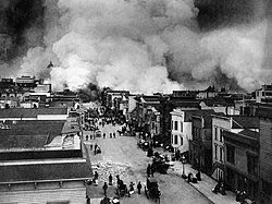


 Strong Support Very nice historical shot. Cat-five - talk 08:41, 11 January 2008 (UTC)
 Original - Mary of Teck was theHer Serene Highness. To her family, she was informally known as May, after her birth month.
 Edit 1 - downsample, slight sharpen, cleanup
 Edit 2 - downsample, more cleanup and enhancement
 Edit 3 by Fir0002 - significant downsample, sharpening, cleanup, enhancement


 Oppose Per Fir. Cat-five - talk 08:45, 11 January 2008 (UTC)


 Support Very interesting subject, encyclopedic, good scan. Cat-five - talk 08:29, 11 January 2008 (UTC)


 Strong Oppose Per all the above. Cat-five - talk 08:44, 14 January 2008 (UTC)

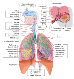


.jpg)
 , though this offers a different perspective from 'above', which gives a better, high-res view of the rings. Let's see what others think. jjron (talk) 08:10, 20 January 2008 (UTC)
 if no one really likes this one. Vanderdecken, which part is the reflection you're talking about? Sagittarian Milky Way (talk) 11:32, 21 January 2008 (UTC)


 and
and  . Would it be useful anywhere else? I'm also not entirely convinced of its use as the infobox image, as without opening it up to at least image page size you can make out almost no details (and remember a lot of users do not open these up any bigger than thumbnail). Also I wonder if links on the image page to the individual images would be useful (no one's going to find them on your Commons userpage)? --jjron (talk) 15:28, 23 January 2008 (UTC)


.jpg)


